How to Build a Style Guide for UI and Website Design

Khanh Linh Le
Created on Sep 28, 2026
A style guide for website design is a documented set of rules that defines how your interface should look and behave. It includes colors, typography, spacing, components, and their different states, so everyone on your team makes the same design decisions.
Think of it as the visual source of truth that keeps your website consistent as it grows and more people contribute. Done right, it works as a practical handbook and also as the foundation you can build a full design system on later.
Here are the key elements every style guide should include and how to put one together that your team uses.
What is a style guide for UI and website design?
A UI and website style guide is a document that defines the visual rules for your interface, including your color palette, typography, spacing, imagery, and component styling, along with guidance on when and how to use each.
Its purpose is to remove guesswork, so two people designing different pages still arrive at the same consistent look and feel.
While people often use the terms interchangeably, a style guide is focused on how your product looks. A full design system goes further by including reusable components, documentation, and workflows for building and maintaining the product at scale.
The line between the two, and where brand guidelines fit, is worth drawing clearly before anything else.
How a style guide differs from a design system and brand guidelines
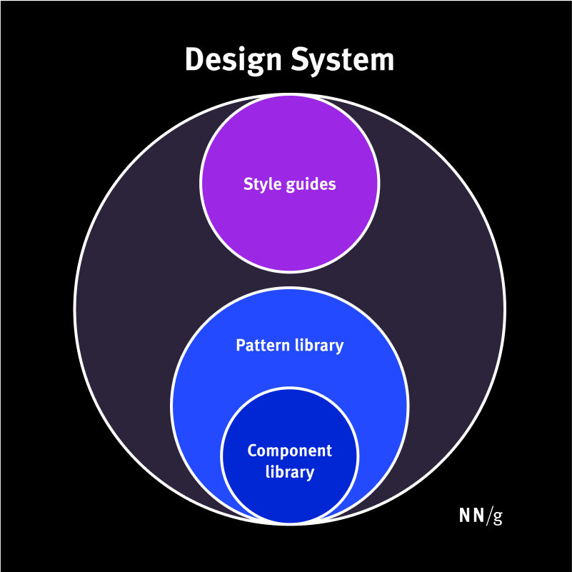
A style guide sets the visual rules for your interface. A design system is a broader set of standards that includes the style guide. Brand guidelines go even further, covering the entire brand in all its interactions. Although all three establish standards, this is the reason for their frequent confusion, since each has a different scope.
According to Nielsen Norman Group, a design system is the complete, living set of standards for designing and building products at scale. A style guide is one part of that system, focused on the visual rules for the interface, while the pattern library and component library cover reusable UI patterns and implementation.
In other words, a style guide helps define how the product should look, while a design system also defines how it's built and maintained.
If you're weighing which of the two your team actually needs right now, I've broken down the design system vs. style guide decision separately.
A brand style guide is broader still. It defines how your brand identity should be represented everywhere, including logos, colors, messaging, tone of voice, marketing materials, packaging, and other customer touchpoints. A website style guide takes the parts of that visual identity that apply to digital products and turns them into practical rules for how the brand appears on screen.
If your goal is to keep a website or product interface visually consistent without investing in a full design system, a web style guide is the right place to start.
Why a documented style guide is worth the effort
There's a measurable payoff to documenting design decisions instead of making them from scratch every time. It shows up in two places: how fast a team ships, and how consistent the result looks when they're done. Two studies put numbers on both.
In a controlled Sparkbox study, developers built the same form 47% faster using IBM’s Carbon Design System than by coding from scratch, with a median completion time of 2 hours versus 4.2 hours. They produced more visually consistent results.
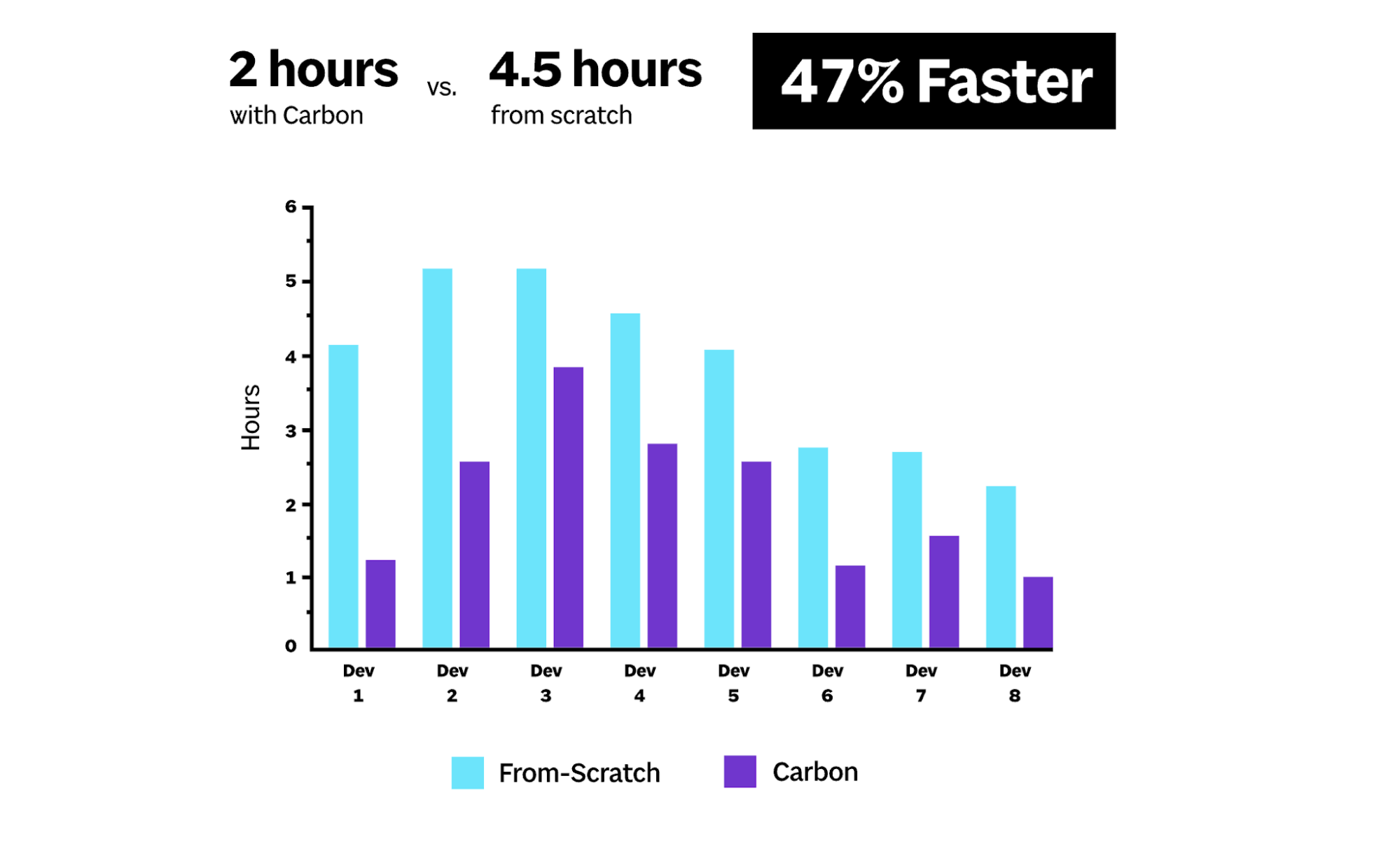
A separate Figma experiment also found that designers completed tasks 34% faster when they had a relevant design system to work from.
You can see how this plays out on any growing website. Once web building involves more than one or two people, the small decisions start diverging. One person uses 8px spacing, another picks 10px, and someone creates a new button because they don't know that an existing style already covers it. Give it a year, and you have five slightly different buttons across the same site.
A documented style guide takes those decisions off the table. The choices that shouldn't need a debate stop being debated, and the team's attention goes to the problems that actually need it.
1. Start with your brand and design foundations
Before you document colors, typography, or spacing, start with the foundations those decisions should follow. At a minimum, capture how your logo can be used, how your brand should sound, and a short set of modern web design principles that guide the overall experience.
These foundations give the rest of your style guide a reason to exist. Instead of ending up with an arbitrary list of hex codes and font sizes, your team can understand why certain visual choices were made and make better decisions when the guide doesn’t cover a specific case.
Here's what to capture for each of the three.
Document logo usage, brand voice, and design principles
For each foundation, document enough that someone new to the team can make the right call without asking around.
Start with your logo rules. Include approved variations such as the primary logo, stacked version, and icon-only mark, then specify clear space, minimum size, and allowed color treatments. Just as importantly, show what not to do through examples of a stretched logo or an unapproved recolor.
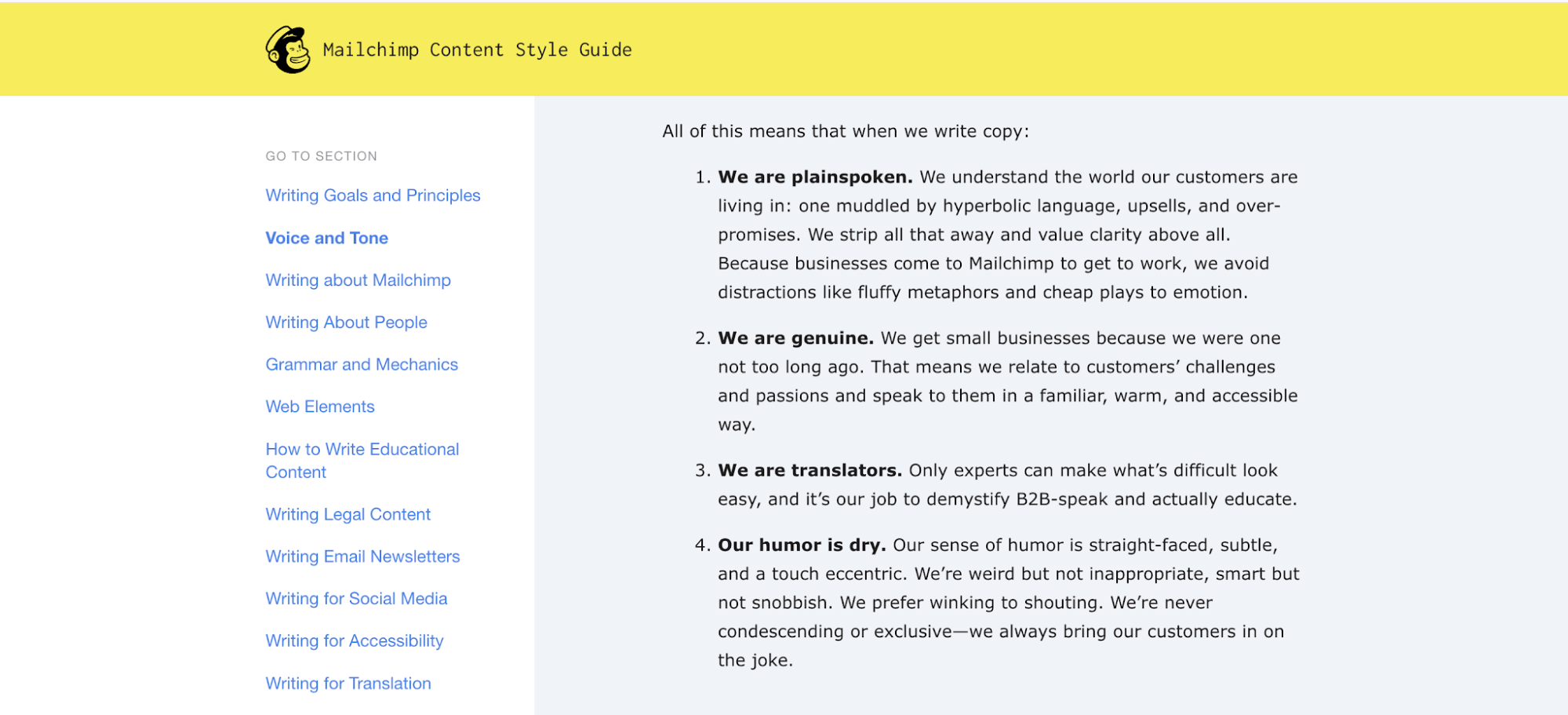
For voice and tone, define a few personality traits that describe how your brand sounds, then explain how the tone changes with context. For example, Mailchimp’s content style guide defines its voice as plainspoken, genuine, and a little dry, then gives writers specific guidance for adapting that voice to different situations. The point is not just to say “we’re friendly,” but to show what that means when someone is writing actual interface copy.
Then add three to five design principles that capture the intent behind your interface. They are guiding statements that explain the product's design intent. These give people something to fall back on when the guide doesn’t cover an exact scenario. Wherever possible, pair each rule with a simple yes/no visual.
2. The core visual elements every style guide needs
At a minimum, your UI and website style guide should define five things: color, typography, spacing and layout, imagery and iconography, and components with their interaction states.
These are the places where unmanaged decisions cause the most visible inconsistencies. For example, a different shade of blue on the settings page, 14px body text next to 15px body text, and buttons that change style depending on who built the page.
If you get these five right, you already have a useful style guide. Everything else, from tokens and usage rules to accessibility and maintenance, builds on top of this visual foundation.
Here's what each of the five needs to define.
Define a color palette with accessible contrast built in
Start by documenting your complete palette: primary and secondary colors, neutrals, and semantic colors for success, warning, error, and informational states. Give each color an exact value, with HEX at a minimum and RGB or HSL if your team needs them for web implementation.
You should also document what each color is for. If two reds appear in the palette, people should know which one signals a destructive action and which one is simply part of the brand.
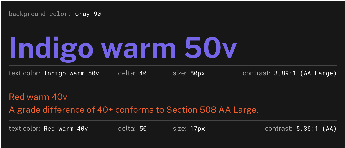
This is also the right time to check accessibility. Test the combinations that will appear together, such as text on a background or an icon on a surface, before adding them to the approved palette. Ideally, you should have a contrast ratio of 4.5:1 for normal text and 3:1 for large text and UI components.
Include a swatch table in the guide showing each color's value, its assigned role, and a pass/fail contrast badge for its most common pairings.
The U.S. Web Design System is a good example to inspect. Its color system uses tokens with defined roles and accessibility guidance, so teams aren’t choosing colors based on appearance alone.
Build a typographic scale and clear hierarchy
Define the type system as a scale, not a pile of one-off sizes. Specify the font families (heading, body, and fallback stacks), a fixed set of sizes stepping up the scale, the weights available at each size, line-heights, and letter-spacing values. That fixed scale is what makes headings, body copy, labels, and captions feel related across the whole interface.
Then map each step to a clear role, such as display, H1 through H6, body, and caption. This way, someone chooses a style based on what the text is doing rather than eyeballing whether 18px or 20px looks better on a particular page.
For example, in IBM Carbon’s type system, they use named type tokens that bundle size and line height into predefined styles for different UI needs. So it's easier to pick the role that fits the content, then use the corresponding style.
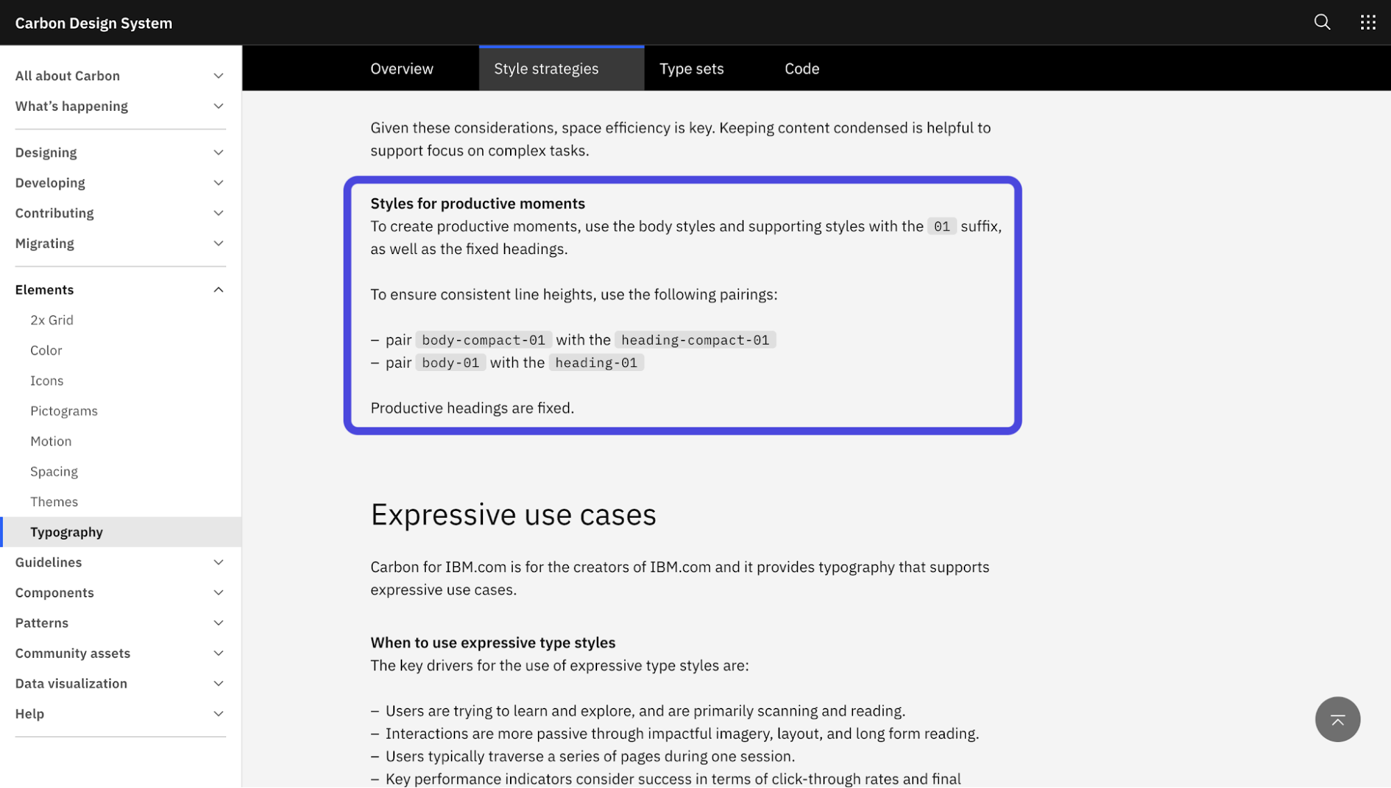
Also, document font licensing and where contributors can access the approved files. And for the guide itself, show the full scale as a visual specimen, with every role rendered at its actual size and its values labeled next to it.
Standardize spacing, sizing, and layout grids
Pick a spacing scale and use it everywhere. A common approach is to start with a 4px or 8px base, then define approved steps such as 4, 8, 12, 16, 24, 32, 48, and 64px. Padding, margins, and gaps should come from that scale instead of whatever number happens to look right on the page.
You should cover the layout grid too. For responsive web design, document the layout grid alongside the spacing scale. Define the number of columns, gutter widths, container behavior, and breakpoints so contributors know how the layout should adapt across screen sizes.
If you're setting the grid up from scratch, it's worth understanding how column grids and breakpoints work together before you commit to a column count.
Take Material Design’s layout guidance as an example. It shows how these decisions work together, using a consistent grid while adapting columns and layout behavior across different window sizes.
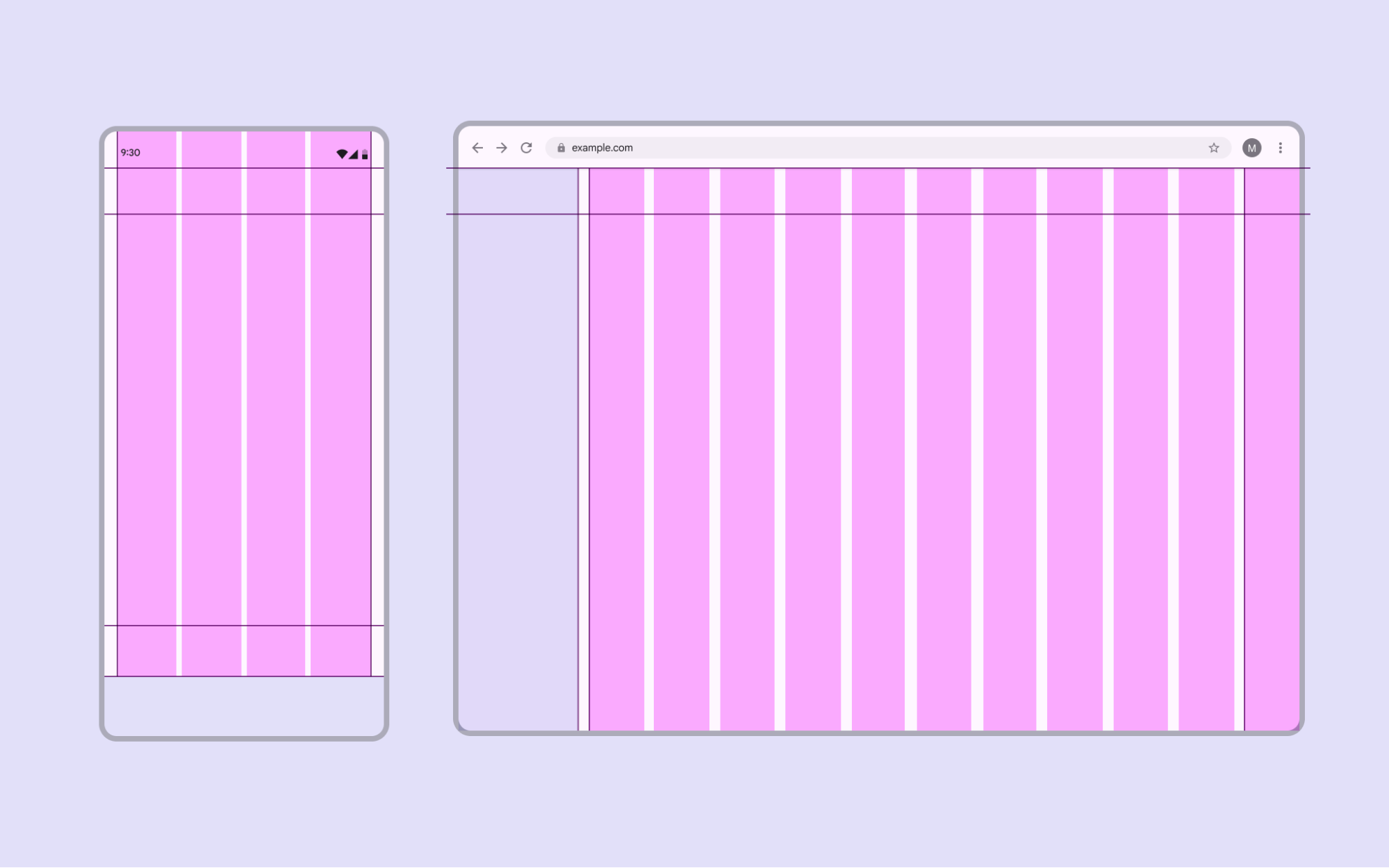
I'd also encode spacing rules as values that both design tools and CSS can pull from. This is where tokens (covered in the next section) connect directly. Include a diagram of the spacing scale and a column-grid overlay showing the system applied to a real layout.
Set rules for imagery, icons, and illustration
For photography and illustration, define the visual style you want to maintain. Are images bright and candid, or muted and editorial? Are illustrations flat and geometric, or detailed and expressive? Pair those descriptions with yes/no examples so people can see what fits the brand and what doesn’t.
Icons need their own rules too. Document the line weight, corner radius, grid size, and any other details that someone would need to create a new icon that still looks like part of the same set.
Apple’s Human Interface Guidelines do this by setting concrete expectations for icon composition and visual consistency rather than leaving each brand asset to individual interpretation.
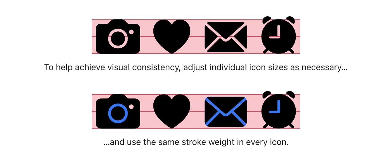
If you use a third-party icon library, name it and specify which subset is approved. If your team draws custom icons, include the grid template they should start from.
For web use, you’ll also want a few specific rules for shipping these assets, including preferred formats such as WebP for images and SVG for icons, maximum dimensions, compression expectations, and alt-text requirements.
This level of detail is what lets someone add a new image or icon a year from now and still match the existing set without guessing or asking around.
Document UI components and every interaction state
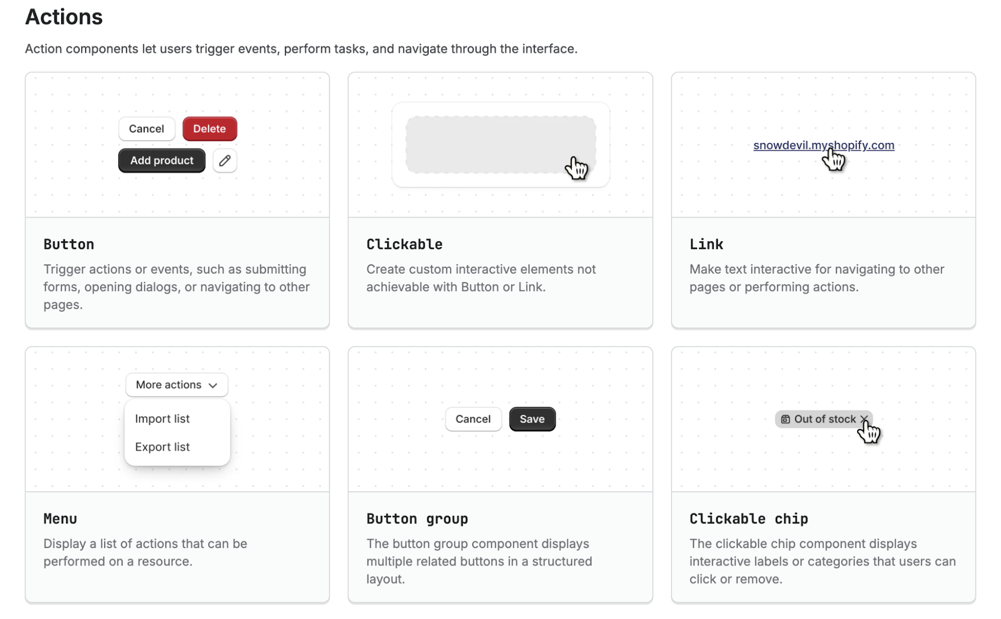
Now document the core components your site actually relies on, such as buttons, form fields, navigation, cards, and alerts. For each one, don’t just show the default version. Capture every state a user might encounter, including default, hover, focus, active, disabled, loading, and error.
Missing states are the most common reason for inconsistency and accessibility issues. When states are not documented, contributors make them up as they go. This leads to things like three different disabled buttons, hover effects that only show up on some cards, and focus rings that disappear when someone designs a new form.
You can show these states side by side for visualization purposes. A single component sheet with the same input or button across every state makes differences much easier to spot. Add a short instruction to help users know when to use each component instead of another. One sentence is usually enough. Use a primary button for the main action on a screen, and secondary buttons for other actions. Place an inline error next to the field that caused it. Use a banner alert for problems that affect the whole page.
Shopify’s Polaris component documentation does this by combining component variants with practical guidance around when and how each pattern should be used.
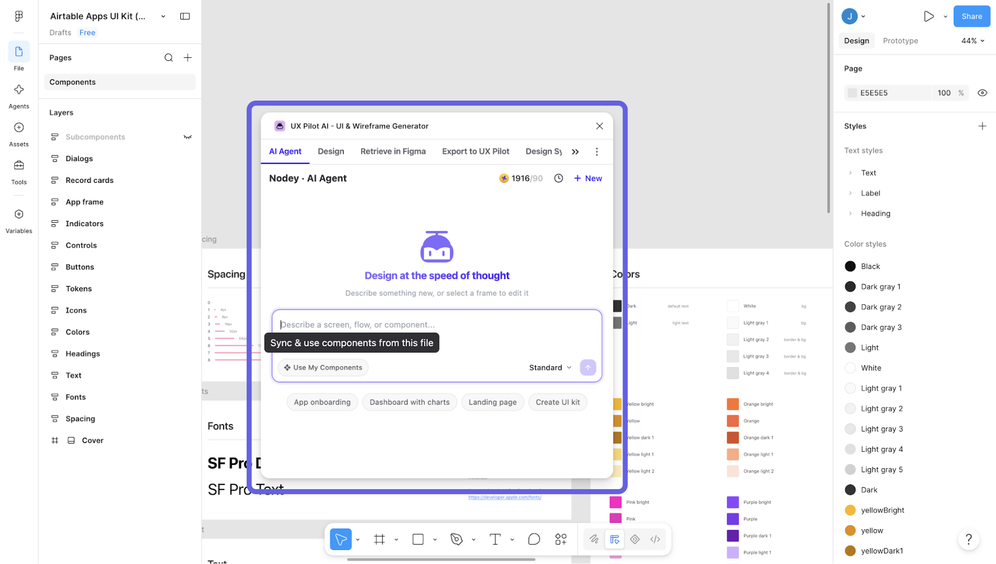
However, it's difficult to keep that brand consistency once people start creating new screens. If your approved components already live in Figma, a tool like UX Pilot can help you import your existing design system and use it as a custom AI model. That means newly generated screens can reuse your real components and run through a built-in style consistency check instead of gradually drifting off-spec as the product grows.
3. Turn your styles into design tokens
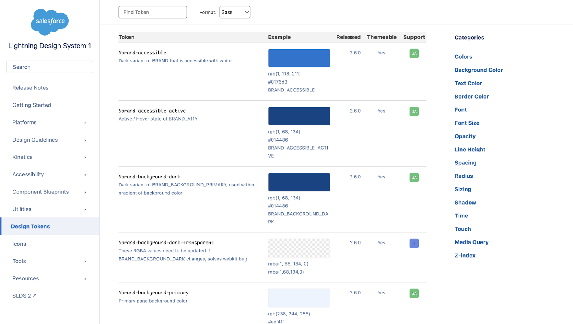
Design tokens are named values that store individual design decisions as data. So instead of hard-coding #2563EB every time you need a primary action color, you reference something like color-action-primary.
The same goes for spacing, typography, borders, and other repeated values. Design and code both read from that shared source, so you’re not maintaining one set of rules in the design file and another in CSS.
A useful way to structure tokens is in three layers:
-
Primitive tokens store the raw values, such as blue-500 or space-8.
-
Semantic tokens map those values to a purpose, such as color-text-primary or color-background-danger.
-
Component tokens apply to a specific element, such as button-primary-background.
Those layers exist for managing complexity as the system grows. If your primary action color changes, you update the underlying token instead of hunting through dozens of screens and stylesheets. It also makes themes such as light and dark mode easier to manage because the semantic role stays the same while the value it points to can change.
Another thing to do is to name tokens by role rather than appearance, store them in a platform-neutral format, and keep primitive values locked down so only system owners can edit them. The World Wide Web Consortium is standardizing a JSON-based format for design tokens, which gives teams a common structure for moving these decisions between tools and code.
In practice, you can refer to Salesforce’s Lightning Design System token catalog. Its public token structure shows how shared design values can be organized and exposed systematically instead of scattered across individual components.
4. Write usage guidelines for your style guide
A table of colors, spacing values, and component specs is not enough on its own. What makes a style guide useful is the guidance around when and how to use those values.
For each major element, document the decisions contributors are likely to face. When should they use a primary button instead of a secondary one? How much body copy should a card hold before the layout needs to change? Which color is reserved for destructive actions, and which one signals a general error?
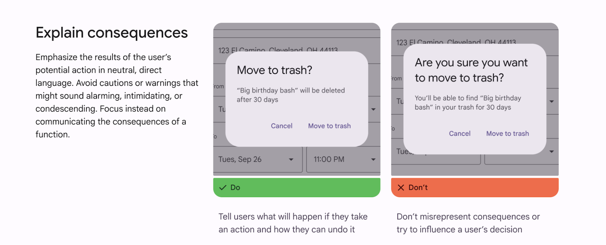
This is where realistic examples do most of the work. Put the correct use next to the incorrect one so people can understand the intent without parsing a long rule. Material Design’s content guidance uses this pattern throughout its documentation, pairing recommendations with visual examples that make the boundary much clearer.
I’d also include at least one complete page or screen built from the guide. Components can look perfectly consistent in isolation and still fall apart when combined. A real application shows contributors how the typography, spacing, colors, imagery, and components are meant to work together.
5. Make accessibility a built-in standard
Accessibility belongs inside your style guide, encoded into the color, typography, and component rules people already use. Treating it as a separate compliance checklist is what pushes it to the end of the project, when fixing it is most expensive. Don’t wait until the site is finished and run an accessibility audit to find problems you could have prevented at the system level.
For color contrast, follow the WCAG 2.2 requirements:
-
Normal text: at least 4.5:1 against its background.
-
Large text: at least 3:1 for text that is 18pt or 14pt bold.
-
UI components and meaningful graphics: at least 3:1 for elements such as form input boundaries, informative icons, and focus indicators.
Check these combinations when colors first enter the palette and again when you design component states. Pay particular attention to focus and disabled states, which are easy to miss when the default component gets most of the attention.
This is worth catching early because low contrast remains the most common accessibility failure on the web. WebAIM’s annual analysis of the top one million home pages consistently finds low-contrast text across the large majority of sites.
In the guide itself, show the check visually: one text/background pairing with its contrast ratio and pass/fail result, then one UI component example, such as an input border or focus indicator, checked the same way.
6. Maintain your style guide as a living source of truth
A style guide only works if people can trust that it reflects the current product.
You should treat it as a living web project with clear ownership, a process for proposing and reviewing changes, and versioning so everyone knows what’s current. This needs ongoing human oversight. Without it, even a well-built system gradually turns into a collection of outdated styles, duplicate patterns, and conflicting rules.
Some teams frame this as sustainable web ecosystem design, the idea that a site's visual rules should outlive the people who wrote them. That leads to a practical question: where should your style guide live so people can keep it updated and use it?
Publish it as a living, hosted reference, not a static PDF
Don't lock your style guide in a PDF and call it done. Host it somewhere that supports easy access and searching, whether that's a dedicated documentation site or an internal reference. The practical difference is that a hosted guide can change with the product.
The GOV.UK Design System, for example, keeps its style guide and components in one public reference, with versioned updates and a clear process for contributing changes.
This matters even more now that many teams use AI as a design companion. If an AI tool is generating new screens from generic patterns while your design rules sit in a static document elsewhere, drift is almost inevitable.
That’s why support for importing and storing an existing design system is becoming a real advantage.
UX Pilot, for example, can work from a team’s Figma components, tokens, and brand rules, with ongoing design-system management as the system evolves. Its Nodey agent also works directly inside Figma, so teams can generate and refine UI in the same environment where those approved components live.
The point is to keep the guide connected to how the team works. Hosting makes the rules accessible, and governance keeps them current. You need both for the guide to remain a living source of truth.
Putting your UI style guide into practice
Start with the five elements that create the most visible consistency: color, typography, spacing, imagery, and components with all their interaction states. Turn repeated decisions into design tokens, then document the usage rules, accessibility thresholds, and ownership needed to keep everything current.
You don’t need to build a full design system from day one. Get these foundations right first and make sure people use them. As your product and team grow, your style guide gives you a solid base to expand into a broader design system without rebuilding the rules from scratch. The principles that keep those systems maintainable are the natural next thing to read.