Design System vs Style Guide: What Enterprises Really Need

Khanh Linh Le
Created on Aug 12, 2026
Many teams assume that once they've documented their colors, typography, spacing, and UI patterns, they already have a design system.
After all, isn't that what a style guide does?
Not quite.
A style guide helps teams define design standards. A design system helps teams implement, maintain, and scale them. That's why a company can have a comprehensive style guide and still struggle with inconsistent end-user experiences, duplicated design work, and disconnected design and development teams.
In this guide, we'll break down the differences between modern design systems and style guides, when you need each one, and how they work together.
What is a style guide?
A style guide is a document that defines a brand's visual identity and communication standards.
Typically, it covers things like logo usage, color palettes, typography, imagery, voice and tone, and editorial guidelines. Think of it as the rulebook for how a brand should look and sound across different channels.
For example, a style guide might specify that primary CTAs use a violet color (#8959FF), body text should be 16px, and marketing copy should maintain a friendly, conversational tone.
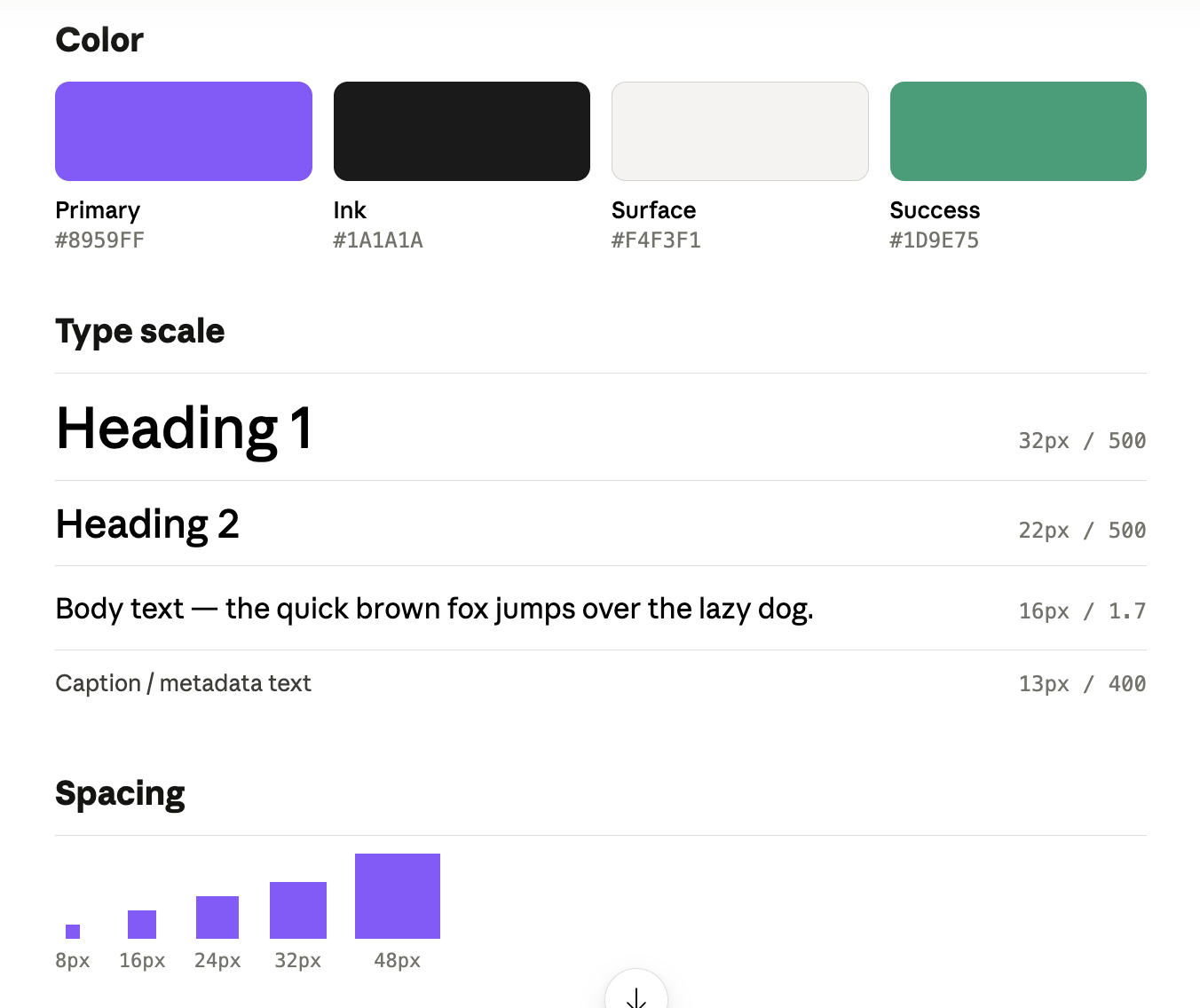
What it doesn't do is tell teams how to build and maintain digital products.
A style guide can tell you what a button should look like, but not how it behaves when hovered, disabled, viewed on mobile, or used with a screen reader. It doesn't include reusable code, design tokens, accessibility requirements, or processes for maintaining consistency across multiple product teams.
That's because style guides are typically owned by brand and marketing teams. Their primary audience is designers, writers, marketers, and external agencies
What is a design system?
A design system is a living collection of design standards, reusable components, code, and documentation that teams use when developing and maintaining digital products.
If you're wondering where the style guide fits in, it's usually one layer of the design system.
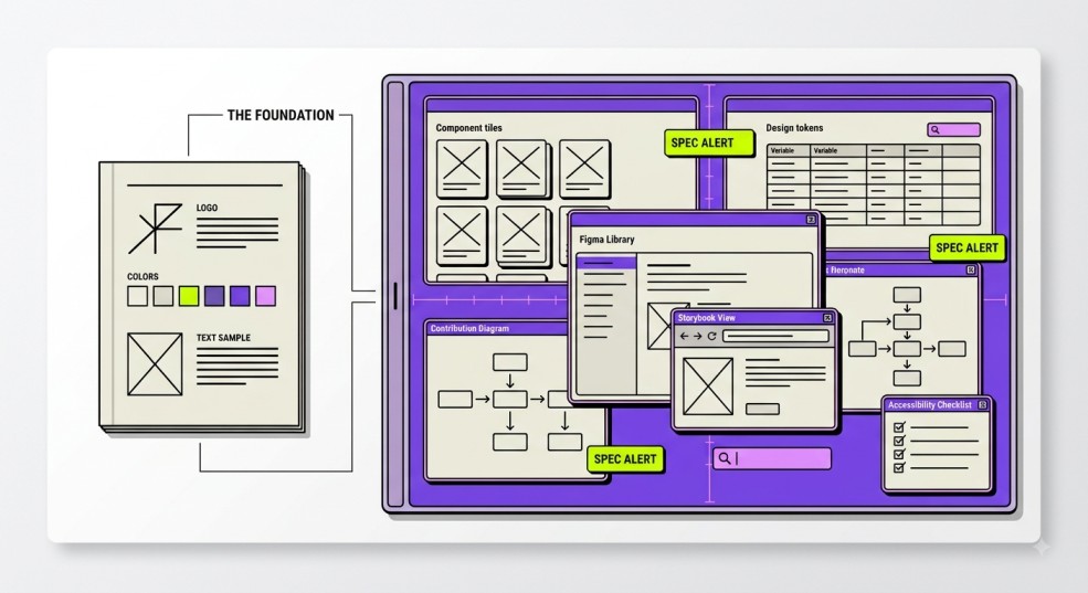
It extends beyond the style guide with design tokens, coded component libraries (React, Vue, Web Components), interaction patterns, accessibility requirements, contribution guidelines, versioning, and living documentation.
Take Airtable's design system as an example. It doesn't stop at documenting colors, typography, and spacing.
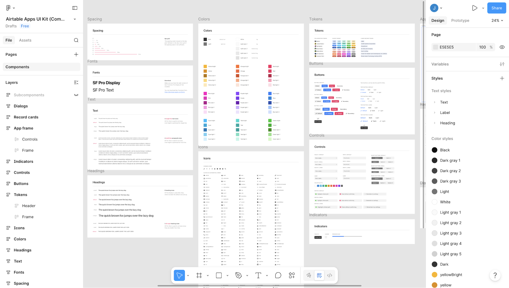
It includes reusable UI components in Figma, design tokens, and developer documentation for implementing them in code.
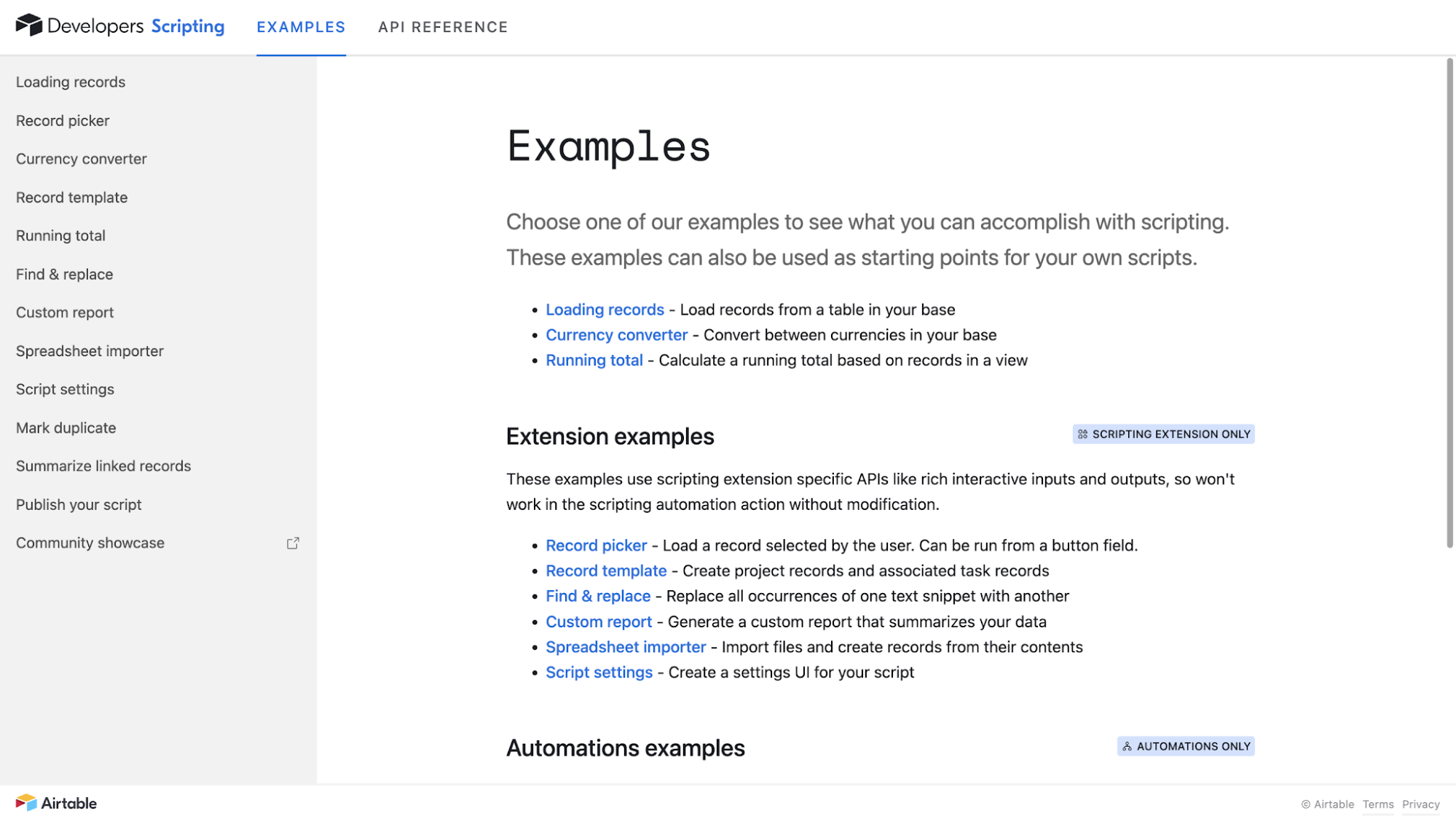
Because of that, a design system isn't just for designers. It's shared infrastructure used by designers, engineers, product managers, QA teams, accessibility specialists, and DesignOps teams to create consistent experiences across products and platforms.
Design system vs style guide: 10 key differences for enterprise teams
A design system is a superset of a style guide. So I think the question for most enterprise teams isn't whether they need one or the other; it's how much of the design system stack they actually need.
|
Dimension |
Style guide |
Design system |
|---|---|---|
|
Primary purpose |
Define brand standards |
Standardize product design process and development |
|
Scope |
Visual identity and communication |
End-to-end product experience |
|
Format |
Static document or website |
Living system of code, docs, and assets |
|
Audience |
Designers, marketers, agencies |
Designers, engineers, PMs, QA, DesignOps |
|
Design foundations |
Colors, typography, imagery |
Includes foundations plus implementation |
|
Components |
Visual examples only |
Reusable, production-ready components |
|
Accessibility |
General brand guidance |
Component-level accessibility requirements |
|
Code integration |
No code assets |
Shared code libraries and tokens |
|
Governance and management |
Owned by brand team |
Cross-functional contribution model |
|
Maintenance |
Periodic updates |
Continuous versioning and documentation |
|
Scalability |
Works for brands |
Works across products and teams |
If you're still unsure where the line is, look for implementation assets. Atlassian's design system, for example, includes design foundations, reusable UI components, design tokens, and developer documentation that help designers and engineers build from the same source of truth.
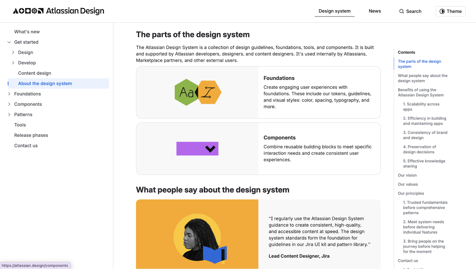
I've also noticed that many companies call their style guide a design system simply because the term sounds more mature.
But the label isn't what matters.
If it's mostly documenting design decisions, it's a style guide. If it helps teams implement, maintain, and govern those decisions across products, it's a design system.
Why do style guides fail at enterprise scale?
Style guides fail at enterprise scale because they're designed to document standards, not enforce them. Engineers tend to skip PDFs, designers copy and adapt files, and a brand update can take months because every product surface has to be changed by hand.
The symptoms are usually easy to spot:
-
Teams ship UI that looks "mostly on-brand" but differs in dozens of small ways.
-
Brand refreshes take months because every product surface has to be updated manually.
-
Engineers hardcode colors and spacing values because there's no shared token system.
-
Accessibility issues increase because teams implement the same component differently.
-
New products, acquisitions, or sub-brands introduce even more inconsistency.
In fact, a designer who led a Fortune 200 enterprise design system rebuild documented exactly this pattern when his team audited their existing files before the rollout:
-
Hardcoded elements scattered across product code
-
Excessive overrides piling up on base components
-
Cross-library conflicts between fragmented Figma files
-
Missing documentation across both design and development
-
Different frameworks and technology stacks in play (React, Adobe Franklin, Power Platform, Tableau), making a unified component library impossible without a token-based foundation
Accessibility is another good example. WebAIM found that 95.9% of homepages had detectable WCAG failures in 2026, with recurring issues like missing form labels, empty buttons, and low-contrast text. These aren't usually one-off mistakes. They're component-level problems repeated across an entire product.
There is a political cost too. When teams find that the style guide does not solve their day-to-day problem, they tend to build their own component libraries. The enterprise then has one official document and several unofficial libraries, none of which talk to each other.
Airbnb ran into a similar problem before creating its Design Language System (DLS). The company already had brand standards that look like this:
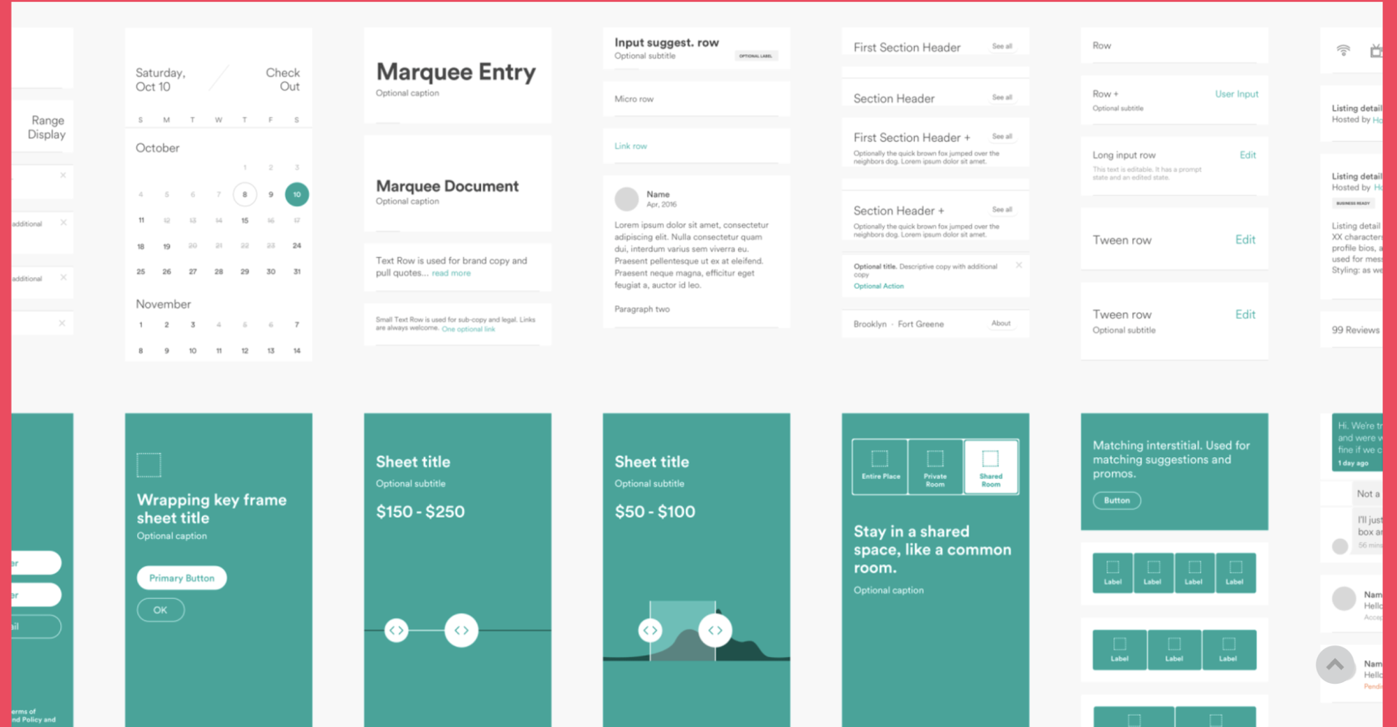
But product teams were building and maintaining UI patterns independently. The result was slower development, inconsistent experiences, and increasing design debt.
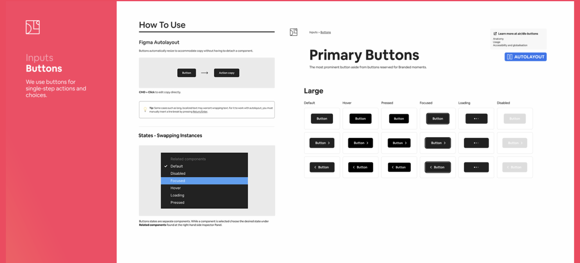
Now, if you look at Airbnb's Design Language System, you'll find much more than colors, typography, and brand rules. The system includes reusable components, documented interaction states, accessibility guidance, usage instructions, and implementation resources for product teams.
What does an enterprise design system need? 6 essentials
In my experience, most enterprise design systems are built around six core capabilities. These aren't nice-to-haves. Skip one, and you'll usually end up with a system that teams ignore, duplicate, or work around.
For example, a component library without code becomes a UI kit. Documentation without accessibility guidance creates compliance risks.
At a minimum, an enterprise design system should include the following six elements:
1. Design tokens for rebrands and multi-brand scaling
Design tokens make rebrands, theming, and multi-brand scaling possible without rebuilding your product.
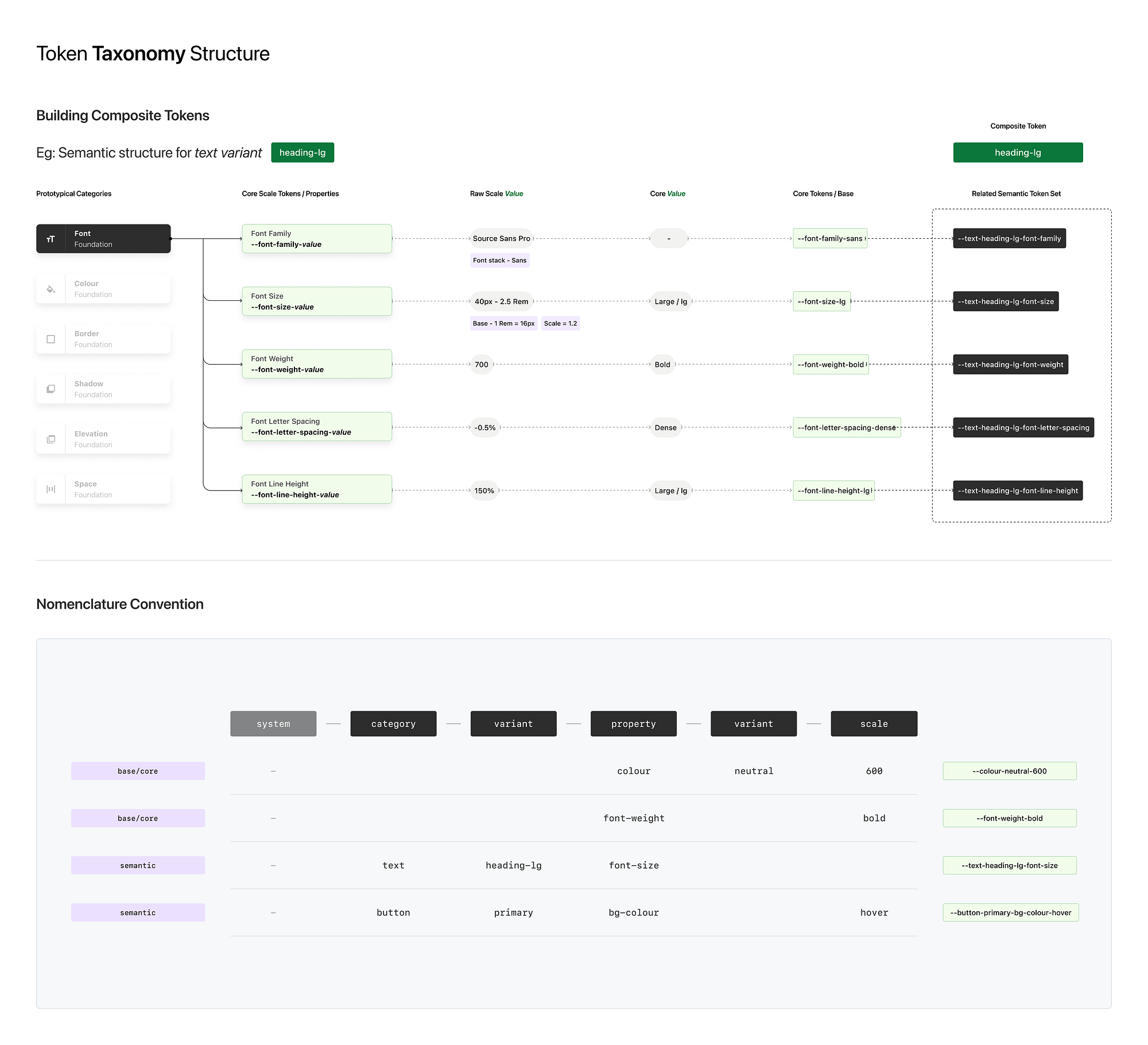
Instead of hardcoding values into components, teams reference named variables. Most enterprise systems structure those variables in three layers:
-
Global tokens: raw values like blue-500
-
Semantic tokens: intent-based values like color-action-primary
-
Component tokens: component-specific values like button-primary-bg
Actually, this three-layer model has a longer history than you think. Jina Anne coined the term "design token" back in 2014 while building Salesforce's Lightning Design System, and the taxonomy has been the enterprise default ever since.
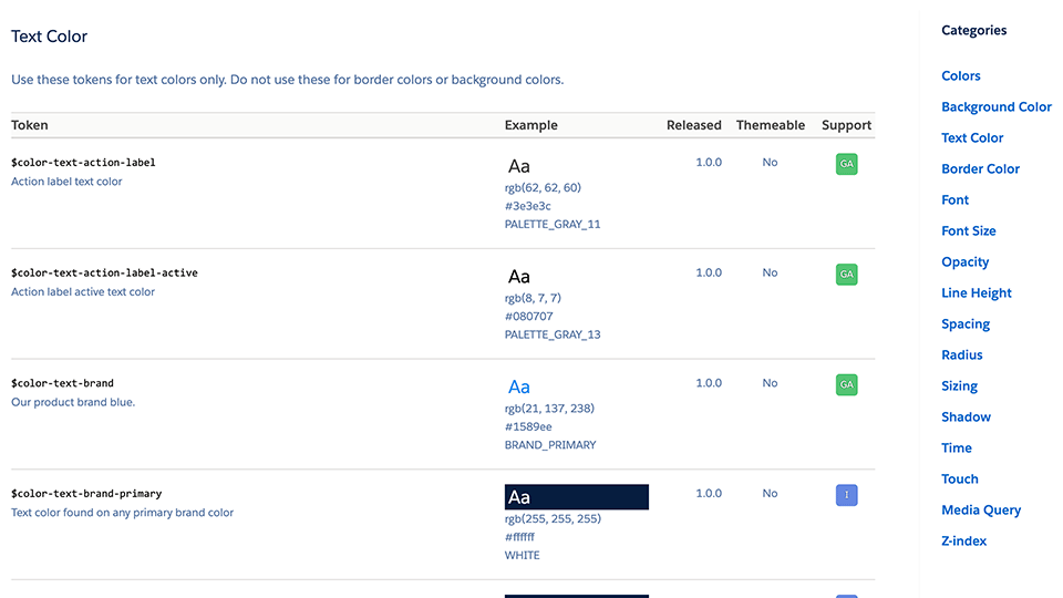
The semantic layer is where the magic happens.
Let's say your primary brand color changes. Or your company acquires another brand. Or leadership decides every product needs a dark theme. If components reference semantic tokens rather than raw values, you can update the system without rebuilding every button, form, and navigation pattern from scratch.
Remember that Fortune 200 case study I mentioned earlier? Here's what that token architecture actually bought them.
Brand update turnaround across 8 subsidiaries dropped from months to days. And the same setup later supported a white-label system projected to cut implementation time by up to 32% for partner brands.
That's why mature enterprises invest so much effort into token architecture. It's what allows a rebrand to be measured in days or weeks instead of quarters.
One shortcut I'd avoid is connecting components directly to global tokens. It feels faster when you're setting things up, but the first major brand change usually turns that shortcut into a migration project.
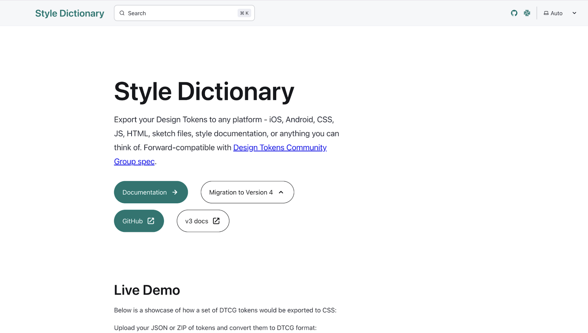
Today, you can use tools like Style Dictionary to transform token definitions into CSS, iOS, Android, JSON, and other platform-specific formats, ensuring the same design decisions are reflected everywhere.
2. Coded component libraries (React, Vue, Web Components)
Coded component libraries are what turn a design system from documentation into something teams can ship.
That's why every component a designer uses should have a matching component a developer can import. For enterprise teams, that means maintaining versioned React, Vue, Angular, or Web Component packages with TypeScript support, token-based theming, and releases distributed through npm or an internal registry.
If you take a look at Adobe's Spectrum, you'd see how the team ships @adobe/react-spectrum via npm with full TypeScript definitions baked in.
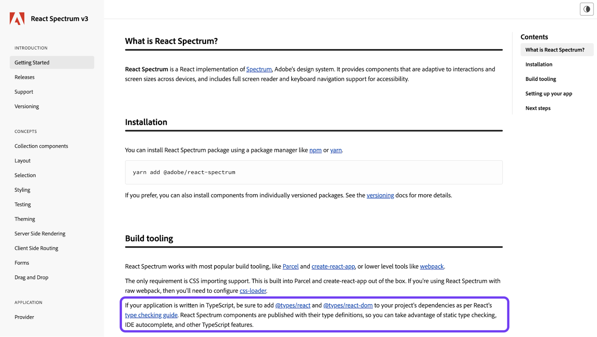
But the bit I find most interesting? They bundle React Aria and React Stately right in. When a product team installs a Spectrum button, they're getting keyboard behavior, ARIA roles, screen reader handling, layout rules, and state logic.
So accessibility and behavior travel with every component. Product teams don't re-implement focus traps or screen reader announcements per app because they get it from the package.
Code also gives you something Figma never can: control through enforcement. Once components live as code, you can hard-code the rules in. No more "please don't override the button color" buried in a guideline doc.
Back in 2016, Airbnb had this exact problem at scale. Their codebase was a mess when engineers used a mix of JavaScript, CoffeeScript, jQuery, React, CSS, Sass, whatever they were most familiar with. Each new feature added another CSS file that overrode the last one.
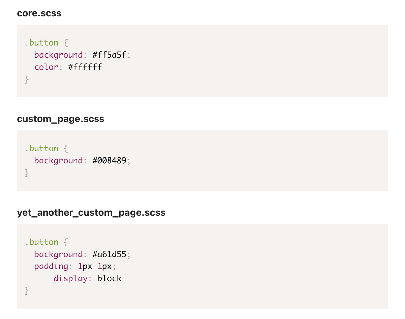
In response to that, they locked customization down to specific component props. No free style or className overrides allowed.
Want an alpaca-colored button? There's an isAlpaca prop. Want to crank up the padding arbitrarily? There's no prop, so you can't. They also use CSS-in-JS to glue each component's styles directly to its markup, which kills style drift and makes theming clean. Every one of those rules lives in code. The Figma file couldn't enforce any of it.
3. Design system governance for large organizations
Design system governance exists to prevent the system from becoming unusable.
Without governance, teams create their own tokens, fork components, invent new patterns, and slowly drift away from the system. Eventually, everyone is using a slightly different version of the "same" design system.
Most enterprises end up choosing one of three governance models:
-
Centralized: one team owns everything. Consistent, but often slow.
-
Federated: a central team owns the foundations while product teams contribute through a review process.
-
Distributed: product teams own most decisions with minimal central oversight.
Based on my observation, most large organizations land somewhere in the federated camp because it balances consistency with team autonomy.
That said, a federated model only works if you name the roles. You need a design system lead, a token librarian, component owners for the big pieces, contribution reviewers, and a steering committee made up of people from the consuming product teams.
If those aren't jobs on someone's calendar, governance turns into everyone's part-time problem, which means nobody's problem.
A typical contribution workflow looks something like this:
Proposal → Review → Design & engineering validation → QA → Release → Adoption
For example, Open edX's Paragon design system structures it like this: New components move through proposal reviews, accessibility and design consultation, engineering implementation, QA, and release, with named owners responsible for each handoff. Nobody has to guess who approves what.
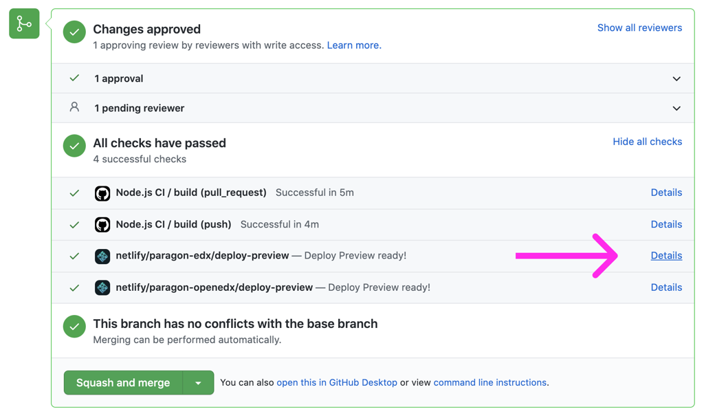
Another thing about design system governance at enterprise is that sometimes, it's a political issue, not technical.
Product teams with their own headcount will ship their own components no matter how many guidelines you publish. Therefore, good governance respects that autonomy while keeping cross-team coordination intact.
Atlassian handles this in a way I like, and I think you can learn from their team too. Their public contribution model has two paths.
-
Participation: ask in their #help-design-system Slack channel or attend fortnightly sparring sessions for systems-level feedback.
-
Contribution: only bug fixes, broken Figma components, and documentation issues accepted. New components and larger patterns are explicitly out of scope.
4. Built-in accessibility (WCAG 2.2 AA and beyond) for the end user
Built-in accessibility helps enterprises reduce compliance risk by making accessible implementation the default.
That's becoming increasingly important with legal implications as accessibility regulations continue to expand, from the ADA in the United States to the European Accessibility Act (EAA), which came into force across the EU in 2025.
In practice, "built-in accessibility" means accessibility requirements are part of the component itself. Focus indicators, minimum touch target sizes, color contrast, keyboard navigation, semantic HTML, and ARIA patterns aren't documented as recommendations; they're implemented directly in the component.
Airbnb treats accessibility this way too. Like their component customization model, accessibility lives at the system level rather than getting patched in per product, which is why their DLS still has dedicated Inclusive Experience Design roles maintaining it years later.
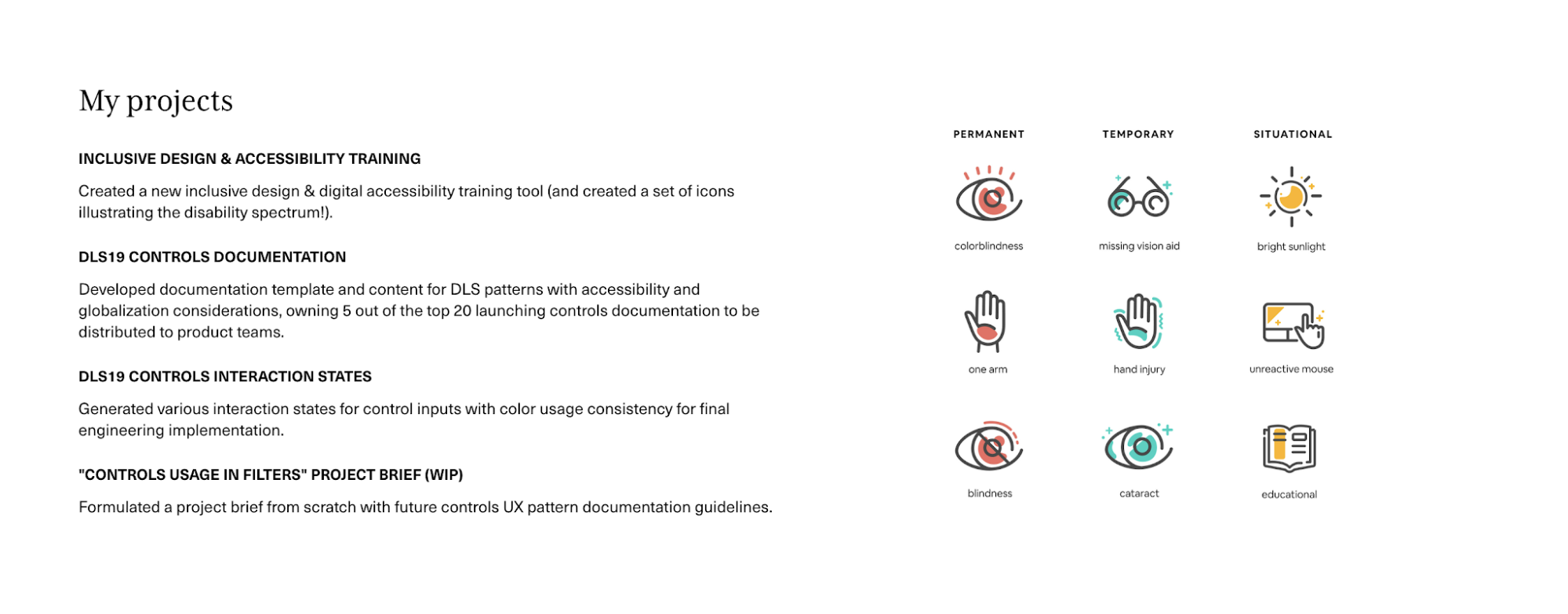
Another thing worth doing is publishing your work, especially if you'll ever face a compliance review.
For example, the U.S. Web Design System work to WCAG 2.1 AA, pushed incrementally toward AAA, and published a VPAT 2.5 conformance report covering 44 components.
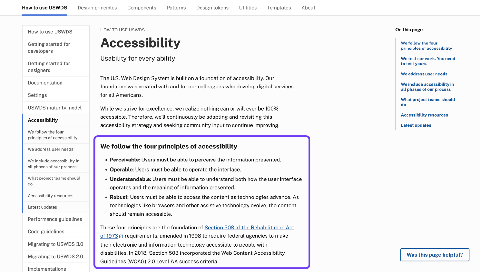
If you can, document:
-
Which WCAG criteria each component meets (e.g., 1.4.3, 2.4.7, 2.5.5)
-
The tools you used (axe DevTools, NVDA, manual keyboard testing)
-
Known limitations or edge cases
That's the difference between "we tried" and "we can prove it."
5. Multi-brand and multi-platform theming
Multi-brand theming allows enterprises to support multiple brands and platforms without maintaining multiple design systems.
Most large organizations aren't designing for a single brand anymore.
Some operate a parent company plus subsidiaries (think Marriott with Ritz-Carlton, Sheraton, Westin). Others run a portfolio of consumer brands. On top of that, they ship across web, iOS, Android, sometimes native desktop.
Therefore, a single design system has to serve all of it without forcing every brand to look identical or every platform to feel foreign.
That's why mature design systems separate behavior from presentation. Components handle structure and behavior. Themes handle colors, typography, spacing, and other brand-specific decisions.
If you've set up your token architecture properly, the same button component can power multiple brands. The behavior stays consistent. The visual layer changes depending on which theme is applied.
The same idea extends to platforms. Your iOS button shouldn't behave like a web button, and your Android components shouldn't ignore Android conventions. The implementation can change, but the underlying design decisions (i.e., colors, spacing, typography, elevation) should still come from the same token source.
At the same time, you should think of clear boundaries around what can and can't be themed. Brands can override certain token layers, but the core system should remain shared.
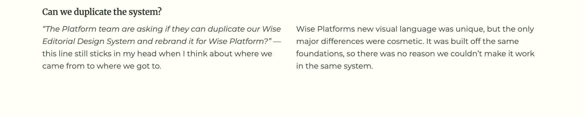
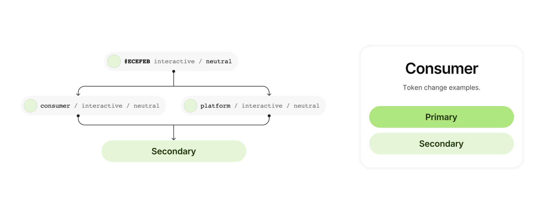
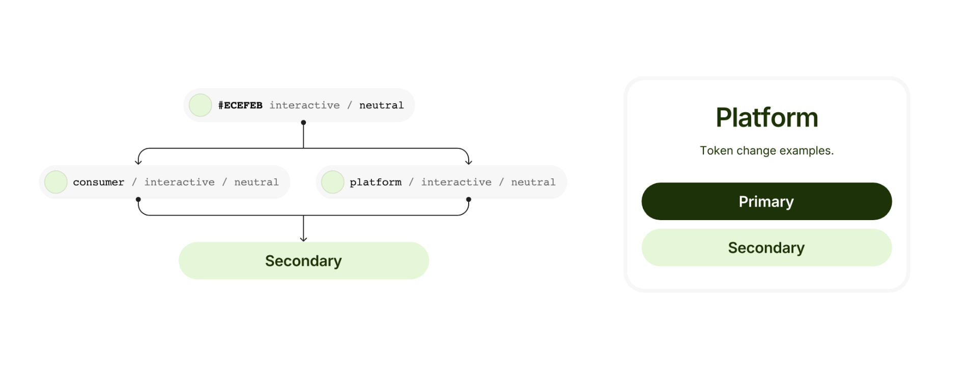
That's what Wise did when they launched Wise Platform (their B2B product for banks) in 2024 alongside the consumer brand. Instead of duplicating their design system, they rebuilt the token architecture so multiple brands could sit on top of the same foundations.
So for consumer applications, it looks like this:
And on the platform for B2B, it looks like this:
Now there are a lot of tools to support that architecture, too. Teams commonly use tools like Style Dictionary, Tokens Studio, Supernova, or Knapsack to transform a shared token source into platform-specific outputs for web, iOS, Android, and different brand themes.
6. Living documentation tied to production code
Living documentation keeps the design system trustworthy as it evolves.
That's why the best design systems don't treat documentation as a separate deliverable. They generate as much of it as possible from the same source of truth that powers the system itself.
In practice, that means a few things:
-
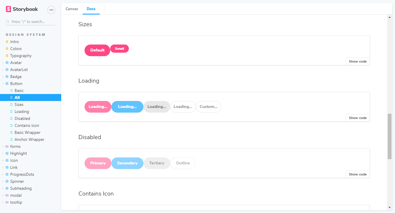
Docs pulled from the codebase. Storybook auto-generates component docs from the library; Zeroheight and Supernova pull tokens and props from your source code.
-
Figma synced to code. Code Connect and Dev Mode let designers and developers reference the same components, so a Figma token change shows up in the codebase.
-
Search instead of curation. This sounds like a small thing until you're supporting hundreds of designers and engineers. At that scale, discoverability becomes just as important as consistency. People need to be able to find a component, understand when to use it, check its props, review accessibility requirements, and move on with their day.
If you're wondering whether all this work pays off, Forrester ran the numbers. Their Total Economic Impact analysis of Figma Dev Mode found one organization measured $4 million in "reuse value" from making their design system easier to use, with more than $10 million projected in 2025.
Quality assurance saw the biggest gains. One Chief Design Officer at a financial services organization reported testing savings of 85–90% on average, mostly because design system documentation stayed tightly coupled to approved code.
That said, one thing I'd warn against is treating documentation as a launch deliverable. Even living docs need a named maintenance owner, or they are likely to decay within two release cycles no matter how automated your pipeline is.
What tools and platforms do enterprises use to build design systems?
Enterprises don't build a design system on a single tool. They assemble a stack of five layers, each with its own dominant tools and its own ownership question: the design layer, the token pipeline, component development, living documentation, and often an external partner. What matters isn't which single tool you pick, but which combination, and who owns each layer.
Here's what sits in each layer:
-
Design layer. Figma is the enterprise default. Code Connect bridges design and code; Dev Mode exposes tokens and specs to engineers. Penpot is the open-source alternative if you need on-prem deployment or want native W3C-compliant tokens without vendor lock-in.
-
Token pipeline. Style Dictionary (open-sourced by Amazon) is the standard for transforming a single token source into platform-specific outputs: CSS variables, iOS Swift, Android XML. Tokens Studio handles token authoring inside Figma. Pair Style Dictionary with GitHub and a CI/CD pipeline, and every commit auto-updates every downstream platform.
-
Component development. Storybook is the de facto standard for component dev environments, visual regression testing, and accessibility audits. Most mature design systems publish their Storybook publicly, which doubles as recruitment and credibility.
-
Living documentation. Zeroheight, Supernova, and Knapsack pull tokens, components, and props directly from the codebase, so docs stay in sync with production. Knapsack is the one I'd point to for large enterprises specifically. It's used by orgs running 12+ product lines with 200+ designers and developers, and it tracks component-to-token relationships with permissioning built in.
-
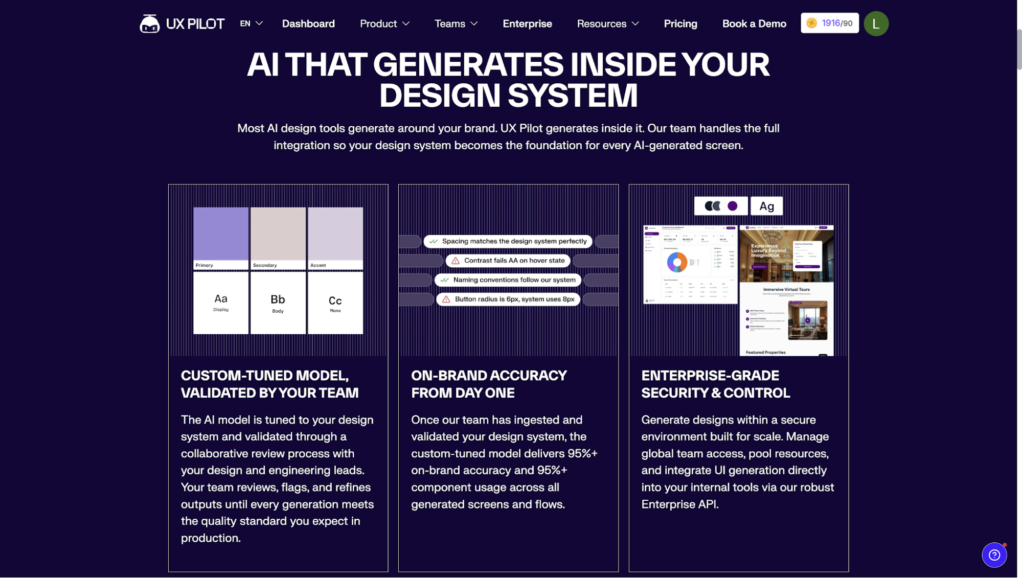
External partner (optional). If you can't staff a 6–12 month internal build, DSaaS (Design System as a Service) is a real deal. UXPilot's DSaaS combines a delivered system with embedded support and integrates Nodey, our Figma AI agent. It fits a staged migration without requiring you to hire a full design system team of 10+ from day one. Try it out!
That said, the mistake I see most often is assuming more tools automatically means a more mature design system.
In reality, every tool introduces another integration to maintain, another workflow to learn, and another place where information can drift. A team with Figma, Storybook, and clear ownership will outperform a team with seven platforms and nobody responsible for them at all.
When is a style guide enough, and when do you need a design system?
If you're managing a single brand, a marketing website, and a relatively small team (I'd say fewer than 20 people), a style guide is often enough. The same is true if your brand assets are mostly consumed by designers, writers, agencies, or marketing teams rather than engineers building software.
However, if you recognize yourself in even two or three of the following, you've outgrown what a style guide can do.
-
Multiple product teams shipping in parallel
-
More than one platform (web plus mobile, or multiple web apps)
-
More than one brand under one umbrella
-
Weekly or faster shipping cadence
-
Accessibility or compliance requirements with audit obligations
-
Frequent rebrands, acquisitions, or sub-brand launches
-
Engineers complaining the brand doc is unusable
Here's the good news, though. At enterprise scale, your style guide doesn't get thrown out. It becomes the brand and foundations layer of your design system. Colors, typography, voice and tone, imagery guidelines: all of that work compounds.
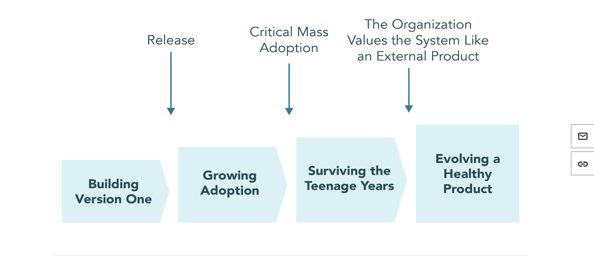
Sparkbox's Design System Maturity Model describes the same progression. They frame the style guide as the right tool for the earliest stage, with the system layering on as adoption grows. Skipping this phase, trying to ship a full enterprise design system before the foundations are in place, tends to produce shelf-ware.
So before you budget and plan for a design system, be specific about which scenario you're in. Trying to govern a 500-person product org with a brand PDF is the most expensive way to learn this lesson.
How to build an enterprise design system: stages, team, design process, and timeline
One thing I'd avoid is trying to build the entire design system at once. You should build an enterprise design system in stages, not all at once: roughly three phases over six to twelve months, backed by a dedicated team rather than a side-of-desk effort. Trying to ship the whole thing in a single quarter usually produces neither a usable system nor a usable style guide.
Stage 1 is about foundations. Boring as it sounds, it makes everything else possible. At this stage, you should:
-
Audit your existing UI across products to surface duplication and inconsistencies.
-
Define design tokens (color, typography, spacing, radius, motion).
-
Build five to ten core components and templates in code (button, input, modal, table, navigation).
-
Stand up basic documentation.
Stage 2 is where governance starts to matter. With the foundation in place, you can start scaling. Name the design system team. Define contribution rules. Set a review cadence. Expand the component library to 30–50 production components. Add multi-platform support if you need it. You can even start measuring adoption through library usage, detachment rates, and component reuse.
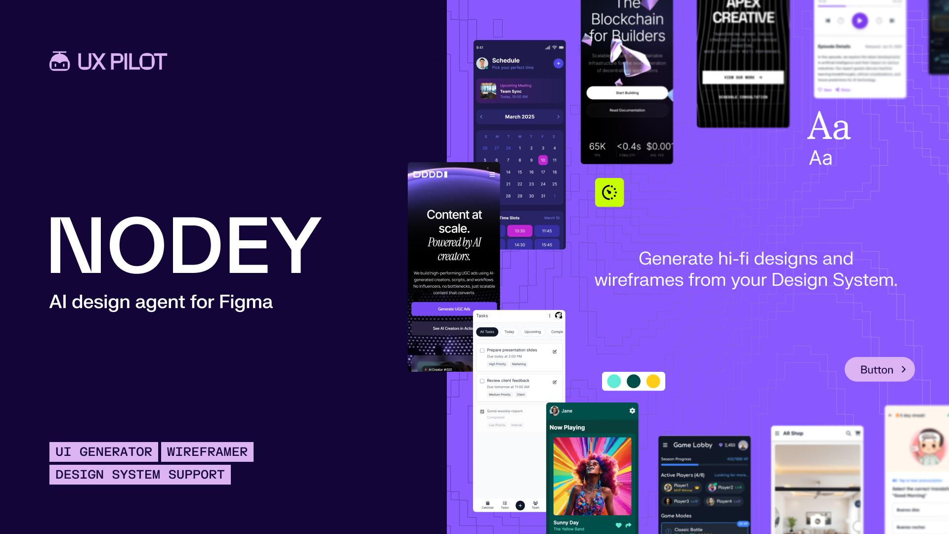
Adoption is also where your tooling choices show up in the numbers. A Figma-native agent like UXPilot's Nodey generates new screens from your synced components and tokens rather than one-off approximations, which keeps fresh work on the system instead of adding to the detachment rate you're trying to bring down.
Stage 3 is when the system starts behaving like infrastructure. At this point, the team's job stops being "build the system" and starts being "support the people using it."
This means adding self-service tooling such as Storybook, Code Connect, and zeroheight. Support multi-brand and multi-platform theming, run automated accessibility checks in CI, and tie ROI measurement to business outcomes.
You should also be realistic about your team size.
A design system isn't something a designer works on every second Friday afternoon. Enterprise systems usually need dedicated designers, engineers, product leadership, and accessibility expertise behind them. Building the first version can take months. Getting the organization to adopt it as part of their working culture usually takes longer.
You can think about design systems as products rather than projects.
Design system vs style guide: the bottom line for enterprises
In my experience, most teams already have a sense of where they are when they finish reading something like this.
So in short:
-
If it's a style guide and the org is small enough that one is genuinely enough, leave it alone. The worst thing you can do is convince leadership to fund a design system that nobody's going to staff properly.
-
If it's a style guide and you're outgrowing it, the first move is getting someone named, calendared, and accountable for owning the next stage. Not the tools.
-
And if you already have a design system but everyone is making their own components, governance is everyone's part-time job, docs are nine months stale, etc., the answer is to fix what's already there before adding to it.
Whatever your scenario, the bottom line is the same: a design system is something that needs constant maintenance.