Trusted by top product teams globally






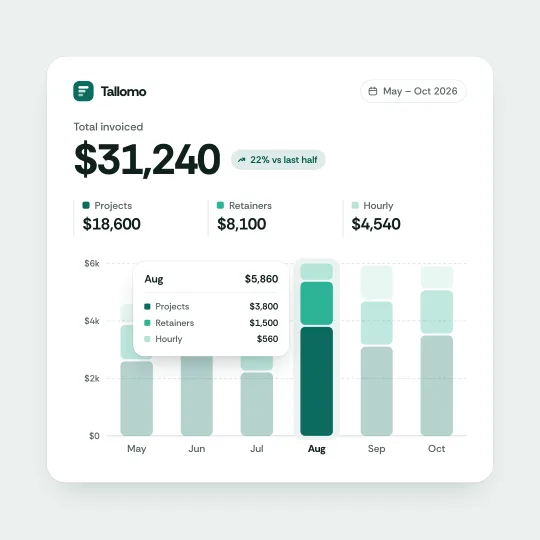
Stacked layer bars
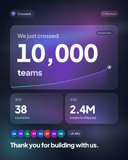
Milestone post

Sweep flood counter
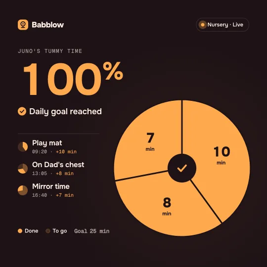
Pie fill goal
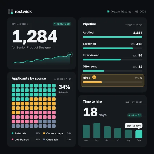
Quadrant split board
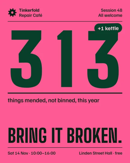
Giant tally poster
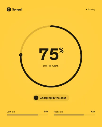
Ring fill and drain
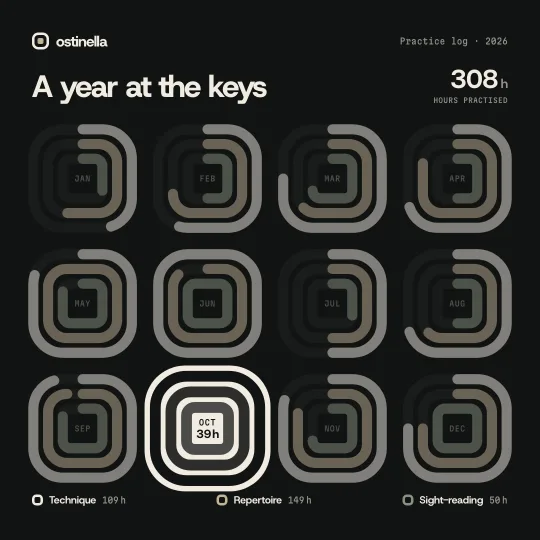
Squircle ring cascade
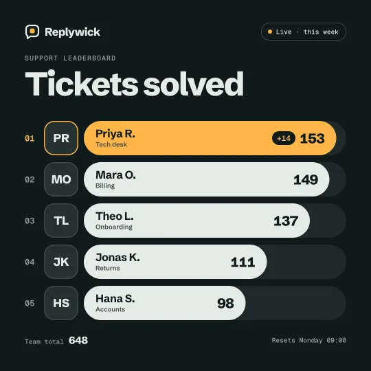
Leaderboard overtake
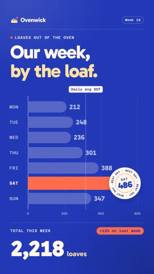
Best-day bar chart
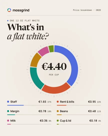
Donut breakdown
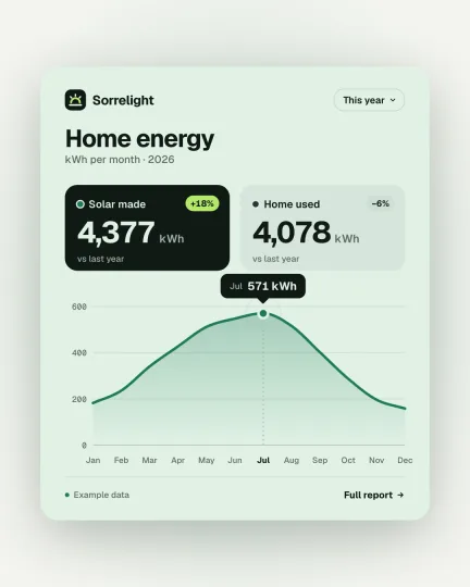
Self-drawing line chart
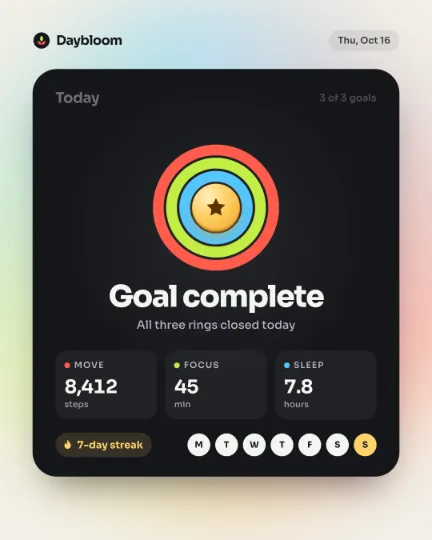
Goal complete card
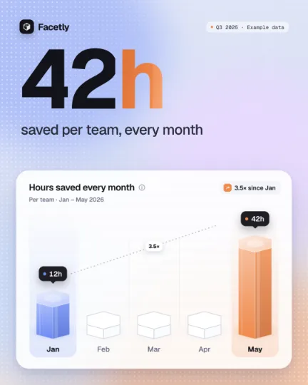
Crystal chart card
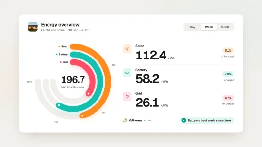
Radial bar dashboard
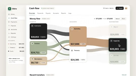
Money flow
Chart types to start from
Six charts people ask for most, each a real template made in UX Pilot. Start from one and swap in your numbers, or describe a chart of your own.
- Pro
Bar chart race
When the story is a ranking that changes: who leads each month, and who overtakes.
Bar chart
To compare a few values side by side, like sales per day, and point out the best one.
- Pro
Line chart
To show a trend over time and call out the best month or the turning point.
Donut chart
To split a total into its parts, like traffic by source or budget by team.
- Pro
Number counter
To land one big number: revenue, users, or a milestone you just passed.
- Pro
Progress rings
To show how close you are to a goal, and to celebrate when you reach it.
How it works
From numbers to chart video in three steps
- 01
Paste your numbers
Type or paste your labels and values into the box, or attach a screenshot of a chart or table. Add your website and the chart picks up your colors and fonts.
- 02
Pick a chart or describe it
Ask for a bar chart race, a donut, a line or a counter, or start from a template. The AI builds it scene by scene, and you change it by chatting or on the timeline.
- 03
Export it everywhere
Download MP4 or WebM for slides and posts, or a GIF for email, and ask for 16:9, 9:16, square or 4:5 cuts of the same chart. Paid plans export at up to 60 fps.
What to paste in the box
There's no spreadsheet or CSV upload. Type or paste your numbers into the box as text, or attach a screenshot of a chart or table. Here's what the AI needs.
Labels and values
A label and a number for each item, like “Organic search 46%”. Say the unit too: dollars, percent, visits or hours.
A value per period for a race
For a bar chart race, give each item its value in every period, in order: one row per item, one column per month, quarter or year.
Cells from a spreadsheet
Copy the cells in Excel or Google Sheets and paste them into the box. They arrive as plain text, and the AI reads them.
Or a screenshot
Attach a screenshot of a chart or table as an image. The AI reads the numbers from it; check them in the first draft.
Example
Monthly signups by plan
| Plan | Jan | Feb | Mar | Apr | May | Jun |
|---|---|---|---|---|---|---|
| Free | 1,200 | 1,850 | 2,400 | 3,100 | 3,900 | 4,600 |
| Starter | 800 | 1,300 | 2,100 | 2,700 | 3,300 | 4,100 |
| Team | 400 | 900 | 1,700 | 2,800 | 3,600 | 4,900 |
| Business | 300 | 500 | 900 | 1,400 | 2,200 | 3,000 |
| Enterprise | 100 | 200 | 450 | 700 | 1,100 | 1,500 |
Paste a table like this with one line on what to make, like “Bar chart race, Team overtakes Free in June, 6 seconds”, and send it.
Animated chart templates
Charts, KPI cards, counters and stat posts, all made in UX Pilot. Start from one and swap in your numbers, or have the AI make one like it.
- Pro
Live market line
- Pro
Radial bar dashboard
- Pro
Squircle ring cascade
- Pro
Stacked layer bars
- Pro
Line to radar roll
- Pro
Pie fill goal
- Pro
Year in dots
- Pro
Island route map
- Sign up to access them
300+ templates
Launch videos, explainers, logo reveals, kinetic type, UI interactions and more, ready to make yours.
Where your animated charts go
One chart, cut for the deck, the feed and the inbox.
Slides and reports
Insert the MP4 in PowerPoint, Keynote or Google Slides, so the key number moves on its slide.
Social posts
Growth milestones, year-in-review numbers and poll results as vertical or square posts with music.
YouTube data stories
Bar chart races and rankings in 16:9, with music and captions, for a channel or an explainer.
Investor and board updates
Revenue, users and retention as a short clip for the update email or the deck.
Websites and landing pages
A looping video of a stat or a chart that shows your results in numbers.
Newsletters and email
A GIF of a chart or a counter that plays right in the email.
Everything else you get

Kresimir Retih,
Project Manager"It has been a game-changer for me! Since signing up, my workflow has become much smoother, and my productivity has increased significantly. I love how intuitive and user-friendly the platform is, making UX tasks much easier and more efficient. Highly recommend it to anyone looking to streamline their UX process!"
Trusted by product teams, designers and founders
Join a growing community of professionals who design, prototype and animate their products with UX Pilot's AI-powered tools.
0M+
users
0M+
screens generated
0
rating from designers and developers
0+
countries
FREQUENTLY ASKED QUESTIONS
Everything you want to know about making animated charts with UX Pilot
Make your first animated chart
Paste your numbers or a screenshot of a chart, and get a chart video in your brand, ready to refine and export.