7 Enterprise Design System Best Practices and Trends for 2026

Khanh Linh Le
Created on Aug 27, 2026
Enterprise design systems (EDS) are one of those things that look like a design problem but are mostly an organizational one.
Essentially, an enterprise design system is a place to organize all the tools that can help businesses when designing enterprise applications, serving as a repository of all the design elements that form an enterprise app design, website, or any digital product.
I’ve seen teams build solid component libraries and still struggle because there was no dedicated owner, no roadmap, and no way to measure adoption. And it’s clearly not an isolated problem either. In the 2025 Design Systems Report, 63% of teams cited lack of resources and staffing as one of their biggest design system challenges.
That's before you factor in 2026. AI-assisted development, agentic workflows, and MCP integrations are accelerating how quickly teams ship, which also makes inconsistencies scale faster.
The practices below are what separate an adopted enterprise design system from an abandoned one, including the agentic AI and MCP shifts reshaping how enterprises ship in 2026.
1. Treat the design system as a product
I think one of the biggest mistakes enterprise design system teams make is treating the design system as a launch milestone rather than an ongoing product.
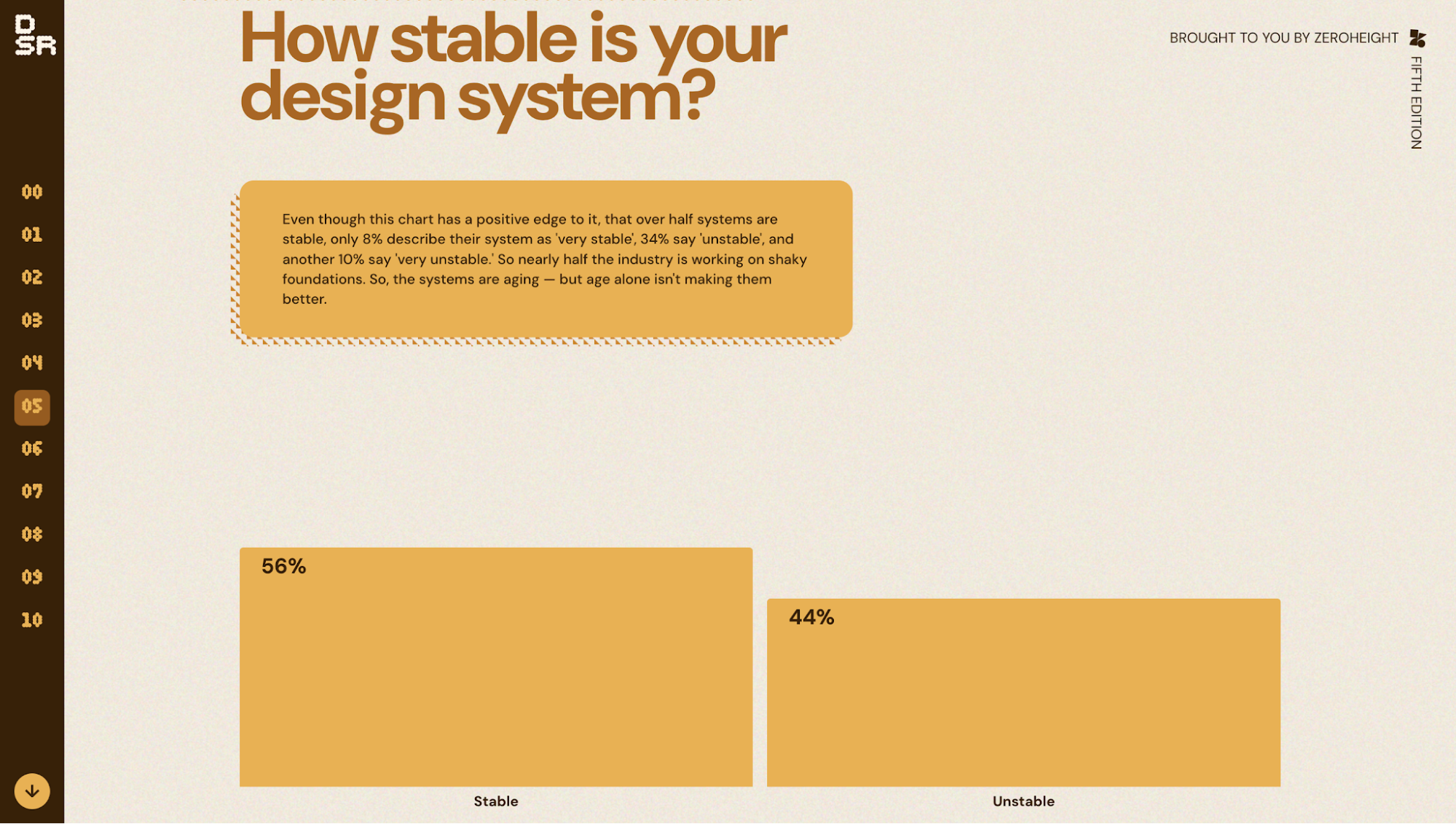
One number that really stuck with me from the Design Systems Report by ZeroHeight is that only 8% of teams described their systems as “very stable.” Honestly, that says a lot about how difficult design systems become once they move past the launch phase and into long-term maintenance across large organizations.
That’s why I think the best enterprise systems are run more like internal products than design deliverables.
Running it as a product means it has the things any product has: an owner, a roadmap, user research, and a backlog, staffed by a standing team rather than a project budget. At a minimum, that team includes a design system lead, component designers, front-end engineers, a documentation specialist, and someone who owns developer relations, funded continuously rather than per project.
The distinction matters. A project has a delivery date and calls itself a success at launch. A product has no end date and calls itself a success only when it's adopted. And the system's real customers are the product teams that consume it: if those teams aren't shipping faster with it, the system is failing even if every component is beautiful.
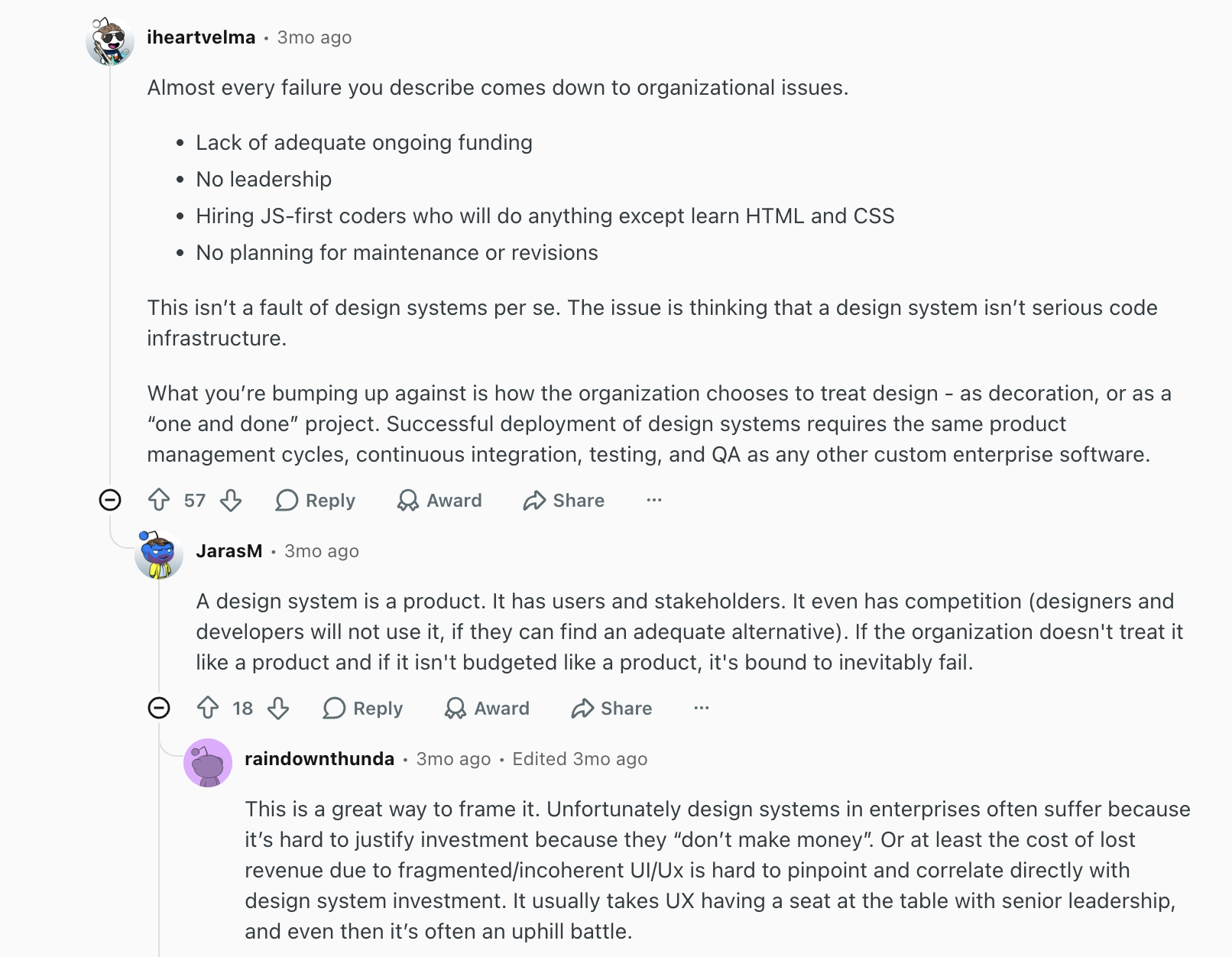
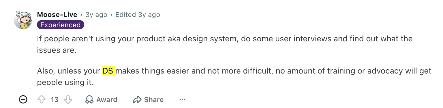
I also came across this Reddit discussion while researching enterprise design systems, and I think it frames the problem unusually well:
The conversation around design systems tends to focus heavily on components and visual consistency, but most long-term failures actually come from operational issues like funding, leadership, maintenance planning, and whether the organization treats the system as real infrastructure in the first place.
IBM’s Carbon design system is one example that's worth mentioning. It is an open-source design system that includes human-interface guidelines, working code, and design resources aimed at improving UI consistency across IBM's digital products.
The team operates much closer to an internal platform team instead of a static component library.
They maintain public workflows, roadmap visibility, office hours, Slack support, GitHub issue tracking, and even a rotating “fire line” support team dedicated to handling incoming requests and unblockers.
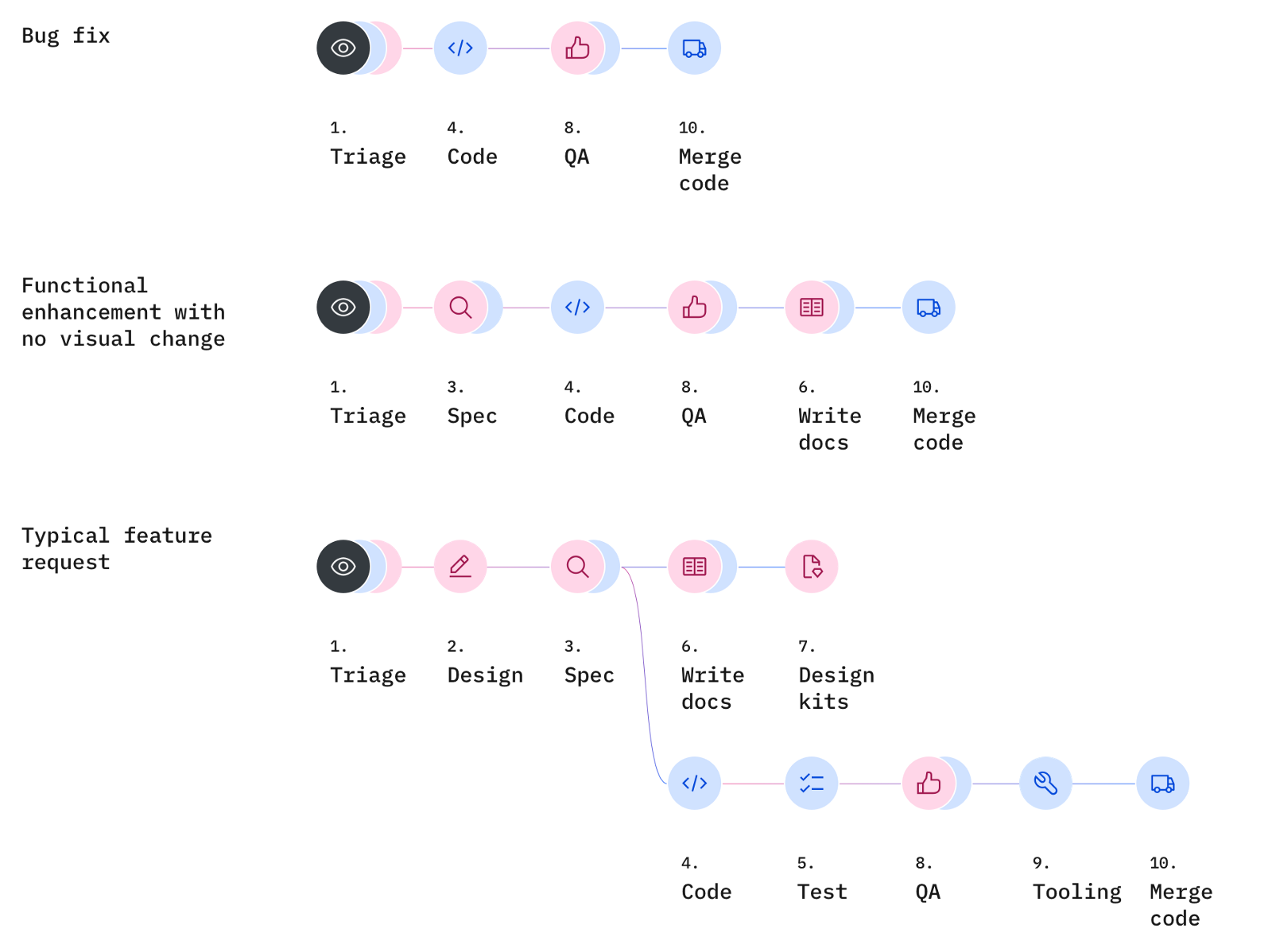
Carbon also puts a surprising amount of attention into operational pacing. They run structured release cycles, design freezes before code freezes, mandatory QA reviews for pull requests, and shared design-dev specification reviews before implementation.
2. Build governance and contribution models that scale
A well-structured governance model is essential for the long-term success of a design system, ensuring alignment, consistency, and efficiency across teams. Nevertheless, it's still a part that most teams underestimate.
A common pattern is that product teams need a new component, can’t get support fast enough, and then build their own workaround to keep shipping. After a while, the system slowly splits into competing local versions.
Therefore, having a governance model in place can help you mitigate many of the risks. A governance model includes clear guidelines for adding, modifying, or removing components from the design system, which helps maintain its integrity and relevance over time.
Four popular models that you can consider include:
-
Centralized: one team owns everything. Works for consistency, breaks when product teams move faster than the central team can respond.
-
Federated: ownership distributed across product teams. More flexible, harder to keep coherent.
-
Community-driven: volunteer maintainers. Works for open source, rarely survives enterprise politics.
-
Hybrid: centrally owned core, distributed contribution at the edges. This is where most mature systems land.
For example, GitLab’s Pajamas separates the system into a Core layer owned centrally and an Extended layer maintained by product teams. Teams can ship their own components without waiting for full approval, as long as they inherit shared tokens and standards.
What makes these models work is usually operational clarity with proposal templates, versioning rules, contribution guidelines, response SLAs, and clear ownership boundaries.
This seems to be a pretty universal problem in enterprise environments. A lot of the design system discussions I came across weren’t really about visual consistency at all. They were about teams bypassing documentation or systems that slow them down.
Let's discuss working inside Figma as another example, especially when it's becoming a popular tool for most enterprise design teams. Ideally, you should:
-
Split libraries into separate layers for foundations, reusable shared components, and product-specific patterns
-
Match Figma naming conventions with engineering tokens, CSS variables, and component naming, as establishing clear naming conventions for design files is crucial for efficiency and ease of use, enabling better collaboration and design implementation.
-
Organize Figma files around product areas, epics, or workflows instead of storing everything in one workspace
-
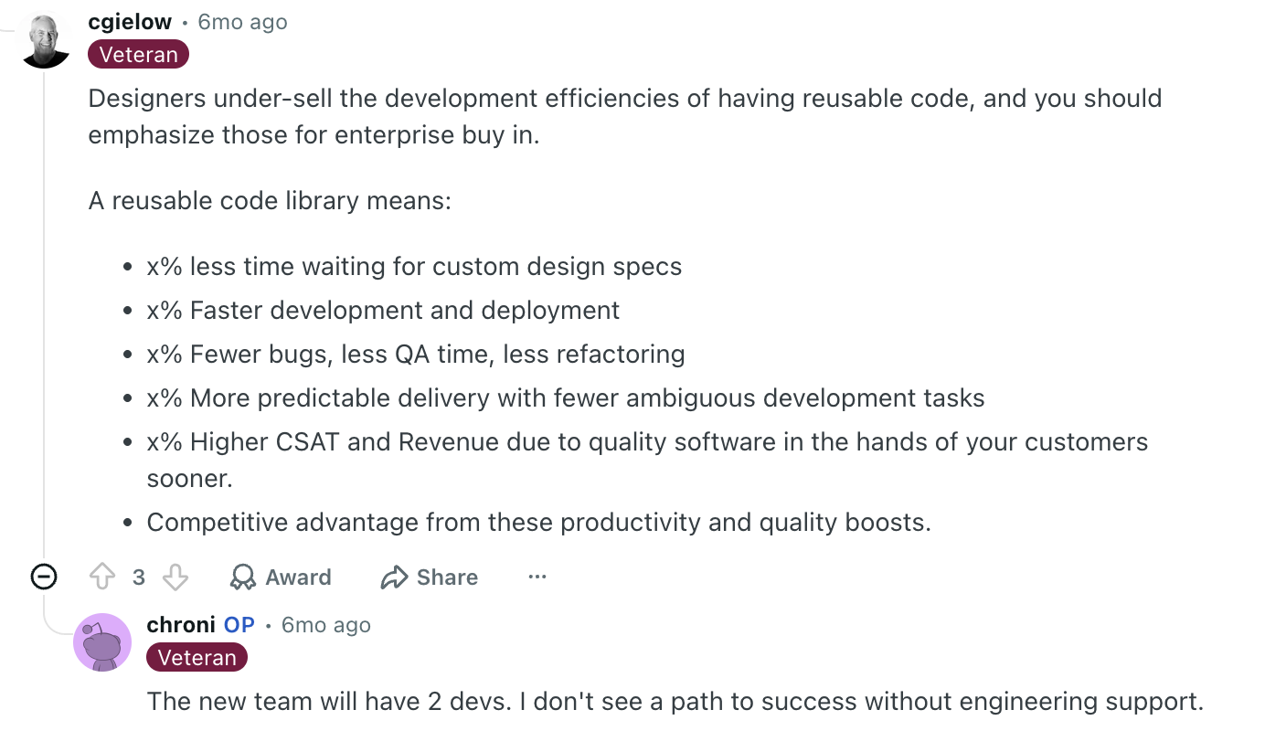
Build reusable component libraries to reduce custom specs, QA overhead, and repeated implementation work across teams.
-
Establish variables and design tokens early to make handoff, scaling, and AI-assisted implementation more reliable

3. Build a token architecture on DTCG standards
While hybrid governance models are usually the most practical setup for enterprise teams, I think one of the most risky things about it is brand drift.
When product teams are building their own extended components, what stops them from accidentally diverging from the brand? If the central team updates the primary color, every extended component could break visually overnight.
The answer is that components shouldn't carry brand decisions at all. Tokens should.
The way I'd think about token architecture is in three layers:
-
Primitive tokens store the raw value: a specific hex, a pixel size, a font weight
-
Semantic tokens assign meaning: color-action-primary tells you what the value is for, not just what it is
-
Component tokens apply that meaning to a specific context, a button's hover state on iOS
This is becoming much more important going into 2026 because AI-assisted workflows, code generation tools, and MCP-connected systems rely heavily on structured semantic data. A token named blue-500 tells an AI almost nothing while one named color-action-primary-hover does.
That naming follows a four-part semantic hierarchy, {category}-{role}-{variant}-{state}, so color-action-primary-hover reads as intent, not just a value. It's load-bearing now: AI agents rely on semantic names to infer what a token is for without hallucinating a component, which blue-500 gives them no way to do.
That’s why more enterprise teams are standardizing around design tokens, especially through the Design Tokens Community Group (DTCG) format.
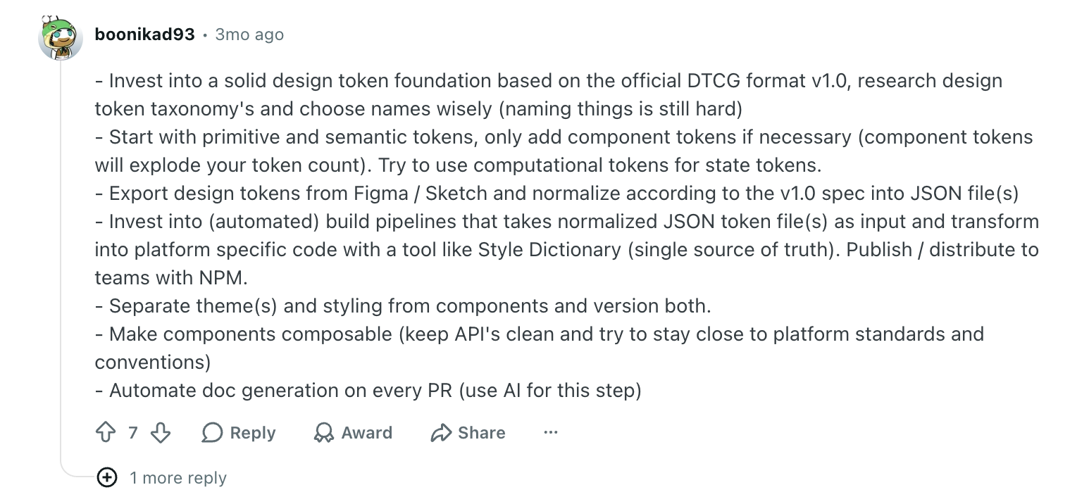
Instead of storing design decisions directly inside components, tokens separate them into reusable variables for things like color, spacing, typography, shadows, etc.
The DTCG structure standardizes how those tokens are formatted and shared across tools like Figma Variables, Tokens Studio, Style Dictionary, and engineering pipelines. Its spec was developed with contributions from Adobe, Google, Microsoft, Figma, Salesforce, and over 20 other organizations, which means tooling support is broad.
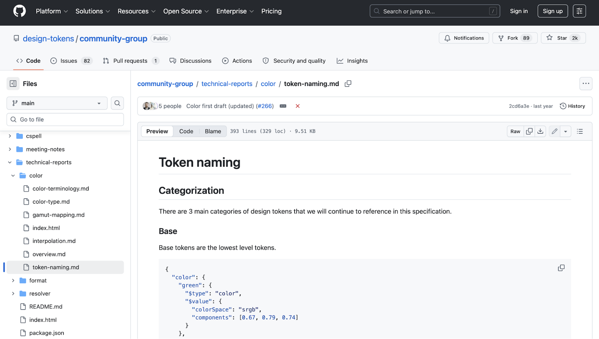
For example, Adobe is taking this to its logical conclusion with their Spectrum system, publishing tokens in DTCG 2025.10 format alongside their existing custom format and implementing a multi-dimensional cascade resolution engine. It's a design system that ensures a consistent experience across Adobe applications, allowing users to easily transition between different tools while maintaining familiarity with the UI.
The engine walks down a strict hierarchy of context: foundation, then platform, then product. When a token decides what color a border should be, the engine checks the foundational brand rules, then the platform rules (Windows or macOS), then the specific product rules (Premiere Pro or Photoshop).
The highest-specificity context wins; if no product-level token exists, the engine cascades down to platform and then foundation. The result is a design that's deeply customized for the user's environment without redundant code.
One rule holds across all of this: build tokens before components, not after. Retrofitting tokens onto components that have already shipped forces rewrites, hardcodes brand decisions where they don't belong, and fragments the system. Tokens come first, or the system splinters.
4. Design for multi-brand and multi-platform from day one
One thing I've noticed with enterprise systems is that they rarely stay single-brand for long.
A company starts with one core product, then suddenly there are regional variants, acquired products, internal platforms, white-label experiences, or separate mobile and web ecosystems. If the system were designed too rigidly around a single brand, the rework becomes expensive very quickly.
That explains why a lot of mature enterprise systems now separate structural foundations from brand expression.
In practice, the theme layer usually controls things like typography scales, color palettes, spacing rhythm, motion behavior, border radius, and elevation styles. The components themselves stay structurally consistent while adapting visually across brands and platforms.
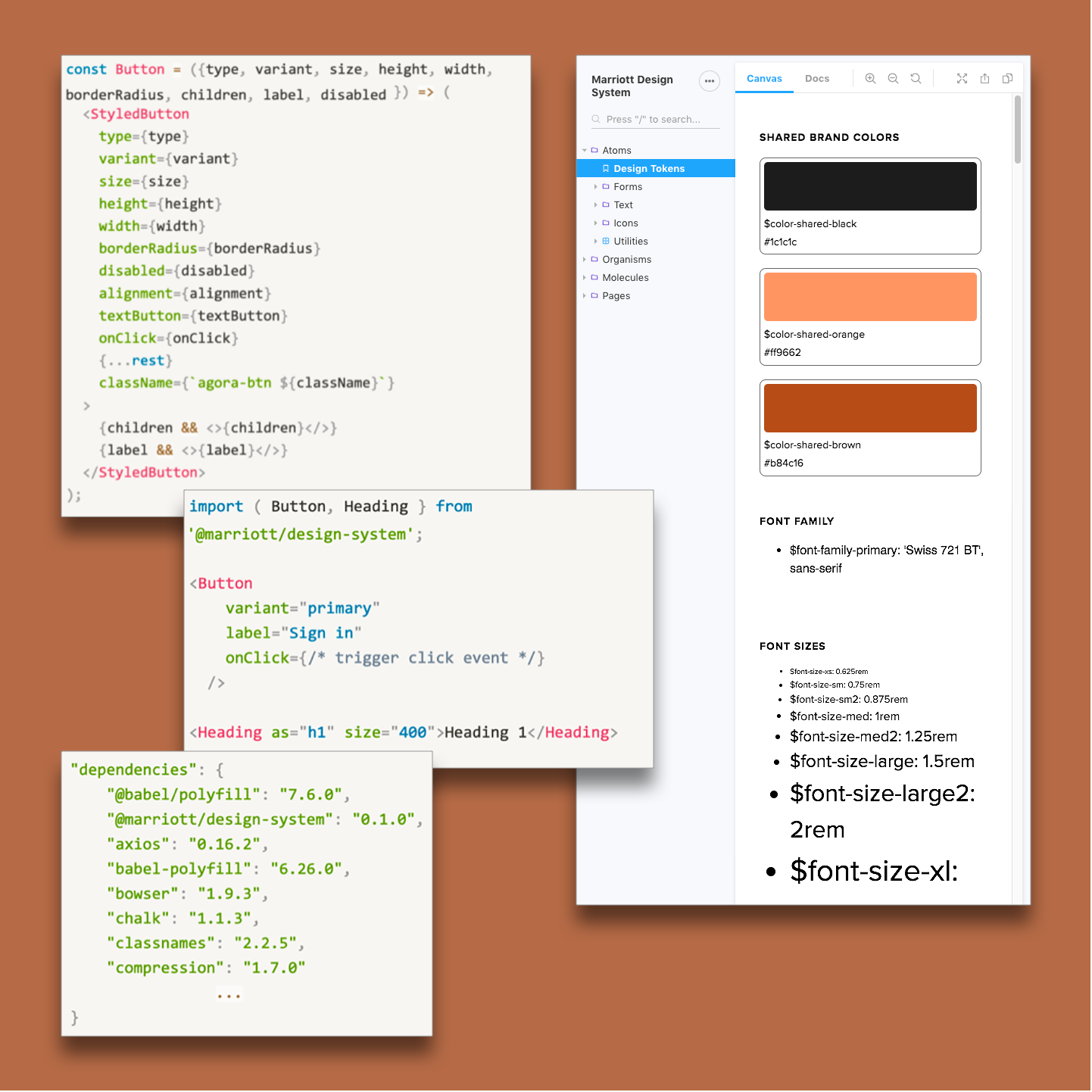
For example, Marriott International has built a custom design system that could support its portfolio of 30+ brands across web and native apps.
-
On the design system side, they build reusable design elements, shared naming conventions between design and development teams, and token-based styling that adapts across platforms and brand contexts.
-
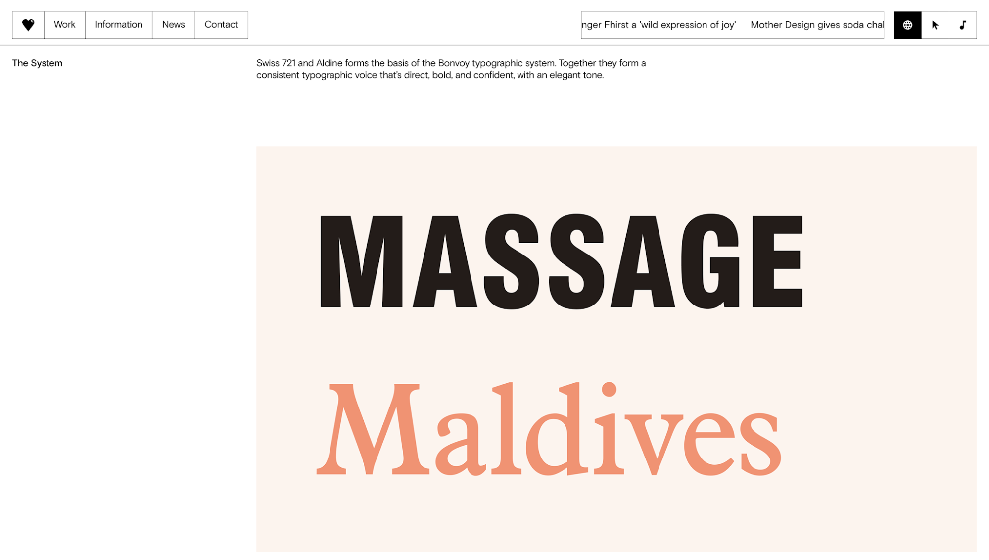
On the brand identity side, they had Mother Design abstract shared visual foundations into a flexible system: a primary logo, paired typefaces, shared color logic, and a modular “connector” symbol that helps maintain consistency across Ritz-Carlton, W Hotels, St. Regis, and the rest of Marriott’s portfolio without losing each brand’s individual character.
This also applies across platforms, not just brands. The same semantic token might resolve differently for web, iOS, Android, or XR environments through platform-specific transformations at build time.
When AI-assisted design workflows are becoming standard across enterprise teams, generating designs is no longer the hard part. Keeping those interfaces aligned with an existing system is.
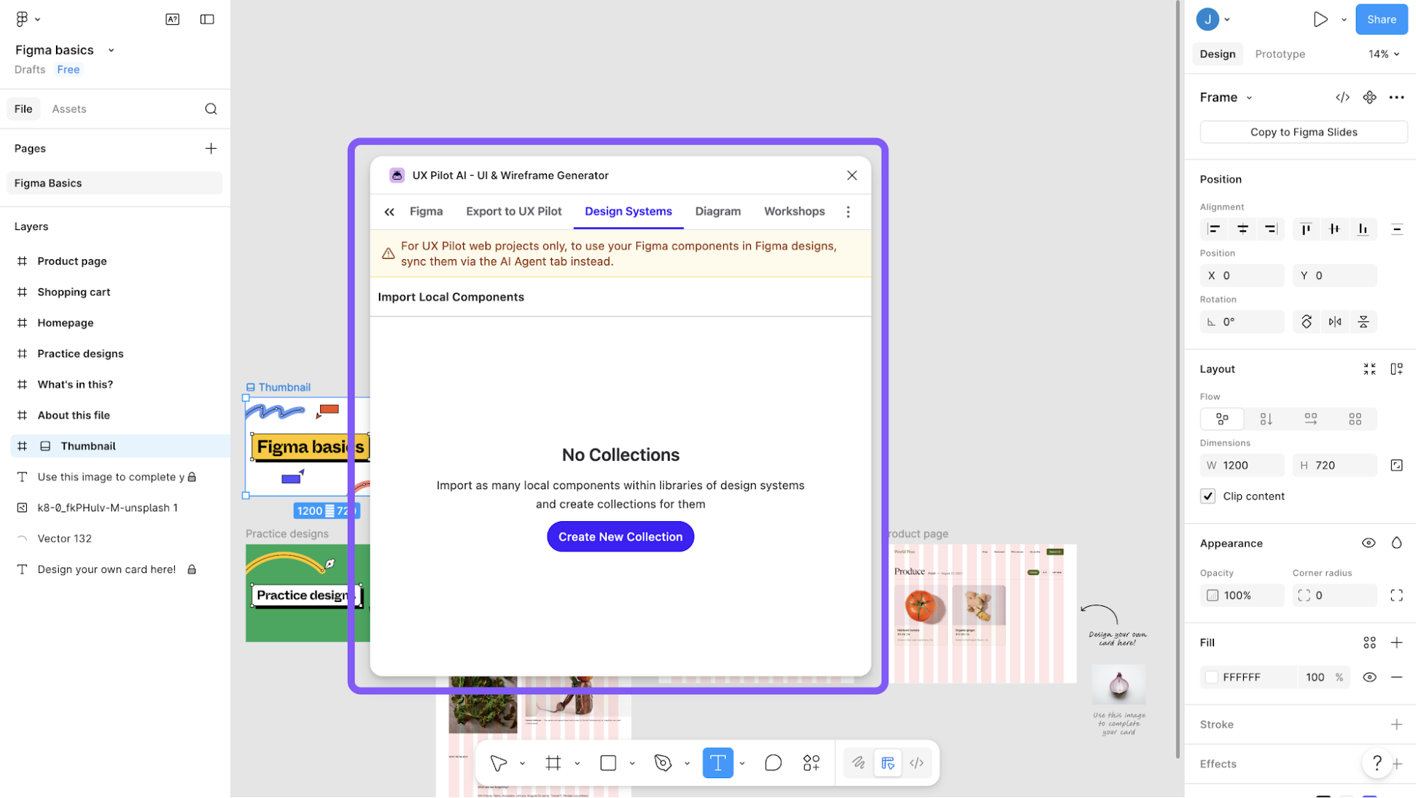
You can already see this direction in popular AI design tools like UX Pilot, which supports importing existing Figma components and design systems so generated screens follow established patterns instead of inventing entirely new UI styles every time.
5. Make documentation a searchable, versioned product
When participating in discussions about system documentation, I've seen multiple teams mention that people rarely read documentation front-to-back. They mostly search for answers while actively building something. That changes how documentation should be designed operationally.
Instead of giant static guideline portals, the stronger systems now behave more like searchable operational products connected directly to code, components, and release workflows.
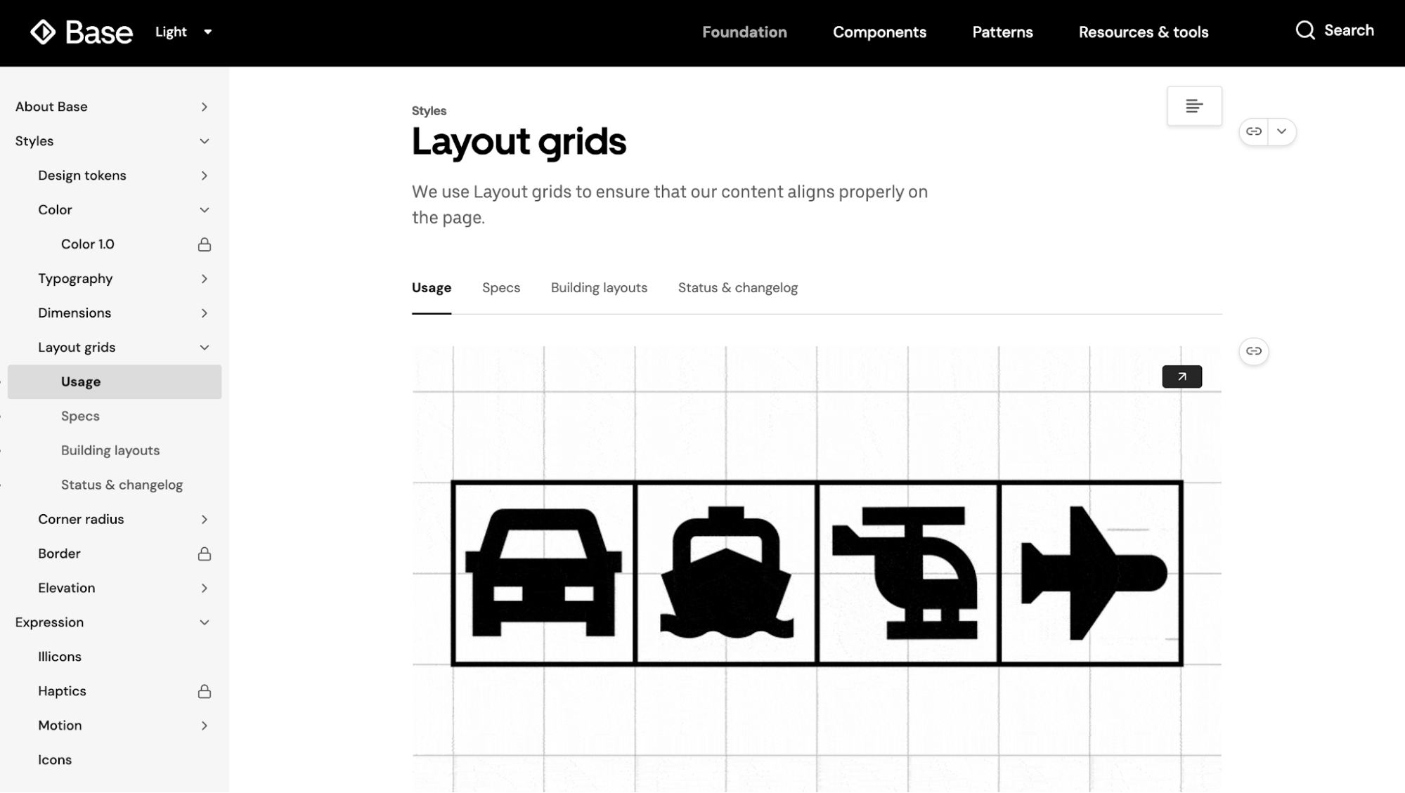
That’s why tools like Zeroheight, Storybook, and Supernova have become so common in enterprise environments. They reduce the gap between design references and live implementation instead of forcing teams to maintain disconnected documentation manually.
Here's what the Uber design system looks like in Zeroheight:
In practice, the most useful component documentation usually includes:
-
Live component examples
-
Accessibility guidelines, interaction states, and behavior notes
-
Usage guidelines, implementation guidance, and edge cases
-
Version history and deprecation notices
-
Links to contribution workflows and support channels
-
Searchable references tied to actual component releases
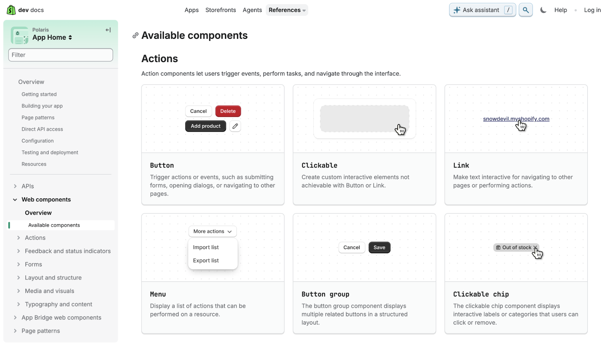
If you need inspiration, Shopify's Polaris does a few things here that I think are genuinely worth borrowing.
They run structured quarterly releases with visible deprecation policies and migration guides. This means teams always know what's changing and have enough runway to update before a breaking change lands.
And as of October 2025, Polaris documentation is published through a Shopify.dev MCP Server, so it's machine-readable for AI-assisted workflows in tools like Cursor, Copilot, or Claude. That's the direction enterprise documentation is heading: not just human-readable, but consumable by the tools teams are already using to ship.
Last but not least, another thing most enterprise teams still overlook is support visibility. If the documentation doesn’t answer a question, people should immediately know where to go next: Slack channels, GitHub Discussions, office hours, contribution flows. Otherwise, teams stop relying on the docs and fall back to tribal knowledge instead.
6. Measure adoption with coverage, usage, and ROI
I’ve always found design system adoption metrics a bit misleading.
A lot of teams track things like the number of components, Figma pattern library usage, or import statistics, but none of that really tells you whether the system is shaping the product experience.
Because technically, a team can import a design system button and still override most of it locally.
So the more useful metrics, at least to me, are:
-
Coverage — what percentage of the total interface is actually built using system components
-
Usage — how frequently specific components are deployed across the product suite
You can also consider quantifying the benefits of a design system, which involves calculating the time saved in design and development, the increased efficiency of the design process, and the potential revenue generated by improved user experience.
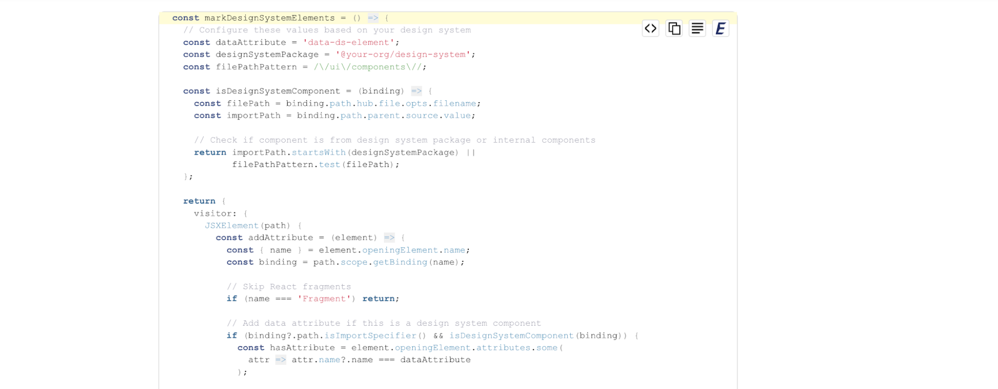
Mews had another really practical measuring method that I wanted to share here, too. Instead of measuring adoption through surveys or repository scans, they tracked what actually rendered in production by injecting HTML data attributes directly into components. That makes it much easier to spot where the system survives intact versus where teams are quietly bypassing it with local overrides.
And I think this is also where design systems become much easier to justify internally.
Once you have usage data tied to the design and development process, translating it into ROI for budget conversations becomes straightforward.
Studies from Sparkbox, Slack, and others consistently show 31-47% efficiency gains for engineering teams working with established libraries for reusable design components, and enterprise research points to 22% faster time to market after design system adoption. Those are the numbers that secure ongoing funding.
7. Wire your design system for agentic AI and MCP
One thing that’s becoming very obvious going into 2026 is that design systems are no longer built only for humans.
A few years ago, the main consumers were designers working in Figma and engineers importing components into codebases. Now there’s an entirely new layer in the workflow.
Coding agents like Cursor, Claude Code, and Copilot are handling significant portions of frontend development. AI design generation tools are increasingly involved in UI work.
And that changes the requirements for design systems quite a bit. If the system is poorly structured, inconsistently named, or disconnected between design and engineering, AI tools tend to fall back to generic patterns from training data.
The industry’s answer to this is MCP (Model Context Protocol).
MCP gives AI tools structured access to things like tokens, component mappings, layout constraints, documentation, and usage guidelines instead of forcing the model to infer everything from prompts alone.
Let me break down Figma's MCP server as an example. When you pair it with Code Connect, it maps Figma components directly to their codebase counterparts. Then an AI agent in Cursor, VS Code, or Claude Code can generate code using your design component library instead of guessing what your Button component looks like or where it lives.

The other thing worth knowing is that this now works in both directions. Agents can write back to the Figma canvas, assembling approved components into new layouts using your design system as the source of truth.
This isn't limited to code editors, design tools are moving the same way. UX Pilot, for instance, can pull in your existing Figma library and tokens so the screens it generates assemble from your actual components rather than inventing new ones: the same MCP-fed context loop, applied at the design end instead of the code end.
Nevertheless, you'll need to ensure that five things are in place for a design system to be genuinely agentic-ready:
-
Semantic token naming
-
Reusable component mappings between Figma and code
-
Machine-readable documentation
-
DTCG-compatible token structures
-
Governance rules that can be validated programmatically
Because AI doesn’t really solve fragmented systems. It mostly scales whatever system already exists underneath it.
Future-proof your enterprise design system
One thing I'll leave you with: the teams I've seen struggle most aren't the ones with bad components. They're the ones still having to justify why the design system deserves a dedicated team, a real roadmap, and ongoing investment.
That conversation gets easier as AI becomes more central to how teams ship. As AI becomes more involved in design and frontend workflows, design systems stop being just a consistency layer for humans. They become a structured context for machines, too.
And suddenly, things like semantic naming, token architecture, reusable components, governance, and machine-readable documentation are no longer “nice design system practices.” They directly affect how reliably AI tools can generate and implement interfaces across the organization.
That might be the most practical reason to get your enterprise system design right now.
If you're deciding where to start, don't add components or chase AI features first. Pick your lowest-scoring fundamental, governance, token architecture, documentation, or measurement, and fix that one. The teams winning in 2026 are the ones with strong fundamentals plus AI infrastructure layered on top, not AI infrastructure on a shaky foundation.