Grid Systems Explained for Design Beginners

Khanh Linh Le
Created on Sep 30, 2025
One of the hardest things for beginners in design isn’t coming up with ideas; it’s making those ideas look consistent across screens. You adjust margins here, tweak spacing there, but the layout still feels uneven. The problem usually isn’t your eye for design. It’s that you’re missing a framework to keep elements aligned and predictable.
That’s exactly what a visual communication manual like a grid system provides. They give you rules that reduce guesswork and make your designs instantly cleaner and easier to use.
In this article, I’ll break down how grid systems work, the types you’ll encounter, and how you can start applying them today without overcomplicating your process.
What is a grid system in web design?
A grid system is an invisible framework of intersecting vertical and horizontal rows that helps you organize elements on a webpage. Think of it as the scaffolding behind your design: you don’t see it in the final product, but it quietly shapes how everything fits together.
Grids bring visual structure and predictability to your design. Users don’t have to work hard to understand where to look next, because the page layout naturally guides their eyes.
That’s why grid-based designs tend to feel cleaner and easier to navigate.
If this sounds abstract, think about real-world examples:
-
Magazines rely on grids to align text columns and images, so no matter what story you flip to, the layout and other graphic elements feels consistent.
-
Architectural blueprints use grids to map out proportions and relationships, ensuring that a building is both functional and aesthetically sound.
Web graphic design works the same way. A solid grid system means your pages look intentional, not like a collage of elements competing for attention.
Why grid systems matter for effective layouts
Grids are the backbone of layouts that feel effortless to read and navigate.
Research shows most people scan pages rather than read them word-for-word, so your layout has to do the heavy lifting of guiding their eyes.
Here’s why they matter for graphic and three dimensional designers, or and anyone working with complex layouts:
-
Readability: Grids control line length, column width, and vertical rhythm. These are three things that make long blocks of text easy to scan. Large-scale tests put the optimal line length around 50–75 characters, which is exactly what good content layouts like Medium’s do.
-
Visual hierarchy: By controlling alignment and proper spacing, grids guide users through the page in the right sequence. Apple’s website is a masterclass here: product shots, headlines, and CTAs always align in a way that creates balance and feels intentional.
-
Trust and professionalism: First impressions are usually visual. Multiple industry write-ups trace the same stat: 94% of first impressions are design-related. People judge credibility fast, and inconsistent spacing or misaligned graphic elements look unprofessional. A measured grid reduces those small cues of sloppiness that quietly erode trust.
-
Fewer micro-decisions = faster design: When you have a grid (and a spacing scale like the 8-point system), you stop arguing about whether this margin should be 12px or 15px.
The most striking way to see all this in action is by comparing extremes. On polished sites like Apple or Medium, you don’t really notice the grid at all because a good layout feels natural to the eye.
But when grids are missing, the mess jumps out at you.
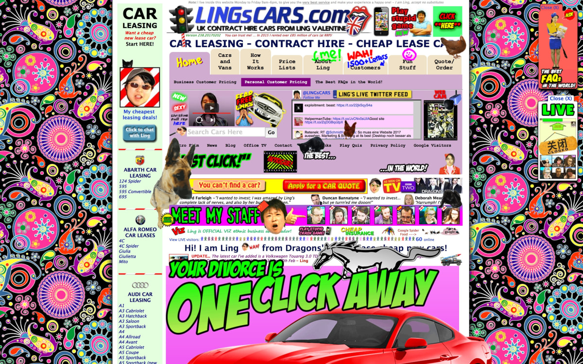
Take Ling’s Cars, a site infamous in design circles: text blocks collide, images shout over each other, and nothing lines up. It’s the opposite of seamless. That contrast alone shows why grids matter.
Examples of grid systems
It’s one thing to talk about grids in theory, but they click best when you see them in action.
Designers use different grid systems depending on the content and context. So, let’s look at the main ones designers rely on most.
Modular grid
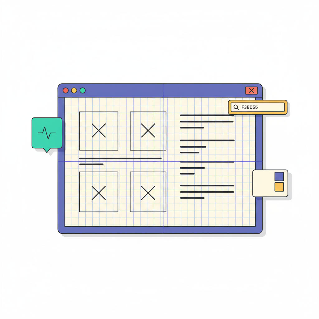
I like to think of modular grids as the Lego blocks of layout design. Instead of just stacking content in columns, you’re dividing the page into both rows and columns. This creates repeatable modules you can fill in.
The idea isn’t new. Swiss graphic designers in the mid-20th century popularized this approach through the International Typographic Style, better known as Swiss Style. Josef Müller-Brockmann even codified it in his book Grid Systems in Graphic Design, showing how modular grids bring clarity, simplicity, and functionality to layouts.
You’ve probably seen the modular system in action on dashboards or e-commerce galleries, where each card follows the same size and spacing.
The beauty is that no matter how many items you add, the design still feels balanced. If you’re building something with lots of repeating elements, a modular grid will save you from chaos. Take a look at this example from Uxcel.
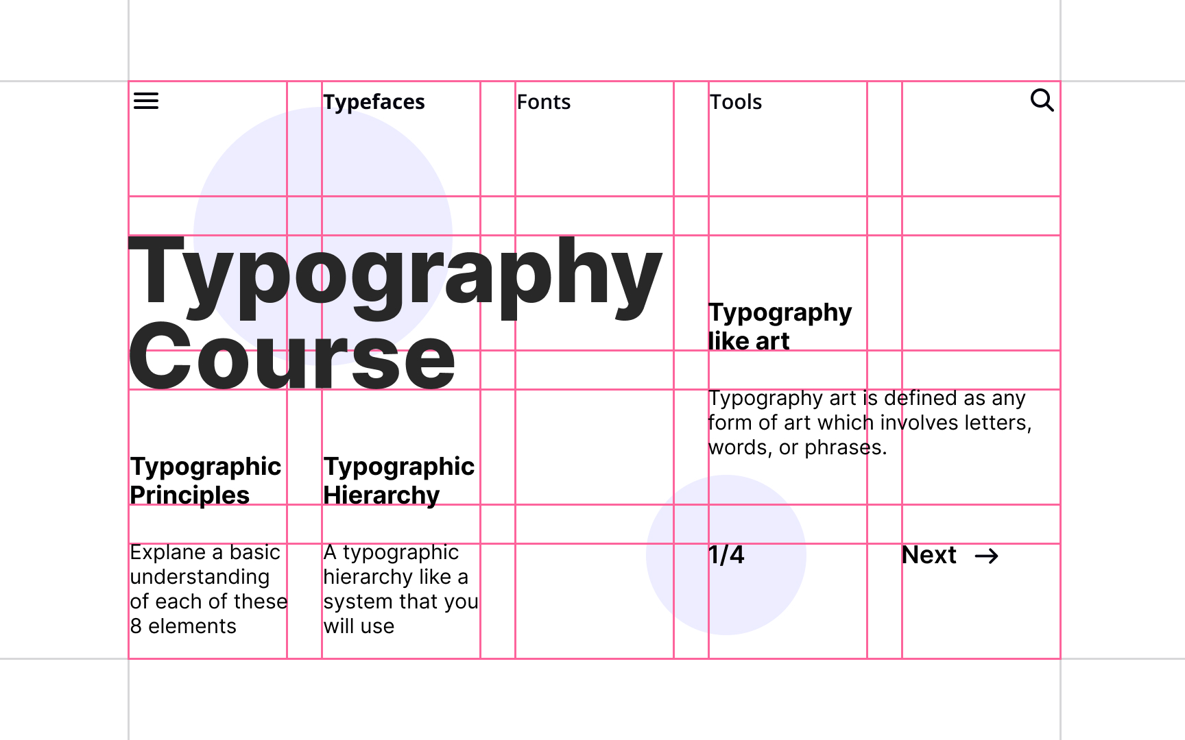
Traditional grids
When I first started noticing grids in real life, it was in newspapers. Every article sat neatly in simple column grids with equal spacing in between; those spaces are called gutters.
That’s a traditional grid: a set of vertical columns that keeps text and images aligned from top to bottom.
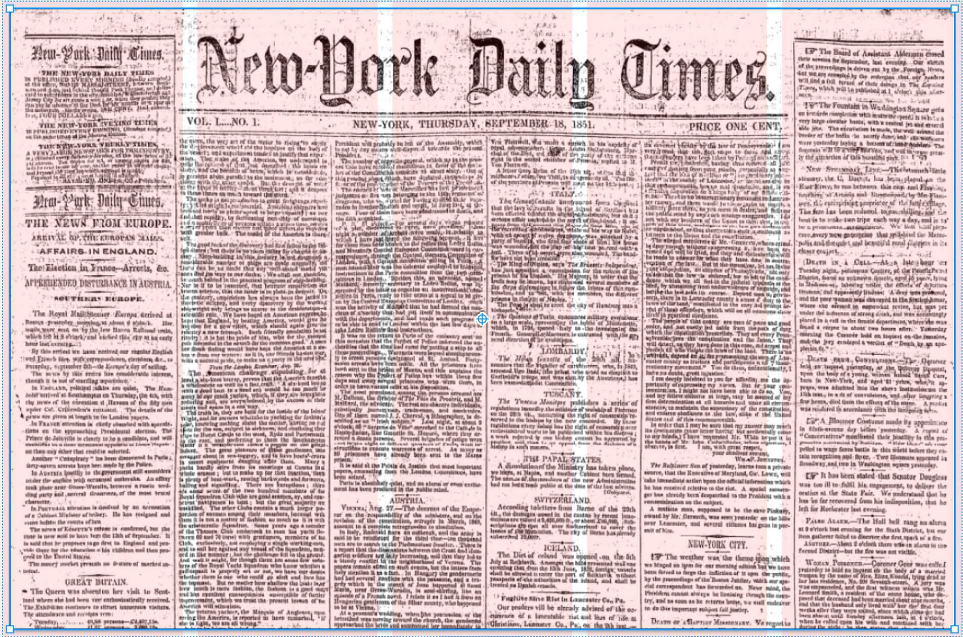
You’ll see the same approach in blogs, simple marketing pages, or multiple pages of long form content where consistent gutters make reading feel smooth and structured. Here's an example from Caroline on Medium.
Hierarchical grids
Not every design plays by strict columns, and you'll find that in hierarchical grids. Instead of treating every element equally, they flex around the importance of the content like the image below.
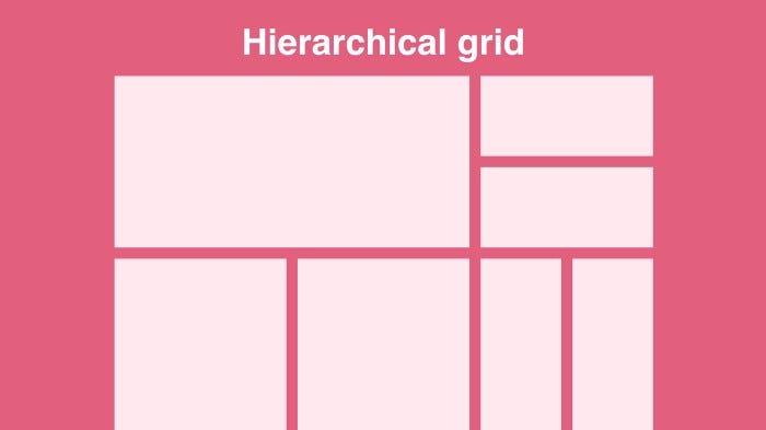
Think about the last time you opened a news site: the lead story probably dominated the top half of the page, while smaller stories filled the margins.
I find this type of grid useful when you need to draw attention to one element without losing overall structure. If you’re designing a magazine-style layout or a homepage with shifting priorities, this is the grid you’ll want to experiment with.
Image source: Flux Academy
Baseline grids
One detail I used to overlook, until it was pointed out to me, was line spacing. Even if your columns are perfect, text can look messy if the lines don’t sit on the same rhythm. That’s what a baseline grid fixes. It aligns every line of text to equally spaced horizontal lines, so paragraphs feel stable from top to bottom.
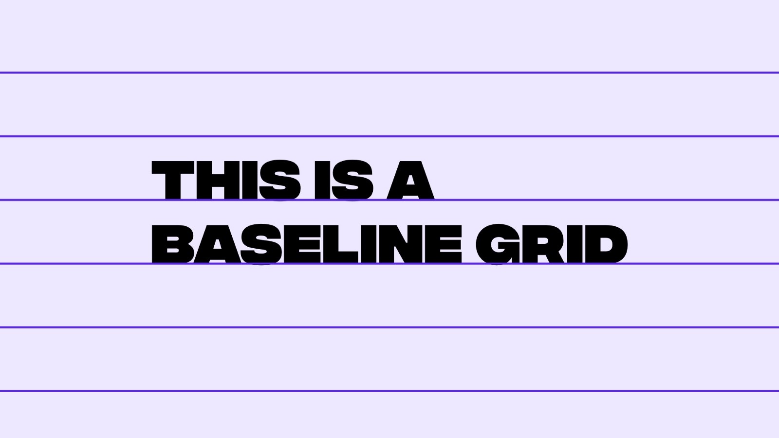
Image source: Flux Academy
For example, you can implement baseline rhythm by treating body text as the base unit. Say you have 12pt body text.
From there, From there, every line-height should be an increment of that base unit. A heading might use 36pt leading (3 × 12) and a subheading 24pt leading (2 × 12).
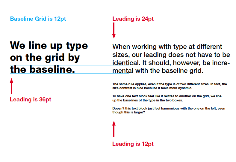
Image source: GDPSU
You’ll notice this most in text-heavy layouts like eBooks, reports, or long-form blogs. If you care about typography (and you should), a baseline grid is your best friend for keeping readability smooth and professional.
Fixed grid
Earlier in the day, most layouts were built on fixed grids. Instead of stretching to fit every screen, the grid had a set pixel width. 960px and 1200px were the classics.
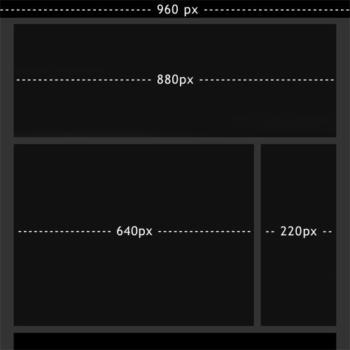
Image source: Smashing Magazine
The upside is predictability: you know exactly how wide each column will be, which makes alignment dead simple. That’s why you’ll still see fixed grids in print-style websites, portfolios, or internal dashboards where screen flexibility isn’t a big concern.
If you’re designing something straightforward and don’t want to juggle endless breakpoints, a fixed grid can keep things clean and consistent.
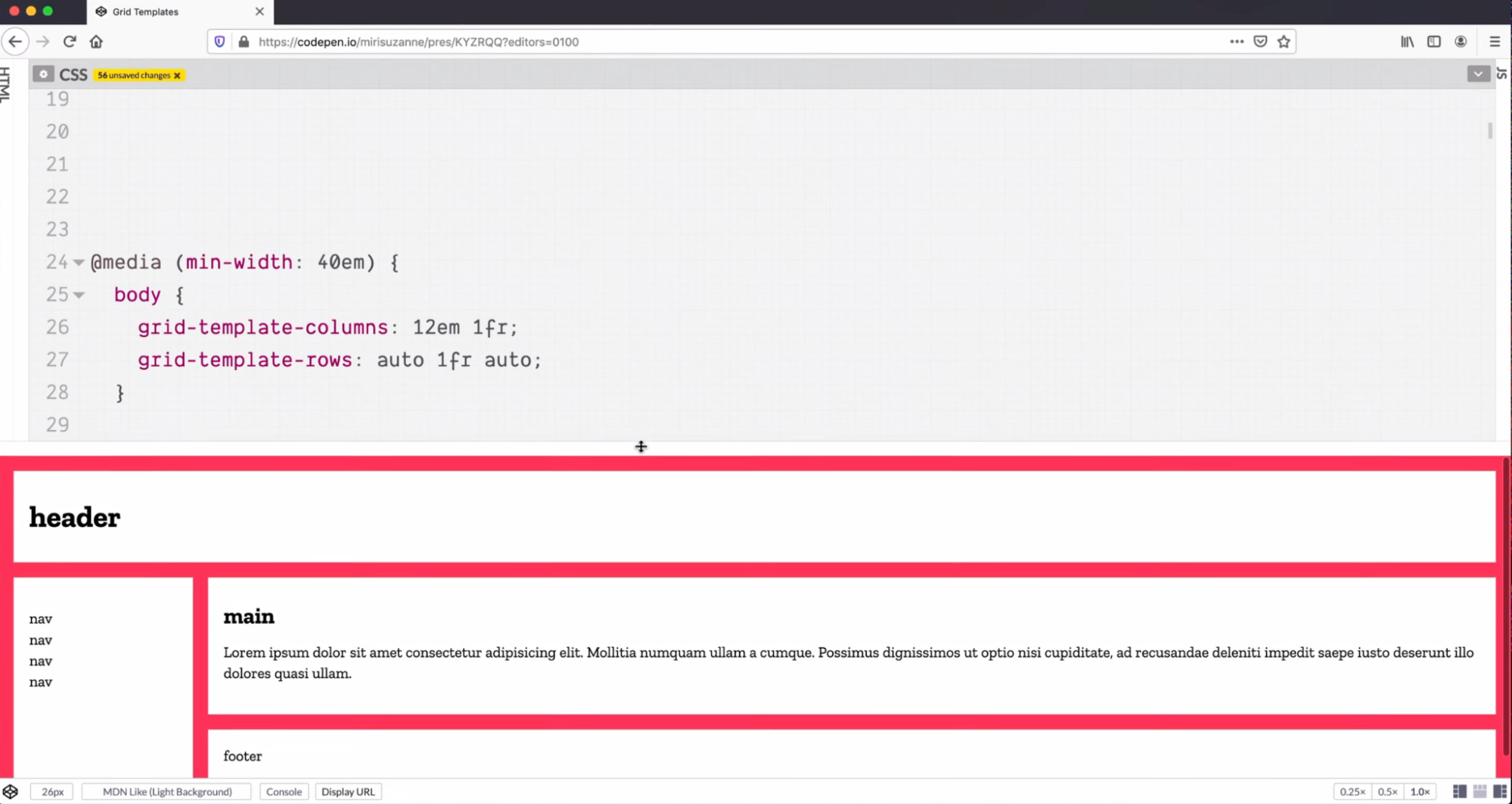
Fluid (responsive) grid
You’ve definitely experienced a fluid grid already, just resize your browser window and watch how content stretches or shrinks without breaking.
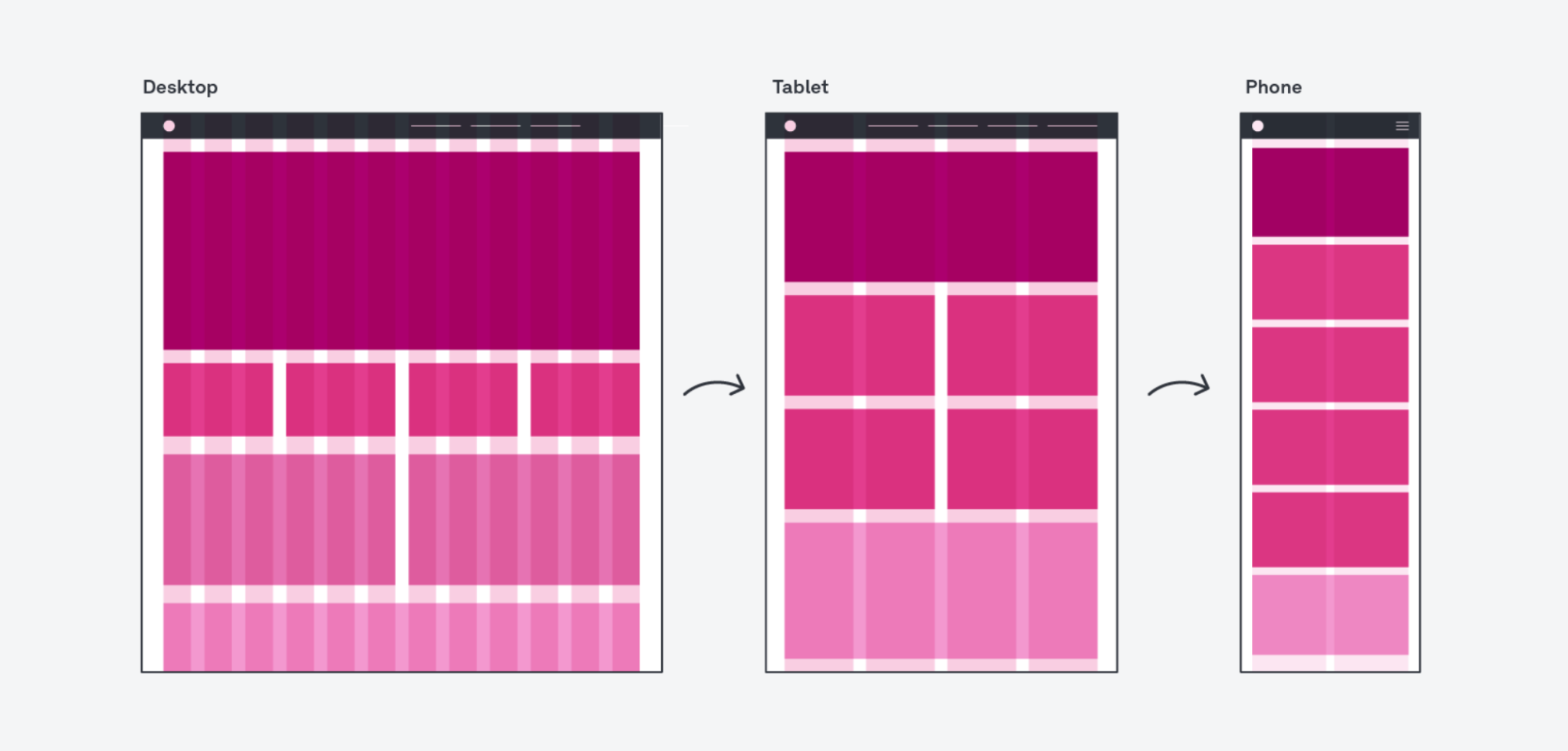
Image source: UX Design Institute
Unlike fixed grids, these layouts use percentages or relative units (like em or fr) so columns adapt to any screen width.
This works best when designing for modern and multi-device products. You never know if someone will open your page on a widescreen monitor or a phone in portrait mode.
For you, the benefit is obvious: no matter where users come from, the layout feels natural and consistent instead of forcing them to zoom or scroll sideways.
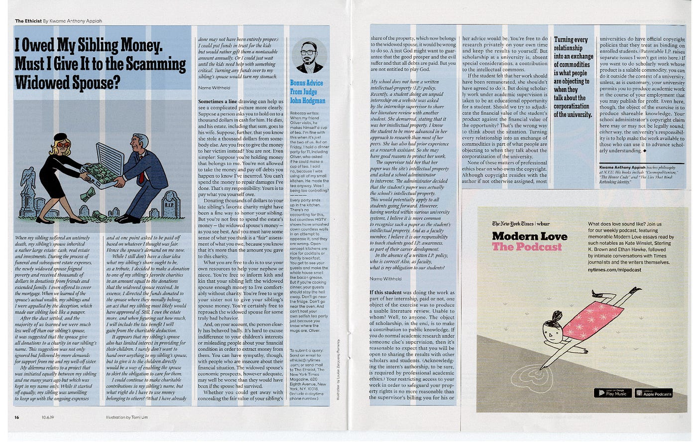
12-column grid system
If there’s one grid you’ll run into everywhere, it’s the 12-column layout. Designers and developers love it because 12 is so flexible: you can split it cleanly into halves (6+6), thirds (4+4+4), quarters (3+3+3+3), or even mix spans like 8+4.
That flexibility means you can experiment with different visually appealing compositions without breaking the overall rhythm.
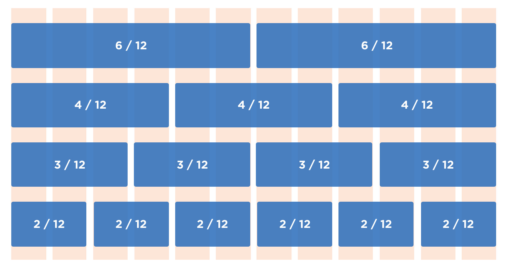
Image source: NZ's Design System
Frameworks like Bootstrap and Foundation bake the 12-column grid in as the default, so if you’ve ever dragged a card across six columns in Bootstrap, you’ve already been using it.
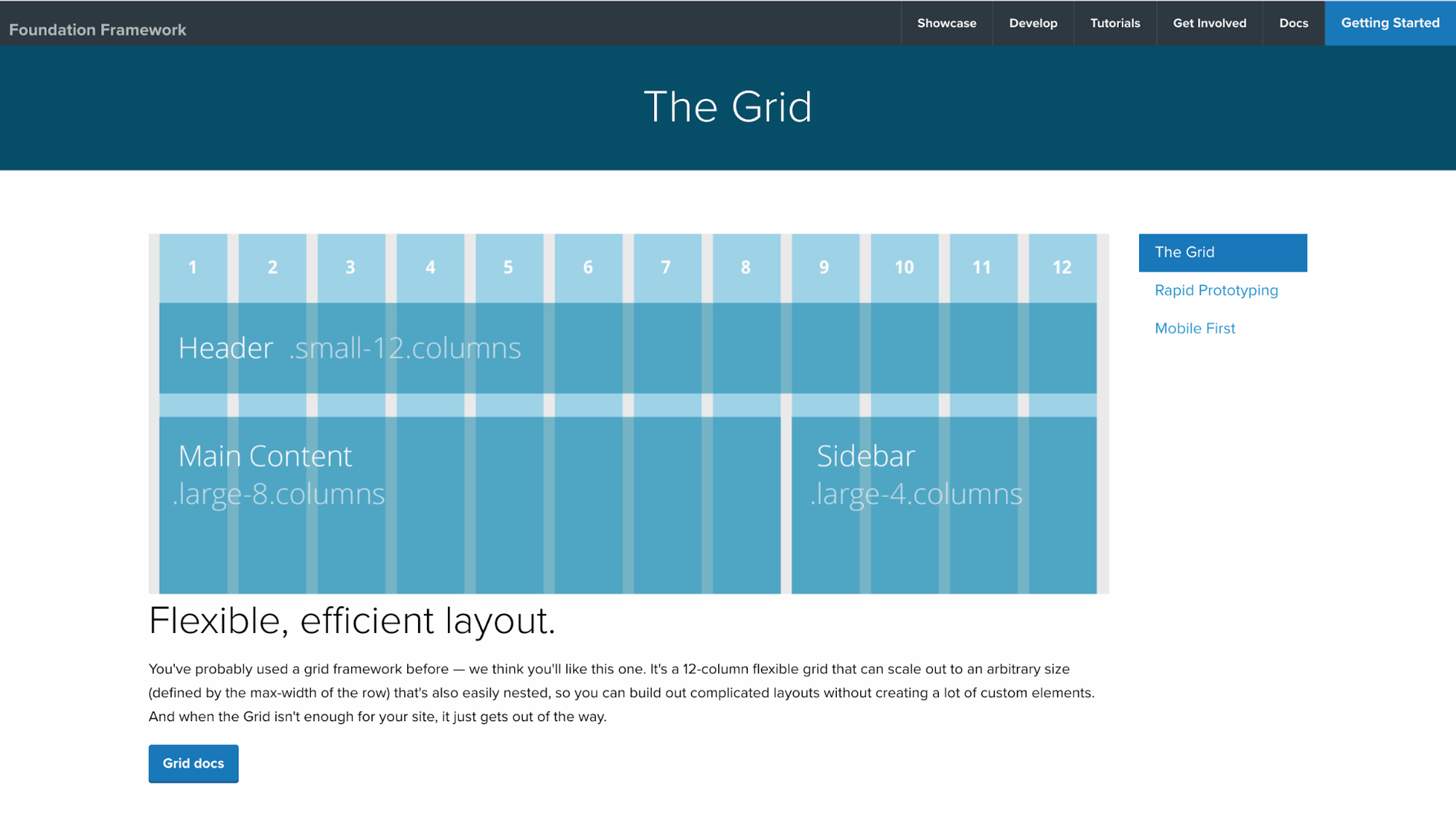
I like it because it gives me a shared language with developers: instead of saying “make that image a bit wider,” I can say “span 8 columns,” and it’s crystal clear.
Imagine it like this: your page is divided into 12 invisible slices, with gutters separating each slice. Drop design elements across any number of slices, and they stays aligned with everything else. That’s the 12-column system in practice.
9 tips to use grid systems
Knowing what grids are is one thing; using them well is another. The good news is that a few practical habits can help you get the most out of any grid.
Here are nine tips I’ve found especially useful:
1. Maintain consistent column count, gutters, and margins
Columns, gutters, and margins are the backbone of any grid. Columns are the vertical divisions where your content sits. Gutters are the spaces between those columns. Margins are the outer boundaries that frame everything on the page.
I’ve seen this play out a thousand times.
On Google’s homepage, for example, the visual effect of consistency is almost invisible, and that’s the point.
The search box, support text, or shortcut highlights all respect a central alignment and predictable spacing so your eye glides straight to the action.
2. Align elements precisely to the grid lines
One of the first things I notice when a design feels “off” is misalignment. A headline might drift a few pixels from the column edge, or a button might sit lower than its neighbors.
These small slips create what’s often called visual noise.
When you align elements like text, images, or buttons directly to grid lines, the effect is the opposite.
You probably don’t even notice the alignment at first, because that’s the point: order fades into the background while the content takes center stage.
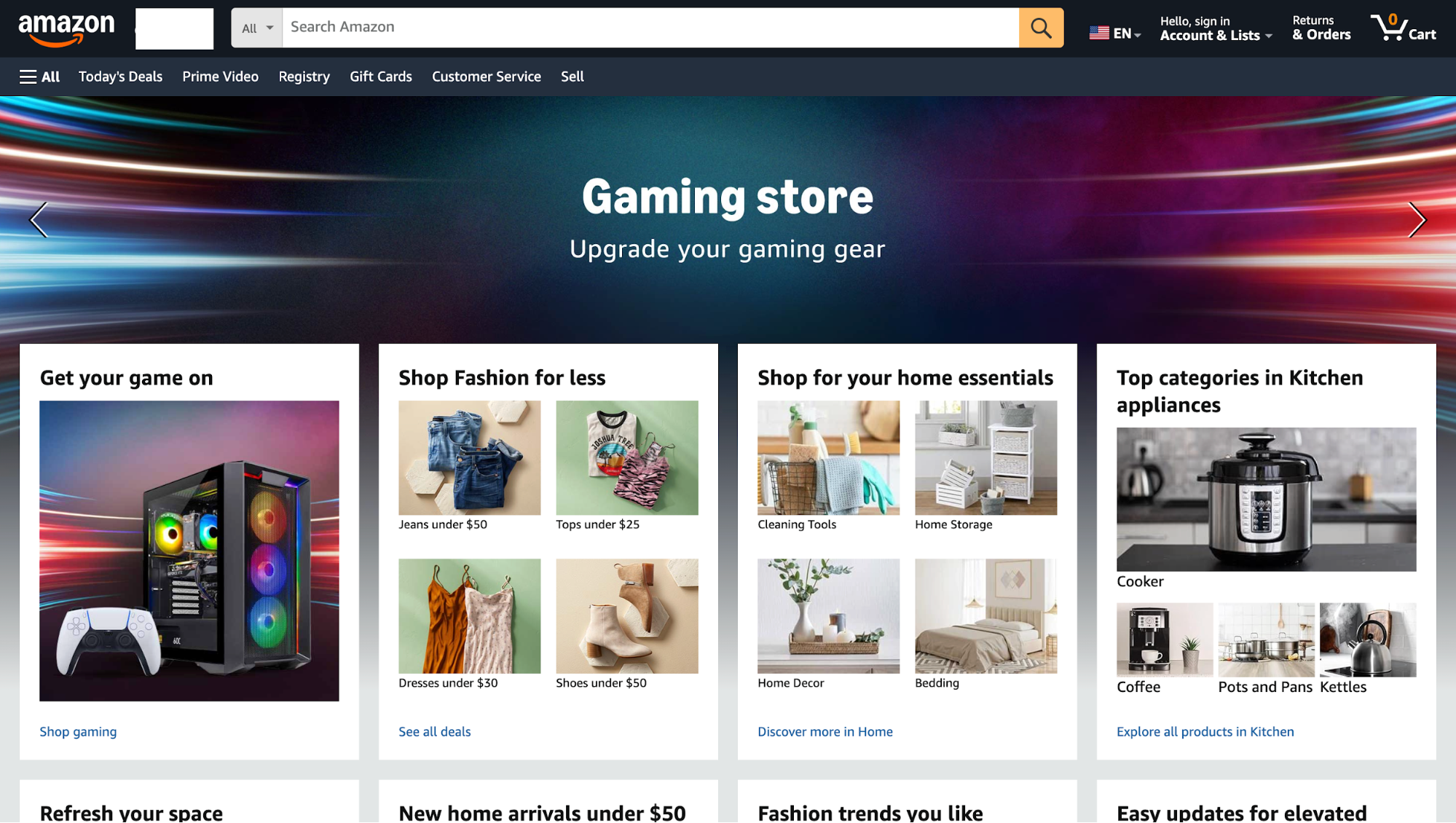
A good real-world example is Amazon’s product grid. Every element has its lane: Category title on top, product images organized neatly, and the CTA anchored at the bottom.
3. Test layout across devices and breakpoints
One grid that looks perfect on a 1440px desktop can fall apart on a phone. I’ve seen this happen: Columns that sat beautifully on desktops collapse into awkward stacks on mobile, images shrink into unreadable thumbnails, and buttons slide out of reach.
That’s why you need to design and test grid behavior across breakpoints, not only at one screen size.
On a desktop, you might use a three- or four-column grid. On a tablet, that same layout should collapse gracefully into two columns. On a phone, it often works best as a single column, making content easy to read without requiring pinching or zooming.
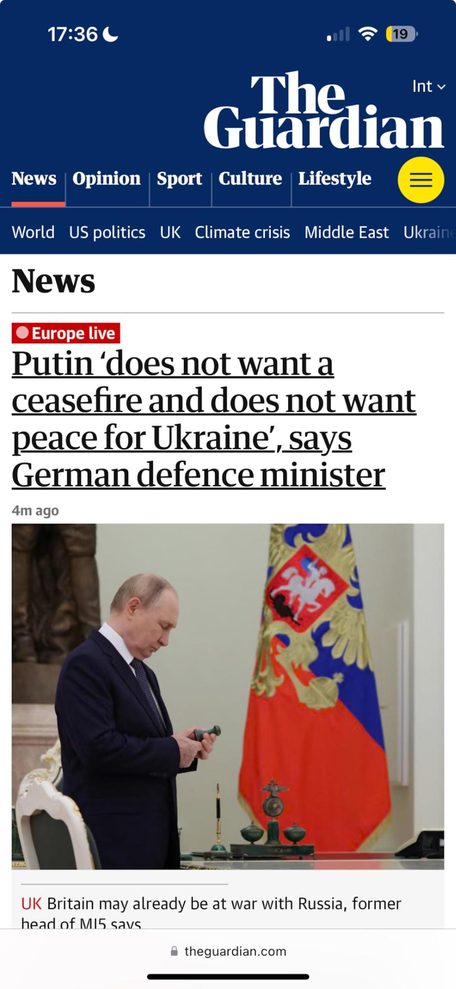
You can see this pattern in action on The Guardian’s website. Their multi-column homepage shrinks neatly into a single-column feed on mobile. Still, the hierarchy makes sense because the grid was designed to reflow from the start.
The tool that makes this possible is the humble media query. With just a few lines of CSS, you can tell your grid to behave differently at different widths. For example, one column below 600px, two columns up to 1024px, and three columns beyond that.
Of course, you can’t just assume it’ll work everywhere. You should spend as much time testing as you do designing.
Chrome DevTools is my go-to for quick checks: I’ll resize the viewport, rotate it, and see how the grid holds up.
However, for a more realistic test, I turn to services like BrowserStack, which allow you to preview your site on dozens of real devices and browsers that you’d never have on your desk.
4. Compare CSS grid vs flexbox for layout control
Think of CSS Grid and Flexbox as two different tools in your layout toolbox. Grid gives you control in two directions (rows and columns), while Flexbox only cares about one direction at a time.
That’s the key distinction, and it shapes how you use them.
I like to use Grid when I’m structuring something big, like a dashboard or a landing page with multiple content areas. It feels like sketching the blueprint of the layout before adding details.
Flexbox, on the other hand, shines when you need quick alignment. Say, a navbar where items are spread out evenly, or a button group where one button sticks to the right while the others stay left.
Image source: Uxcel
You don’t have to choose one over the other, though. Picture this: the page structure runs on a 12-column CSS Grid, but inside each card, Flexbox handles the alignment of text, buttons, and icons. Grid gives the skeleton, Flexbox handles the muscle.
If you’ve ever wrestled with layouts that felt clunky, chances are you were leaning too hard on one tool. Mix them, and you’ll notice your designs not only look cleaner but also adapt better when screens change.
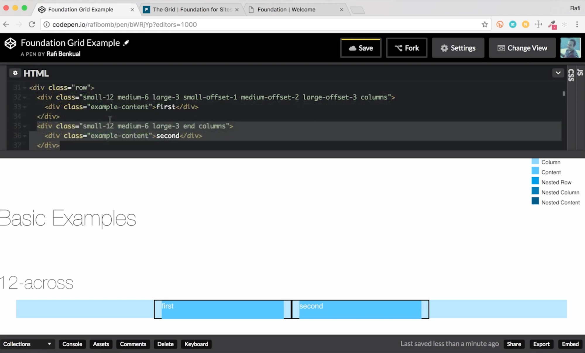
5. Consider grid frameworks like Bootstrap or Foundation
If you don’t want to reinvent the wheel, frameworks like Bootstrap and Foundation give you a ready-made 12-column grid that’s responsive out of the box.
Bootstrap, which originally came out of Twitter, became popular because it let teams spin up consistent layouts fast. It provides you with a responsive, mobile-first 12-column layout built with containers, rows, and columns, all wired to flexbox for adaptability across devices.
Foundation took a similar approach, and you’ll still see it in use on government and enterprise sites that value its accessibility focus.
It offers a nestable 12-column grid that scales across devices.
When you use these frameworks, you get three huge wins:
-
Speed: You skip the setup of spacing, breakpoints, and alignment rules.
-
Consistency: Many sites already use them, so developers often know the system.
-
Built-in responsiveness: Both frameworks include default breakpoints so your grid reflows without extra effort.
But there’s a catch: depending on how much you customize, you may inherit some of the framework’s look and feel. If you lean too heavily on default classes, your site risks feeling templated.
I often prototype using Bootstrap (because I know it’s stable) and then layer in custom overrides or a design system to make it feel unique.
6. Use grid systems with CSS units (%, fr, em)
One of the biggest mistakes is to build grids with only pixel values. It looked fine on screen, but break it open on a different laptop or phone, and the whole layout fell apart.
That’s why modern grids lean on relative units like %, fr, or em. They flex as the screen changes, which is the whole point of responsive design.
You'll find percentages handy when I want fluid columns that share space proportionally.
For example, two columns each at 50% will always balance regardless of screen size. CSS Grid’s fr unit is even smarter: it divides available space dynamically, so if you set grid-template-columns: 2fr 1fr, one column will always be twice as wide as the other.
And for typography or spacing that should scale with font size, I’ll reach for em or rem.
The contrast is sharp if you’ve ever compared a fixed-width layout to a responsive one. A rigid 960px grid might look perfectly aligned on a desktop, but turns into horizontal scrolling on mobile.
A grid built with flexible units, on the other hand, adapts gracefully. No pinching, no zooming, no extra effort for the user.
If you want your designs to last beyond one screen size, relative units are essential.
7. Design mobile-first and scale up
Designing for desktop and then squeezing it down to mobile should be a crime.
With nearly two-thirds of global web traffic now coming from mobile devices, it makes more sense to flip the process.
The mobile-first approach starts with the smallest screens: a simple one-column layout, clear CTAs, and only the most essential content.
As the screen size increases, you add complexity like two columns for tablets, three or four for desktops.
Mobile-first also improves performance. Google found that 53% of mobile visitors leave a site if it takes longer than three seconds to load, which makes a lightweight, content-first design critical.
It’s not just theory. When Walmart Canada rebuilt its site into a responsive/mobile-friendly experience, they reported a ~20% lift in conversions and a large jump in mobile orders after launch. This is a reminder that prioritizing mobile layout and performance can move business metrics.
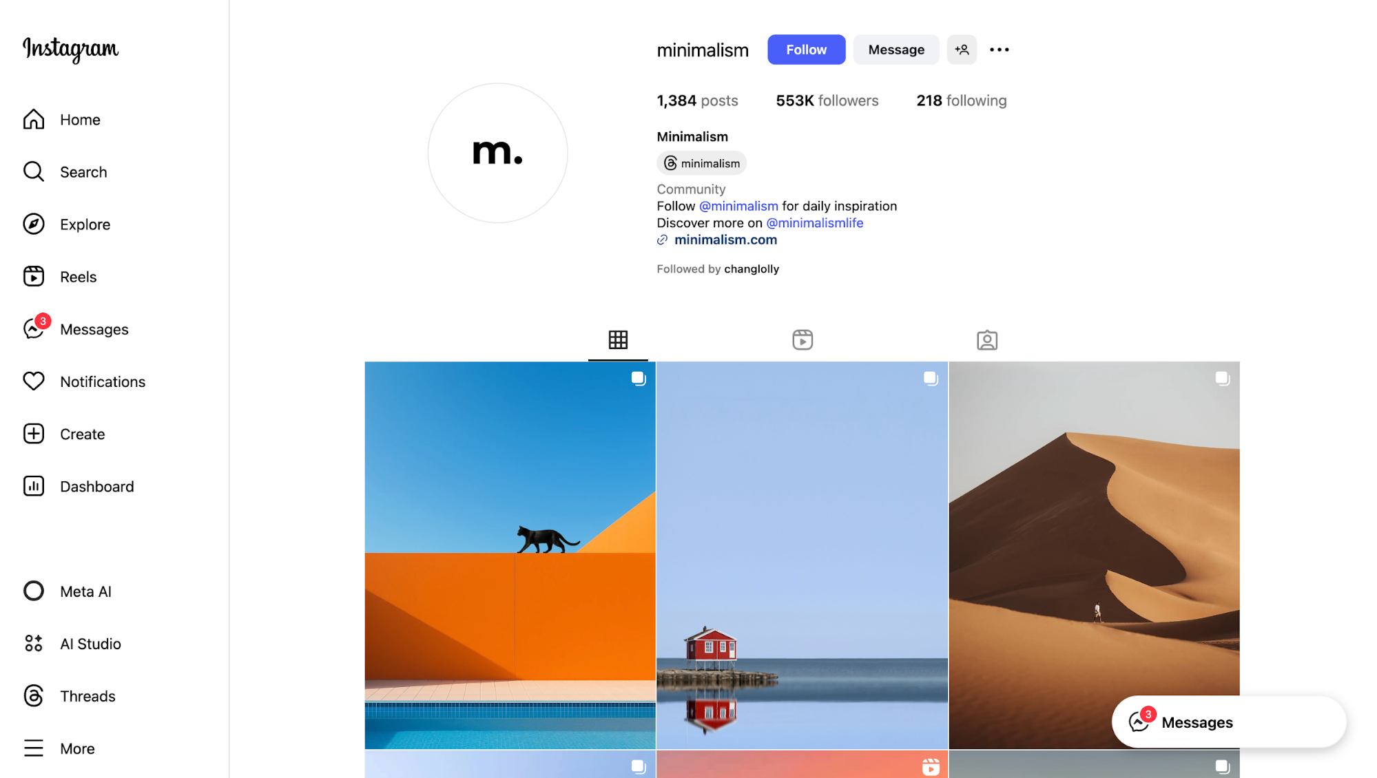
8. Adapt grids for dynamic content
Static content is easy to design for, but most sites don’t stay static. Blogs grow, e-commerce feeds add new products daily, and news sites have to reshuffle when breaking stories hit. That’s where flexible, adaptive grids become essential.
Take Instagram’s gallery grid, no matter how many photos you add, the layout feels balanced because each post snaps neatly into equal-sized slots.
Pinterest goes a step further with its masonry-style grid, letting cards of different heights flow naturally without leaving awkward gaps.
And on major news sites, grids are built to highlight the lead story while automatically rearranging as new articles come in.
On the technical side, modern CSS helps a lot here. Features like auto-placement in CSS Grid let browsers handle unexpected content sizes by filling the next available cell, rather than breaking the entire layout.
That means your design doesn’t fall apart just because someone uploads a taller image or writes a longer headline.
9. Don’t overcomplicate grid structure — keep it simple
Grids are meant to bring clarity, not become the star of the show.
I’ve seen designers get carried away by stacking multiple grid systems on top of each other, nesting rows within rows, and adding more breakpoints than anyone can realistically maintain. The result is a layout that’s fragile, slow, and overwhelming to use.
The best examples are often the simplest.
Many minimalist portfolio websites rely on a straightforward 12-column grid: projects line up predictably, spacing feels intentional, and the work itself takes center stage.
Nothing fancy, just clean alignment that fades into the background.
The principle is simple: Grids are a framework, not the design itself. When they’re doing their job, people don’t notice them at all; they just notice how easy the page is to use. Keep the structure simple, and your design will almost always feel comfortable to look at.
Key takeaways
After breaking down different types of grids and how to use them, the main thing that strikes me is how subtle their power really is. A good grid simply makes everything else feel sharper, calmer, and more professional.
Here’s a quick checklist you can keep in mind when working with grids:
-
Balance: Use grids to keep rhythm without making the design rigid.
-
Readability: Watch line lengths and vertical spacing so text flows.
-
Trust: Align elements consistently; misalignment erodes credibility fast.
-
Flexibility: Design grids that scale naturally across devices.
-
Restraint: Don’t let the grid get in the way; keep it simple.
In the end, grids are there to serve clarity. If users never notice the system behind your layout, that usually means you’ve done it right.