7 Design System Best Practices for UI

Saloni Kohli
Created on Aug 26, 2026
Most UI inconsistency doesn't come from bad designers or developers. It comes from the fact that the same decisions get made over and over again.
One team creates a button. Another creates a slightly different version. A third solves the same problem from scratch.
But over time, products become harder to maintain, design debt grows, accessibility issues slip through, and every new platform adds another layer of complexity.
The design teams behind Spotify, Shopify, IBM, and monday.com solve this with design systems built for adoption, not just documentation. Keep reading for the seven design system best practices they use to scale consistency across products and design teams.
1. Audit your UI before you scale design
A design system is supposed to reduce inconsistency. Without an audit, you're just turning years of inconsistent decisions into official design guidelines.
Start by cataloging recurring design elements across the product, including:
-
Buttons
-
Inputs and forms
-
Cards
-
Modals
-
Navigation patterns
-
Tables
-
Notifications
-
Reusable components, existing code components, and other design patterns are essential to the design process
Screenshot everything and group similar components together. After this, in my experience, most teams go into an audit expecting a few inconsistencies. Instead, they come out with folders full of duplicate components, overlapping styles, the same UI elements, and patterns nobody realized existed.
Research from Netguru shows one audit that uncovered 116 color variables, including 62 shades of gray, before a formal design system existed.
None of those shades were part of a deliberate design strategy. They accumulated gradually as different people solved similar problems at different points in the product's history.
Once you've cataloged everything, prioritize components using two criteria:
-
How often they're used
-
How inconsistent they are
High-use, high-variance components should move to the top of the list. Standardizing a primary button used across hundreds of screens will create far more value than refining a component buried deep inside a settings page.
Intripid discovered this firsthand as the company's sole product designer, Sarthak Goyal, audited every button, dropdown, modal, and icon across the platform.
The audit surfaced buttons "in all shapes and colors" and font weights that were "scattered across the board." Those findings ultimately led to rebuilding the entire component library and UI kit from scratch in their Figma design system.
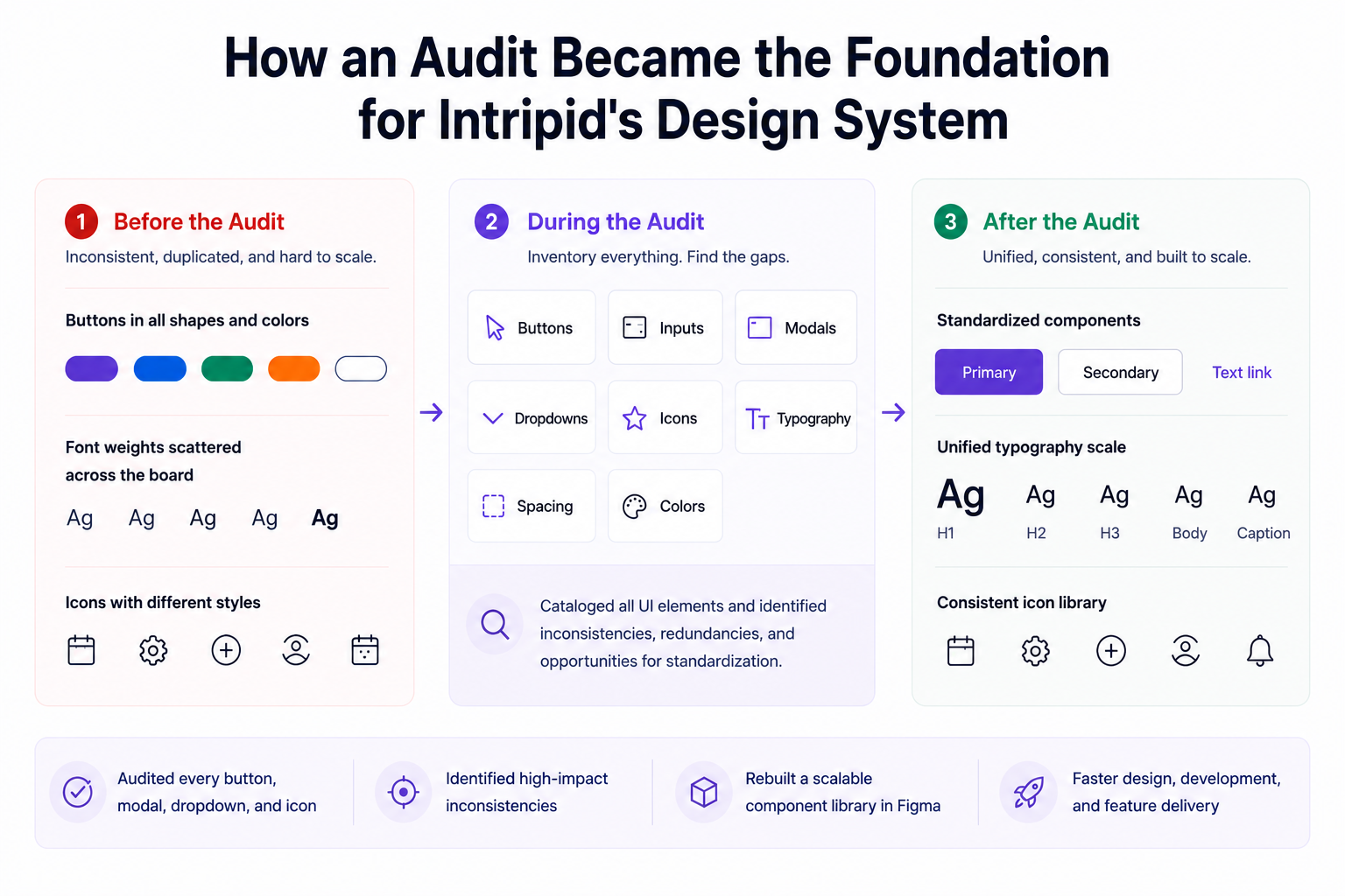
Every effective design system starts with understanding what already exists. Miss the audit, and you'll spend months documenting inconsistencies that should have been removed in the first place.
2. Use design tokens as a shared language
In simple terms, design tokens are named variables that store visual decisions such as colors, spacing values, font sizes, border radii, and motion durations. Instead of hard-coding those values into every component, you define them once and reference them everywhere. Here's how mature teams structure them.
Let’s take the example of a primary button.
Rather than assigning a hex color directly to the button, the component references a token like color-action-primary. If the brand color changes later, you update the token once, and every button inherits the change automatically.
Most mature design systems organize tokens into three layers:
-
Primitive tokens: Raw values such as blue-500, 4px, or 16px
-
Semantic tokens: Meaning-based values such as color-action-primary or color-text-secondary
-
Component tokens: Decisions scoped to specific UI components, such as button-bg-primary
This structure gives UI designers and dedicated teams a shared language while making design decisions easier to scale across products and various platforms.
And tokens don’t stop at colors and typography. A strong token system also manages:
-
Spacing
-
Border radius
-
Elevation and shadows
-
Motion durations
-
Opacity values
These same elements appear across hundreds of screens. Managing them through tokens helps ensure consistency throughout design systems.
The payoff becomes obvious when products evolve with additional updates, like:
-
Dark mode
-
Rebranding the color palette
-
Updating spacing across multiple user interfaces
With a token-based system, design teams can update values at the semantic layer and allow components to inherit those changes automatically instead of touching individual design files or implementation code.
Shopify Polaris offers a strong example of this approach.
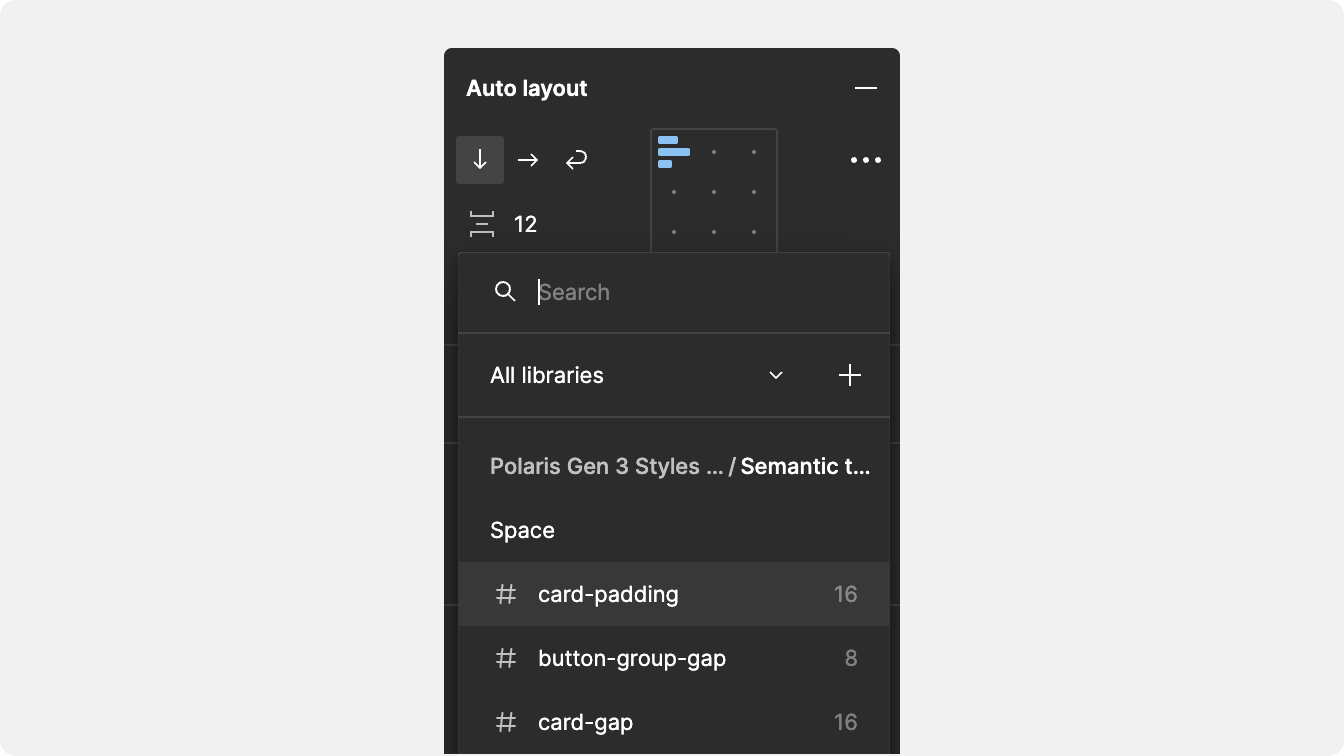
Its spacing system is built on primitive tokens that use a 4px base value, where space-100 equals 4px, and space-400 equals 16px. The system then layers semantic tokens on top for specific use cases such as space-card-padding, which is reserved for padding inside Card components.
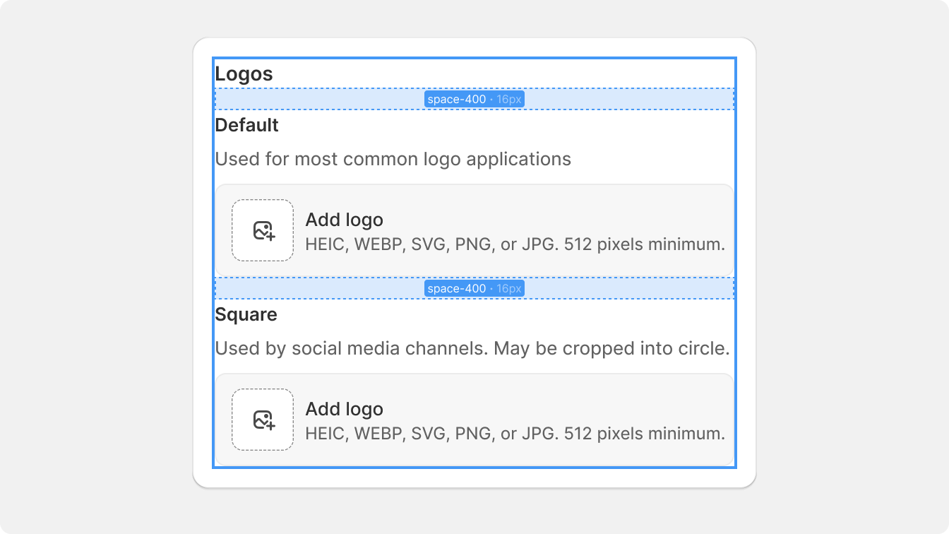
Shopify's documentation explicitly recommends using semantic tokens whenever one exists for that context.
One more reason tokens have become the standard: the W3C Design Tokens Community Group published its first stable specification in 2025, giving teams a common format for managing and sharing tokens across tools and platforms.
Design systems change constantly. Tokens give those changes a single source of truth instead of scattering them across components, codebases, and design element files.
This is also why the newer generation of AI design tools lets you upload your design system. Once your tokens and components are the source of truth, a tool like UX Pilot can generate new screens that already use them, so the output inherits your spacing, color, and type decisions instead of drifting from them.
3. Make accessibility a baseline for every component
Many design teams still treat accessibility as something that gets reviewed near the end of the design and development process.
That's usually where problems start. Here's how to make accessibility a shipping requirement instead of a last-minute review.
When accessibility isn't built into your design components from the beginning, designers and developers end up solving the same issues repeatedly. This might include:
-
A button without proper keyboard support
-
A modal that traps focus incorrectly
-
Or a form with poor screen reader labels can spread across dozens of products before anyone notices
Fixing one inaccessible component is manageable. But fixing hundreds of implementations of that component across multiple products is not.
That’s why accessibility should be treated as a release requirement, not a nice-to-have enhancement. A component should only enter your design system if it meets your accessibility standards. I'd treat WCAG 2.2 AA as the minimum bar for most teams.
If a component doesn't pass, it doesn't ship.
The most reliable systems validate accessibility through three layers of testing:
-
Automated accessibility scanning in CI to catch issues like missing labels, invalid ARIA attributes, and color contrast violations
-
Manual keyboard testing to verify that every interaction works without a mouse
-
Screen reader testing using tools such as JAWS, VoiceOver, and NVDA to ensure content and interactions are announced correctly
Automated testing is an essential starting point, but it won't catch everything. Most accessibility issues involve context, interaction patterns, or usability concerns that require human validation.
That said, automation should still be non-negotiable.
Integrating accessibility linting and automated checks into your build pipeline helps development teams catch regressions before code is merged. Instead of relying on someone to remember accessibility requirements during code review, the system enforces them automatically.
This is where an effective design system creates outsized value.
When accessible components become the default building blocks, every product team inherits those standards automatically. Designers and developers can focus on solving user problems instead of re-auditing the same buttons, forms, menus, and navigation patterns in every project.
IBM's Carbon Design System takes this approach seriously.
Every component undergoes automated Accessibility Verification Testing (AVT) using IBM's Equal Access Checker before reaching stable status.
Their testing covers default states, advanced states, and keyboard navigation, and the results are published publicly for every component. Components must pass all automated checks with zero violations before they can be considered stable.
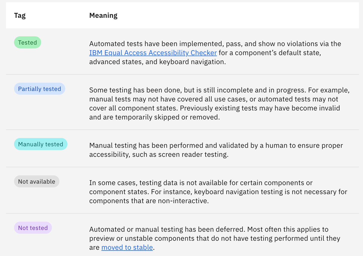
That's the real advantage of baking accessibility into a design system. One investment in accessible components improves every user interface built on top of them.
4. Generate docs from code
Hand-maintained documentation rarely stays accurate for long. A component gets updated, a prop changes, or a new variant gets added, but the documentation doesn't.
Within a few weeks, the docs and the actual implementation start telling different stories.
Once that trust gap appears, developers stop checking the docs and start reading source code instead. At that point, the documentation isn't helping the design and development process anymore and ends up creating extra work instead.
The solution is to generate documentation directly from the source of truth: the component itself.
Instead of maintaining pages manually, modern design systems generate documentation from code, including:
-
Prop tables
-
Usage guidelines
-
Accessibility notes
-
Code snippets
-
Interactive previews
-
API references
Because the documentation is tied to the component, updates happen automatically whenever the component changes. There is no separate documentation workstream to keep in sync.
Storybook's Autodocs feature has become one of the most common ways to do this.
It automatically reads component metadata such as args, argTypes, and parameters, then generates complete documentation pages with interactive examples and API tables. Teams can simply tag stories with autodocs, and Storybook creates documentation pages directly from the component source.
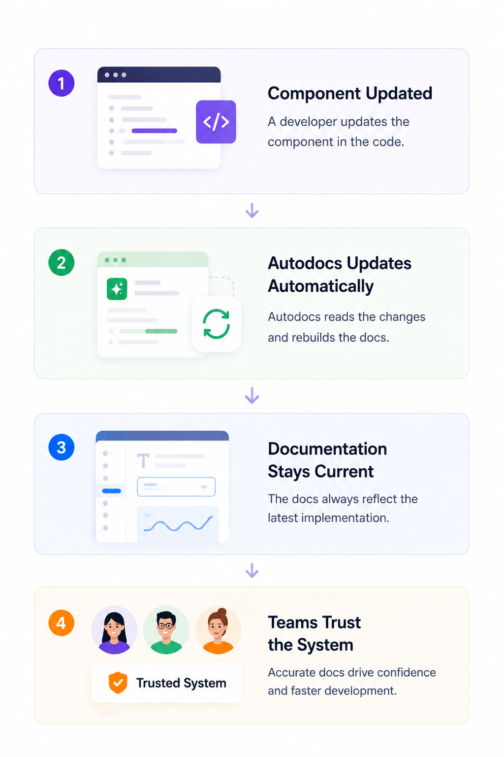
The same principle applies beyond UI components.
Many teams now generate token documentation directly from their design token files, Tailwind configurations, or JSON-based system files. Instead of maintaining a separate page for colors, spacing, elevation, or typography, addons can parse those files and automatically generate visual reference pages.
When documentation is generated from the same source used to build components, design decisions become easier to discover, easier to trust, and far less likely to drift over time. Designers, developers, and product teams are all working from the same information.
A good rule of thumb for maintaining a design system is simple: if it's not documented, it doesn't exist.
But documentation shouldn't be a separate project that teams need to remember to update. It should be a byproduct of building components in the first place.
That's exactly why Storybook Autodocs has become so popular.
A single tagged component can automatically generate living documentation with prop tables, interactive controls, usage examples, and source code references, without requiring teams to manually create or maintain documentation pages.
5. Set a clear design process path from draft to stable component
A healthy design system needs more than contribution guidelines. It also needs a clear path that shows how a new component or visual element moves from an experiment to an officially supported part of the system.
Without that path, teams usually fall into one of two failure modes, which reduce trust in the system:
-
Every new component request gets routed through the core design system team, creating review bottlenecks and slowing delivery
-
Or: teams start adding components without consistent standards, leading to duplicated patterns, inconsistent APIs, and declining quality.
The solution is a component maturity ladder that defines where every component stands and what it needs to progress.
A common model includes three stages:
-
Draft: Proposed or newly developed component that is still being validated
-
Candidate: Meets quality requirements and is already being used in production by at least one team
-
Stable: Fully documented, accessible, versioned, tested, and officially supported
Promotion between stages should be based on objective criteria rather than individual opinions. To move from Draft to Candidate, a component should include:
-
Production-ready code
-
Basic documentation
-
Accessibility validation
-
Design review approval
-
Demonstrated use case
And to move from Candidate to Stable, it should demonstrate broader adoption and long-term maintainability, including:
-
Usage across multiple teams or products
-
Complete documentation
-
Full accessibility compliance
-
Automated test coverage
-
Versioning and support commitments
Spotify's Ads Manager team provides a strong example of this approach.
During the "Bye Purple" redesign, the team created product-specific components that followed the same design principles, React patterns, and state management conventions used in Spotify's Encore design system.
Because those components were already aligned with system standards, they were eventually promoted into the core library. Instead of becoming an isolated product code, they became shared assets that benefited other teams.
The same design principles should apply when components are removed.
Every deprecation should include a clear migration path, supporting documentation, and an automated codemod or migration script wherever possible.
Teams should also receive a defined migration window, such as six months, before removal. Unexpected removals create friction, encourage teams to pin older versions, and quickly erode confidence in the design system.
A predictable deprecation process helps teams adopt new patterns without disrupting product delivery.
Most importantly, the entire maturity ladder should be visible to everyone to reduce confusion, encourage contribution, and ensure consistent quality.
Product teams should be able to see which components are experimental, which are production-ready, and what requirements must be met before a contribution becomes part of the shared system.
6. Share tokens across platforms, not component code
A lot of product managers make the mistake of treating cross-platform consistency as a code-sharing problem.
On paper, a single-component library for web, iOS, and Android sounds efficient. But in practice, it usually creates more complexity than it removes.
Different platforms have different interaction patterns, accessibility requirements, rendering models, and performance constraints. A button that works perfectly on the web won't necessarily feel native on iOS or Android.
The better approach is to share design decisions instead of implementation code.
This is where design tokens become valuable.
Instead of sharing UI components across platforms, mature design systems store tokens in a platform-agnostic format, typically JSON, following the W3C Design Tokens Community Group (DTCG) specification. Those tokens then flow through transformation tools such as Style Dictionary, which convert them into platform-specific formats.
A single token source can generate:
-
CSS variables for web applications
-
Swift values for iOS
-
Dart classes for Flutter
-
TypeScript variables for React
-
Email styling assets
The key is knowing what should be shared and what shouldn't.
|
Shared across platforms |
Platform-specific |
|
Design tokens |
Rendering logic |
|
Color palette definitions |
Interaction behavior |
|
Typography scales |
Accessibility implementation |
|
Spacing values |
Native navigation patterns |
|
Motion durations |
Platform conventions |
|
Naming conventions |
|
|
Component APIs and variant names |
This separation gives teams the best of both worlds.
A button can look visually consistent across web, mobile, and email experiences because it consumes the same design tokens. At the same time, it still behaves according to the accessibility standards and interaction patterns users expect on each platform.
flaconi's design system follows this model through a strict three-layer architecture.
Design tokens are managed centrally in Figma, exported to GitHub as JSON, and automatically processed through Style Dictionary into platform-specific outputs, including CSS for emails, Dart classes for Flutter, and TypeScript and CSS variables for React applications.
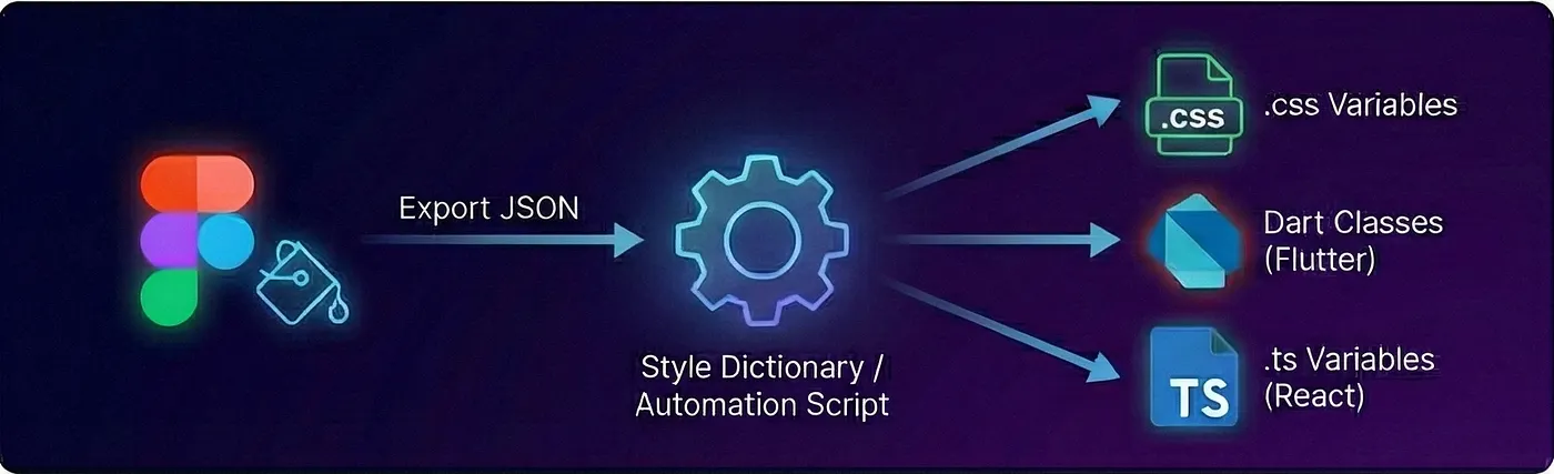
The team also introduced an important governance rule: application-level code cannot access design tokens directly. Instead, all styling must flow through a primitive component layer that sits between tokens and product features.
This prevents teams from creating one-off implementations that gradually weaken design consistency.
As a best practice, avoid forcing web abstractions onto native platforms.
Consistency doesn't mean identical behavior. The best design systems are supposed to share visual decisions while respecting platform-specific conventions.
7. Effective design systems are a product, not a side project
As your product evolves, teams need new components, existing patterns need updates, accessibility standards change, and bugs surface. Without ongoing ownership, even the best design systems eventually become outdated. Here's what treating it like a product looks like in practice.
Remember that a design system has users:
-
Designers
-
Developers
-
and product teams
These users have expectations around consistency, velocity, accessibility, and reliability. Just like any other product, they have needs, expectations, and feedback. If the system is too time consuming or doesn't help solve real problems, they'll find ways around it.
That's why mature design systems operate within best practices, including:
-
A roadmap that communicates what's coming next
-
A backlog that prioritizes improvements and requests
-
Release cycles for shipping updates
-
User research and feedback collection
-
Support channels for questions and issues
Versioning is especially important because it helps teams understand the impact of an update before they install it.
Most design systems follow semantic versioning:
|
Version type |
What it means |
|
Major |
Breaking changes that require teams to update existing implementations |
|
Minor |
New features and components that are backward-compatible |
|
Patch |
Bug fixes and small improvements |
Without clear versioning, updates become unpredictable. A team might install a new release expecting a bug fix and discover that a critical component now behaves differently. Those surprises erode trust faster than almost anything else.
The same principle applies to communication.
Teams should always know what's changing and why. Public changelogs, migration guides, quarterly roadmaps, and regular demos help product teams plan instead of reacting to unexpected updates.
Support matters too.
When design teams get stuck, they need a clear place to ask questions. Dedicated Slack channels, office hours, and documented escalation paths make adoption significantly easier.
monday.com's Vibe design system is a concrete example of how they put this into action. They released a major new version in just one week by treating the launch like a product release, not a library update.
Every change was tracked on a board, documentation evolved alongside development through automated changelog entries and migration guides, and codemods were created to help teams upgrade with minimal friction and technical feasibility.
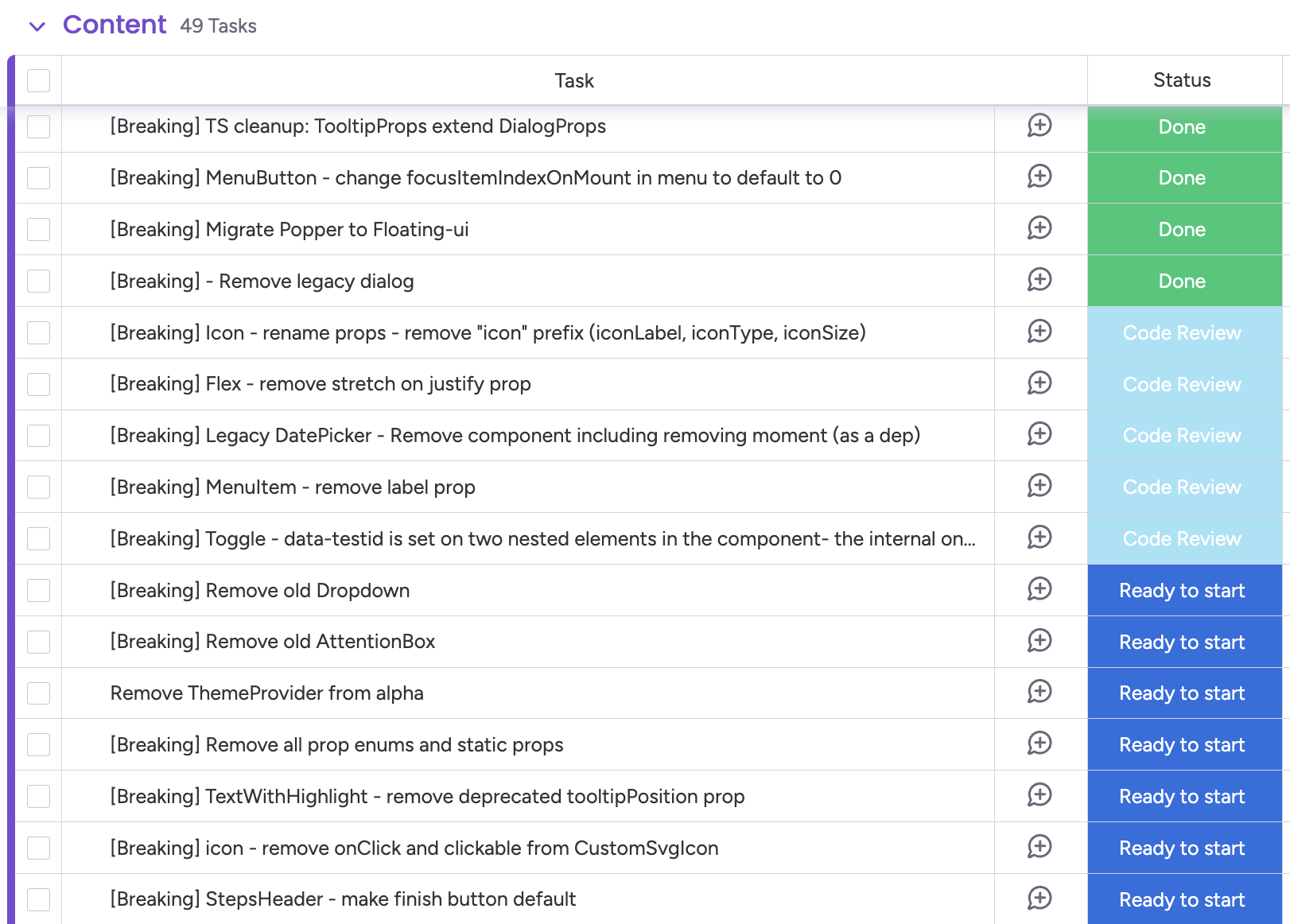
Finally, they were able to ship a semantically versioned release with clear upgrade paths for every consuming team.
This goes to show that the strongest design systems aren't treated as one-time projects, but as an ongoing process with dedicated ownership and focus on user satisfaction. Without that commitment, even the most thoughtfully designed system will eventually lose relevance.
Start creating a design system that scales
The strongest design systems tend to be the ones that fit naturally into how teams already work. When using the system feels faster and more practical than creating something from scratch, adoption follows without much effort.
You don't need to build everything at once. I'd focus on the essentials first:
-
Define your design tokens
-
Standardize your 10 highest-use components
-
Document them clearly
-
Establish a governance process
That's a perfect starting point for design teams.
Remember that these seven practices above aren't sequential phases to complete one by one. They're habits that work together and compound over time. Start small, stay consistent, and let the system evolve alongside your product.