
Design System Principles: 7 Rules for Scalable Product Design


Khanh Linh Le
Created on May 29, 2026
With AI, you can generate a decent-looking interface in minutes now. You can spin up a prototype faster than most teams used to finish a kickoff deck. So naturally, the question started popping up everywhere: Do people even care about design systems anymore?
People are not questioning whether the old way of building and maintaining design systems still makes sense.
And I think that's why so many discussions around design systems have shifted away from components and toward principles, structure, governance, contribution models, documentation, and tokens. The conversation is all about “how do we make decisions that scale across teams, platforms, products, and now AI-generated output too.”
So this article is not about building the perfect design system. I don't think that exists. This is about the principles underneath the systems that teams manage to sustain over time.
What are design system principles?
When people talk about design system principles, I notice they often lump together completely different things. Style guides, component specs, brand rules, token naming conventions, and even “make it clean and simple” somehow all end up under the same umbrella.
But design principles articulate the layer that sits between core values and implementation.
I think the easiest way to explain it is this: values tell you what the team cares about, standards tell you how something should be built, but principles help you decide what to do when there are multiple reasonable options in front of you.
And the key characteristics of a useful principle are that it takes a stance, it applies across contexts, and someone could reasonably disagree with it
“Design should be consistent” doesn’t help much, since nobody disagrees with it. But something like “consistency comes from adoption, not enforcement” immediately changes how a team approaches governance, contribution, and flexibility.
That’s also why I like the way Ross Moody frames the relationship among values, principles, and standards. He points out that broad adjectives like “simple” or “clear” are too open to interpretation on their own. The useful part is translating those ideas into decision-making rules people can apply day to day.
You can see a similar approach in the Atlassian design system. At one point, their team had grown to more than 30 designers, engineers, and content designers, and they kept running into recurring questions around priorities, scope, tradeoffs, and contribution.
Questions like:
-
why are we working on this?
-
why are we pushing back?
-
why does this belong in the system but not that?
-
what are the priorities?
And they focused on creating a shared visual language first.
I think that’s an important distinction because a lot of teams try to fix alignment problems with more component pages, more specs, more reusable visual elements. But Atlassian recognized the issue was upstream from that. People were interpreting priorities differently.

So the principles became a way to standardize reasoning and empower users creativity across the team. That’s a much more useful way to think about principles than treating them like value statements.
Why design system principles matter
Design systems exist because product teams keep solving the same problems repeatedly.
When Atlassian started investing seriously in their design system work in 2012, they found 45 different dropdown patterns across their products.
I think that example explains the value of design systems better than most abstract definitions ever could.
The problem was not that designers randomly loved making dropdowns, but there was no shared framework guiding decisions across products.
The team at Atlassian also made an important distinction early on. They were not trying to create consistency for its own sake. Their goal was to create a more consistent user experience across products while still allowing teams to solve product-specific problems.
Another case I'd bring up is how Indeed goes about creating their design principles. They involved more than 150 people across workshops, surveys, and audits because they understood the principles needed to reflect how the organization makes decisions collectively, not just how leadership thinks design should work.
7 design system principles for scalable product design
Once you start looking at design systems through the lens of decision-making instead of component libraries, the principles underneath them become much easier to evaluate.
That said, here are 7 design system principles.
1. Consistency over sameness
Design system teams don't chase absolute uniformity. Because once a system starts forcing every user interface into the same structure, teams either spend their time fighting the system or bypassing it entirely.
What teams try to preserve instead is consistency in logic. The interaction patterns stay familiar. States behave predictably. Spacing follows the same rationale. Interface components inherit the same behavioral rules even when the UI adapts to different contexts. You can move between products or surfaces without feeling like you entered a completely different design language.
That’s also why many mature systems separate shared foundations from platform-specific implementation. It's keeping common tokens, type scales, and interaction logic centralized while allowing web, iOS, Android, or responsive user experiences to diverge across different screen sizes.
Salesforce had an interesting way of handling this when defining the principles behind Lightning Design System.

Their team writes down a list of principles and stacks-rank them. Clarity came first. Efficiency second. Consistency third. Beauty fourth.
And the reasoning behind consistency being third is the useful part here. In JD Vogt’s write-up on the process, the team discussed what would happen if consistency became the dominant priority. They concluded that the system would struggle to evolve, innovation would slow down, and teams would keep repeating patterns that were no longer working well simply because they already existed.
So consistency became a supporting principle instead of the governing one.
2. Accessibility by default
Accessibility tends to break down when every product team has to remember it manually. Design systems solve this by including accessibility considerations the foundation layer itself.
The accessibility design elements live inside the components, tokens, and implementation patterns from the beginning, so teams inherit those decisions automatically when they use the system.
I'd put it this way. Strong design systems are a mix of user research, content strategy, customer support, librarianship, and accessibility rather than purely graphic design work.

I think that framing is closer to what design systems become at scale. Accessibility stops being a specialized task sitting on the edge of the development process and starts becoming part of the infrastructure every product team builds on top of.
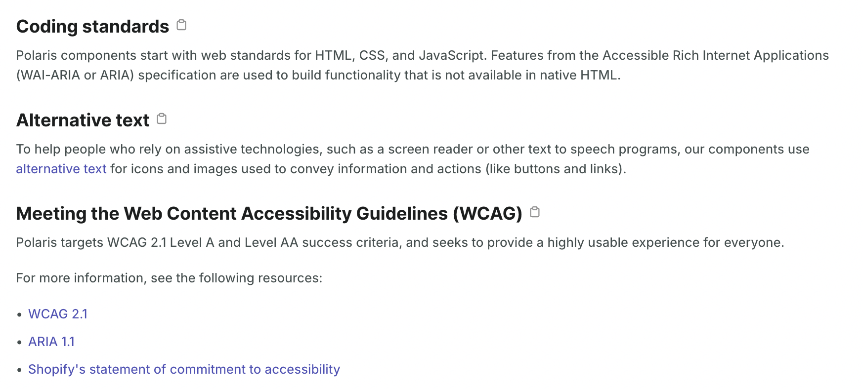
Shopify built Polaris around this idea. Their accessibility documentation explicitly states that components ship with semantic HTML, keyboard support, focus management, ARIA attributes, and WCAG 2.1 Level A and AA considerations built into the component architecture itself. Their accessibility testing tools also warn developers when required accessibility properties are missing during implementation.
3. Modular, not monolithic
A design system becomes difficult to maintain once interface components start depending too heavily on each other internally.
You change a spacing token, and suddenly, cards break in places nobody expected. A navigation update affects unrelated layouts. Teams become afraid to touch foundational components because every small change carries unpredictable side effects across the product.
That’s usually a sign that the system stopped being modular.
Foundational decisions like typography, spacing, and color palette stay centralized, but components remain isolated enough that teams can evolve or replace parts of the system without destabilizing everything around them.
That separation between layers is also why frameworks like Brad Frost’s Atomic Design became influential in design systems work.
A label, input, and button each exist independently as smaller building blocks. Combine them, and they become a search form. Combine multiple forms, navigation patterns, and content blocks together, and you start forming larger interface sections and eventually full pages.

The important part is that those smaller pieces still retain their own responsibilities instead of becoming inseparable from the larger layout around them.

It's also how Andrew Coyle describes building systems incrementally from core elements into reusable components and larger patterns. The important part is not the naming itself. It’s keeping the system flexible enough that teams can swap, extend, or retire pieces over time without triggering a full redesign every time the product evolves.

Modularity also matters more now that generating designs with AI is a common thing. When components are glued together into a monolith, an agent has very little to work with, and it ends up generating around your system.
A modular one gives the agent specific pieces to recombine — tokens it can apply, components it can compose, patterns it can follow. It's part of why we built UX Pilot's design system service around an audit of how your tokens and components are structured before anything gets ingested. The cleaner the modularity going in, the higher the on-brand accuracy of every screen the model generates after.

4. Clarity over complexity
I think people underestimate how much cognitive overhead bad naming creates inside a design system.
You open the library and see things like NotificationBar-v2-final or blue-500, and now you need context before you can even make a decision. Is this deprecated? Is there a v3 somewhere? Does blue-500 mean background color, text color, brand color, or interactive color?
Documentation quality matters because unclear systems create dependency chains around specific individuals. Everyone ends up asking the same people the same questions repeatedly because the logic of the system is not obvious on its own.
That’s why mature systems tend to optimize heavily for self-service. Someone opening the system for the first time should be able to understand what a component does, when to use it, and how it behaves.
Nathan Curtis, who has written extensively on design token taxonomy, argues for this in his article Naming Tokens in Design Systems. So instead of blue-500, you use something like color-action-primary for an interactive button background, or color-text-default for body copy.
5. Flexible, not fragmented
One of the hardest parts of maintaining a design system is deciding how much freedom teams should have.
A lot of mature systems handle this by keeping the foundations stable while allowing controlled extension higher up the stack. Tokens might support theming. Components expose specific override points. Patterns can adapt to different product contexts without changing the underlying interaction logic every time.
This is also why contribution models exist. Consider the hub-and-spoke model that some teams adopt in Figma.
There’s one master system file that owns the foundations like typography, spacing, colors, tokens, and core components. Product teams then duplicate from predefined templates that already reference the master library.

Anything product-specific lives in the local file, while shared patterns can later merge back into the core system if they prove reusable across teams.

Atlassian calls this same idea "local design systems" in their interview on reshaped.so:
"In Atlassian, we've called our approach to governance — local design systems, which empower systems of systems. Teams are already organically forming local systems. There are tons of them created by product teams, and there is a brand design system created by marketing. They all inherit the design guidance and foundations from Atlassian Design System."
I think there are a few more things about how Atlassian runs this that are worth pulling out:
-
The three-layer flexibility spectrum — they split products into three tiers based on how much theming freedom each gets:
-
Flagship (Jira, Confluence, Trello): most flexibility, room for personality, and signature experiences
-
Platform products: moderate consistency, can compose custom UI from primitives
-
Everything else (Bitbucket, Statuspage): least flexible, must use the system as-is, no random theme colors
-
-
The "pervasive API" concept — across all local systems, the API should feel consistent (i.e., if the parent system calls something "error," no local system should rename it "danger").
-
Empowering > enforcing model — Jennie, who leads architecture for the Atlassian Design System, literally says: "We want to guide teams to make the right decision, not police them."
-
Atlaskit ≠ Atlassian Design System — Atlaskit is just the shared component repo where many teams co-locate code. The design system specifically maintains the foundations, not all the components in Atlaskit.
6. Single source of truth
The design system should be the authoritative reference for how UI is built. Design tokens in Figma, component code in the repository, and documentation on the site all need to reflect the same decisions.
This is what design tokens are for. Tokens centralize hard values like hex codes into one file that both design tools and codebases reference. When a designer updates the brand blue in that one place, the change propagates across iOS, Android, and the web at the same time.
On the tooling side, this is where things have changed drastically in the past year. There are a few helpful practices considering how much AI agents can now help you with the source of truth maintenance:
-
Figma MCP + Storybook MCP + Claude. You point an agent at your Figma file and your Storybook at the same time, and it surfaces missing components or design drifts without anyone manually auditing.
-
Figma plugins built on the REST API. Teams are using Claude or Codex to batch update variables, refine descriptions, manage tokens, and push changes into code. Work that used to need a dedicated DS team for weeks is now a few hours of plugin setup.
-
Agent-driven sync between Figma and AI design tools: This is a new reason to invest in the foundations because a lot of teams now use AI agents to generate designs and refine from there. The more context the AI has on your system, the closer the first draft is to something on brand and usable. Take Nodey, our AI design agent inside Figma, as an example. Via one-click Use My Components, it reads your existing components and uses them as instances in every generation after that, so the output is consistent with the rest of your product.

So the single source of truth is partly architecture, partly tooling, and partly the team's willingness to keep using the system. Shopify's Polaris is one of the better examples of this done right — tokens, components, docs, and Figma assets all live in a single monorepo on GitHub, so nothing really has a chance to drift in the first place.
7. Built to evolve
A perfectly tuned design system still needs to change. Technology updates, user expectations move, and the product you're designing for in two years isn't the one you're designing for today.
The way around this is engineering evolution into the system from the start. Because the system is modular, you can swap outdated parts without destroying the whole structure.
Different parts of a design system also move at different speeds. If your system treats every layer like it changes at the same rate, you'll either lock it down so it can't evolve.
For this to work in practice, a few things have to be in place:
-
Logical scales. Spacing, typography, and color should follow consistent relationships, so a new value can slot in without breaking the rhythm.
-
Versioned component APIs. Teams using your components should be able to migrate when it fits their roadmap, not when the system team decides to flip the switch.
-
A contribution model. Designers and developers who use the system daily should have a clear way to propose additions, and the system team should have a transparent process for reviewing those additions.
One framework I keep coming back to is the one Atlassian's design system team uses internally — Horizons of Growth:
-
Horizon 1: laying and maintaining foundations.
-
Horizon 2: extending and maturing what's already there.
-
Horizon 3: projecting forward to what the system needs to be in two or three years.
The key is that all three horizons happen concurrently. You can't pause foundations to do innovation, and you can't drop everything to fix foundations every time something breaks.
Google's Material Design is the most visible example of a system built to evolve at a massive scale. Since its launch as "Quantum Paper" in 2014, Material has gone through three major eras:
-
The original physics-based paper metaphor in 2014.
-
Material Theming in 2018, for brand customization.

-
Material You in 2021, for dynamic personalization.

In 2025, they extended Material You into Material 3 Expressive, which is a refinement focused on more fluid motion and expressive interactions. Each era expanded what the system could do without abandoning its core principles, which is what evolution at scale actually looks like.
Design system principles vs guidelines
I think teams confuse principles with guidelines all the time. It creates confusion later when the system starts scaling because they solve different problems.
Principles are where teams discuss tradeoffs, priorities, and reasoning. Guidelines are where teams standardize execution so people are not reinventing naming conventions, spacing logic, or accessibility patterns repeatedly.
So if the principle is “clarity over complexity,” the guideline might be “name tokens by function instead of appearance.” Then the implementation rule becomes something more rigid, like category-property-variant.
You can see the same structure in how the Interaction Design Foundation explains design guidance. Principles provide general direction (e.g., "prioritize legibility"), guidelines specify how to approach them (e.g., "use large, jargon-free text with short sentences"), and rules define exact implementation (e.g., "use 20pt black Georgia on a lavender background").
Nielsen Norman Group breaks it down in a similar way, except they expand the stack further into heuristics, patterns, and team charters. Once a design system grows, teams are usually managing all of these layers simultaneously.
How to define design system principles
If your team doesn't have design system principles yet or the ones you have are too vague to settle an internal debate, here's a practical process for creating them. The goal is 3 to 5 specific, opinionated, memorable principles instead of a 20-item wish list.
Align design, product, and engineering
Principles should be written cross-functionally from the beginning because affects how engineers structure APIs, how product teams prioritize tradeoffs, how content designers define naming, etc.
A workshop format I like for this is keeping the group small and cross-functional from the start. Bring in people from design, engineering, product, maybe content design too. Put examples from systems like Atlassian or Material on the table first so people react to concrete tradeoffs instead of abstract words like “simple” or “scalable.”
Then everyone writes down candidate principles individually before discussing them together.
I actually learned this method from Maria Meireles, who structures her workshops in a similar way. She recommends sharing other companies' principles as inspiration, then having participants select their top 3 that could be adapted to the team's product. From there, the group collaboratively groups, votes, and refines.
It can end up looking something like a spreadsheet of candidate principles, themed by color, with the most-voted ones highlighted.

Start from real decisions
I think teams get stuck when they try to invent principles from scratch in a workshop room without looking at existing user research and how they already make decisions day to day.
The better starting point is your existing product work.
Look at the last few design and development debates. Maybe people kept arguing about flexibility versus consistency. Maybe the tension was around whether a familiar pattern should win over a newer interaction idea.
Those repeated debates can be much closer to your principles than abstract words like “delightful” or “innovative.”
A simple exercise I like is collecting recent product decisions and reviewing them together. Pull screenshots of components the team shipped, patterns that created friction, etc.
That’s also why copying another company’s principles directly rarely works well. Atlassian’s principles came from Atlassian’s own product structure, governance problems, and scaling challenges. Material Design reflects Google’s ecosystem constraints. Those principles make sense inside those environments because they were shaped by operational decisions already happening inside those companies.
Keep principles short and actionable
Actionable principles tend to work better than aspirational ones, and that's why you should keep them short and direct in plain language.
For example, “optimize for readability before density” can give your product team a direction when they are debating whether to squeeze more information into a dashboard.
I also think principles become much easier to apply when you pair them with concrete examples from the actual system.
A short principle, a quick rationale, and then a real implementation example are usually enough. People understand the idea faster because they can immediately connect it back to something tangible instead of treating the principle like abstract philosophy.
Shopify makes the same point in their guide to writing design principles. The emphasis is on principles being authentic to how the organization operates, specific enough to guide decisions, and memorable enough that teams can recall them.
Test principles in real scenarios
A lot of principles sound convincing until you try applying them to an actual product decision.
That’s the fastest way to tell whether a principle is useful or just good-sounding language and visual aesthetic.
Take a few recent debates from the team and run the principles against them. Would the principles have helped the team resolve the discussion faster? Would they have clarified the tradeoff? Or would everyone still interpret the principle differently afterward?
I also like the reversal test for this.
If the opposite statement sounds ridiculous, the principle is probably too generic to help anyone. “Good UX matters” does not tell a team how to decide because nobody disagrees with it. But something like “accessibility by default” creates a much clearer stance.
At the same time, principles drift over time, too.
A company changes structure, products expand, new platforms appear, AI workflows enter the design process, and suddenly, the principles written three years ago stop matching how decisions are being made today. So the useful systems tend to revisit them regularly instead of treating them like permanent doctrine.
How teams use design system principles
Principles that exist only in a document are principles that don't exist. For design system principles to have impact, they need to be embedded into the tools and workflows where decisions happen.
Here are the key considerations:
-
Design critiques and reviews. Intercom's design team uses this approach, and I find it such an effective way to keep the whole team aligned. For example, instead of saying "I don't like how you laid out that toolbar," they frame it as "aligning the toolbar layout with our other menus would increase consistency."
-
Contribution decisions. When a product team proposes adding a new component to the system, the design system team evaluates it against the principles. Does it work as a standalone module, or does it create a tight dependency? Does it maintain the single source of truth, or does it introduce a parallel pattern? The principles provide a structured way to say yes, no, or "not yet, here's what needs to change."
-
Onboarding. New designers and engineers should read the principles before using the component library. Understanding the "why" behind the system gives new hires a decision-making framework from day one, so they can make decisions even in situations the documentation doesn't explicitly cover.
-
Conflict resolution. When two teams disagree about a design approach, principles depersonalize the debate. The argument should be about "which approach better aligns with what we all agreed on."
For maximum impact, you can even embed principles directly into daily tools via design critique templates, Figma library descriptions, PR review checklists, and onboarding documents. If the principles aren't visible at the decision-making moment, they might as well not exist.
Common mistakes to avoid
After studying how teams define, adopt, and sometimes abandon design system principles, here are the six mistakes you should avoid.
-
Writing truisms instead of principles. "Good design is accessible" is a value everyone agrees with, and that's precisely the problem. It provides no decision-making power because it doesn't force a tradeoff. You should go for the principle that takes a stance: "Accessibility requirements override visual preference in every component." Some designers would push back on that, which means it's specific enough to guide decisions.
-
Having too many principles. Ideally, you only need 5 to 7 principles. Anything more than that means nobody remembers them. And principles that can't be recalled from memory won't surface during a design review when they matter.
-
Copy-pasting from other design systems. As I have made this point earlier, it's tempting to adopt Salesforce's or Atlassian's principles wholesale. But principles must reflect your team's specific product, users, and constraints. You can use other systems for inspiration, then write principles that address your actual decision-making pain points.
-
Defining principles without governance. Writing principles once and never revisiting them turns them into a historical artifact. The team evolves, the product evolves, the industry evolves, and so should the principles. Schedule 6-month reviews, compare against recent decisions, and update the language when the team's understanding has shifted.
-
Keeping it design-team exclusive. Principles defined only by designers will be more likely to be ignored by engineers and product managers. If those roles weren't involved in the creation process, they have no ownership over the outcome. The workshop must be cross-functional.
-
Not embedding principles into daily workflows. Principles need to appear in design critique templates, PR review checklists, component documentation, and onboarding materials.
Build design system principles for the long game!
I keep thinking about how much easier it has become to generate interfaces compared to even a few years ago.
You can prompt AI for layouts, spin up components instantly, and ship experiments faster than ever. But none of that automatically creates coherent products.
Because the difficult part was never only producing screens. It was building a predictable architecture when dozens of teams, tools, and tradeoffs are all pulling in different directions at the same time.
And I think that’s why it's even more important to build design system principles correctly. They give teams a shared way to think when the pace of building starts outgrowing the pace of alignment.