Product Onboarding: 7 Steps To Turn Signups into Active Users

Saloni Kohli
Created on Sep 25, 2026
You spend months building a product and driving users through the signup process, only to see 40–60% of lost users within the first 30 days.
Not because they didn’t see the value proposition. Because they never experienced it.
That gap between signup and value is where most products win or lose—and your product onboarding process is what bridges it.
Strong onboarding can reduce churn by 20–50% and push user activation rates to 40–60%. Even small gains matter—a 1% increase in activation can lead to roughly 2% lower churn over time.
This makes onboarding one of the highest-leverage areas for product teams, especially in product-led business models.
In this guide, I'm breaking down what successful onboarding actually looks like for product-led growth, and walk you through seven best practices to help users move from signup to activation and long-term retention.
What is product onboarding?
Product onboarding is the structured process of guiding new users from signup to their first meaningful value moment in a platform or tool.
It is not limited to a single feature walkthrough or a one-time product tour. A complete onboarding process spans multiple touchpoints, including:
In-app guidance such as tooltips, product tours, and onboarding checklists
Email sequences that bring users back into the product
Push notifications that prompt key actions
Support and help content that removes friction
All of these work together to teach users how the product works and the actions required to experience value.
Product onboarding and user onboarding are often used interchangeably, but they’re not the same:
Product onboarding is a baseline experience that includes the default onboarding flow that every new user goes through, regardless of who they are.
User onboarding focuses on adjusting the experience based on the user’s role, goals, or behavior.
For example, product managers might see different steps for a B2B product onboarding flow as compared to someone in a marketing team, depending on the user data that has been shared with a platform.
Different users may see different onboarding steps depending on what they’re trying to achieve in the product.
Product onboarding sets the foundation, and user onboarding makes the experience relevant for different users. And user retention depends heavily on how well this system works.
Around 75% of users abandon products within the first week, and nearly 70% of SaaS users churn within 90 days due to poor onboarding. Onboarding alone accounts for 30–50% of overall churn variation.
Even small improvements early in the onboarding journey can have a large impact. Increasing first-week retention by 15% can nearly double the number of retained users over a 10-week period.
The key metric that ties all of this together is time-to-value (TTV). TTV measures how quickly users experience a meaningful benefit from the product.
The best onboarding flows for self-serve products aim for under five minutes. Every step in the user onboarding process should focus on reducing that time and helping users reach value faster.
Slack’s product onboarding is a great example of how this works.
Instead of relying on a static product tour, Slack uses Slackbot as part of its onboarding system. When users first enter the product, Slackbot introduces key actions, responds to what users have already done, and suggests the next step.
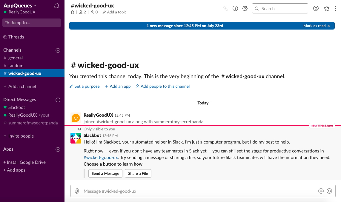
This approach combines in-app guidance with behavior-based triggers across multiple touchpoints. This helps create an onboarding experience that adapts to user behavior and continuously guides users toward activation, rather than relying on a one-time walkthrough.
7 steps for customer onboarding and driving user activation
If users aren’t reaching value, they won’t stick around. These seven best practices focus on what actually moves users from signup to activation—with some of my favorite examples from products that have really nailed their onboarding experience.
1. Define your aha moment and map the critical path to it
Before you design any onboarding flow, you need to be clear on what you’re guiding users toward.
That point is the aha moment—the specific action where a user first understands your product’s value. It’s the moment that gives them a reason to come back. Without defining it, every decision in your product onboarding process is arbitrary.
This looks different for every product:
For Slack, it’s when a team sends a message and gets a reply
For Dropbox, it’s when a user syncs their first file across devices
And for Canva, it’s when a user creates and downloads their first design
In each case, the value is immediate and obvious.
There are two ways to identify this moment. The first is to work backwards from your best users. Look at:
Long-tenured accounts
High NPS promoters
Users on higher pricing tiers
Then analyze their early user behavior. What did they consistently do in their first few user sessions? Which core features did they use early on?
The goal is to find the actions that correlate with long-term user retention and product adoption.
The second approach is to work forwards. Compare a brand-new user with someone who is already getting value from the product.
Ask:
What does the user need to understand?
What actions do they need to take?
Where do users typically get stuck or drop off?
That gap defines your onboarding journey.
Once the aha moment is clear, the next step is to map the critical path—the minimum set of steps required to reach that moment.
Start by listing every step in your current onboarding flow, from signup to value. This typically includes:
Account creation
Setup steps
Initial product interactions
Any required inputs or configurations
Then simplify aggressively. Remove anything that doesn’t directly help users reach value. Combine steps where possible, and delay anything that isn’t essential.
The target is 3 to 7 core steps.
Flows that stretch beyond 20 steps reduce completion rates by 30–50%, which directly affects user activation and increases the risk of users dropping off before they experience value.
When you map this out visually, it becomes much easier to spot unnecessary steps.
For example, I created a quick user onboarding flow for a project management tool using UX Pilot to understand what the shortest path to value might look like for a typical SaaS product. All of this took zero design team requirements, just a simple prompt.
This makes it much clearer about which steps could be removed or combined before moving into detailed design.
One important detail here is that activation isn’t always the same for every user. Different user personas have different goals, which means their path to value can vary.
Instead of forcing all users through the same flow, define activation separately for each persona and tie it to a specific value event that correlates with retention. This is what makes a user onboarding experience effective.
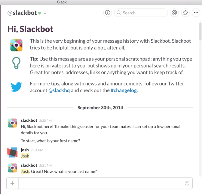
Slack is a strong example of this in practice. The founder, Stewart Butterfield, shared that once a team exchanges around 2,000 messages, 93% of those teams continue using the product long-term.
That insight works backwards to define their aha moment: the first real team conversation.
Every onboarding decision—from Slackbot prompts to channel suggestions and invite flows—is designed to move users toward that single outcome.
[Source]
Instead of explaining features upfront, the focus stays on helping users experience value as quickly as possible, but at their own pace.
Users who never reach that aha moment have no reason to return.
2. Reduce signup friction
Before users can move through your onboarding flow, they have to get through the signup process. And this is where a lot of drop-off happens.
Every additional form field creates friction. The more effort required upfront, the fewer new users actually enter your product onboarding process.
Your goal should be to reduce the signup process to the absolute essentials. At most, this should include:
Email (or SSO like Google)
Password
Company name (only if required for B2B)
Everything else, like job role, team size, or use case, can be collected later, once users are already engaged in the onboarding journey.
There are three high-impact ways to reduce friction here:
Let users start before email verification: Don’t block access at the door. Allow users to explore the product first, then verify their email before accessing sensitive features. This keeps momentum going in those first critical user sessions.
Avoid requiring a credit card upfront: For free trial products, asking for card details too early can reduce free trial starts by 50–80%. Let free users experience value before introducing any commitment.
Reduce form fields aggressively: Cutting fields from 8 to 4 can increase completion rates by 50–120%. Fewer decisions = faster entry into the user onboarding experience. Also, 65% of website visitors refuse to fill out a form if it asks for too much personal information.
Once users are inside, the next challenge is how much to show them—and when.
This is where progressive disclosure comes in.
Instead of overwhelming users with every feature upfront, reveal functionality gradually based on what they need at that moment. A complex dashboard might be useful for power users later, but early on, it increases cognitive load and slows down user activation.
The goal is to:
Show users only what they need
Exactly when they need it
This directly impacts user engagement, reduces drop-offs, and helps guide users toward the aha moment faster.
One of the most common mistakes in product-led onboarding is front-loading too much information. Trying to showcase every feature, basic function, and every use case early on doesn’t improve the user experience; instead, it only delays value.
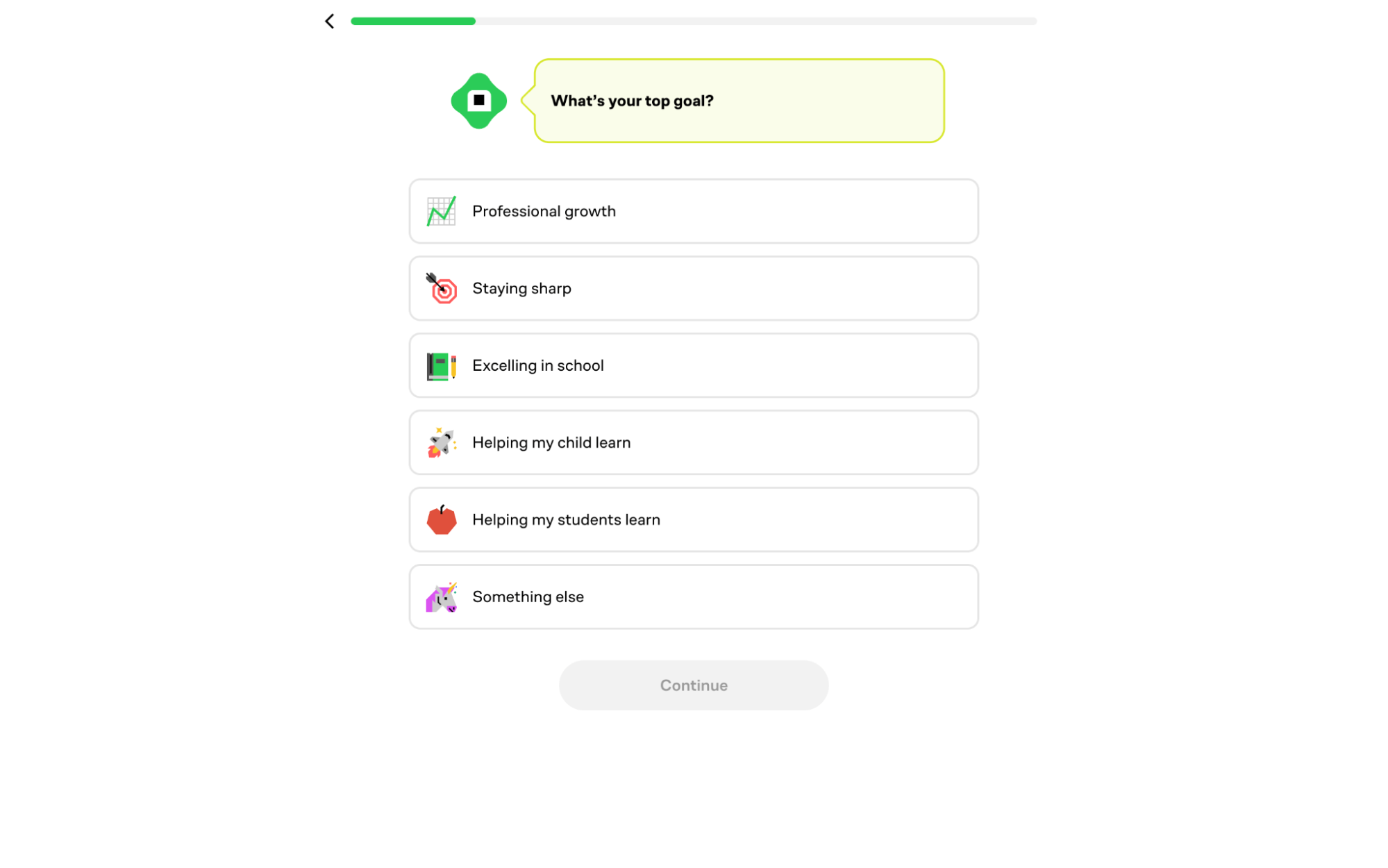
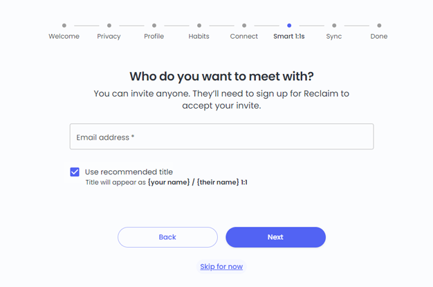
For example, this onboarding questionnaire by Reclaim.ai might be a poor experience for many users because, despite the visible progress bar, the number of required steps and information upfront creates too much signup friction, making it harder to retain attention early on:
The goal of onboarding isn’t to explain everything. It’s to move users forward in the customer journey as quickly as possible.
Duolingo is a strong example of how this works in practice.
Users can start a lesson immediately—without creating an account. The signup prompt appears only after they’ve completed an initial lesson and experienced value. This reduces friction at the start while still allowing the product to collect data later.
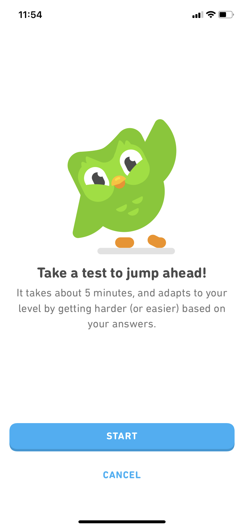
Duolingo spreads its data collection across multiple steps instead of asking everything up front. For example:
Users select their language first
Then indicate their skill level
Then choose learning goals and preferences
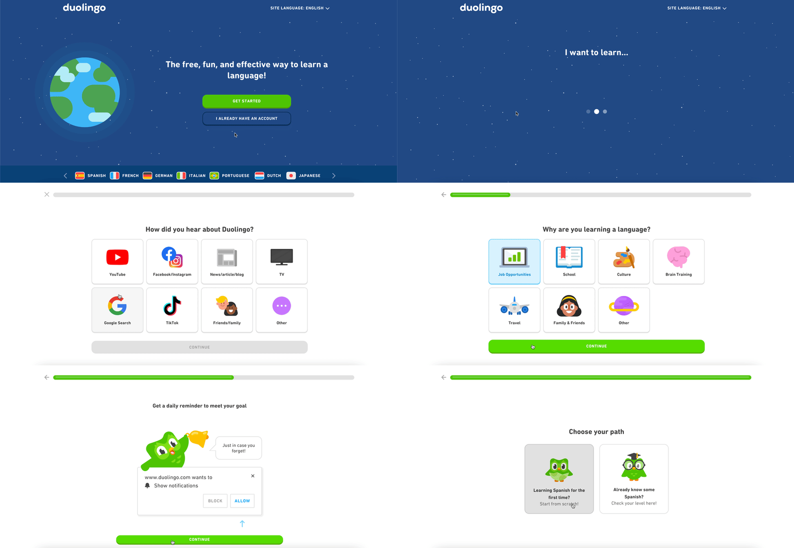
These inputs are captured gradually across the flow instead of through a single long form.
This staged approach allows users to invest incrementally, rather than committing everything before they understand the value. With this process, users are also more likely to reach the aha moment sooner instead of making it feel like they’ve just gone through a comprehensive product tour.
3. Guide users with interactive walkthroughs for new features
Once users enter your product, the next challenge is what happens next.
Most products rely on passive product tours like click-through modals that explain features one step at a time. But the problem is that users don’t retain much from these. They click through, dismiss them, and still don’t know what to do.
On the other hand, interactive walkthroughs work differently. Instead of explaining, they require users to take action.
The difference between the two is simple:
Passive tours: Users read and click “Next”
Interactive walkthroughs: Users perform real actions inside the product
And the data reflects this. Short, 3-step interactive flows see completion rates as high as 72%, while longer 7-step passive tours drop to around 16%.
The reason is straightforward—users learn by doing.
When users actively complete a step, they’re not just understanding the feature; they’re already using it. That’s what drives user activation and early user engagement.
To make this work, walkthroughs need to be designed carefully. Effective walkthroughs typically follow these principles:
Keep 3–6 steps that focus on a single job-to-be-done
Make every step an action, not a modal to dismiss
Always include skip and exit options for power users
Trigger steps contextually, instead of auto-playing everything upfront
And remember that not every feature needs a walkthrough. Save the walkthroughs for:
Multi-step workflows
High-complexity UI
Set up actions that block users from reaching the value
For simpler actions, contextual tooltips are enough. Overusing walkthroughs can slow down the user onboarding process instead of improving it.
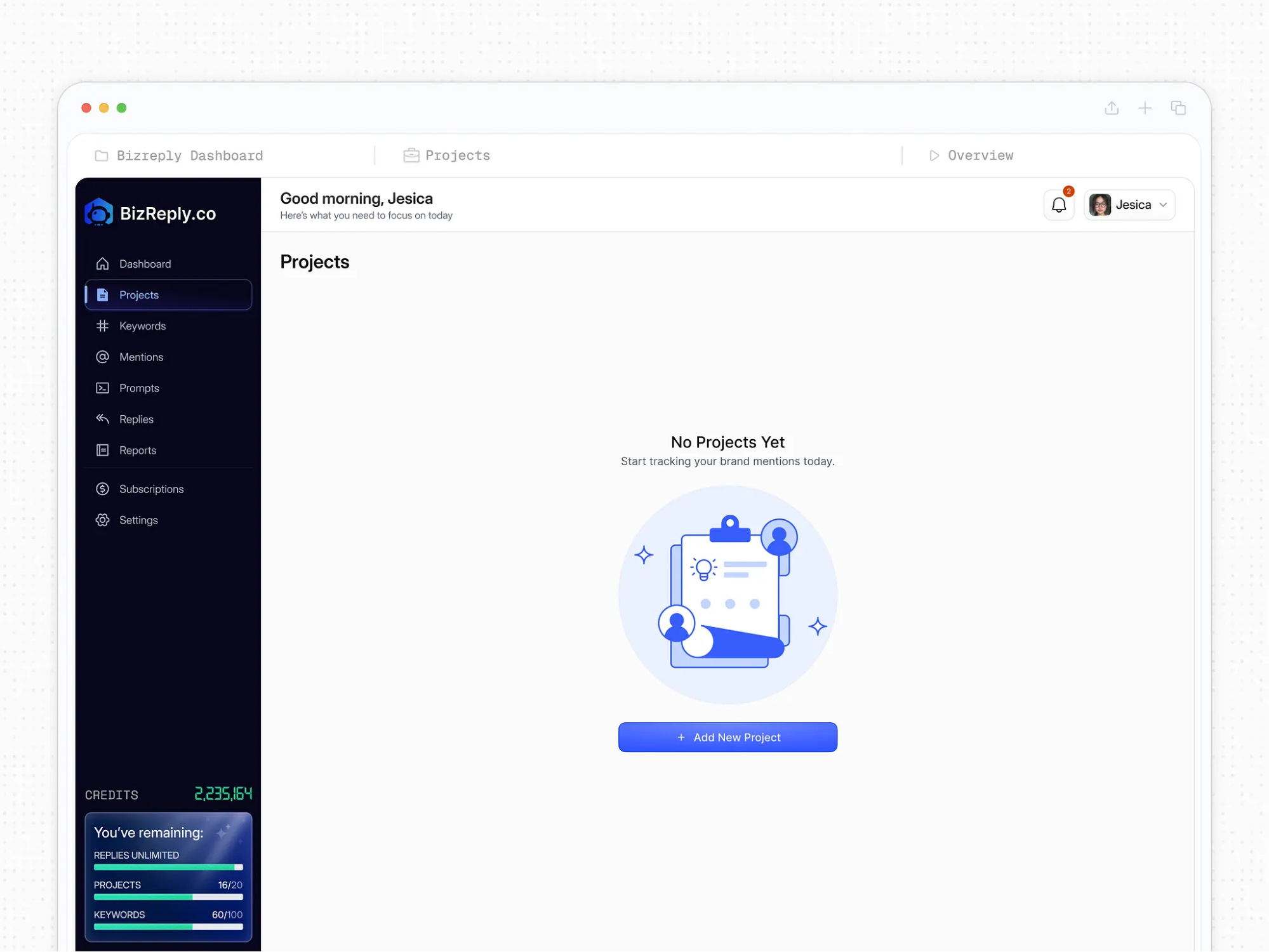
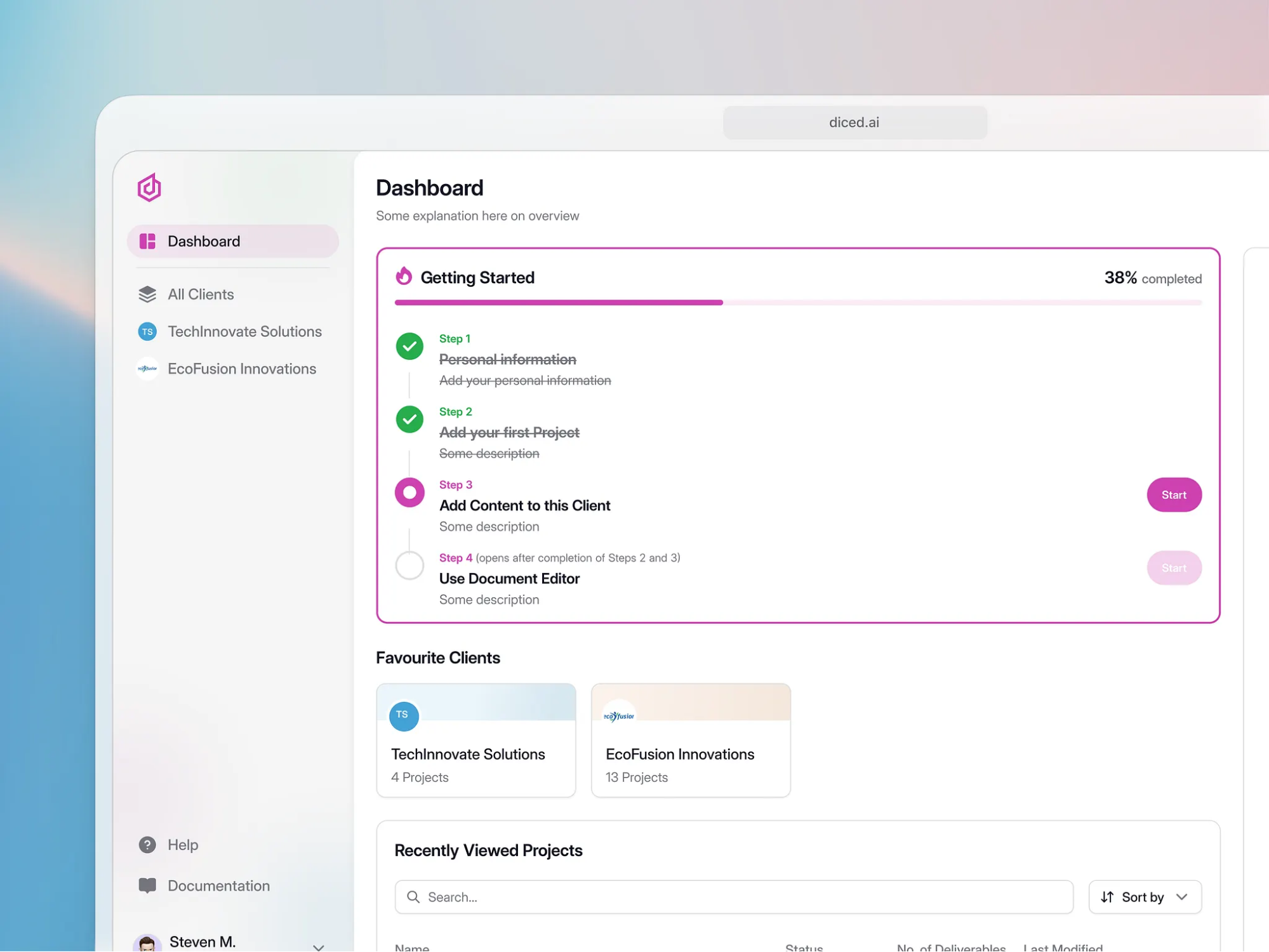
A big opportunity here lies in empty states—something most teams overlook. When users first log in, your product or “dashboard” is empty. Meaning, users are presented with:
No projects
No data
No activity
[Source]
Instead of showing a blank screen with “No projects yet,” use that space to guide users with guided flows like:
“Create your first project to get started”
“Upload your first file”
“Invite your team to begin collaborating”
Each empty state should point to a single, clear next step. This removes ambiguity and helps guide users forward in their onboarding journey. Something like this:
[Source]
Designing an interactive walkthrough can be tricky, especially figuring out what actions to include and how the steps should connect.
One way to approach this is to quickly prototype the flow before designing it manually. For example, I used UX Pilot’s Figma plugin to generate a simple onboarding flow for a project management tool—just from a short prompt describing the use case.
Within a few seconds, it created multiple connected screens showing how a user would:
Land on the dashboard
Create a project
Add a task
Invite a teammate
What makes this useful isn’t just the instant design generation, but actually seeing the sequence of actions laid out visually. Instead of guessing what the walkthrough should include, I could immediately see:
Which steps were essential
Where the flow felt too long
Where users might get stuck
From there, it’s much easier to turn that into an interactive walkthrough inside your product.
And since every screen is editable, you’re not locked into the output—you’re just starting with a clearer, faster first draft.
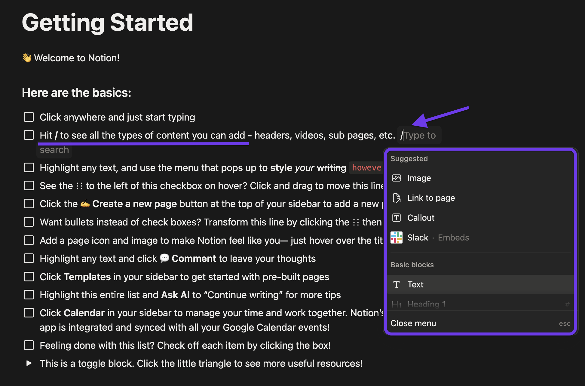
Notion’s “Getting Started” page is a great example of interactive walkthroughs.
Users learn features like slash commands by actually typing “/” inside the product. And tooltips appear contextually as users interact, not all at once. On top of that, pre-built templates reduce the effort required to get started.
This shifts the experience from:
“I need to build everything from scratch”
to“I can start from something and move forward”
As a result, users reach value in roughly 3–6 minutes.
Dropbox takes a different but equally effective approach.
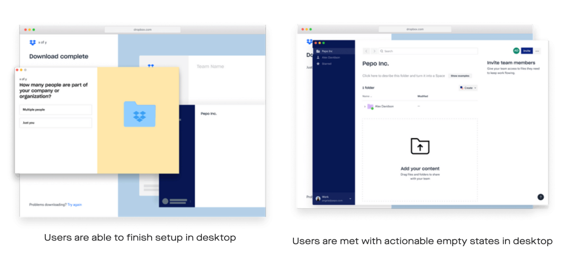
Their original onboarding flow had close to 36 steps, which created friction and slowed down product adoption, with only a small percentage of users completing onboarding.
[Source]
The redesign removed that complexity and dropped users directly into the product with actionable empty states. Instead of explaining features, the interface prompted users to take core actions:
Add content
Set team permissions
Invite collaborators
These actions appeared in context, exactly when users needed them. The result was a much more streamlined user onboarding experience, increasing Dropbox’s onboarding completion by 50%.
That’s the shift from passive onboarding to effective onboarding.
Don’t just tell users what your product does. Design the experience so users interact, take action, and move forward toward real value.
4. Personalize the customer journey flow by role, intent, and behavior
Not every user is trying to achieve the same thing with a product. Developers, product managers, and founders all have different goals—and if they’re pushed through the same onboarding flow, it slows down user activation and hurts retention.
Personalizing the experience based on role or intent can lift 7-day retention by up to 35%. This works best when you layer personalization in a simple, structured way.
The first layer is segmentation at signup. Start by asking the user one clear question:
“What’s your role?”
“What are you trying to achieve?”
That single input can route users into completely different user onboarding experiences, without adding friction to the signup process.
The second layer is behavioral personalization. Once users start interacting with the product, adapt based on their user behavior:
If they explore a feature → offer a deeper walkthrough
If they hesitate → trigger contextual help
If they move quickly → reduce guidance
The third layer is templates. Instead of starting from scratch, educate users on what success looks like for them:
Role-based dashboards
Pre-filled workflows
Use-case-specific starting points
This reduces the learning curve and accelerates product adoption.
Of course, designing all these individual flows across different user personas can get complex quickly. But with a tool like UX Pilot, you can whip up designs for specific user flows in just minutes with zero design skills required.
For example, you can create mapping onboarding flows for a fintech product—one for personal finance users, one for small businesses, and one for solopreneurs. Each needed a completely different path to value.
With this, you'll be able to compare flows side by side and spot gaps early—before getting into detailed design. Plus, you can make edits to details like font, colours, text, and more.
Another big part of making personalization work is how you deliver guidance.
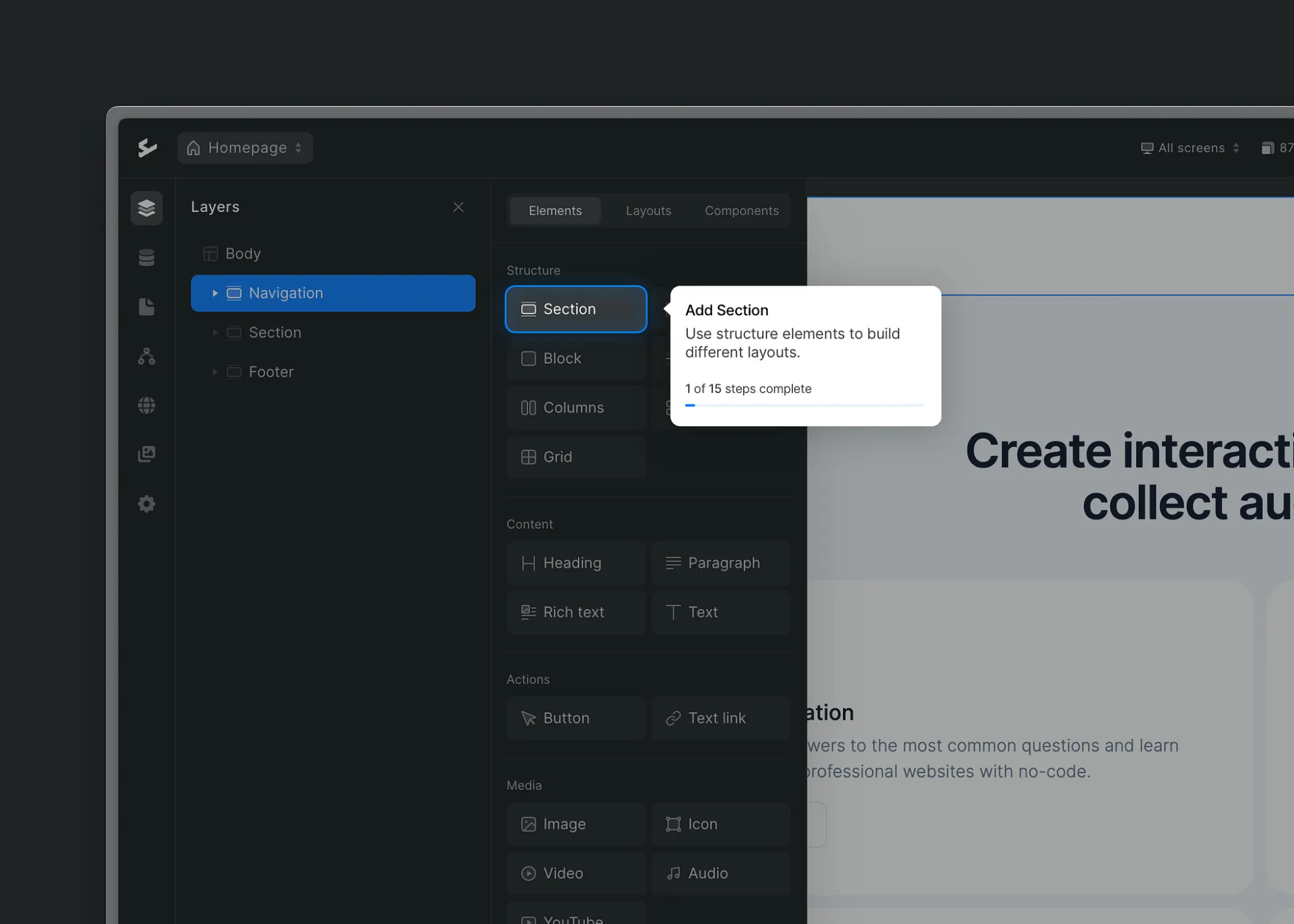
Contextual tooltips are one of the most effective ways to do this. Instead of interrupting users, they appear exactly when needed. For example, when a user hovers over a feature or spends too long on a page.
[Source]
But this needs restraint:
Use tooltips only when necessary
Limit to one contextual message per session
Avoid overwhelming users
Too much guidance ends up creating noise, not clarity.
The goal of personalization isn’t complexity—it’s relevance. A single well-chosen segmentation question will always outperform a long intake form that users abandon halfway through.
Take Canva, for example. During signup, users select their role and goals. That one input shapes the entire onboarding journey:
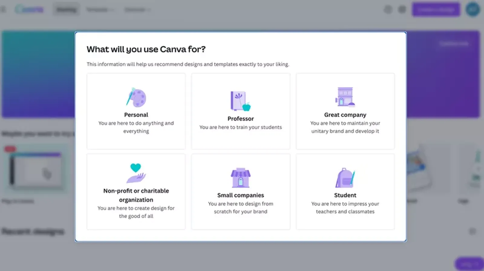
A teacher sees education templates, while a social media manager sees content creation workflows. This approach helped Canva improve activation rates by over 10%, leading to a significant increase in active users.
5. Drive task completion with progress indicators and gamification
Once users enter your onboarding flow, the challenge is getting them to complete it — and that’s where progress indicators help.
And the reason is psychological.
The endowed progress effect shows that people are more likely to complete a task when they feel they’ve already made progress. Research on loyalty cards found that customers with pre-stamped cards completed them 34% faster than those starting from zero, despite the identical effort required.
In onboarding, this comes down to how you present progress. Instead of showing: “0 of 5 steps complete.”
Show: “2 of 5 complete.”
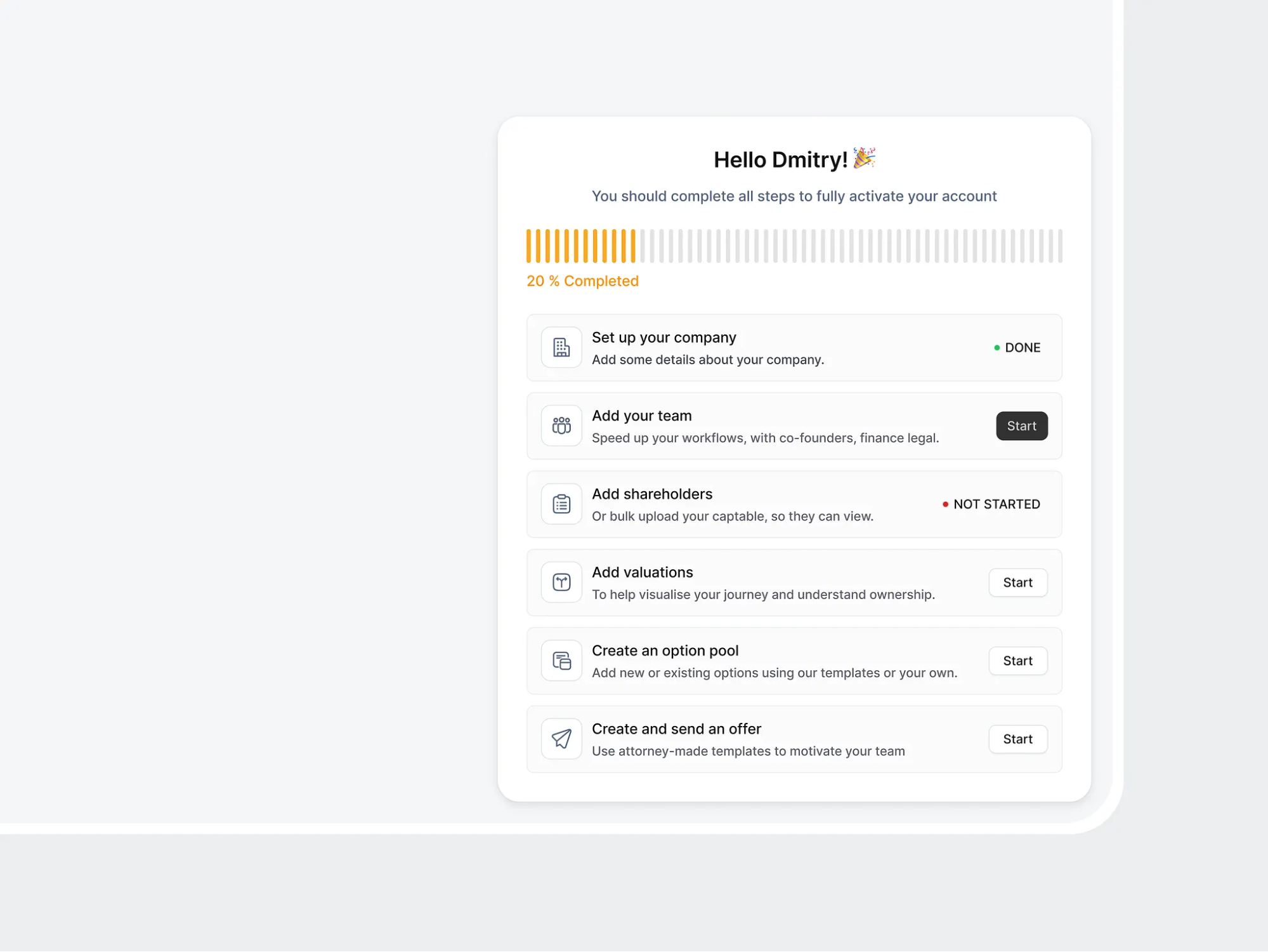
This small shift creates momentum, encouraging users to actually complete the onboarding steps.
For example, LinkedIn’s profile strength meter shows users how complete their profile is and what’s left to finish. Each small update moves the bar forward, making the next step obvious so users engage.
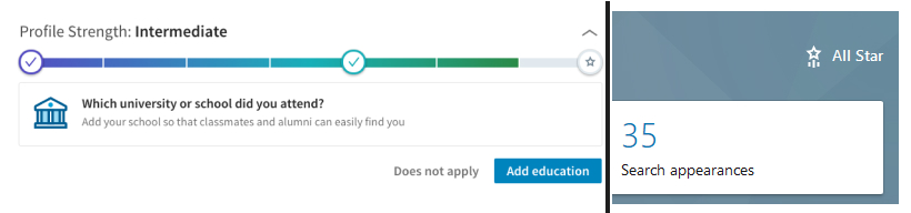
This approach increased LinkedIn profile completion by 55%, with later improvements pushing it even further.
To apply this in your product onboarding process:
Keep onboarding checklists to 3–5 key steps
Pre-complete any system-driven actions
Show visible progress across the user journey
Make progress persistent so users can continue across sessions
And these changes aren’t just cosmetic or for aesthetic purposes. Progress indicators can increase completion rates by 20–30%. And one SaaS company jumped from 40% to 91% completion just by reframing the visual progress to count system-automated steps as pre-completed.
Beyond checklists, gamification is also a great way to reinforce product onboarding momentum—but only when it’s done subtly.
The most effective gamification patterns are simple:
Small milestone confirmations when a step is completed
Lightweight rewards tied to meaningful actions
Visual indicators that show how far users have come
Fathom is an excellent example of integrating gamification to engage users.
Their onboarding breaks tasks into clear steps, but what stands out is how they layer in rewards.
As users complete key actions, they earn points—for example, completing setup steps or enabling features prompts messages like “Earn 10 points,” and users can track their total points within the product.
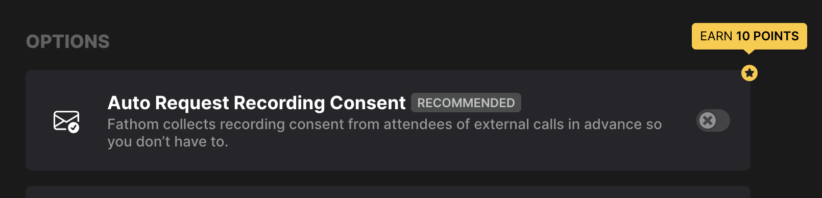
This creates a sense of progress beyond just a checklist.
Users aren’t just completing tasks, but they’re accumulating progress in a way that feels tangible. At the same time, the onboarding remains focused on real actions like setting up recordings or running a test call, so the gamification never feels distracting.
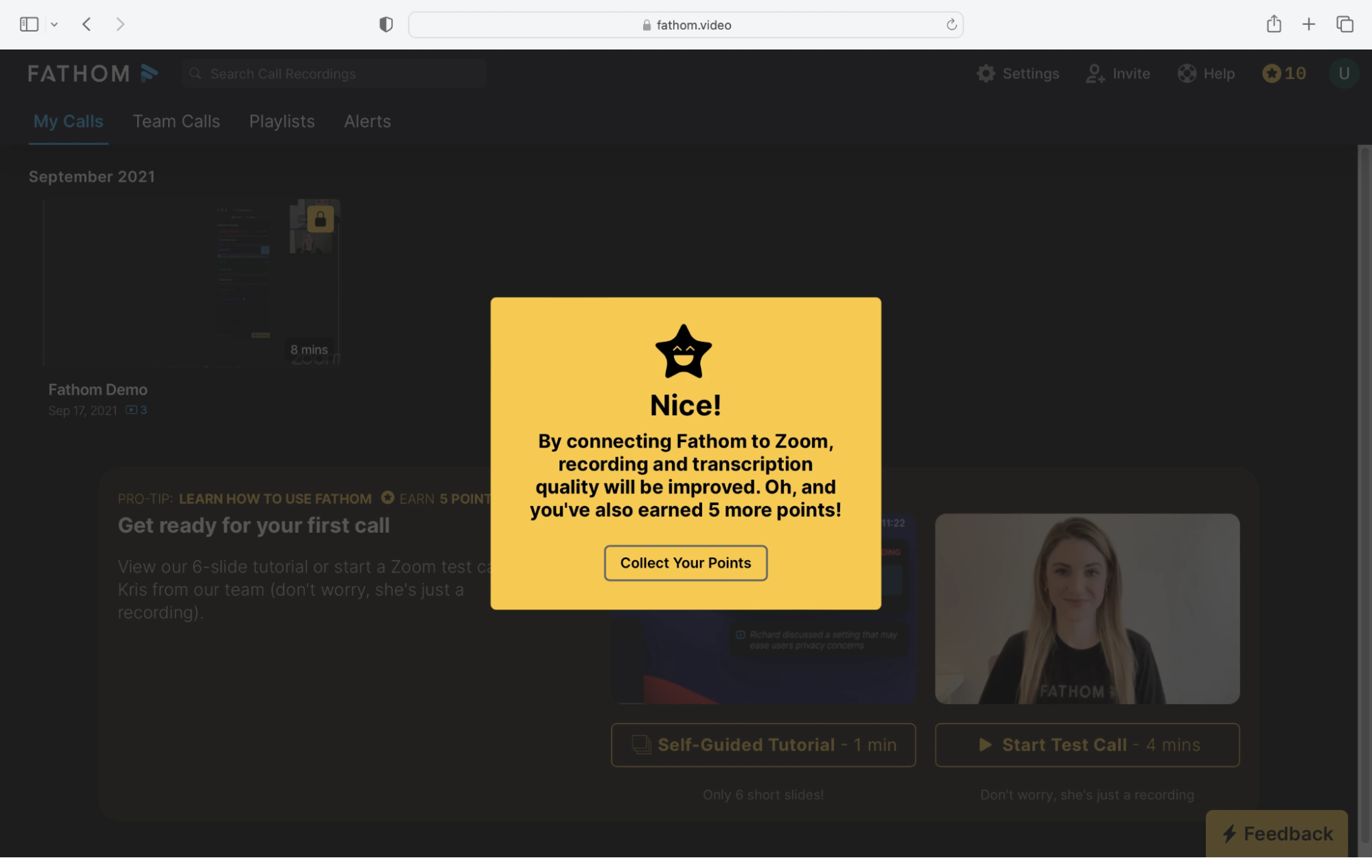
When users can see progress, feel momentum, and get small signals of completion along the way, they’re far more likely to finish onboarding. And that directly improves user activation, feature adoption rate, and long-term customer retention.
6. Extend onboarding beyond the product with multi-channel messaging
Your product onboarding process doesn’t end when users leave the app, as most of them won’t complete onboarding in a single session.
That means, if you rely only on in-app guidance, you lose them the moment they drop off. This is where out-of-product messaging (OPM) matters.
78% of users report a better experience when interactions are consistent across email and in-app channels. Done right, this keeps users moving forward in the onboarding journey, even when they’re not actively using the product.
A simple multi-channel sequence looks like this:
Day 0: Welcome email with one clear next step (not a feature list)
Day 2–3: Highlight a key feature or use case tied to their goal
Day 5–7: Share a customer story or example of success
Day 10–14: Check in and offer help (support, demo, or resources)
But timing alone isn’t enough. The key is knowing when to stop.
If users become active, don’t keep sending onboarding emails. Move them into product updates or new feature communication instead. Continuing the same sequence after activation creates noise and reduces user engagement.
More importantly, this shouldn’t be a fixed drip sequence. Effective customer onboarding is driven by behavior, not just time.
Trigger messages based on how customers interact with the product onboarding journey:
Users who haven’t completed key onboarding steps
Users who haven’t logged in after a few days
Users stuck between free trial and paid conversion
Users who reached out to customer support
Each of these signals a different kind of friction in the user onboarding process. Responding with personalized, behavior-based messaging helps guide users back into the product at the right moment.
For example, Foresyte, a group travel planning app, achieved a 4x increase in daily active users with this approach.
They identified key activation moments (creating a trip plan or booking a vacation) and built workflows around them. When users dropped off at specific steps, they triggered personalized emails, followed by targeted push notifications if users didn’t respond.
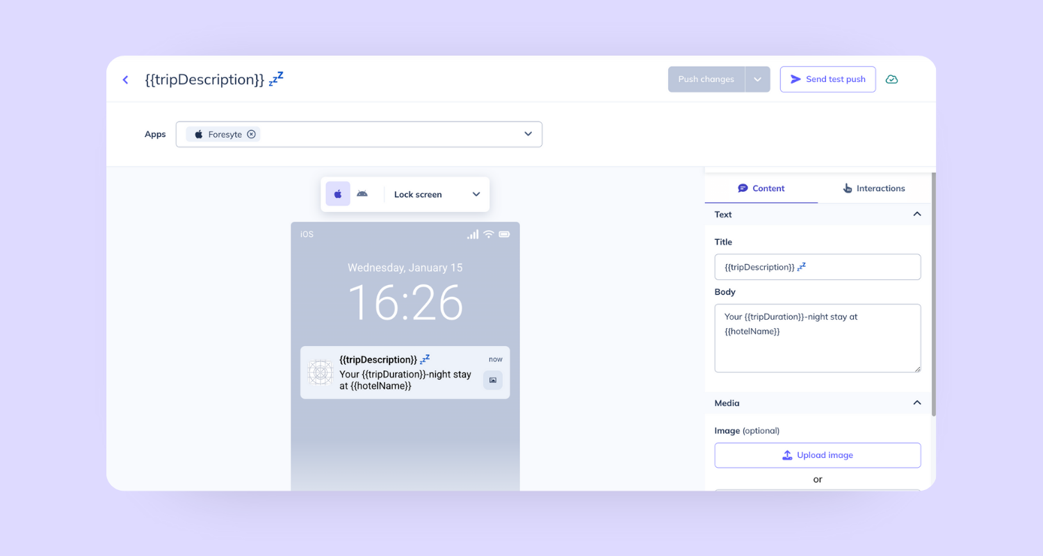
[Source]
This shift to behavior-driven messaging led to a 4x increase in daily active users.
Before this, their system was fragmented—emails handled in one tool, push notifications in another. Consolidating these into a single workflow made the entire onboarding process more consistent and scalable.
And this kind of consistency requires cross-team coordination that spans multiple teams:
Product
Marketing
Sales
Support
If messaging across these touchpoints isn’t aligned, it creates confusion. A support email that contradicts an in-app message, or a sales team follow-up that ignores user interactions and activity, breaks the experience.
So, effective multi-channel onboarding isn’t just about sending more messages. You need to ensure every interaction (inside and outside the product) works together to move users toward activation and long-term customer retention.
In the long run, this form of communication can also work as a user feedback channel.
7. Measure activation metrics and iterate the onboarding experience
Improving your product onboarding process without measurement is just guessing. To understand what’s working, you need to track a few core onboarding metrics:
Completion rate: What percentage of users finish the onboarding flow
Time-to-value (TTV): How long it takes users to reach their first meaningful action
Activation rate: The percentage of users who reach the defined activation event (20–40% is typical, 60%+ is strong)
Day 1, 7, and 30 retention: How many users come back
One mistake teams make is focusing too much on completion.
Completion tells you if users finished the steps. But activation tells you if those steps actually delivered value.
Most teams optimize onboarding completion rates while activation stays stuck at 20–30%. The goal is to ensure that completing onboarding actually correlates with long-term retention.
To make this actionable, map your onboarding flow as a step-by-step funnel that measures how many users:
Signed up
Completed profile
Created their first item
Invited team
Performed core action
Then track where users drop off. Those drop-offs are where you focus on product onboarding improvements.
But identifying why users drop off is where most teams get stuck.
To speed up this process, I uploaded an onboarding screen design into UX Pilot’s design review to see what might be causing friction. Within a few seconds, it highlighted issues I would’ve otherwise missed—things like low text contrast, weak visual hierarchy, and unclear progress states.
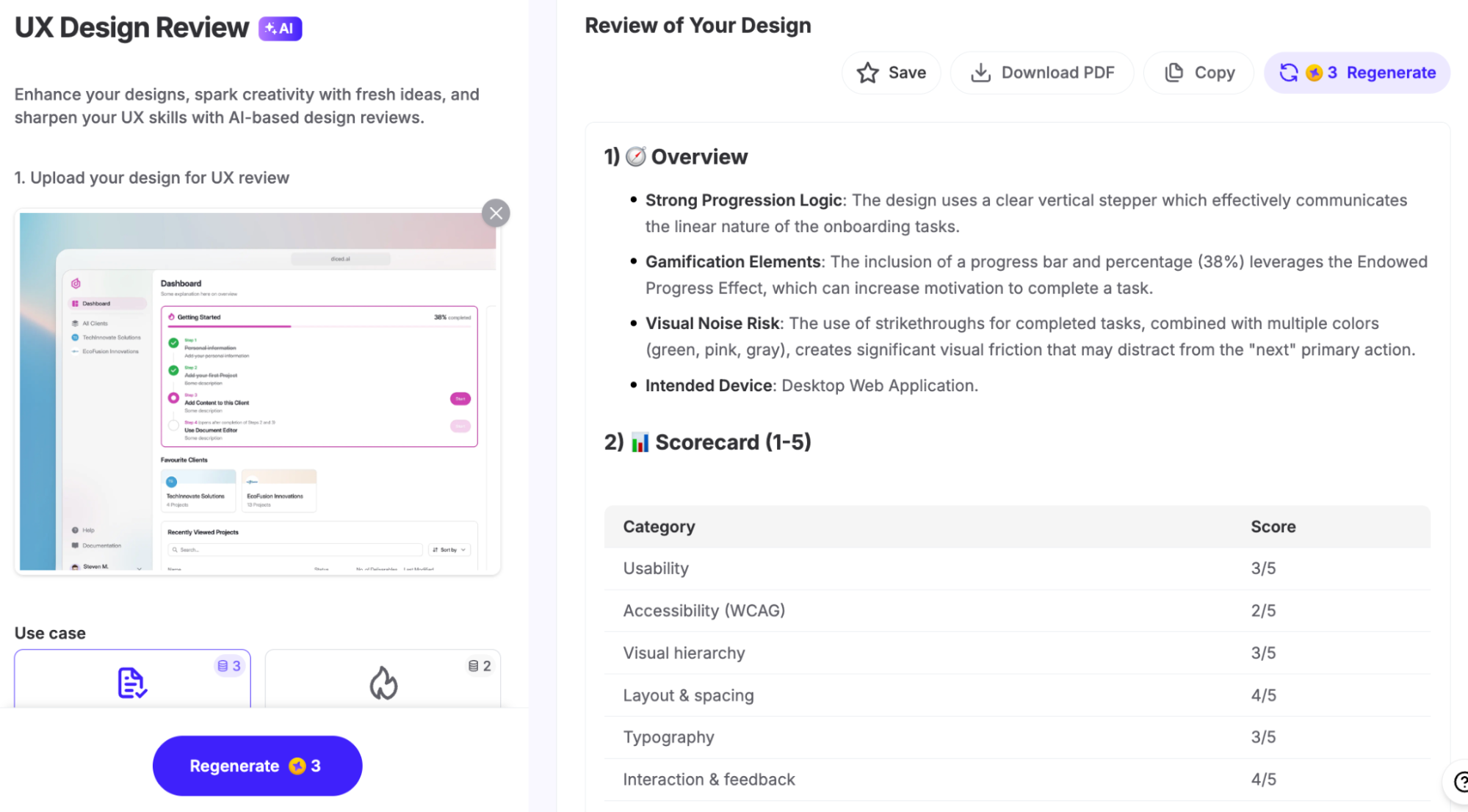
It also gave:
A scorecard across usability, accessibility, and visual hierarchy
Key issues with severity (so you know what to fix first)
Quick recommendations you can act on immediately
A predictive heatmap showcasing where users are more likely to click
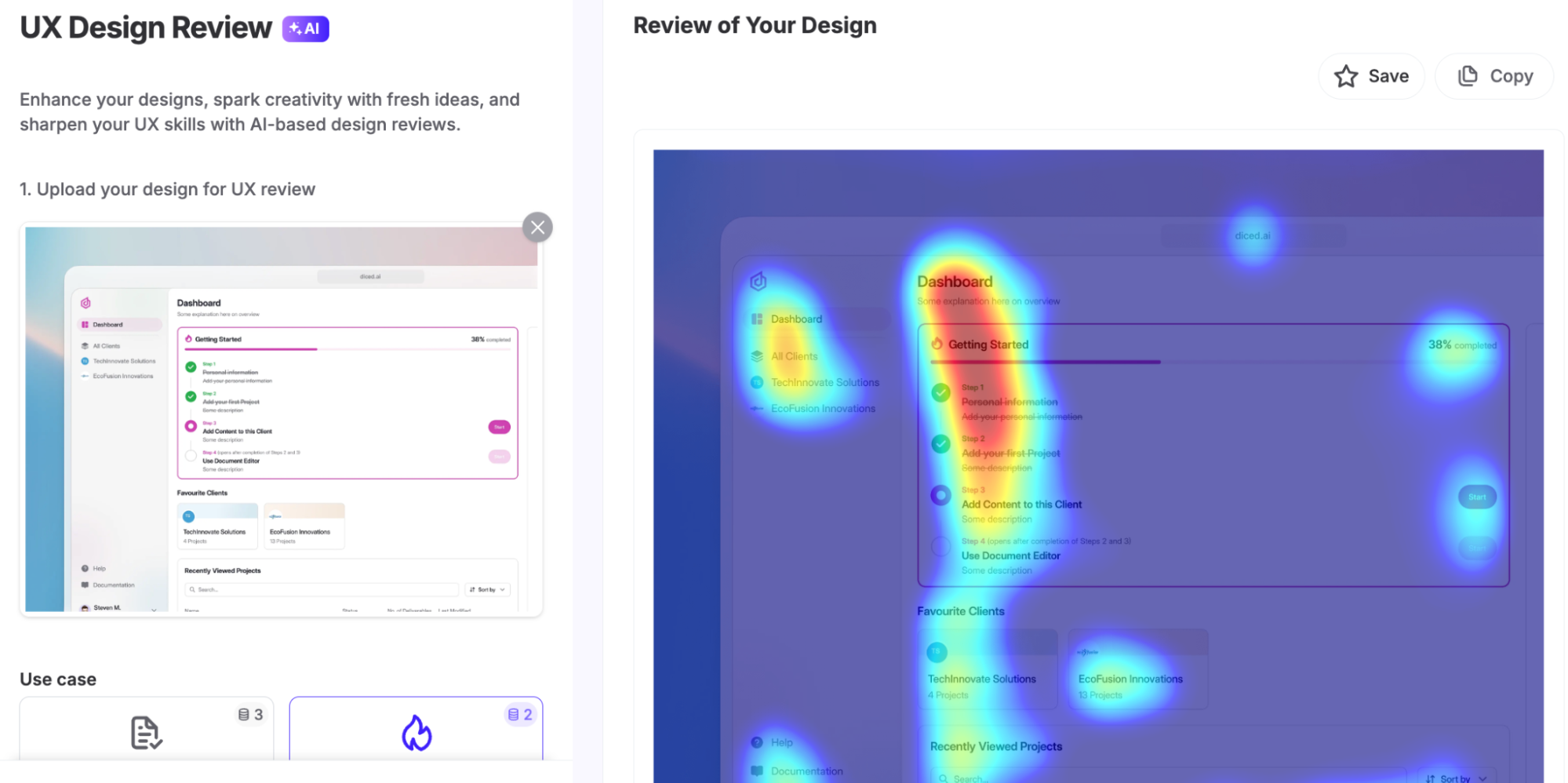
It’s not a complete replacement for full usability testing or customer feedback, but it’s a fast way to catch obvious gaps before they affect real users, which makes iteration much faster.
Because once you identify drop-offs, the next step is iteration.
Users who adopt 3+ core features show up to 70% higher retention compared to those who don’t. So your onboarding strategy should focus on driving meaningful product adoption, not just step completion.
For example, HubSpot defined activation as a very specific action: sending a tracked email within 7 days. Their data showed users who did this were 20% more likely to explore other features.
Instead of optimizing everything, they focused on that one moment.
They ran a 30-day experiment, simplifying an 11-step onboarding flow to prioritize that action—and measured the impact on activation.
That’s what effective iteration looks like:
Define the activation event
Measure against it
Remove what doesn’t contribute
Test again
Onboarding isn’t a one-time setup. Review your onboarding metrics regularly, make small improvements, and redesign when needed.
A simple check:
If users who complete onboarding have 2x better retention → it’s working
If there’s no difference → something in the flow isn’t adding value
That’s the difference between an onboarding flow that looks complete and one that actually drives user activation and long-term customer retention.
Start building a product onboarding flow that actually retains
Most teams treat onboarding like something to layer on after the product is built.
But product onboarding isn’t a feature—it’s the highest-leverage part of your product that directly impacts whether users stay or leave.
It accounts for 30–50% of churn variance, and even a 1% increase in activation rate can drive roughly 2% lower churn.
Everything covered in this guide—from reducing friction in the signup process to improving user engagement with walkthroughs, personalization, and multi-channel messaging—works together as a system.
And it’s not a one-time setup. Effective onboarding is a continuous loop that involves:
Defining the value moment
Removing friction from the onboarding flow
Personalizing the experience for different users
Measure success based on what actually drives user retention
Iterating based on real user activity, customer needs, and product analytics
Ultimately, it all boils down to defining your product’s aha moment and mapping the critical path to it.
That one step will clarify everything else—what to show users, what to skip, how to guide users, and which onboarding metrics actually matter.
Because once you know how users reach value, building a successful product onboarding experience becomes a lot more straightforward.