9 Design System Examples to Level Up Your Design Workflow

Horea Matei
Created on Jun 16, 2026
Design systems are handy when scaling products: consistency is a big pain point here, because lacking a proper design system means design teams likely need to redesign the same buttons, navigation patterns, and forms manually for each new project — which may or may not end up following the same design language as before.
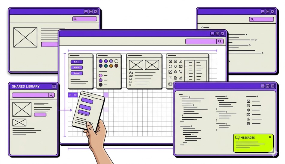
Design systems fix this issue. They provide all the resources needed to help design teams maintain consistency across multiple projects: brand style guides, reusable component libraries, implementation guides, and more.
Still, design systems are quite complex. In this article, I'll walk you through all the elements that make up a good one and show nine real examples covering various use cases: from design systems applied in enterprise environments to those in smaller, product-led teams.
What is a design system?
A design system is a collection of standardized design and development resources that aim to optimize design processes for maximum consistency and efficiency. A design system centralizes assets and documentation from across the design process to act as the single source of truth for designers and developers, and help speed up their workflows.
As such, design systems are sets of pre-defined design and development resources that often include elements like:
-
Reusable components
-
Brand style guides
-
Pattern libraries
-
Code snippets
-
Design tokens
Design systems act as building blocks to speed up design and development processes and deliver digital products at scale. Here's how Adham Dhanaway, author of "Practical UX," puts it:
"A design system is like a box of LEGO bricks for digital products. Just as LEGO bricks come in different shapes, sizes, and colours that you can snap together to build anything you can imagine, a design system provides a set of pre-made components, like buttons, icons, and form inputs, that you can combine to create consistent and cohesive user interfaces."
Rather than building new UIs completely from scratch, design systems include ready-made components (forms, buttons) and implementation docs (brand guidelines, pattern libraries, design tokens). These help design and development teams mix and match design components and tailor them to each particular project.
Important note: A design system is not an individual design document (like a brand style guide). It's a collection of resources that covers elements across the entire design and development processes, along with instructions on implementing the principles, processes, and governance to unify them.
For example, design teams may use separate documents, including:
-
Brand style guides to cover brand and visual language across UI elements
-
A pattern library to store reusable UI patterns and usage guidance
-
A component library to store coded UI elements for speedy implementation
A design system merges all the above-mentioned documents into a unified resource, plus implementation guidelines.
Key elements of a design system
A solid design system includes the following core components:
-
Design tokens: Stores color, spacing, typography, border radius, and motion values under easily readable labels. To illustrate, you can call the HEX Code "#FFE135," "Banana Yellow." Design tokens also let teams update a single value; changes will apply to all corresponding components and platforms.
-
Component library: Reusable, coded UI elements (buttons, input fields, data tables, modals, etc.) with defined variants, states, and accessibility built in. They usually include both design components (for Figma) and coded components (for React, Angular, etc.)
-
Design guidelines and principles: Includes the rules that govern how components should be used, combined, and customized. Covers elements like visual hierarchy, spacing rules, color usage, and content tone.
-
Patterns: Larger, multi-component solutions for common UX flows (logins, onboarding sequences, data filtering, empty states, error handling). Patterns go beyond individual components to address complete user tasks.
-
Documentation: The how-to layer that makes everything else usable: usage examples, do/don't comparisons, code snippets, accessibility notes, and integration guides.
-
Governance and contribution model: Encompasses the process for proposing changes, reviewing additions, versioning, and maintaining the system over time. Without governance, a design system stagnates.
It's worth noting that you shouldn't treat design systems as static documents. Design systems are full projects that require ongoing maintenance, dedicated ownership, and iteration, just like any other product teams ship.
Benefits of creating a design system
Well-crafted design systems improve deliverable quality and significantly accelerate project completion times. Here's how:
-
Fast development: Reusable components eliminate the need to code new UI elements for each project. Dev teams create with ready-made, pre-tested building blocks.
-
Visual consistency: Ensures brand recognition and trust across screens, products, and platforms through a shared library of tokens and components that adhere to the same design language.
-
Easy onboarding: New team members adapt faster when there's a single source of truth for how the product looks, behaves, and communicates.
-
Built-in accessibility: Ensures accessibility integrates into the components themselves (WCAG-compliant focus states, contrast ratios, keyboard navigation), and automatically transfers to future features using said components.
-
Reduced design debt: Standardized design principles, processes, and components mean that you minimize hiccups that may get expensive to fix later down the road (e.g., realizing a project is not WCAG-compliant after completion).
-
Cross-team collaboration: Reduces handoff friction or miscommunication by ensuring designers, developers, and product managers work from the same playbook.
Case in point, Sparkbox conducted a study where eight developers coded a contact form from scratch and then used IBM's Carbon design system to compare productivity and output quality. The Carbon design system sped up project completion by 47% and significantly improved code accessibility and visual consistency.
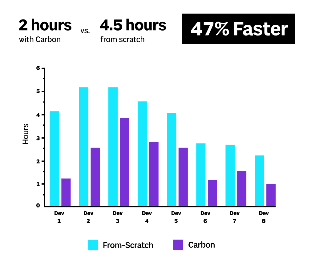
Of course, that means the Carbon design system would also noticeably decrease design and development costs in real-world scenarios.
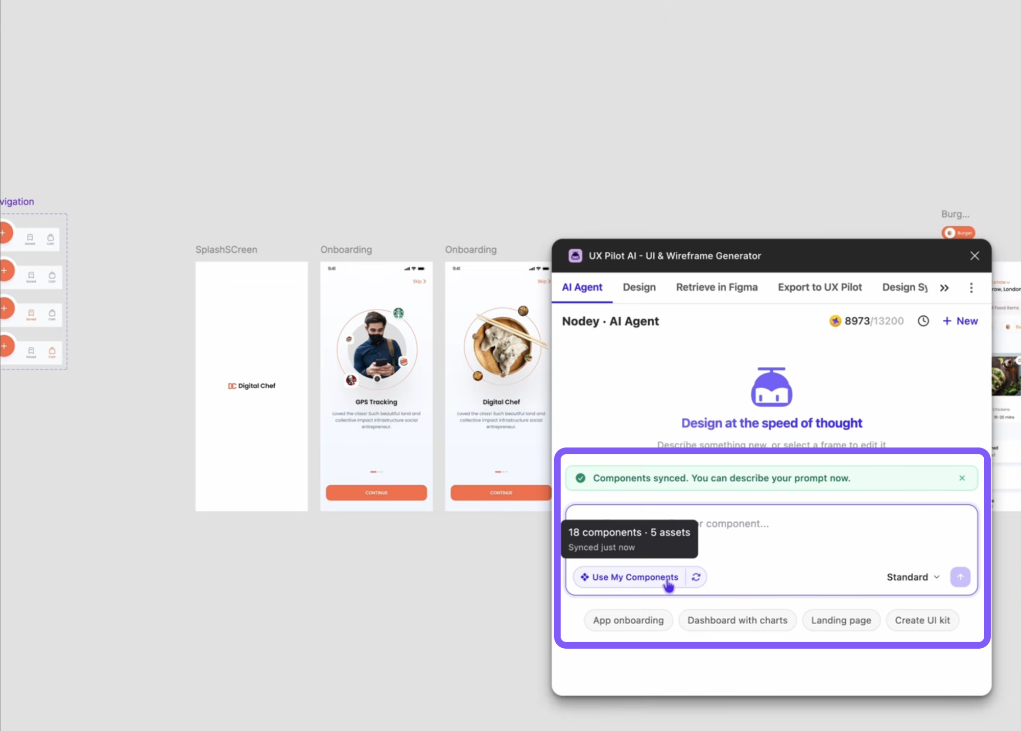
AI design tools like UXPilot add to a design system’s benefits by further speeding up workflows.
Teams can import their existing design system to UXPilot and have the platform generate new component variations or adapt reusable components to particular projects through text prompts.
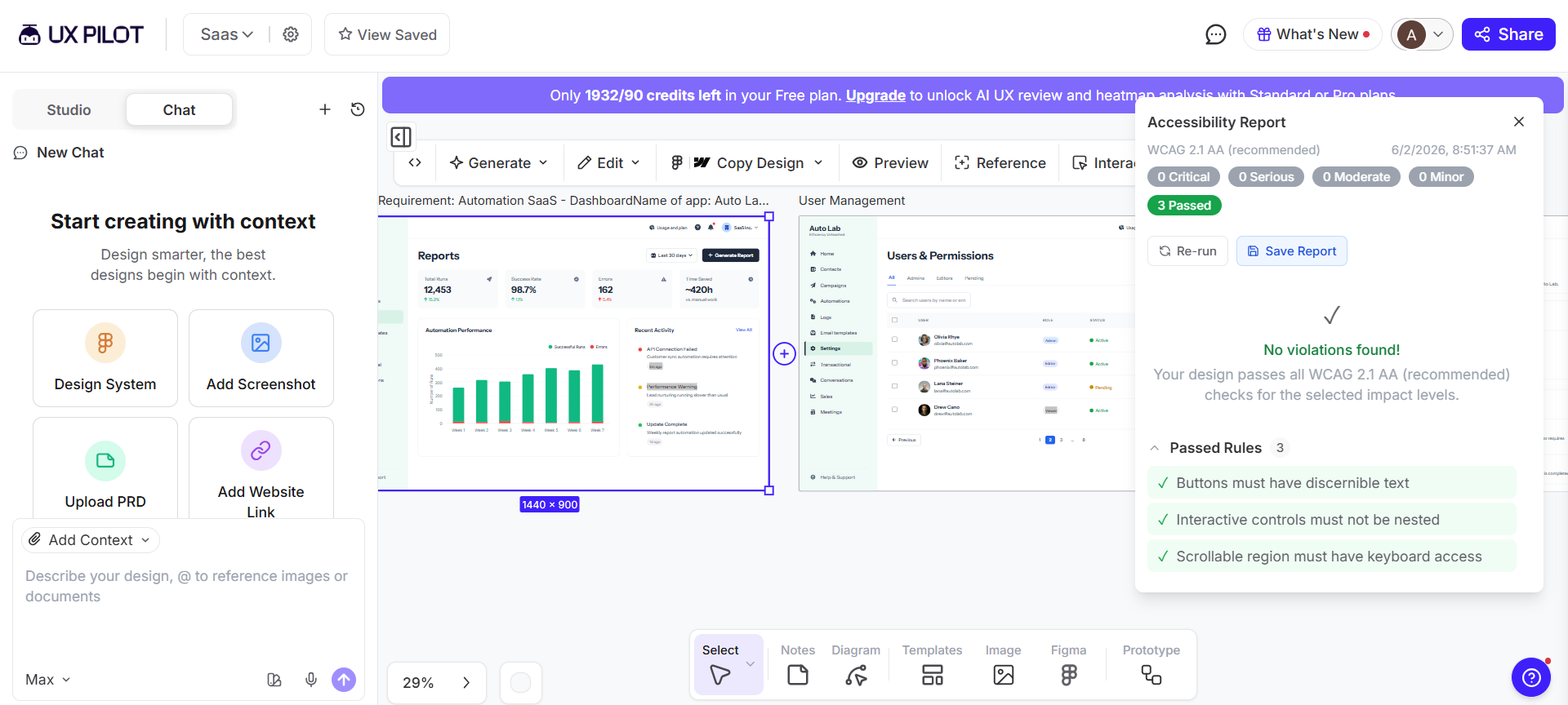
Plus, UXPilot’s Accessibility Review feature ensures accessibility best practices are naturally embedded into a design team’s workflows: it automatically examines and adapts design components and screen layouts to comply with WCAG 2.1 accessibility standards.
9 design system examples to learn from
This section walks you through a few real-life examples that successfully apply all the key design system elements mentioned above. You’ll see nine examples from different industries. I'll point out what each design system does right and what you can learn from it.
Enterprise design systems that set the standard
The following examples cover purpose-built systems for large-scale organizations. These prioritize governance, scalability, and cross-platform consistency to facilitate workflows where hundreds of people contribute work across multiple products.
IBM Carbon: open-source benchmark for enterprise design systems
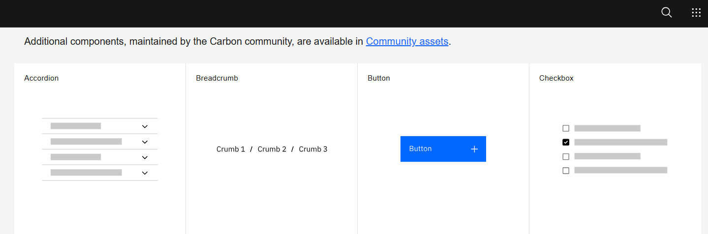
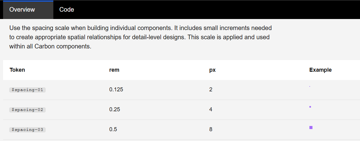
Carbon is IBM's open-source design system. The system facilitates product design workflows across IBM's entire portfolio and primarily stands out through in-depth documentation.
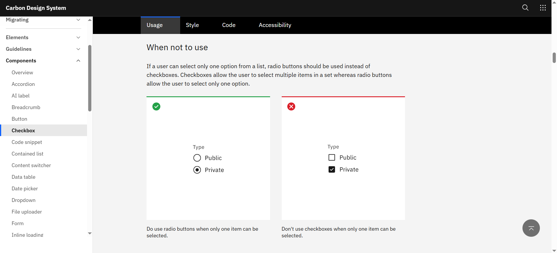
Carbon includes guidelines covering each aspect of the design process: from component-level do's and don'ts to UI pattern implementation guides, code snippets, accessibility rules, and more. This approach ensures teams make the right design decision across entire workflows.
Here's what else Carbon does right:
-
Includes excellent data visualization guidelines for charts covering everything from chart types down to when to add breaks in axes, and more.
-
Has a simple yet versatile layering model indicating depth with colors, not shadows. Layers alternate between white and gray (in light mode), or progressively get lighter (in dark mode). This approach makes it suitable for UIs that need ample layering sets.
-
It's framework-agnostic with React, Angular, Vue, Svelte, and Web Components support, plus a community contribution model via GitHub.
All these factors combined significantly boost team productivity and help design products optimized for success. Case in point, IBM.com's Commerce Platform team used Carbon to refresh side-wide design assets. The results? A 5% conversion rate boost.
What to learn from Carbon: Carbon goes to show how guidance and documentation minimize friction and help deliver successful products.
Atlassian Design System: consistency across a multi-product ecosystem
Platforms like Trello, Jira, Confluence, and Bitbucket are all powered by the Atlassian Design System. These products are used by millions, often interchangeably. Atlassian's system facilitates consistency to ensure users experience little to no friction as they transition between products.
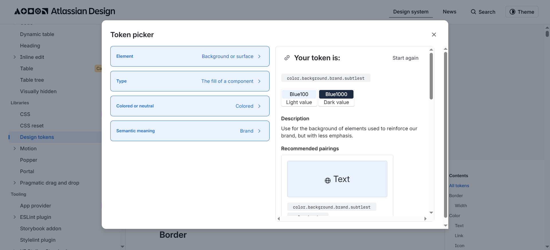
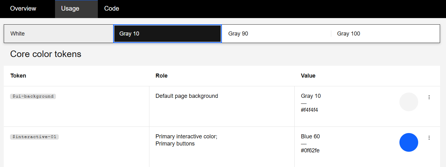
The system helps provide consistent experiences through its huge library of design tokens: it even includes a built-in token picker to help teams find the appropriate color palettes based on their needs (like text, background, or shadow, or data visualization color schemes).
The Atlassian Design System also includes the following best practices:
-
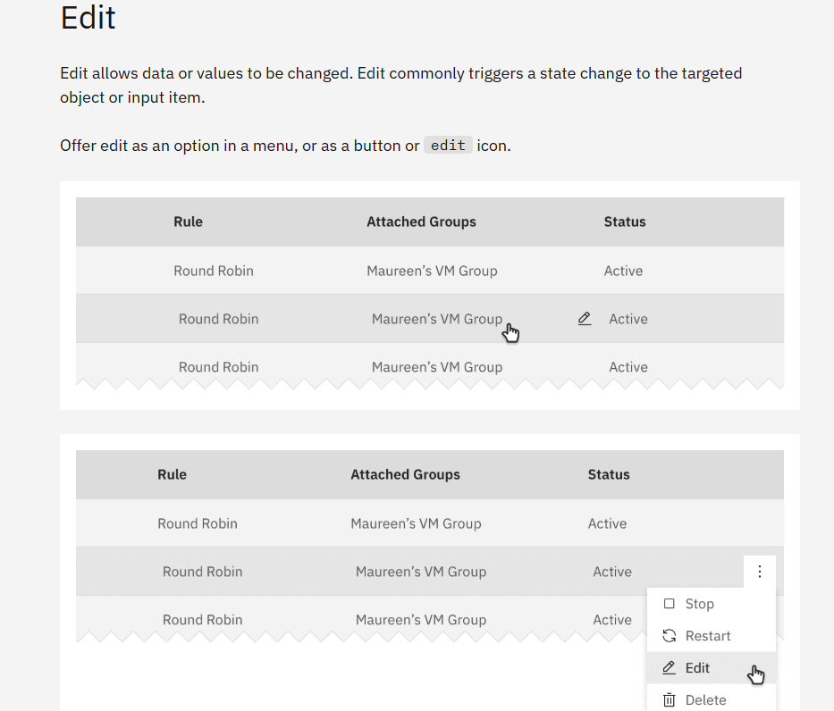
Status update labels to design sections to signal outdated ("deprecated" ), work-in-progress ("beta" and "early access"), and near-end-of-shelf-life elements ("caution"). It lets teams know which elements they should or shouldn't use.
-
A dedicated content section with detailed guidance on style, grammar, punctuation, tone of voice, plus visual representations for different message types (error states, feature discovery). It helps UX writers maintain consistent messaging across all Atlassian products.
-
The design system is organized under two key sections covering Foundation (everything that involves visual guidelines) and Component (the reusable component libraries) for easy navigation.
These principles allow Atlassian design teams to simultaneously build and maintain multiple digital products at scale with little to no compromise in productivity or user experience.
What to learn from Atlassian: Atlassian shows how user-friendly experiences and clear instructions are just as important for designers when creating products as for the end-user when browsing the said products.
Salesforce Lightning Design System: scalable UI for complex enterprise platforms
Salesforce Lightning Design System(SLDS) is the world's first open-source enterprise design system, built specifically for enterprise-level products. SLDS was originally released in 2015 and has continuously evolved ever since, reaching its second iteration a decade later.
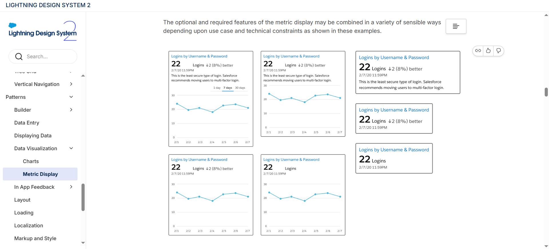
The system includes specialized components for data-heavy apps (KPI banners, bubble maps, metric overlays), plus UI patterns for enterprise workflows, like complex data entry and in-context search, for example.
Some other Salesforce Lightning Design System standouts include:
-
A detailed accessibility section with guidelines around text and color contrasts, mobile design, keyboard navigation, global focus orders, and general accessibility standards — each under its own sub-section. It helps users build complex applications, yet still ensures top-notch usability.
-
A massive reusable components library with interactive examples covering vertical navigation for side-menus, tree grids for data tables, and breadcrumbs for easy navigation in complex layouts.
-
Uses HTML blueprints over fully-functional components for full framework agnosticity. This approach makes it compatible with most tech stacks (Lightning Web Components, Aura, Visualforce, React, or vanilla JavaScript).
In other words, Salesforce's cross-framework approach, coupled with its emphasis on data visualization, accessibility, and an ample set of design components, created a complex enterprise-specific design system that's still easy to use and scale.
What to learn from SLDS: Framework agnosticism and ample component libraries are important for developing a design system that's easy to scale and has the ability to serve both internal teams and external developer communities.
Product design systems built for real-world use
The following design systems are specifically built to serve product ecosystems with specific audiences: merchants, news readers, riders, and drivers. They optimize for specific use cases and workflows rather than universal enterprise coverage.
Polaris Web Components: designed for merchants, adopted by a global ecosystem
Polaris Web Components is the latest iteration of Shopify's design system. Released in 2025, the new design systems replaced the previous React-based Shopify Polaris with a Web Components-oriented system. The idea behind the shift was to make the new design system faster, smaller, and framework-agnostic.
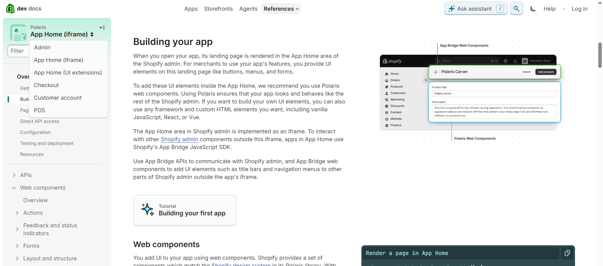
The new design system also merges Admin, Customer, and Checkout UI kits to help teams create consistent experiences across entire buyer journeys: from homepages to checkouts, customer profile pages, subscription management UIs, and more.
Plus, Polaris Web Components includes:
-
Accessibility features are built directly into all available UI components, so designers and developers have one less thing to worry about.
-
Local testing protocols to ensure designs are polished and error-free before deployment.
-
A detailed UI component library with each component category split under Properties (code snippets and accessibility guides), Examples (side-by-side illustrations of mockup UI and code fragments), and Best Practices (implementation tips).
The new design system retained most positive aspects of the old one (like built-in accessibility and an ample UI component selection), but also managed to make up for some of Shopify Polaris's biggest drawbacks: React dependency and disjointed workflows between Admin, Customer, and Checkout UI kits.
What to learn from Polaris Web Components: A design system is not a static document: it requires constant updates and occasional rehauls to maintain relevance — just like any other product.
The Guardian Source: where brand identity meets system consistency
Source is The Guardian's design system. Most systems aim for visual neutrality or a dedicated brand guidelines section, but the Guardian consistently implements branded assets and true-to-life examples throughout its entire design system.
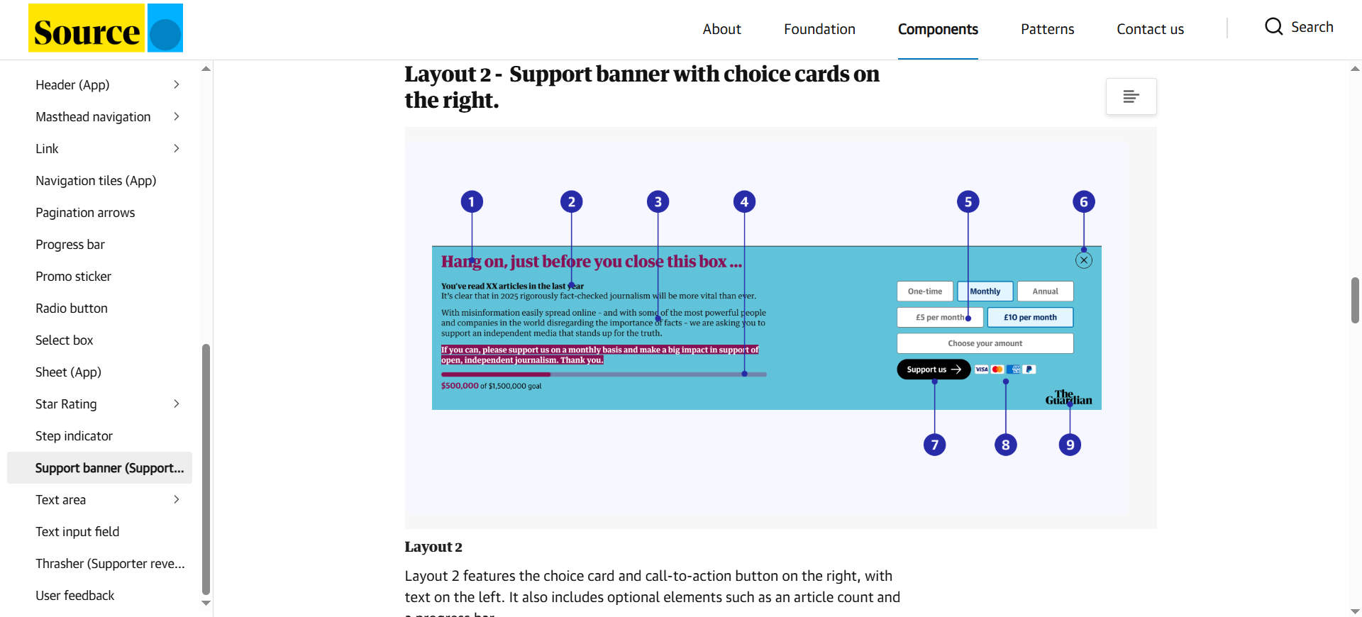
This approach helps designers better visualize how each component plays into the website's overall layout and ensures they iterate on the system with The Guardian's brand identity in mind during the entire design process.
Here are a few other noteworthy practices Source implements:
-
Includes separate web and app guidelines to clearly establish the differences between the two layouts across components and typography.
-
Detailed color scheme guideline, including different color palettes based on UX scenarios (error/success messages) and content type (special report, breaking news, etc).
-
Links to Figma templates and cheat sheets for quick on-hand guidance whenever needed.
Source is also a very focused design system. The Guardian doesn't include numerous products to adapt designs for, so they doubled down on design system specificity to speed up projects even further.
What to learn from The Guardian: Design systems don't need to be brand-neutral. Implement branded assets through your system to ensure brand consistency at all times.
Uber Base Design System: modular foundation for fast-moving product teams
Uber Base stands out through its simplicity and modularity. The design system's component library works on a "base + pattern" framework.
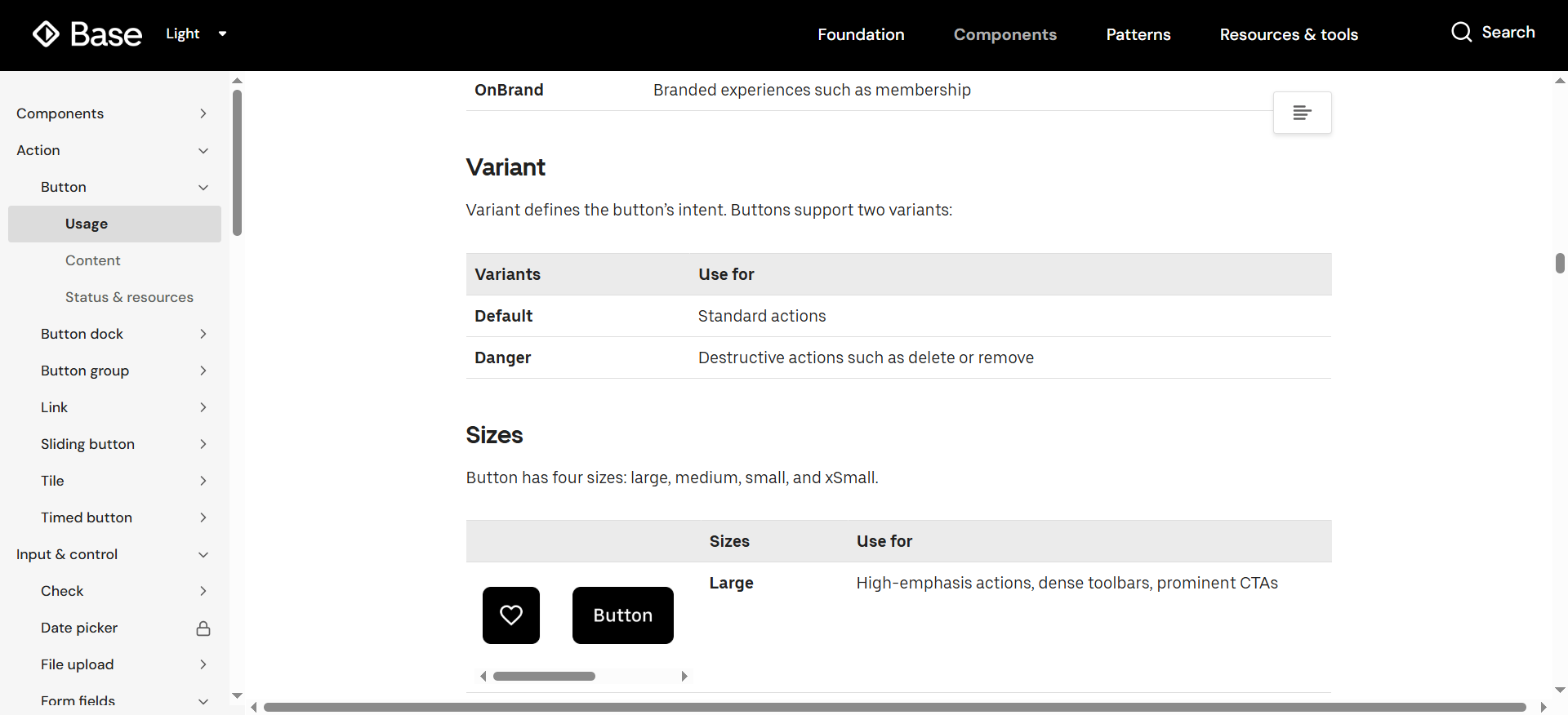
Components include a default version for standard user actions tapping a button for navigation), and intent-based variants for destructive actions (like deleting an account). Uber base also covers variations for component shapes, extra elements, etc. This gives designers plenty of quick customization options without risking breaking the system.
Here's what else Uber Base does correctly:
-
It's structured under four core categories: Foundation, Components, Patterns, Tools & Resources, ensuring a strong balance between variety and design system navigability.
-
It includes straightforward specs covering four core design element sizes, two layout grid types, and five icon types to ensure consistency and minimize decision paralysis.
-
Accessibility is built into each component to standardize design processes.
These factors combined allow Uber to build a unified design system framework and maintain consistency across all of its services: Uber, Uber Freight, Uber Eats.
What to learn from Uber Base: The simpler the design system is, the better the flexibility. Too many options may induce decision paralysis and cause problems consistency-wise.
Brand-led design systems with strong identity
The following examples merge brand identity and visual philosophy with functional consistency, which results in systems that help teams create designs that are both functional and adhere to their brand identity under unified workflows.
Google Material Design 3: the most widely adopted design system worldwide
Google Material Design 3 (M3) is Google's open-source design system for building across Android, iOS, Flutter, and the web. It's the most widely used design system, with a massive community and countless third-party products built on top of it.
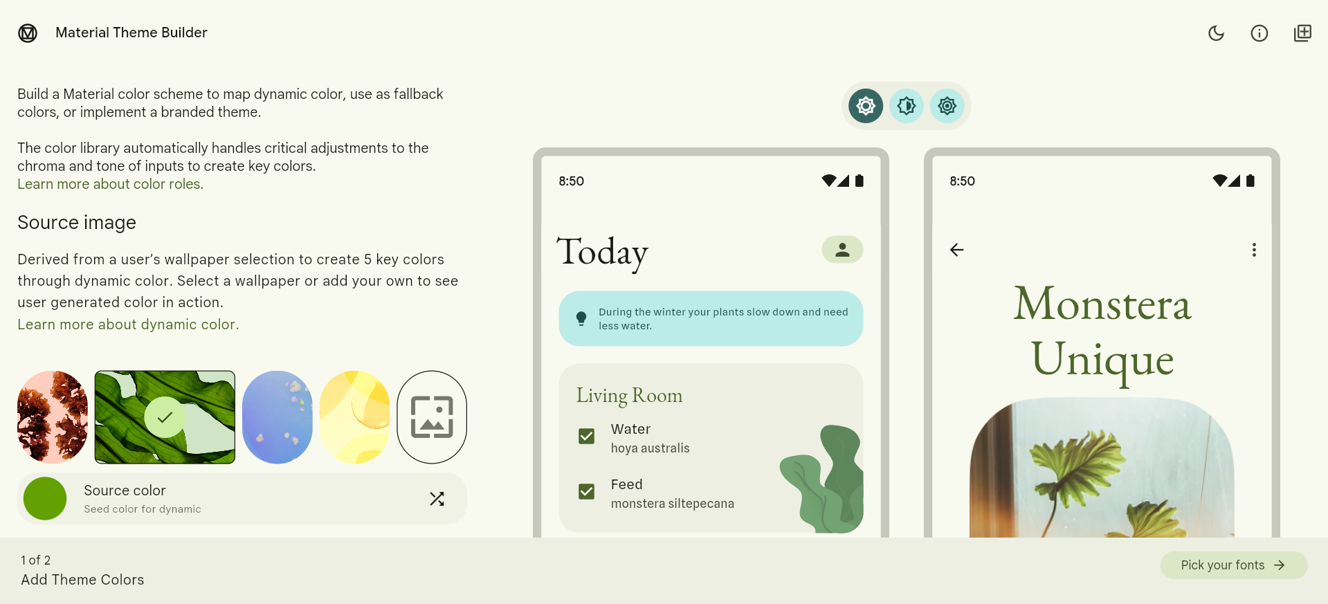
The design system stands out through its theme builder: it generates color schemes based on user wallpapers and in-app content, and lets you export and adopt them to your system for quick and easy branded visuals.
Other Google Material standouts include:
-
Built-in accessibility features and guidelines to help creators build highly usable products, with a strong emphasis on color contrast, keyboard navigation, and screen reader support.
-
Excellent component documentation quality with detailed guidelines, live examples, do/don't comparisons, and code integrations for React, Flutter, Android, and iOS for each component.
-
Uses tonal colors instead of drop shadows for easy visual hierarchy.
One of the main reasons why Google M3 grew so popular is its emphasis on lowering the design barrier to entry: its color scheme generator, built-in accessibility features, and detailed documentation help novice designers build complex projects and polish their skills.
What to learn from Material Design: This is another case of design system simplicity. Aside from flexibility and faster workflows, a system with little to no learning curve can also lead to mass adoption.
Apple Human Interface Guidelines: consistency across Apple products and top-notch documentation
Apple Human Interface Guidelines (HIG) is a design system centered around the entire Apple ecosystem: from iPhone and Mac devices to Apple Vision Pro, Apple Watch, and more.
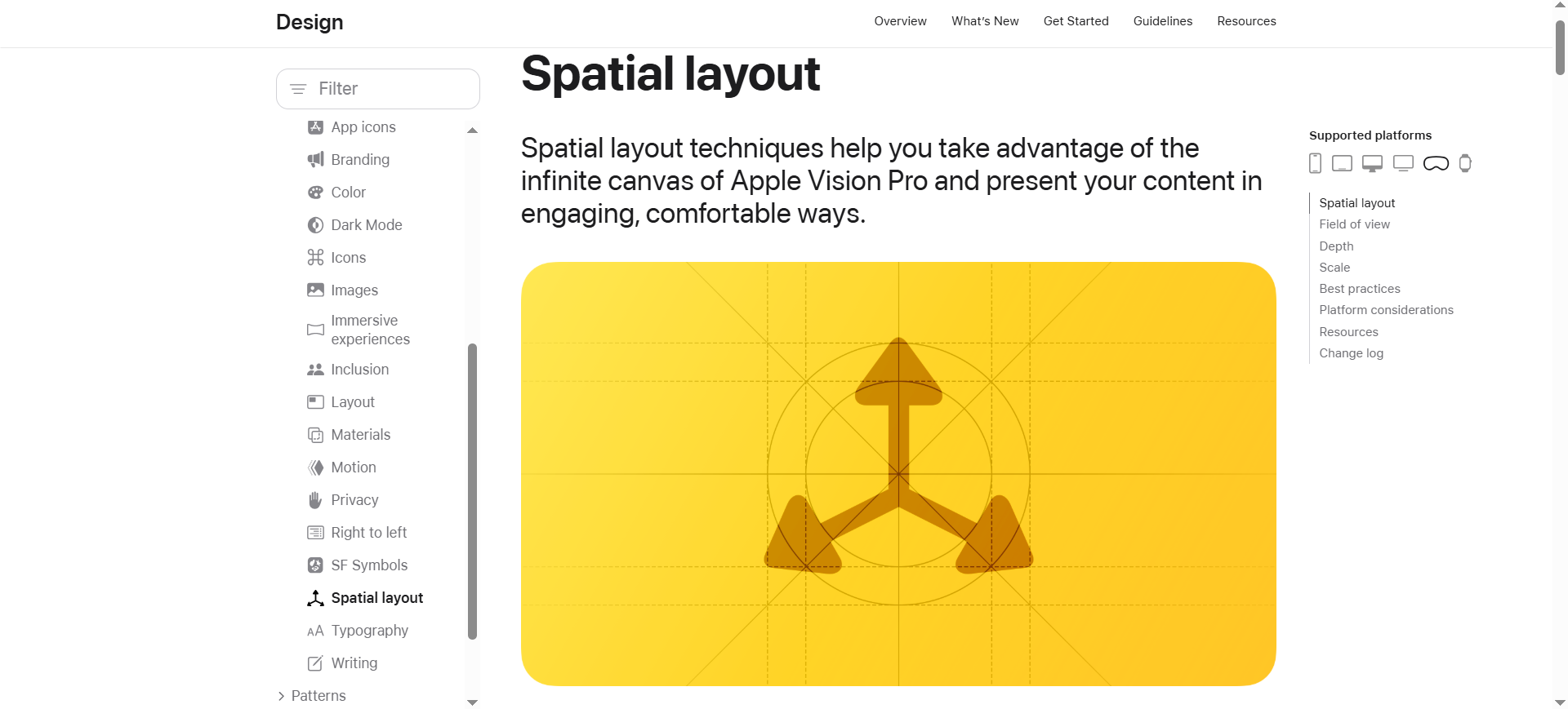
The design system stands out through its detailed documentation and guidelines. They cover best practices for designing products around each particular Apple device, like how to leverage spatial layouts to display content for the Apple Vision Pro, for example.
Here's how else Apple HIG helps product teams:
-
Showcases the Apple tech stack to give a better idea of the type of Apple features and services you can embed into your product.
-
Includes device-specific accessibility guidelines covering text and button size, and user input methods (speech, keyboard, touch, etc.) for each Apple product.
-
Receives regular updates after each major OS release to ensure products are always optimized for the latest requirements.
Apple's emphasis on documentation ensures that each new product or app fully aligns with the company's core vision.
What to learn from Apple: Cross-device consistency ensures that designers and product managers build experienced fully-optimized for different viewports, which can help avoid any potential costly mistakes further down the road.
Adobe Spectrum: a design system that doubles as an education platform
Adobe Spectrum is perfect for beginners. Its guidelines are so detailed yet easy to understand, they practically double as mini UI design courses on their own.
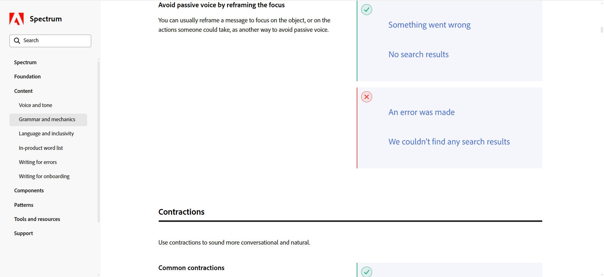
These cover everything from how to use passive voice and contractions in copywriting to adding micro and macro animations for motion effects. The entire design system packs screenshots and illustrations for visual aid.
Adobe Spectrum also improves workflows through:
-
Scaling up component and typography sizes on mobile to account for screen tap navigation.
-
Downloadable UI kits and links to code repositories across each design system category for access to extra resources and faster implementation.
-
CSS, React, and Web Components support for framework agnosticity.
The system's focus on clear guidelines helps Adobe maintain consistency across the company's huge product suite, despite having tools for vastly different use cases (like photo editing, document management, and so on).
What to learn from Spectrum: A design system can also serve as an educational resource, especially handy for companies with novice design teams or large influxes of new employees.
Build and scale your design system with UXPilot
Each design system example above acts as the single source of truth for its company's design workflows. It includes massive component and pattern libraries, tailored usage guidelines around each design-related task, practical examples, and more.
In other words, setting up and maintaining your own design system is quite the undertaking. Of course, you can build one from scratch, but that will require significant time and financial investments. That's where AI design agents like UXPilot's Nodey come in.
Nodey is a Figma-native AI assistant that generates and edits components, assets, UI kits, and complete multi-screen layouts using your existing Figma files. That means the platform lets you:
-
Take components from existing Figma projects
-
Develop on them to set up a component library with a few prompts
-
Mix and match components to create UI kits and UX flows for your pattern library
-
Generate styling and brand artifacts
UXPilot then applies all assets to your future projects, ensuring consistency across all designs. Plus, its native Accessibility Review feature spots and addresses any potential issues based on WCAG 2.1 guidelines, so all your design elements are optimized for accessibility from the get-go.
Alternatively, you can opt for UXPilot's Design System as a Service offering. UXPilot's team offers the support needed to set up or migrate your design system onto the platform, while its AI features maintain design consistency across all future projects.