UX PIN
UXPin Head to Head Comparison of Features, Alternatives and Pricing
No credit card needed80 daily credits
At a glance: UX Pilot vs UXPin feature comparisons
| Compare Features |  |  |
|---|---|---|
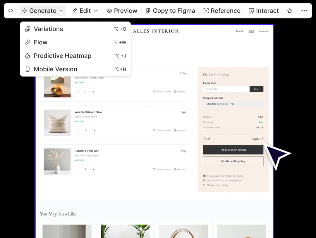
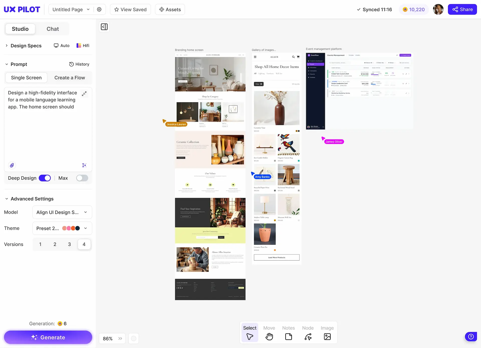
| AI design approach | AI-native | AI-assisted |
| Prompt adherence | Full | Partial |
| Output quality | Production-ready | Prototype-level |
| Screen generation speed | 12 seconds in Blitz mode | >1 minute |
| Multi-screen flow generation | Advanced | Limited |
| Design from references | High-fidelity interpretation | Inconsistent results |
| Interactive prototypes | Clickable out of the box | Requires manual wiring |
| Predictive heatmaps | ||
| Design variations | Limited | |
| Natural language editing | Advanced | Basic |
| Learning curve | Minimal | Steep |
| Best suited for | Ideation to production | Design system refinement |
| Pricing (paid plans) | $14/month (Standard) | $29/month (Core) |
| AI credits included | 420 | 200 |
| Custom integration | Teams plan | Enterprise only |
| Seats and roles management | Teams plan | Enterprise only |
UX Pilot vs UXPin: Design Output Comparison
Comparing the same prompt in both tools.
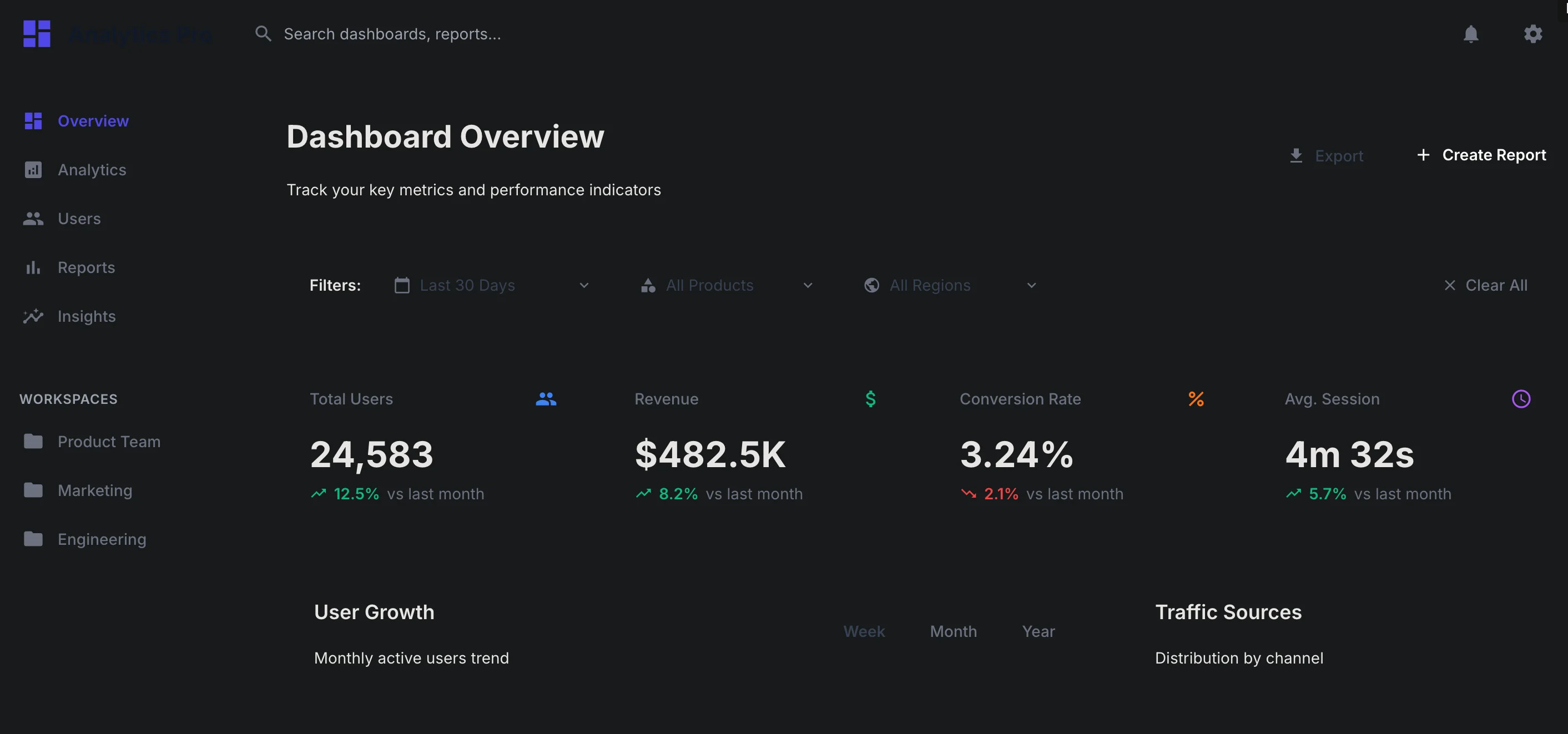
PROMPT 1: Desktop Wireframe for a SaaS Analytics dashboard for product managers“Create a desktop wireframe for a SaaS analytics dashboard used by product managers. Include top navigation, sidebar, KPI cards, charts, filters, and a data table. Layout should be component-based, scalable, and suitable for a shared design system and developer handoff.“ | 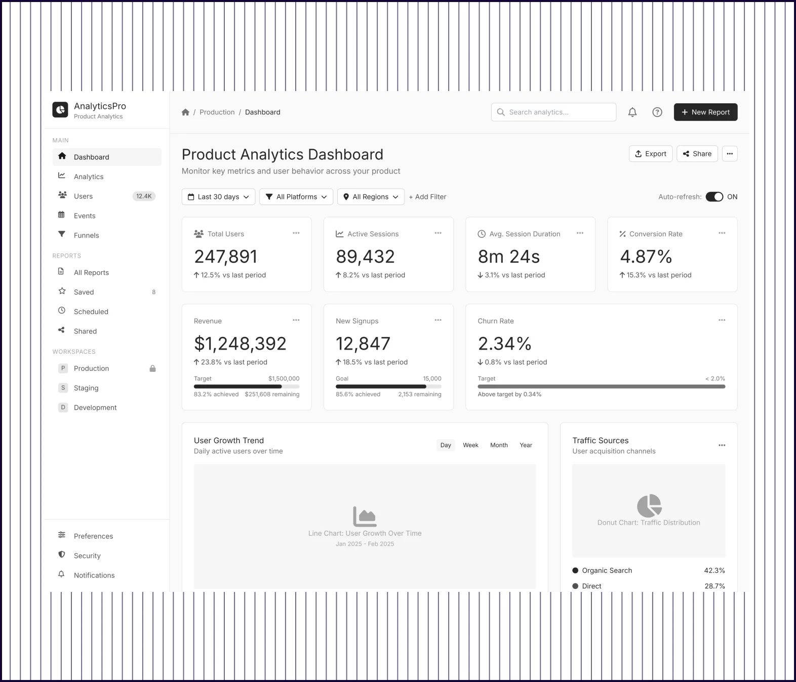 | 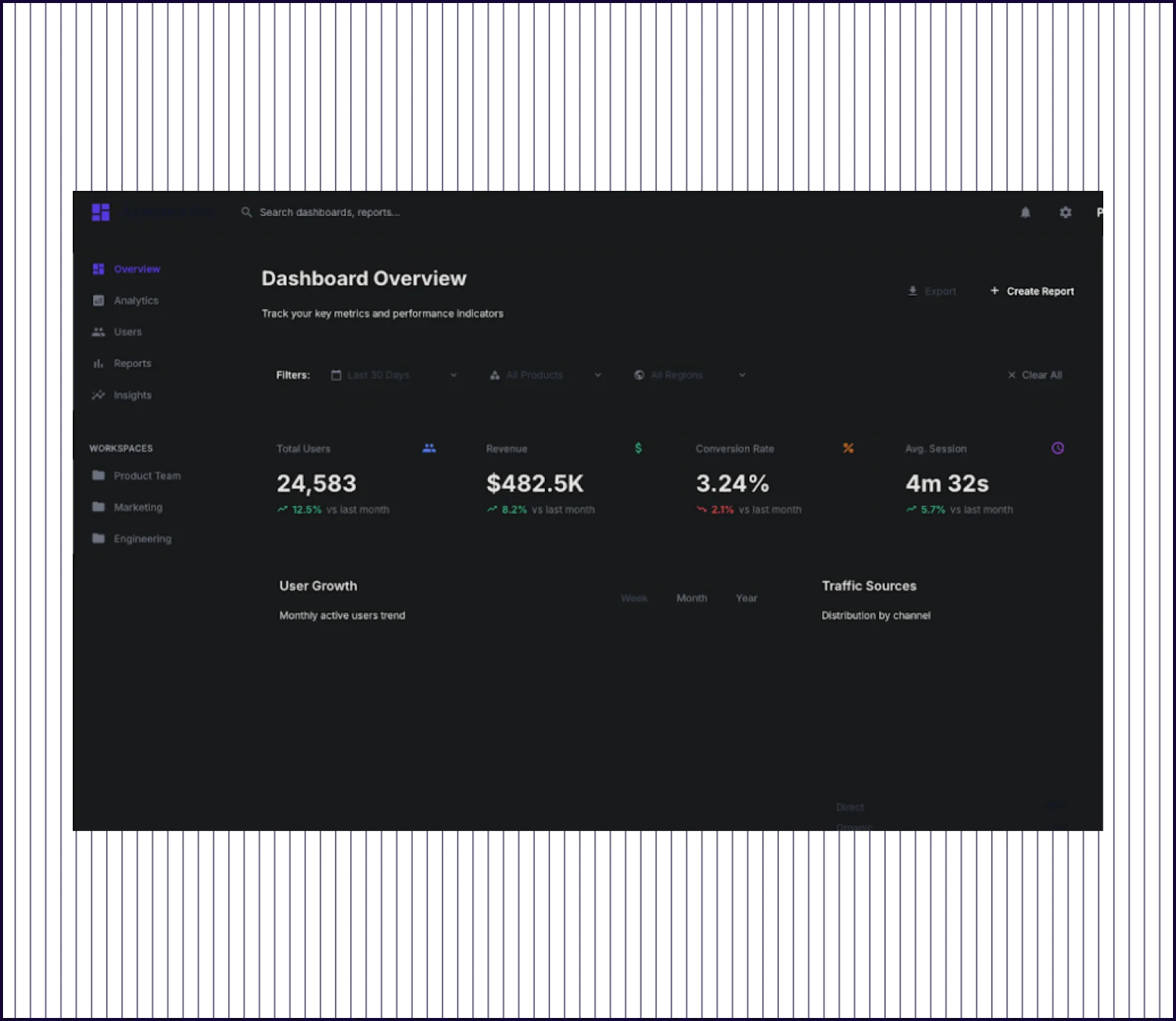 |
|---|---|---|
| Design quality | Polished high-fidelity interface with sidebar nav, modern components, and visual depth | Basic wireframe-style layout with simple cards and minimal styling |
| Data Visualization | Multiple chart types, funnel visualization, geographic map, and cohort retention tables | Two basic charts (line and pie) with simple percentage breakdowns |
| Feature Complexity | Includes advanced filters, export options, activity log with search, and AI recommendations | Shows metrics but offers no filters, actions, or drill-down paths |
| Launch Readiness | Production-ready and polished enough to present to stakeholders or use as a functional spec | Wireframe-level and useful for planning, needs significant design work |
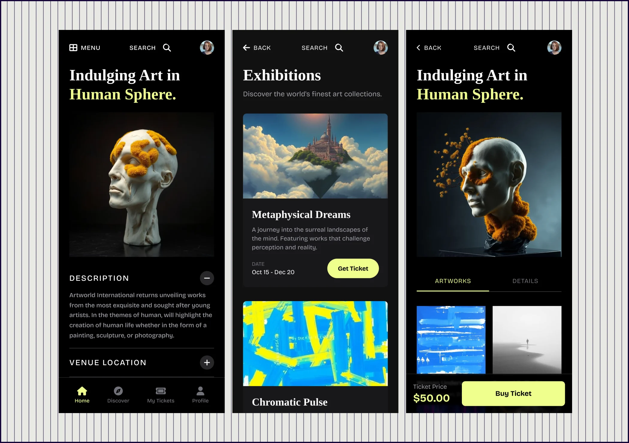
PROMPT 2: Enterprise mobile app task approval flow“Design a mobile approval flow for a B2B productivity app used by managers. Include task request list, task detail screen, approve/reject actions, confirmation state, and notification feedback. Focus on clarity, component reuse, and smooth transitions.” | 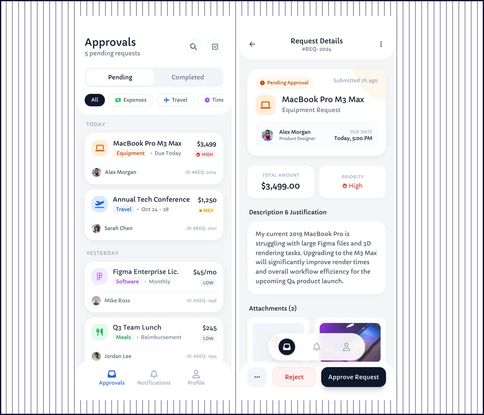 | 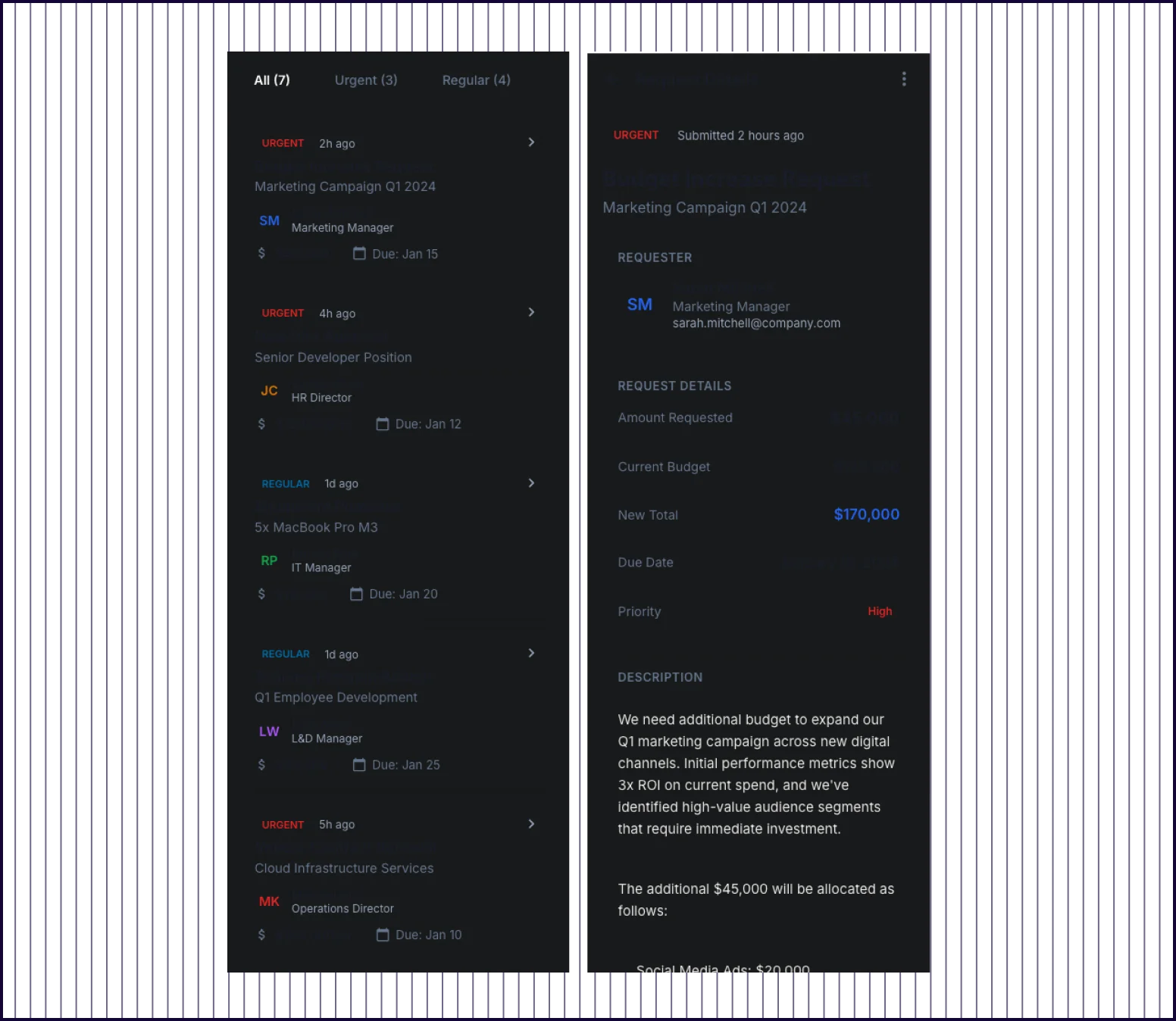 |
|---|---|---|
| Visual Hierarchy | Clear progression of list view, detail screens, action modals, and confirmations each have distinct visual treatment | Functional layout but list items, details, and modals feel similarly weighted |
| Flow Completeness | Comprehensive 10+ screen flow including onboarding, preferences, multiple request types, notifications, and settings | Covers core flow: task list, detail view, approve/reject modals, and confirmation states |
| Component Reuse | Systematic reuse of cards, buttons, status indicators, and list patterns across all screens | Consistent modal patterns for approve, reject, and confirmation screens |
| Prompt Adherence | Exceeds prompt and adds onboarding, customization, analytics, and profile settings beyond the core flow | Addresses all requested elements: list, detail, actions, confirmation, and notification feedback |
| Launch Readiness | Production-ready and complete enough to hand off to development or use as a functional specification | Basic prototype and usable for stakeholder review with polish needed |
PROMPT 3: Enterprise design system documentation UI“Create a desktop interface for internal design system documentation. Include sidebar navigation, component previews, usage guidelines, code snippets, and version notes. The layout should support scalable documentation and collaboration between design and engineering teams.” | 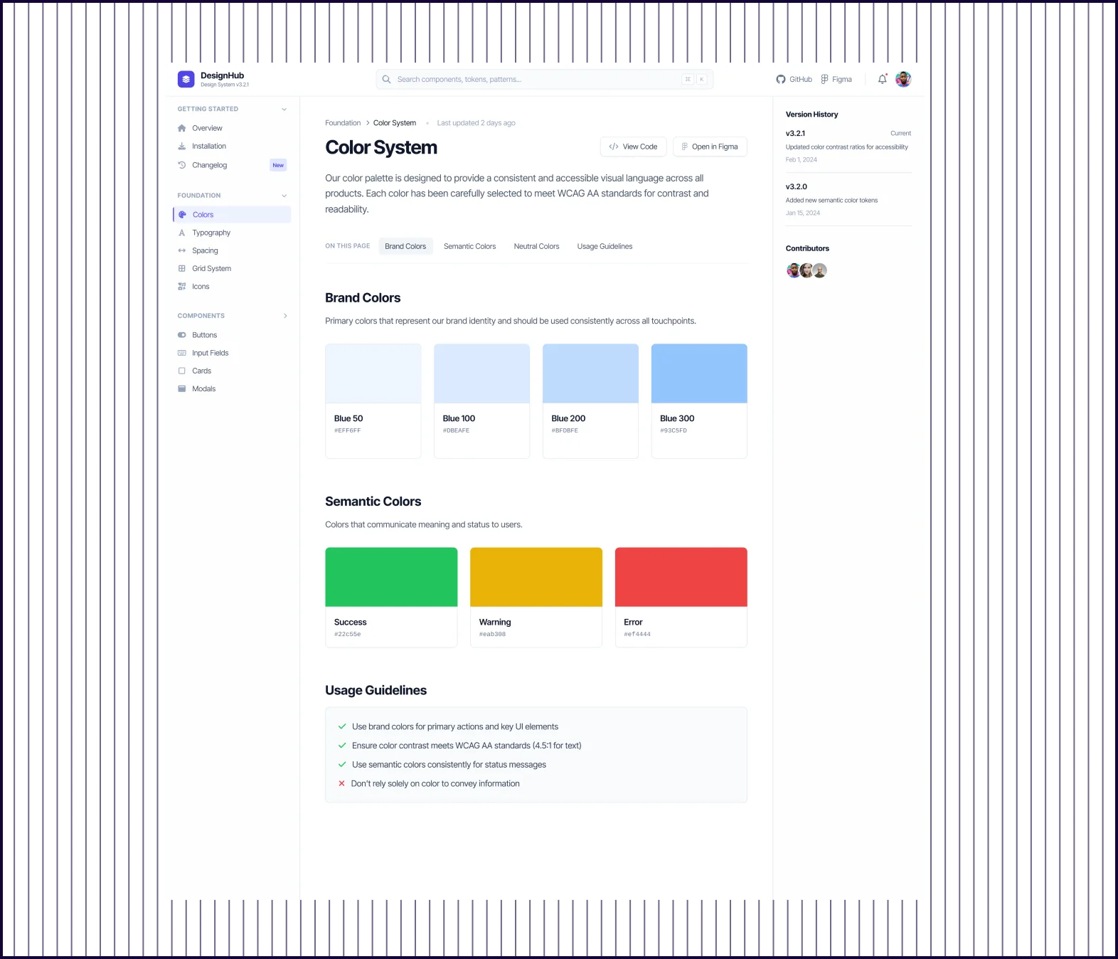 | 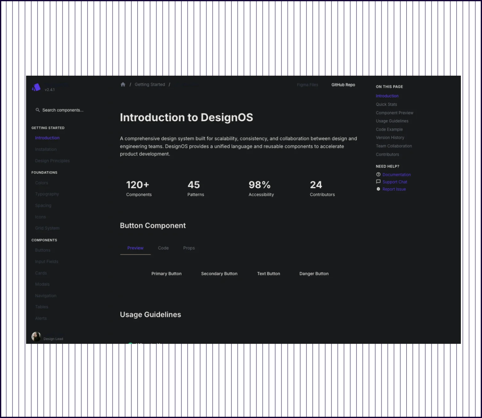 |
|---|---|---|
| Design quality | Polished light interface with color-coded sections, visual hierarchy, and modern component styling | Clean dark-themed layout with clear typography and functional sidebar navigation |
| Visual Hierarchy | Clear page organization—brand colors, semantic colors, guidelines, code, and collaboration each get dedicated treatment | Well-structured with distinct sections, but component preview area feels sparse |
| Collaboration Features | Includes contributors list, comment threads, feedback submission, and recent discussions with engagement metrics | Shows Design Lead profile at bottom with minimal team visibility |
| Prompt Adherence | Fully addresses all elements: navigation, previews, guidelines, code snippets, version history, and collaboration tools | Covers sidebar, component preview, and usage guidelines—version notes partially visible |
| Launch Readiness | Production-ready and comprehensive enough to serve as actual working documentation | Basic foundation and usable structure that needs content populated |
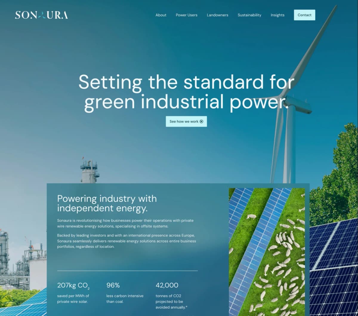
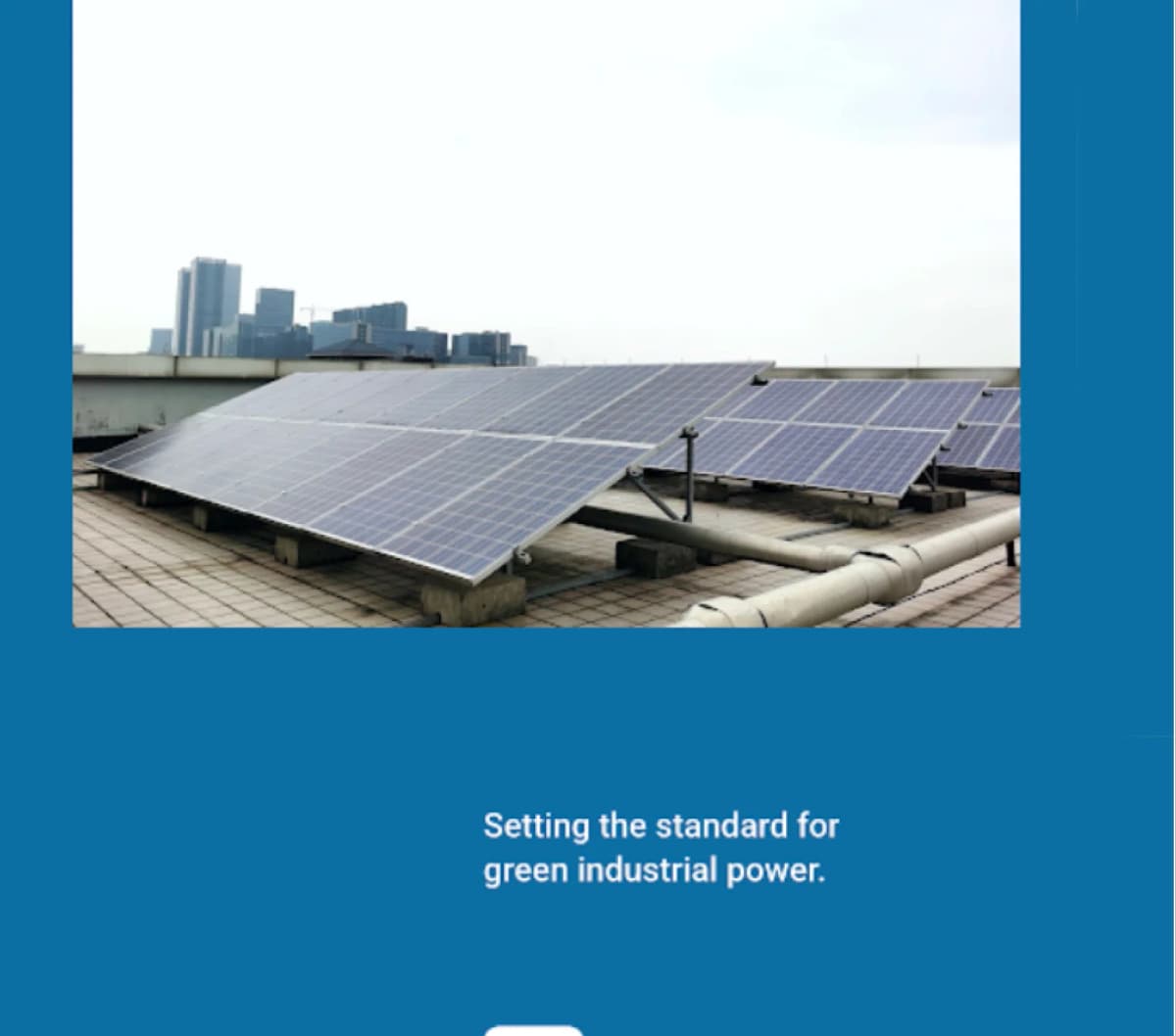
PROMPT 4: Component-based product onboarding“Design a desktop in-app onboarding flow for an AI fintech product. Include welcome state, feature highlights, tooltips, progress steps, and completion state. The flow should reuse components and integrate smoothly into an existing application layout.” | 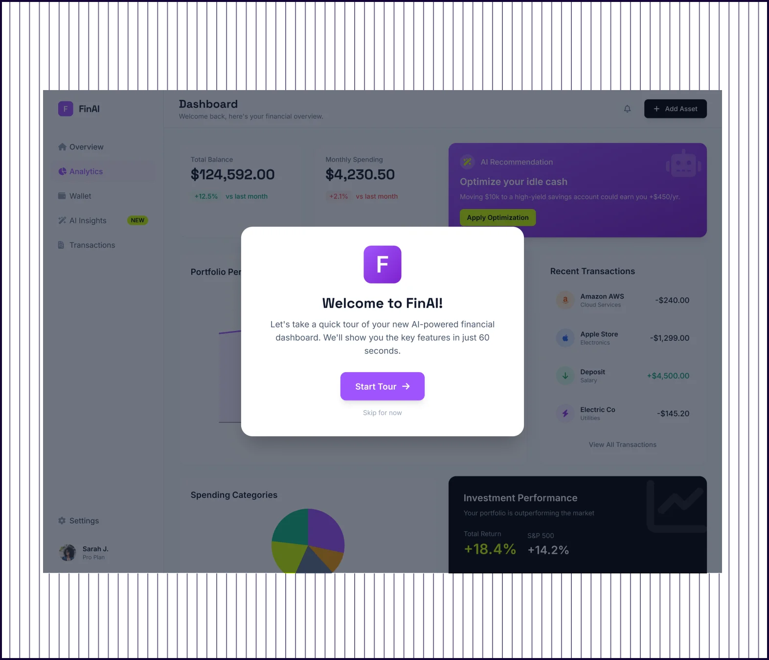 | 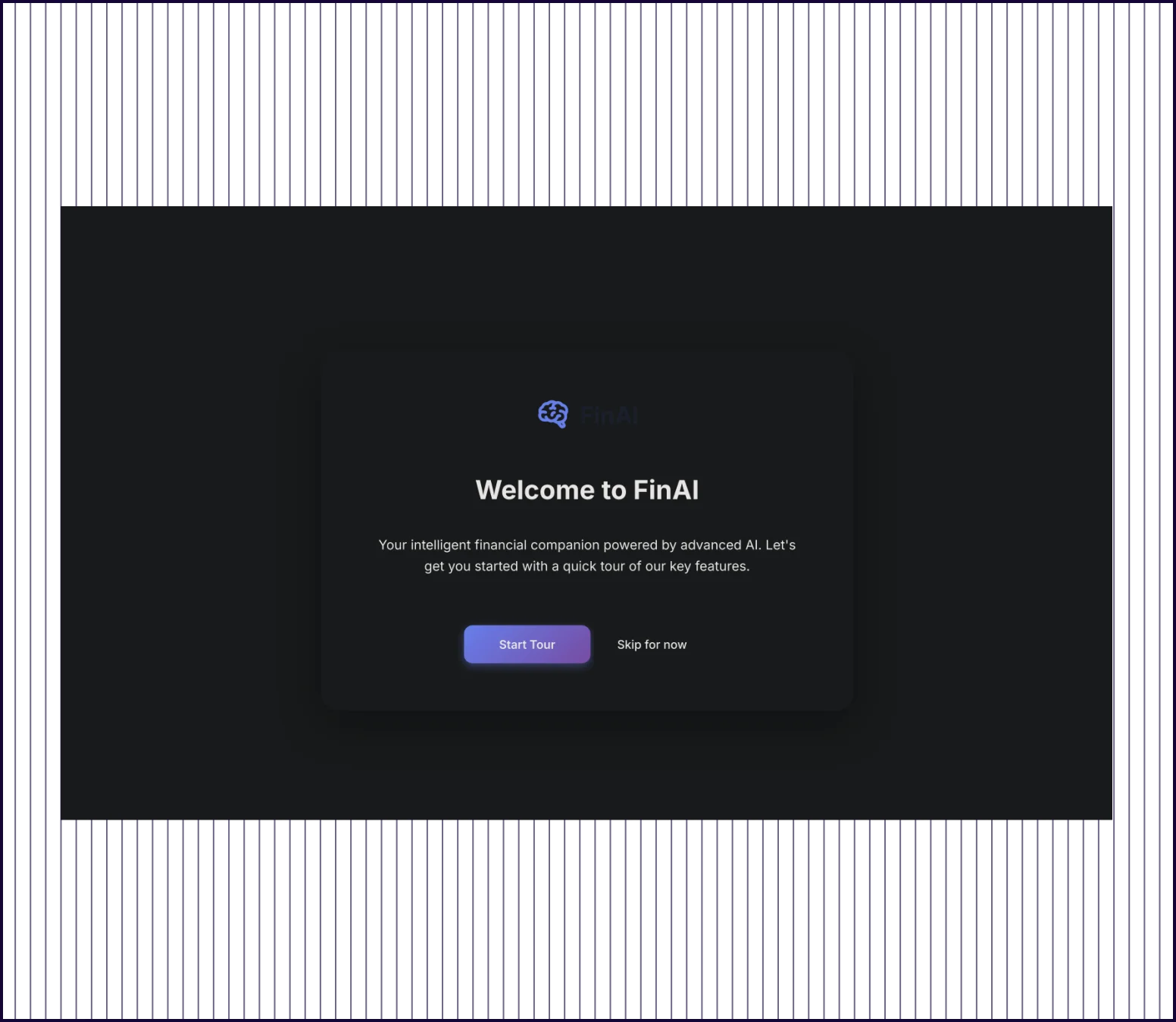 |
|---|---|---|
| Flow Completeness | Complete flow plus extras: welcome, feature highlights, full dashboard with activity feed, and comprehensive settings | Full flow: welcome screen, dashboard tooltip, AI insights, budget analytics, financial goals, and completion state |
| Progress Indication | Progress bar with labeled steps (Welcome, Feature Tour, Preferences, Complete) visible across onboarding screens | Step counter shown (e.g., “Step 1 of 4“) with Next/Skip buttons on each tooltip |
| Component Reuse | Systematic reuse of navigation, cards, progress indicators, and action buttons across onboarding and app screens | Consistent tooltip pattern, button styles, and card layouts reused across all steps |
| Prompt Adherence | Fully addressed with additions: includes settings and quick actions beyond the core onboarding flow | Fully addressed: welcome, highlights, tooltips, progress steps, and completion state |
| Launch Readiness | Production-ready and comprehensive enough to serve as a complete onboarding specification | Production-ready but UI can be tweaked for visual aid. |
PROMPT 5: Secure mobile authentication flow“Create a 3 screen mobile authentication flow for an enterprise app. Include login, two-factor authentication, error states, password reset, and success state. Design should prioritize security cues, accessibility, and consistent component behavior across screens.” | 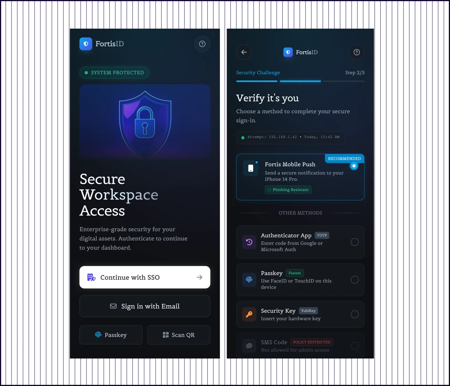 | 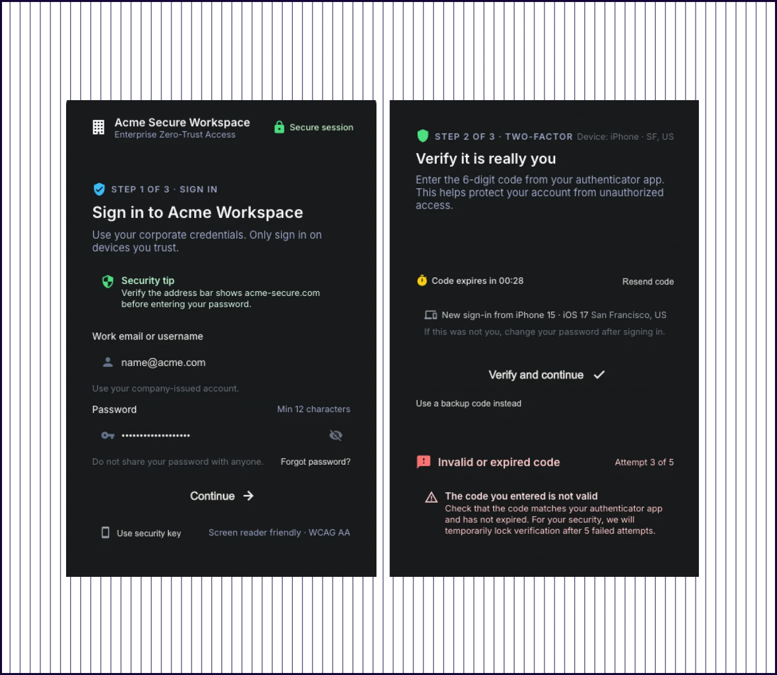 |
|---|---|---|
| Design Quality | Polished, modern interface with visual hierarchy, color-coded status indicators, and refined component design | Functional dark-themed layout with dense text and basic form styling |
| Content Depth | Rich contextual information: device details, enterprise security features, recent activity, backup codes, trusted devices, and recommended security actions | Covers core authentication steps with error messaging and password reset |
| Trust Elements | Multi-layered trust: certification badges, anomaly detection callout, verification attempt counter, supported authenticator apps, and 92/100 security score | WCAG compliance note and session summary on success screen |
| Prompt Adherence | Fully addresses all requirements with additional depth: device trust, backup codes, biometric setup prompts, and security scoring | Addresses login, 2FA, error states, and success with password reset included separately |
| Launch Readiness | Production-ready and polished enough to implement directly or present to stakeholders | Functional prototype but needs visual refinement for production use |

Kresimir Retih,
Project Manager"It has been a game-changer for me! Since signing up, my workflow has become much smoother, and my productivity has increased significantly. I love how intuitive and user-friendly the platform is, making UX tasks much easier and more efficient. Highly recommend it to anyone looking to streamline their UX process!"