Uizard
Uizard Head to Head Comparison of Features, Alternatives and Pricing
No credit card needed80 daily credits
At a glance: UX Pilot vs Uizard feature comparisons
| Compare Features |  |  |
|---|---|---|
| Natural language editing | Advanced | Basic |
| Prompt adherence | Full | Partial |
| Output quality | Production-ready | Prototype-level |
| Screen generation speed | 12 seconds in Blitz mode | >1 minute |
| High-fidelity UI generation | Limited | |
| Design variations | Limited | |
| Import your own components | ||
| Export to Figma | Export directly with plugin | Export as SVG then import |
| Design system setup | Enterprise only | |
| Team collaboration | Teams plan | Business plan and above |
| Shared pool of credits | Teams plan | |
| Custom integration | Teams plan | Enterprise only |
| Seats and roles management | Teams plan | Enterprise only |
UX Pilot vs Uizard: Design Output Comparison
We compared results for the same prompts for a variety of scenarios.
PROMPT 1: Landing Page for a SaaS Marketing Website“Design a modern SaaS landing page for a B2B project management tool for remote teams. Include a hero section, value proposition, key features, social proof, pricing overview, and clear CTA. Style should be clean, professional, and conversion-focused, optimized for desktop with responsive layout considerations.“ | 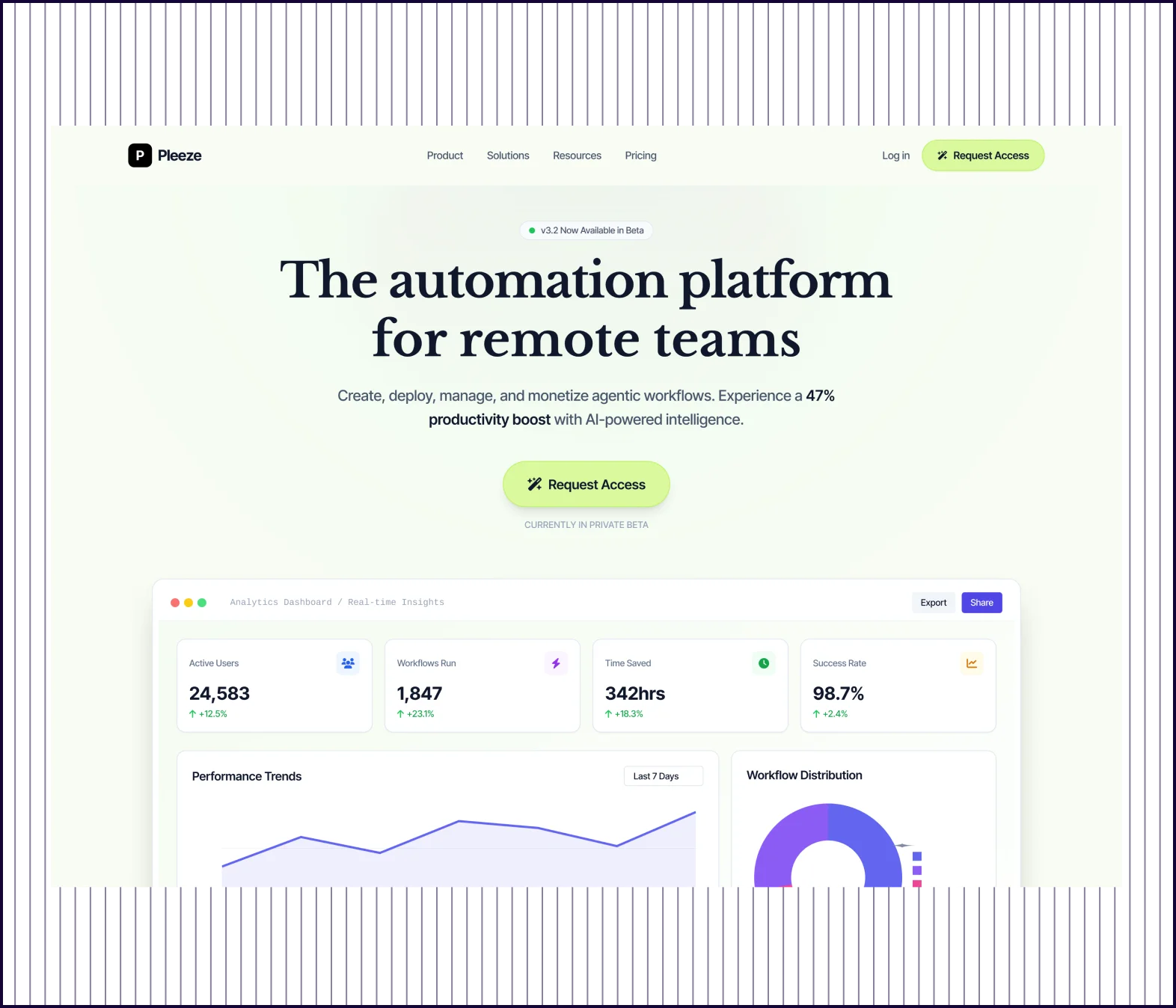 | 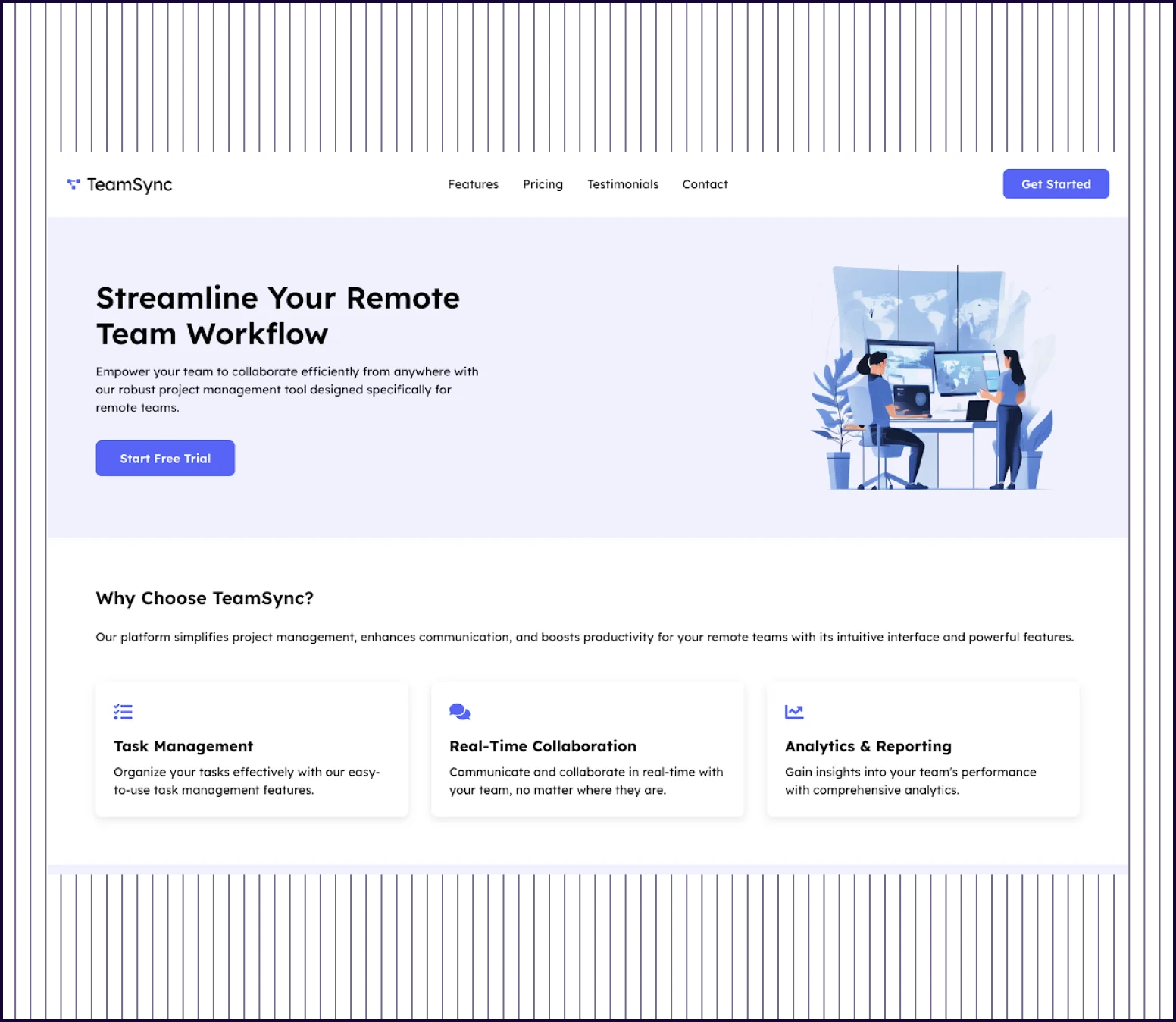 |
|---|---|---|
| Design quality | Visually rich landing page with data visualization, integration grids, and high-fidelity graphics. | Basic, text-heavy layout with standard sections. |
| Information Architecture | UX Pilot offers compelling, specific value propositions like “47% productivity boost,“ “AI-powered intelligence,“ and “Enterprise-grade security“. | Uizard provides generic benefit statements about “simplifying project management.“ |
| Content Depth | UX Pilot guides the user from awareness to technical validation to risk minimization and education with FAQs. | Uizard is very text-heavy but leaves gaps in positioning the product, assuming the user is ready to buy. |
| Launch Readiness | UX Pilot's page includes a “Contact Sales“ option and 14-day free along with detailed metrics, and a library of integrated tools. | Uizard's page looks like a “Minimum Viable Page“ covering the basics. |
PROMPT 2: Mobile App Onboarding Screen for a Finance App“Design a mobile app onboarding screen for a personal finance app that helps users track expenses and set monthly budgets. The design should feel friendly, simple, and trustworthy, with clear copy, strong visual hierarchy, and a smooth progression toward account creation.” | 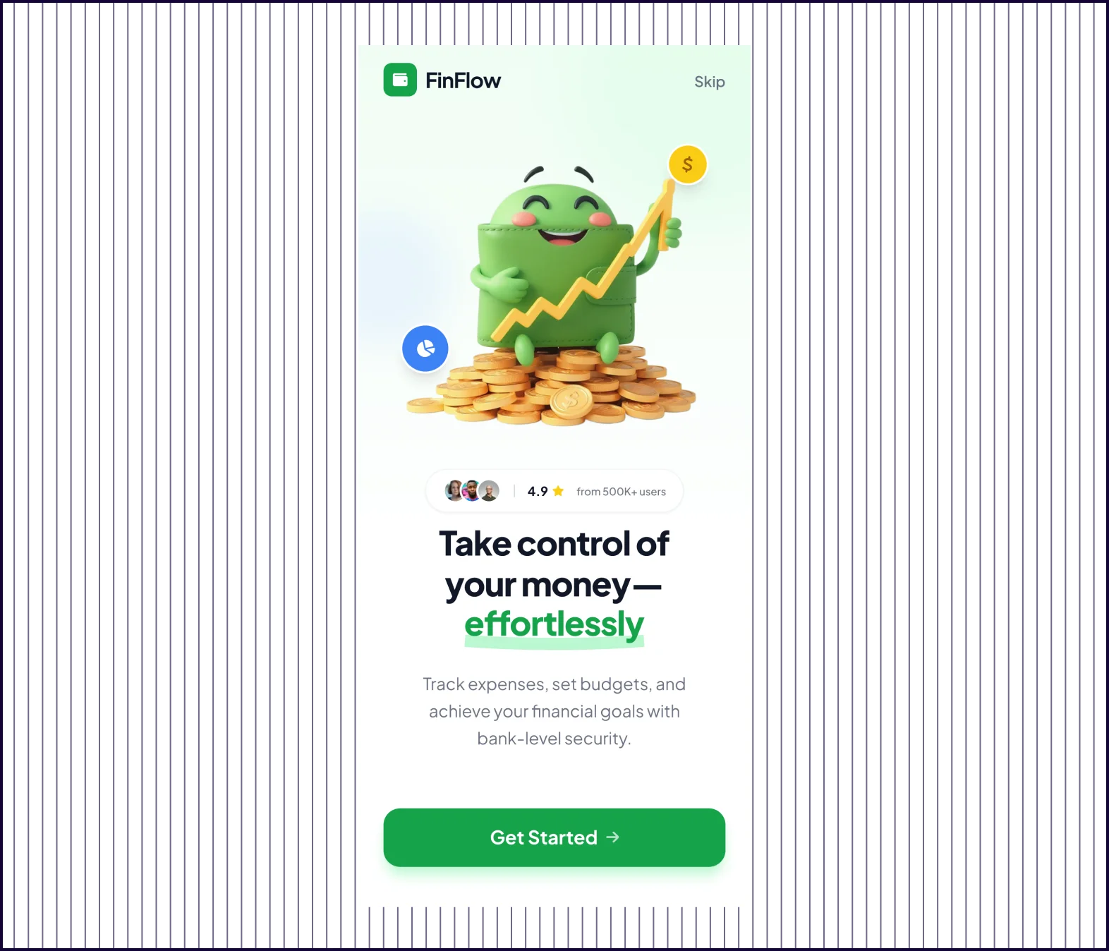 | 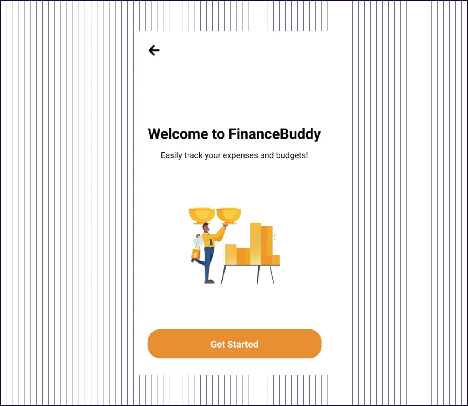 |
|---|---|---|
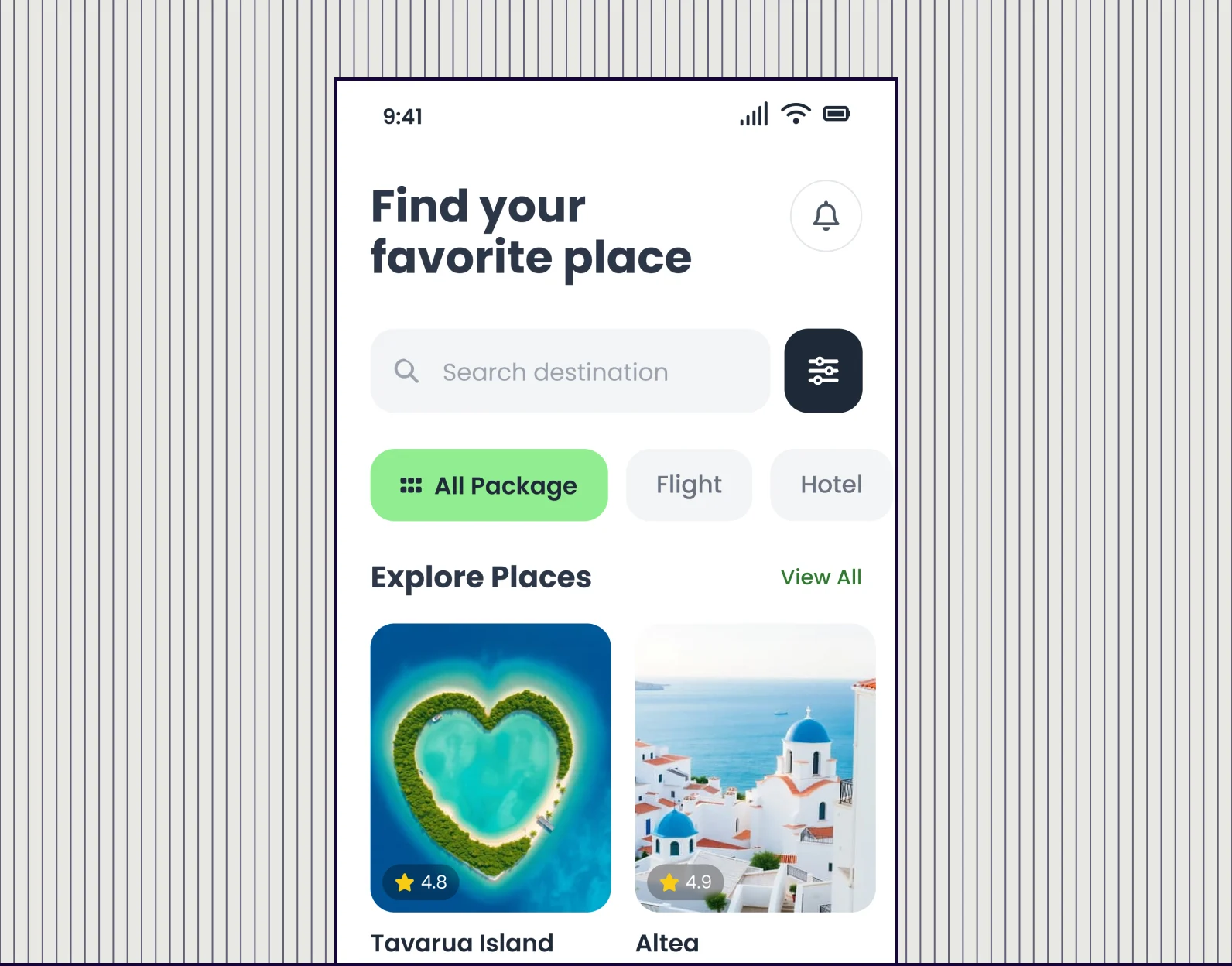
| Design quality | Polished high-fidelity screens with 3D graphics, gradients, and modern components | Basic flat illustrations with simple icons and standard UI patterns |
| Visual Hierarchy | Clear focal points, contrast, and visual weight guide users through each screen | Even spacing with minimal emphasis—nothing draws the eye first |
| Content Depth | Specific value props like “500K+ users,“ “4.9 rating,“ and “bank-level security“ | Generic statements like “Easily track your expenses and budgets“ |
| Conversion Design | Conversion-optimized with social proof, urgency and a free trial. | Functional onboarding focused on collecting user information. |
PROMPT 3: Desktop version of an E-commerce Product Detail Page“Design a product detail page for a modern DTC e-commerce brand selling premium wireless headphones. Include product imagery, key features, pricing, variants, reviews, and an add-to-cart CTA. The layout should be clean, visually driven, and optimized for conversion on desktop.” | 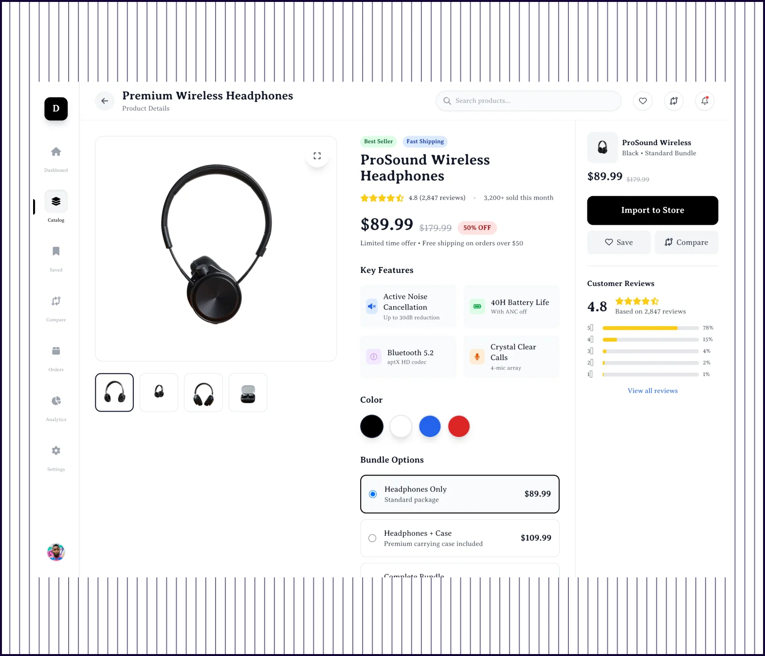 | 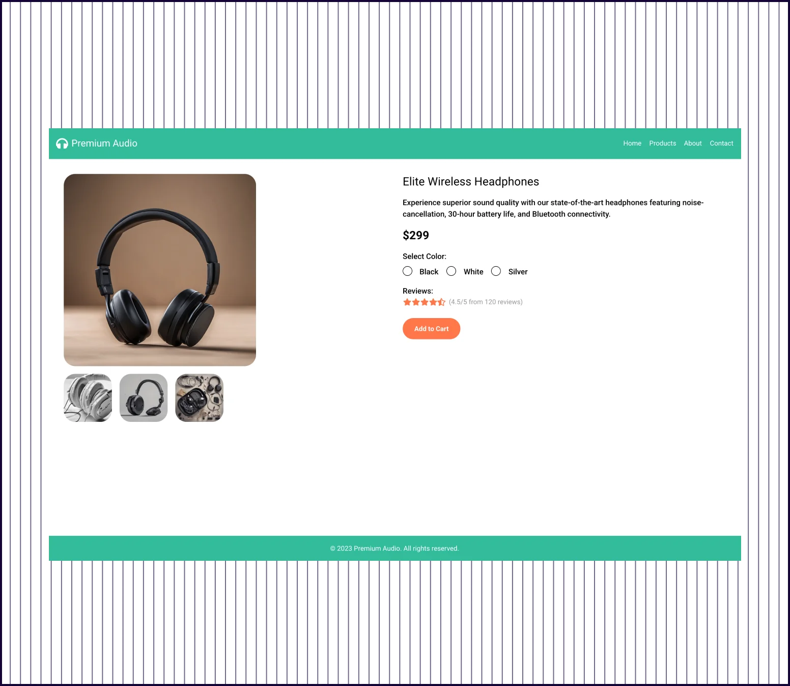 |
|---|---|---|
| Design quality | Polished full-page design with modern components, trust badges, and visual depth | Basic two-column layout with standard elements and excessive white space |
| Content Completeness | Comprehensive—features, specs, what's in box, model comparison, reviews, and FAQs | Minimal—image, price, color selector, reviews count, and one CTA button |
| Conversion Elements | Multiple CTAs, trust badges, urgency pricing, social proof, and risk reducers throughout | Single “Add to Cart“ button with basic star rating |
| Product Description | Full feature breakdown with benefits, technical specs, and use-case context | One-line feature description with no supporting details |
| Social Proof | Rating breakdown, written reviews with photos, verified badges, and review submission | Shows “4.5/5 from 120 reviews“ with no actual review content |
| Prompt Adherence | Fully addressed—imagery, features, pricing, variants, detailed reviews, and conversion optimization | Partially addressed—has imagery, price, variants, and CTA but misses features and reviews |
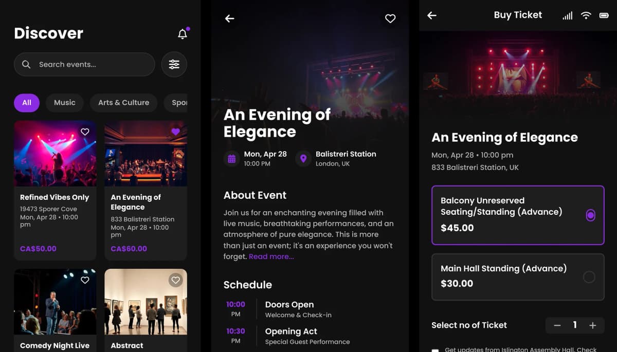
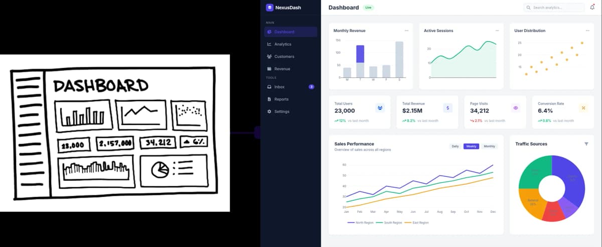
PROMPT 4: Web Dashboard UI for Analytics Software“Design a web dashboard for an analytics platform used by marketing teams to track traffic, conversions, and campaign performance. Include navigation, KPI cards, charts, filters, and a table view. Prioritize clarity, scannability, and data hierarchy over visual flair.” | 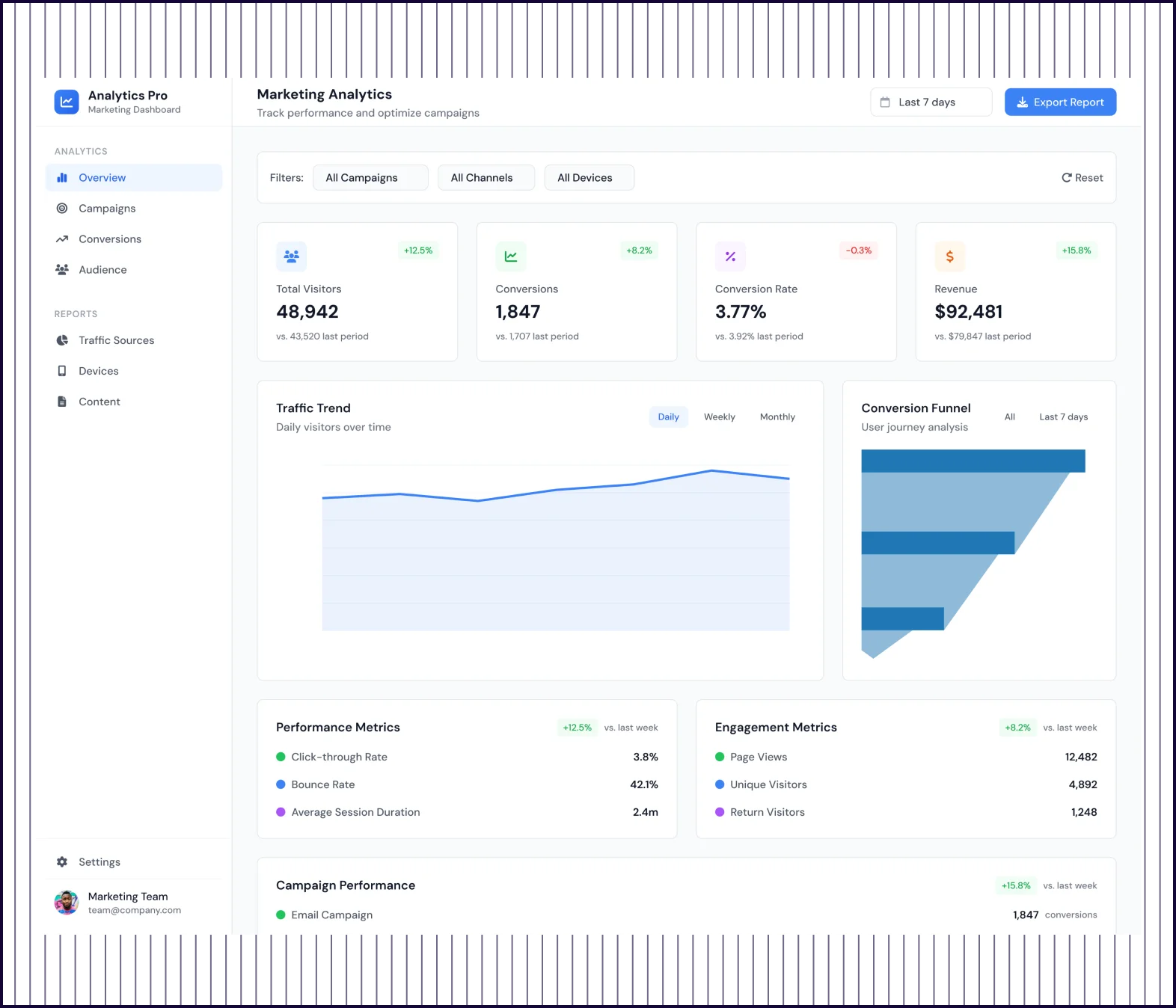 | 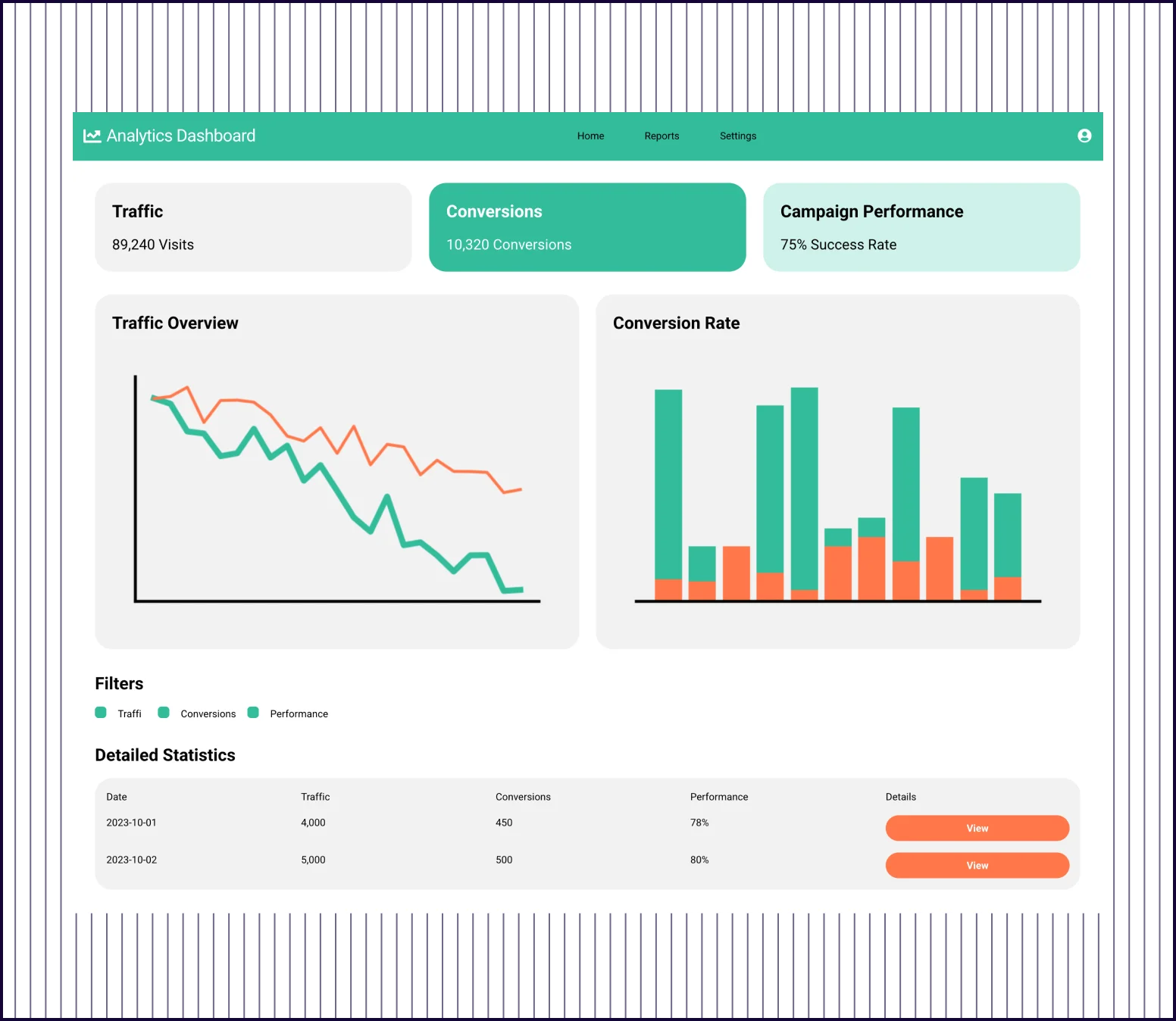 |
|---|---|---|
| Design quality | Polished interface with sidebar nav, organized sections, and modern data visualization | Basic layout with simple cards, charts, and a minimal data table |
| Design Depth | Full analytics suite—KPIs, funnel, sources, devices, locations, campaigns, and content | Three high-level KPIs with two basic charts and a two-row table |
| Visual Hierarchy | Clear hierarchy—summary KPIs first, then trends, then breakdowns, then detailed tables | Flat structure where all elements feel equally weighted on the page |
| Feature Complexity | Includes filters, alerts, AI recommendations, goal tracking, and real-time activity | Shows data but offers no path to dig deeper or take action on insights |
| Prompt Adherence | Fully addressed—navigation, KPIs, multiple chart types, filters, and detailed table views | Partially addressed—has KPIs, charts, filters, and table but lacks depth |
PROMPT 5: Mobile App Flows for a Healthcare Appointment Scheduling App“Design a mobile app flow that allows patients to book appointments with doctors. Include doctor search, availability calendar, appointment details, and confirmation. The design should feel calm, accessible, and trustworthy, with clear steps and minimal cognitive load.” | 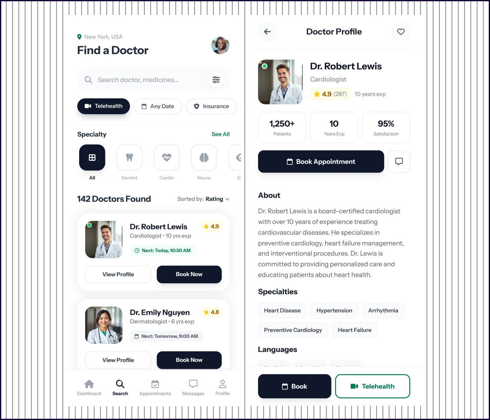 | 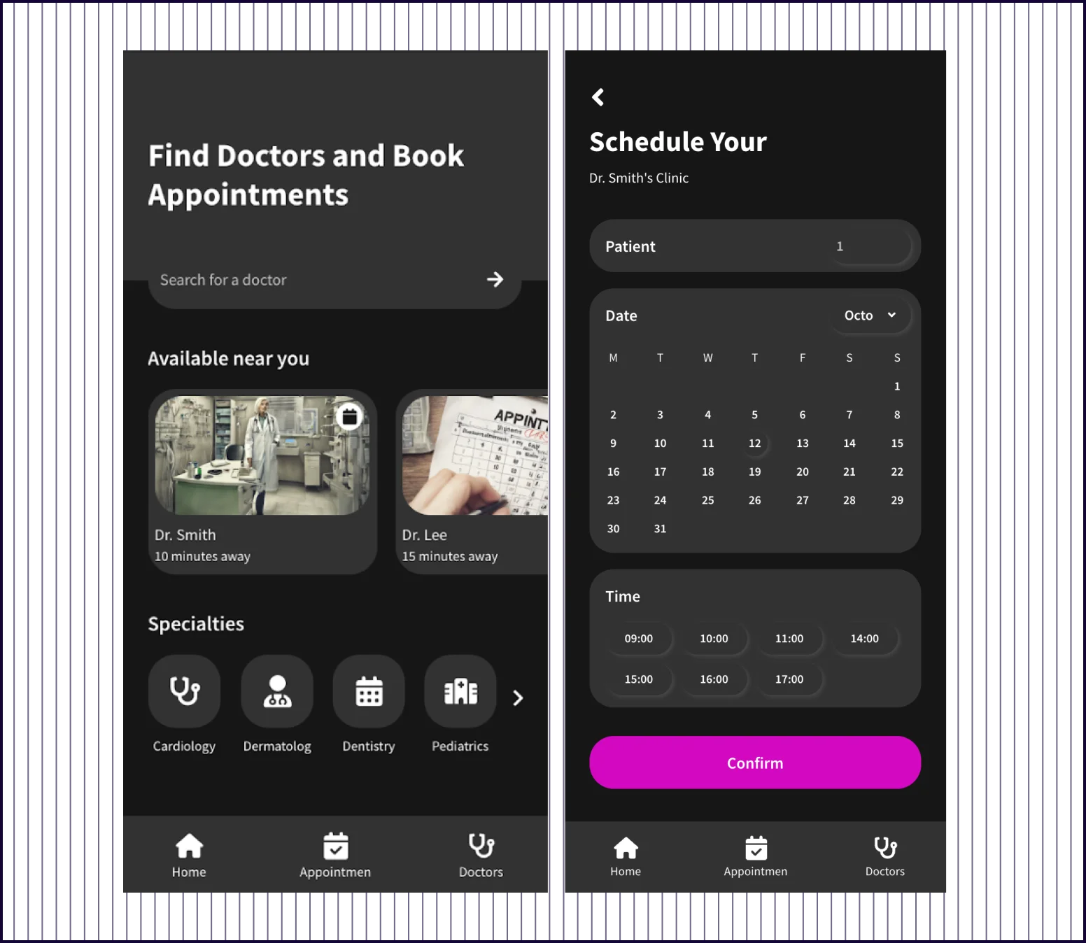 |
|---|---|---|
| Design quality | Clean, light interface with polished components and consistent visual language | UI with basic components and AI-generated stock imagery |
| Flow Completeness | Complete journey—search, profile, calendar, details, confirmation, and dashboard | Disjointed screens—mixes medication reminders and login with booking flow |
| Doctor Profiles | Full profile with experience, ratings, reviews, bio, education, and certifications | Shows name and distance only—no credentials or trust-building details |
| Booking Experience | Structured flow—select time, choose visit reason, describe symptoms, then confirm | Generic calendar and time picker with no context about the appointment |
| Prompt Adherence | Fully addressed—all requested screens present with calm, accessible, low-friction design | Partially addressed—has search and calendar but adds unrelated screens, misses confirmation |
PROMPT 6: UI for an Educational Course Platform“Design a web interface for an online learning platform offering video-based courses. Include course catalog, course detail page, lesson player, and progress tracking. The design should feel structured, distraction-free, and easy to navigate.” | 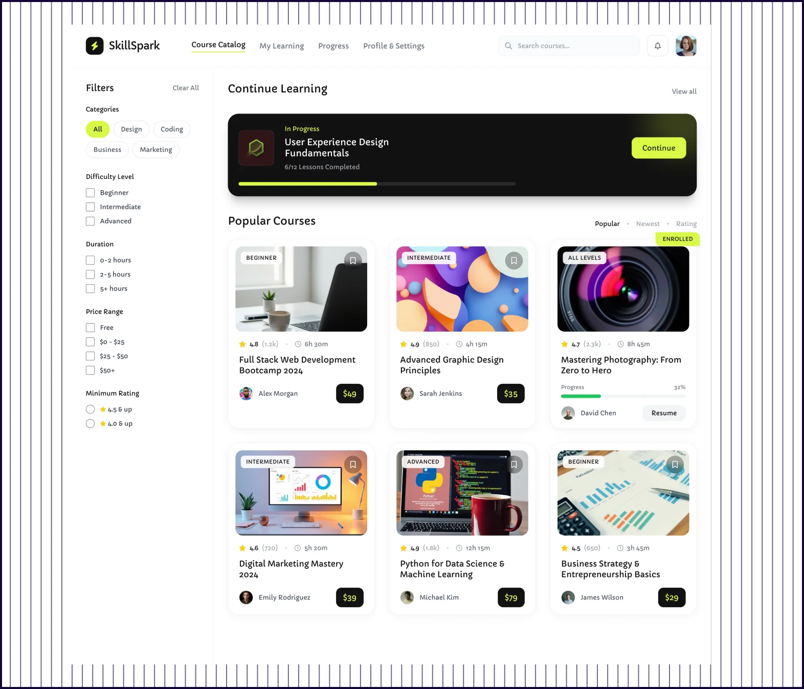 | 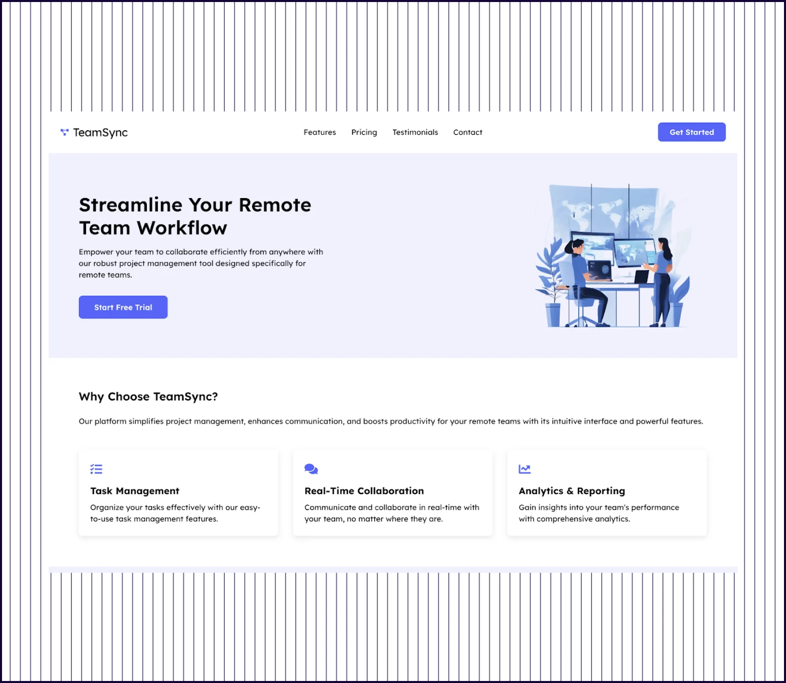 |
|---|---|---|
| Design quality | Polished interface with custom components, clean typography, and modern styling | Basic dashboard layout with stock 3D images and simple card components |
| Information Architecture | Logical flow—catalog, lesson player, progress sidebar, and discussion clearly organized | Confusing structure—mixes healthcare elements (doctors, appointments) with course content |
| Content Depth | Complete lesson view with objectives, code examples, downloads, quiz, and instructor bio | Surface-level course cards showing titles, dates, and basic progress indicators |
| Prompt Adherence | Fully addressed—course catalog, detail page, video player, and progress tracking all present | Partially addressed—shows courses but adds unrelated features and misses lesson player |
| Launch Readiness | Production-ready design that could ship as a functional learning platform today | Concept-level mockup requiring significant rework to match the original brief |

Kresimir Retih,
Project Manager"It has been a game-changer for me! Since signing up, my workflow has become much smoother, and my productivity has increased significantly. I love how intuitive and user-friendly the platform is, making UX tasks much easier and more efficient. Highly recommend it to anyone looking to streamline their UX process!"