Website Redesign: An 11-Step Guide [Free checklist inside]
![Website Redesign: An 11-Step Guide [Free checklist inside]](https://www.datocms-assets.com/16499/1775836102-website-redesign.png)

Petar Marinkovic
Created on Apr 10, 2026
A website redesign is not just swapping colors and fonts across pages—it's a structural overhaul of a site's content, UX, visual design, information architecture, and even its technical foundation.
So does your website need such a massive revamp, or just a simple refresh? And if it's the former, how do you do it right?
That's what I'll explain in this guide. After discussing some signs that your site is due for more than just a cosmetic change or two, I'll show you how to execute a redesign project from the ground up.
Does your site need a reskin or a redesign?
There is a huge difference between a site reskin and a true redesign, so you should never confuse the two.
A reskin changes the surface layer. You change up brand colors, update fonts, modernize the photos, and so on. Think of it as a fresh coat of paint.
A redesign, on the other hand, is a fundamental remodel. It makes you rethink how users move through the site, how content is organized, and how the technical layer supports your business goals.
So which one do you need? You can use this table as a reference point:
|
Process |
When to do it |
Practical symptoms |
|
Reskin/refresh |
The site structure is sound, but the brand has evolved |
|
|
Redesign |
The site is no longer achieving business goals |
|
You should also factor in the investment when deciding between a refresh and a redesign. A simple reskin might take 4–8 weeks, while a redesign is a 4–8-month commitment. You need to clearly define what needs to be changed to set reasonable expectations and prevent scope creep.
If you need an example of a website that underwent a redesign, you're on one right now! Here's what the UX Pilot site used to look like:
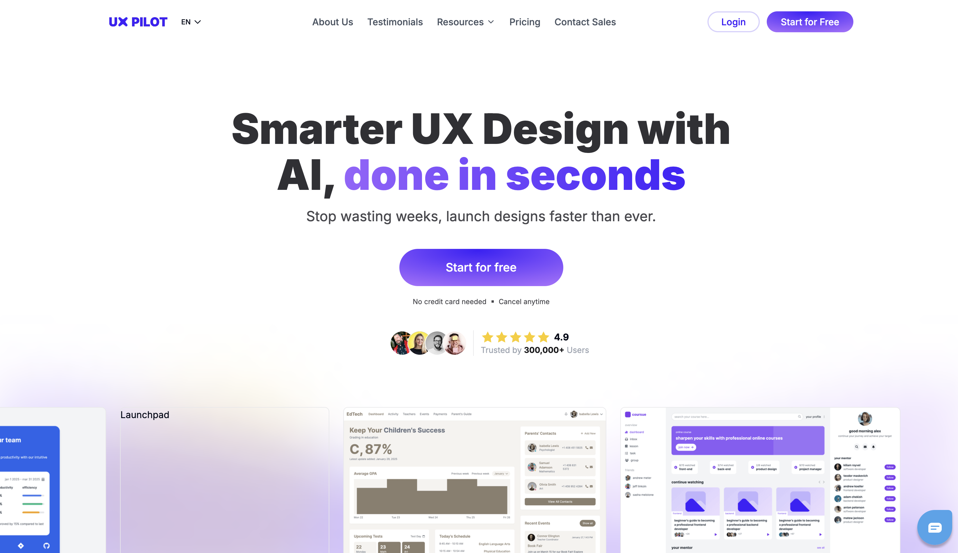
And here's what it looks like now:
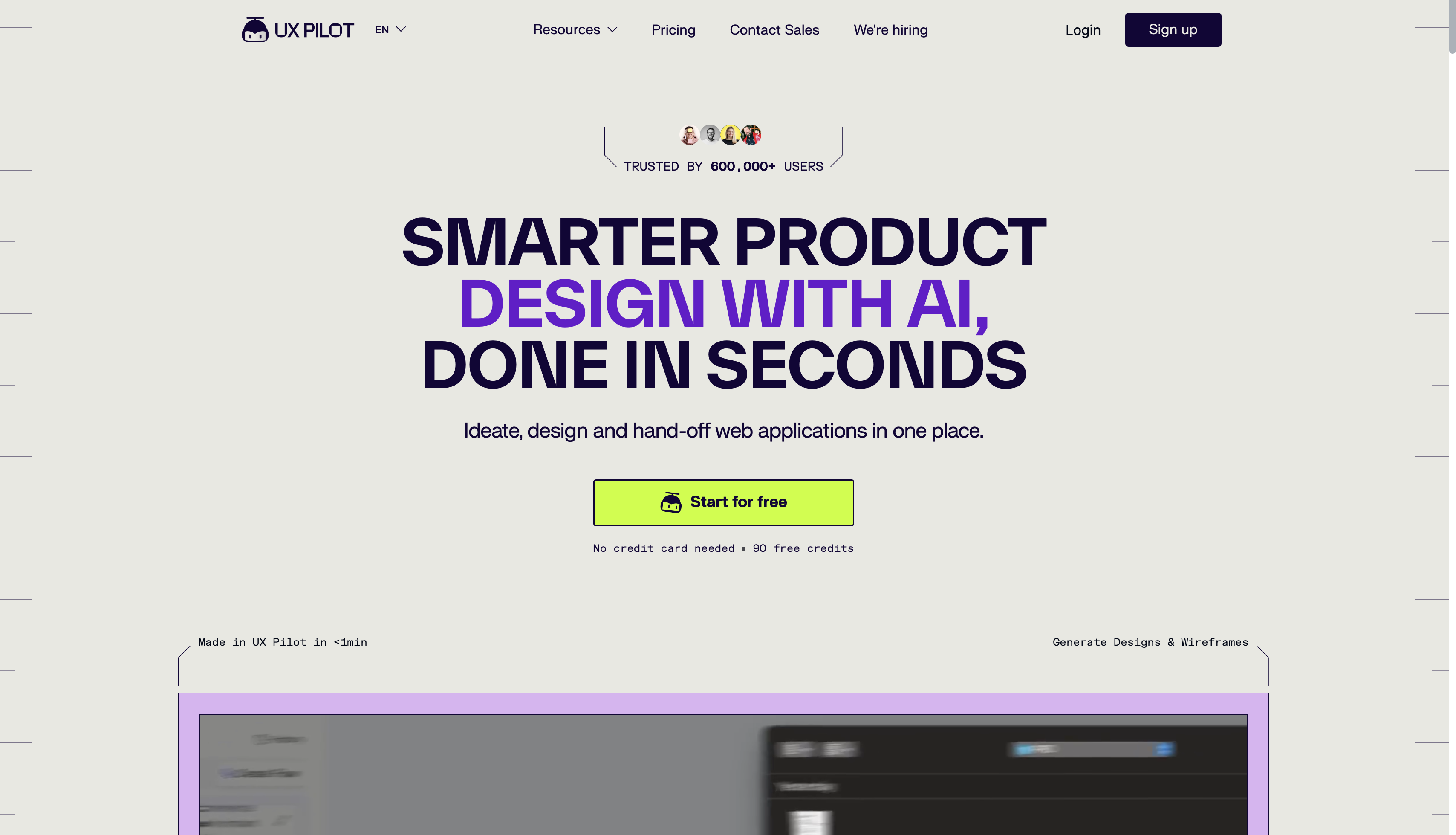
Of course, you can only see the visual changes of the homepage in these images. But under the hood, so much has changed, including:
-
Information architecture (which was reorganized around workflow and outcomes)
-
Landing page patterns for conversion improvement
-
The visual system (overhauled with new UI components and stronger product visuals)
All these changes don't happen overnight, and they call for careful planning. So let me show you what that looks like.
How to plan a website redesign from scratch
Planning is the phase that determines whether the site redesign succeeds or becomes an expensive lateral move. Every decision you make has long-term consequences, so poor planning is the root cause of most failed redesigns.
That's why you shouldn't look at redesign planning as a one-dimensional practice. It requires cross-functional alignment between content, SEO, design, and development from the get-go.
To ensure that alignment, you need to follow these steps:
1. Audit your performance data and UX gaps
Jumping into a website redesign project without an audit is the most common and most expensive mistake you can make. Every decision you make should trace back to evidence (analytics, user research, search performance), not stakeholder preferences or guesswork.
The first step you should take is to look at the numbers. In other words, audit for quantitative performance data to find the biggest red flags, such as:
-
Slow page load time (anything over three seconds makes over half of your users leave the site)
-
High bounce rate (60% or higher typically means you need to make some changes)
-
Declining conversion rate (compared to historical data)
-
SEO issues (drop in organic traffic, lower SEO rankings, etc.)
Cold figures are important because they ground you in reality and show exactly what your redesign should focus on. But they don't tell the whole story.
Instead, you must focus on the seemingly more vague but equally important qualitative signals. These include:
-
Outdated product positioning and brand identity
-
Disjointed or incoherent design elements (e.g., inconsistent colors, fonts, and layouts)
-
A CMS or tech stack that limits what the team can build
-
Confusing navigation and consistent UX friction
This last point is especially tricky. You need to put yourself in your users' shoes and spot UX gaps like:
-
friction points in user flows
-
Accessibility failures
-
Any mismatches between what users want and what the site prioritizes
This calls for a detailed audit that lets you see where the issues are. While quantitative data may be easier to gather through tools like Google Analytics (for traffic and behavior data) and Google Search Console (for crawl and indexing issues), qualitative insights require methods like:
-
Heatmaps for click and scroll behavior
-
User interviews or surveys for subjective UX insights
-
Session recordings to identify points of confusion or abandonment
While auditing takes time and effort, it's more than worth everything you put into it. Without diagnostics, all your design activities are shots in the dark.
A site audit by Stack Daily shows exactly why this is true. It revealed that the site's organic traffic had collapsed due to a combination of major issues like:
-
A cluttered homepage with 12 navigation items
-
Load times of six seconds
-
Poor mobile design
-
Outdated visuals
With this data, the designers could pinpoint exactly what the issues were and how to fix them instead of randomly redesigning pages—and the results reflected this. After the redesign was complete, the site saw a 45% spike in organic traffic, along with a 20% lower bounce rate (among other improvements).
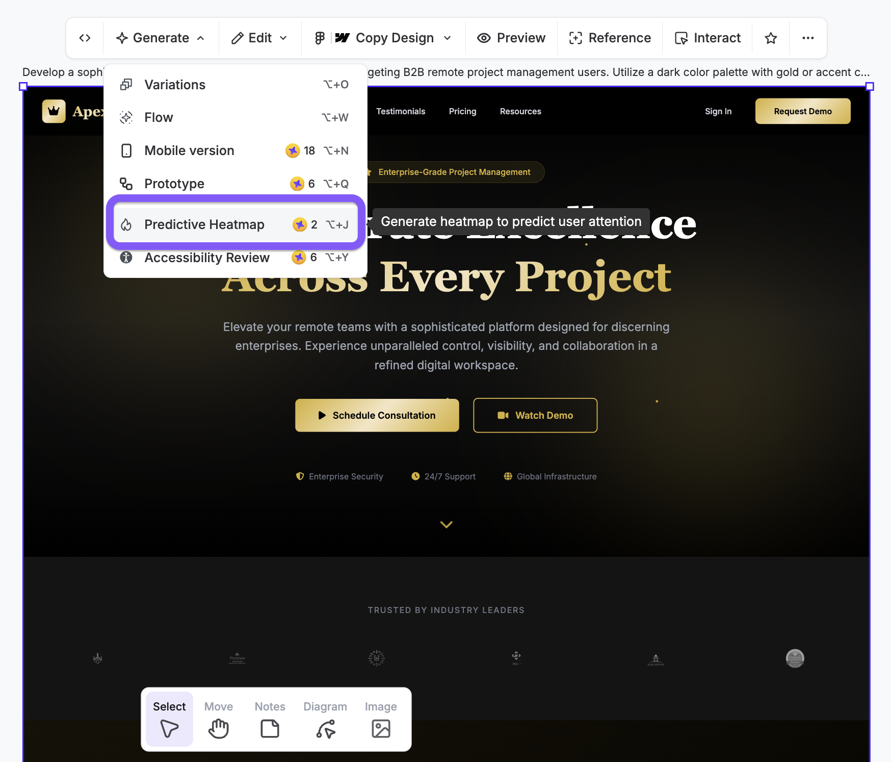
UX Pilot's predictive heatmap feature is handy when you want to review UX gaps that can affect user experience.
2. Set measurable goals tied to business outcomes
"Improve the user experience" sounds like a perfectly fine goal—but it's not quantifiable. And if you can't measure it, you can't know how close you are to achieving it and if your redesign process is actually yielding results.
That's why you need a clear number you're trying to hit. Something like:
-
Reduce bounce rate from 68% to under 50%
-
Increase demo requests by 25%
-
Improve mobile conversion rate by 15%
-
Cut the average page load time below 2 seconds
More importantly, numbers are just vanity metrics unless you connect them to specific business goals. On its own, a bounce rate of 50% doesn't mean much—it only feels like success when you put it into a business context:
Lower bounce rate → more engaged visitors → higher conversion potential
Similarly, a page that loads in 1.8s doesn't just mean you've got the technicalities right; it leads to:
Better Core Web Vitals → improved rankings → more organic traffic → more leads and conversions
So basically, you need to connect each "What" with "How much" and then "Why." If you're not sure how, you can reverse-engineer the process by starting with a goal and then working your way back to the redesign tasks that will achieve it.
No matter how you go about it, limit goals to 3–5 main KPIs to maintain focus. Trying to do it all at once will dilute your redesign project and probably result in a bunch of unfinished tasks. Lay out your goals, prioritize the most business-impactful ones, and then cherry-pick KPIs accordingly.
Make sure that any goals and KPIs you set are agreed on cross-functionally and documented before any design work begins. This prevents decision silos and turns goals into concrete guideposts for all the teams involved in the redesign.
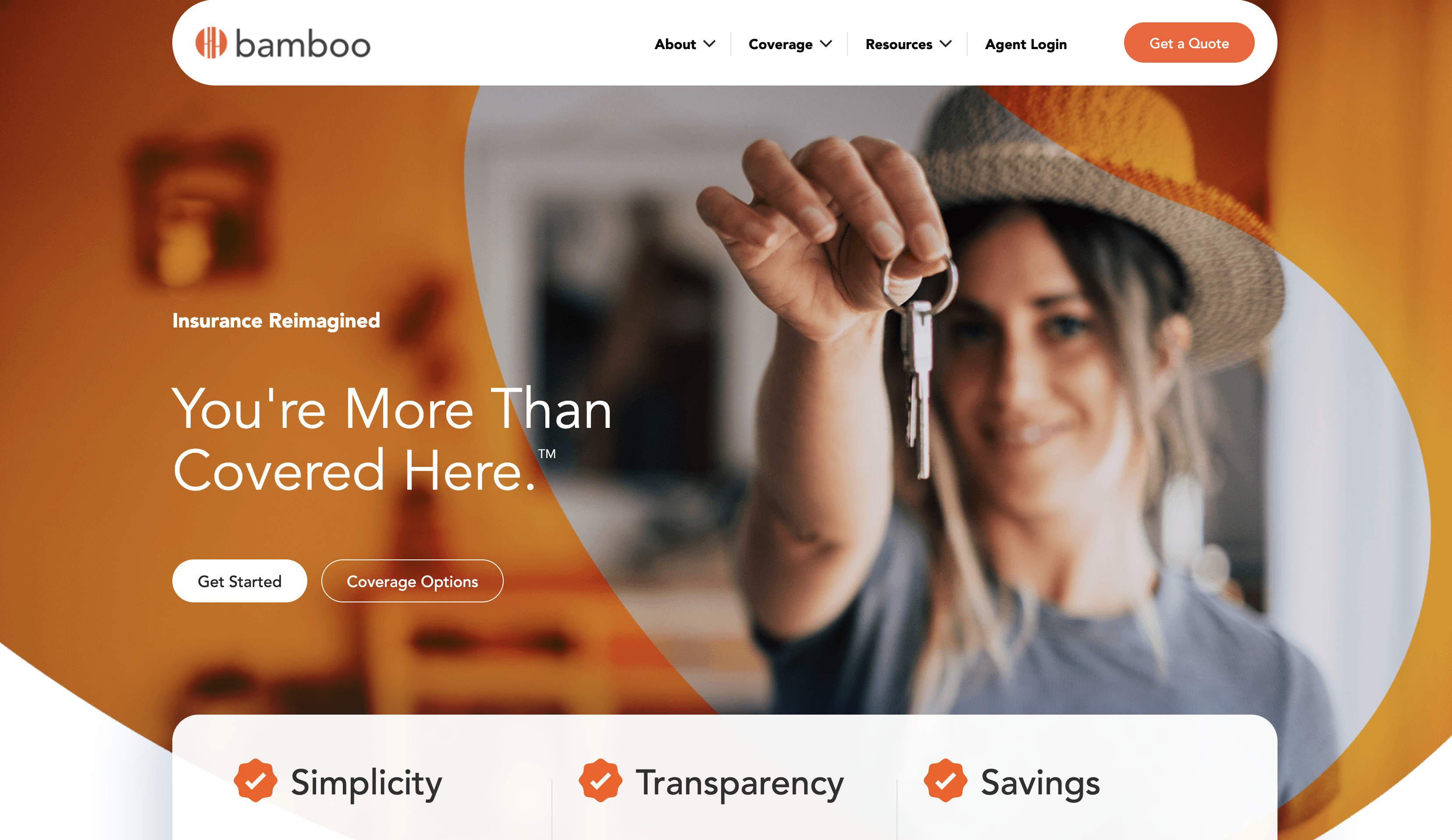
Bamboo Insurance is a great example of goal-driven redesigns. It engaged a team that would redesign its website around specific objectives, such as:
-
Supporting expansion into new markets with clearer messaging
-
Improving navigation to reduce friction for quote-seekers
-
Building a scalable design system that could accommodate new product lines
Guided by these goals, the redesign team overhauled the existing site to improve:
-
Visual consistency
-
Usability
-
Conversion potential
Coupled with the refined brand identity, the new website is now aligned with Bamboo Insurance's objectives, and the system provided by the design team ensures long-term scalability without the need for additional revamps.
3. Research successful websites in your niche
While your site should never be a copycat of another, taking a peek at competitor websites can give you plenty of redesign ideas. It's not about copying the look but reading other websites as strategic signals.
Specifically, you should explore components like:
-
Homepage messaging
-
Navigation structure
-
CTA placement
-
Pricing page design
-
Conversion funnels
It's also a good idea to look beyond the page elements. Find 3–5 top-performing competitor websites and explore:
-
Content depth and topic coverage
-
Keyword rankings and traffic sources
-
Messaging clarity and value proposition positioning
Let me give you an example.
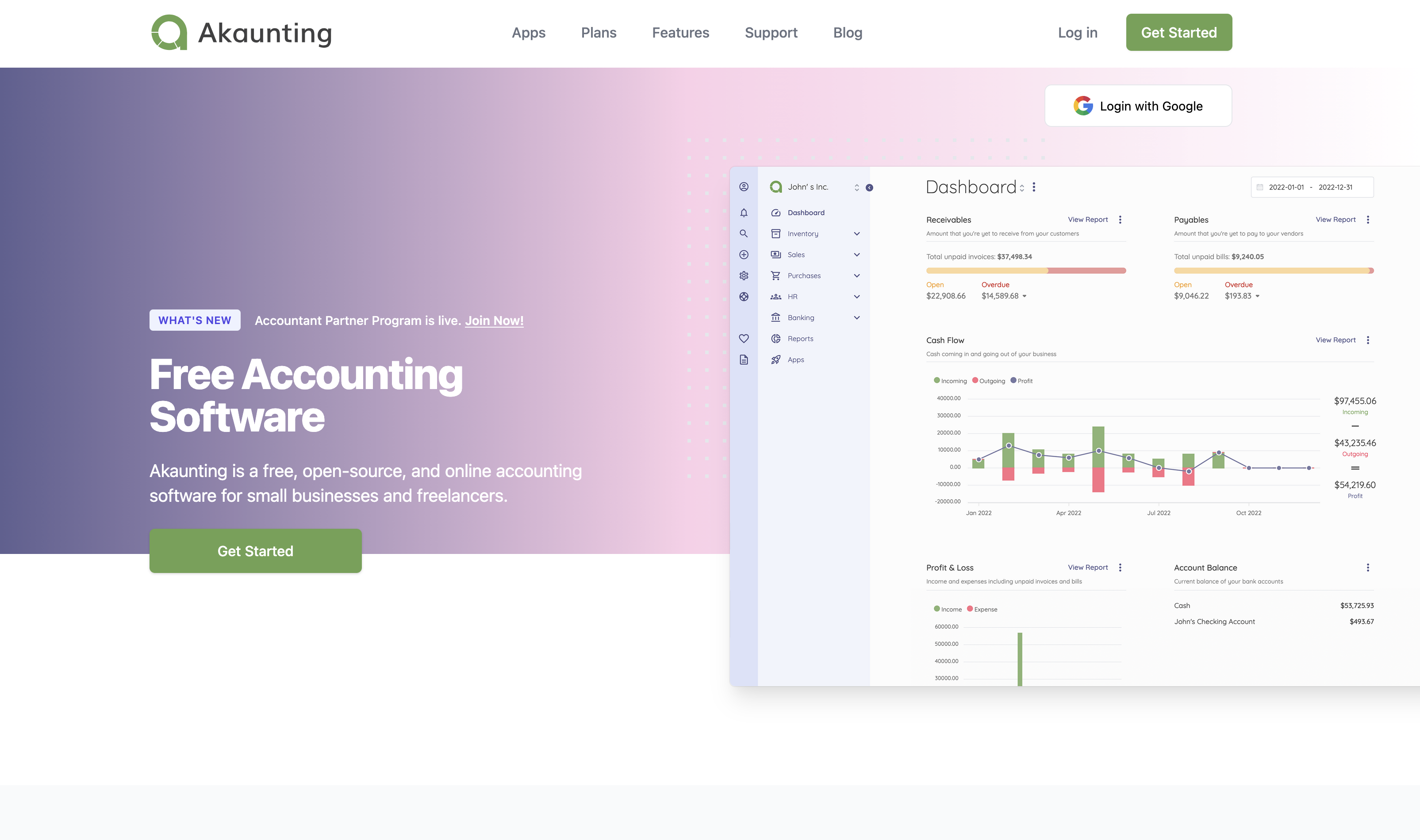
Say you're redesigning an accounting software website. You'd do a quick Google search (unless you already know who the top performers are), and then have a look around to see what they're doing well.
For example, you could draw inspiration from the hero section of Akaunting's homepage, where you'll see:
-
Product-led visual elements
-
A compelling headline with effective USP copy
-
Clear CTAs
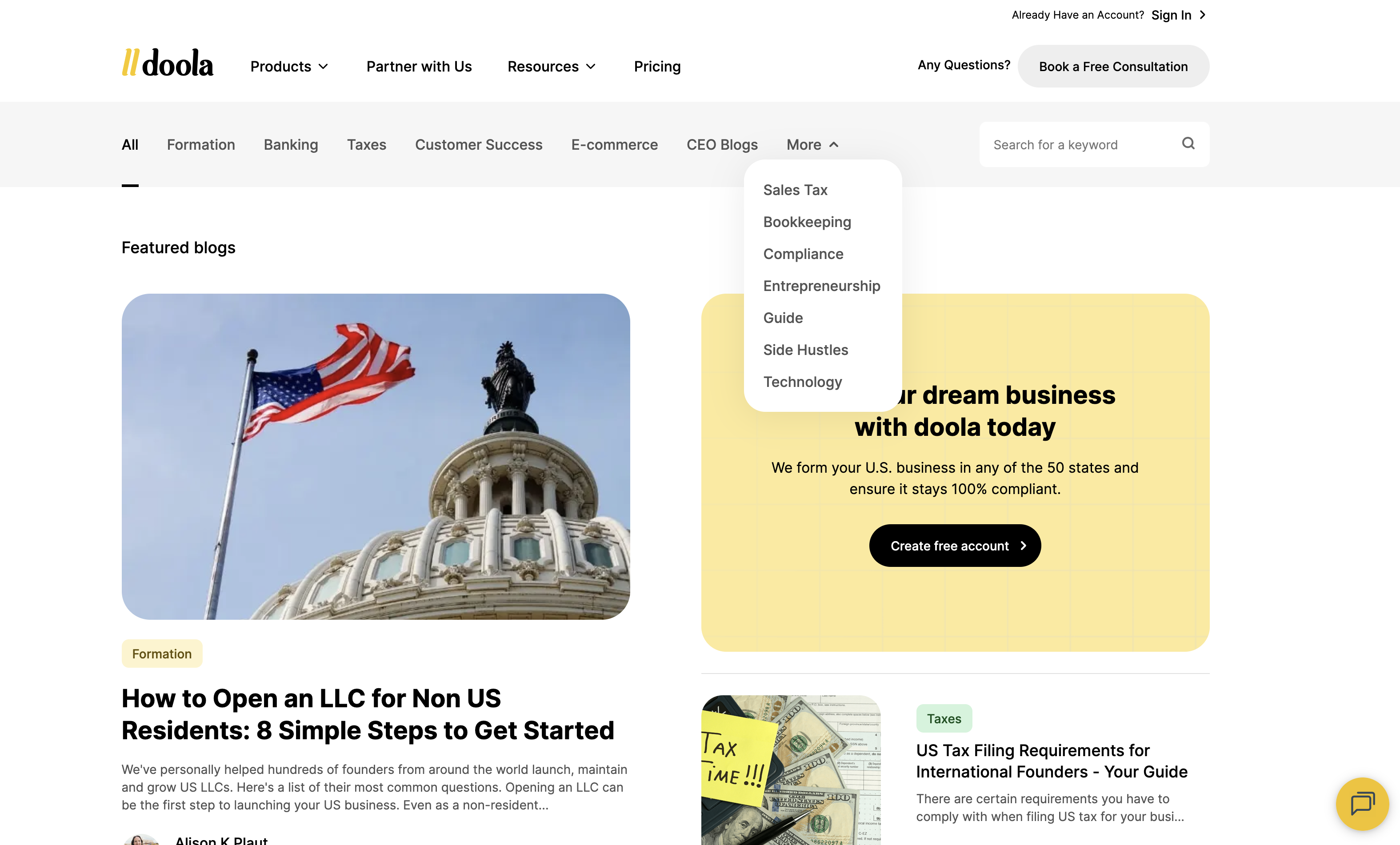
You could then see Doola's blog to explore its content strategy, including:
-
Topic coverage
-
Navigation and structure
-
Conversion-driven elements (newsletter sign-up, demo CTA, etc.)
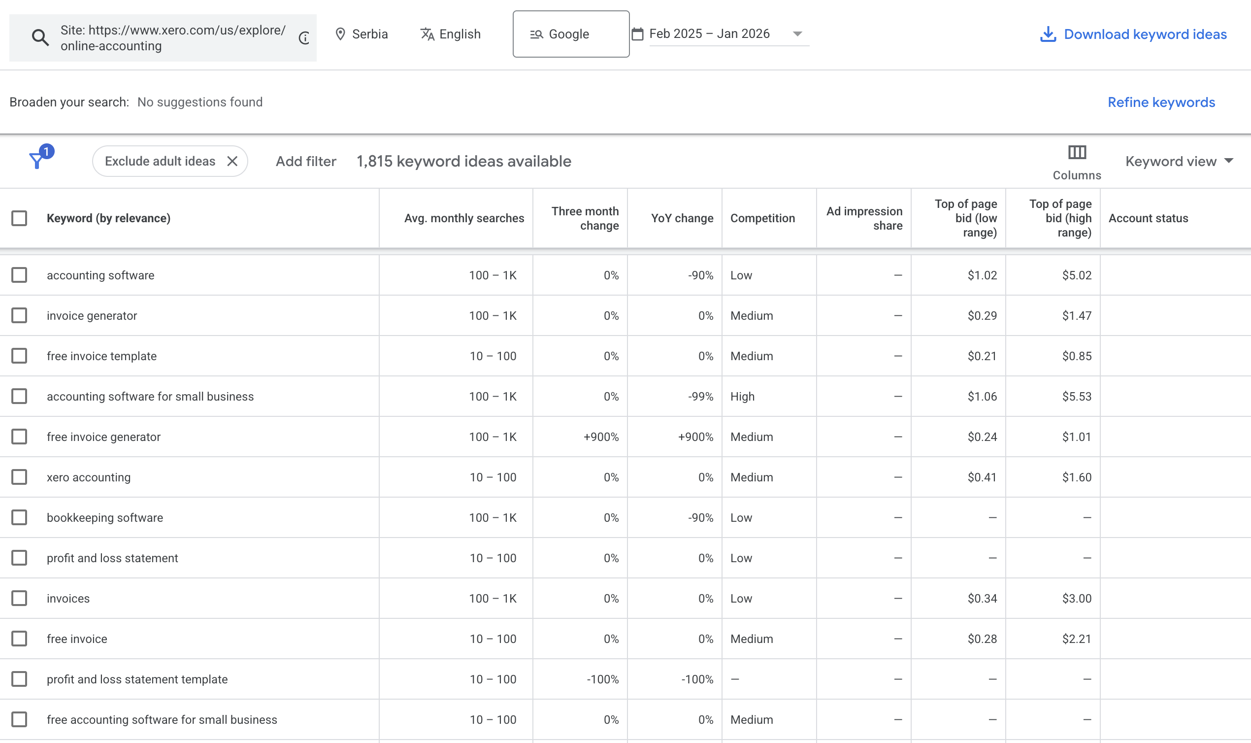
To take it a step further, you could take a competitor like Xero and run its site through a keyword research tool like Google Keyword Planner. It would uncover the keywords that Xero is ranking for, helping you define and fine-tune your site's SEO strategy.
Speaking of SEO, pay attention to the competitors' demand distribution and traffic sources. See if others in your niche rely on organic traffic (SEO-driven), paid traffic (ad-dependent), or direct traffic (brand-driven). Besides giving you traffic ideas, this lets you explore the gaps you can fill to draw traffic to your site.
Your competitor research will probably uncover tons of insights, so I'd suggest giving them some structure. For example, you can split insights into actionable categories you'll use for the redesign:
-
Quick wins (e.g., messaging improvements)
-
Experiments (e.g., new page types)
-
Longer bets (e.g., content hub strategies)
-
With this structure, you can prioritize the most impactful tasks so that your redesign starts paying off faster.
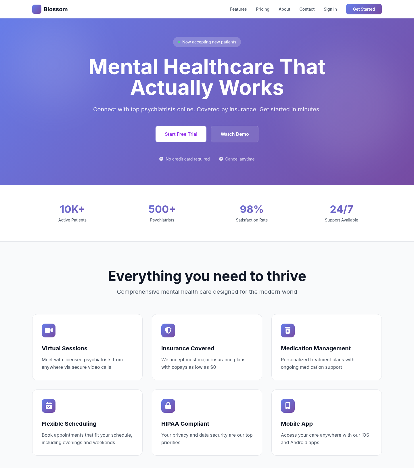
You can also expedite this process and go straight to a new design using UX Pilot's website redesigner. For example, I used Blossom Health's design as a reference to turn it into a typical SaaS website.
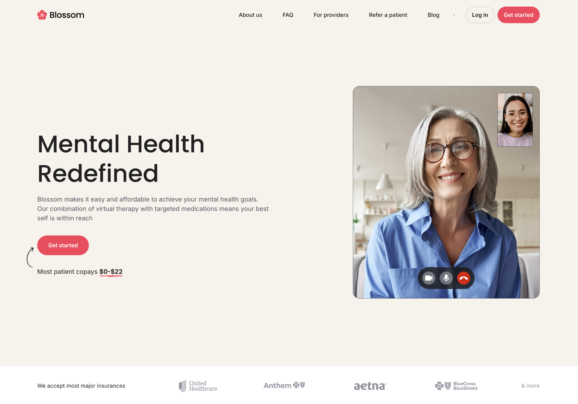
I deliberately used no additional instructions.
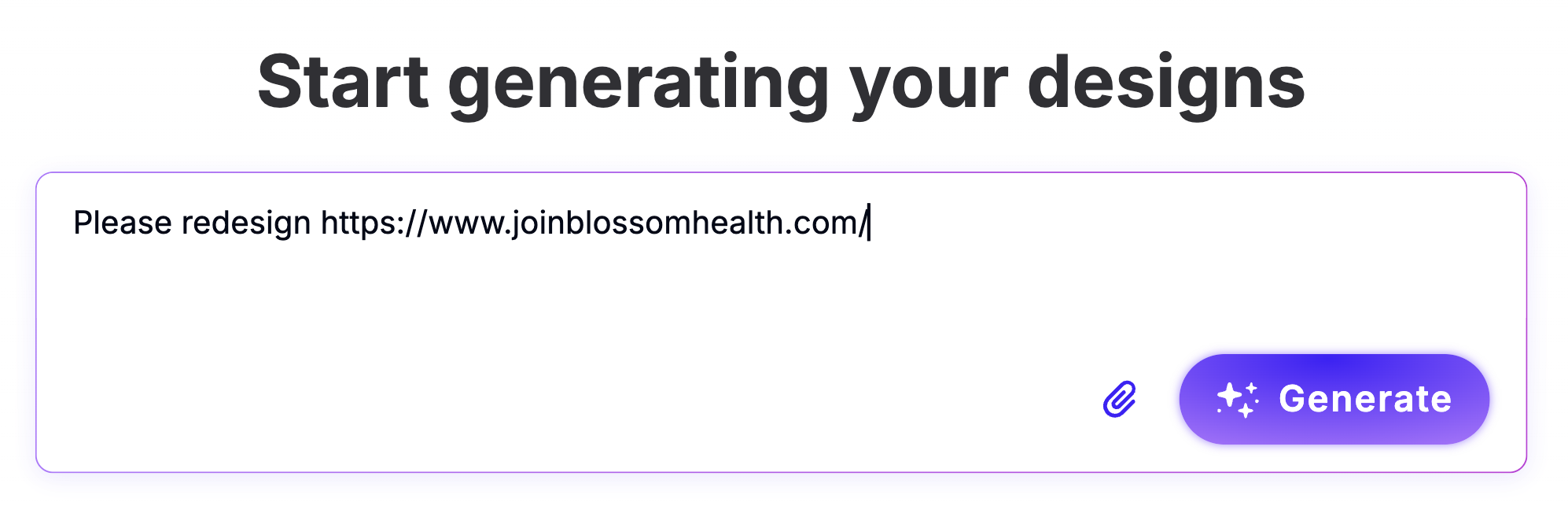
Here's what the redesign looks like.
4. Map out navigation, page hierarchy, and user flows
Information architecture (IA) is the skeleton of your redesign that determines:
-
How pages relate to each other
-
How users navigate your site
-
How search engines understand your site's structure
IA can make or break the entire user experience, and no cosmetic feature can make up for a poor structure. That's why you need to lay out your entire website and create:
-
A sitemap showing every page and its place in the hierarchy (search engines need this to index your site properly)
-
User flows for primary tasks (e.g., learn about service → view pricing → request demo)
-
A navigation structure (preferably one that limits top-level items to 6–7 clear, descriptive labels)
When defining IA and navigation, follow the "3-click rule"—make sure that each important page is reachable within 3 clicks from the homepage. This forces hard prioritization decisions about what matters most on your site.
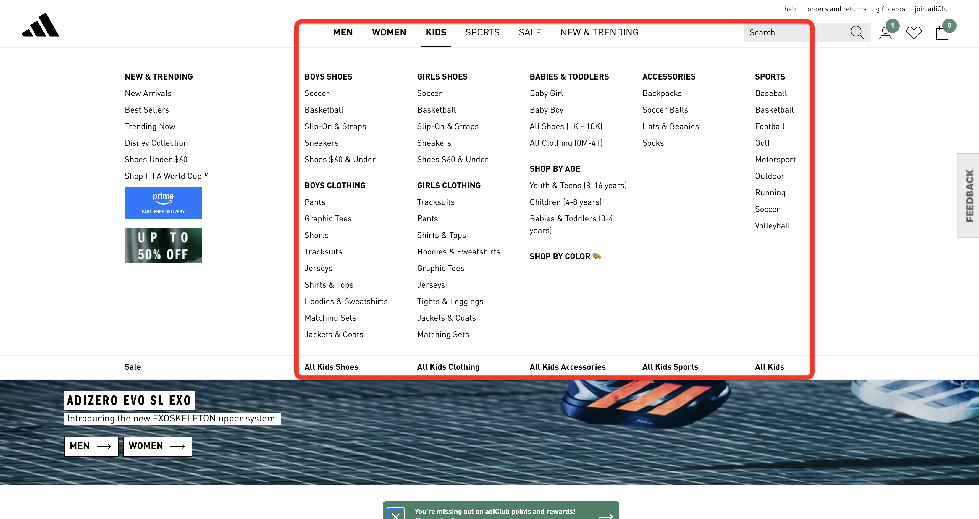
If you have too many hierarchy levels to do this, it's a clear sign that you need to flatten your IA. One of the most effective ways to do this is to replace complex, multi-level dropdowns with mega menus that display multiple levels of the information hierarchy at once.
You can check out Adidas as a good example:
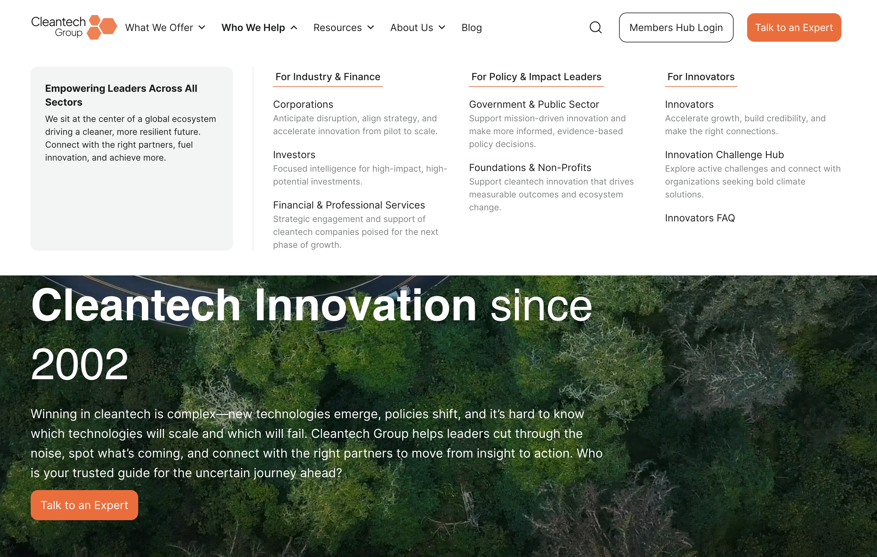
Finally, site architecture should reflect how users think and search, not how your company is organized internally. That's why you should never replicate your org chart as your site structure. Instead, design based on user intent, tasks, and topics to make navigation more intuitive.
The Cleantech Group redesign is a textbook example of how this issue was avoided effectively. The company restructured its website around user pathways for different audience segments (corporations, investors, innovators, governments) instead of mirroring the internal org structure.
The redesign team also created specific content for each user group, ensuring the site centers around users' needs.
5. Create a redirect plan before you start
Redirects (specifically 301 redirects) ensure that old, broken, or changed URLs automatically send visitors and search engines to the new, relevant, or updated content. If your redesign changes any URLs and you skip mapping redirects, you can erase years of accumulated domain authority and search rankings overnight.
For example, if you change a page's URL from /services to /what-we-do, Google needs to know where that page went. Without a redirect, anyone clicking an old link hits a dead page (probably a 404), and Google assumes the content is gone forever. As a result, you'll lose the authority, backlinks, and rankings built by the page.
The good news is that you can avoid this issue in three steps:
-
Inventory every indexable URL on your current site
-
Map each URL to its new destination (or flag it for removal)
-
Implement 1:1 301 redirects (never use generic redirects that send everything to the homepage)
When planning redirects, prioritize pages by value. Those with the most backlinks, highest traffic, and strongest keyword rankings carry the most SEO equity, so you don't want to lose them.
You need to complete the redirect plan before the web development team gets its hands on the site. Figuring it out as you go is bound to backfire, and it's not the risk you should take. Besides, planning redirects lets you spot any IA issues and decisions that still need to be made.
Out-Smarts documented their SEO-safe redesign process, so you can use it as a reference point. Before doing any design work, the team completed a few key SEO preservation steps:
-
Analyzing existing traffic patterns in GA4
-
Examining Search Console data for sitelinks and keyword performance,
-
Cataloging every live URL to create a comprehensive redirect map
After implementing 301 redirects, they updated all internal links and submitted the new sitemap through the Search Console to ensure the site's SEO performance remains intact.
6. Design mobile-first and optimize for speed
Over 60% of online traffic comes from mobile devices, so they should be your priority when you're redesigning a site. As a rule of thumb, you should design for the smallest screen first, and then progressively enhance for larger screens.
In other words, prioritize the core content functions on each page so they fit comfortably within a smaller footprint. You can then add complexity for larger screens to cover all ground.
Besides setting your priorities right, this approach helps maximize site speed and create a clean interface. This is the basis of Google's Core Web Vitals, which are not only a ranking factor but also crucial guidelines for ensuring a positive user experience.
The key metrics you need to focus on include:
-
Largest Contentful Paint (LCP): How fast does the biggest visible element load?
-
Interaction to Next Paint (INP): When you tap a menu, how fast does it respond?
-
Cumulative Layout Shift (CLS): Does the page stay stable, or do elements jump around as things load?
You can check each page's Core Web Vitals and overall mobile-friendliness by using PageSpeed Insights. Enter the URL, and you'll get a thorough assessment.
My suggestion is to avoid focusing on the binary "passed/failed" score you'll get and instead focus on the individual figures. For example, Asana's product overview page is marked as having failed the assessment, but it's overall solid and only has a slight CLS issue.
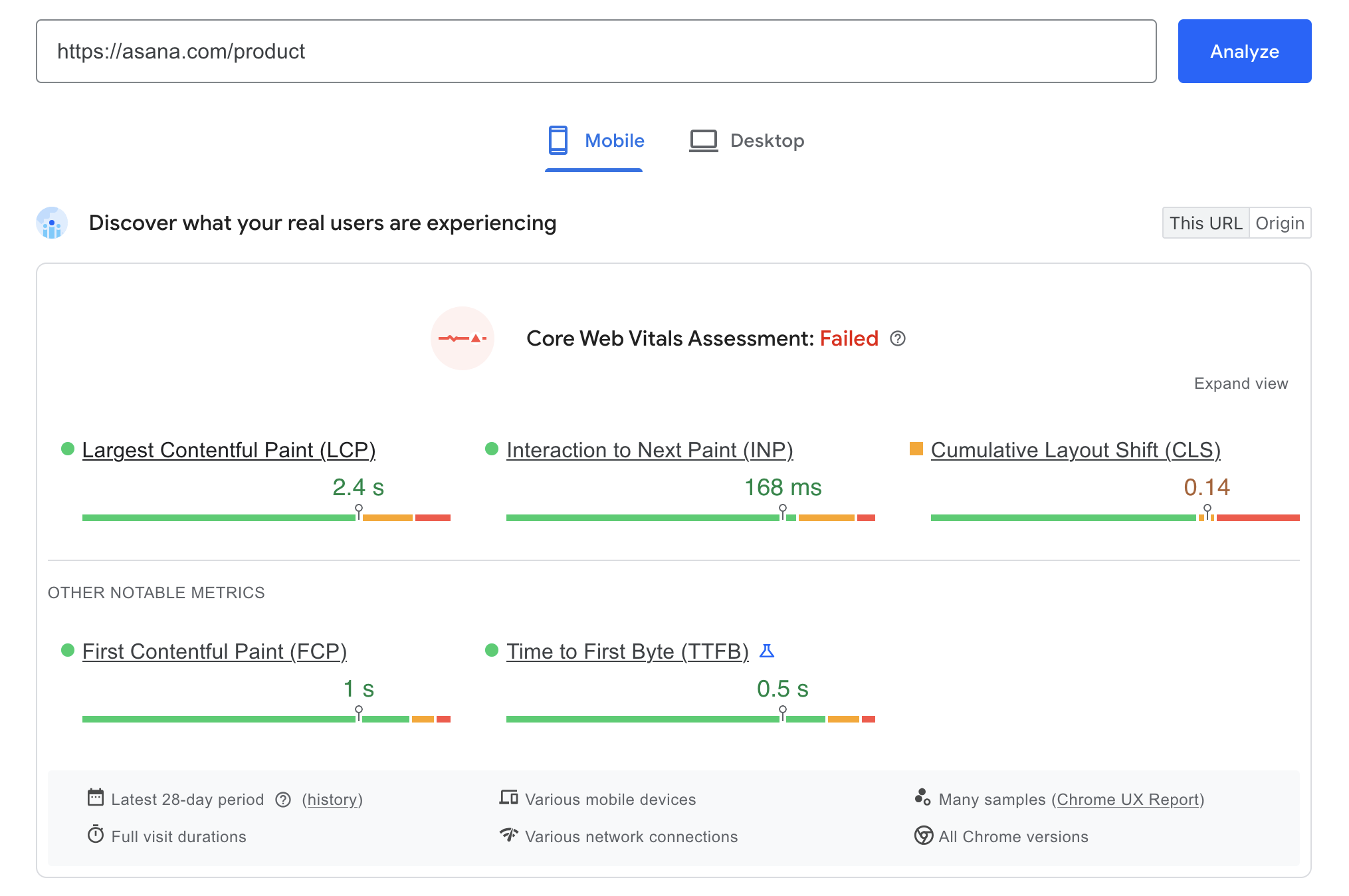
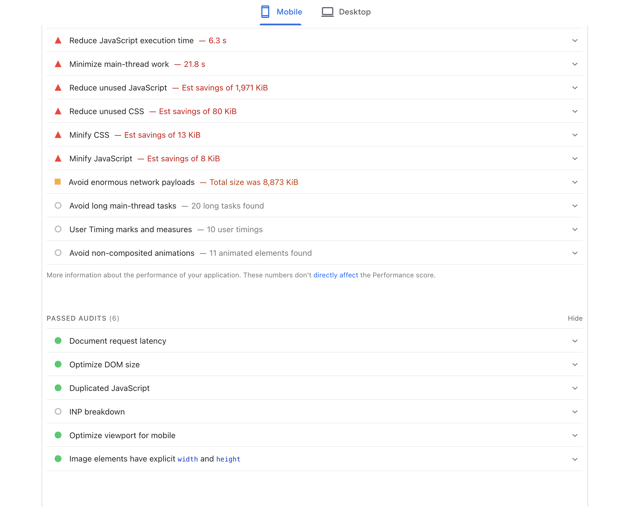
More importantly, check the diagnostics to spot the actual issues you should focus on. You'll get clear recommendations on what to improve, so prioritize the most impactful ones.
If you encounter site speed issues, there are plenty of ways to fix them. If I had to cherry-pick the most effective ones, I'd suggest:
-
Image compression and modern formats like WebP/AVIF (this often makes the biggest impact)
-
Code minification (which reduces file size without changing functionality)
-
Lazy loading for below-the-fold content
-
Reducing third-party script bloat
Whatever you do, don't treat these improvements as just a technical checklist. Every 100-millisecond improvement in load time has a measurable impact on conversions, so think of it in the context of the real user experience.
T-Mobile had this mindset when optimizing their site, and it more than paid off. The team integrated a web-vitals tracking library to capture real user performance data and tied it directly to business KPIs. They found that conversion rates measurably declined with every 100ms increase in LCP.
Their optimization efforts resulted in a 42% LCP reduction, which had tangible results, most notably a 20% reduction in customer complaints and a whopping 60% improvement in visit-to-order rate.
7. Start with wireframes and prototypes for core pages
Wireframes are the cheapest and fastest way to test if the new structure works before committing to full design. They strip away the cosmetics, letting you focus on the layout, content hierarchy, and user flows on a page-by-page basis.
Start with the 5–10 highest-impact pages, such as:
-
Momepage
-
Main landing pages
-
Product/service pages
-
Key conversion pages (squeeze pages, pricing, etc.)
When you get these right, you have the design system for the rest of the site.
In most cases, you'll follow a linear progression:
Low-fidelity sketches → wireframes → interactive prototypes
Each stage adds fidelity and brings you closer to the final product. As such, it should include stakeholder review and user feedback before moving to the next step.
A crucial rule to follow—and I can't stress this enough—is to avoid lorem ipsum text during wireframing. Placeholder text always looks perfect and hides structural content problems, giving you a distorted image of the structure.
If your actual headline is 15 words long but the designer used a 3-word fake Latin placeholder, the entire layout will break when you plug in real copy. That's why you should use real content, or at least a close approximation.
Unless you plan to repurpose some of the site's old content, I'd suggest whipping up some copy you plan to use before getting the design done. It doesn't need to be perfect, just close enough to give you an accurate idea of the layout.
8. Apply UX best practices to layout, navigation, and CTAs
Your website redesign process should be guided by four UX principles that matter most:
-
Visual hierarchy: Guide the eye to what matters most on each page. Use size, color contrast, spacing, and positioning to clearly signal priority so users immediately understand what to read, click, or act on first.
-
Whitespace: Reduce cognitive load and make content scannable. Adequate spacing between sections, text blocks, and interface elements helps users process information faster and prevents the interface from feeling cluttered.
-
Consistency: Use the same patterns, components, and interactions across pages. Repeating familiar layouts, navigation structures, and UI elements helps users build mental models and move through the product without relearning how things work.
-
Accessibility: Ensure WCAG 2.1 compliance as a minimum, not an afterthought. Design interfaces that support keyboard navigation, sufficient color contrast, readable typography, and screen-reader compatibility so the experience works for the widest possible range of users.
I already covered navigation from the IA perspective, but I need to mention one more rule that's often overlooked—descriptive labels over clever or fun ones.
Sure, "Our Journey" sounds nice, but it can also be pretty vague. As boring as it may be, sticking to "About Us" provides immediate, universally understood context.
These seemingly small changes can have a bigger impact than you think. For example, Formstack discovered during their redesign that renaming a main navigation item from "Why Use Us" to "How It Works" increased page views by 50% and conversions by 8%
When designing CTAs, make sure they:
-
Stand out from the background
-
Contain action-oriented copy
-
Naturally follow decision points in the user flow
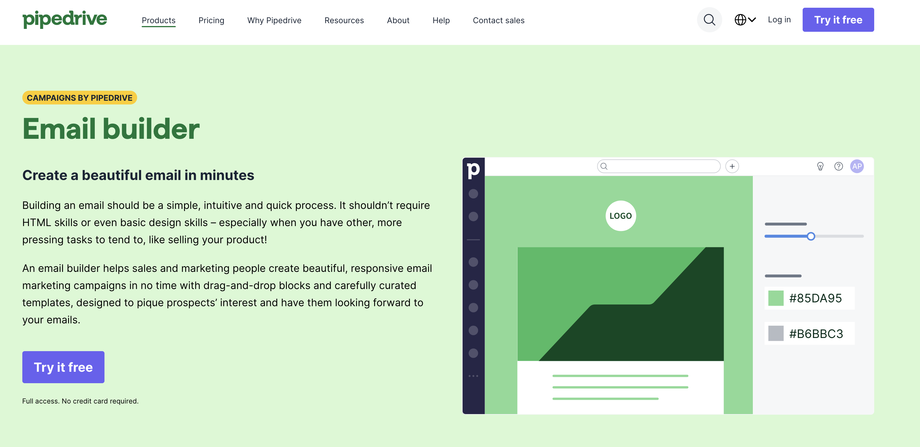
Pipedrive does this well in its product pages. When you open one, you'll see a visually distinct CTA in the header and another in the hero section.
As you scroll down and learn more about the product, you're greeted with another one with a bit of copy that increases your confidence in the solution:
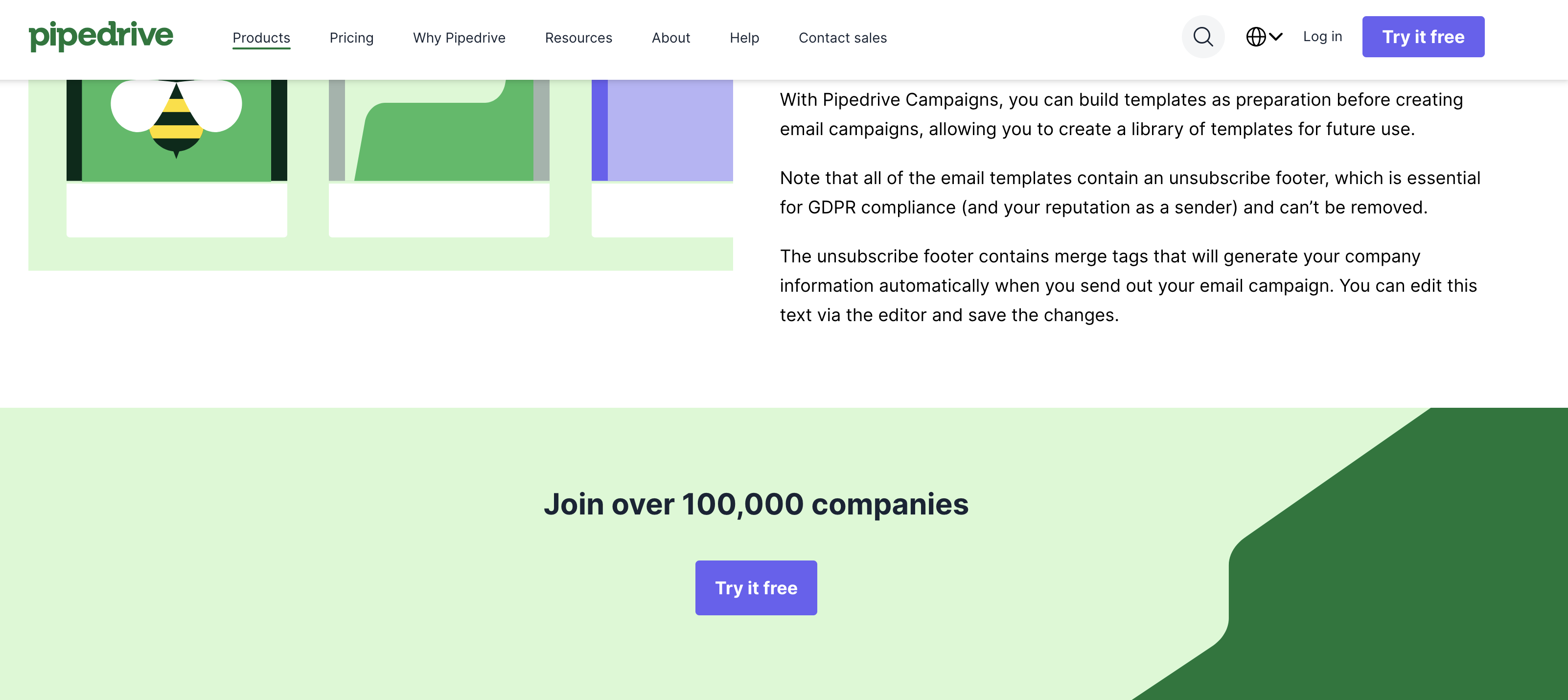
And then at the bottom of the page, there's the third CTA with the final nudge focused on the financial value:
It's also a good idea to come up with alternative CTAs for users who may not be able to commit fully. For example, instead of just inviting users to purchase or sign up for your solution, you can encourage them to:
-
Check out some free resources
-
Sign up for a newsletter
-
Read testimonials and case studies
These secondary CTAs are often contextual, so make sure to place them where they belong. For example, you can add one of the most compelling testimonials to a product page and include a CTA to explore more.
9. Lead with the content strategy, not aesthetics
I mentioned that during wireframing, you should first write copy and then design to make sure everything fits well. You can (and probably should) apply that same logic throughout the site.
The reason is simple—when design leads, content gets shoehorned into templates that were not built for it. But when content leads, design serves the message and the user's needs.
One of your site's main goals is to help users find value as quickly and easily as possible. And that's exactly what content does. The design is there just to support it and make sure the user experience is smooth and enjoyable.
As you're not starting from scratch but redesigning an existing site, you probably have some content you'll want to carry over. To do it right, perform a content audit and split your pieces into four buckets:
-
Keep
-
Update
-
Consolidate
-
Remove
When you know what content you'll keep (and how you'll tweak it for the new site), you need to conduct a gap analysis to see what topics or pages are missing. This will probably involve some competitor research, so identify 3–5 competitor websites and compare the content you'll keep to their articles, pages, and other resources you may not have.
This is also where you'll want to do some SEO work. At a minimum, you should outline the primary and secondary keywords that all pages will target. You can do this with free tools like Google Keyword Planner or a more capable third-party option if you have the resources and bandwidth.
Lastly, you'll need a content production plan for new pieces, which will include:
-
Your target audience and the related details
-
Editorial calendar (topic titles, content types, and publishing dates)
-
Content workflow (e.g., brainstorming > drafting > editing > SEO > design > uploading)
-
KPIs and performance monitoring guidelines
Think of the content development plan as the site's structural blueprint, which should be done before any design work. The "design first, fill in the words later" approach will most likely result in generic, underperforming content, which is a high price to pay for prioritizing the looks.
That's why digital marketers and other experts always recommend focusing on the substance first. A good example is 3 Aspens Media, which advocates a content-first redesign methodology where SEO audits and content architecture are completed before design begins. This prevents the common pattern of designing beautiful pages that underperform because content was treated as an afterthought.
10. Run usability and A/B tests before launch
Testing is the last quality gate before launch. No matter how carefully your design team reviews everything, they're too close to the redesign project and can't see what actual website visitors do.
To avoid myopic decisions, run usability tests where real users will perform specific tasks on prototype or live-site designs to give you valuable insights on:
-
Real user behavior
-
Pain points and frustration
-
Overall navigation experience
No matter how good the redesign is, you'll probably get some user feedback worth implementing. When you do, you can move on to A/B tests that will compare old and new pages to show you the tangible impact of the redesign. For example, you can show 50% of users version A and 50% version B, and then measure metrics like:
-
Click-through rates
-
Bounce rates
-
Form submissions
Make sure to run both types of tests across devices and browsers, with special attention to mobile. Check forms, CTAs, navigation flows, and page load times on actual phones and tablets, not just browser developer tools on a laptop.
Testing should validate the redesign against the goals you set during planning. If the new site does not outperform the old one on your target KPIs, it is not ready to launch.
Sam Goertler, Asana's PM, said that testing and iteration were one of the most important aspects of the company's product redesign.
He specifically highlighted an A/B test performed on the redesigned top bar navigation. It was only after the test showed improved performance that the rest of the team got fully on board with the redesign.
This shows that cold data speaks the loudest. Instead of assumptions or wishful thinking, rely on it to understand the real impact of your redesign and check if anything needs more work before launch.
11. Monitor performance and iterate post-launch
Your website redesign strategy doesn't end at launch day. This is only the end of the first phase, after which you need to keep track of whether the redesign is actually yielding the results you were looking for.
Post-launch monitoring should follow a structured cadence:
-
Daily checks in the first week
-
Weekly reviews for the first month
-
Monthly reviews at 60 and 90 days
Don't ignore daily reviews immediately after launch. This is when you might spot the most pressing issues that might have crept in, and that shouldn't wait a week to get solved. Specifically, you should monitor:
-
404 errors and broken redirects (catch these in the first 24–48 hours)
-
Analytics integrity to confirm data is flowing correctly into GA4
-
Core Web Vitals in the field based on actual user data, not just lab scores
-
Crawl errors in Search Console (pay attention to any indexing issues)
-
Conversion rates versus your pre-redesign baseline (which is the whole point of documenting that baseline)
You don't need to stare at the screen all day to get the data you need. You can set up automated alerts for critical metrics (e.g., traffic drops exceeding 15%, spikes in 404 errors, or conversion rate declines). This lets you catch problems in hours instead of discovering them in a monthly report weeks later.
If you notice some SEO fluctuation in the first days (or even a couple of weeks) after launch, don't worry or assume that the redesign failed. Rankings may dip temporarily as Google recrawls and re-evaluates the new site architecture, which is perfectly normal. If you built your redirect map correctly, all you need is a bit of patience.
Performance monitoring isn't just about catching and fixing issues—you should also use it to identify further optimization opportunities. As your redesign settles, take some steps to highlight new areas of opportunity. For example:
-
Use heatmaps and session recordings to understand how users actually behave on the new site
-
Run A/B tests to validate further changes before full rollout
-
Send user feedback surveys to capture qualitative signals
-
Analyze conversion funnels to identify new friction points
When monitoring your performance, do it against the key goals of your redesign. For example, when Stanley underwent a redesign and site migration, SEO was the priority.
By monitoring and refining the SEO strategy after launch, the site saw a 156% increase in total keyword rankings by December compared to October, with organic traffic rising to 200% of pre-migration levels.
Your free website redesign checklist
-
Audit current site performance, traffic, and keyword rankings: Pull data from Google Analytics and Search Console to identify the biggest red flags before making any changes.
-
Document pre-redesign analytics baseline: Record current sessions, conversions, top pages, and speed metrics so you have a benchmark to measure results against.
-
Define 3–5 measurable redesign goals tied to business outcomes: Turn vague intentions like "improve UX" into specific targets like "reduce bounce rate from 68% to under 50%."
-
Research competitor websites and identify structural gaps: Analyze 3–5 top performers for navigation, CTAs, content depth, and traffic sources to find opportunities your site is missing.
-
Build a new sitemap and define page hierarchy: Map every page and its place in the structure, keeping all important content reachable within 3 clicks of the homepage.
-
Map primary user flows for key tasks: Trace the steps a user takes to complete high-value actions (e.g., learn → evaluate → convert) and design each page to hand off smoothly to the next.
-
Create a comprehensive URL redirect map (1:1 301 redirects): Map every current URL to its new destination before development begins to avoid losing years of accumulated SEO equity.
-
Develop a content strategy: audit existing content, plan new content, assign keyword targets — Sort current content into keep/update/consolidate/remove buckets, identify topic gaps, and assign keyword targets to every page before design starts.
-
Create wireframes and prototypes for core page templates: Test layout and user flows on your 5–10 highest-impact pages using real copy, not lorem ipsum, before committing to full design.
-
Apply UX best practices to navigation, layout, and CTAs: Use visual hierarchy, whitespace, consistent patterns, and WCAG 2.1 accessibility standards to guide users to the right action on every page.
-
Design mobile-first with Core Web Vitals optimization: Start with the smallest screen and work up, while hitting Google's LCP, INP, and CLS benchmarks to protect both rankings and conversions.
-
Build and develop on a staging environment: Complete all development and QA on a staging server so bugs and broken redirects are caught before they affect real users.
-
Run usability tests and cross-device QA: Have real users complete key tasks and run A/B tests against the old site to confirm the redesign measurably improves your target KPIs.
-
Launch with monitoring in place: Go live with analytics, automated alerts, and Search Console configured so broken redirects, indexing errors, and conversion drops are caught within hours.
-
Review performance at 30, 60, and 90 days and iterate: Measure results against your pre-launch baseline and use heatmaps, A/B tests, and user surveys to find the next layer of improvement.
Get the most out of your redesign
A successful website redesign is built on data, not guesswork. Set the stage with thorough audits, and the path forward will pretty much reveal itself. Validate every change against a documented baseline, and tie each decision back to a concrete business outcome.
After building your website redesign plan, don't set it in stone. Leave room for the flexibility you might need if usability tests and performance reports call for a change of course. Make sure all the key stakeholders are on board with the plan, and keep them posted on the results so you can keep improving as needed.