10 Usability Heuristics for UX Design

Khanh Linh Le
Created on Jan 30, 2026
Most people use dozens of digital products every day, yet rarely do users recognize why some feel easy to use while others create friction. The difference usually isn’t visual polish or feature count. It comes down to usability.
That’s what we call usability heuristics. These are foundational principles that help designers create interfaces users can understand, navigate, and trust without extra effort. They act as guardrails, keeping products intuitive instead of confusing as complexity grows.
In this article, I’ll break down the 10 usability heuristics for UX design, explain what each one means in practice, and show you how to apply them using clear, real-world examples.
What are usability heuristics?
Usability heuristics are broad guidelines for evaluating and improving user interface design. They’re not specific usability guidelines, strict rules, or step-by-step instructions. Instead, they help you quickly judge whether an interface is likely to feel clear, predictable, and usable.
The word heuristic literally means a rule of thumb.
In UX/UI design, that’s exactly how heuristics work, which are practical shortcuts for spotting usability issues early. You can use them to review screens, flows, or prototypes and catch obvious problems without running full user testing every single time. That makes them especially useful when time, budget, or access to users is limited.
The most widely used set of usability heuristics was created by Jakob Nielsen in 1994. Even 30 years later, these 10 heuristics are still relevant because they’re grounded in human psychology.
Think of how people perceive feedback, process information, and recover from mistakes. Human behavior hasn’t changed, while the interfaces around it have.
Why usability heuristics matter for UX design
Usability heuristics matter because they give UX teams a fast, reliable way to spot friction before it reaches users. Instead of relying on vague feedback like “this feels off,” heuristics act as practical guardrails that help you evaluate clarity, navigation, and trust across an interface.
When I look at digital products that feel confusing or frustrating, usability heuristics often help me explain why the experience breaks down. They give teams a practical way to evaluate interfaces without overanalyzing every design choice.
They matter UX design basics because they help teams:
-
Evaluate early designs with limited context: When prototypes are still rough, heuristics make it easier to assess clarity, feedback, and flow even when real users aren’t involved yet.
-
Talk about usability in concrete terms: Instead of vague feedback like “this feels off,” heuristics give teams a shared vocabulary. You can point to specific issues, such as "missing error prevention" or "poor visibility of system status", and align more easily on what needs fixing.
That said, heuristics aren’t a replacement for user testing. Research shows that heuristic evaluation and usability testing uncover different types of usability problems. Heuristics tend to surface broader, principle-level issues, while user testing reveals problems tied to real user behavior and context.
Therefore, when you combine both methods, you have more complete issue coverage than using either method alone.
10 usability heuristics explained
Below are Jakob Nielsen's principles that have become the industry standard for UX design best practices.
What keeps them relevant through 30 years of interface evolution is that they're grounded in fundamental mismatches between humans and machines rather than any individual screen designs or UI technologies.
Nevertheless, you shouldn't follow these guidelines mechanically. In practice, they can sometimes pull in different directions. Improving one heuristic may weaken another, which means applying them well requires judgment and context, not blind rule-following.
Now let's dive into the specifics.
1. Keep users informed of system status
When you take an action, the system should immediately show what’s happening so you understand the result without second-guessing it.
You see this in progress bars during file uploads, loading spinners when pages refresh, or confirmation messages after submitting a form.
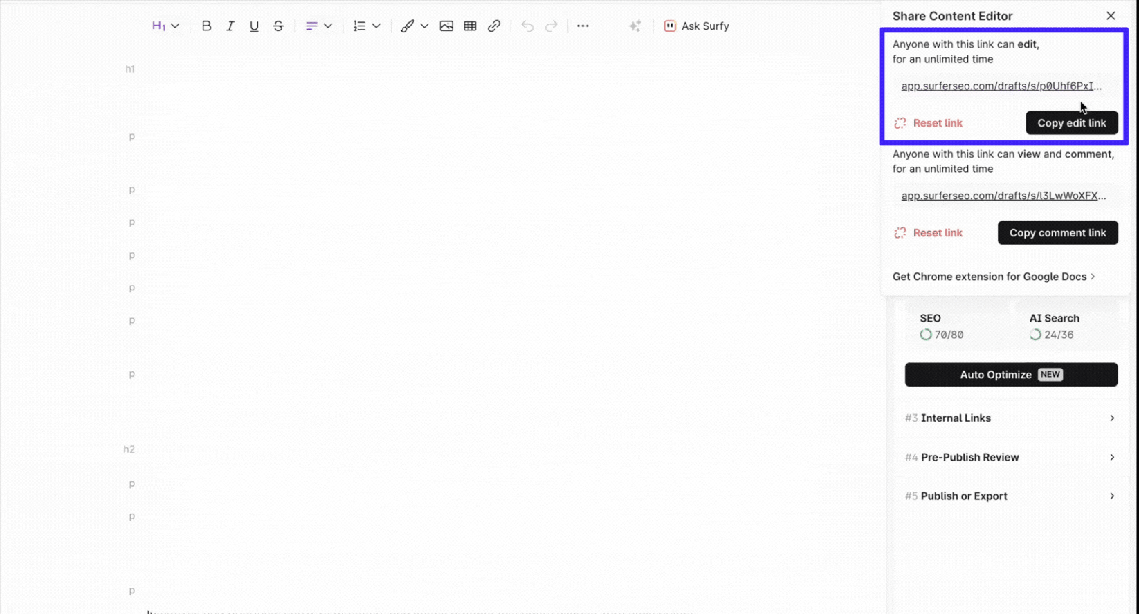
For example, Uber displays your driver's location in real-time during pickup, or Surfer shows "Copied" when you copy an editable content draft link.
These simple signals reduce uncertainty and prevent users from tapping the same button multiple times because they weren't sure if the first time worked
2. Use familiar language and concepts
This is about helping users understand an interface without having to learn its internal logic.
When a product uses words, layouts, and concepts familiar to users, it feels intuitive because it mirrors how they already think about the real world. The interface speaks your language, not the system’s.
You see this principle at work in everyday physical objects. For example, the front-left control usually operates the front-left burner on a stovetop. Users don’t need labels or instructions because the layout follows a natural and logical order. It matches users' mental model.
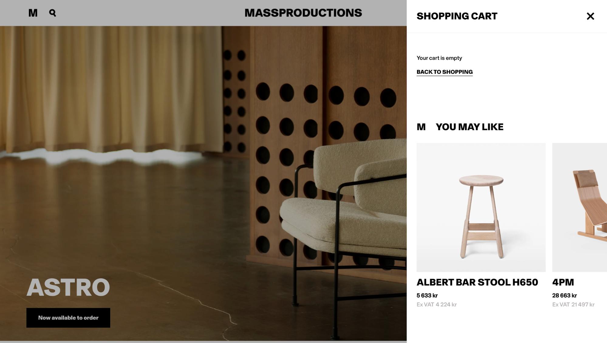
Good digital products do the same thing. E-commerce sites talk about a “shopping cart” and “checkout” instead of technical terms like “transaction queue” because the shopping metaphor immediately makes sense and reduces cognitive effort.
When teams ignore this heuristic, the usability cost can be severe, especially in domain-specific systems. A heuristic evaluation of a hospital statistics system used in Iranian hospitals is a good example.
Evaluators found 86 usability problems in total, and a significant chunk of them came from two places: Poor help and documentation, and unfamiliar system language. In fact, 11 issues were directly tied to the system not using language healthcare workers actually understood.
So, the more specialized the domain, the more intentional you need to be about language and mental models.
3. Give users control and easy exits
User control is all about giving users a way out when something goes wrong.
When an interface lets you undo, redo, or cancel an action, it puts you back in control instead of forcing you to follow a rigid process. Clear “emergency exits” matter because they let you recover from mistakes without stress or unnecessary steps.
You see this most clearly in features like Gmail’s Undo Send, which gives you a short window to reverse an email before it actually goes out.
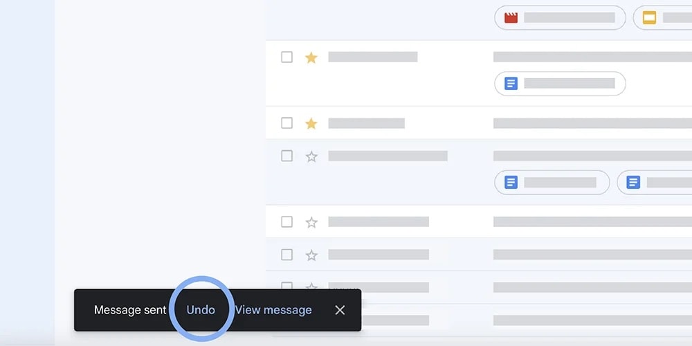
Image source: Google Blog
The same idea shows up in simpler patterns, like back buttons or cancel options that let you exit a flow you entered by mistake. These controls reduce anxiety because you know your actions aren’t permanent. That confidence makes the product easier to use, which ultimately enhances user satisfaction.
4. Maintain consistency throughout
Maintaining consistency means reducing the mental effort you spend figuring out whether things mean the same thing.
When an interface stays consistent, you don’t have to relearn how it works as you move through it. Think of using the same words, icons, and behaviors in similar situations. Consistency lowers cognitive load by letting you rely on patterns instead of constant interpretation.
A familiar example is the shopping cart icon. Across most e-commerce sites, it signals “view items to purchase,” and you know what will happen before you click because the meaning is consistent.

This works on two levels.
Internal consistency means patterns stay the same within a single product or product family. External consistency means following industry conventions that users already recognize, so expectations transfer naturally from one product to another.
5. Prevent errors before they happen
Prevention beats correction. This means the best interfaces eliminate error-prone conditions or checks for them before you commit to potentially destructive actions.
You'll often see this in the form of confirmation dialogs and constraints like character limit counters on text fields, a disabled form submission button unless all the fields are filled, etc.
Such designs are so common today that you might not notice them.
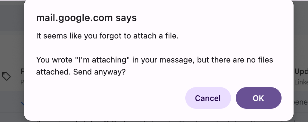
I can't count how many times Gmail has saved me from sending an email without the attachment I mentioned. When you write something like "I've attached the document" in your email body but forget to actually attach a file, Gmail catches it and asks, "It seems like you forgot to attach a file" before sending.
It's one of those small features that prevents genuine embarrassment.
6. Minimize memory load
If possible, try to prioritize recognition rather than recall. You should keep relevant details visible so they can recognize what they need rather than recalling it from memory.
A classic way to see the difference is this. It’s easier to answer “Is Lisbon the capital of Portugal?” (which is recognition) than “What’s the capital of Portugal?” (which is recall).
Interfaces work the same way.
That's why dropdown menus work better than text fields, where you have to remember and type valid inputs.
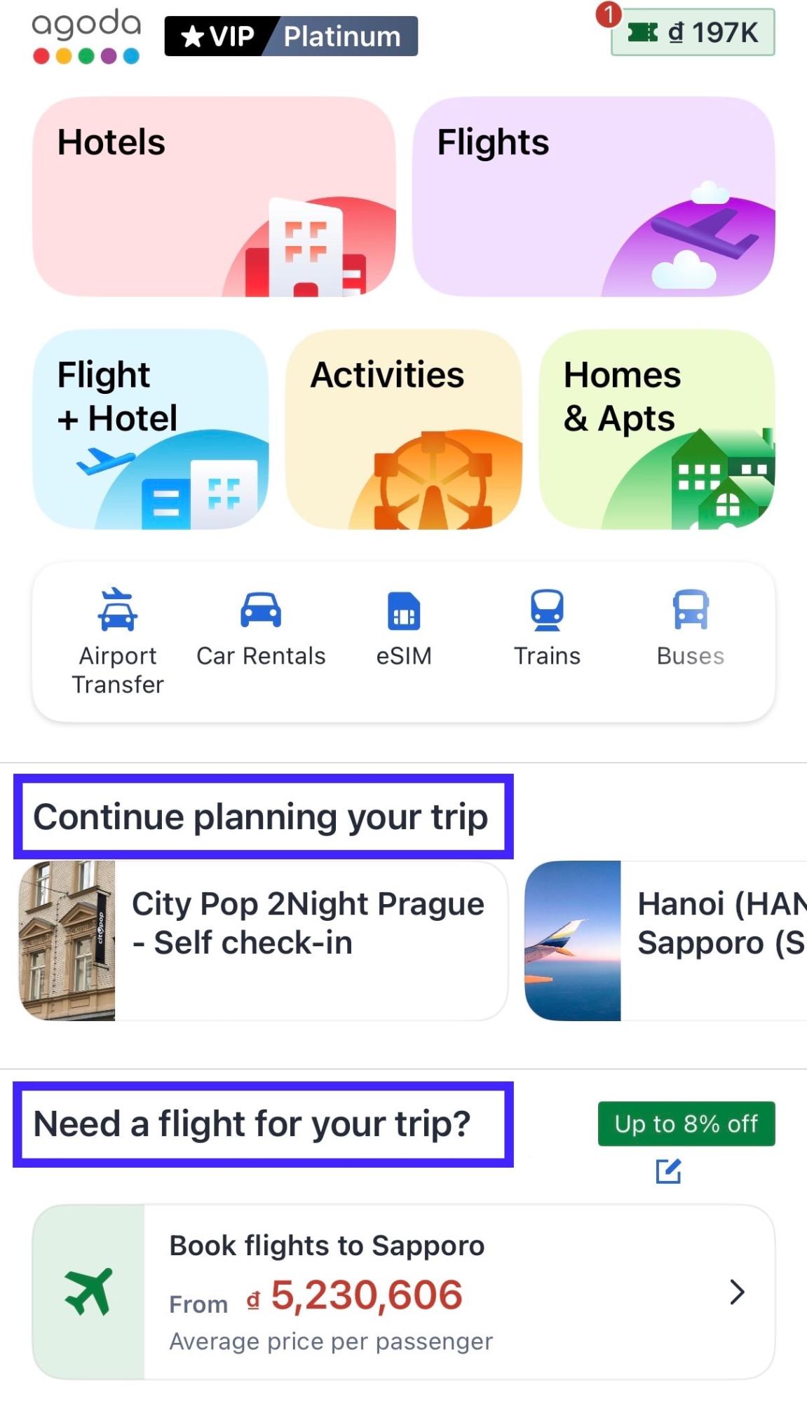
For example, e-commerce sites like Amazon show recently viewed items on your homepage, Google displays your search history as you type, and booking platforms like Agoda keep your travel preferences visible throughout the flow.
These features are such brilliant moves because they reduce users' memory load significantly. They show you options to recognize instead of asking you to remember details from earlier screens.
7. Support both novice and expert users
Your interface ideally should work for everyone, from first-time users to experienced users who interact with your product daily. However, the challenge is doing this without making either group feel like the design is working against them.
A common way to address this is through enabling shortcuts and customization.
You see this clearly in tools like Gmail, Photoshop, or any Microsoft applications. As a new user, you can rely on visible buttons and menus to get things done without memorizing anything. Over time, keyboard shortcuts like pressing “c” to compose an email or Ctrl+S to save let power users move faster without adding complexity for everyone else.
This approach is often called progressive disclosure. The interface shows essential options by default, while advanced features stay available when you’re ready for them
8. Remove unnecessary elements
Interfaces should focus on essentials. This is simple because every extra unit of information in an interface competes with the relevant units of information and diminishes their relative visibility.
It's even more critical on mobile devices, where screen space is limited, and users are often distracted, multitasking, or interacting in short bursts.
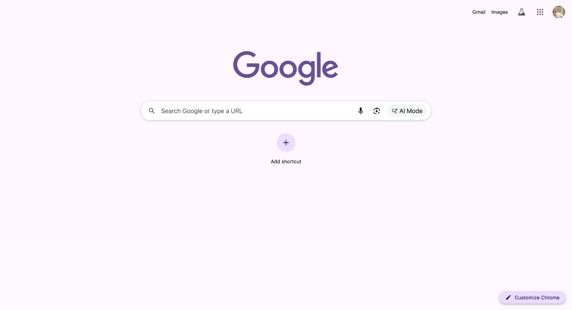
The most classic example I can think of is Google's homepage. It strips the experience down to a logo and a search box, making the next action obvious without explanation.
By contrast, cluttered interfaces force you to scan, filter, and interpret before you can act. This doesn’t mean every product should go for an aesthetic and minimalist design. This is even more important when designing products for mobile devices, where space has always been little
Rather, it means each element should earn its place by supporting a real user's task. When something doesn’t, removing it often improves usability more than adding another feature.
9. Provide clear error messages and solutions
When errors happen, your message shouldn't just tell users something went wrong; it should help them fix it.
That's why it's important to use plain language instead of technical jargon for these messages, and clearly describe the exact problem rather than generic statements like "An error occurred".
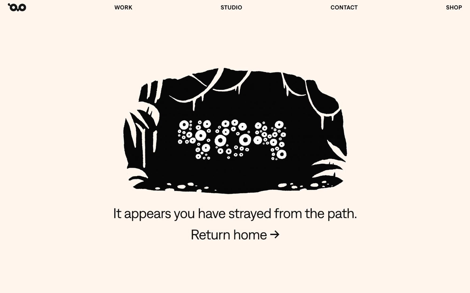
The difference is night and day. A helpful message like "We can't find that page. The link might be broken, or the page may have moved. Try searching or return to the homepage" is a much better error 404 than just displaying "404" alone.
Visual treatments matter too.
You should use color, icons, and text hierarchy to make errors noticeable without being overwhelming. Position error messages near the problem area so users can connect the message to what needs fixing.
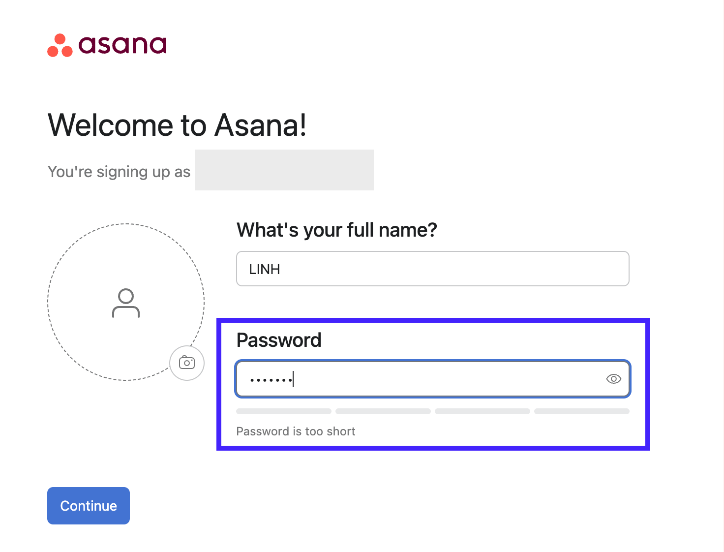
For example, highlight form fields with a red border and provide a short inline message like "Password must be at least 8 characters" right next to the field, rather than listing all errors at the top of the page where users have to hunt for what went wrong.
That's what Asana does when a new user sets up a password that's too short.
10. Offer accessible help when needed
Even well-designed products reach moments where you hesitate. The difference between a smooth experience and a frustrating one often comes down to whether help shows up at the right time.
This heuristic acknowledges that interfaces should be largely self-explanatory, but when guidance is needed, it must be easy to access, task-focused, and immediately useful.
For example, Stripe surfaces contextual explanations next to complex fields like payment methods or tax settings, so you don’t have to leave the page to understand what’s required. Or Notion uses inline tooltips and subtle prompts to explain features as you encounter them.
Even Slack’s “Learn more” links open short, targeted explanations tied to the exact action you’re taking.
How to conduct a heuristic evaluation
Once you understand the heuristics, the next step is applying them when conducting heuristic evaluations.
A heuristic evaluation is a structured review where you inspect an interface against the said principles to surface usability problems systematically.
You can run this kind of evaluation on almost anything, such as a live SaaS product, an early prototype, or even a competitor’s site if you want to spot patterns and gaps in the market.
While one person can perform heuristic analysis, it's better to have a team of three to five independent evaluators working on the same project.
This is simply because each person might notice different problems, and together they give you a much more complete picture of where usability breaks down.
Now, let's get into the steps!
1. Prepare your evaluation scope and objectives
Before you start reviewing screens, you should be clear about what you’re evaluating and why. A heuristic evaluation works best when the scope is focused.
That might mean reviewing the entire product if it’s small. But more often, it’s smarter to concentrate on specific flows like onboarding, checkout, or account setup. These are where usability issues have the biggest impact.
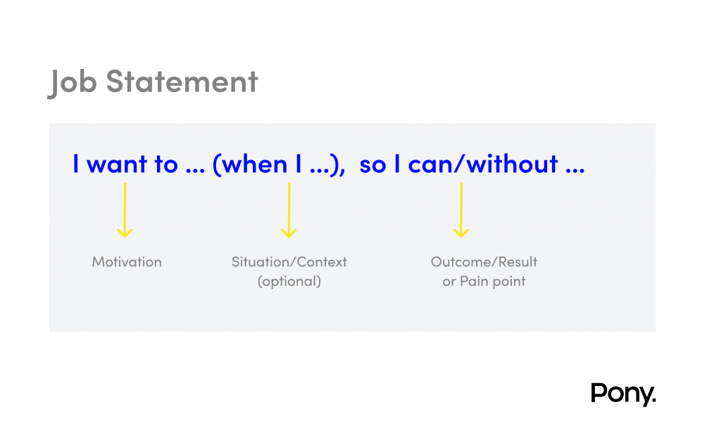
At this stage, I find it useful to ground the evaluation in real user goals. Having user personas or clear job-to-be-done statements on hand helps evaluators judge issues from the user’s perspective, not their own assumptions.
It’s also important that everyone involved understands the heuristics themselves. A short training session or a practice round on a simple, familiar interface can align how evaluators interpret each principle.
Finally, set up a shared template or spreadsheet to consistently log issues. It can include fields like what heuristic is violated, where it happens, and why it matters.
Depending on the size of the product, this step can take several hours or stretch across days. For large applications, the best practice is to evaluate one section at a time, rather than trying to assess everything in a single pass.
2. Conduct independent evaluations
One of the biggest mistakes teams make in heuristic evaluations is doing the review together as a group. That sounds efficient, but it kills one of the biggest advantages of this method: Different evaluators see different problems.
That's why in practice, I often recommend a simple two-phase process for each evaluator:
-
During the first phase, you'll use the product freely, complete key tasks, explore navigation, trigger states like errors or empty screens, and get a feel for how the product behaves. All without applying any heuristic principles to understand the interaction scope and identify which elements matter.
-
In the second phase, you slow down and systematically apply the heuristics. Go through each relevant screen, flow, and component and check it against the principles to spot violations.
As you record problems, specificity is non-negotiable. Vague notes like “this layout is confusing” or “the registration flow is confusing” don’t help designers fix anything.
Instead, a useful note would be "During registration, inconsistent button placement violates Heuristic #4 (Consistency). The ‘Continue’ button appears on the right in Step 1 but on the left in Step 2, forcing users to visually hunt for the primary action and slowing task completion.”
So make sure your note answers What, When, Where, and How.
3. Consolidate findings and assign severity ratings
At this step, what I do is compile all the recorded problems into one master list, remove duplicates, and then assign severity ratings so you can prioritize what to fix first.
Start by merging everyone’s findings into a shared document or spreadsheet. You’ll almost certainly see the same issue described two or three different ways. That’s okay at this stage, but it’s your job to unify those entries so you’re not double-counting. Once you’ve got a clean list of unique issues and appropriate feedback, it’s time for the severity rating.
I recommend sticking with Nielsen’s 0–4 scale for this because it gives enough granularity without overcomplicating things:
-
0 = Not a problem
-
1 = Cosmetic
-
2 = Minor usability problem
-
3 = Major problem
-
4 = Usability catastrophe
By having each person rate independently and then averaging their scores, you smooth out those individual biases and end up with a more realistic sense of what really matters.
Once that’s done, we hold a debriefing meeting where the team walks through the consolidated list together. This is a chance to ensure everyone understands the descriptions and agrees on the severity averages. It’s also the moment when you make issue prioritization, especially when resources are limited.
One thing I always remind teams at this point is that not every flagged issue is a real problem. Heuristic evaluation is great at surfacing potential issues, but research shows that roughly 34% of these flagged items don’t turn out to be actual problems when you validate with real users.
That’s why heuristic evaluation works best as a complement to real usability testing rather than a replacement for it.
Heuristic evaluation vs. usability testing
This is a question I hear all the time: Should you run a heuristic evaluation or usability testing?
The real answer is that it’s not an either-or decision. They solve different problems, and confusing the two is where teams usually go wrong.
Here are the key differences:
-
Speed: Heuristic evaluation takes about 15.5 hours, including data analysis. Meanwhile, usability testing requires around 45 hours when you factor in recruiting participants, running sessions, and analyzing results. That's roughly 1-2 days for heuristic evaluation versus 1-2 weeks for usability testing.
-
Cost: Heuristic evaluation is significantly cheaper. One study found it cost $10.54 compared to $47.30 for usability testing. With heuristic evaluation, you're using your internal team. With usability testing, you need to recruit participants, provide incentives, and potentially invest in testing tools.
-
Types of findings: Heuristic evaluation helps with spotting principle violations. Things like inconsistent navigation patterns, missing feedback, or unclear labels that break established guidelines. Meanwhile, usability testing reveals how users behave. For example, unexpected workflows, confusion points you didn't anticipate, or problems that only surface when someone unfamiliar with the system tries to complete actual tasks.
Because of this, heuristic evaluation works especially well early in the design process and between user testing rounds, when you want to catch obvious issues quickly.
Nevertheless, heuristic evaluation cannot fully replace othe user usability inspection methods because only real users can validate whether a design actually works for your specific audience in their actual context. Ideally, you should use both methods as complements to each other.
3 usability heuristics tools
You don’t need fancy software to run a heuristic evaluation. A shared spreadsheet can work fine, especially for small teams or quick reviews. That said, once evaluations involve multiple reviewers, larger products, or repeated cycles, specialized tools can make the process far smoother.
If that's the case for you, here are 3 tools to consider:
Tool 1: UX Check (Chrome Extension)
UX Check is a free Chrome extension that brings Nielsen’s 10 usability heuristics directly into your browser, letting you evaluate any live website as you navigate it.
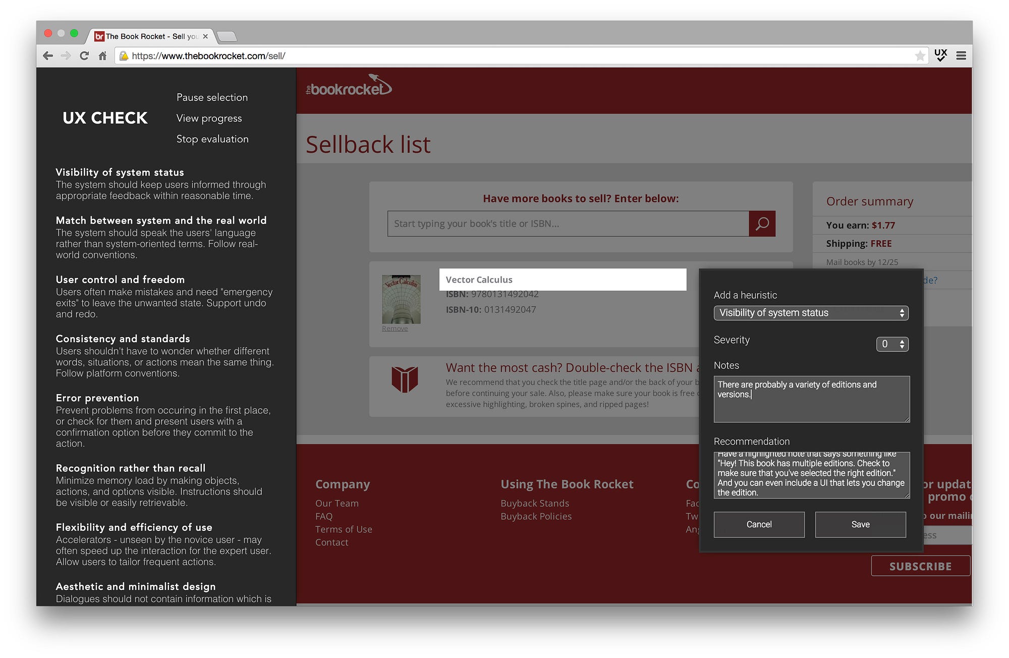
Image source: Chris Gallello
As you click through pages, you can annotate specific elements, automatically capture screenshots, and map each issue to a heuristic without switching tools.
It also supports custom heuristic lists and lets you export findings as a Word document, making it easy to share results or turn them into actionable reports.
UX Check works especially well for individual evaluators or small teams who want to run quick audits without setting up complex workflows.
Because it’s lightweight, free, and works on any live site, it’s a solid choice for beginners learning heuristic evaluation and for experienced UX professionals conducting solo reviews.
Tool 2: Heurio (Chrome Extension)
Heurio is a modern Chrome extension built for team-based heuristic evaluations.
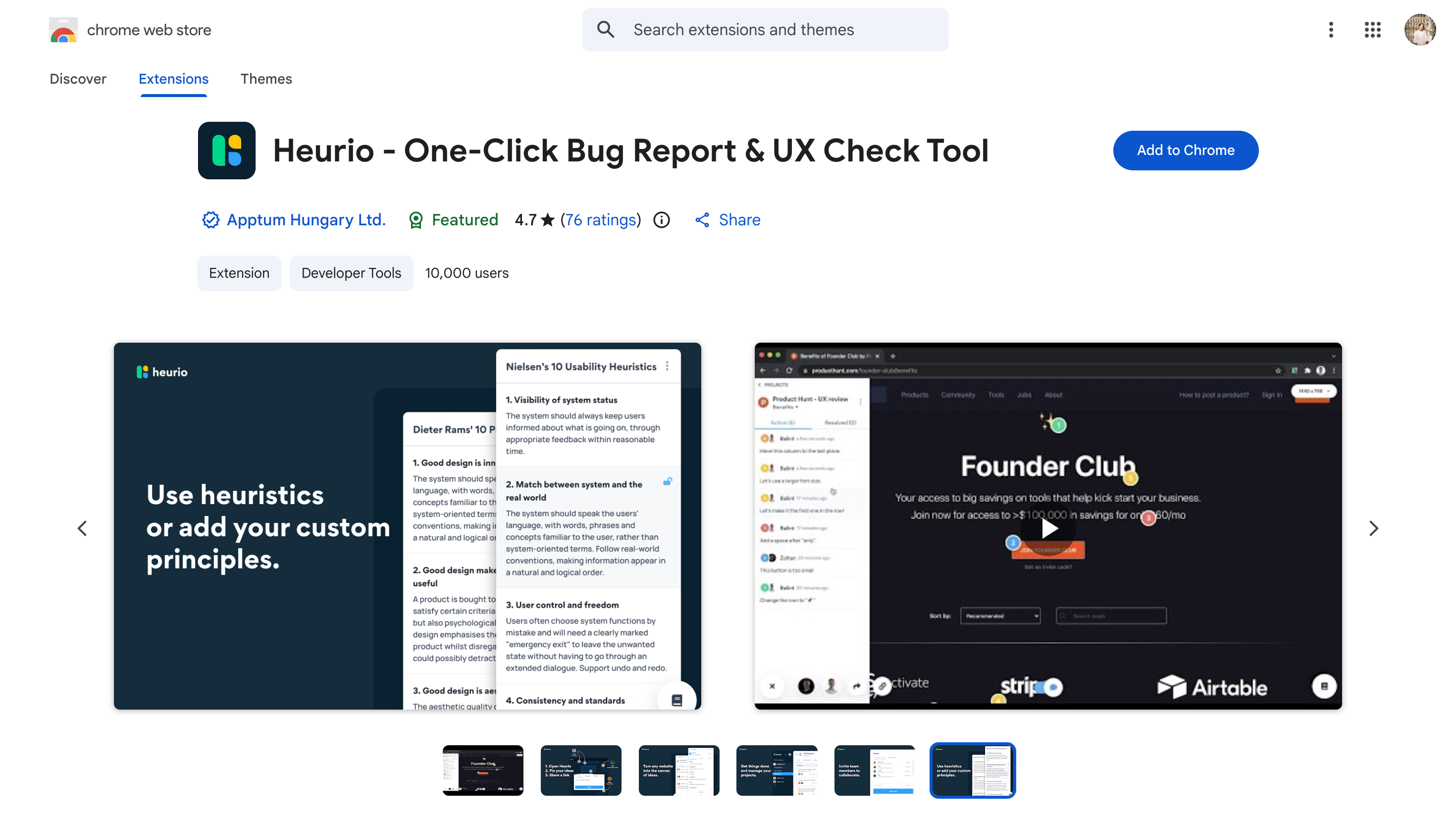
It lets you leave visual comments directly on live websites and web apps, so feedback stays tied to the UI instead of screenshots or docs.
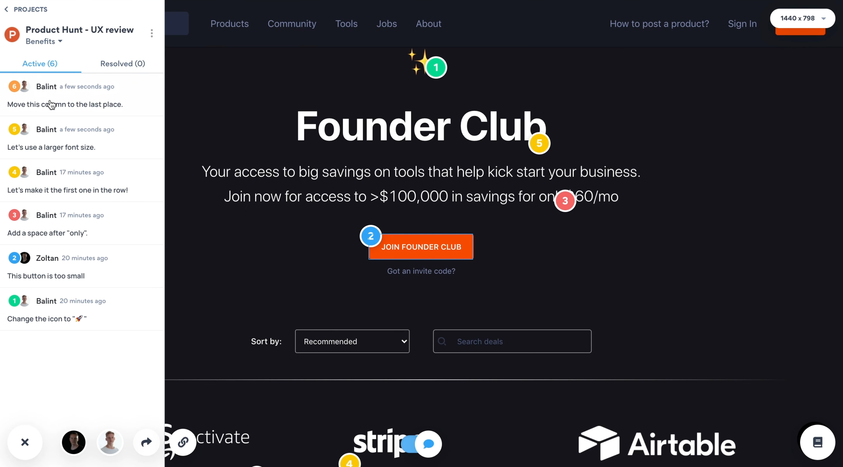
It supports multiple heuristic frameworks out of the box, including Nielsen’s heuristics, Dieter Rams’ principles, and custom lists. This makes evaluations more structured and consistent across teams. You can also assign priorities, use color-coded severity indicators, and collaborate with teammates in real time.
Because it works on production sites, Heurio is especially useful for evaluating live products or running competitor analysis.
There’s a free tier to get started, with paid plans for advanced collaboration and exports.
Tool 3: Miro Heuristic Evaluation Template
If your team already lives in Miro, this heuristic evaluation template is an easy win. It gives you a structured, shared workspace to run evaluations without introducing yet another tool.
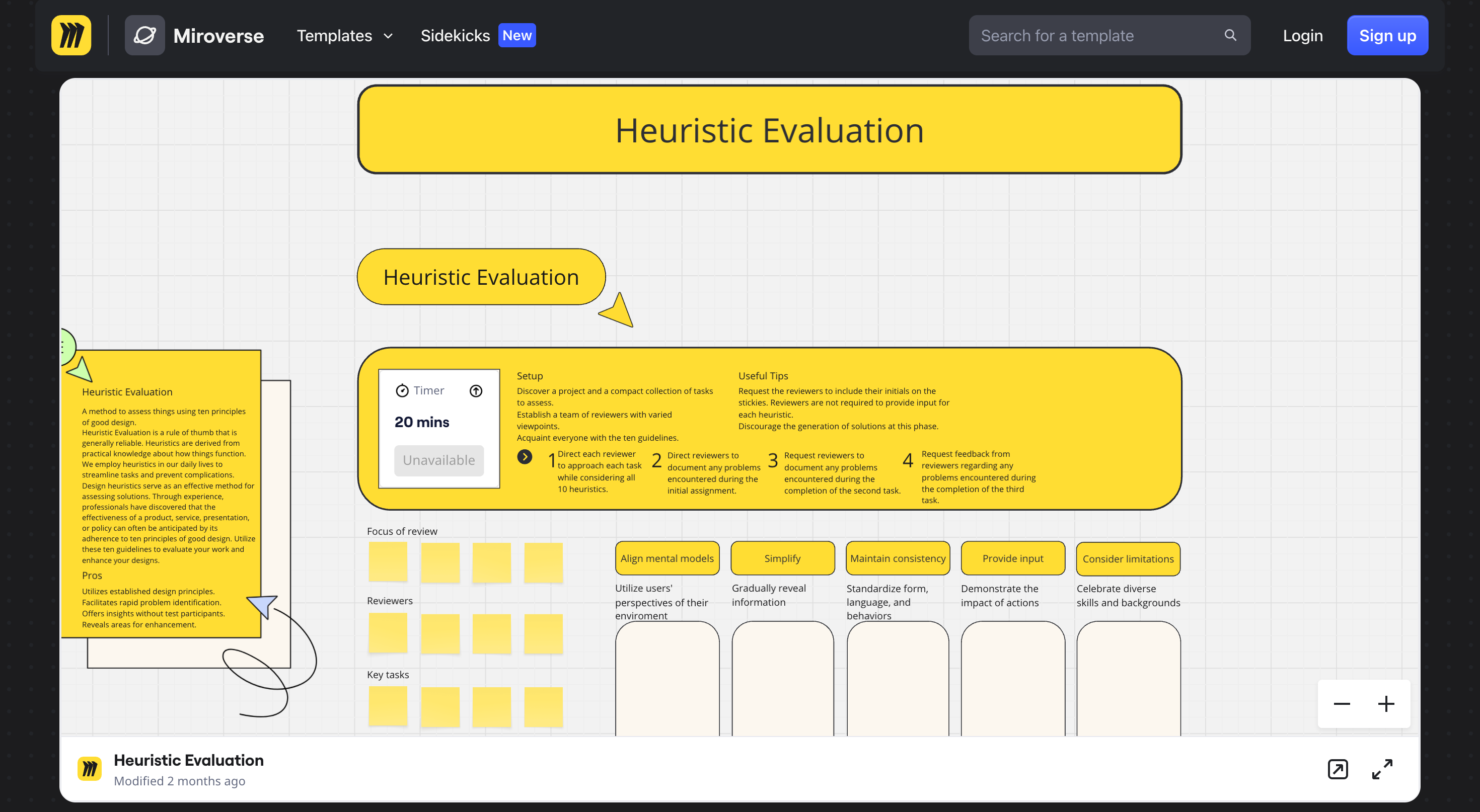
The template uses a sticky-note approach to document issues and includes all 10 established usability principles as built-in references, so evaluators don’t have to rely on memory. What I like most is that it supports separate areas for independent evaluators, which helps prevent groupthink before findings are consolidated.
Once everyone’s done, you can quickly merge insights into a single view, discuss severity, and prioritize fixes together in the same board. No exporting, no spreadsheets, no context switching.
It’s best suited for design teams already using Miro or teams running their first heuristic evaluation together. Miro offers free and paid plans, and the template itself is available to all users.
Start using usability heuristics to catch UX issues early
These 10 usability heuristics have stuck around for three decades because they're grounded in how people naturally think and interact with interfaces.
Whether you're designing something new or auditing an existing product, these design principles give you a reliable way to spot usability issues and make interfaces more intuitive.
If you want to get better at spotting usability issues, start practicing today. Pick one product you use regularly and run through these heuristics. You'll be surprised how quickly you start noticing patterns and problems you'd normally overlook.
When should you use usability heuristics instead of user testing?
Usability heuristics are best when you need a fast way to catch obvious UX issues early, especially before you have a testable prototype or access to users. They help teams identify friction points quickly without waiting for full research cycles.
User testing is still the gold standard for understanding real behavior, but heuristics are a strong first pass. They’re especially useful during design reviews, QA, or when you need to prioritize fixes before running more expensive usability studies.
What are the most common UX problems usability heuristics help uncover?
Usability heuristics help uncover common UX issues like unclear navigation, confusing labels, inconsistent UI patterns, and lack of feedback after user actions. They also highlight problems like poor error handling, missing guidance, and unnecessary complexity.
These issues often don’t require deep research to detect—they’re visible once you evaluate the interface systematically. That’s why heuristics are widely used to improve flows like onboarding, forms, checkout experiences, and product dashboards.
How do usability heuristics improve UX writing and microcopy?
Usability heuristics improve UX writing by making copy clearer, more predictable, and easier to act on. They encourage teams to use language that matches user expectations and reduce confusion during key moments like errors, confirmations, and next steps.
Good microcopy supports usability by setting context, reducing uncertainty, and guiding users through decisions. Heuristics help writers spot places where text feels vague, overly technical, or inconsistent, which can quietly increase drop-offs in high-intent flows.
How do you run a usability heuristic evaluation step by step?
A usability heuristic evaluation involves reviewing a product screen-by-screen and checking it against a set of usability principles. The goal is to identify where the interface breaks expectations, creates friction, or fails to support user goals.
A practical workflow is to define the key flow, review it using the heuristics, document issues with examples, and assign severity levels. Once issues are grouped and prioritized, teams can fix the highest-impact problems before validating improvements through user testing.
What’s the difference between usability heuristics and UX design principles?
Usability heuristics are practical rules used to evaluate whether an interface is easy to use, while UX design principles are broader guidelines that shape how a product should feel and behave. Heuristics are more diagnostic, while principles are more directional.
In other words, heuristics help you spot what’s broken in an existing design, while principles help you design better from the start. Many teams use both: principles to guide decisions and heuristics to review the final experience before shipping.
How do you prioritize issues found in a heuristic review?
To prioritize issues from a heuristic review, focus on severity, frequency, and impact on key tasks. Problems that block completion, cause repeated confusion, or increase errors should be addressed before smaller UI polish issues.
A simple way to prioritize is to score each issue based on how serious it is and how often users are likely to encounter it. This keeps teams from wasting time on minor inconsistencies while larger usability failures continue to hurt conversion and retention.
Can usability heuristics be applied to mobile apps and SaaS products?
Yes, usability heuristics work well for both mobile apps and SaaS products because the core usability problems are similar: unclear navigation, weak feedback, confusing workflows, and inconsistent design patterns. The heuristics help you evaluate how smoothly users can complete tasks.
The key is applying the principles with context. Mobile UX needs more focus on touch targets and limited screen space, while SaaS UX often requires clarity in complex dashboards, settings, and multi-step workflows.