7 User Experience Basics for Designers

Petar Marinkovic
Created on Nov 25, 2025
To create meaningful, usable, and emotionally resonant products, you need to design with user experience (UX) in mind. Everything someone does before, during, and after using your product defines their experience, and careful design choices ensure a positive one.
In this guide, I'll show you how to make this happen by covering:
-
The general idea behind UX design
-
Its difference from UI design
-
The key UX design principles to follow
What is user experience in design?
User experience is everything a person encounters, feels, and understands while interacting with your product. It's the sum of their impressions on the product's visual appeal, functionality, and the emotional response the product triggers.
We can also define UX as the process of creating the above result. From this perspective, UX encompasses:
-
Researching user needs
-
Ideating solutions
-
Prototyping
-
Testing and refinement
UX spans across the entire user journey, not just their interaction with your product. Before someone even signs up, they'll see your ads, landing pages, app-store descriptions, and other materials—and this is where the first impression is made.
If you leave a solid impression, the UX journey will continue to onboarding and initial use and span all the way to long-term use and ongoing support. Good UX ensures that all of these touchpoints feel seamless and aligned with user expectations.
Duolingo is a perfect example of engaging, user-centered design. Whether you use the web app or the mobile version, you'll see a pretty intensive task like language learning turned into a fun, gamified experience through elements like:
-
Colorful interface with playful animations
-
Micro-lessons and immediate feedback for reduced friction points
-
A clear, structured learning path
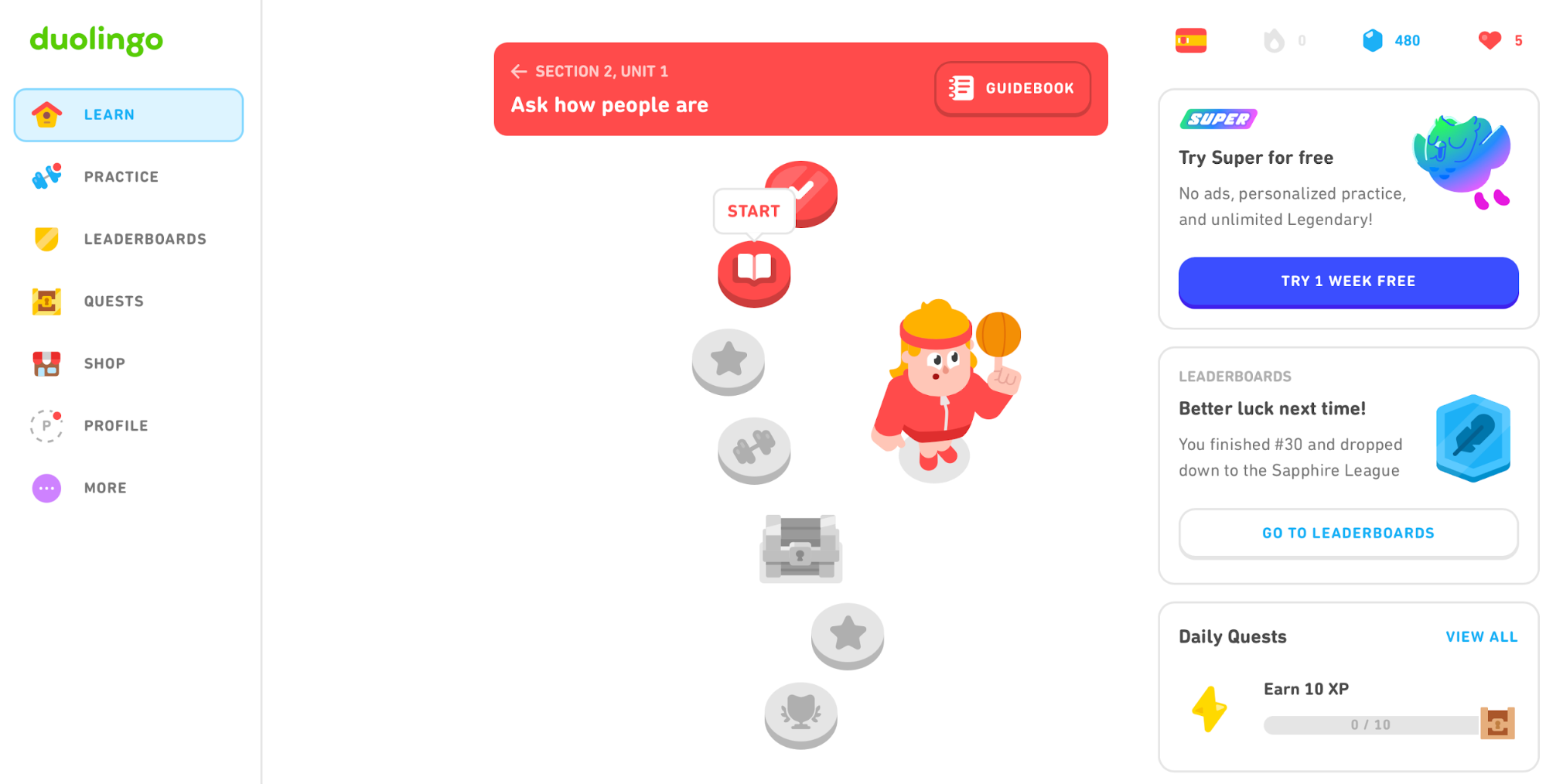
Duolingo's UX shows that even complex products can create an experience that makes users want to come back. All it takes is to put yourself in their shoes at every stage of the design process.
UX vs. UI Design
The main difference between UX and UI design is that UX encompasses the entire experience with your product, while UI focuses specifically on the look and behavior of the interface’s visual elements. In other words, UI design is a subset of UX design.
Let's go back to Duolingo as an example.
While I use the app, I interact with its UI. But everything I feel and think about the platform while using it is the result of UX design. UX also kicks in whenever I remember to do my lesson, talk about the app, or recommend it to others.
With this in mind, UI and overall usability fit under the umbrella of UX, which encompasses plenty of other components I'll discuss here.
7 UX design principles and fundamentals
To ensure a positive user experience aligned with your audience's needs and preferences, apply these principles:
1. Empathy in Human-Centric Design
The UX design process starts with three components:
-
User motivations (The Why)
-
Their goals and tasks that accomplish them (The What)
-
The way to make experiences smooth and pleasing (The How)
Answering these questions requires thorough user research that lets you design with a complete emotional and situational understanding of your user. Through empathy, you can make sure that your product isn't just a tool but a source of genuine emotional connection.
To achieve this, develop a user persona that clearly outlines:
-
Demographics (age, gender, etc.)
-
Core problems your users encounter
-
The outcomes users expect after using your app
-
Their preferred tone and style of communication
Your persona's description will inform pretty much every decision, from the overall user interface design to action button colors and copy. This is why you shouldn't rush the research process or start designing solutions before being sure that you can form a strong emotional bond with the user.
You can use many techniques to ensure an empathy-focused design, such as:
-
Surveys (to gather demographics and broad insights)
-
User interviews (to explore motivations and pain points)
-
Journey mapping (to visualize the full experience, including emotional highs and lows)
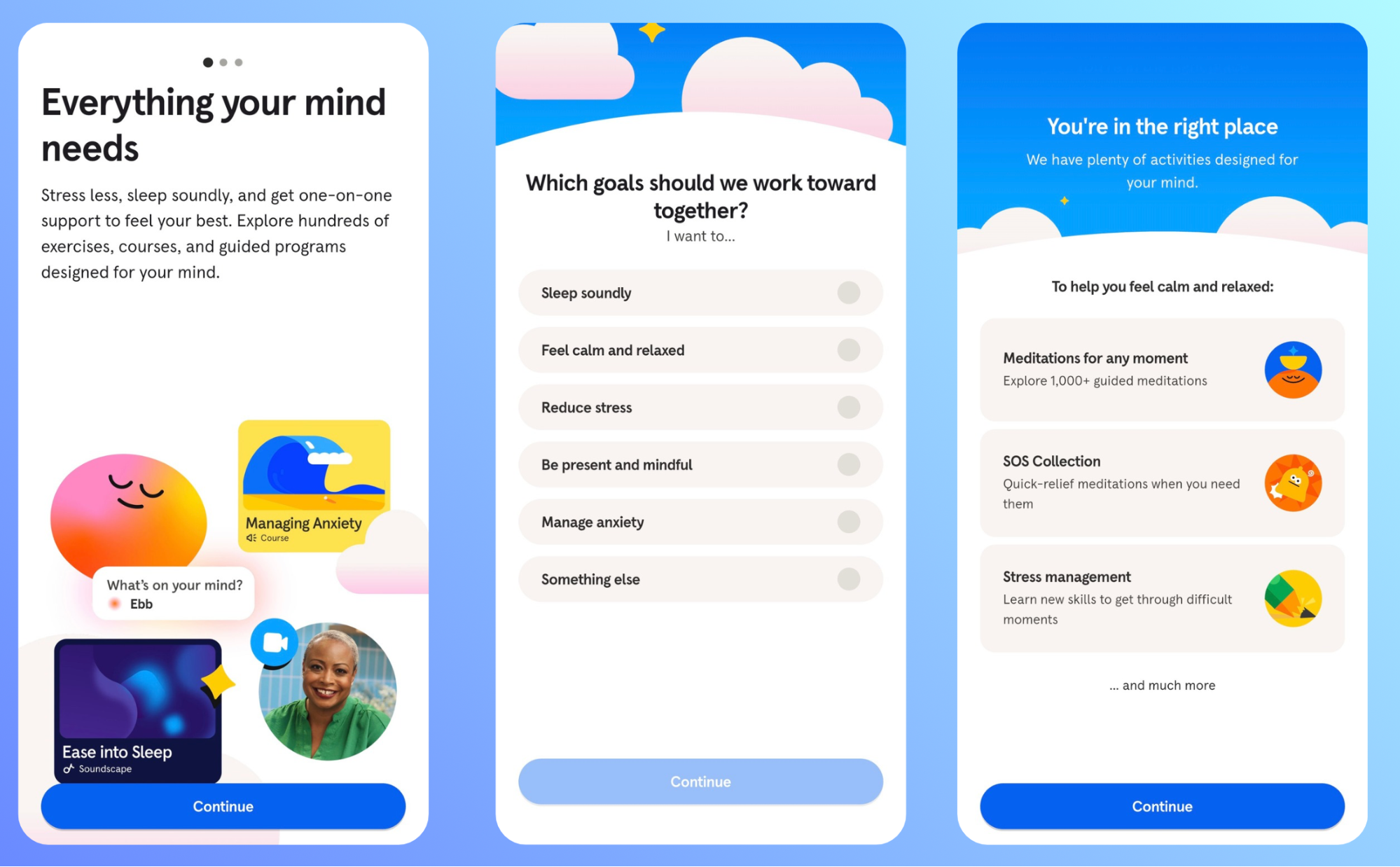
If you need an example of empathetic design, take a look at Headspace. As a meditation and mental-wellbeing app, it places special attention on the users' emotional states at every stage of the user experience.
Headspace UX designers know that many beginners feel intimidated or unsure where to start, so they developed onboarding and first-session flows that feel reassuring, calm, and judgment-free. They did this through friendly illustrations, supportive language, and simple choices that reduce anxiety and make meditation approachable.
2. Consistent visuals, patterns and user expectations
Consistency is a behind-the-scenes element that makes a world of difference to the user experience. Users rarely notice it when it’s done well, but they instantly feel when it’s missing.
This is because a consistent interface lowers cognitive load by making the product predictable. When buttons, icons, layouts, and interactions behave the same across the entire experience, the user can relax and focus on their goal instead of figuring out how the interface works.
Think of Google’s ecosystem. Docs, Sheets, Keep, and all other products share:
-
The same visual language
-
Recognizable iconography
-
Familiar navigation structure
-
Predictable interaction patterns
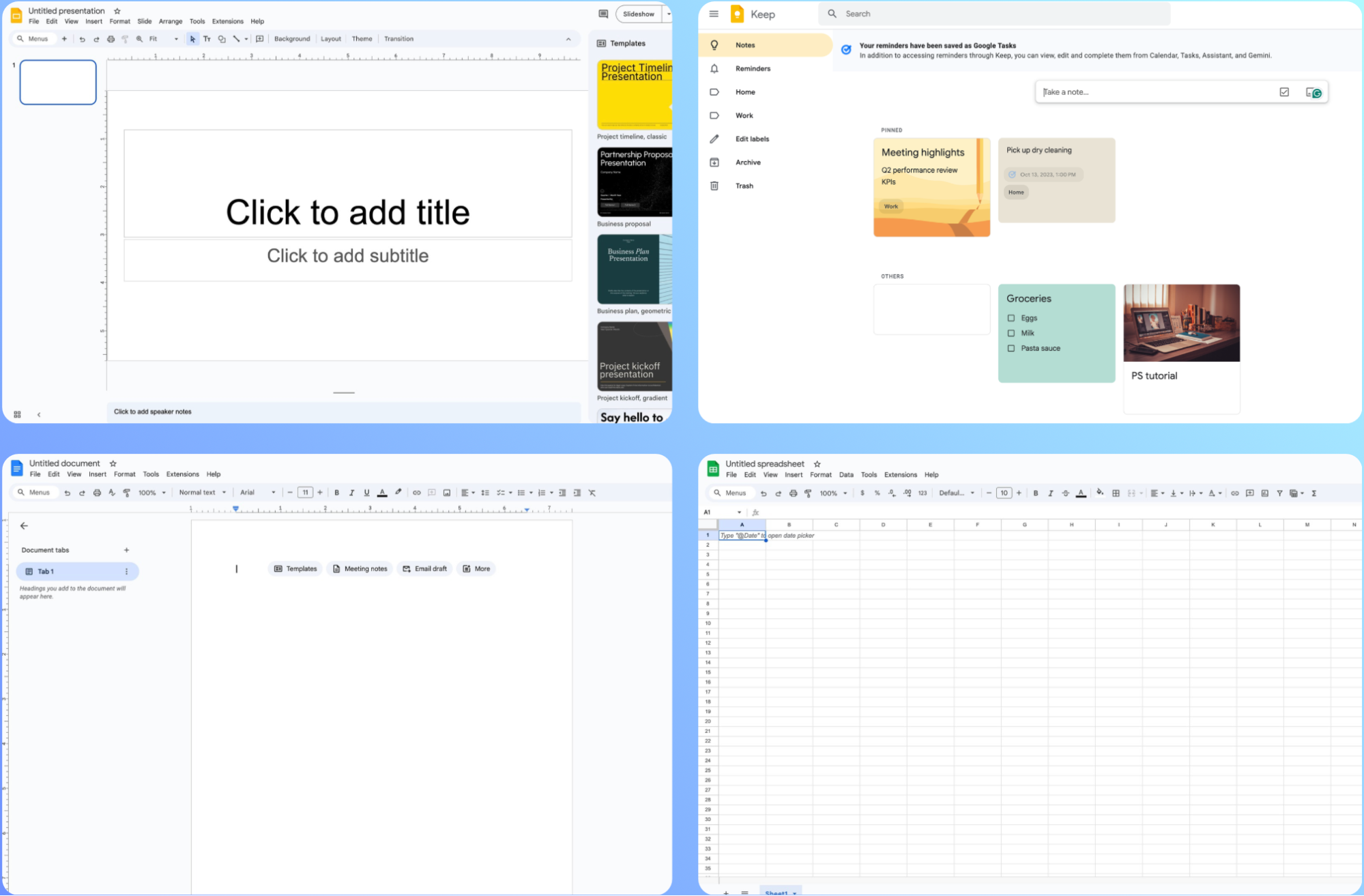
Thanks to this consistency, learning one tool automatically makes the next one feel intuitive.
Due to its importance, consistency is more of an umbrella principle that includes many elements, most importantly:
-
Navigation: Menus, tabs, and back buttons should appear in familiar places.
-
Visual style: Color palettes, typography, spacing, and branding should feel unified.
-
Tone of voice: Microcopy, error messages, and tooltips should sound like they come from the same brand personality.
-
Interactions: Buttons behave the same everywhere, gestures follow a clear logic, and animations reinforce user expectations.
This sort of alignment builds trust as users interact with your product. When an interface behaves the way they expect, users feel more confident exploring new features or navigating unfamiliar pages.
Before designing your product, check out complementary or competing platforms to understand industry standards. Users come with strong expectations based on other apps in the same category, so the general patterns should feel familiar. For example:
-
Dating apps use swipe gestures
-
Banking apps rely on strong confirmation patterns
-
E-commerce apps stick to clear “Add to cart” flows
While you shouldn't blatantly copy another product's interface, adopt the overarching design elements so that your platform instantly feels familiar.
3. Easy and intuitive usability
Even the best-looking UI falls apart the moment a product becomes difficult to use, which can ruin the overall UX. Confusion, clutter, and unnecessary space can force users to stop and “figure out” how something works, wasting time and causing frustration.
Usability heavily relies on clean layouts and intuitive navigation, so you need to remove everything that doesn't serve a purpose, such as:
-
Excess buttons
-
Purely decorative elements
-
Long text blocks
-
Duplicate actions
When you strip away these items, key actions become easier to spot, quicker to understand, and more satisfying to interact with.
Apple’s iOS is a classic example of usability through simplicity. Despite the plenty of changes and updates it's gone through, it feels smooth, predictable, and easy to grasp even if you're a new user.
iOS does this through:
-
Minimal iconography
-
Consistent placement of key elements
-
Familiar and intuitive gestures
Besides smart design choices, Apple ensures such a positive UX through rigorous usability testing. Other than in-house tests, the company releases beta versions to gather user feedback in real-time and tweak the product to their liking.
By doing the same and listening to users, you can build a familiar product they'll get used to in no time.
4. Hierarchy of design and information
Visual hierarchy instantly tells users what matters most, where to focus next, and what to ignore until needed. It's an invisible structure and set of guideposts that lead the eye from the entry point to the key actions, shaping how quickly users understand what they’re seeing.
At a high level, hierarchy consists of three elements:
|
Element |
What It Does |
Examples |
|
Placement |
Defines importance and creates a mental order of tasks |
|
|
Typography |
Creates rhythm and guides attention |
|
|
Spacing |
Separates unrelated ideas and connects related ones |
|
When hierarchy is intentional, the interface feels self-explanatory, so users don't have to look around to figure out what to do next.
Look at Canva's interface as an example. As soon as you open the web app, your eyes are immediately drawn to the template search bar (which makes sense because templates are Canva's main selling point). Your eyes then gradually go down through template categories grouped through spacing.
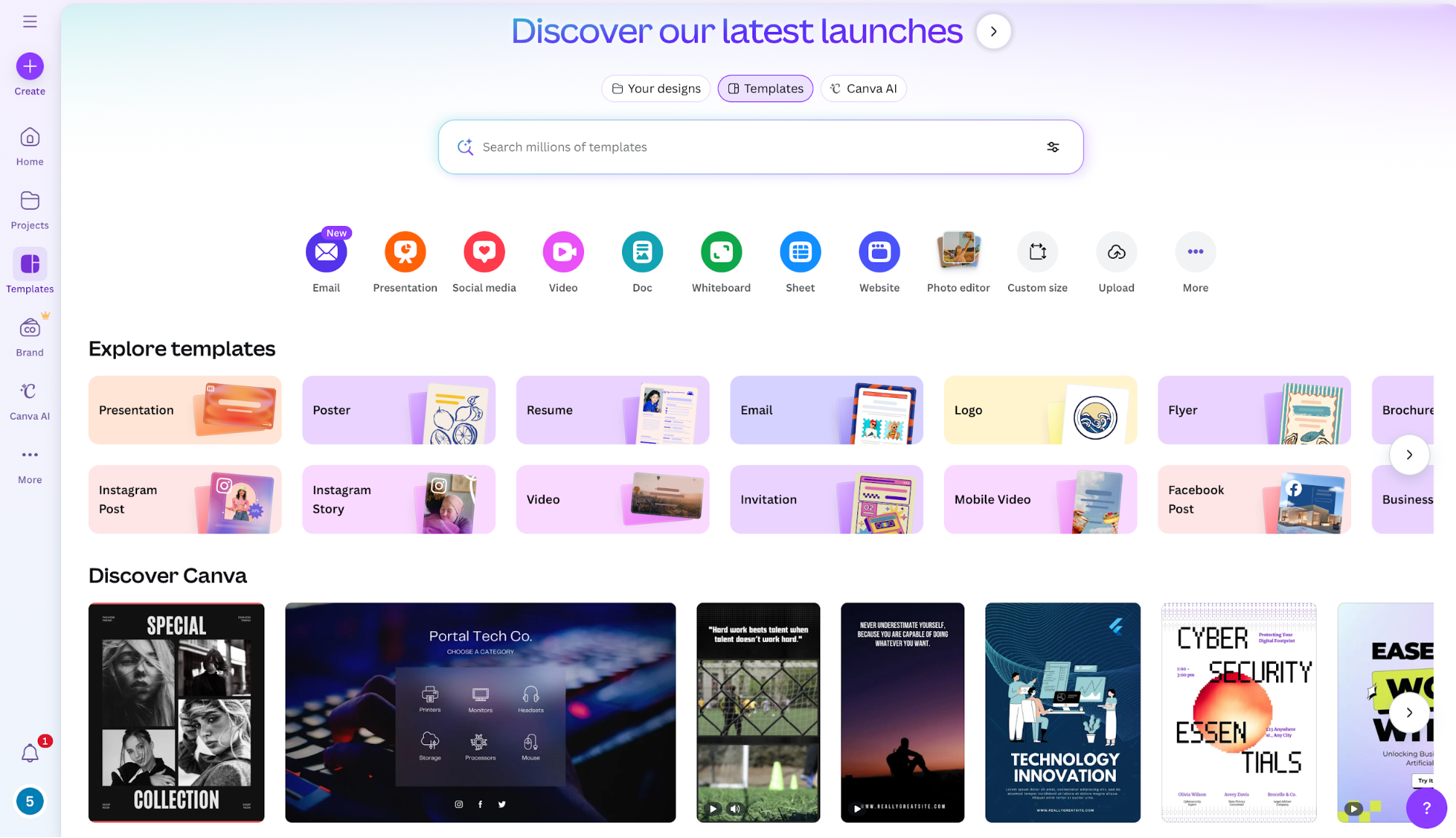
You have your utilities and tools in the left-hand pane, which is a familiar choice that ties back to the importance of checking out industry standards like I explained above. Overall, the hierarchy is clear and intuitive, so navigation is as simple as it gets.
5. Accessibility and inclusive design
A major part of effective UX design is making sure your product doesn't exclude users with visual impairments, physical disabilities, or even temporary limitations. Poor color contrast, unclear labels, and difficult interactions lead to an incomplete product, so you should prioritize inclusivity throughout the design process.
The good news is that doing so doesn't require shots in the dark. We have a clear, comprehensive set of rules to follow when it comes to inclusivity, known as Web Content Accessibility Guidelines (WCAG). The guidelines cover every aspect of accessibility, including:
-
Text size and contrast
-
Keyboard navigation
-
Alt text
You don't need to go through the entire document to understand accessibility requirements. To nail down the basics, it's enough the complete the WCAG 2.0 checklist. Go through each point, and compare it to your product's current standing to outline areas of improvement.
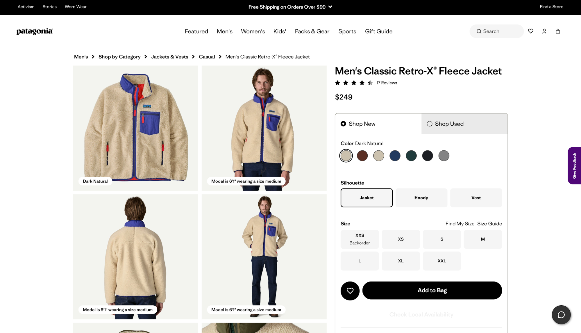
Patagonia's ecommerce store is an excellent example of inclusive design. If you browse it, you'll notice that:
-
Text and background colors are chosen to meet the WCAG contrast guidelines, making product details readable for everyone.
-
Images (especially product photos) are paired with meaningful alt text, supporting screen reader users.
-
Forms and checkout flows use clear labels, error messages, and logical focus order, so the entire purchase journey is keyboard-accessible.
-
Navigation is simple and consistent, with clear headings and link text that describes the destination instead of using vague labels like “Click here”.
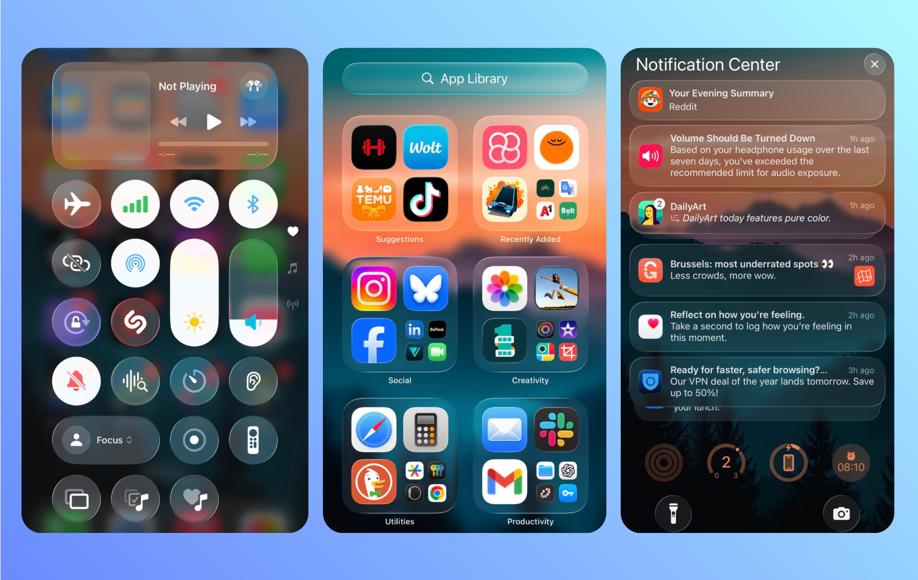
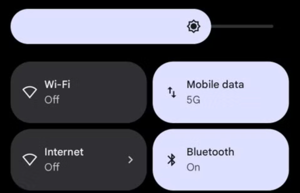
6. Feedback and user control
Each time a user performs an action, your product's interface should acknowledge it. UI feedback boosts users' confidence and engagement, drastically improving the overall UX.
Even small signals like a “Like” button filling with color or a toggle smoothly switching states reassure users that the system understood their intent. This happens subconsciously through the most mundane tasks, such as turning WiFi on and off.
For more complex actions, feedback can (and should) be stronger—think elements like:
-
Progress bars during uploads
-
Confirmation messages after saving a doc
-
Loading indicators that show something is currently happening
Without these cues, users are left guessing if they should wait, try again, or assume something failed.
User control also makes a world of difference to the product's overall feel. You need to make sure users stay in control of the platform instead of feeling trapped by it. For example, features like undo, redo, cancel, and “emergency exits” allow users to recover from mistakes, stop unintended actions, or explore without fear.
The result is lower cognitive stress and tension, which encourages experimentation.
In some cases, feedback can also directly help a user complete their actions without errors, which makes users feel like the product supports them and cares about their goal.
A perfect example is my favorite Gmail feature—the attachment warning. If you write an email saying "I’ve attached…" or something similar but hit Send without actually attaching a file, Gmail stops you and asks whether you meant to include one.
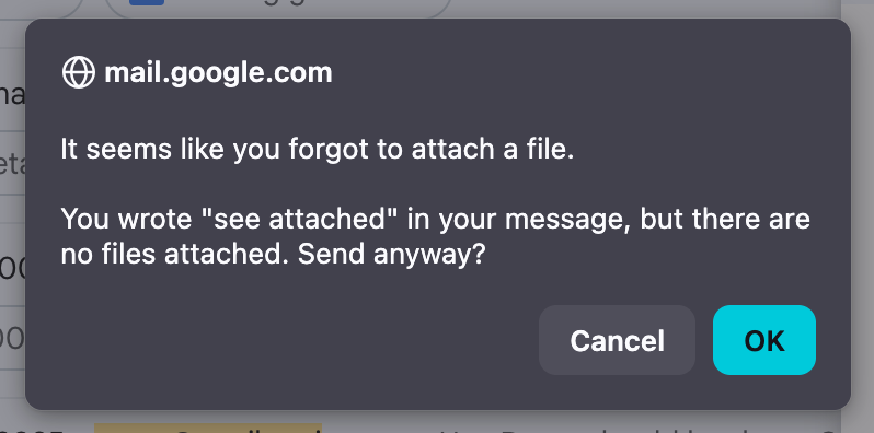
This simple heads-up has saved me plenty of frustration. Even if I overlook it, Gmail's "undo send" feature lets me unsend the email, giving me further control over the experience.
7. Validation and iteration
Good UX is shaped through continuous validation, where actual users interact with the product and reveal:
-
What works well
-
What confuses or frustrates them
-
What needs further refinement
This means the UX design process is inherently iterative. After launching your product, you need to maintain continuous user testing to help the product evolve based on feedback, analytics, and changing user expectations.
If you're not sure where to start with user testing, prioritize these activities:
Usability testing
Usability tests put real users in front of interfaces to see how easily they can complete key tasks. Meanwhile, designers track metrics like:
-
The time users spend completing tasks
-
The overall task completion rate
-
User satisfaction during the activities
Google has an entire User Experience Research system that relies heavily on usability testing. The company conducts task-based tests, interviews, and prototype evaluations to uncover pain points and improve navigation, content discovery, and overall ease of use.
A/B testing
A/B testing compares two versions of a design to see which performs better with live users. It’s effective for refining elements like button placement, copywriting, layouts, or onboarding steps. Besides ensuring a valuable user experience, A/B testing can boost marketing-focused metrics like click-through rates or conversion rates.
LinkedIn routinely conducts A/B tests on different components, including:
-
Feed layouts
-
CTA labels
-
Connection prompts
-
Follow suggestions

Through these tests, LinkedIn can measure which version leads to higher engagement without increasing friction.
Ongoing refinement cycles
Post-launch testing is essential for making sure your product stays aligned with users' expectations. Product teams should collect feedback through:
-
Support tickets
-
Analytics
-
Surveys
-
User interviews
-
Heatmaps
All the data you collect should guide your design thinking to keep the product evolving. This way, you can make small tweaks that can have a bigger long-term impact (and are cheaper) than massive redesigns.
Take Netflix as an example. It constantly adjusts its recommendation UI, tweaking thumbnails, row layouts, and preview behavior based on user interaction patterns across millions of sessions.

Key takeaways
To design a product with an enjoyable user experience, put yourself in the shoes of your target users to understand what matters to them. Define a precise persona for whom you want to create solutions, and keep it in mind at every stage of the design process.
While designing your product, focus on consistency, usability, information architecture, and accessibility as the pillars of a positive UX. You're free to get creative and put a personal stamp on the product, but don't let aesthetics come at the cost of usability.
Once the product is live, refine it continuously through an ongoing feedback loop. This way, you can keep meeting users' expectations and make them stick around.