Visual Hierarchy: 8 Principles and Fundamentals Explained

Petar Marinkovic
Created on Sep 30, 2025
Visual hierarchy guides the user's eye to the most important information and key actions on the page, which makes it a fundamental component of effective web design. In this guide, I'll show you how it works and discuss the best practices for creating an intuitive hierarchy.
What is visual hierarchy?
Visual hierarchy is a deliberate organization of design elements to signal importance, create focal points, and help users find information and take intended actions. It ensures seamless navigation and a positive user experience without friction.
Good hierarchy reduces cognitive load and makes scanning easier, no matter how many elements are on the page.
Instead of hunting around for where to start, users instantly see the main message (big headline), the supporting info (subhead), and the next action (CTA button).
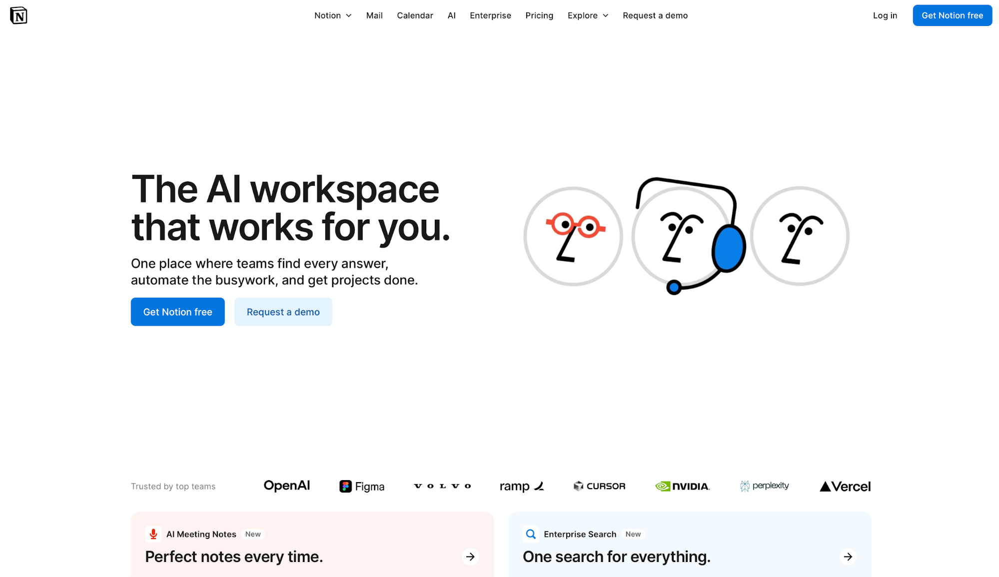
Check out Notion's homepage as an example.
The hero section leads with a short, high-contrast headline and a clear subhead that frames the value prop. Right beneath it, the primary action gets prime placement, while supporting proof (customer logos and feature teasers) sits just below in smaller type and lighter contrast.
Visual hierarchy exists everywhere, from newspapers to billboards and apps. Whenever there's a need to draw attention to a specific element, a clear hierarchy makes it happen.
Why is visual hierarchy important for UX?
Visual hierarchy reduces the time it takes for users to find the key information, and it shortens user journeys by creating a more intuitive and streamlined browsing experience. It gives the user a clear entry point from which the eye is guided to the most key content and actions.
Plenty of eye-tracking research has demonstrated the value of a clear visual hierarchy. For example, a study by the Nielsen Norman Group showed that people scan websites and phone screens in specific patterns, with the F and Z pattern being the most common.
You must adapt content to these patterns through a hierarchy that places each element in a specific spot. This way, you can leverage natural visual search behavior to highlight the key messages and actions.
For example, the "Add to cart" button placement on the Bose product page isn't accidental:
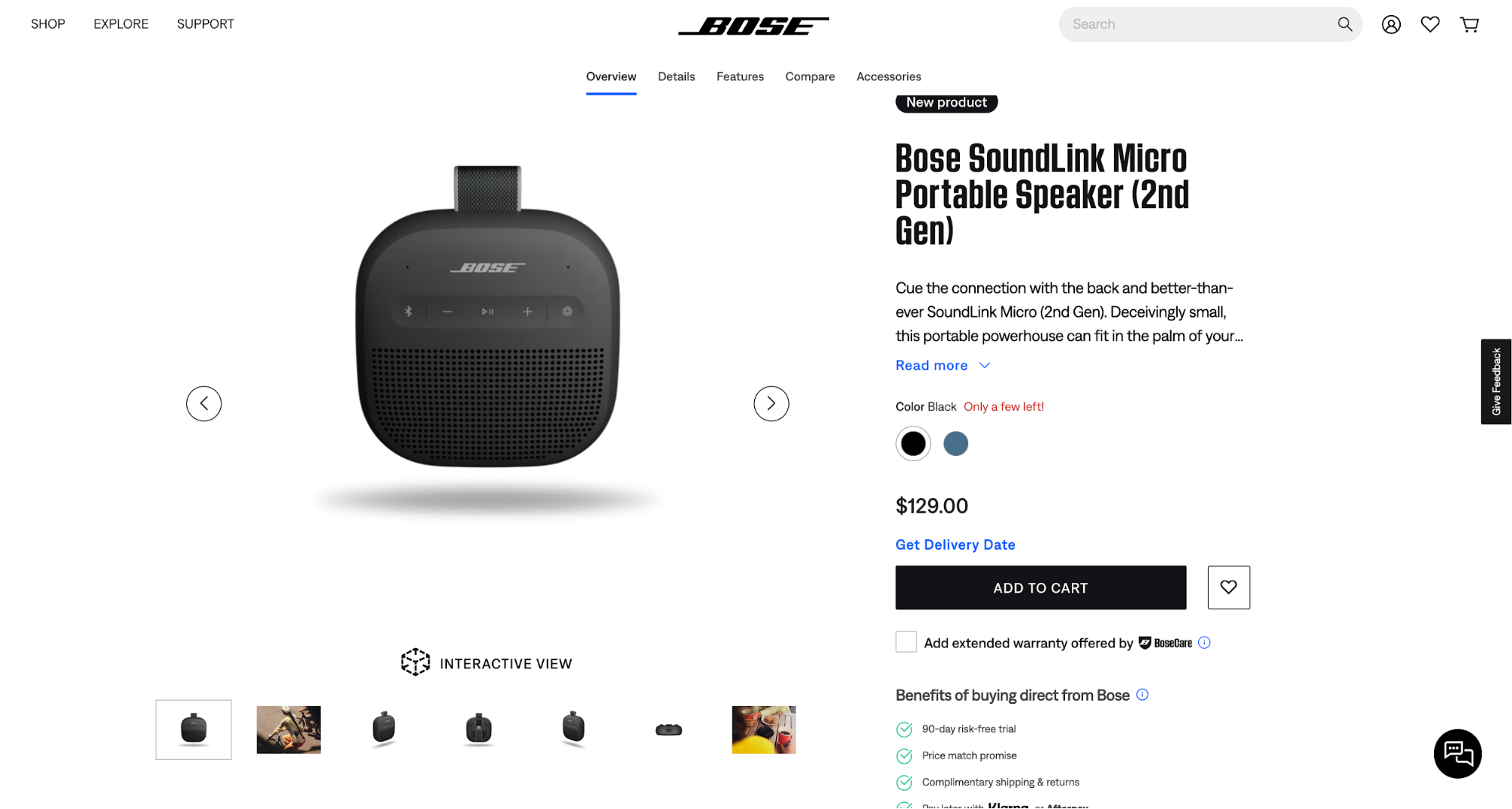
The eye movements are:
-
Product image as the entry point
-
Right to the name and description
-
Diagonally down to additional photos
-
Right again to "Add to card"
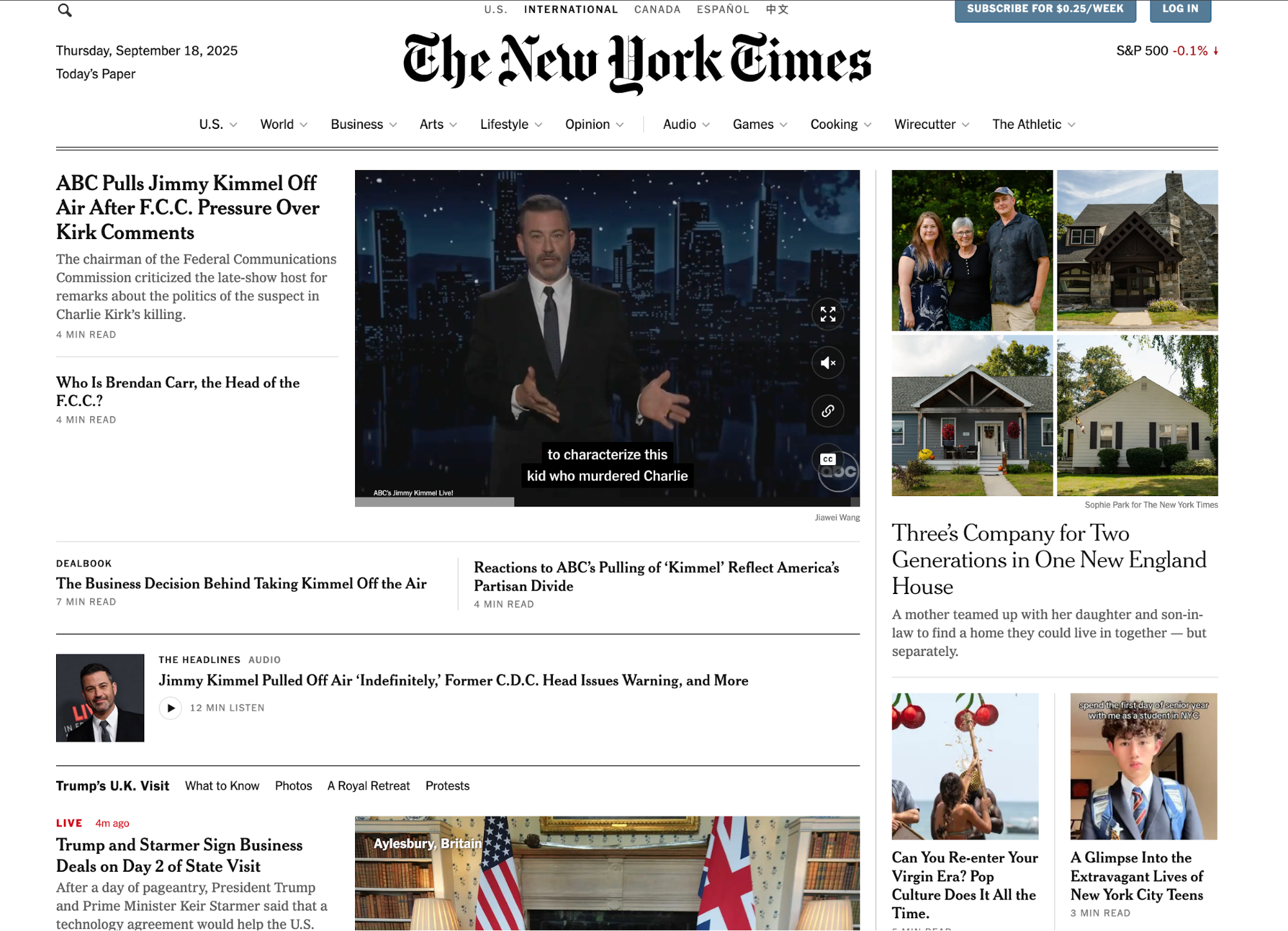
This is a prime example of the Z pattern, whereas the F pattern can be seen on many news websites.
For instance, The New York Times highlights the latest headlines in the top-left corner, from which the eye keeps moving down in a repeat left > right direction.
Principles of visual hierarchy
Visual hierarchy operates on a well-established set of principles that graphic designers, web designers, and other visual artists should follow. Here are the key ones:
Size and scale establish importance
Our eyes naturally notice larger elements first, so it doesn't come as a surprise that oversized headlines, hero images, and bold CTAs tend to “win” the first fixation.
That first look sets the reading order (big → medium → small), subtly hinting to users what matters most.
To test this principle, open any Amazon product page. The product title is large and high-contrast, so it grabs attention immediately. Beneath it, smaller elements (the price breakdown, variation selectors, bullet-point details, and long-form description) fade into secondary roles.
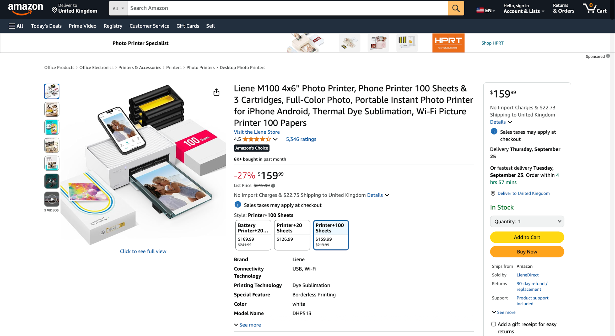
The scale difference does the heavy lifting when it comes to guiding the eye. The title answers “What is this?” first, then the eye steps down to supporting info, and finally to the micro-copy (shipping notes, fine print, etc.).
Scaling is among the simplest ways to separate primary and secondary content across a layout. Here's how:
-
Make the core message (headline, key image, primary button) meaningfully larger than everything around it
-
Size down for context (subheads, short blurbs)
-
Downsize further for utilities (filters, tags, links)
With a consistent scale, you get a clear visual path with a smooth progression from the big idea to the helpful details.
Color and contrast influence attention
Color acts as the spotlight of your page, highlighting what the user should focus on. Bold accents on neutral or muted backgrounds instantly draw attention, especially when used on buttons and primary CTAs.
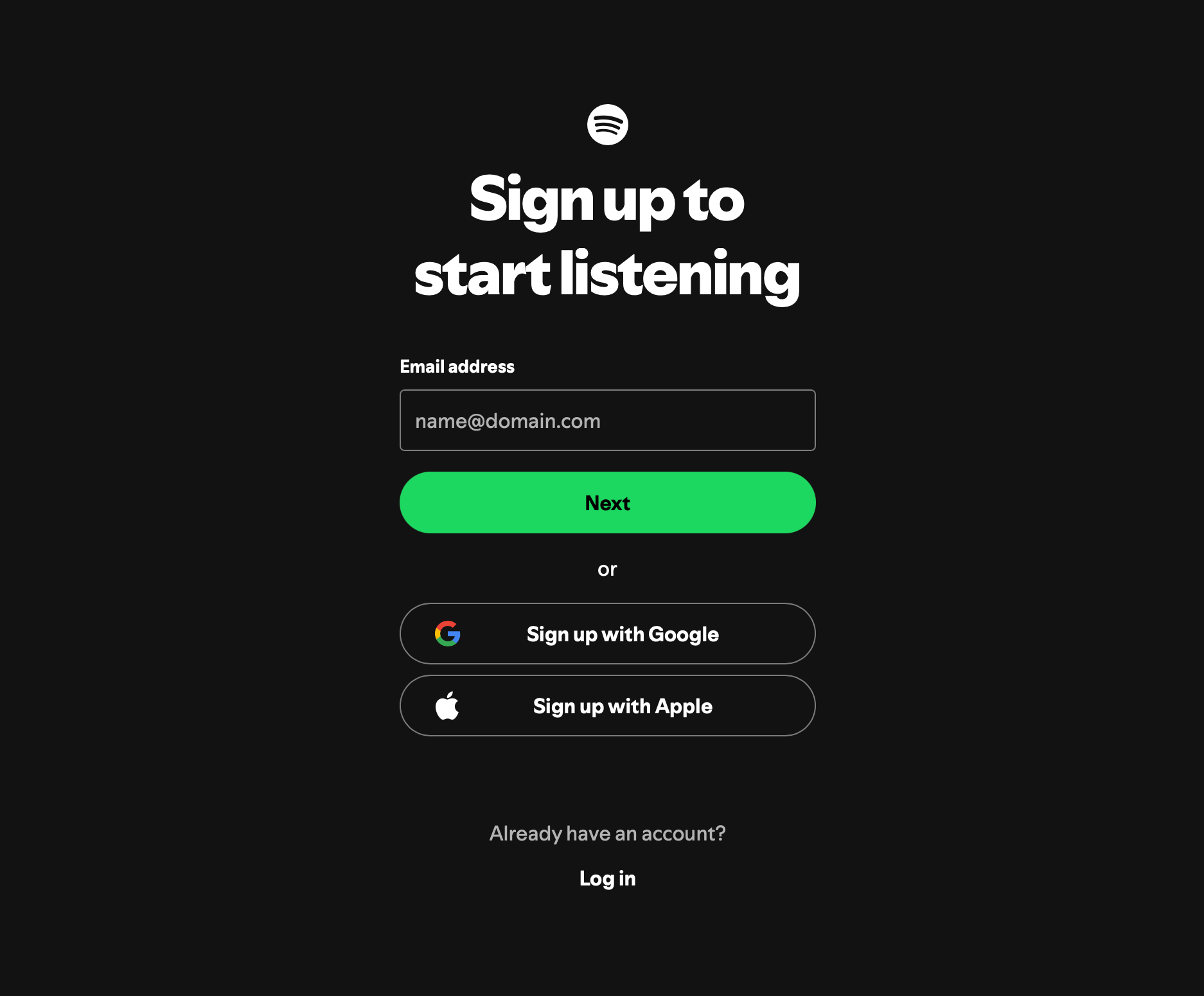
Take a look at Spotify's signup page as an example.
The bright green CTA sits on top of a dark background contrasted by the white text, creating a strong focal point. This contrast is engineered so your gaze hits the action first, then the supporting copy.
Contrast doesn't only serve the purpose of being eye-catching—it's also crucial for readability and accessibility. When implementing contrast colors, you should consult the WCAG contrast guidelines, most importantly:
-
Aim for WCAG 2.1 AA contrast: 4.5:1 for normal text, 3:1 for large text (18pt+ or 14pt bold), and 3:1 for UI components (icons, form inputs, and button states).
-
Don’t rely on color alone to communicate state or meaning (e.g., “errors in red”). Back it up with text, icons, or patterns.
-
Maintain contrast in all states (hover, active, disabled, and focus) so buttons remain obvious and usable under interaction.
Proximity and grouping create relationships
People read spatial cues as meaning, so when related elements sit close together (and unrelated elements are spaced apart), we understand what belongs with what contextually.
This is the Gestalt proximity principle, which explains that distance (or lack of it) creates perceived relationships and a clear reading path.
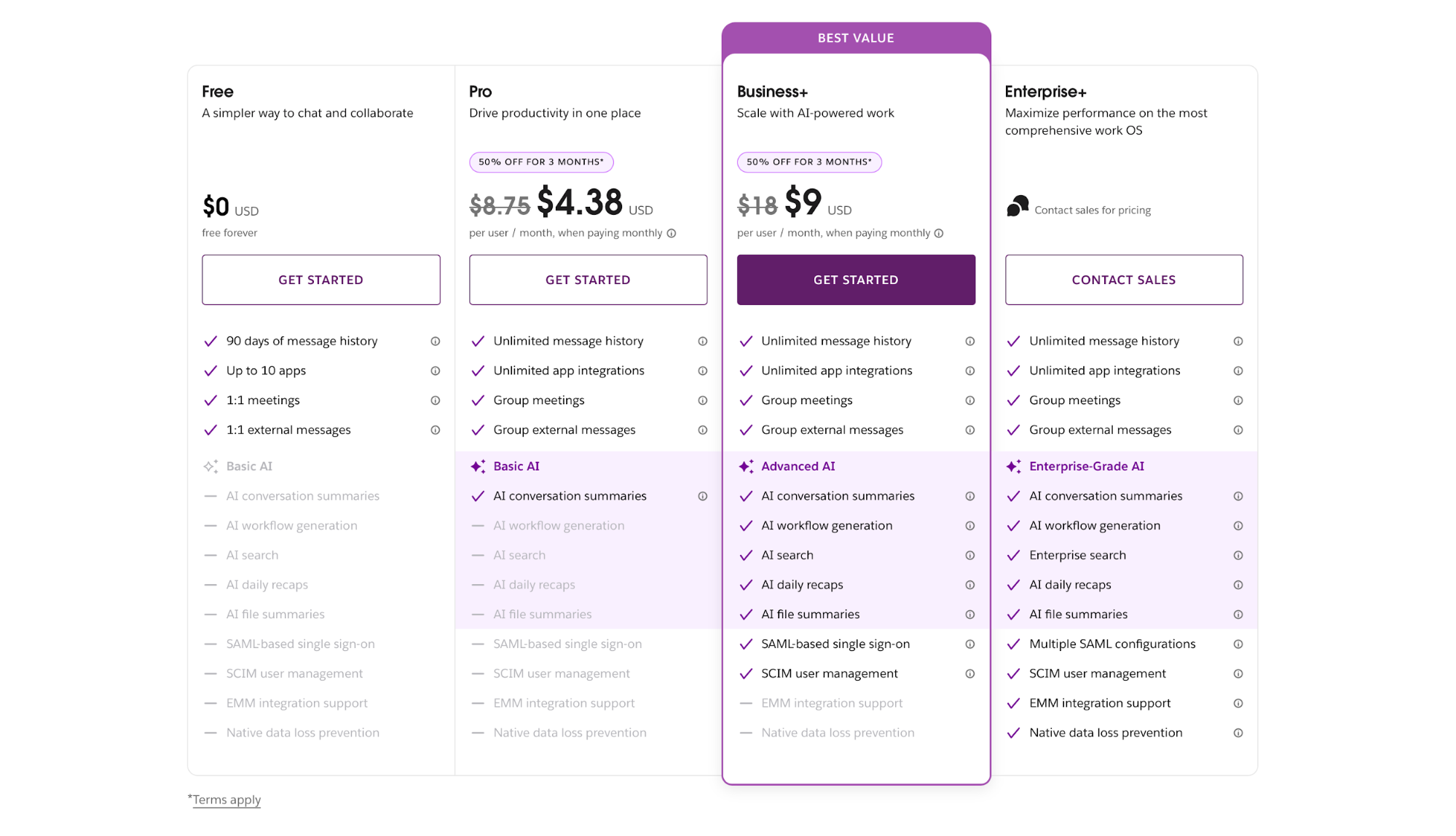
You can see this effect in many pricing pages, such as Slack's page. Each column keeps its own headline, price, feature list, and CTA in a compact block, while horizontal gaps separate one plan from the next.
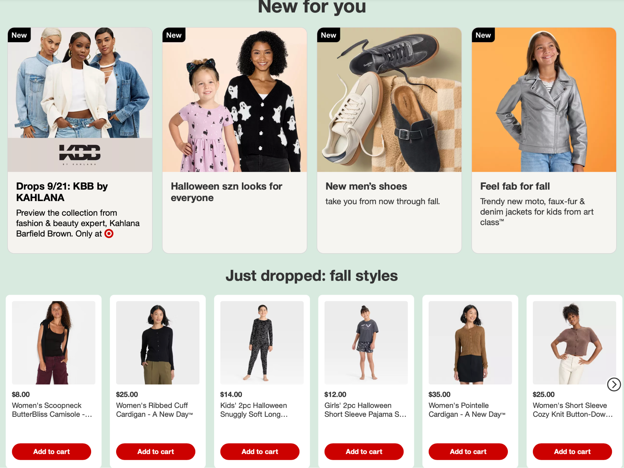
The same principle can be applied to category pages to ensure a clean structure. For example, Target groups the visual elements of different categories and keeps them separate from product cards.
This proximity, combined with proper isolation, creates a single navigational block that doesn't seem cluttered.
If you get spacing wrong, you may harm the comprehension of important elements and create a page that feels confusing and overwhelming.
For example, the Craigslist Los Angeles electronics page makes several spacing mistakes. The sidebar lacks adequate horizontal spacing between different filtering options, which makes it harder to skim.
Listings also stack with tight line-height, minimal padding, and little visual separation between title, price, location, and post meta, which further harms skimmability.
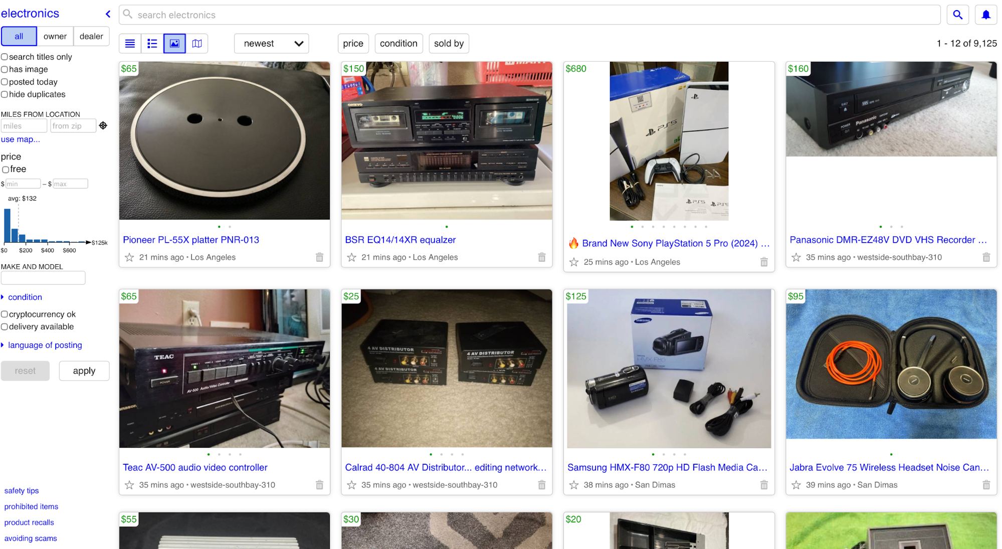
To avoid such issues, define “inside vs. outside” spacing rules. Keep small, consistent spacing inside a group (label ↔ item ↔ helper), and larger, consistent spacing outside to separate neighboring groups.
White space provides balance and focus
White space (negative space) is the intentional empty space around and between elements that gives your content breathing room. It separates ideas, reduces visual noise, and opens room for a focal point that other elements won't compete with.
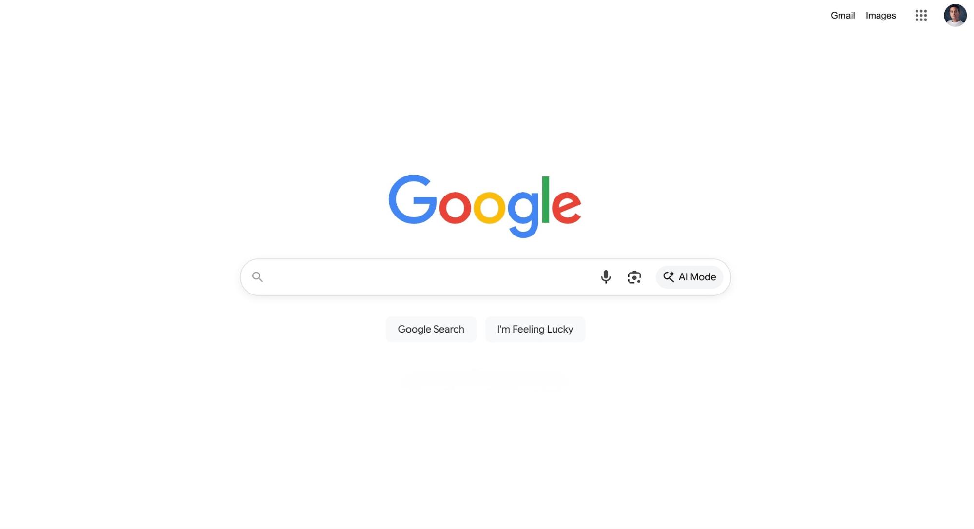
Google's homepage is a perfect example. It’s almost all whitespace, with a single focal point (the search box) sitting comfortably in the center.
The surrounding emptiness isn’t “wasted” space; it directs your eye to the task at hand: type, then search.
Compare this to a page like LINGsCARS:
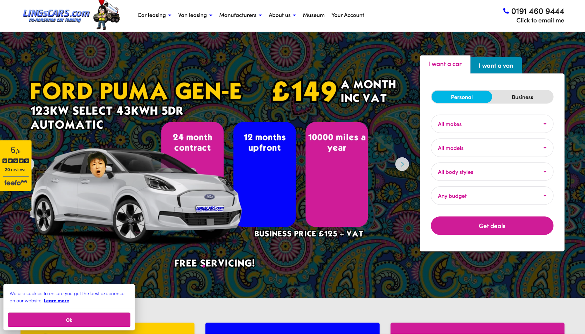
It packs dense text, animations, banners, and bright accents into the same visual space, leaving little room for the eye to rest.
Without clear negative space around primary actions or messages, everything shouts at the same volume, so it takes longer to decide where to look (and what to do) first.
Don't look at white space as an aesthetic choice. It's a functional element that you can use to isolate the main action (form, CTA, headline), after which you can add progressively tighter spacing for supporting details to create a page that feels lighter and supports conversions.
Focal points anchor user attention
Every page needs a single anchor that wins the first glance and lets you create visual hierarchy around it. Different elements can act as that focal point, such as:
-
Hero image
-
Bold headline
-
Primary CTA
The focal point must not compete with another element in the same visual space because this dilutes the user's attention, forcing them to spend more time deciding what matters on the page.
Apple is famous for its ability to create a strong focal point. Look at the MacBook Pro landing page as an example:

The dramatic hero shot acts as the entry point and draws you in, and it's supported by a short value line and primary actions that sit close enough to feel connected.
Despite the bright colors in the hero, the "Buy" button is still prominent enough to clarify that this is the page's target action.
This page also demonstrates another important rule: you should structure the secondary elements in a way that supports the focal point.
These elements include:
-
Subheads
-
Short blurbs
-
Feature tiles
-
Spec callouts
Secondary elements should live one step down in scale and contrast, expanding the story that the hero section starts. By structuring them this way, you create a clear instructional pathway: anchor first, explain second, invite action third.
Repetition and consistency build familiarity
Consistency helps with pattern adoption so that navigating a site feels like it's done from memory instead of aimlessly browsing around.
When the same fonts, colors, and button styles repeat across a site, users start remembering the function of different elements—for example:
-
The big bold type reads as a headline everywhere
-
The accent color always signals a primary action
-
The same button shape means “clickable” no matter the page
Google’s Material Design guidelines both explain and demonstrate how consistency defines and reinforces the function of different elements:
-
The type scale defines predictable roles for headings and body text, so hierarchy feels the same in every view
-
The color system assigns roles (primary, secondary, surface/on-surface) so that accents are used consistently
-
Button specs standardize shape, elevation, and states, so the primary button always looks and behaves like the priority
Linear implements repetition and consistency well, both within each page and between them. The same type scale, spacing rhythm, and button styles repeat, and primary actions use the same shape and interaction states.
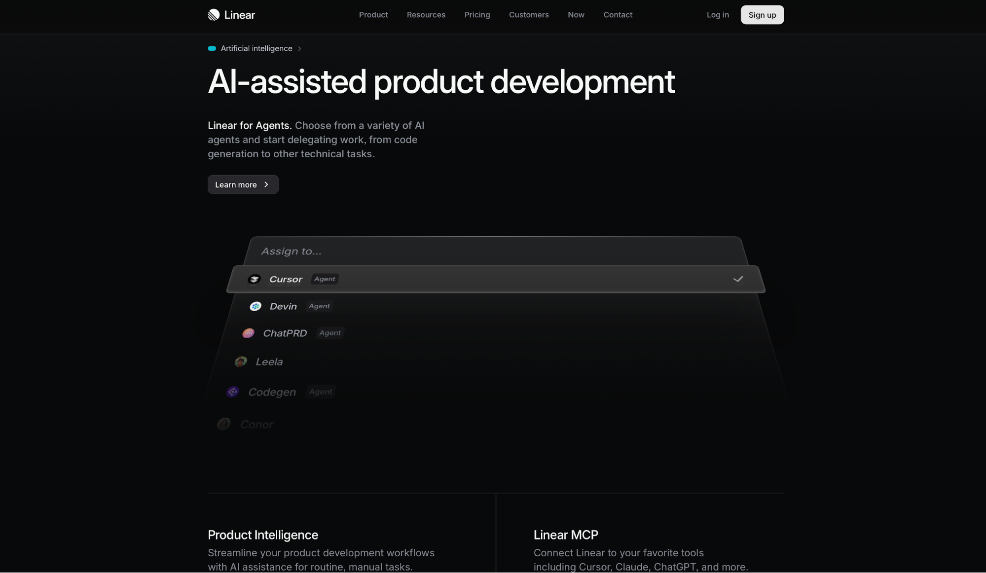
This consistency reduces cognitive load, creating a faster, cleaner UI.
By contrast, the Yale School of Art homepage misses the mark. It blends multiple type styles, shifting column widths, and ad-hoc link treatments from page to page.
Navigation labels jump around, sections don’t share consistent spacing or headings, and similar elements don’t look alike.
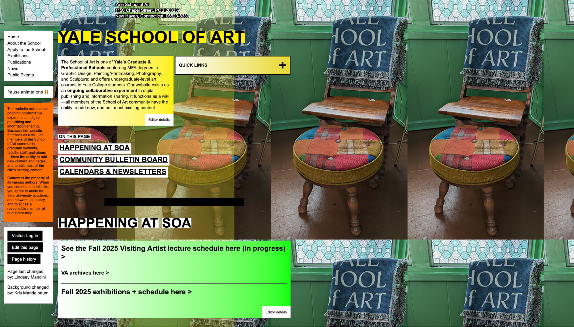
As a result, you’re constantly reinterpreting what’s primary vs. secondary, or even what’s clickable on the page.
Pick a type scale, define color roles, standardize interactive components, and then repeat them across the site. The more your UI rhymes with itself, the more users can focus on content and decisions.
8 tips for using visual hierarchy in design
Once you have a grasp of the key visual hierarchy principles, you can follow these practical tips to implement them:
1. Make headings at least 2–3x larger than body text
Seeing as the size and scale of the page's content convey importance, different-sized headings give readers an instant map of the page. When your H1, H2s, etc. are roughly 2–3× the body size (e.g., 16px body → 32–48px headings), readers can scan the structure easily and drop into the parts they care about the most.
You can see this in most articles around the web, but let's use Medium as an example.
Article titles are significantly larger than the body copy, subheads step down a notch, and pull quotes sit between them. This way, the eye never confuses a section break with a sentence.
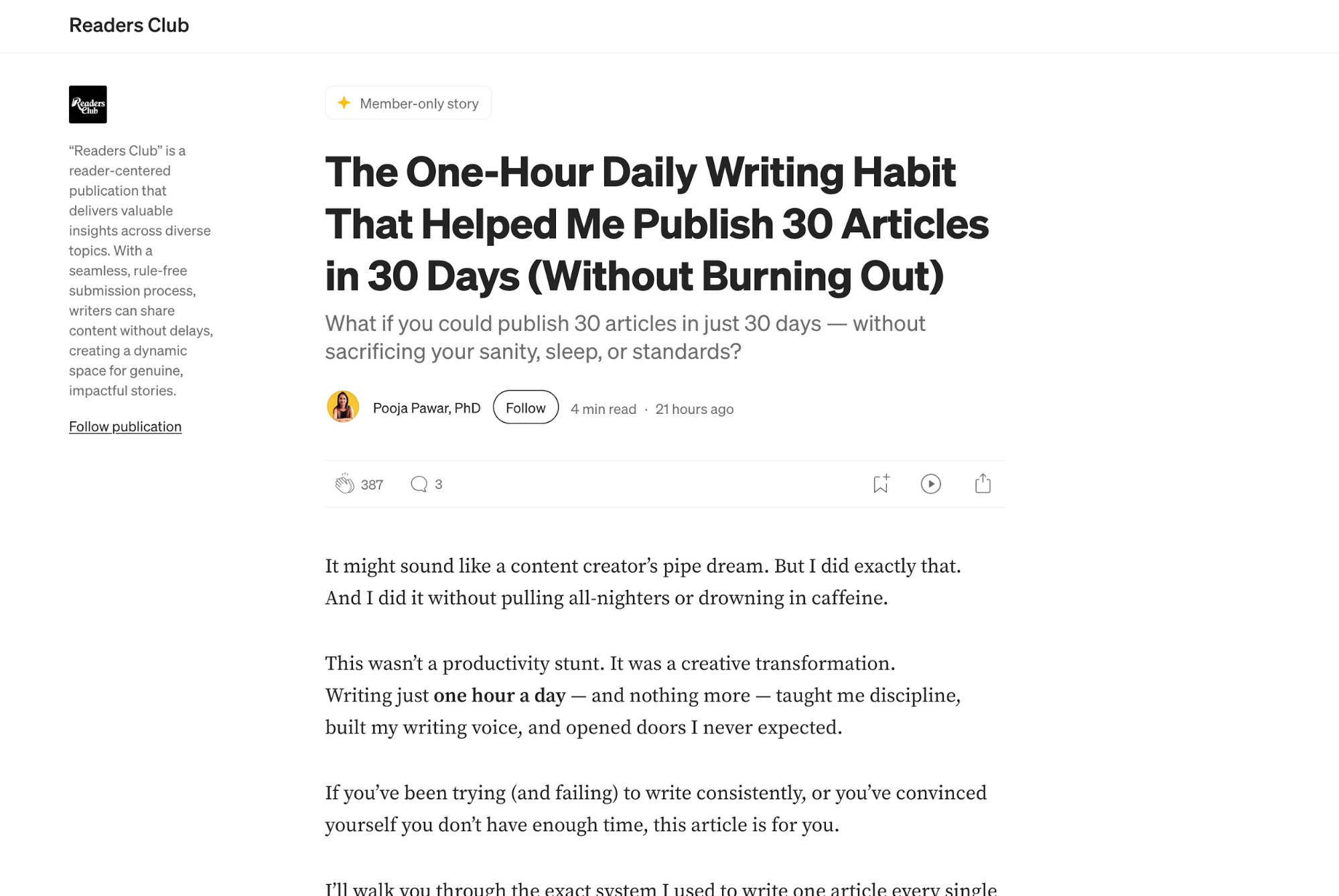
Even on the homepage and topic feeds, card titles are notably bigger than preview text, which makes scanning fast and low-effort.
When it comes to heading scale, you need to ensure consistency across your website. If an H2 is 2.25× body on one page and 1.5× on another, users have to re-learn your hierarchy every time.
To prevent this, choose a scale (e.g., 16 → 24 → 32 → 48) and stick to it across website templates. Doing this helps readers build muscle memory when browsing your site, ensuring that content feels organized.
2. Choose one bold brand color for CTAs
Visual organization heavily depends on careful color combinations. If everything is colorful, nothing stands out—including essential elements like CTAs.
That's why you need to choose a single bold brand color and reserve it for primary CTAs ("Sign up," "Buy Now," etc.).
By limiting that hue to moments of action (and keeping the rest of the UI neutral or quieter), you create a reliable spotlight that users notice elements instantly.
For example, if you visit Netflix's homepage, it's hard not to notice the "Get Started" button first. Even though there's some color in the background, the bright-red CTA stands out effortlessly.

To ensure there's no visual clutter and that nothing competes with CTAs for the user's attention, keep the CTA color exclusive to primary actions.
Don't use it for badges, links, or decorative icons, as doing so confuses the eye and prolongs decision-making.
Also, keep your CTA styling the same across the site. This helps establish and reinforce a faster mental model in users that makes decision-making more effortless.
3. Limit your design to 2–3 fonts
Fonts communicate your site's visual voice, so too many of them can easily confuse users and make them reorient too many times as they scan a page. To keep the interface cohesive, stick to a limited set of two to three fonts:
-
One for headlines
-
One for body content
-
One for accents like code or small UI labels (if necessary)
Clean designs often rely on one font family with multiple weights and styles to create hierarchy without too much noise.
Take Dropbox as an example—their brand leans on Sharp Grotesk Variable (one superfamily with many weights/widths) to create hierarchy without mixing typefaces.
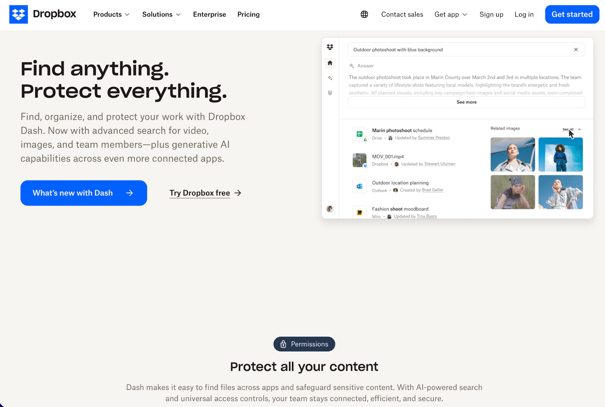
To ensure such clarity, pick a font family that resonates with your brand voice. For example, you might use a single sans-serif (Regular for body, Semibold for subheads, Bold or Black for H1s), plus italics for emphasis and a monospace font only where code appears.
Here are some other simple patterns that can work:
-
Single-family system: One sans-serif (e.g., Inter or Source Sans 3) at 400/600/700 for body, subheads, and headings.
-
Two-font pairing: A serif for headlines (for character) and a sans-serif for paragraphs (for readability). Keep sizes and spacing consistent across templates.
-
UI-specific add-on (optional): A monospace strictly for certain elements other than regular text (must be used sparingly and consistently).
If you're not sure which font to pick for your site, you can browse Google Fonts. It has plenty of families with different weights and scripts, so you can find the one aligned with your brand's identity.
4. Use at least 16px for body text
Small body text forces users to squint, pinch-zoom, and re-read content, which significantly harms their experience. This is especially the case on mobile devices, where viewing distance, glare, and motion already work against comprehension.
You can avoid this by bumping body copy to 16px (or higher on large devices). Doing so gives letters enough pixel detail to render cleanly while improving word shapes and reducing eye strain.
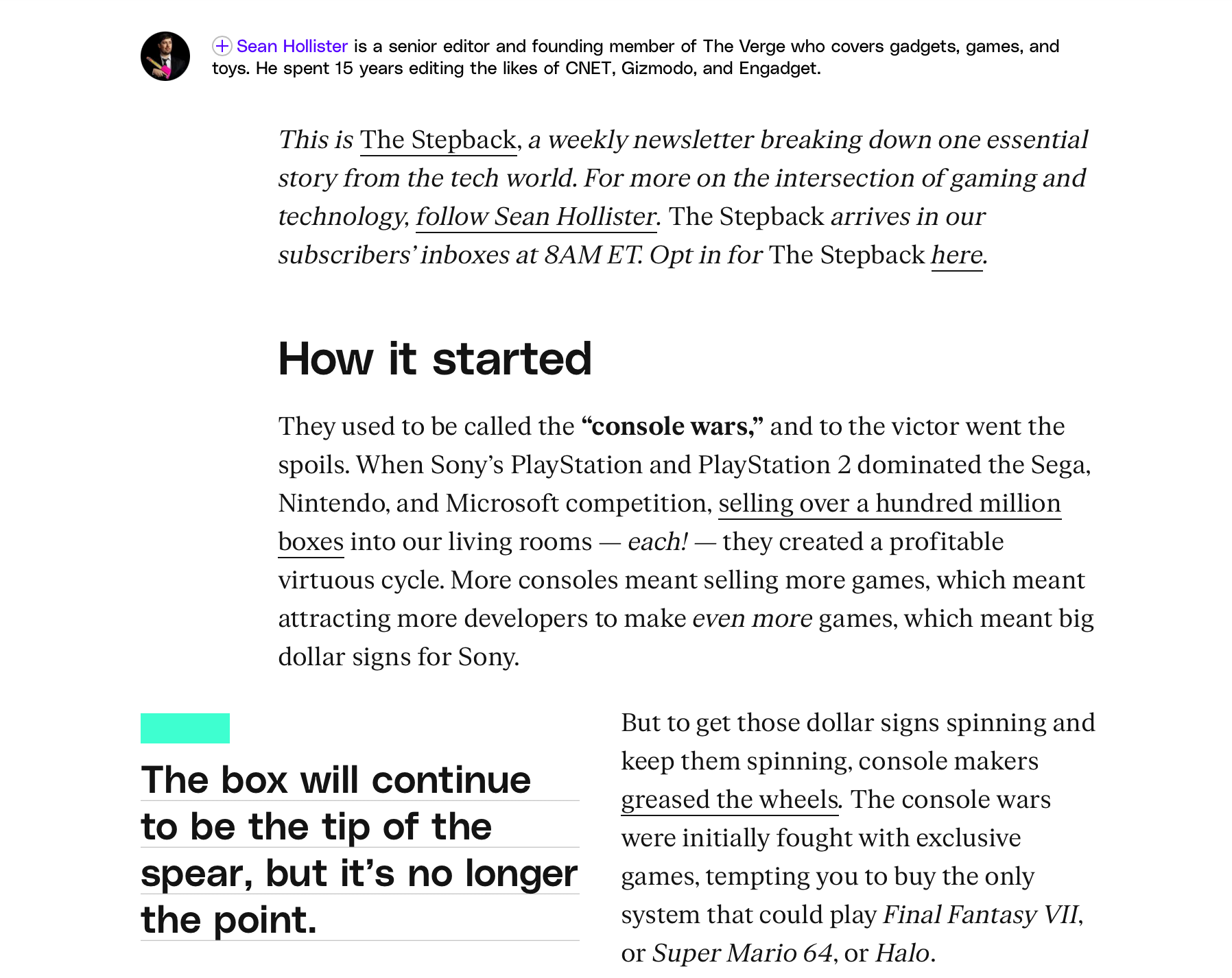
Comfort-first typography is especially important on content-heavy sites. For example, The Verge leverages generous body sizes, ample line height, and sensible line length so articles feel airy and digestible.
While 16px is the recommended minimum for body text, this value isn't set in stone—you should adapt it to different screen sizes to ensure comfortable reading. You also need to pay attention to line height and length, as they define the heaviness of your paragraphs.
If you need some reference points, you can try this:
-
Mobile: Treat 16–18px as a floor for body text, with ~1.5–1.7 line-height and tighter line length (45–70 characters). Thumbs and small screens demand bigger type and more spacing between lines and tap targets.
-
Tablet: Similar body size often works, but you can open the line length a bit and scale subheads up to preserve hierarchy on wider viewports.
-
Desktop: You can keep body at 16–18px (or nudge to 18–20px on very wide layouts) and widen the measure to ~65–85 characters. Balance with whitespace so lines don’t form a thick wall of text.
5. Test your design on mobile first
Over 60% of global web traffic comes from mobile devices, so your hierarchy has to work on the smallest screen sizes. This means:
-
One clear focal point
-
A single-column (stacked) flow
-
Comfortable tap targets
-
Readable typography
To check all the necessary boxes, you should design and test on mobile devices before moving on to desktop. Doing so gives you constraints you need to follow, which forces decisions like trimming copy and ordering elements by importance.
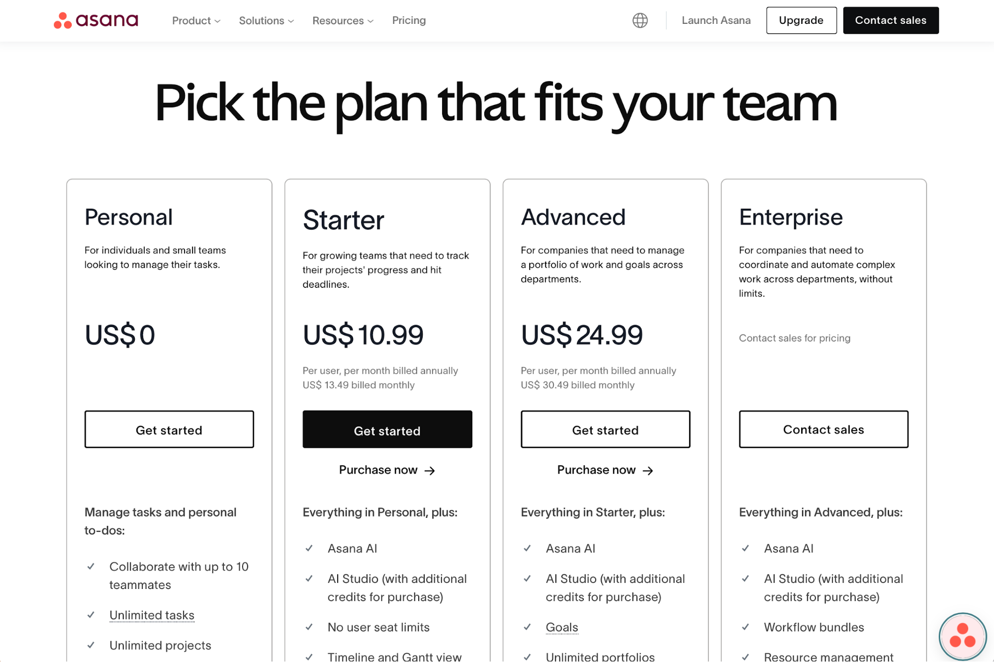
If you need an example of responsive design that adapts to smaller screens, Asana's pricing page is a good one. On desktop, the plans sit next to each other clearly divided into columns, so all the key information is above the fold.
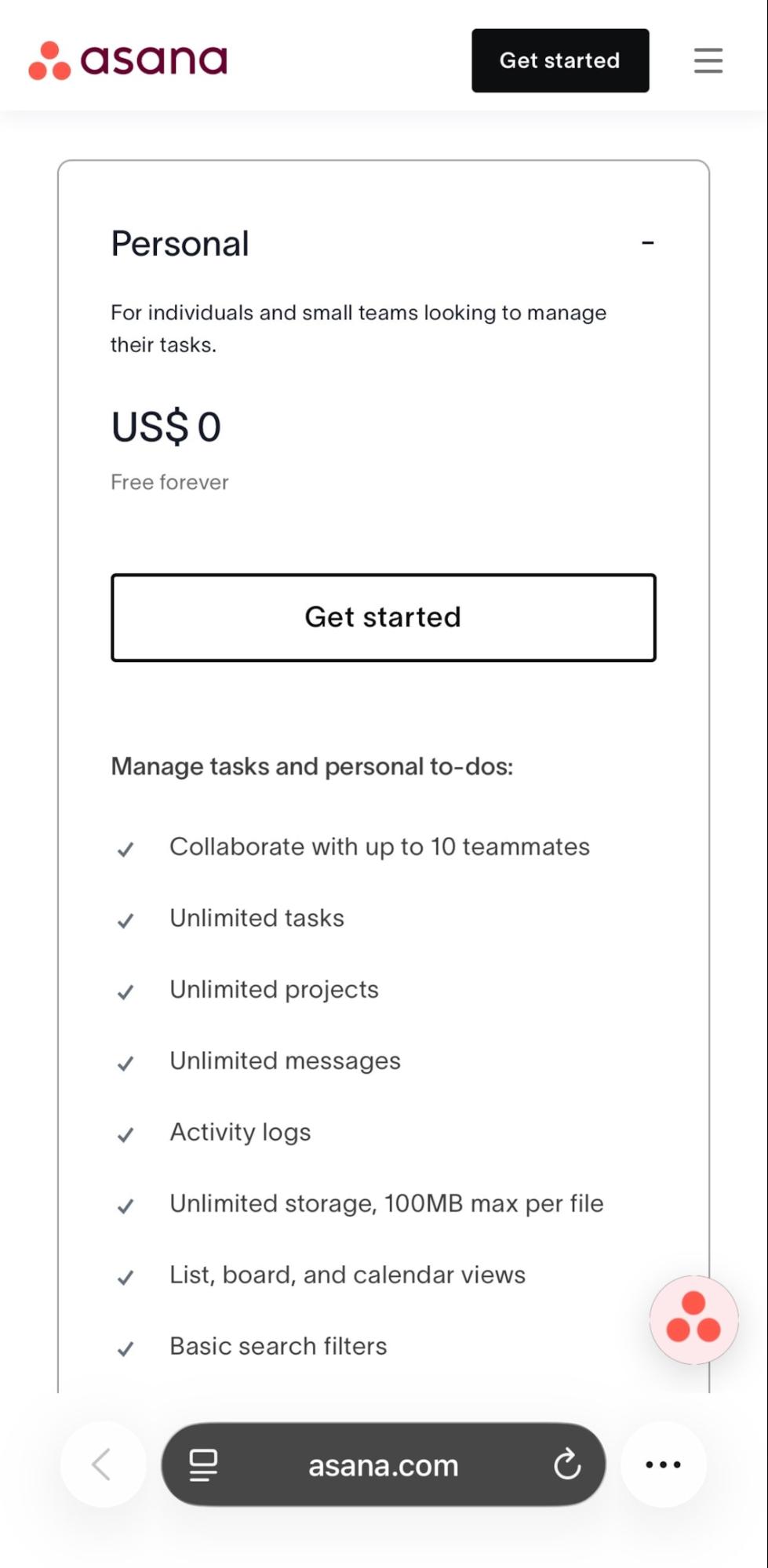
If you open the page on a smartphone, you'll see that the plans are compressed into full-width cards in a vertical sequence.
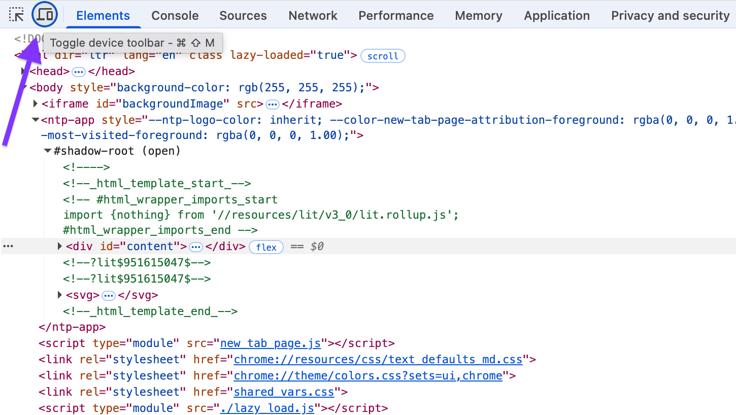
You can use Chrome DevTools to test your pages' mobile-friendliness.
On any page, right-click and choose Inspect (or press Cmd+Option+I on Mac / Ctrl+Shift+I on Windows), and then click Toggle device toolbar to switch to mobile view.
Check the reading path with the interface collapsed to a single column, and see if your elements are visible and accessible enough.
Alternatively, you can use a third-party tool like BrowserStack. It lets you spin up real iOS/Android hardware and test Safari, Chrome, Firefox, and Edge across versions.
The platform can be useful for catching type rendering, subpixel quirks, and Safari-only layout issues.
6. Place the most important CTA above the fold
When someone enters your page, the main goal should be immediately obvious. This means your primary CTA (“Start free trial,” “Get demo,” “Buy now”) should be visible without scrolling, so new visitors can act the moment they understand the value.
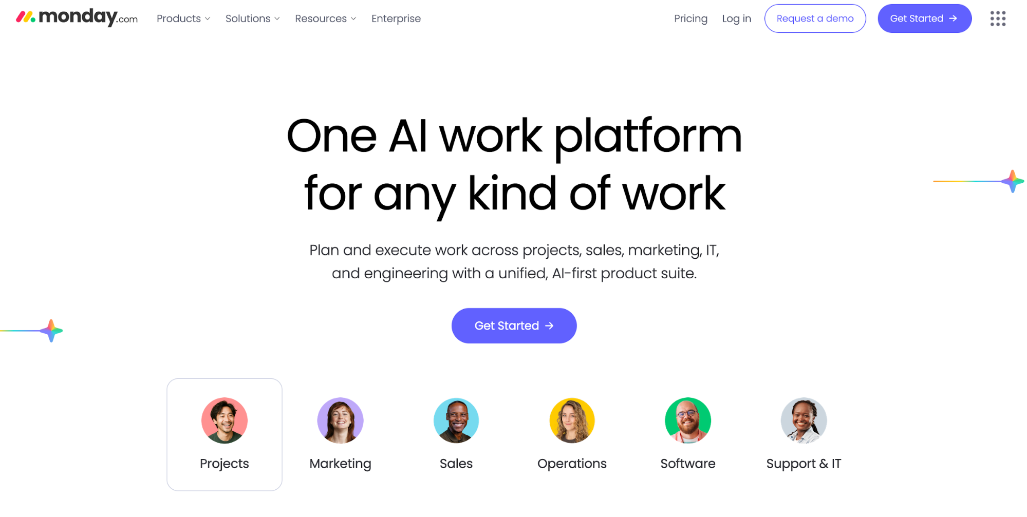
You can see what this looks like on Monday's homepage. The "Get Started" CTA is centrally placed right in the hero alongside a tight value prop, so the next step is obvious on first load.
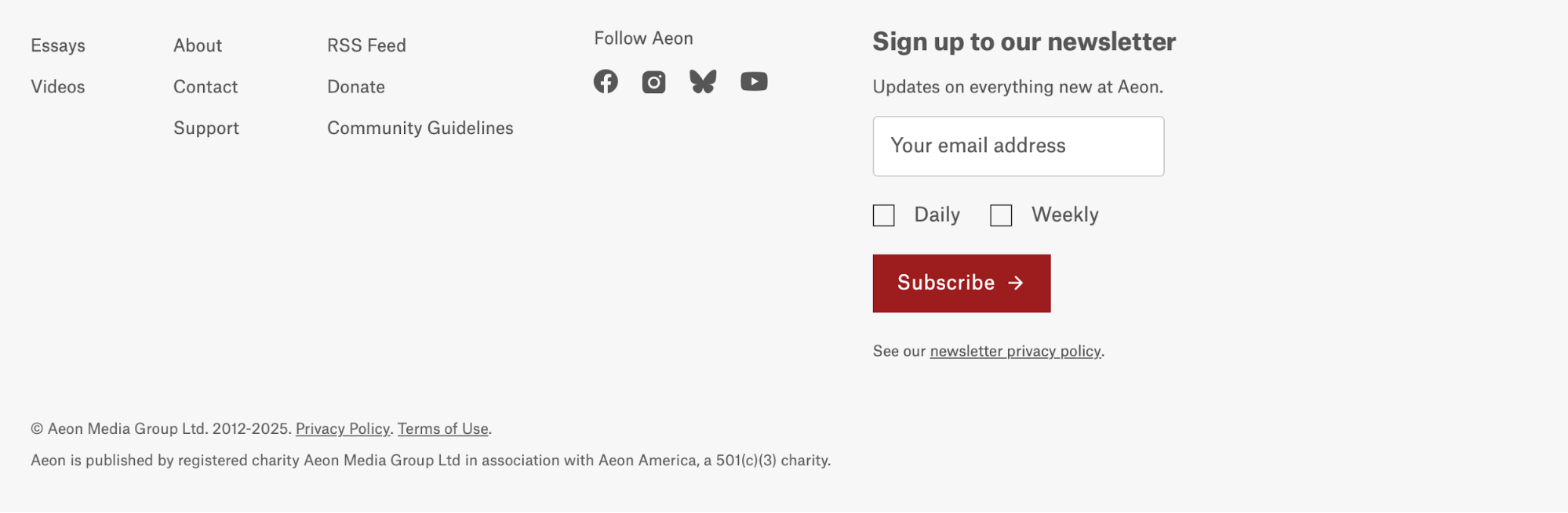
Compare this to a site like Aeon. When you open the page, you'll first see a prominent headline, and the CTA section won't appear until you scroll all the way to the bottom.
Sometimes, the CTA may be above the fold but placed in a way that makes it hardly noticeable or confusing. Take a look at the Wait but Why homepage as an example:
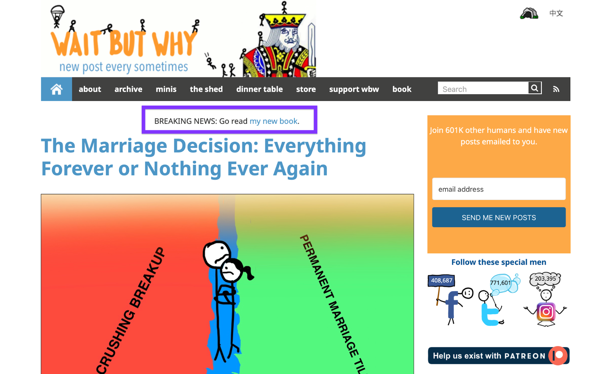
There's a text CTA to read the author's book, but it's easy to miss because the eye lands on the large article headline first.
There are also multiple CTAs in the sidebar (signing up, making a Patreon donation, and following authors on social media), so the primary action is unclear.
To avoid such issues, follow the right CTA placement best practices:
-
Put the main CTA in (or just below) the hero, paired with a concise value line.
-
Keep one clear action in view; use secondary links as quiet alternatives.
-
Re-test on mobile—if your header takes over the screen, tighten it so the CTA still appears in the first viewport.
7. Use alignment grids to avoid clutter
Grids give your layout a backbone, letting you align particular elements to consistent columns, gutters, and baselines. The result is a clean structure, predictable spacing, and a natural reading path that users can follow seamlessly.
Portfolio pages often leverage grids to neatly organize all cards and elements. For example, Pentagram's Work page uses a three-column grid so that all project cards line up perfectly.
Larger elements fit exactly two columns, ensuring consistency.
Magazine-style grids are also common, especially among content-heavy pages.
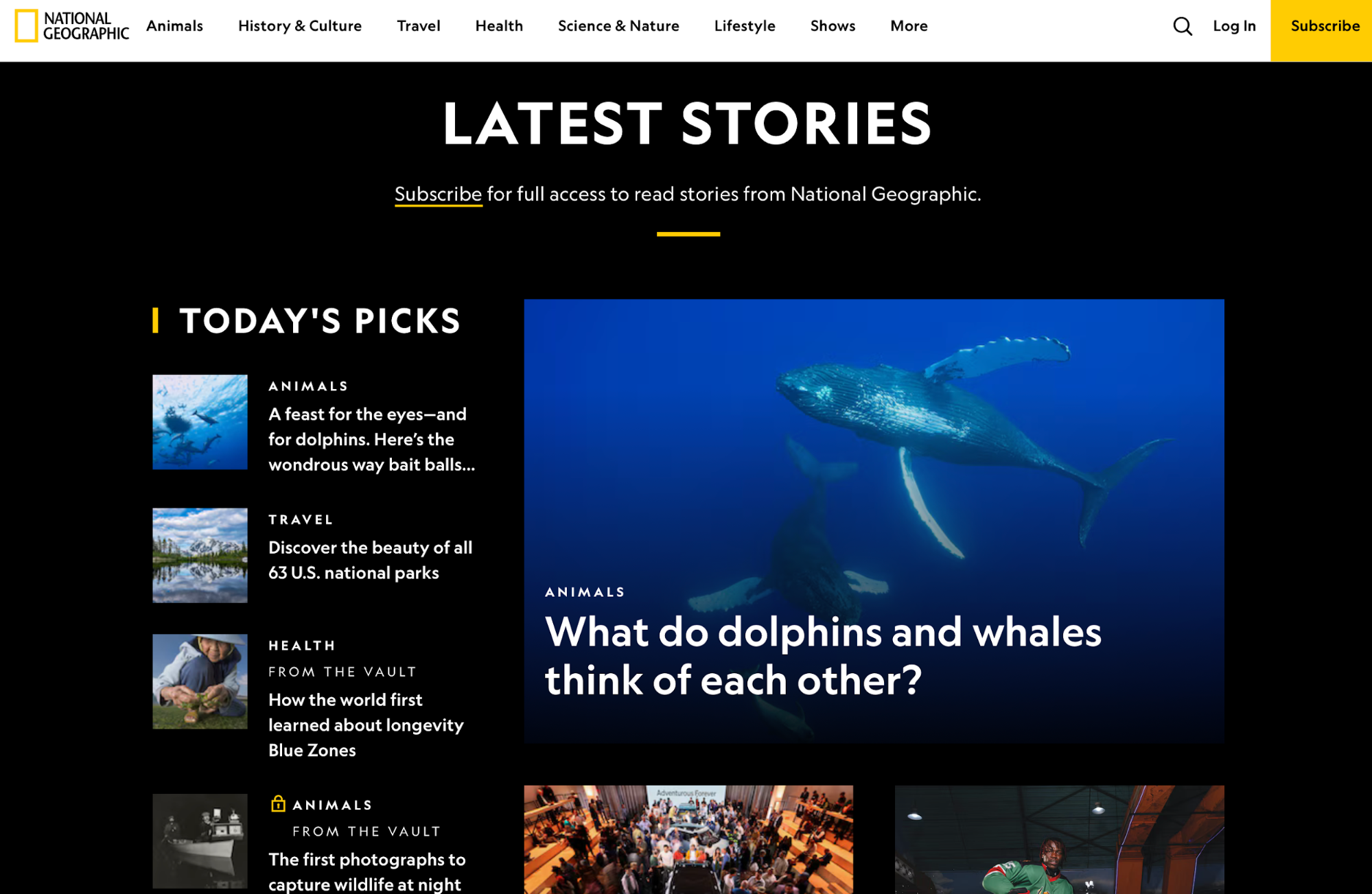
You can see National Geographic's site as an example—you'll see balanced imagery and long reads with a disciplined grid where big photos span set columns, while text blocks and side modules align cleanly.
Many web and graphic design tools offer features that let you define a specific grid. In Figma, you can set up a Layout Grid on frames (e.g., 12 columns, 80–120px max content width on mobile/desktop variants) and use Auto Layout to keep internal spacing consistent as content changes.
On the web, you can use CSS Grid for page scaffolding and card galleries, as well as Flexbox for clear rows within columns. Start with a responsive 12-column grid and fixed gutters, and define utilities for consistent margins/padding so “inside vs. outside” spacing stays predictable.
8. Declutter by removing weak or redundant elements
When too much is happening on the screen, nothing feels important enough to grab attention and guide the user's action.
Decorative icons, unnecessary badges, and excessive banners pull visual weight from the key elements, diluting their value.
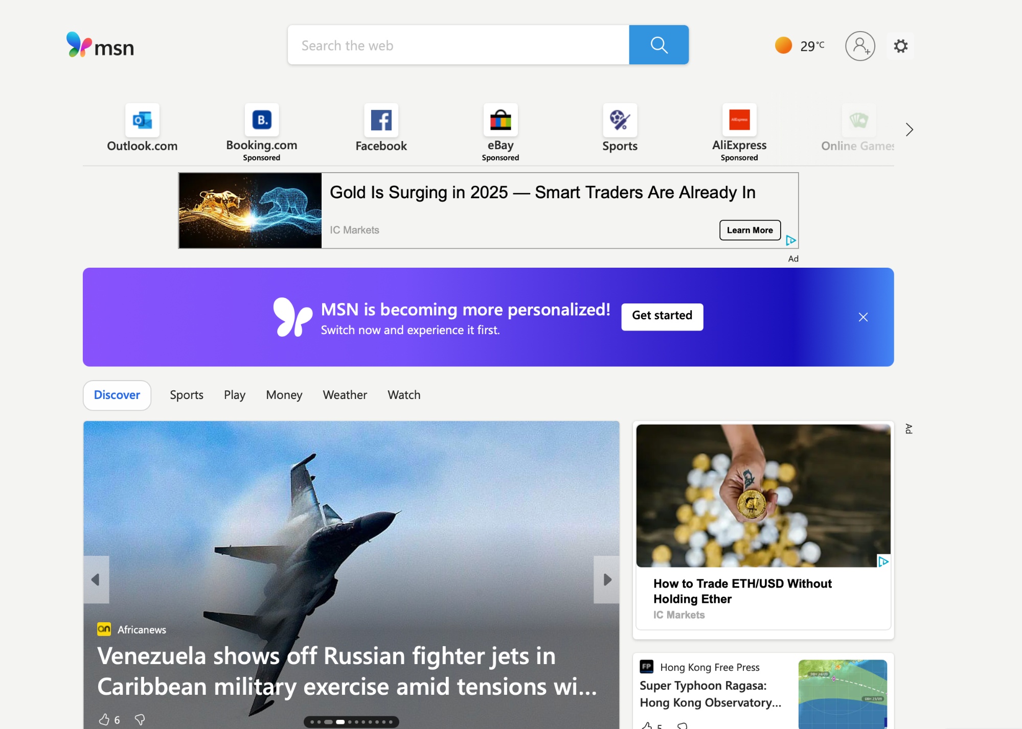
For example, it's hard to know what to do first when you open MSN's website.
The homepage packs dense modules, multiple promo rails, and many competing visuals in the first screenful, so there isn't one visual element that stands out and acts as the entry point.
Now let's look at Basecamp's site. Despite the lively visuals, the page maintains:
-
One bold headline
-
A tight value prop
-
A clear primary action
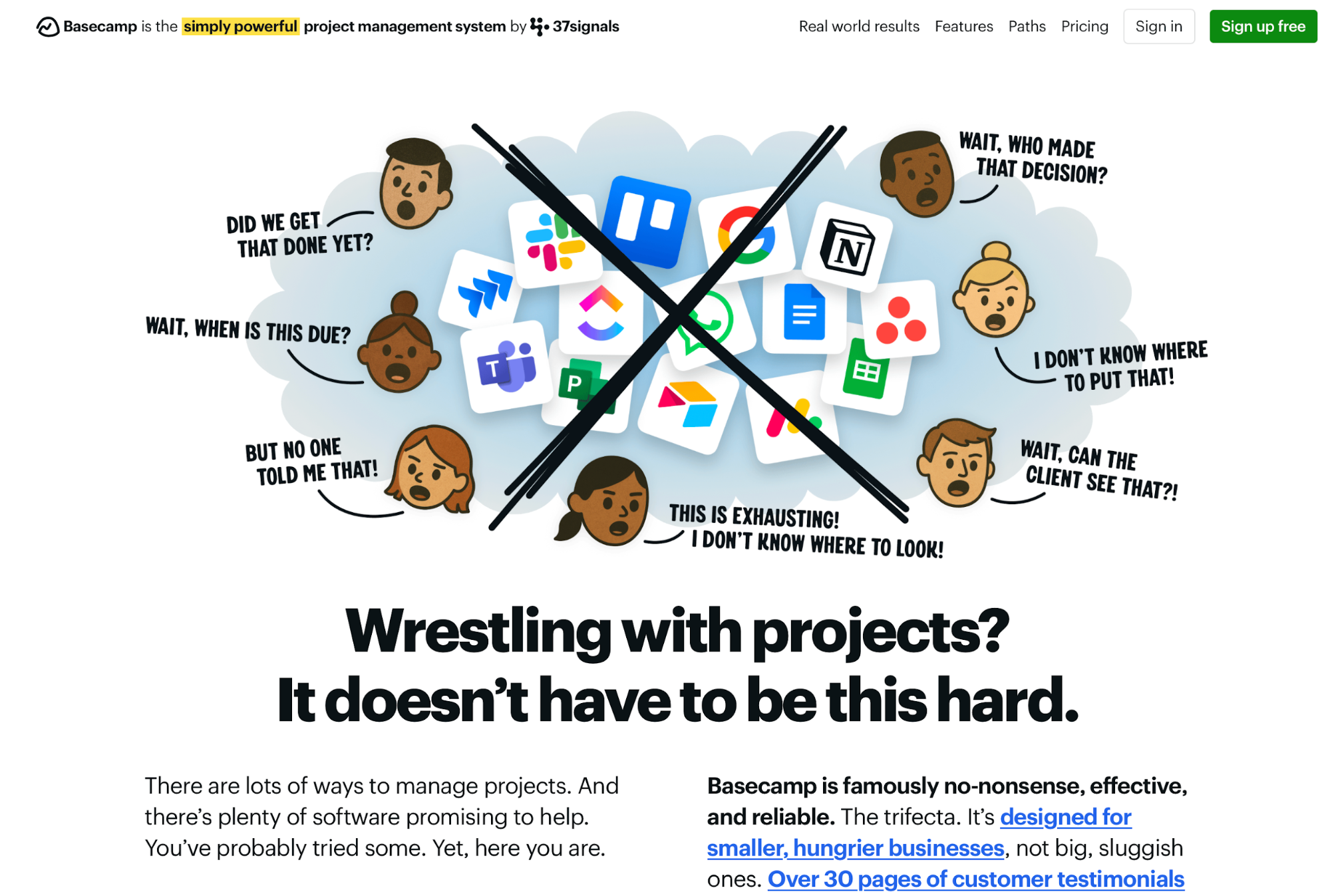
This shows your site doesn't have to be monotonous or boring to feel clean and well-organized—all you need to do is edit the design down to essentials. Specifically, you should:
-
Pick a single hero message + primary CTA, and make sure everything else looks and feels secondary
-
Consolidate repeated links, redundant badges, and overlapping promos into one stronger instance
-
Remove icons that don’t add meaning, background textures behind text, and extra borders that create visual buzz
-
Keep details (FAQs, long specs, edge-case links) collapsible or below the fold so they don’t compete with the primary story.
Examples and case studies of visual hierarchy in action
To design pages that combine visual appeal with functionality through a clear hierarchy, you should learn from the best. Here are some sites for inspiration:
GitHub
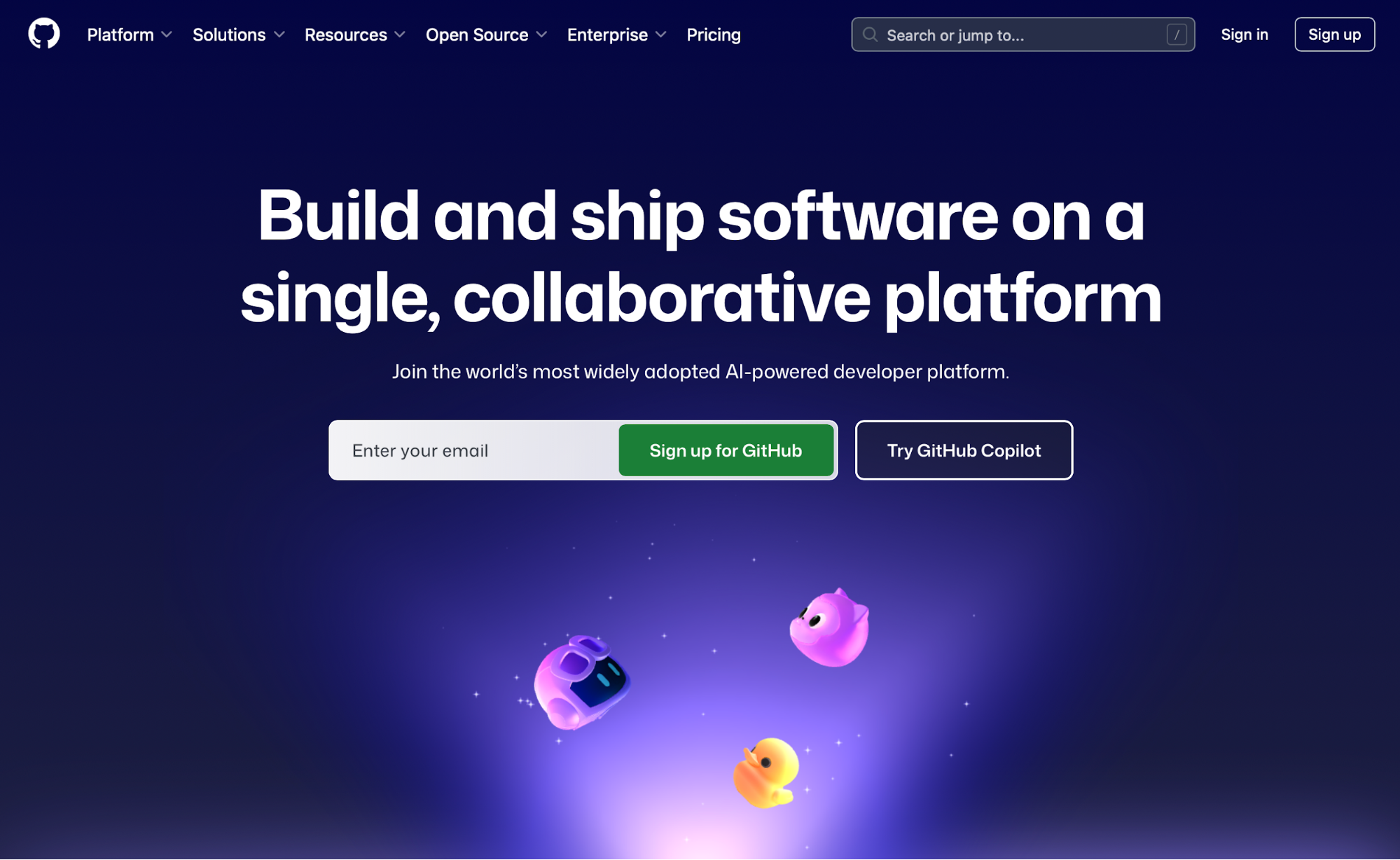
GitHub has mastered visual hierarchy across the site, but the homepage is particularly well-designed. It features a bold hero headline and a single, high-contrast CTA to create emphasis around signing up.
As you scroll down, the layout adapts to features and value props, arranging elements between one and three columns depending on their importance.
As you scroll to the bottom of the page, you're met with a similar hero + CTA placement as above the fold, which further reinforces action.
Duolingo
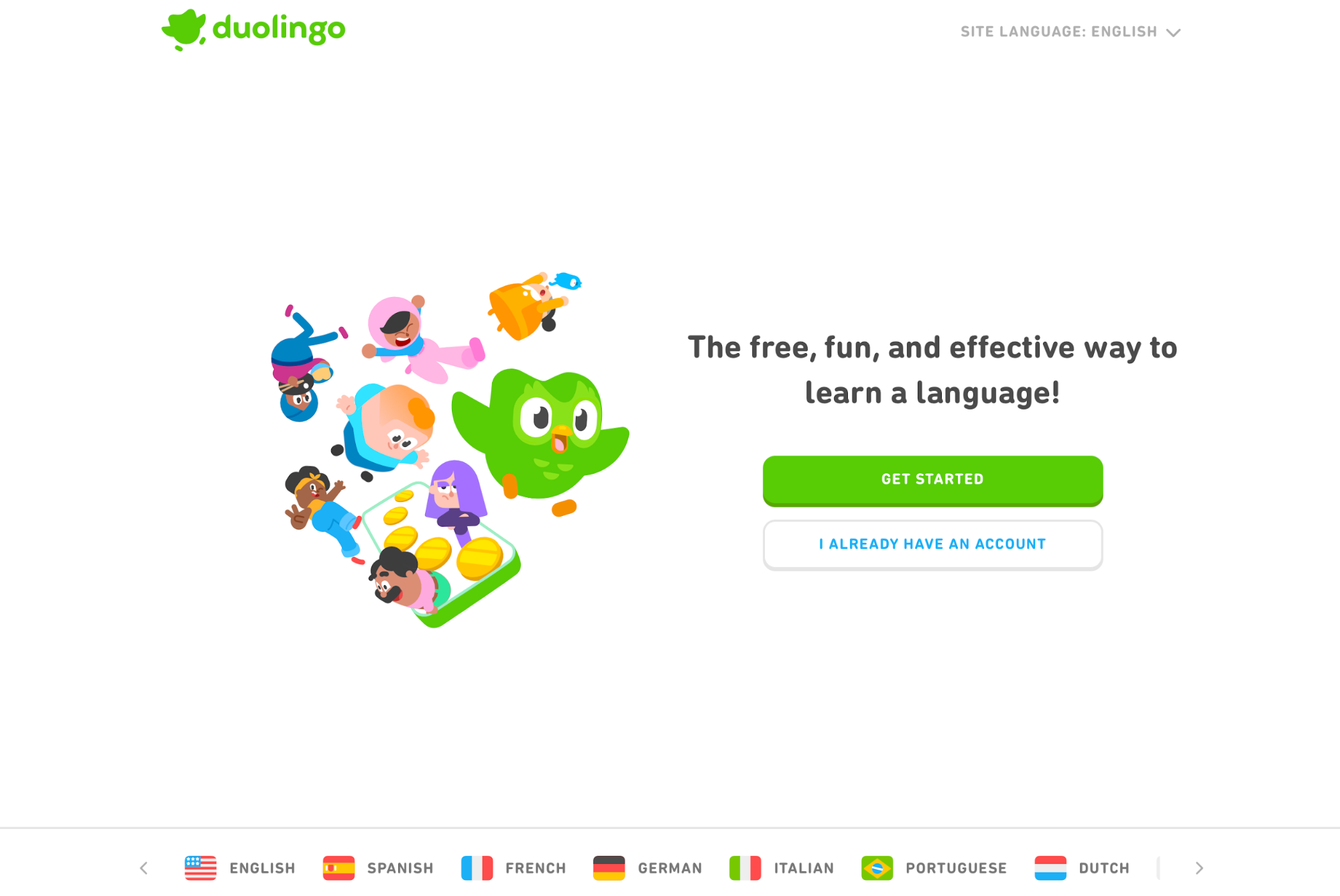
Duolingo's site is a crash course on simplicity. The first screenful highlights the value prop and immediately encourages action. While there are some decorative visuals, they don't pull attention from the CTA or the headline.
The sign-up CTA remains bright and consistent across screens, and color is used sparingly to spotlight actions while generous white space gives sections plenty of breathing room.
The Washington Post
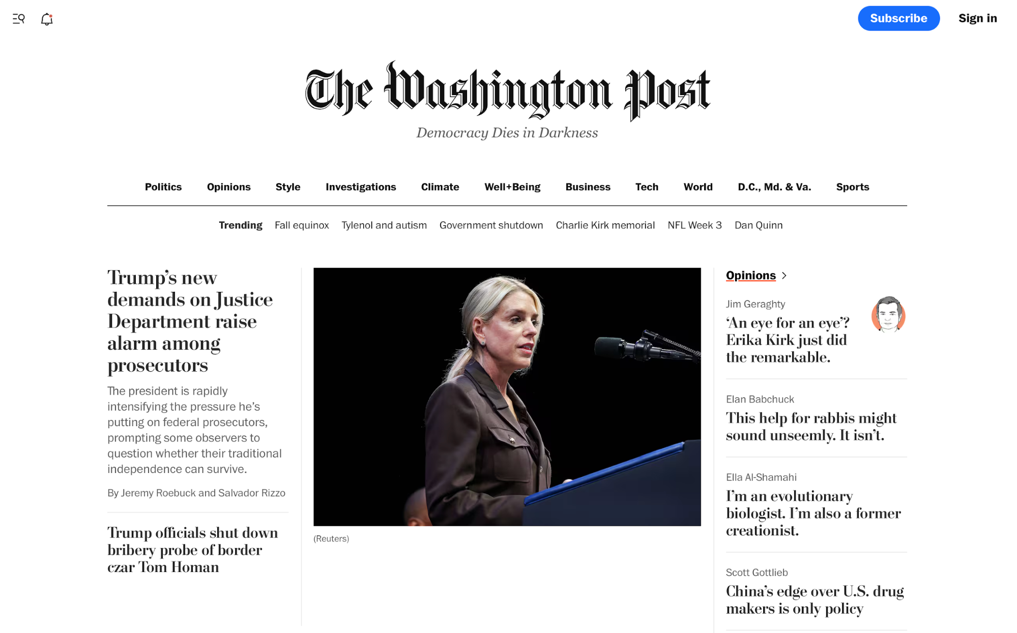
The Washington Post combines clear alignment grids with the right size and typography principles to establish the site's hierarchy.
Lead story commands the top with the largest headline and prominent art, while secondary stories step down in size and weight. Clear section headers and consistent card layouts create “importance ladders,” so you scan top news first, then dive into categories without losing your place.
Canva
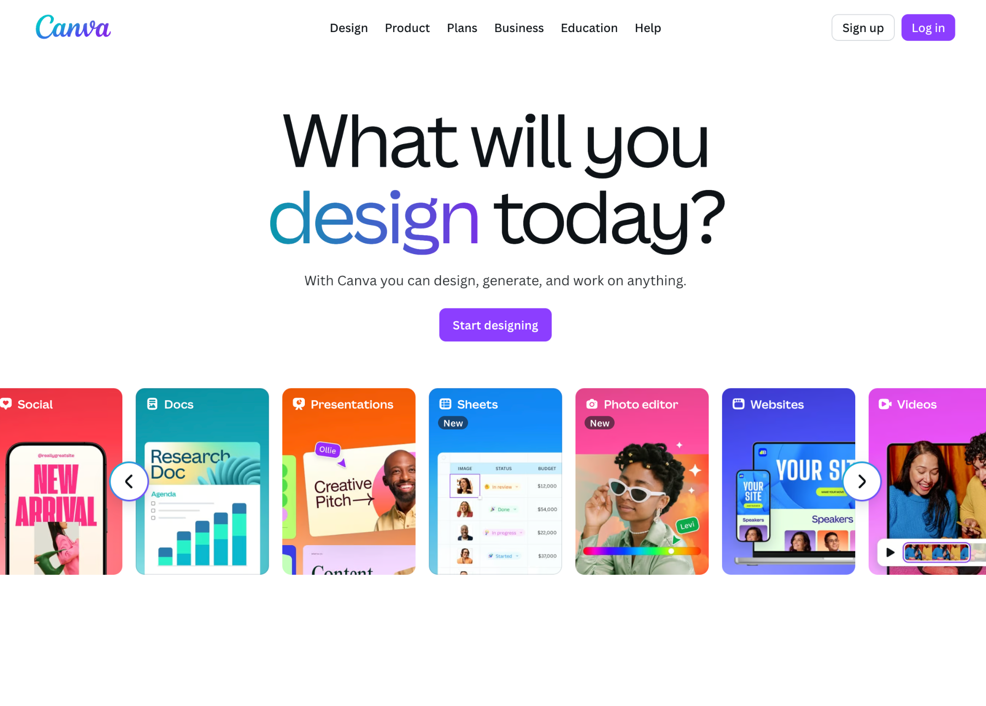
Unsurprisingly, web designers at Canva know how to design a hierarchy with elements that attract attention and enable a smooth experience.
A bold hero headline and a single primary CTA anchor the first screen, while supporting proof (templates, logos, feature teasers) sits one tier down in size.
As you scroll, the platform's features fill the entire layout, with each screen having a corresponding CTA that matches the content. Supporting features are neatly structured in a four-column grid with strong value props that encourage action.
Key takeaways
-
Visual hierarchy intentionally orders elements so users see the most important message and action first. It lowers cognitive load and makes skimming pages easier, providing a user-centric experience.
-
Place primary content and CTAs where eyes naturally scan (e.g., F- and Z-patterns) to streamline user journeys. Use size and scale to signal priority, making core elements meaningfully larger, and keep a consistent type scale.
-
Apply color and contrast to create focal points. Reserve one bold accent for primary CTAs and meet accessibility contrast ratios.
-
Group related items tightly and separate unrelated ones—define “inside vs. outside” spacing to clarify relationships. Leverage white space to isolate the task at hand and prevent competing visuals from shouting at the same volume.
-
Repeat typography, color roles, and component styles across pages to build familiarity and reduce re-learning. Limit your design to 2–3 fonts, and use at least 16px for body text to ensure readability.
-
Test your design on mobile first, ensuring responsiveness across screen sizes. Use stacked flow to collapse elements and make them visible on smaller footprints.