Beginner's Guide to Color Theory in Web Design: Tips and Walkthrough


Petar Marinkovic
Created on Sep 29, 2025
Colors influence everything from a web page's readability to users' emotional responses, so picking the right ones for your site is essential to a positive user experience. In this guide, I'll teach you how to do this by explaining what color theory is and how to select the best colors on your website
What is color theory?
Color theory is a framework that defines how colors interact, create harmonies, and evoke specific emotions or messages. It helps understand the properties and relationships between colors, letting you achieve aesthetic balance and effective communication.
This concept is used in virtually all design fields, including:
-
Graphic design: Color theory helps build readable, on-brand palettes for everything from posters and packaging to social posts
-
Web design: Understanding color theory lets you set accessible contrast for text/UI, create clear emphasis, and keep components consistent across screens
-
Interior design: Working out the relationships between colors helps balance warm/cool tones and saturation to influence the mood in a room
-
Branding: Color theory helps you choose signature hues that signal positioning (e.g., energetic, premium, eco-friendly) and remain flexible across print and digital assets
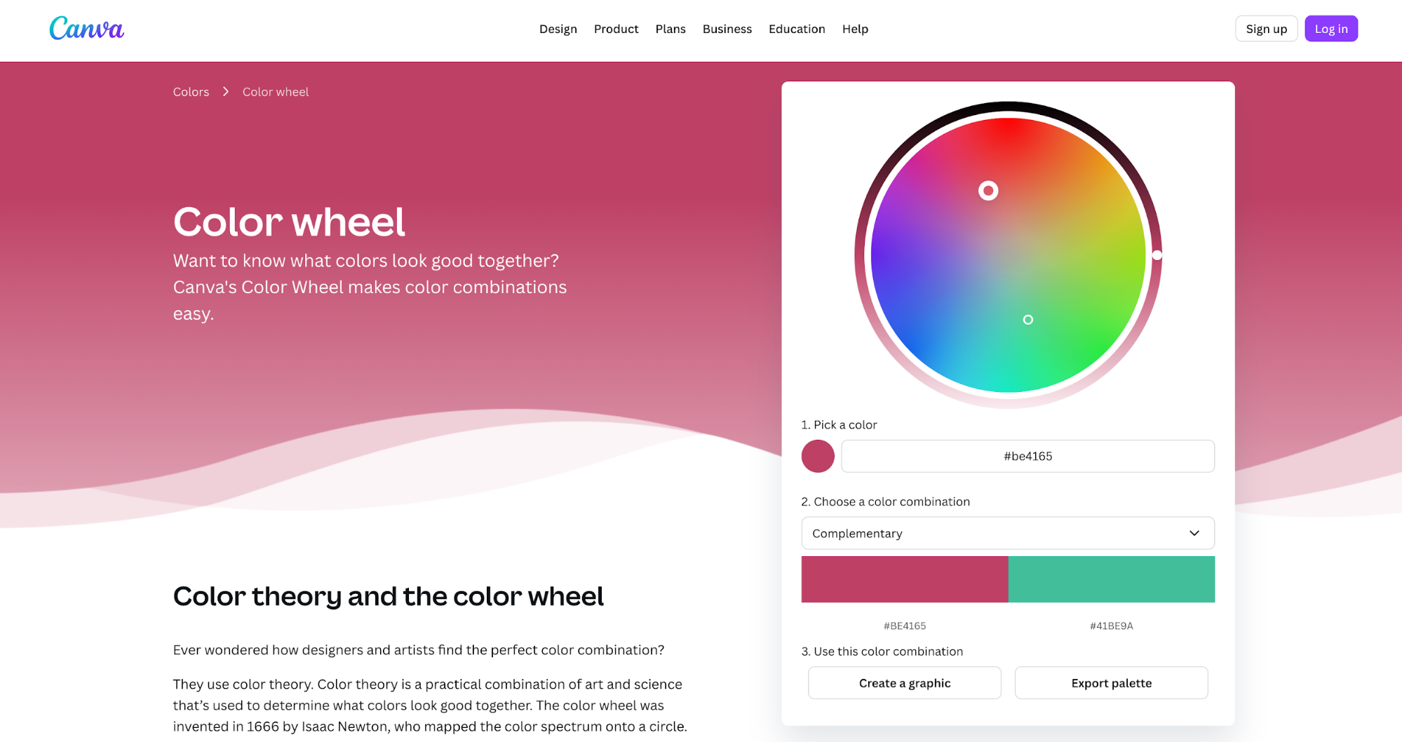
Today's color theory largely revolves around the color wheel, which visually organizes colors to show their relationships and how they mix.
You can play around with Canva's color wheel as an example. Experiment with different palettes, hues, and tones to see how they interact.
Color theory is far from a new concept. It dates back to the 17th century, when Isaac Newton split white light with a prism and arranged the spectrum into a circle.
Later, Johann Wolfgang von Goethe approached color from perception and psychology, influencing how designers think about the feel of hues instead of just their physics.
Today, color theory is everywhere you look. For example, traffic lights use red, yellow, and green because those distinct hues map to clear, universal cues—stop, caution, go. This happens at a glance, even at peripheral vision.
When you apply color theory to a page or product, you’re doing the same thing: turning color choices into instant, intuitive communication with users.
Why is color theory important to understand?
Learning color theory is important because color choices influence user experience, readability, and emotional response—all of which determine the success of your website.
For example, ensuring that color combinations have sufficient contrast improves legibility for everyone, including users with low vision and aging eyes.
Similarly, your chosen color hues, brightness, and saturation dictate how users perceive your page, so a muted palette can feel “serious” while high-saturation colors feel “active.”
Color also strengthens branding by making companies instantly recognizable and signaling personality.
If someone asked you to name a brand with a red logo, it would be hard not to think of Coca-Cola. The company uses a vibrant red to amplify energy and visibility, evoking excitement in users.
By contrast, Facebook uses a more calming blue, which has been found to communicate more trustworthiness than red.

In marketing-focused web design, color is mainly used to nudge decisions. For example, red is used for CTA buttons because it communicates urgency, subtly encouraging users to click the button.
Even subtle changes to the shade of one color can make a bigger difference than you might think. Back in 2014, Google's executives revealed that changing the shade of the blue used for links resulted in a $200 million increase in revenue.
Choosing color schemes carefully helps you create standout visuals that boost brand recognition.
Well-known research by Satyendra Singh established that 62–90% of initial product or brand assessments are based on color alone, while a more recent experiment showed that using blue, green, and red makes a brand more visible and memorable.
All of this tells us that color choices aren't accidental. Taking a strategic approach to defining your palette lets you design with intent and leverage the powerful psychological effects of different colors.
Types of color models
One of the first things you'll learn in color theory is the different models you can implement when incorporating colors in your design. Here are the best-known ones:
Primary, secondary, and tertiary colors
At the most basic level, the traditional color wheel starts with three primary colors—red, yellow, and blue (RYB). Mix any two primaries and you get the secondary colors:
-
red + yellow → orange
-
yellow + blue → green
-
blue + red → violet/purple
Blend a primary and secondary color adjacent to it, and you get the six tertiary colors that sit between them:
-
Red-orange
-
Yellow-orange
-
Yellow-green
-
Blue-green
-
Blue-purple
-
Red-purple
This is the 12-hue wheel you might've seen in art class, and it’s the foundation designers use to plan their color palette.
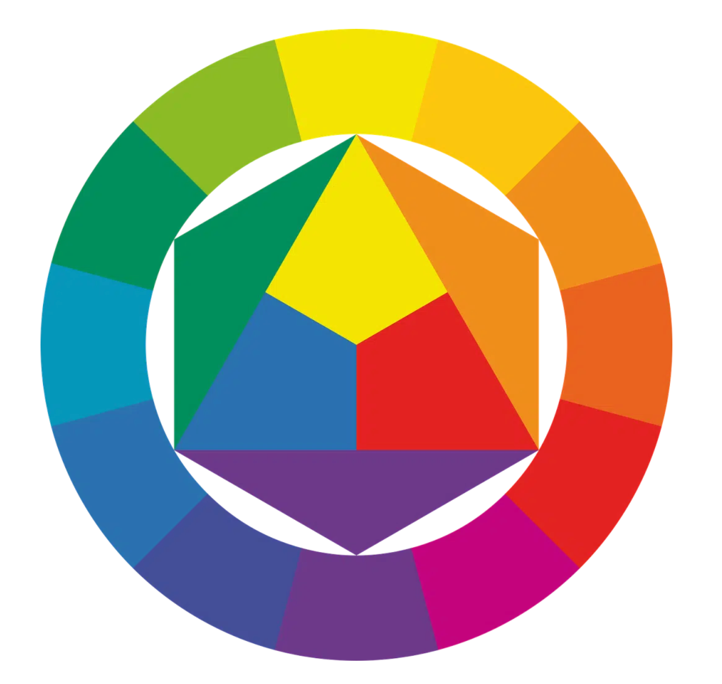
This simple wheel can expand to seemingly countless mixes and defines all color relationships you'll use in your projects (complementary, analogous, etc.).
Once you see how secondaries and tertiaries fill the gaps between primaries, choosing a palette becomes less guessing and more strategy.
Complementary, analogous, triadic, and tetradic schemes
Color harmonies or schemes are structured ways of picking hues from the color wheel so your palette feels intentional. You can choose the number of colors and their relationships to create a color harmony that fits a specific purpose.
Complementary colors are opposites on the wheel, which are used to create high-contrast, energetic designs.
You'll often see this harmony in sports logos, such as the New York Knicks with its blue-orange combination.

By contrast, an analogous color scheme is made up of neighboring colors sitting side-by-side on the wheel (think green → teal → blue). This combination gives a low-contrast, cohesive design that typically communicates calm or freshness, depending on the exact colors.
For example, The Ocean Cleanup uses different shades of blues and cyans to create a calming flow. The site's layout shows the analogous schemes work well for backgrounds, illustrations, and section theming, with a neutral color for text.
Triadic color schemes form a triangle on the wheel (e.g., 0°/120°/240°). They're made up of evenly spaced hues that offer vibrancy without the harshness of complementary colors.
The most commonly used type is the primary triad (red–yellow–blue), which we can see in many logos, such as Burger King's pre-2020 logo before the redesign.

Finally, tetradic color schemes form a rectangle made up of two complementary pairs (e.g., 0°/90°/180°/270°).
This combination is highly flexible, but it's easy to overdo due to the many contrasting colors.
Famous examples of tetradic color schemes can be found in tech giants like Google and Microsoft, which leverage vibrant mixes combined with white space for balance.

RGB vs CMYK (and when to use each)
The RGB (Red, Green, and Blue) system mixes light, which is how screens work. It’s the default for websites, apps, and digital ads.
By contrast, CMYK (Cyan, Magenta, Yellow, Key/Black) mixes ink, which is how printing presses and most digital printers reproduce color.
Each system has a specific use case, even when the goal is the same. For example, if you're creating ads, you will use:
-
RGB for a digital ad or any online materials
-
CMYK for printed pieces like posters, flyers, and business cards
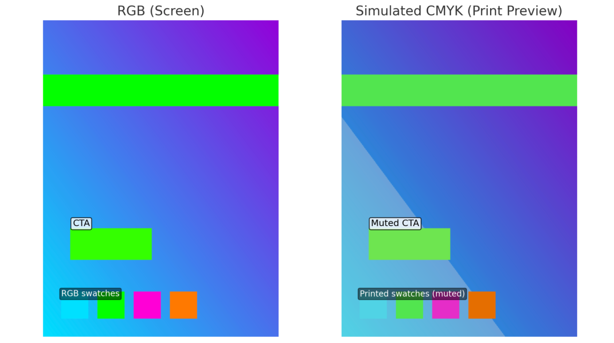
Make sure not to mix up the two systems because doing so can result in inaccurate color representation. Sending an RGB design to print can produce duller, shifted colors, especially in bright cyans, greens, and neons that exist on screens but fall outside the CMYK gamut.
If you need an example, here's a simulated effect of what would happen if you tried printing a web page in the RGB color system:
If you need some practical tips for using the right system, follow these guidelines:
-
Design in RGB, then soft-proof CMYK and convert at the end if the final output is print (Adobe apps support this flow).
-
For ads and on-screen graphics, export RGB (often sRGB) with an embedded profile so platforms render colors consistently.
-
For print, export CMYK PDFs using your printer’s ICC profile to minimize surprises. If you skip this, the print shop will convert for you, where you have less control.
RYB and traditional art models
RYB (Red, Yellow, Blue) is popular in painting and art education because it’s intuitive with real media. You see the color form right on the palette, and you learn practical craft skills like:
-
How much water to add
-
How to glaze
-
How different pigments behave (e.g., opaque cadmium red vs. transparent alizarin crimson)
RYB is different from digital color systems. Screens work with light (RGB), not pigment, so mixing is additive (more light = closer to white).
By contrast, paint is subtractive—you’re absorbing light, so piling on pigment tends to dull or darken the image. That’s why a bright “neon green” you can see on a monitor is easy in RGB but hard to mix from RYB without it turning muddy.
If you're new to design, RYB lets you go back to the basics of color theory. You can use plenty of school-like art projects to practice, such as:
-
Color wheel painting: Start with red, yellow, and blue dots, and mix your way around the wheel to discover a dozen hues with just three tubes.
-
Landscape wash: Lay a yellow sky, blend to orange with a touch of red, then mix a calm blue-green for trees by nudging blue with a little yellow.
-
Complementary shadows: paint a lemon (yellow), then deepen the shadow with a hint of violet (blue+red) instead of black to keep it lively.
Tints, shades, and tones
Tints, shades, and tones describe value and saturation tweaks to a hue. When you tweak a color’s value, you change its mood:
-
Tint = add white → the hue gets lighter/softer (think pastels)
-
Shade = add black → the hue gets darker/richer (more drama)
-
Tone = add gray (or reduce saturation) → the hue gets more muted/subtle
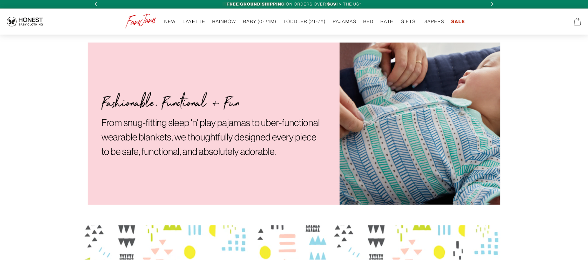
Designers often use these tweaks to bring their designs closer to the target audience. For example, Honest Baby Clothing’s website heavily relies on pastels to project calm and comfort.
Similarly, dark shades are commonly used by luxury brands to convey authority, heritage, and gravitas. A good example is Mazarine's Panthère de Cartier campaign, which uses lush, dark scenes to complement and accentuate the opulence of Cartier's pieces.

If you need a quick mental model for changing a color's value, here are some common rules:
-
For gentle reassurance, move your palette toward tints (white added).
-
For elevated, evening-wear energy, introduce shades (black added).
-
For understated polish (e.g., for dashboards or docs, work with tones (gray added) so color supports content rather than competing with it.
How to use the color wheel?
Start with a base hue that fits your message (e.g., calm blue, energetic red), and then pick a harmony to structure the palette:
-
Complementary for bold contrast and standout CTAs
-
Analogous for cohesive, low-tension layouts
-
Triadic for lively balance
-
Tetradic for flexible, multi-accent systems
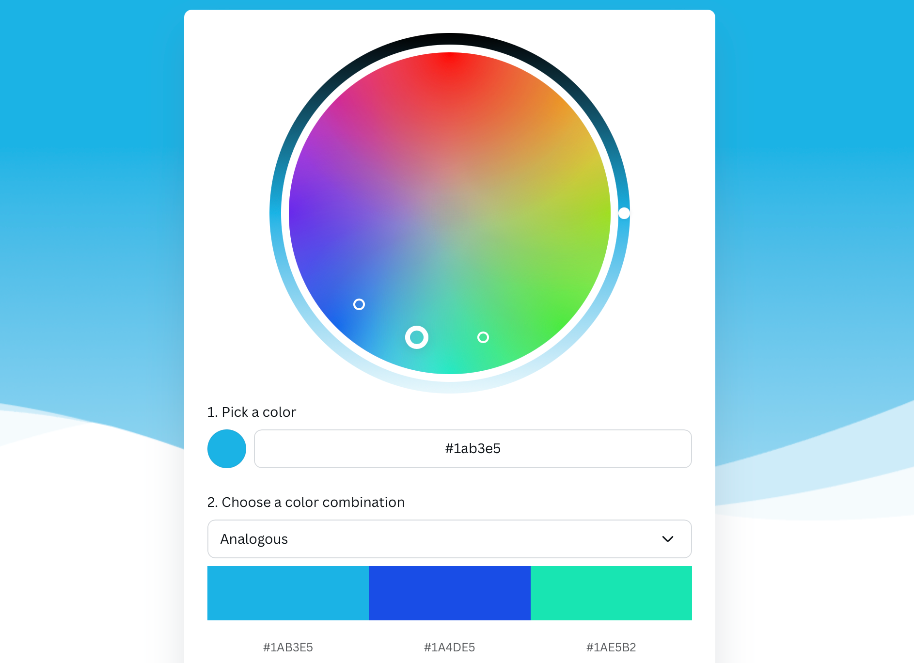
Here's an example of an analogous harmony based on a blue base:
Assign clear roles to colors so that each option feels intentional. Choose one dominant hue (backgrounds/large areas), one neutral for text, and 1–2 accents (buttons, highlights).
Then, use tints, shades, and tones of your base to handle states (hover/active), depth, and hierarchy without adding new hues.
Always aim for strong text–background contrast for accessibility. You can use the WCAG contrast checker to ensure your color combinations meet the necessary guidelines.
After choosing your color combinations, prototype key components (nav, cards, forms) to see how colors work together.
Keep the palette tight (3–5 core colors plus neutrals) and test across light/dark imagery and on multiple devices.
Finally, document hex values and usage rules so your palette stays consistent in design and development.
Color psychology for design
Your color palette can evoke a range of emotions, so you need to choose the one that triggers the feelings you want users to experience.
To do this, you should familiarize yourself with the emotional and cultural context of colors.
Colors and the emotions they evoke
Color is a fast emotional shortcut that performs pre-verbal communication before copy kicks.
A simple comparison between warm and cool colors can demonstrate this—warm colors (reds, oranges, yellows) feel energetic and urgent, while cool colors (blues, greens, teals) read calm, reliable, or restorative.
You can go even more granular and connect specific colors to emotions, for example:
-
Red often signals lively energy and passion
-
Blue suggests trust and a calm energy
-
Green implies growth and health
These emotional connections are often the starting point when choosing a color palette. For example, banks like Barclays and Chase use different shades of blue to project reliability and stability.

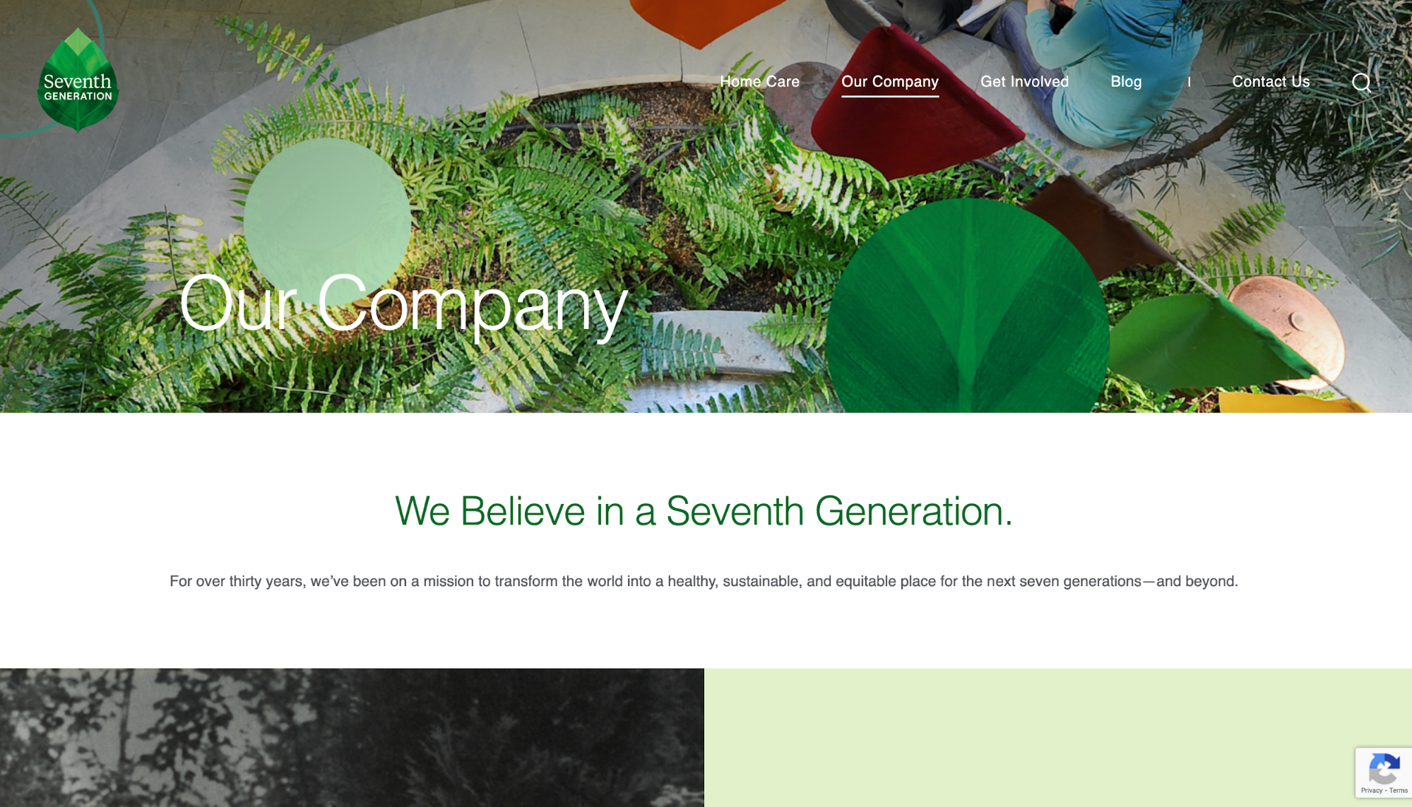
Similarly, eco-friendly brands lean toward green to signal growth, purity, and sustainability. You can see this on the Seventh Generation website, which uses various shades of green across its pages:
Think about what you want someone to feel the moment they enter your site. Define your color palette accordingly, and then test your combinations in real-life settings through focus groups or surveys to see if your choices accurately reflect the target emotions.
Cultural meanings and context of colors
Colors don't have a universal meaning. White may signal purity in Western weddings, but it’s associated with mourning in parts of East and South Asia.
At the same time, red can signal danger/urgency in the West but stands for luck and celebration in China.
This is why you should validate cultural assumptions before exporting a palette. Understand your target audience's social cues when it comes to color, and adapt your palette accordingly.
The way global brands adapt to cross-country audiences can show you how this is done. Take McDonald's as an example. While it's unmistakably associated with its legendary red-yellow combination, the chain changed its background color to dark green for the German market back in 2009.

This was a part of a broader initiative to go green and align with Europe's sustainability efforts.
While the redesign was a success, it wasn't without backlash. McDonald’s “green” move was criticized by some outlets as greenwashing, showing how a color that reads “eco” in one market can trigger skepticism in another and potentially misfire.
Color carries cultural and political baggage, not just aesthetics. You need to carefully assess your audience's sentiment toward a specific color before using it in your designs.
4 tips for applying color theory practices
If you need a starting point for leveraging the principles of color theory in your designs, here are some tips to follow:
1. Use harmony and contrast to craft balanced palettes
To create a cohesive design, start with harmonious color combinations (e.g., analogous neighbors). Then, add one contrasting accent to drive attention where it matters, for example:
-
CTAs
-
Sign-up forms
-
Hero sections
The accent should come from a complementary or triadic relationship with the base, so it pops without feeling random or screaming too loudly.
Take Airbnb as an example. Soft neutrals and gentle supporting hues carry most screens, while the vivid Rausch red appears sparingly on high-value actions (booking, primary buttons).
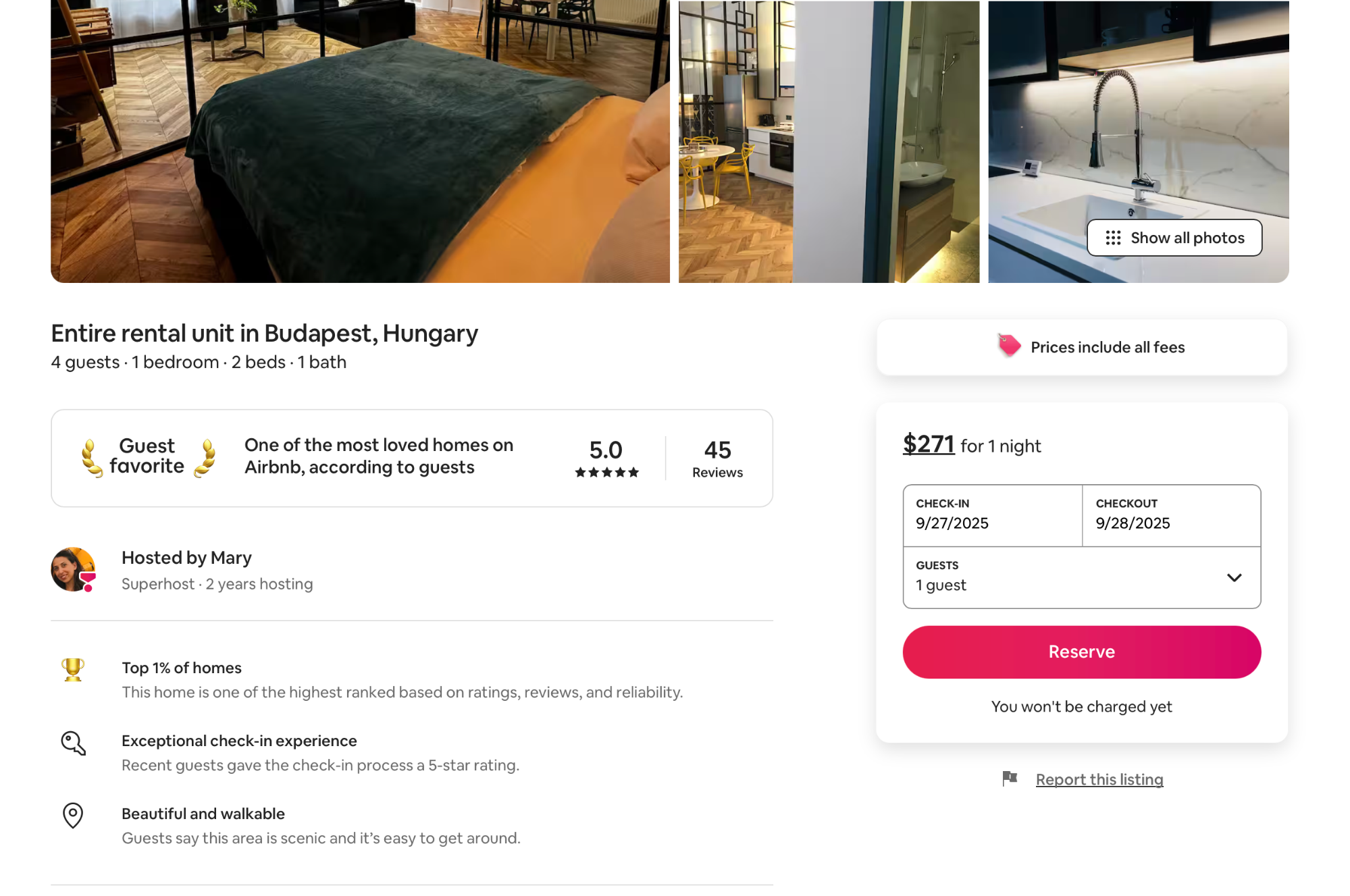
Besides contrasting the base, the accent color is used with restraint, which makes it work nicely with the palette and ensures there aren't too many elements competing for attention.
To keep your designs balanced, use the 60–30–10 rule:
-
~60% of the design should be your dominant background/base
-
~30% should feature a complementary secondary color
-
~10% should be the accent
While this rule comes from interior design, it translates well to UI—your 10% becomes the CTA/feedback color that users can’t miss while browsing the page.
2. Apply color theory for accessibility and readability
Text must sit on backgrounds with enough contrast to be comfortably read by everyone (including people with low vision). According to the Web Content Accessibility Guidelines (WCAG), you need to ensure 4.5:1 contrast for body text (AA level) and 7:1 for enhanced readability (AAA level).
This is why many designers choose complementary color schemes for their sites. Complementary colors are often high-contrast, so they meet the accessibility guidelines if used correctly.
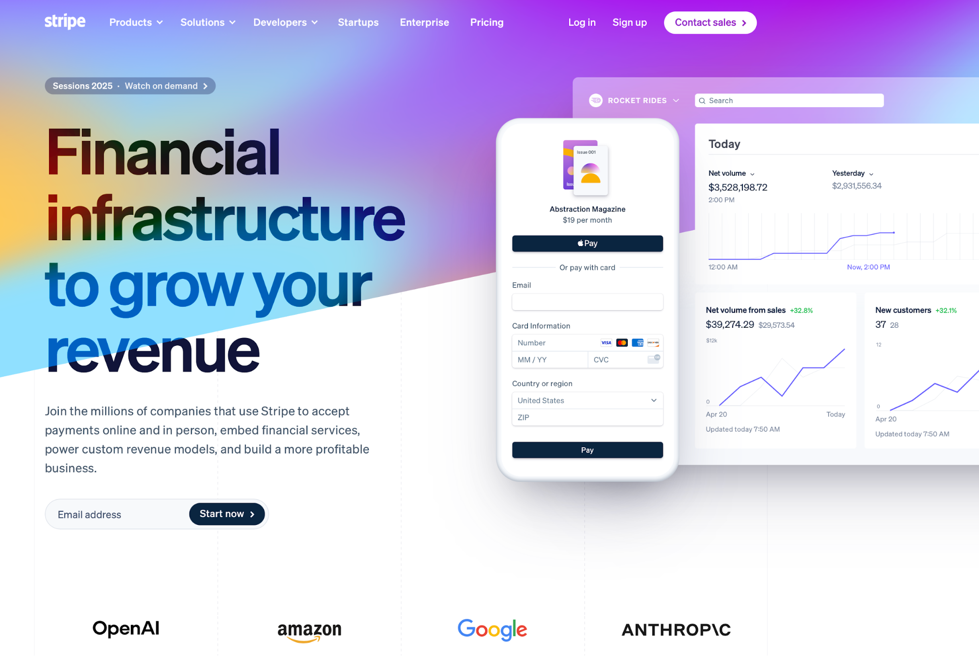
Stripe is a good example of a site with sufficient contrast. While there's a splash of color in the hero section, all the text is clearly visible.
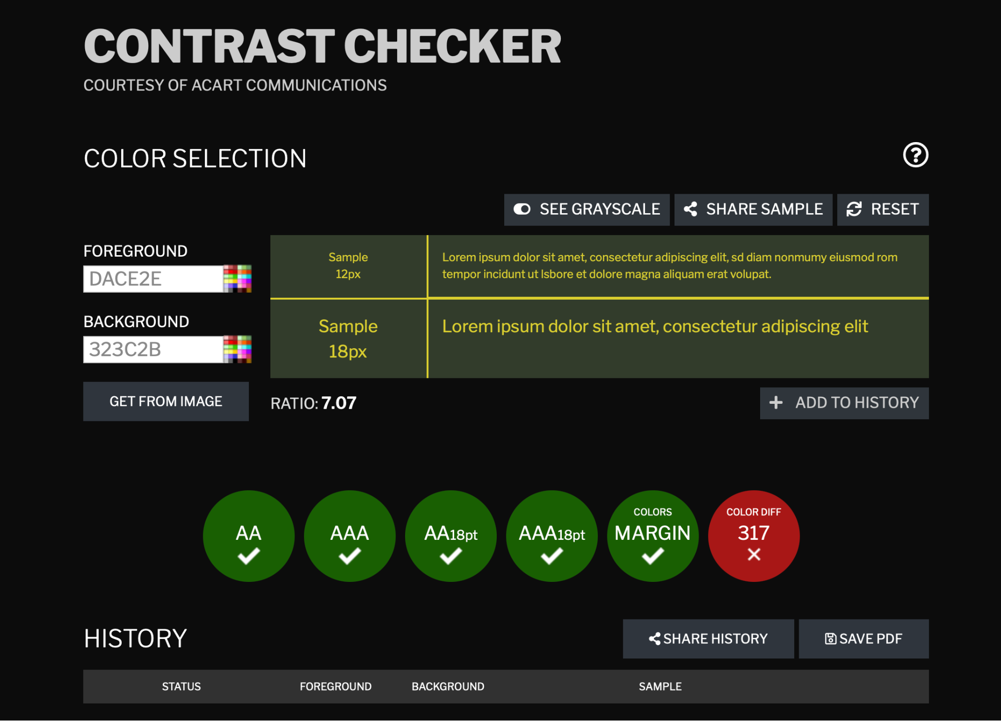
Conversely, Steam's website lacks contrast in some places. For example, in the list of games, gray and dark blue text is on a dark magenta background, which can make it hard to read.

If we sample the colors using a tool like the WebAIM Contrast Checker, we can see that this combination doesn't pass the WCAG guidelines:
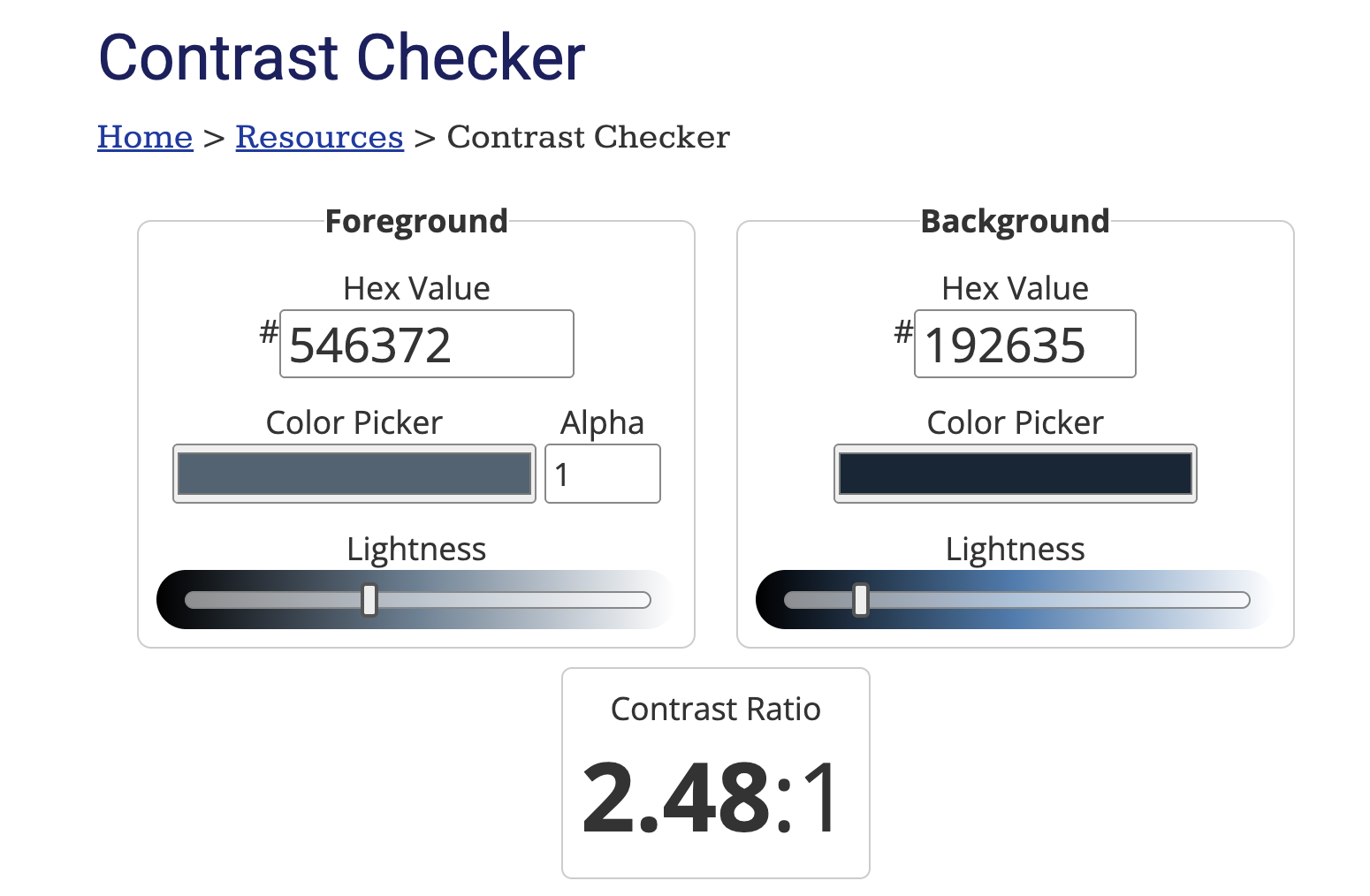
Before shipping your product, always perform a contrast check to avoid such problems and make your design accessible.
3. Use tools and practice to build real color skills
There's no better way to master color theory than through practice. You can use plenty of online tools to experiment with color relationships and palettes, such as:
|
Tool |
What it's for |
|
Lets you spin through harmonies (complementary, triadic, etc.) and check accessibility |
|
|
Great for rapid palette exploration and locking a hue while shuffling the rest |
|
|
Helps you build practical sets fast (especially if you’re already designing in Canva) |
You can also pull palettes from photos to train your eye. For example, nature shots (forest, beach, sunrise) let you capture believable greens, sands, and sky blues. Similarly, film stills help explore moodier tones (think muted blues with a single warm accent).
As you pull color palettes, name color roles (background, text, accent), make 1–2 tints and shades for each, and test contrast. This helps you get hands-on experience with color manipulation and makes color usage more intuitive.
After playing around with palettes, turn them into small projects like:
-
Logo mini-sprint: Design a wordmark in grayscale, then apply your palette and a single accent
-
Poster card: Headline, subhead, CTA; try a harmonious base + contrasting accent and check WCAG contrast
-
UI tile: Button, input, alert—use tints for states (hover/focus) and shades for depth.
Repeat the process with new photos or constraints (e.g., “dark UI only” or “no blue allowed”). This helps you work within guidelines and learn structure.
4. Avoid common beginner mistakes with color
One of the most common mistakes beginner designers make is going overboard with color. Your color palette plays a key role in a page's visual hierarchy, which guides users from the entry point to the key action.
You can't establish a hierarchy if different cards, badges, and buttons shout in different colors.
As an example, take a look at this page and think about what you should do first:
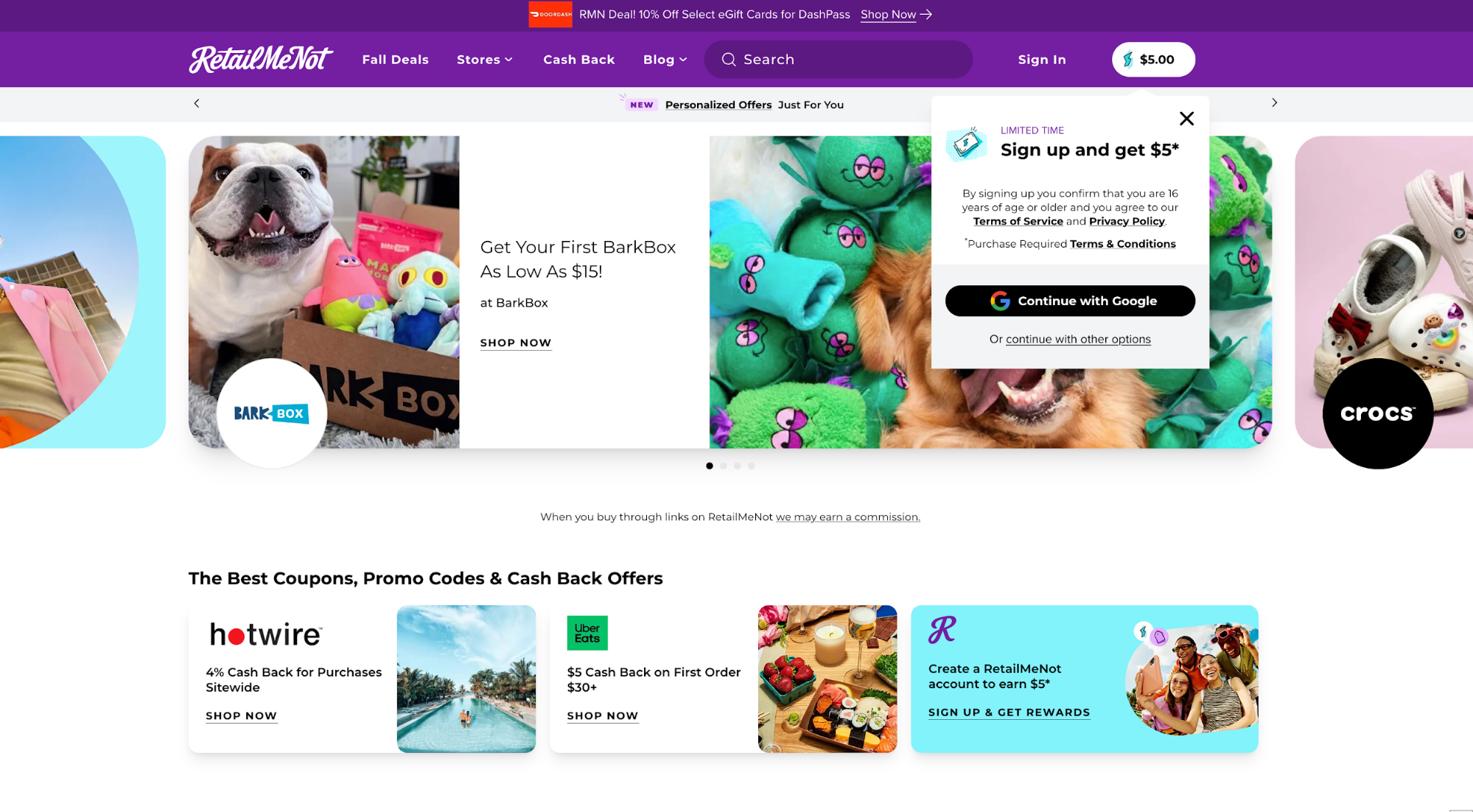
With so many colors in the cards, the signup pop-up, and different CTAs ("shop now," "sign up," etc.), the page creates quite a bit of confusion. As a result, nothing grabs enough attention, and the decision-making process is slowed down.
Now compare this to Apple's homepage:
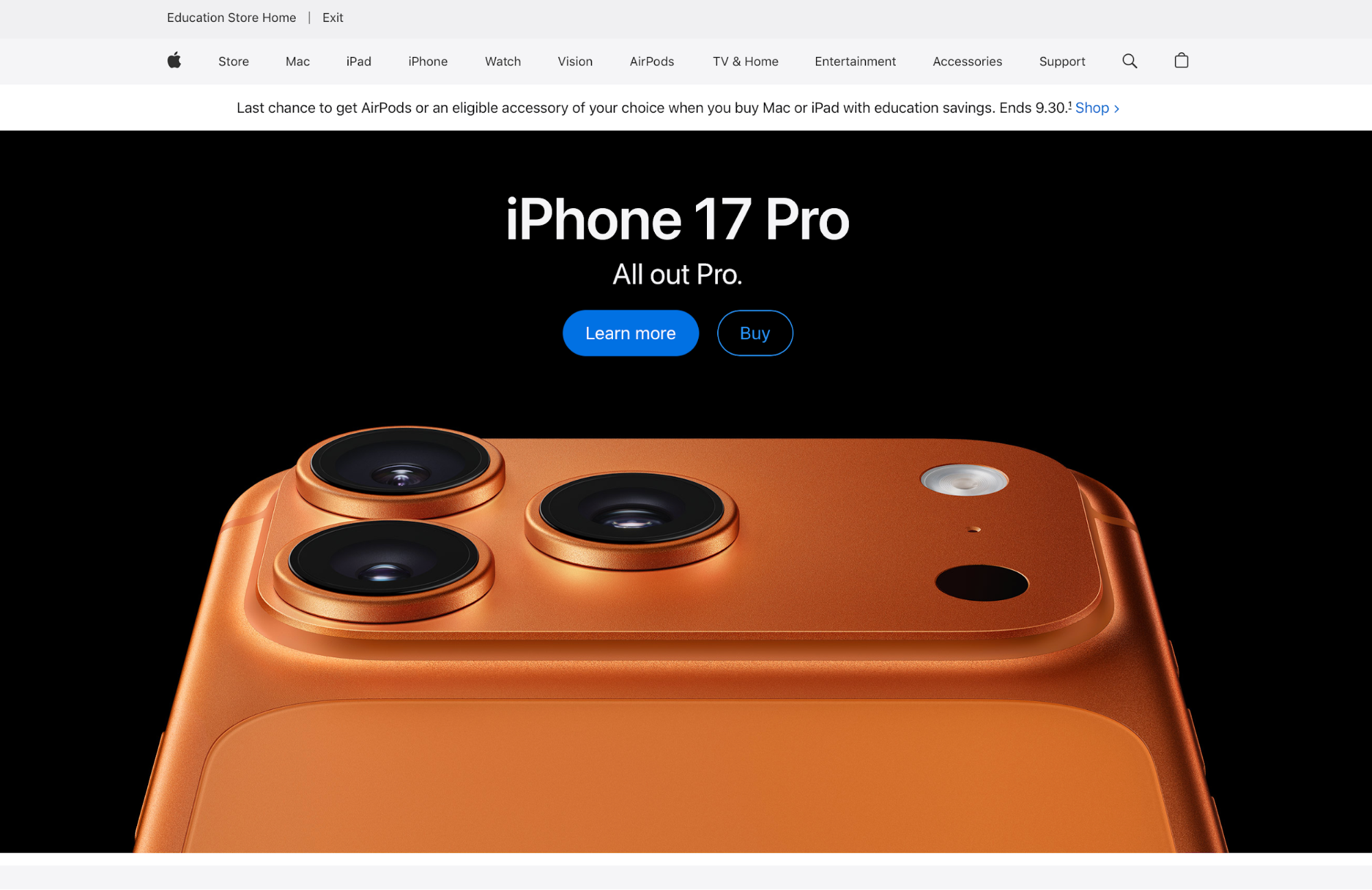
Besides a simple color palette, Apple used a clear visual cue for the CTA, so the next step is immediately obvious.
As a rule of thumb, stick to 2–3 main colors (brand base + secondary + accent) supported by neutrals. Reserve the accent for CTAs and key highlights, and reuse it consistently so users learn “this color = action.”
If you need more variety (e.g., categories), vary tints and tones of the same hue family instead of adding new hues.
Key takeaways
-
Color theory is a framework for how colors interact, creating harmonies that communicate meaning and guide attention on a page.
-
When creating a color palette, choose a base hue that fits your message, pick a harmony (complementary, analogous, triadic, or tetradic), and add one contrasting accent to focus CTAs or key highlights.
-
Meet accessibility by checking contrast, aiming for at least 4.5:1 for body text. Prototype real components (nav, cards, forms) across devices and imagery.
-
Use the RGB system for screens and CMYK for print. Design in RGB, then soft-proof and convert to CMYK before handing files to a printer to prevent dull, shifted colors.
-
Leverage color psychology but validate cultural context. While warm colors energize and cool colors calm, meanings can shift by market.
-
Keep palettes tight with 2–3 main colors plus neutrals. Extend with tints, shades, and tones for states and depth, and build skill by extracting palettes from existing designs or photos.