10 UX Best Practices to Follow in 2026

Khanh Linh Le
Created on Feb 9, 2026
UX trends come and go, but the fundamentals don’t. In 2026, the most effective digital products are still built on UX design principles that have been validated for decades.
I’m talking about the foundational research from Nielsen Norman Group. It's the backbone of modern UX practice that continues to shape how users think, behave, and make decisions online.
The business case is just as strong as the theory. According to research by Forrester, every $1 invested in UX can return up to $100.
Whether you’re designing a consumer mobile app, a marketing website, or a complex enterprise tool, the same core principles apply. The context may change, but human behaviour doesn’t.
So in this article, I will break down 10 UX design best practices to follow in 2026.
1. Start with user research with real people
User research is simply the practice of learning what users need through interviews or behavior observation before you build anything.
There are two core methods you can use:
-
Interviews (qualitative) – Talk to users via one-on-one calls, focus groups, or surveys. You can ask open-ended questions like "What's frustrating about X?" or "Walk me through how you do Y."
-
Observation (behavioral) – Watch what users do via usability tests, session recordings, or heatmaps. This helps reveal what people do versus what they say they do, often uncovering needs users can't articulate.
A typical example is how Airbnb's founders, Brian Chesky and Joe Gebbia, tried to figure out why nobody was booking listings in New York. And they realized the photos were terrible.
They rented a high-end camera, flew to New York, and went door-to-door to take the photos themselves. They got out from behind the screen using a more hands-on approach that eventually led to a second behavioral discovery among their users
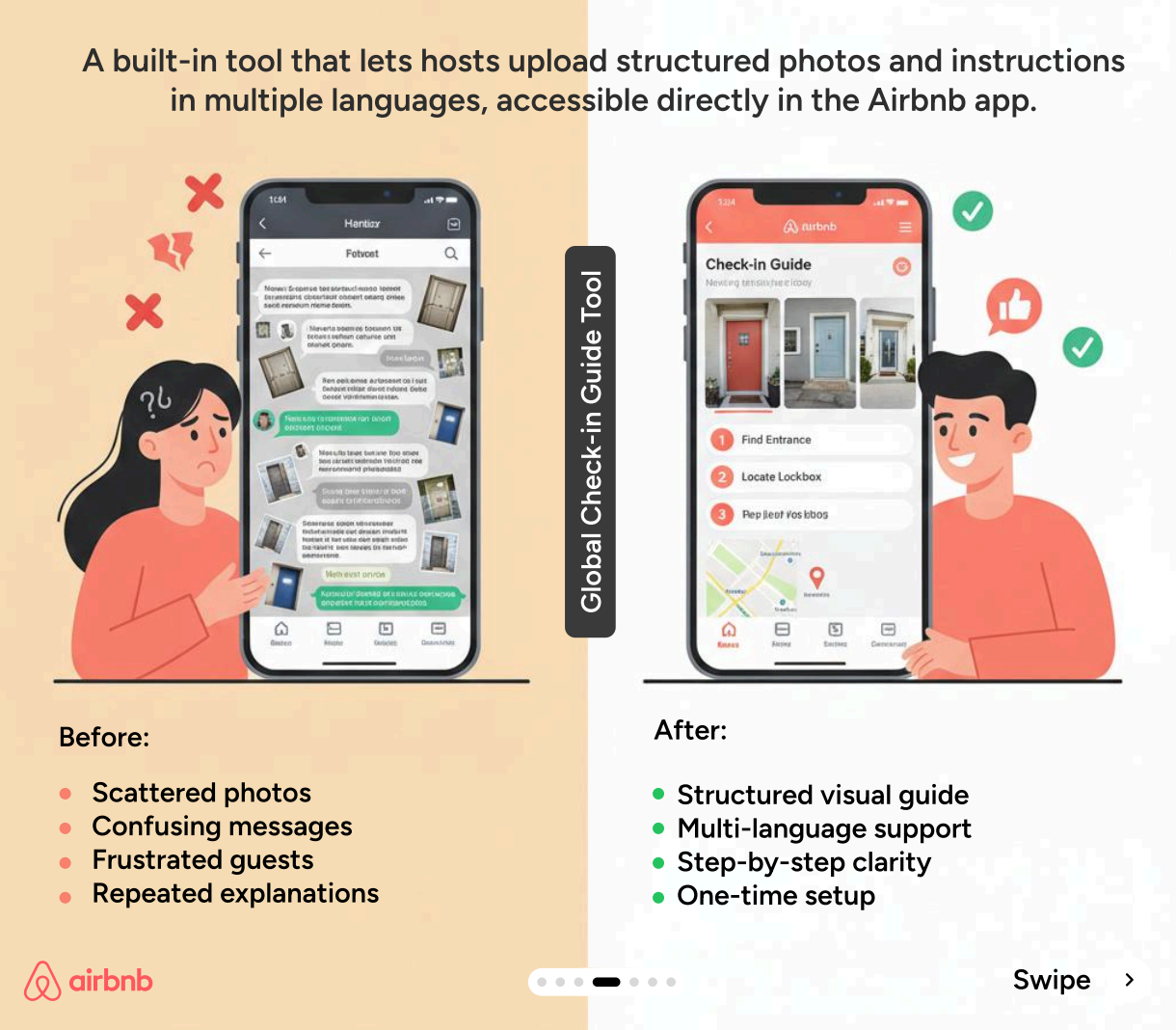
By observing the hosts, they noticed that people were spending hours sending the same emails over and over again, explaining where the key is, what the Wi-Fi password is, etc.
This behavioral observation helped Airbnb understand user goals and build the global check-in tool to automate the collection of that information.
Even with limited resources, I'd still recommend investing in research when you're validating core assumptions, facing critical UX design decisions, or seeing problems in your metrics that you have no clue about.
You don't need hundreds of users. Start with beta testers, early customers, or anyone in your target audience. According to Nielsen Norman Group research, you only need to test with about five users to uncover 85% of your usability problems.
You can see this same principle in Vera Chen’s Uber capstone project. By interviewing just 8 premium riders, she uncovered that requests for a “favorite driver” feature weren’t really about the driver at all. It was about wanting consistency and trust in the ride experience.

Uber eventually shipped a Favorite Driver feature in 2020 with most of her team's designs and ideas.
So the takeaway is to watch what users do. This understanding of user expectations is critical.
2. Design for consistency across the experience
Consistency reduces what we call cognitive load. Every time a user sees a button that looks different or a menu that's in a weird place, their brain has to pause and process, "Wait, does this do the same thing as the last button?"
You want to minimize that mental effort.
This is why Nielsen's heuristics list consistency and standards as fundamental principles. Users shouldn't have to wonder whether different words, situations, or actions mean the same thing.
There are four types of UX design consistency to consider.
-
Visual consistency means the same fonts, colors, spacing, and other visual elements throughout.
-
Functional consistency means interactions behave the same way, like a delete button always deletes things or a swipe always does what a swipe did before.
-
Internal consistency is staying coherent within your own product.
-
And external consistency means matching the conventions users already know from other apps and platforms.
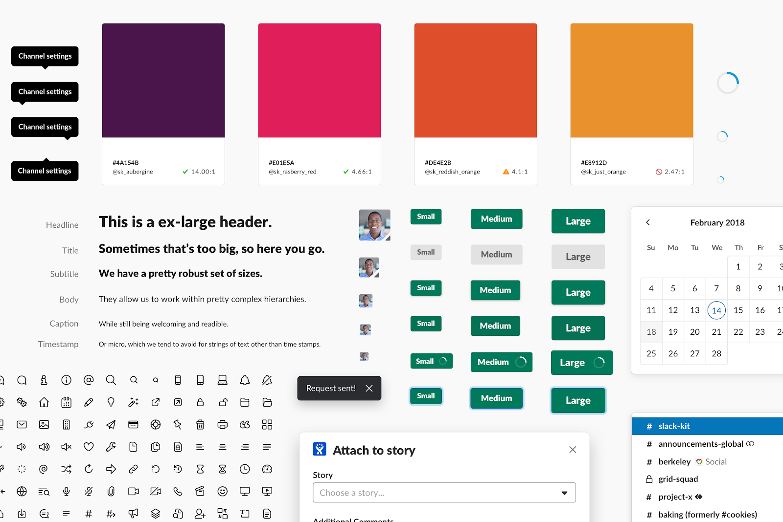
Slack is a masterclass at internal and brand consistency. They built a design system called Slack Kit to make sure that whether you're on the desktop app, the web, or your phone, the visual and functional elements behave the same way.
For external consistency, consider platform conventions and operating systems.
If you're building an iPhone app, users have spent years learning that swiping right usually means going back. If you decide to be creative and make swiping right delete a file, you are fighting their muscle memory, and you will lose that fight. Don't reinvent the wheel if the wheel is already rolling perfectly fine.
The takeaway: build or adopt a design system early. Even a simple style guide prevents churn as your product scales.
3. Keep users informed with clear feedback
The user should never have to guess if the app is working or if it's just frozen.
This is Nielsen's first heuristic: the design should always keep users informed about what's going on, through appropriate feedback within a reasonable amount of time.
Feedback comes in three forms:
-
immediate responses to actions (like a button changing state when clicked)
-
system status indicators (like loading spinners)
-
and outcome confirmation (success or error messages).
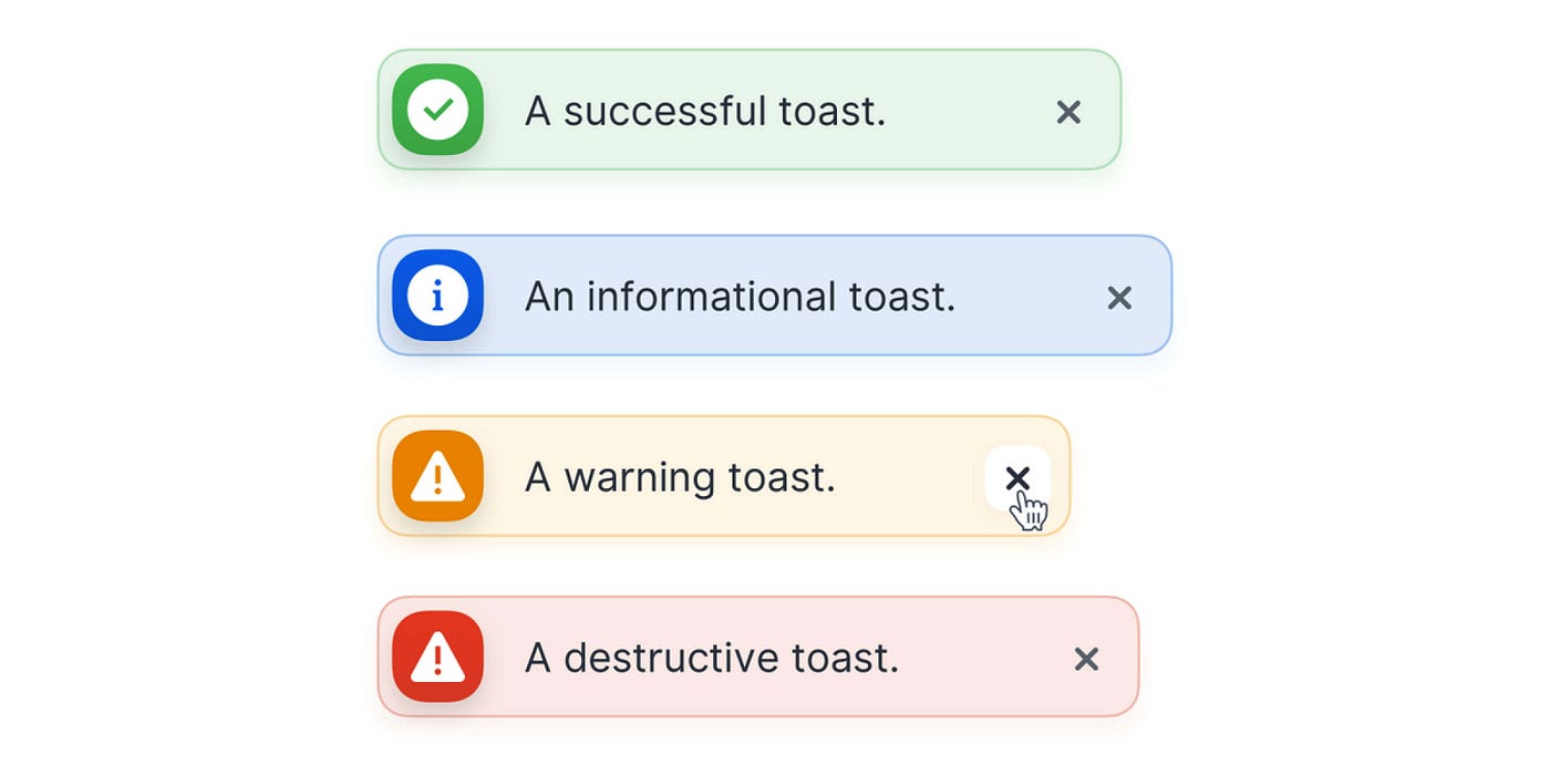
Image source: Antonin Kus
The research on progress indicators is fascinating. It shows people are willing to wait three times longer if you just show them a progress bar. It creates and reinforces certainty.
Without such feedback, it triggers uncertainty and anxiety. For example, if you click "pay now" and the screen just sits there, you may panic and wonder, Did I get charged? Should I click it again?” An unresponsive experience like this could lead to rage clicking among your users.
There's also a specific timing breakdown for this:
-
If an action takes less than one second, you don't need an indicator because it happens fast enough that users don't notice any delay.
-
One to three seconds, you need a spinner.
-
Three to ten seconds, that's when you need a progress bar. Show them how much is left.
-
Anything longer than ten seconds, you need to give a detailed estimate and ideally let the user go do something else while it works.
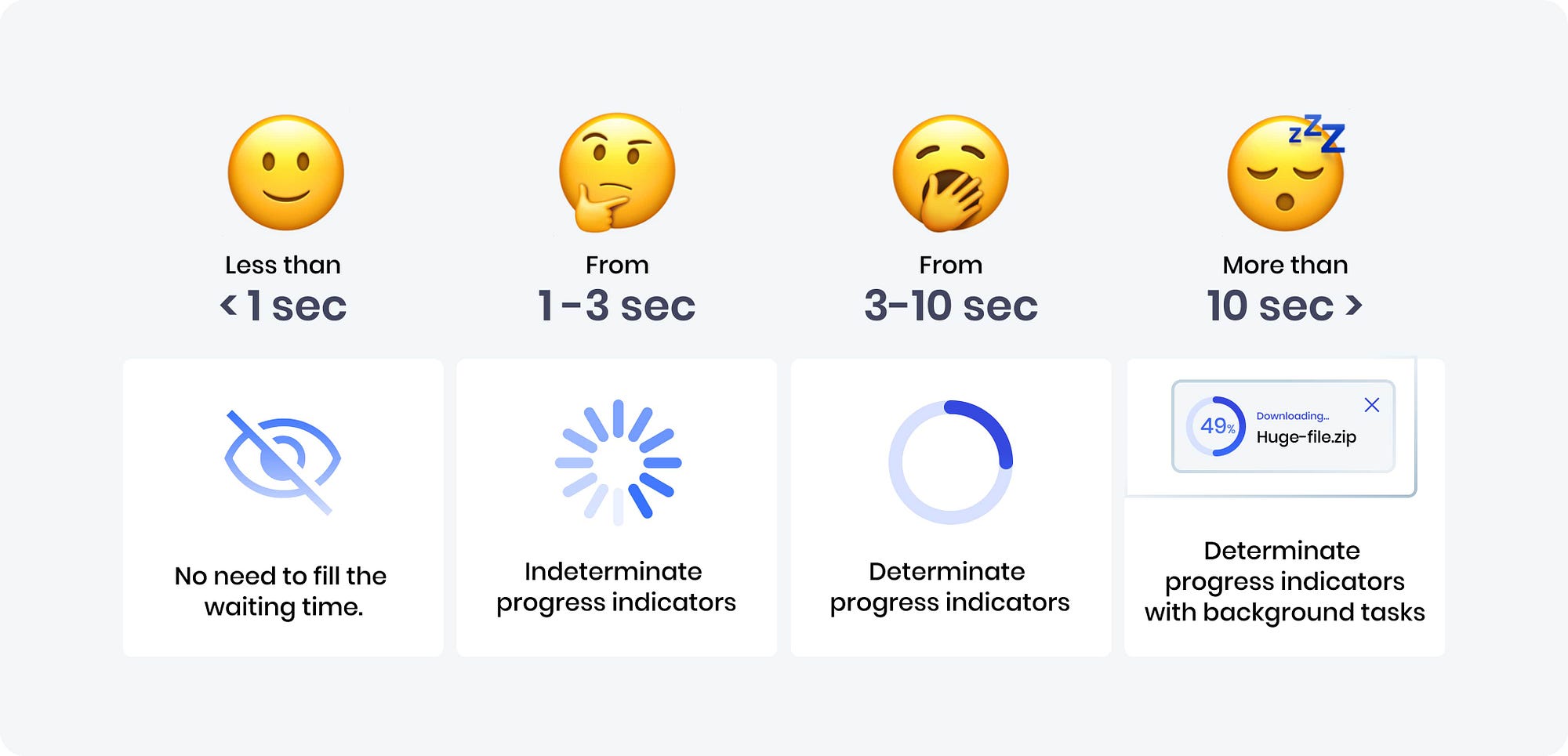
Image source: UXDesign
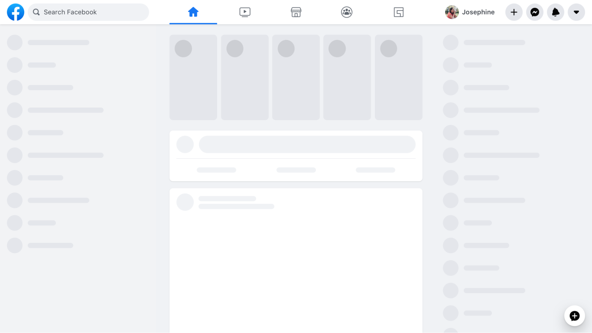
Skeleton screens are everywhere now. Think of Facebook or LinkedIn. When you open the feed, you don't see a spinning wheel.
You see those gray pulsing boxes where the text and images will go. It's a psychological trick. It makes the load time feel shorter because the layout appears instantly. It tells your brain, "Okay, we're working on it, here's the structure."
There's another great example, which is the Gmail "undo send" button. When you hit send, Gmail doesn't actually send it immediately. It holds it for five seconds, showing you an undo option during that window.
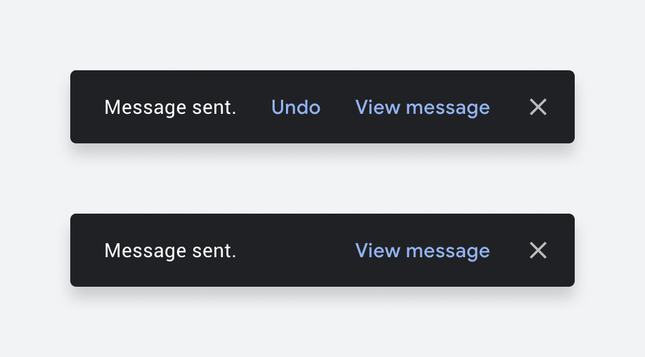
Image source: UXDesign
They realized giving you control to fix a mistake was more important than instant transmission.
Every user action deserves a response, even if the response is "we're working on it."
4. Prioritize recognition over recall
This is a UX principle that favors showing users choices over making them remember information to create a seamless user experience.
As Nielsen's heuristics put it: minimize the user's memory load by making options visible rather than requiring them to remember information.
Practically, this is why we have "recently viewed" lists on Amazon. Amazon doesn't make you try to remember "what was that brand of toothpaste I looked at yesterday?" They just show you a picture of it and say, "Here it is, want it?"

Image source: Rejoiner
The same principle applies to search. Dropdown menus with visible options beat empty text fields that require users to know valid inputs. Search autocomplete showing suggestions beats a blank search bar, expecting users to know exact terms. Think of the Google Search box or any ecommerce platforms, like Etsy.

Image source: Printful
This also connects to familiar patterns or UI elements users already know: shopping cart icons, hamburger menus, and a heart for favorites. These leverage existing mental models, so users don't have to learn something new.
Then there's progressive disclosure, which is just a fancy term for "don't overwhelm the user." Like a game tutorial, it teaches basics first and introduces advanced actions later.
Duolingo does this by starting with recognition-based exercises and gradually shifting users toward recall as they progress.

Image source: UXPlanet
The takeaway: if users have to remember something to complete a task, the interface is making them work too hard.
5. Prevent errors before they happen
The best error message is the one you never see.
A lot of designers focus on writing polite error messages, like "Oops, something went wrong", but a great designer asks, "Why did we let the user make that mistake in the first place?"
This is Nielsen's error prevention heuristic: even better than good error messages is a careful design that prevents problems from occurring in the first place.
There are several error prevention strategies to consider:
-
Constraints: Disable invalid options. Think about booking a flight. If you're selecting a return date, a good system will simply gray out all the dates before your departure date. You physically cannot pick an impossible date.
-
Smart defaults: Pre-fill likely choices like location, currency, or date format based on what you know about the user.
-
Confirmation dialogs: For destructive actions like delete, ask "Are you sure?" before it's too late.
-
Undo functionality: Let users reverse mistakes without penalty.
Look at Google Search. If you type “how to bake lazagna,” it doesn’t assume you’re wrong. It shows results for the corrected spelling, while still giving you the option to search the original term instead.

Duolingo is another example where it leans on undo instead of punishment. If you miss a day, your streak can be frozen, giving you an easy way to recover from a mistake without losing progress.

Form design is another area where this matters. Travel sites like Agoda and Trip.com use constraints and inline validation to prevent errors. They disable invalid dates in passport forms or guide users through card expiration fields during checkout.
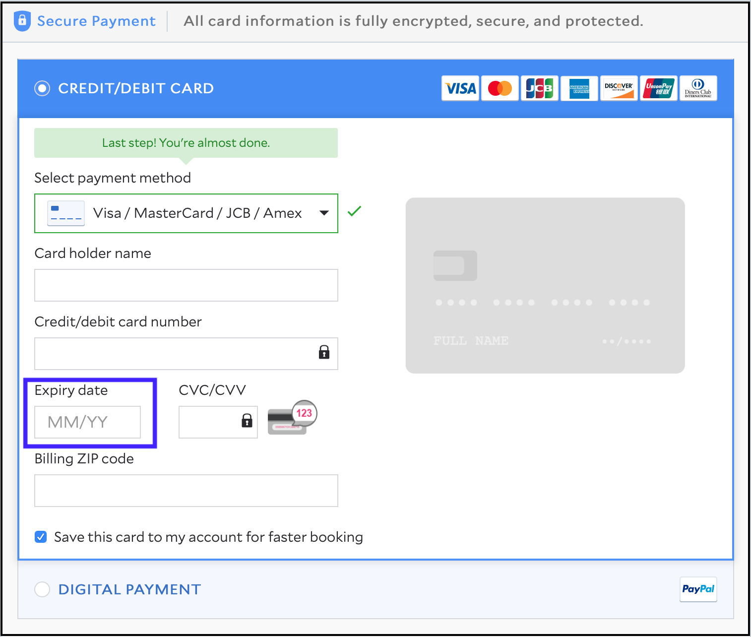
So the takeaway is to anticipate where users are likely to make mistakes and design guardrails around those moments.
6. Build accessible experiences from the start
This simply means creating user-centered designs for digital products (websites, apps, software) that everyone can use, including people with disabilities.
So how do you build accessible products? The framework to remember is WCAG's POUR principles:
-
Perceivable: Provide text alternatives for images, captions for video, and sufficient color contrast.
-
Operable: Ensure keyboard navigation works, and give enough time for interactions.
-
Understandable: Use clear language, consistent navigation, and helpful error messages.
-
Robust: Make it compatible with assistive technologies like screen readers.
And it's not just about doing the right thing. There's a serious business case here.
We're talking about designing for more than one billion people worldwide. That's 16% of the global population who have some form of disability. If you ignore accessibility, you are slamming the door on a massive market.
Research from Semrush analyzing over 1 million websites found that only 30% of sites meet basic accessibility standards.
On top of that, sites that fixed their accessibility issues saw a 23% increase in traffic. Even better, those with higher compliance levels ranked for 27% more keywords and saw a 19% boost in their domain authority scores. Therefore, accessibility can give you a competitive advantage.
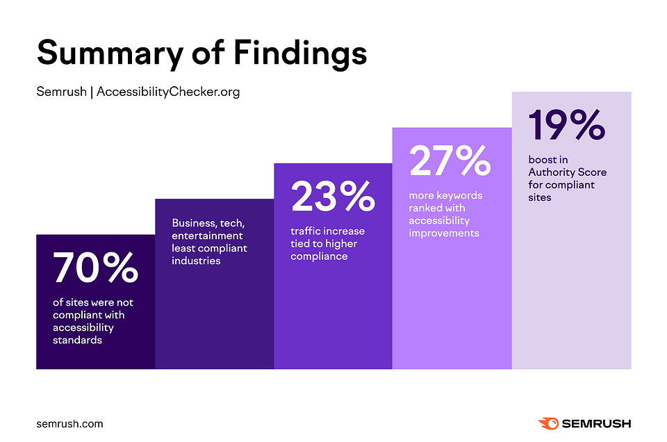
Image source: Semrush
On the flip side, there's also the risk aspect. Domino's Pizza was sued for not making its website accessible to blind users. It was a five-year lawsuit and millions in damages.
But beyond compliance, there's what we call the curb-cut effect. Features designed for disabilities often end up helping everyone and offer a more satisfying user experience.
For example, high-contrast text helps people with visual impairments, but it also helps you when you're looking at your phone in bright sunlight. Keyboard navigation is critical for users who can't use a mouse, but power users love it too.
Accessibility is really just extreme usability. If your product meets the POUR criteria, it's just better for everyone.
The takeaway: run automated accessibility audits (WAVE, Axe) and test with screen readers during UX design process. Don't treat accessibility as an afterthought.
7. Simplify the user interface
For every UX designer out there, this simply means removing what doesn't serve the user.
This is the hardest one because every department in a company wants their thing on the homepage. Marketing wants a banner, sales wants a pop-up, and legal wants a disclaimer. And the user just wants to watch a movie.
Nielsen's aesthetic and minimalist design heuristic says it plainly: interfaces should not contain information that is irrelevant or rarely needed.
This comes down to cognitive load. Research done by cognitive psychologist Peter Skehan pointed out that humans have limited attention. And that every added task or interaction can dilute our brain's capacity.
Making matters worse, attention spans are also shrinking. Dr. Gloria Mark's research at UC Irvine found that average attention on a screen dropped from 2.5 minutes in 2004 to just 47 seconds today.
Therefore, making your product's interface simple is critical to creating a positive user experience.
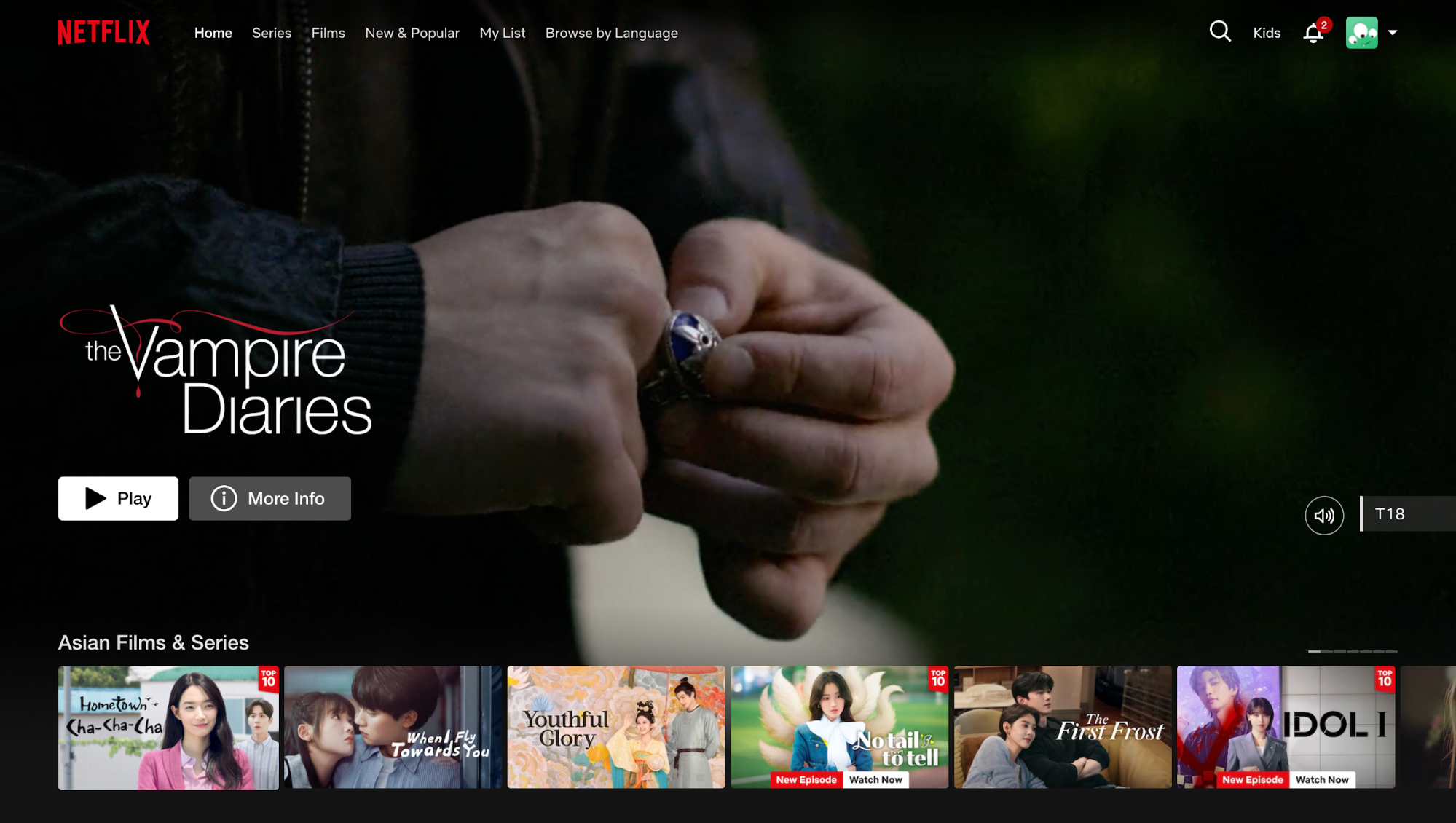
Netflix is the gold standard here. Look at their homepage. It only has space for essential elements.
The artwork for the shows and one clear call to action "Play" on a dark background. They let the content do the talking rather than overwhelming users with options.
There's a framework for this: remove, hide, shrink, organize. It's a prioritization exercise.
First ask, "Can I just remove this?"
If not, "Can I hide it until it's actually needed?"
If it has to be visible, "Can I shrink it?" And finally, just organize what's left.
In addition, we ask users for way too much stuff we don't need. Address line two is a classic example. Or asking for a phone number when you only need an email.
Progressive disclosure applies here, too. Duolingo starts with simple exercises and introduces advanced features as users progress. Reveal complexity gradually instead of dumping everything at once.
For every element on screen, ask "Does this help the user complete their goal?" If not, cut it.
8. Design mobile-first for cross-device experiences
The mobile-first philosophy means starting with the most constrained environment, small screen, touch input, variable connectivity, and then enhancing for different devices with larger screens.
This also matters because most users don’t meet your product on a 27-inch monitor in a quiet room. They meet on a phone, in motion, with one hand, in bad lighting, on unstable networks, and with limited attention.
And statistically, it’s the norm. Today, over 60% of global web traffic comes from mobile devices, and many user journeys start on phones and finish on larger screens.
And this is not just about resizing for responsive design, but an intentional prioritisation of mobile users’ needs over desktop by design.
Because mobile interaction is touch-driven, design must account for how people physically interact with it. That means
-
Tap targets need to be at least 44×44 pixels so fingers can reliably hit them
-
Spacing must prevent accidental taps
-
Primary actions should live where thumbs naturally rest
These principles reduce friction and support faster task completion on the go.
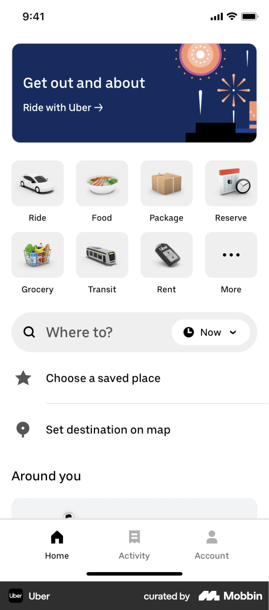
Uber is one example I can think of. Open the app, and it already knows where you are via GPS. The "Where to?" button sits within thumb-reach.
You can request a ride in two taps because they assume you're standing on a street corner in a hurry.
Meanwhile, Walmart took the opposite approach and paid for it. Their mobile site was slow and clunky, designed as an afterthought to their desktop experience.
After completely rebuilding with a mobile-first approach, they saw a 20 % increase in conversions and a 98 % jump in mobile orders. And that's not just better UX, it's measurable revenue impact from prioritizing mobile users first.

But don't forget performance. Compress assets, lazy load off-screen content, and consider low-bandwidth scenarios. A beautiful design that takes 10 seconds to load on a 5G connection isn't good UX.
So you should prototype on mobile first, test on real devices (not just browser emulators), and ensure core tasks work with touch alone.
9. Use personalization to create relevant experiences
Personalization is all about relevance. It's moving from "here is our content" to "here is your content."
It means adapting content, recommendations, or interface based on user behavior, preferences, or context.
There are three types to consider:
-
Explicit personalization: User-provided preferences, like Sephora's beauty quiz that asks about skin type and concerns.
-
Implicit personalization: Inferred from behavior, like Netflix analyzing your watch history.
-
Contextual personalization: Based on immediate context like time, location, or device.
The Netflix algorithm is the standard, with 75 percent of viewer activity coming from recommendations.
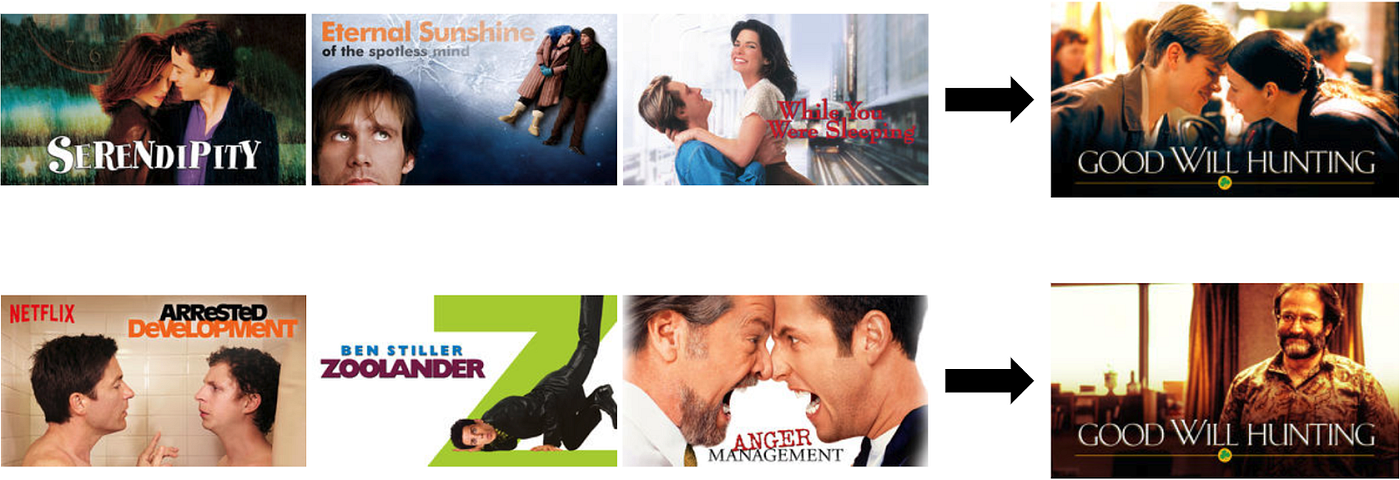
But here's the mind-blowing detail: they don't just recommend titles, they personalize the artwork. Let's say two users are both recommended the movie Good Will Hunting.
If your watch history shows you like romance movies, the thumbnail you see might show the couple kissing.
If I watch a lot of comedies, my thumbnail might show Robin Williams laughing. They're framing the same content in the language that appeals to each user personally.
Spotify's Discover Weekly is another great example. It algorithmically generates personalized playlists that ignite 566 million tracks saved weekly.
But there is a trap: the "cold start" problem.
How do you personalize for a brand-new user when you don't know anything about them? That's why Netflix asks you to pick three titles you like during onboarding. They need just enough seed data to get the ball rolling. You can also use popularity-based defaults until you collect enough behavioral data.
There's also a privacy-personalization balance to consider. Be transparent about data collection, provide clear opt-out options, and avoid "creepy" personalization that reveals too much tracking.
The takeaway is to start simple, even remembering a user's name or last session state creates a more relevant experience.
10. Test with real users early and often
We started with research, and we're ending with testing for usability issues.
Because UX is never done. It's a cycle: you research, you design, you test, you learn, you iterate.
The principle is simple: assumptions are guesses, only real user testing reveals what actually works.
And again, you don't need a massive lab. According to Nielsen Norman Group, five users will reveal 85% of the issues.
In addition, design teams can go for different testing methods depending on testing purposes, such as:
-
Usability testing: Observe how users interact with your product and complete tasks. Best for identifying friction points.
-
A/B testing: Compare two versions to see which performs better. Best for optimization.
-
Surveys or user interviews: Gather attitudes and preferences. Best for understanding why.
The GymShark story is one of my favorites. Their checkout was fast, clean, and technically sound. But when they tested it with real users, they saw something they didn’t expect.
Shoppers were leaving the checkout to look for sizing information or reviews elsewhere, then struggling to return and complete the purchase.
So Gymshark changed the experience. They surfaced sizing guidance and reassurance directly in the checkout instead of forcing users to leave the flow.
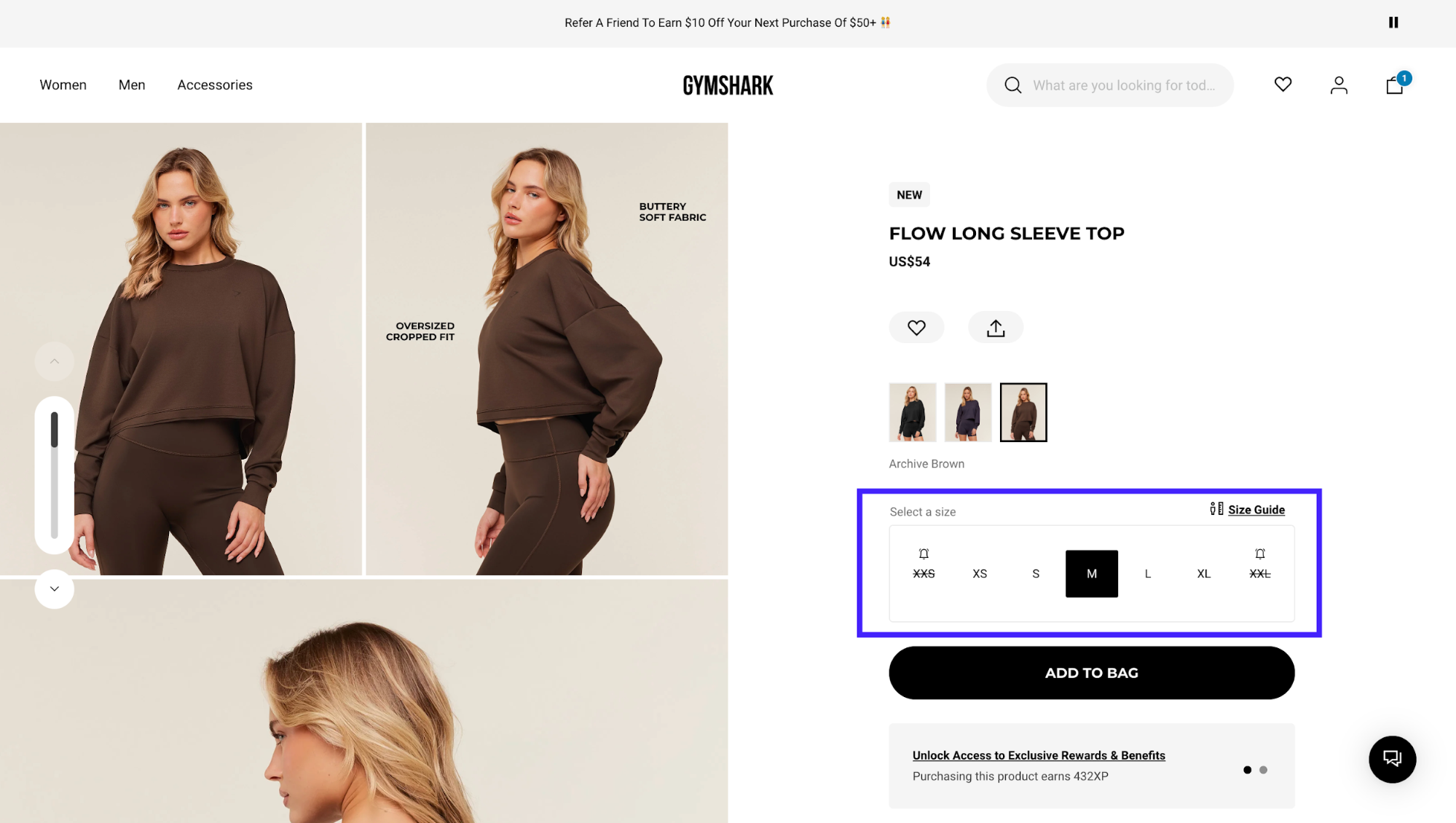
When they did that, checkout conversion increased by around 11%.
So there are indeed a few things you only learn by testing with real humans.
Even Google takes this approach to the extreme. They constantly conduct extensive A/B testing for features, and even small changes like button colors are validated with data.
If you're looking for solutions, tools like Hotjar (for heatmaps), UserTesting (for recorded sessions), and Maze (for unmoderated tests) make this accessible even for small teams.
So my advice is to schedule regular usability tests, even informal hallway testing with colleagues, is better than no testing.
Putting UX best practices into action
So let's recap. We've covered research, consistency, feedback, recognition over recall, error prevention, accessibility, simplicity, mobile first, personalization, and finally, testing.
It sounds like a checklist, but really, they all share one single goal: empathy. It's about respecting the user's time and their mental energy.
It goes right back to that invisible feeling we talked about at the very start. The great irony of our job is that if we do it perfectly, nobody notices. Nobody says, "Wow, what a great error prevention mechanism." They just breeze through the checkout and get on with their day.
So here is our challenge to you. The next time you are using an app or a website, and it feels magical like you're just flowing right through it, stop for a second. Ask yourself: what didn't I notice? What bit of friction did they remove so that I didn't have to think?
That is where the real work happened.
How do UX best practices help improve website performance?
UX best practices improve website performance by reducing friction, making content easier to find, and helping users complete tasks efficiently. When interfaces follow proven design patterns, users are more likely to engage, stay longer, and convert.
From a marketing perspective, strong UX supports SEO, conversion rates, and retention. Pages that load clearly, guide attention, and remove confusion tend to perform better across search, analytics, and user feedback metrics.
Are UX best practices the same for all types of websites?
UX best practices provide a foundation, but they are not applied identically across all websites. What works for an ecommerce store may differ from a SaaS product or content-heavy site.
The article emphasizes adapting best practices to context. Core principles like clarity, consistency, and accessibility remain constant, while layouts, interactions, and priorities should reflect user intent and business goals.
How do UX best practices support SEO and discoverability?
UX best practices support SEO by improving crawlability, engagement signals, and content clarity. Clear navigation, readable layouts, and fast-loading pages help both users and search engines understand site structure.
Search engines increasingly reward experiences that align with user expectations. When UX best practices reduce bounce rates and improve interaction, they indirectly reinforce search visibility.
What role does accessibility play in UX best practices?
Accessibility is a core component of UX best practices, ensuring experiences work for users with diverse abilities and devices. This includes readable text, sufficient contrast, keyboard navigation, and clear interaction feedback.
The article highlights accessibility as both a usability and business concern. Accessible design expands reach, reduces friction, and aligns with inclusive design standards without requiring complex solutions.
How often should UX best practices be reviewed or updated?
UX best practices should be reviewed regularly as user behavior, devices, and expectations evolve. Periodic audits help identify friction points that may emerge over time.
Rather than redesigning constantly, the article recommends incremental improvements. Monitoring analytics, feedback, and usability signals allows teams to refine UX while maintaining stability.
Can following UX best practices limit creativity?
Following UX best practices does not restrict creativity; it provides guardrails that prevent usability issues. Designers can still innovate within familiar patterns that users understand.
The article suggests that creativity works best when usability is preserved. Breaking conventions should be intentional and tested, not accidental or driven by aesthetics alone.
How can teams apply UX best practices without extensive UX resources?
Teams can apply UX best practices by focusing on clarity, consistency, and user feedback before advanced design work. Small changes like simplifying navigation or improving content hierarchy often have significant impact.
The article encourages prioritization. Start with high-traffic or high-conversion pages, test improvements, and build UX maturity gradually without overengineering processes.