
Google Stitch AI Walkthrough: Comparison, Features, Alternatives, and Pricing


Khanh Linh Le
Created on Oct 24, 2025
When Google first introduced Stitch through Google Labs (after it acquired Galileo AI), it positioned the tool as a fast, AI-powered way to turn simple prompts or rough sketches into functional UI designs and frontend code.
It felt like another step toward closing the gap between idea and implementation—something many design-to-code AI tools have been trying to solve for years.
I actually tested Stitch about five months ago when it first came out, and at the time, my impression was mixed. It was fast and promising, but also inconsistent, especially in layout precision, design systems, and handling more complex flows.
Since then, Stitch has gone through a series of updates, and more recently, at the beginning of March, it rolled out five major new capabilities. That felt like a good reason to revisit it.
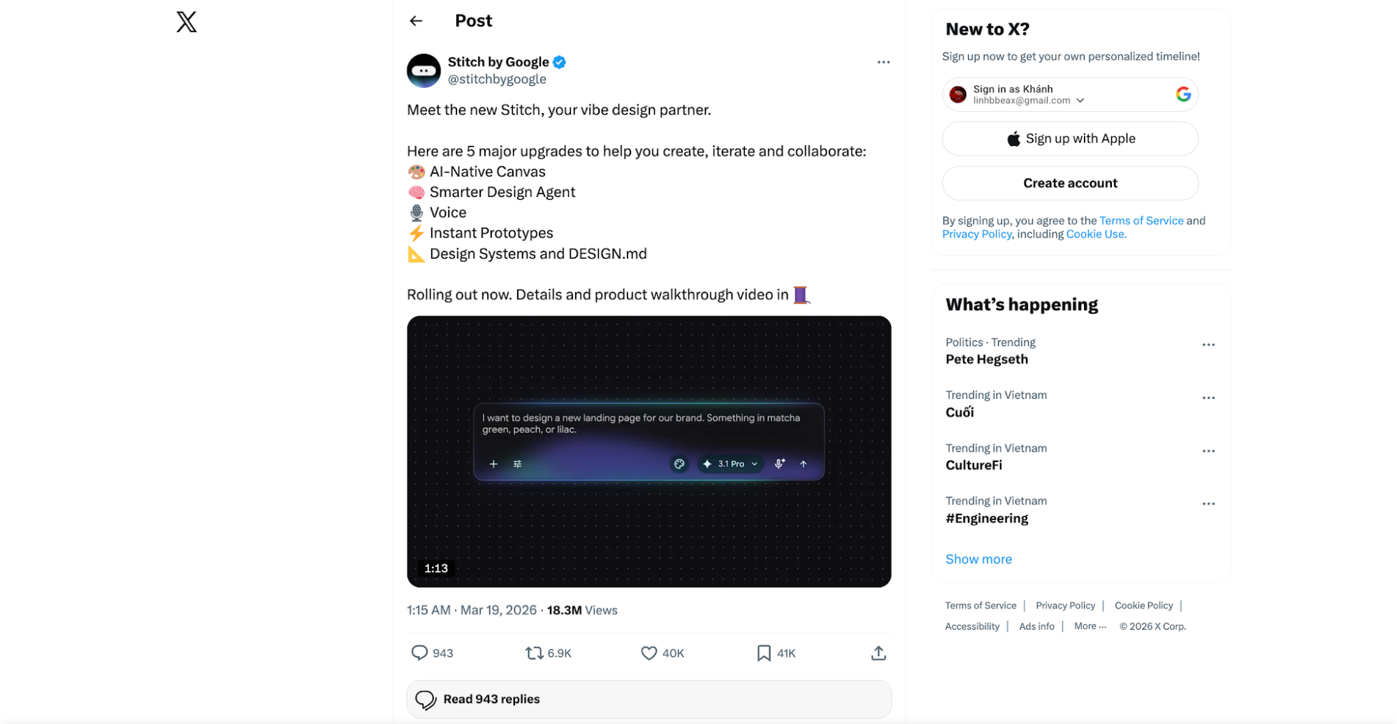
So in this updated Google Stitch review, I’m going back into Stitch with fresh eyes—testing what’s improved, what still feels experimental, and whether these new updates move it closer to being a reliable design-to-code tool.
I’ll also compare it against more established AI-powered tools to see where it stands today.
What is Google Stitch?
Google Stitch is an experimental AI-native design platform from Google Labs that helps you turn ideas into high-fidelity user interfaces—and increasingly, into interactive prototypes.
At its core, Stitch is no longer just a text prompt-to-UI generator. It has evolved into what Google calls an “AI-native design canvas”.
Basically, it provides you with an infinite blank canvas where you can create, iterate, and collaborate on interfaces using natural language, images, and even code as inputs.
You can start with something as simple as initial concepts, a description, or a reference image, and Stitch will generate UI designs for mobile or web apps. Then export the frontend code that can be used as a starting point for development.
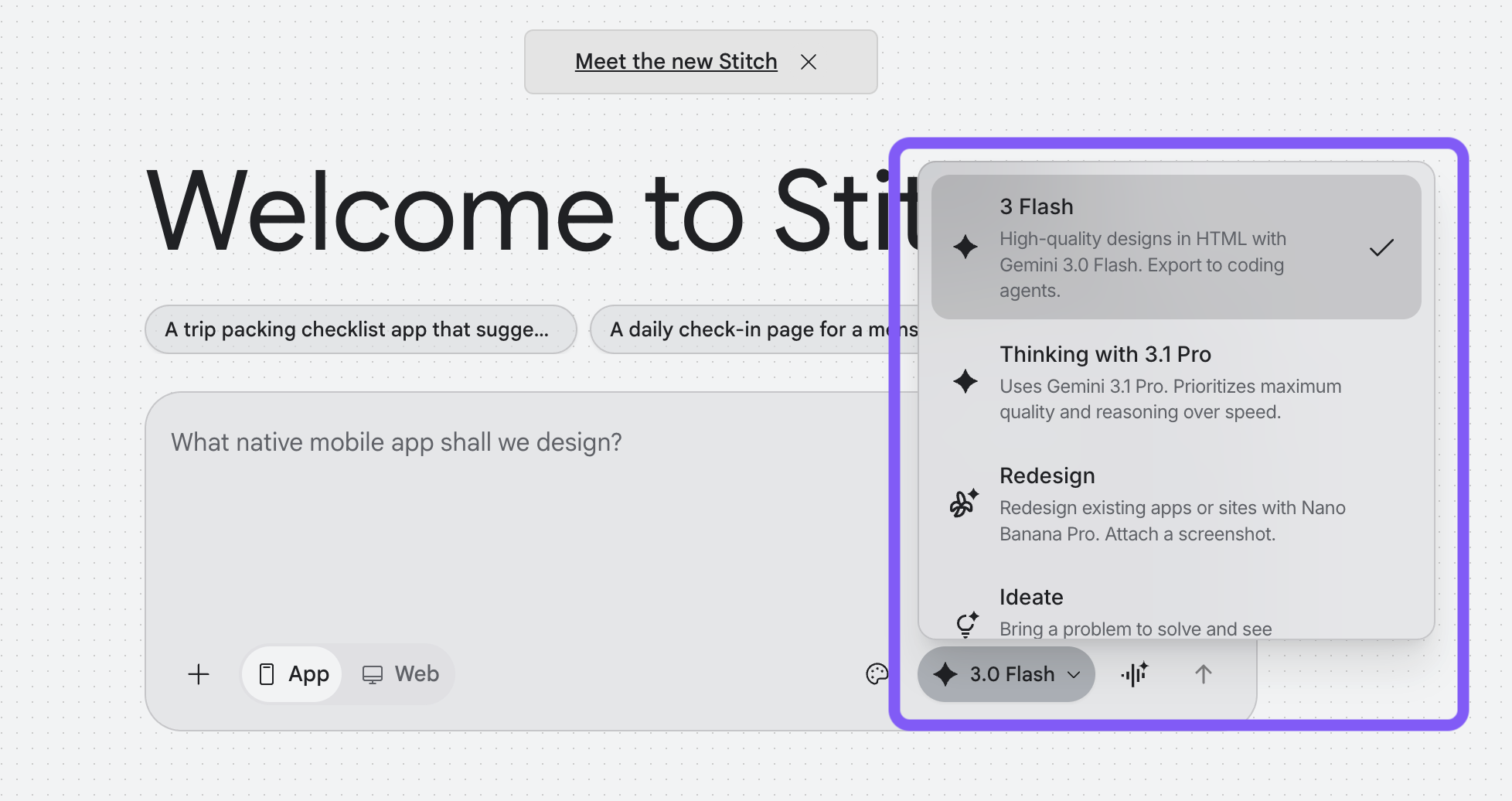
Since late 2025, Google has started upgrading Stitch with Gemini 3 models, bringing improved reasoning, better multimodal understanding, and more consistent UI generation.
In practice, this means Stitch now operates using two distinct modes:
Faster models (Flash variants) handle quick ideation and iteration
More advanced models (Pro / newer Gemini 3 variants) handle complex layouts, multimodal inputs, and higher-fidelity design generation
Core Google Stitch features for vibe design process
Stitch packs several AI features to make design-to-code workflows faster and more connected. Compared to tools that already tackle the same problem, like UXPilot, these capabilities aren’t exactly groundbreaking.
Still, here’s a quick look at the key features that define what Stitch can do for vibe designing.
1. Generate designs using prompts
This is still the core of how Stitch works, but it’s improved.
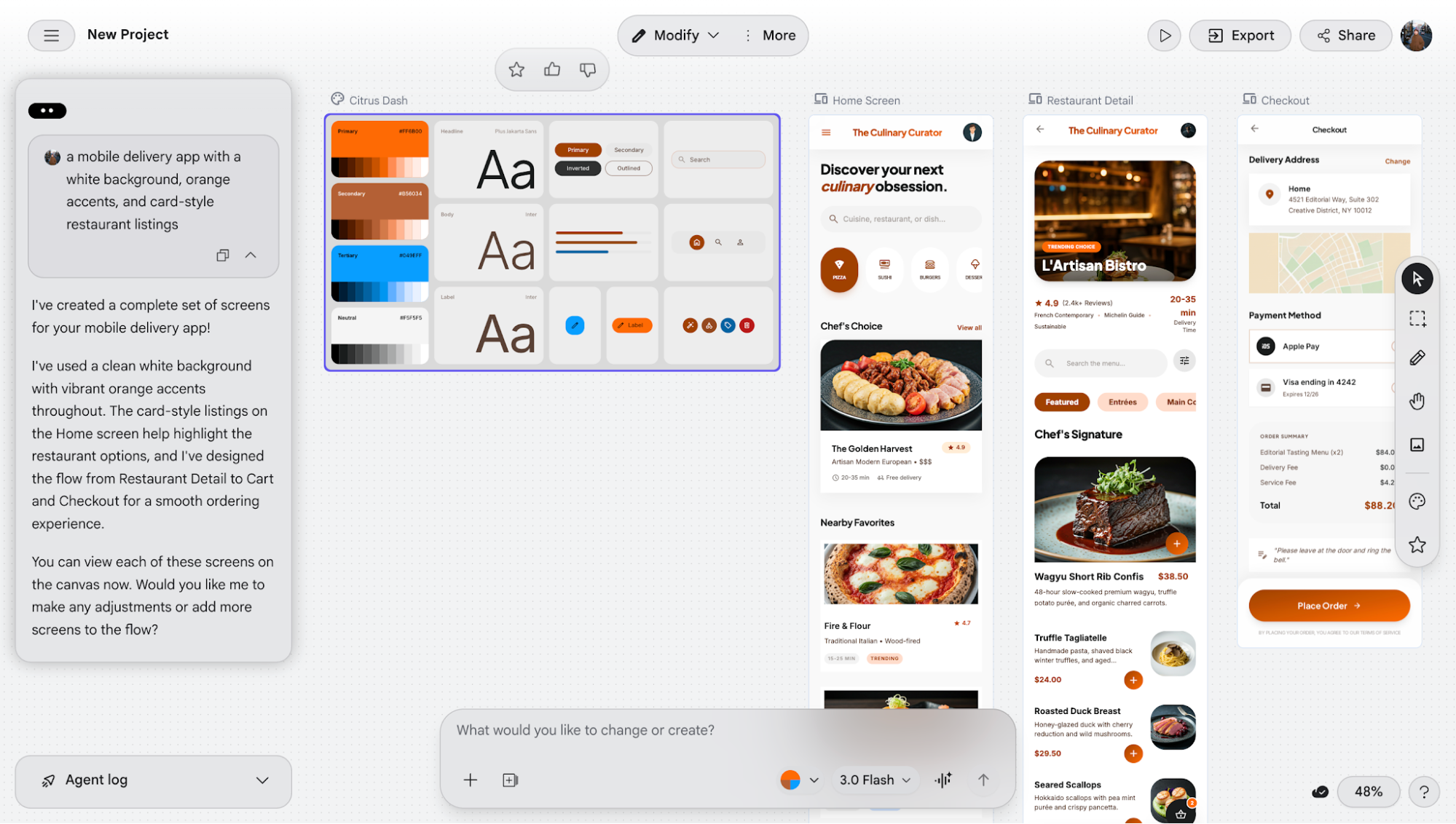
You can describe your interface in plain English (e.g., a delivery app with a white background and orange accents), and Stitch generates multiple screens with layouts, components, and styling.
What’s new is that Stitch now defines a basic design system first, like brand colors and typography, before generating the UI. This makes the results feel more consistent across screens, instead of looking pieced together like before.
It’s a noticeable upgrade. The outputs are more cohesive and usable without heavy prompting.
I still noticed small issues with spacing, hierarchy, and component polish that need manual fixes.
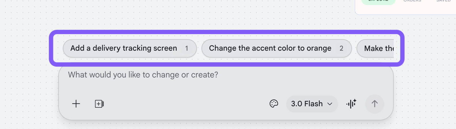
It also suggests quick, iterative actions (like “change accent color” or “add a screen”), making refining designs much faster.
Compared to my first test, this feels like a meaningful upgrade. It has gone from an “interesting but messy” UI design tool to an actually usable one.
2. Use voice mode to generate designs
This is one of the newer features, and it’s currently in experimental mode.
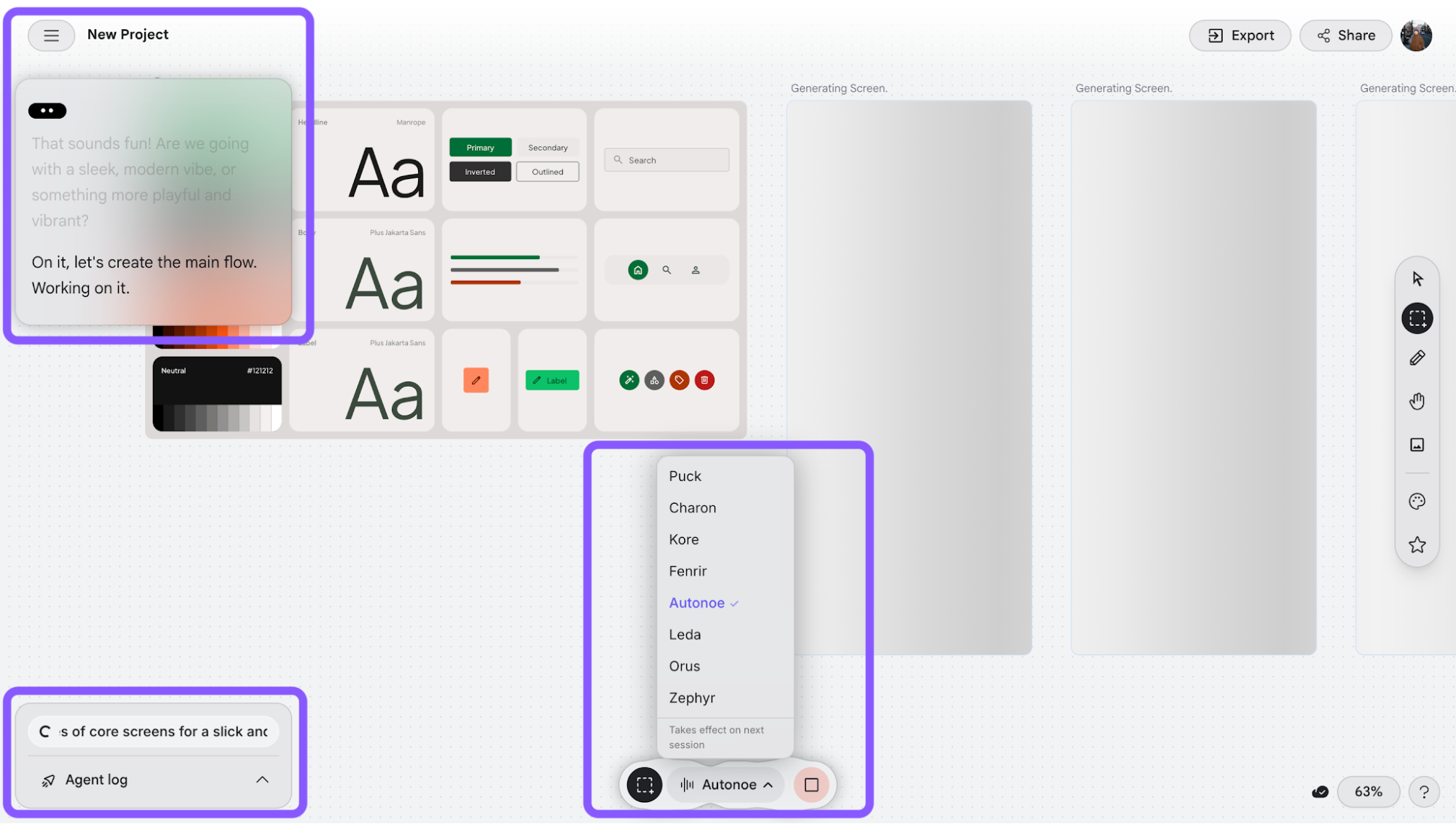
Functionally, it’s almost the same as generating designs with prompts. The main difference is that you speak rather than type. I can describe what I want out loud, and Stitch responds by generating or updating the UI in real time.
What makes it interesting is the co-design aspect. It talks back, suggests directions, and helps refine the flow as you go. You can also switch between different voice characters (similar to voice modes in tools like ChatGPT), which adds a bit of personality to the interaction.
There’s also an agent log panel that shows what it’s doing behind the scenes, which helps you follow its “thinking” as it works.
3. Generate UI from images and wireframes
This feature lets you upload a reference image like a screenshot, wireframe, or existing app, and Stitch will try to recreate it as editable UI screens.
I tested this using a livestream flow reference from eBay and ran it in Pro/thinking mode, expecting much stronger results this time.
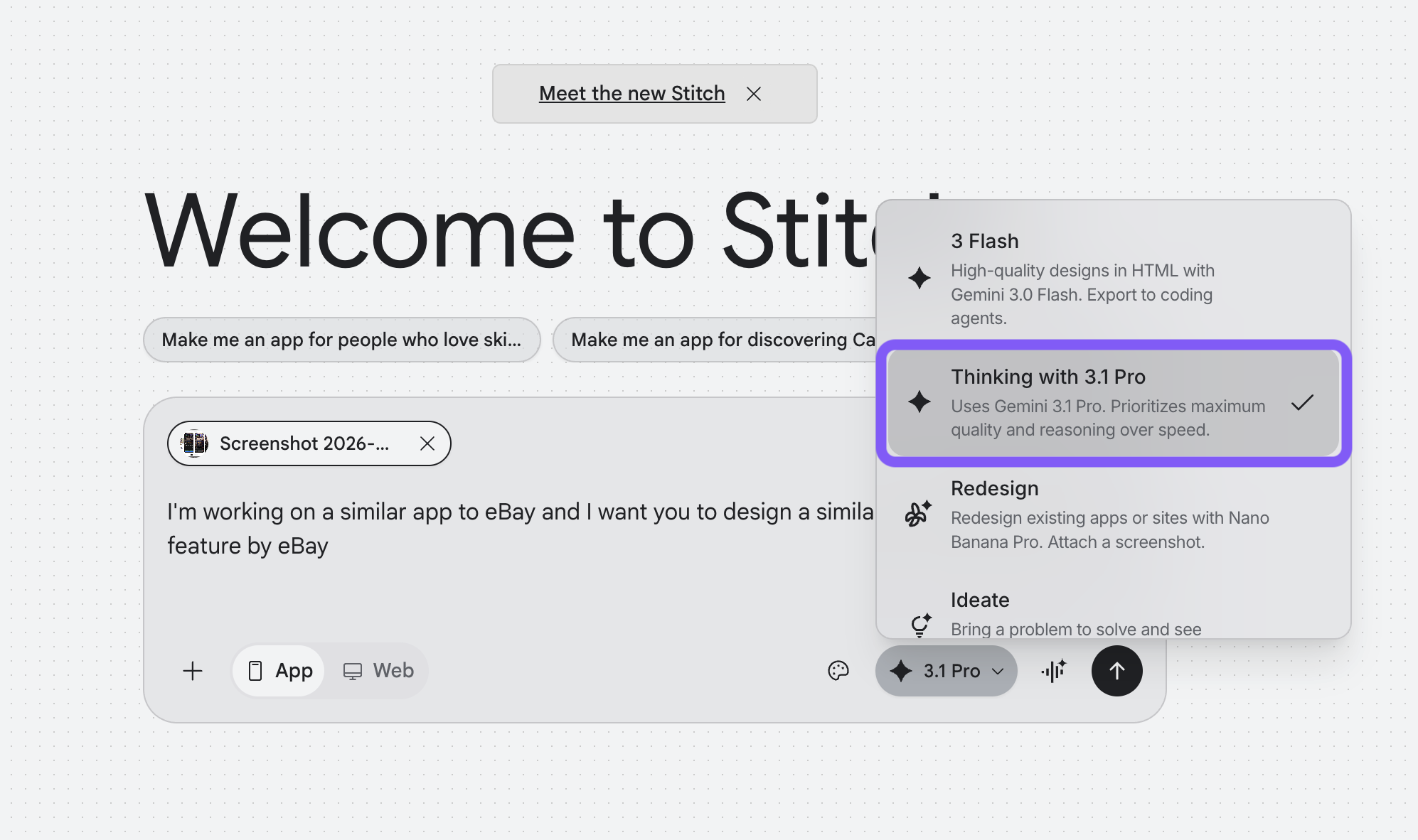
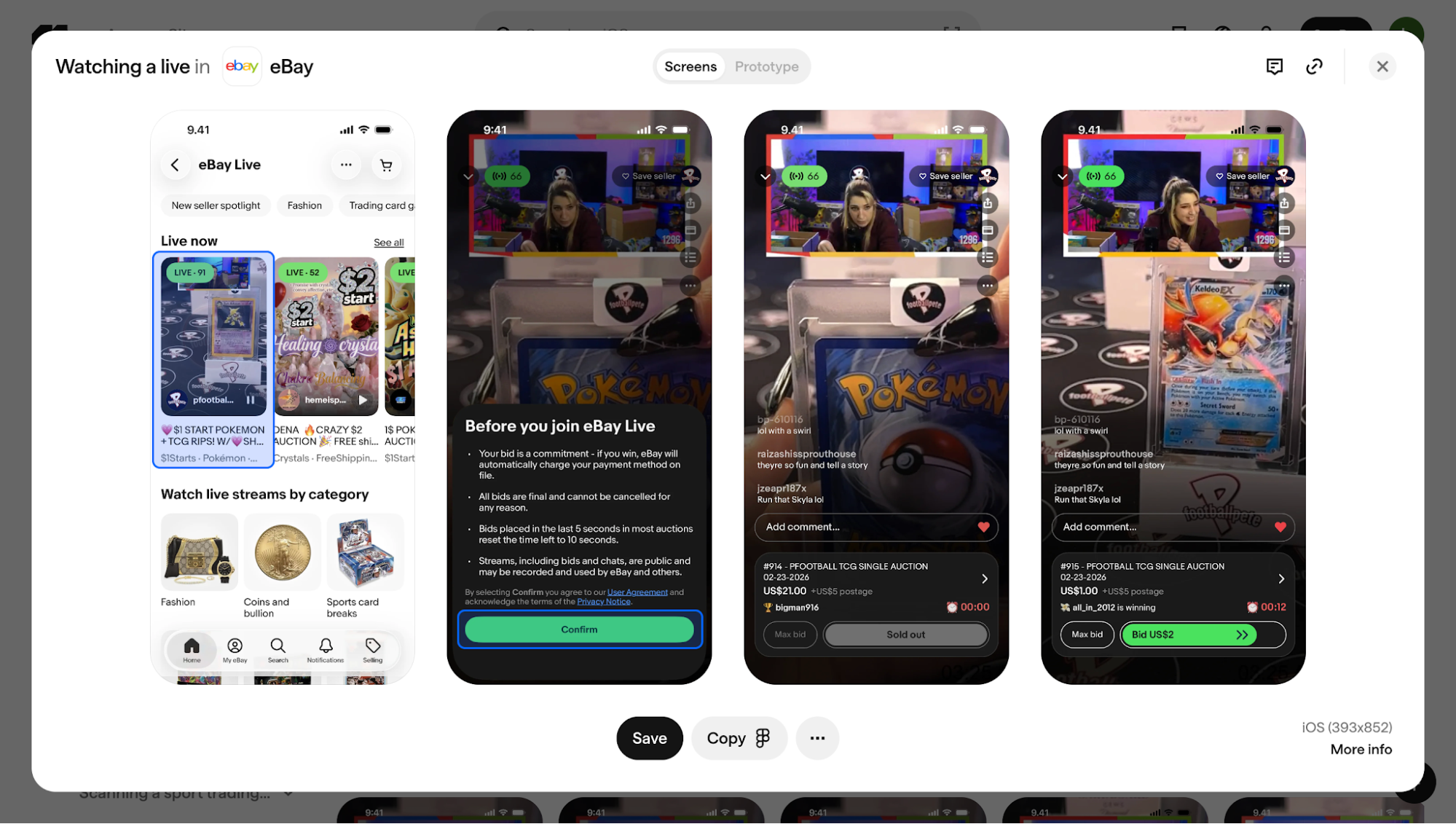
This is the flow reference image I uploaded to Stitch.
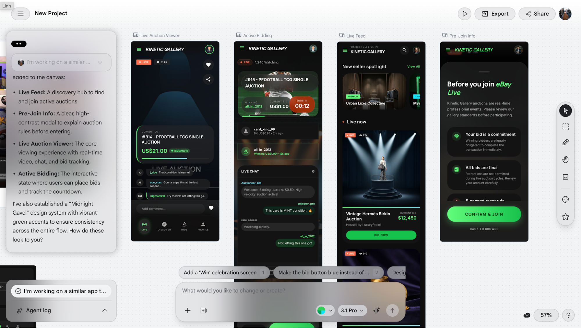
When I first tried it last year, the feature technically existed but would often crash and fail to generate anything. Now, it does generate, but the output still doesn’t meet expectations.
From my testing, the biggest issue is a lack of flow. Instead of producing a connected user journey, the screens feel fragmented and disconnected. UI elements are recognized, but consistency breaks down, and the action flow isn’t preserved across screens.
I also tested it with a wireframe sketch, asking it to generate a full app flow. It only produced two screens, which are the event and artist pages.
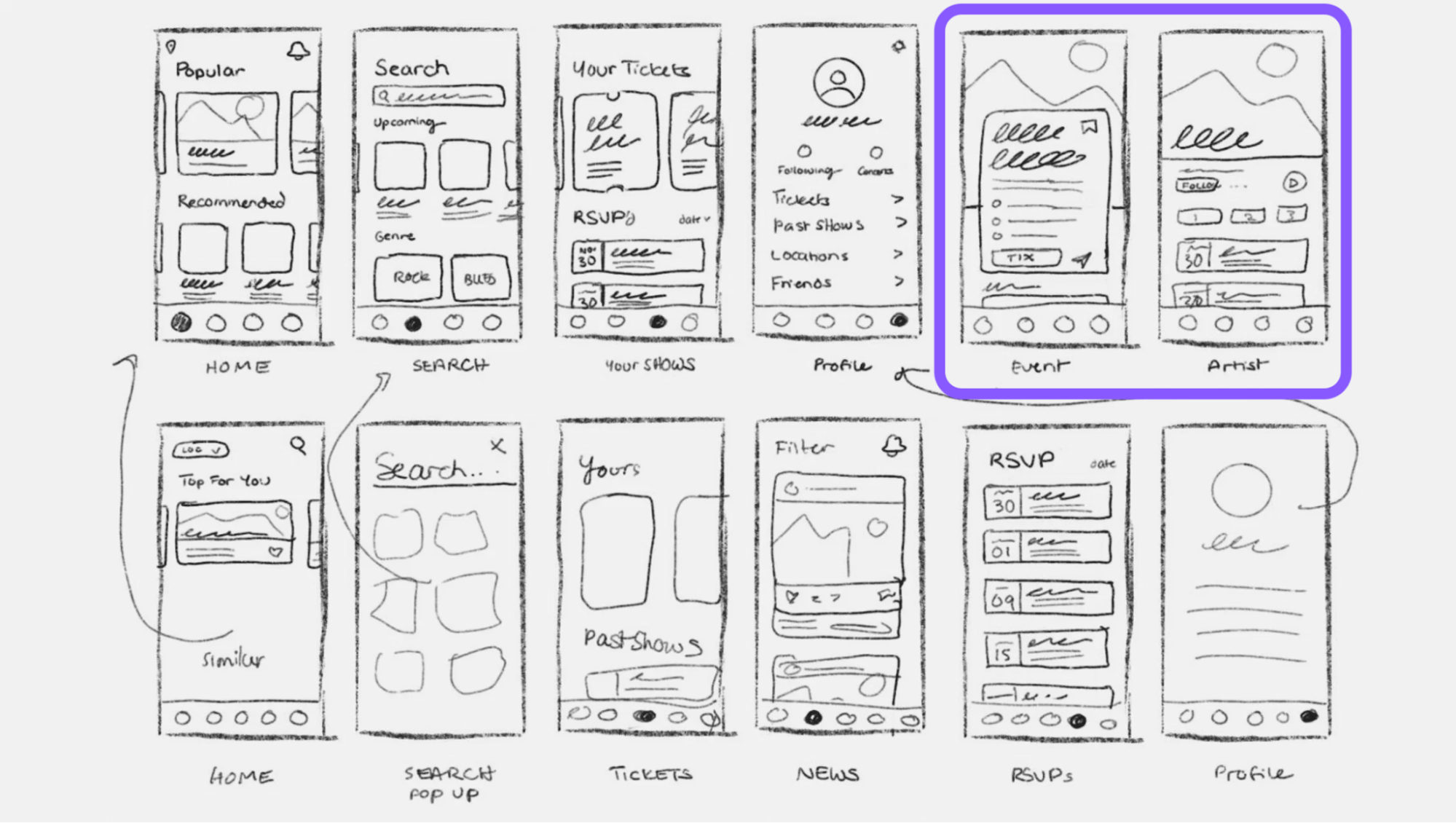
And they weren’t very close to the original structure.
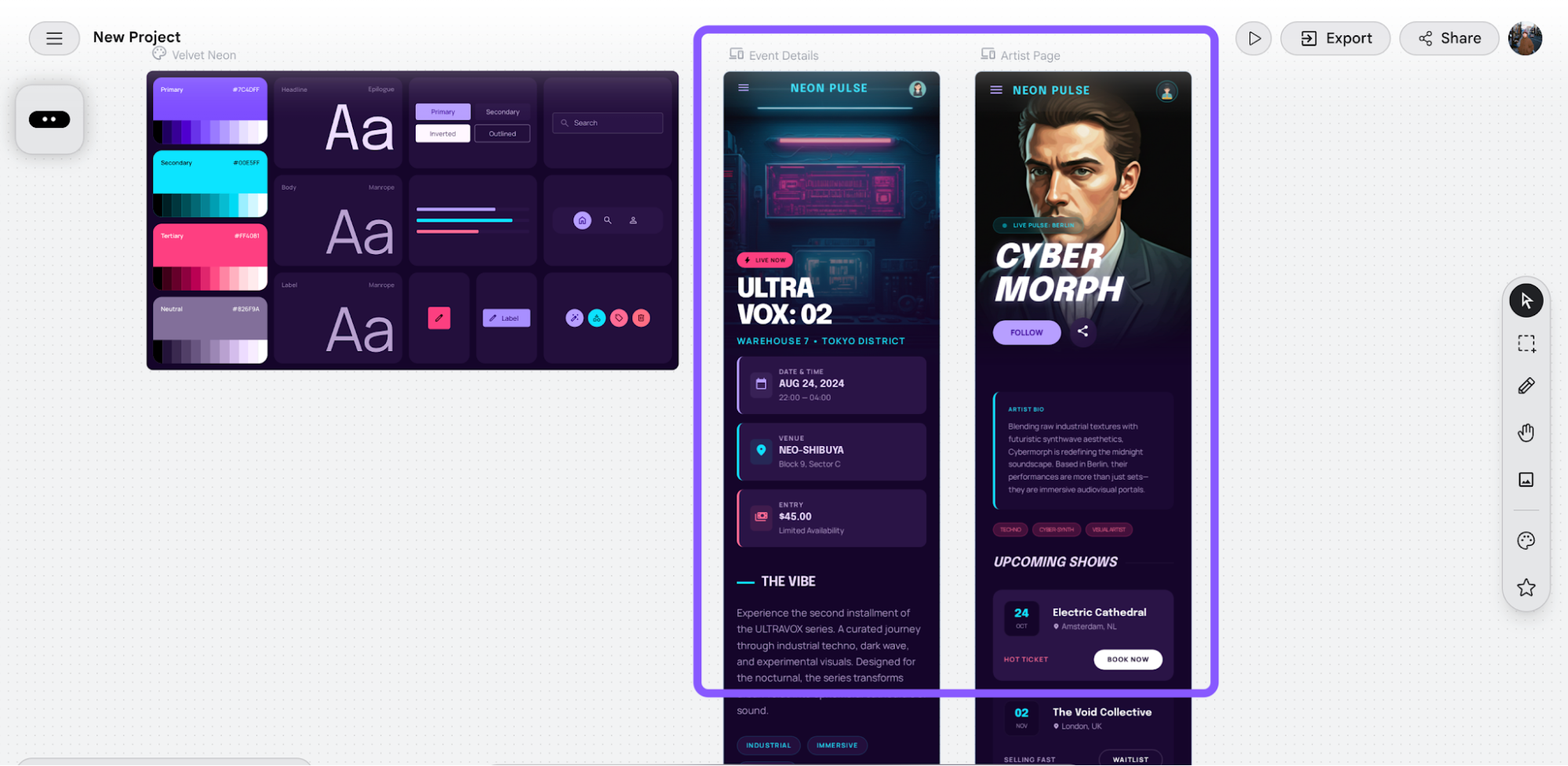
More importantly, the navigation logic breaks down. For example, the artist page ends up living under unrelated sections like tickets.
So while it’s improved from before, it’s still not something I’d rely on for real design work yet.
4. Redesign existing websites or mobile applications
When in redesign mode, you can redesign an existing product by entering a URL, uploading a reference, or describing changes, while choosing between web or mobile.
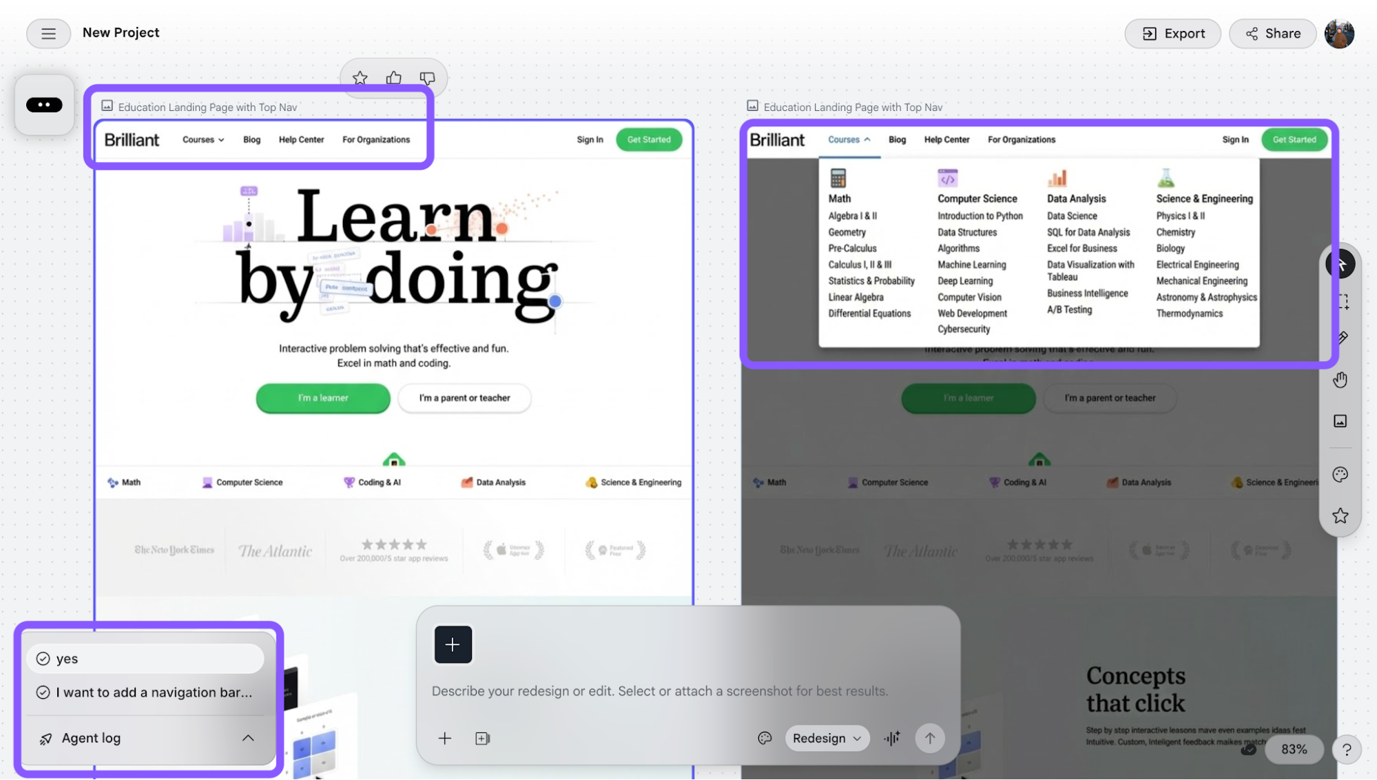
Since I already tested image input earlier, I tried the URL-based workflow using the website brilliant.org as the existing design.
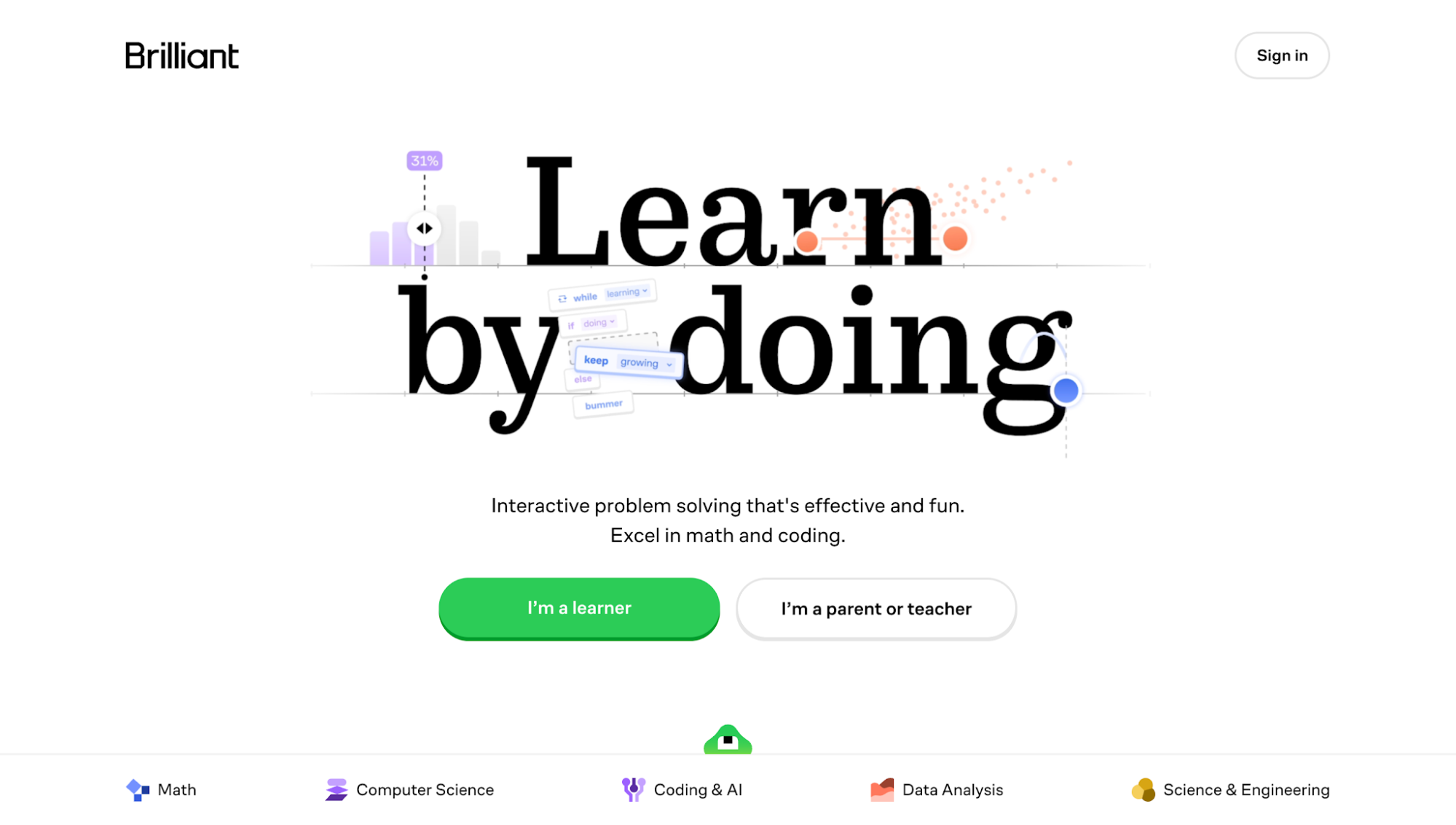
My prompt was really simple: add a top navigation bar with blog, help center, customer, and courses (with dropdown), without changing anything else.
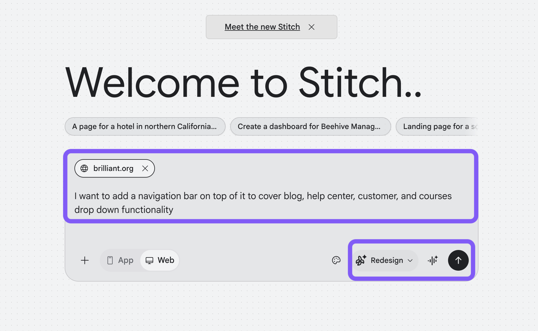
To its credit, it followed the request fairly closely. The structure was mostly correct, although it renamed “customer” to “for organizations.” My redesign requirement was simple anyway.
It also asked if I wanted the courses dropdown populated, which is a nice touch. I said yes.
But the biggest issue is render quality. The output looks noticeably pixelated and low-resolution, which makes it feel far from production-ready even if the structure is technically there.
5. Vibe designing with an ideate agent
This is probably one of the more interesting additions, because instead of starting with a UI, you start with a problem.
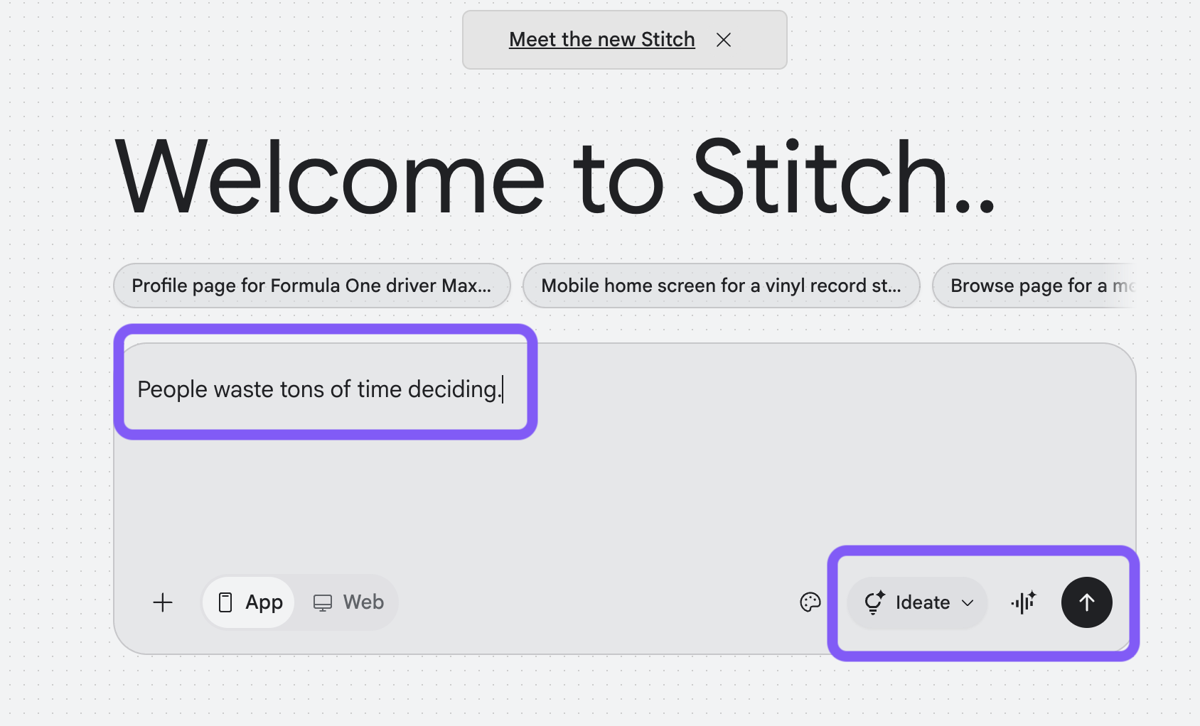
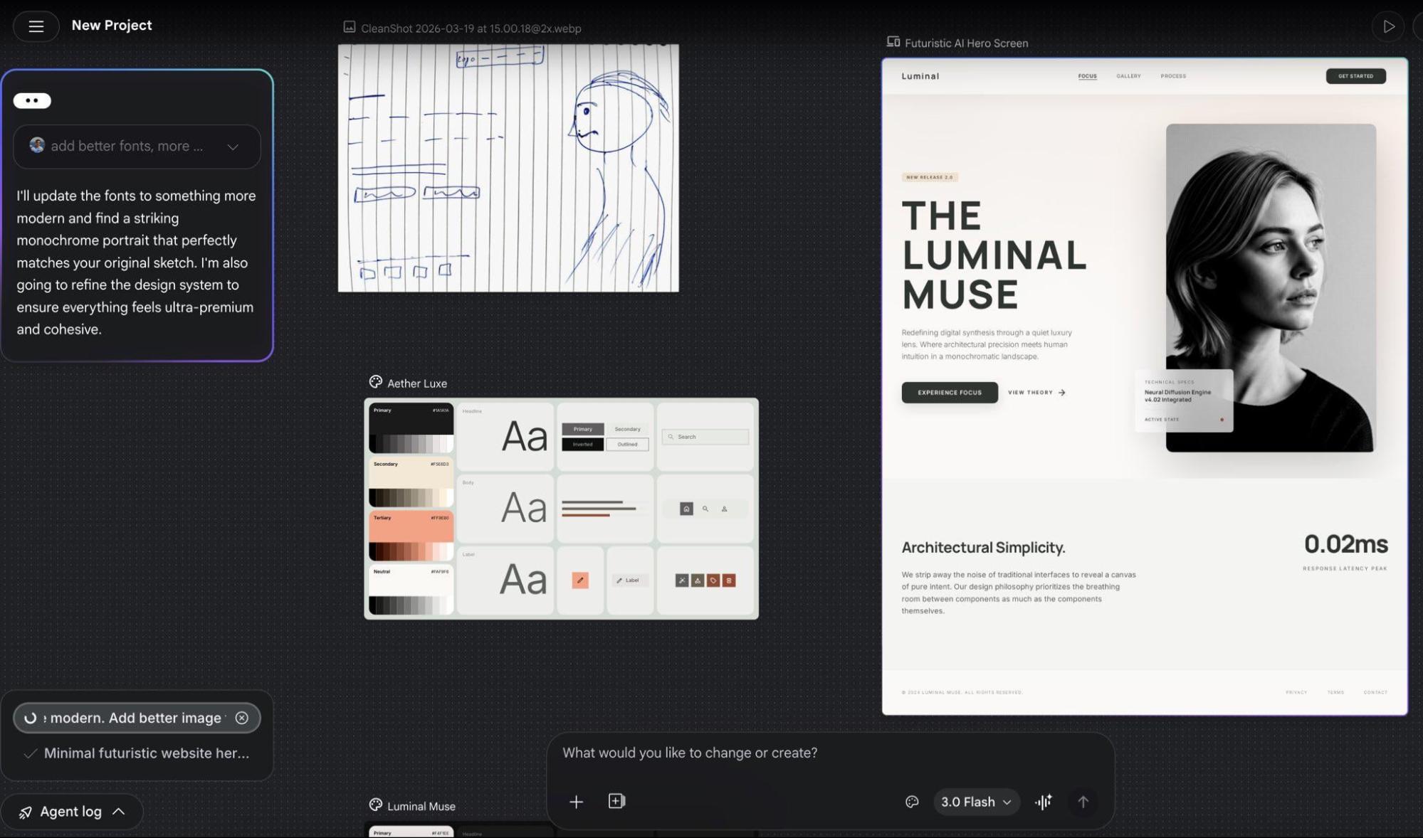
I tried it with this problem: “People waste tons of time deciding.” From there, the ideate agent came back with three clear product directions, each with its own concept and visual style.
Deciding what to do, eat, or watch can definitely be a massive time sink! Let's build a mobile app designed specifically to eliminate decision fatigue.
Here are three distinct design directions we could take to solve this:
1. "Just Pick It" (Brutalist & Minimalist)
The Concept: An ultra-fast, no-nonsense decision maker. You put in the options, and it aggressively picks one for you. No second-guessing allowed.
Visual Style: High contrast, brutalist design. Think stark black and white backgrounds, massive bold typography, and a single neon accent color (like electric green) for the primary action button. It feels decisive and final.
2. "Spin the Wheel" (Playful & Gamified)
The Concept: Making decisions fun instead of stressful. You input choices into a visually engaging spinner, swipe cards, or shake your phone to get an answer.
Visual Style: Vibrant, colorful gradients, soft rounded UI components, and playful micro-interactions. The palette would use energetic pastels with bright primary color accents to keep the mood light and fun.
3. "The Analyst" (Structured & Rational)
The Concept: For the over-thinkers. A structured tool to weigh pros and cons, score options based on specific criteria, and visualize the best logical choice.
Visual Style: Clean, sophisticated, and editorial. We'd use an elegant serif font for headings paired with a highly legible sans-serif for the details. The color palette would be muted and calming—slate grays, sage greens, and soft beige—to reduce cognitive load.
I went with the first option.
Before jumping into screens, it actually generated a PRD-style breakdown and asked me to confirm or tweak things. I pushed it a bit further toward a more Gen Z vibe (similar to Bump), and then let it proceed.
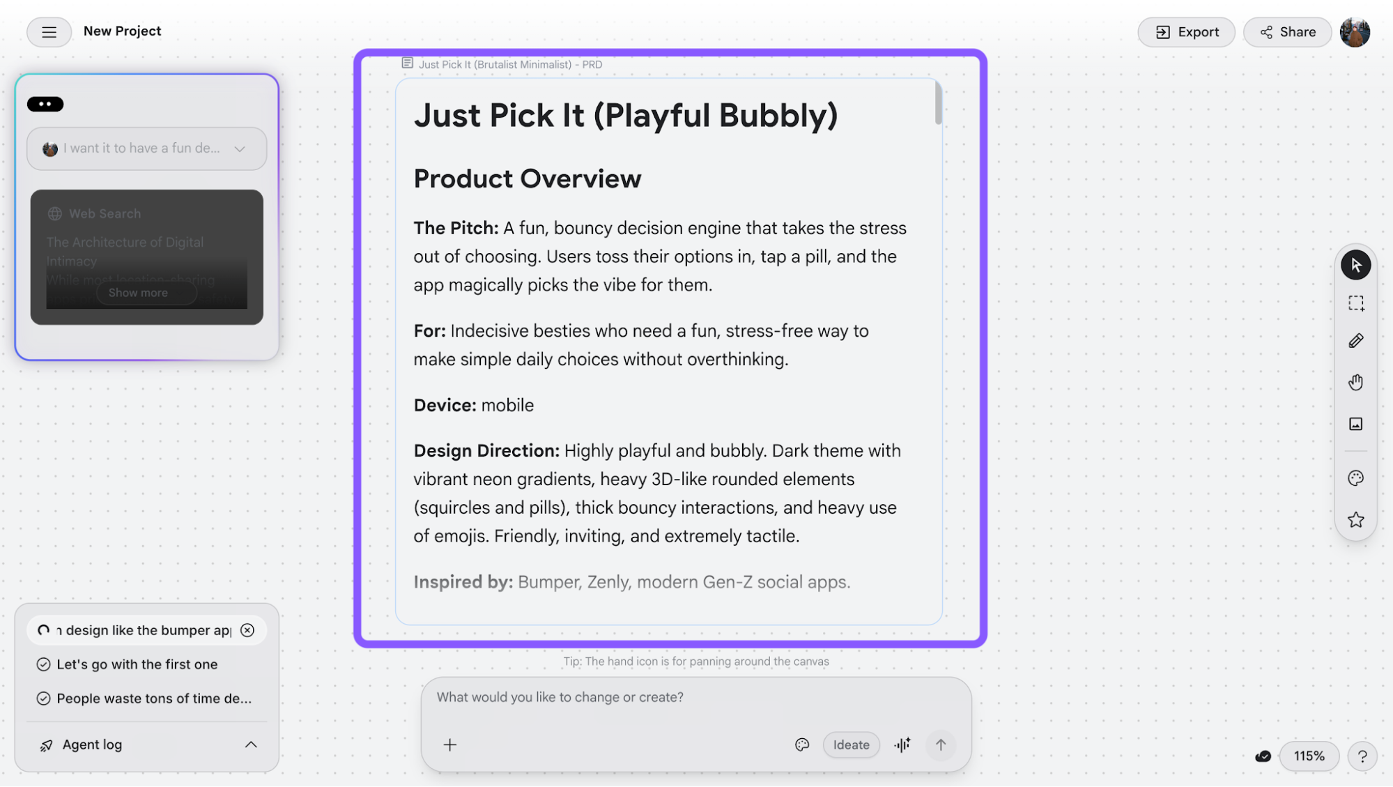
Visually, it gets close to the vibe. But it’s slow, sometimes fails mid-generation, and asks if I want to retry specific screens. It also mostly focuses on the main action flow without thinking through navigation or the full product structure. Think of things like navigation, login, or full product structure.
Consistency is also still an issue, as I noticed things like drop shadow buttons being applied inconsistently across screens.
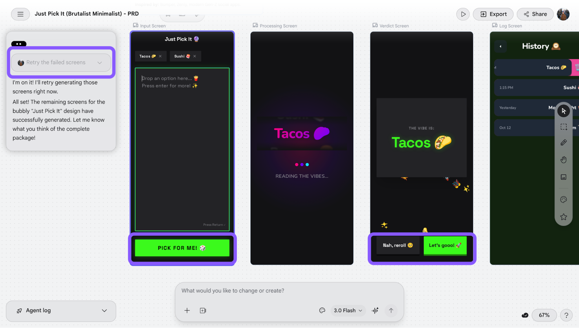
So while it’s great for shaping direction, it’s still more of a starting point than something truly usable.
6. Iterate designs using chat, edit mode, and design.md
This is where Stitch starts to feel more like an AI design tool.
You can use Stitch's customization options to edit and refine designs after generation, depending on how hands-on you want to be:
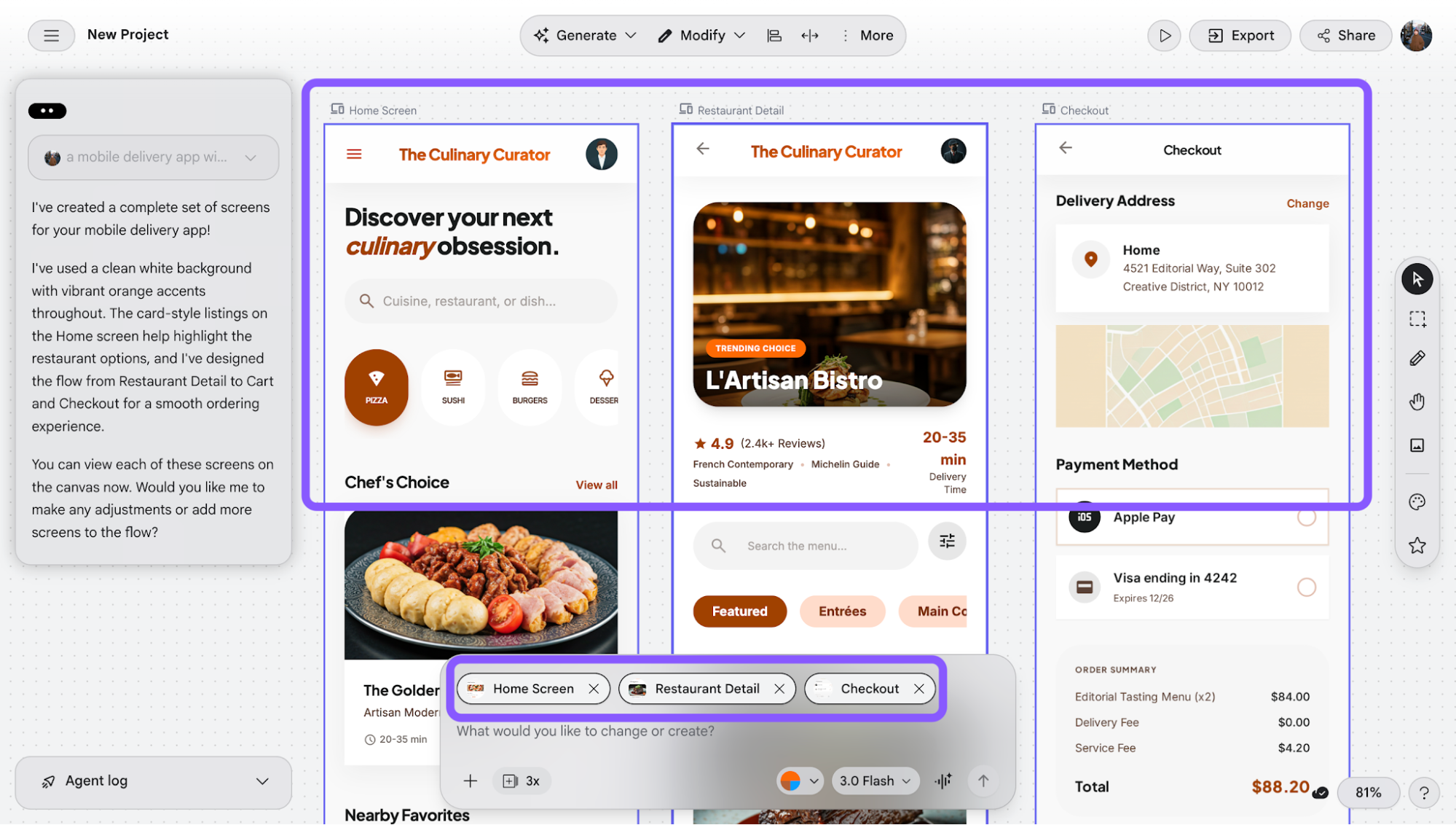
Modify (chat-based editing): This is the default way to fine-tune. I can just use the chatbox to send follow-up prompts, and Stitch updates the design accordingly. What’s useful is that I can select multiple screens (Shift + click) and apply the same change across all of them. This is helpful for things like updating components or styles consistently.
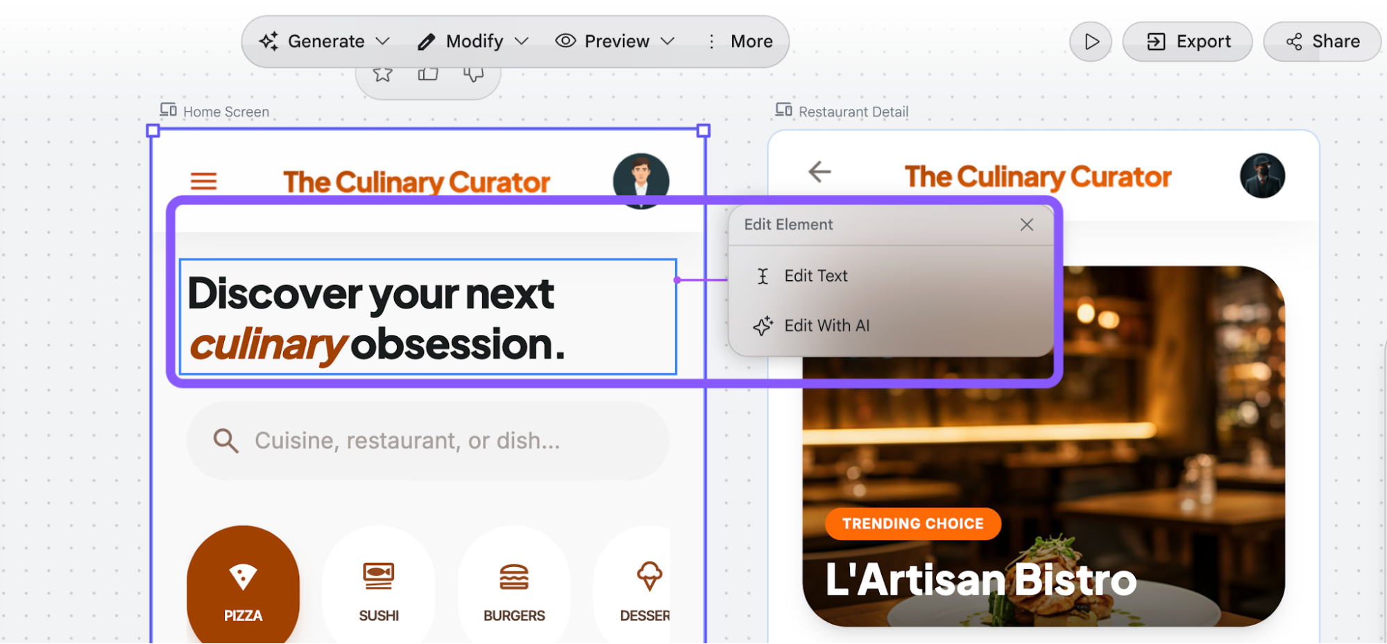
Edit (element-level control): This makes the design feel more like a traditional tool. I can hover and click into specific elements like text, images, icons, and edit them directly. That said, it’s still limited: I’m not uploading my own assets or redesigning components from scratch, just tweaking what’s already there or asking AI to adjust it.
design.md (theme control): This is more system-level. I can upload or write a markdown file to control the overall design language, things like colors, typography, or corner radius, or use the built-in theme options to adjust those globally.

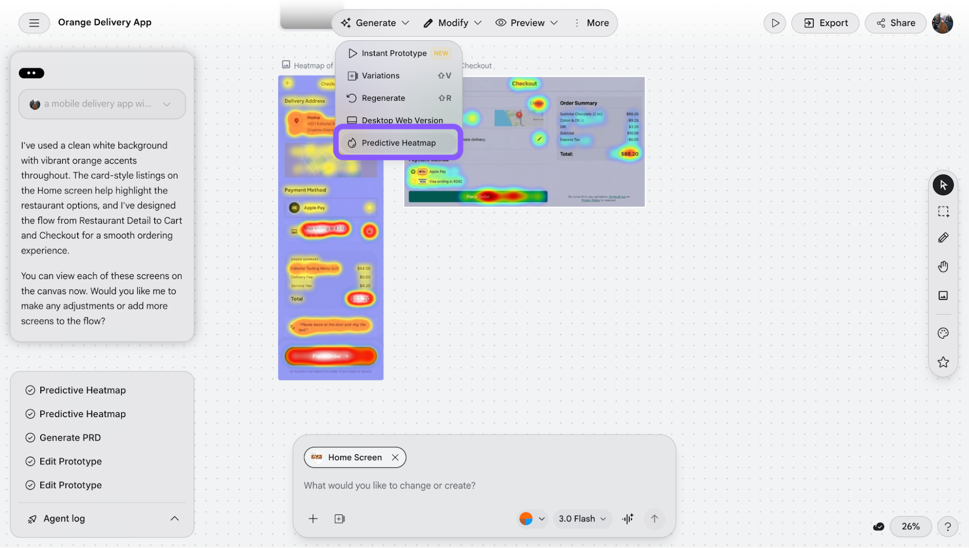
Predictive heatmap: Stitch can generate a predictive heatmap, but only one heatmap per selected screen at a time. The output is placed somewhat randomly on the infinite canvas, rather than being tied directly into the user flow or prototype. Because of this, it works more as a visual reference for design consideration (e.g., attention hotspots) rather than a fully integrated UX validation tool.
On top of that, there are smaller utilities like marking, panning, annotations, and uploading images onto the same canvas. I found this more useful for collaboration or comparing ideas side by side.
Google Stitch features for code export and development hand-off
This is where Stitch tries to go beyond just generating designs and actually connect them to development workflows.
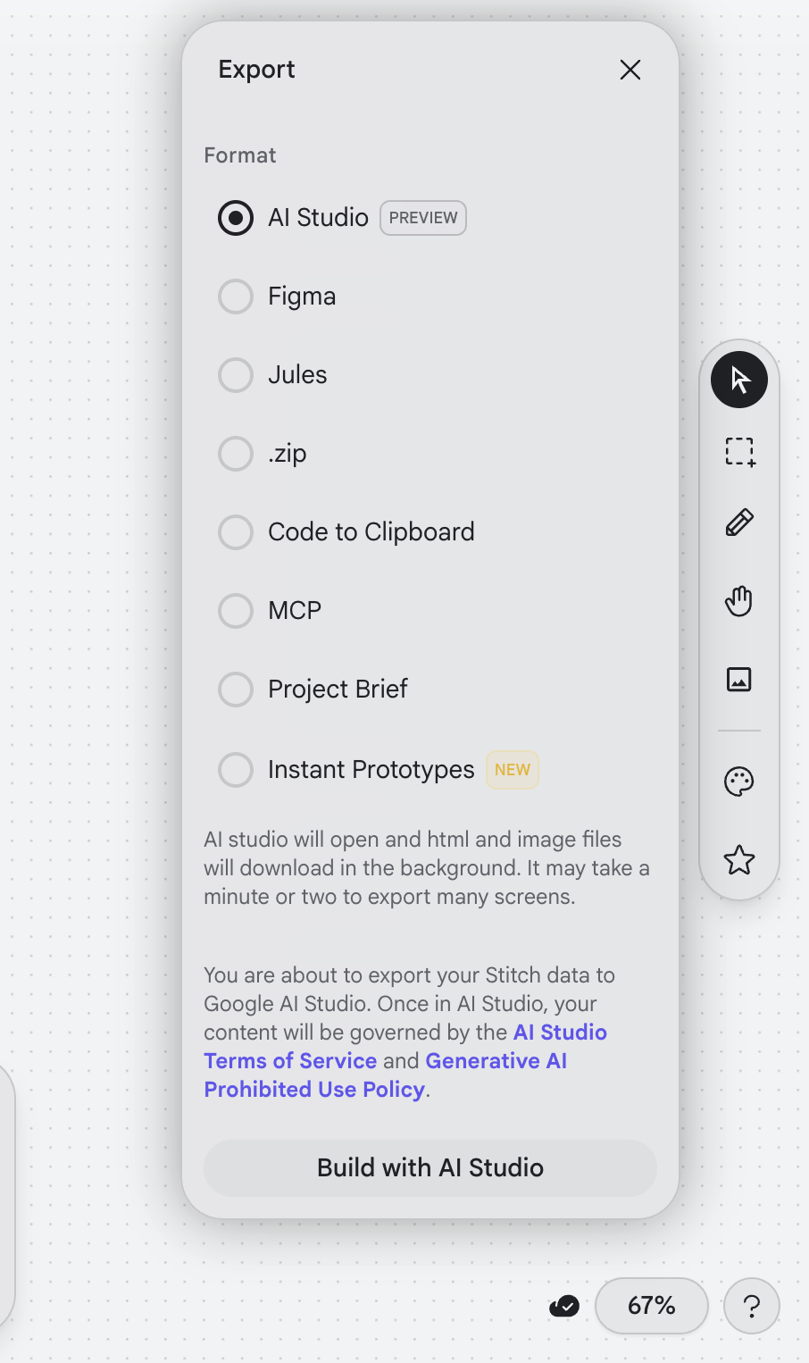
It offers a few way to export designs like Figma, raw code, AI Studio, MCP, and even instant prototypes, which makes it feel like you can move straight from idea to implementation.
Let's get into them in more detail.
Generate prototypes from your design outputs
You can instantly spin up a clickable prototype from your existing design screens, and Stitch handles all the connection logic automatically.
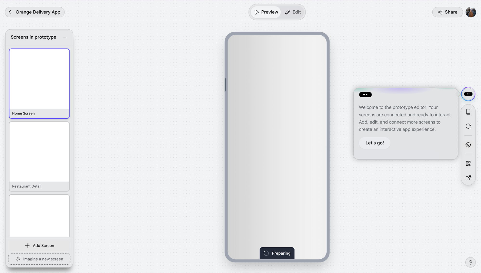
When I switch to Preview → Instant Prototype, it takes me into the prototype view and loads the first screen by default.
From there:
Add screens to the prototype: On the left panel (“Screens in prototype”), I can click “Add Screen” and pull in screens from my existing outputs to include in the flow or generate additional ones on the spot.
Reorder screens to define flow: In that same panel, I can drag screens up or down, and Stitch will automatically figure out how they connect. I don’t have to manually wire everything.
Switch between Preview and Edit (prototype edit mode): At the top, I can toggle between Preview and Edit. Preview lets me click through the flow, while Edit lets me adjust how screens are connected.
Edit connections directly on elements. In prototype edit mode, clickable elements (like buttons/cards) are highlighted with connection indicators. I can click on them to change which screen they link to, or remove/reassign the connection entirely. You can also make minor edits to other elements, like generating a new screen from the selected elements, or adding new connectors, etc.
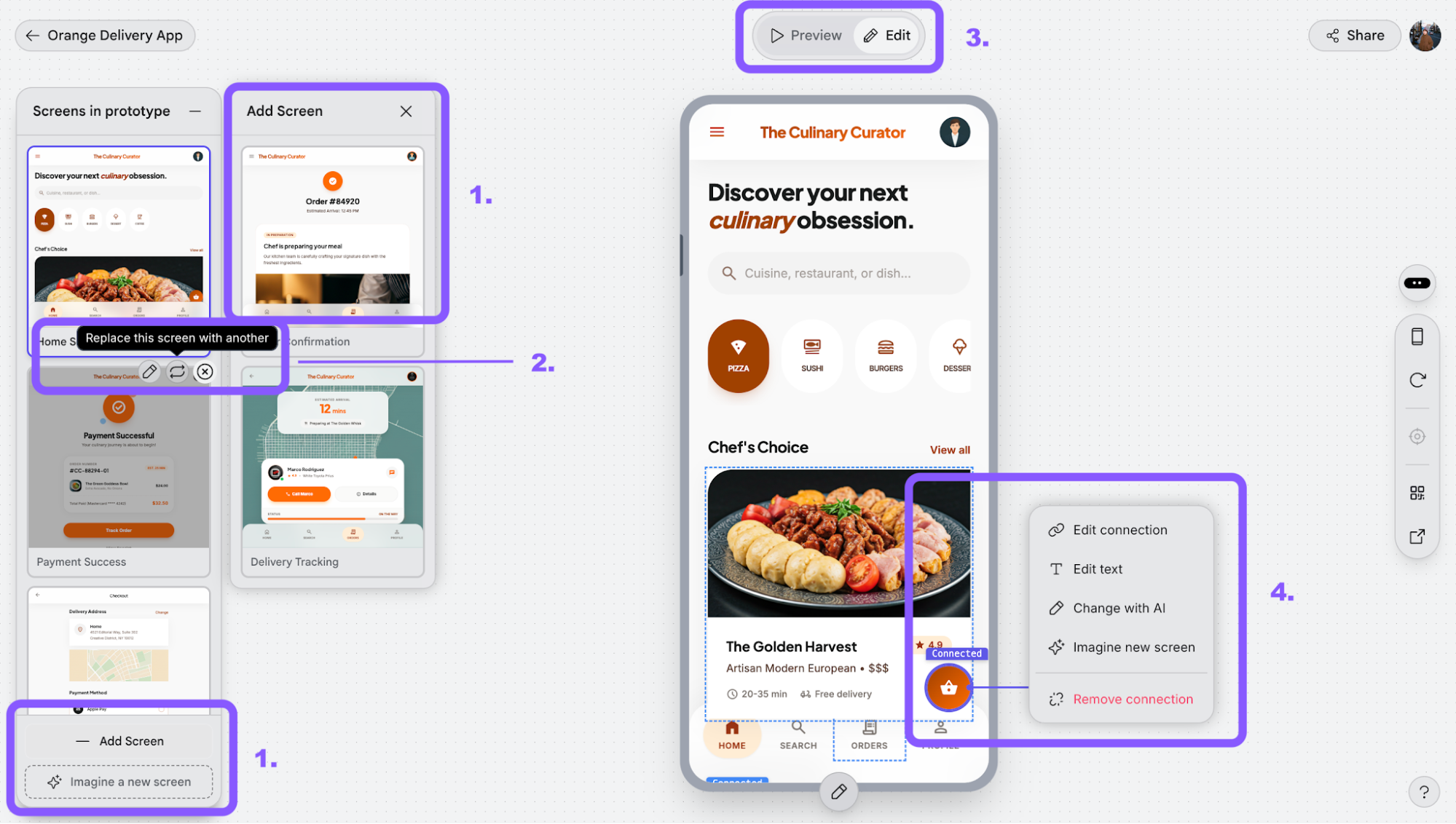
In terms of results, the auto-generated flow is surprisingly decent. The connections it creates generally make sense based on the screen order.
That said, it’s not the smoothest experience. It’s a bit laggy, and there’s always a short wait when generating or updating the prototype.
Export code and design to other tools
This is where Stitch starts trying to close the loop between design and development.
Instead of keeping everything inside the canvas, it gives you multiple ways to extract, hand off, or continue building elsewhere. It all depends on whether you're a UX/UI designer, developer, or somewhere in between.
Here’s how each export option works:
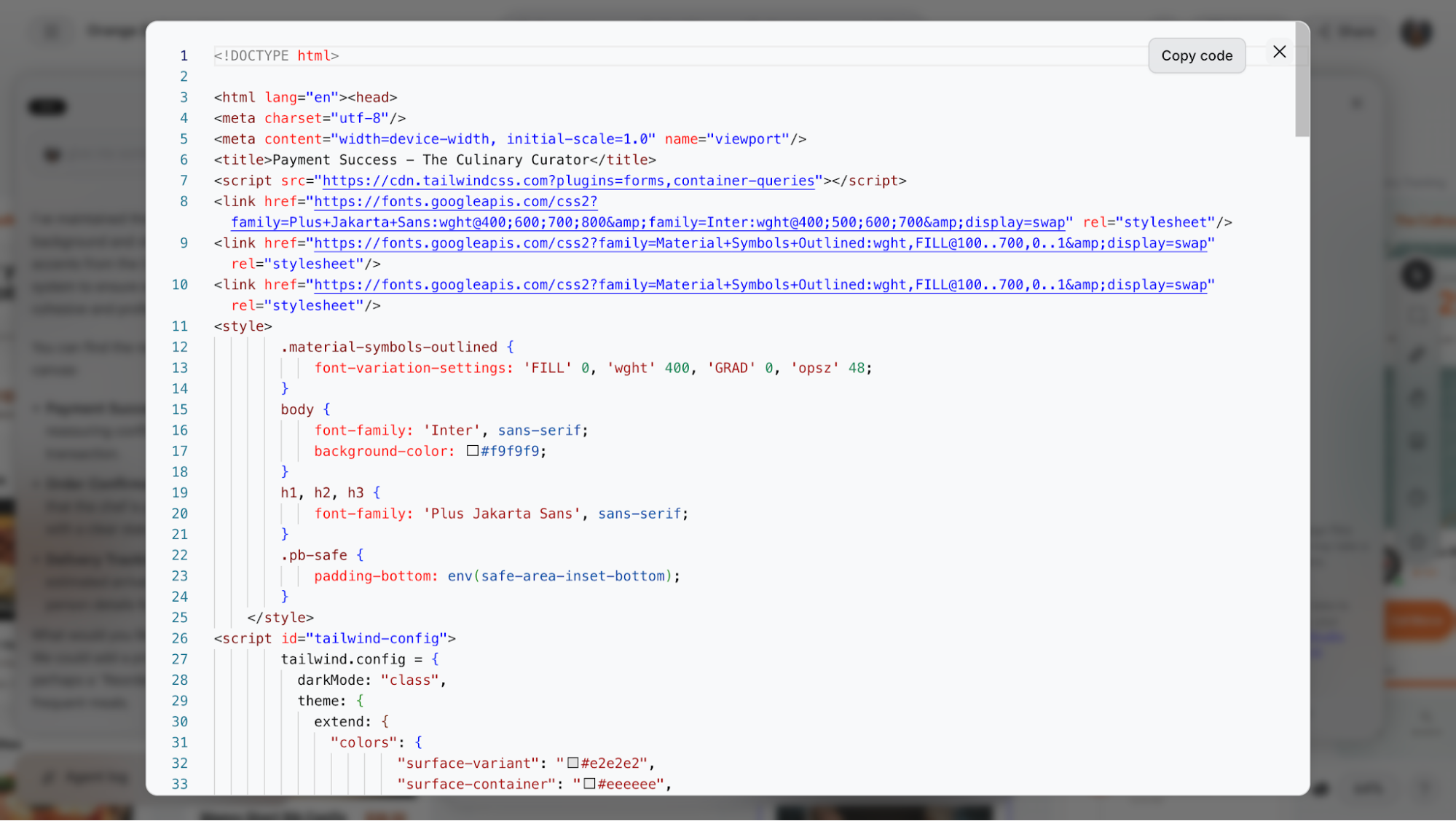
Copy code (HTML only): This is the most direct export. It simply copies the HTML structure of a single screen to your clipboard. It’s fast and reliable, but also very barebones. No full styling system, no assets, just structure. Useful if you want to quickly inspect or reuse layout, but not something you can drop straight into production.
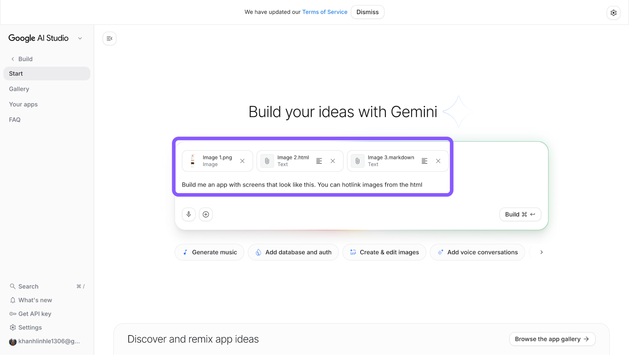
Export to Google AI Studio: This is the most “native” workflow. It sends your design into Google AI Studio, where you can continue building with Gemini. The idea here is less about design handoff and more about continuing development in an AI-native environment.
Export to Figma: This converts your screens into editable design files. Instead of code, you get preserved layout structures that can be refined, shared, or handed over to designers. It’s useful when you want to move from AI-generated output into a more controlled design system but you lose the code layer entirely.
Export as .zip: This bundles everything into a downloadable package, typically including HTML files, static screens, and image assets. It’s the closest thing to a “full export,” but still not production-ready.
Think of it as a snapshot of your project that you can inspect or rebuild from.Export to Jules: This option connects your project to a GitHub-based workflow. You’re pushing your design into a repo where it can be further developed, potentially with AI assistance.
It’s clearly aimed at a more dev-heavy flow, where Stitch is just the starting point.Export via MCP: This is the most abstract one. Rather than exporting files, it sends your design context to external tools through a protocol layer. The goal here is interoperability, letting other coding tools or agents access your design system, structure, and intent. It’s powerful, but also not something you’d use unless you already know why you need it.
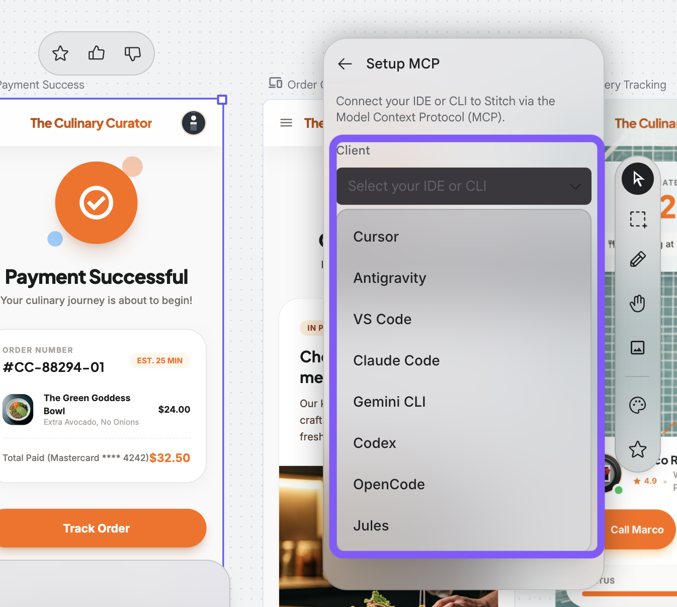
Project Brief: Instead of code or design files, this generates a structured document describing your project. It’s essentially a PRD-style output, useful for aligning with stakeholders or documenting the idea behind the screens.
How to use Google Stitch
At this point, I’ve already covered most of the features in detail, so I won’t repeat everything here. The good thing is that getting started with Stitch is pretty quick and straightforward.
The workflow is simple, and you can go from idea to screens in just a few steps.
Here’s what the process looks like:
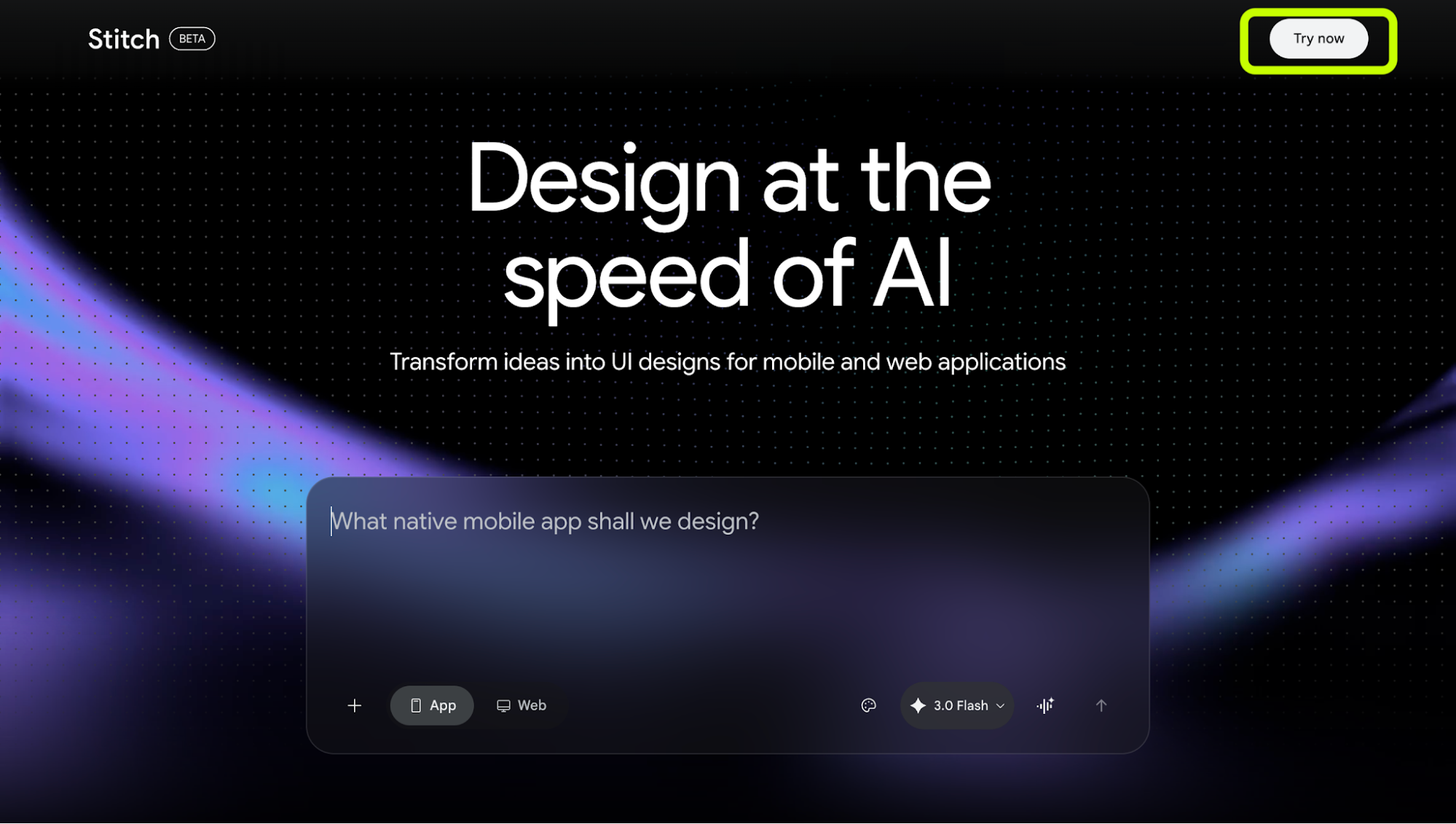
Go to Stitch and start a project. Head to Google Stitch and click “Try now” in the top right corner.
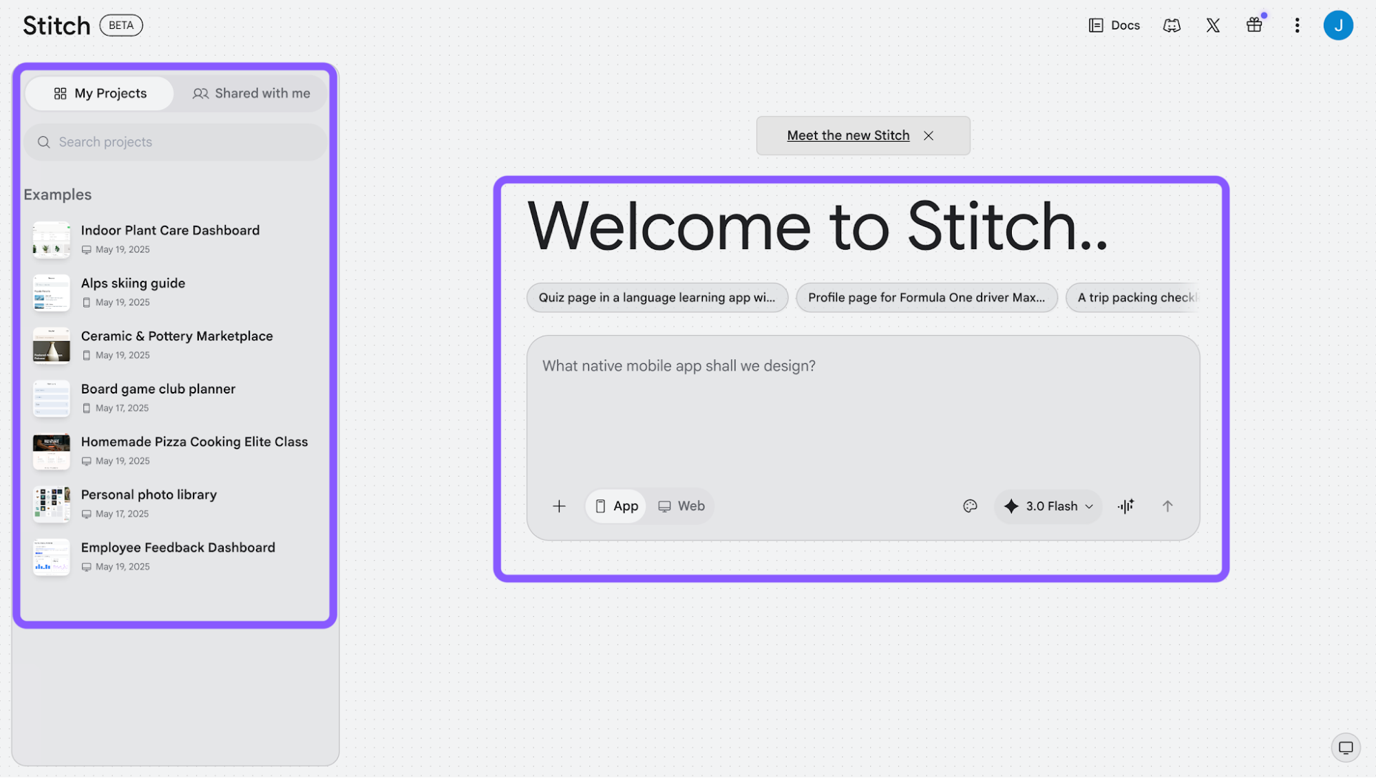
Sign in with your Google account. You’ll be prompted to choose a Google account to log in with, which takes you into the Stitch workspace.
Start generating designs. From there, you can:
Enter a prompt
Upload a reference (image, wireframe, etc.)
Choose platform (web or mobile) and mode
Or pick a sample project from the left sidebar to get started faster
Refine your designs on the canvas. Once inside the canvas, you can iterate using all the features mentioned earlier, such as chat-based edits, voice mode, element-level editing, design.md, and more.
Export or continue elsewhere. When you’re ready, you can export your work to Figma, code, AI Studio, or other tools, depending on how you want to continue building.
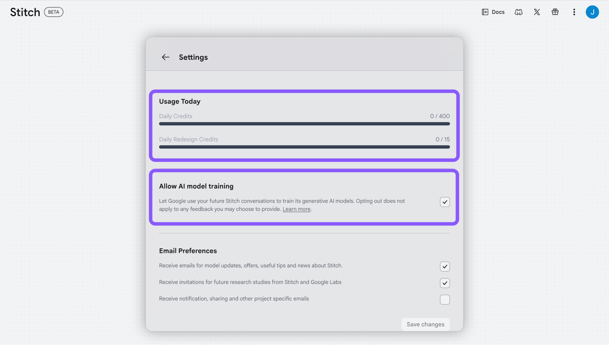
Before jumping into design generation, it's worth adjusting your privacy settings first. Here's how:
Click the profile icon in the top right corner and select Settings
Scroll down to Allow AI model training
Toggle this off if you'd prefer Google not use your Stitch conversations to train its AI models
While you're here, you'll also see your usage limits. The free plan gives you 400 daily credits and only 15 redesign credits per month.
Overall, the learning curve is minimal. It’s more about how far you want to push it, rather than how hard it is to use.
What does Google Stitch do well?
Stitch stands out for how efficiently it handles early-stage design, compared to traditional design tools. It’s fast, accessible, and removes a lot of friction from the first round of prototyping. The interface itself is straightforward. There’s hardly any learning curve, and you can pick it up in no time.
Developers, product managers, and non-designers can move from rough ideas to testable layouts in minutes.
This makes it easier to validate concepts or share design directions early in a project. For early ideation, that speed is its main strength.
What does Google Stitch not do well?
The most immediate thing I noticed is the lag. There's always a wait when generating, so "instant" is a bit of a stretch. Small price to pay for what it does, but worth knowing going in.
The bigger frustration shows up once you start iterating. Stitch is genuinely impressive on the first pass, but ask it to tweak something small, and things can go wrong pretty quickly. Think of changing one element often triggers a full-screen regeneration, and stuff you didn't even touch gets redone.
Consistency is probably the most common complaint I've seen echoed across the board: colors change between screens, text styles drift, components that looked one way a moment ago suddenly look different. People kept running into this:
"One simple change request and it will generate major new changes you didn't ask for. And when you ask why it changed something it will apologize and say it reverted the changes. But when you look at it, nothing changed." via hell_a, r/vibecoding
"It can't keep a navigation or button style consistent across screens (...) Every single time it came back with a square canvas with its edges rounded... AND STILL PRODUCED A ROUNDED SQUARE." via Minkstix, r/vibecoding
"Whenever I wanted to make even a small change to the copy or a design, it always generated a new page." via Pranav Malvawala on Linkedin
This gets worse the more screens you add. Build out a longer flow, and small things start going off. For example, a header menu picks up an extra button on one screen, spacing looks slightly different somewhere else, and components that should be identical aren't anymore. A lot of people building out full flows hit this:
"As I keep creating more and more screens, small inconsistencies start to appear — things like slightly different layouts for components that should be identical." via HODLING_APE, r/ClaudeCode
"I've found sometimes it changes the nav items, or completely changes the color theme." via abdulqkhan, r/ClaudeCode
Working from existing references is another area where I personally found it lacking. Whether you're uploading a wireframe, a screenshot, or pointing it at a live URL to redesign, it tends to lose track of what you gave it. Screens come out feeling like they don't quite belong together, navigation logic gets confused, and you rarely get the full connected flow you were hoping for:
"Instead of producing a connected user journey, the screens feel fragmented and disconnected. Elements are recognized, but consistency breaks down, and the action flow isn't preserved across screens."
"I tried to have it create a mildly complicated design and it barfed on itself."
"Even with CC-generated design system and description, Stitch with G3.1 Pro still didn't stick to my design, but invented his own."
Design result from a Reddit user showing how Google Stitch doesn't handle designing from reference images really well.
And even starting from scratch, the designs can feel a bit samey, like it keeps reaching for the same visual patterns regardless of what you ask for:
"It's not that great unless you want generic looking stuff." via andy_mac_stack, r/GeminiAI
"It just slaps material design and purple for no reason even though I specified not to." via BeingMani97, r/FigmaDesign
"After a while you start noticing what was made with what. They seem to have a relatively small number of design patterns they keep falling back to." via NightCodingDad, r/ClaudeCode
On the code export side, what you get out of Stitch is more of a design reference than anything you can actually ship, like the HTML needs a significant rewrite before it's usable.
The Figma export is cleaner, but you lose the code layer entirely when you go that route. Passing everything through Claude Code helps close the gap, but it's an added step, and even then, the Stitch MCP isn't always reliable enough to get pixel-perfect results:
"Stitch's exported HTML is design-spec quality, not production code. Claude still rewrites most of it. You're paying for a better reference image, not a shorter implementation loop." via tom_mathews, r/ClaudeCode
"Stitch MCP is not that accurate. What really worked for me: iterate design in Stitch → export to Figma → use Figma MCP + Claude Code to implement. When using MCP directly from Stitch, the UI generated by Claude Code is not exact." via Potential-Impact-388, r/ClaudeCode
None of this makes it a bad tool; it just means it hasn't replaced Figma or a proper development handoff workflow yet. That's a consensus among discussions for the answer to "Will Google Stitch replace Figma?". For now, it lives firmly in the ideation and first-draft space, and anything beyond that needs something else in the mix.
"Great for the entry level part of the industry, unstable for professional UX or UI." via SoggyMattress2, r/FigmaDesign
"Not a replacement for Figma workflows on serious projects, but for MVPs and rapid prototyping? Game changer." via abdulqkhan, r/ClaudeCode
Google Stitch pricing
Currently, the app publisher is keeping Google Stitch free in beta through Google Labs. However, its usage is limited rather than unlimited.
From what I noticed in the settings, usage is controlled by daily credits, not monthly quotas:
You get 400 daily credits for general generations
And 15 daily redesign credits for redesign-specific actions
These reset every day, which makes it more flexible for short bursts of work, but still capped if you’re doing heavy iteration.
There’s no clear paid plan yet, but given the credit system already in place, it’s pretty likely Google will introduce pricing or adjust these limits as the product matures.
Google Stitch alternatives
To understand where Google Stitch fits, it helps to see how Google Stitch compares against AI-powered design tools that are already solving similar problems.
Here are some of the alternatives worth considering.
Lovable
If you’re exploring alternatives, Lovable often comes up alongside Google Stitch, but it sits in a slightly different place.
Lovable leans more toward “vibe coding” and MVP building rather than structured UI design. Instead of focusing on flows, design systems, or screen-level consistency like Stitch tries to do, Lovable helps you build working apps via natural language prompts, often with real backend logic (auth, database, etc.).
For example, when generating an e-commerce experience, it doesn’t stop at UI. In addition, it surfaces actions like connecting to Shopify directly within the flow.
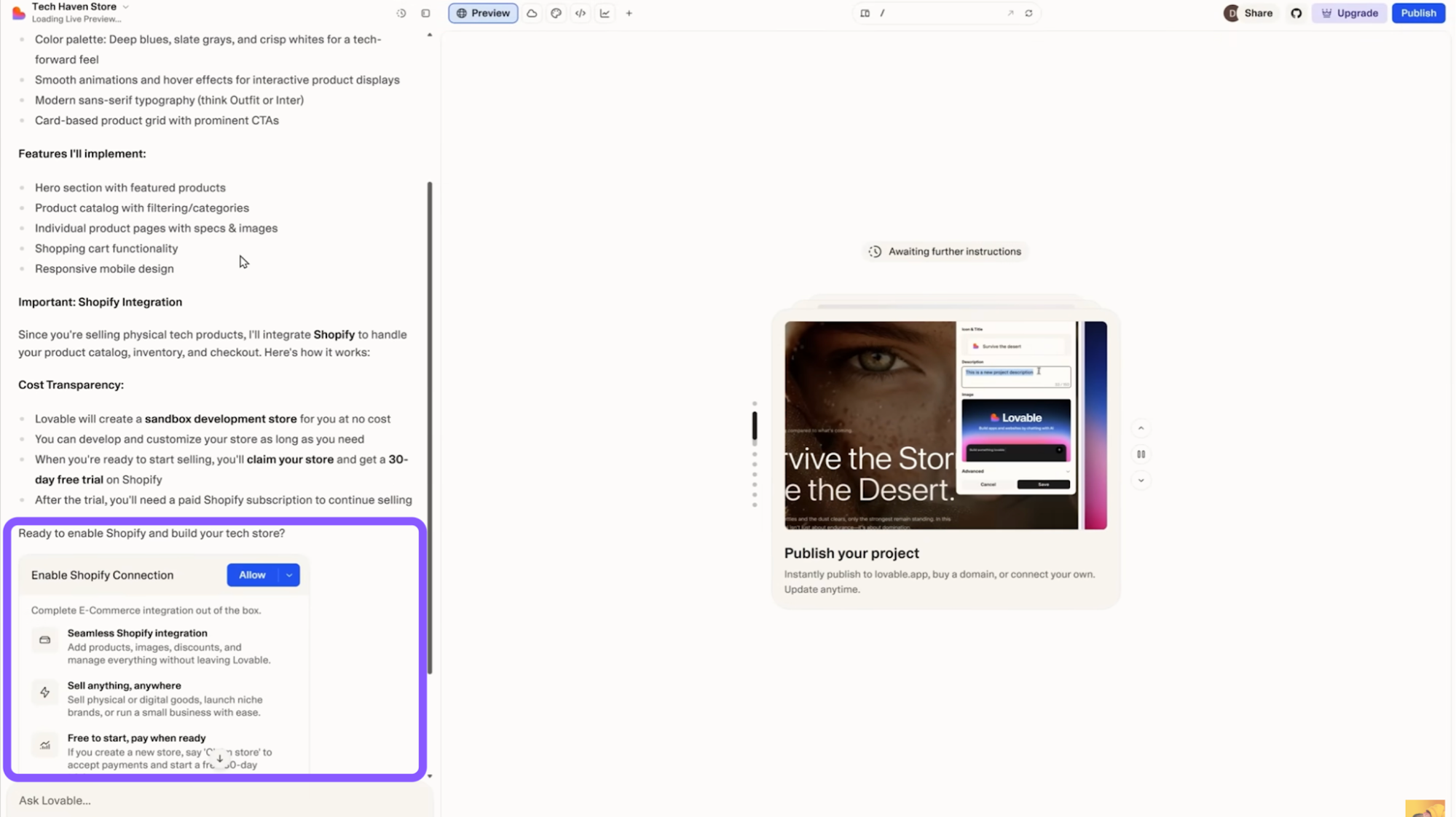
That makes it particularly strong for:
MVPs and quick experiments
Solo builders or non-designers
Situations where “working product” matters more than “perfect design.”
In terms of pricing, Lovable uses a subscription + credit system: there’s a free tier with limited daily usage, while paid plans start at around $25/month for 100 credits, with each prompt or action consuming credits depending on complexity.
Bolt
Compared to Stitch, Bolt feels less like a design tool and more like opening a dev environment that just happens to be powered by AI.
It takes a browser-based full-stack builder approach that helps you generate and run apps instantly.
Where Stitch focuses on UI flows and design systems, Bolt skips that layer entirely and goes straight to working software. You prompt it, and it spins up a live app with frontend, backend, and database already wired. The interface reflects that with a chat panel for prompting, a live preview, and quick toggles between visual view and code, so you can iterate either by prompting or directly editing the codebase.
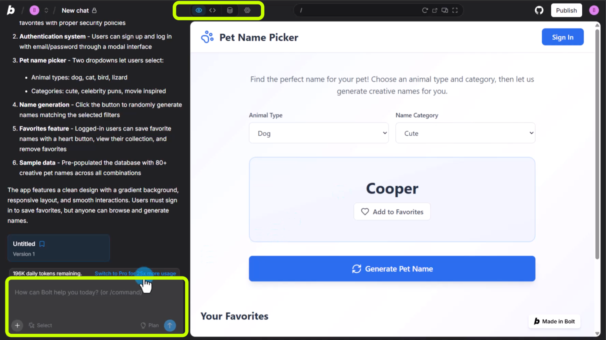
That makes it powerful for:
quickly testing product ideas
building internal tools or MVPs
skipping setup and environment configuration
Pricing is token-based. There’s a free tier with around 1M tokens/month (with daily limits), and the Pro plan starts at $25/month for ~10M tokens, with higher tiers scaling usage.
UX Pilot
If Stitch feels like “vibe designing,” that sometimes works and sometimes doesn’t, UX Pilot feels much closer to an actual design workflow tool.
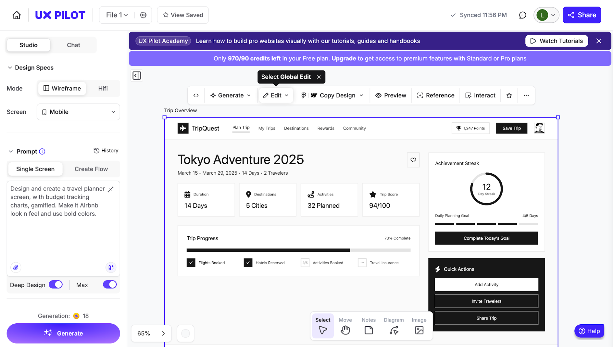
What stands out immediately is that it doesn’t just generate random screens; it helps you build structured product flows with auto layouts from the start.
I can either describe each screen myself or let it handle that through auto flow, where it breaks down the product into a full set of screens with clear purposes before generating anything. That alone makes a big difference compared to Stitch, where flows often feel fragmented.
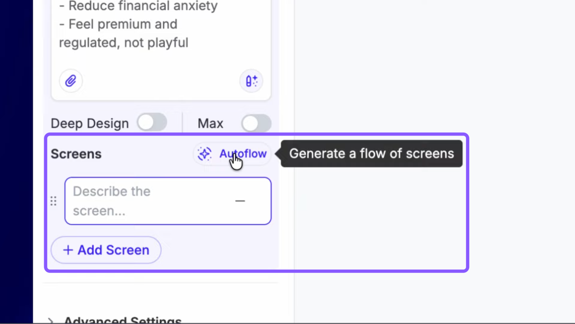
It also supports multiple fidelity levels, so I can start with wireframes or jump straight into hi-fi, and even convert between them later. That flexibility makes it much more usable across different stages of the design process.
Where it really separates itself is consistency. Instead of regenerating everything every time something feels off (like in Stitch), UX Pilot lets me:
apply a theme system across the entire project (colors, typography, radius, etc.)
or even import a real design system from Figma via the plugin and have everything generated against it
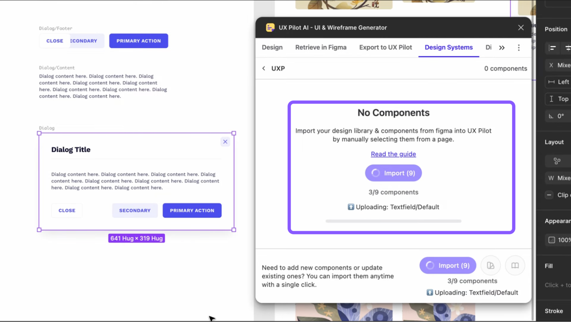
It also handles larger, more complex flows much better and faster. I can generate multiple screens at once, and they still maintain structure and relationships instead of breaking apart.
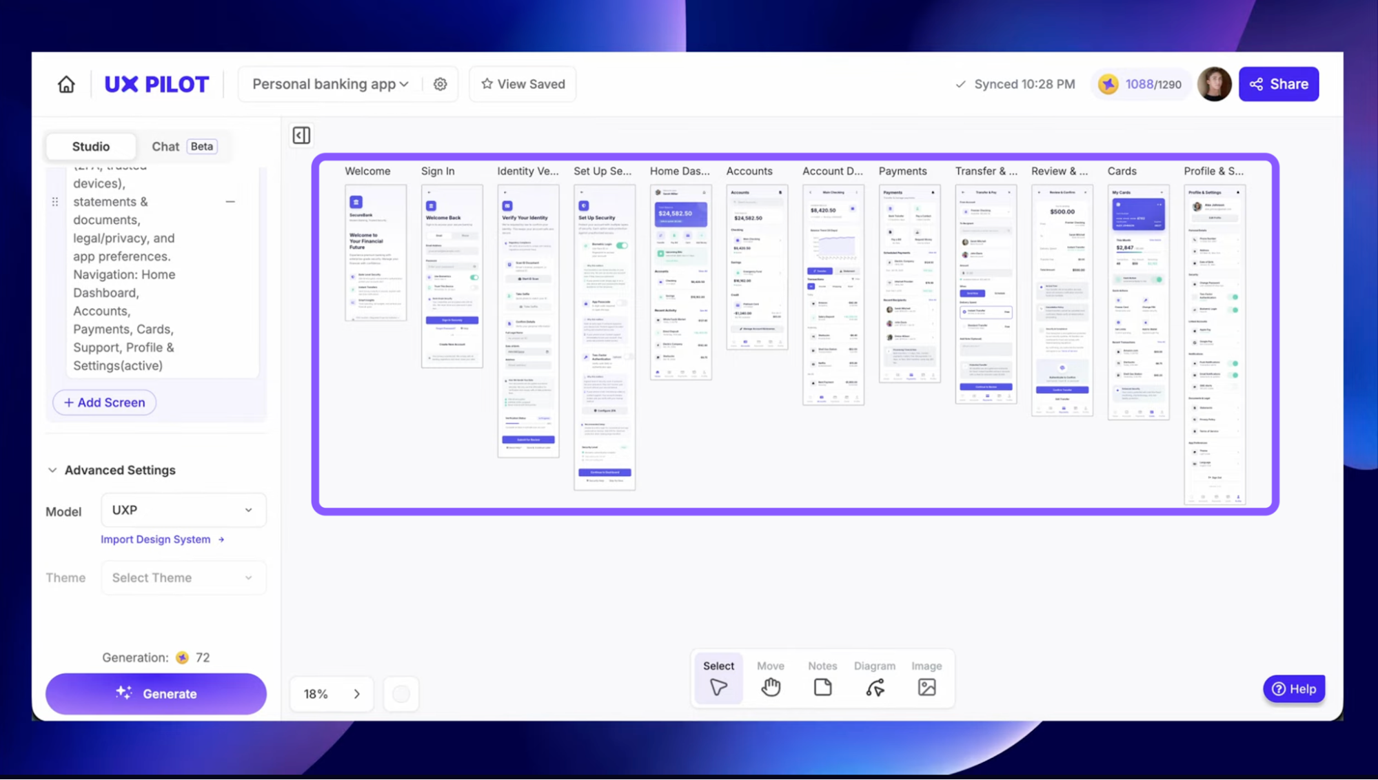
On the prototyping side, it fits naturally into a real workflow. I can:
generate a clickable prototype in one step
and then copy everything into Figma as fully structured frames
So it’s not replacing tools like Figma, it’s doing the heavy lifting before that stage. Overall, UX Pilot feels less like an AI experiment and more like a tool that understands how designers work.
Pricing is credit-based but predictable. There’s a free tier to try it out, while paid plans start around $12/month (~70 screens) and go up to $22/month (~200 screens with advanced features like unlimited flows and design system import).
Google Stitch Vs UX Pilot
Category | Google Stitch | UXPilot AI |
|---|---|---|
Core focus | Fast UI generation + prototyping + code generation | Full UX workflow (wireframe → flows → validation) |
AI approach | Powered by Gemini (strong multimodal AI) | Proprietary models with UX-focused modes |
Design modes (fidelity) | ⚠️ No explicit modes → Outputs mostly mid → high fidelity UI (limited control) | ✅ Multiple modes: • Low-fi wireframes • High-fi UI screens • Flow generation |
Output quality | Mid–hi fidelity (needs refinement) | More production-ready and polished designs with element consistency |
Collaboration | Very limited (no real team features) | Strong real-time collaboration (teams, comments, Figma integration sync with editable layers, etc.) |
Pricing | Free (with usage limits) | Freemium → paid tiers ($15–$29+) |
Best for | Quick ideas, MVP mockups, dev handoff experiments | Product teams, real UX workflows, scaling design |
Framer Design pages
Framer Design Pages is a compelling alternative to Google Stitch if you need a comprehensive platform for web design and development.
It provides a freeform canvas with advanced design tools such as vector editing, P3 color support, and image exporting. This enables designers to create visually rich websites directly within Framer, eliminating the need for separate design and development tools.
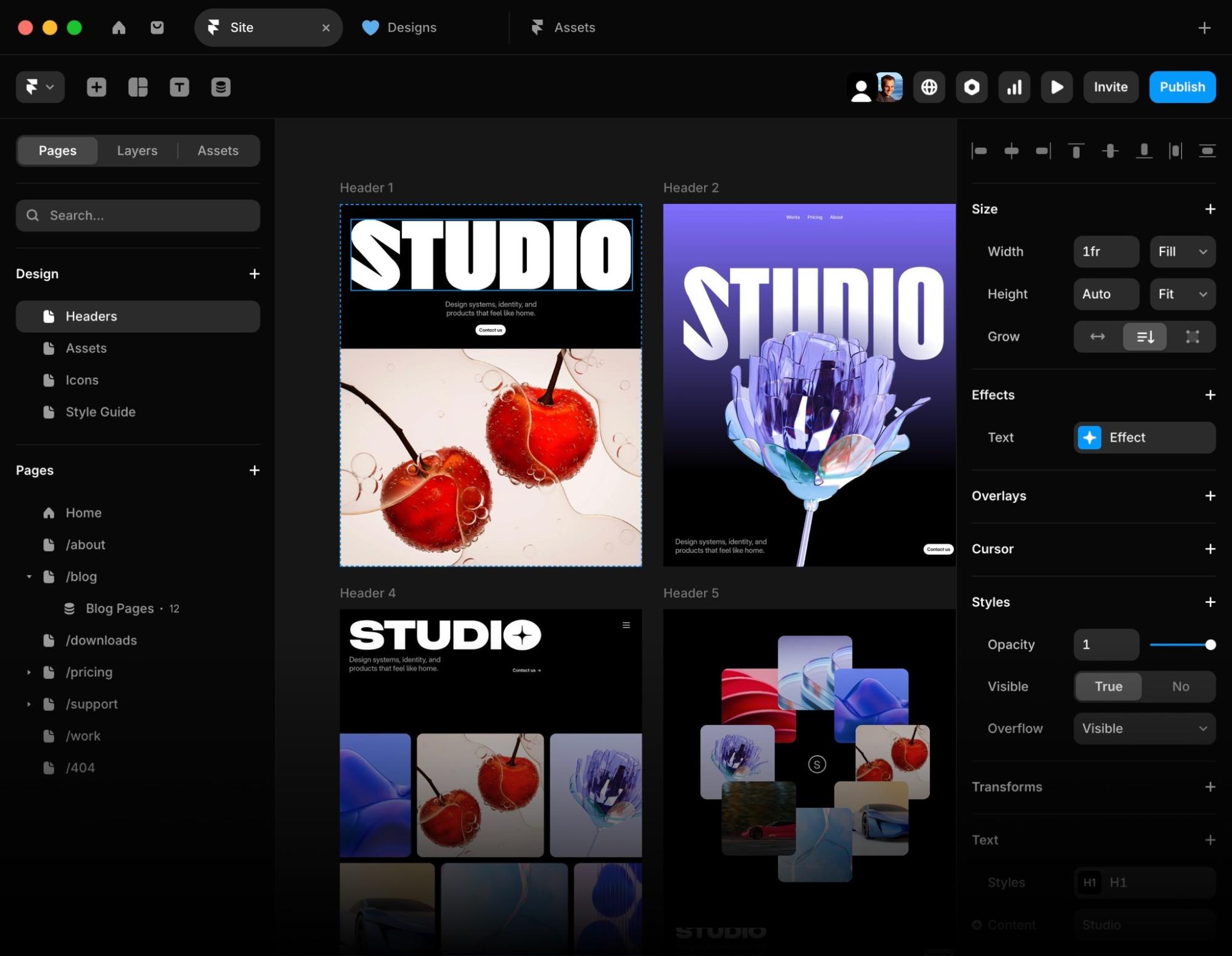
Framer offers a Free plan for personal and non-commercial projects. Paid plans start at around $10 per site per month (Basic) and scale up to $100+ per site per month (Scale) for high-traffic and advanced use cases.
Is Google Stitch worth using?
Google Stitch is a valuable tool, just not in the way the hype might suggest. If you come in expecting a tool that takes you from idea to production-ready design, you'll likely walk away frustrated. But if you treat it for what it actually is, it earns its place in the workflow.
So in my opinion, the sweet spot is early-stage exploration. It offers a fast, completely free way to get rough ideas out of your head and onto a screen.
What it can't do yet is carry you through the full journey. Iteration gets messy, references don't always land, consistency breaks down at scale, and the export story still needs work.
Given that it's still an experimental Google Labs product and has already improved significantly since it first launched, it's worth keeping an eye on. If Google keeps iterating, this could become something much harder to ignore.