8 Web Design Goals To Select from

Denisa Lamaj
Created on Sep 21, 2025
A good-looking site isn’t enough. You might end up with something that looks polished, but doesn’t actually help website visitors or support the company’s main objectives.
That’s where web design goals come in. They give you direction and make sure every decision (whether it’s about the website’s layout, navigation, or content) works toward the same outcome.
In this guide, I’ll walk you through:
-
What web design goals are
-
Why they’re important for building effective websites
-
8 practical goals you can choose from for your next project
What is a web design goal?
A web design goal is a measurable objective that guides how a website should be structured, look, and function.
It turns vague ideas like “make the site look better” into something specific, such as “increase conversions by 20% in the next quarter.”
The difference matters. A goal is concrete and measurable, while an intention is just a preference.
Goals also keep teams aligned across design, marketing, and product. Instead of debating opinions, everyone works toward the same outcome.
Think of it like a compass. Every design choice (from navigation to page layouts) should point in the same direction, toward the goal you’ve set.
For example, a nonprofit might set a goal to increase donations by simplifying its online donation form.
Or an e-commerce store might focus on improving checkout completion rates by reducing the number of steps in the purchase flow.
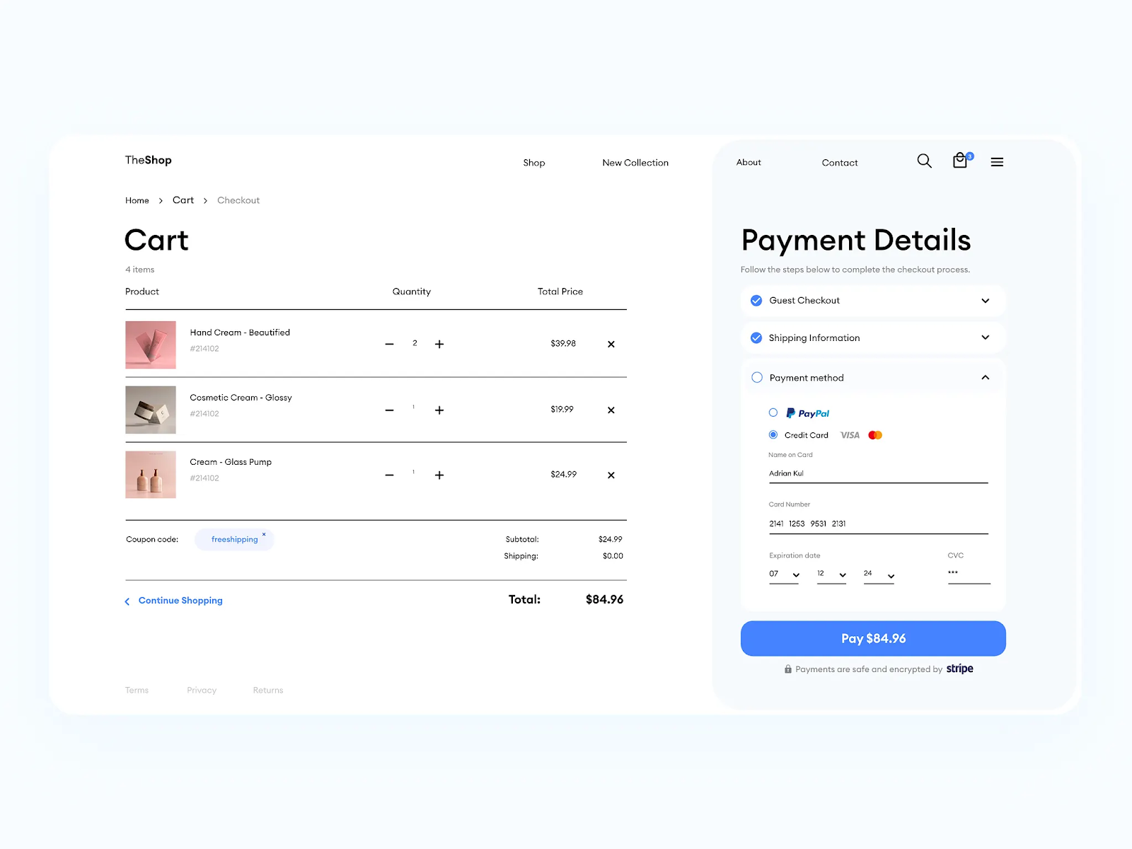
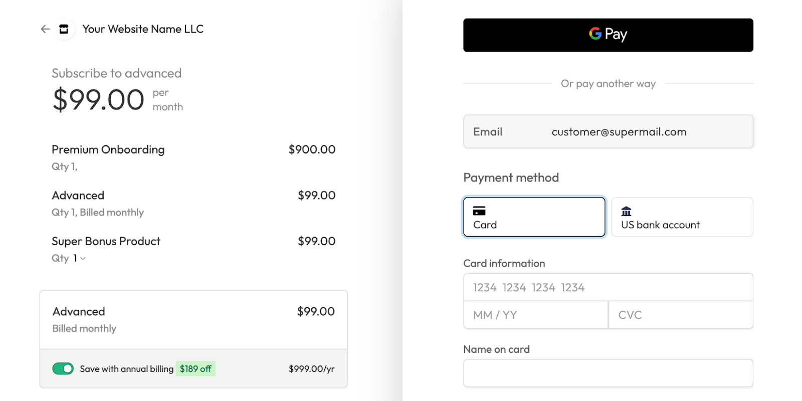
The checkout page below is a good example. It makes the process easier by showing the cart items on one side and the payment steps on the other:
Why setting website design goals is important
Setting clear website design goals is important because they give everyone involved in the project a shared direction.
When stakeholders align around the same business goals, it reduces confusion, cuts down on back-and-forth debates, and prevents wasted resources.
Goals also make success measurable. Instead of relying on vague impressions of what looks “good,” you can track metrics like bounce rate, time on page, or the website’s conversion rate.
Take cart abandonment as an example. An e-commerce team that sets a goal of lowering abandonment rates will likely redesign its product pages with clearer calls-to-action and a simplified checkout flow.
That’s exactly what Bear Mattress did. After optimizing its product pages with well-placed upsell offers and a clearer purchase path, the company increased revenue by 16%.
This shows how goal-driven design isn’t about following trends. It’s about making focused changes that solve real problems and deliver measurable results.
8 website design goals to evaluate
Choosing the right design goals turns a website redesign project from guesswork into strategy. Each goal leads to a different outcome, like increasing website traffic, improving usability, or building trust.
Here are 8 practical goals you can use to guide your next web design project:
1. Align design with business objectives
Every design choice should connect back to the main outcomes a business wants to achieve, such as driving revenue, generating leads, or strengthening brand visibility.
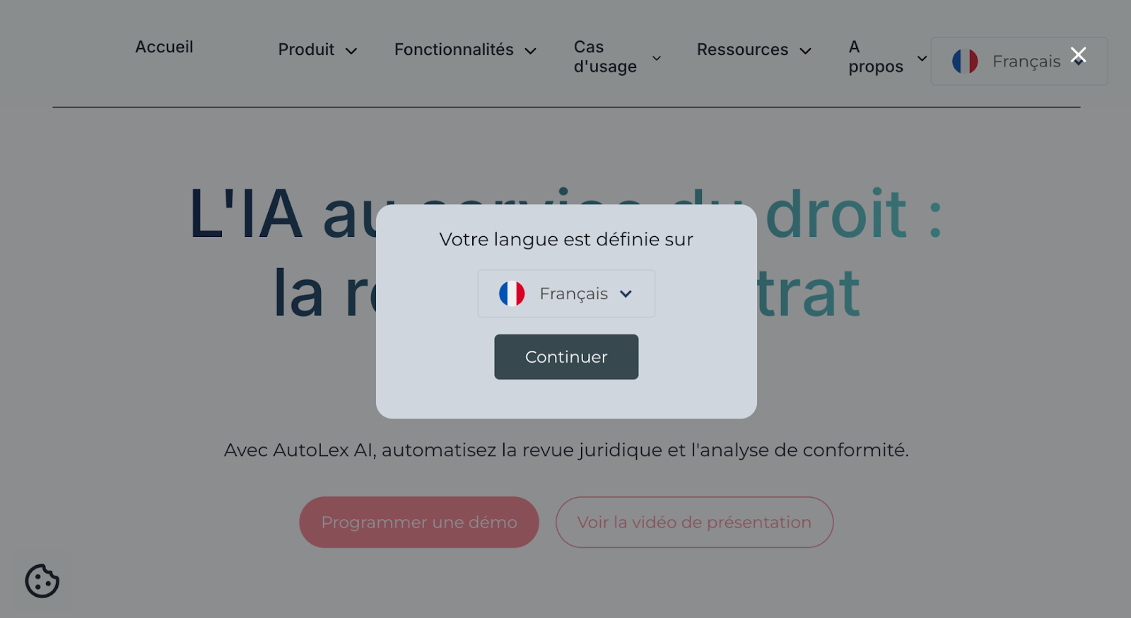
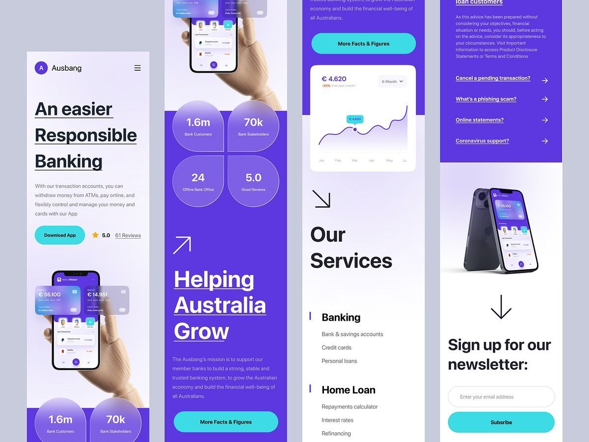
If a company’s objective is to expand internationally, the design goal could focus on multilingual support and localized content. This makes the website accessible to a wider audience and helps users feel comfortable engaging with the brand.
For example, the website below uses a simple language selector to adapt content for French-speaking users. It’s a small design decision that directly supports a larger business objective: reaching new markets.
Key performance indicators (KPIs) like lead volume, sign-up rate, or regional traffic growth can then show whether the design is achieving those objectives.
This process works best when design teams collaborate with marketing, product, and leadership to make sure goals reflect both business priorities and user needs.
2. Optimize for conversions
Conversion goals are the actions you want users to take on your website, such as signing up for a newsletter, completing a purchase, or downloading a resource.
Design has a direct impact here. A user-friendly site with a clear layout guides people smoothly through the process, while a poor design creates friction that makes them drop off.
Some of the most effective tactics include:
-
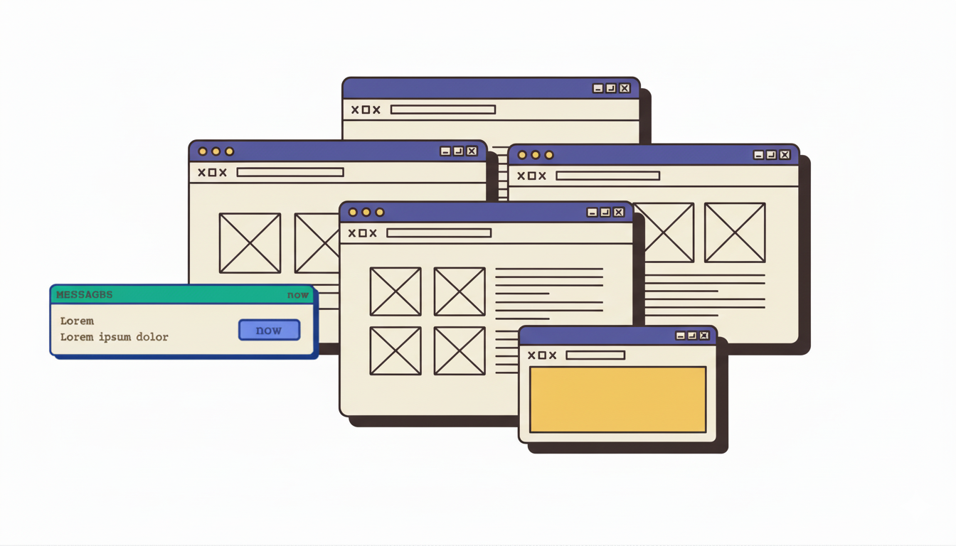
Placing call-to-action (CTA) buttons in visible, consistent spots: Users shouldn’t have to hunt for the next step. Placing CTAs above the fold and repeating them across the page makes it easier to act right away. Here are four examples where CTAs are placed:
-
Keeping forms short and easy to complete: Every extra field adds friction. Shorter forms reduce drop-offs and keep the focus on the primary objective, moving users smoothly to the next step.
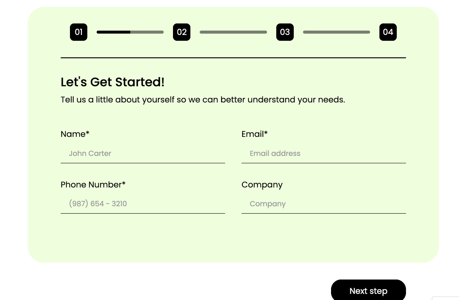
-
Simplifying checkout flows so users don’t abandon halfway: Complicated checkout processes are one of the biggest causes of cart abandonment. A clean layout, multiple payment options, and guest checkout turn the checkout into a user-friendly site experience that keeps people engaged.
A/B testing is important to refine these elements. It shows which design choices actually increase conversions, instead of relying on guesswork.
Crazy Egg highlights that removing navigation bars from landing pages can boost conversions by up to 100%, while long-form landing pages have increased conversions by as much as 220% in certain cases.
These examples show that conversion design isn’t about following trends, but it’s about testing and learning what actually works for your target audience.
3. Improve usability and accessibility
Usability is what makes a website feel easy to use. If visitors can quickly find what they’re looking for, add products to their cart, or complete a purchase without confusion, they’re more likely to stick around.
A site that feels “simple” on the surface often has a lot of thoughtful design behind it.
Accessibility builds on this idea. It ensures that everyone (including users with disabilities) can have the same smooth experience. That means things like:
Using proper color contrast so text is easy to read: Low contrast makes reading hard, especially for people with visual impairments. Clear contrast between text and background ensures content is readable for everyone, even in bright light or on small screens.
Here’s an example:
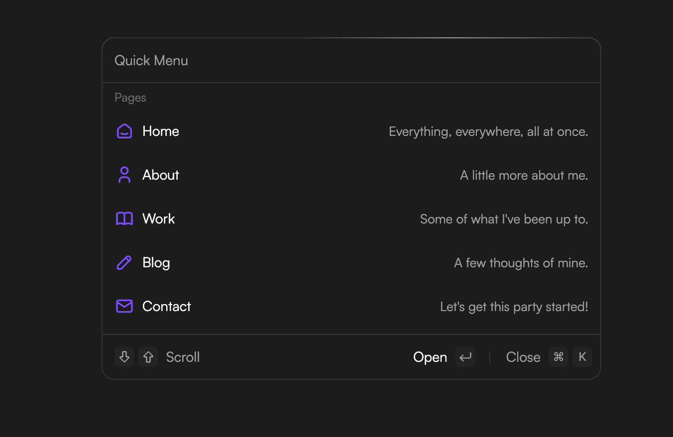
Making sure the site works with just a keyboard: Not all users rely on a mouse. Some people navigate entirely with a keyboard or an assistive device. That means a website should have a clear order when you press the Tab key, and visible focus states so you always know where you are on the page.
Here’s an example when pressing Cmd + K opens a quick menu, and you can move through each option (Home, About, Work, Blog, Contact) using only the keyboard.
This makes the site fully usable without a mouse and shows good website accessibility in practice.
Ensuring content is compatible with screen readers: Screen readers turn on-screen content into speech. For them to work, websites need structured headings, descriptive alt text for images, and clear labels for forms. This makes the experience seamless instead of confusing.
These aren’t just nice-to-haves. Research shows that retailers who focused on accessible websites saw sales increase by up to 30% compared to competitor websites that didn’t.
Another study found that improvements in usability and mobile optimization directly boosted customer satisfaction, which then led to higher conversion rates.
For teams planning a website redesign project, the Web Content Accessibility Guidelines (WCAG) provide a solid framework.
They break down exactly how to design in a way that’s both usable and inclusive—helping websites welcome every visitor, not just some.
4. Strengthen brand identity
A strong brand identity starts with design choices that reflect a company’s personality. Colors, fonts, and imagery all work together to send a message about what the brand stands for.
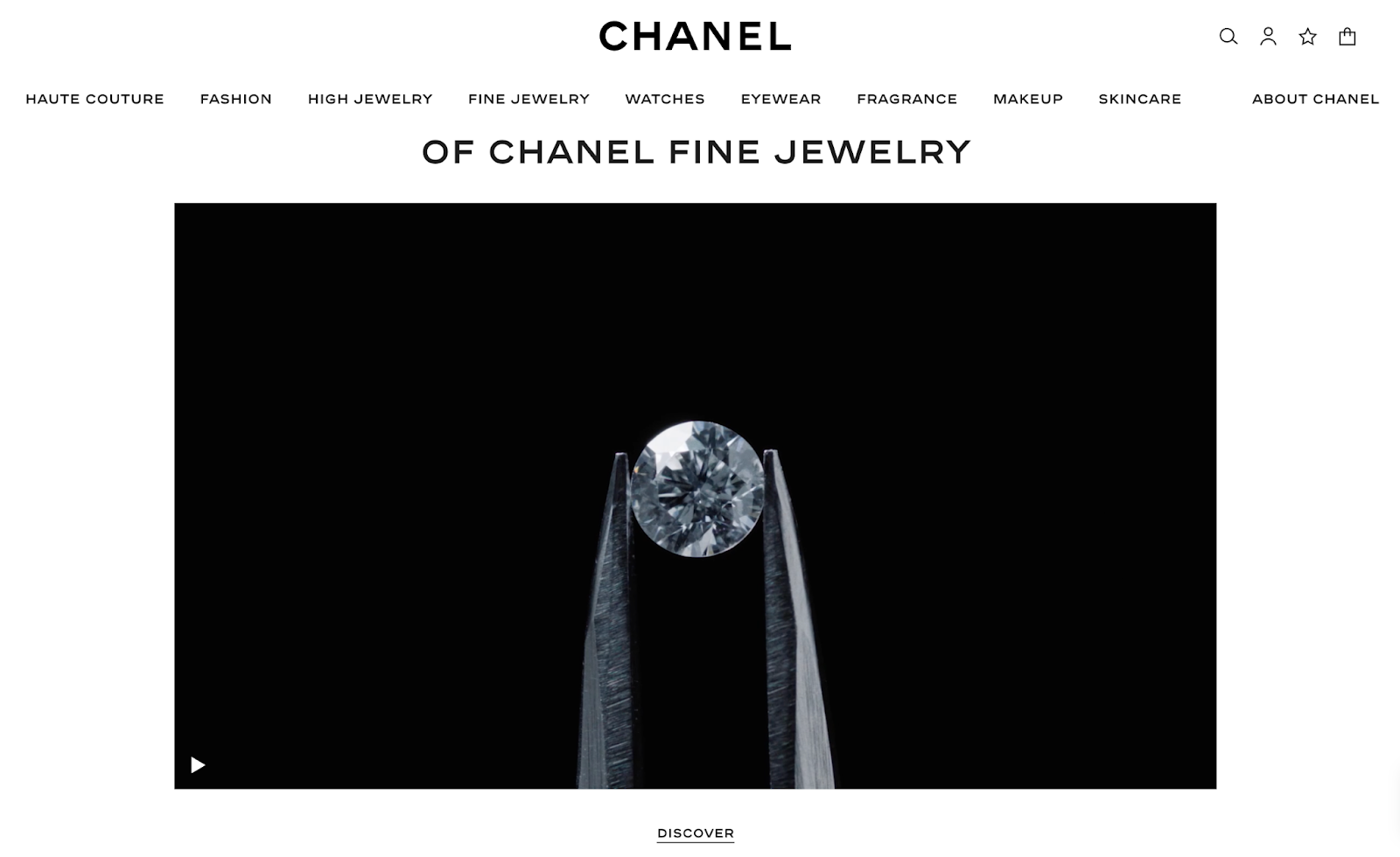
For example, luxury brands lean on minimalist layouts, muted colors, and high-quality photography to convey sophistication.
On Chanel’s website, the clean black-and-white design and elegant visuals highlight exclusivity and timelessness.
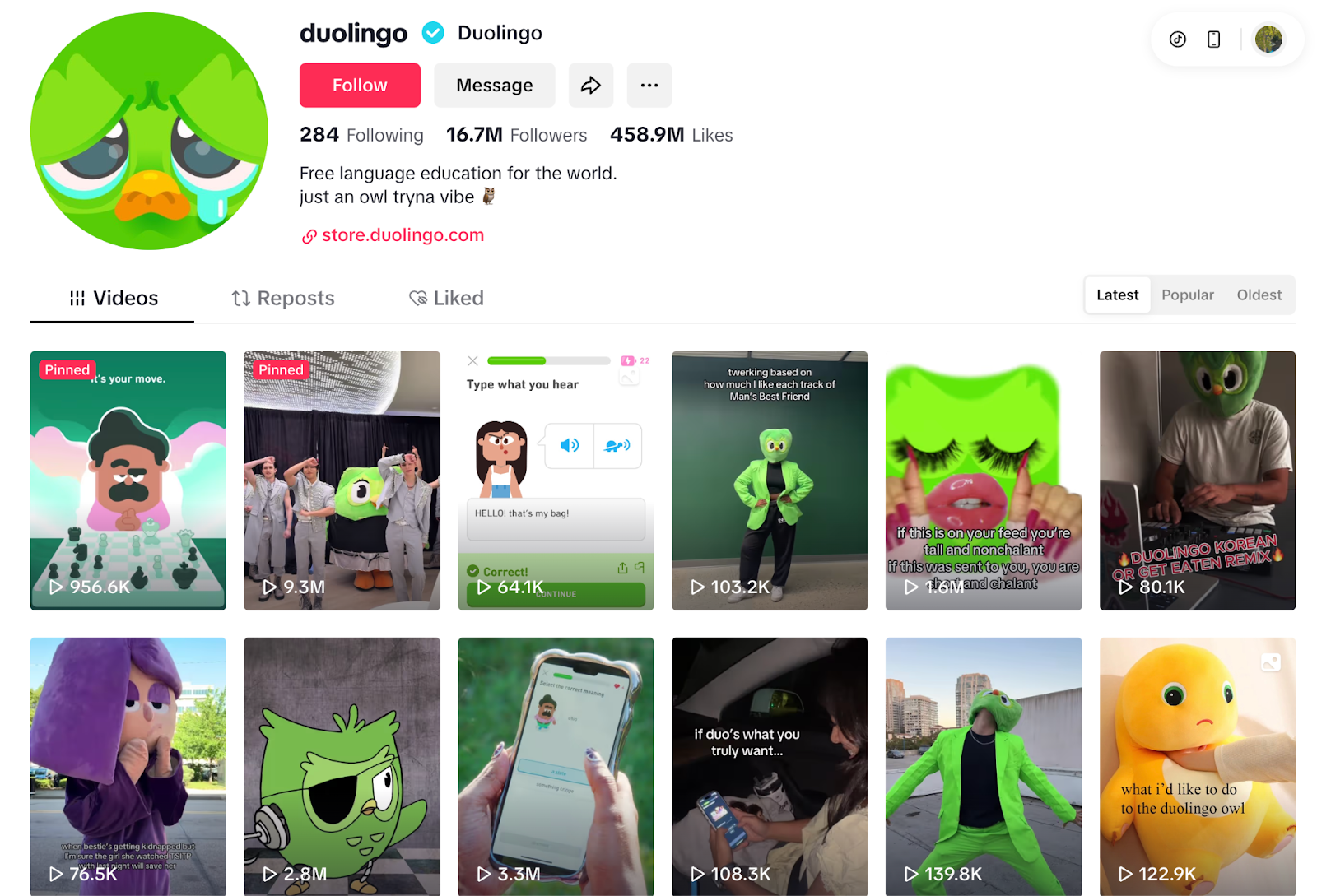
On the other hand, playful brands go in the opposite direction. Duolingo is a perfect example. Their use of bright neon green, bold typefaces, and a quirky mascot creates a fun and approachable feel.
Even their TikTok presence mirrors this personality, full of humor, memes, and exaggerated visuals.
This consistency makes the brand instantly recognizable and helps it engage users across different platforms.
Consistency is key. When a brand carries the same visual and tonal style across its website, app, and social channels, people quickly learn to recognize and trust it.
Over time, that familiarity drives stronger recall, loyalty, and even a competitive advantage over other brands. A strong brand can also act as a links magnet attracting high quality links, helping you show up in search results.
5. Build trust and credibility
Design plays a powerful role in building trust and credibility, since it often shapes a visitor’s very first impression of a brand.
A clean, professional layout signals reliability, while cluttered or outdated visuals can quickly raise doubts.
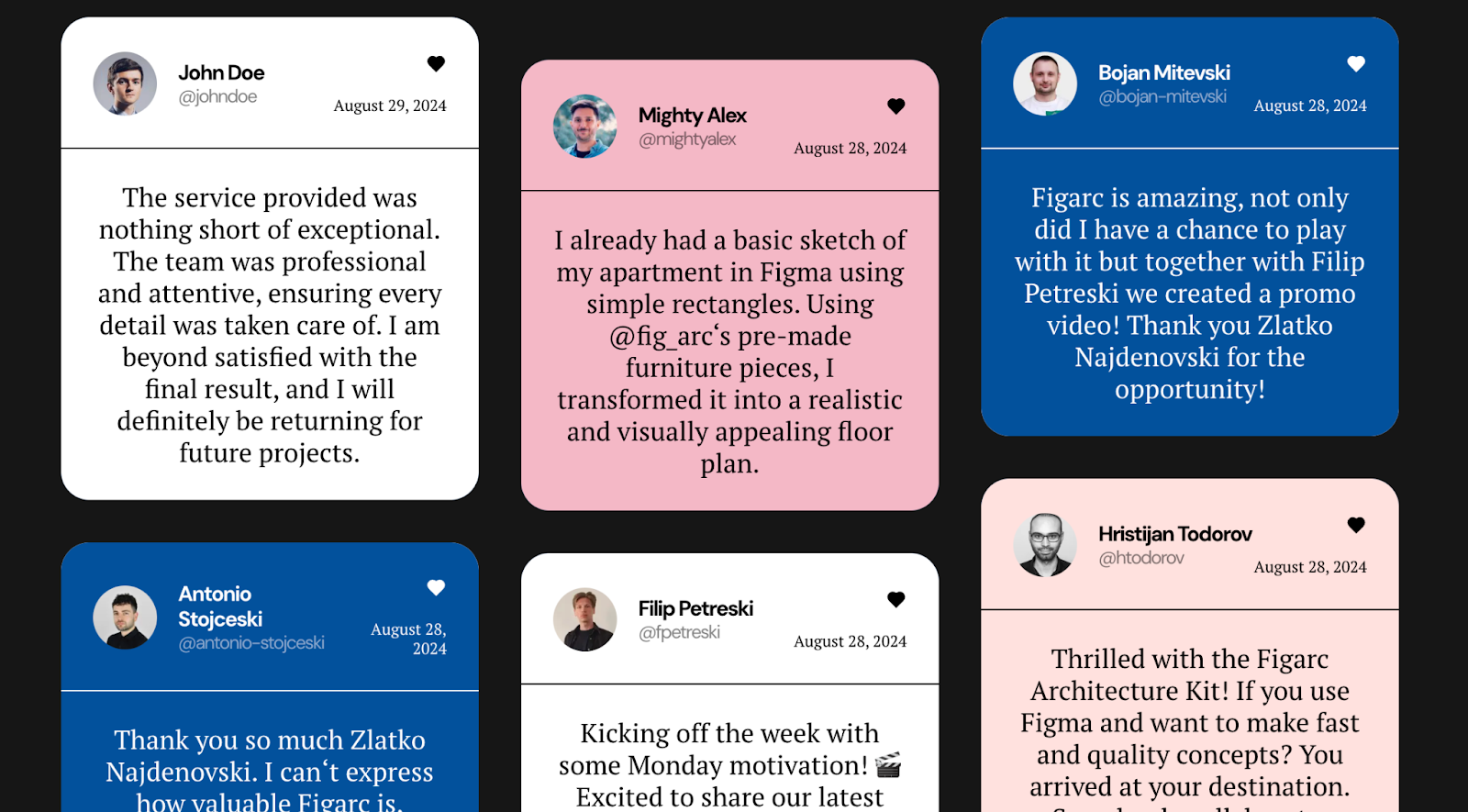
Trust-building elements like customer testimonials, recognizable security badges, and clear return or privacy policies give users the reassurance that they’re making safe choices.
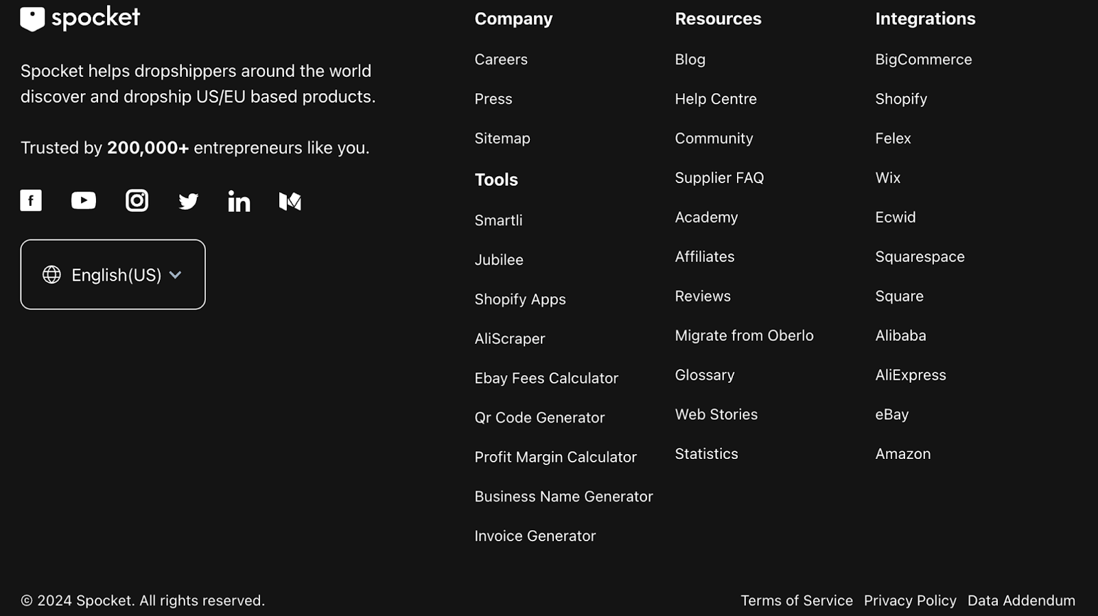
Consistency across pages (using the same style, colors, and structure) also reinforces confidence by showing attention to detail and stability.
For example, here’s how testimonials can be displayed on a business website to highlight real customer experiences:
And here’s a footer example that makes policies and trust signals easy to spot, giving users extra peace of mind before they buy:
When a website feels polished and transparent from the first click, users are more likely to stay, explore, and eventually convert.
Over time, these design choices don’t just support credibility in the moment.
They create a lasting sense of professionalism that strengthens the brand’s reputation, improves visibility in search engine results, and encourages repeat interactions.
6. Enhance mobile responsiveness
Most people browse the web on their phones, so a site that only looks good on desktop is no longer enough.
A responsive design makes sure your website automatically adjusts to any screen size (big or small) without losing usability.
For example, a page that shows three columns on desktop can turn into a single scrollable column on mobile. This way, users don’t have to pinch, zoom, or struggle to find information.
Here’s an example of how a layout adapts smoothly on mobile:
Mobile responsiveness also helps with visibility. Google ranks mobile-friendly websites higher in search engine results, so a site that isn’t optimized risks losing both visitors and web traffic.
The best approach is to test your design on different devices and browsers. This ensures every visitor (whether on a laptop, phone, or tablet) gets the same smooth experience.
7. Support content strategy
Design and content strategy work hand in hand—without the right design, even the best content can go unnoticed. A good layout helps readers follow the story, focus on the key points, and take action where it matters most.
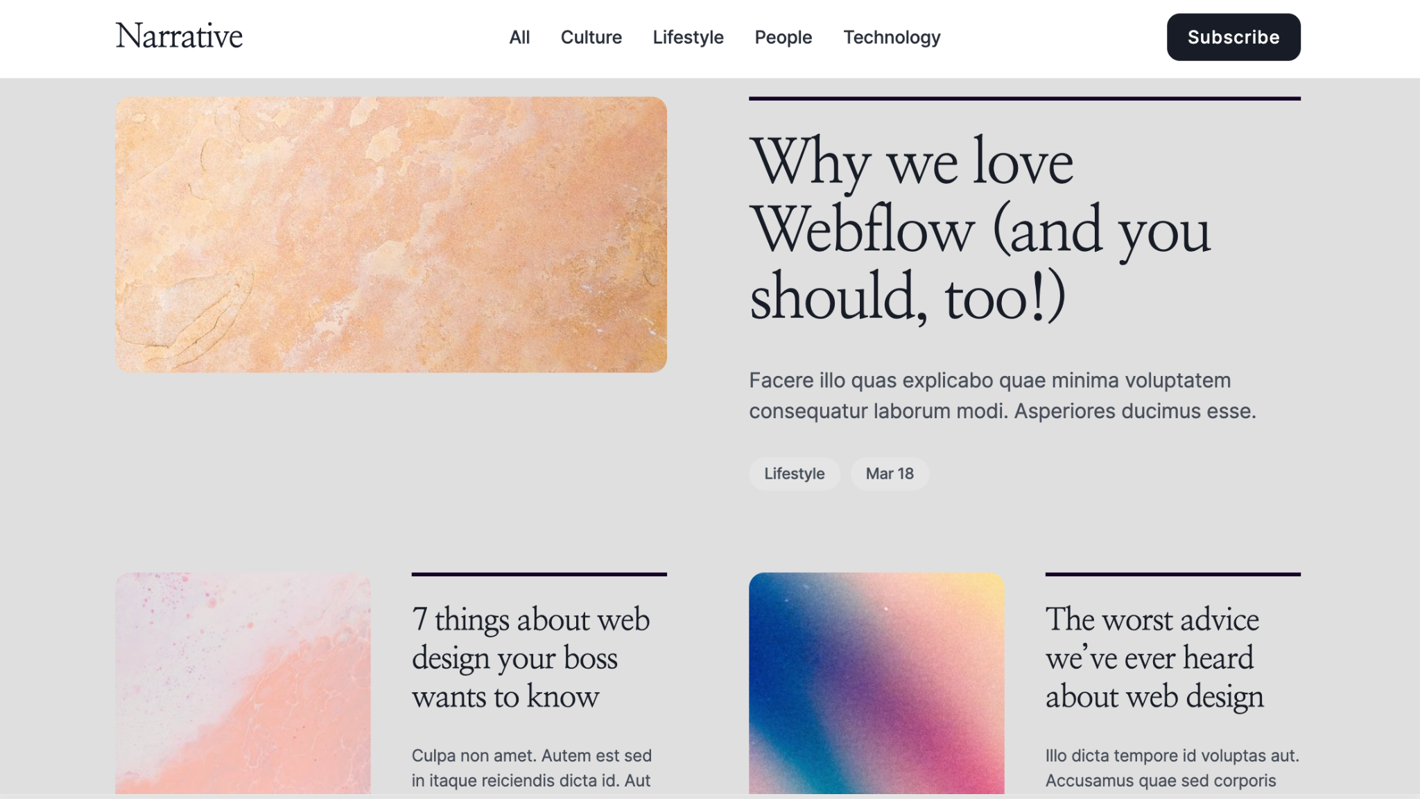
Take blog posts, for example. Long-form articles are easier to digest when the design uses clear headings, plenty of white space, and strong visuals to break up the text.
This way, readers can quickly scan, pick out the sections they care about, and stay engaged rather than dropping off.
Notice how large feature images draw attention to the main story, while secondary articles are neatly organized below.
The typography is clean, spacing is generous, and category tags help readers explore related topics, all small design choices that make the content more inviting.
Now compare that with a product page. Here, design needs to support quick decisions by combining images, descriptions, and reviews in a clear hierarchy.
The visuals capture attention, while the copy and star ratings provide credibility right away.
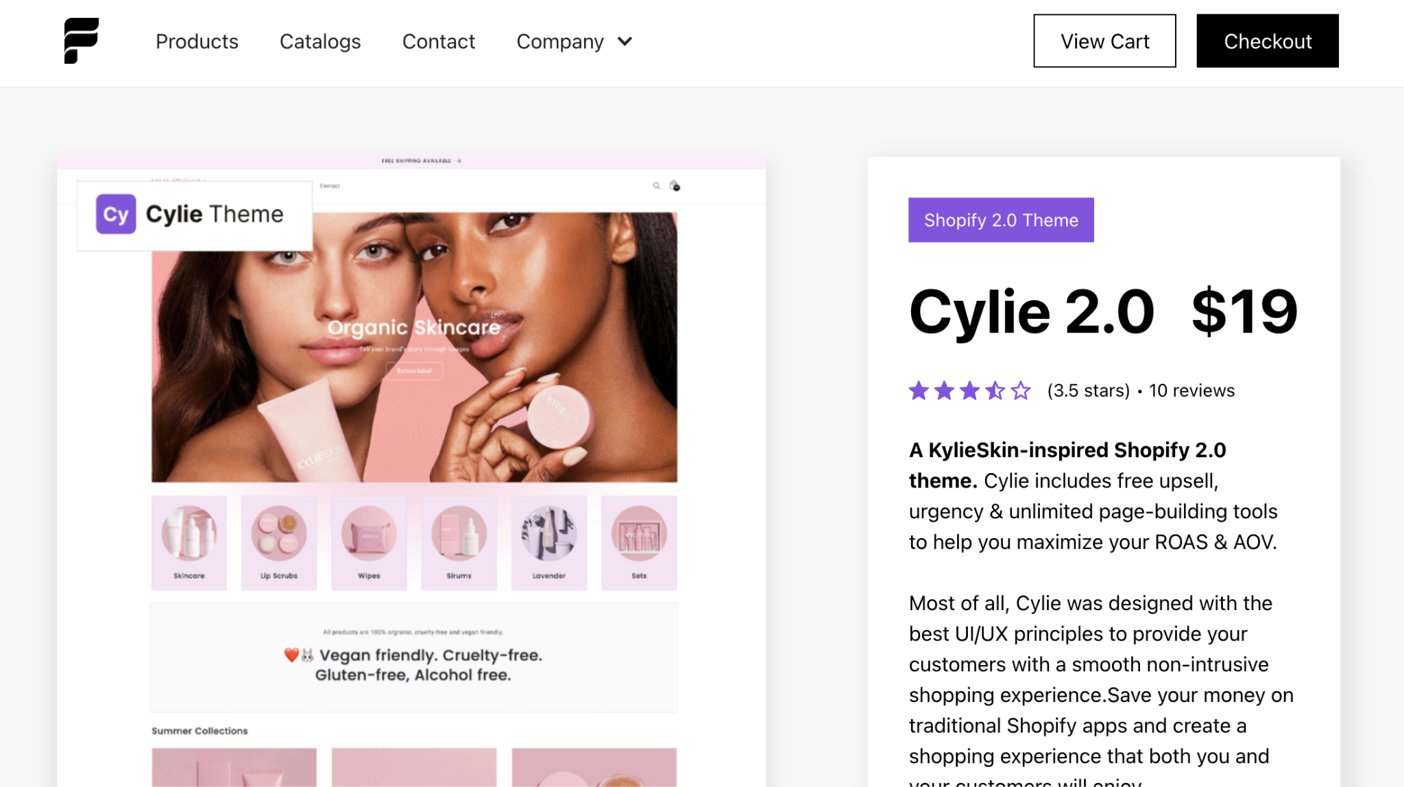
This design places product photos front and center, with supporting text and reviews nearby. Trust badges and a clear pricing guide users toward checkout without distraction.
It’s a design built to back up the content, turning information into action.
Even micro elements matter: button text, form labels, or tooltips may be short, but they give clarity at crucial moments.
Together, these design choices ensure content does its job, whether that’s informing, persuading, or converting.
For any website redesign project, aligning design with content marketing goals is one of the smartest ways to engage your audience and support broader marketing strategies.
8. Measure performance with data and feedback
Measuring performance with data and feedback is how you know if your design goals are actually working.
Analytics tools like Google Analytics track metrics such as bounce rate, conversion rate, and time on page to reveal patterns in user behavior.
For example, a dashboard like the one below shows sales performance, user engagement, and product popularity at a glance.
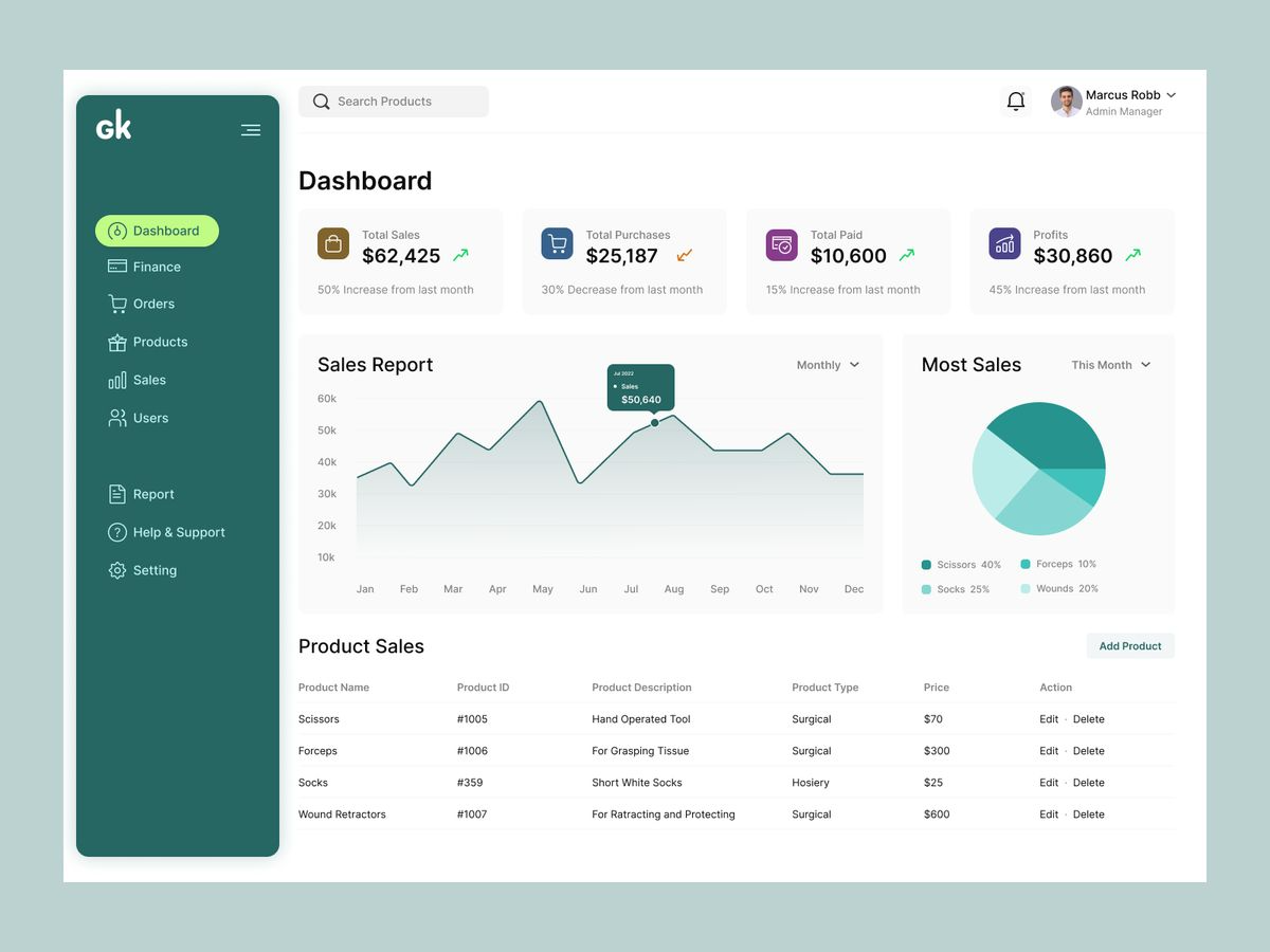
Teams can quickly spot issues (like a dip in purchases) and tie them back to design decisions.
But numbers alone don’t tell the full story. That’s where A/B testing and user feedback come in. By comparing two design variations, you can see which one performs better in practice.
Here’s an example: in the test below, Variation A led to a 23% conversion rate, while Variation B only reached 11%.
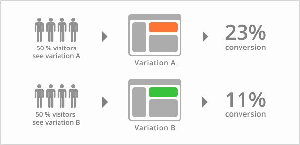
Pairing results like this with usability tests or customer interviews helps explain why one version worked better than the other.
When teams use both analytics and feedback, they can make steady, informed improvements. If your team is predominantly focussed on design, and lacks analytical skills, consider outsourcing this task.
But ensure that you hire an industry specific team or person. So for example, hire a healthcare UX agency if your website is in the health niche.
Over time, this cycle of testing and refining ensures that design choices align with real user needs, leading to stronger results and better user experiences.
Key takeaways
-
Set smart website goals that align with your business objectives—whether it’s lead generation, boosting online sales, or attracting more traffic from search engines.
-
A well-designed website with a clear visual hierarchy helps site visitors navigate easily, meet user expectations, and convert into potential customers.
-
Prioritizing usability and website accessibility ensures a user-friendly interface across mobile devices and desktops, engaging a broader audience and improving user satisfaction.
-
Strong brand elements and trust signals (like testimonials, clear policies, and consistent design) effectively communicate your values, build credibility, and increase brand awareness.
-
Responsive web design supports both user preferences and marketing objectives, while also improving search engine rankings and driving long-term organic traffic.
-
Tracking a website’s performance with tools like Google Analytics provides valuable insights into conversion rates, user behavior, and content effectiveness—helping teams refine their website strategy and achieve online success.