10 bad UX examples: Design fails you can learn from

Horea Matei
Created on Mar 1, 2026
We've all encountered bad user experiences: the washing machine with undecipherable icons, or a car infotainment system that has you take your eyes off the road and browse through endless sub-menus just to turn on the climate control.
These seem like annoyances we just have to deal with, but they cost companies millions. Bad UX damages brand reputation and drives users towards competitors. That's especially the case for apps and websites. According to TopTotal, 88% of users are less likely to return to a website after a bad experience.
Many major companies have notorious UX design fails that frustrate users to the point of site abandonment. That said, I'll walk you through real-life bad UX examples, where they went wrong, and how to fix them.
1. Workday's job application nightmare
Workday demonstrates how a poorly designed user experience can tank a company's reputation. The platform's job application process, one of its core features, is unnecessarily complicated.
Users have to retype all their education and work experience-related details for each single job application — even if those details are already available in their uploaded CVs.
This translates to a lot of time spent on tasks that would otherwise take a few minutes to complete.
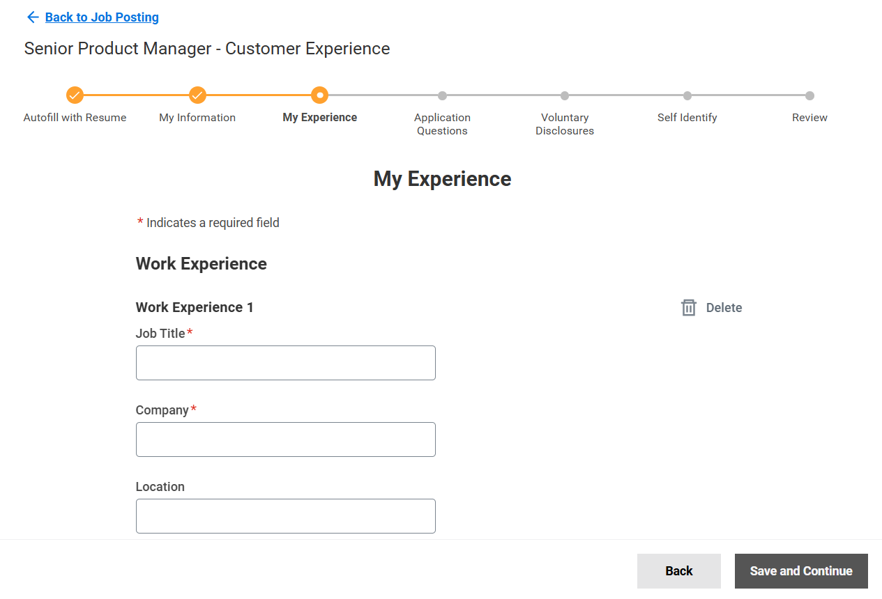
Workday has an Autofill with Resume feature, but it doesn't work as intended: resume info is often put in the wrong form fields or is not included at all, dates get mixed up, and so on. Users have to go through and edit all their information anyway, which makes the autofill option practically redundant.
The result? A 1.1 rating on TrustPilot and loads of user backlash across community forums and social networks. Here's a LinkedIn post snippet talking about Workday, for example:
"I've stopped applying for jobs. Jobs that require me to apply with Workday. I can't do it anymore. If you want your job application to be as high friction and as thankless as possible just use Workday." - Matthew Spence, Vice President of Software Development at CLICS
These UX design fails are obviously bad for business.
The fix: Just cut out form fields that require information already present in the user's CVs, and keep data fields strictly requested by the employer.
Glassdoor does a good job at it.
The application process takes a few simple steps:
-
Complete contact and location information
-
Upload resume
-
Answer questions requested by the employer
-
Review application
Glassdoor completely bypasses Workday's most frustrating part: re-adding/editing info already present in the CV. This approach is much quicker and more intuitive.
UX lessons to learn from Workday:
-
Usability testing on closed user groups before publicly launching particular features is mandatory. It helps you spot and fix any UX issues and prevents excessive user backlash.
-
Never asks users for more information than necessary. You'll create needless friction that breaks user flow and causes frustration otherwise.
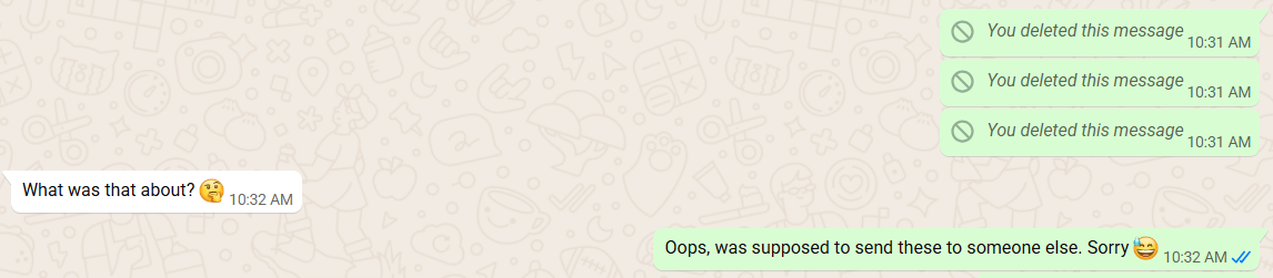
2. WhatsApp's "delete for everyone" that doesn't delete
WhatsApp shows how small UX copy mistakes can mislead users into having false expectations around specific features.
Case in point, the "delete for everyone" copy should be pretty self-explanatory: it permanently deletes messages if users accidentally send them to the wrong people.
But that's not the case. WhatsApp instead replaces the text with a "This message was deleted" prompt in the chat. This can get users into slightly awkward situations, where the recipient is left thinking about what was in the said message, and potentially prompting the user to explain himself.
These minor UX copy mistakes are especially aggravating when users are led to perform actions other than intended, like having a "View more" CTA button download a document, rather than opening up a new page.
The fix: Rewrite the UX copy to be as clear as possible. For instance, "Mark message as deleted" better reflects WhatsApp's feature — users will know that the message won't disappear from the chat, so they'll have accurate expectations.
Of course, another solution would be to rework the feature to actually unsend messages, as Telegram does. But rephrasing the copy is a much simpler, less expensive fix in WhatsApp's particular case.
Lessons to learn from WhatsApp:
-
UX copy must be crystal-clear and accurately describe each button's or feature's purpose.
-
Perform UX copy audits to ensure all texts accurately describe your layout's features.
3. Microsoft Teams' cluttered interface problem
Microsoft Teams has seen some major UX improvements over the years, but it still struggles with a busy interface.
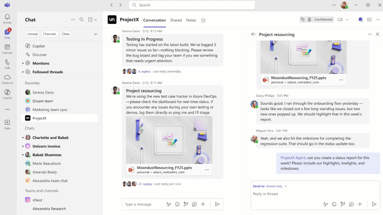
There's way too much going on: the main and secondary navigation sidebars on the left, the horizontal menu on top, the sub-chat on the left — it's cognitive overload.
That's especially the case for larger organizations using the platform across multiple departments or projects.
The overwhelming interface can also confuse users during the onboarding process, which hinders product adoption and may drive them to other team collaboration platforms.
You can resize or collapse the secondary sidebar, but MS Teams does little to let you know about it. The only indicator is when your cursor changes into a double-sided arrow once you hover your mouse over the border.
Plus, despite the latest positive changes in Team's UI, some updates caused accessibility issues. For example, the platform automatically truncates URLs shared in chats for aesthetic purposes.
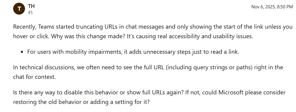
Seeing the link in full now requires users to either hover or click on the corresponding message, which can cause problems for users with mobility impairments.
The fix: This one is a bit tricky because MS Teams is so rich in features that it's hard to pack it all into a seamless browsing experience. It should first make it more obvious that you can collapse the secondary navigation menu through a permanent toggle icon.
I also personally think that hiding particular features (like the secondary chat) under smaller chatbot-like pop-ups would add some extra breathing room.
UX lessons to learn for Microsoft Teams:
-
List all your planned key features first and order them based on importance, then build the layout around that list. This helps a more structured, seamless design process. Doing the opposite makes it much harder to pinpoint which features should make it to the final layout, and which shouldn't, potentially causing a cluttered interface and poor usability.
-
Try to use white-space and visual hierarchy as much as possible to give your layout some breathing room and ensure an intuitive interface.
-
If you're building large scale business products, follow enterprise UX design practices, not consumer UX.
4. Ryanair's hidden fees and dark pattern
Ryanair is a classic case of dark UX patterns — a set of design choices that push customers to take actions that may not be in their best interests, like spending more money than intended.
For example, here's what happens if I try to book a ticket with standard hand luggage:
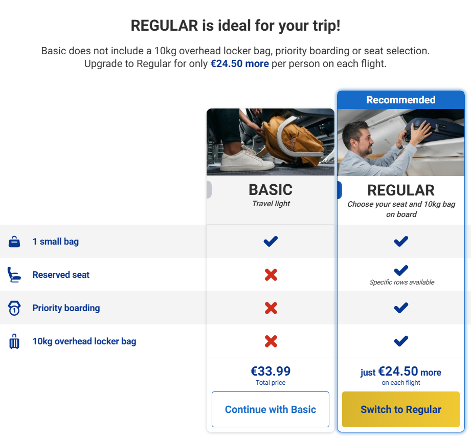
Ryanair triggers a full-page pop-up that tries to persuade me to purchase the Regular luggage plan instead, which costs almost as much as the ticket itself. It's intrusive and obviously not a customer-first approach.
Notice how the CTA button for the Regular plan contrasts with the background to attract extra attention. The button's design can misdirect users into accidentally purchasing the add-on.
Even if I decide to continue with the Basic plan, Ryanair remains aggressive about its upsells later in the checkout process.
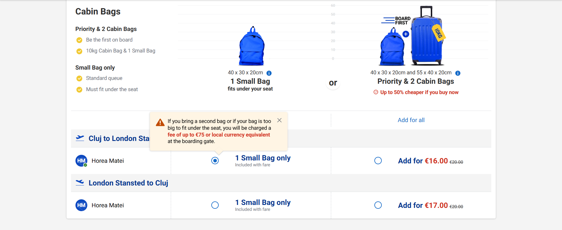
The copy under the red tooltip basically tries to intimidate me into purchasing two extra cabin bags. I may be charged with a hefty fee at the boarding gate otherwise. Plus, the cabin bag add-on comes with priority boarding by default — there's no option to pick either one or the other.
The same idea applies to travel insurance:
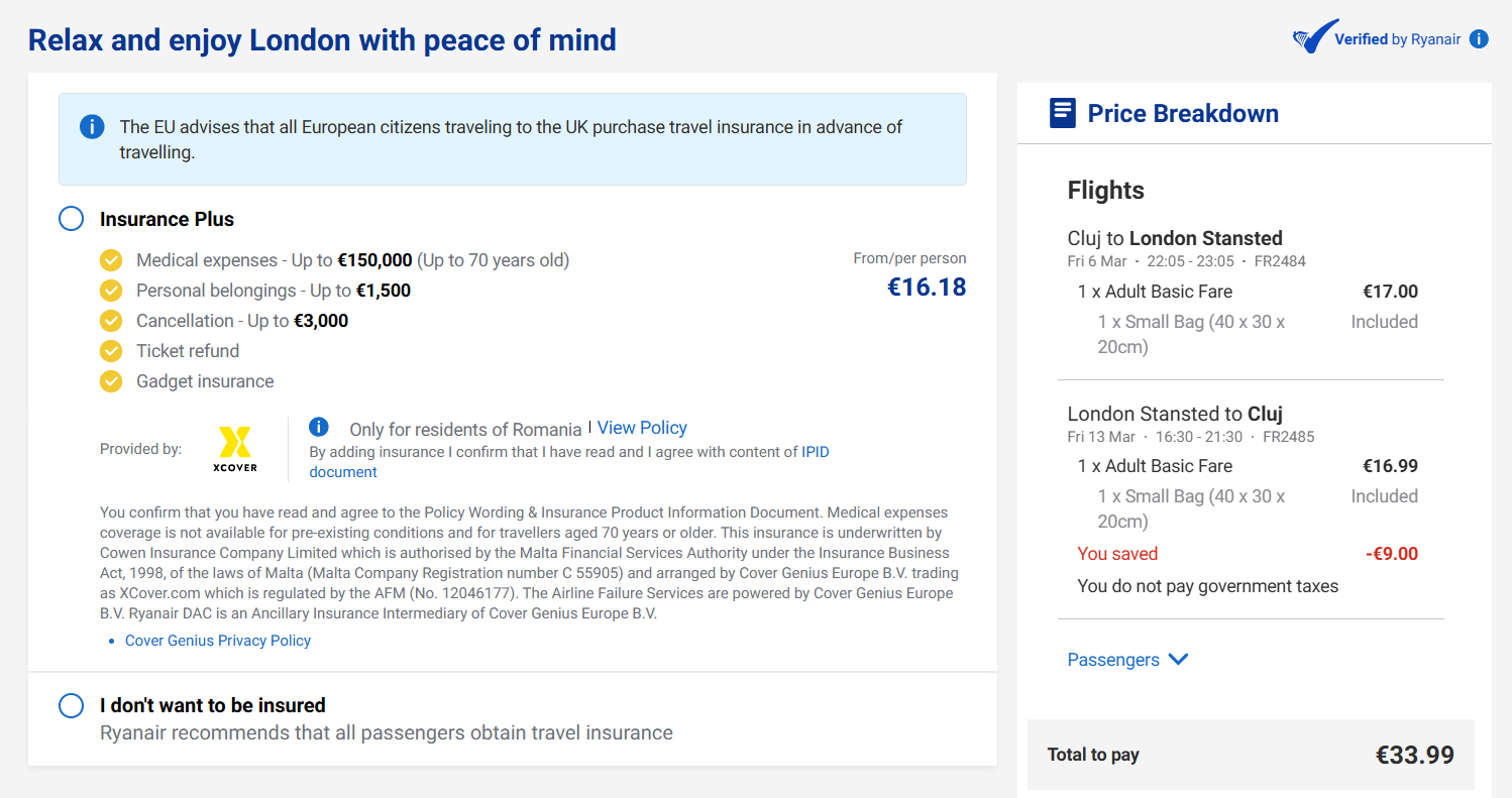
This obviously makes for a bad image — users don't want to interact with a company that feels like it constantly tries to squeeze its customers for money.
The fix: RyanAir should ditch dark UX patterns. Removing the forced pop-ups, the misleading button coloring, and the fear-inducing copy would be enough make the browsing experience more enjoyable.
Lessons to learn from RyanAir:
-
Dark UX patterns make your website come across as shady. Always be up-front and honest about extra costs and add-ons. Even if still potentially inconvenient, customers will appreciate it.
5. Apple's storage warning with no clear next step
Error messages and warnings must always be accompanied by clear, actionable instructions that guide users in fixing their problems. Otherwise, users may get stuck not knowing how to resolve their issues, which causes a lot of frustration.
Apple's storage warning is a classic how-not-to example:
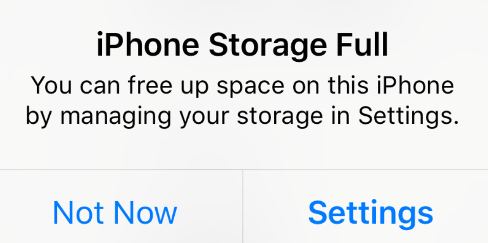
Although the error message still provides some instructions by telling users to head over to settings, it's not enough.
It doesn't tell users what file types occupy the most amount of storage, or how much space they need to free up to resolve the issues. Users are left to figure out the problems for themselves.
This UX mishap is especially problematic when users want to take a photo to capture an important moment in their lives. The lack of clear instructions gets users confused, causes them to miss out on that particular moment, and can ruin that moment overall.
Plus, the Not Now button doesn't dismiss the notification — it will just keep running in the background, pestering you until you resolve the problem.
The fix: Rewrite the UX copy for extra clarity. Some examples include offering potential tips to maximize storage, pinpointing file types that occupy the most space, or highlighting the amount of memory they need to free up to make the issue go away.
The option to quickly remove duplicate images to free up space would've also been a nice touch.
UX lessons to learn from Apple:
-
Again, UX copy can make or break the experience. Make sure it clearly instructs users on what to do next — CTA copy included.
6. Netflix autoplay nobody asked for
Netflix automatically plays trailers the moment you hover your mouse over the previews within your watch feed — at full volume, by default, and even right after you log into your account.
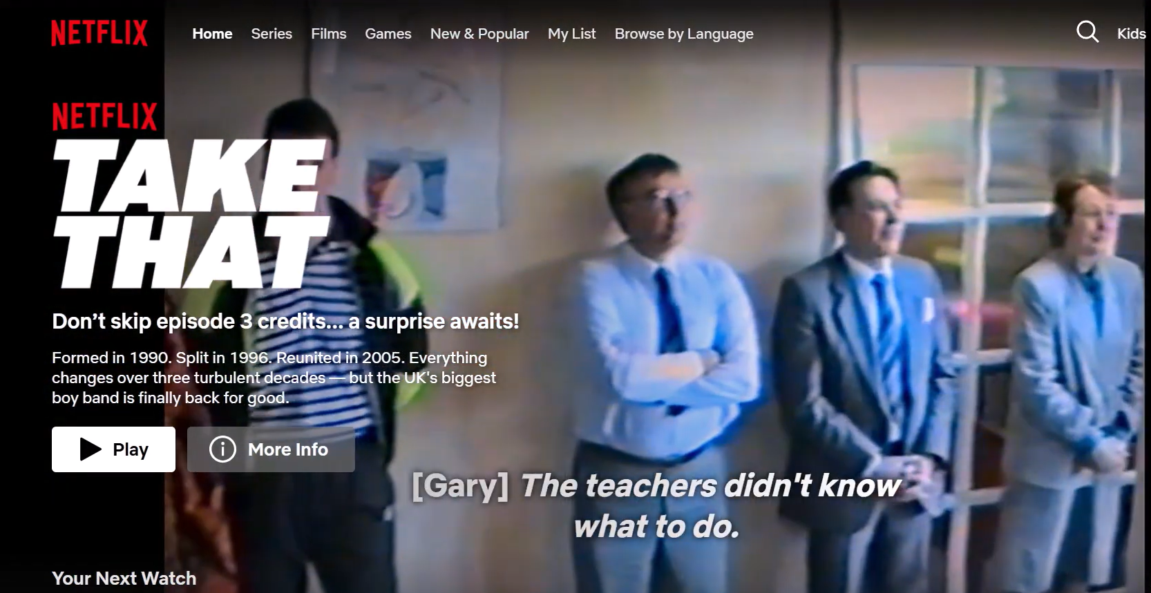
This makes the entire browsing experience feel like a minefield.
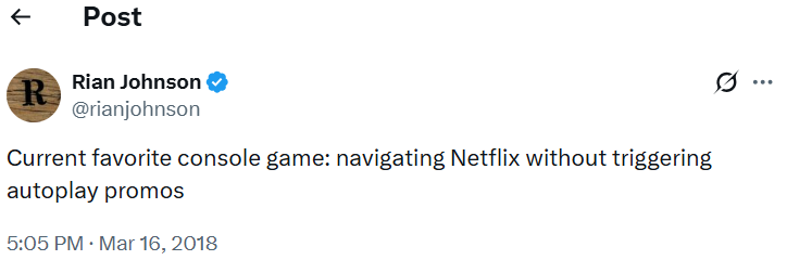
Users have to carefully watch their cursor movements to avoid triggering autoplays.
The idea behind this design choice is to inflate engagement metrics: autoplay triggers count as actual views. But in reality, these views have nothing to do with engagement. They're invasive and throw users off whenever they trigger.
This problem was even worse before the platform's 2020 update, when there was no option to turn off the Netflix autoplay feature whatsoever. Even now, previews autoplay by default, forcing users to go through the settings to turn them off.
The fix: Simply turn off the audio or remove the default autoplay feature by default, but still give users the option to activate it in the settings.
UX lessons to learn for Netflix:
-
Never use auto-play, especially with audio. It's invasive and drastically worsens the browsing experience.
-
Users must always have full control over how they interact with your layout — autoplay completely disregards this rule.
7. HuffPost's upside-down design
HuffPost underscores the importance of sticking to web design conventions — a set of practices users have grown accustomed to and expect when browsing new websites.
Some examples include:
-
The horizontal navigation menu in a site's header section with a search bar on the top-right
-
The clickable logo on the top-left that doubles as a homepage button
-
The hero section with aligned headlines, supporting copy, and CTAs
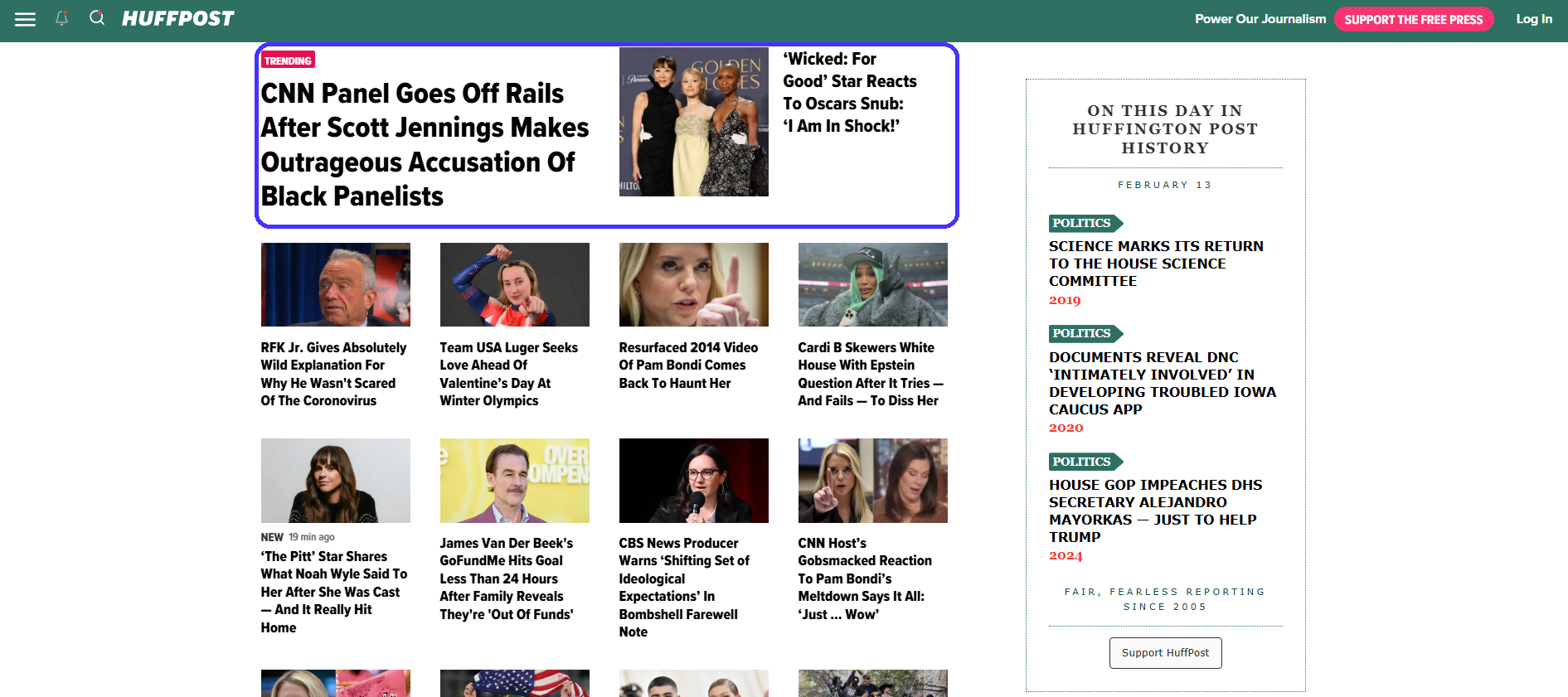
HuffPost's layout, however, is literally turned on its head:
The main navigation menu (which you would expect to see on top) is placed in the mid-section of the screen. Meanwhile, the header section is taken up by a distracting carousel.
This layout approach will throw many users off and potentially cause them to leave the website. I first thought the website's layout was broken when I first landed on their homepage, for example.
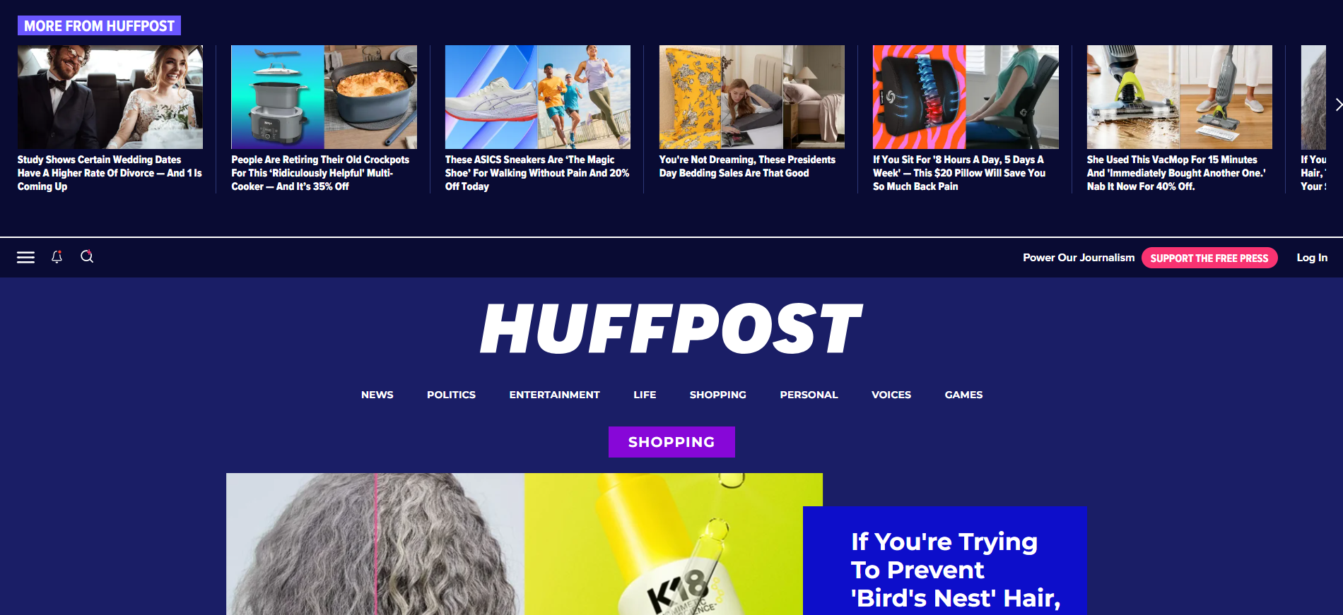
HuffPost's layout structure is also inconsistent across web pages. Here's how the shopping page's below-the-fold section looks like:
It's really well-done: the page alternates color schemes, grid layouts, and design element sizing to establish visual hierarchy, as well as make it easy for users to browse through large amounts of content.
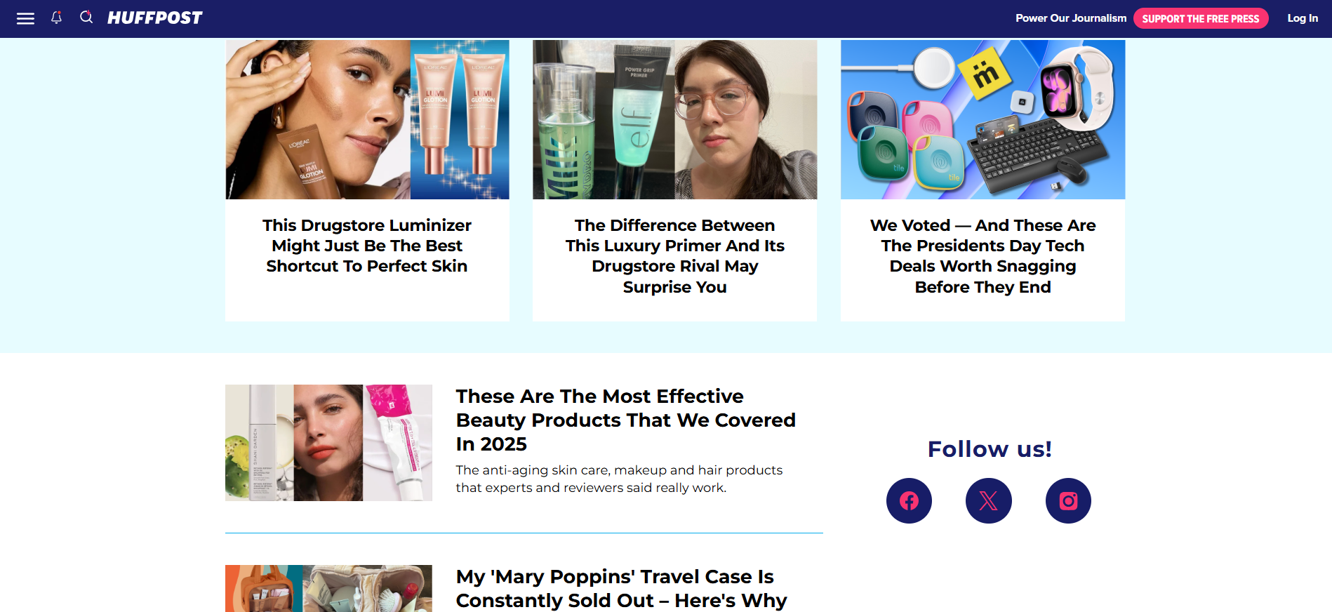
But here's a below-the-fold screenshot of HuffPost's homepage:
It's different and objectively worse. Visual hierarchy is all over the place — you don't know what headline corresponds to which image. The grid layout now includes way too many options, and the small texts and visuals cause issues for users with visual impairments.
Again, this inconsistency between layouts will confuse users as they browse from one page to the next.
The fix: The homepage needs a switch-up. The navigation bar must be placed in the actual header (as per design conventions), while the carousel should be positioned somewhere below the fold to give users extra content variety.
UX lessons to learn from HuffPost:
-
Take design conventions seriously. Creativity in design is always a good thing, but common attention hot-spots are definitely not places where you want to stand out by doing something different — you'll just confuse users.
-
Ensure your layout is consistent across all screens or pages to establish seamless user flows and easy browsability.
8. Zara's style-over-function website
Zara shows how not to implement the minimalist approach: the website's image-centric layout is aesthetically pleasing, but it ignores almost every other UX design rule in the book.
The homepage is particularly confusing:
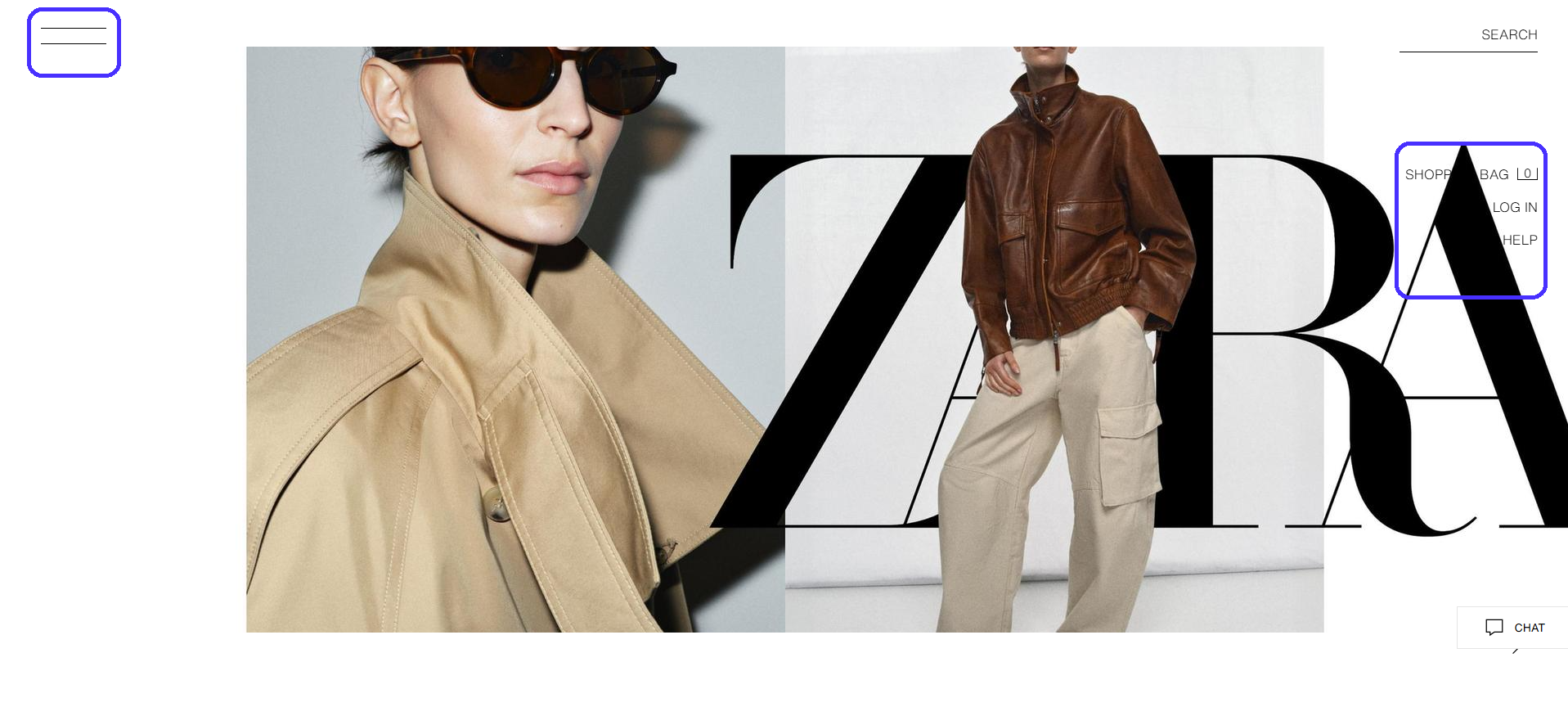
It's essentially an image slideshow. The homepage doesn't include any headings, supporting copy, or CTAs — it doesn't give first-time visitors any direction on what to do next.
Also, notice the navigation menu on the right side of the screen. Navigation links occasionally overlap with the visuals, making the copy unreadable.
Plus, the main navigation hides under the hamburger icon. It's a best practice to declutter the screen on mobiles, but a UX mistake on desktops.
Most users expect to see the standard horizontal navigation bar on desktops, so a hamburger icon will likely throw them off and leave them confused.
Since 37% of website visitors get annoyed by poor website navigation and design, Zara may lose out on significant traffic here.
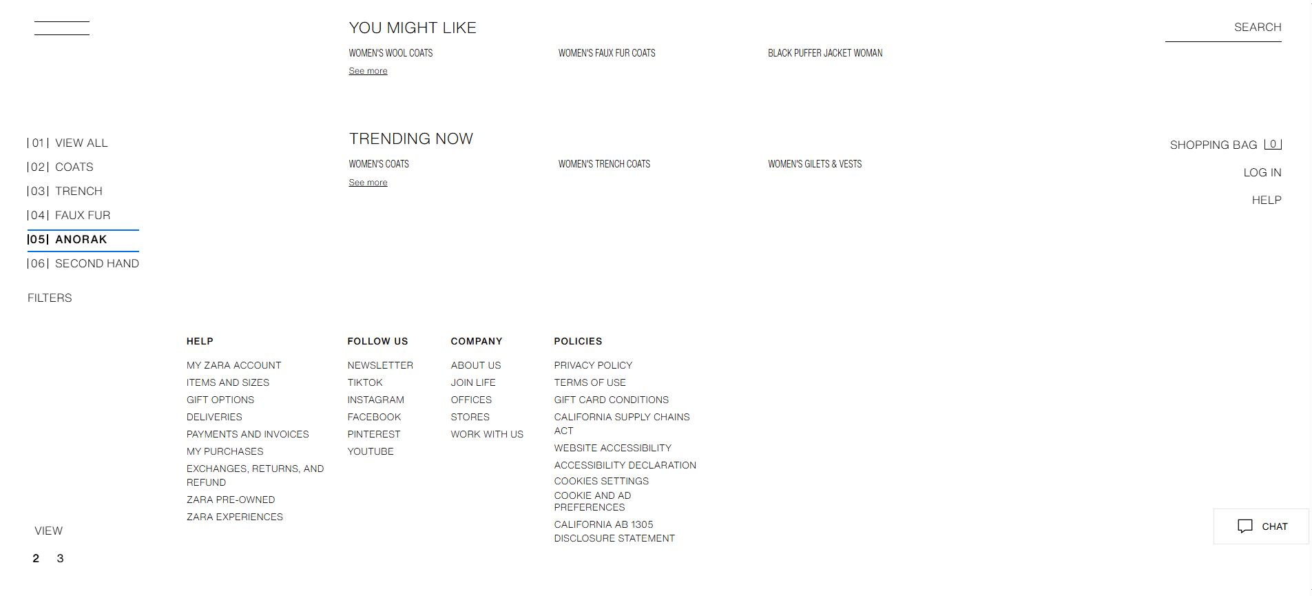
Things don't look any better below the fold either. Footer navigation links are too small and hard to read, even when zoomed in at 125%.
The fix: Zara could do with a UX design overhaul: it needs to find a balance between function and aesthetics. For example, Patagonia's minimalist approach is much more user-friendly, yet still aesthetically pleasing.
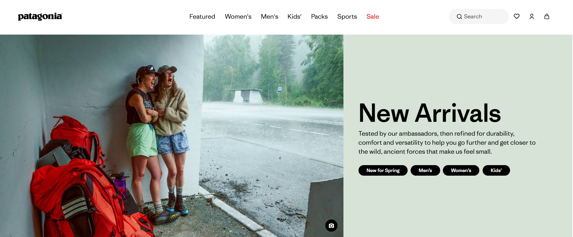
Here's what it gets right:
-
The horizontal navigation menu is easy to spot and super intuitive.
-
Hovering over a main navigation item triggers a secondary dropdown menu to help users further narrow down their search.
-
The hero section gives users a clear indication of what to do next — to check out the company's newest arrivals.
UX lessons to learn from Zara:
-
Focus on usability first, aesthetics later. This helps you create layouts that are both functional and attractive. Plus, it spares you the trouble of going through major overhauls further down the road.
-
Navigation should be easy to spot and crystal clear: you can't go wrong with the classic horizontal bar on desktops.
9. LinkedIn's notification overload
Notifications are great to keep users engaged with your platform, as long as they're relevant and not pestering. LinkedIn's notification volume is truly overwhelming.
Here's a quick snippet of all the notification types the platform sends by default:
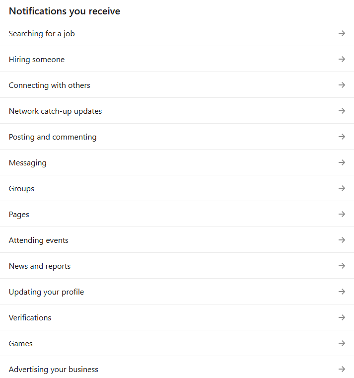
There are 14 notification categories with a few extra sub-categories for each. Plus, LinkedIn sends over updates via in-app, email, and push notifications for mobile users. It's a never-ending stream of multi-channel updates most users will find irrelevant anyway.
Even worse, LinkedIn makes it particularly hard to disable these notifications. You'll need to head over to your account settings and continuously jump between all multiple categories and sub-categories to select the notifications you want to receive.
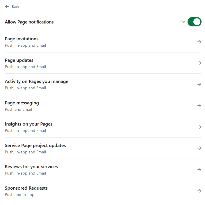
It takes around three clicks to a single notification type. Multiply that by all the other categories and sub-categories, and an otherwise simple task starts to feel like a chore.
The fix: LinkedIn should reduce the number of notification types it sends to users by default.
It should prioritize quality over quantity by sticking to info that's actually relevant to its audience, like messages, connection requests, job application updates, or content notifications for active posters.
The platform could also do with a rehash in the settings department. An idea would be to simply move the toggle on/off button right next to each main notification category — not hide it behind a separate screen.
UX lessons to learn from LinkedIn:
-
Perform extensive user research to understand what users would need the most from your app. Use the gathered details to structure your notifications appropriately.
-
User cross-channel notifications sparingly. It's best to send different notification types to each specific channel to prevent annoying users. For example, send over the most important update via push notifications, while secondary ones could be sent via email.
10. Amazon Prime Video's bait-and-switch browsing
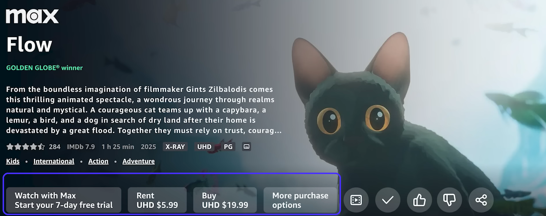
Amazon Prime Video's watch feed mixes content included with your existing Prime subscription with content you need to pay extra for — either via rentals or through extra subscriptions on Prime's partners.
The problem is, Prime doesn't distinguish free and paid content well enough.
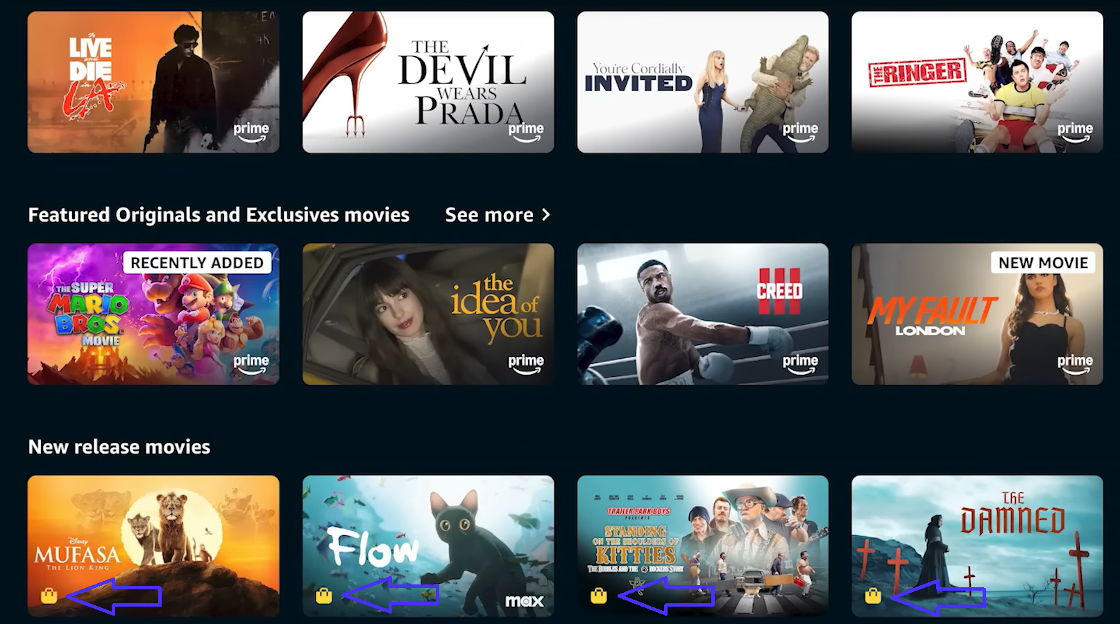
The small shopping bag icons are there, but they're small and easy to miss. This causes users to click on a show they think is free, only to realize they actually have to pay once they land on the product page — a huge buzzkill.
Prime's approach here is another case of dark UX patterns, just like with RyanAir. It's misleading and causes users to perform actions other than intended.
The same idea applies to Prime's review system.
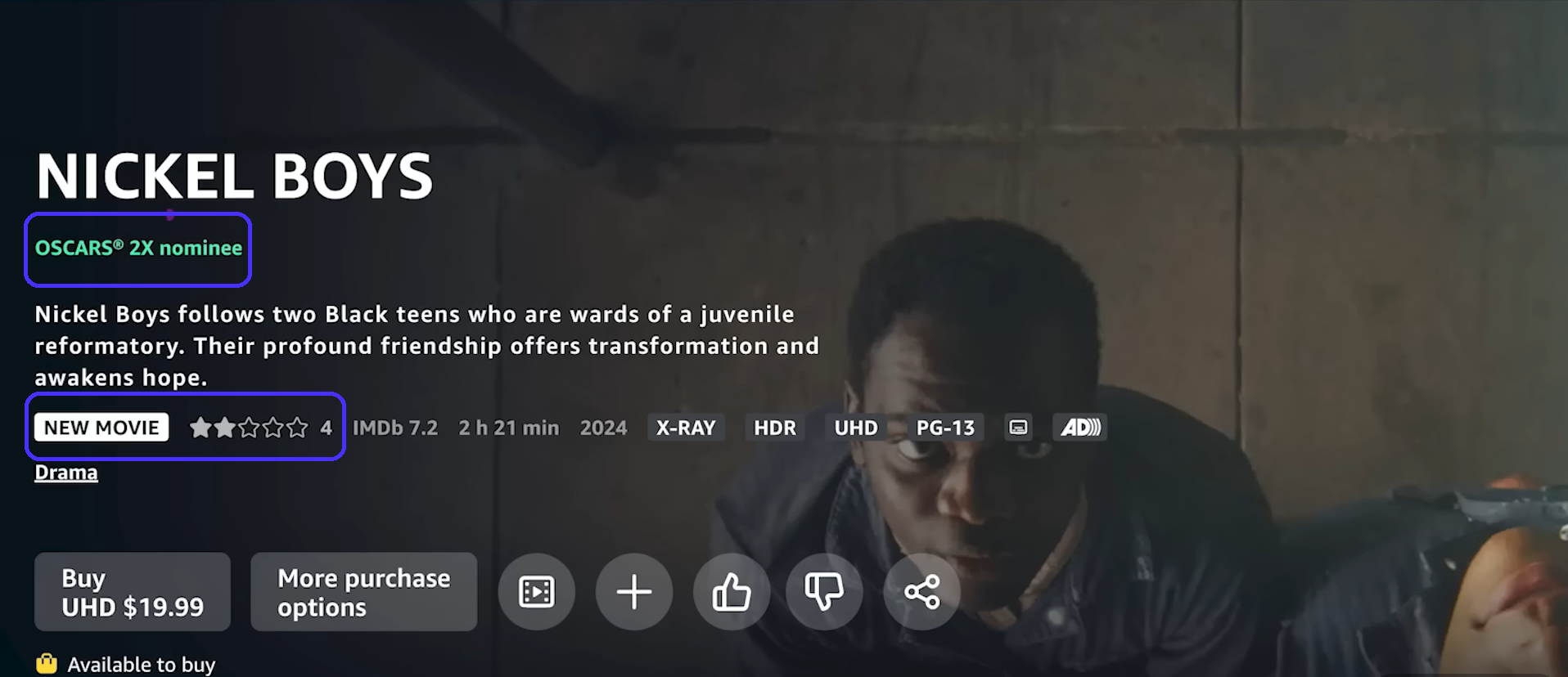
Despite scoring 92% on RottenTomatoes and a 6.9 on IMDb, Nickel Boys had a two-star rating on Prime when it originally released — that rating was based on only four reviews.
This can be especially problematic if the situation were reversed (like displaying a few five-star ratings for an objectively bad movie).
The fix: Prime should clearly distinguish between free and paid content through prominent labels or by creating completely separate content categories that users can access via the navigation menu.
Displaying start ratings only after review numbers exceed a specific threshold (e.g., 20) will also help users form a more accurate first impression for the movie in question.
UX lessons to learn from Amazon Prime Video:
-
Once again, never sacrifice transparency for cash grab-like conversions. This only erodes trust and will eventually hurt revenue in the long-run.
What we learned from bad UX design examples
Let's consolidate all the common UX mistakes shown above and see what you can take away from them:
-
Always conduct tests before publicly rolling out features and fix any usability issues right away. You don't want to end up like Workday.
-
UX copy must clearly explain what your features do and what users get from them. WhatsApp's and Apple's storage management systems' UX copy mistakes caused a lot of user frustration.
-
Never employ dark UX patterns: be honest and transparent about any extra costs. Making users feel like you're trying to rip them off (as in RyanAir's and Amazon Prime's case) is probably the most aggravating UX problem in this list.
-
Simplify navigation, use visual hierarchy, and employ whitespace to reduce cognitive load to make the user experience as seamless as possible. MS Teams got a lot of flak due to its complex navigation and busy UI.
-
Don't implement features and notifications users never ask for — you'll frustrate users otherwise. The Netflix hover auto-play functions and LinkedIn's notification overload perfectly demonstrate why.
-
Stick to web design conventions across attention hot-spots to ensure new users feel comfortable with your layout when they first land on the page. HuffPost and Zara broke the rules and created a negative user experience.