8 Enterprise UX Design Best Practices and Principles [with examples]
![8 Enterprise UX Design Best Practices and Principles [with examples]](https://www.datocms-assets.com/16499/1767560171-enterprise-ux.png)

Petar Marinkovic
Created on Jan 4, 2026
Enterprise UX is the design of business-critical software that employees use for hours every single day. If it's not functional and scalable, it can impact everything from employee satisfaction and productivity to the key business outcomes.
In this guide, I'll help you make sure this doesn't happen by covering the core principles behind effective enterprise UX design. To show you what it looks like in practice, I'll also share some examples from industry leaders like Slack, IBM, and Salesforce.
What is enterprise UX?
Enterprise UX is a specialized process of designing software applications used within business contexts. This includes everyday enterprise software like:
-
Customer relationship management (CRM) solutions
-
Enterprise risk management (ERM) tools
-
SaaS platforms
-
Monitoring dashboards
-
Internal tools (e.g., communication or reporting platforms)
Enterprise UX design isn't aimed at general consumers. Business users are professionals performing specialized, business-critical tasks, and the design process must reflect this. Most importantly, the design must enable tools to support complex workflows like sales operations, data analysis, customer service, and reporting.
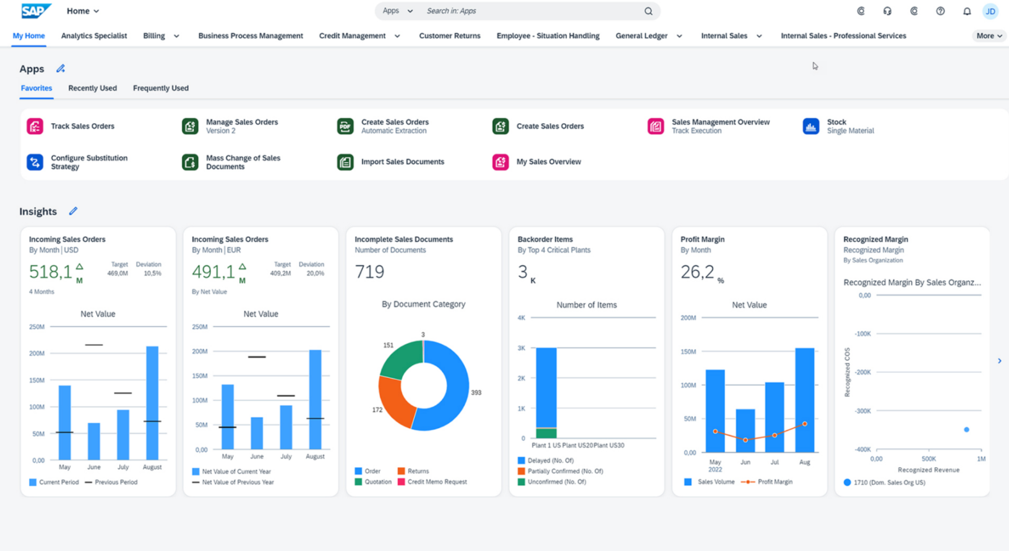
Take SAP as an example.
As an ERP solution handling everything from supply chain management to accounting, it must be meticulously designed to support different teams and tasks.
This specialized use of enterprise solutions introduces many nuances you probably won't encounter while designing consumer apps.
What makes enterprise UX different from consumer UX?
Enterprise UX differs from consumer UX in its focus on complexity, efficiency, and scale rather than delight or simplicity alone. While consumer UX optimizes for quick adoption and emotional appeal, enterprise UX is successful when it reduces cognitive load, speeds up work, and remains consistent across large, evolving systems.
There are three major differences between enterprise UX and consumer UX design:
-
Target audience: Enterprise users tend to be power users with highly specialized needs who need software to perform precise, repeatable, and often technical tasks instead of just browsing, socializing, or shopping. At the same time, the software must be accessible to new employees, so UX designers face a unique challenge of supporting deep expertise without overwhelming beginners
-
Complexity of enterprise workflows: Enterprise tasks that the UX must address are often spread across multiple steps, systems, and decision points instead of simple, single-screen actions. They also involve dependencies and structured inputs that consumer apps rarely deal with.
-
Cross-audience satisfaction: One platform may serve analysts, frontline workers, managers, admins, and compliance officers, so enterprise UX needs to satisfy multiple stakeholder groups
As enterprise software handles critical tasks where errors have real-life consequences, UX design tends to prioritize efficiency, scalability, reliability, and regulatory compliance over pure simplicity.
While a consumer app focuses on ease of use and engagement to keep voluntary users from abandoning it, employees can't just "leave" a bad internal system—they must still use it daily. So instead of churn, poor UX leads to frustration, errors, rework, and costly operational mistakes.
To make sure this doesn't happen, you need to follow a unique set of design principles that consumer UX designers don't need to worry about as much.
8 enterprise UX design principles and best practices
Drawing from famously well-designed software tools, I put together a framework for building effective enterprise products. Here are the steps you should follow:
1. Start with user research across multiple roles
Enterprise software almost never serves a single, uniform user group. Analysts who live in data all day, managers who need high-level visibility, and administrators responsible for configuration, access, and compliance all need to use the same product.
This is why effective enterprise UX starts by understanding each of these roles individually, not averaging them into a vague “user.”
Role-specific research helps uncover everything that matters to each group:
-
Daily tasks and workflows: Most common/routine tasks and places where friction slows users down
-
Technical expertise levels: From highly technical power users to occasional or new users, your product should feel seamless to everyone
-
Pain points and risks: Errors, workarounds, bottlenecks, and compliance concerns
To uncover all these insights, enterprise UX designers use research methods that reflect real-life settings, such as:
|
Method |
What it does |
|
Contextual inquiry |
Observe users in their real work environment as they perform everyday tasks to spot hidden workarounds, dependencies on other systems, and constraints. |
|
Workflow mapping |
Documents end-to-end processes across systems and roles to highlight issues like bottlenecks, unnecessary steps, and handoff failures. |
|
Journey mapping |
Outlines how work moves between roles (e.g., from an analyst to a manager and then administrator) to identify friction points that single-role research would miss |
|
Cross-functional workshops |
Brings multiple roles together to expose dependencies and conflicts within actual organizational constraints |
User research shouldn't be a one-off initiative, and you shouldn't treat users as passive testers throughout the process. Instead, create a continuous feedback loop that helps users shape your enterprise apps and solutions.
IBM does an excellent job of creating this culture of ongoing improvements. Besides a solid feedback loop, the company involves "sponsor users" early in the process. These are real users embedded in the project from the start, not just brought in for usability testing.
This way, the product interacts with users from the get-go and can evolve according to their needs.
Another good example is Microsoft, which uses enterprise customer advisory boards and role-based focus groups for products like Microsoft 365, Azure, and Dynamics. These groups are often segmented by role (e.g., IT admins vs. business users) and maturity level to showcase how different users collaborate within the same system.
2. Build a design system that scales with your product
A design system is a comprehensive collection of reusable components, patterns, and standards that ensures consistency as products grow in size, complexity, and team ownership. Developing one is important for any product, especially an enterprise one where multiple teams are usually building in parallel.
Without a shared system, you may run into issues like:
-
Similar features behaving differently
-
Having inconsistent interfaces
-
Forcing users to relearn patterns across modules
With a design system, you can avoid these problems and help teams move faster without sacrificing cohesion, even as the product evolves over the years.
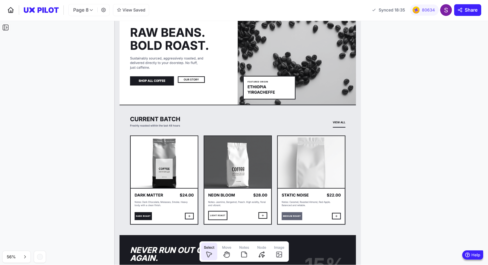
I took a minute to show you how easy it is to create a design system inside UX Pilot. I fed the tool with my black and white design details and asked for a quick homepage design.
While each design system is unique to accommodate the specifics of your enterprise design processes, the general elements include:
-
UI components (tables, forms, filters, and modals)
-
Code snippets and reusable components that engineers can implement directly
-
Typography and color palettes optimized for readability and long work sessions
-
Interaction patterns for complex behaviors like bulk actions, approvals, and error handling
-
Accessibility guidelines covering contrast, keyboard navigation, and screen-reader support, which are essential for enterprise compliance
Let me give you some examples so you can see what I mean.
The Salesforce Lightning Design System (SLDS) puts a special focus on how enterprise design systems standardize data-heavy UI elements like tables, filters, charts, and bulk actions. Visually, you’ll notice consistent spacing, predictable interaction patterns, and components designed for dense information rather than visual flair.
Similarly, Microsoft's Fluent 2 outlines color usage, layouts, iconography, and typography. Enterprise products like Microsoft 365 and Azure rely on Fluent’s clear visual hierarchy and restrained use of color to reduce cognitive fatigue.
As much as standardization and efficiency are the key points of design systems, your system isn't a static style guide but an evolving operational tool that aligns enterprise designers, engineers, and product teams around shared decisions.
When maintained properly, the system reduces design debt, speeds up delivery, and gives enterprise users a predictable, trustworthy experience, no matter how elaborate the product is.
3. Leverage AI-powered interfaces and predictive workflows
Unsurprisingly, AI is quickly becoming a core layer of enterprise UX instead of a bolt-on feature. In recent enterprise products, AI-driven personalization has started shaping how users find information, complete tasks, and make decisions.
Specifically, AI enriches enterprise software design in many high-impact ways, including:
-
Predictive search and smart filtering: Surface the most relevant records, reports, or actions based on role, history, and context
-
Decision support: Highlights anomalies, trends, or risks hidden in large datasets
-
Automated task suggestions: Recommend next steps, approvals, or follow-ups based on workflow patterns
Instead of forcing users to manually navigate dense interfaces, AI can propose solutions, flag potential issues early, and reduce cognitive load. For example, a finance user might see unusual transactions automatically highlighted, while a sales manager might receive deal-risk warnings before a forecast review.
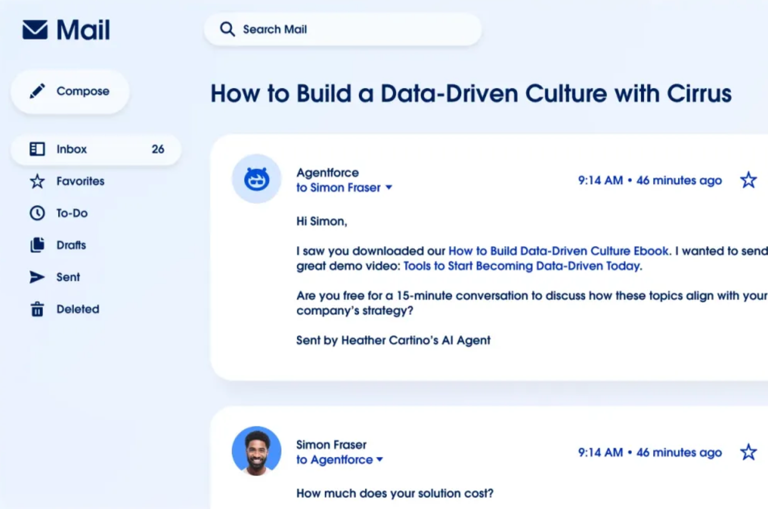
Salesforce's Einstein is an excellent example of AI usage when designing enterprise software. Within CRM, analytics, and Slack, it uses behavioral and historical data to complete tasks like:
-
Predicting deal outcomes and flagging at-risk opportunities
-
Recommending next best actions for sales, service, and operations users
-
Automatically summarizing conversations, records, and activity threads
-
Surfacing insights contextually, inside the screens users already work in
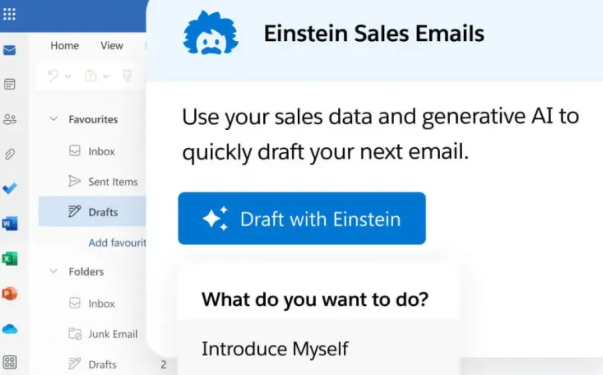
Agentforce extends this with agent-like workflows that can coordinate tasks across systems by drafting responses, preparing reports, or escalating issues with human oversight.
From a UX perspective, this reduces manual navigation, repetitive data entry, and context switching, letting users focus on impactful work instead of mechanics.
Despite the rise of AI in enterprise UX design, human involvement is still unavoidable. While effective enterprise AI can augment human judgment, it can never replace it because enterprise decisions often involve nuance, accountability, and regulatory oversight.
The role of AI is to narrow choices, offer context, and speed up analysis while leaving final decisions with the user.
4. Build in contextual help and progressive onboarding
Having to search documentation or contact support every time a user hits a wall is frustrating and can ruin productivity. And that's where contextual help comes in. It includes tooltips, inline guidance, walkthroughs, and in-app instructions that support users directly within the interface.
Including contextual help is a must because enterprise platforms are inherently feature-rich and complex, with steep learning curves and infrequent edge-case tasks. Users can't rely on training manuals or one-off onboarding sessions to remember how everything works, especially when workflows evolve over time.
Instead, they should have contextual information exactly when and where it's needed.
Take Workday's feedback form as an example. When choosing the person who should provide feedback, a user gets a bit of context that clarifies the field and explains what will happen when it's filled.
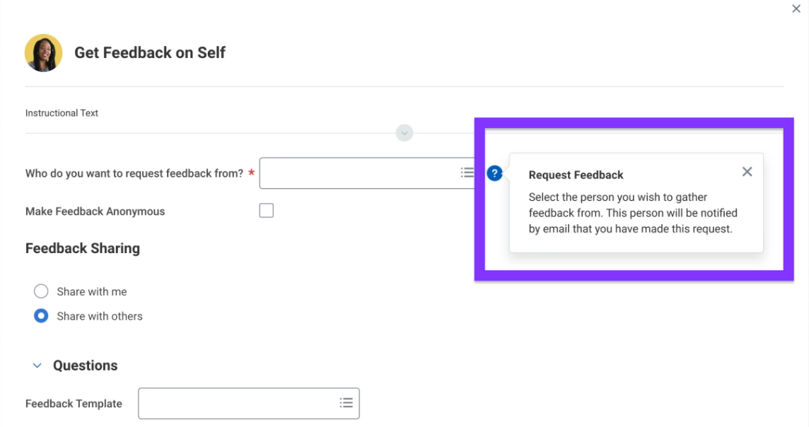
This might seem obvious to someone who's worked at a company for years, but your product isn't just for them but also for those who are seeking feedback for the first time.
Thanks to contextual help, they can complete the process confidently without the need for external assistance.
Contextual help works particularly well when paired with progressive onboarding. Instead of overwhelming users upfront, the system:
-
Provides more guidance early on, when users are unfamiliar
-
Gradually reduces prompts as confidence and proficiency increase
-
Reintroduces guidance when workflows change or new features appear
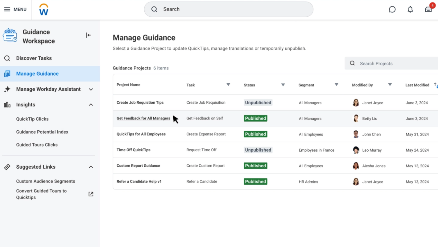
Let's go back to Workday to illustrate this.
The platform combines guided in-app tutorials with contextual tooltips across HR workflows. This helps new employees get step-by-step guidance for tasks like submitting timesheets while experienced users see contextual prompts when processes change.
There are plenty of ways to incorporate contextual help and progressive onboarding, such as:
-
Interactive product tours for first-time users
-
Arrows and highlights pointing to key UI elements during critical tasks
-
Contextual hints triggered by user actions or errors
-
Inline explanations for complex fields, rules, or approvals
No matter how you approach it, don't look at in-app help as an afterthought.
In enterprise UX, it directly impacts time-to-productivity, user confidence, and adoption rates. Well-designed contextual help also reduces reliance on support teams by preventing errors before they happen.
5. Support role-based personalization and access control
Unlike consumer software, enterprise systems almost always support multiple roles at the same time (analysts, managers, administrators, frontline staff, etc.). Each user group has different responsibilities, priorities, and data needs that enterprise UX designers must account for.
You can do this by designing for two key components:
-
Role-based access
-
Personalization
Role-based access control (RBAC) means restricting what users can see or do based on their job function. For example:
-
An administrator may need full configuration access
-
A manager only needs dashboards and approvals
-
An analyst requires deep data interaction
With a deep understanding of user needs, you can design solutions that reduce clutter, prevent errors, and help users focus on what actually matters to their role.
Role-based design also ensures security and compliance benefits. By making sensitive data available only to authorized users, you can reduce risk, meet regulatory requirements, and maintain auditability.
As for personalization, it boils down to letting users customize components like:
-
Dashboards
-
Shortcuts
-
Saved views
-
Filters
This way, each team member can align the interface to their role, which boosts efficiency and removes unnecessary navigation.
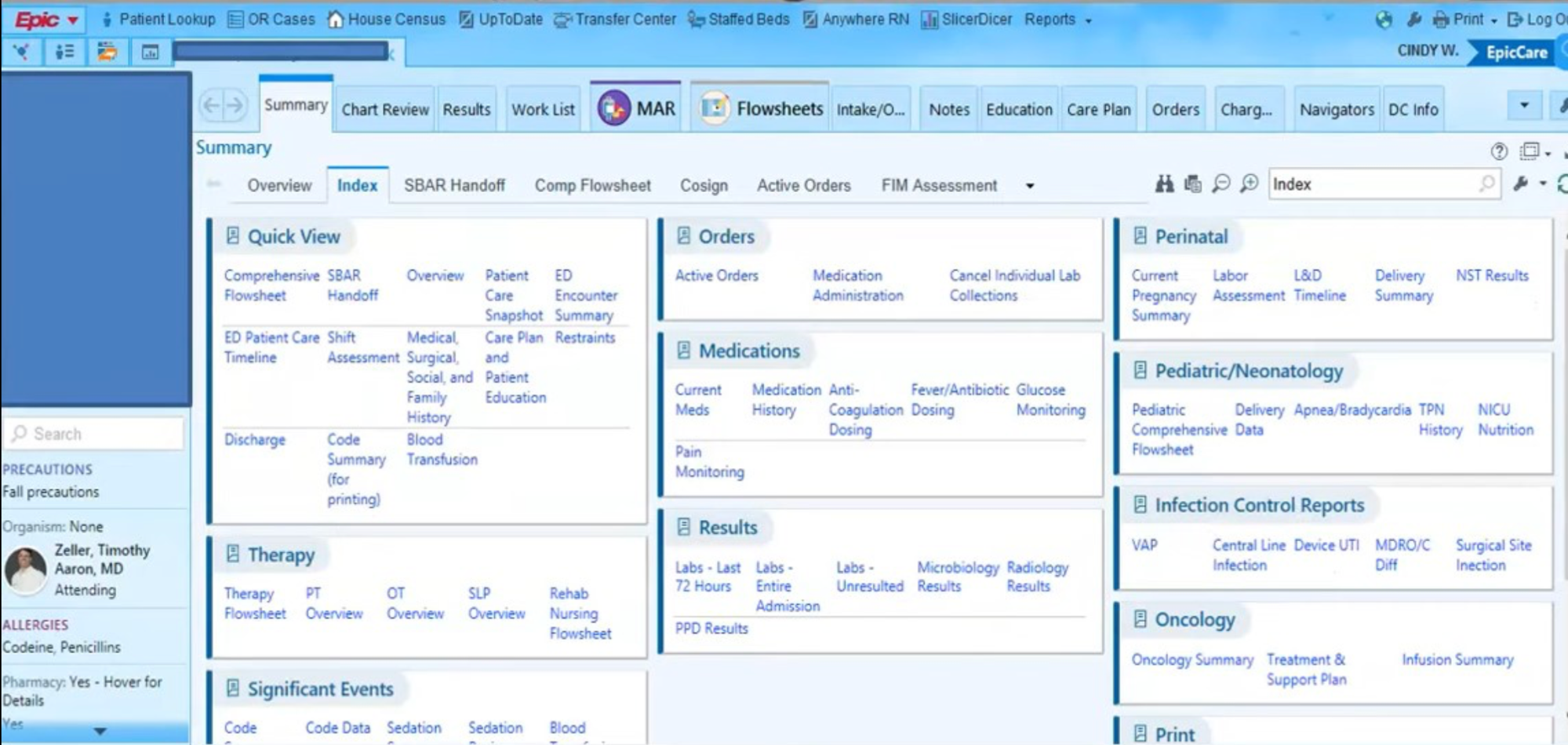
RBAC and personalization are especially important for organizations in tightly regulated industries. For example, Epic offers comprehensive medical software that provides HIPAA-compliant role-based access controls, which restrict Protected Health Information (PHI).
Nurses typically access patient vitals and care notes, physicians can view full medical histories and diagnostic data, while billing staff only see insurance and payment information.
Even if there are no regulatory constraints you software tools must adhere to, this level of personalization goes a long way toward maximized productivity and helps meet user expectations.
6. Make data visualization clear and actionable
Enterprise users often work with massive amounts of data. Whether they're monitoring performance, managing risk, or making operational decisions, they need to spot patterns, anomalies, and trends quickly.
That's why your enterprise product needs to turn raw data into clear, actionable insights.
Elements like charts, dashboards, and visual cues support decision-making and help users immediately answer critical questions:
-
What is happening?
-
Why does it matter?
-
What should I do next?
When designed well, visualization reduces cognitive load and helps prevent costly mistakes by making key information impossible to miss.
Seeing as enterprise systems serve different roles, visualization must also be role-aware. An IT administrator may care about system uptime and error rates, while an HR manager focuses on headcount, attrition, or compliance metrics. The same dataset can (and should) be presented differently depending on who's viewing it.
When designing the visual elements of your enterprise software (both the desktop and mobile apps), you should focus on:
-
Clear visual hierarchy, so the most important metrics stand out first
-
Appropriate chart types that match the data (e.g., trends over time vs. comparisons)
-
Interactive dashboards that allow filtering, drilling down, and switching views
-
Real-time or near-real-time updates for business-critical decisions
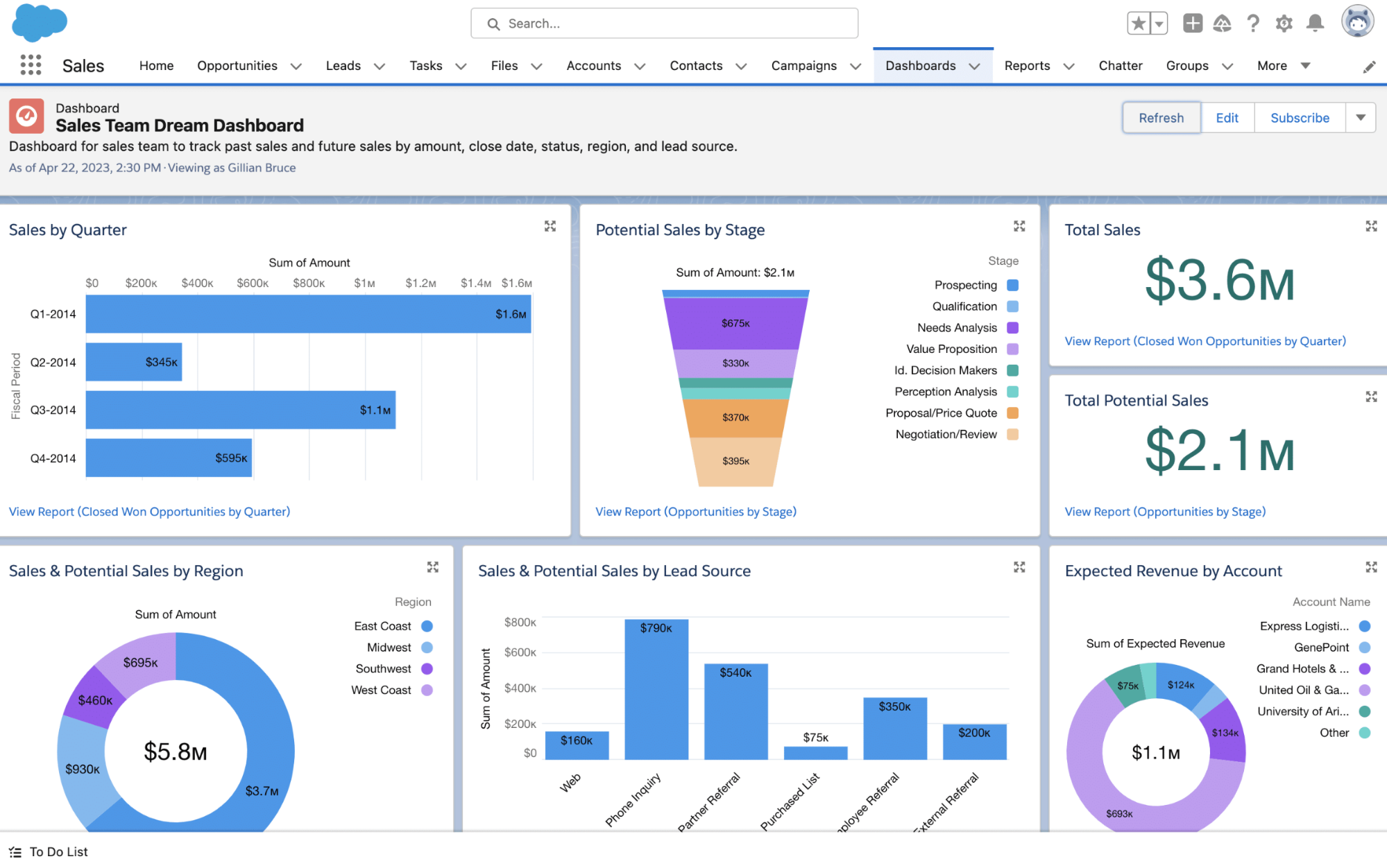
I strongly recommend checking out Salesforce CRM to see what solid visualization looks like in practice. It embeds analytics directly into everyday workflows, letting sales teams view real-time pipeline reports showing deal stages, win rates, and quota attainment through interactive charts and gauges.
Dynamic dashboards also automatically adjust based on user roles. For example, sales reps see only their own deals, while VPs and executives see aggregated team performance for a high-level overview.
7. Design for efficiency and retention
Enterprise users often spend six to eight hours a day inside the same systems, so seemingly small inefficiencies can add up to major bottlenecks. An extra click here and there, unnecessary confirmation, or a poorly placed action slowly but surely eat away at long-term productivity.
Whether you're developing a new solution or redesigning legacy systems, you must treat efficiency as a requirement, not a refinement.
The goal here is to reduce the number of steps required to complete repetitive tasks. Actions that might take eight to ten clicks (updating records, approving requests, or generating reports, etc.) should be streamlined to two or three wherever possible. This reduction results in:
-
Less friction
-
Fewer errors
-
Faster task completion
When designing for efficiency, don't forget about learnability. Highly abbreviated labels or icon-only controls may save space and speed up experienced users, but they can confuse new employees. To prevent this, good UX accounts for both by pairing efficient patterns with:
-
Clear affordances
-
Progressive disclosure
-
Contextual explanations
If all this sounds a bit esoteric, I have a perfect example that combines efficiency and learnability—Slack's usage of default values. When menus and buttons are pre-filled with intelligent defaults, users move from making many decisions to making just one: yes or no.
Slack leverages this across the board. When setting up notification preferences, you get a suggested notification schedule. So instead of thinking about the best time to receive notifications, all you need to do is decide if you want to accept the most logical recommendation.
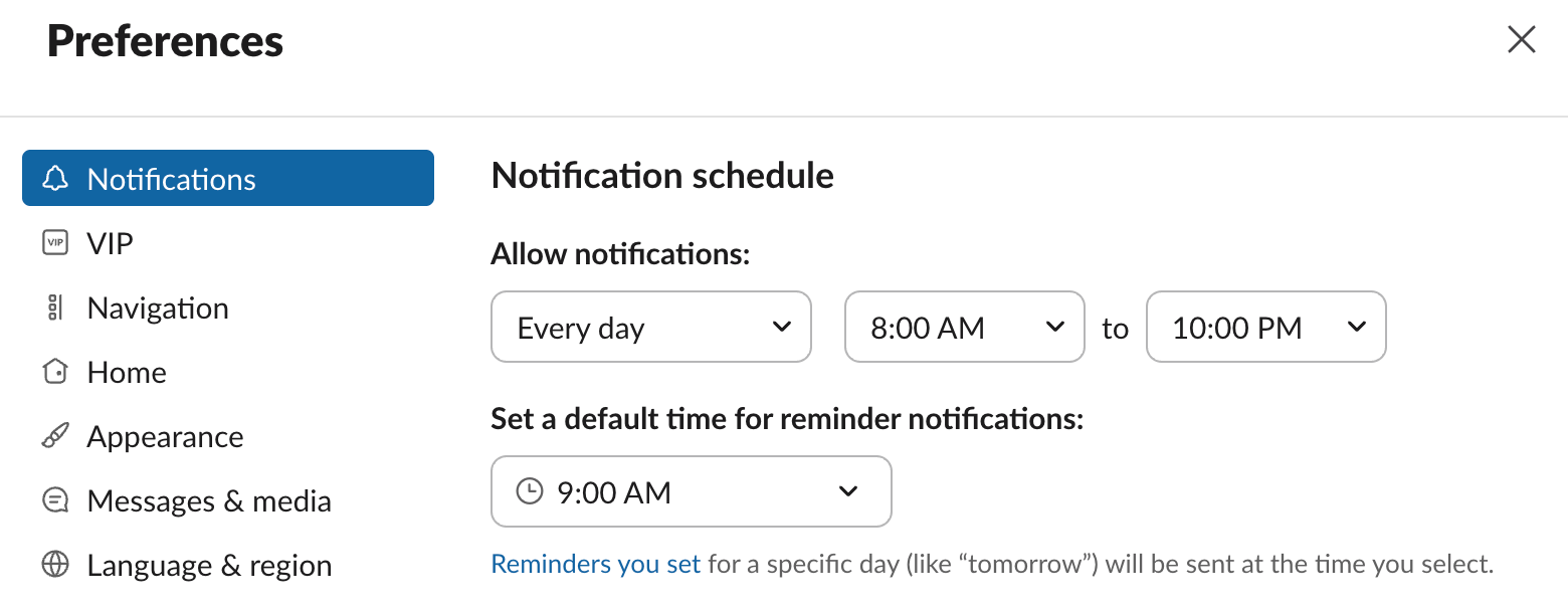
At the same time, Slack provides a bit of context and clarity as to what happens when you set a reminder for a specific day. A power user will ignore this because they already know that, but it increases learnability for a new employee who doesn't.
I've mentioned Slack a few times so far because I find its focus on UX impressive. I've been using it for years, and the experience has been as smooth as it gets.
I'm not the only one who thinks so—Slack scored 81.5 on the System Usability Scale (SUS), which puts it in the 91.6th percentile and the highest tier among business software products. That's why I strongly believe that enterprise UX designers should take a page from its book when building their solutions.
8. Measure success with enterprise-specific metrics
If you've been designing commercial software so far, measuring the success of an enterprise solution will require some refocusing. While consumer UX often focuses on engagement, retention, or conversion, enterprise UX must be evaluated based on productivity, accuracy, and operational impact.
In other words, the core question isn't "Do users like it?" but "Does this help people do their jobs better, faster, and with fewer errors?"
Specifically, you need to track metrics like:
-
Task completion time
-
Error rates
-
User satisfaction scores
-
Adoption rates
-
Support ticket volume
Among these, time-to-complete-task is one of the most telling metrics. When completion times decrease, it usually signals that workflows are clearer, steps have been removed, and users are no longer struggling with avoidable complexity. Tracking this metric before and after design changes helps see if UX improvements actually increased efficiency.
Speaking of which, pre- and post-launch analysis is crucial when measuring performance. Without baseline data, you can't demonstrate impact or justify continued investment in UX. Enterprise UX measurement should always be tied to real operational outcomes, not vanity metrics.
As you can imagine, there's also a clear ROI dimension. Better UX directly benefits the metrics that companies care about, such as:
-
Training time (and the related investments)
-
Support costs
-
Error rates (especially for mistakes with a direct financial impact)
Whatfix shared a case study that shows what these improvements look like in practice. Before introducing in-app guidance, their client's new employees took roughly six months to reach proficiency. After implementation, time-to-proficiency dropped to three months— an impressive 50% reduction.
The client also reduced accounting errors by standardizing how users interacted with the applications, improving both productivity and accuracy.
This proves that in the enterprise space, UX success is quantifiable. When design decisions are tied to productivity gains, error reduction, and business objectives, UX becomes a strategic business investment, not just a design discipline.
Key Takeaways
Enterprise organizations need software that makes complex systems work better at scale. The most successful products support multiple roles, reduce friction in daily workflows, and prioritize business efficiency, accuracy, and adoption.
This is why UX professionals must put themselves in the shoes of each specific group using the platform. By making decisions that are grounded in real user research and measured by productivity gains, you can create enterprise UX that becomes a strategic driver of performance, retention, and long-term business value.