7 Stages of Effective UX Workflows

Petar Marinkovic
Created on Mar 16, 2026
The word "workflow" sometimes gets a bad rep because it implies something rigid that stiffles creativity. But that's not the case.
If anything, a solid workflow supports creativity by leaving more time for meaningful work instead of endless back-and-forth caused by design process bottlenecks.
In this guide, I'll give you a general overview of a UX design workflow that makes this happen. I'll also get more granular with each stage of the workflow to tell you what to focus on when developing a UX design process.
What is a UX workflow (and why it matters)?
A UX workflow is a repeatable, step-by-step process that guides a team from the initial conceptualization of a product to design handoff and post-launch iteration. But—and this is a big "but"—it's not a rigid script you must follow to a T.
Instead, a good workflow leaves some room for flexibility. The workflow for a three-person startup working out of a garage is going to look radically different from the workflow at Google or IBM.
With that in mind, a UX workflow loosely follows the established UX design principles but varies based on:
-
Product type
-
Team structure
-
Policies
-
Tools
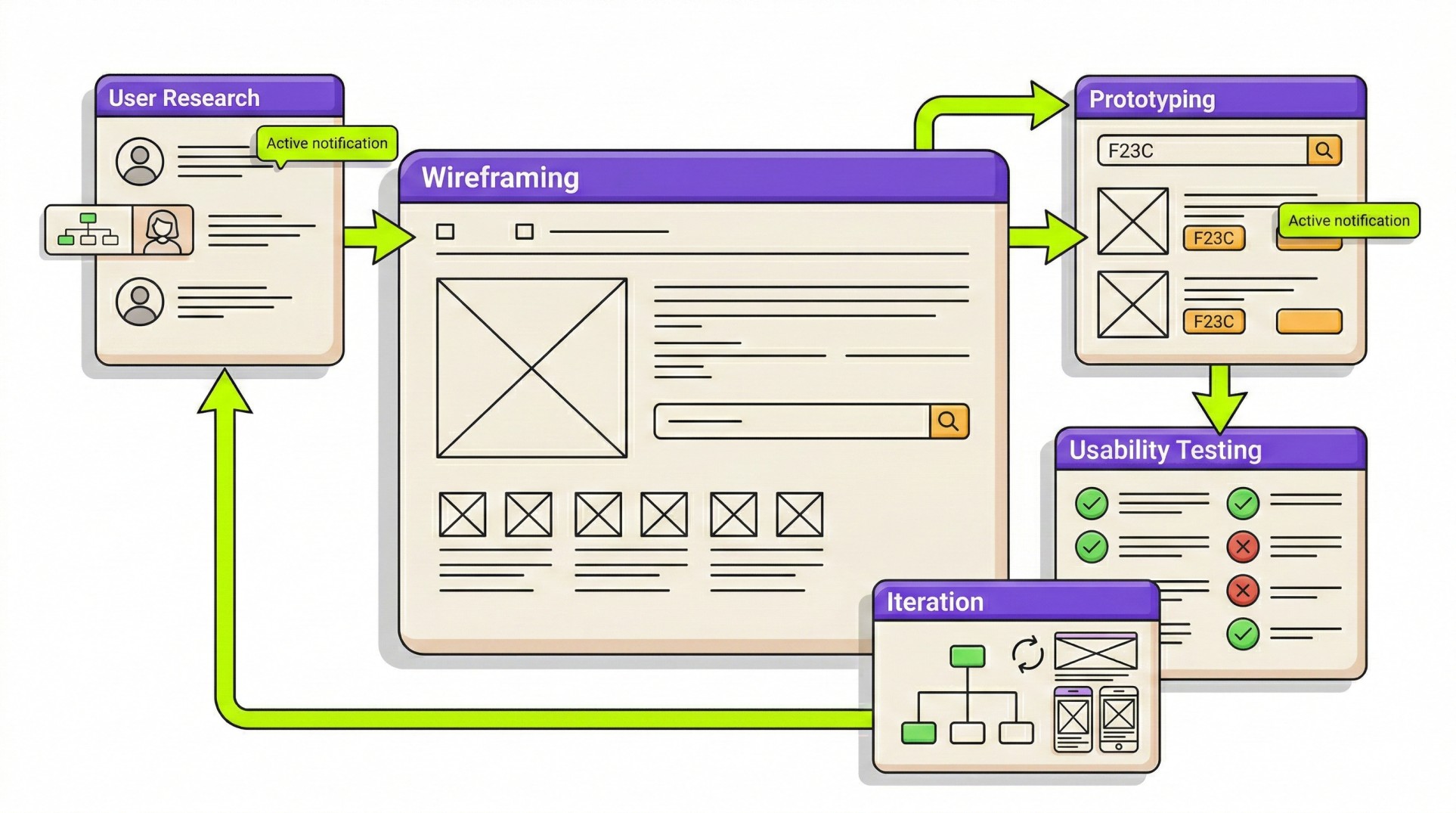
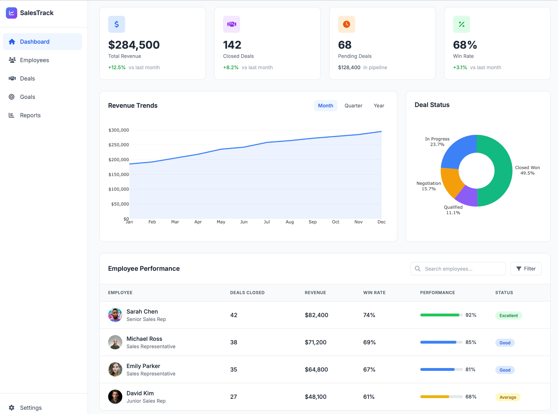
Visualizing a UX workflow can be tough, so let me give you an example. I created a mockup workflow for the stages I'll walk you through in this guide (so it's also a sneak peek into what's to come). Here's what it looks like:
Keep in mind that this isn't a finished product—it's just something I whipped up in a few minutes with UX Pilot to give you a rough idea of what a UX workflow looks like.
Your workflow will probably look different based on the five components it needs to prioritize when it comes to the product you're building:
-
Time: How efficient are the tasks? Can the user get from point A to point B quickly?
-
Learning: How intuitive is it? Can a new user pick it up without reading a manual?
-
User satisfaction: Does the user actually enjoy the experience?
-
Memorability: If a user leaves and comes back in a month, will they remember how to use it, or do they have to relearn everything from scratch?
-
Error assessment: How easily can a user recover when they mess up (which they probably will at some point)?
What makes a workflow different from random design activities?
Workflows include defined stages, checkpoints, and feedback loops instead of exposing you to a bunch of disconnected activities. You know exactly when to involve stakeholders, when to test, and when to iterate, so there's no guesswork about "what comes next."
A workflow also creates documentation and shared artifacts that persist beyond individual team members. If your lead designer quits tomorrow, the insights don't walk out the door with them. The UX personas, journey maps, and research findings all live in the system.
Lastly, workflows establish accountability. When you have defined stages, you can actually track where things went wrong. "We launched, and it failed" becomes "We skipped the usability testing phase, and that's where it broke."
In short, you can learn and improve.
7 core stages of a UX workflow
While each UX workflow is unique, most of them consist of seven stages:
1. Scope definition and stakeholder alignment
Before you open any design tools or start writing code, you need to get in the room and align on the project scope.
This stage builds the foundation of the entire project and prevents scope creep if done well. So if you rush it, a simple app can quickly become overloaded with additional features, integrations, and competing priorities.
The key points you'll cover during the initial meeting include:
-
The core business objectives
-
Key performance indicators (KPIs)
-
The project budget and timeline
-
Success metrics
-
All relevant stakeholders
Speaking of stakeholders, one of the most important dynamics to address at this stage is the tension between stakeholder needs and user needs.
This is a constant tug-of-war because UX designers prioritize users while stakeholders focus more on business objectives (and the two are often in conflict).
For example, a stakeholder may want users to leave contact details for sales follow-up. While this makes perfect sense from a business perspective, it adds effort on the user's end and may reduce conversions.
In these situations, the UX role shifts. The question is no longer if the requirement should exist but how to implement it with minimal friction. For example, you'd ask things like:
-
Can the request appear later in the flow?
-
Can the value be clearly explained?
-
Can the interaction feel intentional rather than intrusive?
While acknowledging all these constraints can be tough, you must do it early on. Identifying non-negotiables from the get-go and aligning on priorities lets you design solutions that support both user experience and business goals.
2. User research and discovery
Once you've set things up internally, focus outward to understand your users.
And at this stage, there's no room for guesswork. Brushing over research means building on assumptions, which can be expensive.
That's why you shouldn't treat research as a formality. Sending a quick survey to colleagues or asking internal teams for feedback isn't research. You need to distance yourself from internal bias and get closer to real users.
You can use plenty of research methods to do this, most notably:
-
User interviews to understand real needs, behaviors, and motivations
-
Contextual inquiry to observe users in their natural environment
-
Quantitative surveys to identify patterns at scale
-
Competitive analysis to understand market standards and gaps
-
Usability testing to assess existing products or prototypes
Now, you're not always starting from scratch. Design and development teams building on existing products sit on a mountain of behavioral data, which is often the most objective starting point. Issues like high drop-off rates, friction points in checkout flows, or low engagement in key features provide clear guideposts for setting your priorities right.
No matter how you perform user research, it's only as good as your team's willingness to accept what it reveals.
Google’s studies found that psychological safety—the ability to speak openly without fear of negative consequences—was the strongest predictor of high-performing teams.
This means that when uncomfortable truths arise (which they probably will), you need to let them surface. This way, you can ensure that usability failures, flawed concepts, and weak assumptions are acknowledged before they become costly mistakes.
And if you don’t resolve these mistakes proactively, you can still fix them when they arise with proper research. The perfect example is a UX team at a major streaming provider that tackled a retention problem by moving beyond standard usability tests and surveys.
To understand why subscribers were cancelling the service, the team organized “deep hanging out” sessions to understand recently cancelled subscribers. This revealed some tough truths, most notably:
-
The service was too expensive for some subscribers
-
The offboarding process was way too labor-intensive
-
Subscribers who wanted to use the service again were put off by the idea of going through offboarding again when their wish to cancel
The team acknowledged all the issues with a simple tweak and a new feature—a subscription pause. The UX was also redesigned to make offboarding/pausing easier, which drastically increased retention and returning subscribers.
3. Analysis and synthesis
The first two stages of the UX workflow will probably be pretty chaotic because of all the back-and-forth and all the ideas being thrown around. At this stage, you're cleaning up that mess and turning raw data into actionable insights.
In other words, you're turning "User A clicked this button three times" into "We need to change the navigation because the label is confusing."
This is where it starts looking like you actually have a structure. But to achieve it, you need to bring together two types of data:
-
Quantitative data: Answers what happened and provides scale and patterns (drop-off rates, click-through percentages, completion times, etc.).
-
Qualitative data: Explains why it happened to reveal motivations, misunderstandings, frustrations, and workarounds.
For example, analytics might show that 60% of users click a specific button repeatedly, and interviews may reveal they’re confused by the label and unsure what it does. The numbers identify friction, while the stories explain its cause.
By combining them, you can answer the three critical questions:
-
Who are we designing for?
-
What problems matter most?
-
Where are the biggest opportunities for improvement?
You'll know how well you're doing this when you start creating personas, which are the main output this stage produces. When defined well, user personas are strategic decision-making tools instead of decorative profiles filled with irrelevant personal details.
Specifically, your persona should be a data-backed user archetype that outlines characteristics directly relevant to your product, including:
-
Motivations
-
Constraints
-
Behaviors
-
Goals
Let me give you an example.
Your persona is not a middle-aged corporate worker. Instead, they're a time-pressed manager who needs to approve expenses while commuting with unreliable internet access.
That insight informs concrete design decisions: simplified workflows, large tappable elements, offline functionality, and minimal cognitive load that leads to increased user satisfaction.
Once you understand this, it's time to put your persona into a bigger picture. While products are often viewed in isolation, users experience them as part of a broader sequence of touchpoints. That's why you need a journey map that visualizes the full lifecycle:
-
Discovering the product
-
Evaluating alternatives
-
Onboarding
-
Daily use
-
Post-use interactions (e.g., emails or support)
Mapping this journey shows you where breakdowns happen and where improvements will have the biggest impact. But to do this, you can’t just focus on cold numbers. Instead, you’ll need quite a bit of qualitative data, so don’t hesitate to get creative with the ways to collect it.
For example, Marketade helped Tonal achieve astronomic growth through a unique approach to qualitative research. To understand home gym users, the team went beyond traditional research under controlled circumstances and actively participated in the research process with the customers. Specifically, they:
-
Conducted in-home interviews with customers
-
Observed customers while they used Tonal’s product
-
Got Tonal’s stakeholders to watch the interviews live through a video conference
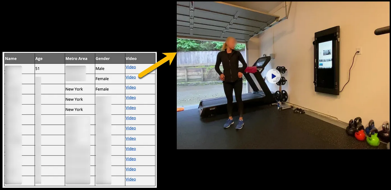
This hands-on approach helped Marketade map the entire user journey and understand the customers’ habits and expectations. As a result, the company’s performance increased tenfold in just one year.
4. Ideation and information architecture
By this point, the research was analyzed, priorities were defined, and the problem is now clear. Now it's time to focus on the solution.
In other words, you begin the ideation process—but you're not starting with a blank slate. You have plenty of data on user problems and constraints, so you'll use them when brainstorming.
As you do, involve engineers from the get-go. As a designer, you're leading the process, but engineers offer input on how feasible your ideas are. They understand the technical constraints and can help shape ideas into solutions that are realistic within the given timeline, budget, and platform limitations. By involving them early on, you can save yourself plenty of headaches down the line.
This is also the point at which you'll focus on information architecture (IA) as the structural foundation of the product. While the visual design of the user interface may create appeal, IA determines if users can actually find what they need.
The key IA boxes you'll need to check include:
-
Defining navigation and menu structures
-
Creating site maps and flow hierarchies
-
Establishing content groupings and labels
-
Validating structure through user testing
If you're debating which technique to use, I'd suggest card sorting. It only involves two steps:
-
Writing pages or features on cards
-
Giving cards to users so that they can group them in ways that make sense to them
This reveals users’ mental models and highlights how they expect information to be organized, helping you gather feedback and improve accordingly.
One UX team used this method alongside other research techniques to decide how to restructure Brooklyn Public Library’s website. This resulted in various tweaks across the site, from the expansion of the utility menu to including a search shortcut with various filtering options.
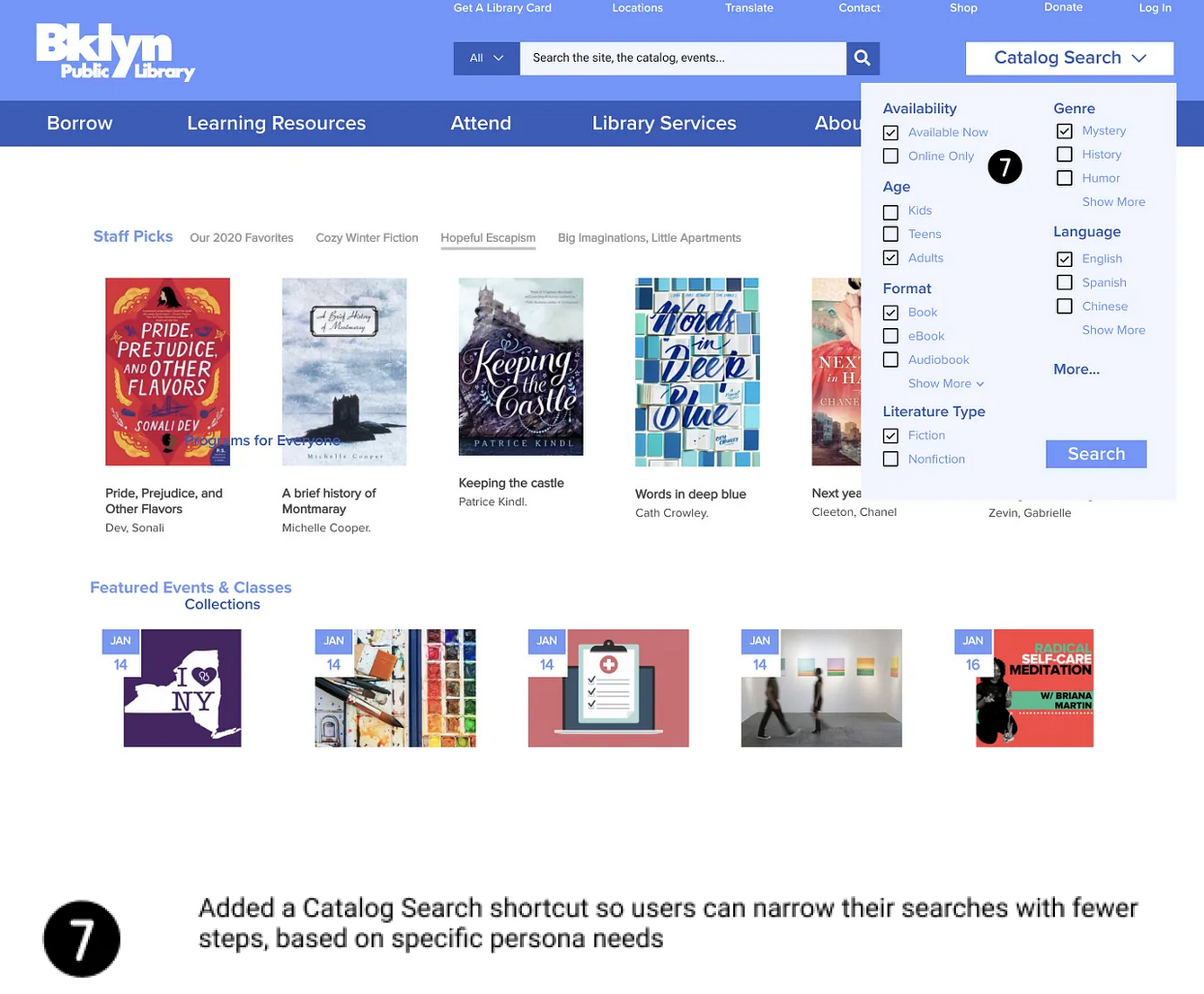
The result was a major redesign that helped the library serve 2.6 million people across 58 branches.
5. Wireframing and prototyping
This is where you actually start doing what you're meant to do—design the product. Specifically, you'll use wireframing and prototyping to translate concepts into something tangible.
The best thing you can do here is start small. Instead of jumping straight into polished, high-fidelity designs, focus on low-fidelity work (paper sketches, whiteboards, and quick layouts). It reduces emotional attachment and encourages open critique, letting you discard and improve concepts as you go.
As concepts solidify, sketches evolve into digital wireframes that act as blueprints to define things like:
-
Layout
-
Hierarchy
-
Navigation
Early prototypes focus on structure and flow instead of aesthetics, so don't worry about color or visual styling right away. Nail down the skeleton first, and then focus on cosmetics.
The entire progression should look something like this:
-
Rough sketches and whiteboard concepts
-
Digital wireframes outlining screens and navigation
-
Low-fidelity interactive prototypes
-
High-fidelity prototypes that simulate real interactions
The problem is that going through all the phases can be pretty time-consuming. To speed up the process, you may want to partner with AI.
I get that there are mixed opinions on AI among designers and that many feel threatened or generally put off by it (I'm a writer, so we're in the same boat here). But with the right tool, you can skip the legwork and focus on the creative part much faster.
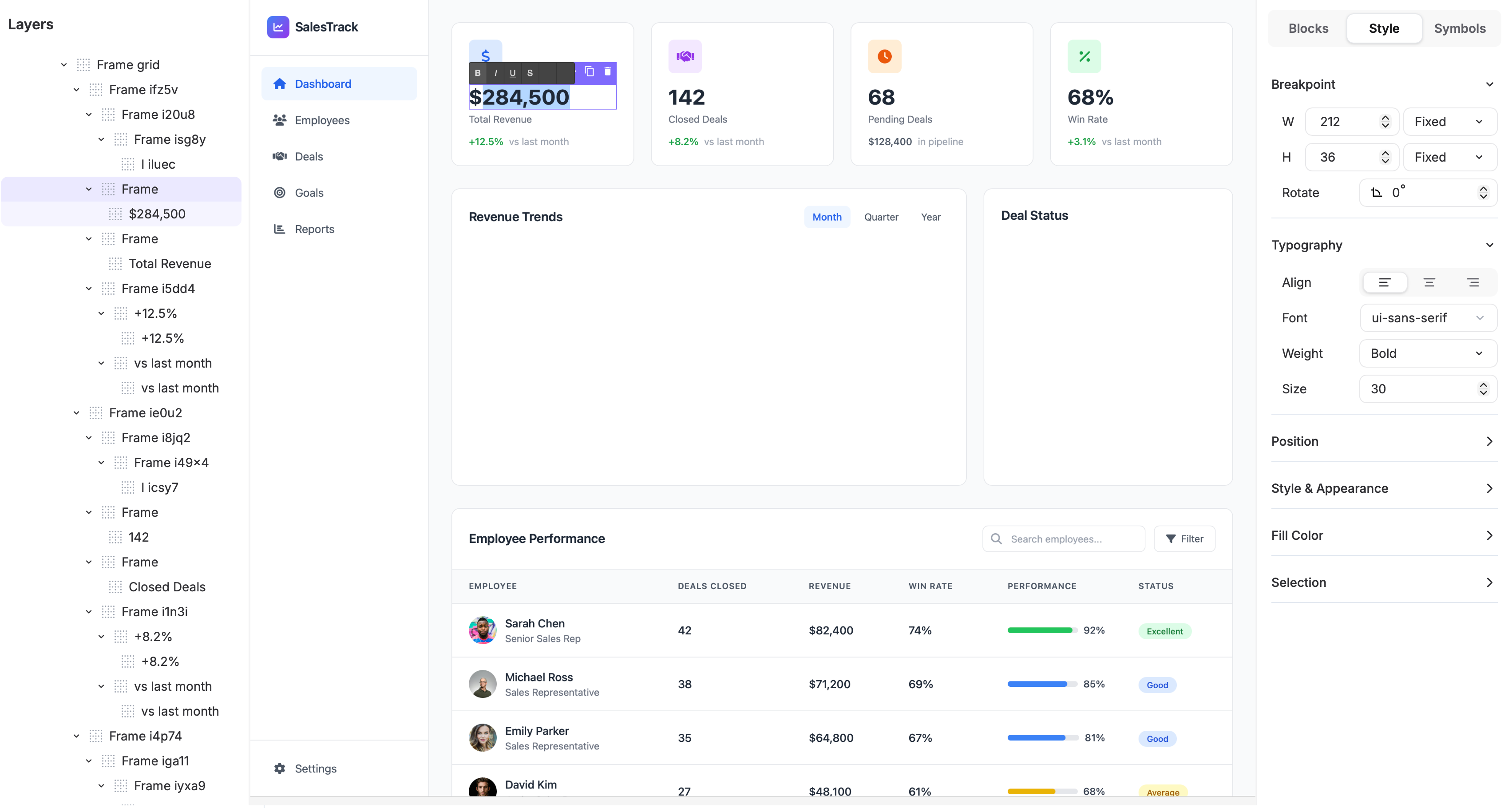
For example, here's a quick wireframe I created with UX Pilot in under five minutes:
I got this with a simple one-line prompt, so I didn't give it any references or drafts. I'm sure that even with a rough sketch, you could get something closer to what you're looking for from the get-go.
When you do, you can edit every detail to fit your preferences and constraints. So you're still doing the most impactful part of the work, but you get a better starting point and a more streamlined UX workflow.
More importantly, a solid prototyping tool lets you simulate realistic behavior, including conditional logic and dynamic content. You're not just testing the layout but also logic and interaction patterns.
This is crucial because identifying usability and logic issues at the prototype stage is much faster and cheaper than stumbling upon them during the product development process.
6. Usability testing and iteration
While usability testing happens throughout a typical UX workflow, this is where it takes shape and becomes a formalized process. The way it works is simple:
Test, analyze, revise, and test again.
Effective testing revolves around placing a prototype in front of real users, assigning tasks, and observing what happens. As much as you'll want to intervene, you need to resist this temptation because when users struggle, this isn't failure—it's insight.
There are plenty of usability testing methods you can implement, such as:
-
Moderated usability sessions: A facilitator guides users through tasks in real time, asking follow-up questions to uncover intent, confusion, and decision-making.
-
Unmoderated remote testing: Users complete predefined tasks on their own, letting teams gather scalable, less biased behavioral data quickly.
-
A/B testing: Two or more variations are compared in a live or simulated environment to decide which performs better against defined success metrics.
-
Eye-tracking studies: Visual attention is measured to spot what users notice, ignore, or misinterpret during key interactions.
One of the most common design traps is focusing only on the “happy path,” which is the ideal scenario where everything goes right.
Sadly, real usage rarely looks like this. You're much more likely to run into edge cases and failure scenarios, so make sure to embrace them. These moments define trust and provide key user feedback you'll need for future iterations.
Usability testing also ensures you don’t fall into the trap of “trendy” elements that actual users don’t care for. A perfect example of this is Joe Pendlebury, who pushed against the “burger” menu navigation on Next’s site. The leadership preferred it because it was popular, but Pendlebury preferred a horizontal "Snail Trail" scrolling design.
To show that this isn’t just a personal preference, he A/B tested both options. The Snail Trail consistently showed better performance, with 50-70% higher click-through rates and a 0.5 percentage point conversion lift.
The A/B test revealed that a burger menu would cause a sales revenue drop of 9.1%. According to the related projections, the Snail Trail consequently saved Next around £135m.
This is the value of effective usability testing. A solid feedback loop replaces assumptions with evidence and surfaces issues before they reach the final product.
Now, feedback doesn't only need to involve real users. Before you put the prototype in front of them, you can proactively address common issues through an internal review. For example, UX Pilot uses AI-powered design reviews to provide a bunch of feedback in no time.
All you need to do is upload your design, and you'll get:
-
A scorecard with ratings on usability, accessibility, and visual hierarchy
-
Key issues with severity ratings for easy prioritization
-
Recommendations for quick wins and impactful changes
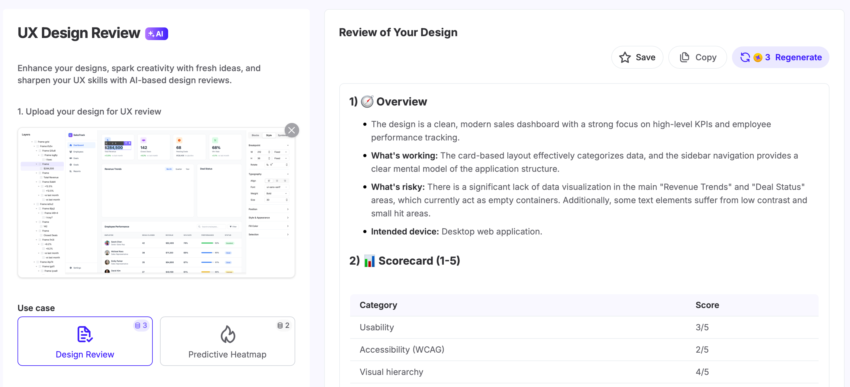
A quick review run can uncover plenty of issues before they reach users, making the usability testing process much more efficient.
7. Design handoff and documentation
Design handoff is one of the most sensitive points in the UX workflow. If you've been in the design space for a while, I'm sure this may sound familiar:
You export designs to Figma, zip the files, and email them to developers pretty confidently. A few weeks later, the responses start coming in...
"How does this animation work...?" "You didn't give me the font file..." The spacing is inconsistent..."
And because developers are on a deadline, they need to rely on guesswork to get things done quickly. As a result, they built a product that looks nothing like the design.
The easiest way to avoid this is to do what I mentioned a bit earlier—involve the development team from the get-go. In other words, treat handoff as a continuous collaboration instead of a one-time transfer to solve problems as they show up.
You'll know that your handoff package is strong when it includes:
-
Detailed design specifications
-
Exported assets (icons, images, illustrations)
-
User flows and interaction logic
-
Accessibility requirements
-
Annotated design documentation explaining behavior and intent
You should also agree on shared naming conventions to make sure everyone speaks the same language. One widely used approach is BEM notation (Block, Element, Modifier).
Instead of vague layer names, components are labeled in a way that mirrors how they will be implemented. For example, a primary button might be named .btn--primary, clearly indicating both its role and variation.
Besides clear naming conventions, here are a few extra handoff tips to follow:
-
Document user interaction behavior and edge cases clearly: Describe how components behave across states such as loading, error, empty, disabled, and offline scenarios so developers don’t have to infer behavior under failure conditions.
-
Walk developers through designs in a dedicated handoff session: Review flows, assumptions, and constraints live to align on intent, answer questions early, and prevent misinterpretation before implementation begins.
-
Maintain a shared source of truth: Use a design system or collaborative tool to centralize components, styles, and documentation so designers and developers always reference the same, up-to-date specifications as the product evolves.
UX workflow methodologies compared
While the general UX workflow consists of the steps I mentioned, there isn't a single best approach. Instead, you can use different methodologies:
|
Methodology |
Focus |
Best For |
|
Design Thinking |
Innovation and user empathy |
Complex, ill-defined problems requiring innovative solutions |
|
Double Diamond |
Structure and clarity |
Teams looking for a clear visual guide for divergent/convergent thinking |
|
Lean UX |
Speed and collaboration |
Agile environments that require rapid feedback and iteration |
|
Agile UX |
Integration with development |
Cross-functional teams working in sprints |
I'll expand more on each method as I answer a question that bugs many designers:
How to optimize your UX workflow
Defining a comprehensive UX workflow doesn't mean everything will run smoothly forever. You need to maintain the workflow and optimize it as your team and projects evolve. Here's how:
Match your workflow to your team and project
Each project has a methodology that suits it best. For example:
-
Design Thinking is best suited for ambiguous or exploratory challenges. When the problem isn’t well defined, it prioritizes empathy and problem understanding before solution-making.
-
Double Diamond provides structure and clarity. Explicitly separating divergence and convergence helps teams know when to explore broadly and when to narrow focus. This is especially effective for complex projects that need clear decision points.
-
Lean UX prioritizes speed and learning. It focuses on building the smallest viable solution to test assumptions quickly, so it works for startups and time-sensitive initiatives.
-
Agile UX workflows integrate design with development cycles. Agile development breaks work into small, incremental pieces that let teams ship value continuously instead of all at once.
These frameworks aren't mutually exclusive, so you can (and should) use them together when needed. For example, you can use Lean UX to validate early ideas and switch to a more structured approach like Double Diamond when refining complex features.
Build feedback loops into every stage
A good UX workflow doesn't wait until the finish line to provide feedback. User insight should flow continuously through research, design, development, and post-launch.
The best ways to make this happen include:
-
Releasing features gradually to small target audience segments
-
Holding regular design critiques and stakeholder reviews
-
Involving developers during prototyping, not just after
-
Sharing research findings across teams to maintain alignment
-
Capturing and documenting learnings from each project
Markets and user expectations change quickly, and ongoing feedback keeps you grounded in reality instead of enabling outdated assumptions.
Use design systems to accelerate consistency
A design system provides a shared language for design and implementation. It includes reusable components, styles, patterns, and guidelines that teams can rely on instead of reinventing basic elements.
Your design system should include:
-
UI component libraries
-
Style guides and design tokens
-
Pattern libraries and interaction rules
-
Content and accessibility guidelines
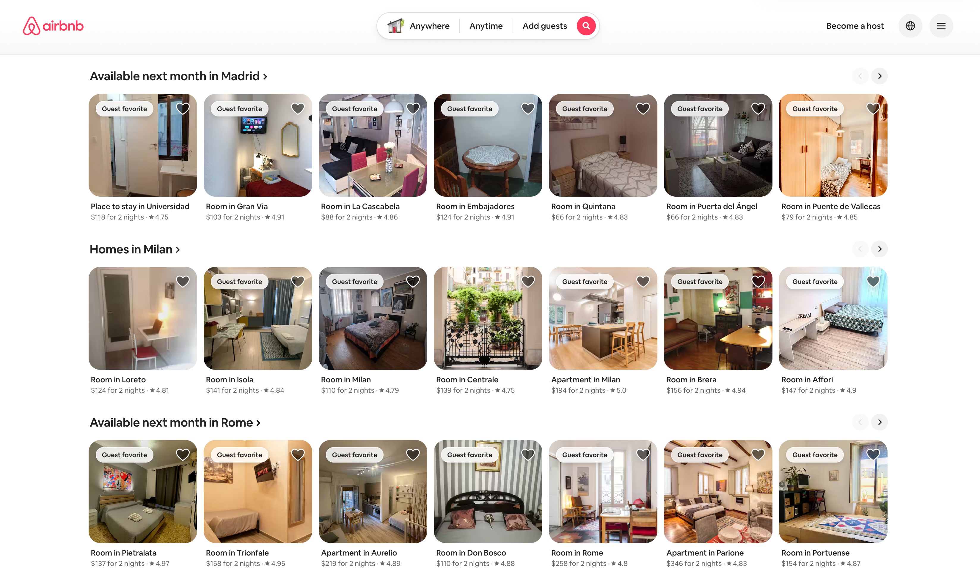
A perfect example of a solid design system is Airbnb. Its rich system ensures consistency across platforms and a positive user experience while speeding up development.
Streamline your UX workflow
A strong UX workflow turns uncertainty into clarity. It replaces assumptions with evidence and helps teams move from ideas to solutions that genuinely solve user problems.
So how will you know if your workflow does this?
The real measure of success isn’t shipping features but improving outcomes. Fewer support tickets, higher conversion, and clearer experiences are all signs that you're doing something right.
That said, there's no finish line you should expect to reach because workflows evolve as teams, products, and users change. Trust the process, adapt it when needed, and keep listening to your users to build meaningful experiences.