What Is a Wireframe? 5 Steps to Create and Use Wireframes


Denine Walters
Created on Aug 18, 2025
Every great website starts with a sketch. Before the colors, code, or logos come into play, there’s a simple but powerful tool guiding it all: the wireframe.
Wireframes are the architectural blueprints of UX design. They show how users navigate a site, how content is organized, and what happens on each page, without the distraction of colors or branding.
In this guide, I’ll explain what is wireframing, how it fits into the UX design process, and how different wireframe fidelity levels work. I’ll also walk you through five actionable steps to create wireframes that align with user goals and business goals.
What is a wireframe?
A wireframe is a basic visual layout that outlines the structure of a digital product, like a website, app, or dashboard, before any code or visual design is applied.
Think of it as the skeleton framework of a digital product. It maps where key interface elements like navigation menus, buttons, content blocks, and calls to action will appear on the web page.
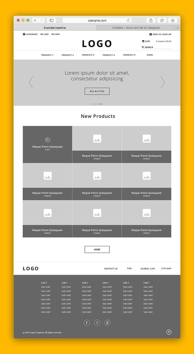
This low-fidelity wireframe uses grayscale boxes and placeholder text to sketch the basis of an e-commerce homepage layout.
Wireframes are typically created in the early stages of a digital project. They help teams focus on the core functionality, content hierarchy, and user flow, without the distraction of fonts or colors.
That makes them ideal for testing ideas, gathering early feedback, and making decisions before any development work begins.
A helpful analogy?
Wireframes are like house blueprints. Before choosing furniture or wall colors, you need to know where the walls and plumbing go.
Wireframes vs prototypes
The main difference between wireframes and prototypes is that wireframes are static, showing what goes where, whereas prototypes are interactive features that simulate how they work.
Wireframes focus on layout and user flow. They map out the basic structure of the user interface: where the nav bar sits, how forms are arranged, and where the CTA appears.
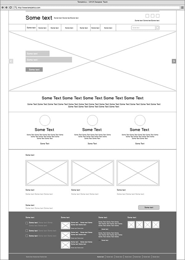
At this stage, there’s no styling or interaction, just placement and hierarchy, like this example.
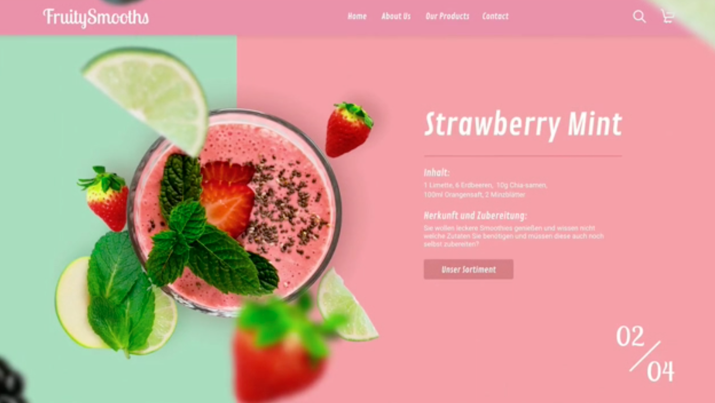
Prototypes, on the other hand, are clickable demos, like this smoothie page, that mimic the final UI.
They show how buttons behave, how menu systems expand, and how users interact with the interface.
You’ll start with an initial wireframe to explore structure and content. Later, you’ll build prototypes to test intended behaviors and fine-tune the experience.
Types of wireframes
Wireframe fidelity refers to how much detail is included in a layout, which varies depending on the stage of the design process.
Some wireframes are rough sketches with only simplistic images. Others feel almost like the final design, with branded fonts and fully structured content.
Let’s break down the three main types—low, mid, and high-fidelity wireframes—and when to use each one.
Low-fidelity wireframes
Low-fidelity wireframes, or lo-fi wireframes, are the simplest form. They’re quick to create, often sketched with pen and paper or built using lightweight digital wireframing tools.
These layouts use only simplistic images: gray boxes for photos, scribbled lines for text, and outlined shapes for buttons. There’s no color, branding, or UI polish, just the basic page structure and flow.
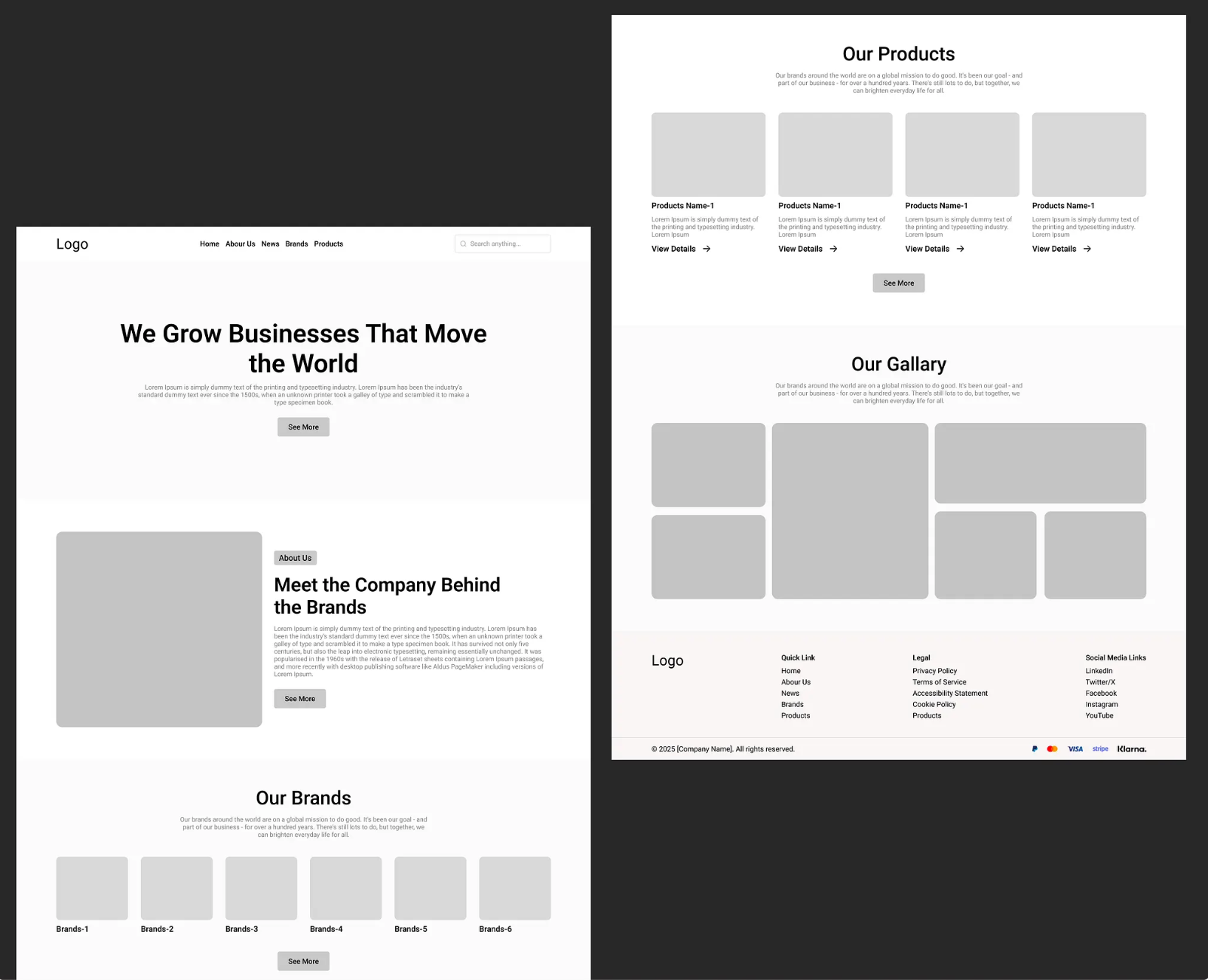
This low-fidelity wireframe shows a grayscale layout with basic boxes and placeholder text. It’s ideal for exploring structure before adding any design elements.
They are perfect for the early stages of the wireframing process, especially when validating ideas, mapping user flow, and gathering honest feedback from stakeholders.
Mid-fidelity wireframes
Mid-fidelity wireframes bridge the gap between basic sketches and polished layouts. They introduce screen templates, grid systems, and a clearer visual hierarchy, while still avoiding a complete UI design.
Unlike low-fidelity wireframes, mid-fi versions use real copy, labeled menus, and clearly defined page elements like nav bars, buttons, and input fields.
You’ll also see proper proportions and layouts that adapt to different screen sizes.
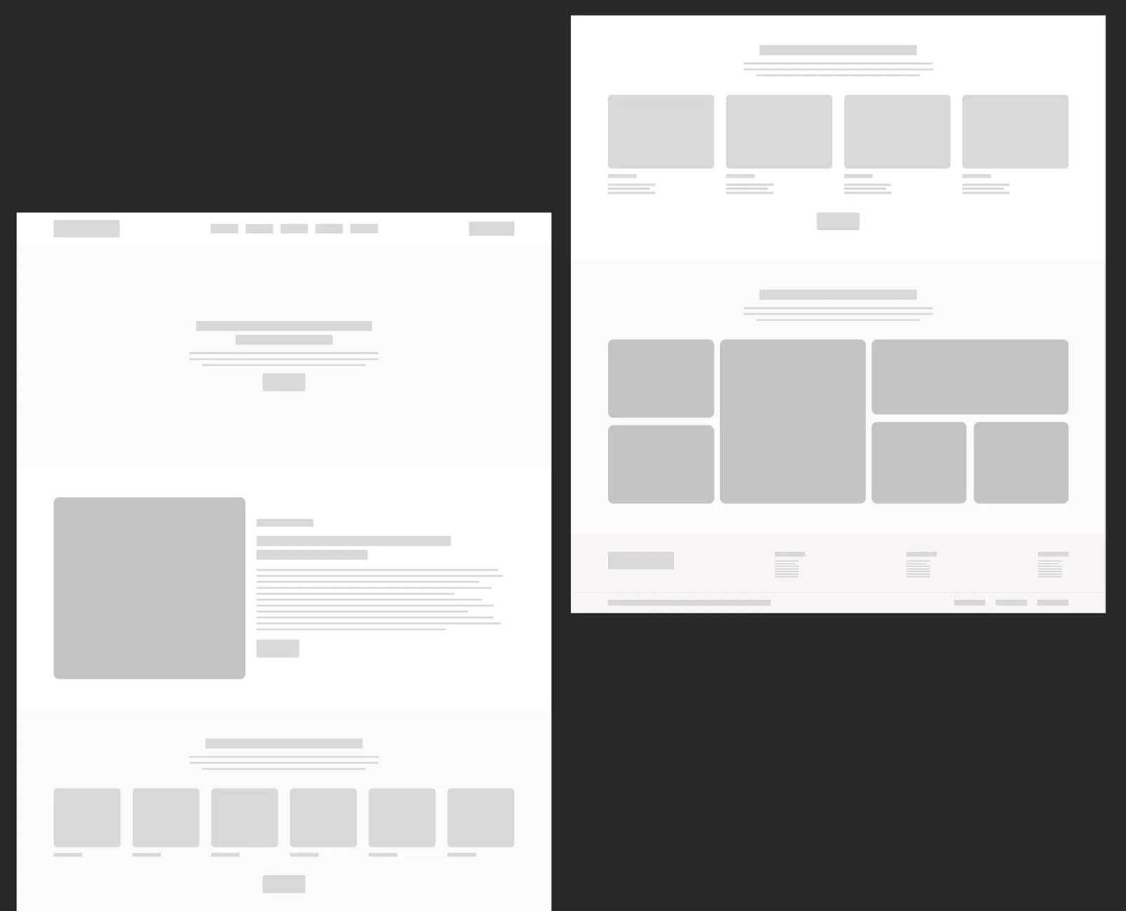
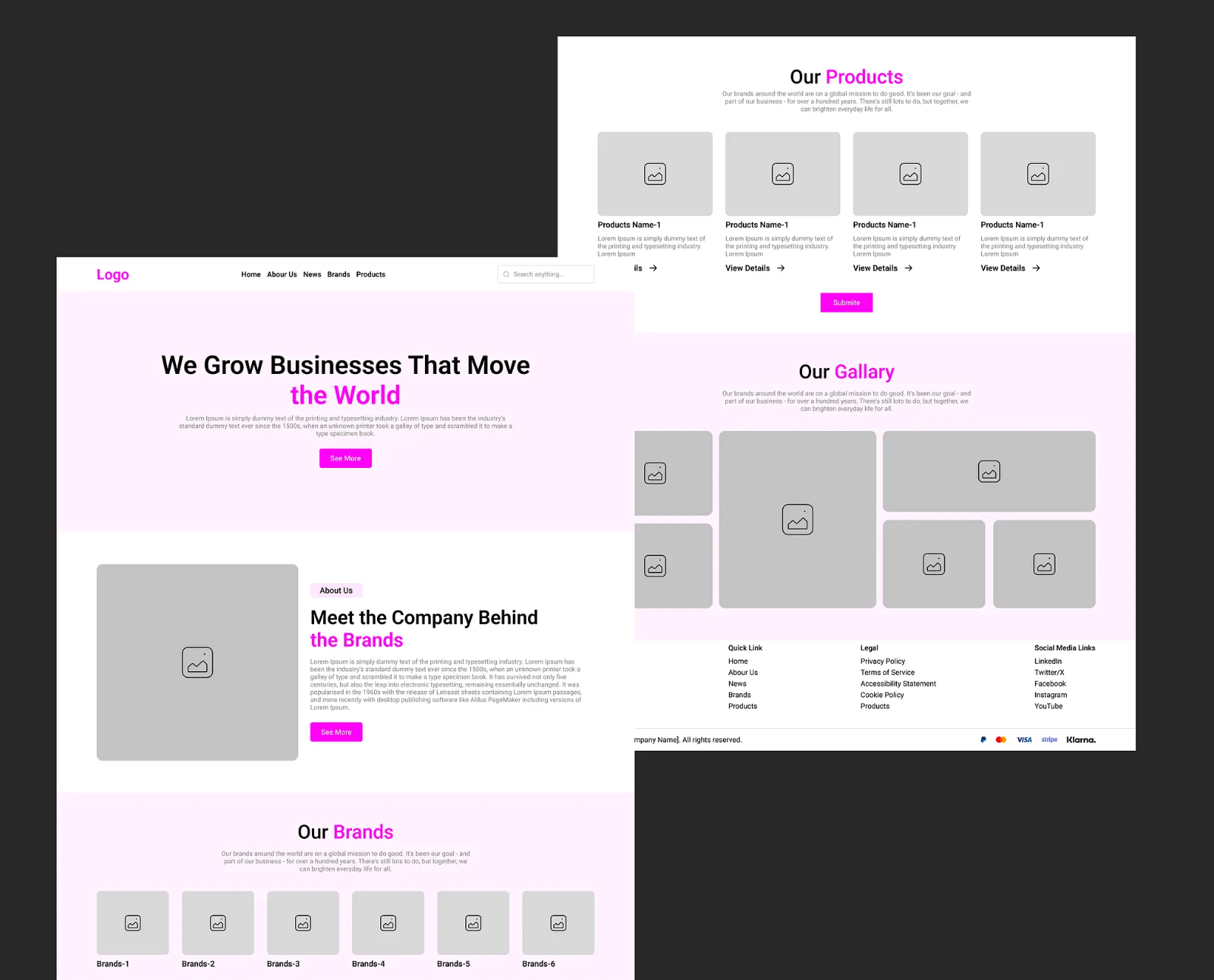
This mid-fidelity wireframe builds on the lo-fi layout with a more defined structure, real text labels, and better spacing. It still avoids styling and brand elements, but begins to hint at the final product to show how the web page will function.
Mid-fi wireframes are ideal for aligning project teams on layout decisions and information architecture. They allow enough detail to support user testing, without getting bogged down in unnecessary complexity.
High-fidelity wireframes
High-fidelity wireframes are the most detailed. They look and feel almost like the final UI, with accurate spacing, real content, brand fonts, icons, and annotations explaining intended behaviors.
You might also see actual featured images, hover states, or error messages to simulate user interaction.
This high-fidelity wireframe includes styled buttons, branded typography, and realistic data. It’s ideal for developer handoffs, stakeholder reviews, and late-stage user testing.
By capturing structure and behavior, high-fidelity wireframes reduce surprises during the development process, prevent rework, align the entire team, and smooth the path to launch.
5 steps to create wireframes
Creating wireframes isn’t just about drawing boxes. It’s about shaping experiences and aligning your digital product around clear goals.
These five steps will help you create wireframes that work.
1. Define your goal
Start by clarifying the purpose of each web page or screen. What should users do here? What action supports your business requirements?
Whether it’s a product purchase, newsletter signup, or contact form, your wireframe designs should guide the user toward that outcome.
Clear goals prevent feature bloat, improve user flow, and keep the layout focused.
Ask yourself: What’s the user trying to do? What’s their next logical step?
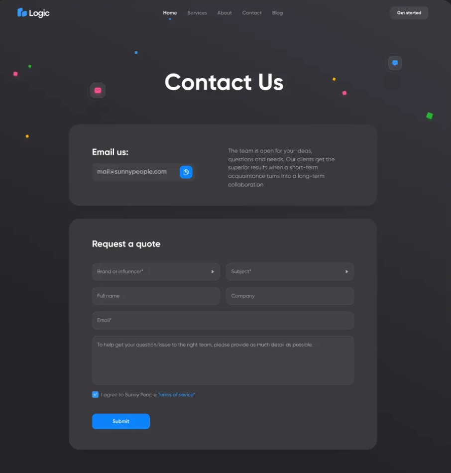
On this contact page, for instance, the layout supports a clear CTA, clean fields, and smooth navigation. Everything is focused on the goal.
2. Research competitors
Before finalizing your page layout, study 3–5 competitors. Take screenshots of their key pages, map out their screen templates, and notice how they place CTAs, testimonials, or product grids.
Use tools like PageFlows or Pinterest wireframe boards to collect wireframe designs that show working patterns in your niche.
Look for repeated behaviors, like:
-
Sticky nav bars
-
Hero sections with bold headlines
-
Testimonials or logos near the CTA
-
Cards for features or comparisons
Ask: What’s working? What feels cluttered?
A quick screenshot grid or comparison board helps validate your ideas and prevent common UX design mistakes.
Let’s say you’re designing for a SaaS product. Trello, ClickUp, and monday.com all lead with a signup CTA front and center, no scrolling needed.
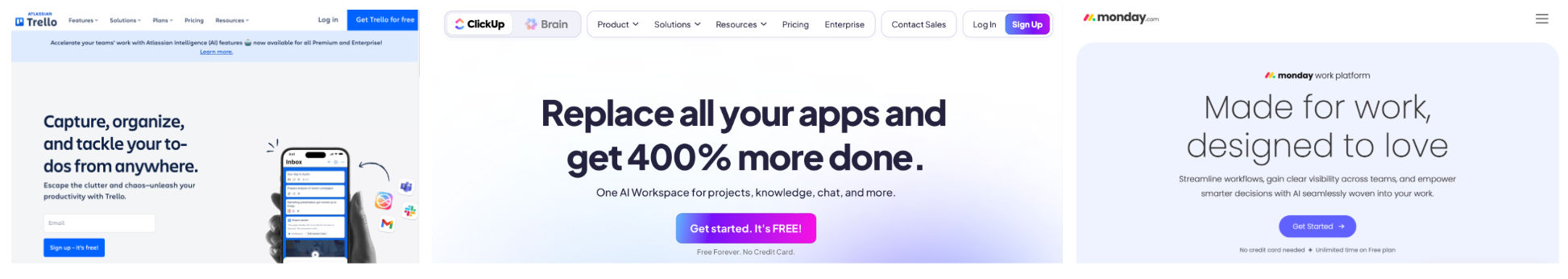
Each one uses a clear headline and a brightly styled CTA button to drive early action. This consistency points to a UX design best practice: if your goal is conversions, your primary CTA should be immediately visible and paired with a benefit-driven headline.
Consider borrowing this pattern for your own wireframe, especially if you’re offering a free trial or account signup.
3. Sketch layouts with a wireframe generator
It’s now time to create wireframes for your own website service or app.
Use a wireframing tool to sketch out key elements like nav bars, buttons, hero images, and CTAs, ignoring any styling for now.
Label each section clearly to communicate structure:
-
Hero
-
CTA
-
Services Grid
-
Testimonials
-
Footer
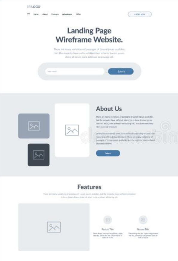
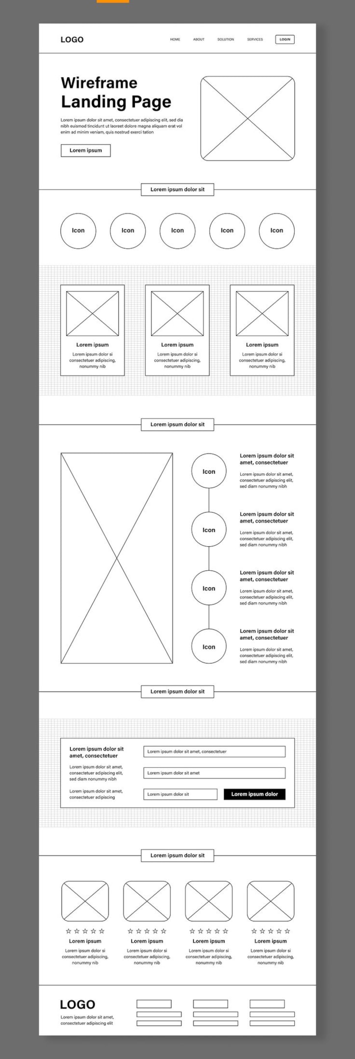
This mid-fidelity landing page wireframe shows a clear layout using labeled screen templates and simple grayscale blocks.
Want to save time?
Use an AI wireframe generator like UX Pilot. Just describe your digital project, and the tool creates a low-fidelity wireframe layout based on common design elements and user flows.
This speeds up ideation, reduces the technical barrier, and lets you explore more concepts, faster.
4. Chart the screen and page flows
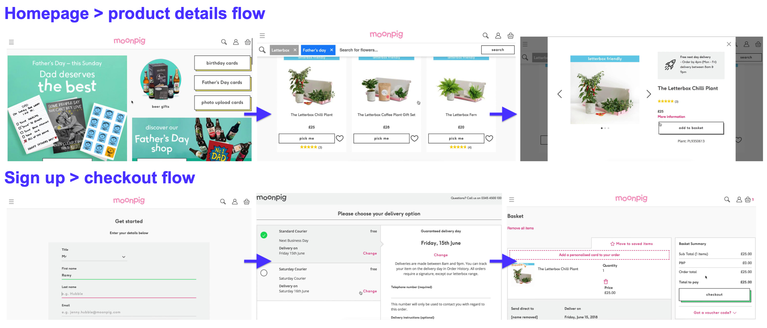
A screen flow diagram, user journey map, or page flow shows how users move from one screen, such as the homepage, to the next, like the checkout, search, or support.
Use flowcharts to show primary flows, like: Homepage → Product Page → Checkout → Confirmation
Moonpig has a clean e-commerce funnel. The site leads users from gift selection to delivery confirmation in just a few frictionless steps, ideal for reducing drop-off and increasing conversions.
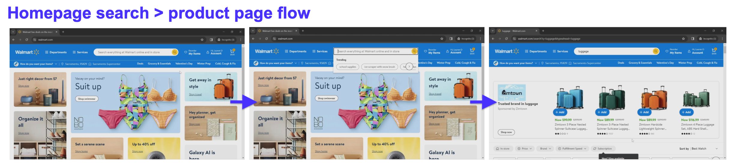
You can also chart optional paths like:
Homepage → Search → Search Results → Product Page
Walmart’s structure supports product discovery at scale. Users often search directly rather than browse, so this flow prioritizes quick results and intuitive filtering.
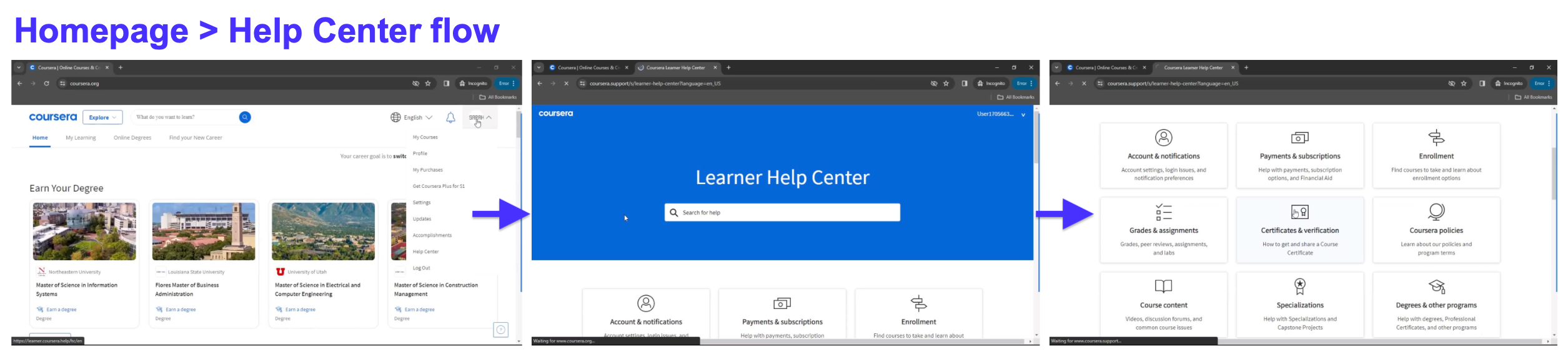
Homepage → Help Center → FAQ
Coursera’s page flow lets users access support content without leaving the main experience. It’s a great example of using clear page structure to reduce frustration and promote self-service.
Creating these visual maps lets you test user flow. It also helps catch gaps, missed links, or redundant steps before development.
Need inspiration? PageFlows has real-world screen flows for benchmarking and exploration.
5. Maintain design consistency
Consistency makes your product easier to use, build, and scale. It also makes your wireframes more effective.
Start by reusing the same spacing, grid system, and interface elements across your key pages.
Buttons, input fields, nav bars, headings, and cards should look and behave the same wherever they appear, whether that’s on desktop or mobile devices.
Define a simple visual hierarchy using varying text weights:
-
Large text for headings
-
Medium for body content
-
Small for labels and form elements
Even if your wireframes are grayscale, this structure sets up a smooth handoff to UI designers and developers later in the process.
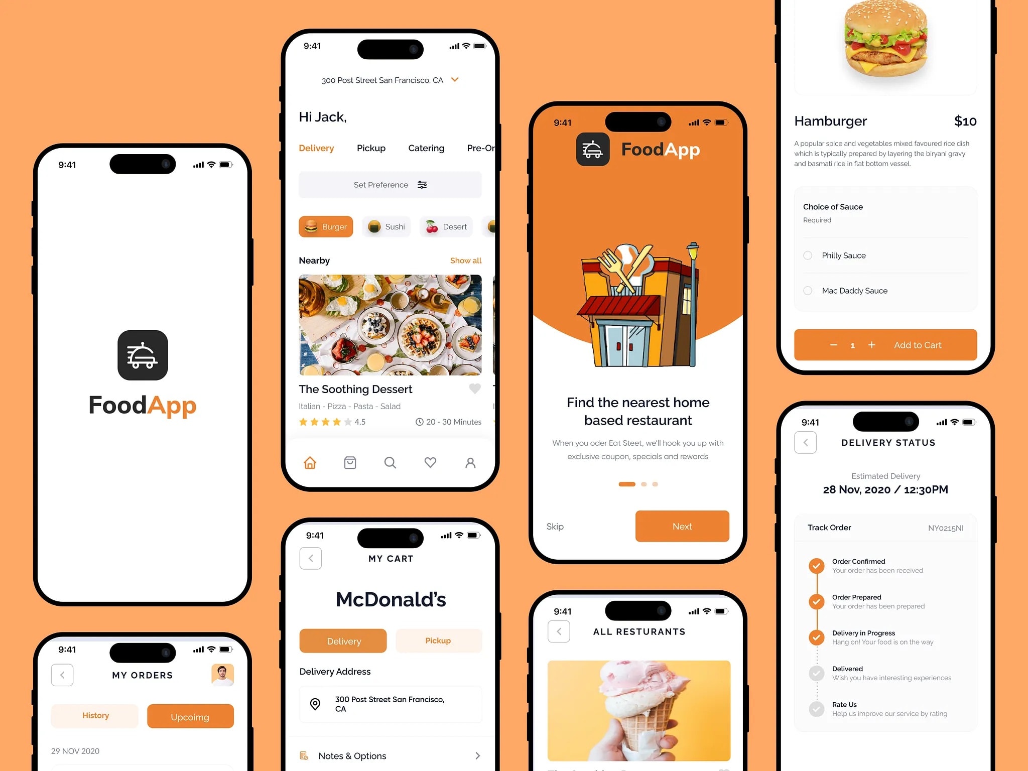
This wireframe from a mobile food delivery app shows how repeated orange accents, rounded icons, and consistent spacing create a clean, familiar experience, from browsing to checkout.
Polished wireframes lead to smoother development and better usability across screen sizes. The more consistent your base structure, the more intuitive and scalable the final product.
3 examples of wireframes
These examples show how wireframes work at different fidelity levels, using different design elements and solving different UX needs.
Landing page wireframe
Fidelity level: low
This grayscale wireframe outlines the basic structure of a corporate landing page. Key sections include a hero image with CTA, service icons, testimonial blocks, and a footer.
With no styling or color, your attention stays on layout, hierarchy, and flow, making this perfect for early-stage conception and team feedback.
e-Commerce product website
Fidelity level: mid
This mid-fi wireframe represents an online bookstore product page. It features a product image, description, price, and bestselling books.
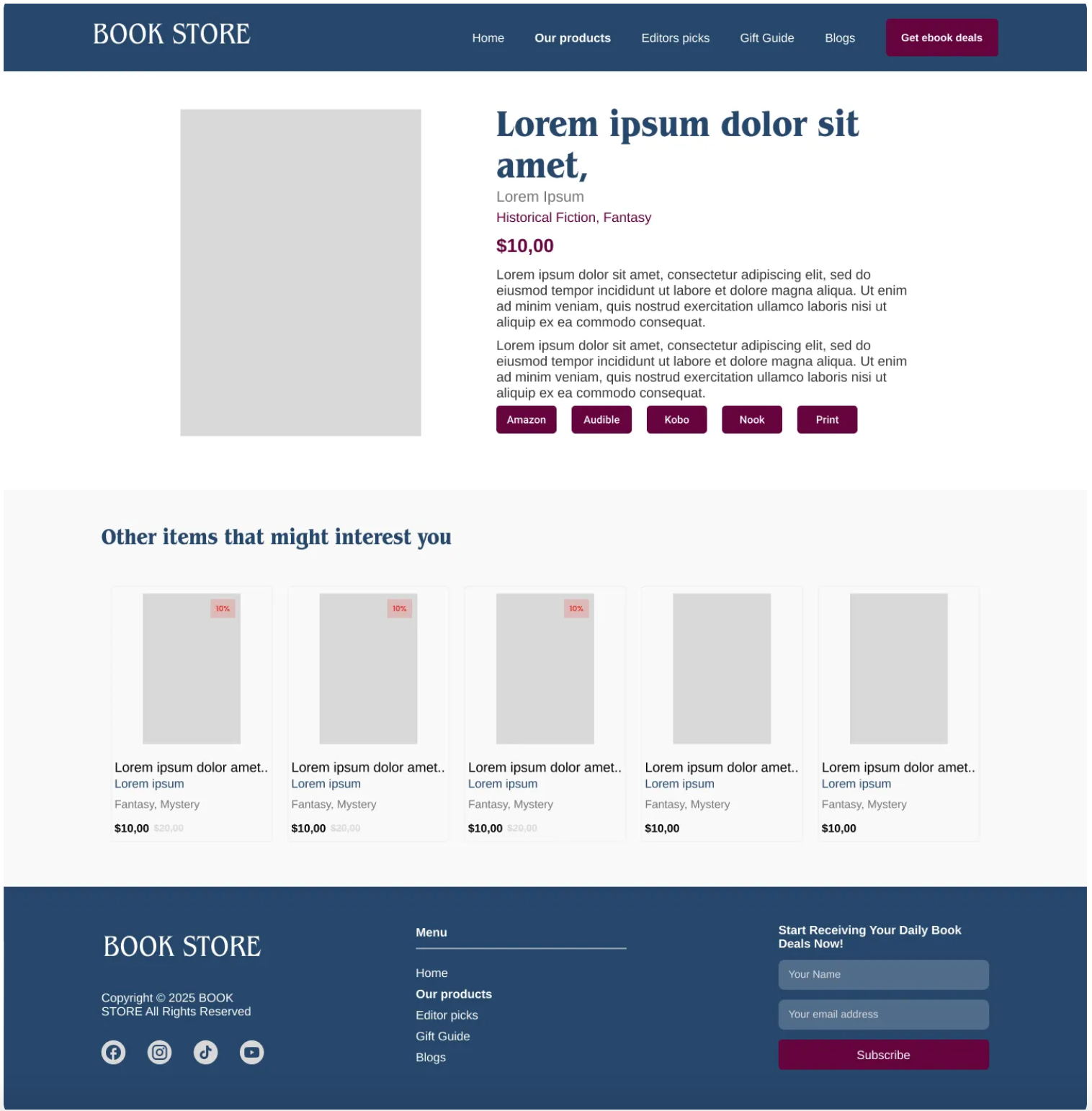
CTA buttons are placed on product cards to guide action, while layout clarity helps validate shopping behavior before UI design begins.
SaaS product login wireframe
Fidelity level: high
This high-fidelity wireframe features real text, input fields, a CTA, and supporting illustrations.

It’s clean, user-focused, and helpful in testing the onboarding flow, a critical moment in any digital product.
Create wireframes with AI using UX Pilot
UX Pilot is an AI-powered tool that helps you create wireframes from short prompts, no design experience required.
Just describe your project (like “a homepage for a fitness coaching site”) and choose a page layout. UX Pilot does the rest, producing a wireframe based on proven UI patterns and user flows.
It’s perfect for marketers, product managers, or founders who want to test a concept without opening a design file.
For example, a small business owner might say: “I need a homepage with a hero, services grid, and contact form.” UX Pilot instantly generates a low-fidelity wireframe that reflects those needs.
That means faster iterations, quicker user feedback, and fewer blockers in your iterative process.
Key takeaways
-
Wireframes are basic visual layouts that map out the structure and user flow of a digital product before any design, color, or code is applied.
-
They come in low, mid, and high fidelity, each suited for different stages of the design process, from quick sketches to polished layouts ready for development.
-
Unlike prototypes, wireframes are static: they focus on layout and functionality, not interactive features or styling for user testing.
-
Start by defining clear goals for each web page to avoid clutter and guide users toward the right action with minimal friction.
-
Use competitor research and wireframing tools (or AI like UX Pilot) to explore layout ideas, validate structure, and streamline the wireframing process.
-
Consistency in interface elements, spacing, and visual hierarchy makes wireframes easier to test, build, and scale across devices and teams.