Low Fidelity Wireframes: What is it and How to Create it

Denisa Lamaj
Created on Aug 4, 2025
Ever wasted time designing a page only to change everything later? That usually happens when the layout or design concept isn’t clear from the start.
Low-fidelity wireframes (or low-fidelity prototypes) help you map out the basic blueprint of your page before diving into visual design elements. No fonts or polish, just structure, flow, and core ideas.
In this guide, I’ll explain what low fidelity wireframes are, when to use them, and how to create your own, step by step, with examples.
What is a low fidelity wireframe?
A low-fidelity wireframe is a simplified layout that shows the basic structure of a page, without any colors, images, or styling.
It’s made using simple shapes like boxes, lines, and placeholder text to map out where things go.
Think of it like a napkin sketch: quick, simple, and focused only on layout and function.
You’ll usually see common parts like a header, navigation bar, main content blocks, buttons, and a footer, arranged in plain grayscale.
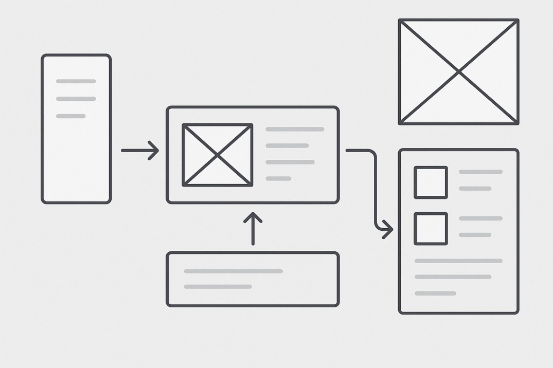
Here’s a quick example to help you picture it:

Notice how the layout is built entirely with simple boxes and placeholders with no images or real content.
You can clearly see the structure: a header at the top, a few content sections, some cards, and a footer. Everything is arranged to test the layout and flow before getting into any design details.
Why are low fidelity wireframes useful?
Low-fidelity wireframes are useful because they provide a quick, low-cost way to plan the structure and flow of a digital product before adding visual design.
They help teams align on content hierarchy, layout, and user flow during the early stages of the design process.
They also make it easier to collect feedback from stakeholders, clients, or teammates. Designers can collaborate on the layout to the layout and suggest changes without being distracted by fonts or icons.
Since wireframes are fast to sketch and easy to change, they save time and budget. You can try out different versions, test flows, and fix issues before moving to high-fidelity wireframes.
Here’s an example showing four homepage wireframe variations:

Each version uses grey tones, image placeholders, and simple headings to explore different content flows. The different variations of the hero section can help designers visualize which layout and navbar placement is best suited for their needs.
Teams can compare versions like these to see which better aligns with user goals:
-
Is the CTA clear?
-
Is the content hierarchy logical?
-
Can users find key info without scrolling?
By testing variations like this during the early stages, designers can validate core concepts and gather stakeholder feedback.
This helps avoid costly changes later in high fidelity and ensures layout decisions are made before investing time in visual details.
When to use a low fidelity wireframe
Low-fidelity wireframes are best used at the very beginning of a design project, when you need to explore ideas quickly and get everyone on the same page.
They’re mainly useful during early brainstorming sessions, pre-client presentations, and internal UX discussions.
I recommend creating them before jumping into mockups or high-fidelity prototypes. They help you test ideas without worrying about visuals yet.
Here are a few common scenarios where you can use low-fidelity wireframes:
1. Exploring different layout options before launching a new landing page.
Creating a few low-fidelity variations for a new landing page can help you ideate and test feedback before committing to a final design.
You don't want to spend the time and effort in building a new page, and then have to redo it all over again because you skipped seeking design feedback on the page's structure and layout in the pre-design phase.
2. Redesigning an existing product flow to improve usability
Low-fidelity wireframes help you map out the current flow and spot where users may be getting stuck. You can test different layouts or step sequences before touching the actual UI.
This way, you catch usability issues early and improve the experience without wasting time on visual design updates that might not solve the real problem.
3. Planning the layout of a new mobile or web app from scratch
When you're starting fresh, wireframes give you a simple way to shape the app’s structure and content hierarchy.
You can sketch out key screens, test how users move between them, and get input from your team or stakeholders. It’s a low-risk way to validate your ideas before you build anything.
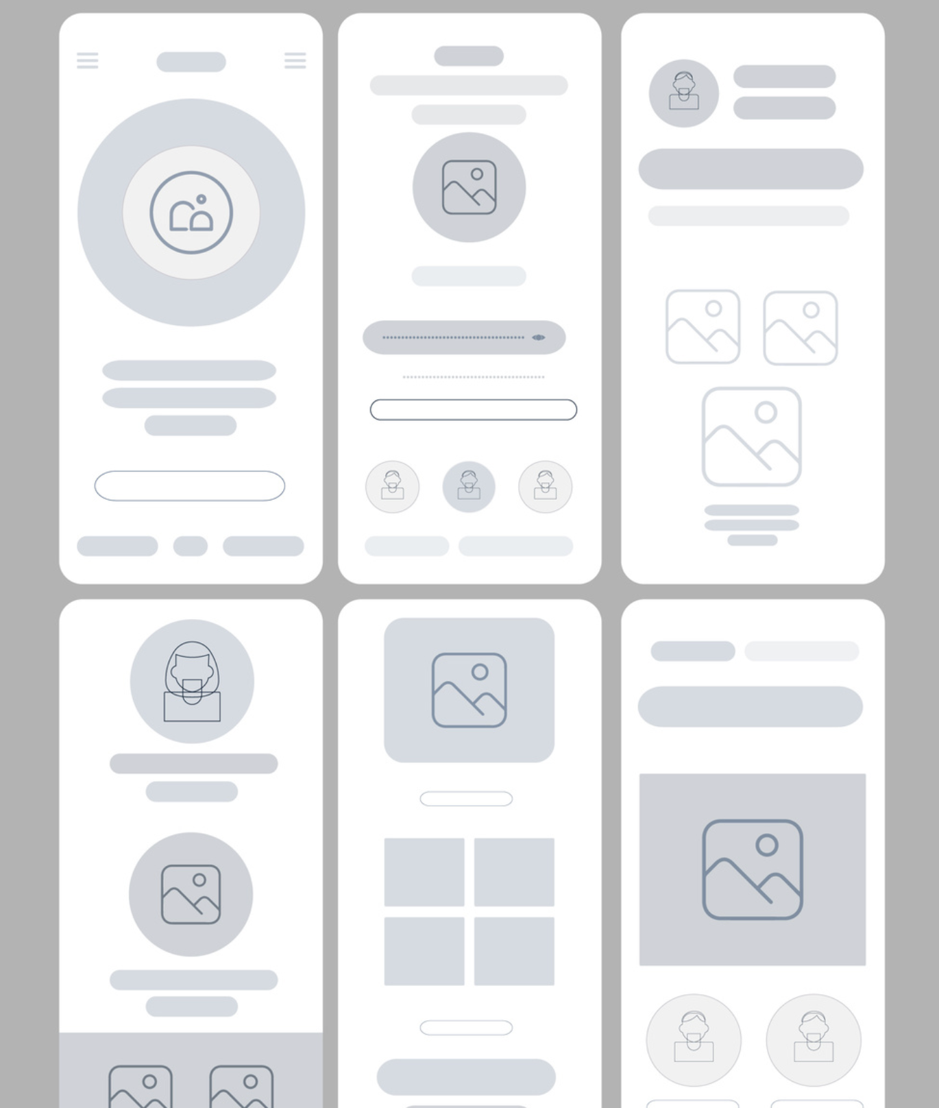
Below is a quick example of what a low-fidelity wireframe for a mobile app might look like:
They’re not just for designers. Founders, marketers, and product managers can use wireframes to explain ideas clearly, without needing any design tools or skills.
You can also use low-fidelity wireframes during usability testing to gather early feedback on your layout and content.
Ask users simple questions:
-
Can they find what they need quickly?
-
Do they know where to click?
-
Are they skipping over important sections?
Since low-fi wireframes remove all visual distractions, you can focus on how users interact with the layout. Observe which areas draw attention, where they hesitate, or what actions they miss.
This is mainly valuable for testing CTA placement, navigation flow, or content order. Just because something feels obvious to you doesn’t mean it will be clear to a first-time visitor.
If users struggle to complete their goal or miss a key section, that’s a sign your structure needs work before turning it into a high-fidelity design.
Key elements of a low fidelity wireframe
Low-fidelity wireframes rely on basic shapes to represent real content and layout structure.
Here are the most common elements you’ll find in a low-fidelity wireframe:
Placeholder boxes
Placeholder boxes are used to represent images or videos. These are typically gray rectangles or squares with an “X” through them, like the ones below.
They show where visual elements will go, without adding actual content.

Horizontal lines
Horizontal lines stand in for text. Different lengths suggest headings, subheadings, or paragraph content. This keeps the wireframe clean while still showing how copy might be structured.

Circles
Circles often represent icons or buttons in low-fidelity wireframes. As shown below, they may be labeled with short actions like “Sign up” or “Add to cart.”
These basic shapes help indicate interactive elements without adding visual design too early.

Visual hierarchy is shown through spacing and layout, not style.
For example, important actions like a CTA button might appear near the top, with supporting information arranged below.
A typical wireframe layout might follow this flow:
Header → Hero image → Subheading → CTA button → Content grid → Footer
Here’s an example of what that structure can look like in practice:

The header and hero section sit at the top, followed by a subheading and a CTA button.
Below that, you’ll see a simple content grid and footer, all laid out without any color, fonts, or visuals, just structure.
Without any fonts, colors, or visuals, the wireframe keeps attention on the user journey and content placement.
It helps teams project what will go where without getting caught up in the final design.
How to create a low fidelity wireframe
Creating a wireframe doesn’t require complex tools or polished design. A pen and paper or a simple wireframing tool are enough to get started.
The goal is to map out the structure and flow.
Here’s the exact process you can follow to sketch fast and effective wireframes:
1. Focus on user goals
Before you start sketching, ask yourself:
What’s the main thing your user should do on this page?
It might be reading a blog post, signing up for a newsletter, or browsing new products.
Once you’ve defined that goal, break the page into sections that support it. I recommend placing the most important content (like a value proposition or call-to-action) above the fold, so users see it right away.
It also helps to sketch 2–3 different layout versions for the same page. You can compare structure, prioritize elements differently, and choose the one that feels clearest before moving forward.
For example, here’s a blog homepage wireframe I created using UX Pilot’s AI wireframe generator:

It includes:
-
A simple header with navigation
-
A featured article section
-
A newsletter signup block
-
A content feed with category filters
-
And a footer with helpful links
Each section is tied to a clear user goal, whether that’s finding helpful content or staying in the loop with updates.
2. Sketch user flows as sequences, not isolated screens
Wireframes work best when they show how users move through your product, not just what one page looks like.
Instead of designing pages in isolation, I map out the full journey.
For example:
Homepage → Product Page → Checkout → Confirmation
Label each screen in sequence and draw arrows to show how users progress through the experience.
If there are conditional paths (like a failed login or an abandoned cart), include those too. This helps you catch friction points early and design smoother flows across all touchpoints.
The wireframe below shows a branching user flow, with arrows that map out how users move from one screen to another, including alternate paths.

This kind of layout is perfect for visualizing a complete user journey from start to finish, such as a product checkout or onboarding process.
If you're looking for more inspiration on how to visualize multi-screen user flows, you can explore real examples on PageFlows.
3. Prioritize screens using a content hierarchy list
Before you sketch anything, you should write down every piece of content or feature the page needs, and then you can rank them by importance.
For example, on a landing page, a list might include:
-
Logo
-
Navigation menu
-
Headline and subheading
-
Hero image
-
CTA button
-
Testimonials
-
Footer
Ask yourself: What does the user need to see first to take action or stay engaged?
Prioritize items at the top of your layout. Supporting content, like testimonials or links, can appear further down the page.
This method helps reduce visual clutter and keeps your layout focused on the most important message.
Here’s a wireframe I generated with UX Pilot’s AI wireframe generator that reflects this exact hierarchy in action:

4. Sketch using wireframing tools
Once you have a rough layout in mind, you can use a wireframing tool to sketch things out cleanly, but keep it simple.
There’s no need to overthink it. Tools like Wireframe.cc or UX Pilot’s AI Wireframe Generator are great for getting started fast, even if you’re not a designer.
You can use AI tools to quickly generate multiple layout versions based on a short prompt.
For example, you can type in a prompt to generate a low fidelity wireframe in UX Pilot and the tool does the rest.

The key is speed.
This stage is about testing the structure, not creating a final design. It’s totally fine if your wireframes look rough, because that’s what makes them flexible.
3 low fidelity wireframe examples
Here are 3 low fidelity wireframe examples: a homepage, a contact page, and a product page layout, with details on each, showing grayscale layouts using placeholder elements and clean structure.
Homepage wireframe example
This low-fidelity wireframe design outlines the structure of a homepage for an equipment rental business.
At the top, you’ll find a clean header with basic UI elements like a logo and navigation menu, followed by a bold headline, a short description, and a prominent call-to-action button encouraging sign-ups.

Next is a featured product grid using placeholder boxes and minimal text, which is perfect for visualizing core concepts without getting bogged down in detailed design elements.
Further down the page, an “About” section and newsletter signup form help guide the user’s flow naturally from top to bottom.
The spacing creates a clear hierarchy, putting important actions like the CTA near the top and supporting info later.
Notice how grey rectangles and simple labels stand in for real content. This lo-fi wireframe avoids styling distractions and is perfect for testing user flow in the early stages of the creation process.
Contact page wireframe example
This is an example of a contact page wireframe. It shows a clear layout with two main sections: contact details on the left and a user input form on the right.
The form includes fields for name, email, subject, and a message box, plus a visible submit button and confirmation note below

The design uses simple rectangles and grey tones to represent content without styling, letting layout and spacing define hierarchy.
There are no fonts, colors, or images—only structural placeholders like input fields and text blocks.
Above the form is a horizontal navigation bar with labeled page placeholders, while the bottom of the layout features a carousel-style section with product boxes and cost placeholders, offering visitors something to explore post-submission.
This structure supports the user's goal of getting in touch quickly, while also encouraging continued interaction with the brand.
Ecommerce product page wireframe example
This product page wireframe includes a large image placeholder on the left, with thumbnails stacked vertically to preview alternate views.
On the right side, you’ll find key product details: the title, price, color, and animal variant dropdowns, availability, and an “Add to cart” button.
There's also space for reviews, social sharing, and additional product info like dimensions and weight.

Further down, the layout features a tabbed section for the description and reviews, followed by a “You may also like” carousel in grid format.
The entire wireframe uses grey tones and placeholder boxes, keeping the focus on layout flow and content hierarchy rather than design.
It’s perfect for testing how users navigate a full product experience, from viewing images to checking specs and adding to cart.
Create low-fidelity wireframes with AI using UX Pilot
You can use UX Pilot’s AI Wireframe Generator to create low-fidelity wireframes in seconds if you don’t want to start from scratch.
UX Pilot uses powerful AI features to effortlessly create low-fidelity wireframes through simple, natural-language prompts. You can rapidly generate clear, structured wireframes by typing straightforward commands to instantly generate UI wireframing components.
While a prompt like "design a wireframe for a signup page for a productivity app" will bring you results, be more specific to get the design you want.
For example, I entered a concise but specific prompt;
Create a low fidelity wireframe for a mobile fitness app homepage. Include header, navigation bar, workout summary section, progress tracker, and call-to-action button. Use simple boxes and placeholder text only.
And here’s the design that UX Pilot generated for me.

You can see how accurate it is, incorporating my instructions about a mobile fitness app that includes a header, navigation bar, workout summary section, progress tracker, and CTA using placeholder boxes and text
It’s evident how using an AI tool like UX Pilot can save time during early ideation and lower the barrier for non-designers like founders, marketers, or solo builders.
You can focus on the flow and layout first, then fine-tune later.
Key takeaways
-
Low-fidelity wireframes help map out the basic layout and core functionality early in the UX design process.
-
They rely on simple shapes, placeholder text, and greyscale to remove visual design distractions.
-
Ideal for testing early concepts, user interaction, and refining the user interface before high-fidelity work.
-
Support rapid iteration, feedback gathering, and alignment across design and development teams.
-
Great for conducting usability testing and validating design ideas without needing polished visuals.
-
Tools like UX Pilot help non-designers create wireframes effortlessly and move quickly from rough sketches to a clear structure.