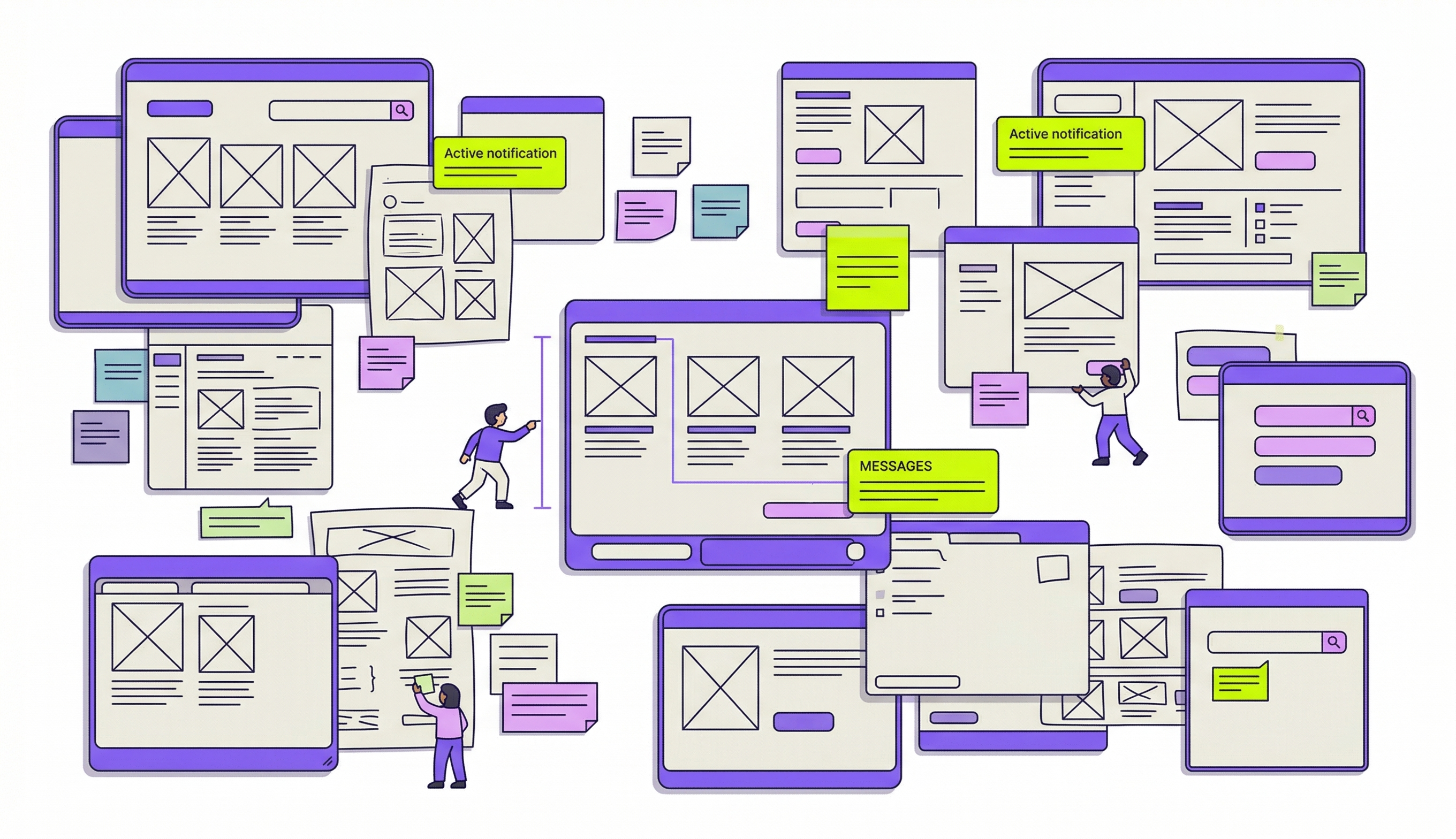
Rapid Prototyping for Product Design in 8 Steps

Khanh Linh Le
Created on Apr 10, 2026
Rapid prototyping, especially in product and app design, isn't a nice-to-have. It's how you avoid building the wrong thing at full cost during the product development process.
Research has found that validating designs before development can reduce iteration cycles by 25%, avoiding costly iterations and millions in rework. When you've seen a project spiral because assumptions went untested for too long, that number makes complete sense.
So I will lay out these 8 steps to help you tackle rapid prototyping.
What is rapid prototyping in product design?
Rapid prototyping is a methodology in which product designers create scaled-down, testable versions of a product to validate functionality and design decisions — and the emphasis here is on validation.
It's not a shortcut but a smarter sequence.
Traditional prototyping tends to move in a fixed sequence: sketch, wireframe, mockup, prototype, then handoff. Rapid prototyping collapses that.
That's also the biggest advantage of rapid prototyping. You might jump straight from a rough sketch to a clickable flow if that's what's needed to answer the next question.
That brings up fidelity, which I think gets misunderstood more than anything else in this process. Fidelity is often, in my opinion, a strategic choice:
-
Low-fidelity sketches and basic wireframes can validate structure and flow in under an hour.
-
Mid-fidelity adds navigational logic.
-
High-fidelity simulates the final product with content and interactions.
The common mistake I see isn't going low-fi but reaching for high-fidelity before you've even confirmed the flow makes sense.
A good example of what this looks like in practice is RedStack, a multi-role platform supporting five personas across interconnected portals. The team replaced static wireframes with working prototypes as the shared source of truth across product, engineering, and design. The result was noticeably less misalignment across a genuinely complex set of requirements.
8 steps for a rapid prototyping workflow that ships faster
There's no single right way to run a rapid prototyping process, but there are patterns that consistently work. These eight steps below are exactly that.
1. Define scope and constraints
You always need scope and constraints in every project, and this also applies to the rapid prototyping process.
While it's called rapid prototyping, it doesn't mean unplanned. Before opening any tool, the team needs to answer three things:
-
What specific question does this prototype need to answer?
-
What fidelity is sufficient to answer it?
-
What's out of scope?
In practice, I've found it helps to scope around a single user flow or decision point rather than trying to simulate an entire product. A prototype that tests the onboarding sequence is actionable. One that tries to cover the whole app is unfocused and slow to build.
A useful model here is the design sprint structure — Day 1 to understand, Day 2 to diverge, Day 3 to decide, Day 4 to prototype, Day 5 to test. The fixed timebox is the point. It forces the team to scope the work to fit the time, not the other way around.

Image via Coda
Another thing worth separating early is the concept from the visual design. They're different questions, and conflating them in the same prototype tends to muddy both.
Thoughtbot's sprint with Merck is a good example of how you can get this right. The team spent an entire day just aligning on whether the portal's primary job was knowledge sharing among developers or demonstrating ROI to managers. By converging on that focus first, they avoided building a prototype that tried to serve two audiences and answered neither clearly.
2. Start with low-fidelity to validate concepts and user flows
The initial prototype should be the roughest version that still answers the question you defined in step one. That usually means paper sketches, sticky-note flows, or basic wireframes.
A question I see come up often among UX designers is whether you can skip this step entirely.
And honestly, sometimes you can. If you're in a startup moving fast with a small, aligned team, or if you're working within a mature design system where the components already cover 80% of what you need, jumping straight to high-fidelity can be a reasonable call.
But for most cases, I'd advise against skipping it.
At the lo-fi stage, when something looks unfinished, people focus on whether the flow makes sense, not whether the button color is right. This is still very much what most experienced designers agree on.
For example, if major unknowns are coming out of the strategy phase, skipping lo-fi means burning hours on structural changes while already trapped in high-fidelity expectations.
After all, what lo-fi is genuinely built for is structural questions, such as
-
Does the navigation feel intuitive?
-
Are there missing steps in the flow?
-
Can users find what they're looking for?
I'd bring up the Q, a streaming aggregator app, as an example here. They ran user interviews and affinity mapping first, then used sketch prototypes to validate navigation and information architecture before any visual design began. It helps them ensure the structure reflects user needs rather than designer assumptions.

3. Use AI to accelerate prototyping without losing design intent
Rapid prototyping tools powered by AI have genuinely changed how fast a team can move from idea to testable artifact.
More significantly, prototypes are increasingly replacing PRDs as the primary decision-making tool. When you can generate multiple prototypes in hours, you can show stakeholders something interactive instead of asking them to read a document and imagine it. That alone collapses product development cycles from weeks to days.
At this point, adopting AI into your prototyping workflow isn't really a question of if; it's when. The cost of not moving is falling behind teams that are iterating faster and validating earlier.
Nevertheless, speed is only useful if what you're building is pointed in the right direction. This is the part I think a lot of teams are still getting wrong.
The issue isn't AI itself; it's using it without clear, refined inputs and expecting good outputs. Garbage in, garbage out applies here more than anywhere.
They are excellent for communicating your ideas with clarity. But that requires you to have the idea clear in the first place.
The teams getting remarkably good results are the ones treating AI as a tool that amplifies good thinking, not one that replaces it.
Thoughtbot's sprint for TellaDraft is a strong example. Before any prompting began, the team consolidated discovery notes, user personas, and detailed workflows into centralized context documents. The result was a fully functional prototype with screens and interactions delivered in a short period.
This brings me to the principle that makes this work: context first, code second. The quality of what AI generates is directly tied to what you feed it upfront:
-
Your existing design system and component library
-
User personas and key research findings
-
The specific flow or decision the prototype needs to answer
-
Product constraints and out-of-scope items
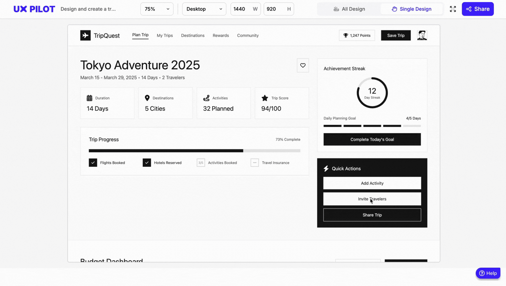
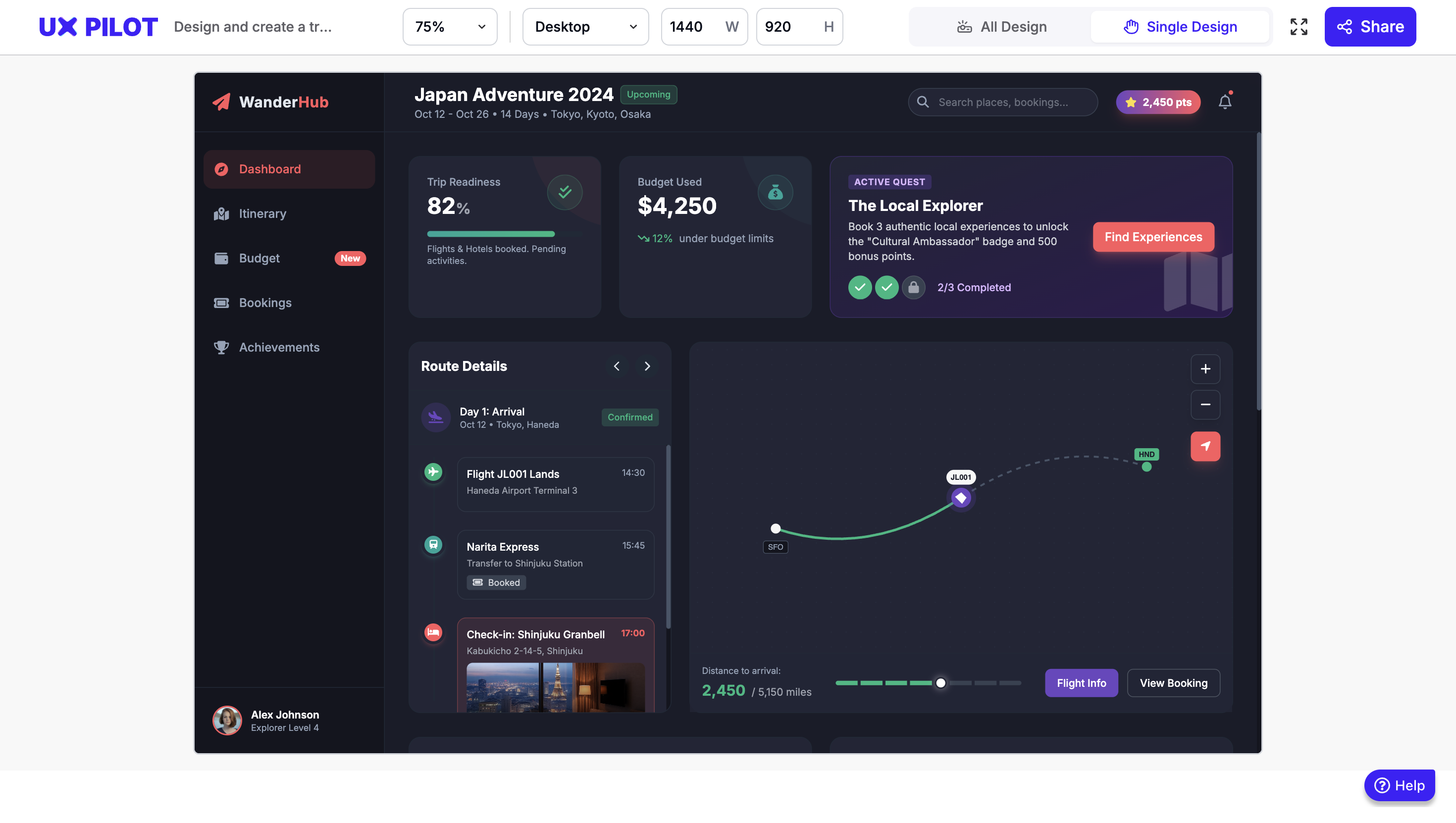
My personal favorite AI tool for this design process is UX Pilot's Prototype generator. It's trained specifically on UX design rather than general-purpose AI, which makes a real difference in output quality.
I tested it myself without a brand kit, prompting it to design a travel planner screen with budget tracking, gamified elements, and an Airbnb look and feel in lo-fi mode.
The result below came back in minutes and was already directionally solid. Imagine what it produces when you upload brand guidelines, reference screens, and more specific requirements.
4. Test with real users at every fidelity level
In my opinion, usability testing should be something that runs alongside every iteration. A paper prototype can be tested with a handful of users in an afternoon. A mid-fidelity wireframe can go out for remote testing within a day. Waiting until the prototype feels "ready" almost always means waiting too long.
The method you use depends on what you're trying to learn:
-
Moderated testing — a facilitator watches users complete tasks in real time — works best for complex interfaces, early-stage concepts, or when you need to ask follow-up questions to understand the reasoning behind behavior.
-
Unmoderated testing — users complete tasks independently on their own devices — works better for quick validation, larger user feedback volumes, and observing natural behavior without the presence of a facilitator changing how people act.
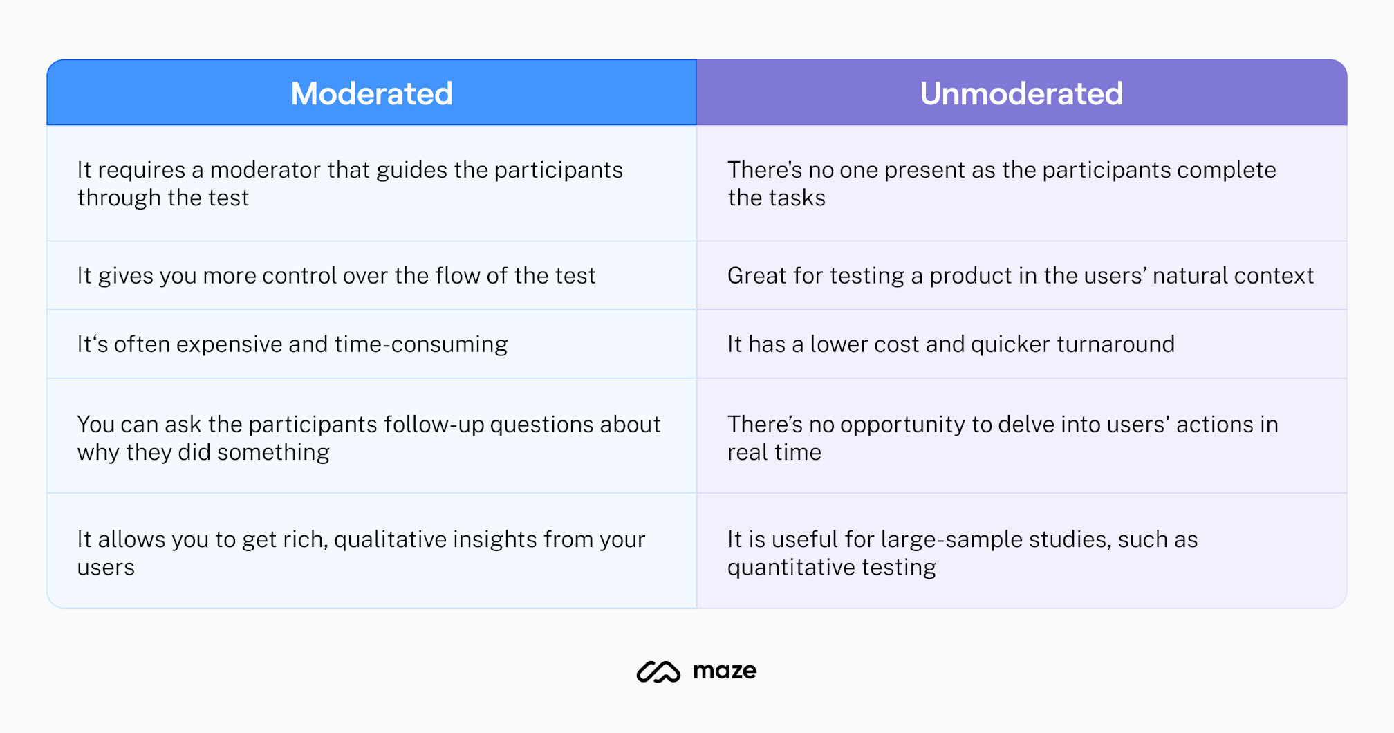
Image via Maze
A practical cadence I've found useful is to test lo-fi prototypes with 3-5 users for structural feedback, iterate, then test mid-to-high fidelity with another 3-5 users for interaction and comprehension.
Nielsen's research suggests that five users will surface around 85% of design flaws and usability problems in qualitative testing. This means you don't need large groups to get meaningful signals; you just need to do it consistently at each stage.
Another thing worth adding is that involving more than one evaluator in review sessions meaningfully increases problem detection. Research shows that going from one to two evaluators increases the number of usability problems found by an average of 46%. This is a significant jump for minimal extra effort.
GetFTR ran this kind of layered testing through their entire process. Starting with sketching workshops first, then progressively more interactive prototypes, testing at each stage. By keeping fidelity low early on, they maintained iteration speed while still generating feedback that was meaningful enough to act on.
5. Time-box iterations using the RITE method
For rapid prototyping, the iterative process I keep coming back to is RITE — Rapid Iterative Testing and Evaluation.
Developed by usability experts at Microsoft, the logic behind it is straightforward: find it, fix it, test it again. Rather than running all participants through the same version and analyzing everything at the end, you fix clearly identified issues immediately and retest with new participants right away.
It has a tight cycle of 1 to 3 participants per round, cycling through multiple iterations until no new issues surface.
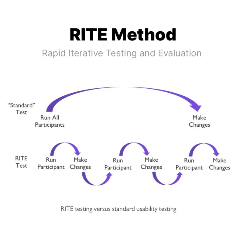
Image via Helio
What I think makes RITE genuinely effective isn't just the speed; it's the decision-making model that comes with it.
Designers, PMs, and engineers observe sessions together and leave each one having sorted observations into three categories: fix immediately, investigate further, or defer. That shared accountability means decisions happen in the room, not in a follow-up meeting days later.
Nevertheless, RITE only works if your prototype can be modified quickly between sessions. This is exactly why over-investing in high-fidelity polish too early kills the method. If changing the prototype takes longer than running the next session, you've lost the whole advantage.
In fact, Microsoft originally validated RITE during the development of the Age of Empires II tutorial, where rapid test-fix-retest cycles caught problems that batch testing would have surfaced far too late to address without significant rework.
6. Avoid the "pretty trap" of premature high-fidelity polish
Pretty trap is the process where you spend hours polishing a prototype before the initial concept has been validated. It's the pattern I've seen kill design velocity more than almost anything else.
The moment something looks finished, people treat it as finished, regardless of what you tell them.
I recently came across a case that captures this well.
A designer presented high-fidelity mockups in an early stakeholder review and watched the entire conversation shift to visual attributes like typography, while the navigation problems went completely unaddressed.
I had put on too much polish too early on in the process, and as a result I had distracted the user and limited the usefulness of her feedback.
When she deliberately reverted to lower-fidelity prototypes for the next session, the feedback changed entirely. Suddenly, her client was questioning the structure, which was exactly what needed to happen.
This tracks with what I see designers and PMs discussing in product communities, too.
"Designer here. Often times going too high fidelity too fast is a trap. Once people see an image they start reacting to the image instead of what you’re trying to make conscious design decisions about.
Staying in low fidelity as long as possible should make it so you make a very intentional design overall.
The fidelity of your designs and prototypes should match the fidelity of your learning goal."
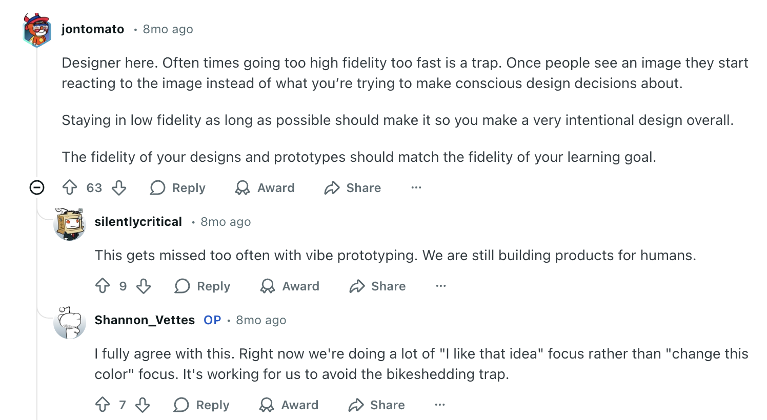
I think that's the heuristic we all should internalize. Core UX comes first — does the flow work? Functional mechanics come second — do the interactions feel right? Visual polish comes last — does it look finished? You should only invest in the next layer after validating the current one.
7. Scale to high-fidelity for interaction design and developer handoff
High-fidelity is the point where your concept is validated, the flow is tested, and the structural decisions are settled.
And when you get there, it serves two jobs:
-
functional testing whether the intended interaction design works
-
giving engineering teams a clear, unambiguous reference to build from.
Essentially, a developer-ready high-fidelity prototype should include: real (or realistic) content instead of lorem ipsum, accurate spacing and typography from the design system, interactive states (hover, active, disabled, error, loading), responsive behavior across breakpoints, and annotated specifications for animation timing and interaction logic.
Here's an example of one that I generated using UXPilot:
One thing I've noticed is that the more complete and accurate the high-fidelity work, the fewer back-and-forth questions come up during development.
The prototype might showcase most of that in high definition that then could help the QA and testing A LOT and thus reduce costs.
I find that the higher fidelity and more comprehensive the mocks, the less post-handoff questions I get from dev. I have a couple of devs who guess well in the absence of 100% clarity, but most do not. It can also simplify the approval process of the dev work when they know they better not show it to me until it looks like the mocks.
This is also where having a solid design system pays off in a real, tangible way. When you're assembling validated components rather than designing from scratch, high-fidelity moves fast.
A lot of designers describe essentially working in high-fidelity by default once a mature component library is in place — not because they're skipping steps, but because the system handles the repetitive decisions so they can focus on the interactions that require judgment.
The handoff model itself is also shifting. More teams are moving away from the traditional "design then hand off" workflow, with designers submitting code directly using AI-assisted tools.
One PM I came across described cranking out interactive mocks in their existing design system live during a meeting. This is exactly the kind of speed that makes the old sprint cycle feel unnecessary.
The only caution I'd add is to treat AI-generated prototypes as showcase artifacts, not production code.
The goal of high-fidelity prototyping is to improve communication and alignment, not to generate code your engineers will build from. It gives stakeholders a minimum viable product experience to get a sense of functionality.
The moment a polished prototype gets mistaken for a finished product, you've lost the whole point of the process.
8. Keep stakeholders aligned with the right prototype at the right time
Stakeholder misalignment is often framed as a communication problem. In my experience, it's usually a fidelity problem. Think of showing a rough wireframe to a CEO expecting a polished demo and you create doubt about progress.
The prototype isn't wrong, you just present it to the wrong audience at the wrong moment.
A practical way to think about this is matching fidelity to who's in the room and what decision they need to make. For example:
-
Internal design reviews — lo-fi, keeping the conversation on flow and logic rather than visual details
-
Executive updates — mid-fidelity, enough visual context to convey direction without implying completion
-
User testing — varies depending on what's being validated, lo-fi for structural questions, hi-fi for interaction testing
-
Developer handoff — high-fidelity with full specifications, interactive states, and annotations
Crema's engagement with Diode Ventures is a good example.
The team ran a full strategy and alignment session before touching any design tool, then moved into rapid prototyping. They managed to convert abstract ideas into high-fidelity designs within days. Stakeholders could see, interact with, and react to an actual product experience before a single line of code was written. The result was genuine team-wide buy-in, not the more common outcome where stakeholders approve a concept they've each interpreted differently.
Which is why setting expectations before every prototype review is worth making a habit. You don't need a long disclaimer, just "we're here to discuss the flow today, not the visual design" is enough.
Start prototyping faster to build better products
Honestly, no version of this process works cleanly every time. You'll skip steps when deadlines are tight, revert to wireframes when stakeholders react to the wrong things, and over-invest in fidelity once or twice before learning your lesson. That's fine, that's the process working.
What I've found is that the biggest variable isn't the tools or even the process. It's whether the team is clear on what they're trying to learn at each stage. Without that, it doesn't matter how fast you prototype, you'll just be generating artifacts that look like progress.
So start with the question, not the tool. Keep fidelity as low as the decision allows. Get it in front of real people sooner than feels comfortable. And when AI tools, design systems, or faster workflows let you move quicker, use that speed to test more, not just to build more.