Vibe Designing Guide: From Prompt To Shipped Product in 8 Steps

Petar Marinkovic
Created on May 8, 2026
The design process has always been full of dependencies. You had an idea, but you had to wait — for the Figma file, the agency pitch, someone to push pixels...
AI tools changed this by giving us vibe designing. You describe what you need plainly, AI does the heavy lifting, and you get to curate the details until everything feels right.
Despite the trendy slang, vibe designing isn't a fad. According to the State of AI in Design Report, AI has already improved the workflows of 89% of designers, so there's no coming back now.
If you want to get on board, I'm giving you a playbook that explains:
-
What vibe designing is
-
How it differs from the traditional design process
-
How to do it in seven steps
What is vibe designing?
Vibe designing is an AI-powered design approach that lets you describe the look, mood, or outcome you want in natural language and have AI tools generate the design assets. It offers fast, intuitive creation that replaces manual workflows.
If you've stumbled upon the term "vibe coding," you can probably imagine how it translates to design. The whole "vibe" lingo was coined in 2025 by OpenAI co-founder Andrej Karpathy, who used vibe coding to explain the process where developers "give in to the vibes" to generate code and let AI handle implementation without thoroughly reading, understanding, or debugging the resulting code line-by-line.
A vibe designer does the same — instead of manually placing every element and exporting every asset size, you describe the vibe and let AI produce it. All you need to do is know which result feels right and give it a few tweaks.
The paradigm shift here is massive because the traditional design process starts without the big picture. You need to make hundreds of micro-decisions (grids, columns, breakpoints, component specs) before answering what the product should feel like.
Vibe designing turns it around. On a high level, it looks like this:
-
You prompt an AI tool with general instructions on how the product should look and feel
-
You get one or more draft product ideas with established aesthetics and emotional tone
-
You choose the preferred result and play around with it before shipping
Muzli's analysis explains the process well. Instead of starting with gray wireframes for a meditation app, a vibe designer prompts: "design a landing page for a meditation app that feels calm and minimal, inspired by Apple Health and Headspace."
The result is 20 to 50 full-color, detailed variations in minutes. You immediately jump to the final emotional impact instead of building up to it for weeks.
But it's not just about you having a more enjoyable experience. If done right, vibe designing gets real, tangible results.
For example, a landing page that cost $15 to produce beat a $15,000 human-designed version by nearly 45% in a controlled conversion test. That's a thousand-to-one cost ratio for a demonstrably better outcome.
I get how this may sound threatening, but no — AI tools won't replace designers. There are still plenty of processes and decisions where you'll play a crucial role, including:
-
User research
-
Information architecture
-
Accessibility auditing
-
Brand strategy
After all, we design for people, so AI can never replace human judgment at the strategic level — it just compresses the production layer.
The only thing that changes is the designer's primary constraint, which is no longer time but curatorial judgment. If anything, taste and creative direction become more valuable, not less.
7 steps to vibe design an app
Vibe designing isn't just about prompting and tweaking — here's what the process looks like:
1. Define the job to be done
The whole point of vibe designing is to start with a workable draft, which you can't do with vague instructions. Designing without a clear user objective produces beautiful screens nobody needs, so you need to start with a single sentence that captures why someone would use your product.
The jobs-to-be-done (JTBD) framework gives you clear guidance on how to do this:
"When [trigger] happens, [user persona] wants to [action], so that they can [desired outcome]."
This sentence sets your priorities straight and becomes a design compass for all UI components.
Vague sentences won't work here. It's not enough to just whip up something like:
"Engineers need to send incident updates."
This gives vibe design tools way too much freedom, so you'll probably end up with poor designs. Instead, do this:
"When an incident occurs, engineers want to communicate status updates quickly and clearly so that customers and internal stakeholders stay informed and trust is maintained."
This sentence explains exactly:
-
Who will use the product
-
What they need
-
Why they need it
As such, it's much more likely to give you the result you're looking for.
The JTBD statement is what you paste into every AI prompt to keep the tool anchored on the user. It takes five minutes to craft and can save hours of prompt-and-pray iteration downstream.
JTBD isn't specific to vibe designing, nor is it a new concept at all. Clayton Christensen, professor at Harvard Business School, discussed it when he explained how McDonald's used it decades ago to boost milkshake sales.
After analyzing customer behavior, McDonald's realized that the JTBD for customers wasn't just to enjoy a treat but to make their commute less boring. The team then streamlined the purchase process so that customers wouldn't be late for work.
Your product's JTBD will probably be clearer than this, but the point stands — lead with the main user objective so that the rest of your design process stays focused on it.
2. Build a reference stack from similar tools
Experienced designers don't start with a blank screen or write a prompt from scratch. Most AI systems can use visual data, so you should use a stack of screenshots as a reference point to guide your tool.
Research 3–5 existing products that serve a similar audience or solve a similar problem. Then, create a checklist of what the tool should pull from each reference. For example:
-
Where your eyes go first
-
How many clicks it takes to complete the core task
-
What's the emotional tone (calm, dense, playful, premium)
-
What animations or hover states stand out
These screenshots and guidelines will become the core of your AI prompts later on. That's why, much like the JTBD statement, they should be descriptive and precise.
For example, "Linear's keyboard-first command palette" is a much better reference than "something clean" — and the output will reflect this.
While drawing inspiration from a competitor is a wise move, copying them verbatim isn't. Don't just clone references without context, as this will almost always backfire because you have a unique audience with specific needs.
For instance, while dark mode is everywhere these days, it probably won't work for a healthcare patient portal. Keep your audience and their objective in mind, and translate references accordingly.
I mentioned Linear above because it's a perfect platform to reference in a vibe design prompt. It's become the gold standard for modern software tool design thanks to design choices like:
-
Sub-50ms response times
-
Keyboard-first navigation via Cmd+K
-
Opinionated triage workflows that reduce decision fatigue
Now compare Linear to Jira, which has been notoriously criticized for its high complexity and slow performance. When you make this comparison, you get a concrete "do this, not that" reference stack that gives AI tools a clear direction.
3. Write a design brief that doubles as your AI prompt
While vibe designing means you don't have to juggle a bunch of manual tools, you still have to master the tools you are using. You need to get really good at prompting because a one-liner won't do the trick.
Instead, you need a brief that covers objective, audience, success criteria, mood, constraints, and references. The more detailed you are, the fewer rounds of regeneration you'll need later on.
The general structure of your brief should look something like this:
-
Objective (what the design should achieve)
-
Target user (who is using it and what mindset they're in)
-
Success criteria (how you'll know it works — e.g., reduced checkout time or load time)
-
Key screens (the 2–3 views you need)
-
Design intent (how it should feel — e.g., "fast, minimal, focused")
-
Tech constraints (if applicable)
-
Competitor/reference notes (what to emulate vs. avoid from the last step)
This is where the "vibe" part shows up. You're describing the mood and feel, not the mechanics or technicalities. For example, instead of "blue button, 16px font," write "minimalist SaaS landing page with warm earth tones, asymmetric grid, editorial photography feel."
The point is to focus on emotional direction, not pixel specifications.
Once created, your brief becomes a reusable artifact that speeds up future projects. As you document prompts, you'll build a library that the team can simply pull from instead of prompting from the ground up.
A great example of this is IBM's Cloud Infrastructure team, which used structured one-shot prompting with their Carbon Design System to compress months of enterprise prototyping into minutes.
For complex workflows like virtual machine creation flows with 100+ screens and multiple edge cases, a detailed prompt removed what designers call "noodle work" — the tedious manual screen connections that often bottleneck enterprise UX.
The key to the team's success was the specificity I mentioned. Instead of "design a VM setup flow," they described the full context, constraints, and design system tokens in a single prompt. As a result, they created a sort of system kit for AI-assisted designing.
4. Produce several variations
The goal of vibe designing isn't to create one concept and iterate endlessly. Instead, you can generate 5 of 50 variations across different directions to brainstorm and get some inspiration before landing on the preferred design.
In other words, it's about breadth, not depth.
You don't need a bunch of different prompts for each variation you need — your design tool should take the one prompt you come up with and give you multiple designs that vary across elements while sticking to the same core.
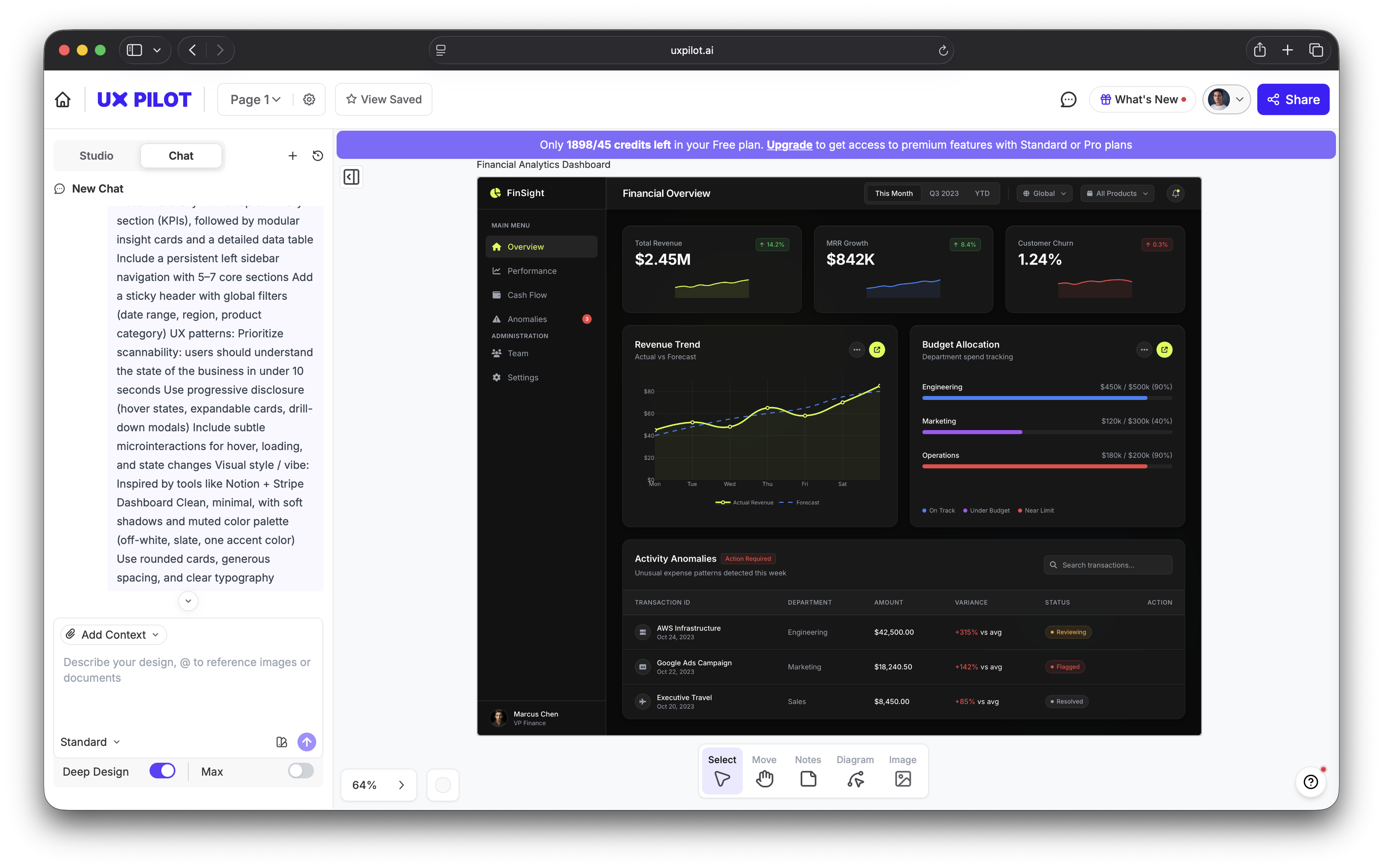
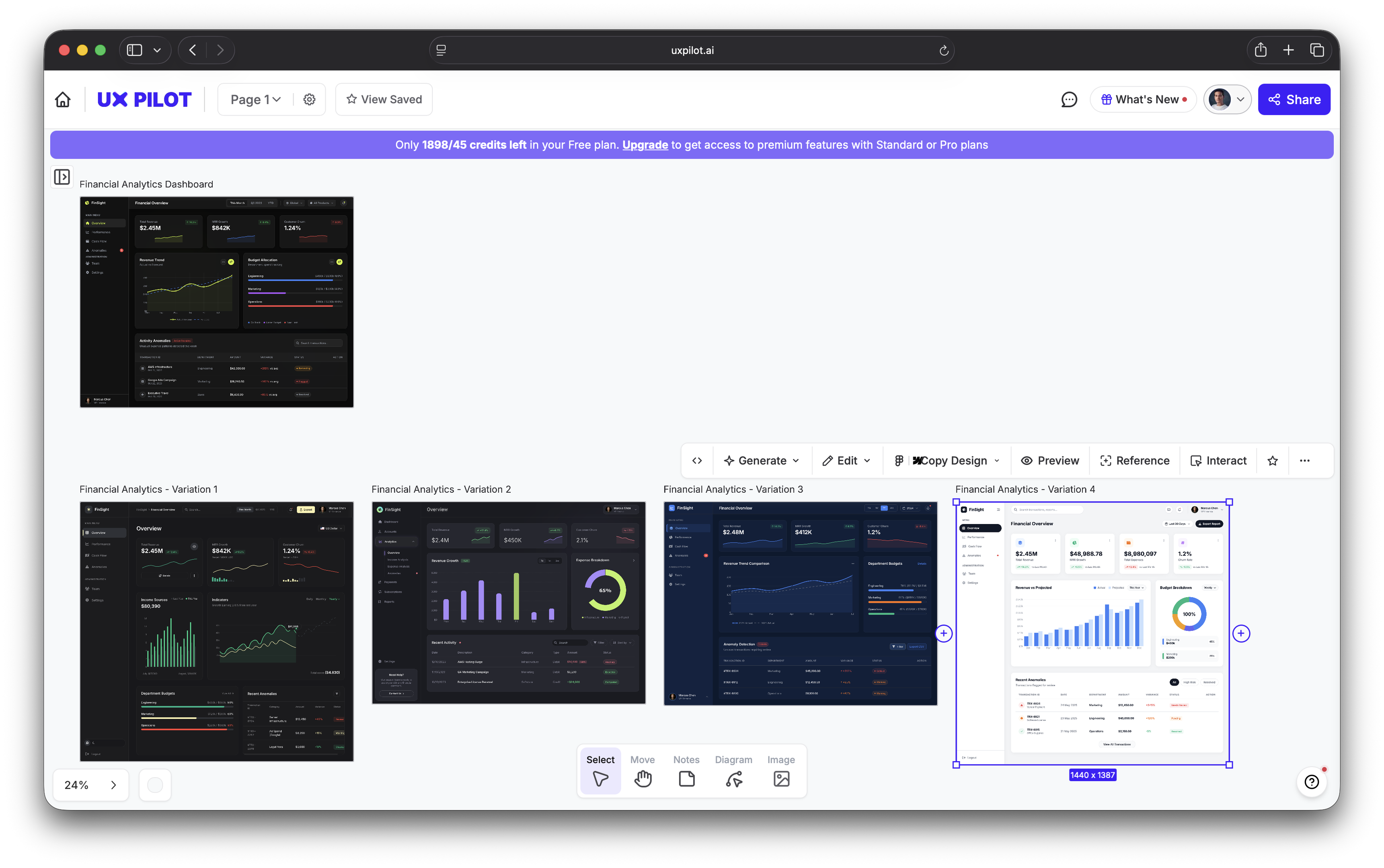
For example, I told UX Pilot to design a financial analytics dashboard based on my key preferences (Notion- and Stripe-like vibe, muted color palette, rounded cards, etc.). It included all my details in the first variation:
I then told it to create four more variations without additional prompting. I just went to Generate > Variations and selected the number of versions I needed.
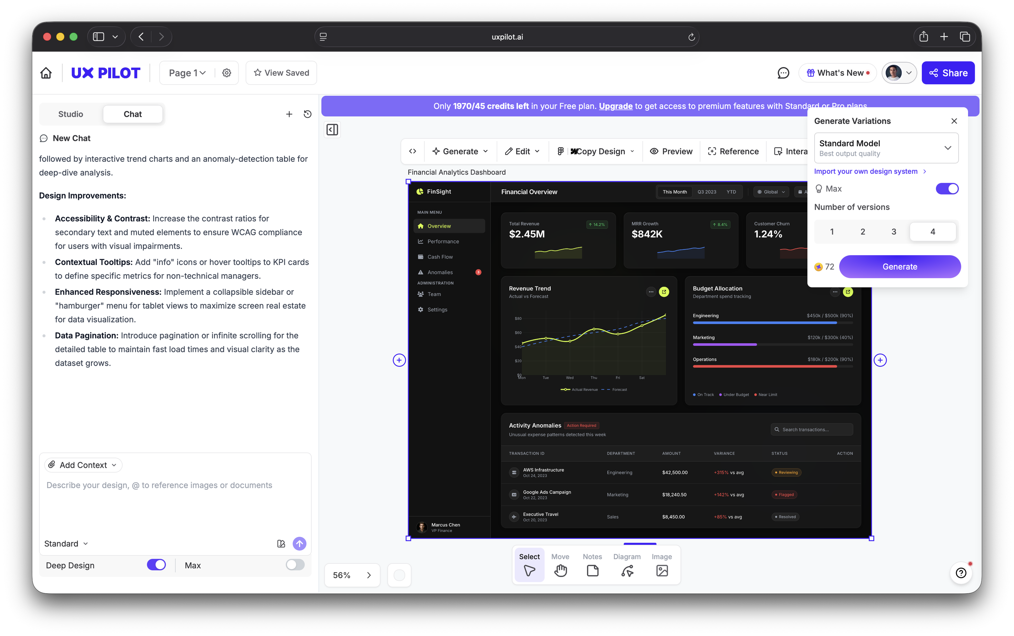
In no time, I had four variations of the initial design that changed things like the color scheme, layout, and overall information architecture. Still, all designs were aligned with my initial prompt in terms of the objective and overall vibe.
This is where vibe designing differs a bit from vibe coding. A vibe coder follows a linear conveyor belt — prompt → build → tweak. Meanwhile, a vibe designer can generate and test several designs at once. You get multiple directions first, test what resonates, and then refine once the mood is clear.
Essentially, you can leverage the fact that volume is cheap with AI. Generating 30 concepts takes minutes instead of weeks, so you become a curator of almost production-ready UI instead of endlessly clicking and moving pixels around.
Zalando, Europe's largest online fashion retailer, implemented this multi-directional approach to scale production and software development. Their design team uses vibe designing to generate dozens of visual concepts per campaign instead of committing to a single creative direction from a traditional photoshoot-
This worked so well that by early 2026, over 90% of Zalando's content was AI-generated — and the results were impressive:
-
Production timelines compressed from 6–8 weeks to 3–4 days
-
Marketing costs reduced by 90%
-
70% more content was produced year-over-year without increasing headcount
5. Refine for brand guardrails and accessibility
If you prompt an AI design tool well enough and create enough variations, you can pick a design that's mostly ready to go. All you have to do is make a few executive decisions and tweaks, such as:
-
Adjusting colors to match brand guidelines exactly
-
Fixing compositional issues or AI artifacts
-
Ensuring typography is consistent and readable
A particularly important aspect of your review is accessibility, which should never be entirely left to an AI tool. It's not just a nice-to-have with room for interpretation but a non-negotiable that you must ensure before shipping.
By default, most AI design tools don't automatically ensure WCAG 2.2 compliance, even with detailed execution. Different color palettes may fail contrast requirements, layouts may not be screen-reader friendly, and tab order may be broken.
The good news is that you can be proactive about these issues with effective prompting. Instead of using ad-hoc prompts to fix problems, build a governed style reference system with approved:
-
Color palettes
-
Style references
-
Typography rules
-
Negative prompts (what AI should avoid when designing)
IBM's Carbon Design System that I mentioned earlier is a great example of a system that effectively incorporates style references you can add to prompts. The machine-readable design tokens and accessibility-first approach can help fine-tune your prompt for a more WCAG-compliant result.
For example, you can include this in your prompt:
Follow IBM Carbon system:
- Use IBM Plex Sans
- Spacing: 8px grid
- Colors:
  - Background: #FFFFFF
  - Interactive: #0F62FE
  - Text: #161616

Constraints:
- Use structured data tables and form layouts
- Maintain high-density enterprise UI
- Ensure keyboard navigation order is logical
Of course, this only reduces the risks of non-compliance — it doesn't remove it altogether. You'll still have to double-check the output to make sure it's aligned with the relevant accessibility guidelines.
6. Launch to a small group and measure what sticks
The speed advantage you get with vibe designing can easily be undermined if your team still uses slow launch cycles. You should get the product in front of real users as quickly as possible to maintain the momentum.
This doesn't have to be your entire user base but a small trusted group where the stakes are low enough to learn.
If we're talking numbers, launch to 1–5% of users first depending on the size of your user base. Then, watch session replays to check for any instances of:
-
Hesitation
-
Rage-clicking
-
Bouncing
Most importantly, track funnels tied to the job to be done from step one. Task completion rate and speed are tell-tale signs of how well you've designed, so the job should be done with minimal friction.
A major benefit of AI-powered design is that you can blast through experiments that traditionally take a ton of time. You can test 10 hero image variants instead of two and try five different landing page layouts in a week instead of one per quarter.
As you do, talk to your users. Ask what felt slow, confusing, or unnecessary to understand their experience. Qualitative feedback catches things that hard metrics miss, so it's the key to successful user research.
A perfect example of effective testing is Flux8 Labs, which worked with a client to improve their conversion rate that was stuck at 2.1% despite a solid landing page design.
Instead of redesigning the page from scratch, Flux8 introduced an AI-powered personalization layer that dynamically adjusted elements based on user behavior and context signals. To test its effectiveness, the team went beyond a standard A/B test and served different UX combinations dynamically.
The results were impressive — conversion rates jumped to 4.7%, mainly as a result of increased time on page and scroll depth.
7. Build a prompt library for the next round
You probably won't notice an efficiency boost from AI-powered design in a single project, especially the first one. If anything, it will likely take more time to get the hang of the workflows.
But after this, each project will be faster than the last one. The efficiency compounds over time, and you'll reach a point where your new workflows are several times faster than the old ones.
To make this happen, though, you need to systemize everything from the get-go. Every good prompt, style reference, brand brief, and negative prompt should be documented in a shared, searchable library accessible by every software engineer, designer, and other key team member.
So on top of component libraries, you should have a prompt library that contains:
-
Effective prompts paired with their outputs
-
Template prompts for recurring project types (landing pages, social posts, product mockups)
-
A brand prompt kit with style references and parameters
-
Negative prompts that prevent common AI mishaps (bias, generic content, etc.)
The compounding advantage here is massive — the team that builds a 200-prompt library over six months can onboard a new designer in hours instead of weeks because the library encodes the team's taste and brand standards.
Once built, a prompt library directs and speeds up the whole workflow. It feeds the design brief from step three on every future project, making each round faster than the last.
If you're still not convinced, check the results that Microsoft got after shifting from manual mockups to what they call "collaborative prompt design" with product managers and engineers. Here's what happened after the switch:
-
85% of designers reached quality first drafts faster
-
77% of early adopters said they wouldn't go back to the old workflow
-
76% reported higher satisfaction with their tools
Make vibe designing your competitive edge
Vibe designing isn't meant to replace designers — it's about giving every designer (and founder, PM, and product engineer) the production capacity of a full design team. When each team member can get interactive prototypes in minutes instead of days, tool proficiency is no longer the key differentiator. Instead, it's taste, creative direction, and the discipline to anchor every design in a real user need.
But enough theory. Take a project, apply this seven-step framework, and measure the time saved against your traditional process. Most teams see a 50–70% reduction on their first real project, so you'll almost definitely see comparable results.