UX Mapping Guide and Methods for Better User Experiences

Saloni Kohli
Created on May 8, 2026
UX Mapping Guide and Methods for Designing Better User Experiences
Most teams design products around features, screens, and flows. But users don’t experience products that way.
From a user’s perspective, every interaction is part of a larger journey, which includes decisions, frustrations, expectations, and moments where things either work smoothly or fall apart.
UX mapping helps product teams see that journey clearly.
Instead of analyzing isolated screens or usability issues, UX mapping visualizes how users move through an experience from start to finish. It highlights where users succeed, where they struggle, and where design improvements can make the biggest difference.
In this guide, I’ll explain what UX mapping is, why it matters in the UX design process, and the key UX mapping methods teams use to better understand user behavior and improve the user experience.
What is UX mapping and why it matters
UX mapping is a visual representation of how a user interacts with a product or service from start to finish.
It shows the steps users take, the decisions they make, and the emotions they experience while trying to accomplish a goal. Instead of analyzing isolated screens or features, UX mapping looks at the entire user journey across multiple touchpoints.
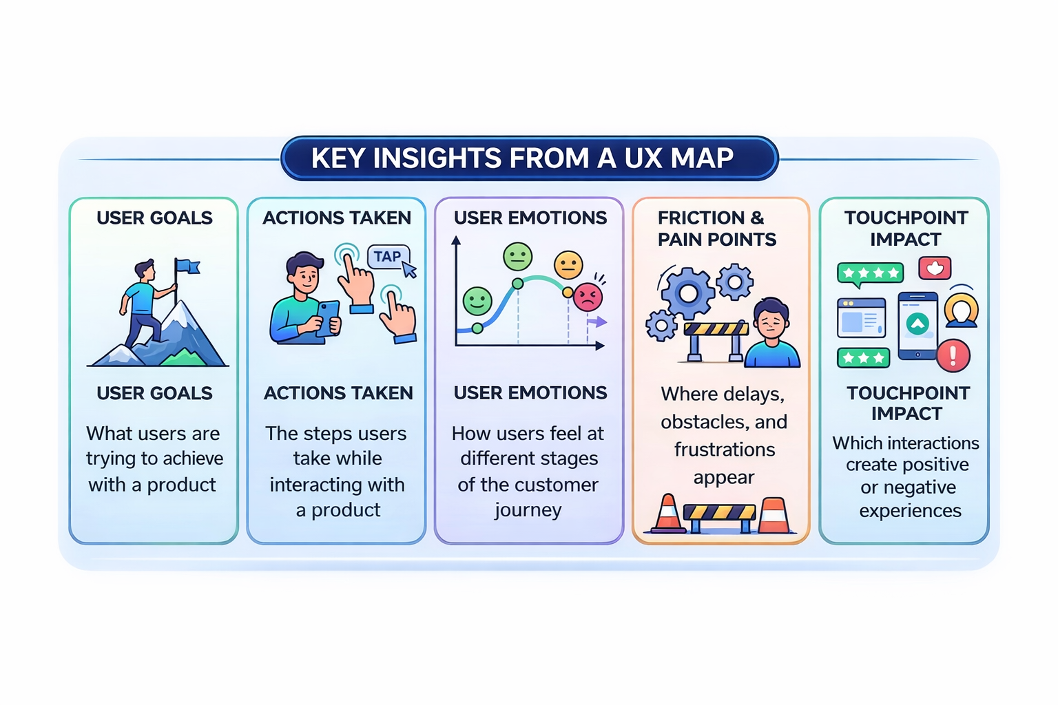
A typical user experience map provides a comprehensive understanding of:
-
What users are trying to achieve with a product (user goals)
-
The actions users take while interacting with a product
-
How users feel at different stages of the customer journey
-
Where friction and user pain points appear
-
Which touchpoints create negative or positive experiences
Seeing the experience mapped out makes patterns obvious. Issues that seem small in isolation often reveal bigger problems once the entire journey is visible. This helps product teams address customer pain points.
UX mapping also helps teams move beyond assumptions. Product teams often think they know how users behave, but real user interactions rarely follow the clean paths teams design. Mapping the journey forces teams to step into the user’s perspective and base decisions on actual user research.
Another reason why UX mapping matters is that it helps create alignment across teams. Designers, product managers, engineers, and stakeholders can look at the same customer journey and quickly understand where the experience breaks down.
Once these patterns become visible, teams can identify opportunities to improve the design process, facilitate desired outcomes, and minimize negative customer experiences.
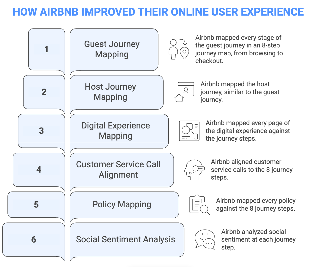
Airbnb is a great example of this.
As the company scaled, different teams were responsible for different parts of the guest and host experience, which made it hard to see where problems actually started.
So Airbnb mapped the entire journey—from browsing listings to completing a stay—across eight stages.
Then they layered real data on top of those stages, including product pages, customer support calls, policies, and user feedback. This gave teams a clear picture of what was happening at each step and helped them identify whether an issue was caused by the product, customer support, or gaps between different stages of the experience.
The most widely used UX mapping techniques you’ll come across for this process include empathy maps, journey maps, service blueprints, and mental model diagrams, each focusing on a different part of the user experience.
Other mapping techniques like ecosystem maps, affinity mapping, or scenario mapping workshops also support the mapping process by helping teams organize research insights or understand broader systems around a product.
4 core UX mapping techniques
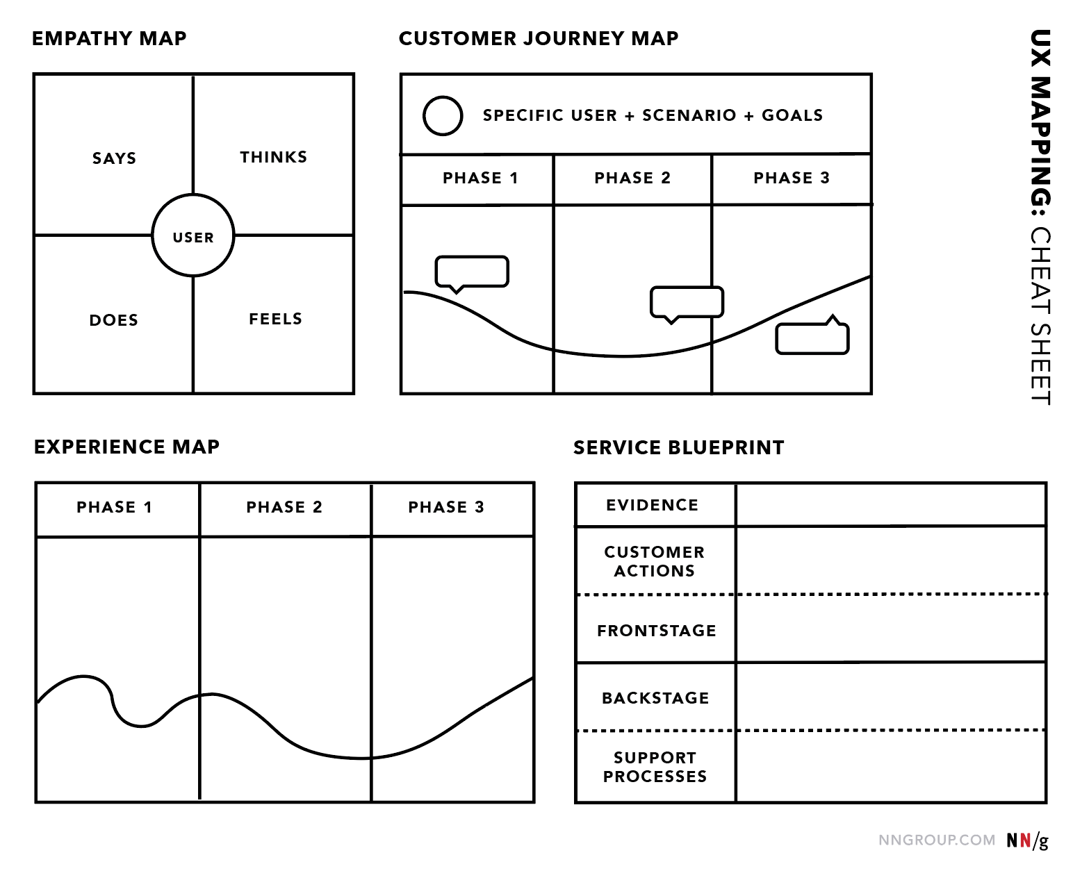
1. Use empathy maps to capture what users say, think, feel, and do
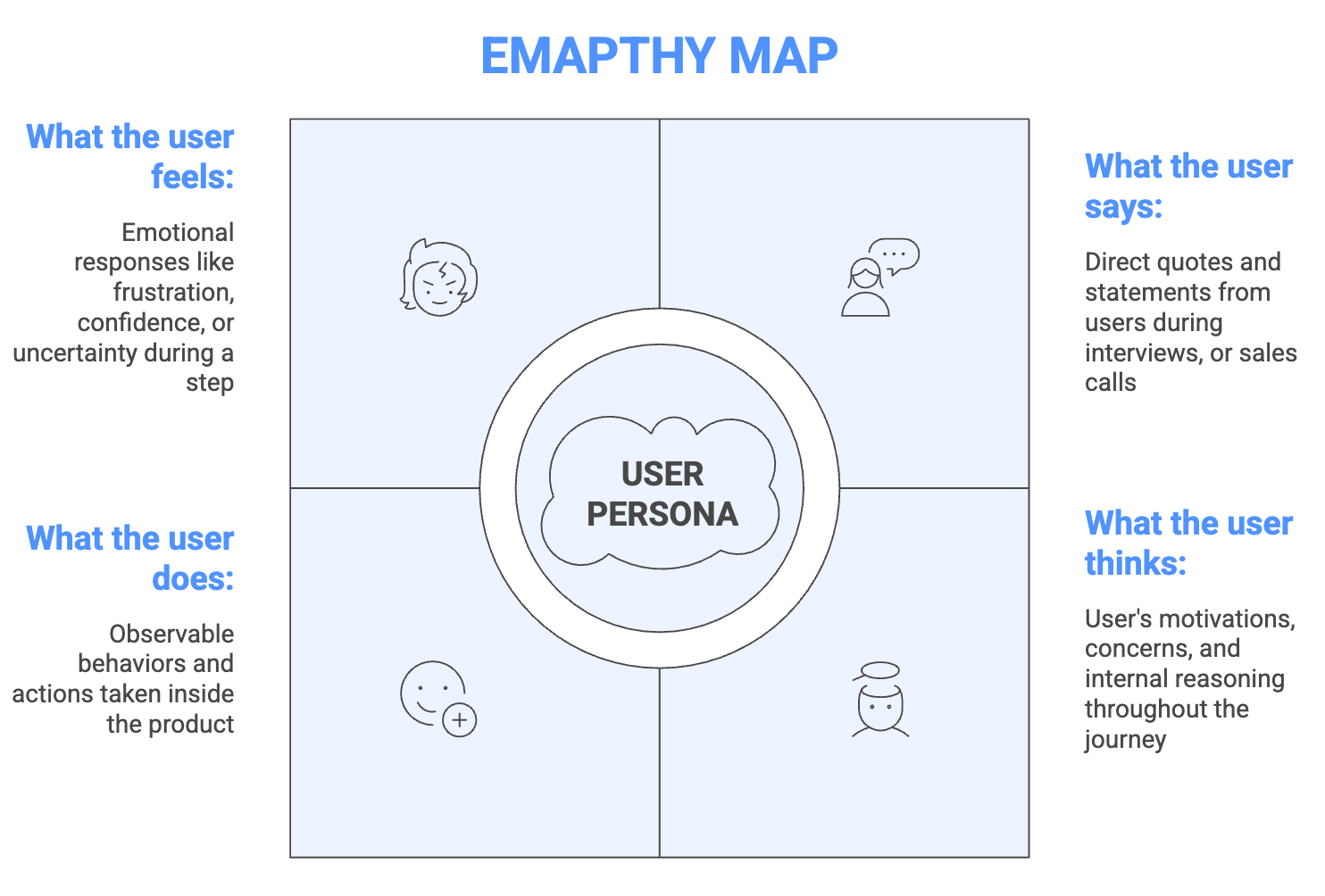
An empathy map helps teams understand a user’s mindset during an experience. Instead of focusing on features or flows, it captures what the user is actually experiencing in a moment— what they say, think, feel, and do.
Most empathy maps follow a simple four-quadrant structure centered around a specific persona or user type:
-
Says: Direct quotes or statements from users during interviews or research
-
Thinks: The user’s motivations, concerns, and internal reasoning
-
Does: Observable behaviors such as actions taken inside the product
-
Feels: Emotional responses like frustration, confidence, or uncertainty
This structure helps teams translate scattered research insights into a clearer picture of how users experience a product and general human behavior towards design.
Empathy maps are also one of the fastest UX mapping methods to create, which makes them a good starting point when a team has limited research.
Teams sometimes create empathy maps for a single user as a deep dive into one persona. In other cases, insights from multiple users are combined into an aggregated map to identify broader patterns across user groups.
Both approaches are useful at different stages of the UX research process.
But the biggest benefit is the collaborative process of creating it. When designers, product managers, and engineers fill in the quadrants together, they often surface conflicting assumptions about the user.
That conversation builds shared empathy and alignment across the team.
Empathy maps also pair naturally with journey maps. Once teams understand what users are thinking and feeling, they can then map how those experiences evolve across the entire journey.
A global pharmaceutical company similarly used empathy mapping during an internal sales leadership conference (facilitated by DesignThinkers Group).
After restructuring from functional silos into cross-functional matrix teams, the company wanted to improve collaboration between roles but faced significant internal friction—blurred reporting lines, overlapping responsibilities, and frustrated employees.
Instead of speculating about each role’s experience, teams filled out empathy maps together with the actual team members present.
[Source]
By collaboratively documenting real feelings and actions rather than relying on corporate assumptions, they dramatically reduced cross-functional friction and built a shared understanding of what each role was actually experiencing on the ground.
The exercise created meaningful conversations about responsibilities, surfaced misunderstandings, and helped reduce friction between teams.
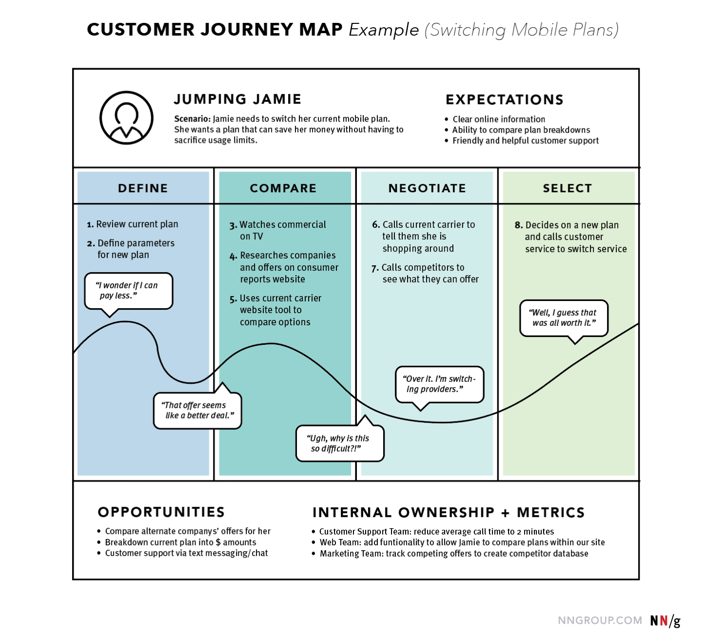
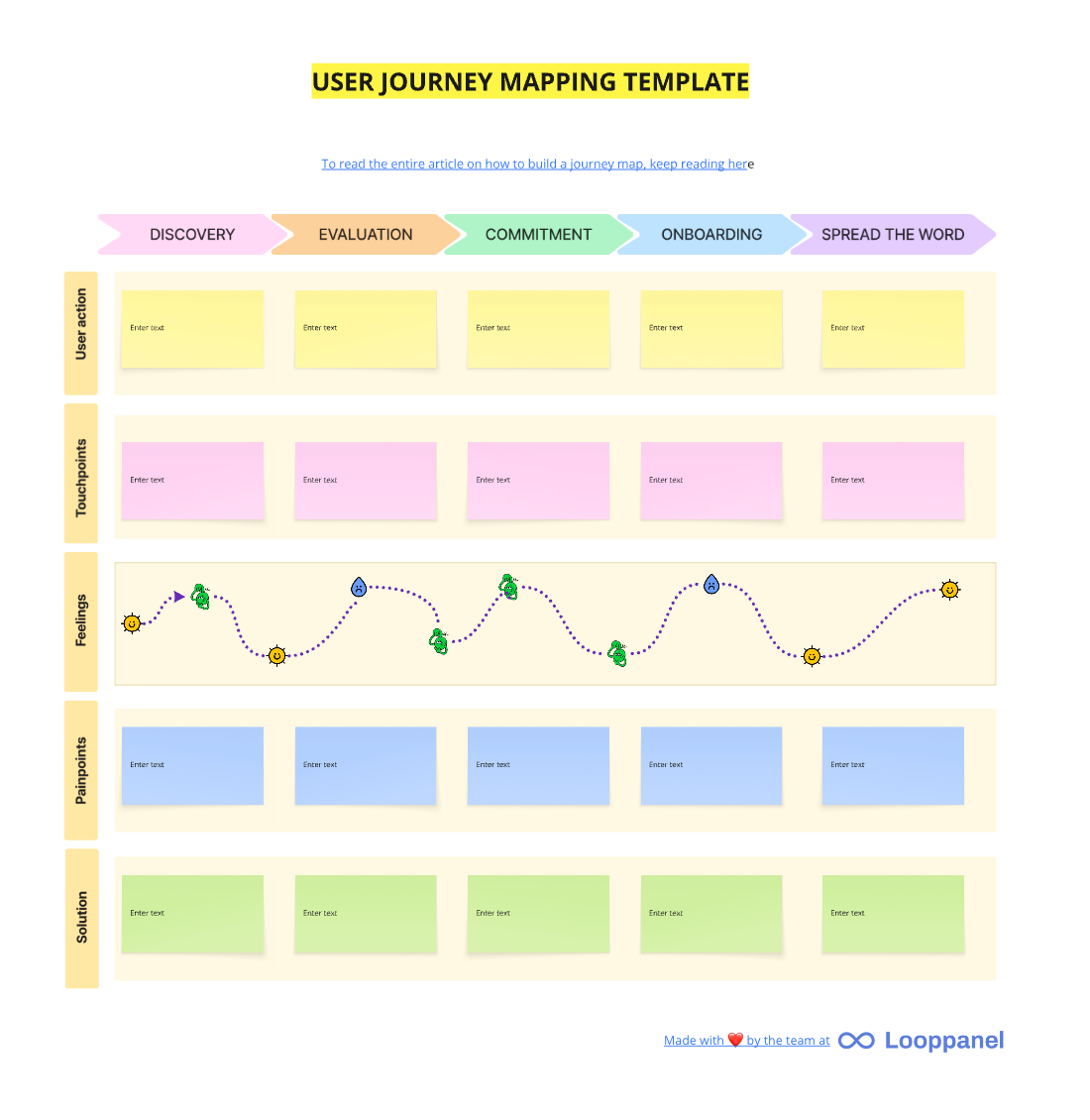
2. Build journey maps to visualize the user's path across touchpoints
While empathy maps focus on a user’s mindset in a moment, journey maps focus on how an experience unfolds over time.
A user journey map visualizes a specific user’s experience as they move through key touchpoints while trying to accomplish a goal. The map captures what the user is doing, thinking, and feeling at each stage of the journey.
Most journey maps include these core components:
-
Stages: Phases of the journey, such as awareness, consideration, active use, and retention
-
Touchpoints: Every interaction point with the product or service (website, mobile app, store, support channels)
-
Emotional states: How the user feels throughout the journey, including moments of frustration or satisfaction
-
Pain points: Obstacles or frustrations users encounter
-
Opportunities: Areas where improvements could make the experience smoother
[Source]
Teams also need to be clear about the difference between user journey maps and customer journey maps.
A user journey map focuses on the person actually using the product—how they complete tasks, interact with touchpoints, and where friction appears. A customer journey map, on the other hand, focuses on the buyer’s perspective.
This distinction matters in B2B products where the buyer and the user are often different people.
For example, a company may purchase a tool, but employees are the ones interacting with it every day. Mapping both perspectives helps teams understand both the purchase decision and the actual product experience.
Another common mistake is assuming journeys follow a perfectly linear path because real user behavior is rarely that tidy.
Users move between channels, revisit earlier steps, and often loop back before completing a task. A useful journey map reflects this reality rather than forcing the experience into a neat funnel.
Before creating a journey map, teams also need to make two scoping decisions:
-
Current state vs. future state: Map the experience as it exists today, or design how it should work after improvements.
-
Research-first vs. assumption-first: Base the map on real research insights, or start with assumptions that will later be validated through user research.
Being explicit about these choices helps the team understand whether the journey map reflects actual user behavior or a working hypothesis.
Athleta’s design team encountered this challenge when trying to map customer interactions across stores, website, mobile, and customer service.
A static journey document quickly became difficult to navigate as research insights grew. Instead of relying on a traditional PDF map, the team created an interactive journey framework in Figma.
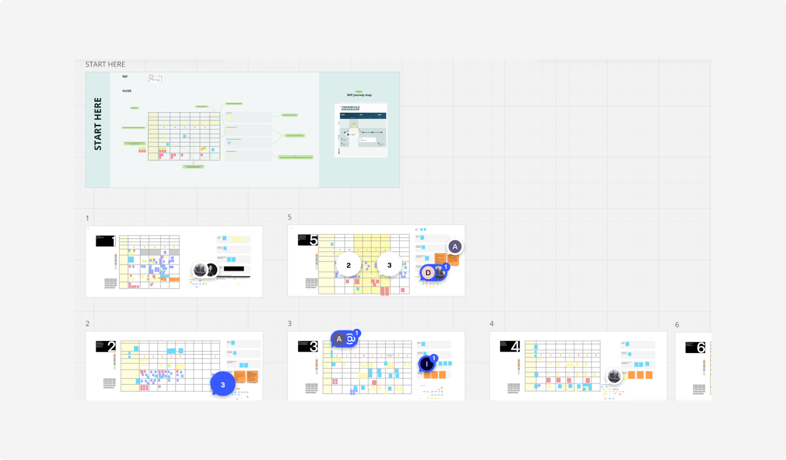
[Source]
This modular system allowed stakeholders to click into individual touchpoints, explore research insights, and identify friction points themselves. With this, they were able to create a much more usable journey map that supported faster, data-driven decision-making across teams.
3. Create service blueprints to link user actions with behind-the-scenes processes
A service blueprint extends a journey map by revealing everything happening behind the scenes that supports the user experience.
While a journey map focuses on what the user sees and does, service blueprints connect those visible interactions with the internal systems, teams, and processes that make the experience possible.
In other words, they link the frontstage experience with the backstage operations that power it.
Most service blueprints are structured in layers that include:
-
User actions: What the user is doing at each step of the experience
-
Frontstage interactions: The visible touchpoints, such as interfaces, employees, or support channels
-
Backstage processes: Internal actions that support the experience but are invisible to users
-
Support systems: Infrastructure like inventory systems, databases, or operational workflows
Seeing these layers together makes it easier to understand how breakdowns in one layer create pain points in another. A problem that appears to be a UX issue might actually be caused by a backend process, an operational constraint, or a policy decision.
Because of this complexity, service blueprints are usually created after a journey map already exists.
The journey map defines the user experience, and the service blueprint adds organizational depth to explain how the experience is delivered.
They become especially useful once a product or service has reached scale and involves multiple moving parts. At that point, teams need a clearer view of how product design, operations, support, and internal processes intersect.
For example, Starbucks created a service blueprint mapping the entire customer experience from entering the store to receiving an order.
The blueprint connects visible touchpoints—such as ordering at the counter, waiting for the drink, and picking it up—with backstage activities like preparing ingredients, maintaining equipment, managing inventory, and coordinating staff workflows.
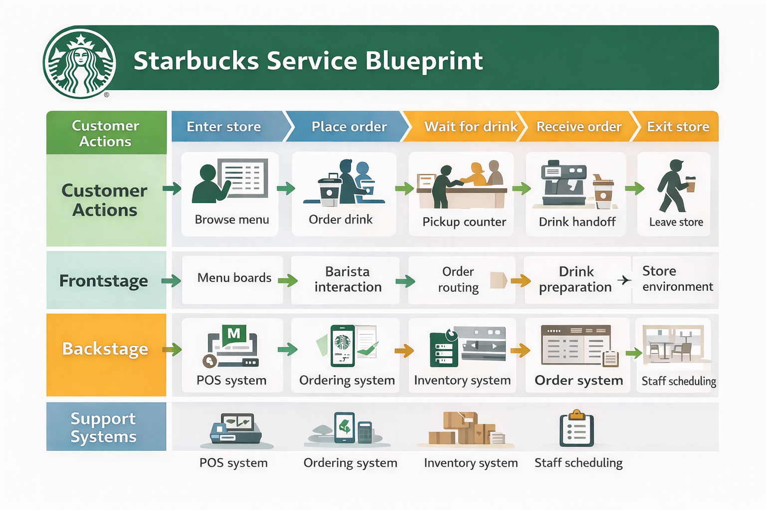
By mapping these layers together, Starbucks could see where operational processes affected the customer experience and where gaps between marketing promises and operational delivery created friction.
4. Diagram mental models to align design with user scenarios
A mental model diagram shows how users think a product works based on their past experiences, habits, and assumptions. This matters because users approach every product with expectations already in their heads.
This is different from how the product actually works.
When a product’s structure matches that mental model, the experience feels natural. When it doesn’t, users get confused, even if the interface itself looks perfectly designed.
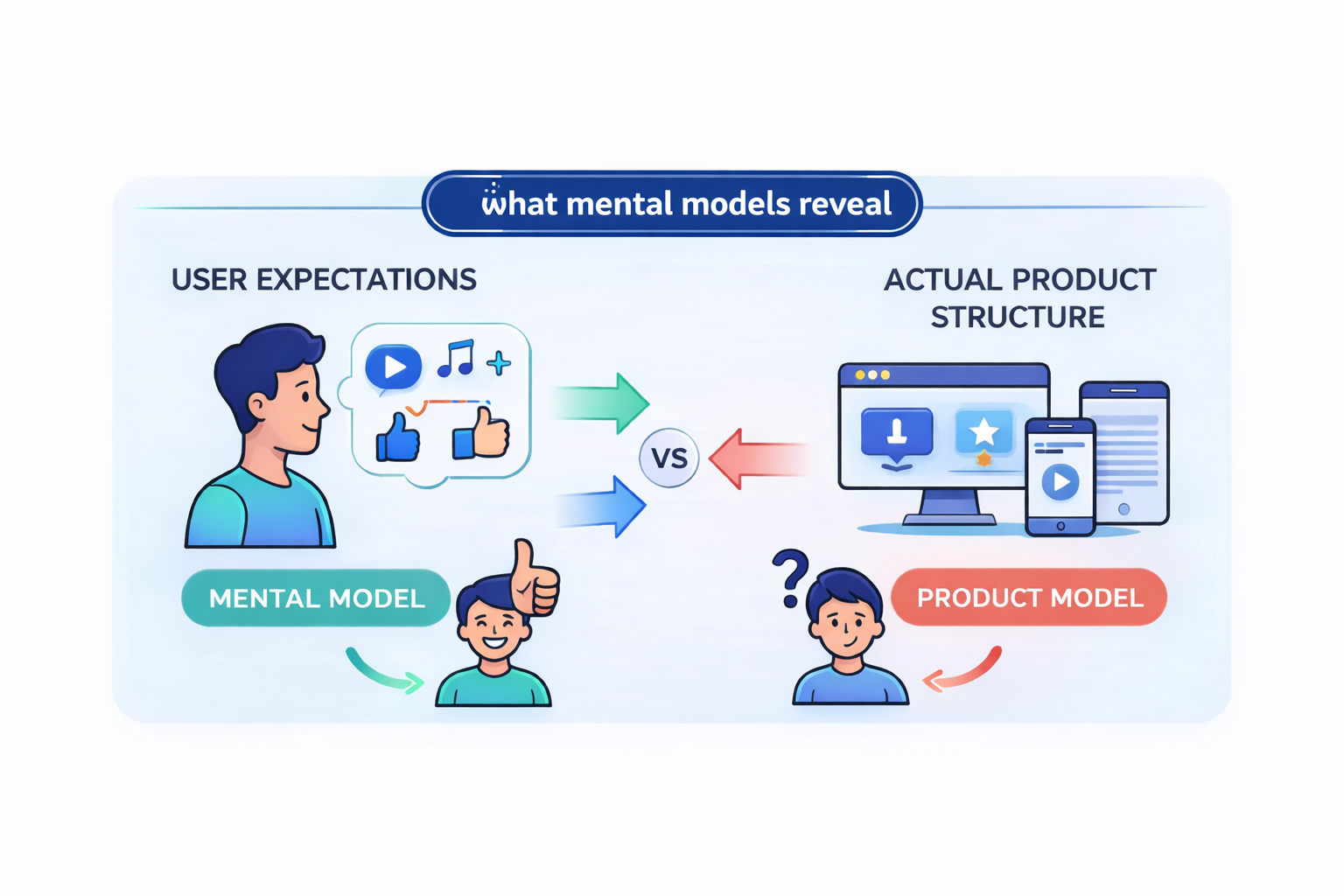
The purpose of mental model mapping is to understand those expectations and design around those customer needs.
Creating an aligned mental model diagram usually involves a research-driven process:
-
Conduct user research to understand how people approach a problem.
-
Document insights and observations on sticky notes or digital cards.
-
Group those insights into themes that represent how users think about the task.
-
Organize those themes into a visual structure that shows key concepts, tasks, and phases of the experience.
This process helps reveal how the target audience approaches a potential problem long before they interact with the product.
Mental model diagrams work particularly well alongside journey maps as they show what users actually do, while mental models show what users expect to happen.
The gap between these two visuals is where many usability issues live, and where design improvements often emerge.
Although mental models are the least commonly created of the four UX mapping methods, they can be one of the most powerful tools for identifying unintuitive design patterns.
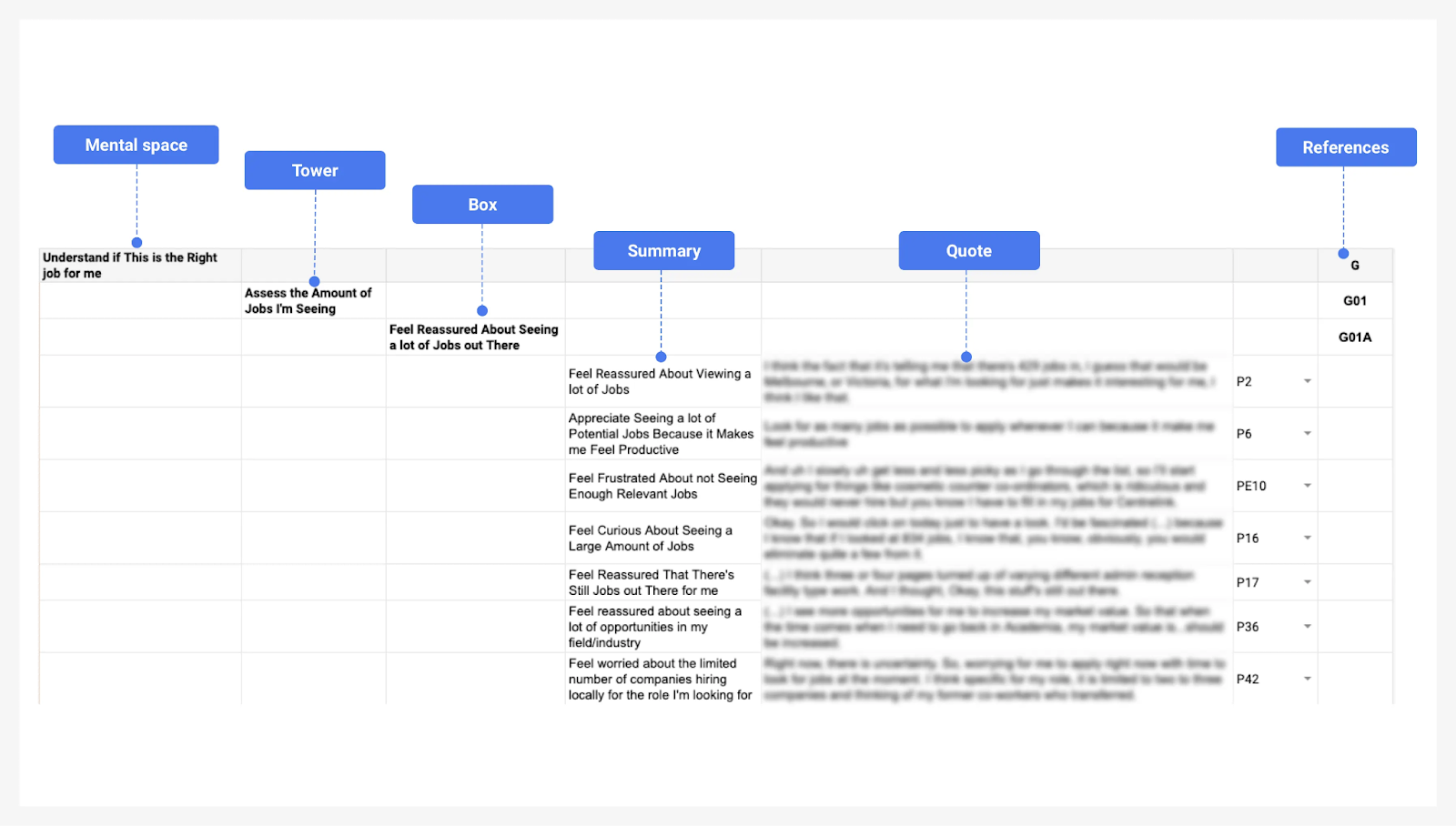
The Australian job platform SEEK documented this approach while researching how people search for jobs online.
Their UX team built mental model diagrams based on interviews with job seekers, capturing their intentions, expectations, and emotions throughout the search process.
[Source]
By comparing those mental models with how the product actually worked, the team was able to identify mismatches in the experience and use those insights to guide design decisions.
How to choose the right user experience mapping method
Each UX mapping method answers a different question about the user experience. Understanding those questions makes it much easier to decide which UX journey map to use.
It's best to match the experience map type to your research question and project stage, then layer additional maps as the design process evolves.
Think of the four core UX mapping methods like this:
-
Empathy maps answer: Who is our user and what do they experience?
-
User journey maps answer: What does the user's path look like across touchpoints?
-
Service blueprints answer: What processes behind the scenes support that journey?
-
Mental model diagrams answer: Does our design match how users think?
Instead of choosing randomly, teams should match the experience map type to the stage of the design process and the type of user research available.
Here’s a simple comparison framework to help you understand how journey mapping starts:
|
Map type |
Primary question it answers |
Best used at (project stage) |
Input data needed |
Typical output |
|
Empathy map |
Who is the user and what are they thinking or feeling? |
Early discovery stage |
Initial user research, interviews, assumptions |
Four-quadrant visual (says, thinks, does, feels) |
|
User journey map |
What does the user journey look like across touchpoints? |
Research and design planning stage |
User research, usability testing, behavioral insights |
Timeline of stages, actions, emotions, and pain points |
|
Service blueprint |
What internal systems support or break the experience? |
Later design or operational stage |
Journey map, service processes, internal workflows |
Multi-layer map showing user actions, frontstage, backstage, and support processes |
|
Mental model diagram |
Does the product structure match how users think? |
Any stage where usability confusion appears |
Deep UX research and behavioral insights |
Conceptual model showing user expectations and tasks |
Most teams start with empathy maps. They are the fastest mapping method to create and help synthesize existing user knowledge when research is still limited.
Once a team conducts deeper user testing and research, journey mapping usually becomes the central deliverable. A user journey map reveals the stages, touchpoints, and user pain points across a specific customer journey.
As a product or service grows more complex, teams often add service blueprints. These maps extend the customer journey map by connecting user interactions to internal business processes, support systems, and operational workflows.
Mental model diagrams are slightly different. They can support any stage of the UX design process. Teams typically use them when something feels unintuitive or when user expectations don’t match how the product actually behaves.
According to Nielsen Norman Group, teams should first decide whether the experience map represents the current experience or an improved future version of the journey. Second, decide whether the map is built from existing research or from team assumptions that will be validated later.
In practice, most product teams combine both approaches.
They sketch an early version of the map based on what the team already knows, then refine it as research, user testing, and behavioral insights to add more clarity.
And one final rule: don’t create every UX map at once. Instead, start with a single mapping method that answers your core question.
As the team gains deeper insights into user behavior, pain points, and support processes, additional maps can be layered on to build a more complete understanding of the user experience.
Nielsen Norman Group’s UX mapping cheat sheet positions empathy maps as the starting point, journey maps as the primary artifact for understanding the user journey, and service blueprints as the advanced layer used to analyze operational complexity across multiple departments.
[Source]
How to create a UX map step by step
1. Define your user persona and scope before mapping anything
Every UX map starts with a user persona. You can’t map a journey for a product, service, or tool without knowing whose journey it is.
A persona represents a specific type of user and helps teams focus on real behaviors and needs instead of designing for a vague “average user.” Most personas include three core elements:
-
Behaviors: Habits, lifestyle patterns, and personality traits that influence how the user interacts with a product.
-
Goals and motivations: What the user is trying to achieve, including needs, frustrations, and pain points.
-
Demographics: Relevant background details such as age, occupation, or level of comfort with technology.
Remember that personas should always be based on real user research, not assumptions. Teams typically gather these valuable insights through:
-
Surveys: The cheapest and fastest way to collect insights from a large group of users
-
User interviews: Deeper conversations that reveal motivations and frustrations
-
Focus groups: More resource-intensive discussions that surface shared attitudes and behaviors
For example, when Spotify built its internal listener personas in 2017, the UX research team conducted diary studies and contextual interviews with U.S. listeners to understand how people actually experience music in their daily lives.
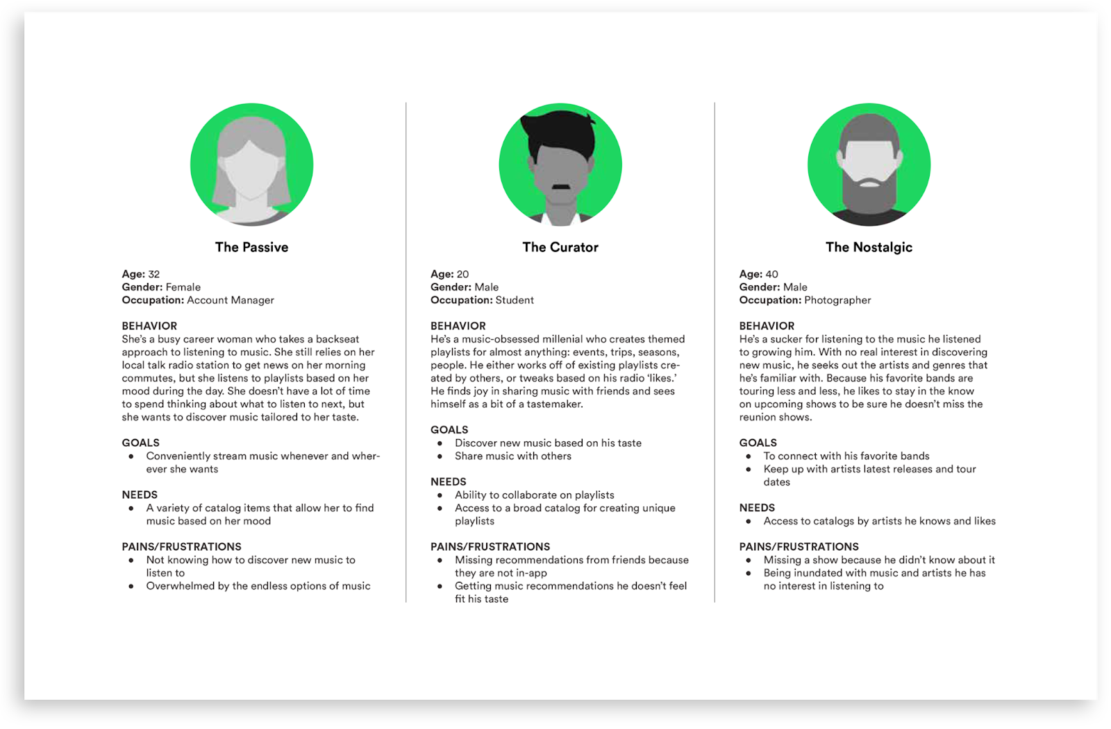
[Source]
The research showed that grouping users only by their needs wasn’t enough.
Instead, the team built personas by combining attitudes toward music, listening habits, device usage, and real-life contexts, creating a more accurate picture of different listener types.
Before creating a UX map, teams also need to decide what they’re trying to understand. Is it:
-
A complete end-to-end experience?
-
A specific user flow, such as onboarding or checkout?
-
A single moment within a journey, like reporting a problem or discovering a feature?
The scope determines which UX mapping method to use and how detailed the map should be.
Finally, avoid creating too many personas. One persona per distinct user type is usually enough.
When teams create too many personas, the map tries to represent everyone at once and ends up helping no one. A focused set of personas keeps the UX mapping process clear and actionable.
2. Gather real user data to fill in the map
Many teams create user experience maps based only on internal opinions.
The result looks polished but doesn’t reflect how real users experience the product. When that happens, the map becomes a presentation artifact rather than a tool for improving the user experience.
But without real user data, UX mapping just becomes guesswork,
To build an accurate user journey map, teams usually conduct user research through multiple sources:
-
User interviews: Pinpoint motivations, frustrations, and expectations
-
Surveys: Gather patterns across larger groups of users
-
Product analytics: Identify key touchpoints, drop-off points, and behavioral trends
-
Customer support logs: Reveal recurring complaints and edge cases
-
Behavioral observation: Watch how users actually move through tasks
Each source reveals specific customer journey touchpoints. Interviews explain why people behave a certain way, while analytics show where friction occurs.
When speaking with users, the goal is to understand what they experience at each stage of the journey. A few simple questions help uncover the insights needed for mapping:
-
What is your goal at this step?
-
What frustrates you during this part of the process?
-
What do you like about this step?
-
How do you feel while doing this?
-
What actions do you usually take next?
These answers provide the raw material for identifying pain points, emotions, and behaviors across the journey.
It’s also important to expect conflicting feedback.
Different user types often experience the same touchpoint in completely different ways. So instead of averaging those differences into a single view, treat them as signals that separate journey paths or personas may exist.
Another common mistake is only interviewing loyal or satisfied customers.
These kinds of users tend to describe smoother experiences because they’ve already learned how to work around problems. To understand the real friction in the user journey, include dissatisfied users and people who abandoned the product.
Airbnb is a great example of how powerful data-driven mapping can be.
Their team layered millions of customer-service call records onto an eight-step customer journey map, then added social sentiment data at each stage.
The analysis showed that some major frustrations weren’t product design issues at all, but were actually policy gaps and customer service handoffs that a basic journey map would never have revealed.
3. Move from low-fidelity drafts to polished deliverables
User journey maps rarely appear fully formed. Most teams develop them in stages, gradually refining both the content of the map and its visual presentation.
A typical UX mapping workflow moves through three levels of fidelity:
Low fidelity → Mid fidelity → High fidelity
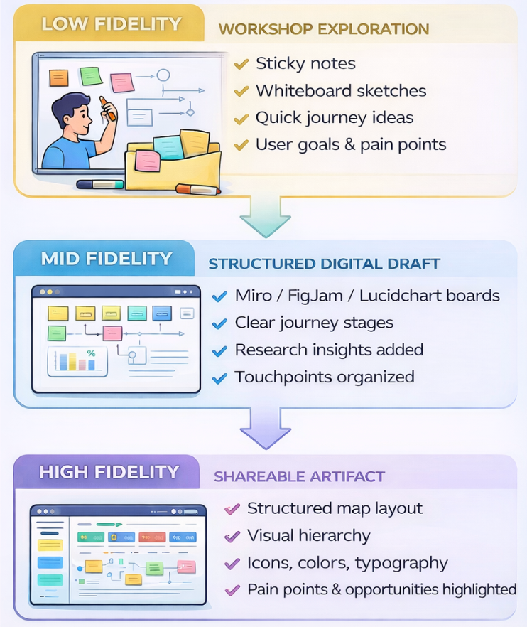
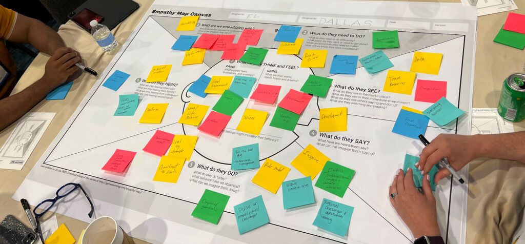
The low-fidelity stage usually consists of quick collaborative drafts created during workshops, like:
-
Sticky notes on walls or whiteboards capturing user actions, touchpoints, and pain points
-
Rough sketches of a user journey or service flow
-
Early discussions about user goals, frustrations, and expectations
At this stage, speed and collaboration matter more than the structure. The goal is to externalize what the team already knows about the user experience, surface disagreements, and identify gaps in user research.
Low-fidelity user experience maps are particularly effective during workshops because they are easy to modify.
If a step in the user journey turns out to be wrong, teams can simply move or replace a sticky note. This flexibility encourages discussions and prevents teams from becoming overly attached to early assumptions.
Once the structure starts to make sense, the map usually moves into a mid-fidelity format, which includes:
-
Transferring sticky notes into digital tools like Miro, FigJam, or Lucidchart
-
Organizing the customer journey into clearer stages, touchpoints, and interactions
-
Adding insights from user interviews, analytics, or usability testing
This stage is where the map begins to take shape as a real artifact. Teams refine the sequence of steps in the user journey, clarify where friction occurs, and identify patterns in user behavior that were not obvious during early brainstorming.
After the content is validated, teams create high-fidelity UX maps, which typically include:
-
A structured layout with defined stages, swim lanes, or mapping layers
-
Consistent typography, color systems, and icons to improve readability
-
Visual cues that highlight user pain points, emotional states, and opportunities for improvement
High-fidelity maps are designed for broader distribution.
They make it easier for people outside the design team—such as product managers, engineers, leadership, or external stakeholders—to understand the user experience at a glance.
Investing in this kind of visual polish usually makes sense when:
-
The map will be shared across multiple departments or teams
-
It will be presented to clients, partners, or executive leadership
-
The artifact needs to support important strategic decisions
In these situations, visual clarity becomes more than a design preference.
Stakeholders often associate polished artifacts with credibility and legitimacy, which can influence whether insights from the map lead to action.
That’s why it’s important to note that low-fidelity and high-fidelity maps serve different purposes.
Low-fidelity maps are better for workshops and collaborative exploration, while high-fidelity maps function as long-term reference artifacts that teams revisit during product planning and iteration.
The mistake many teams make is jumping straight to a polished map before validating the underlying insights. When that happens, the team may spend hours refining the layout of a map that doesn’t accurately reflect real user behavior.
Teams that validate their designs across multiple fidelity levels experience 37% fewer post-launch usability issues, because problems are discovered and addressed earlier in the design process.
When refining the visual design of a UX map, Nielsen Norman Group recommends a four-step process:
-
Choose a tool: Select a tool that fits how the map will be created and shared (for example, Figma, Miro, or slide-based tools).
-
Create a visual system: Define consistent styles such as colors, typography, and icons so elements like stages, touchpoints, and pain points are easy to distinguish.
-
Establish the layout: Set up the structure of the map, such as timelines or swim lanes that organize the journey.
-
Add the content: Populate the map with insights from user research, behaviors, and touchpoints, then refine spacing and visual hierarchy.
This approach helps teams avoid polishing the visual design before the structure of the UX map is validated.
4. Design for stakeholders, not just your design team
One of the most common reasons UX maps and customer journey maps fail is that they’re created during a workshop and then never referenced again.
Instead of becoming tools for ongoing decisions, they turn into static artifacts that document the exercise rather than guiding product improvements.
To avoid this, ecosystem maps should be designed for stakeholders across the organization, not just the design team that built them. Different teams rely on journey maps for different decisions, so the level of detail and information they need varies.
Here’s what that might look like:
Executives and leadership:
-
Need a high-level journey view rather than detailed interaction flows
-
Focus on major drop-offs, strategic opportunities, and business impact
-
Look for insights connected to revenue, retention, or customer satisfaction
Product teams:
-
Need visibility into touchpoints across the user journey
-
Focus on pain points, friction areas, and unmet user needs
-
Use journey maps to guide feature prioritization and roadmap decisions
Engineering teams:
-
Look for technical integration points and system dependencies
-
Need visibility into data flows and backend systems supporting the experience
-
Use the map to understand where technical limitations affect the journey
Showing the entire UX map to every stakeholder often creates more confusion than clarity.
Plus, large user experience maps quickly become overwhelming, especially for teams that only need a specific slice of the journey.
Instead, create custom views of the journey map by filtering the stages or swimlanes most relevant to each group.
For example:
-
Leadership views that highlight key stages and outcomes
-
Product views focused on user needs, frustrations, and opportunities
-
Engineering views showing integrations, systems, and technical dependencies
Research from UXPressia found that tailoring journey maps to stakeholder knowledge and presenting only the most relevant sections (rather than the full map) significantly improves understanding and buy-in.
They recommend creating separate views for different departments, each focused on the stages and swimlanes that matter most to that team.
It’s also important to share journey maps early and often rather than waiting for a fully polished version. When stakeholders are involved during creation, they can validate assumptions, point out missing touchpoints, and contribute insights from their teams.
That involvement builds ownership and increases the likelihood that the map will actually influence product decisions.
Finally, strong UX maps make moments of truth easy to identify. These are the points in the journey where the experience has the biggest impact on user outcomes.
This might include:
-
Key decision points where users choose whether to continue
-
High-friction pain points that block progress
-
Important conversion or adoption stages
-
Opportunities where improvements would create the greatest impact
Highlighting these moments helps teams quickly focus on where improvements will matter most, which helps turn the journey map into a practical tool for prioritizing product and experience changes.
5. Choose a UX mapping tool that supports collaboration
Once teams begin creating UX maps, the next practical question is where those maps should live.
Industry estimates suggest the collaborative whiteboard market could reach $8.11 billion by 2033, reflecting how widely these tools are now used for UX research synthesis and cross-team planning.
Most teams use collaborative whiteboard tools so designers, product managers, researchers, and other stakeholders can contribute to the same map in real time.
Miro is often used for larger, cross-functional mapping sessions because it supports more complex workflows. You’ll also find:
-
Advanced workshop features such as timers, voting, and facilitation modes for structured mapping sessions
-
Broad integrations across product, engineering, and collaboration tools
-
Extensive template library for journey maps, service blueprints, and workshop exercises
-
Flexible boards that support large ecosystem maps and complex workflows
Because of these capabilities, Miro is commonly used when multiple teams are mapping customer journeys, service processes, or operational workflows.
FigJam, on the other hand, is simpler and more design-centric, particularly for teams already working in Figma. It offers:
-
Direct integration with Figma, making it easy to move from brainstorming to interface design
-
Lightweight boards suited for journey mapping workshops and quick ideation sessions
-
AI-powered templates that help teams generate mapping structures quickly
-
Familiar interface for designers already working in the Figma ecosystem
Design teams that already work inside Figma often gravitate toward FigJam, since it keeps the entire mapping and design workflow in one environment.
If you’re looking for other UX mapping tools, the 2023 Design Tools Survey highlights the top-rated whiteboarding tools, which include:
-
Miro: A highly flexible collaborative whiteboard used for complex UX workflows, with features like workshop facilitation tools, integrations across product and engineering stacks, and a large template library for journey maps and service blueprints.
-
Whimsical: Known for its clean interface and fast diagramming, making it a popular choice for creating user flows, journey maps, and lightweight UX diagrams.
-
FigJam: Figma’s native whiteboarding tool that allows teams to brainstorm, map journeys, and move directly into interface design within the same ecosystem.
-
Canva Whiteboards: A visual-first collaboration tool with drag-and-drop elements and templates, often used for simple brainstorming boards and presentation-friendly journey maps.
-
Lucidspark: Part of the Lucid collaboration suite, designed for structured team workshops and brainstorming sessions with strong integration into enterprise workflows.
Your deciding factor should depend on your team’s existing tool ecosystem.
Teams designing in Figma often prefer FigJam, while teams working across product, engineering, and operations may benefit more from Miro’s broader integrations.
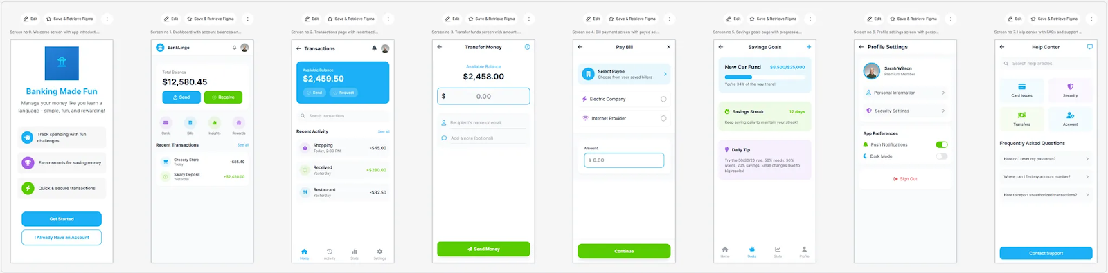
For quick mapping exercises, tools like UX Pilot can also generate simple flows or journey structures from a prompt, which designers can then export directly into Figma and refine alongside other design artifacts.
This makes it easier to turn rough workshop notes into a clear digital outline of user steps and touchpoints before refining the map further in tools like Miro or FigJam.
For example, you can generate a sequence of screens showcasing a user journey for an online banking app like this using UX Pilot:
Common UX mapping mistakes and how to avoid them
1. Building experience maps on assumptions instead of real data
Many teams create user journey maps based on internal opinions rather than real user research. When this happens, the map reflects what the team believes is happening instead of what users actually experience.
To avoid this, treat data gathering as a prerequisite for mapping. Use interviews, analytics, usability testing, and support logs to ground the map in real behavior.
2. Mapping UX without a clear goal
Starting a mapping exercise without a clear objective often leads to maps that look impressive but don’t drive decisions.
Every UX mapping effort should connect to a specific outcome, like improving onboarding, reducing churn, or identifying friction in a key workflow.
3. Assuming customer journey maps are linear
User journeys rarely follow a perfect funnel. People revisit steps, jump between channels, and sometimes abandon tasks before returning later.
Good journey mapping reflects real behavior patterns rather than idealized paths.
4. Treating the map as a one-time deliverable
A customer journey map quickly becomes outdated if it’s never revisited. As products evolve and new research emerges, the map needs to evolve too.
Treat UX maps as living artifacts and update them regularly as new insights come in.
5. Only interviewing satisfied users
Research that focuses only on loyal customers often hides the biggest pain points. Satisfied users have already adapted to the product.
Include frustrated users, churned customers, and new users to uncover the friction that loyal users may overlook.
6. Keeping the map inside the design team
When UX maps stay inside the design team, their insights rarely influence broader product decisions.
Sharing maps across product, engineering, marketing, and support teams helps translate user insights into action.
7. Mapping at the wrong level of detail
Some teams only capture high-level funnels, while others get lost in overly detailed process maps.
Research from Akendi shows that effective journey mapping requires choosing the right level of detail for the decision being made. Teams should map at the level that helps solve the problem they’re addressing, and then zoom in or out as needed.
Ultimately, the value of UX mapping isn’t the diagram itself. It’s the shared understanding and aligned action that the map enables across teams.
Mastering UX mapping to design seamless user experiences
UX mapping helps teams step back and see the full user experience—how people move through a product, where friction appears, and where improvements can have the biggest impact.
When teams map the journey thoughtfully, they gain a clearer understanding of user behavior and the decisions shaping that experience.
Throughout this guide, we’ve covered how teams can approach UX mapping methods more strategically:
-
How to choose the right mapping method for the problem: Empathy maps, journey maps, service blueprints, and mental models each answer different questions about the user journey.
-
Choosing the right method for your project stage: Start with simpler maps to understand users, then layer deeper analysis as your research evolves.
-
Ground every map in real user data: Interviews, analytics, and support insights reveal the real behaviors behind the journey.
-
Iterate from low-fidelity drafts to polished maps: Rough workshop sketches help explore ideas before creating maps that stakeholders can use long-term.
-
Use collaborative tools that fit your team’s workflow: The right tool makes it easier for multiple teams to contribute and act on insights.
-
What to avoid throughout your UX mapping journey: Assumptions, outdated maps, and narrow research can undermine the value of the exercise.
When teams approach UX mapping as an iterative, research-driven process, it becomes far more than a design exercise. It becomes a framework for aligning product, design, and business teams around the same understanding of the user journey.