Usability Metrics: 10 Key Measures for Better UX

Petar Marinkovic
Created on May 7, 2026
When measuring a product's success, most teams track business metrics like conversion rates and revenue. While this is obviously important, you also need to know what's driving those numbers.
That's what usability metrics can show you. They pinpoint what it is about the user experience that contributed to the increase (or decrease) in those key business figures.
In this guide, I'll show you the 10 most important usability metrics you should track. You'll learn what each one tells you, how to measure it, and what benchmarks to aim for.
But first, let's start with the basics.
What are usability metrics?
Usability metrics are data points that show the efficiency, effectiveness, and overall satisfaction that users experience when interacting with your product. They provide objective insights into the usability benchmarks and any problems you need to solve.
While they're different from business metrics, usability metrics are closely related to business outcomes. Think of it like this:
-
Business metrics show what happened (new users signed up, existing users are churning, etc.)
-
Usability metrics show why it happened (existing users have advocated for you, a user had trouble navigating the user interface, etc.)
Usability metrics may sound descriptive, but they're usually quantitative data tracked across three specific categories:
-
Effectiveness (can users complete tasks?)
-
Efficiency (how much effort does it take?)
-
Satisfaction (how do users feel about it?)
We can also group usability metrics by how we collect them, in which case we have two categories:
|
Metric type |
What it is |
Examples |
|
Behavioral/performance metrics |
Objective data points gathered by observing user interactions |
|
|
Attitudinal/self-reported metrics |
Subjective data points collected directly from user feedback |
|
Based on key metrics that have the biggest impact on your product, you can design specific frameworks to measure them. For example, Google developed the HEART framework for tracking usability metrics across five categories:
-
Happiness
-
Engagement
-
Adoption
-
Retention
-
Task success
The model directly maps usability metrics to product goals, bridging the gap between UX research and product management. As I discuss different metrics, I'll show you how they connect to business outcomes so you can do the same.
10 key usability metrics to track
Some usability metrics actually reflect your product’s performance, while others are just vanity numbers. It can sometimes be hard to draw the line between the two, so here are the impactful ones to focus on:
1. Task success rate
Task success rate is the percentage of users who complete a defined task completely and correctly. It's the first metric you should track because if users can't do what they came for without becoming frustrated or lost, no other aspect of your product matters much.
Depending on what you're testing, you can measure two types of success:
-
Binary success (pass/fail)
-
Partial success (measured through a graded scale)
Binary success is measured when you need to assess the health of linear or critical processes, such as:
-
E-commerce checkouts
-
Password resets
-
Money transfers
It's simpler to measure than partial success, which you should use for complex or more exploratory processes where the outcome matters more than the path taken.
A good example is help center usage. If the user found a solution to their problem but didn't use the quickest path, you'd consider the test partially successful.
No matter which type of success you're measuring, you need to define the criteria before testing. For example, if the task is to successfully complete the checkout, it needs to specify:
-
The page that the user needs to reach (e.g., the confirmation page)
-
The time frame
-
Whether any errors are allowed
You'll use the task success rate to benchmark against historical performance or competitor metrics. If you need a reference point, MeasuringU research shows average task success rates across industries are around 78%. Over 90% means that the workflow is well-optimized, while anything below 70% indicates major bottlenecks.
If you get such a low score, you can use partial success to understand why a user failed and where in the process they got stuck (even if they completed the task).
For example, the user might've checked out but used the search function instead of navigating the page (which would've been faster), in which case you'll make a note of that in the results.
No matter the rate you get, take it with a grain of salt because the results tend to inflate in controlled usability tests with guided tasks. Real-world success rates are almost always lower because users face distractions, incomplete information, and less motivation, which you should factor in to assess the actual performance of your product.
2. Time on task
Time on task measures how long it takes the user to complete an action, recorded from the first action they take to task completion. It directly measures your product's efficiency and is often used to A/B test design alternatives.
Despite the focus on efficiency, it's not always about the speed. While there are tasks for which the time spent should be minimal (e.g., checkout or form completion), there are also processes where you want the user to spend more time on a task, such as:
-
Content consumption or research
-
Learning (or any process that involves analytical thinking)
-
Entertainment
Time on task may be easy to quantify, but there's a catch — the data is typically not symmetrical and can be skewed by the outliers who take much longer to complete tasks.
Let's say one participant takes 10 minutes and four others take 1 minute to complete a task. The arithmetic mean (2.8 min) is higher than most participants' experience, so it doesn't accurately capture the actual time.
That's why you should use the geometric mean or median instead of the arithmetic mean to avoid getting a distorted picture.
Unlike the task success rate, time on task doesn't always have a clear reference point. For example, a good checkout time might be 90 seconds for returning buyers and 150 seconds for new customers.
Because of these nuances, you should compare results against your own baseline before looking at industry benchmarks.
Where you can look at industry data is factors that contribute to the time on task and ways to improve it. For example, Baymard's 2024 research showed that the average checkout process takes 5.1 steps and involves 11.3 form fields. If your process is more involved, you can make changes like:
-
Using a single Name field instead of separate fields for the first and last name
-
Saving the account creation process for after the checkout so that users don't have to interrupt the checkout process
-
Consolidating address fields (e.g., turning "Address 1," "Address 2," and "Billing address" into a single field or collapsing the unnecessary ones by default)
3. System Usability Scale (SUS)
System Usability Scale (SUS) is a standardized, 10-item questionnaire that measures perceived usability on a scale from 0 to 100. While it was developed back in 1986, it's still widely used as one of the most reliable and cost-effective methods of tracking usability.
SUS uses a 5-point Likert scale (strongly disagree to strongly agree) that lets users answer questions related to their experience (e.g., "I think that I would need the support of a technical person to be able to use this system.")
After gathering the answers, you can get the SUS score through four steps:
-
Subtract 1 from the user's rating in odd-numbered questions
-
Subtract the user's rating from 5 in even-numbered questions
-
Sum all 10 adjusted scores (0–4 each)
-
Multiply the total sum by 2.5
The figure you get isn't a percentage — it's a composite score. The average score across products is 68, with the entire scale being:
-
A+ (90–100): Exceptional (Best imaginable)
-
A- (80–89.9): Excellent
-
B (70–79.9): Good
-
C (60–69.9): Okay
-
D (50–59.9): Poor
-
F (<50): Awful (Worst imaginable)
SUS works for everything from internal tools to apps and websites, and you can use it at different points, such as:
-
After usability test sessions
-
After onboarding flows
-
Periodically for longitudinal tracking
-
When comparing competing designs
Besides actual usability, for which there are eight questions, SUS also dedicates two questions to learnability. If your product has steep learning curves or requires training, you can focus specifically on those two questions and break down the score for insights on what you should improve.
4. Single Ease Question (SEQ)
SEQ is a simple metric that uses a 7-point Likert scale to answer one question:
"Overall, how easy or difficult was this task?"
It directly captures perceived difficulty at the task level, helping you spot and fix inefficiencies.
That's why SEQ is typically used alongside SUS in iterative testing. SUS can tell you that your product has a problem, while SEQ tells you what the problem is.
The average SEQ score across studies is between 5.3 and 5.6. Scores of 6.0+ indicate a smooth experience, while anything below 5.0 means the task is too difficult.
If you measure SEQ alongside other metrics, you'll surely notice some patterns. For example, a low SEQ almost always means higher time on task and a lower task success rate. It can reveal a so-called "painful success," where the user goes through a task but with plenty of frustration. Such tasks are prime candidates for a redesign, so you can use SEQ to set your priorities.
5. Error rate
Error rate measures the number of errors a user makes while attempting a task. Depending on the testing level, it can either be expressed as errors per task or as a percentage of users who encounter at least one error, such as:
-
Wrong click
-
Incorrect form entry
-
Navigation dead-end
While the error rate is quantifiable, you also need to assess the type of error and how it happens. From this perspective, we can split errors into two types:
-
Slip: An unintended action (e.g., a user clicks "close" instead of "safe" because of their proximity)
-
Mistake: An incorrect mental model (e.g., the user tries to find a "Cancel" button in a dialog that only offers a "Back" button, resulting in a misunderstanding of the system flow)
Slips are typically minor and suggest the need for a UI polish, while mistakes point to more pressing issues with information architecture or labeling.
But not all errors are severe enough. A small mishap that a user can recover from quickly shouldn't be treated the same as a critical error that entirely prevents them from completing a task.
That's why you should go beyond calculating the error rate and categorize errors. Designers often use the standardized scale popularized by the Nielsen Norman Group:
|
Level |
Description |
Example |
|
1 |
Cosmetic problem |
An off-center "Submit" button |
|
2 |
Minor usability problem |
A "Date of Birth" field that makes users click or scroll through days, months, and years instead of typing them in |
|
3 |
Major usability problem |
A search bar that doesn't support "Enter" to submit (so users must find and click a tiny magnifying glass icon) |
|
4 |
Usability catastrophe |
An unresponsive "Pay now" button |
Depending on your bandwidth and goals, you can use two types of user testing to measure the error rate:
-
Moderated: The facilitator tracks errors in real-time and can observe user behavior for deeper insights into the errors
-
Unmoderated: Participants test alone at their own pace, while proxy measures actions like form validation triggers, back-button frequency, and rage clicks
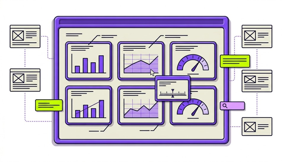
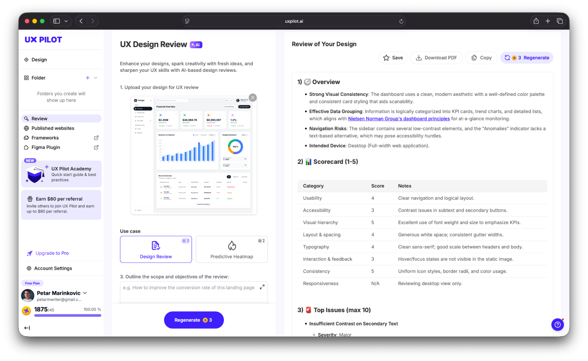
If you want to be proactive, you can catch and fix errors before they reach users. For example, UX Pilot lets you perform an automated review by uploading your design. It highlights issues that could increase the error rate, such as:
-
Contrast problems
-
Spacing inconsistencies
-
Hierarchy issues
You get a detailed report alongside the top mistakes, which you can then fix in UX Pilot’s AI-powered editor.
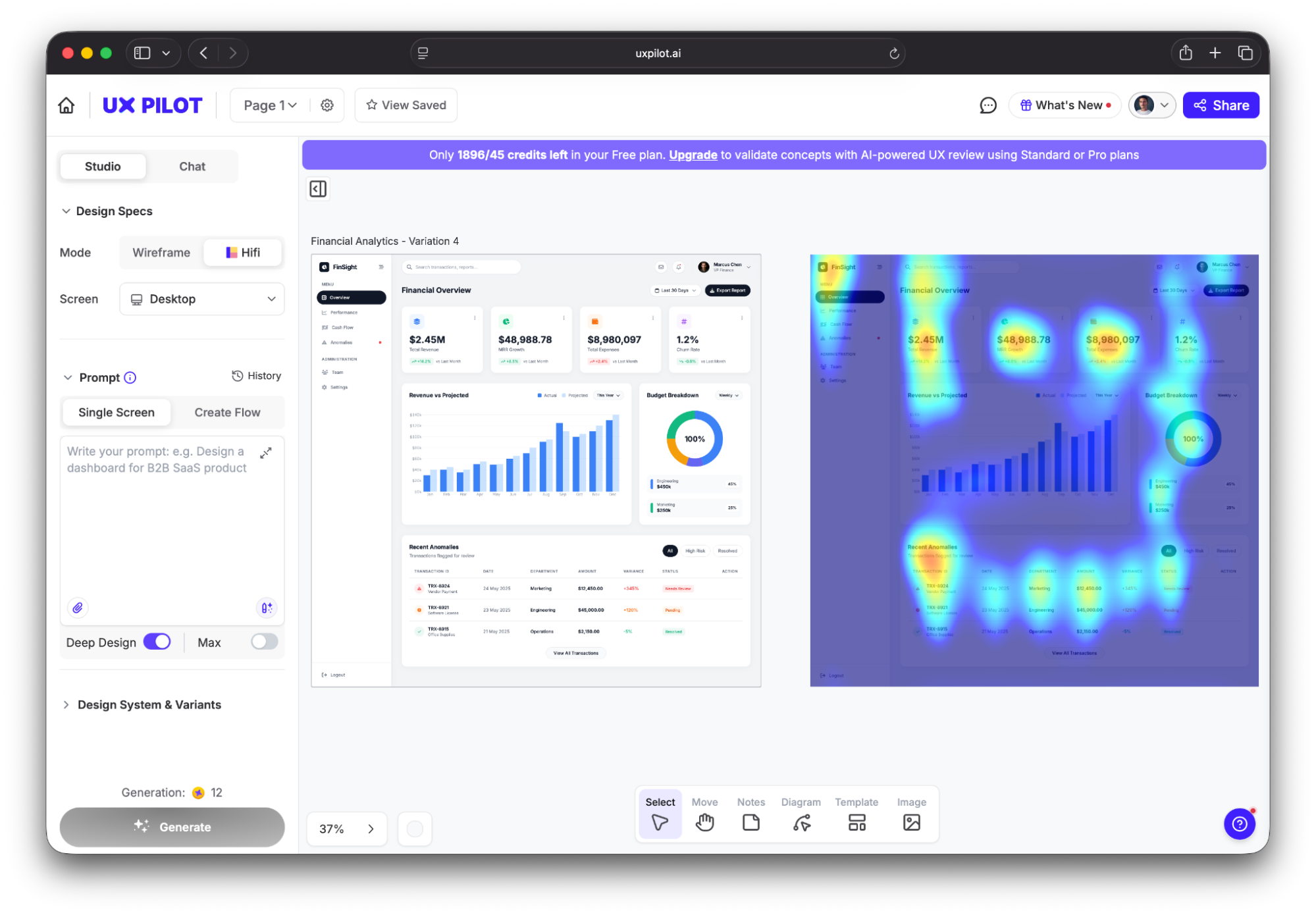
You can also use a predictive heatmap to see where users are likely to focus and click, which lets you pay special attention to those areas to minimize the risk of errors.
6. Navigation vs. search ratio
The navigation vs. search ratio shows the proportions of users who use site navigation (menus, links, categories) versus site search to find content. If it's too high (meaning more users resort to search), your navigation structure might not be intuitive and could force users to give up on browsing in favor of search as a fallback.
But — and this is a major "but" — search-heavy user behavior isn't always a bad thing. It could happen for many valid reasons, including:
-
Your site has a large catalogue (e.g., an e-commerce store with thousands of SKUs)
-
The user already knows what they need (which could signal high intent)
-
Your site has specialized topics that the user can search for
This context matters because the navigation vs. search ratio isn't meant for all sites. It should mainly be used on content sites, dashboards, or any product where navigation should logically surface what users need.
If over 50% of sessions start with a search on such sites, and there are fewer than 100 pages, the navigation probably needs some restructuring. And if even the search doesn't help the user find what they need, the problem compounds and shows major issues with information architecture.
That's why for a full picture, navigation vs. search ratio should be tracked alongside search success rate (which shows how many users find what they're looking for or complete tasks using site search).
If you spot navigation issues but aren't sure where they are, look at the top search queries. If users repeatedly search for terms for which you already have navigation categories, the labels or placement aren't working as they should.
7. Lostness score
The lostness score shows how much a user deviates from the most optimal path to complete a task. It ranges from 0 (perfectly efficient) to 1 (completely lost) and reflects the efficiency of your product.
Think of the lostness score as an excellent companion to the time on task. Even if someone completes a task fast, they might still visit unnecessary pages along the way. The lostness score captures this and lets you remove these navigation issues, which can boost the time on task.
To calculate lostness, you'll need to use a formula that seems a bit daunting:
L = √((N/S – 1)² + (R/N – 1)²)
The good news is that it's actually pretty straightforward. Here's what it accounts for:
-
N = Unique pages visited
-
S = Minimum pages needed
-
R = Total pages visited
So if the user finds what they need immediately, N and S will be equal to R, resulting in low lostness. The higher the discrepancy, the more disoriented the user is.
As a rule of thumb, anything above 0.4 means that there's too much disorientation. But the number itself doesn't tell us where the user is getting lost.
To find this out, you can use the lostness score alongside click-path analysis. It maps out the sequential trail of clicks, helping you identify useless pages and bottlenecks.
8. Task-level efficiency
Task-level efficiency combines two metrics I've covered — success rate and time on task. It's expressed as "goals achieved per unit of time" and measures the speed at which users successfully complete tasks.
In other words, it combines effectiveness and efficiency into a single number, which makes it useful for comparing design alternatives.
Measuring task-level efficiency involves two steps:
-
Divide the task success score (1 for success, 0 for failure, or a partial score) by the time on task
-
Average across users
There are no specific thresholds to hit here, and the rule is simple — higher values mean users are completing tasks both successfully and quickly.
Plenty of research has shown that task-level efficiency is closely related to key business metrics. For example, McKinsey's Design Index study tracked 300 publicly listed companies over five years and found that top-quartile performers in usability and design grew revenue 32% faster — and task-level efficiency improvements in core user flows were cited as one of the strongest predictors of commercial outperformance.
As task-level efficiency combines two metrics, it prevents the trap of optimizing speed at the expense of task accuracy (or vice versa). This makes it useful for many processes, including:
-
A/B testing design alternatives
-
Comparing competitive products
-
Measuring the impact of a redesign
There's just one constraint to keep in mind — this metric is only useful where both the success rate and time on task are reasonable. Efficiency is meaningless for tasks with near-zero success rates, so pick the tasks where both variables are showing decent numbers.
For deeper insights, you can pair task-level efficiency with task-level satisfaction, which measures the users' subjective perception of completing a specific action. While efficiency focuses on "how fast," satisfaction focuses on "how it felt," and both should be measured immediately after a task is completed to capture accurate sentiment.
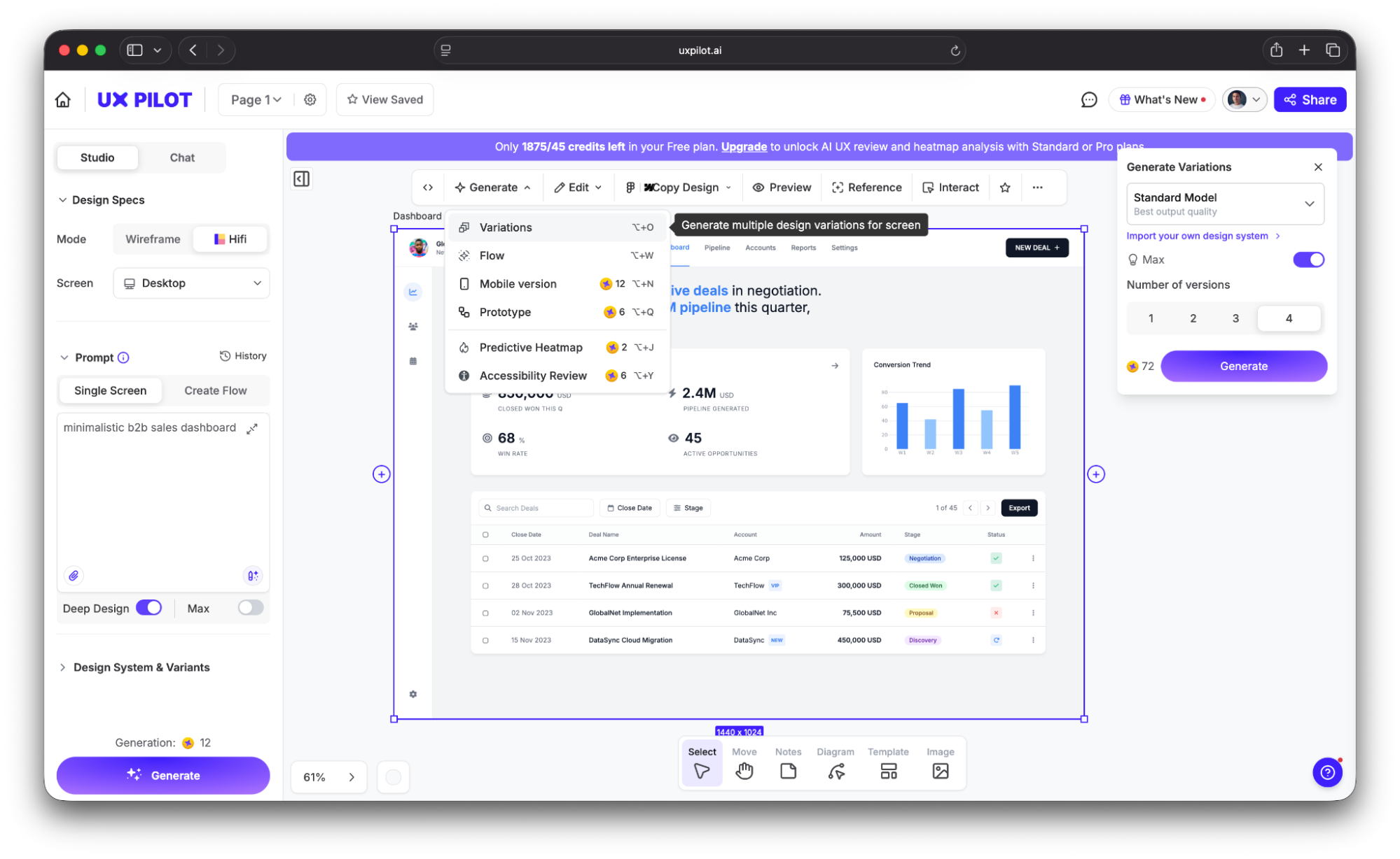
If you’ll use task-level efficiency to A/B test design alternatives, you first need the alternatives. And designing each option manually can take forever.
To speed up the process, tools like UX Pilot let you generate multiple UI variations from a single text prompt. Instead of spending days on manual mockups, you can get several layout options in minutes and run efficiency comparisons against each one.
9. Net Promoter Score (NPS)
Net Promoter Score (NPS) revolves around a simple question:
"How likely are you to recommend this product to a [colleague/friend/etc.]?"
The answer is typically scored 0–10, and it divides your users into three categories:
|
Score |
Category |
|
9–10 |
Promoters |
|
7–8 |
Passives |
|
0–6 |
Detractors |
After analyzing responses, you should:
-
Divide the number of promoters and detractors by the total number of respondents
-
Subtract the percentage of detractors from the percentage of promoters
You will then get the NPS, which can range between -100% and +100%.
While NPS is widely used, it's often criticized in UX research circles because it doesn't specifically address usability. It measures brand loyalty and advocacy intent, which has plenty of factors besides product design, let alone usability as a single design feature.
With that in mind, you should use NPS as a proxy for user satisfaction instead of a hard metric related closely to usability. It's still worth tracking because UX teams can directly influence it through usability improvements like:
-
Increased task success
-
Reduced errors
-
Faster flows
These improvements reliably lift NPS over time, so the connection is consistent despite being indirect.
As for the benchmarks you should hit, they vary greatly between industries. Qualtrics' research of 22 industries showed that average scores included:
-
Grocery: 34.3%
-
Bank: 28%
-
Social media: 24.2%
-
Software: 21.1%
-
TV and internet: 16.2%
Generally speaking, anything above 0 means there are more promoters than detractors, which is good. While you should aim for higher scores, trends matter more than absolute numbers. Track NPS longitudinally and correlate changes with usability improvements.
10. Customer Satisfaction Score (CSAT)
CSAT is one of the key satisfaction metrics that directly asks a question like:
"How satisfied were you with [experience]?"
Answers can be graded on a 1–5 or 1–7 scale, depending on how granular you want the CSAT to be.
Unlike NPS (which measures intent to recommend) or SUS (which measures perceived usability), CSAT measures satisfaction with a specific interaction or moment. This makes it more useful than other metrics for milestones like:
-
Post-support interactions
-
After completing a specific workflow
-
At the end of onboarding
-
After a feature update
Because CSAT captures how users feel about this specific experience right now, it can be used to fine-tune pretty much any aspect of your product, so it goes beyond measuring usability.
The American Customer Satisfaction Index (ACSI®) was 76.9% in Q4 2025, so you can use this as a cross-industry reference point. Anything between 75%–85% is considered good, while a score below 70% calls for investigation.
Now, just because a CSAT can be used to measure user satisfaction at any point, it doesn't mean you should overwhelm users with surveys. Instead, place them strategically at key moments like:
-
Post-checkout
-
Post-onboarding
-
Post-support
These are high-value points, so they can give you accurate insights into how satisfied users are with different aspects of your product.
How to build a usability metrics framework
Collecting and tracking metrics without a framework can give you a bunch of data without valuable insights. Before you measure usability metrics, you need to know why you're doing it and what you want to find out.
To develop the right structure, you can use the Google HEART framework I mentioned or a simplified version of it. For example, the organizing structure can look like this:
-
Define a goal for each metric
-
Identify the signal that indicates progress
-
Specify the metric that measures the signal
If you're not sure where to start, I'd recommend task success rate, time on task, and SEQ as the core trio. They're easy to track and can cover effectiveness, efficiency, and user interaction satisfaction with minimal overhead. You can then add SUS for quarterly benchmarking and error rate for diagnostic depth as the team matures.
Of course, the metrics you'll track can vary according to your goals or even regulatory constraints. For example, the UK Government Digital Service (GDS) mandates four KPIs for every government service:
-
Completion rate (task success)
-
User satisfaction (CSAT)
-
Digital take-up
-
Cost per transaction.
This framework turned usability metrics from optional research figures into mandatory performance standards reviewed at the ministerial level.
While I gave you industry averages for the key metrics, don't take them to heart or measure progress solely against them. Benchmarks are only useful when compared against your own baseline, so compare your product's current performance to its last measurement to track progress.
So now that you have a grasp of usability metrics, here's what to do:
-
Pick 3–5 metrics from this article
-
Establish baselines this quarter
-
Tie each metric to a specific product or design decision
Remember that usability metrics only matter if they change what you build, so make sure to turn numbers into tangible improvements.