12 Dashboard Design Principles For Better UX

Khanh Linh Le
Created on Mar 16, 2026
Organizations invest heavily in collecting data, yet the dashboards meant to surface it often bury the insights instead.
And it turns out this isn't just my observation.
A systematic review of 75 studies confirms that information overload is the most prevalent dashboard challenge, affecting 46.7% of users. This is driven by excessive data density, poor visual hierarchy, and a lack of contextual filtering.
That's why I put together this guide. I will cover 12 dashboard design principles, from understanding your users to measuring performance, to help you build more actionable ones.
Why most dashboards overwhelm instead of inform
Most dashboards overwhelm simply because they're built to display raw data rather than to support decisions. The result is screens packed with charts nobody reads and KPIs stripped of the user context needed to act on them.
What I've noticed isn't that the data is too complex but that the design makes it harder to process than it needs to be.
Cognitive load theory, a framework developed by educational psychologist John Sweller, breaks this mental effort into three types:
-
Intrinsic load is inherently the complex data itself. Some numbers require thought to interpret.
-
Extraneous load is the mental energy wasted on poor design, such as cluttered layouts, confusing navigation, and unlabeled charts. Such visual noise is what good dashboard design should eliminate.
-
Germane load is the productive cognitive effort devoted to pattern recognition and insight. This is essentially what you need data visualization for.
The stakes are measurable. Famous researchers like Miller and Cowan have pointed out that human working memory holds only three to five items at a time.
When cognitive load exceeds working memory capacity, users make more errors, slow down, and often abandon the task entirely.
But once you reduce that extraneous load, well-designed dashboards improve decision speed by 58.7% and boost productivity by 40%.
This isn't just a metaphor for lost time; it's a literal biological cost. Neuroscience research has shown that pupil dilation is a reliable indicator of how hard the brain is working. When you stare at a bad dashboard, your body reacts to the design as physical strain.
Therefore, every dashboard design best practice I cover in this guide targets one thing: minimizing extraneous load so your users can extract valuable insights from the data.
1. Identify the decisions your dashboard must support
Every element and data point on your dashboard should trace back to a specific decision someone needs to make. If a chart doesn't offer actionable insights, it's useless.
The way I approach dashboard layout is simple. Talk to your stakeholders first. Ask each one: "What action will you take based on this data?" If they can't answer, the metric isn't ready for the dashboard.
This is also where you learn to tell vanity metrics apart from decision metrics. Total pageviews and registered users feel informative, but they rarely drive action.
Conversion rate, churn rate, and time-to-resolution do, because they signal something is working, broken, or needs attention right now.
A tool I find useful at this stage is a simple decision map: a document listing each metric, the decision it supports, and who needs it. It takes an hour to put together and saves weeks of scope creep later.
Image via Mindmanager
Google's own shift from Universal Analytics to GA4 is a textbook example of what happens when a platform realigns around decisions.
The old Universal Analytics centered on bounce rate, which flagged any single-page session as a failure regardless of actual user engagement. Now, GA4 has replaced it with an engagement rate that reflects real user behavior. For example, a session only counts as engaged if it lasts over 10 seconds, triggers a key event, or includes two or more pageviews.
So, if you've ever felt lost staring at a dashboard at work, consider this: it's likely not a failure of your intelligence. The dashboard is failing to answer your question.
2. Match information depth to user roles
Matching information depth to user roles means giving each person exactly the key data they need to do their job.
An executive checking in once a day needs a high-level trend at a glance. A support agent needs their queue, response times, and escalation status. An analyst needs granular, filterable tables they can drill into to identify trends across multiple data sources.
Same data, completely different needs.
The mistake I see most often is designing for the most data-literate person in the room and assuming everyone else will adapt. They won't, and they'll just stop using it.
The better approach is role-aware information architecture: design around what each role needs to accomplish.
And the research backs this up. A cross-industry study spanning finance, healthcare, manufacturing, and technology found that companies investing in user-centric dashboard design consistently report higher adoption rates and better decision-making outcomes.
Therefore, before you create dashboards, define 2–4 user personas, each with their own primary tasks, key metrics, user preferences, and acceptable complexity levels. Then build role-specific views.
You can use a brainstorming tool like Miro for this process.
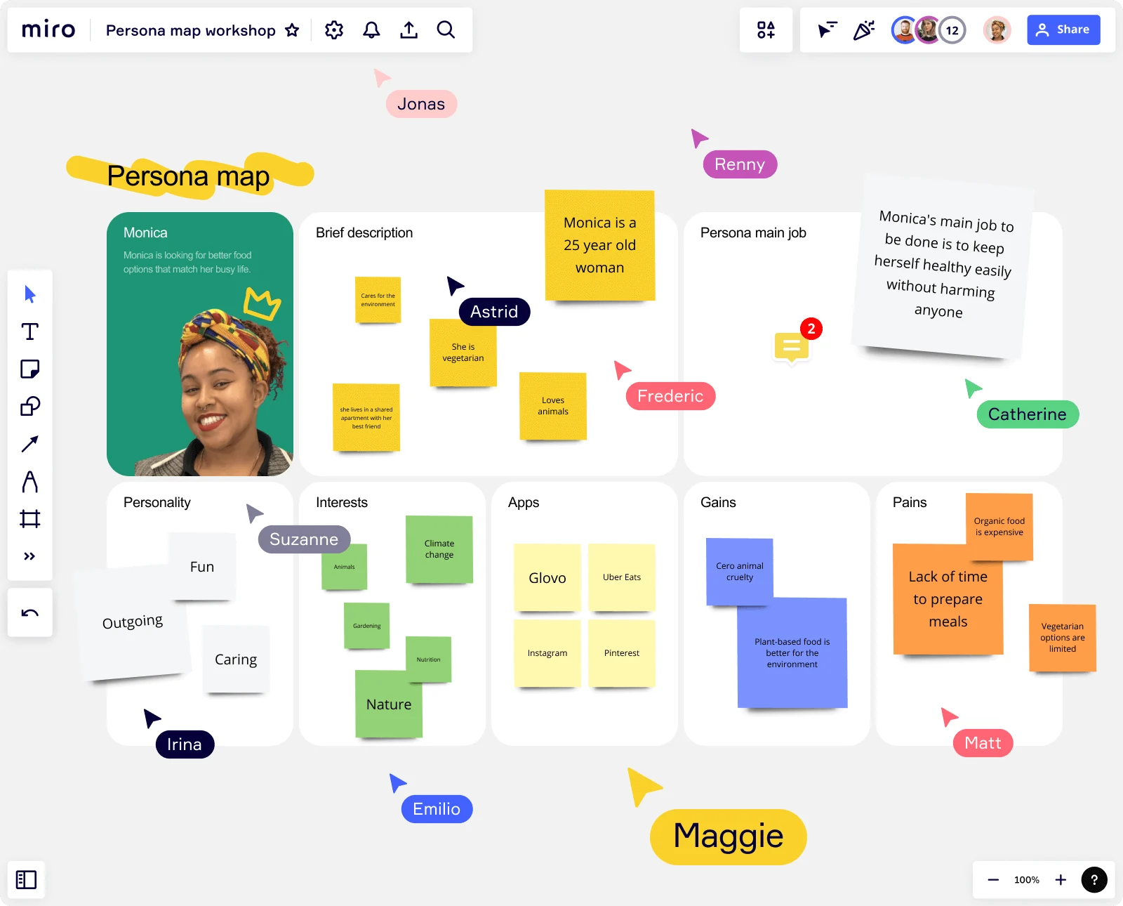
Image via Miro
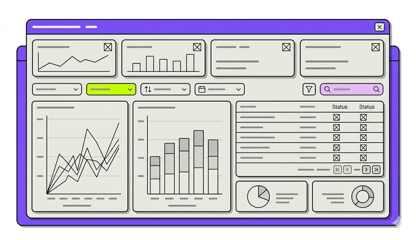
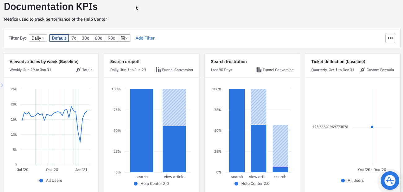
3. Place critical KPIs where the eye naturally lands
Placing critical key performance indicators (KPIs) where the eye naturally lands ensures your target users get the most relevant data first before anything else.
People don't read dashboards the way they read books. Eye-tracking research from Nielsen Norman Group, studying 232 users across thousands of web pages, found that users scan in an F-shaped pattern. It's a horizontal sweep across the top, a shorter sweep further down, then a quick vertical scan down the left side.
But the research that stuck with me most came from Tableau. Because they build dashboards for a living, their findings hit closer to home. Their eye-tracking study found two things every data dashboard design should adhere to.
-
First, big numbers command attention immediately. If you have an important number, give it visual emphasis.
-
Second, when the same element repeats across a dashboard, i.e., a row of KPI cards, a series of bar charts, attention is strongest at the first item and drops off from left to right, and top to bottom.
This means if you have five KPI cards in a row, most users will barely register the last two. You'll have to think of priority when you present data.
My advice is to use an inverted pyramid to build the most effective structure:
-
Top row: High-level summary metrics, which often cover the 3 to 5 KPIs that matter most. Each should be a clean metric card with a large, readable number, a clear label, and a contextual indicator like a sparkline, trend arrow, or comparison to the prior period.
-
Middle band: Trend visualizations and time-series charts that show where things are heading.
-
Bottom section: Granular detail tables and breakdowns for users who need to dig deeper.
4. Use psychological principles to speed up comprehension
Applying psychological principles to dashboard design means using what we already know about how the brain processes decisions and designing with that knowledge instead of against it.
Here are three laws in particular that shape how I think about layout and component decisions:
-
Fitts's Law (1954). Psychologist Paul Fitts showed that the time required to move to a target depends on its distance and size. Fast movements toward small targets result in higher error rates. The implication for dashboards is direct. You should make your critical KPIs and action buttons large and easy to reach. Don't bury important controls in corners or hide them behind small icons.
-
Hick's Law (1952). The more choices a person is presented with, the longer they take to reach a decision. This is why dumping 20 filter options onto a dashboard is a form of cognitive sabotage. Show only the essentials upfront and use progressive disclosure. You can hide advanced options behind a "More filters" toggle until your users actually need them.
-
Gestalt Principles of Grouping (1920s). Formalized by Wertheimer in 1923, these principles describe how the brain naturally organizes visual elements into meaningful wholes based on proximity, similarity, and enclosure. Cluster revenue metrics together, engagement metrics together. When related data lives together visually, patterns surface without any extra effort from the user.
These aren't abstract theories. They've been practiced as an industry standard for decades. Apple, Microsoft, and Google have all embedded Fitts' Law directly into their official design guidelines. Minimum touch target sizes exist specifically because of it.
If the world's most-used interfaces are built around these principles, your dashboard should be too.
5. Structure layout using the F-pattern and grid systems
Structuring your layout around the F-pattern and grid systems means your dashboard works with how users naturally scan.
Eyes don't wander randomly. Nielsen Norman Group's research on F and Z patterns shows users sweep across the top first, then drift down the left side in shorter and shorter horizontal movements.
The layout that works best follows that path naturally:
-
Top row: Primary KPIs — what matters most, seen first
-
Middle band: Trend charts and time-series showing where things are heading
-
Bottom section: Granular tables for users who need to dig deeper
But knowing where to place things is only half the job; the other half is making sure everything holds together visually.
A 12 or 16-column grid with an 8px base unit locks components into alignment, makes responsive dashboard design manageable, and gives the dashboard a visual consistency. White space works the same way, where you dedicate generous spacing between card groups to reduce cognitive strain.
Stripe learned what happens when you neglect this foundation. Years of decentralized development had left their merchant dashboard fragmented across 1.4 million users with no shared system and no responsiveness.
Once they migrated to a unified grid-based design system, everything from tables to filter controls worked consistently across all screen sizes. Within three months, that single change contributed to over $10 million in new SaaS partnerships.
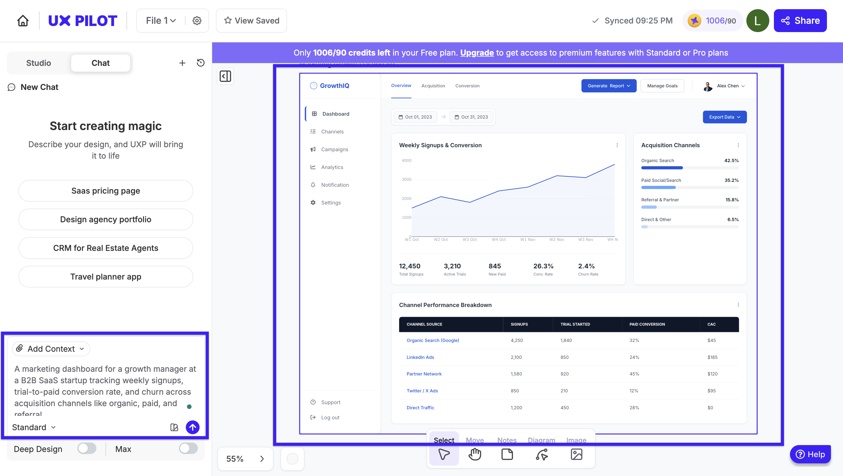
If you'd rather not work through all of this from scratch, UX Pilot's AI dashboard generator handles the pattern and layout logic automatically.
It's as simple as you describe your metrics and use case, and it generates a user-friendly interface ready to build on.
6. Match chart types to the story your data tells
Having the right chart type for your data is one of the fastest ways to cut the time it takes users to reach an insight.
The question I always start with isn't "what chart looks good?" It's "what am I trying to say?".
Geckoboard, a tool built for business intelligence dashboards, codified exactly this thinking into its chart selection flowchart.
It starts with the data type (nominal, ordinal, or quantitative data). Then moves on to the question you need answered (trend? ranking? comparison?) to help you visualize data in a suitable format.
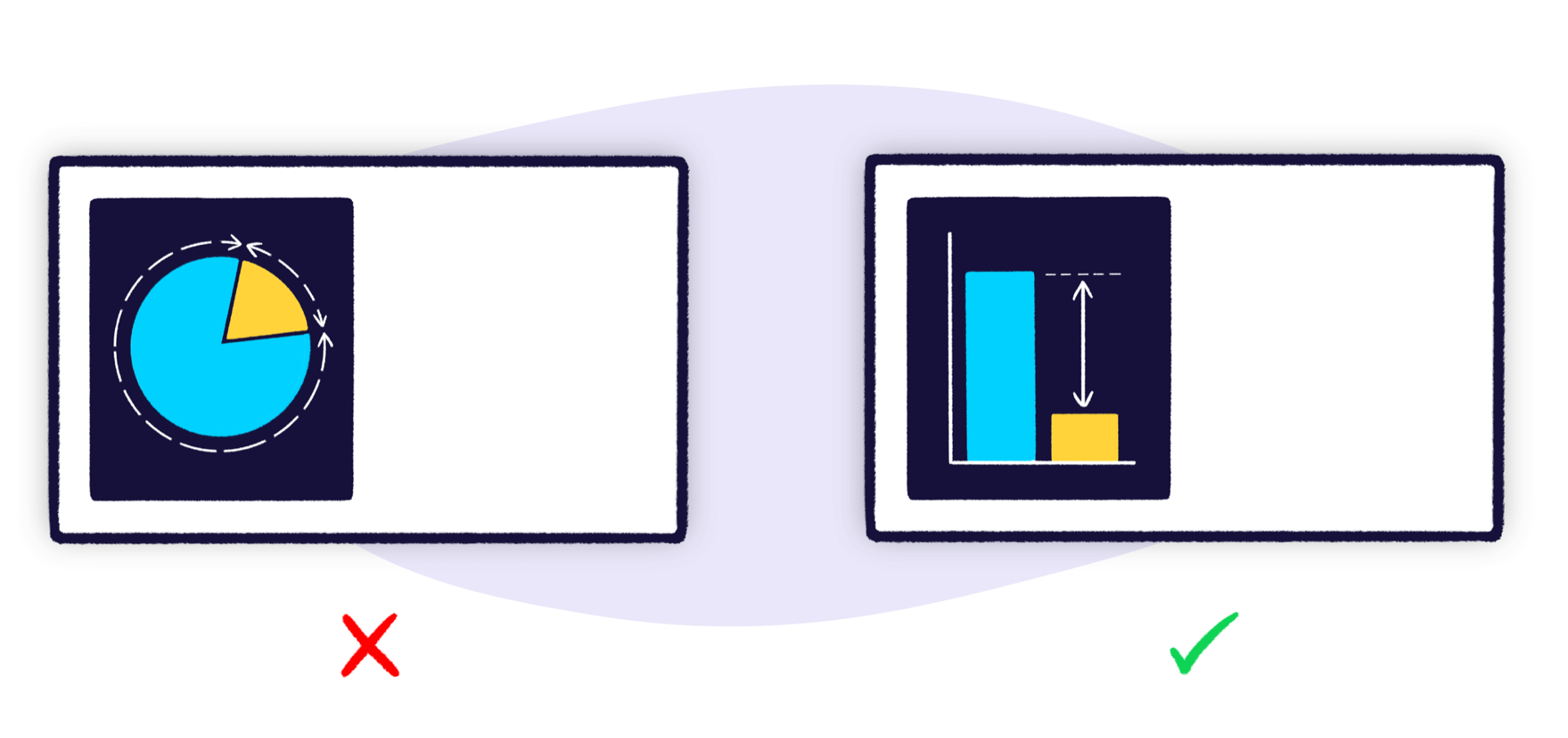
Image via Geckoboards
The dashboard type matters too. Nielsen Norman Group draws a distinction I find pretty useful here:
-
Operational dashboards, think server monitoring or emergency response, exist to deliver information quickly to users making immediate, time-sensitive decisions. They most commonly work with real-time data.
-
Analytical dashboards, like sales trends, marketing performance, or revenue trends, support deeper exploration and pattern recognition. They typically rely on historical data to surface trends over time.
Over time, I've landed on a few pairings that rarely let me down:
-
Line charts for trends over time
-
Bar charts for comparisons between categories
-
Scatter plots for correlations between variables
-
Single-number cards for current status at a glance
There are two things I also avoid entirely: pie charts with more than 3–4 slices, and anything in 3D. Both create the illusion of insight while distorting it.
The last thing I always check before a chart ships is what I call the hover test.
If a user has to hover over something just to understand what it's showing, the chart has failed. So charts should be clear at a glance through data labels, legends, and annotations without any interaction required.
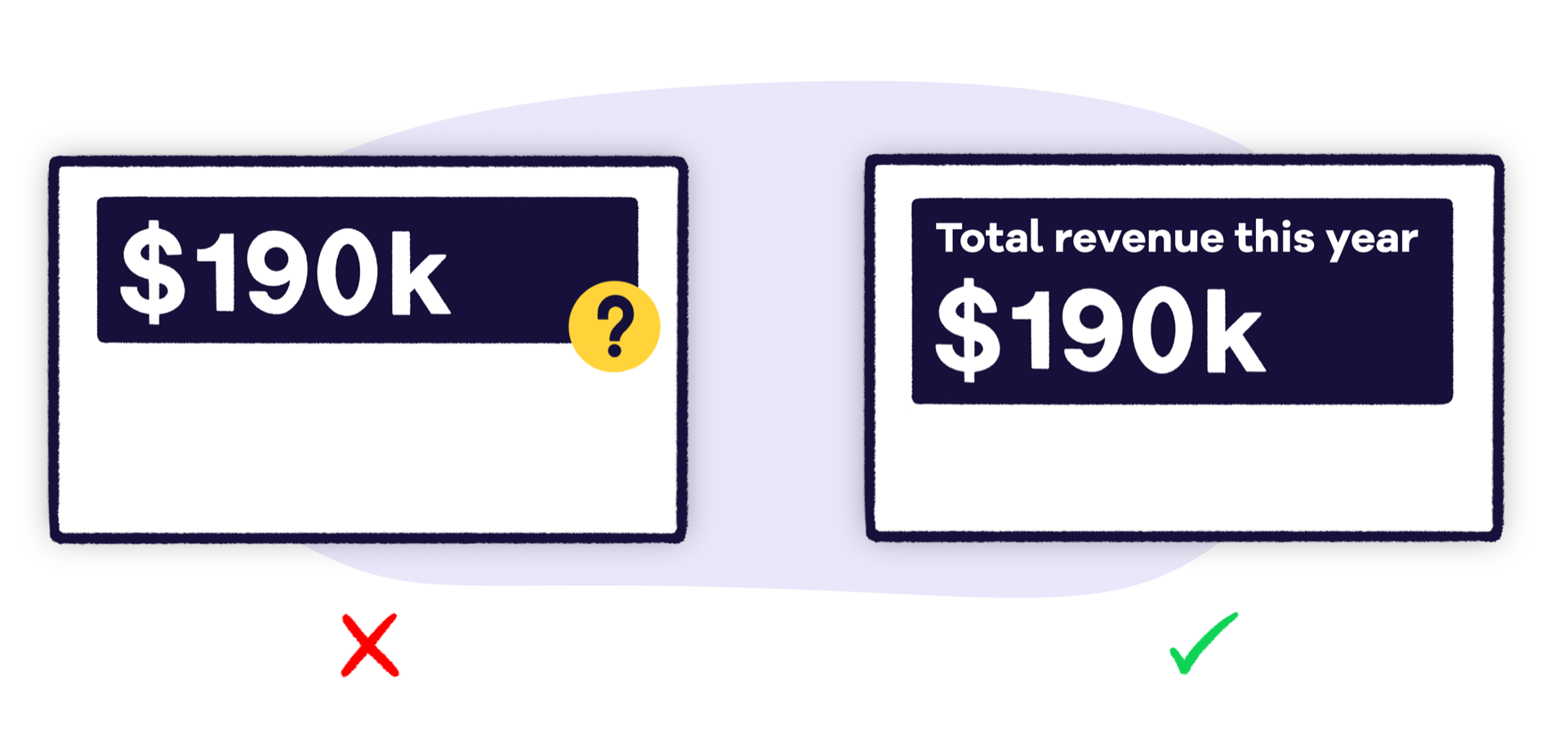
Image via Geckoboards
7. Add context that makes every metric actionable
A number without context is meaningless. If you log in and a metric card shows "Revenue: $142,000," you have no idea about the data model or its state to determine whether that's a win.
Essentially, every KPI card needs three types of context to become useful:
-
Temporal comparison — a week-over-week or month-over-month percentage change that shows direction.
-
Benchmark or target — did you hit the quota? How does this compare to the goal?
-
Trend indicator — a sparkline, directional arrow, or color-coded status that lets users judge instantly whether the metric is healthy, at risk, or failing.
That said, there's a limit. The goal is just enough context to make a judgment call. If users need to dig deeper, that should happen through a drill-down, not by trying to cover too much detail in a card.
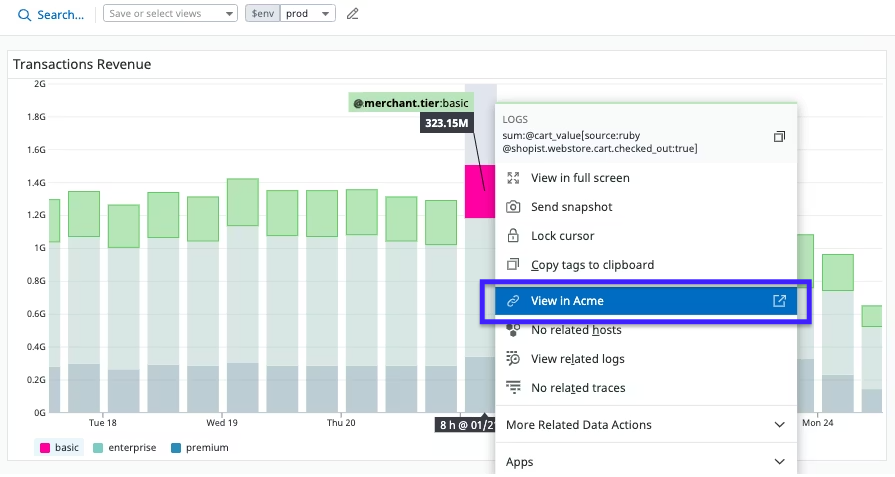
Datadog gets this right with its context links feature. Every metric widget connects to deeper views and related data sources.
Users can see a spike in a KPI in summary and immediately drill into the underlying host dashboard to find the root cause. That way, core insights stay visible and a full report with all the data is just one click away.
Mixpanel even takes this further with a creative approach to dashboard UI/UX.
It has this Metric Trees feature that organizes metrics hierarchically to show how different data points connect to higher-level business outcomes. Instead of seeing a number in isolation, teams see where it sits in the bigger picture and what it influences.

8. Show essentials first, reveal details on demand
Progressive disclosure is one of the most powerful patterns for building an intuitive layout in any data dashboard.
You show the critical information upfront in a clean summary view, and let users click, expand, or drill down to access granular details only when they need them.
Effective drill paths follow common hierarchies, for example:
-
Geographic: Region > country > city
-
Temporal: Year > quarter > month > week
-
Categorical: Department > team > individual
There's also a performance benefit worth noting. Summary data loads fast because it's aggregated. Granular data is only queried when a user asks for it. Therefore, progressive disclosure is good UX and good engineering at the same time.
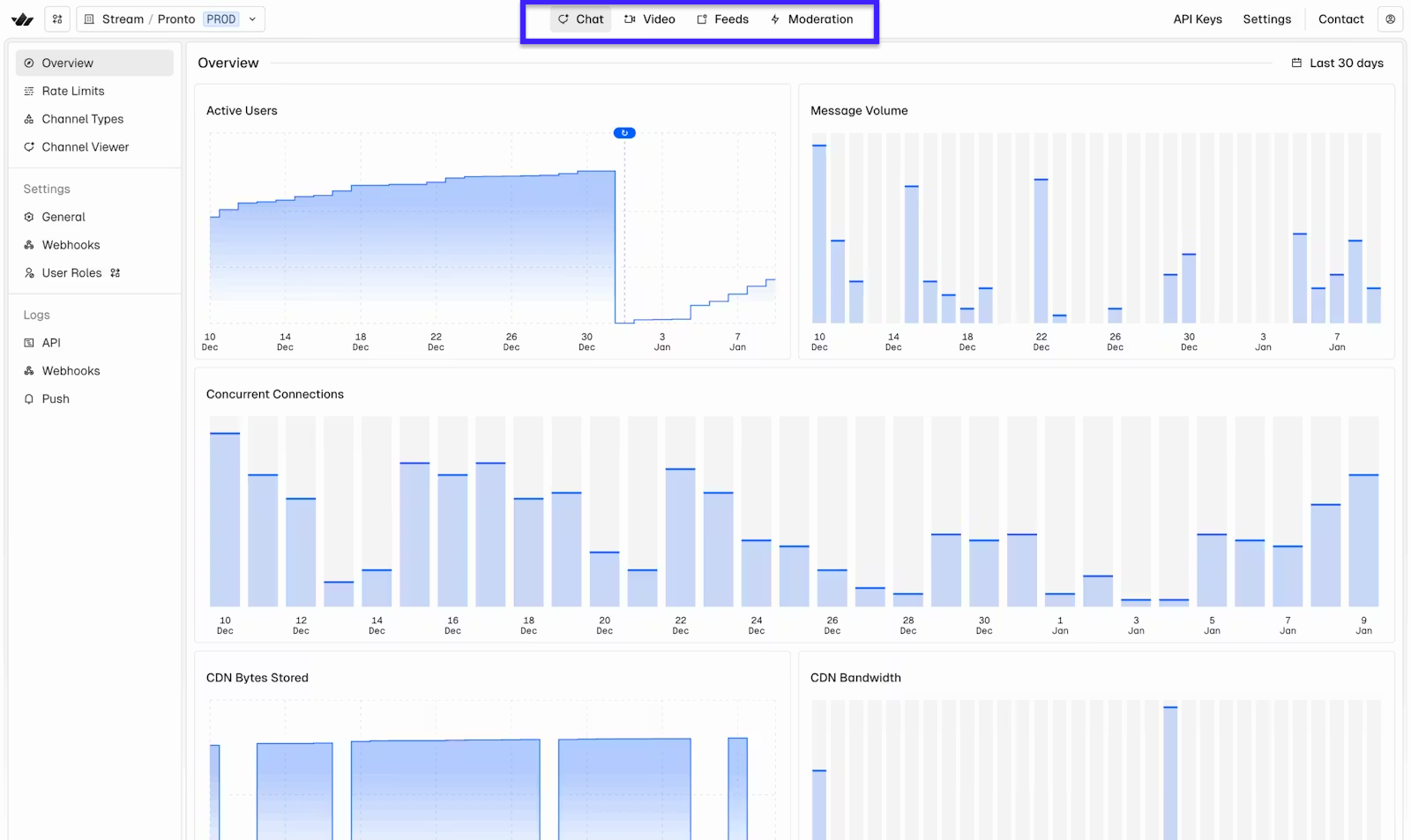
I recently read the Stream case on redesigning their dashboards, and it was exactly the case when you ignore this.
As their dashboard grew to cover four interconnected products, Chat, Video, Feeds, and Moderation, each evolving independently, the experience became fragmented and hard to navigate.
Their solution was to rebuild around predictable hierarchies and deep-linkable views. It is so that users could move from high-level status to product-specific detail without losing context, and share exact views with teammates without extra steps.
9. Give users control with filters and custom views
Filters, saved views, and layout customization let users shape the dashboard to match their specific workflow without requiring a redesign.
This is simply because no single default view perfectly serves every user. A regional manager wants to filter by territory. A product lead wants to filter by feature. Without filter controls, they're both staring at the same aggregate view that's only partially useful to either of them.
With that said, here are the most common filter types every dashboard designer can rely on:
-
Global filters, such as date range, team, and region, that update all widgets simultaneously
-
Individual widget filters for granular control over specific tiles
-
Saved filter presets so users can switch between common views without reconfiguring everything from scratch
Nevertheless, unlimited customization creates its own problem: too many options, and users end up paralyzed.
The right approach should be structured flexibility, which you do by including pre-defined filter categories, drag-and-drop within a grid, or a curated widget library. These give users control within guardrails, not a blank canvas.
An example of such structured flexibility is Looker. Dashboard filters can apply to all tiles simultaneously or to individual tiles only, and users can temporarily update filter values without affecting what anyone else sees.
Or take Amplitude as an example. It explains how filters don't need to be complicated. Their dashboard filter system lets users filter all charts simultaneously by date range, interval, or property. And once a filter is applied, users can copy the URL to share that exact filtered view with teammates.
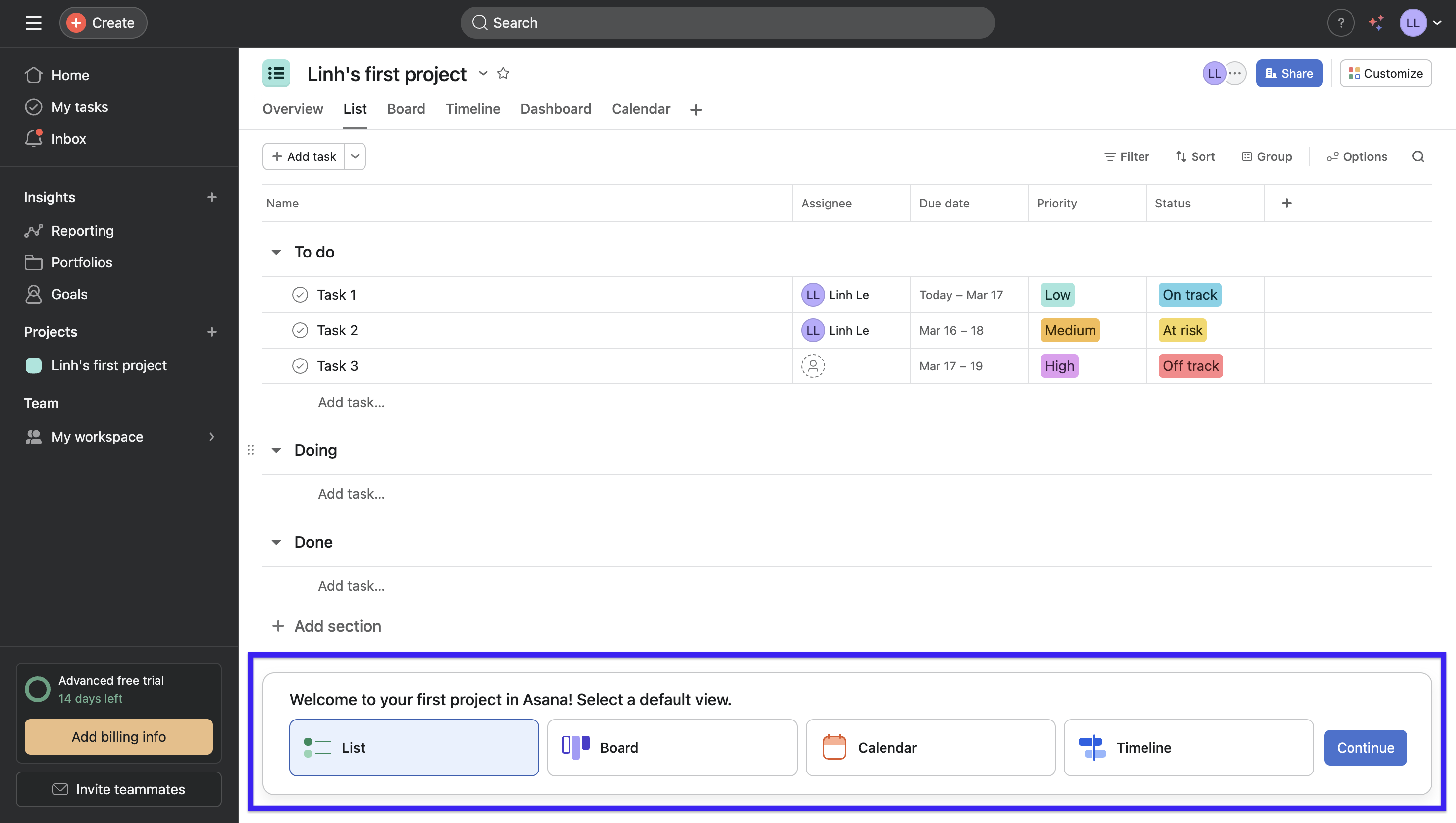
10. Design for empty, loading, and error states
Designing for empty, loading, and error states means building your dashboards for states where data is unavailable or it just doesn't load.
Think about what a first-time user can possibly run into: no data yet, a slow connection, a failed API call, a filter that returns zero results.
There are three states that an efficient dashboard design always addresses deliberately:
-
Empty states are the biggest missed opportunity. Instead of leaving users staring at a blank screen, treat it as an onboarding moment. You can show what the populated view will look like and give them a clear next step.
This is a common practice in SaaS, and Asana is one of the best examples I've seen of this. Rather than defaulting to tooltips or modals, they pre-populate empty screens with the tasks you said you wanted to accomplish during onboarding. They give you a clear status view with options to choose your preferred layout.
-
Loading states — skeleton screens are something most of us know from scrolling LinkedIn or Facebook, that ghost layout before content loads in. The same principle works for dashboards. Mirror the final layout while data loads to keep users oriented.
Image via UXDesign
-
Error states are where most dashboards completely give up. "Something went wrong" is not a design decision. What I always push for is plain language that tells users what happened, and a clear path forward, like retry the query, adjust the filters, or contact support. An error that's handled well barely registers as a problem at all.
11. Design for accessibility and real-world conditions
When you design for accessibility and real-world conditions, you build a dashboard that works for everyone.
While accessibility is often treated as a compliance checkbox, I'd push back on that.
High contrast helps users differentiate data points in bright office lighting. Keyboard navigation helps power users move faster. Clear labeling helps anyone unfamiliar with the data. The overlap between accessible design and good design is almost total.
Here are some WCAG 2.1 AA requirements that I feel most relevant to dashboards:
-
4.5:1 minimum color contrast for text, 3:1 for large text and UI components
-
Full keyboard navigation — Tab, Shift+Tab, Enter, Escape should reach everything
-
ARIA labels on all interactive elements for screen reader support
-
Readability at 200% zoom without content breaking or overlapping
The one I see violated most often is color. A red/green status system feels intuitive until you remember that roughly 8% of men have some form of color blindness. Adding text labels like "On track" and "At risk" alongside the color costs almost nothing and closes the gap entirely.
You can learn from how mature products already make this part of their key features. Tableau, for instance, ships a built-in Color Blind palette and recommends pairing shapes with color so users never have to rely on color alone to read a chart.

And when teams treat it as a core requirement from the start, the results speak for themselves. DezoDev built a fintech dashboard for 50,000+ users and shipped with zero accessibility violations, 4.8:1 color contrast across all visualizations, and full screen reader and keyboard support. All WCAG 2.2 AA compliant.
12. Measure dashboard effectiveness with real user performance
The only honest measure of a dashboard's quality is whether users can complete their tasks faster and more accurately than before.
The metric I rely on most is time on task, which is how long it takes a user to complete a specific, representative task. You can start by picking a set of representative tasks. Then, time users completing them and track how that number changes across iterations.
What I find useful is how MeasuringU breaks this down into three variants:
-
time to complete (successful tasks only)
-
time on task (all participants, including failures)
-
time till failure (failed tasks only).
Measuring all three reveals not just how fast successful users are, but how long struggling users spend before giving up.
If you have more capacity, I'd recommend tracking these metrics as well:
-
Task success rate — did they find the right answer?
-
Error rate — did they misread or misinterpret the data?
-
5-second test — can a new user identify the dashboard's purpose within 5 seconds of seeing it?
The goal isn't a one-time launch test. It's a continuous feedback loop where you run lightweight user testing sessions after every major release.
Start building dashboards that drive decisions, not confusion
If there's anything that stuck with me, it's that efficient dashboard design is not simply making it visually appealing but building a tool that drives decisions.
That's why every dashboard design tip I've curated for this guide traces back to one idea: each design decision should reduce the mental effort required to reach an insight.
If you want to test your own dashboard today, start with the 5-second test. Sit someone unfamiliar with the interface in front of it and ask them to identify the most important thing on the screen. If they can't do it within five seconds, you have the first thing to start fixing.