9 UX Metrics: How to Measure What Actually Matters

Khanh Linh Le
Created on Mar 4, 2026
I've been going down a rabbit hole lately, trying to understand how UX metrics are actually measured. And honestly, a lot of what I found surprised me.
One piece that stuck with me was a 2023 paper in ACM Interactions by Maximilian Speicher called "So, How Can We Measure UX?" His argument is one I completely agree with: none of the metrics readily and easily available from web analytics data can reliably measure UX.
Bounce rate, session duration, conversion rate, etc., we've all used them as proxies for experience. However, they don't tell you how users feel, where they're confused, or why they leave.
This guide is my attempt to provide you with research-backed frameworks for choosing metrics. I'll also cover the most common UX metrics to measure.
What are UX metrics?
UX metrics are quantitative data points that measure how users interact with and feel about a product. They generally fall into two categories:
-
Behavioral metrics (what users do): task success rate, time on task, error rate, clicks, and navigation paths.
-
Attitudinal metrics (how users feel): satisfaction scores, Net Promoter Score (NPS), and perceived ease of use.
It's important to distinguish UX metrics from business KPIs. Revenue, profit margins, and conversion rates are business outcomes; they tell you whether the company made money, but they don't tell you why.
If revenue drops, staring at the revenue number won't help you fix it. UX metrics measure the human behavior and sentiment that drive those outcomes. The two should connect, but they aren't interchangeable.
That connection is what matters. If UX metrics don't tie back to organizational goals, they are useless.
3 frameworks for choosing UX metrics
Once you decide to start measuring, the temptation is to track everything: scroll depth, hover time, click-through rate, session duration. That leads to one of two problems: analysis paralysis from tracking too many metrics, or vanity metrics that look impressive but offer no insight.
Frameworks solve this by helping teams align on what to measure and connect those measurements to goals. Nevertheless, the framework choice depends on your context.
Here are 3 popular UX frameworks to help you choose metrics.
Google's HEART framework
The HEART framework was developed by Google's UX research team (Kerry Rodden, Hilary Hutchinson, and Xin Fu) to measure user experience at scale.
When you have a billion users, you can't interview them all. HEART provides five dimensions to focus on:
-
Happiness: User attitudes and satisfaction, measured via surveys and NPS.
-
Engagement: Level of voluntary user interaction, such as session time, frequency of use, and depth of use.
-
Adoption: New users coming to a product, such as sign-ups, downloads, and new feature usage.
-
Retention: Users who return over time, i.e., active users month-over-month, churn rate.
-
Task success: Ability to complete specific tasks, such as completion rate, time on task, and error rate.
You don't need to track all five. Pick one or two that align with your product's current goals.
HEART is best suited for consumer products where users choose to engage. Google uses it internally to track Gmail satisfaction. When users reported anxiety about accidentally sending emails, the team focused on the Happiness dimension and developed the "Undo Send" feature. This wasn't a bug fix but an emotional fix driven by measuring user sentiment.
The Goals-Signals-Metrics process
Goals-Signals-Metrics (GSM) is a structured process for deciding which metrics are actually worth tracking. It's what makes HEART actionable in practice.
The process has three steps, and the order matters since you won't start with a metric:
-
Goals: Define what you want to achieve. (i.e., "Improve onboarding completion.")
-
Signals: Identify user behaviors that indicate progress toward that goal. (i.e., "Users completing each setup step")
-
Metrics: Quantify those signals into trackable numbers. (i.e., "% of users who complete all 5 onboarding steps in their first session").
This process prevents teams from picking metrics just because they're easy to measure.
If you start with a metric, for example, "we need to track bounce rate," and then try to invent a reason why, you end up measuring the wrong things.
It's like buying ingredients before you know what you're cooking. If you can't connect a metric back to a goal, you probably shouldn't be tracking it.
When HEART doesn't fit: alternatives for enterprise and B2B
HEART works brilliantly for consumer products, but it might break in enterprise and workplace contexts.
The problem is structural, where dimensions like engagement, adoption, and retention are meaningful only when users can choose whether to use a product.
When your users are employees who have no say in the matter, retention tells you nothing about experience. It just tracks headcount.
This is where CASTLE comes in. Developed by Nielsen Norman Group in 2023, it's a framework built specifically for internal tools, intranets, healthcare systems, and other workplace software where usage is mandatory.
The six dimensions are:
-
Cognitive load: The mental effort required to complete tasks.
-
Advanced feature usage: Whether users adopt powerful features or stick to basics.
-
Satisfaction: Overall user contentment.
-
Task efficiency: Time and steps to complete workflows.
-
Learnability: How quickly new users become proficient.
-
Errors: Frequency and severity of user mistakes.
In one case study referenced by the Nielsen Norman Group, a company redesigning an internal HR platform used CASTLE to measure success.
By tracking Learnability, they discovered that new hires took eight full days to become proficient with the old system. After simplifying the interface, it dropped to two days. It's a result that would have been invisible under HEART.
The good news is you don't have to choose one or the other. Teams can mix and match.
Think of pairing Task Success from HEART with Cognitive Load from CASTLE, depending on what they're building and who they're building it for.
9 UX metrics every team should track
Frameworks give you decision-making guidance, but they don't tell you which key metrics to put on your dashboard.
So I went digging. I cross-referenced a systematic literature review of 61 UX studies with Nielsen Norman Group's famous book "UX Metrics and ROI," which analysed 44 real-world design projects across companies like Shopify, HelloFresh, Atlassian's Jira, and Asiacell.
Most teams cluster around three types of metrics:
-
self-reported measures like satisfaction scores and perceived ease of use
-
performance measures like task success rate and time-on-task
-
adoption or retention indicators, like returning visitors.
-
effectiveness metrics, i.e., whether users can actually complete what they came to do
Based on all of that, here are the 9 metrics worth building into your practice.
Task success rate
Task success rate measures the percentage of users who complete a target task without assistance or failure. Think of actions such as finding a product, submitting a form, or finishing a checkout.
I keep coming back to this one because it's direct and value-proven.
According to the NNG's book "UX Metrics and ROI", effectiveness metrics like task success rate showed the widest improvement range of any category across real-world redesigns. It's a significant range from -9% to 271%.
That variance alone proves that when this metric moves, something meaningful has changed.
To measure task success rate, you can run moderated or unmoderated usability tests with realistic scenarios. Record a simple pass/fail for each attempt, then calculate the proportion of successful completions across participants.
In reality, if you have an analytics tool in place, simply track task completion percentage for flows that are core to your business or product. For example, if you're building a healthcare portal, track whether patients can successfully locate and book an appointment without dropping off or calling support.
You can even go further by benchmarking it to your industry's average number. Take this as a standard number: MeasuringU analyzed 1,189 usability tasks across 115 studies and found the average task success rate is 78%. Scores above 78% are above average. Scores below 70% indicate serious usability problems.
Time on task
Time on task measures how long it takes users to complete a specific action, reported as an average or median across users.
Speed isn't the goal, but unexplained slowness is always a signal. When users are lingering on a step that should take seconds, there's friction somewhere. For example, if a user is paying a bill, ten seconds is ideal.
Nevertheless, context matters. A patient reading a medical diagnosis on a health portal should take their time. If they spend ten seconds on that page and leave, that's not efficiency but panic or confusion.
So before drawing any conclusions, establish baseline times first. Without a baseline for average task completion time before a redesign, you have no reference point to measure improvement against.
In addition, time on task works best as a comparative metric rather than an absolute one. You should combine it with the task success rate when comparing task times across design iterations, benchmarking against competitors, or pinpointing bottlenecks in complex workflows.
Error rate
Error rate tracks how often users make mistakes during a task, such as wrong clicks, failed form inputs, and misread navigation labels.
You can measure error rate by logging every observable mistake per task per user during usability tests. Then, divide total errors by total task attempts to get a rate. You can also categorise errors by type to identify patterns.
There are different types of errors worth distinguishing:
-
Slips: Accidental mistakes, like clicking the wrong button.
-
Mistakes: Errors caused by a wrong mental model, like looking for a setting in the wrong menu.
-
System errors: Bugs or unclear UI elements that lead users astray.
What I find useful about error rate specifically is that it catches the near-misses, the moments where a user recovered and completed the task, but only just. Those recoveries often hide your biggest design problems.
System usability scale (SUS)
The SUS is a 10-question standardised questionnaire that produces a usability score out of 100. It's fast, free, and remarkably reliable.
Developed by John Brooke in 1986, it's still one of the most widely used usability metrics in UX research today.
Based on Jeff Sauro's research across 500+ studies, here's how to interpret your score:
-
80+ = A grade (top 10% of products)
-
68 = C grade (average)
-
Below 51 = F grade (serious usability problems)
But there's one thing to note: don't modify the questions. The benchmarks only hold for the standard 10-item scale.
I think its staying power comes down to one thing: it's sensitive enough to detect changes, but simple enough that participants actually complete it honestly. If you're only going to add one post-task questionnaire to your research, this is the one.
However, it only works best when paired with qualitative research.
The SUS score will help you flag the problem. When you combine it with further interviews, user feedback, and observation, you can eventually explain the reasons behind the given SUS scores.
In short, you can use it after usability tests or periodically to track perceived usability over time.
Net promoter score (NPS)
Net promoter score asks one question: "How likely are you to recommend this to a friend or colleague?" on a 0–10 scale. Subtract the percentage of Detractors (0–6) from Promoters (9–10), and you get your score.
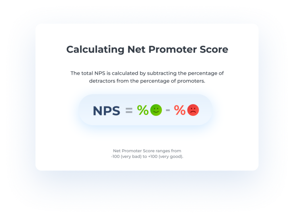
Image: Nicereply
The best practice I'm seeing across different product teams is to run NPS surveys quarterly or post-milestone. You should always use it to track directional trends over time since a single NPS score in isolation doesn't tell you much.
You can even benchmark your NPS against your industry standard for context on where you stand.
For example, according to SurveySensum data:
-
B2B SaaS: Average NPS around 40
-
Insurance: Average NPS around 80
-
E-commerce: Varies widely, often 20–50
-
Global standard: 50+ is excellent, 70+ is world-class
The limitation worth knowing, and this is something Nielsen Norman Group (NNG) flags explicitly, is that NPS measures the entire customer relationship: brand perception, pricing, customer service, and design all rolled into one number.
It correlates strongly with SUS scores, which is why some teams track one or the other rather than both. But neither replaces qualitative research when you need to understand the why behind the score.
I'd treat NPS the way the NNG suggests, as a Satisfaction/Perception metric. It's valuable for stakeholder conversations, but not granular enough to drive design decisions on its own.
Customer satisfaction score (CSAT)
CSAT is a direct customer satisfaction check: "How satisfied were you with this experience?", typically rated on a 1–5 scale.
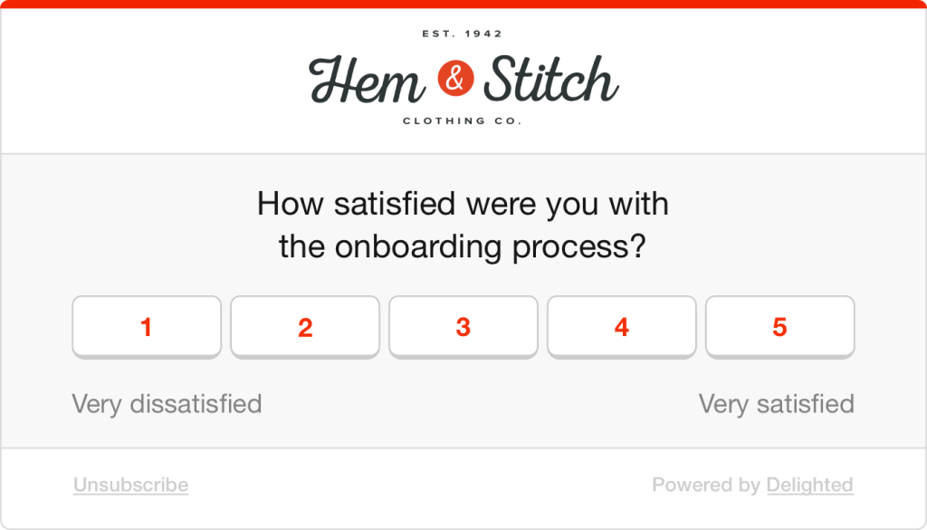
Image: Delighted
It's flexible, easy to embed at key moments in the journey, and gives you a quick read on user satisfaction at specific touchpoints.
To collect the score, you can trigger a short survey post-task, post-purchase, or post-support interaction.
Here's the thing I find fascinating, though.
The NNG report found satisfaction metrics averaged only a 19% improvement after redesigns, the lowest of any category.
Even when the underlying experience gets meaningfully better, perception is slow to follow. That doesn't make CSAT less useful; it makes it more important to pair with behavioural metrics, so you can see the gap between what users experience and what they report.
Adoption rate
Adoption rate tells you how many eligible users started using a new feature or product in a given period: (new users of feature ÷ total eligible users) × 100.
It sounds simple, but teams often confuse it with retention. In the HEART framework, the distinction is clear. Adoption is about getting users in the door, while retention is about whether they come back. Essentially, you need both.
The number one mistake I see is celebrating high adoption without checking what comes next. Users might try a feature once and never return. So always pair it with retention or engagement data to know if the adoption actually meant something.
Retention rate
Retention measures the percentage of users who return to your product over a defined time period.
The business case for caring about this metric is hard to ignore. Research by Frederick Reichheld of Bain & Company shows that increasing customer retention rates by just 5% can increase profits by 25% to 95%.
This makes the user retention rate one of the easiest metrics to bring into a conversation with stakeholders.
To measure it, pull from your analytics tool, define your return window based on your product type (day 1, day 7, day 30 are common), and track cohorts over time rather than aggregate numbers.
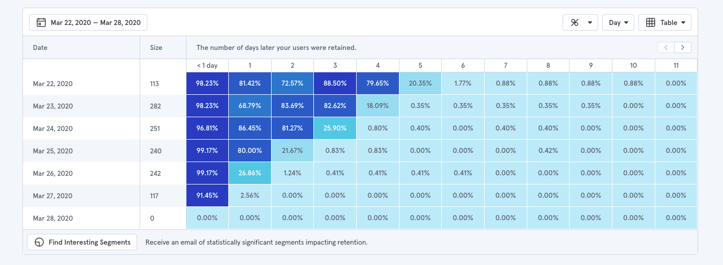
Image: Baremetrics
You can also pair it with churn rate for more valuable insights into your product health, which is the inverse of retention. Retention tells you how many users stayed; churn tells you when they left and can point you toward where the experience broke down.
Findability/ Navigation success rate
Findability measures whether users can successfully locate specific content, features, or pages, independent of whether they eventually complete a task through a workaround.
This distinction matters more than most teams realise.
A user can complete a task without ever finding what they were originally looking for, which means task success rate alone won't catch navigation failures.
As the NNG suggests, the most reliable way to measure it is through tree testing. You can use different platforms like Optimal Workshop, Maze, UserBerry, etc., to conduct tree testing.
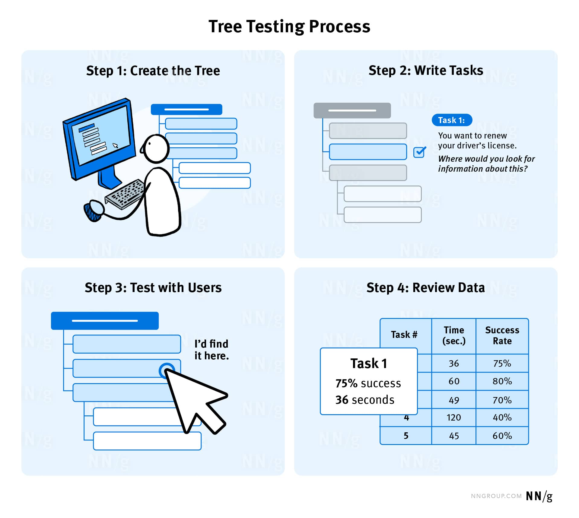
Image: NNG
Participants are shown only the labels and structure of a hierarchy, given a task, and asked to locate where they'd expect to complete it. This isolates navigation from everything else. Three metrics come out of it:
-
overall success rate
-
direct success rate (found it on the first try)
-
indirect success rate (eventually got there after a wrong turn).
That last one is particularly telling. Indirect success often reveals where your labels are misleading, even when users recover. You can also complement this by tracking navigation paths in your analytics tool to identify where users are detouring or backtracking in real usage.
What I find more interesting is how you can even layer in user engagement metrics as supporting context:
-
Long session duration + poor findability score = users weren't engaged; they were lost.
-
Low feature usage frequency on a valuable feature = your architecture is burying it, not users ignoring it.
-
Declining DAU/MAU over time = users who can't find value reliably stop returning daily, long before they churn.
How to choose the right UX metrics for your product
Frameworks give you structure. Individual metrics give you data points. But neither tells you which specific metrics your product actually needs right now. That gap is where most teams either overthink it or default to whatever's easy to pull from their analytics dashboard.
To make this practical, I'll walk through the process using one example throughout: a B2B SaaS product trying to reduce time-to-value for new users.
1. Align metrics to organizational goals
If a metric doesn't connect to what the business cares about, it won't get attention or resources.
You can start with organizational goals like growth, retention, efficiency, customer satisfaction, and work backward:
-
Identify the organizational goals.
-
Map UX work to those goals (i.e., "improving checkout UX supports revenue growth").
-
Choose metrics that demonstrate that connection (i.e., checkout completion rate, time to purchase).
For our example, the business goal is to reduce time-to-value for new users. That maps directly to onboarding. The metrics that demonstrate that connection are onboarding completion rate, time to first key action, and where users are dropping off in the setup flow.
A question I find useful to ask stakeholders early: "What would convince you that this UX work is delivering value?" The answer usually points you straight to the right metric.
2. Avoid the vanity and silo traps
The Nielsen Norman Group identifies two common measurement traps:
The vanity trap: Metrics that look impressive but offer no insight. These are often ever-growing metrics where bigger is always better, like the overall number of users, app downloads, and page views. To avoid this trap, convert raw numbers into rates. Not "total sign-ups" but "percentage of sign-ups who complete onboarding within 24 hours." That number can go down, which is precisely what makes it actionable.
The silo trap: Metrics chosen by the UX team in isolation, without stakeholder buy-in. No one outside UX cares about them, so they never influence decisions. You can fix this by involving stakeholders in the selection process early and framing UX metrics alongside the business metrics they already care about.
The difference in practice looks like this: "total new sign-ups" always climb and tell you nothing about the experience.
In contrast, "percentage of new sign-ups who complete all five onboarding steps within their first session" is something UX directly influences and something a product or growth team will pay attention to.
3. Start small and iterate
The goal is to pick three to five metrics and build from there. Here's my recommendation of a starting set that works for most products:
-
One behavioral metric: Task success rate or time on task.
-
One attitudinal metric: SUS or CSAT.
-
One business-aligned metric: Adoption, retention, or conversion.
In our onboarding example, that means task success rate on the setup flow, a post-onboarding SUS score, and 30-day retention.
The process from there is just iteration, where you establish a baseline before any changes, make design decisions, measure again, and compare.
But it's also important to drop a metric when it no longer aligns with current goals or when you've solved the problem it was tracking. If your checkout success rate hits 95%, stop obsessing over it and move to the next problem.
4. Benchmark against industry standards
There are four types of benchmarks :
-
Historical: Compare against your own past performance. This is the most useful for tracking improvement over time.
-
Competitive: Compare against direct competitors, which requires benchmarking studies.
-
Industry standards: Compare against published averages.
-
Goal-based: Compare against targets you've set internally.
Early on, when you don't yet have historical data to draw from, industry standards are your best anchor.
A task success rate of 61% against a 78% average tells you there's a gap. It gives you something concrete to bring into a stakeholder conversation beyond a number on a slide.
As your product matures, that changes. Your own trajectory becomes a more meaningful reference point.
Moving from 61% to 74% over two quarters tells you far more about the health of your product than any published benchmark ever could. This is simply because it reflects your users, your context, and the specific design decisions your team made.
5. Turn insights into design decisions
Picking the right metrics is half the battle. The other half is having the infrastructure to collect data, monitor, and respond to them.
The measurement stack most teams need breaks down into four layers:
-
Analytics tools (Mixpanel, Amplitude, Google Analytics) show you what's happening — where users drop off, which features get used, and how far through a flow people get.
-
Usability testing tools (Maze, UserTesting, Lookback) let you observe task success rate, time on task, and errors in structured sessions.
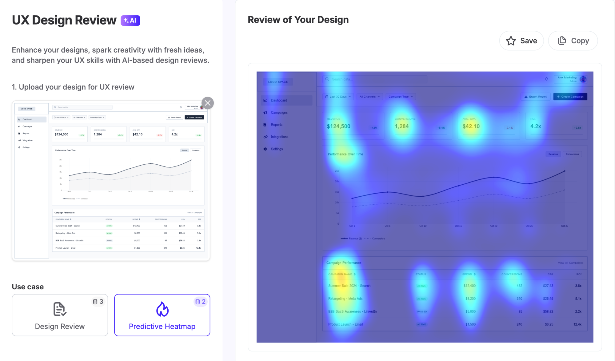
UX Pilot's heatmap feature for example, uses eye-tracking studies and user behaviour patterns to predict where attention lands on a design, so you can spot issues before testing even begins.
-
Survey tools (Typeform, Qualtrics, SurveyMonkey) collect NPS, CSAT, and SUS scores at scale.
-
Session replay tools (Hotjar, FullStory) show you where users hesitate, rage-click, or abandon.
What actually separates teams that improve from teams that just report is having a process for acting on what they find. Here's the quick process I'd recommend:
-
Identify metric drops or anomalies.
-
Use qualitative methods (session recordings, user interviews) to understand root causes.
-
Prioritize fixes based on impact versus effort.
-
Measure again after changes to validate improvement.
You can even set up regular review cadences (i.e., weekly for fast-moving products or monthly for stable ones) to make sure you actually use the data you collect.
Turn UX mapping insights into better user experiences
UX measurement is a practice you build over time, not a one-time project. Start with a framework, pick a small set of metrics that connect to goals, and resist the urge to track everything at once.
What good measurement gives you, eventually, is something most UX teams find hard to articulate: a direct line between design decisions and business outcomes.
That's what earns resources, builds stakeholder trust, and shifts UX from a team that makes things look good to one that demonstrably drives results.