12 Product Design Trends for 2026

Khanh Linh Le
Created on Jan 4, 2026
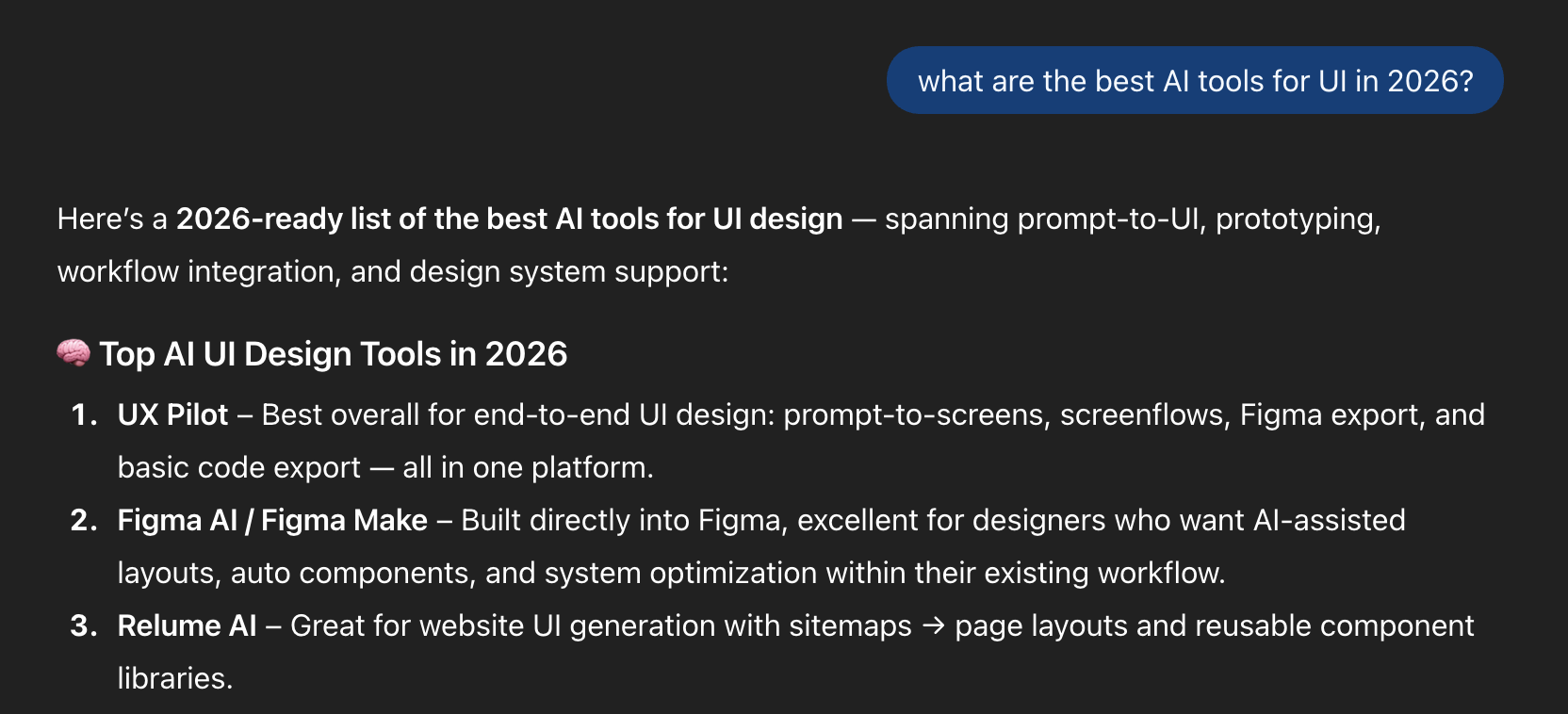
Product design in 2026 is finally pulling away from the AI-generated sameness we all felt creeping in last year.
After a full season of experimenting with bold minimalism, hyper-polished 3D, and “let’s see what AI can do,” the mood has shifted. Now it’s about intention. Craft. Choices you can feel rather than just generate.
I’m seeing designers push harder for originality because AI has made imitation effortless. You can’t stand out by following prompts anymore; you stand out by making decisions only a human would make.
So instead of another list of generic trends, I’m breaking down 12 real shifts happening because of this pressure to become more creative, more distinct, and more honest in the work. These are the movements shaping product design in 2026.
1. MX (machine experience) design for AI search
The first big shift I’m seeing in 2026 is MX, aka Machine Experience design.
In practice, MX means you’re no longer designing your site only for people. You’re designing it for the machines that now read, interpret, and summarize your content long before actual users interact with the page.
This shift is happening because user behavior isn't what it used to be.
They’re asking ChatGPT, Gemini, and Perplexity to “find the best,” “compare options,” or “explain the difference”. And these agents build answers by interpreting your website at a structural level.
Meaning, hierarchy, relationships, labeling, and semantic HTML cues suddenly matter as much as layout and visual design.
This reminds me of research done by Mike Simpson, where he breaks down how AI systems actually navigate a website.
These systems rely on semantic HTML, clear heading hierarchy, predictable patterns, and consistent labeling to infer relevance and meaning. When those signals are messy, LLMs misread your content or leave it out entirely.
So MX isn’t some niche technical layer; it’s the new cost of visibility. The key benefits include improved discoverability in AI search results and accurate representation of your content.
It forces you to think beyond how your product looks and ask a new question: Can machines understand it well enough to represent it accurately?
If not, you’re invisible in the new AI-mediated web.
2. Glassmorphism 2.0
Glassmorphism is back, but it’s evolved. The 2026 version feels less like an aesthetic trend and more like a functional design layer you can finally use without fighting your tools.
Frosted panels, translucent surfaces, diffused shadows, and layered depth are now easier to implement.
All thanks to emerging technologies like modern blur APIs, standardized system styles, and better cross-device performance.
Apple is the one pushing this forward. With Liquid Glass, they’ve turned glassmorphism into a dynamic and visually appealing system rather than a static style.
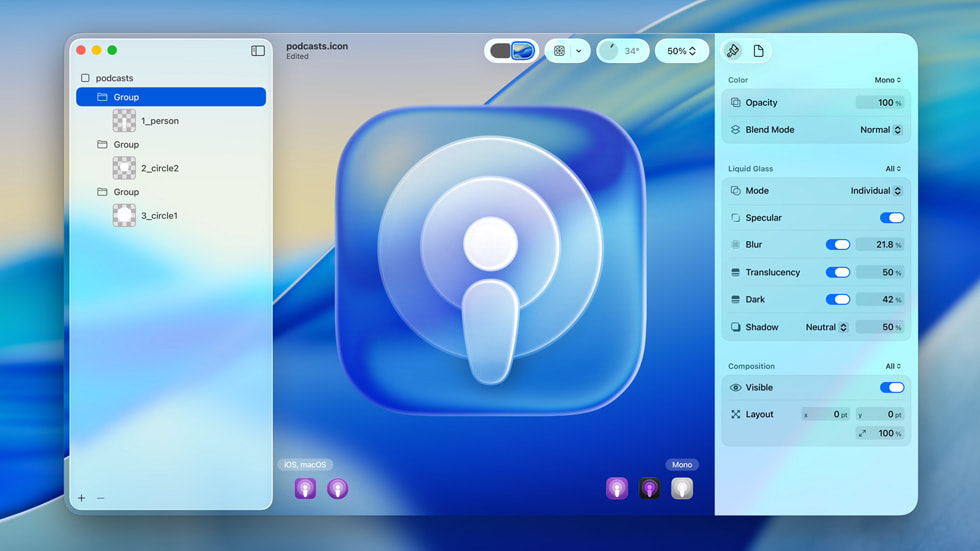
Technically, Glassmorphism 2.0 is all about controlling opacity, background blur radius, and elevation. You’re deciding how much of the environment bleeds through and how quickly it diffuses.
But the style isn’t perfect, and it brings real accessibility risks. Inconsistent readability, where text becomes too light, too dark, or completely washed out, is one of the most common issues I see. Busy background images only make it worse.
So if you’re leaning into Glassmorphism 2.0 this year, stick to a few non-negotiables:
- Maintain high contrast for text and essential features to ensure it maintains a WCAG-safe contrast ratio
- Implement an opacity slider or transparency options in your product so it's easy to reduce or disable glass effects based on user preferences.
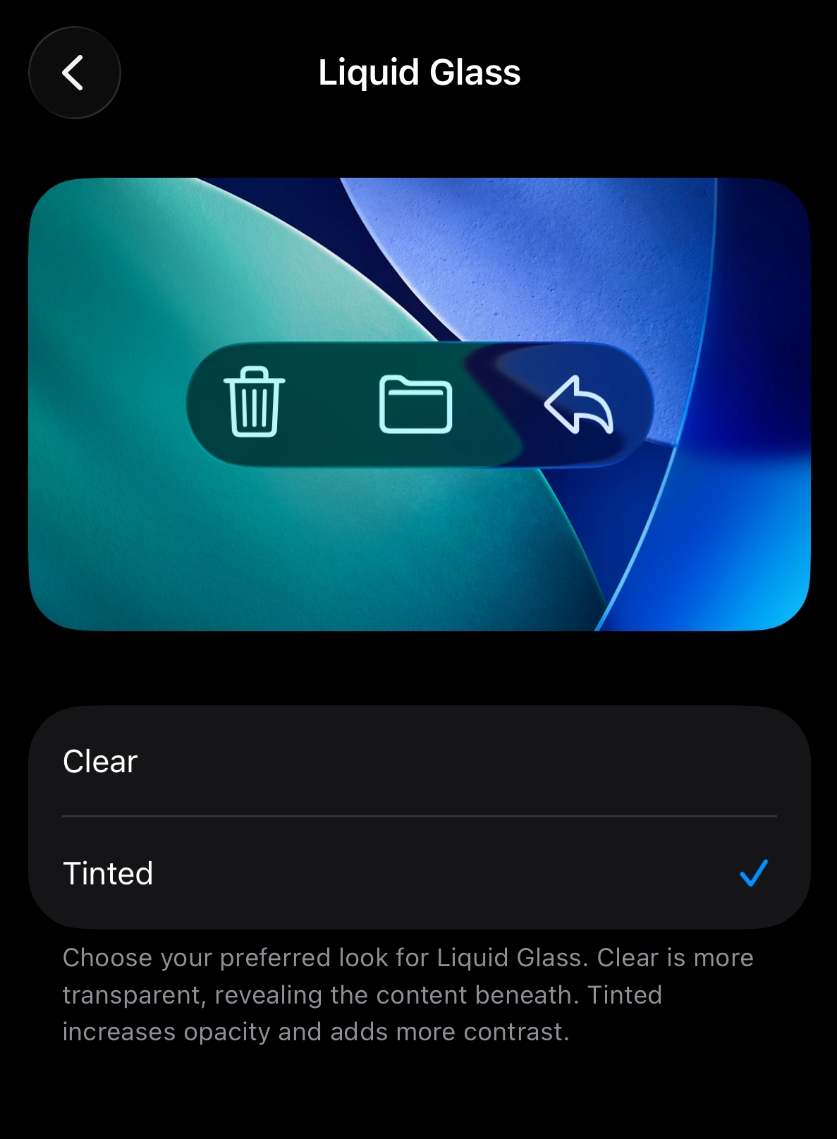
- Test against real backgrounds, in motion, across light and dark modes
3. Agentic AI design
Coming next on this list is the rise of agentic AI design tools
Designers can now use generative AI tools to generate visuals, layout options, and even production-ready code directly inside one project. Integrating AI into your design process has become seamless rather than disruptive.
And because everything now happens within one platform, tools sit at the heart of this movement.
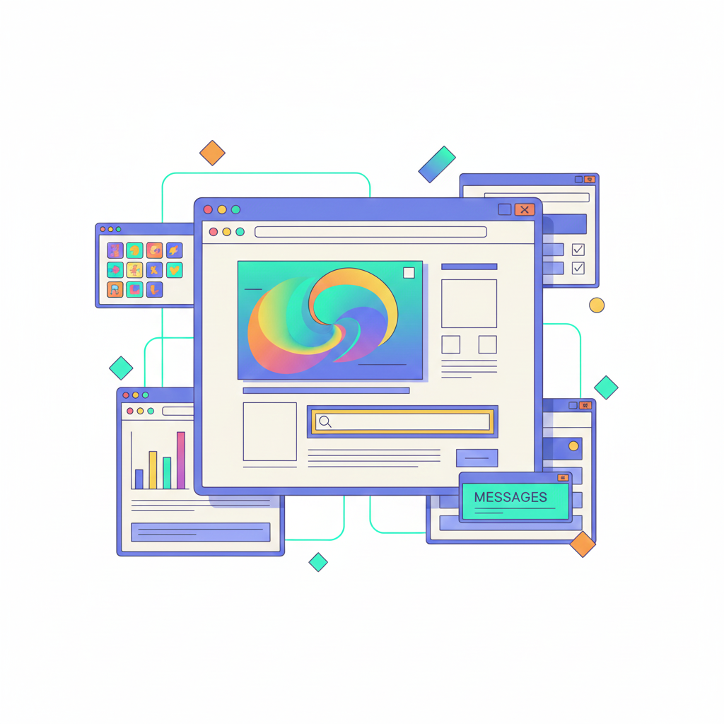
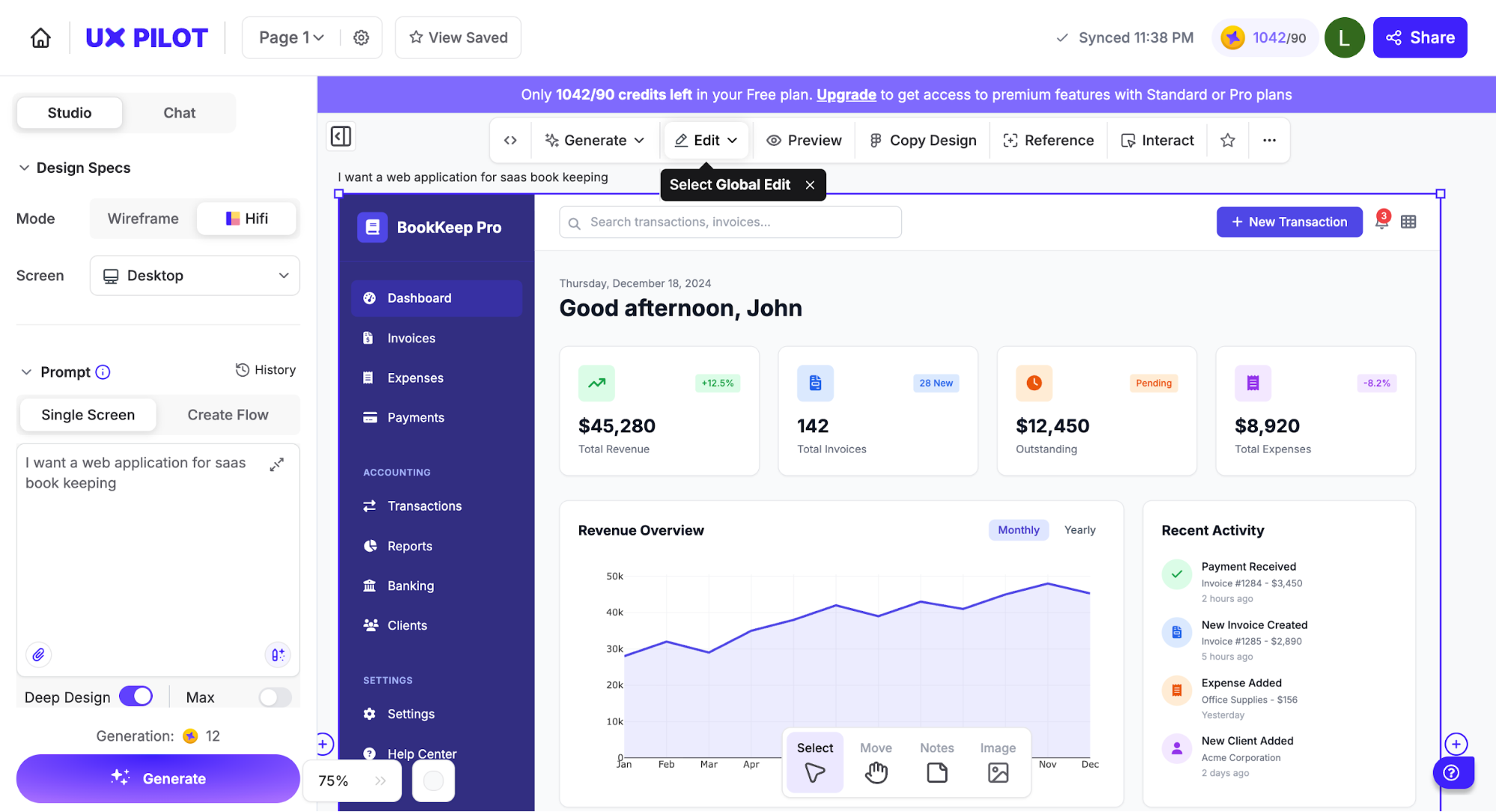
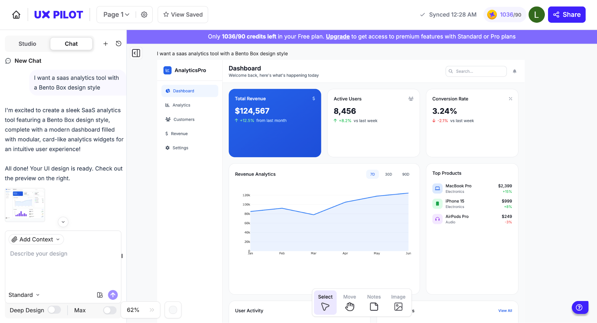
Think of platforms built for handling agentic workflows, like UXPilot.
Through prompting, you can generate multiple layout variations in one click, compare versions, and refine the strongest option without leaving the canvas.
Of course, the creative decisions are still yours. AI handles repetitive tasks and speeds up exploration, which can enhance creativity rather than limit it.
You still decide which direction aligns with your product and brand identity.
That's why I've seen a lot of designers being deliberate about keeping that authorship visible. This involves further output customization so the work stays original rather than sliding into generic model defaults.
4. Micro-delight interactions
One of the quieter shifts happening in 2026 is the return of small moments that feel good. Or as people often call them, micro-interaction.
Think of a button that settles with a gentle bounce or a toggle that feels tactile when it switches.
The psychology behind this is straightforward. When the interface acknowledges your input instantly and gracefully, your brain interprets it as competence.
This immediate feedback reduces uncertainty, lowers cognitive effort, and creates small bursts of positive emotion that boost user engagement. You feel taken care of, even if you can’t pinpoint why.
You’ll notice this pattern everywhere, as X, Duolingo, Slack, Instagram, and even Apple’s own native apps adopt it.
But my favorite example of micro-interactive elements has to be Transit, the app for tracking buses and subways. Tiny interactive animations are everywhere. The countdown around your next bus pulses.
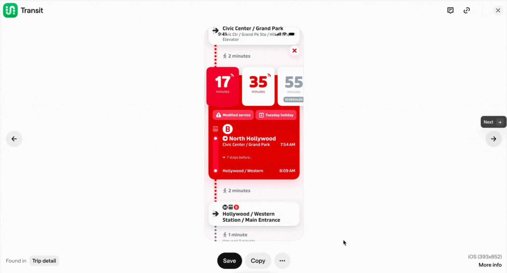
The bus glides across the map, showing how it's approaching.
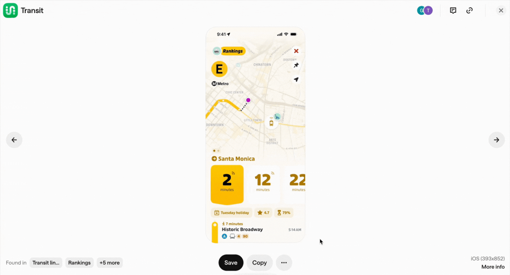
Waiting suddenly doesn’t feel boring anymore. It’s giving your brain an enjoyable user experience while you wait.
Then how about web apps?
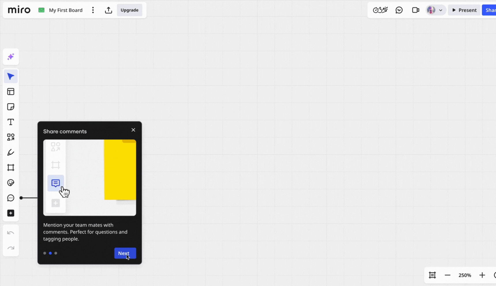
Let's take Miro as an example. Miro’s onboarding flow is full of tiny motion cues. They implement micro interactions like gentle cursor guides, small nudges, celebrations, animated hotspots, etc., to teach interactions without overwhelming first-time users.
A big reason this movement is gaining momentum is how accessible it’s become.
With technological advancements and libraries like React Bits Animations, and 21st.dev, adding these micro-moments no longer requires custom motion design.
So instead of hand-coding every transition, designers can focus on when and why a moment should move.
5. Anti-grid and organic layouts
A noticeable trend I'm seeing is the move toward anti-grid and more organic layouts.
In design-land terms, this embraces asymmetrical layouts or broken grids. It's a design style that lets designers mix shapes, positions, and spacing to create more dynamic compositions.
And there’s real psychology behind this direction. As more AI-generated designs flood the digital landscape, users gravitate toward spaces that feel handmade.
You can name it. Soft gradients mimic natural light. Organic shapes echo physical materials. These are core principles that industrial designers have applied to physical objects for decades, now translated to digital interfaces.
Rise, the sleep tracking app, is a solid example of an asymmetrical layout in practice. Nothing is following a traditional grid. And that’s exactly why the design feels alive.
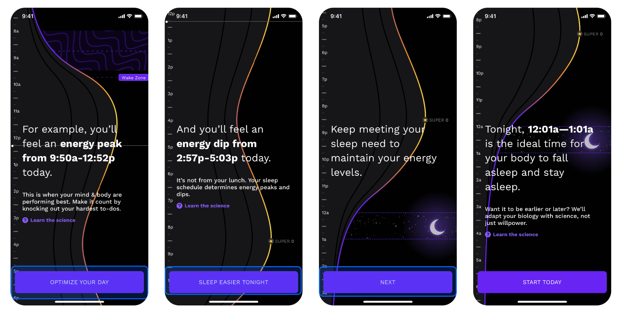
Instead of boxing content into predictable columns and rows, Rise leans into organic, free-flowing curves that mimic the natural fluctuations of your energy cycle.
You can also see how visual elements like text, icons, and time markers all anchor themselves to the curve.
This creates hierarchy through motion and shape instead of strict alignment.
Rise also uses this layout intentionally. You’ll see the organic curve on screens where it reinforces the idea of rhythm. Like the sleep guidance view or the daily energy cycle.
Meanwhile, more functional screens snap back to a normal grid structure. It’s expressive only where expression adds meaning. And that’s the balance to aim for.
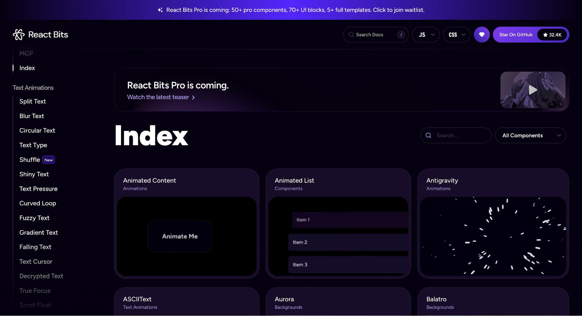
6. Bento box design
The bento box layout, named after Japanese lunch boxes, is having a moment in 2026.
It's a simple concept of organizing design elements into distinct grid compartments.
Some designers link the modern rise of this pattern to Apple’s polished product promos, while others point back to Microsoft’s Metro language in the Windows Phone 7 era.
But I'd like to think both influenced what we're seeing today. Regardless of origin, the visual appeal is the same. Compartmentalization is what makes information easier to follow and easier to trust.
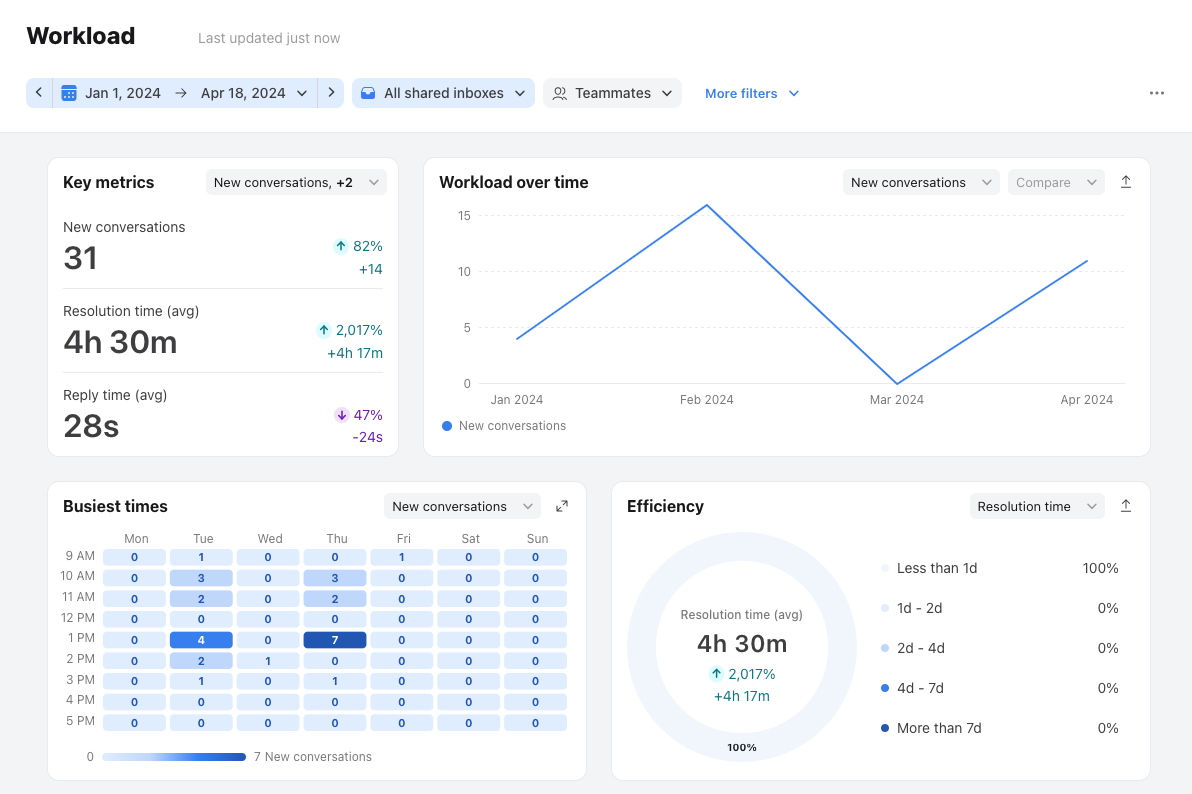
You’ll also find bento box principles everywhere that information needs to be readable at a glance. Think of digital interfaces like analytics and dashboard screens. It helps users easily digest and act on multiple data points quickly.
Front’s dashboard is a great example. It uses a bento-inspired layout to organize key performance metrics like busiest time, workload, efficiency, etc.
If you’re considering this layout, it helps to ask yourself a few questions before you start designing:
- Which pieces of information naturally belong together?
- Which card deserves the most visual weight?
- How should these cards expand, collapse, or stack across breakpoints?
- Do you need multiple card sizes, or should everything follow one modular scale?
This is where tools that support rapid layout exploration come in handy.
With a tool like UXPilot, you can try out different bento configurations just by prompting the AI or uploading a reference. It can help you generate modular layouts, swap hierarchy orders, etc. It’s a quick way to see which grouping and card sizing make sense before committing to a full design.
7. Neobrutalism
Neobrutalism is an aesthetic defined by high contrast, blocky layouts, thick borders, and colors that demand attention. In a world full of slick, AI-designed interfaces, this trend feels like a deliberate swing in the opposite direction.
It’s a reaction against the hyper-polished, algorithmic design we see everywhere.
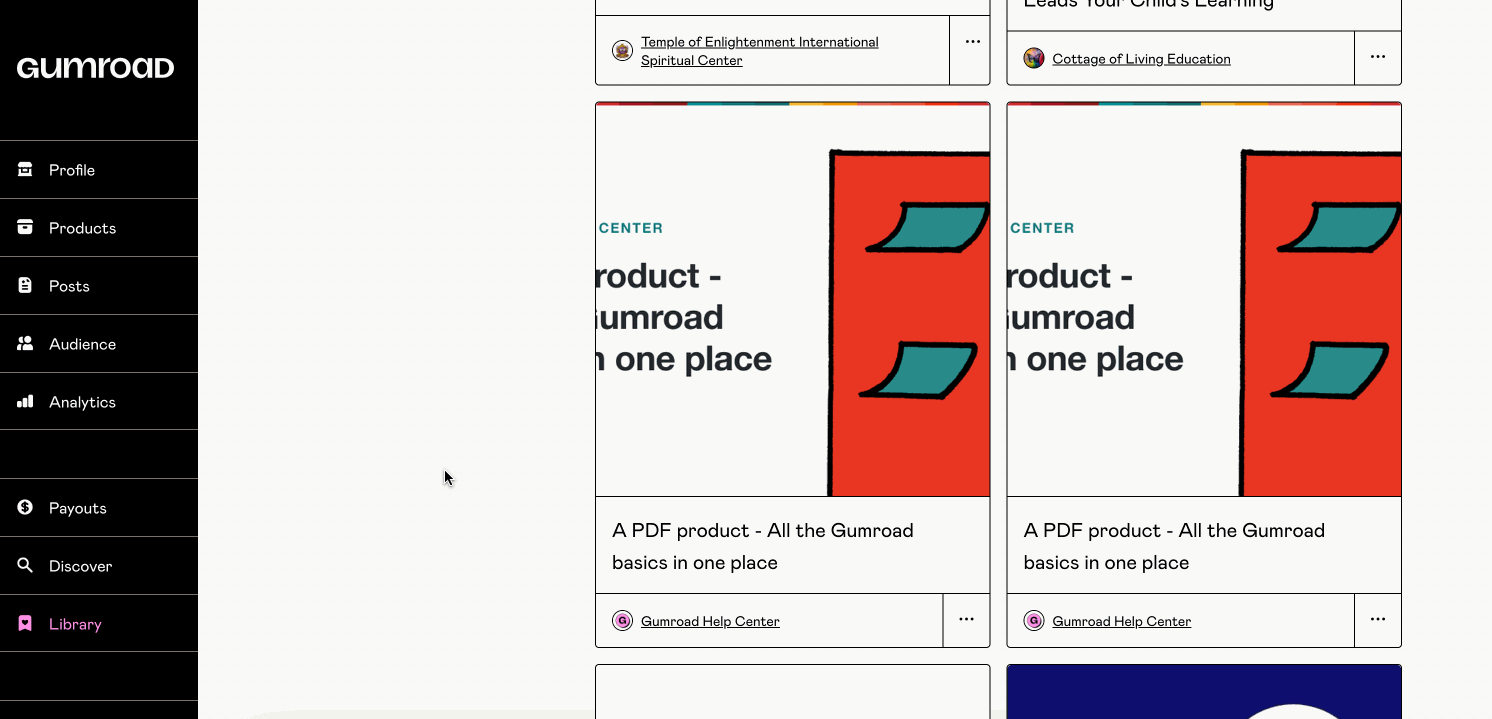
Gumroad is one of the rare applications that executes neobrutalism well across its entire ecosystem.
The platform builds its visually compelling interface around a simple yet effective palette of Black and White, brought to life with a signature Lavender Rose.
On their website, you see this bold color palette immediately. Bright pink animations, CTAs against black backgrounds, high-contrast text, and chunky geometric shapes.
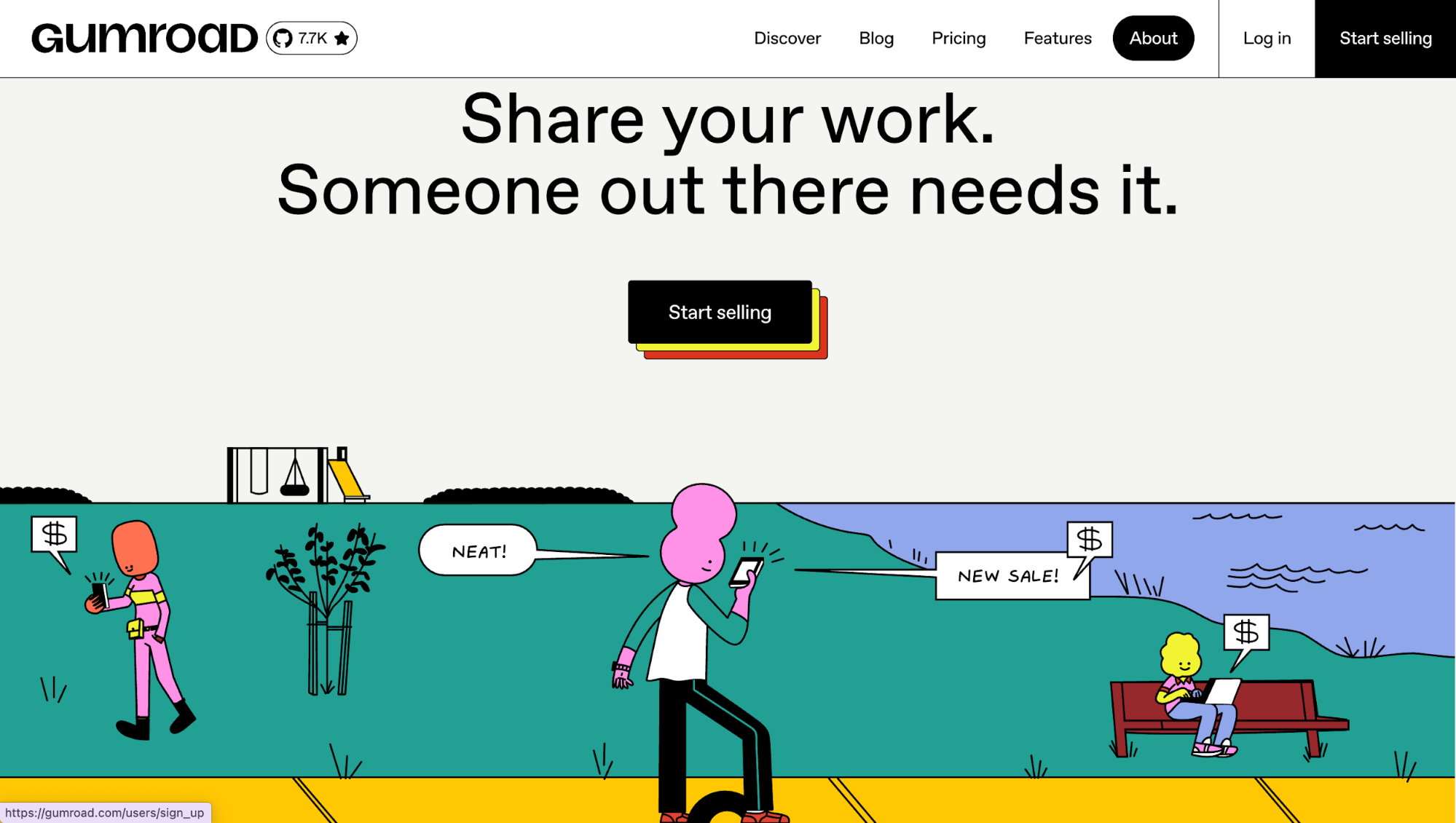
Their typography gravitates towards something more curvy and cartoonish, with a retro touch reminiscent of 90s UI design. Product cards have thick borders. Icons are bold and simplified.
This consistency carries through to their web and mobile app experience. You'll see the same color palettes across product cards or buttons with the same striking shadows.
But as with all bold styles, balance is key to maintaining the aesthetic appeal. Too much contrast or clutter can overwhelm users and hurt accessibility. Done right, though, neobrutalism offers a fresh, honest approach to digital design that stands out in a sea of sterile perfection.
8. Retro web aesthetics
Retro web aesthetics is a design trend where you intentionally bring visual styles from the early internet back into modern digital products.
When you create products with this visual aesthetics in mind, you play with asymmetrical layouts, visible grid structures, chunky typography, raw textures, and nostalgic fonts.
Culturally, this trend is driven by Gen Z and younger millennials rediscovering early 2000s web and graphic design, from Y2K aesthetics and Windows 95/98 interfaces to the DIY vibes of GeoCities.
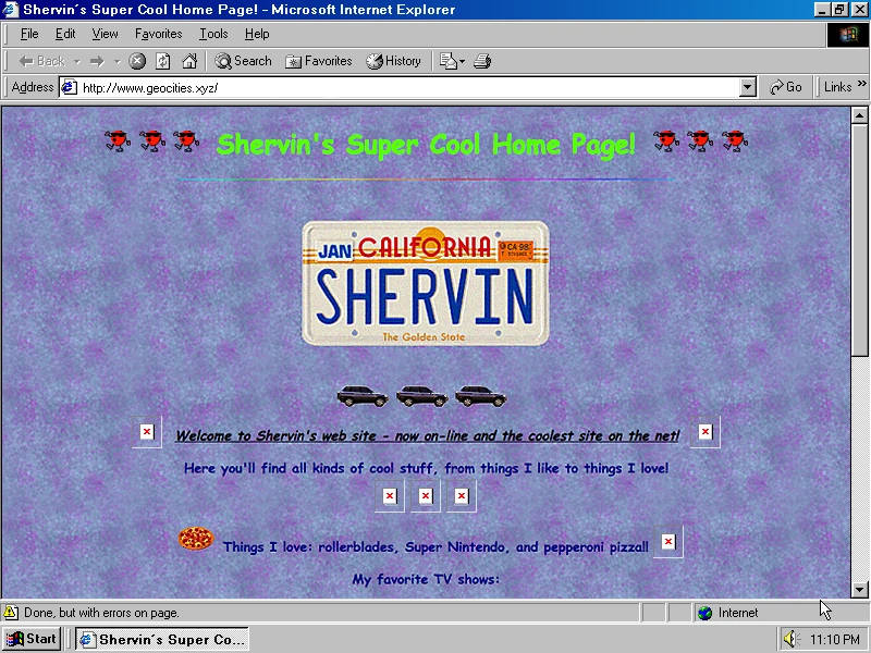
It’s a rebellion against the clean, corporate, overly polished web, signaling personality and authenticity.
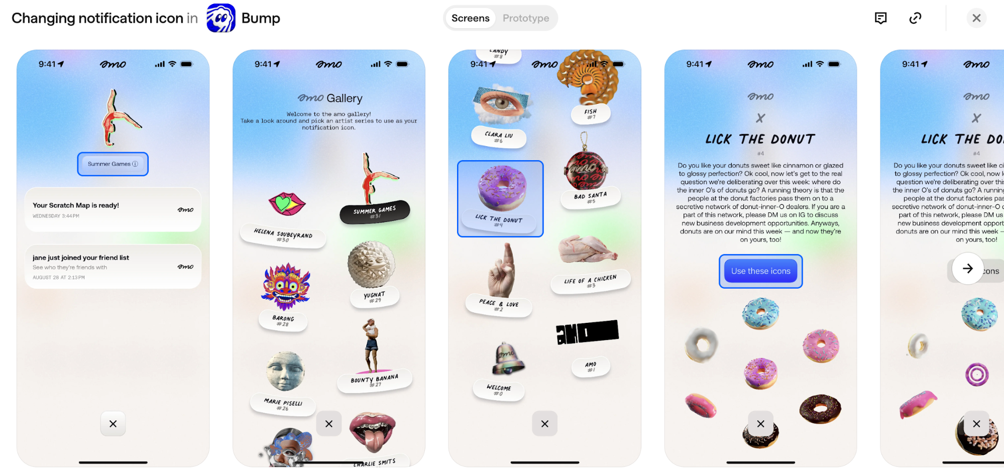
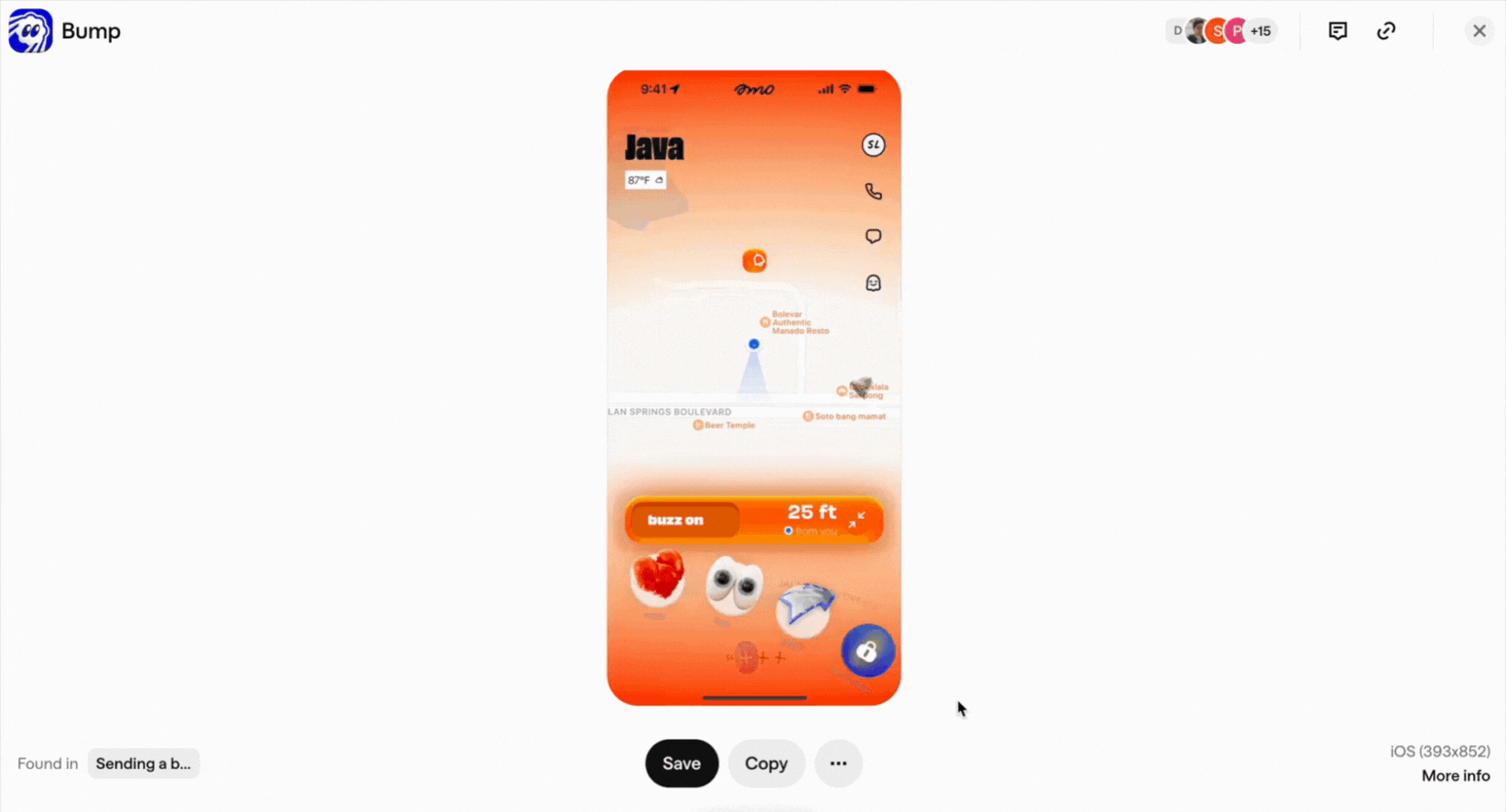
One impressive example I've seen is Bump by amo. The app uses scrapbook effects across its screens, for example, in their notification icon gallery.
You'll see handwritten labels, clay sculptures, fish stickers, and vintage illustrations scattered at angles.
Web apps are doing this too.
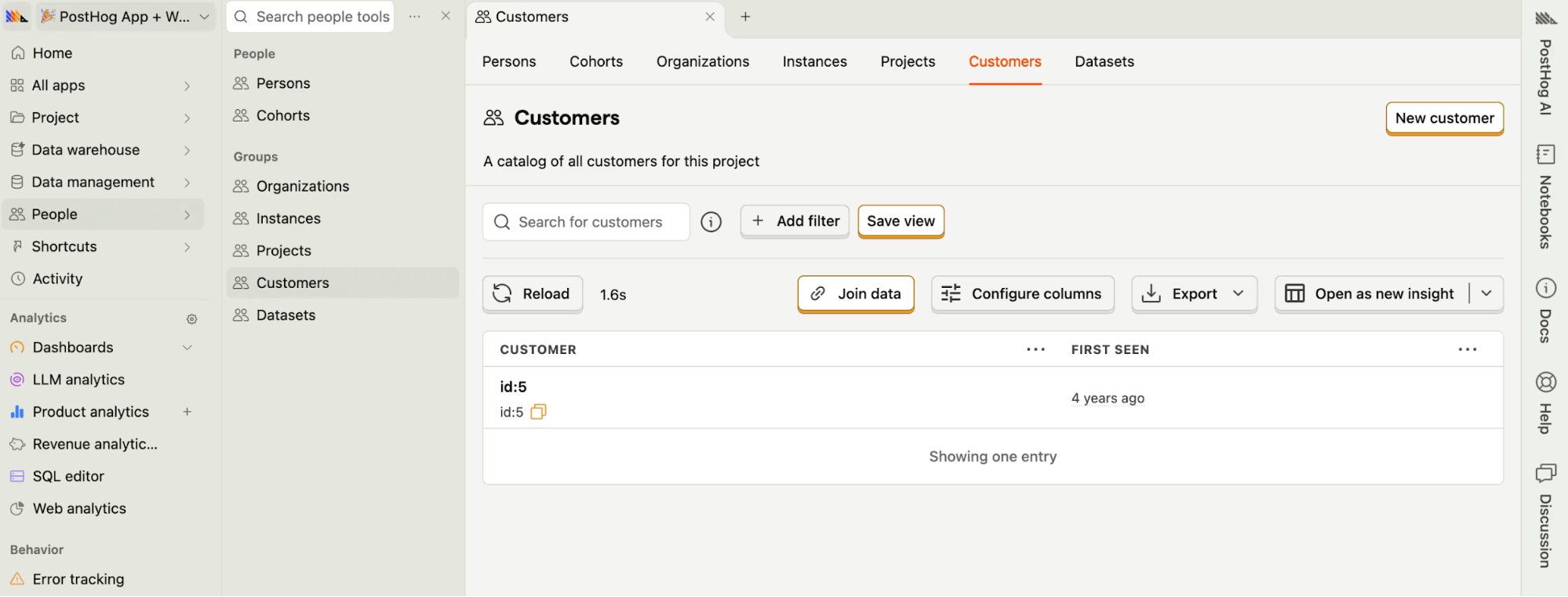
PostHog recently redesigned its entire site to look like an old Windows desktop. You get folders on the left, window controls at the top, and even that beige textured background.
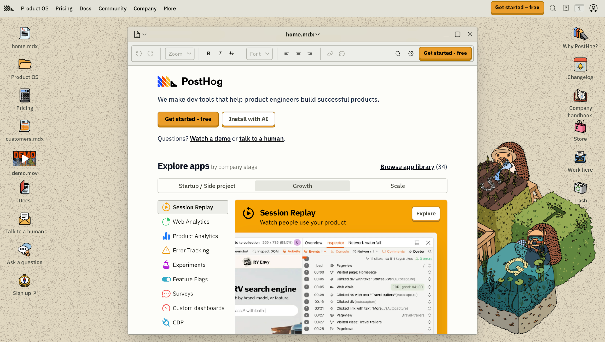
The retro vibe carries into their actual app, where you'll spot vintage-styled buttons and paper textures in data tables. It makes enterprise software feel less boring.
If you’re implementing it, use retro elements sparingly for maximum impact, and always balance them with modern usability so your audience can navigate easily.
Think of it as combining nostalgia with practicality. You can use messy, playful visuals, but you have to ensure they still work.
9. Kinetic typography
I'm seeing kinetic typography everywhere. It's the art of using variable fonts, animated text, and responsive type to create a more dynamic, engaging, and adaptive interface.
The big unlock here is variable font technology. You can now adjust weight, width, or slant in real time so type reacts to what you do.
Unlike static images or fixed typography, it gives you a whole set of interaction triggers to play with:
- Scroll position (letters expanding as you reach a section)
- Touch gestures (weight shifting as you drag)
- Device tilt (type reacting to orientation changes)
- Beat-matching (text pulsing rhythmically to audio cues)
You’ll see this across Spotify Design, where kinetic text helps reinforce mood and genre.
And again, let's revisit Bump, one of my favorite real-world examples. Tap the buzz button and the text shakes, ripples, and settles in a way that mirrors the physical act of buzzing a nearby friend.
It’s a tiny detail, but it makes the whole interaction feel more human and more intentional.
So if you’re considering adding kinetic type, accessibility is the thing you shouldn’t ignore. Make sure users can reduce motion, slow down transitions, or switch to static type. Motion should enhance user experience, not force itself onto people who don’t want it.
10. Light skeuomorphism
This is basically skeuomorphism making its way back in a light version. Instead of heavy textures or literal materials, it uses soft shadows, delicate gradients, lightly raised surfaces, and restrained embossing to suggest depth.
In practice, it's a pressable-looking button or a toggle that looks grabbable.
You’ll get the most value using this approach on components that benefit from tactile cues: primary buttons, toggles, sliders, and cards.
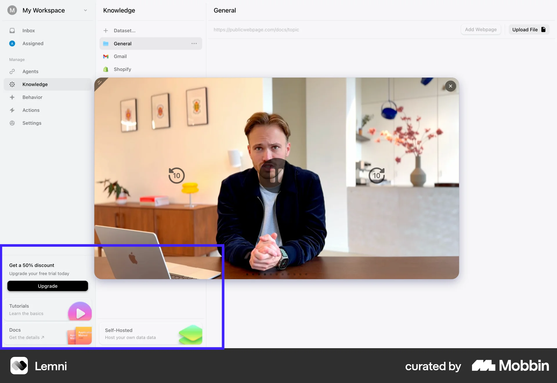
Like how Lemni did for its web application. They only apply the soft shadow effect to the upgrade CTA and resource cards at the bottom of the sidebar. The elevation draws your eye down and makes those sections feel visible in the bottom places where information can easily get missed.
11. Resonant Stark effect
Resonant stark design is what minimalist design looks like when it finally grows some emotion.
At its core, this trend strips interfaces down to the essentials. Think ultra-thin typography, generous whitespace, muted palettes, and soft gradients that fade rather than shout.
From my observation, this style emerged as a response to visual overload. After years of maximalist layouts, bold collisions, and constant stimulation, designers are pulling back. But instead of returning to rigid, lifeless minimalism, resonant stark design adds just enough motion to keep the interface human.
That’s the key difference. Micro-interactions, gentle transitions, and subtle animated cues give the layout emotional presence.
Let's take a look at Adaline as an example. It demonstrates well how resonant stark design can work across your entire product. When you hit their homepage, you get this serene, hand-painted landscape in muted earth tones.
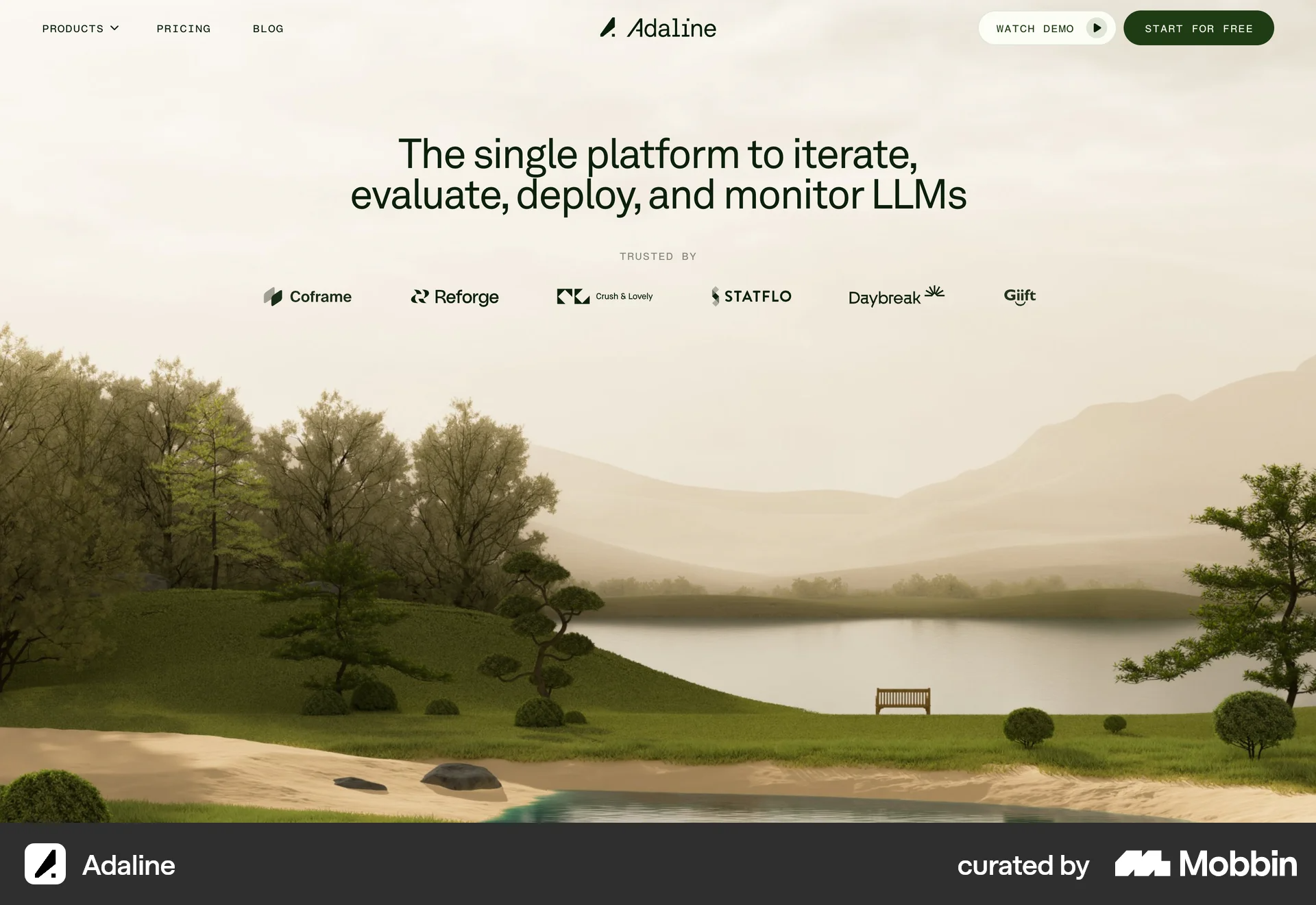
Then you move into the web app, and that same restrained aesthetic carries through.
The natural landscape illustration, the organic shapes in the charts. The earthy green instead of bright blue. Everything is stark minimalism but with warmth.
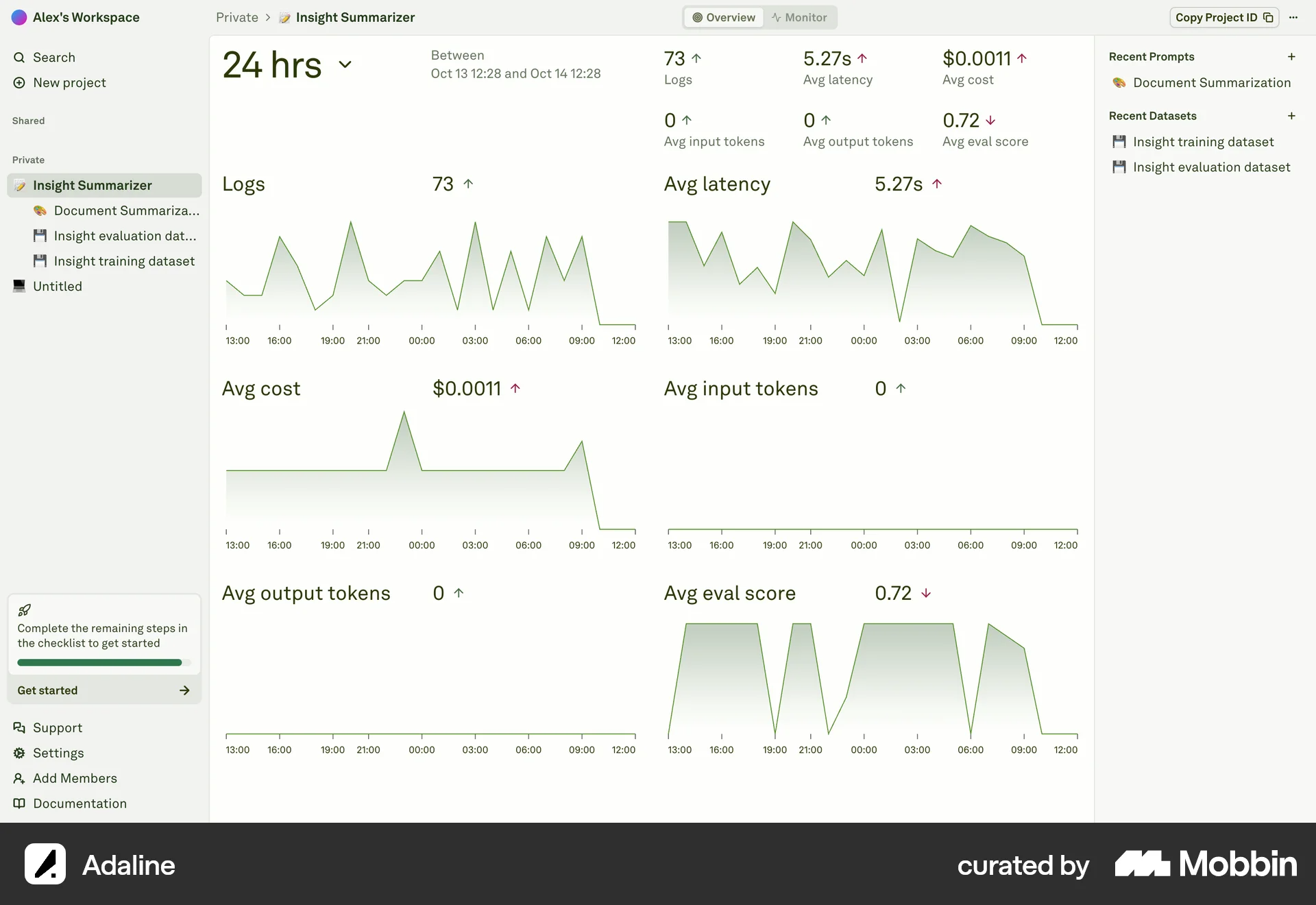
I always feel this design style works best when you’re designing for focus-heavy experiences like audio tools, productivity apps, or editorial sites. This approach lets you stay clean without feeling clinical. It’s minimalism, but with resonance.
12. Sound as an interface element
Sound is quietly becoming part of the design system in 2026.
Not in the form of autoplay music or noisy effects, but as small, intentional audio cues that support interaction. A soft click when a toggle switches. A muted whoosh when a task completes. Or a short tone that confirms when you perform an action.
This shift is happening because interfaces are visually saturated. Motion, color, and layout are already doing a lot of work. Sound adds a second channel for feedback, one that reaches users instantly, even when they’re not looking directly at the screen.
A great example is Santiago Franco’s UX/UI portfolio. As you scroll, the interface emits a light, almost watery bubble sound. When you click, you hear a short, crisp “tick,” similar to the sound of a light switching on.
In my opinion, these subtle sounds do a great job of reinforcing user interactions, turning scroll and click into tactile moments.
But of course, accessibility is key. It's important that you tie every sound to an equivalent visual, and users should always have the option to disable sound if they prefer.
Key takeaways
These trends reflect bigger shifts in the design world. As AI becomes more prevalent, there's a growing desire for authentic, human-centric design. Users are craving experiences that feel real and personal, not automated or sterile.
But don’t get caught up trying to chase every trend you see. Choose what truly serves your brand, business objectives, and user expectations. Not everything will fit your vision, and that’s okay.
The best design in 2026 will still balance innovation with usability and accessibility to maximize user satisfaction.
I can say this year is all about making intentional choices. Let your design resonate emotionally with users while leveraging technology to create smooth, intuitive interactions. That's what separates good products from forgettable ones.