12 Glassmorphism UI Features, Best Practices, and Examples

Khanh Linh Le
Created on Nov 25, 2025
Glassmorphism has made a strong comeback in UI design over the past few years. You're probably seeing it everywhere, from Apple's iOS interface to countless design systems and web applications.
Glassmorphism can make an interface feel lighter, cleaner, and more futuristic, but it’s also one of the easiest styles to misuse. A slight change in blur, transparency, or background can turn a component from elegant to unreadable.
So, in this article, I’ll break down the key features of the glassmorphism design trend, the best practices that keep it usable, and examples you can learn from.
What is glassmorphism UI?
Glassmorphism is a design style that mimics frosted glass. You create it by combining background blur, transparency, and subtle borders to build layered, semi-transparent UI elements that add depth without heavy shadows or gradients.
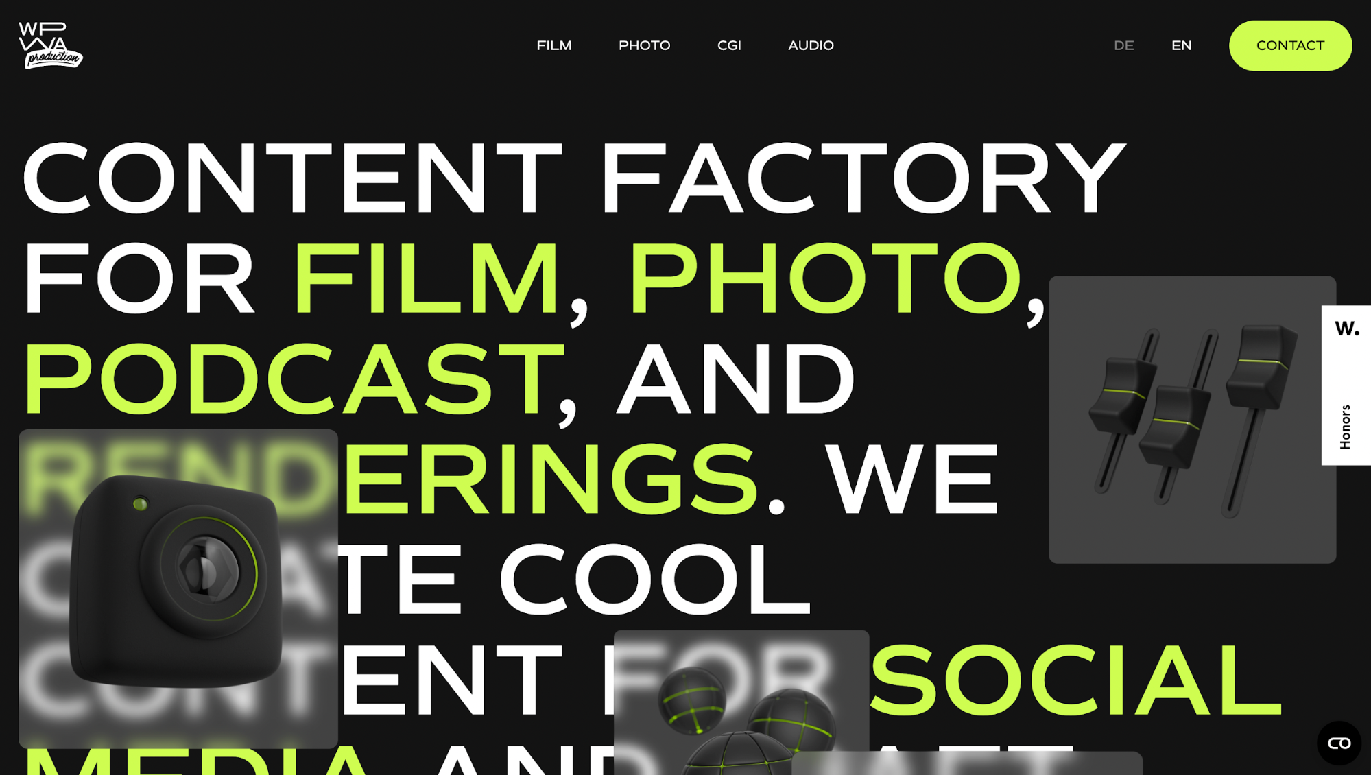
The trend started gaining popularity around 2020–2021 when big tech companies started using that same effect everywhere.
Apple rolled out its first glassmorphic elements in macOS Big Sur and iOS, then took it to the next level with the release of iOS 26 and macOS Tahoe in 2025.
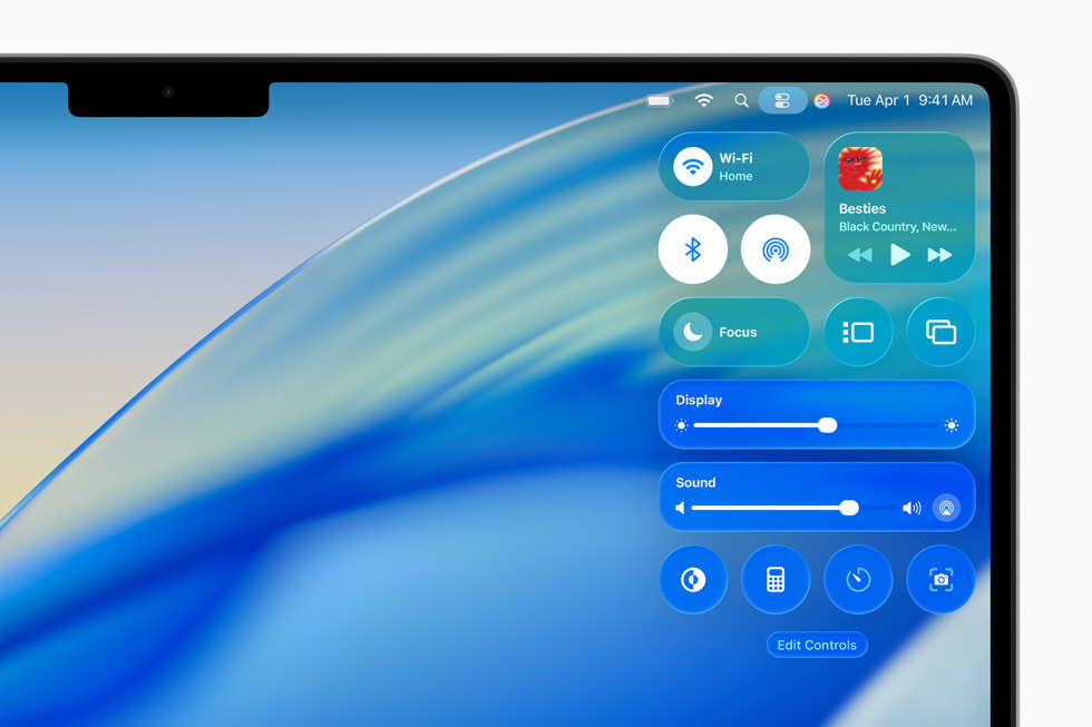
Image source: Apple
Microsoft followed suit with Windows 11's Fluent Design System. These moves proved the style wasn't just a pretty concept; it could actually work at scale.
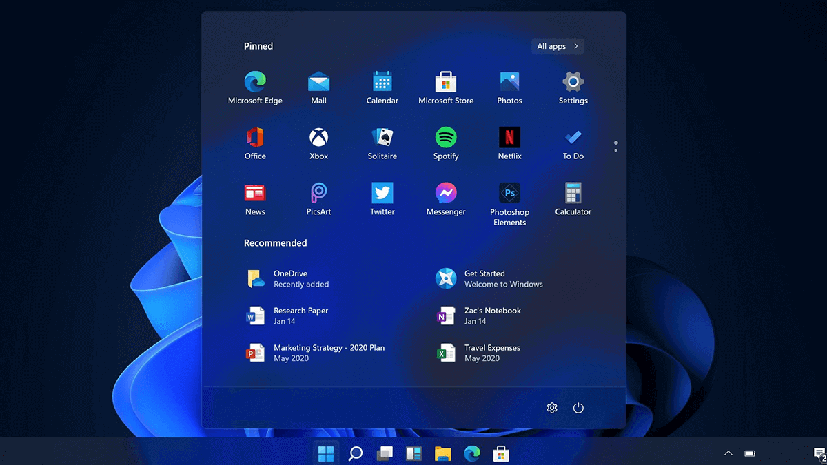
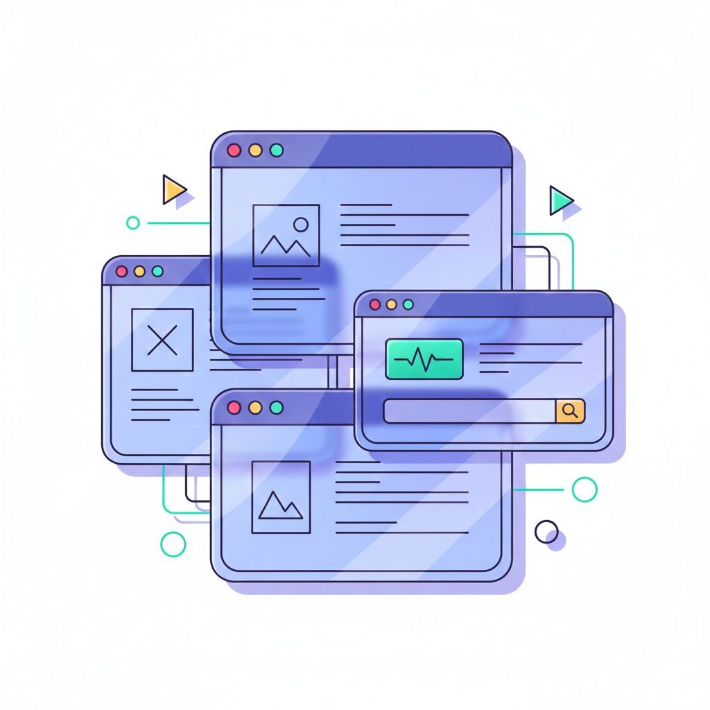
Image source: LambdaTest
So what's the point of glassmorphism? It's all about creating visual hierarchy and focus cleanly. Look at Apple's OS notifications and control panels across apps. You can still see what's behind them, but everything's blurred just enough that you stay focused on what matters.
Difference between glassmorphism and neumorphism
These two styles might sound similar, but they're actually pretty different in how they work.
Neumorphism (or "soft UI") creates elements that look like they're extruded from the background. Think of buttons that appear to be pressed into or popping out of your screen. You achieve this through subtle shadows and highlights that match your background color.
The catch with neumorphism is that it relies heavily on monochromatic color schemes. Your buttons and cards need to be nearly the same color as your background for the effect to work.
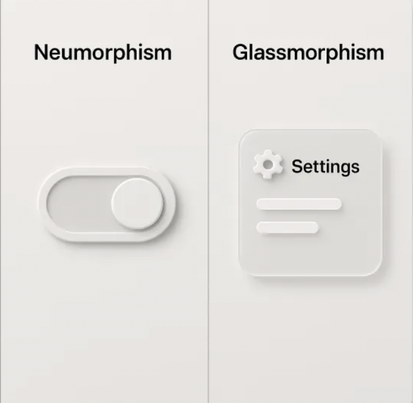
Image source: Uinkits
Meanwhile, for glassmorphism, you're layering transparent panels over your background instead of extruding elements.
The practical difference is: Neumorphism peaked around 2019–2020 but quickly faded because designers realized it looked cool in Dribbble shots but caused real usability problems. Glassmorphism stuck around because it's more functional.
Glassmorphism UI principles
Now that you know what glassmorphism is and how it differs from other styles, let's break down the core principles that make it work.
Transparency and frosted glass effect
The foundation of glassmorphism is transparency combined with background blur. This combo creates that semi-opaque glass layer effect.
It's like you're looking through a frosted window where you can see shapes and colors behind it, but nothing's quite in focus.
Here's the tricky part: blur intensity and background contrast directly impact how readable your content is. Too much blur with a busy background? Your text becomes impossible to read. Not enough blur? You lose the glass effect entirely and just end up with a see-through box.
Take the example below 👇. It looks stylish at first glance: bold typography, strong contrast, and floating translucent cards. But in practice, it’s not very usable. The background competes with the foreground, and the blurred elements don’t provide enough separation for the text to remain clear.
You need to find the sweet spot. Most designers use a blur radius between 10 and 30px, depending on the background complexity. Busier backgrounds need more blur to calm things down.
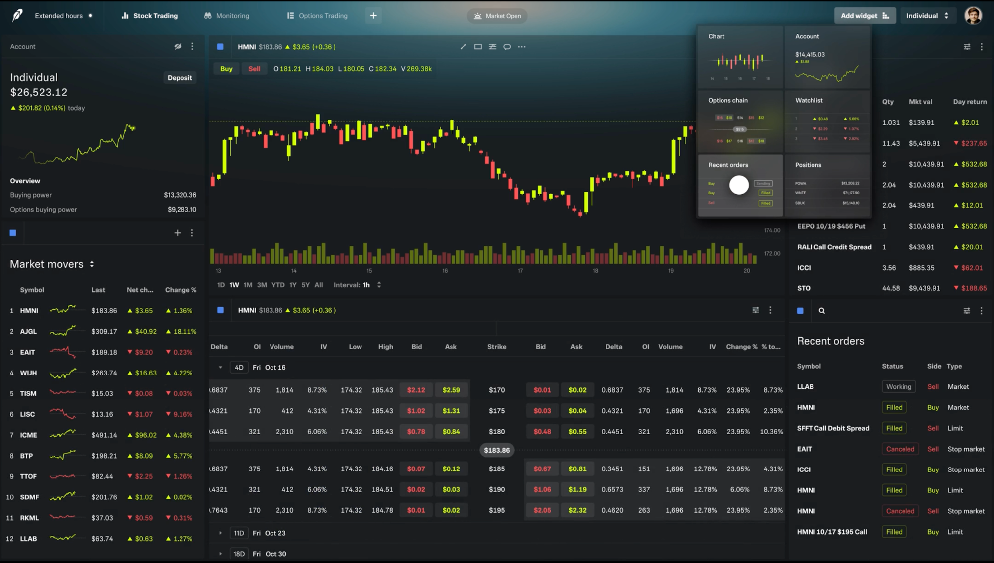
Robinhood's crypto trading platform shows how to balance this well. Upon clicking, their translucent widgets overlay market data and charts with enough blur to create that premium glass look.
Text legibility is also where most glassmorphic designs fail in practice. You can't just throw text on a blurred panel and call it done. The fix is pairing your blur with a semi-transparent solid overlay. Add a subtle white or dark tint (10-30% opacity) to your glass panel. This creates contrast between text and background without killing the effect.
Depth and layering
Glassmorphism only works when there’s something behind the glass. Without a layered environment, the effect collapses into just a semi-transparent box. That’s why depth is the foundation that makes the whole style readable and believable.
Take the example I have below.
In the first frame, the background is a flat navy surface. When you drop a frosted card on top of it, nothing interesting happens. There’s no depth cue, no separation, no visual story.
But once you add those large, soft, floating spheres and create a blurry background in the second frame, the glass suddenly comes alive.
You can see hints of shape and color bleeding through the blur. This creates the illusion that the card exists between layers, not just on top of a flat canvas.
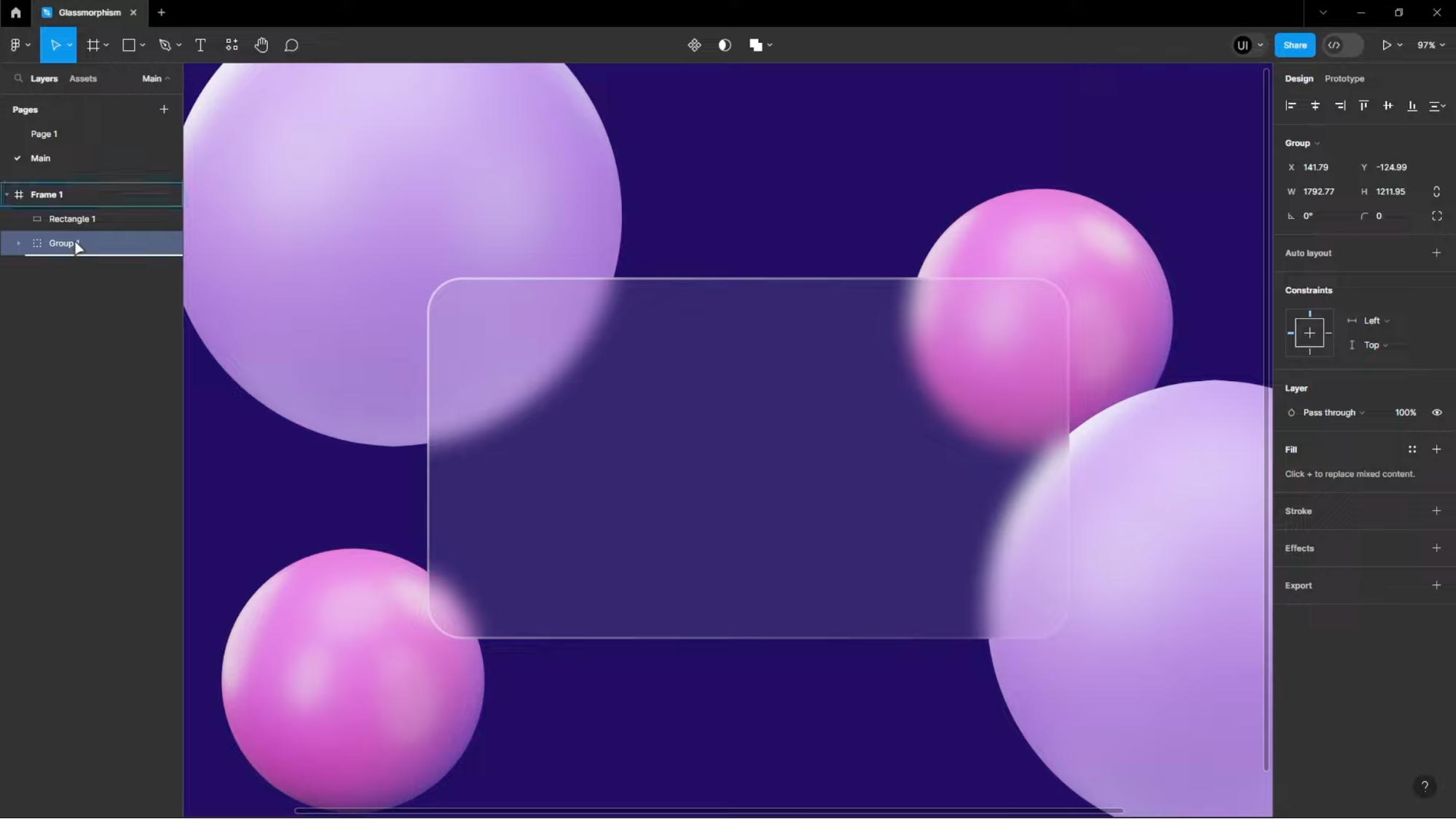
So how do you pull this off?
Creating this effect in your own UI comes down to managing z-order and elevation carefully. In web design, that means stacking panels using z-index and reinforcing them visually with soft shadows or thin, semi-transparent borders.
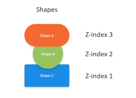
Image source: Zendesk
In mobile design, elevation tokens or shadow layers perform the same role, making the topmost design elements feel physically closer to the user.
For added realism, subtle motion can further enhance the effect. Parallax scrolling or gentle elevation shifts, like those used in iOS control center, make the interface feel tactile and spatial.
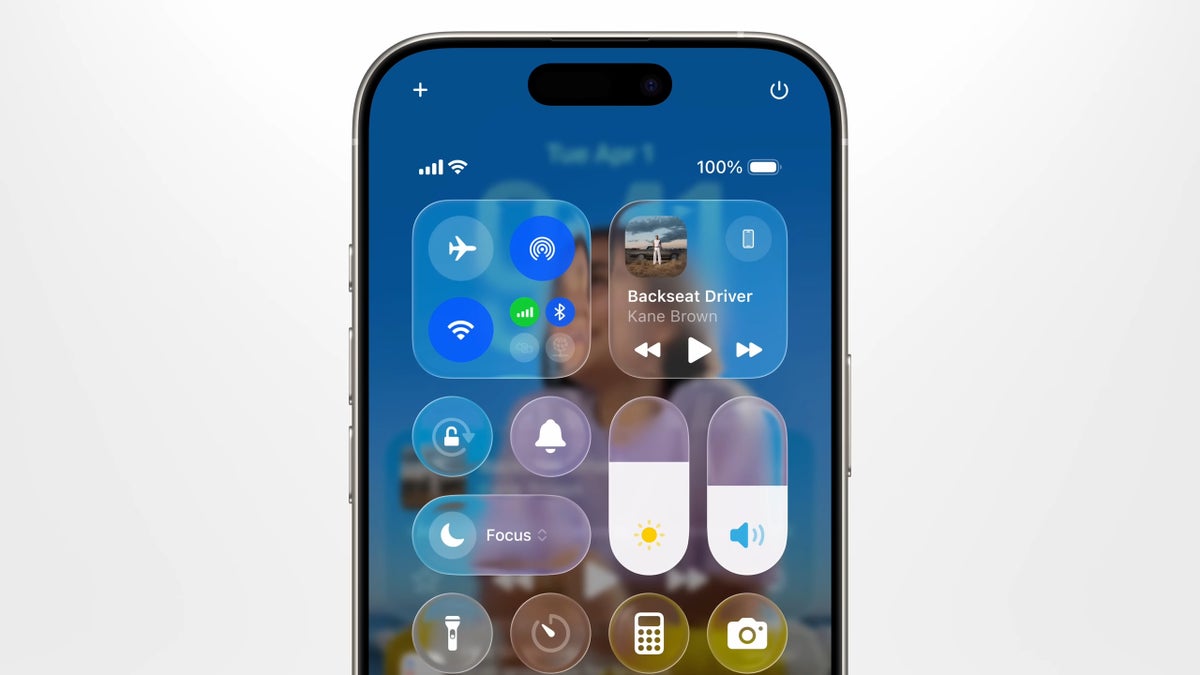
Image source: Apple
For example, you can apply a minor elevation (e.g., 2-4 dp) above the background and a softer shadow when the widget is “active”. Or if you are building an app, vary the motion speed for background vs. card elements (e.g., background elements shift 3px per scroll, card elements move 5px).
Light, shadow, and color balance
Light, shadow, and color are the supporting cast that sell the glassmorphic illusion.
When I study interfaces that use glassmorphic effect well, they all share one thing: the lighting feels intentional. In practice, that means three interdependent decisions: where the light is coming from, how strong the shadow is, and what color sits behind the glass.
A few helpful tips to get it right include:
-
Keep a single, consistent light direction across all panels. This ensures that highlights and shadows align for a cohesive UI. A faint white edge or rim light along the side facing the light source adds realism. Like in the example below, you can easily spot the subtle glow along the card's edges.
-
Adapt lighting for both light and dark themes. You’ll get different results in light and dark themes, so design both. In light mode, glass usually uses pale tints and darker text; rim highlights can be near-white. In dark mode, swap to darker tints or a desaturated color tint, lighter text, and consider a subtle colored rim (navy, violet, or teal) instead of pure white.
-
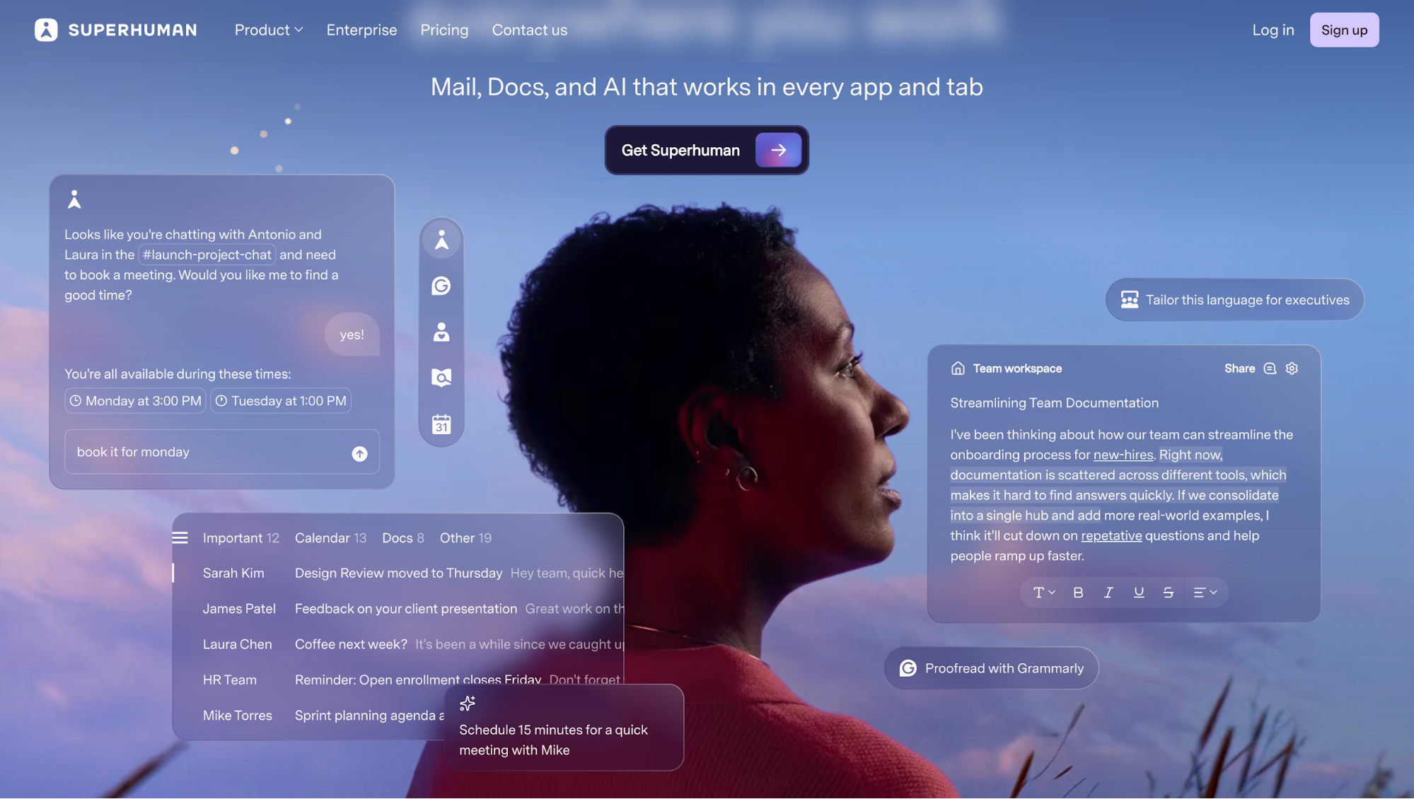
Use background color to tell a story. The background is what gives glassmorphism its personality. If your product already has an animated or designed backdrop, something like Superhuman’s, let that background do the storytelling.
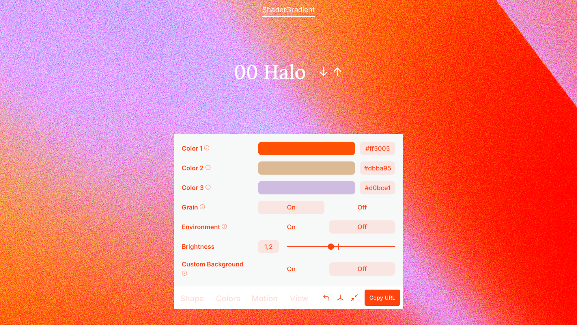
But if your background is flat or too minimal, use gradients to introduce subtle depth. They provide the variation the glass needs to feel alive. Not sure what colors to blend? You can use tools like Shader Gradient to experiment with gradient combos, motion, and light texture.
Minimalism and focus
Minimalism is about removing what doesn’t matter, so what does matter can shine.
Here’s what you should aim for: fewer competing elements, plenty of whitespace (or in this case, translucent “space”), and glass panels that act like spotlight frames around key actions.
I've got some quick tactics for you:
-
Use a translucent panel only for the highest priority card (e.g., “Start Free Trial”, “Unlock Feature”, “Primary Dashboard”). Let secondary cards use plain backgrounds.
-
Reduce distracting background elements behind the glass panel. A busy background under your frosted surface competes for attention and hurts readability.
-
Limit your palette and iconography around the panel. Clean icons, simple shapes, and minimal text let the glass effect do the guiding.
Simplicity also helps with accessibility by reducing cognitive load. When you have fewer competing visuals, users find it easier to focus, scan, and act. Glassmorphism, when paired with minimal design, can support this, but only if you maintain contrast, space, and clear visual separation.
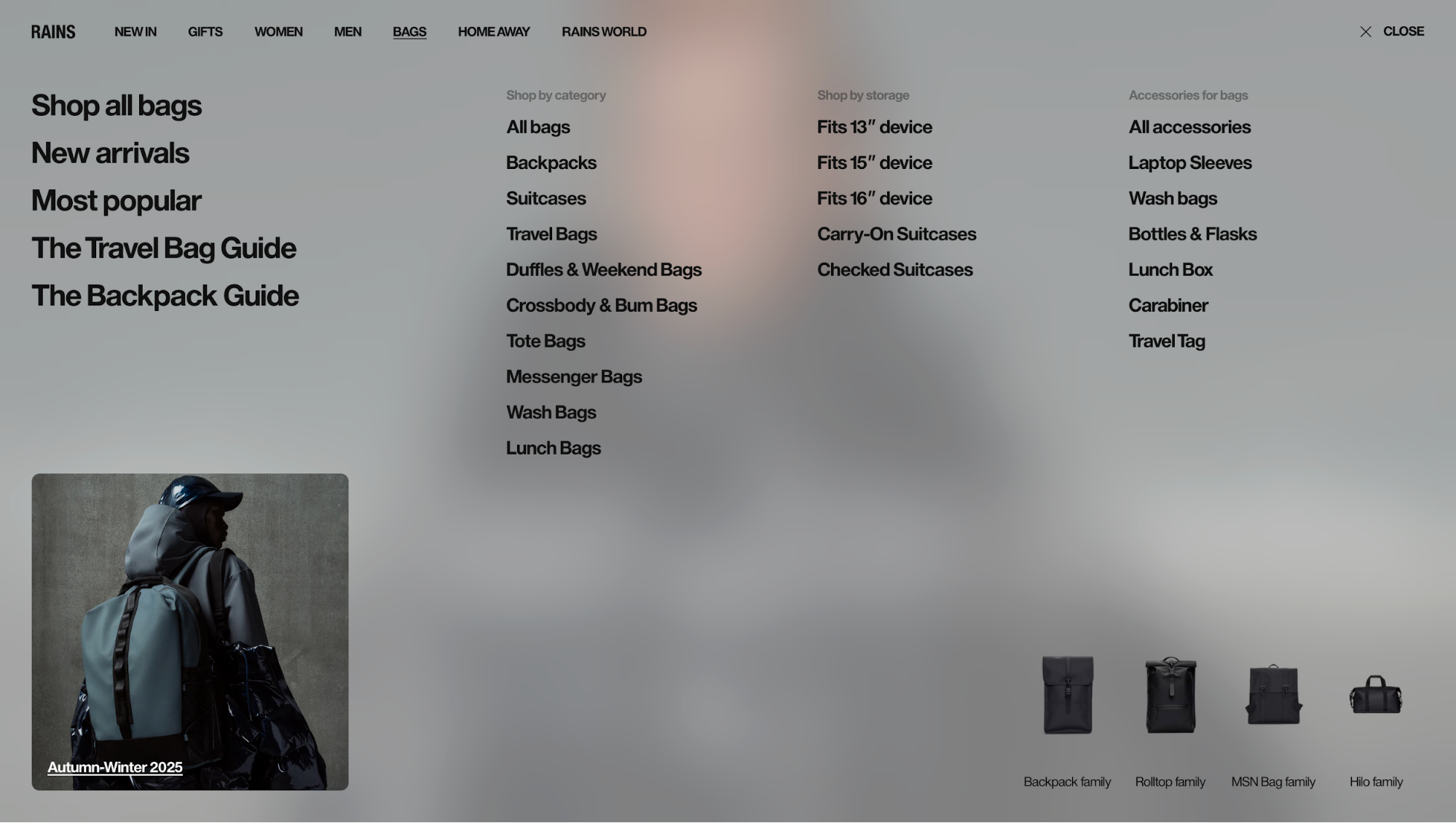
A great example of this comes from Rains, the Danish outerwear brand. Their website uses a muted, neutral color palette across large background images. The glassmorphism effect appears only where it counts: on buttons and the main navigation bar.
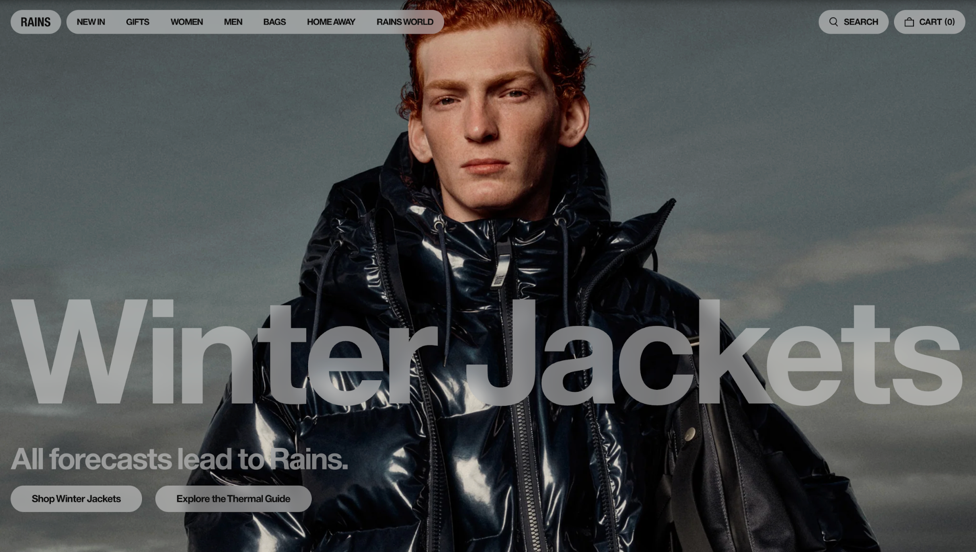
Because the rest of the layout stays minimal, your eyes instantly land on the interactive areas. It’s a perfect example of using glass not as a style, but as a focal tool.
Contrast and accessibility
No matter how elegant your glass effect looks, it fails the moment users can’t read what’s on it. Glassmorphism relies on transparency and blur, two things that naturally reduce contrast.
That’s why maintaining strong separation between text, icons, and background is not just a design choice, but an accessibility requirement.
Here’s how to keep readability intact:
-
Use semi-opaque overlays behind text. Place a subtle tint between the glass layer and your text. This thin film dampens background noise and guarantees consistent legibility across different images.
-
Match the text color to the glass tone. If your glass panel is light (white tint), use dark text. If it’s dark (black or colored tint), switch to white or light-gray text. The principle is simple: opposite tones amplify clarity. Many designers also add a 1px text shadow to subtly lift type from the glass surface.
-
Increase contrast with layering, not saturation. Instead of over-darkening backgrounds or brightening text, use small opacity tweaks. For example, changing a glass layer from 20% to 30% opacity can dramatically improve readability without breaking the visual softness.
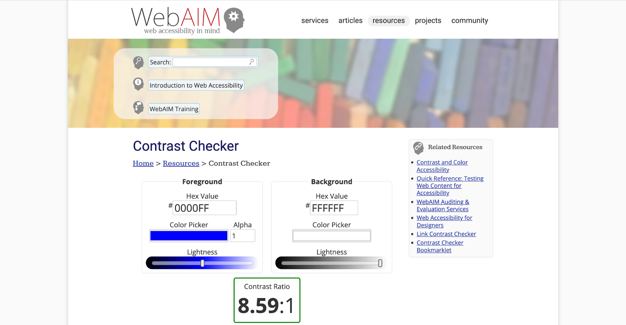
According to the WCAG (Web Content Accessibility Guidelines), normal-sized text should maintain at least a 4.5:1 contrast ratio, while large text (18 pt/14 pt bold or higher) should meet a 3:1 ratio. You can quickly check your design against these standards using WebAIM’s contrast checker.
Glassmorphism UI tips and best practices
Glassmorphism is easy to get wrong if you treat it purely as a visual trend.
In the following tips, I’ll walk you through the most reliable ways to create a glass like appearance that is clean, performant, and usable across product interfaces.
1. Keep it subtle and restrained
Glassmorphism only works when it’s used with intention. The more blur and transparency you add, the more you risk turning your interface into visual fog.
Most UX guidelines and product case studies warn that heavy blur hurts readability, slows performance on mobile, and pulls attention away from the content itself.
So there are two tips you should keep in mind:
-
Use glass for only a few key elements. Stick to navigation bars, primary buttons, or important cards, not every component on the screen.
-
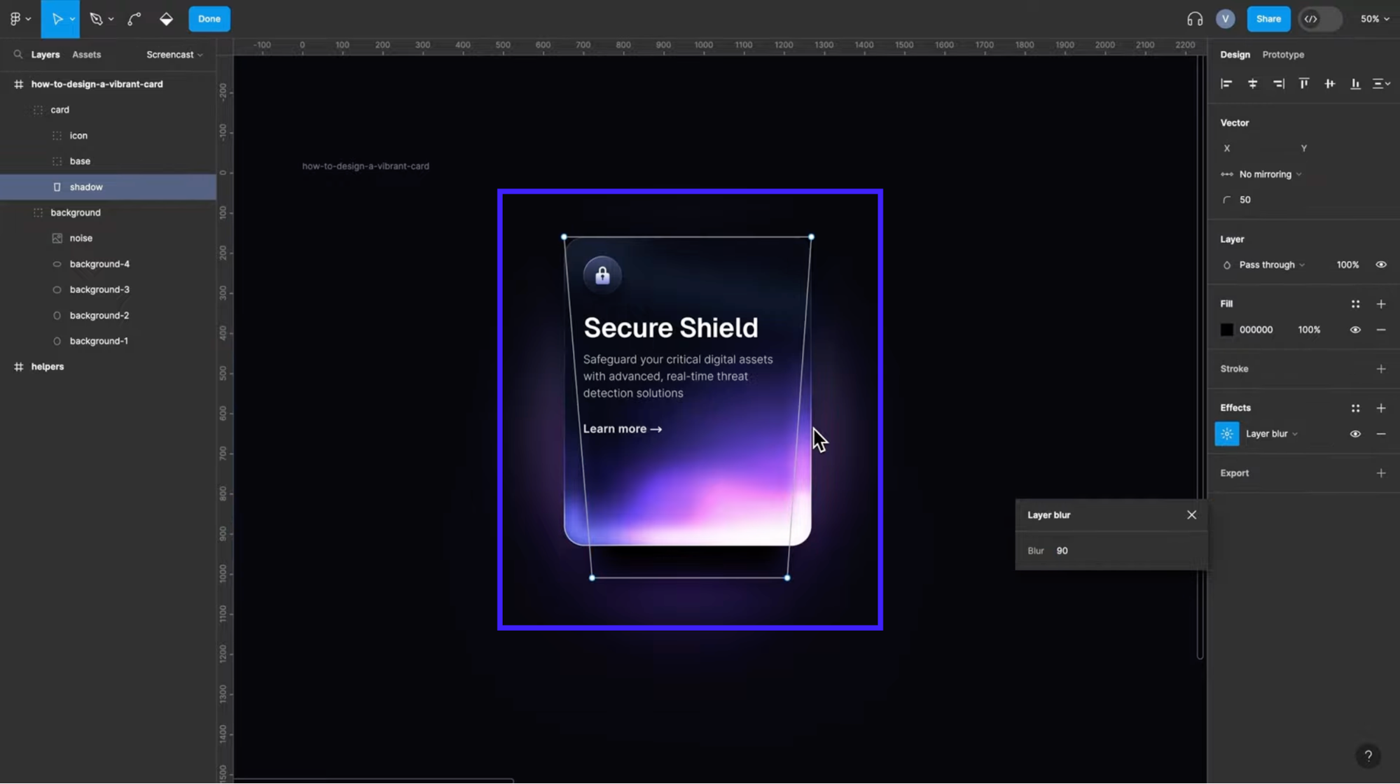
Start with low blur values. Something around blur(4–6px) is usually enough. Larger values often look muddy and cost more to render.
For example, all three cards below use the same 30% opacity, but the blur strength alone completely changes how readable and stable each panel feels.
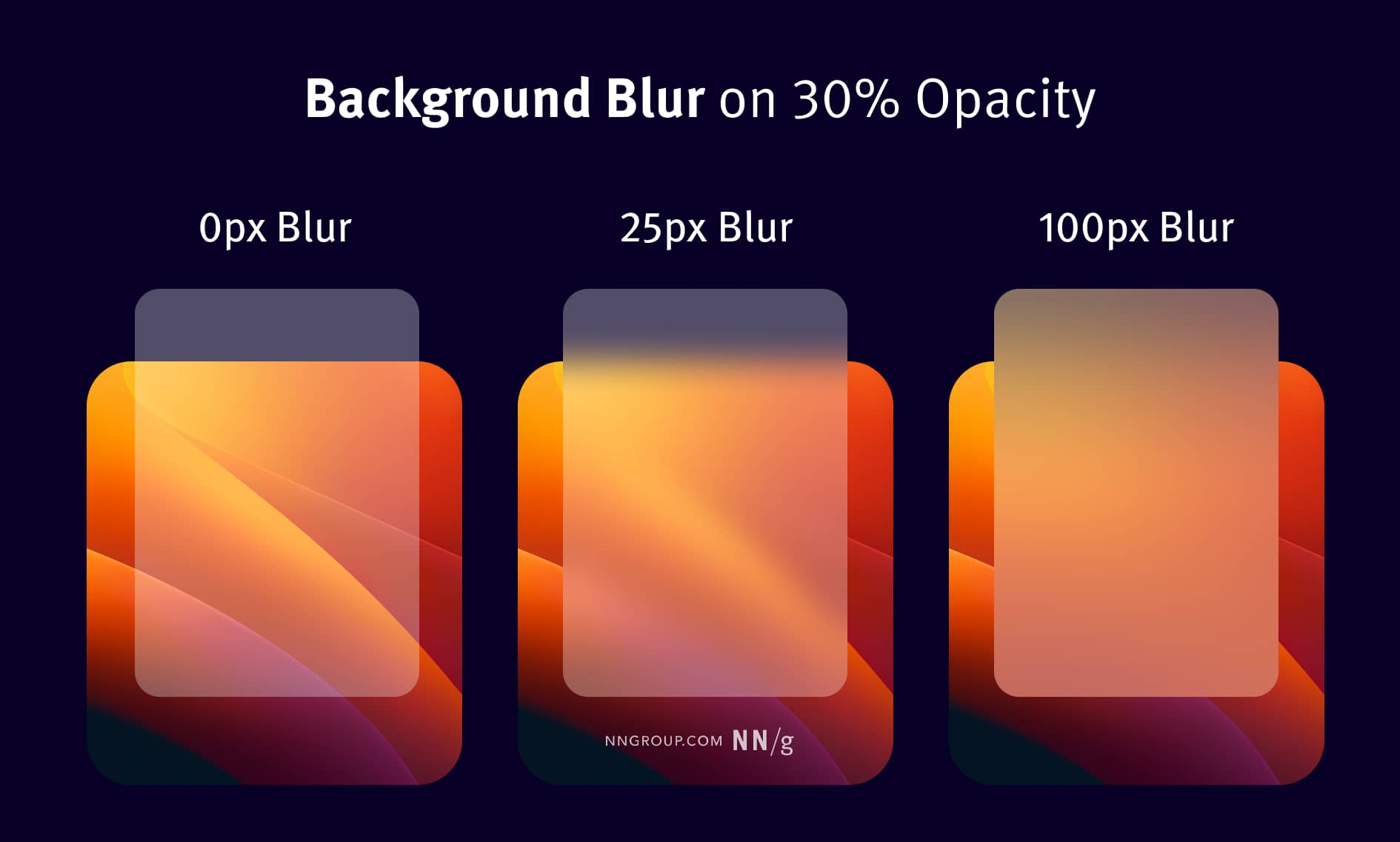
Image source: NNGroup
-
Limit simultaneous filters. Don’t stack multiple blurred elements on top of each other or animate many blur/shadow changes at once. That’s the usual cause of janky scrolling on mobile. At the same time, you should provide a non-blur fallback for older devices.
2. Use sufficient contrast and background blur
One of the easiest ways glassmorphism breaks is when the background is doing too much. A busy photo, a sharp gradient, or even subtle texture can leak through the frosted layer and make your text feel unstable.
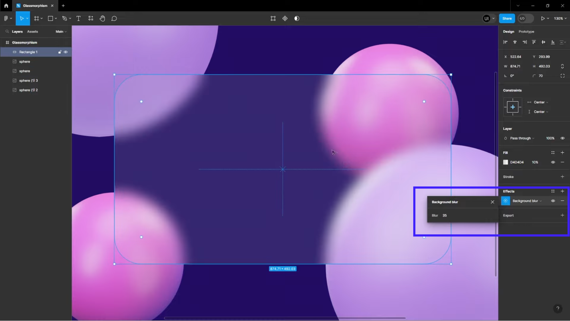
A quick solution to this is to crank up the blur or add more tint. You can test different blur sizes in Figma or Sketch and see what works best.
Nevertheless, when you’re working with transparency, everything underneath it matters, and that’s where many teams get caught off guard.
Sometimes the smartest move is to design the environment the glass sits on:
-
Give the section a subtle wash or gradient so the backdrop under the glass stays consistent.
-
Try different arrangements of background elements so the glass panel sits over calmer areas.
-
Avoid placing important text over areas where the background jumps drastically from light to dark.
Even small environmental tweaks can stabilize contrast dramatically without making the glass look heavier.
3. Combine glassmorphism with vibrant colors or gradients
Glass effects pop when they sit over lively, colorful backdrops. Instead of a dull or flat background, use vivid gradients or saturated hues to give the frosted glass more personality.
I often see designers pair glassmorphism with energetic color palettes because bright backgrounds amplify the frosted effect. That's why I've got some bright sample palettes and strategies you can use:
-
Bright blues & teals: Think of electric blue fading into teal or aqua. These cool tones create a crisp, futuristic feel when used with semi-transparent glass.
-
Purples & magentas: A gradient that shifts from violet to magenta or pink adds depth and emotion. This is perfect for media apps or product experiences that want to feel creative.
-
Neon gradients: Combine neon purple, cyan, and blue for a bold, high-energy background that makes translucent cards feel like they’re floating in light.
Image source: freepik
In music UIs, for example, designers exploring glassmorphism often pull inspiration from platforms like Apple Music or Spotify. Some concept UIs even mix dark, moody purples or blues with frosted navigation bars or playback controls.
4. Optimize performance for mobile and web
Glassmorphism looks great, but if you overdo the blur, you can pay a heavy performance price, especially on mobile or older devices.
Here’s how to keep the glass effect beautiful and snappy:
-
Limit the number of blurred elements. Don’t blur every panel on every screen. Use frosted glass only where it matters, like key cards, modals, or navigation, not on full-page backgrounds or many overlapping elements.
-
Use moderate blur values. Heavy blur (e.g., blur(20px+)) demands more GPU work. Stick to lower or medium blur values (e.g., blur(5–15px)) so the rendering stays smooth.
-
Enable hardware acceleration. Trigger compositing by using something like transform: translateZ(0) on your glass layer. That nudges modern browsers to offload the rendering to the GPU.
-
Use feature detection & fallbacks. Not all browsers support backdrop-filter. Wrap your blurred style in a support rule, and provide a fallback (e.g., a semi-transparent background) when it’s not available.
@supports (backdrop-filter: blur(10px)) { .glass { backdrop-filter: blur(10px); } } @supports not (backdrop-filter: blur(10px)) { .glass { background: rgba(255,255,255,0.85); } } -
Use static or pre-blurred backgrounds when possible. If performance is a concern, especially on lower-end devices, consider using a pre-blurred image behind your glass panel. This gives you the frosted look without the runtime cost of a CSS filter.
-
Avoid animating blur-heavy elements. Animation of backdrop-filter is expensive. Try to limit or simplify animations on your glass panels (or use will-change cautiously) so the effect doesn’t cause jank.
5. Test for accessibility and theme modes
Glassmorphism behaves very differently in light and dark themes, so you can’t assume a component that looks perfect in one mode will hold up in the other.
Transparency, blur, shadow strength, and even the background color all shift visually depending on the theme.
Therefore, if you don’t test across both, you’ll almost always end up with at least one mode where the glass feels washed out or unreadable.
The simplest way to think about it is:
-
In light mode, glass needs stronger boundaries. Light-on-light can flatten quickly, so you often need clearer edge definition. Think of subtle borders, slightly higher opacity, or a touch more blur to separate the panel from the bright backdrop.
For example, the same blur level that looks subtle in dark mode can feel too strong in light mode, making the panel look foggy. So you should expect to tune blur per theme rather than using a single universal value.
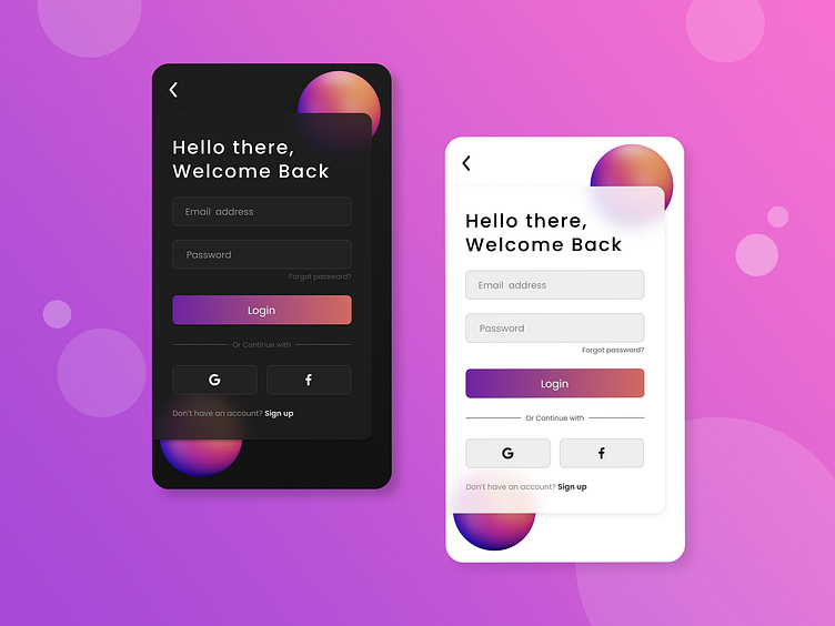
Image source: Suhas Salian on Dribble
-
In dark mode, glass needs softer highlights and gentler shadows. Anything too bright (e.g., a pure-white border) glows harshly against a dark background. You’ll likely dial back opacity or switch to neutral-gray highlights instead of pure white.
3 real-life examples of glassmorphism in apps and products
Seeing glassmorphism in theory is one thing. Seeing how teams apply it in shipped products is where the real learning happens. When you look closely at modern apps or websites, you’ll notice that the best implementations aren’t just pretty but also functional.
So I'll walk you through three real-life examples that show how different teams use glassmorphism with intention.
AnyDistance uses the glassmorphism effect for key buttons
AnyDistance is a training mobile app that leverages glassmorphism in a subtle yet effective way.
It doesn’t plaster glass everywhere. Rather, it uses it intentionally, mainly for interactive elements and content surfaces that need extra focus without feeling heavy.
On the home screen, the “Start” button and the workout selector sit inside soft, frosted containers. These panels have:
-
A subtle background blur that gently lifts them off the dark backdrop
-
Rounded shapes with smooth, pill-like geometry
-
Low-contrast borders to keep the glass visible without glowing too harshly
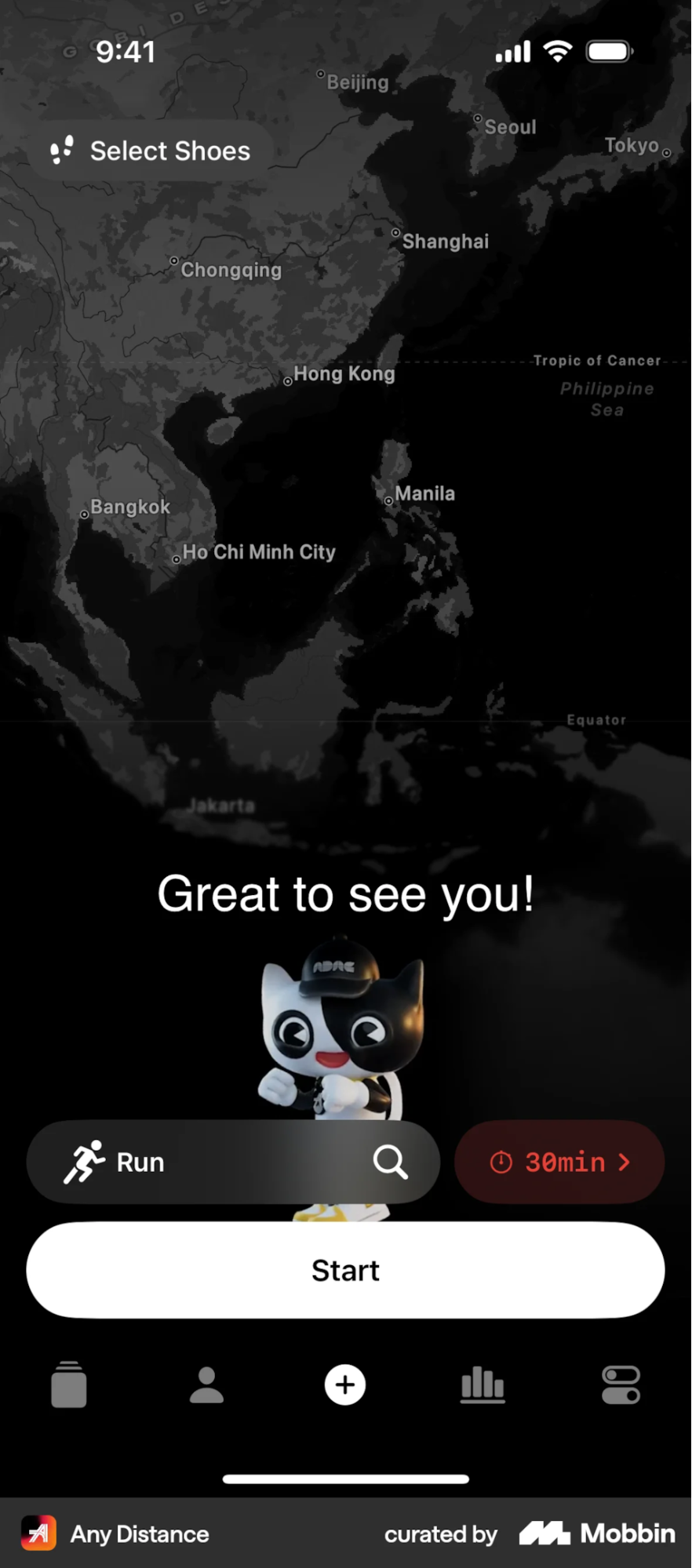
Because the background behind them is mostly dark and uniform, the blur never fights with high-detail content.
You can see a stronger use of glass in the Collectibles and Stats areas. The horizontal cards float above environmental imagery (trees, sky, and map visuals), and the app uses:
-
Heavier blur and deeper opacity to keep the content readable
-
Wide-radius cards that emphasize softness and motion
-
Layered stacking, where the top card appears slightly clearer and brighter than the cards behind it
This creates a dimensional, almost physical card stack, which is a very Apple-native interpretation of glassmorphism.
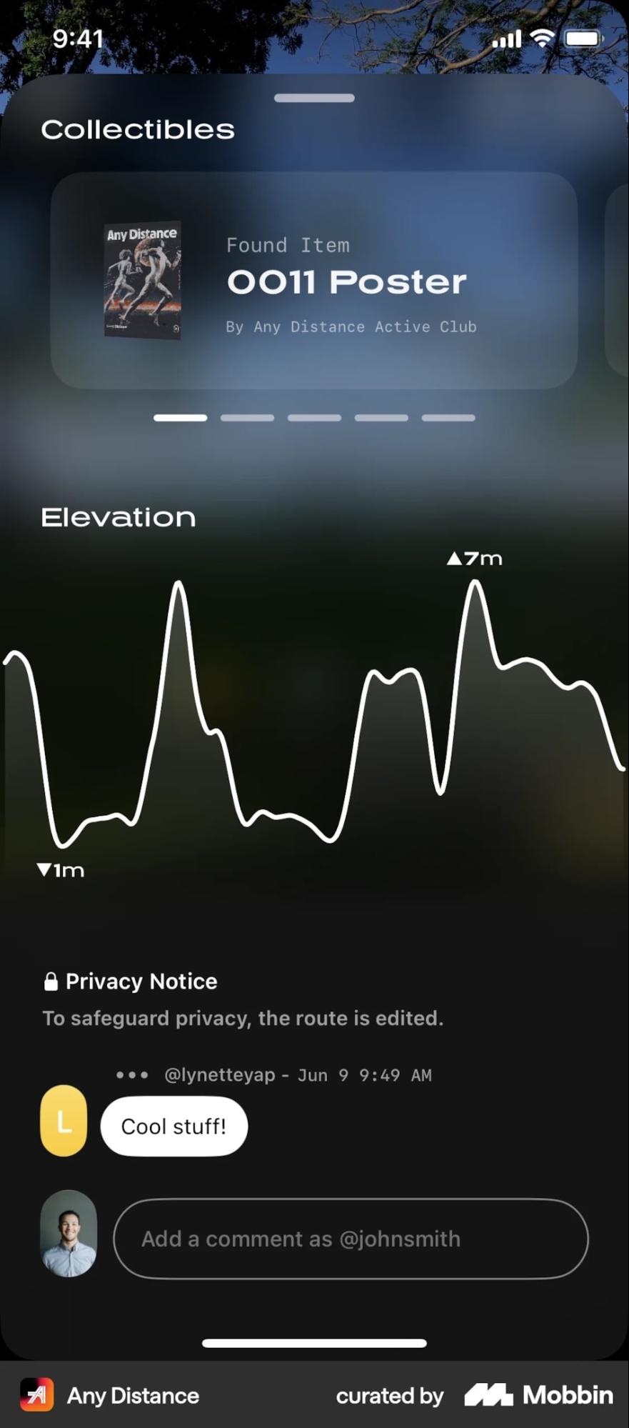
What’s smart is that AnyDistance keeps text high-contrast and clean, so even when the background includes complex outdoor textures, the glass feels controlled. The UI always ensures the content layer is sharp and the environment stays behind the glass.
The General Intelligence Company uses glassmorphism against a highly stylized backdrop
The General Intelligence Company’s homepage is a great example of how glassmorphism can stabilize content when the background is visually intense.
The site leans into a vivid, pixel-art skyline with bright blues, sharp edges, and high contrast. It’s a beautiful scene, but it could easily overpower text if placed directly on top.
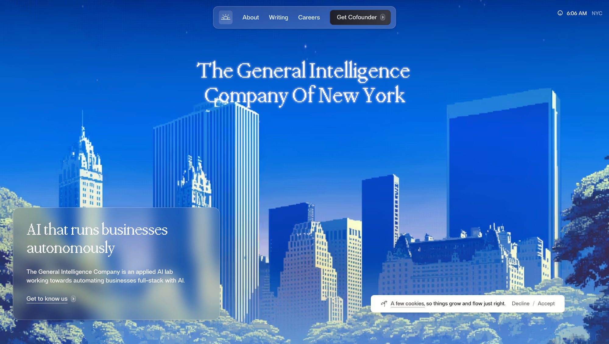
I can notice a few things they do especially well:
-
High blur + low opacity: The heavy blur prevents the pixel-art details from cutting through too sharply, but the opacity stays low enough that the environment remains part of the composition.
-
Soft curvature: The rounded corners make the panel feel like a real diffused surface rather than a hard overlay.
-
Consistent layering: The navigation bar repeats the same glass effect but at smaller scales, giving the entire page a cohesive visual language.
-
No unnecessary reflections or highlights: The glass stays minimal, aligning with the overall calm-and-futuristic vibe of the site.
Nike's After Dark Tour adopts layered glass for navigation and storytelling
Nike's website for their After Dark Tour takes glassmorphism not as an UI design trend but to create stable surfaces on top of very loud visuals.
The whole experience is built around a set of running locations. That’s why you see those big red place names in the hero. They set the mood and tell you instantly what the site is about.
But here's where it gets interesting: those same city names appear again inside the navigation menu, just in smaller type.
The glassmorphic panel separating these two layers is what makes this work. It creates depth, separation and hierarchy. Your eye can distinguish that the menu is a functional layer sitting above the decorative background text. It's depth through transparency.
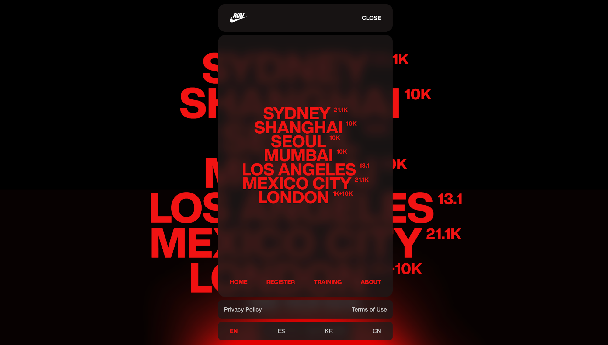
What I like about Nike’s approach is that they don’t stop there. The same glassmorphic layer shows up again in small, purposeful ways across the site, like in CTA chips on photos or distance markers on the route map.
Key takeaways
After digging through real examples and studying how top products apply glassmorphism, my conclusion is pretty simple: glassmorphism isn’t hard to implement; it’s hard to implement well.
Most of the problems designers run into come from treating it as a visual trend instead of a functional pattern. So here are the core points you should walk away with:
-
Glassmorphism only works when the background cooperates. Design the environment behind the glass, not just the panel itself.
-
Contrast and readability matter more than aesthetics. If users can’t read the text, the effect has already failed.
-
Use glass with intention, not everywhere. Reserve the effect for high-value elements like primary buttons, navigation bars, pinned cards, or contextual surfaces.