8 Web Design Concepts for Successful UX

Khanh Linh Le
Created on Sep 25, 2025
When a website doesn’t follow a clear design concept, it shows. Fonts, colors, and layouts feel like they’re competing instead of working together.
The result? A site that’s harder to use and even harder to remember.
A strong design concept does the opposite. It connects every element, from navigation to typography, into a single, recognizable experience. That makes the brand identity feel more consistent, the UX smoother, and the site itself stick in visitors’ minds.
In the sections that follow, I’ll share 8 practical design concepts you can apply to connect elements, sharpen your brand presentation, and make experiences stick.
What is concept design for the web?
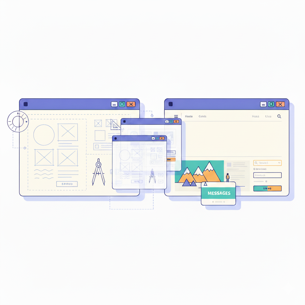
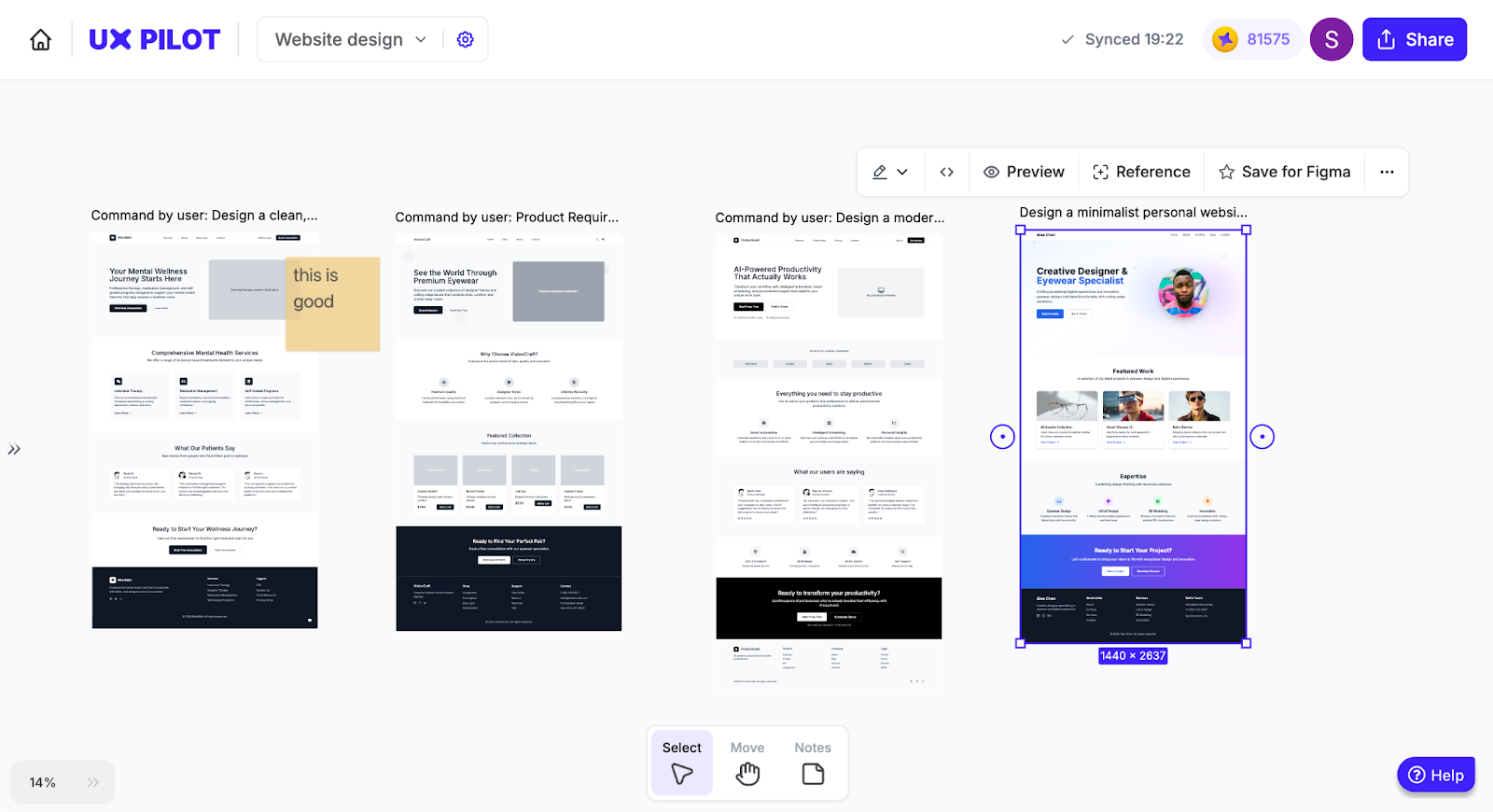
Concept design is the starting point of any website project. It’s the stage where ideas, strategy, and creative direction take shape before anything gets built.
Instead of jumping straight into layouts or coding, you step back and define the framework that will guide every design decision.
At its core, concept design blends three things: brand strategy, visual exploration, and user goals. That mix gives you a north star to communicate effectively with your site visitors.
I’ve worked on projects where teams skipped this step, and the results were messy: scattered typography, disconnected visuals, and confusing navigation. By contrast, when a design concept is in place, web pages feel connected because every choice traces back to a single direction.
For example, a design team might start by creating mood boards that define tone, color palettes, visual elements, and inspiration.
From there, they sketch rough layouts and build wireframes to see how the key concept plays out in the web development process. Only after that foundation is set do they move to full-page designs. This process ensures the final site feels cohesive and purposeful.
Why is concept design for the web important?
Concept design matters because it keeps your website's user interface from feeling like a patchwork. It ties visuals, navigation, and content together so users experience one brand story.
Here’s why that’s such a big deal for every web design project:
-
It creates consistency. When typography, colors, and navigation all follow the same rules, people don’t waste energy re-learning your site. Consistent UI reduces cognitive load and nudges users toward action.
-
It aligns design with goals. If you set priorities up front, conversions, sign-ups, or storytelling, the concept becomes your filter for every design choice. Forrester even found that every $1 spent on UX can return $100.
-
It connects with your audience. Take a nonprofit as an example: A concept built around trust and empathy leads to warm imagery, people-focused stories, and inviting CTAs. No guesswork since the tone is set from the start.
-
It prevents fragmented UX. Skip concept design and you’ll likely end up with mismatched visuals or confusing flows. That’s costly when 94% of first impressions come down to design and visual appeal.
8 web design concepts
In the next sections, we’ll go through 8 web design concepts that strike the right balance between looking good, working well, and leaving a lasting impression.
Think of this as a menu: you don’t need all of them, but picking the right ones can completely reshape how users experience your site.
1. User-centred design and inclusive design
If there’s one lesson I’ve learned from building websites, it’s this: the site isn’t for you, it’s for your website visitors.
You might have strong opinions on fonts or navigation, but unless those choices help your target audience reach their goals, the design doesn't really matter. That’s called user-centered design.
User-centered design starts with research on user needs. Instead of guessing, you gather insights from surveys, interviews, user personas, and usability tests.
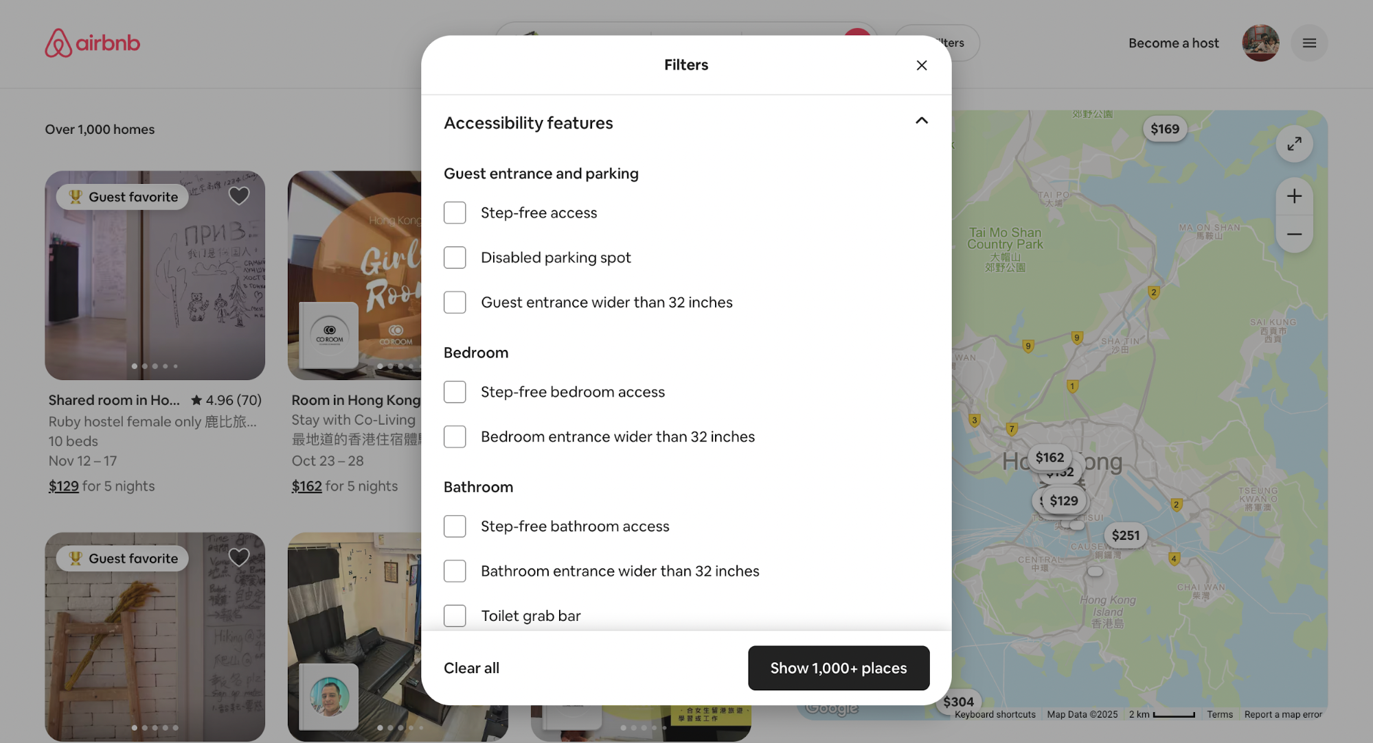
However, user-centered design takes a deeper approach when combined with inclusive design. Inclusive design ensures your site works for people of different abilities, cultures, and languages.
A clear real-world example is Airbnb. Their platform adapts content and layouts for multiple languages, currencies, and cultural norms. They also add accessibility filters (e.g., step-free access, wide doorways), making it easier for site visitors with disabilities to find suitable stays.
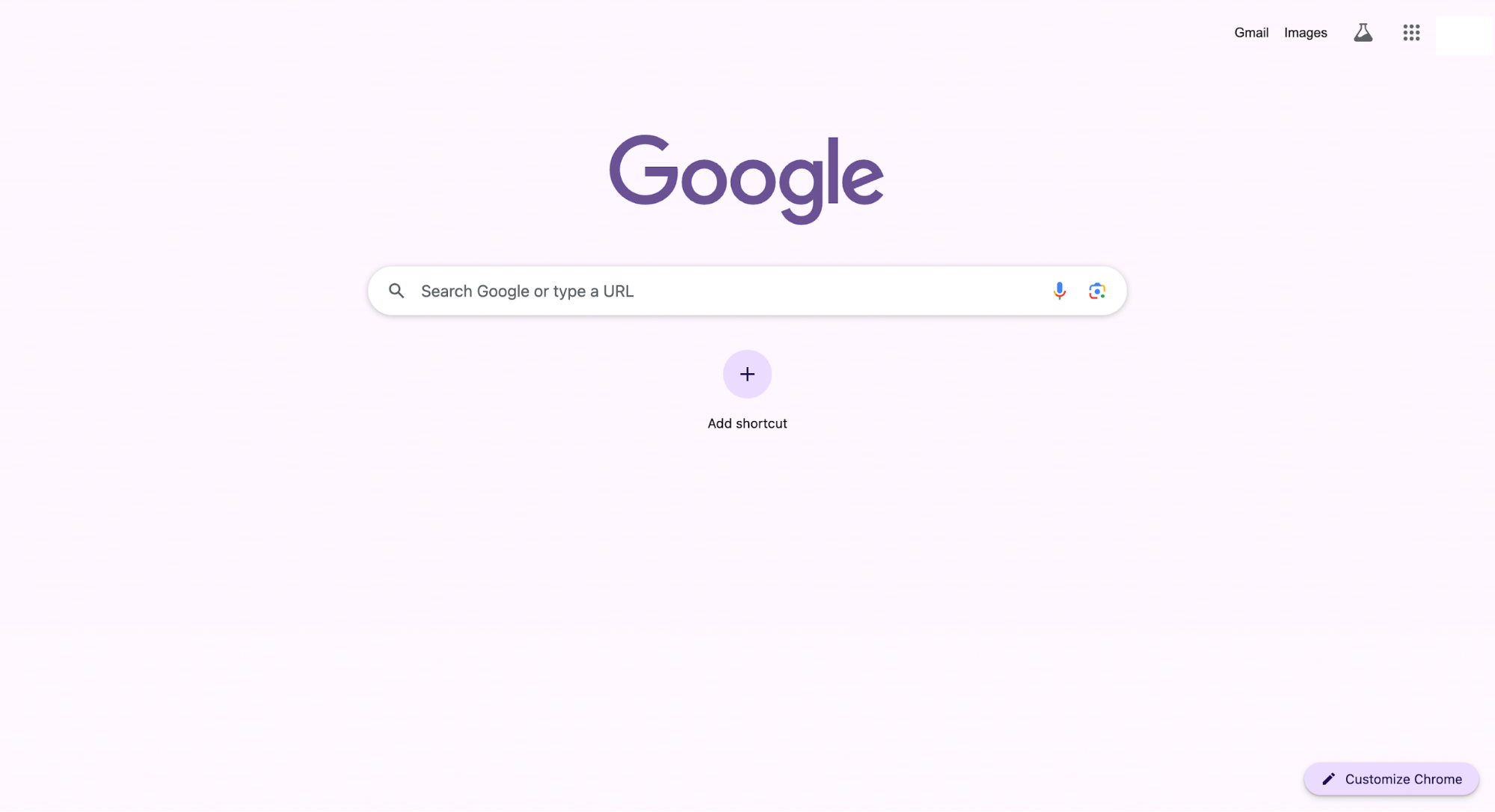
Think about simplicity, too. Clean navigation creates a seamless user experience across the board. You can see this philosophy in action with Google’s search interface.
It’s painfully simple: a single box, a button, and clean results. That clarity works whether you’re 12 or 72, whether you type with two fingers or use voice input.
2. Responsive and adaptive design
Whenever I test a new site, the first thing I do is shrink the browser window or load it on my phone. If the layout breaks, I already know users won’t stick around.
That’s why adaptive and responsive web design is non-negotiable for modern web designers.
Responsive design relies on fluid grids and flexible images.
Think of it like water filling a container: The layout flows to match the screen. I’ve had projects where simply switching to fluid grids cut bounce rates in half because users no longer had to pinch, zoom, or scroll sideways.
Adaptive design addresses the same problem differently. Instead of stretching one layout, it delivers tailored versions for different devices like desktop, tablet, or mobile.
The result feels deliberate, like the site was built for your exact screen.
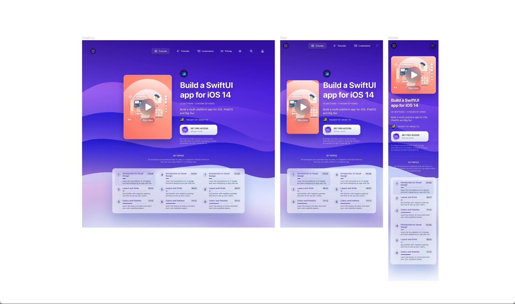
Source: Designcode
I always start with mobile. More than half of traffic comes from smartphones, and for many people, it’s their only device.
Plus, since mid-2024, Google has officially switched to mobile-first indexing.
This means its search engine uses the mobile version of your site for ranking and indexing. If your mobile site isn’t up to snuff, it can directly hurt your visibility.
That's why you hardly see any outdated websites make it to the search results' pages.
With that said, you should keep in mind the following critical aspects when designing for mobile:
-
Use touch-friendly UI elements: buttons and links need enough padding and avoid making users miss taps.
-
Prioritize content: show only what users really need first. Strip away secondary features (e.g., non-critical sidebars, large images) so the load is fast and the focus is clear.
-
Optimize images and media: load smaller versions for mobile, compress resources, and lazy-load offscreen content.
3. Visual hierarchy, layout, and navigation
When I land on a page, my eyes don’t scan everything equally. They’re pulled to the biggest, boldest, or most colorful elements first.
That’s visual hierarchy at work: The way size, color, and placement guide attention. If you don’t set this intentionally, users will create their own order (and it’s rarely the one that drives conversions).
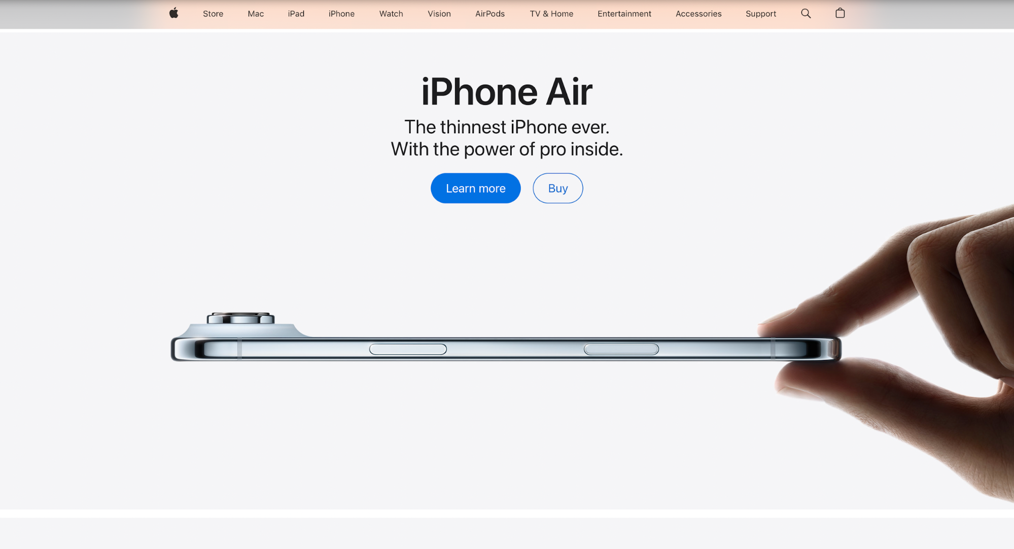
Apple’s product pages are a masterclass here. Large, high-contrast headlines grab attention immediately, followed by sharp product imagery that reinforces the message.
The hierarchy is deliberate: headline → image → supporting details → call-to-action. You never wonder where to look next.
Layout patterns also play a huge role. Eye-tracking studies show people naturally scan in predictable ways:
-
F-pattern: Users interact and read across the top, then down the left side. This is common for text-heavy sites like blogs or news outlets.
-
Z-pattern: A visitor's eyes often sweep across the top, diagonally down, and across the bottom. This is great for landing pages that lead to a single CTA.
By aligning content with these patterns, you’re sort of manipulating user behavior.
Navigation ties the whole thing together. Consistent menus, headers, and breadcrumbs help people interact and orient themselves.
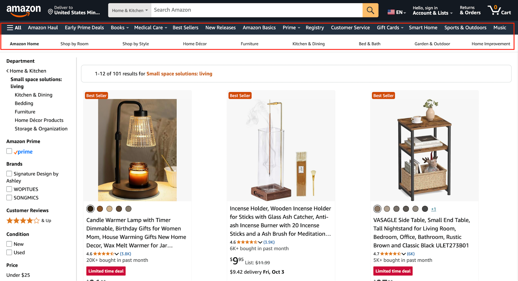
Think of Amazon’s site: no matter where you are, the top navigation bar anchors you, and breadcrumbs show your exact path. This reduces friction because users always know where they are and how to get back.
4. Typography, colour theory, and visual consistency
If there’s one thing I never compromise on, it’s readability. Fancy fonts might look clever in a mockup, but if users struggle to read them on a screen, the design has already failed.
That’s why typography hierarchy matters so much in presenting your website's content.
Headings should signal importance, body text should be effortless to scan, and spacing should give the eye room to breathe.
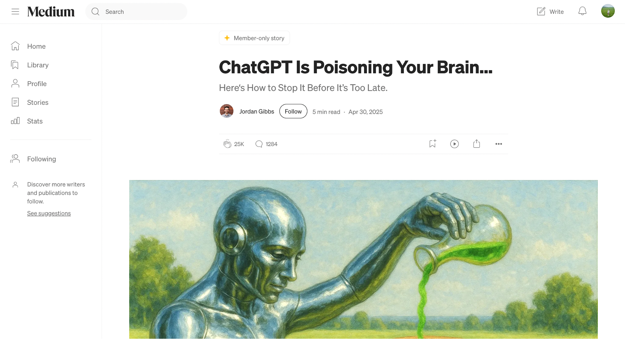
Medium nails this with oversized, clean typography so their articles feel approachable, not intimidating.
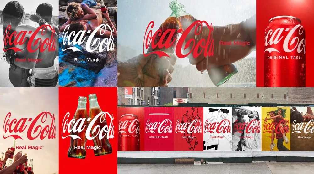
Color works on a different level. It’s emotion and something that helps showcase brand personality.
Red energizes and excites (Coca-Cola has built an empire on it). Blue communicates trust, which is why you’ll see it everywhere from banks to SaaS dashboards.
Source: Print Magazine
When I choose a palette, I’m not only thinking about contrast and accessibility but also about the story or visual concept the brand is portraying through those hues.
Finally, consistency is what locks it all in. Fonts, colors, and UI elements, such as buttons, need to appear consistently across every page.
Spotify is a great example; their black-and-green identity is consistent across their mobile app, desktop player, and marketing website. That unity builds recognition for.
5. Separation of content and presentation (HTML vs CSS)
When I audit a page, the first thing I do is turn off the styles (or view the page with a browser setting that disables CSS).
If the content still reads in the right order and the form controls still make sense, you’re already ahead.
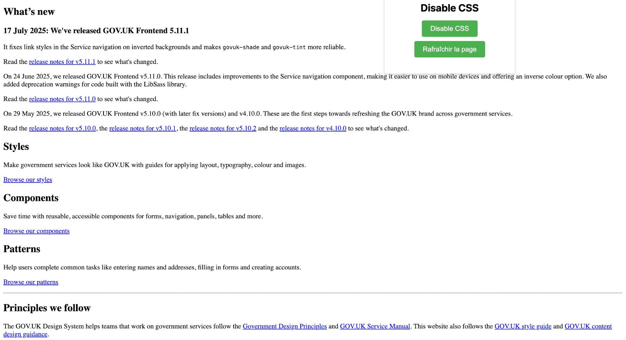
That simple test is the practical payoff of one principle: HTML = content and semantics; CSS = presentation. HTML describes what things are (headings, lists, forms, landmarks); CSS decides how they look.
Here’s why this matters for website owners:
-
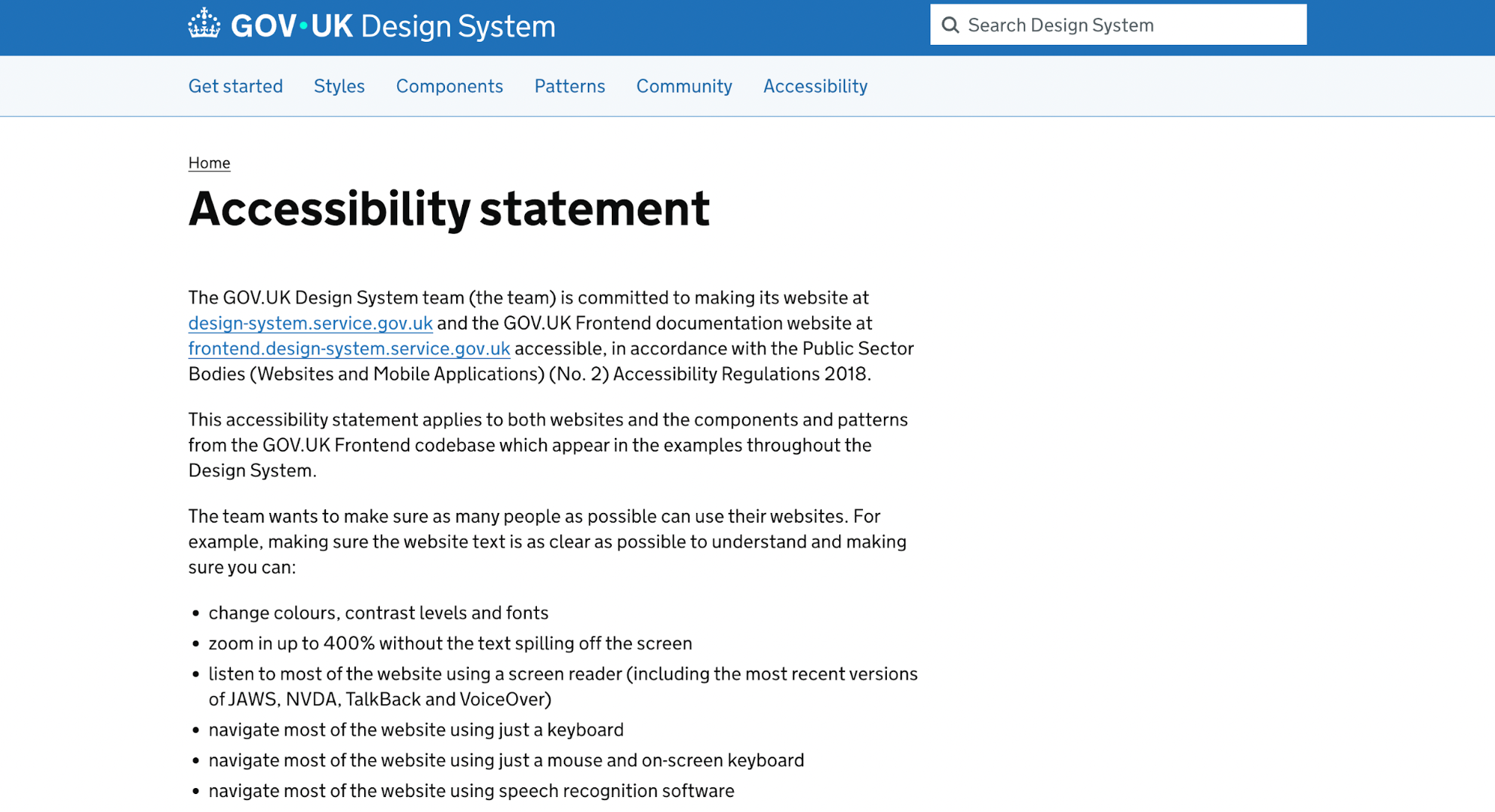
Accessibility comes first. When content lives in proper HTML elements (like headings, lists, or forms), screen readers can understand and announce it correctly. That’s why many government websites keep HTML clean and simple to make sure everyone can use them.
GOV.UK and USWDS (U.S. Web Design System) both start with semantic HTML and progressive enhancement.
They explicitly state in their public accessibility commitments that services must remain usable for everyone, even if styles or scripts fail.
That’s why government sites are often the most excellent resources for content-first design reference.
-
Faster performance. Stylesheets can be cached and reused across pages, which means quicker load times. Change one CSS file, and the whole site gets faster.
-
Easy updates. Want to rebrand? With CSS variables or global styles, a single change (say, updating your brand color) can ripple through every page instantly.
You can implement this separation easily with a good content management system (CMS) like WordPress, Drupal, or Webflow. They let you manage content in structured, semantic HTML while applying styles separately through templates or CSS.
6. Accessibility and inclusive design practices
I think of accessibility as non-negotiable. If a site only works for some users, it’s already broken.
Inclusive design isn’t just about edge cases; it’s about making sure your content is easily accessible for every visitor, regardless of ability.
Some practices make a huge difference right away:
-
Alt text for images helps screen readers describe graphical elements.
-
Captions on videos support people who are deaf or hard of hearing (and anyone watching on mute).
-
Keyboard navigation ensures users who can’t use a mouse can still move through menus, forms, and buttons.
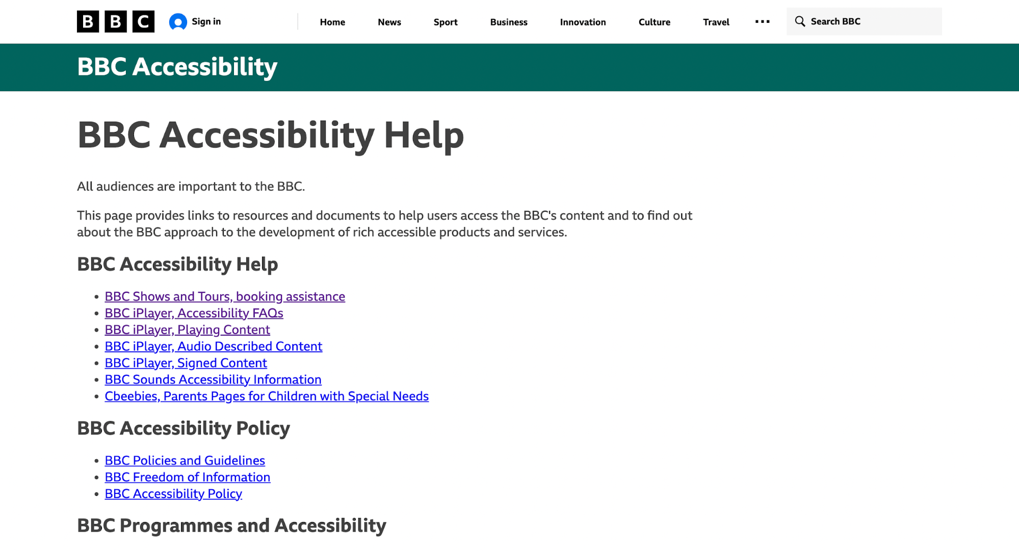
The BBC is often held up as a user-friendly model here. Their web content accessibility guidelines influence not only their own site but also industry standards. From clear headings to well-labeled media players, they build with accessibility as the default.
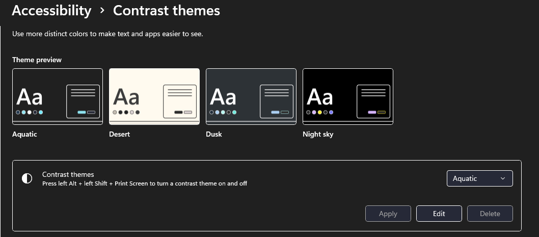
Visual design plays a role, too. High-contrast text improves readability for people with low vision and benefits everyone in bright environments.
Microsoft even added a high-contrast toggle in its apps so users can switch to a sharper view instantly.
And then there’s the compliance side. In the U.S., the ADA (Americans with Disabilities Act) has been applied to digital experiences.
Companies from Domino’s to major retailers have faced lawsuits over inaccessible websites. The legal risk is real, but the ethical responsibility is bigger if your design excludes people; you’re failing your audience.
7. Content strategy and information architecture
I’ve learned that even the most beautiful design falls flat if the content behind it is weak or disorganized.
A strong content strategy and clear information architecture (IA) give design something solid to stand on.
-
Content strategy starts with quality.
-
What messages matter most?
-
How do they align with user goals?
Once you get those business objectives clear, IA kicks in to organize those messages logically.
Upon planning and creating websites, you can leverage powerful tools like sitemaps and wireframes to map out where content lives and how end users will move through it.
The payoff is faster, easier navigation. When users can predict where information will be, they spend less time hunting and more time acting.
Think of Shopify’s e-commerce checkout flow. The steps are clear, minimal, and predictable: Cart → shipping → payment → confirmation. That clarity reduces cart abandonment because people aren’t second-guessing where to click next.
Source: Shopify
8. Simplicity, performance, and sustainability
I treat performance like a core UX feature.
Slow pages frustrate people, and the data is blunt about it: the probability of bounce rises 32% when load time goes from 1s to 3s.
On mobile, more than half of visitors will abandon a page that takes over 3 seconds to load.
That’s why simplicity matters, and you shouldn't sacrifice it for fancy-looking visuals.
Each extra image, third-party script, or interactive element is more than a design choice. It’s extra bytes the user must download, and one more reason they might leave.
The web is also getting heavier: median page weight has trended upward year-over-year, which makes optimization non-optional.
Here are a few things you can do to improve your website's performance:
-
Remove non-essentials first. If a block doesn’t help most users reach their goal, hide it on mobile or delete it. Simpler pages are faster and convert better.
-
Optimize images and media. Serve modern formats (WebP/AVIF), resize with srcset, and lazy-load offscreen images. These moves alone usually cut 30–70% of image bytes.
-
Reduce and defer JavaScript. Third-party tags and heavy client libraries often cause the biggest slowdowns; load them asynchronously or remove them.
-
Use a CDN + cache aggressively. Static assets cached at the edge reduce latency worldwide. (PSI/Lighthouse will flag cache misses.)
Key takeaways
After breaking down these eight concepts, I keep coming back to a simple truth: UX isn’t defined by any single element. It’s the conversation between them. Fonts talk to colors, layouts shape navigation, and performance carries the whole story.
For me, the biggest shift in website design has been thinking less about what looks good and more about what feels effortless.
The best sites I’ve worked on weren’t the ones packed with features or flashy animations. They were the ones where users barely had to think.
If you want to keep sharpening your own work, here are a few directions worth carrying forward:
-
Notice where users hesitate, that pause is design feedback in disguise.
-
Pay attention to inclusivity early in the design process, not later. It’s much harder to retrofit accessibility.
-
Keep mobile performance front and center; if it’s slow on a phone, it’s already failing.
-
Think of consistency as branding: every font, color, and button teaches users what to expect.