11 Website User Experience Checklist Steps for UI/UX

Adam Fard
Created on Feb 9, 2026
0.05 seconds. That's less than the blink of an eye and it's all the time you have to make an impression online. Research consistently shows that visitors form a gut-level opinion about your website in just 50 milliseconds.
Most websites are actively leaking visitors. Not because the product is bad, but because of fixable UX friction. The good news is that a systematic checklist can help you identify and eliminate these barriers.
In this guide, I'll walk you through 11 essential checks to audit your website's user experience. Whether you're evaluating your own site or trying to understand why you instinctively click away from others, these items will help you stop the leak.
1. Check that your value proposition is immediately clear
Your value proposition answers the question: Is it immediately clear what you offer, who it's for, and why it matters?
The industry standard is the five-second test. Can a total stranger land on your homepage and understand what you do within five seconds, without scrolling?
If your headline reads "Imagine what you'll accomplish," you've already lost. Accomplish what? Software? Life coaching? Blenders?
Vague, aspirational headlines fail because they could apply to any business.
Specificity wins. Warby Parker didn't say "See the world differently." They said, "Try five frames for free without leaving home."

It's almost aggressively literal, telling you what, how, and why instantly.
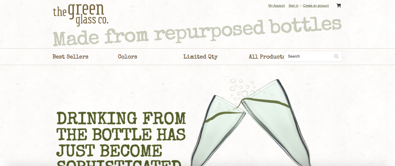
The Green Glass Company conveys their entire value in just four words: "Made from repurposed bottles." Done. You get it.
Here's your audit checklist:
-
Is the headline specific rather than aspirational?
-
Does supporting text explain a clear benefit?
-
Is there zero jargon?
-
Can someone understand what you do without scrolling?
If you fail the five-second test, you've probably lost them.
2. Verify contact information and trust signals are visible
You might want what a site is selling, but if you think they'll steal your credit card information, you're not going to buy. The Edelman Trust Barometer found that 83% of consumers will walk away if they don't trust the brand. That's almost everyone.
Trust signals anchor your business in the real world. A phone number and a physical address can signal assurance because it tells people, "We are real people you can talk to."
Like this jewelry business in New York that shows a number, email, open times and social profiles.

But it will immediately raise suspicion if there is no contact information.
The data backs this up. TrustedSite research found that adding trust badges led to conversion increases between 2% and 30%.
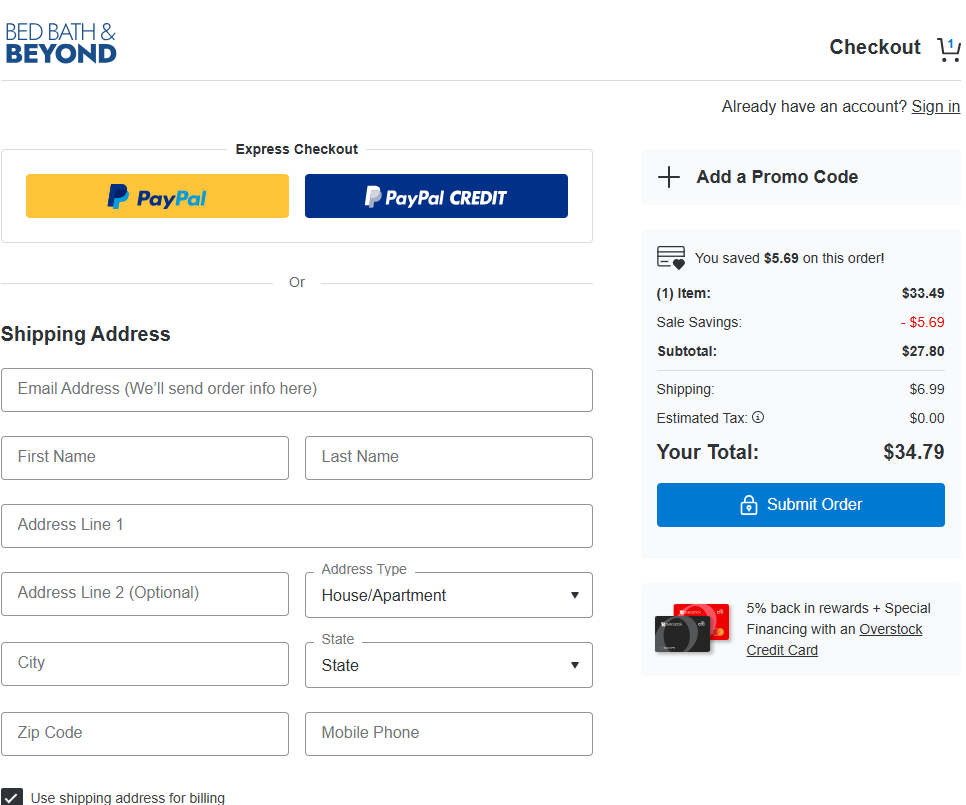
But placement matters. Baymard Institute found that security seals work best near checkout forms because that's where the anxiety peaks.
Take a look at Bed, Bath & Beyond's checkout page for trust signals.
For B2B companies, social proof matters more than security badges. Client logos or third-party validation like Trustpilot or G2 badges carry weight because they're harder to fake. "My mom thinks our software is great" is not a trust signal.
Like Ramp does in its hero section.

Here are essential trust signals to add in your UX checklist:
-
Phone number or contact information (header or footer)
-
Security badges near checkout (SSL, payment provider logos)
-
Customer reviews or ratings
-
Client logos (especially for B2B)
-
Industry certifications
Pick the most relevant trust signals for your context and UX persona. Too many badges start to look spammy and undermine the credibility you're trying to build.
3. Audit your menu structure for clarity
Navigation is the backbone of your site and should feature high up in your design system checklist. The classic rule of thumb is the three-click rule: no page should be more than three clicks away from the homepage.
If visitors need to go on an archaeological dig to find your pricing, they're gone.
Don't get too clever in your design process. Calling your menu "The Journey" or inventing creative labels creates friction. Navigation is the one place where boring is good.
Conventions exist for a reason—logo on the left, main navigation on the right. Users expect it, and meeting expectations reduces cognitive load.
What about the hamburger menu (those three little lines)?
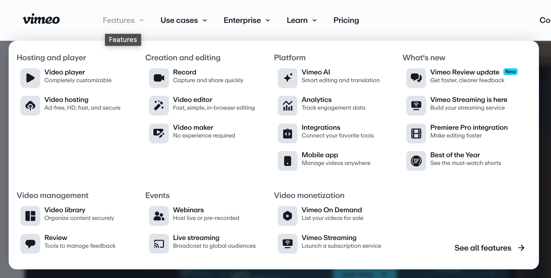
On mobile devices, it's often necessary. On desktop, Nielsen Norman Group's findings are clear: hiding navigation reduces discoverability.
Out of sight means out of mind. If you have the screen space, show the menu like Vimeo does.
Show users where they are for a positive user experience. Baymard Institute found that 95% of e-commerce sites fail to highlight the user's current location in the navigation menu. It's like removing the "you are here" marker from a mall map. Without it, users will feel lost.
Navigation checklist:
-
Is every page within three clicks of the homepage?
-
Are menu labels clear and conventional?
-
Is navigation visible on desktop (not hidden in a hamburger)?
-
Does the menu highlight the user's current location?
-
Is the logo on the left and linked to the homepage?
Apple demonstrates this perfectly. Despite a massive product range, they use clear categories in a narrow fixed bar.

Users can locate products quickly. It proves that complexity can be made simple.
4. Evaluate text formatting and scannability
This check is about fighting visual fatigue. The dreaded "wall of text" shuts brains down and nobody ends up reading it.
The formatting checklist is specific. Keep paragraphs to two to four sentences maximum. Optimal line length is 50 to 75 characters.
If a line is too long, your eye gets lost finding the start of the next one. Too short, and your eye tires from jumping back and forth. The sweet spot exists for a reason.
Even a few lines clumped together can lead users to avoid your text, like the example below.
Font size matters too. Use a minimum of 16 pixels for body text on desktop, and go larger on mobile devices. Anything smaller creates unnecessary work for the reader.
Front-load your information like journalists do. Put the most critical content at the start of paragraphs. Research on reading patterns shows that users scan in an F-pattern. They read the first line, then their eyes drift down the left side.
If your key point is buried at the end of a paragraph, it will be missed. Here's an example on formatting content for scannability from our blog.
Scannability checklist:
-
Are paragraphs kept to 2-4 sentences?
-
Is line length between 50-75 characters?
-
Is body text at least 16px on desktop?
-
Is critical information front-loaded in each section?
-
Are walls of text broken up with whitespace and subheadings?
5. Simplify form fields and labels
Forms are barriers. Every field adds friction.
The guiding principle is minimal input: only ask for what you absolutely need. Do you really need a fax number? A middle initial? Probably not.
A huge design mistake is using inline labels that sit inside the text box and disappear when you type. They look clean, which is why designers like them.

But they're awful for usability. The moment you click and start typing, you forget what the field was asking for.
Labels should be visible above the field to improve the user interface.

Stop splitting fields unnecessarily if you dont have to.
First name and last name in separate boxes? Why? Use one full-name field. Don't make users tab or click more than they have to.
The same applies to phone numbers— you don't need to separate the area code.
Here's a surprising statistic: Baymard Institute found that sites should mark both required and optional fields explicitly, but only 14% actually do this.
Most just use a red asterisk for required fields.
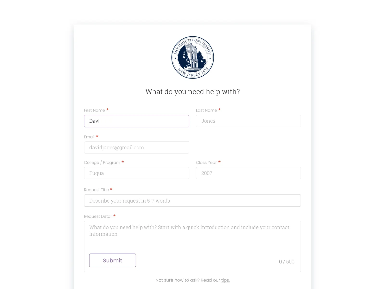
Explicitly writing "optional" tells users they can skip it, which reduces errors and speeds completion.
Use smart defaults.
If you know the user is in a particular country, pre-select it. If shipping usually matches billing, make that a one-click checkbox. Use appropriate HTML input types (email, phone, date) so mobile users get the right keyboard automatically.
Do the work for the user.
Form simplification checklist:
-
Are you only asking for essential information?
-
Are labels positioned above fields (not inline)?
-
Are both required AND optional fields explicitly marked?
-
Have you avoided unnecessary field splitting?
-
Are smart defaults pre-filling where possible?
-
Do input types trigger the correct mobile keyboards?
6. Test touch targets and tap areas
Welcome to the fat finger problem or as it's known in the industry, "rage taps." Fingers are imprecise, and targets that are too small cause frustration and errors.
Size guidelines are clear. Apple's Human Interface Guidelines recommend 44×44 pixels minimum. Google's Material Design specifies 48×48 dp. In real-world terms, that's about nine millimeters, roughly the size of an average adult's finger pad.
Smaller than that, and it will negatively affect how users navigate.
Spacing matters too. Touch targets should be separated by at least eight pixels, so users don't accidentally hit "delete" when they meant to hit "save."
Steven Hoober's research on the thumb zone maps where the thumb can comfortably reach when holding a phone one-handed.
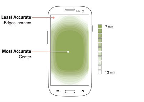
"If the fingers are grasping a handset, the range of motion that is available to the thumb is more limited. But by moving their fingers, users can change the area of the screen their thumb can reach."
– Steven Hoober, UX researcher
Your main call to action needs to be in that easy-to-reach zone, typically the center and bottom of the screen.
Your visual size doesn't have to match functional size. A useful technique is to have a small-looking icon at 24 pixels, but add invisible padding to make the tappable area 48 pixels. The design stays clean while the user's thumb has a proper target.
Design system checklist for touch targeting:
-
Are interactive elements at least 44×44 pixels (Apple) or 48×48 dp (Google)?
-
Is there at least 8 pixels of spacing between targets?
-
Are primary actions positioned within the thumb zone?
-
Have you tested on actual touch devices?
7. Verify content adapts to different screen sizes
Responsive design is not just about shrinking the desktop version for mobile but also about adapting it intentionally for each context.
It helps to test across a few standard breakpoints to catch layout issues early. At minimum, check mobile (375–414px), tablet (around 768px), and desktop (1024px+). These sizes represent the most common screen categories and will reveal whether your layout adapts smoothly or breaks at key transitions.
The NN/G group has some great examples.
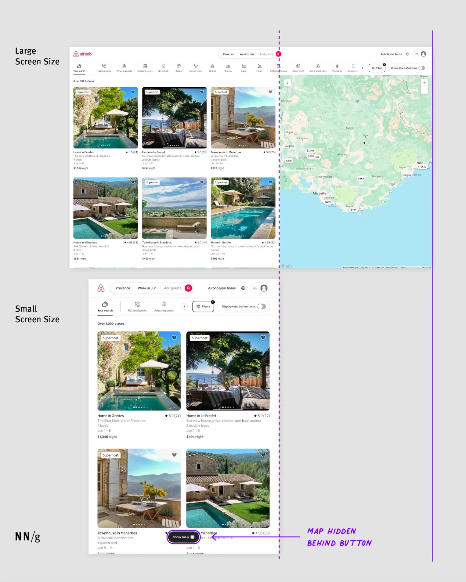
Test at common breakpoints: mobile (375-414px), tablet (768px), and desktop (1024px and above) at minimum.
But don't just resize your browser window. Test on real devices. Actually hold a phone in your hand. Emulators don't capture real touch interactions and performance characteristics.
When reviewing responsive design, focus on the checkpoints that most directly affect usability.
Start with readability and visuals: can users comfortably read the text without zooming in? Do images scale cleanly without getting cropped, distorted, or pushing content off-screen?
On smaller screens, menus should simplify and transform naturally (often into a hamburger menu) so users can still find what they need.
Like UX Pilot's navbar that goes from this on the desktop.

To this on mobile.

Watch for horizontal scrolling. On mobile, it’s almost never acceptable because it usually signals that an element (like a table, image, or long line of text) is overflowing the layout.
Even a small amount of sideways scrolling can make a site feel broken and instantly lower trust.
We've discussed forms, but don't forget that inputs, dropdowns, and buttons should stay easy to tap, fill out, and submit without frustration.
The responsive design checklist:
-
Is text readable without zooming?
-
Do images scale properly without breaking layouts?
-
Does navigation transform appropriately for mobile?
-
Is there any horizontal scrolling? (There shouldn't be—it feels broken.)
-
Do forms remain usable on smaller screens?
8. Measure load times with diagnostic tools
Page speed is the silent conversion killer. Users don't consciously think "this site is slow"; they just leave if a response takes time. Often this is a page, but it could also be the search function on your site.
Google's Core Web Vitals are the key metrics:
-
LCP (Largest Contentful Paint): How fast does the main content appear? Target: under 2.5 seconds.
-
INP (Interaction to Next Paint): When you click something, how fast does the page respond? Target: under 200 milliseconds. Any slower feels sluggish.
-
CLS (Cumulative Layout Shift): How stable is the page? When you start reading and then an ad loads and everything jumps down, that's a high CLS. Target: as close to zero as possible.
Minimizing your pageload speed is also important for search engine optimization because search search platforms prefer pages that load fast.
Use Google PageSpeed Insights to check these metrics. It provides both lab data (controlled testing) and field data (real user experience from Chrome users over the past 28 days).
Field data matters more because it reflects what your actual visitors experience. Other useful tools include GTmetrix, WebPageTest, and Google Search Console's Core Web Vitals report.
Test mobile and desktop separately because they have completely different speed bottlenecks.
9. Check color contrast and text alternatives
Accessibility should be a given, but it's often overlooked.
The main check is contrast ratio. WCAG guidelines require a 4.5:1 ratio for normal text against its background, and 3:1 for large text (18pt or 14pt bold) and UI components.
That light-gray text on a white background might look sophisticated, but it's unreadable for many people.
Here's an example of difficult readability.

Use WebAIM's Contrast Checker or browser extensions like Silktide Accessibility Checker to verify your color combinations meet the standards.
Don't use color alone to convey information. If a form field has an error, don't just make the border red. About one in 12 men and one in 200 women are colorblind. You need an icon or text label that says "error" alongside the color change.
Every informational image needs descriptive alt text for screen readers. Decorative images should have an empty alt attribute (alt="") so screen readers skip them entirely rather than announcing "image" with no context.
For forms specifically, ensure labels are properly associated with their inputs using the for attribute, and that error messages are announced to screen readers (using ARIA live regions or proper focus management).
Accessibility checklist:
-
Does text meet 4.5:1 contrast ratio (3:1 for large text)?
-
Is color never the only indicator of meaning?
-
Do all informational images have descriptive alt text?
-
Are decorative images marked with empty alt attributes?
-
Are form labels properly associated with inputs?
-
Are error messages accessible to screen readers?
10. Ensure CTAs are prominent and action-oriented
The call to action is often the whole point of the page. The button needs to stand out through color contrast, size, and whitespace without clashing with the overall design.
Copy matters as much as visual design. The word "Submit" is terrible and sounds like the user is giving something up.
Use action verbs that describe what happens: "Get started," "Download free guide," "Create my account."
Here's an example from Wise that articulates what to expect when clicking.

There's a subtle but effective technique: first-person language. Changing "Start your free trial" to "Start my free trial" can perform better in A/B tests. That single word creates a sense of ownership and shifts the user's mindset.
Use one primary CTA per section to focus. Multiple competing calls to action create analysis paralysis and reduce overall clicks.
Netflix demonstrates this perfectly, using just "Get Started" with reassuring supporting copy. Clean, focused, effective.

Place CTAs where users are ready to act: after your value proposition, at the end of persuasive content sections, and in sticky headers for longer pages.
CTA checklist:
-
Does the button stand out through color and whitespace?
-
Does the copy use action verbs (not "Submit")?
-
Is there one primary CTA per section?
-
Is the button placed where users are ready to act?
-
Have you tested first-person language ("my" vs "your")?
11. Gather real user feedback
You've done all this work but how do you know if your design practices are actually working? Analytics tell you what is happening: 60% of people are leaving this page.
But analytics don't tell you why. You have to ask your users for real feedback.
Short onsite surveys and exit surveys surface real problems: "I couldn't find the shipping costs," "the form was broken on my phone," "I wasn't sure if you ship internationally."
These specific insights are impossible to get from bounce rate data alone.
The gold standard is usability testing with real people trying to use your site.
Research by Jakob Nielsen shows that testing with just five users reveals the vast majority of usability problems. If three out of five people can't find the checkout button, you don't need to test fifty more to know you have a checkout button problem.
It's humbling to watch someone struggle with your own design. But that's where the learning happens.
Collecting feedback without acting on it wastes everyone's time. Build an internal system for reviewing insights regularly and prioritizing fixes.
Feedback checklist:
-
Are you running short onsite or exit surveys?
-
Have you watched real users try to complete key tasks?
-
Do you have a process for acting on feedback, not just collecting it?
How to turn a UX checklist into real improvements
Eleven checks is a lot to take in. But the goal isn't perfection overnight, but continuous improvement.
Don't try to fix everything at once. Prioritize the highest-impact areas: page speed, mobile experience, and form friction. These are usually the silent killers that lose the most visitors.
A slightly faster page, plus a clearer headline, plus a better button all adds up. Each fix removes a silent barrier that was costing you visitors and conversions.
Here's your challenge: pick just three items from this checklist. Maybe check your load speed in PageSpeed Insights, test your value proposition on a friend who's never seen your site, and verify your touch targets on mobile. Audit those three this week and see what you find.
You might love your website design. You might think it's a work of art. But the only opinion that truly matters is that of the user trying to accomplish their task in 0.05 seconds.
Make it count.
What is a website user experience checklist?
A website user experience checklist is a step-by-step way to review how easy your site is to understand, navigate, and use. It helps you spot friction points like unclear messaging, slow pages, confusing menus, or hard-to-use forms so you can fix issues that cause visitors to leave.
A good checklist keeps your audit focused on real user behavior instead of opinions. It’s also useful for prioritizing quick wins, especially when you can’t redesign everything at once.
How often should you run a UX audit on your website?
Most websites should run a UX audit at least once per quarter, and again after any major redesign, launch, or traffic drop. Regular audits help you catch usability issues early before they hurt conversions, SEO performance, or customer trust.
If your site changes frequently, even a monthly “light check” can help. The goal isn’t perfection—it’s consistent improvement based on what real users experience.
What are the biggest UX issues that make visitors leave a website?
The biggest UX issues are usually unclear messaging, slow load times, hard-to-find information, and unnecessary friction during key actions. When visitors feel confused or delayed, they often leave before they ever reach the product, pricing, or signup step.
Small problems add up quickly. A site can look great visually but still lose users if it makes them work too hard to understand what to do next.
How do you prioritize UX fixes when you can’t fix everything?
Start by fixing the problems that block users from completing important actions, like understanding what you offer, finding key pages, or completing forms. Prioritizing high-impact friction points helps you improve results without needing a full redesign.
A helpful approach is to focus on issues that affect many users and appear on high-traffic pages. Fixes that reduce confusion and speed up tasks usually deliver the fastest gains.
What’s the fastest way to spot UX problems on your website?
One of the fastest ways is to watch how someone uses your site without guidance. If they hesitate, get lost, or miss key information, that’s a clear UX signal. You can also use analytics to spot pages with high drop-offs or low engagement.
Even a short test can reveal issues you don’t notice internally. Quick observations often highlight confusing labels, weak page structure, or unclear next steps.
How do you know if your website UX improvements are working?
You’ll know UX improvements are working when users complete tasks more easily and key metrics improve over time. Look for better engagement, lower abandonment on important flows, and stronger conversion rates on key pages.
The most reliable approach is to combine behavioral data with feedback. Numbers show what changed, and real user comments help explain why the change mattered.
What’s the difference between website UX and SEO?
Website UX focuses on how easily users can understand and use your site, while SEO focuses on helping people discover your pages through search. The two overlap because better UX often improves engagement, trust, and performance—signals that can support SEO results.
Good SEO can bring traffic, but UX determines whether visitors stay, take action, or leave. A strong website experience helps turn visibility into outcomes.