Web Design Process Explained in 7 Steps

Khanh Linh Le
Created on Oct 24, 2025
We’ve all been there: Clicking on a website that looks promising, only to wait for it to load or get lost trying to find simple information. Within seconds, frustration kicks in, and you’re gone.
According to Google, 53% of mobile users abandon a site that takes longer than 3 seconds to load. As load time increases from 1 second to 3 seconds, the probability of bounce jumps by 32%.
What’s worse: 88% of visitors say they’re unlikely to return after experiencing a poor user experience, such as slow loading, chaotic navigation, or confusing design.
If your web design process is ad hoc or missing a clear structure, you could be undermining the very things that keep users around: speed, clarity, and trust.
In this article, I’ll break down the 7 steps of an effective website design process, showing how each stage supports usability, performance, and happier users.
1. Conduct research for the industry and audience
Every successful website project starts with research. Before working on a new website, you need to understand the website's primary aim and the competitor landscape.
Skip this step, and you’re guessing, and guesswork is what leads to pretty layouts that fail website visitors.
Good web project research covers two fronts:
Market research reveals the landscape — your competitors, industry patterns, and what users already expect from products like yours. Start by identifying 3–5 key competitors, then analyze how they position themselves, structure content, and guide users through key flows.
Tools like Similarweb, Ahrefs, or SEMrush show where they get traffic from, while BuiltWith or Wappalyzer reveal their tech stack. The goal is to find opportunities to do better.
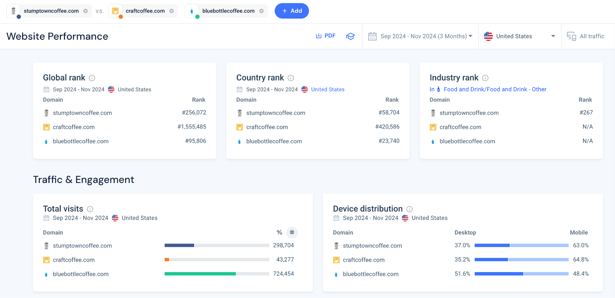
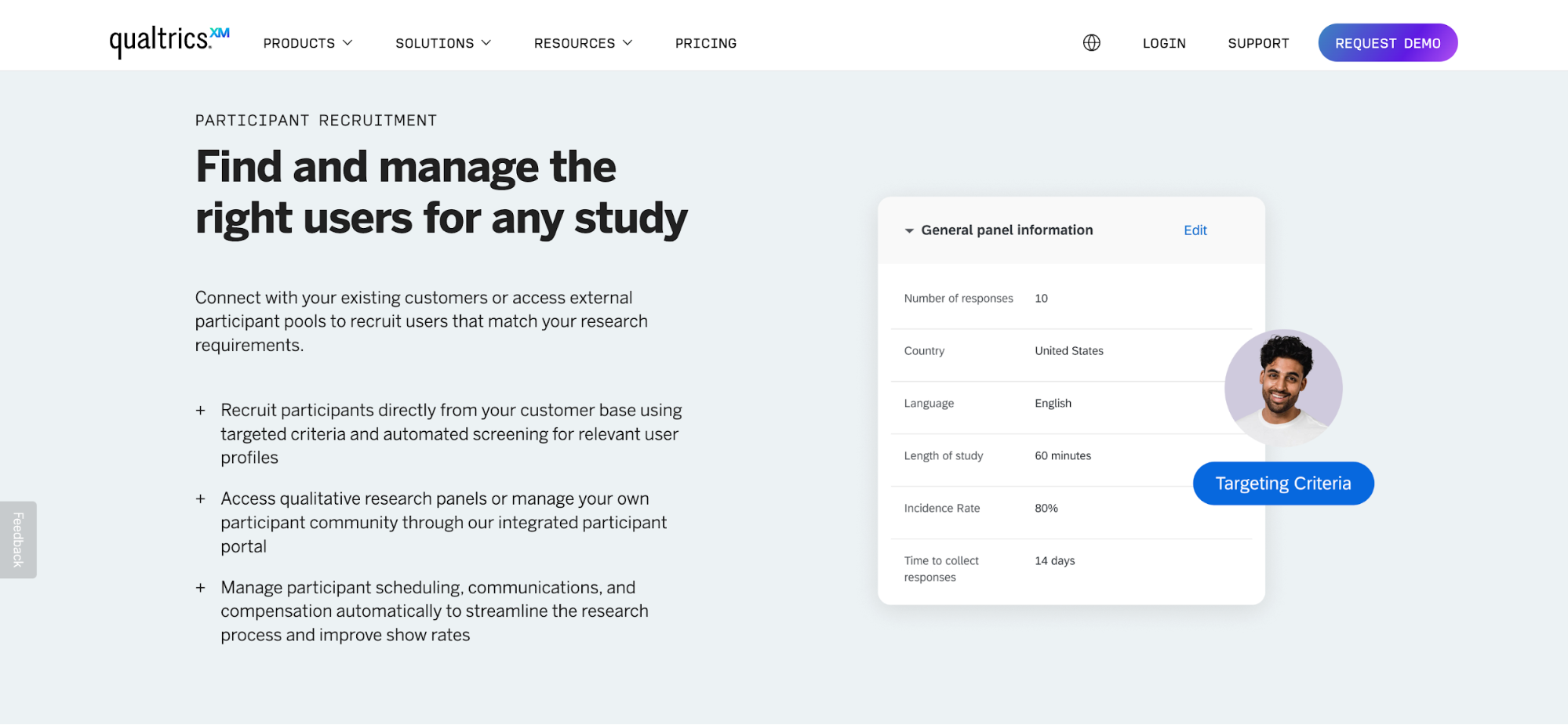
User research focuses on your website's target audience — their motivations, pain points, and goals. You can combine survey or interview insights with analytics data from Similarweb. Tools like Qualtrics can be useful to conduct user research, especially when you start from scratch. These findings will help guide your design decisions later, especially for a website redesign.
A strong research process also includes competitor benchmarking, but in a practical, ethical way.
Technically speaking, you can’t access your competitors' heatmaps or Google Analytics data, but you can conduct short usability sessions where participants use competitor sites while you observe. This helps you identify common usability gaps and opportunities for improvement.
Take a hypothetical example: say you’re designing a platform for online fitness coaches. Market research might show competitors focus on tracking workouts.
But through interviews, you find that clients struggle to stay consistent between sessions. That insight could inspire design features like progress reminders or motivational streaks, the things your competitors overlook.
2. Define the project’s scope, objectives, and timelines
Once your research gives you a clear picture of your users and the market, the next step is to define what you’re building, why you’re building it, and when it should be delivered.
This step might not sound as creative as wireframing or prototyping, but it’s where great web design projects either succeed or collapse.
Here’s how to do this right:
|
Element |
Why It Matters |
How to Define It |
|---|---|---|
|
Objectives |
Keeps everyone aligned on success metrics |
Use SMART goals (Specific, Measurable, Achievable, Relevant, Time-bound) — e.g., “Increase free-trial signups by 20% in 6 months.” |
|
Scope/ Deliverables |
Prevents overruns and “feature creep” |
List out in scope and out of scope features. E.g., “Home, About, Pricing, Blog, Contact pages”. |
|
Milestones |
Builds accountability and pacing |
Break the project into phases (design, dev, QA, launch) with dates and buffers. |
|
Roles & Responsibilities |
Eliminates ambiguity |
Clarify who is doing what (designer, dev, content, QA) and decision ownership. |
|
Scope-control process |
Manages inevitable changes |
Decide how changes will be approved. E.g.: “Any change request after signoff will incur +1 week per feature unless approved in writing.” |
|
Assumptions & Constraints |
Surfaces hidden risks |
E.g., dependencies on client content delivery, integrations with third-party APIs, browser support constraints, and budget caps. |
Let’s say you’re designing a website for a fitness brand. Their main goal is clear, which is to boost online sign-ups by 30% in six months. That single metric drives every decision you make.
The project scope includes ten pages: Home, About, Classes, Trainers, Pricing, Blog, Contact, plus an online booking system. Anything beyond that, like member dashboards, gets parked for later.
Then, you can map out an eight-week timeline: one for discovery, two for design, three for development, one for testing, and one for launch. Everyone knows what’s coming next, and feedback fits into the plan instead of derailing it.
3. Select brand and visual guidelines and elements
The next step is to make sure your own website design speaks the same visual language as the brand. You'll need brand and visual guidelines for this.
Even if you’re not the web designer, you need to understand why these guidelines exist and how they shape every design decision that follows. Think of them as the rules that keep a brand recognizable and consistent, no matter who’s designing or what’s being designed.
When used consistently across web pages, it builds familiarity and trust — two of the most important ingredients in user experience.
For example, Spotify’s design system defines not only its signature green but also how that green interacts with black, white, and photography. The result? You can recognize a Spotify page even before seeing the logo.
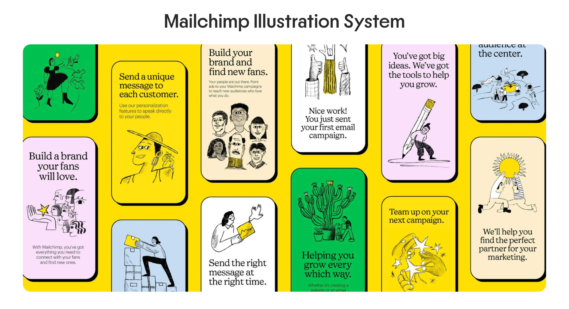
Mailchimp’s style guide does the same, pairing quirky illustrations with warm yellows and friendly typography to reflect the brand’s approachable tone.
If you’re creating or refining brand guidelines, focus on the essentials:
-
Color palette: Pick a primary brand color (often from your logo), a secondary palette for accents, and neutral tones for backgrounds and text. Limit the total to keep things cohesive.
-
Typography: Choose one or two typefaces — one for headlines, one for body copy — and decide on hierarchy rules (sizes, weights, spacing) for content elements.
-
Logo usage: Clarify when and where to use the full logo, icon, or wordmark, plus minimum sizes and clear space.
-
Visual elements and iconography: Define photography style, illustration tone, and icon shapes or line weights.
If the brand already has a design system, reference it closely. If not, I usually work with the designer to create a lightweight version, like a short guide or Figma board, with the essentials. The goal is to make sure everyone stays visually consistent.
4. Create a sitemap and conduct SEO keyword research
Before starting on the wireframing design phase, you need to map out what pages to build and what those pages rank for better site visibility.
This is where sitemap creation and keyword research for search engine optimization contribute to a more efficient web design process.
A sitemap is a planning tool that presents the site architecture, including web pages, in a hierarchical fashion, that are accessible to users. It shows every page, how they connect, and where users can navigate from one section to another.
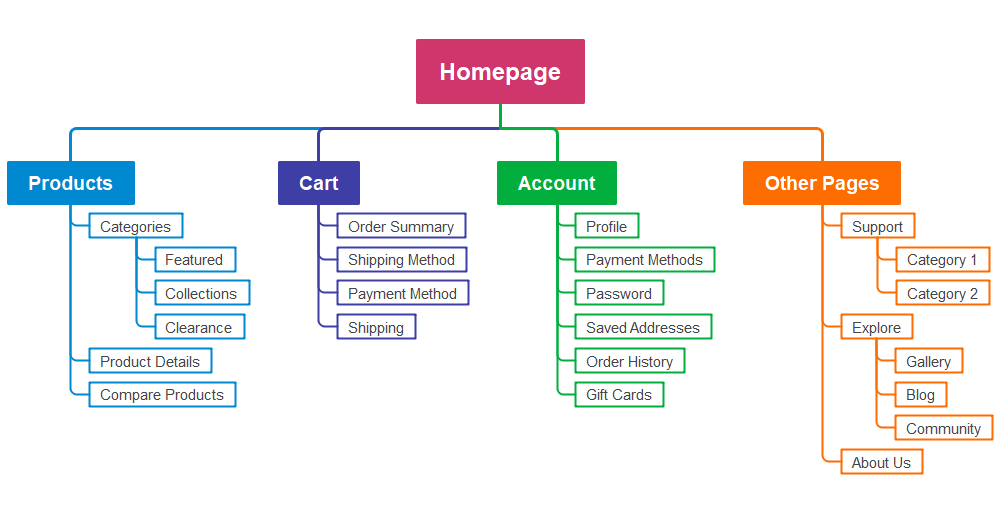
Source: EdrawMind - Wondershare
Start by listing your primary pages like Home, About, Services, Pricing, Blog, Contact, whatever makes sense for your business.
Then add secondary pages that sit underneath these primary ones. For example, if you have a Services page, your secondary pages might be "Branding Design" and "Website Content."
Next, figure out what each one should rank for. Say you're building a site for a SaaS tool. Your Features page might target "project management software." Your blog tackles questions like "how to manage remote teams."
Each page gets its focus keyword based on what people are searching for. Tools like Ahrefs or Surfer make on-page SEO easy, just plug in a few seed keywords and see what comes up.
The goal is to match each keyword with a page that best satisfies search intent.
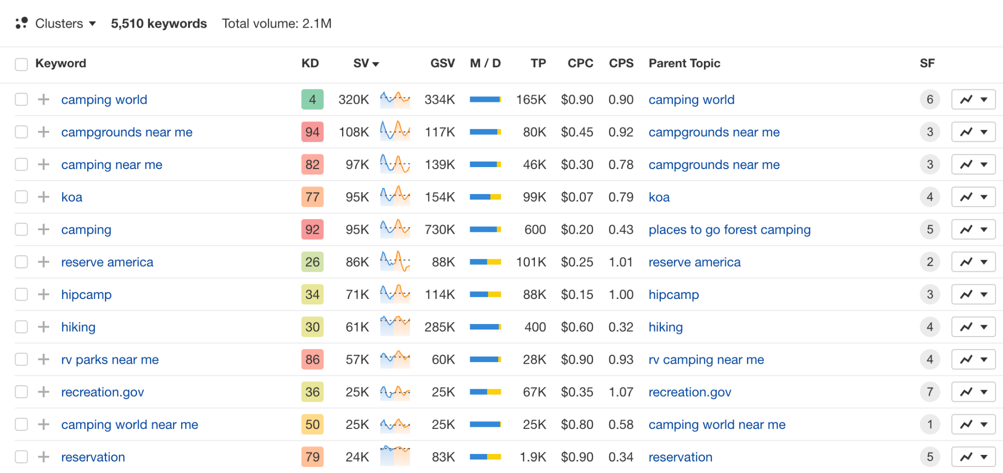
I usually create a simple spreadsheet: Page Name, URL, Primary Keyword, and a couple of Secondary Keywords. Nothing fancy.
Just something that keeps me from accidentally optimizing two pages for the same thing or missing opportunities altogether.
Source: The Blueprint Training
This is also a good time to choose your content management system (CMS). WordPress, Webflow, and Framer are popular website builders with different strengths. Often, your choice will depend on factors like technical complexity, scalability needs, and whether you need a blog or online store functionality.
5. Turn ideas into wireframes
Wireframes are the blueprint of your website. They map out the layout, hierarchy, and flow before any content creation gets involved.
They also make it much easier to catch structural problems early, long before the design or web development process begins.
During such time, keep your sitemap close. It helps ensure every page has a clear role, that site structure and key pathways (like homepage → product → checkout) flow logically, and that no content gets buried or duplicated for both users and the search engine.
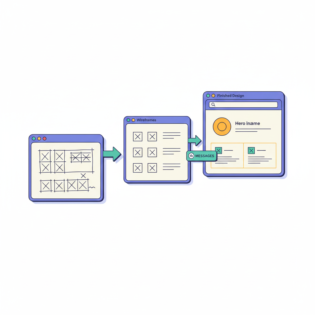
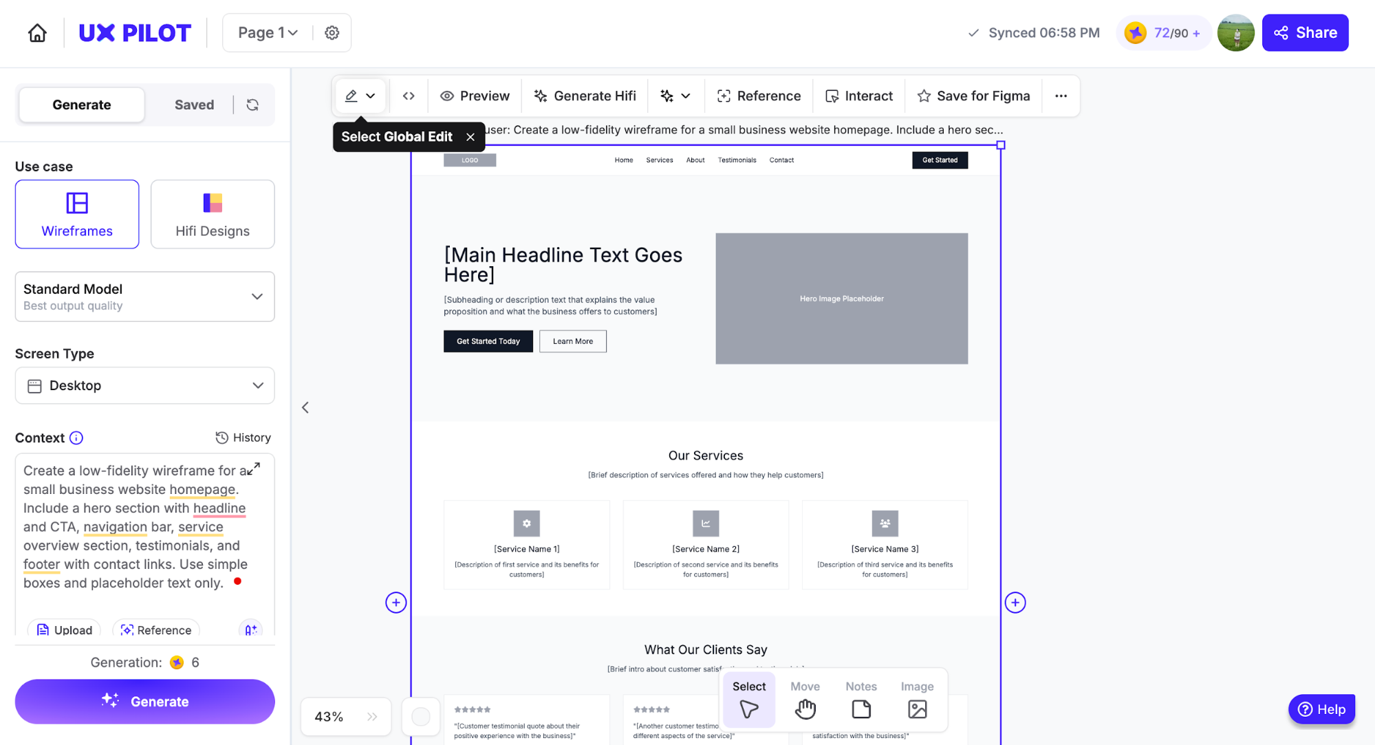
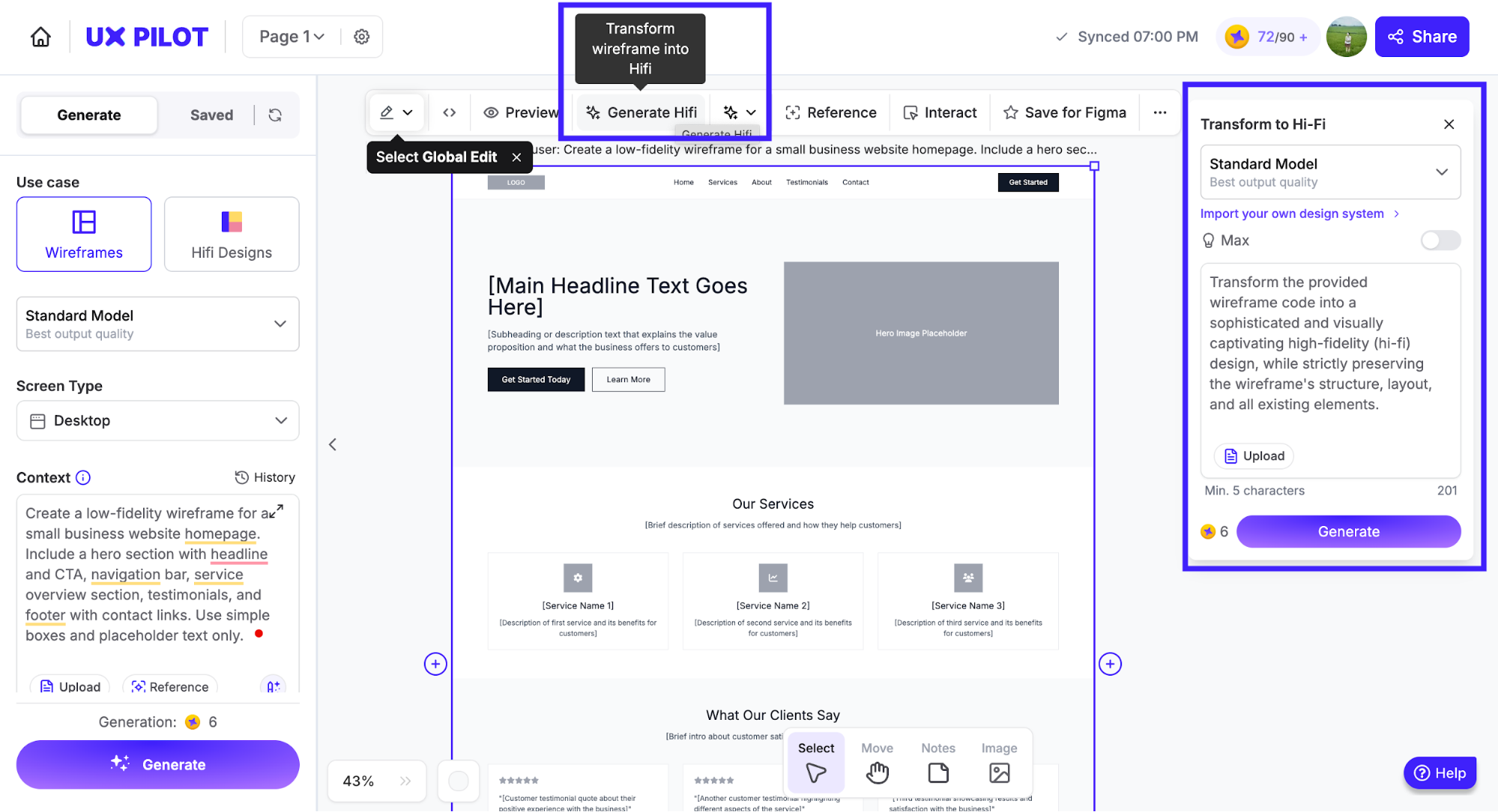
Then, you can start working on early wireframes, known as low-fidelity ones. These often include grayscale boxes, simple lines, and placeholder content. Do note that this is not the stage to include the actual content or any high-quality images yet. This is to keep everyone focused on the core website function and flow.
You can sketch them on paper, in a whiteboard session, or with a tool like UX Pilot. For example, if you are using UX Pilot, the process is as simple as filling in your prompt:
At this point, designers focus on things like:
-
The hierarchy of information on each page
-
Where users will look or click first
-
How navigation connects across pages
-
How much space different content types need
If you’re not the one drawing the wireframes, this is your chance to give feedback on structure, not style. For example, you can flag missing sections or suggest clearer calls to action.
6. Polish wireframes into high-fidelity pages
With your wireframes serving as the structural foundation, the next step is to refine them into high-fidelity pages.
At this step, the entire project should closely resemble your desired website outcome. This means to add visual design, interactivity, and user experience on top of your existing low-fidelity user interface.
Here's what changes when you move from wireframe to high-fidelity:
-
Visual design gets applied – Your brand colors, actual typography, real images, and UI elements replace the gray boxes and placeholder text. High-fidelity designs include typography, colors, images, icons, and CTA buttons.
-
Spacing becomes precise – Instead of rough layouts, you're defining exact margins, padding, and alignment. Every pixel has a purpose.
-
Content becomes real – Swap out "Lorem ipsum" for actual headlines, body copy, and CTAs. This reveals whether your content hierarchy actually works or needs adjustment.
-
Interactive elements take shape – Buttons, forms, hover states, and navigation get their final styling. You'll see exactly how users will interact with each element.
The traditional approach is to use design tools like Figma or Adobe XD and manually apply all your visual guidelines to each wireframe. This works, but it's time-consuming, especially if you're iterating on multiple page layouts.
Some teams are now using AI tools to speed up this transition. For instance, UX Pilot can generate high-fidelity designs from low-fidelity wireframes or even text descriptions, which can be particularly helpful when exploring different visual directions quickly.
Here's what I get when moving from a low-fidelity design to a high-fidelity one using the same tool - UX Pilot:
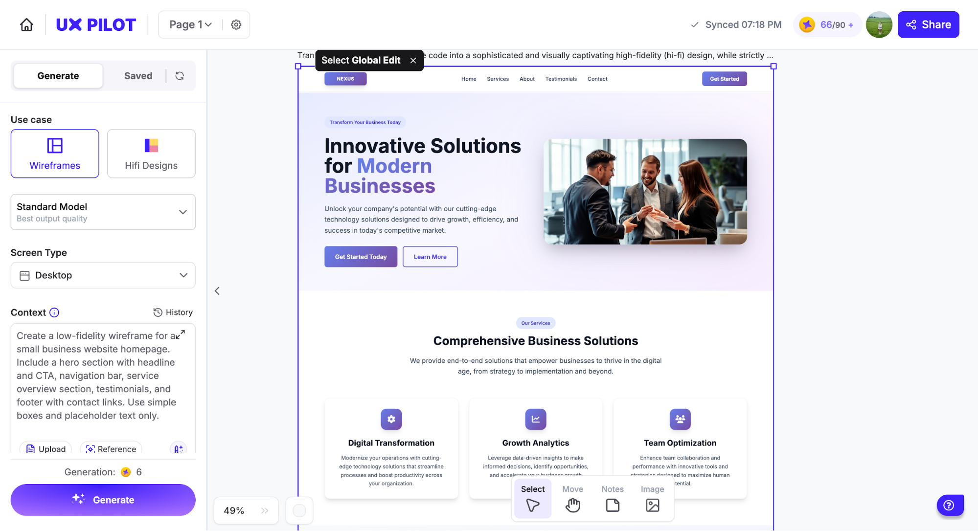
You still need to review and refine the output, but it significantly reduces the initial design time. The key here is to gather stakeholder feedback at this stage before development begins. It's much easier (and cheaper) to change a button color or adjust spacing in a design file than after it's been coded.
7. Test a functional prototype
At this point, you've got high-fidelity designs that look polished. But looking good on a screen and actually working for users are two different things.
That's why you need to run a functional prototype. It doesn't need to be fully coded or connected to a real database. You're essentially creating a clickable simulation of the real website.
Tools like Figma or Framer let you add interactivity without going into the development phase. Basically, if you use Figma for this, you will need to add connectors that indicate flows and navigation. It can look as complex as the one below:
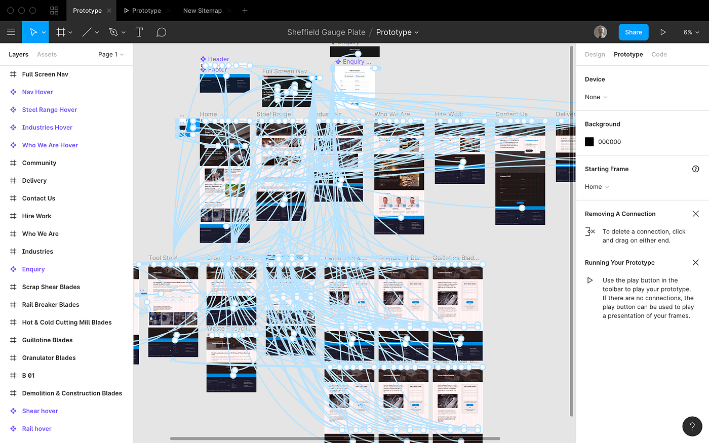
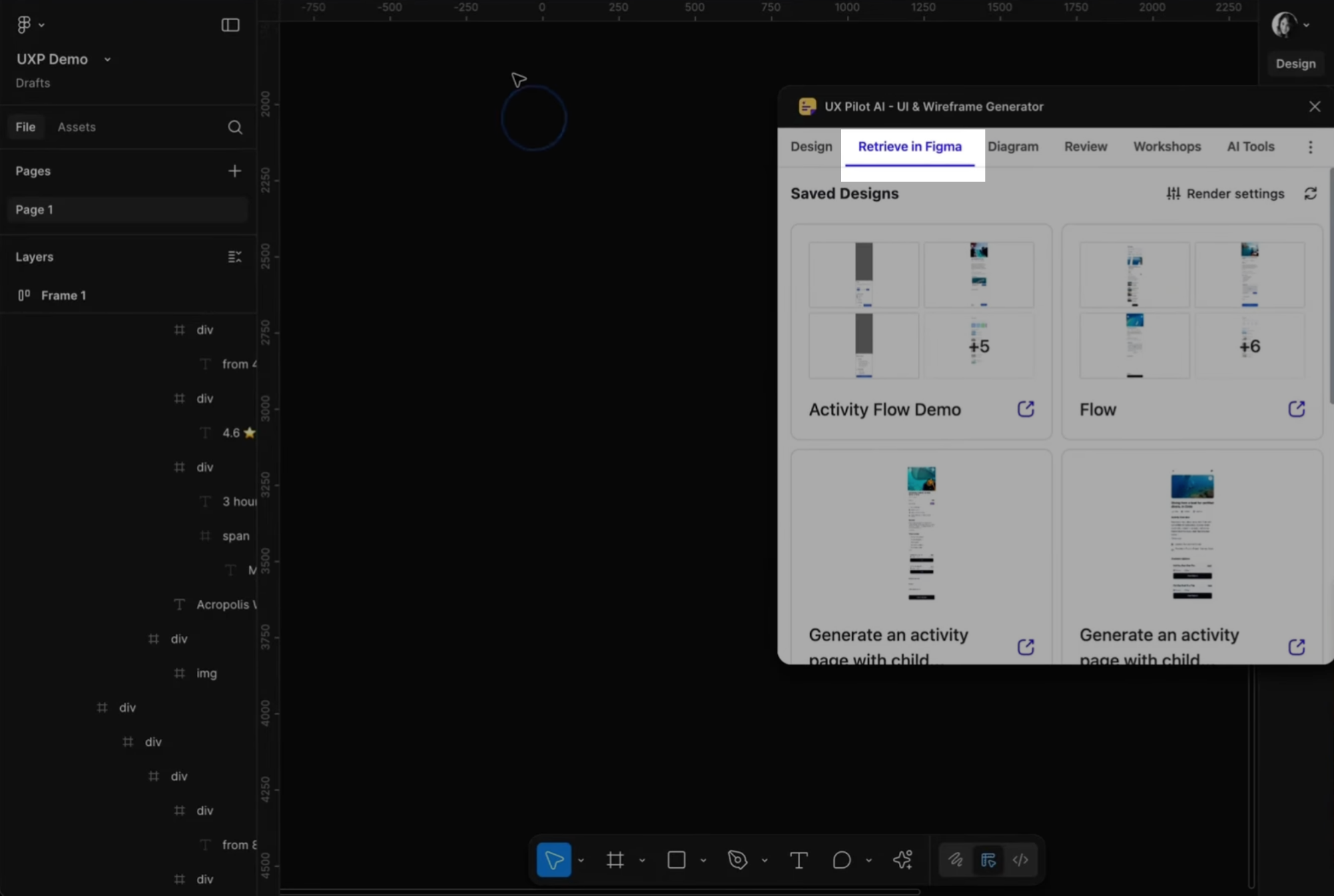
If you're using UX Pilot for your designs, you can load them directly into Figma using the UX Pilot-Figma extension. This makes the transition from high-fidelity design to interactive prototype seamless. Once your designs are in Figma, you can add interactions, link pages together, and turn everything into a clickable prototype in minutes.
Say you're designing an e-commerce site. Create a prototype where users browse products, add items to the cart, and complete checkout. Then watch real users attempt a purchase. Do they find the cart easily? Can they update quantities without confusion? You'll spot issues immediately.
I usually recruit 5-8 participants who match the target audience. Give them realistic tasks like "Find a product under $50 and add it to your cart," and watch what happens.
Tools like Maze, User Testing, or Lookback make remote testing straightforward. You can send participants a link to your prototype and collect data on where they click, how long tasks take, and where they drop off. If you want deeper insights, run moderated sessions where you can ask follow-up questions in real time.
8. Continue to test and iterate
Website launch isn't the finish line. It's the starting point for real learning. It shifts into a continuous cycle of testing, analyzing, and improving based on how actual users behave.
You'll continuously identify opportunities to improve website performance. This means using analytics, A/B testing, and direct user feedback to identify what's working and what needs adjustment.
Take Electronic Arts as an example. When preparing to launch SimCity in 2013, they ran A/B tests on their pre-order page. The original version prominently featured a promotional offer at the top. The variation completely removed the offer. Surprisingly, removing the promotional offer drove 43.4% more revenue from the product launch.
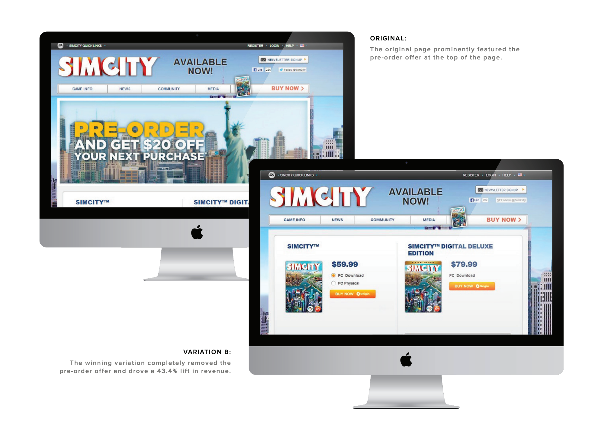
Source: Optimizely
You can apply the same approach to any part of your site. Maybe your homepage hero section isn't driving clicks to key pages. Test a different headline or call-to-action.
But optimization isn't just about conversions. Technical health matters just as much for user experience and search visibility. Tools like Screaming Frog crawl your entire site to catch broken links, missing meta descriptions, duplicate content, or page speed issues.
To make all of this manageable, set up feedback loops that make iteration systematic rather than reactive. Weekly or monthly design reviews work well. Bring your team together to review performance metrics like site speed, user feedback, and test results.
You can start with quantitative data like bounce rates, conversion rates, time on page, and session recordings from tools like Hotjar or Microsoft Clarity. Then layer in qualitative insights from user interviews, support tickets, or on-site surveys.
Key takeaways
The teams that follow a clear web design process consistently deliver faster, with fewer revisions, and better results. Skip steps, and you end up fixing avoidable issues after launch when changes cost 100 times more.
So, here's what matters most:
-
Research first, design second – Identify 3-5 competitors to spend time on researching and running usability tests, so you can find gaps.
-
Create a keyword-mapped sitemap before wireframing – Assign primary keywords to each page in a spreadsheet so your site structure supports organic search from day one.
-
Get stakeholder feedback on high-fidelity designs before development – Show polished designs with real content and visuals to catch issues when they're still cheap to fix in design files.
-
Test clickable prototypes with 5-8 target users on specific tasks – Watch them complete key flows like checkout or sign-up to spot usability issues before any code gets written.
-
Schedule monthly reviews combining analytics data with user feedback – Use bounce rates and heatmaps alongside interviews and surveys to understand what's broken and why.