9 UX Design Practices for Online Ecommerce Stores

Horea Matei
Created on Jan 4, 2026
Website traffic matters, but it won't drive you revenue—proper website design will. According to Google, 88% of online consumers are less likely to return to a website after a bad user experience, while good UI/UX design boosts conversion rates by over 200%.
"UI/UX design" is the keyword here. Website visitors value simple sites with excellent usability over flashy, but slow and confusing-to-navigate layouts.
You'll learn everything you need to know about UX design for online stores: what it is, its three core principles, and how to set your ecommerce site up for success in nine steps.
I'll also show you real examples of successful ecommerce businesses that nailed their UX.
What is UX design for online stores?
UX design for online stores is a set of web design best practices that optimize customer experiences for maximized conversion rates and user satisfaction. These practices imply site speed and mobile optimization, navigation, accessibility, copy, and all other site elements that tie into your customer journey.
Note: UX design doesn't involve aesthetics like buttons or colors—that's UI design's job.
Both UI and UX design are important, but proper UX is absolutely critical to ensure website visitors fulfill their goals quick and easy.
Case in point, Craigslist's UI design is practically non-existent.
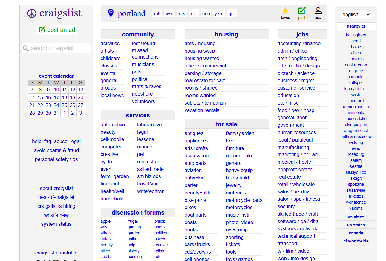
Yet it's one of the most visited websites in the US. That's partially because its UX gets the job done: the lack of flashy visuals means the site loads fast, while navigation links make the website accessible to keyboard users, for example.
That's why UX design is so important. It ensures your website's core browsing experience is optimized from the get-go. UI design then builds on top of it and packs it into an aesthetically pleasing format.
The business case: how UX directly impacts your bottom line
By contrast, poor UX design significantly impacts revenue, no matter the traffic you bring. As per the SellersCommerce report, 70.19% of all 2024 shopping carts were abandoned.
Some of the top reasons include UX-related issues: complicated checkout processes, shipping costs not transparent up-front, and so on. It's a lot of revenue lost for UX issues that are otherwise easy to fix.
Besides reduced cart abandonment, here's how else UX design benefits your ecommerce site:
-
Helps with brand image: Prioritizing customer satisfaction solidifies your brand image, especially to first-time visitors.
-
Improves retention and loyalty: 88% of visitors won't return to a website after a bad user experience. That means 88% will after a good one.
-
Boost overall conversion rates: The easier you make it for visitors to fulfill their goals, the more they'll do it—adding a product to cart, completing checkout, signing up for newsletters, etc.
UX design is good for business because it builds an environment that customers enjoy and want to return to. Even if you sell top-notch products, customers probably won't buy them if they are hard to reach.
3 principles for high-converting online shopping
Good UX design is based on three core principles:
-
Function always comes over aesthetics
-
Customer journeys rarely start with homepages
-
Mobile optimization is absolutely mandatory
These principles are your baseline. Your ecommerce website will experience better conversion rates as long as you design with them in mind. That said, let me talk about them in more detail.
Principle 1: Prioritize function over fashion
As I just showed in the Craigslist example, users will always pick a fast and functional website over eye candy. Of course, Craigslist is on the extreme side, but Amazon's design won't win any awards either.
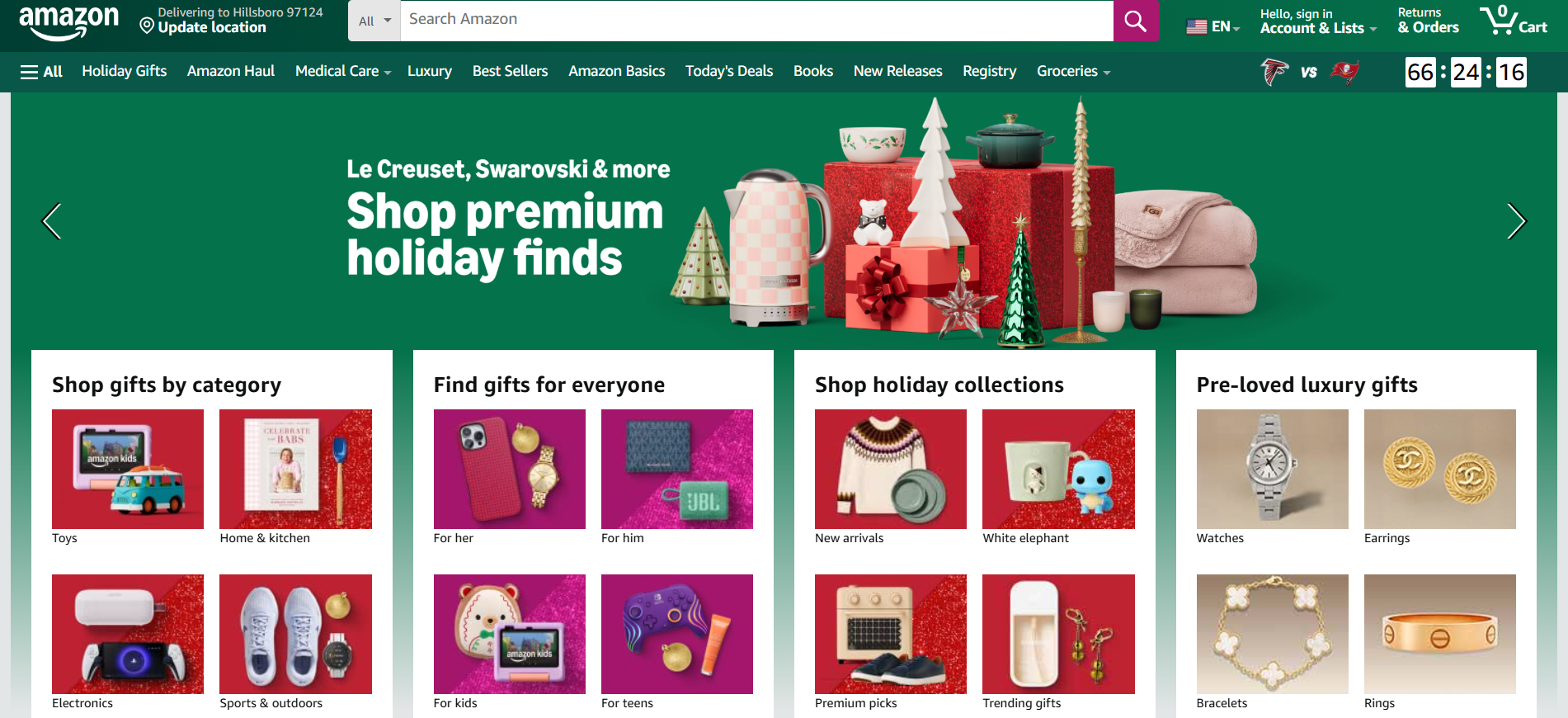
But it loads super fast. Plus, the search bar, grid-based layout, and well-organized navigation menus let users easily browse between millions of products with little to no effort.
Loading speed is most important here. A huge amount of mobile visitors will leave a website if it takes over three seconds to load. Slow loading speeds cause you to lose a good chunk of visitors before they land on your site in the first place.
Avoid design elements like automatic image carousels, video backgrounds, and parallax scrolling effects. These are heavy-hitters loading-wise, while their dynamic nature distracts from the core browsing experience.
Principle 2: Users don't start on your homepage (design accordingly)
Most people land on your website because they look for products you happen to sell—not because they look for your website in particular.
Case in point, Bull & Cleaver's number one traffic driver is one of its product pages. A blog post takes up the second spot, while the homepage occupies a distant third.
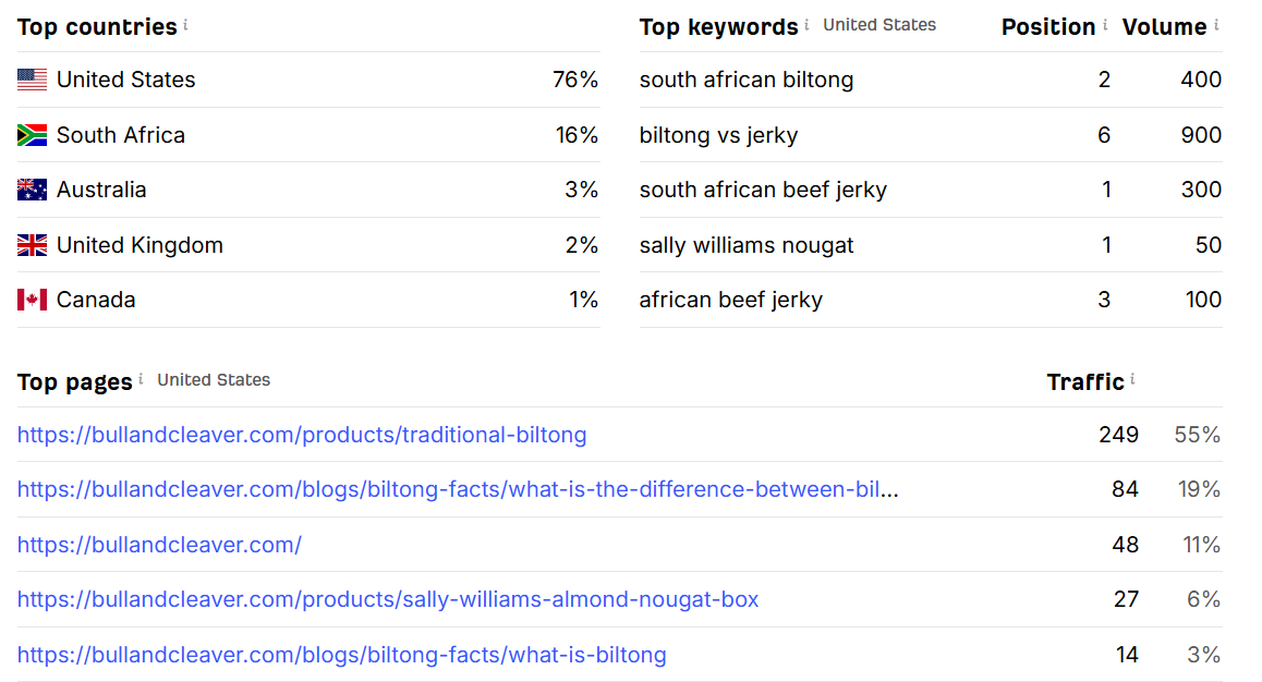
Notice how all the keywords directly relate to the top two traffic drivers.
Most of Bull & Cleaver's traffic comes from ads or search engine results related to what the company offers. It's safe to say that a good chunk of visitors interact with the company for the first time.
Never assume product page visits come from people already familiar with your brand.
Each individual page should be persuasive and detailed enough to give online shoppers the information they need without going to site areas other than the product page they first landed on.
Clearly communicate what your product does and why people should buy it. Bull & Cleaver's top page is spot-on with this:
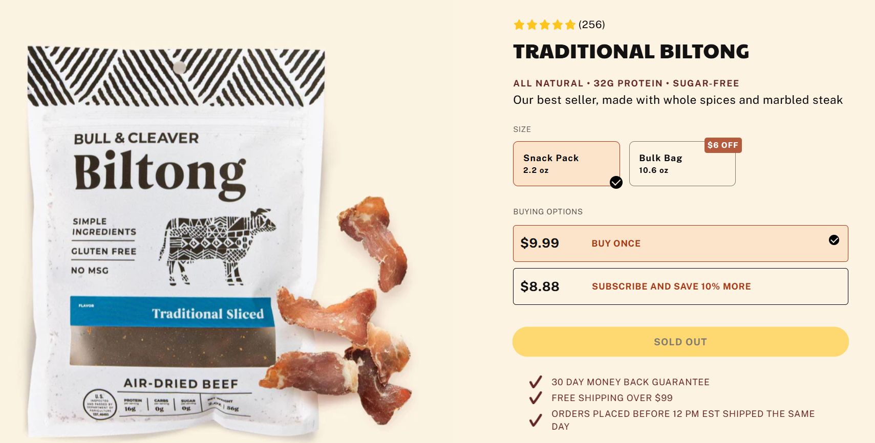
It serves all the info that first-time visitors need. It spotlights the product through high-quality images, includes a compelling product description, and the checklist below further incentivizes customers to buy it.
It's also worth noting that there are other common entry points outside organic and paid search results. More specifically:
-
Returning customers looking up your website directly
-
Social media users clicking on ads
-
Email subscribers clicking on CTAs
Each user type has different needs and expectations. Email is common for upselling campaigns, for example. In that case, product pages should also explain why particular products pair well with customers' previous purchases or top-selling products.
Design your pages with your sales funnels in mind. Each page should cover the needs of customers from various traffic sources and sales funnel pages.
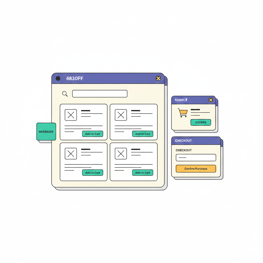
You can use UX Pilot to quickly ideate various product page designs using a simple prompt like this,
"Create 4 different product page designs optimized for conversion, for an online design store that sells hard drives. Ensure that these pages include the best CRO practices."
Here's what that looks like.
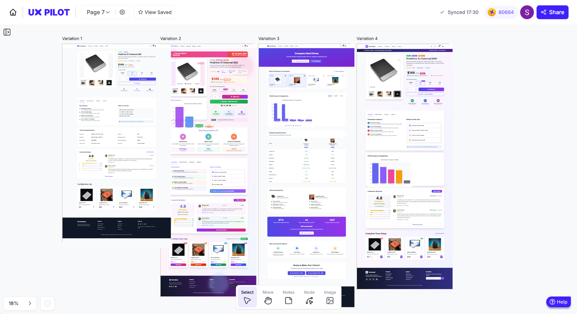
This was a quick generation for the purpose of this article, so it doesn't include any details or the latest ecommerce design trends, but you can customize designs as much as possible.
If you'd like to see the layouts in detail, I included the first design at the end of this article.
Principle 3: Mobile-first isn't optional in 2026
Mobile-first design is absolutely mandatory. You'll lose a lot of visitors otherwise. It's also critical for search engine optimization.
According to Mastercard Dynamic Yield, mobile devices generated 79% of all ecommerce site traffic in November 2025. Plus, Google uses mobile-first indexing. Search crawlers use your site's mobile version when indexing and ranking it across search results pages.
Responsive design is the best approach here: a design method that automatically adjusts a website's layout across viewports through fluid grids, custom breakpoints, and CSS media queries.
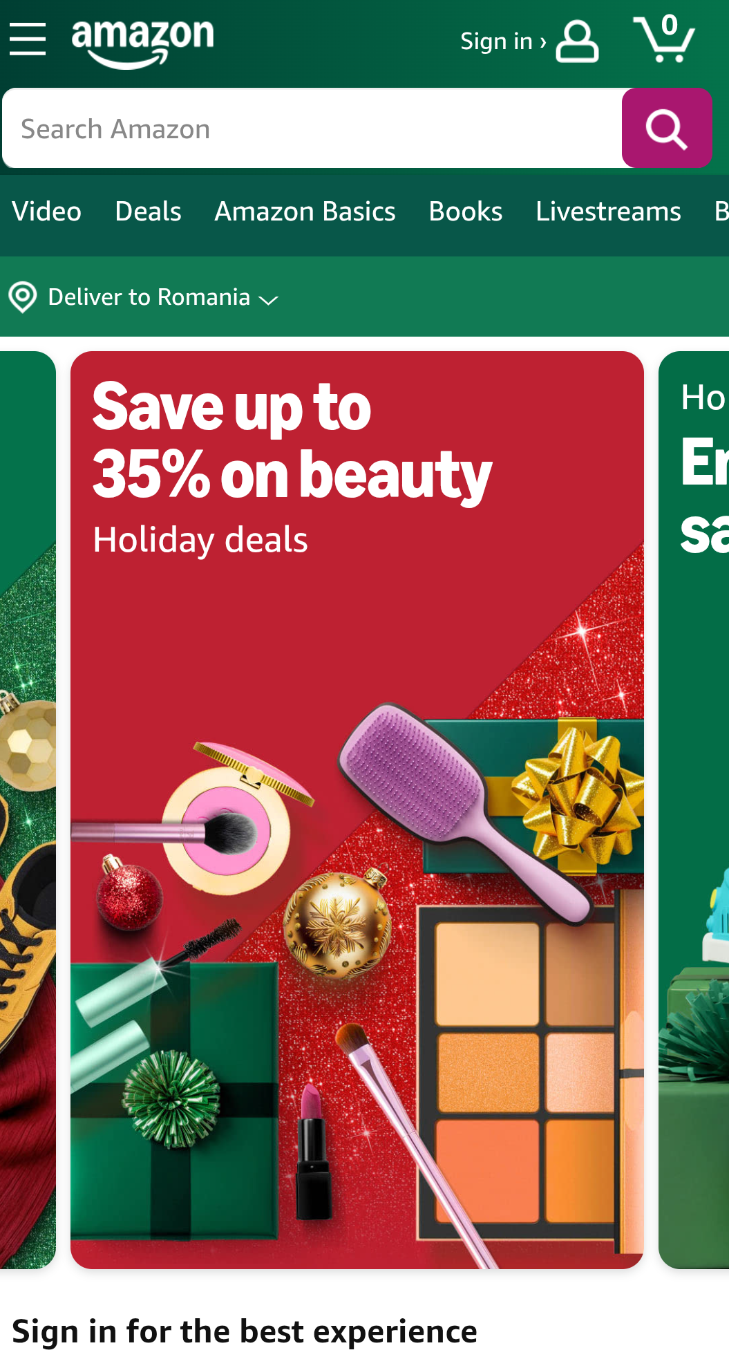
To illustrate how it works, I'll show you snapshots of Amazon's mobile layout and how the desktop version looks for mobile users.
Here's the mobile version:
And here's the desktop layout as seen on mobiles:
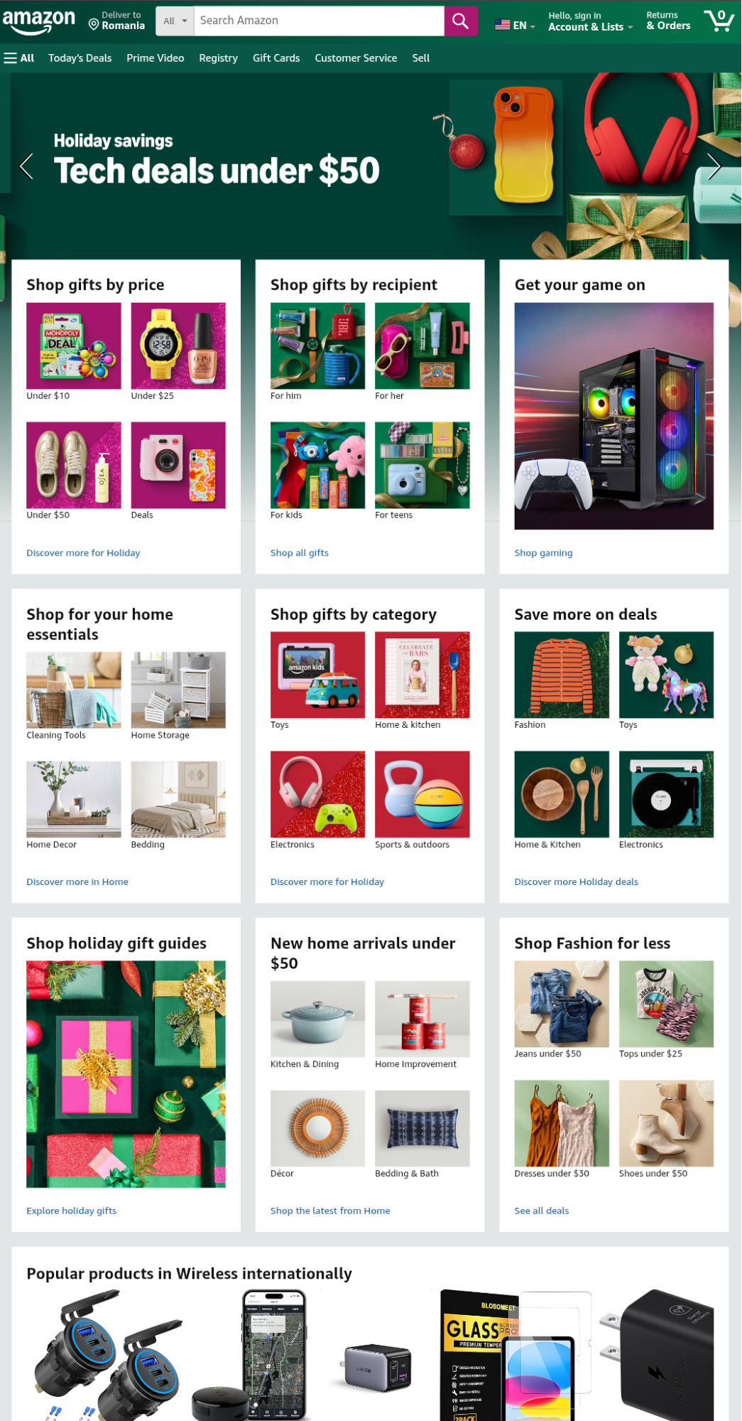
The desktop version is practically unusable on mobile devices. Interactive elements are too small and close together. This makes screen tap navigation extremely difficult.
Here's how responsive design fixed that:
-
Design elements within four-row, four-column grids display individually under a one-row, one-column layout for easy screen taps
-
The navigation menu hides behind a hamburger icon to declutter the screen
-
Content displays vertically to adjust to mobile screens
Checkout processes are particularly important here. Filling out form fields on mobile devices is often tedious, and users will drop off if a website lacks accelerated checkout options.
Make sure to implement quick checkouts with popular payment providers: Shop, Apple, Google, Meta Pay, PayPal, Stripe, and so on.
Either way, mobile optimization is important to avoid lost sales. Unoptimized websites won't get traffic due to Google's mobile-first indexing, and the traffic they do get will likely leave due to poor mobile ecommerce ux.
9 UX steps to design an online shopping store
Having covered the basics, I'll show you how to optimize ecommerce user experience in 9 steps. These steps cover all user journey stages—from first-time page visits to checkouts and ongoing A/B testing.
Step 1: Build navigation that actually makes sense
38% of first-time visitors check a website's layout or navigation links right after landing on one of its webpages. Solid navigation menus establish good first impressions and encourage potential customers to explore your site.
"People won’t use your Web site if they can’t find their way around it." - Steve Krug, UX design professional and author of "Don't Make Me Think"
To put it differently, your navigation menu must feel logical and familiar. Columbia Sportswear does a great job at it.
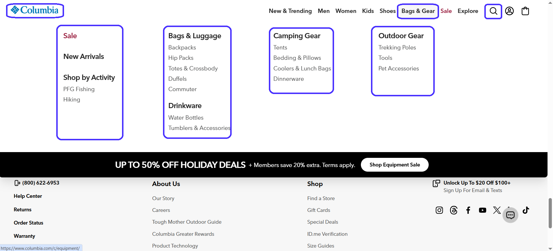
It uses the mega-menu—a navigation design approach particularly common in ecommerce sites.
Mega-menus comprise two separate navigation layers:
-
The main navigation menu: Always visible and links to key website areas.
-
Secondary drop-downs: Drop-downs for each main menu item with links to related sub-pages.
Mega-menus are useful because they give users a good variety of navigation options without overwhelming them with too many initial links.
Here's what else Columbia does right:
-
Sticky main navigation gives users easy access to main items at all times.
-
Secondary menus neatly categorize links by product type for easy navigation.
-
Main menu includes a search functionality to let users type in specific products.
-
Universal footer across all site pages for easy access to extra information.
-
Top-left company logo doubles as a back button.
You've probably seen this menu layout before—that's the point. Your navigation should feel familiar to visitors. Don't get creative here; stick to what's proven to work. New layouts will probably confuse visitors and make them leave.
All these factors combined create a natural browsing experience that lets visitors easily move between pages, encourages them to spend more time on-site, and increases the likelihood of purchasing products.
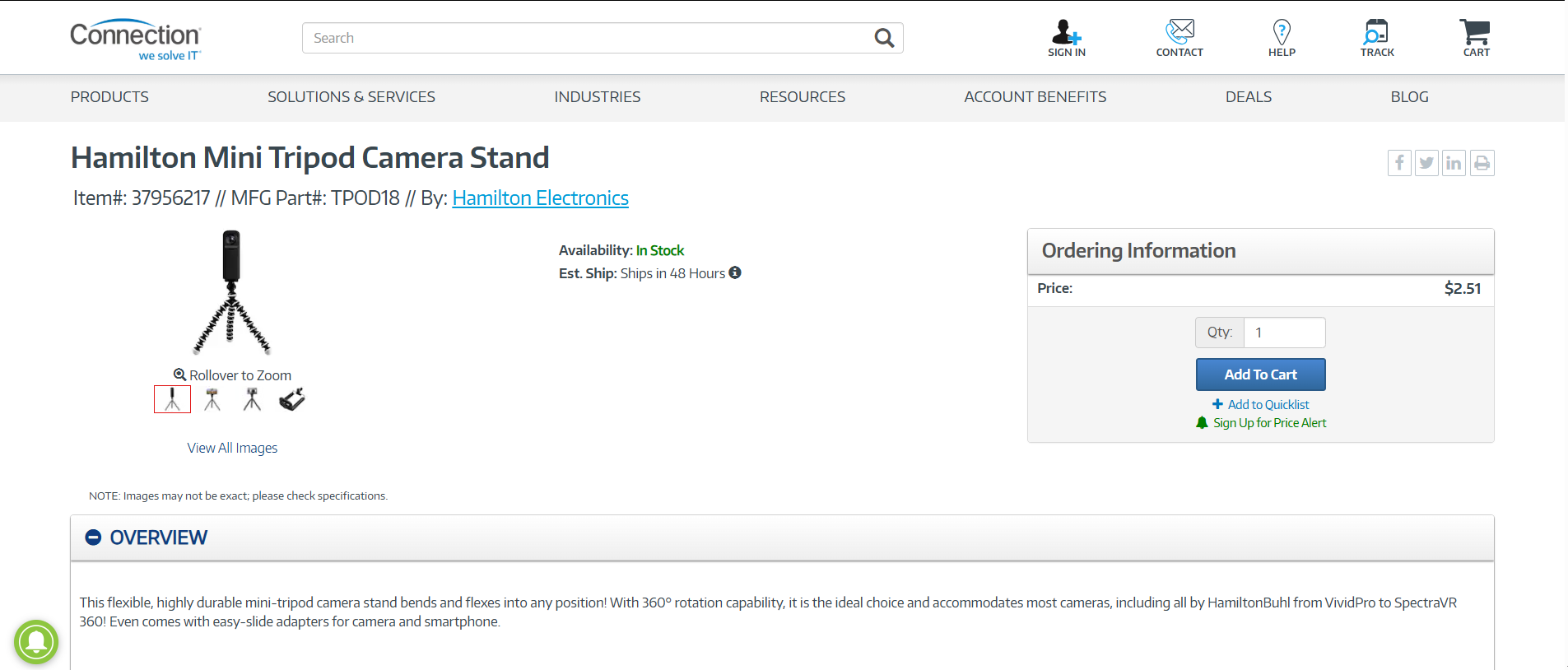
Step 2: Design product pages that convert first-time visitors
Most product page views come from first-time visitors. As such, pages must convey all the details necessary to help first-time buyers make confident, well-informed purchase decisions.
Chubbies is a solid example:
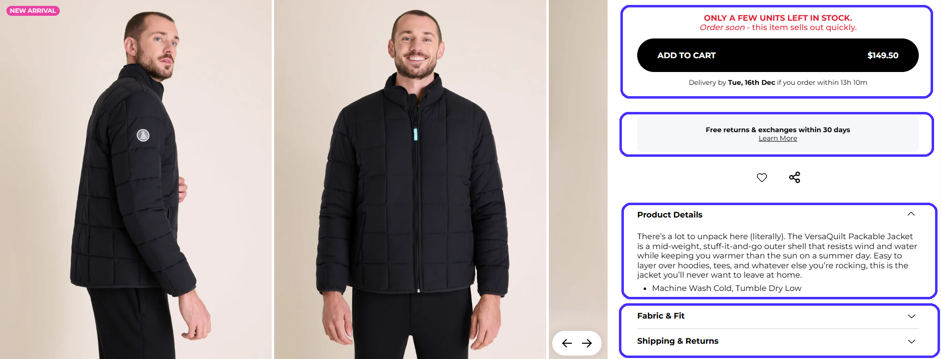
Here's why it works:
-
Has a "related products" section to maximize purchase likelihood for visitors who may not be sold on the initial product and also encourages upsells.
-
High-quality photos with zoom functionality to try and match physical shopping experiences.
-
Detailed product descriptions: material key benefits, fit type, and washing instructions.
-
Instills a sense of urgency through the red copy above the CTA.
-
"Add to cart" CTA uses contrasting colors for clear visibility.
-
Displays delivery times and return policies for reassurance.
In short, Chubbies leaves no room for guesswork. The page clearly shows info first-time visitors may not know about: what the product is, why they should buy it, and how to maintain it.
It also includes customer reviews, shipping times, and return policies to minimize potential uncertainties that may influence a customer's final decision.
Step 3: Implement search that serves real user behavior
Visitors use the search bar to look for specific products. That means these visitors know exactly what they want and are very likely to become paying customers if they actually find the products they look for.
Your search bar should account for synonyms, spelling errors, and offer auto-complete suggestions to make your products easy to find. For example, I intentionally mistyped one of Timberland's products to see if it still offers relevant search results.
It does.
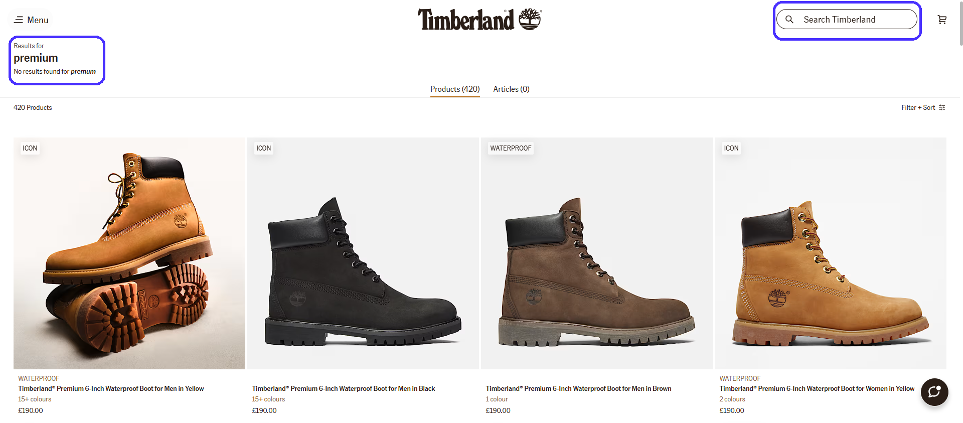
A dead-end search would've taken all the momentum away and likely caused visitors to leave. Notice the search icon placement on the top-right corner section of the header—just like Columbia. Most ecommerce sites place it in the same spot because users expect it to be there.
A proper search functionality also gives you more accurate data. You can look into users' search queries to identify highly sought-after products and adjust inventory or product development accordingly.
Step 4: Use filters and categories to cut decision paralysis
If visitors don't know exactly what to look for, add filters to help narrow down their search. This also eliminates decision paralysis, where users feel overwhelmed by too many options, especially common in large product catalogues.
Here's how to implement filters properly:
-
Include essential filtering options like product color, user ratings, price sorting, brand, and type.
-
Enable simultaneous filter selection for extra precise search results.
-
Add individual filter deletion to enable users to refine their search.
-
Show product filter counts so users know exactly what to expect.
-
Display active filters to let users know what they are looking for.
Once again, Timberland does this perfectly.
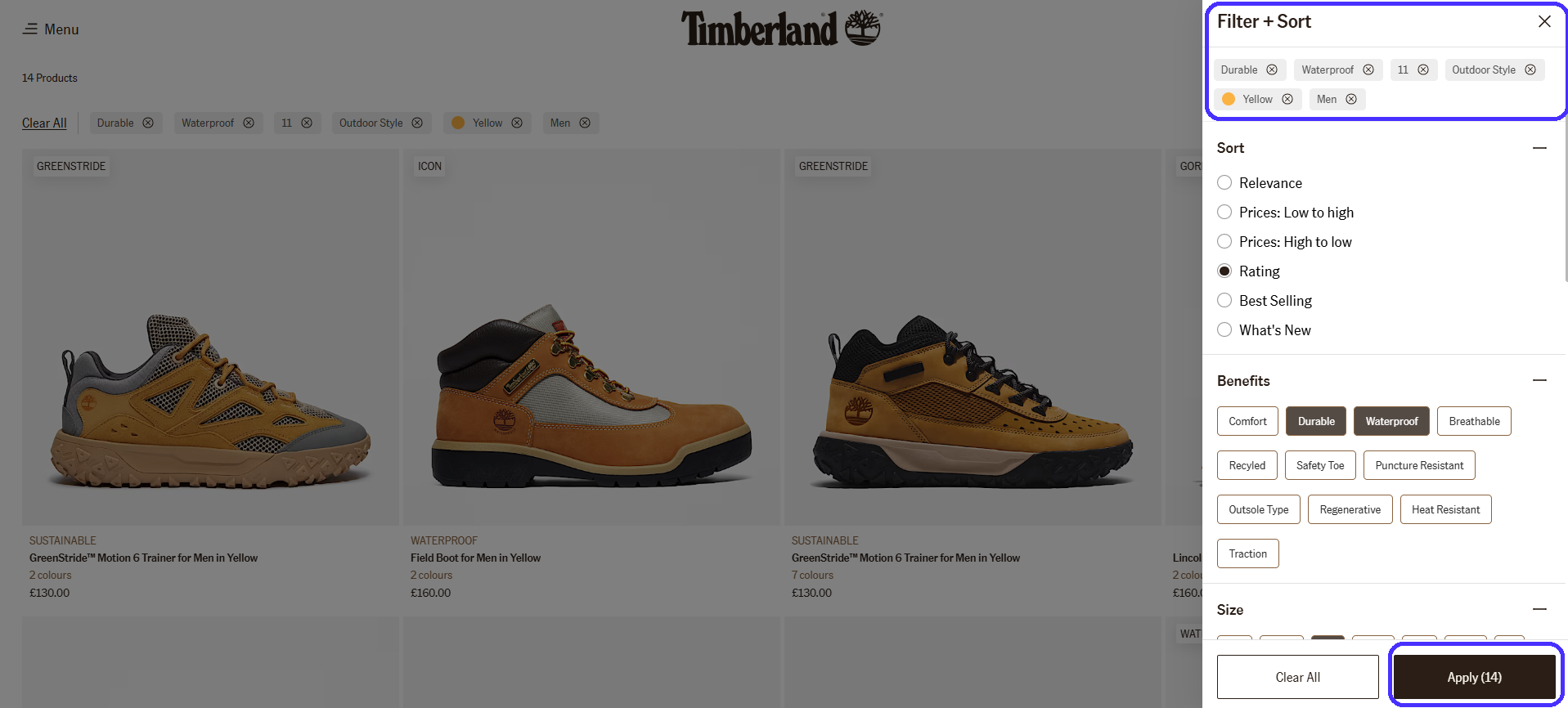
The site's filter set let me narrow a 700+ product catalogue down to 14 options. That said, proper filters allow customers to find what they need with little to no effort. In return, you'll get lower bouncer rates and better conversions.
Step 5: Write copy that guides action (not confuses)
Good UX copywriting is concise and dead-easy to understand. Your UX copy must clearly explain what each button does and what each product is for to drive users from one stage of the customer journey to the next as smoothly as possible.
GymBeam's UX copy is a great example. Take a look at the navigation menu, for example:

Besides the visual cue itself, the "Search entire store here" copy explains what the search bar is for—GymBeam wants to cut down visitor thinking time as much as possible for easy navigation.
GymBeam is also clever about its product categories.
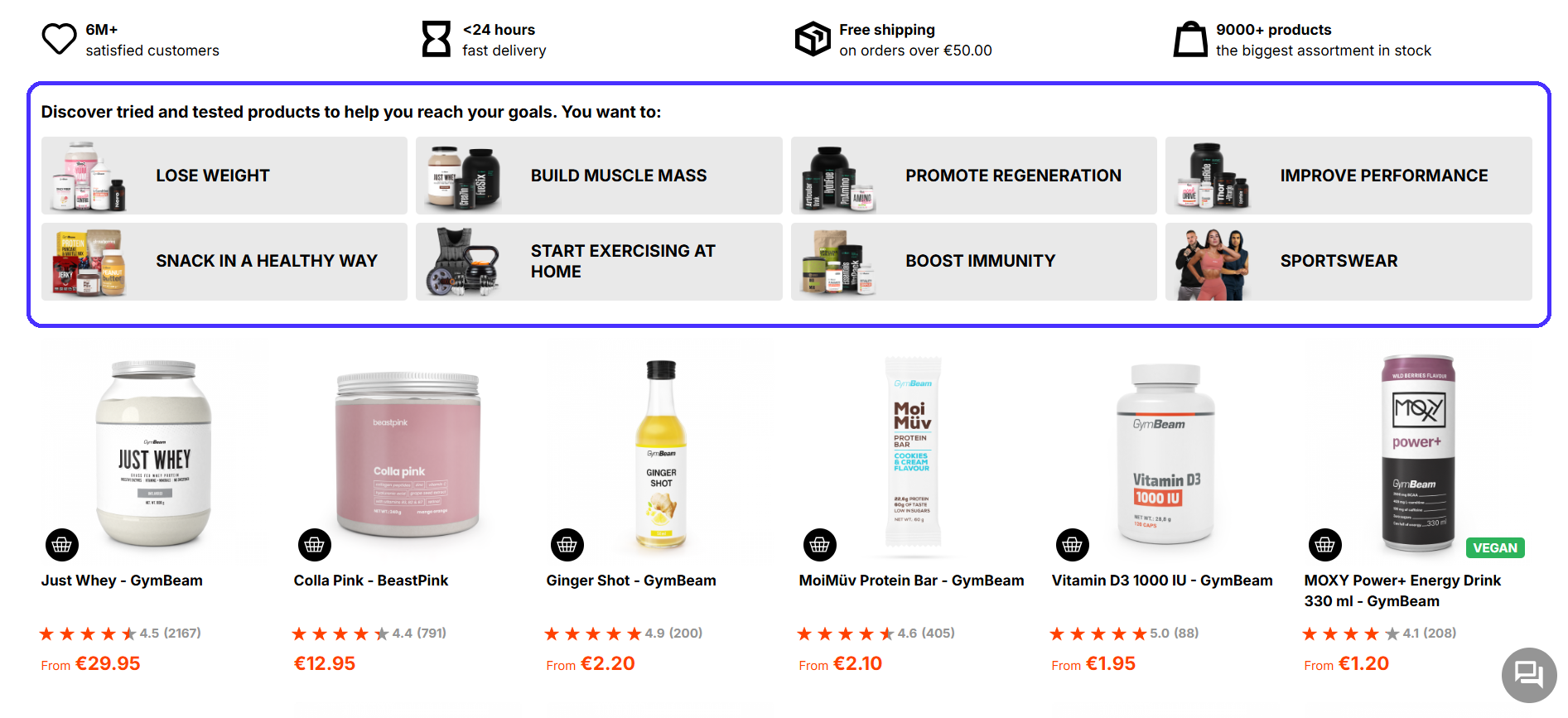
It categorizes products based on how they help—not what they are. Novice gym goers who may not be familiar with supplement-related terminology can easily find the products they need.
The same idea applies to product page labels and buttons.
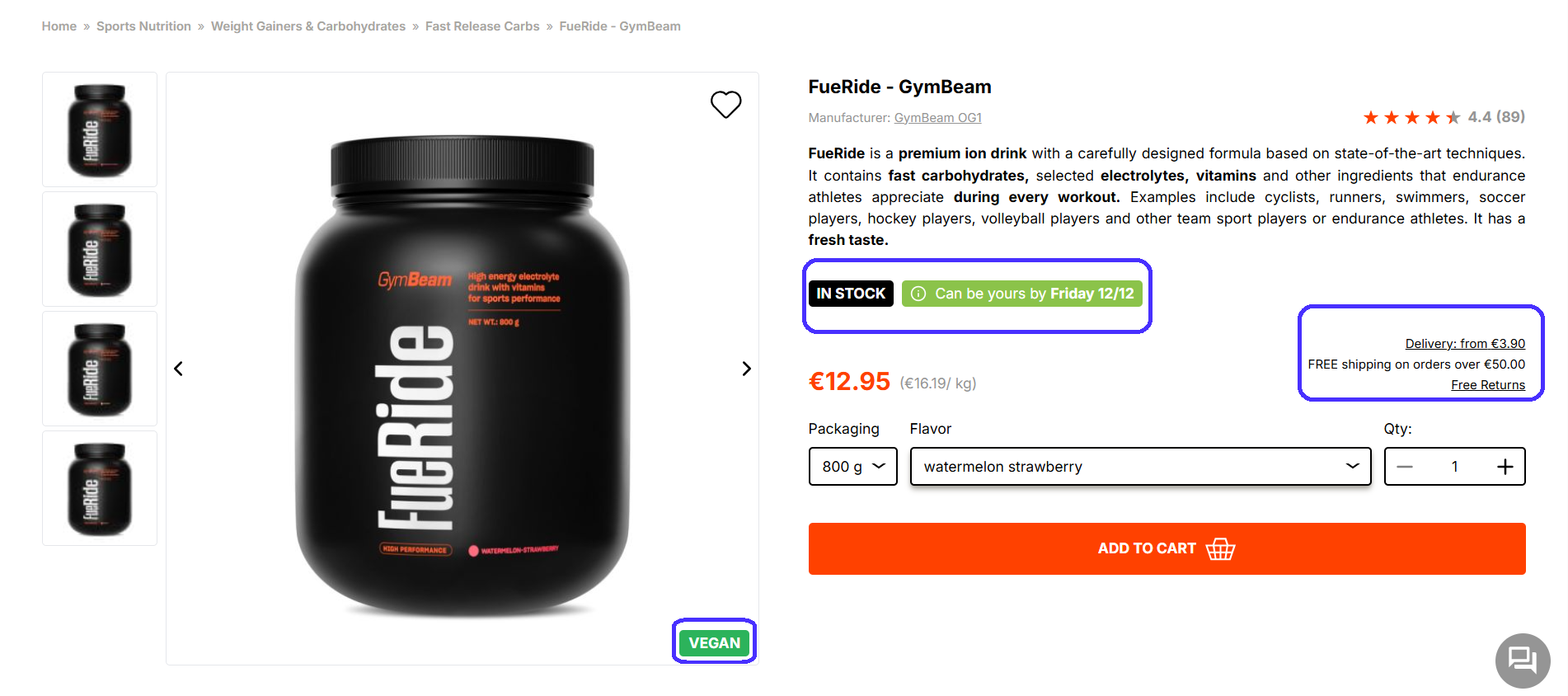
It clearly lets visitors know about shipping costs, whether the item is in stock, and when it can reach their doorstep.
Here are a few other best practices to keep in mind:
-
Stick to standard phrases: Copy like "Add To Cart" and "Buy Now" is super common, and users expect it. Stick to these formulas to avoid throwing visitors off and potentially causing confusion.
-
Be consistent across channels: Copy across ads, emails, and web pages should follow similar styles to ensure seamless transitions between sales funnel stages.
-
Write descriptive anchor texts: Make sure hyperlinked texts clearly describe where links lead so users know what to expect.
Overall, UX copy shouldn't be flashy or salesy. It must be self-explanatory and guide users through customer journey stages with little to no cognitive effort.
Step 6: Add social proof without overwhelming the page
Add social proof to reassure visitors. Testimonials, reviews, ratings, and trust badges eliminate purchase anxiety, offer validation from previous customers, and build credibility.
User-generated content, like product photos from existing customers, reinforces that effect. But do it moderately. Too many trust signals distract from the browsing experience and make you come across as pushy, which instills doubt among visitors.
You can take a look at examples of UX design for inspiration from other online sites.
Here are some brief guidelines for appropriate social proof:
-
Add star ratings near product titles to let visitors quickly gauge a product's quality.
-
Show reviews near the end of product pages to let visitors seek extra reassurance without interrupting the core browsing experience.
-
Display average rating and review numbers to signal your products have been bought before.
-
Add "verified purchase" labels on reviews to let visitors know each review comes from real customers.
-
Include trust badges on checkout, like payment system icons and security certifications, to eliminate any potential doubts during final sales process stages.
Here's how Macy's handles it:
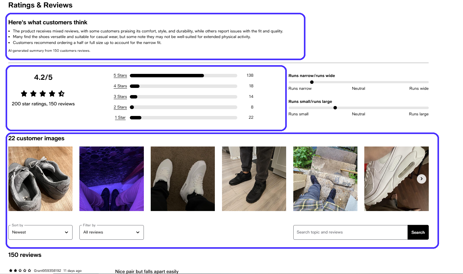
The AI-generated review summary is a particularly nice touch. It lets potential customers quickly gauge the product's main advantages and disadvantages.
Here's what else the site does right:
-
It's transparent about positive and negative reviews: showcasing only positive reviews instills doubt.
-
It allows visitors to filter reviews by date and ratings to check different opinions.
-
It includes a search bar to enable visitors to find particular reviews by keywords.
-
It enables reviewers to add their own product photos.
Also, be sure to respond to product reviews, especially negative ones. This lets customers know you listen and care about their experiences. Ignoring them is bad for brand image.
Step 7: Optimize checkout to stop cart abandonment
Once again, 70.19% of all shopping carts were abandoned in 2024. Here are some of the top reasons why:
-
Extra charges like shipping and tax: 48%.
-
Mandatory account setups: 26%.
-
Credit card information concerns: 25%.
-
Long checkout processes: 22%.
-
Lacking payment methods: 13%.
Checkout processes are one of the most cumbersome, tedious customer journey steps. But, like I said, most of these issues are easy to fix.
Display shipping costs as soon as possible to set clear expectations. Tacking on extra charges during the final checkout steps guarantees cart abandonment.
For example, Patagonia displays them in the Shopping Cart section, before users proceed to the actual checkout.
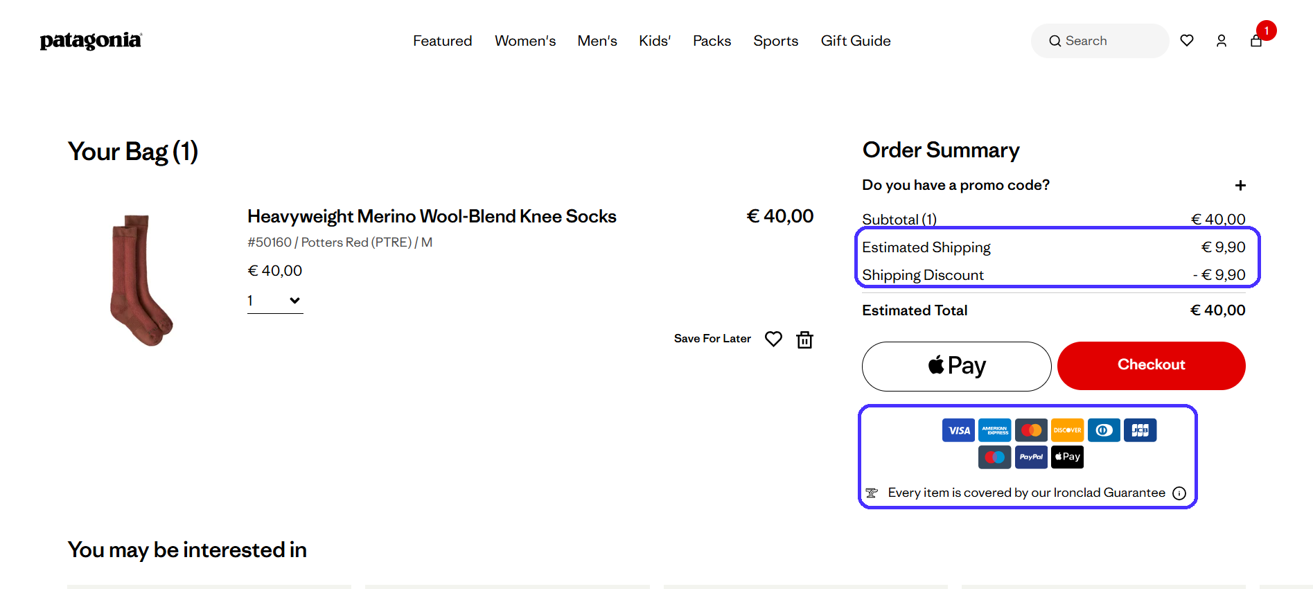
The online store eliminates any unpleasant surprises—users are more likely to complete the checkout if they already know about shipping costs.
Here are some other best practices for streamlined checkout processes:
-
Always allow guest checkout: Mandatory account setup significantly slows down checkout times, users will likely abandon their carts.
-
Use minimalist checkout pages: Sales are your ultimate goal here, so keep your design focused. Avoid pop-ups, excessive visuals, and navigation links that distract from the checkout process.
-
Minimize form fields: Forms take a while to complete, so keep things as tight as possible. Instead of two separate "First Name" and "Last Name" form fields, create a single "Full Name" form field.
-
Add progress indicators: Let users know about how far they're into the checkout process. It reassures them and encourages customers to complete it.
-
Offer multiple payment options: Customers won't buy your products if they can't pay for them. Include as many payment options as you can (all major credit card companies, PayPal, Google and Apple Pay, etc.)
-
Add security badges: Product guarantees, compliance badges, and so on show users they are safe from any potential hiccups.
Patagonia is particularly clever about its checkout experience.
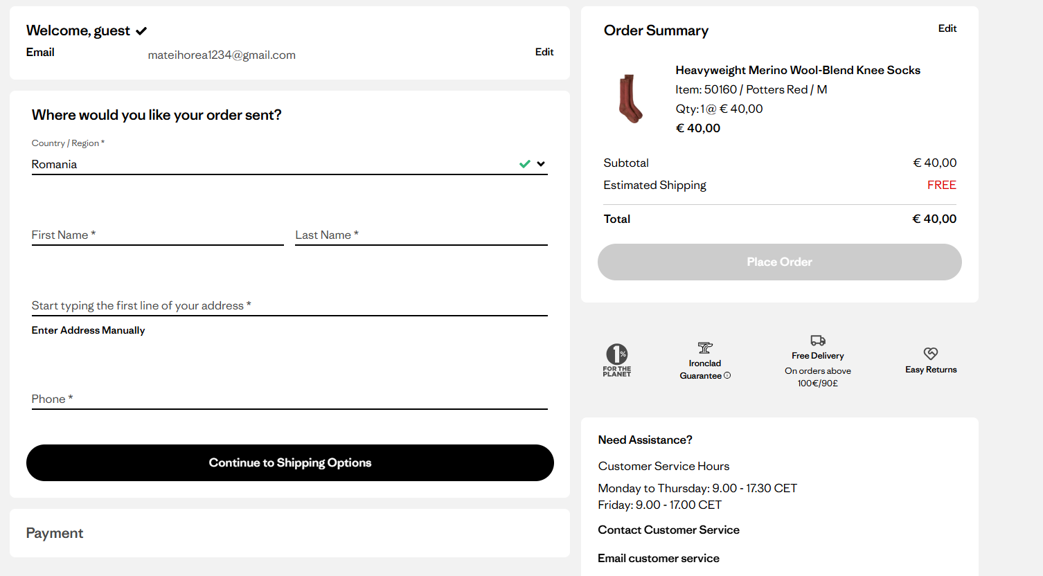
It's a gated three-step checkout process. The page gradually reveals new form fields as users progress to each step, which encourages customers to complete the entire process.
By contrast, displaying all form fields at once would probably overwhelm customers and cause them to abandon carts.
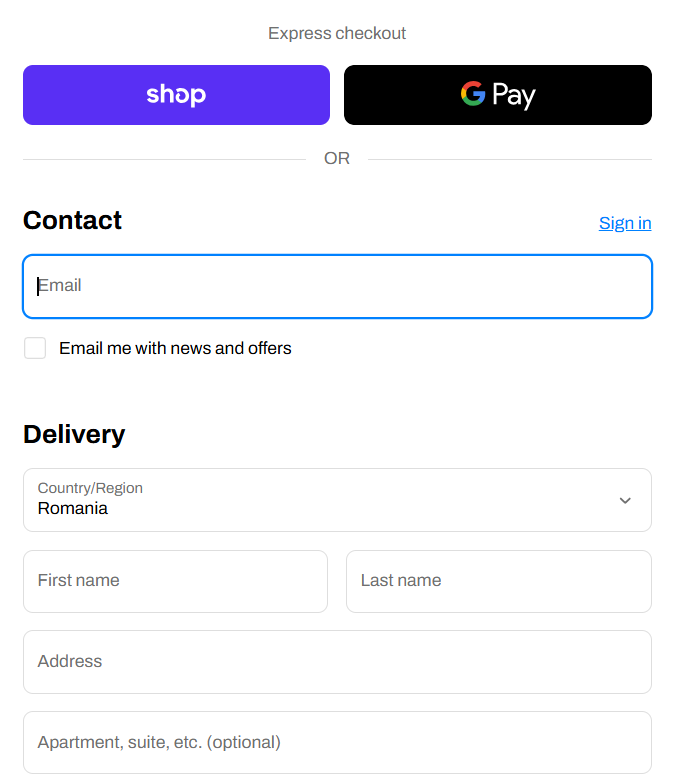
Step 8: Integrate accelerated payment options for mobile users
Checkouts are particularly tricky for mobile users. Small screens plus a lot of info to manually fill probably equals more lost sales.
Accelerated payment options like Google, Apple, Shop, Meta Pay, and PayPal fix these issues through automatic form and payment data completion via stored profiles, and one-tap checkouts. They're also useful for customers who don't happen to have on-hand access to their credit card info.
Plus, accelerated payments are solid trust elements. Online shoppers already know and trust these systems, so they're much more likely to pick accelerated payment options over manual credit card data entry.
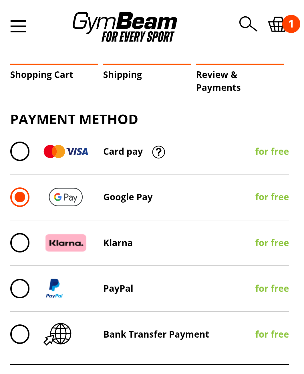
Selecting Google Play or PayPal here skips manual payment data entry (card number, name, expiration date, CC code). I'll just redirect to the payment system's page, where I would need to confirm the transaction with one tap—it saves a lot of time.
Step 9: Run A/B tests that actually prove what works
A/B tests deploy multiple variations of the same web page to measure how small design tweaks impact overall results.
These design tweaks usually involve:
-
CTA button color, placement, and size
-
Product descriptions formats
-
Image sizing and placement
-
Overall page layouts
-
Navigation menus
-
Checkout flows
-
UX copy
A/B tests are important because they employ a data-driven approach to your ecommerce site's design. Each design tweak is optimized for maximum effect.
To illustrate, here's a snapshot from one of Conversion.com's case studies:
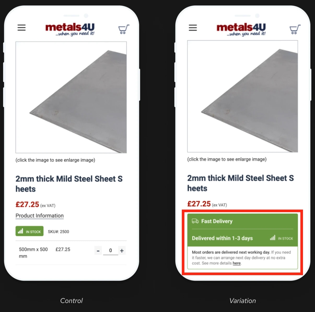
The original product page doesn't highlight shipping times, while the testing variant does. This small change boosted conversion rates by 6.9%.
In other words, don't skimp on this step: A/B tests give you valuable insights into customer preferences and will improve online sales across the board. Try to identify one element on your product page you could A/B test this week.
In the meantime, there are a few A/B testing best practices to follow:
-
Test one variable at a time for the most accurate results. Testing multiple tweaks at once dilutes your metrics—you won't know which modification did exactly what.
-
Run tests long-term to confirm design tweaks are effective. The A/B test in the case study above lasted 12 months, for example.
-
Use proper sample sizes to further solidify your conclusions. The more people test page variations, the more accurate the results.
-
Segment results by device. Shopping behavior differs across desktop and mobile devices. A/B tests must bring positive results across both to ensure truly seamless shopping experiences.
To summarize, never design your ecommerce website based on personal preferences or assumptions.
Your site serves your target audience, so you have to know exactly how to set up your site's UX to satisfy their needs. A/B testing gives you the data necessary to do just that.
Common UX mistakes in online shopping
Aside from best practices, there are also a few ecommerce UX mistakes that can often negate all the tips mentioned above.
Let me walk you through some of the most common ones.
Performance-destroying design elements
Once again, function always beats aesthetics. Try to avoid design elements like:
-
Automatic image sliders: They distract from the browsing experience, slow down loading times, and most users will struggle to read through copy as slides change.
-
Video backgrounds: They tank page speed and lose visitor focus. Automatic audios are also particularly annoying here.
-
Parallax scrolling: Overdoing it creates a frustrating user experience. It complicates an otherwise simple task too much—scrolling down.
-
Gost buttons: Not enough contrast between backgrounds and CTA buttons will make visitors think CTAs are just regular web copy, so they'll overlook it.
For example, Mad Catz's homepage includes an image carousel that took me a long time to load, despite having a solid internet connection.

And visuals don't even display properly on mobiles. It's safe to say this error doesn't create good first impressions: first-time visitors may leave the website as soon as they land on it.
Always think about performance before any design decision, and whether it contributes to your final goal: generating sales. The simpler your site is, the faster it is, and the fewer chances of having things go wrong with it.
Journey-breaking strategic errors
Websites that don't account for their target audience's customer journey generate a lot of friction and lose on potential customers. Again, never assume that if people check one of your product pages, they must've visited other site areas too.
For example, PC Connection's product pages completely lack information about shipping costs.
Users probably won't want to browse other pages to find these details, so they're most likely to abandon the website altogether.
Page copy should always answer each question potential customers may have regarding your online business.
While we talk about customer experiences, also try to avoid:
-
Forcing user journeys with automatic redirects: If pages receive low traffic, don't redirect users to your homepage—it breaks momentum. Try to improve the said pages instead.
-
Foregoing the mobile-first principle: Prioritize mobile site versions first. Good mobile layouts look solid on desktop computers, too. Scaling down desktop designs to mobile screens is usually much harder, just like in the Mad Catz case.
These elements contribute to bumpy user flows, which lead to traffic loss. Make sure your design matches user behavior: bank on usability and try to make end-to-end shopping processes as seamless as possible.
Mobile UX pitfalls (still happening in 2026)
According to Baymard Institute, 81% of all major ecommerce sites have mediocre mobile UX performance or worse. Case in point, Newegg's checkout process is far from ideal.
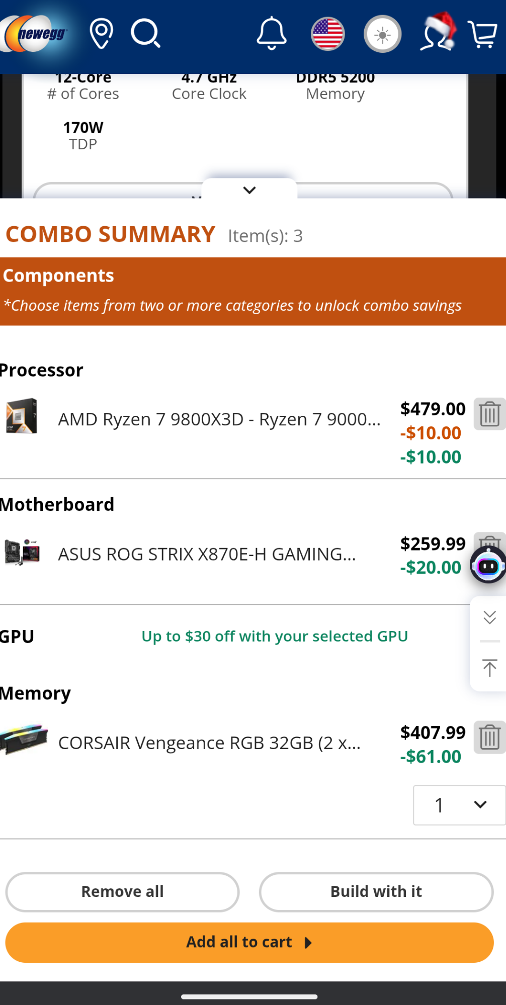
The page feels cluttered, while the CTA buttons are too small and close to each other, which causes misstaps.
Browser dev tools are often not enough to test and measure your site's mobile UX. Make sure you actually test and navigate through mobile layouts yourself.
Here are some areas you should particularly focus on and why:
-
Button size and placement: All buttons should allow for error-free finger taps. Misstaps are frustrating.
-
Text size: Copy should be readable without requiring users to zoom in. They may miss out on important details otherwise, like shipping costs.
-
Pop-ups: Your pop-ups should be easy to turn off and include highly visible close buttons. If not, users may close them by exiting the website completely.
-
Unoptimized forms: Use appropriate input types like "tel" whenever you ask users for their phone numbers. This will open up their dial pads for easier data entry, not the regular keyboard.
-
Scrolling: Avoid horizontal scrolling as it's unintuitive, and users may not realize they can scroll horizontally in the first place.
-
Visuals: Always optimize visuals before you upload them to your website. These are one of the heaviest hitters performance-wise.
-
Navigation: Include the standard hamburger icon for easy button recognition. Navigation links should be appropriately-sized and evenly spaced out, particularly in mega-menus.
Note: Only include the hamburger icon on mobiles and stick to standard navigation menus on desktops. Hamburger icons on desktops are small and easy to miss.
Build a UX-first ecommerce shopping strategy
Of course, there's a lot of info to take in. But implementing all these practices properly is far from impossible. AI-powered UI/UX design tools make it quite easy, actually.
For example, UX Pilot lets you generate wireframes and high-fidelity prototypes across both mobile and desktops—all through a chat-based interface. Plus, the platform's AI actively learns from the latest design trends and best practices.
That means you'll probably nail down your ecommerce store's layout within the first few tries. Try it and see for yourself. Sign-up to UX Pilot for free here!