11 Ecommerce Design Trends for Modern UX

Khanh Linh Le
Created on Dec 22, 2025
The digital shopping industry has reached an inflection point.
As big-name retailers continue to set new standards for personalized shopping, generic and template-driven stores will soon struggle to keep up.
Take IKEA, for example.
Its augmented reality app helped reduce product returns by 30% by enabling customers to visualize furniture in their actual spaces before making a purchase. This is a clever tech feature and precisely the kind of strategic design thinking that separates thriving ecommerce businesses from struggling ones.
You'll be asking how to do the same. So, in this article, I'll be talking about 11 ecommerce web design trends that matter in 2026.
1. AI-powered personalization and recommendations
AI personalized recommendations are one of the latest ecommerce design trends. It uses machine learning to tailor what you see, like product suggestions, content blocks, and search results.
All of such recommendations are based on user behavior, purchase history, and user preferences. And it works in real time. Every click, view, and purchase tells the system a little more about what you’re likely to want next.
The business impact is hard to ignore. For example, Amazon reportedly generates 35% of its sales from its AI-driven recommendation engine. Meanwhile, Netflix saves over $1 billion annually through personalization that reduces churn.
Under the hood, most systems rely on two approaches:
-
Collaborative filtering, which looks for users who behave like you and surfaces the products they interacted with.
-
Content-based filtering, which analyzes product attributes to match you with items similar to what you’ve shown interest in.
In practice, you experience this through personalized landing pages, “customers also bought” sections, dynamic email recommendations, and search results that adapt the moment you start browsing.
Let me give you a more specific example.
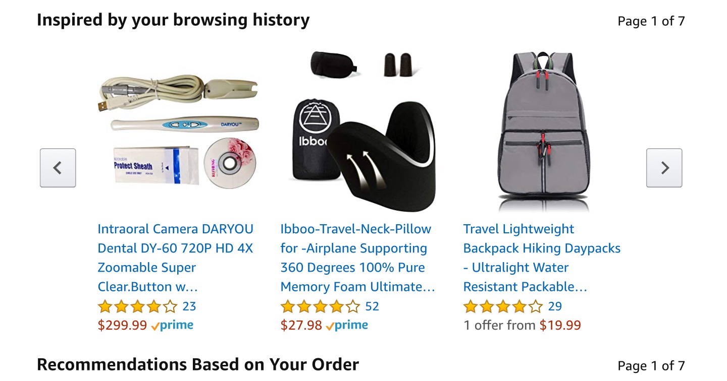
Amazon uses item-to-item collaborative filtering to identify patterns in your browsing and purchase history.
Features like “Inspired by Your Browsing History” and “Frequently Bought Together” are generated from that model. They’re powerful enough to influence roughly a third of Amazon’s sales.
2. AR for immersive product experiences
If you’ve ever hesitated before buying something online because you weren’t sure how it would look, fit, or feel, AR solves that gap instantly.
Augmented reality lets you overlay digital products onto your environment, giving you a clearer sense of size, color, and fit. All of this without you stepping into a store.
Sephora’s Virtual Artist is one of the strongest examples of this user engagement tactic. When users interact with the camera and point it at their face, the app maps their face features in real time.
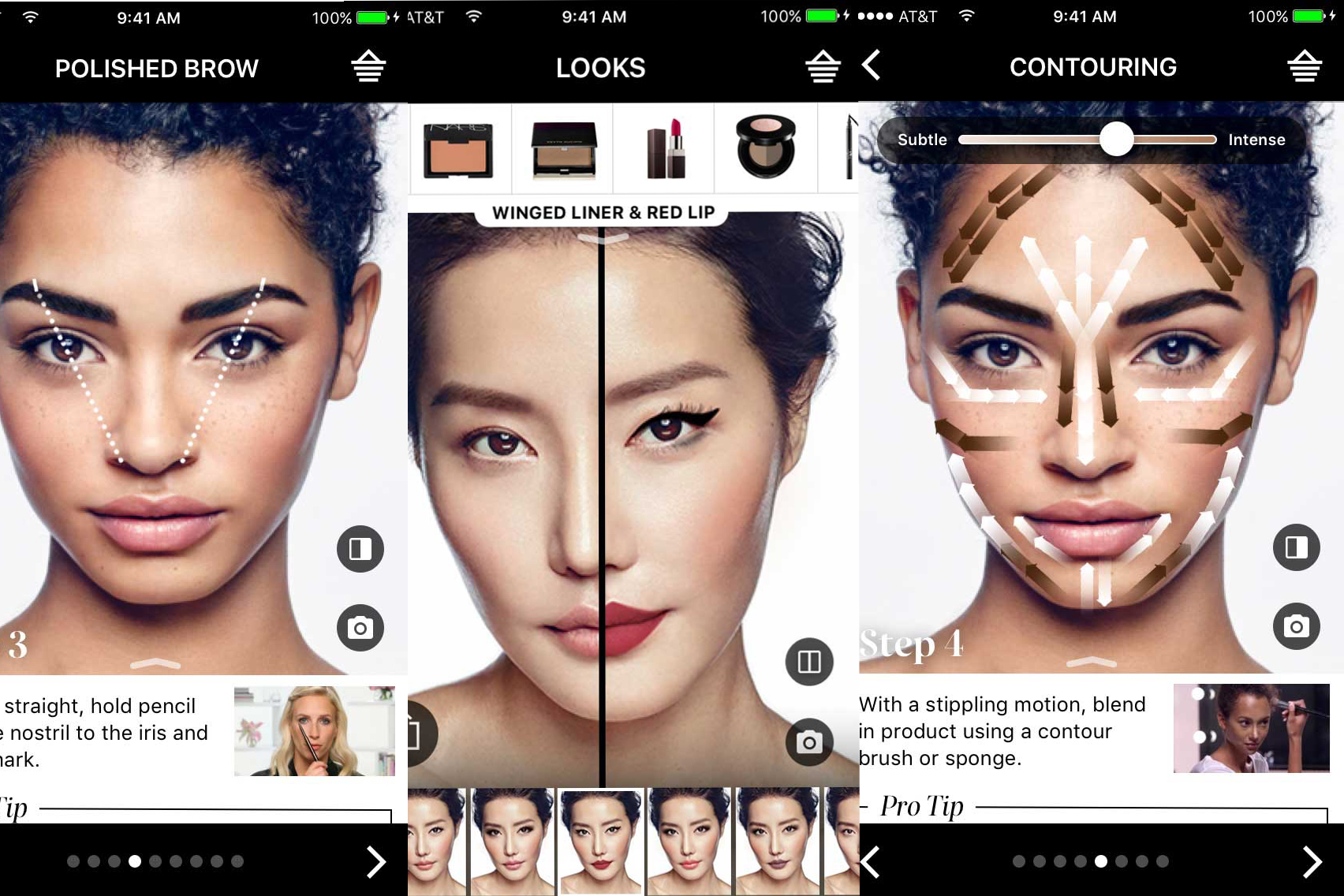
It lets you test shades, mix looks, and experiment without a physical sample. That single feature boosted add-to-basket rates by 25% because users could see what worked for them.
Nike applies AR differently but with the same intent: reducing friction. The Nike Fit tool scans your feet using your phone and recommends the exact size for each shoe style.
If you’re designing an e-commerce website experience today, AR isn’t a “nice extra” anymore. It’s a conversion tool that helps your users make confident decisions when shopping online.
And that confidence shows up directly in your conversion metrics.
3. Intuitive navigation with smart search and filtering
You can have great products, beautiful ecommerce sites, and strong branding, but if users can’t find what they’re looking for, none of it matters.
Research shows that 55% of visitors spend fewer than 15 seconds on a website, which means confusing navigation will cost you customers almost immediately.
Nevertheless, it all boils down to applying simple rules such as clear category hierarchies, headers you can click, and breadcrumb trails. This is so you always know where you are.
For ecommerce websites with huge catalogs, mega menus are essential because they let users scan multiple subcategories at once instead of drilling down endlessly.
Smart search is where things get interesting. This includes design elements such as:
-
Autocomplete helps users course-correct as they type.
-
Synonym recognition handles cases where someone searches “blow dryer,” but your catalog calls it a “hair dryer.”
-
Strong filters such as price, ratings, bestsellers, color, shipping location, and newest items help users narrow down huge inventories without feeling overwhelmed.
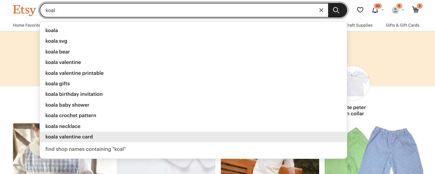
Etsy is one of the best ecommerce brands that has this done right. The moment you start typing, its search bar shows autocomplete suggestions alongside lightweight, sorted previews of actual results. Once you land on a results page, you get a set of filters that help you drill into exactly what you need.
Mobile navigation also needs its own rules. This is because mobile users browse with their thumbs, not their index fingers. And you need layouts that respect that.
That’s why UX designs for online stores now adopt central mobile device navigation. This involves placing key actions within natural thumb range instead of forcing users to stretch to the top of the screen.
When navigation is intuitive, users don’t think about how to move through your site. They simply move. And that’s exactly the point.
4. Product showcases with 360-degree interactive views
One of the biggest gaps in the online shopping experience is simply not being able to see the product the way you want.
Static product images give you a few fixed angles, but they never answer the personal questions you have, like What does this shoe look like from the top? Does the bag feel bulky from the side? How does the pendant sit when viewed straight-on?
That’s where 360-degree product views help online retailers enhance user experience. With it, you can rotate the item yourself and check the perspectives that matter to you.
I’ve seen many ecommerce brands unlock significant gains from this. Canadian furniture retailer EQ3, for example, added a simple 360-spin viewer to their product images and saw conversions climb by 36%.
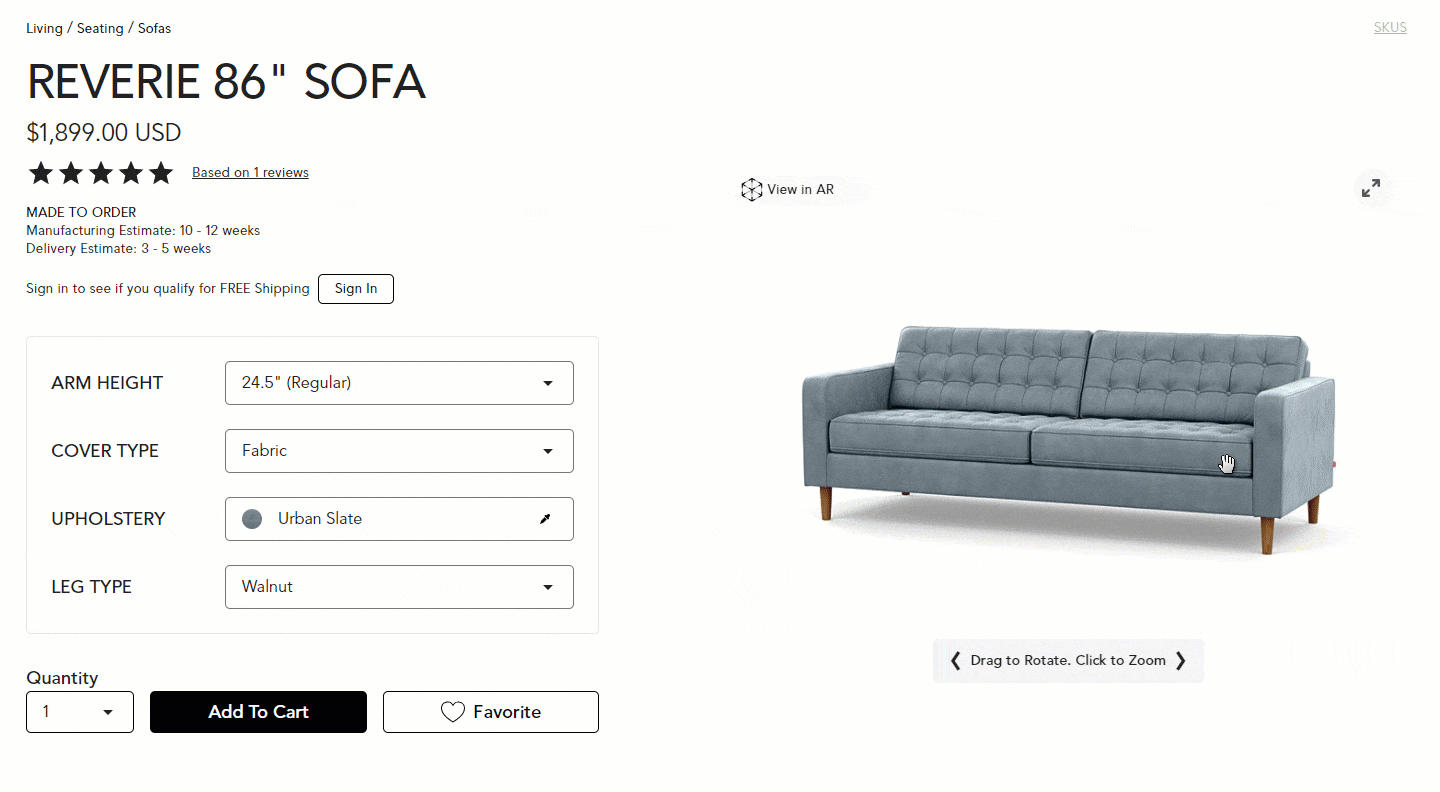
This matters even more in categories where visual appeal, like style and form, is everything. Fashion and jewelry retailers rely on 360-degree views so you can compare toe shapes on shoes, see how earrings hang, etc.
Those visual cues are exactly what help shoppers know whether something matches their taste.
Nevertheless, these interactive spins don’t replace standard photography or lifestyle images. They sit alongside them, filling in the “missing angles” that users almost always look for.
And as long as the viewer loads quickly and smoothly, it’s one of the easiest ways to reduce uncertainty without overhauling your entire product page.
5. User-generated content and customer photos
22% of online shoppers return products because they “look different” in real life than they did online. That single stat tells you everything about the trust gap in e-commerce.
Polished product photos on your web pages aren’t enough anymore. Shoppers now want proof that the item actually looks the way you claim it does.
That’s exactly why user-generated content (UGC) has become one of the strongest conversion drivers for ecommerce platforms.
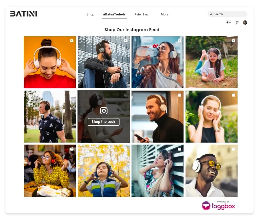
These are photos and videos from real customers, not your studio team. And they matter because they show the product in the wild for your target audience.
Picture real lighting, real bodies, real homes, real styling choices. In other words, the context shoppers rely on to decide whether something will work for them.
The impact is also measurable. Reportedly, when one store added customer photos to its product pages, checkout rates jumped by 24%. That lift didn’t come from a redesign or a promotion. It came from showing authentic photos that closed the “will this actually look right?” gap.
Here are a few ways you can leverage it:
-
Run a hashtag campaign to encourage buyers to share their photos.
-
Reward customers who upload images to reviews. You can use discounts or loyalty points.
-
Feature the best customer images in a gallery on your product detail pages as part of the main visual story.
Nevertheless, make sure you’ve secured permission to use those images by including the proper rights in your review flow or user-content terms.
6. Static hero images over image carousels
Here’s a stat that will change how you think about your homepage: when Grizzlyzoos A/B tested a rotating image carousel against a single static hero image, the carousel got 2.06% of clicks.
The static image? 40.53%. That’s almost 20× more engagement from doing less.
Carousels underperform for a simple reason. You’re asking users to pay attention to something that keeps changing before they can process it.
Most people don’t wait for the “right” slide. They don’t even register half the rotation. It turns into banner blindness, and on top of that, the auto-rotation often slows down your load time. This will hurt conversions even more.
Here's a brilliant example from Apple's iMac page.

I still think they make sense on product pages where users want to flip through different angles. However, it's different for the homepage hero.
When you’re trying to communicate one message clearly, a single focused visual with bold typography can do that far better than five competing ones.
If you’re optimizing your homepage, I highly recommend starting with one strong, clear image that highlights the thing you want users to act on. Add a visible CTA and don’t be afraid to A/B test different static images.
7. Product bundling to increase average order value
If you’ve ever watched your average order value plateau, bundling is usually one of the fastest ways to move that number up. Not because it’s a “growth hack,” but because it removes one of the biggest decision-making problems shoppers face: They don’t always know what goes together.
Instead of making users hunt for complementary items, you give them a ready-made set, such as a full outfit, a skincare routine, a starter kit, etc.
When the bundle on your e-commerce site makes sense, people buy more. All that while they feel like they’re saving, even when your margins stay exactly where you want them.
Here’s what I’ve seen in practice: The brands that win with bundling don’t assemble random leftovers. Rather, they think about the actual job the customer is trying to do and bundle items that complete that job in one click.
I also think visuals are a huge part of this. If the bundle is the value, then show it like a value. Use a group shot of everything in the pack, show the savings clearly (“Save $25 when you buy the set”), and still let users click into each item for specs or sizing.
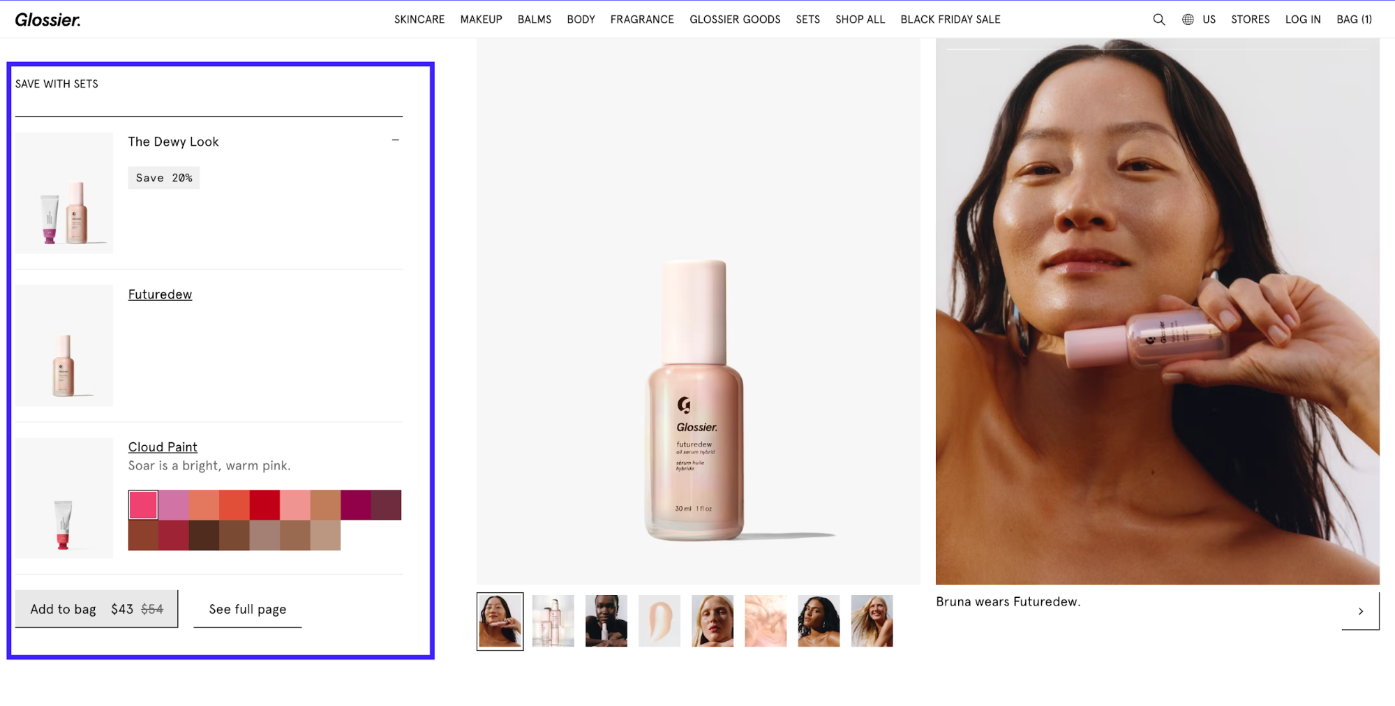
It's even better if you can let them swap or customize pieces. This reduces drop-off from that one item they’re unsure about.
A good example is Asos’s “Buy the Look” module. It shows you the entire styled outfit and the accessories that match it. What I like about their approach is how it opens both cross-sell and upsell lanes without feeling pushy.
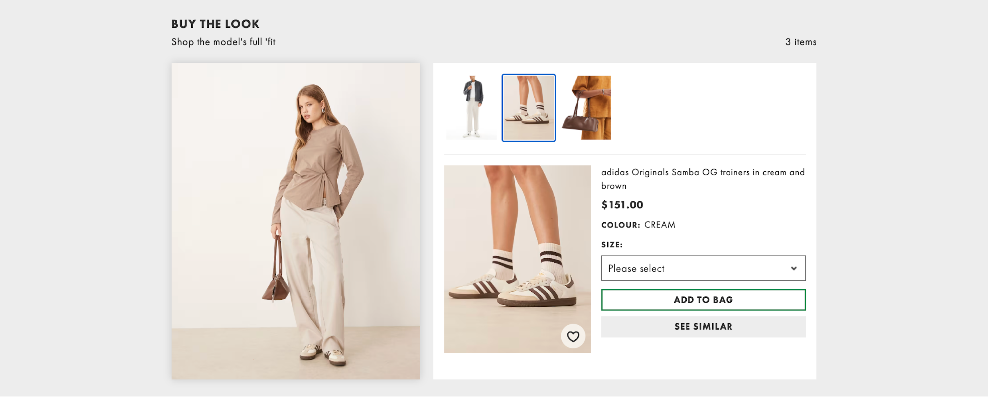
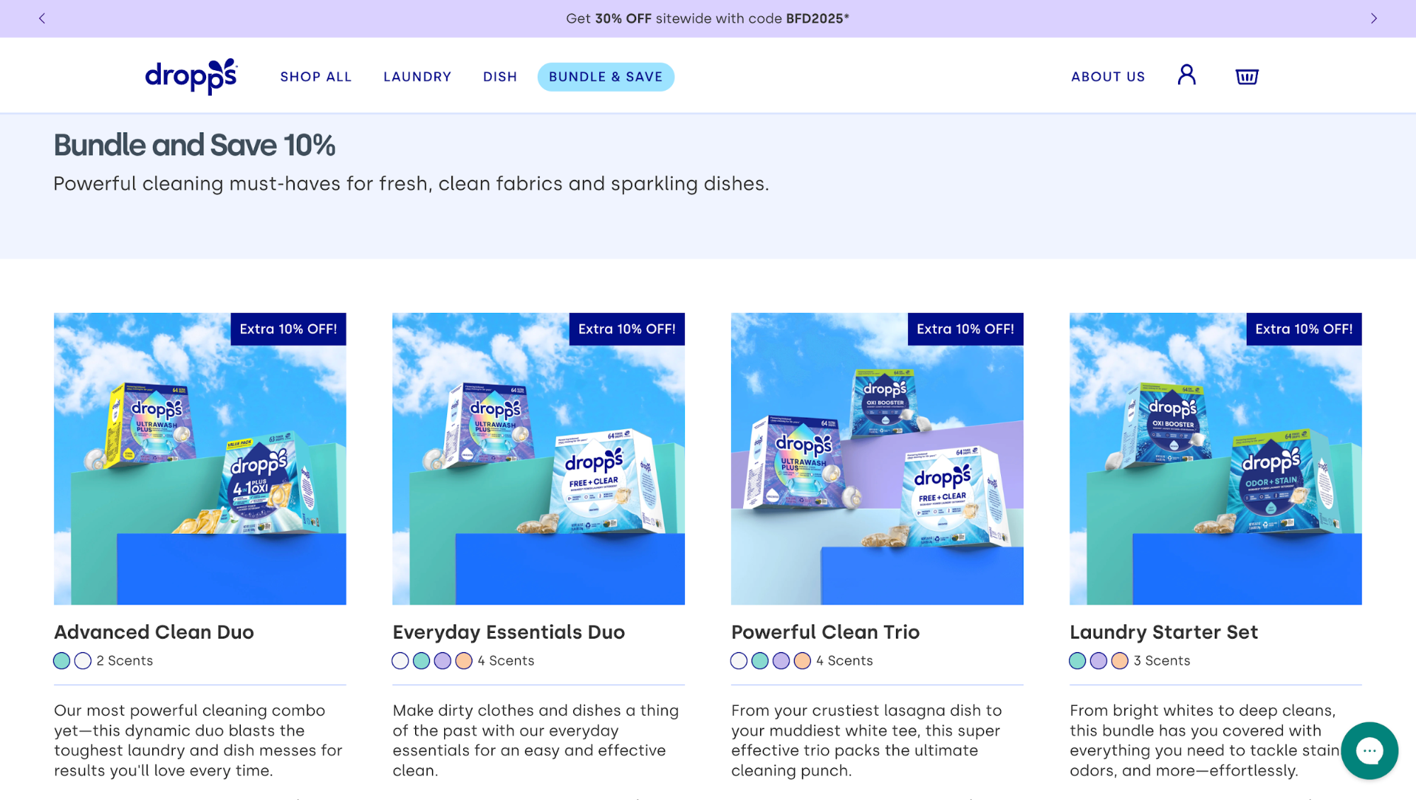
Or look at Dropps, they even dedicate a section on the main navigation bar for bundling offers.
8. Interactive product quizzes
Here’s a stat that’s hard to ignore: 70% of shoppers abandon their carts. And from what I’ve seen, a lot of that drop-off happens long before users even think about checking out. They get overwhelmed, stuck, or unsure what to pick, especially on stores with huge inventories.
That's an issue you can solve with interactive elements like a filtering quiz.
Instead of forcing users to sift through hundreds of options, you collect a few high-signal inputs. These include style preferences, needs, constraints, budget, and return a short, curated list that actually matches what they’re looking for.
There are a lot of effective formats that you can refer to for inspiration, such as:
-
Style quizzes for fashion ("What's your style?")
-
Needs-based quizzes ("Find your perfect mattress")
-
Problem-solution quizzes ("Which skincare routine is right for you?")
-
Gift finder quizzes
-
Product matcher quizzes for technical products
But the value isn’t just in the guidance. A well-crafted quiz captures zero-party data customers willingly share, which you can use for on-site personalization, segmentation, and smarter email flows. It’s a UX pattern that pays you back long after the first click.
Stitch Fix is a great example. Their onboarding quiz gathers details about fit, budget, and personal style, then feeds that data into an AI engine that curates individualized outfits.
Nevertheless, your quizzes may fall flat simply because they drag on too long, so:
-
keep yours short of 5–8 questions max
-
visualize answers whenever possible
-
feature a clear progress indicator
-
generate instant results with product recommendations that don’t require scrolling to find
And don’t forget mobile. Most users will take the quiz on their phones, so the flow has to be thumb-friendly and fast.
9. Streamlined checkout with one-click payment options
One of the easiest, highest-ROI e-commerce design trends I recommend for driving conversions at checkout is adding one-tap wallets (Apple Pay, Google Pay, etc.).
First up, this is a result-proven tactic. Many merchants report a high conversion rate of 70.8% in mobile sales after rolling out Apple Pay and Google Pay.
They also see a 10–20% more mobile sales and a 5–10% higher AOV after enabling one-tap checkout. There are fewer mobile abandonments simply because customers no longer have to type anything in.
If that's not convincing enough, there are two other facts you should consider: Share and yield.
Apple Pay alone accounted for a 54.8% share of U.S. mobile wallet users in 2024. On top of that, iOS users spend 2.5 times more than Android shoppers. Therefore, prioritizing Apple Pay on mobile often yields the best ROI.
With that said, here are the things I would do:
-
Ship at least one one-tap wallet (Apple Pay or Google Pay) on mobile.
-
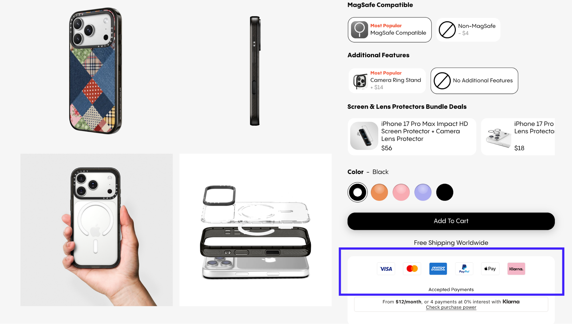
Surface the wallet button early on product pages and in the mini-cart so website visitors know they have payment options. You can find this familiar in leading ecommerce stores like Casetify.
-
Keep a clear card fallback (some users still prefer cards) for a seamless user experience.
-
A/B test the wallet CTA copy and placement to see what's driving more conversions.
10. Home try-on programs to reduce purchase anxiety
Home try-on programs let you order products (usually three to five items) to test at home before purchase. All of that with free shipping and returns included.
An outstanding example I can recall is Azazie. They built their entire wedding dress business around this approach.
Their try-on program allows you to order up to three bridesmaid dresses for just $20 or bridal gowns for $15 each. You keep them for a week, try them on at home with friends and family, then return what doesn't work and purchase what does.
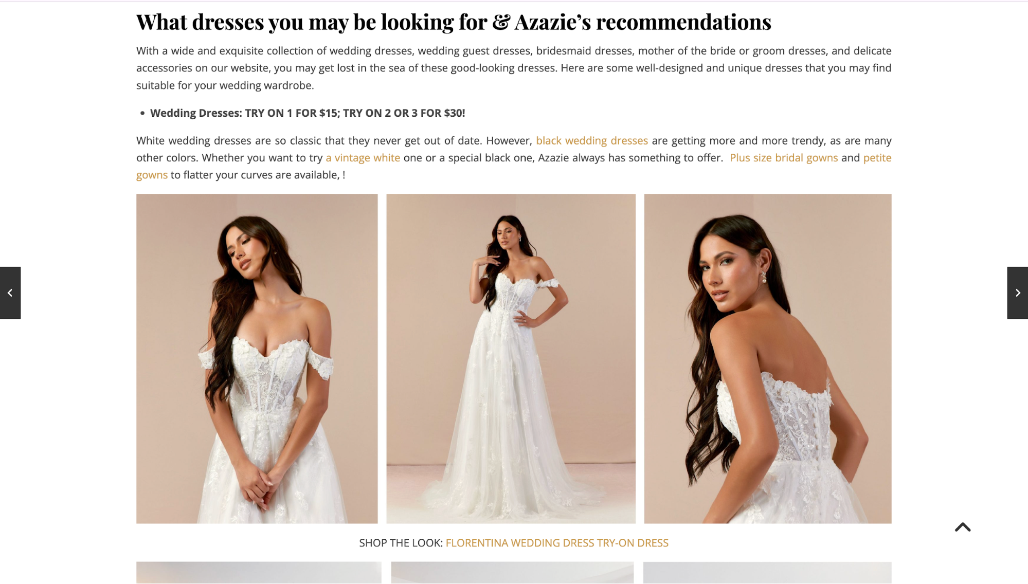
The business impact is substantial.
According to Try with Mirra, a try-before-you-buy (TBYB) solution provider, their customers saw a~55% increase in Average Order Value (AOV) for orders completed via TBYB vs standard purchases.
I think the real power here is how it shifts the decision-making process. When you can test a product in your environment with your wardrobe or space, you make better choices. That means fewer returns from buyer's remorse and more confident purchases from customers.
This strategy works particularly well for eyewear, fashion and apparel, shoes, jewelry, cosmetics, and mattresses. This is basically any category where "try before you buy" traditionally mattered in physical retail.
Nevertheless, running this program requires solid infrastructure. So, make sure you have
-
Reverse logistics that can handle returns efficiently.
-
Enough inventory allocated specifically for try-ons, separate from sales stock.
-
Crystal-clear program rules about how long customers can keep items and how to return them.
One downside you should take note of is the shipping costs. It often adds up fast. This also explains why many brands now combine physical try-on with virtual try-on technology to balance cost with customer experience.
11. Purpose-driven social missions to build brand loyalty
A social mission gives customers a reason to choose you beyond product and price. When you align profit with purpose, you tap into something more than a transaction.
Let me convince you with this interesting statistic. 76% of Gen Z consumers prefer buying from brands with a greater mission or purpose. This means your social commitments directly influence purchase decisions for the generation entering their peak spending years.
So how does this work?
For every purchase, you donate a product, contribute profits to causes, or commit to measurable environmental impact.
Take Patagonia, for example. It pledges 1% of sales to environmental causes and runs programs encouraging the repair, reuse, and recycling of garments.
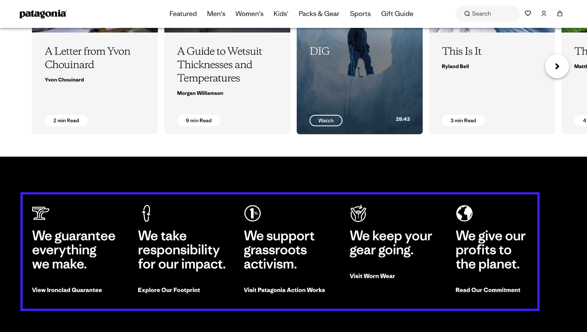
After initiating their sustainability-first approach, Patagonia's sales increased approximately 33% in one year, rising from $543 million to $575 million.
Their strong sustainability reputation also allows them to command premium pricing because customers willingly pay more for products reflecting their environmental values.
Needless to say, your social mission only works if it's authentic. Customers can spot performative activism instantly. This is why your commitments need to be transparent, measurable, and genuinely integrated into how you operate.
Key takeaways
These 11 tactics are really new trends, and you don't have to implement all of them to find success.
In my opinion, the difference between wasted effort and real ROI comes down to knowing which problem you're solving.
If your product returns are high, start with AR or home try-on. If users can't find products, fix your navigation first. If cart abandonment spikes at checkout, add one-click payments.
You don't need all 11 trends. You only need the two or three that remove the biggest obstacles in your specific customer journey. Test those, measure the impact, then expand from there.