14 UX Design Examples for Inspiration

Denisa Lamaj
Created on Aug 28, 2025
Keeping up with UX trends can feel overwhelming.
Big names like Apple, Netflix, and YouTube are constantly rolling out redesigns that quietly reshape how millions of people use their products.
For UX designers, spotting these changes isn’t enough. The real value comes from understanding why they work and how they meet user needs.
You can bring those insights back into your own design projects, from refining a product page to showcasing a great UX design example in your portfolio website.
That’s what this guide is about. Below, you’ll find 14 fresh UX design inspiration examples from 2025.
1. Apple’s Liquid Glass UI across iOS, iPadOS, macOS
At WWDC 2025 (Apple’s annual Worldwide Developers Conference), the company revealed Liquid Glass, a new visual design language rolling out across iOS, iPadOS, and macOS.
Unlike the flat, minimalist reset we saw with iOS 7, Liquid Glass brings depth back into the interface. Elements are rendered as if they’re made of translucent, responsive glass that shifts dynamically with content, motion, and light.
This isn’t just for looks. The design helps guide attention and keeps the experience consistent across devices, creating a more seamless user experience. Three changes stand out:
-
Smarter translucency: Layers blur and refract in real time, so background content shows through without hurting readability.
-
Adaptive focus: Active elements stay sharp while secondary items dim, making it easy to see what matters most on screen.
-
Tactile controls: Buttons, sliders, and sidebars float like polished glass surfaces and respond with fluid animations when you scroll or tap.
You can see this effect clearly in Apple’s video player. The playback controls hover like glass buttons over the content—notice how they remain visible without overwhelming the scene.

The same design language extends to the Control Center. Each tile looks like a glass card, layered with depth and subtle translucency, giving users a sense of order without heavy outlines.

Together, these updates boost readability by increasing contrast where it matters and reducing motion fatigue with smoother, more predictable animations.
For designers, Liquid Glass introduces a few new considerations:
-
Navigation now relies heavily on depth and translucency cues. Apps that ignore these may feel out of sync with the system.
-
Motion design should have purpose. Animations should guide attention, not just decorate.
-
Since controls use subtle treatments instead of bold outlines, clear labeling and strong iconography are more important than ever.
2. Netflix’s redesigned Apple TV experience
Netflix recently updated its Apple TV interface to make browsing simpler and faster. The goal is to reduce cognitive load so people spend less time searching and more time watching.
The biggest change is the top navigation bar, which makes it easier to jump between Home, TV Shows, Movies, and My Netflix without endless scrolling.
Content tiles also feel smarter, with clearer tags, previews, and a new My Netflix section that centralizes watchlists, downloads, and recently viewed shows.
Here’s how the new top bar looks in action. Instead of digging through menus, you can switch between sections instantly.

Another major improvement is the placement of Search. It now sits directly in the top navigation instead of being buried inside menus.
That means less time wasted looking for the search bar and more time actually finding something to watch. This small change improves user engagement, since it helps users find relevant content quickly without frustration.
You can see this difference in the image below. Search is right where you need it, and results appear alongside personalized recommendations.

So let's say you turn on Apple TV, want to watch a crime drama, and type “thriller” right into the top bar.
A full list of options pops up immediately. In the old layout, you would have had to click through extra menus just to reach the search function, adding unnecessary friction.
For app designers, this redesign is a reminder that good UX design doesn’t always come from flashy overhauls. Sometimes the biggest improvements come from small, well-placed changes that make everyday tasks easier and faster.
A major improvement is the new placement of Search, now sitting right in the top navigation instead of being buried in menus. That means less time wasted hunting for the search bar and more time finding something to watch.
3. YouTube’s Video Player Redesign on Web and TV
YouTube has started rolling out a redesigned video player across both web and TV. The familiar gradient bar is gone, replaced with a cleaner, capsule-shaped layout.
The focus of this update is to make playback controls easier to read at a glance, especially on larger screens, while cutting down on visual clutter that distracts from the video itself. It’s the biggest refresh to the player since YouTube introduced its minimalist Chrome years ago.
Early feedback has been mixed. Some people like how modern and uncluttered the new layout feels, saying it makes quick interactions easier.
Others feel the controls are oversized, taking up too much space and disrupting the viewing experience on bigger screens.
Here’s what the updated player looks like in action. Notice how the controls sit inside capsule-shaped buttons, giving the interface a sleeker and more consistent look.

From an accessibility standpoint, the redesign does bring improvements. Focus states for keyboard and remote navigation are easier to spot, and labeling across controls remains consistent.
YouTube also listened to feedback and restored volume adjustments via the mouse scroll wheel and arrow keys, keeping a shortcut many users depend on.
For designers, the takeaway is clear: simplifying an interface should never remove important workflows. A clean UI works best when it also respects accessibility standards and the habits of power users.
4. Google Photos’ new “Create” tab
Google Photos has rolled out a dedicated Create tab on both Android and iOS, bringing all its editing and creative tools into one place.
Before, features like collages, animations, cinematic photos, and highlight videos were hidden under the old “+” menu. Now they’re grouped in a clearly labeled tab marked with a paintbrush icon, which makes them much easier to spot.
Here’s how the new Create tab looks:

This change also cuts down on steps. Making a collage, for instance, now looks like this:
-
Open the Create tab
-
Select Collage
-
Pick your photos
-
Confirm the design
That’s a lot simpler than the old flow, which often left casual users wondering where to start. By reducing taps and clarifying the flow, Google makes sure a user completes their creative task with less effort.
Each tool is paired with a small preview and a plain-language label, so you can see what a highlight video, animation, or collage looks like before tapping.
In short, the update helps Google Photos feel less like a passive photo library and more like a creative space where editing, customization options, and making things are front and center.
5. Gemini app: Deep Research, personalization, privacy controls
The Gemini app has introduced a wave of upgrades that make it feel more private, personal, and powerful.
At the center of the update are Temporary Chats, improvements to Deep Research, and tighter integration with connected apps. Together, they reshape how people trust and use Gemini on mobile.
Temporary Chats change the way conversations work. Instead of every thread being saved, you can now open a chat that leaves no saved messages once it’s closed.
This encourages more candid use, especially for sensitive tasks (like drafting questions for a medical visit) without worrying about long-term history.
Deep Research has also expanded with new connections to Google apps like Calendar, Notes, Tasks, and soon Photos.
The flow is simple: start a query, Gemini searches and reasons across the web and your apps, then delivers a synthesized report you can share or save.
Here’s an example of how that looks. You might start with a query like:

From there, Gemini generates a personalized response. Instead of a generic list, it factors in your past searches and preferences (such as interest in family-friendly trips or tropical destinations) and explains why it’s suggesting certain options.

This personalization is powered by Gemini 2.0 Flash Thinking, which makes responses feel more relevant.
For example, travel advice adapts to your browsing history, and restaurant recommendations can reflect places you’ve searched before.
To keep things clear, these controls are easy to find in the model drop-down. Consent is explained up front, and you can turn personalization off at any time, so user control stays in your hands even as Gemini gets smarter.
From a design perspective, Gemini is also becoming an innovative UX design case study: it blends advanced AI with clear interface design so that mobile users can access different features without feeling overwhelmed.
These updates balance power and trust by giving you research tools that save time, personalization that actually helps, and privacy features that keep you in control.
6. Android 2025 design updates from The Android Show / I/O
At Google I/O 2025, Android revealed a set of design and UX improvements rolling out across phones, tablets, and wearables. Three changes stand out for everyday use:
-
Refreshed safety dashboard: Privacy and security alerts now appear in one unified panel, making it much easier to review permissions and act quickly without digging through menus.
-
Gemini integrations: AI-powered features show up contextually inside system apps, like suggesting smart replies in Messages or generating summaries in Notes. This reduces friction for routine tasks.
-
Updated visual language: Shapes, typography, and animations are now more consistent across screens, creating smoother continuity between phones and tablets.
The first image below shows how these updates feel on the home screen. Notice how widgets, shortcuts, and app cards follow the new rounded shape system and fluid animations, giving Android a more polished and cohesive look.

The second image highlights the redesigned quick settings panel. Controls now use pill-shaped icons that match the overall visual language, making the layout cleaner and easier to scan at a glance.

Cross-device experiences also got attention. One demo highlighted drag-and-drop continuity, where you can start selecting photos on a phone and finish dropping them into an email draft on a tablet.
This kind of seamless flow shows how Android is tightening patterns across form factors, while keeping up with trending graphic design principles.
For app designers, these updates set clear expectations. Navigation now benefits from expressive animations and well-defined visual hierarchies, while UI components are flexible enough to adapt across device types.
And with AI built deeper into Android, layouts need to leave space for real-time tips, suggestions, and actions. This is pushing app design toward interfaces that are modular, responsive, and helpful no matter the screen size.
It’s also a reminder that if users struggle with clutter or inconsistent layouts, the result can quickly feel like a bad UX design example.
For a product designer, this update checks all the right boxes: a unified visual language, smoother navigation, and contextual AI support.
And as always, these kinds of improvements are best confirmed through user research—watching how real people use the system and spotting where they get stuck.
7. Samsung TV Plus: AI-driven personalization refresh
Samsung is giving its free streaming service, Samsung TV Plus, its biggest update yet. At the center of the redesign is a new AI-powered home screen that adapts in real time to what you watch.
Instead of showing the same static rows of channels, the new layout feels dynamic. It surfaces shows, movies, and live events based on your viewing habits, so you don’t waste time scrolling aimlessly.
Here’s what the new home screen looks like:

The AI goes beyond basic recommendations. It powers a full discovery engine that curates content in context.
For example, if you often watch romantic comedies, the Top 10 Movies Today section might already highlight two or three rom-coms right at the top. That way, you land on something you’ll actually watch in seconds, not minutes.
Another useful change is how live and on-demand content now blend together. Before, switching from a live sports match to its replays felt like jumping between two separate apps.
With the update, both live and replayed content are treated as part of the same viewing flow. You can move from one to the other without breaking context.
From a UX perspective, the biggest improvement here is decision speed, how quickly users can go from opening the app to hitting play. A shorter “time-to-first-play” means the AI is doing its job by reducing friction and helping people make faster choices.
This is also a great example of an accessible UX design choice. By streamlining navigation and surfacing what matters most, Samsung reduces the chance of overwhelming users with too many options.
The result is a more user-friendly interface that helps users manage content with less effort and keeps users engaged.
8. TikTok brings handheld features to desktop
TikTok has always been designed first for mobile, but now the company is putting serious effort into making the desktop experience just as smooth.
The redesigned TikTok.com web app introduces a modular layout and a refreshed For You feed that mirrors the flow of the mobile app, only adapted for larger screens.
The first image below shows the new For You page on desktop.
Notice how videos take center stage, similar to the mobile app, but the extra screen space makes the navigation bar more visible and easier to use.

One of the biggest changes is navigation. The sidebar has been repositioned for quicker access, and the Explore tab has been enlarged.
This reduces the sense of clutter that previously made TikTok’s desktop version feel like an afterthought.

The update also brings familiar mobile behaviors into a widescreen context. Videos expand into full-screen playback (including live streams) with landscape support for gaming and other horizontal content.
A new floating player, exclusive to desktop, lets you keep TikTok visible while multitasking in other tabs or apps. It’s a desktop-native feature that still fits TikTok’s fast-swipe rhythm.
On the creation side, TikTok has closed much of the gap between mobile and desktop.
You can now upload a clip, trim it, add sounds and effects, and publish with captions and hashtags—all in one flow that closely mirrors the mobile process.
While not every AR filter or effect has made it to desktop yet, the key steps (record → edit → share) are consistent across devices. That’s especially useful for creators who move between laptop editing and mobile posting.
Accessibility has also improved. With a modular grid layout and clear tab order, users can navigate between feed, search, and player with just a keyboard, no mouse required.
Overall, TikTok isn’t reinventing the desktop experience; it’s removing friction between devices.
By giving the web app the same navigational cues as mobile while adding desktop-only perks like multitasking, the platform ensures both creators and viewers can switch devices without having to relearn the interface.
9. Reddit’s unified search interface (search + AI answers)
Reddit is working to become more than a place people add to the end of a Google search—it’s aiming to be a search engine on its own.
The platform is merging its traditional keyword search with its new AI-powered Q&A tool, Reddit Answers, into one unified experience.
Instead of choosing between scrolling through long subreddit threads or getting a short AI summary, users will now see both combined in the same interface.
Here’s how it looks when you search for something like “best monitor for photo editing”:

Notice how the results highlight top recommendations directly, while also giving you the option to dive deeper into the original threads.
So, instead of replacing community posts with AI, Reddit blends them together so you get quick answers without losing context.
In some cases, the AI summary also includes related posts and visuals from subreddits, giving you quick extra context without having to do more searching yourself.

This design shift is more than cosmetic. By placing the search bar front and center, Reddit is nudging people to start with a query rather than browsing subreddits first.
It’s closer to how Google works, but with Reddit’s added value of real discussions and firsthand opinions.
Practically, this means that a query like “best monitor for photo editing” won’t just show you posts—it will also summarize key user recommendations, call out common concerns like color accuracy, and surface models that come up often (e.g., ASUS ProArt or Dell UltraSharp).
The real test is usefulness. If the AI highlights something concrete (like “Dell UltraSharp monitors are praised for contrast”) and links you back to the exact threads where users said it, then the system is doing its job. If not, it risks feeling like just another chatbot.
That’s why source attribution is key. Clear links to subreddits and usernames protect Reddit’s credibility. Without them, the AI summaries could lose the trust that makes the platform unique.
In short, Reddit wants to become both the place to ask questions and the place to find reliable, community-backed answers. If it gets this balance right, “searching Reddit” could shift from being a workaround to a habit.
10. Microsoft Edge “Olympia”: AI-centric browser UI concept
Microsoft is testing an experimental interface for Edge, called Olympia, that places its AI assistant Copilot at the very center of the browsing experience.
In this design, Copilot is built directly into the address bar (the omnibox), which now supports chat, voice queries, and traditional search in a single spot. The idea is to make interacting with the browser feel more conversational and less like juggling separate tools.
Tabs also get a rethink. Instead of the usual horizontal strip across the top, Olympia introduces vertical tabs that can be opened from a dropdown in the top-left corner.
Let’s say you want to check the weather while browsing. With Olympia, you can simply type or speak your request into the omnibox, and Copilot instantly gives you a short summary.
There is no need to open a new tab or search engine page. That cuts out several steps compared to how most browsers currently work.
The biggest difference compared to today’s AI-enhanced browsers is that Olympia does not treat Copilot as an extra sidebar or plugin. Instead, the assistant becomes the main interface.
It is an agent-first approach where AI is not just helping in the background, but driving how you interact with the browser itself.
Of course, this new layout comes with some risks. People who are used to the standard tab bar or familiar toolbar setup may find it confusing at first.
New users could also struggle with technical jargon or feel lost if the design pattern shifts too quickly. There is also the chance of Copilot being triggered accidentally when someone simply wants to type a URL, which could interrupt their flow.
For this design to work well, Microsoft will need to make signposting very clear, provide intuitive navigation, and offer an easy way to toggle Copilot on or off.
Done right, it could be a perfect example of how an AI-first design project can engage users while keeping the interface visually appealing.
11. Microsoft Teams: Immersive Events
Microsoft is bringing back its metaverse idea inside Teams with a new feature called Immersive Events. It’s a meeting mode that swaps the usual video grid for 3D spaces you can join from a computer or a Meta Quest headset.
Instead of staring at a wall of video squares, you show up as a customizable avatar. You can move around, join conversations, or even step aside for a private chat.
Spatial audio makes it feel more natural, so voices come from the direction of the person speaking, just like in a real room.
Here’s what the avatar setup looks like before joining an event. You can adjust appearance details and make your digital self feel more personal:

There are three different environments to choose from, depending on the type of event:
-
Cascades: looks like an amphitheater, with tiered seating for presentations and a corner designed for quick icebreakers.
-
Oasis: a larger, more casual conference space, where people can easily break into smaller groups for workshops or team chats.
-
Canvas: a plain, flexible room that organizers can customize for product launches, training, or branded experiences.
The main UX change is how conversations work. In a normal video grid, everyone talks into the same stream.
In immersive mode, spatial audio makes it possible to have multiple conversations happening in the same space without interrupting the main discussion. It’s more like mingling at a networking event than sitting in a rigid classroom.
To make sure new users don’t feel lost, Teams includes a quick onboarding process. Before joining, you pick or tweak your avatar, test your mic and sound, and take a short guided tour of the virtual space. It feels more like walking into a conference lobby instead of just clicking a link.
For design teams, this is an innovative design pattern that mixes work with game-like elements, motivating users to participate more actively. Avatars and spatial sound add just enough playfulness without becoming a distraction.
The goal isn’t to replace every meeting with VR. Instead, it’s about bringing back the casual interactions that video grids usually strip away. Whether you’re in Cascades, Oasis, or Canvas, the design aims to make remote events feel less stiff and more human.
12. Slack 2025: Workflow branches, simplified layout mode, analytics
Two of Slack’s biggest 2025 updates tackle the small daily frictions that slow teams down: conditional branches in Workflow Builder and a simplified layout mode.
Conditional branches make Workflow Builder feel smarter and more flexible. Before, every request followed the same path and landed in one catch-all channel, where someone had to manually sort it.
Now, workflows can branch based on issue type. For example, a facilities request goes to #office-ops, while a software bug is sent straight to #dev-support with the right approvers already tagged.
A quick before/after:
-
Before: “Report an issue” form → same three fields for everyone → posts in one channel → human sorts it.
-
After: “Report an issue” form → user selects issue type → workflow branches → automatically posts in the right channel.
That single change removes the manual sorting step, which is often where requests get delayed or lost.
The simplified layout mode is aimed at reducing visual clutter in the desktop app. Instead of juggling sidebars, unread badges, and endless thread indicators, you get a single-column layout with only the essentials.
For power users, it creates a focused workspace. For those using assistive technology, the stripped-down view makes navigation easier and more predictable.
Together, these updates make Slack feel like a tool that adapts to how people actually work—whether that means branching workflows that save a triage step or switching to a simpler mode to stay focused on one conversation at a time.
13. Spotify: New discovery controls and tools
Spotify’s latest update gives listeners more control over how they discover and manage music.
The focus is on the Queue panel in the Now Playing view, which now includes quick-access buttons for Shuffle, Smart Shuffle, Repeat, and even a Sleep Timer—all in one place.
Here’s how the new Queue panel looks in action:

Beyond just playback, Spotify is making recommendations easier to manage. After your current queue finishes, you’ll see suggested songs lined up. Instead of being forced into autoplay, you can preview these picks and decide whether to add them. This means you stay in charge of the flow, not the algorithm.
Another small but handy addition is the Hide button, which makes sure a song you don’t like won’t show up again on any of your devices.
For less drastic cases, the new Snooze option lets you mute a track for 30 days. This is useful if you’ve overplayed a favorite and need a break without removing it completely.
Together, these changes make discovery feel more intentional.
Every skip, hide, or snooze teaches Spotify what you want to hear more (or less) of, so future recommendations become smarter and more tailored. You’re not passively listening, but you’re actively shaping your music experience.
14. Gmail app updates: Material 3 on iOS, flexible split view on Android tablets
Gmail’s newest update brings both a cleaner design and practical upgrades, with changes tailored to iOS and Android.
On Android tablets and foldables, Gmail now supports a flexible split view. You can drag the divider between your inbox and the open email to make either side bigger, or collapse it into a single-pane view. This makes it easier to follow a long email thread while keeping an eye on your inbox at the same time, without constantly switching screens.
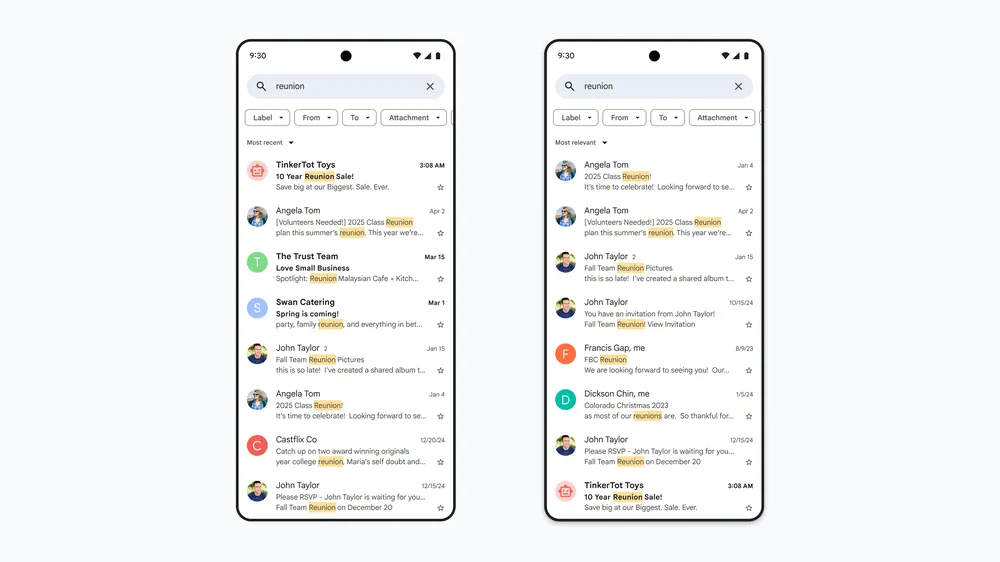
On iOS, Gmail now adopts Google’s Material 3 design language. The interface feels more modern, with rounded navigation buttons at the bottom and a pill-shaped search bar at the top.
The goal is to make Gmail look and feel consistent across iOS, Android, and the web. These visual elements make the app feel more polished and visually engaging on a mobile device.
Workspace users also get something extra: a Gemini sidebar in Gmail.
While composing an email, you can call on Gemini to generate an image and drop it directly into your draft without leaving the app.
This not only speeds up writing but also allows users to stay focused on one screen until the task is complete.
Together, these changes bring Gmail closer to feeling unified across devices. Android stands out for multitasking with its split view, while iOS shines with its fresh Material 3 look—a great example of design thinking applied to everyday tools that keeps business needs and user flow aligned.