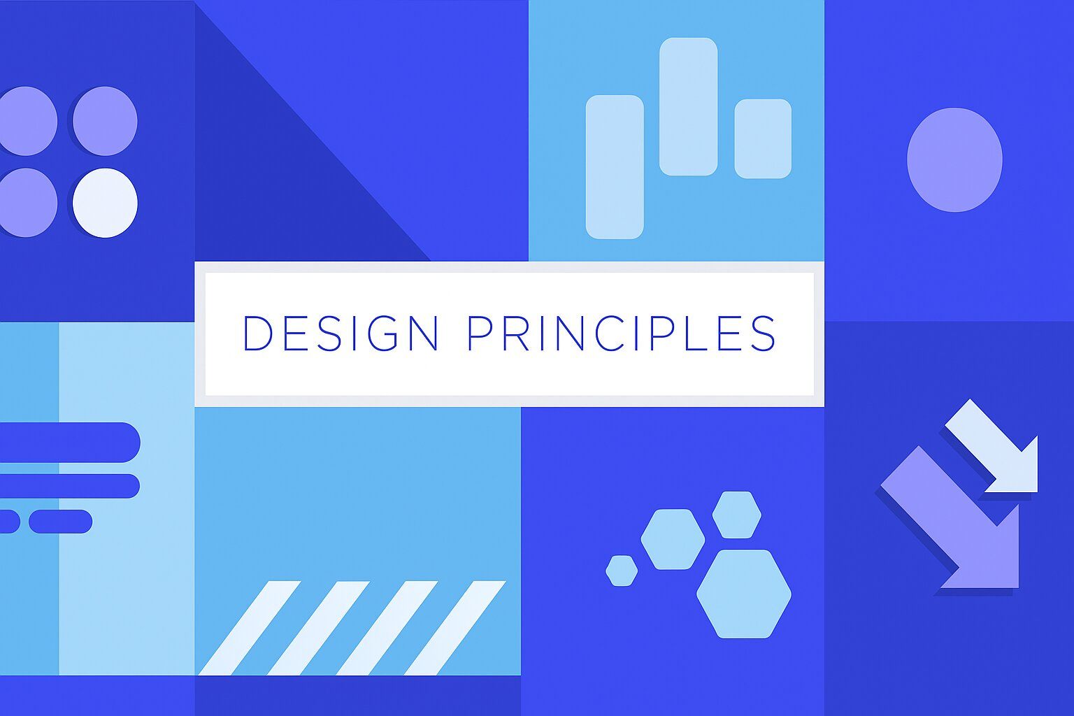
13 Graphic Design Principles and How to Use Them

Khanh Linh Le
Created on Jul 15, 2025
13 Graphic Design Principles and How to Use Them
Ever feel off even when you follow all the graphic design principles? That’s usually because using them well requires more than checking boxes.
In this guide, I’ll walk you through more than just the eight basic design principles you’ll find in most courses. I’ll also cover a few additional fundamental principles and show you when and how to apply them.
1. Color
Color is a means of visual communication that sets the mood and shapes how people feel about your product. It also plays a major role in brand identity and recognition.
I always start with color when I want to reinforce a specific emotion. For example:
-
Blue signals trust and reliability, that’s why banks and SaaS tools use it so often.
-
Red creates urgency or passion. It’s common in fast food and clearance sales.
-
Green is tied to growth, health, or nature, perfect for wellness apps or eco-friendly products.

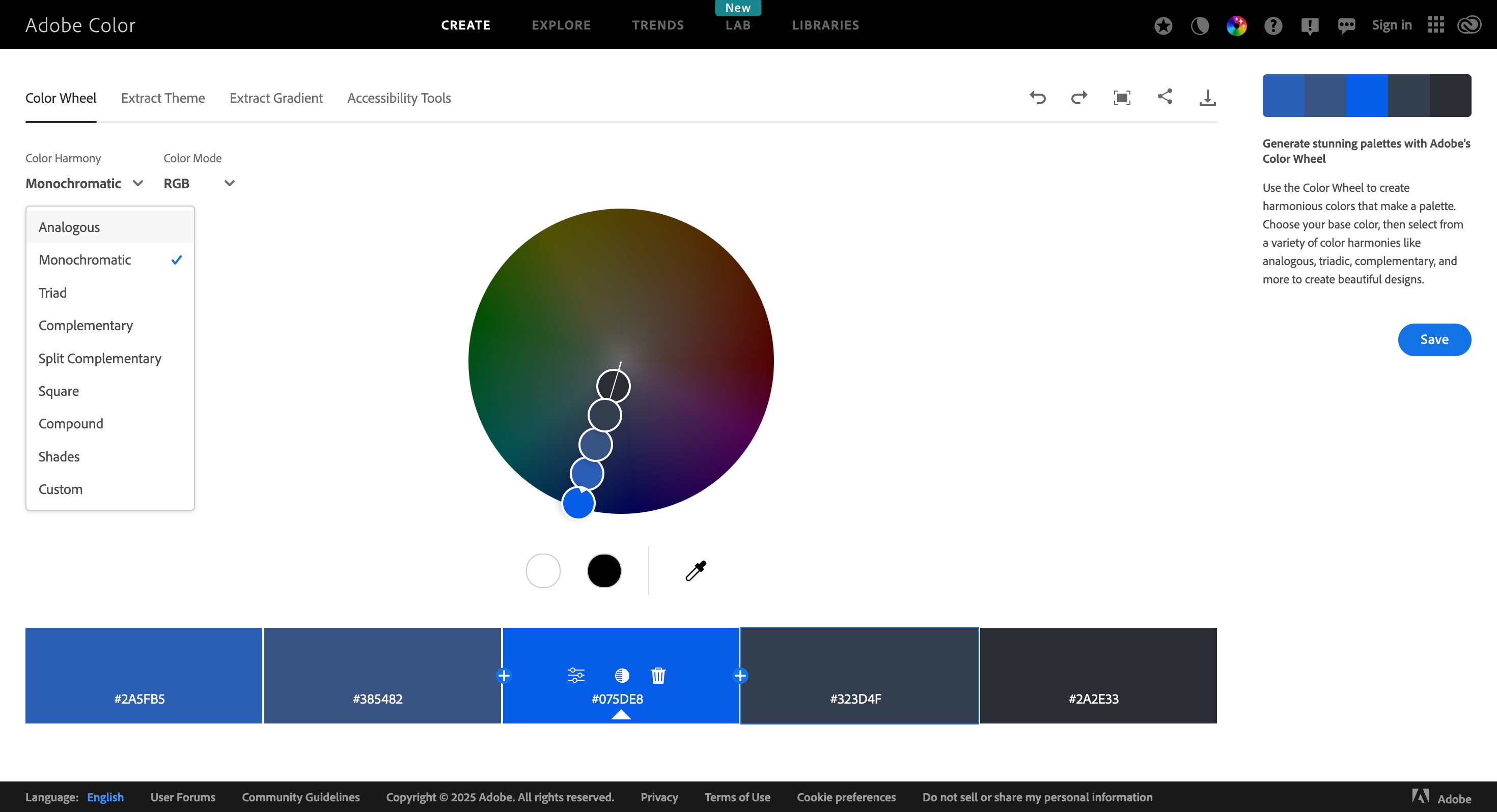
To pick the right combination for your graphic design elements, you can start with basic color theories:
-
Complementary colors sit opposite each other on the color wheel, which is great for high contrast. You can use it in situations like making a CTA button stand out from the background.
-
Analogous colors sit next to each other and they’re more harmonious and subtle.
-
Triadic color schemes use three colors evenly spaced on the wheel, vibrant but balanced. You can reach for this if you want to highlight multiple elements with equal importance, i.e., a landing page with three distinct features or pricing tiers.
Think about Spotify’s green, McDonald’s red and yellow, or Coca-Cola’s red. You recognize them instantly because the color never changes.
To speed up palette creation, you can use tools like Coolors or Adobe Color to test combinations and adjust shades.
2. Contrast
Contrast in graphic design refers to how you help people quickly understand what matters on a page. It makes designs easier to scan, strengthens visual hierarchy, and improves accessibility.
It might surprise you, but 83.6% of homepages still have low-contrast text, according to WebAIM’s 2024 analysis of the top 1 million websites. That makes it the most common accessibility issue online.
To avoid that, here are four techniques to create contrast in your design:
-
Light vs. dark: Classic example, black text on a white background, ensures readability in body copy.
-
Large vs. small: Headlines need to feel larger so they catch attention; you can also size up icons or stats to increase visual weight.
-
Bold vs. thin: When you use bold fonts for headers paired with light fonts for details, it creates hierarchy without clutter.
-
Complementary colors: Opposite colors on the wheel provide the strongest contrast, ideal for important elements like CTAs or alerts.
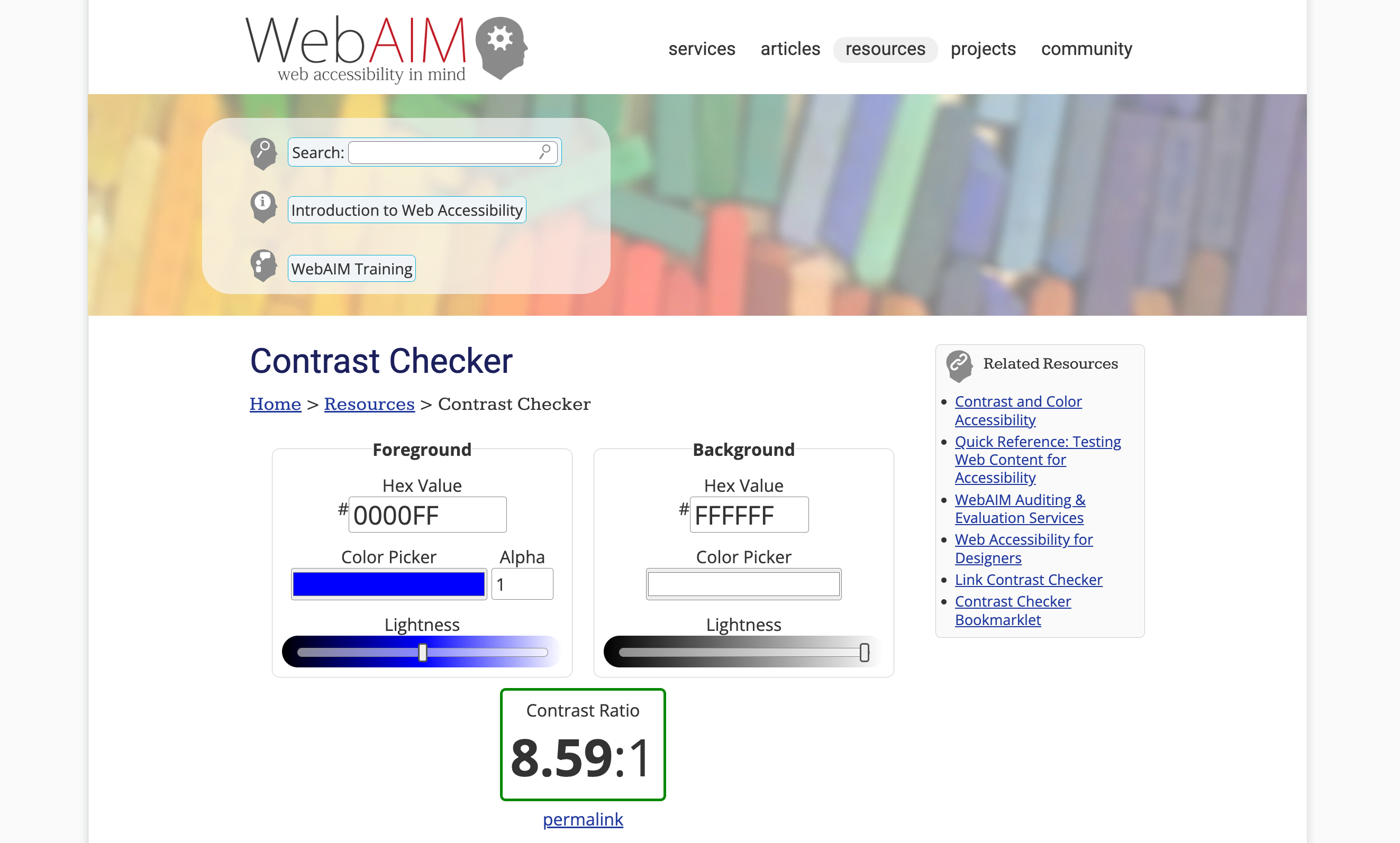
Once the layout is set, you can run everything through the WebAIM Contrast Checker. It helps me make sure my color combinations meet the Web Content Accessibility Guidelines (WCAG). This is especially useful for smaller UI elements where legibility matters most.
You should aim for a contrast ratio of at least 4.5:1 for normal text and 3:1 for large text or interactive components, which covers the minimum requirements under WCAG 2.0 and 2.1.
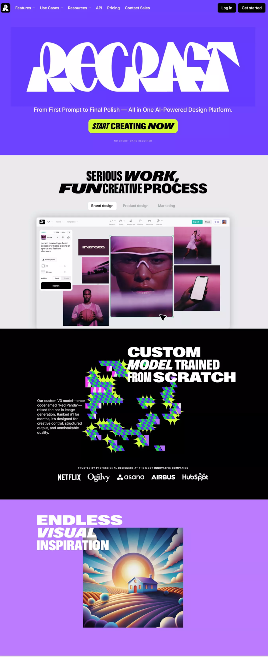
A great example of contrast done right is Recraft’s homepage. It pairs bold neon accents with deep purples and pure blacks, using light-on-dark text and sharp font weights to create instant visual separation.
The contrast between each section, from bright CTA buttons to grayscale UI demos, keeps users focused while maintaining a strong sense of brand personality.
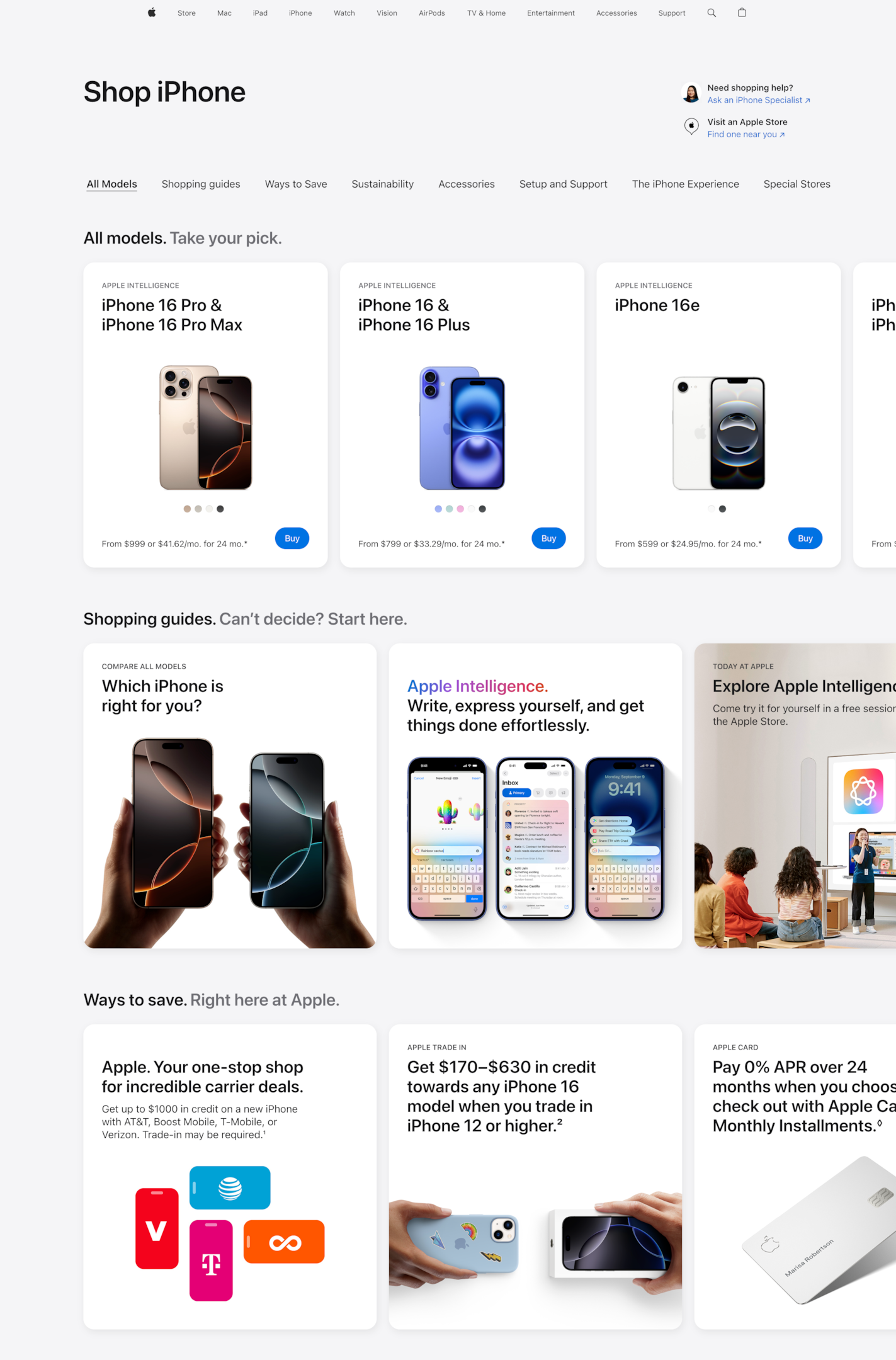
3. White Space
White space is among the basic principles of graphic design. It’s essential for creating organization and flow in your layout.
You can also separate similar or related elements with white space to avoid clutter.
Think of Channel or Apple’s product pages. They are the perfect examples: generous spacing around product shots, minimalist typography, and clean layout blocks make everything feel deliberate and high-end.
When text, images, and buttons are stacked too close together, everything fights for attention. Users end up skimming or skipping entire sections.
By contrast, spacing creates natural breaks between sections and helps guide the eye from one element to the next.
This is especially important in long-form content or digital ads. In a blog post, adding more space between lines and paragraphs makes text feel lighter and more digestible.
In ads, surrounding a short message with space can make it feel more intentional and impactful than one packed with copy and visuals.
Image source: John Wegner
To use white space well:
-
Adjust line spacing to around 150–170% to improve text flow
-
Add padding around CTAs and images so they stand out without needing extra styling
-
Use wider margins for content blocks to separate sections and reduce visual noise
4. Typography
Typography is one of the most impactful graphic elements when it comes to brand personality. It sets the tone of your design and plays a major role in how easily people absorb information.
The typeface you choose communicates mood before anyone reads the content.
Serif fonts, like Georgia or Times, suggest tradition, authority, or elegance. They’re often used in editorial layouts, law firms, or luxury branding. Sans-serif fonts, like Inter or Helvetica, feel modern, clean, and minimal. These work best in digital products, startups, and tech brands that value clarity and simplicity.
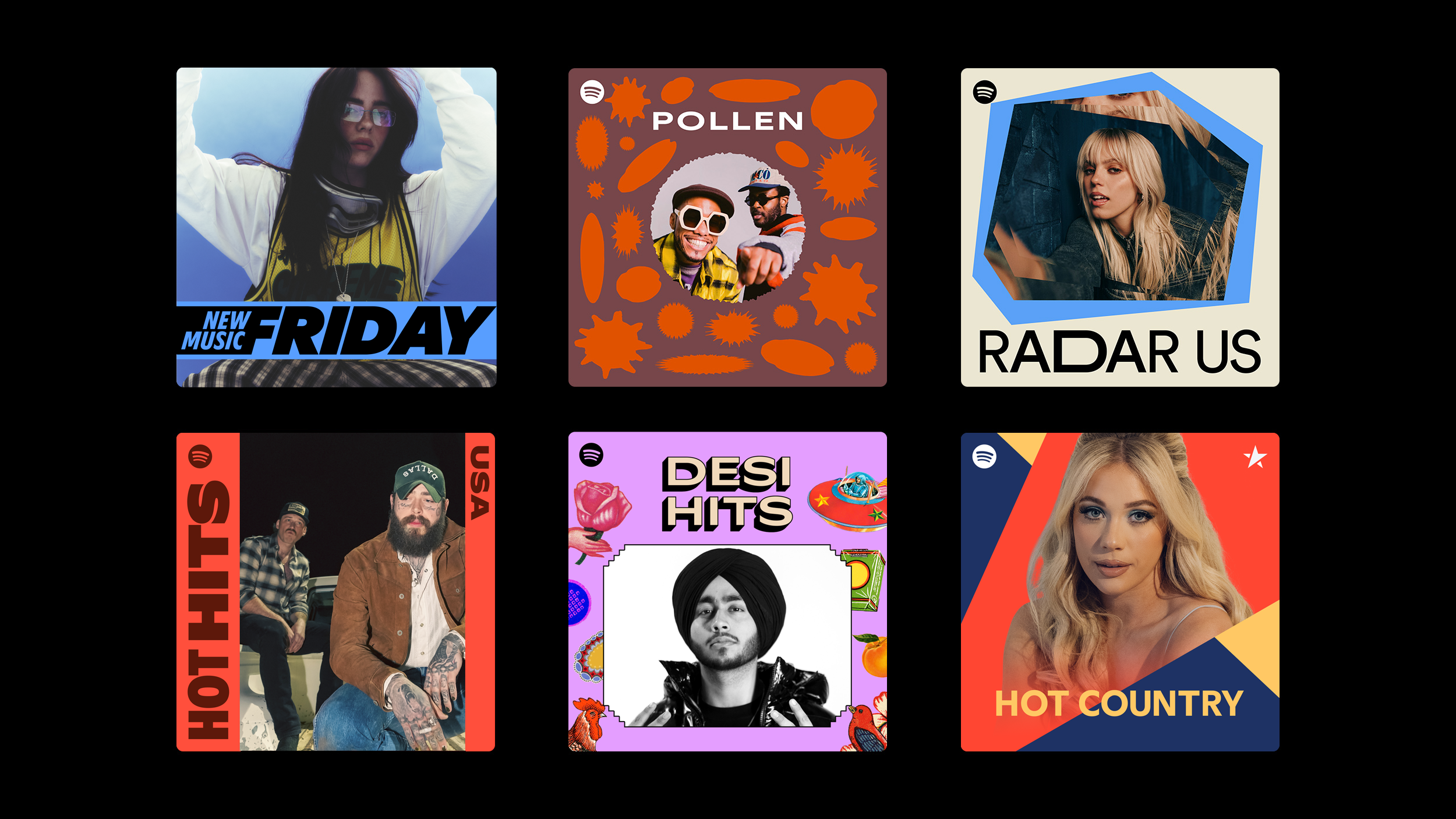
Spotify’s custom sans-serif typeface, seen across its playlist covers below, is a great example. It's bold, geometric, and instantly recognizable as part of the brand.
Good typography starts with hierarchy. Use font size, weight, and line height to guide attention and helps readers scan content faster:
-
Headlines should be bold and large
-
Body text should be readable, with enough space between lines to avoid fatigue
-
Supporting elements like captions or labels should be visually distinct but not overpowering

Image source: Zeka Design
Meanwhile, poor typography quickly weakens a design. Common mistakes include:
-
Using decorative or script fonts for body text as they’re hard to read in blocks
-
Inconsistent kerning (space between letters), which makes text feel unpolished
-
Too many font styles on one page, this breaks visual flow and confuses users
You don’t need expensive typefaces to get it right. Tools like Google Fonts offer thousands of free, web-friendly options. If you’re unsure how to pair fonts, Fontpair is a great resource to explore clean, tested combinations.
5. Alignment
Alignment is one of the most important principles of graphic design. It is what brings structure to your layout and helps users scan information faster.
Research by Ling & van Schaik found that wider line spacing and left-aligned text improved task accuracy and speed on web pages. So, this isn’t just about aesthetics, it has real-world impact.
You can easily spot the difference between a chaotic layout and a clean one is in the side-by-side example below.
On the left, the layout feels messy. Margins are inconsistent, text blocks don’t line up, and visual elements are floating without any clear structure.
The right side shows what happens when you align elements evenly to a consistent grid. Even though the content hasn’t changed, everything feels balanced, intentional, and easier to read.
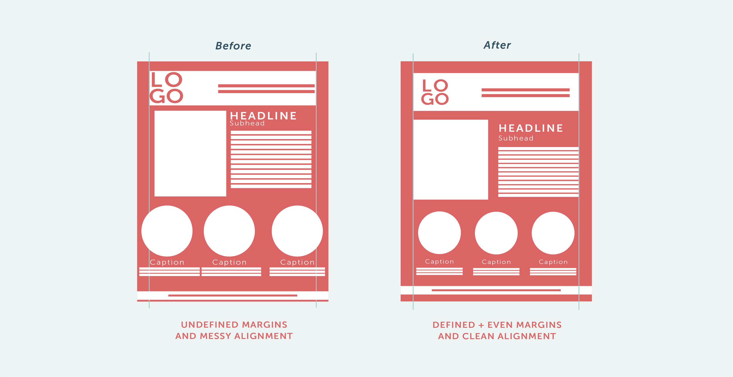
Image source: Allie Marie
So, how to decide which and when to use each type of alignment? Here are some tips:
-
Left alignment – This is often the default for body copy and menus. It supports easy scanning and natural reading flow.
-
Center alignment – Best for hero headlines or splash screens. It creates formality and draws attention to core messaging.
-
Right alignment – Rare, but useful in editorial pull-quotes, price tables, or when you want visual contrast.
-
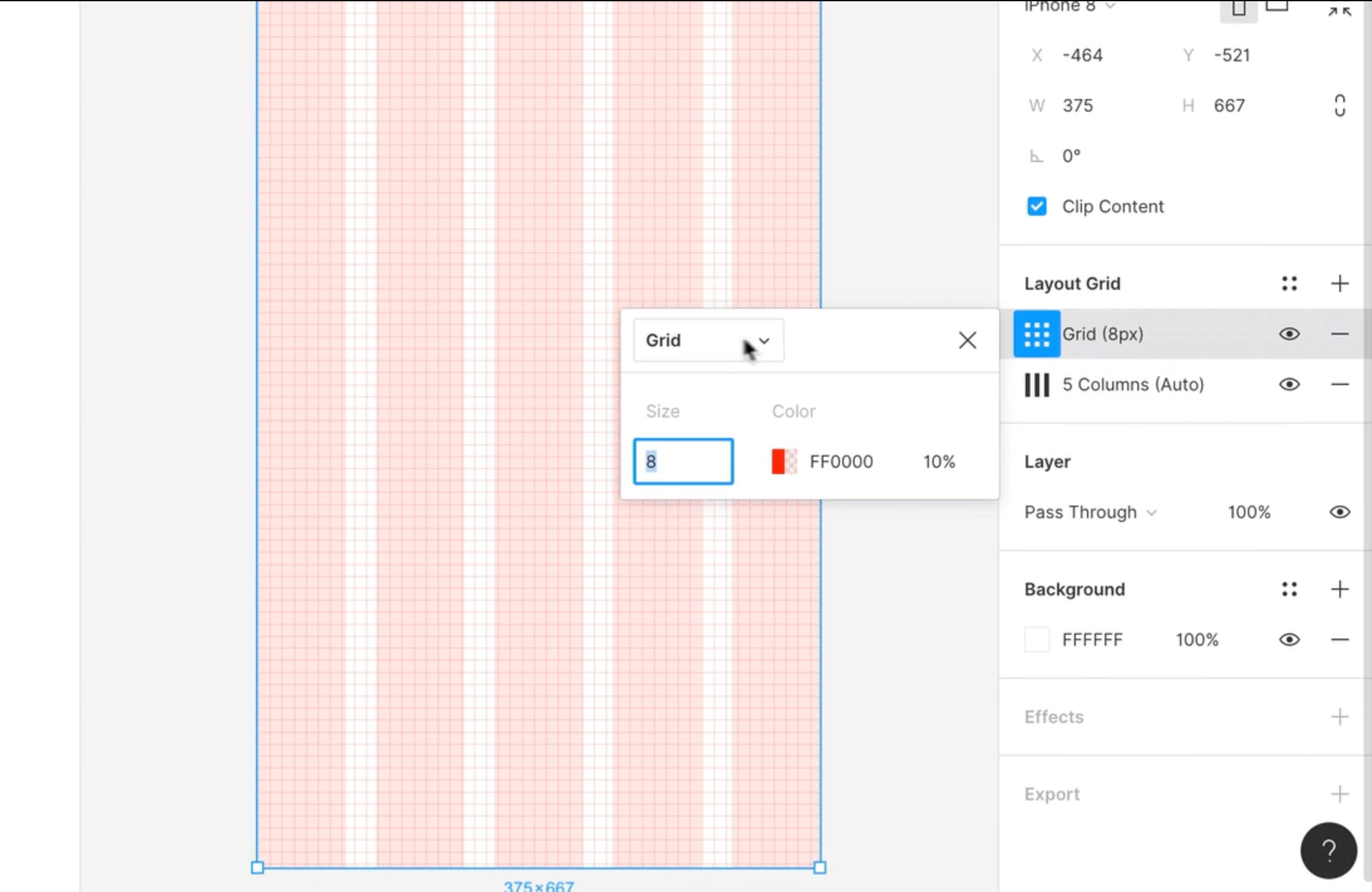
Grids & margins – Every layout should start with a grid system (12-column, 960 Grid, or CSS Grid). This makes everything snap into place, like aligning text to your background photo. You'll find this grid feature in almost every design tools, like Figma.
6. Balance
Balance is what keeps a layout from feeling too heavy on one side or too empty on the other. It controls how the eye moves across the page and shapes the emotional tone of a design.
There are two main types:
-
Symmetrical balance weights elements mirror-like or evenly across sections. It creates a sense of stability and formality. Think minimalist logos or centered event posters. Using an AI logo generator can help you quickly test designs to identify a good fit for your brand.
-
Asymmetrical balance means elements differ in size, weight, or position but still feel cohesive. It feels more modern, dynamic, and energetic. You’ll see this often in editorial layouts or landing pages with bold visuals on one side and text on the other.
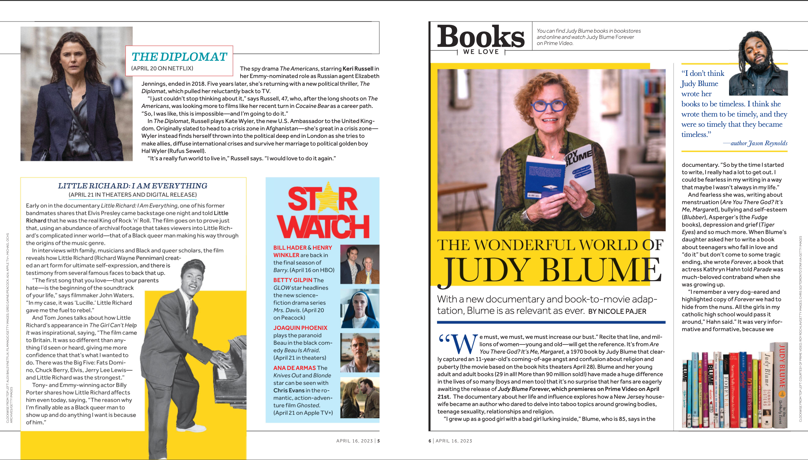
Pages from The San Diego Union-Tribune — Full edition, April 16, 2023
When working on a design, it's useful to think of visual weight and intentional imbalance. Larger objects, dark elements, and bold text all carry more weight.
Placing a heavy element on one side can be balanced by multiple lighter elements on the other. Or, you even use negative space to create visual interest without feeling off-center, just like the famous logos below.

Image source: GraphicSprings
7. Hierarchy
Hierarchy guides the eye. For example, placing an important message physically higher on the page helps establish hierarchy.
Good hierarchy follows what UX folks call the layer cake pattern: A clear structure of headings, subheadings, and body text. A large, bold headline grabs attention. Subheadings support it. Body text explains the details.
But pattern isn’t the only tool. Spacing also plays a huge role. More white space around a message makes it feel more important. Color works too, i.e., a bright CTA button or a high-contrast label naturally draws the eye.
You’ll see this in good promotional flyers. The offer comes first (“50% off”), then the CTA (“Shop now”), then the brand.
A bad example? The flyer below. Every message is bold, colorful, and fighting for attention. This is not to mention the inconsistency in primary and secondary text. All of which make it hard to know where to start.

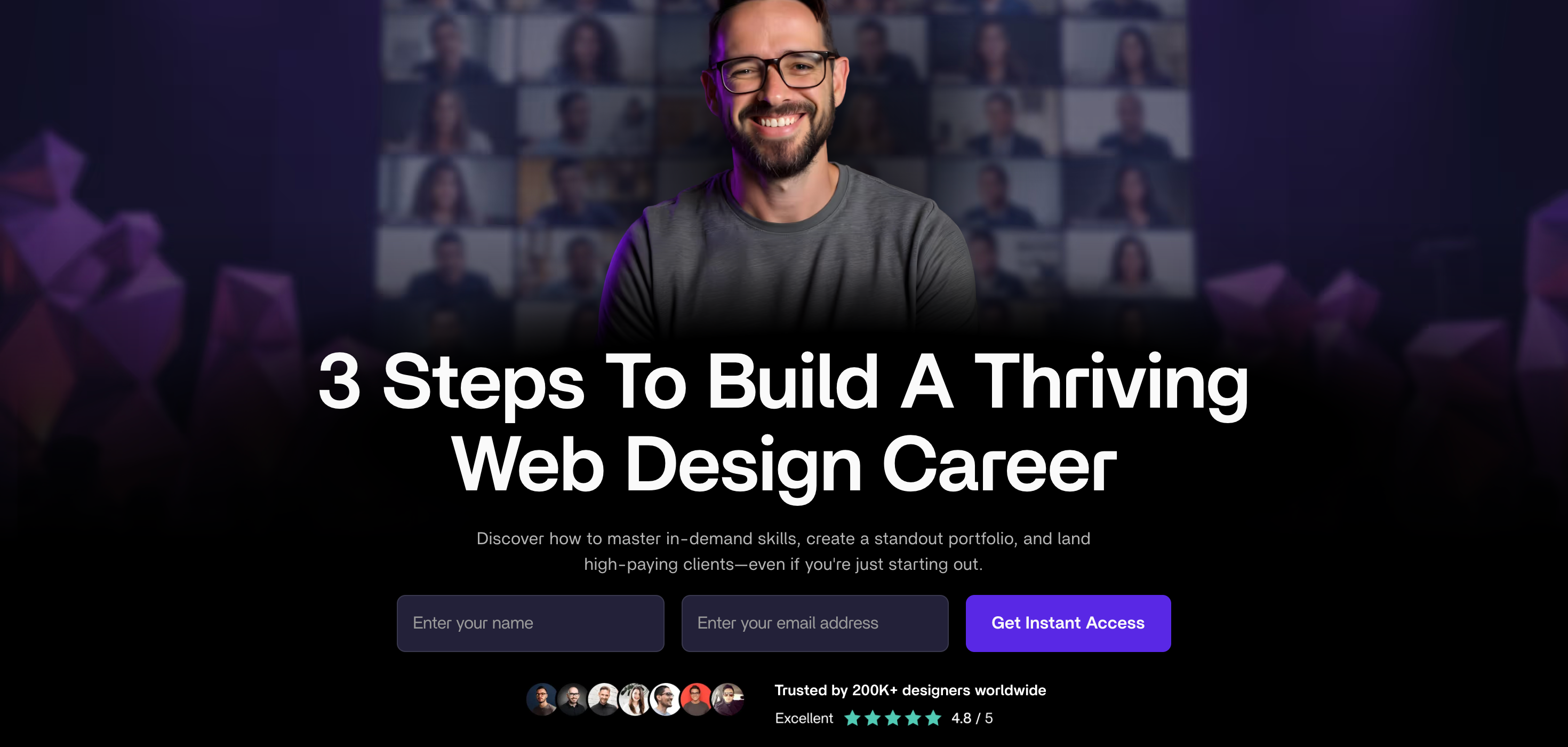
Same goes for websites. In the hero website banner example below, you can see how consistent typography, spacing, and alignment all work together to establish clear hierarchy.
The high-contrast CTA stands out, but doesn’t overpower the message.
8. Repetition
The repetition principle is all about reinforcing consistency and strengthens brand recognition.
You can repeat almost anything: typefaces, icon styles, button shapes, line weights, spacing patterns. The key is to repeat with intent.
Even simple repetition helps. You can do:
-
Matching icons across sections
-
Reusing the same heading treatment at the top and bottom of a page
-
Echoing color palettes from banners into buttons or cards.
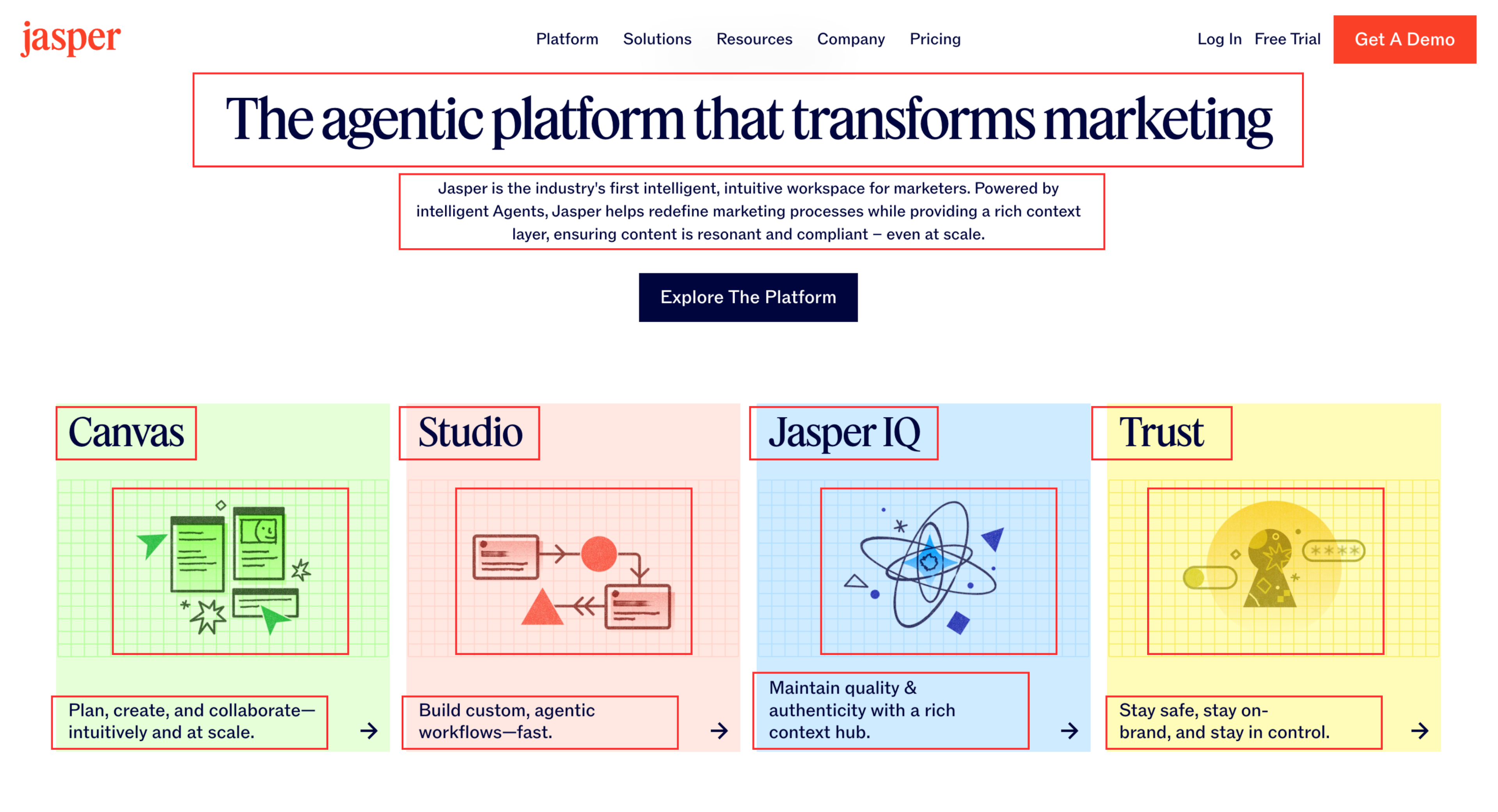
Below is an example. Jasper uses consistent typography for headers and subtext, a repeating card layout with mirrored spacing and grid backgrounds, and the same illustration style across cards.
This repetition ties every part of the page together without relying on other elements to carry the design.
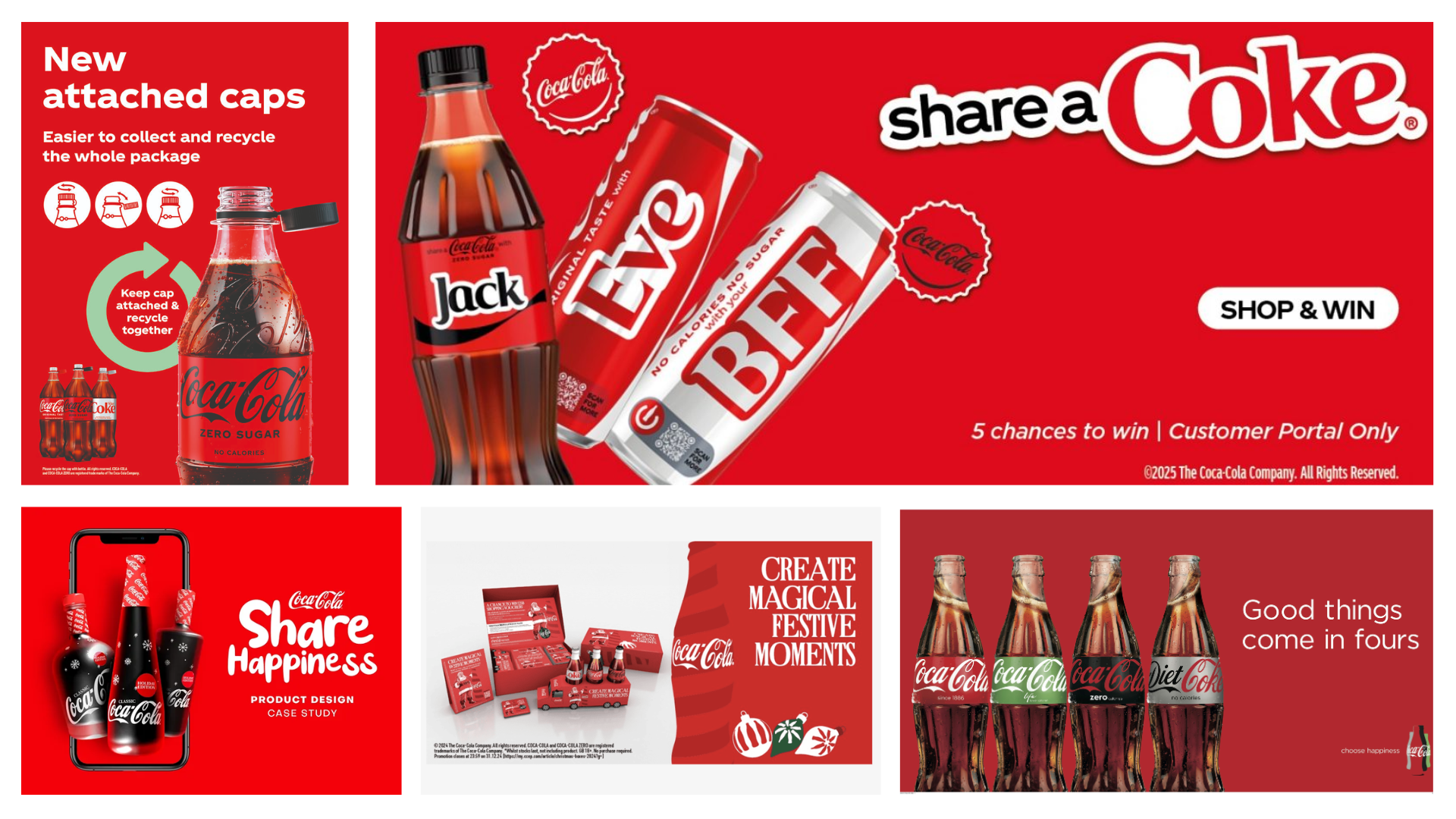
Repetition also strengthens branding. Think of Coca-Cola with the curved white script, the red background, the bottle shape.
It doesn’t matter if it’s an ad, a label, or a delivery truck, it all feels unmistakably Coca-Cola because those elements repeat everywhere.
Image source: Printmag
The easiest way to apply this is by creating a mini visual design system: define your base typography, spacing, color, and element styles, and reuse them across your layout.
It saves time and makes everything feel more polished.
9. Proximity
You can use proximity to group related elements or create a visual connection for ones under the same category. A label next to its icon reads instantly.
Navigation links that sit close together feel like one menu.
You see this a lot in mobile apps. For example, when grouping different elements by categories, it reduces the cognitive load for users. You don’t need to process every item to find what you want. The structure does the work for you.
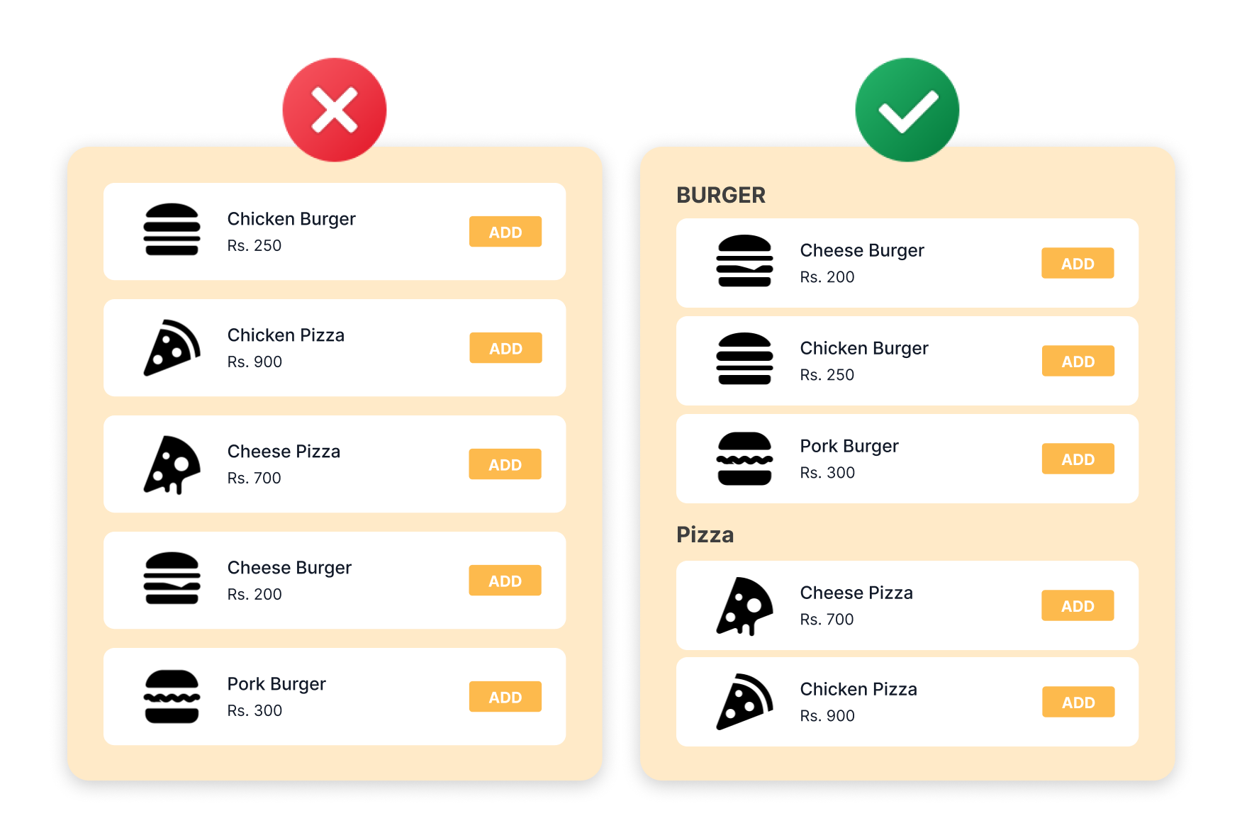
Image source: Yarsa Labs
Negative space helps with proximity too. You’ll see this technique in editorial layouts or posters that want to communicate something more abstract.
Take the Dark Knight Rises poster, for example, the bat symbol isn’t drawn directly. Instead, it’s formed by the collapsing buildings around it. That empty space in the center becomes the focal point.
10. Movement
Movement is the path your eyes take through a design and great designers control that path on purpose.
You can guide it using directional elements like arrows, lines, or image placement. For example, scaling images from small to large can pull a viewer’s eye forward in a specific sequence.
Image source: https://dribbble.com/AntonSKV
On a high-converting sales page, movement is built into the structure: Headline → core benefit → visual → CTA. Each element leads naturally to the next, so there’s no friction in understanding what to do.
In digital products, you can take it further with motion. Think scroll-based transitions, micro-interactions, or animated progress bars, they create momentum and help users follow the journey without stopping to think.
Even static layouts can create movement. Diagonals, zigzag compositions, or a strong focal point in one corner can steer attention across the screen instead of trapping it in one place.
11. Emphasis
Emphasis helps you highlight your most important message or action. When you make one element bigger, bolder, more colorful, or give it breathing room, it instantly becomes the focal point.
This isn’t just theory. A case study from VWO shows that CTA buttons placed in cleaner layouts with more surrounding space can lift conversions by up to 232%.
Take the “Get a demo” button below as example. If it’s the same size and color as everything else, users won’t notice it. But when you make it a contrast color or surround it with more space, it can becomes the center of attention.
You can create emphasis using:
-
Size — Bigger elements naturally draw the eye.
-
Color — High-contrast shades stand out against muted backgrounds.
-
Spacing — Giving key elements room to breathe makes them feel more important.
-
Anchors — Icons, outlines, or badges can serve as a central point to attract attention.
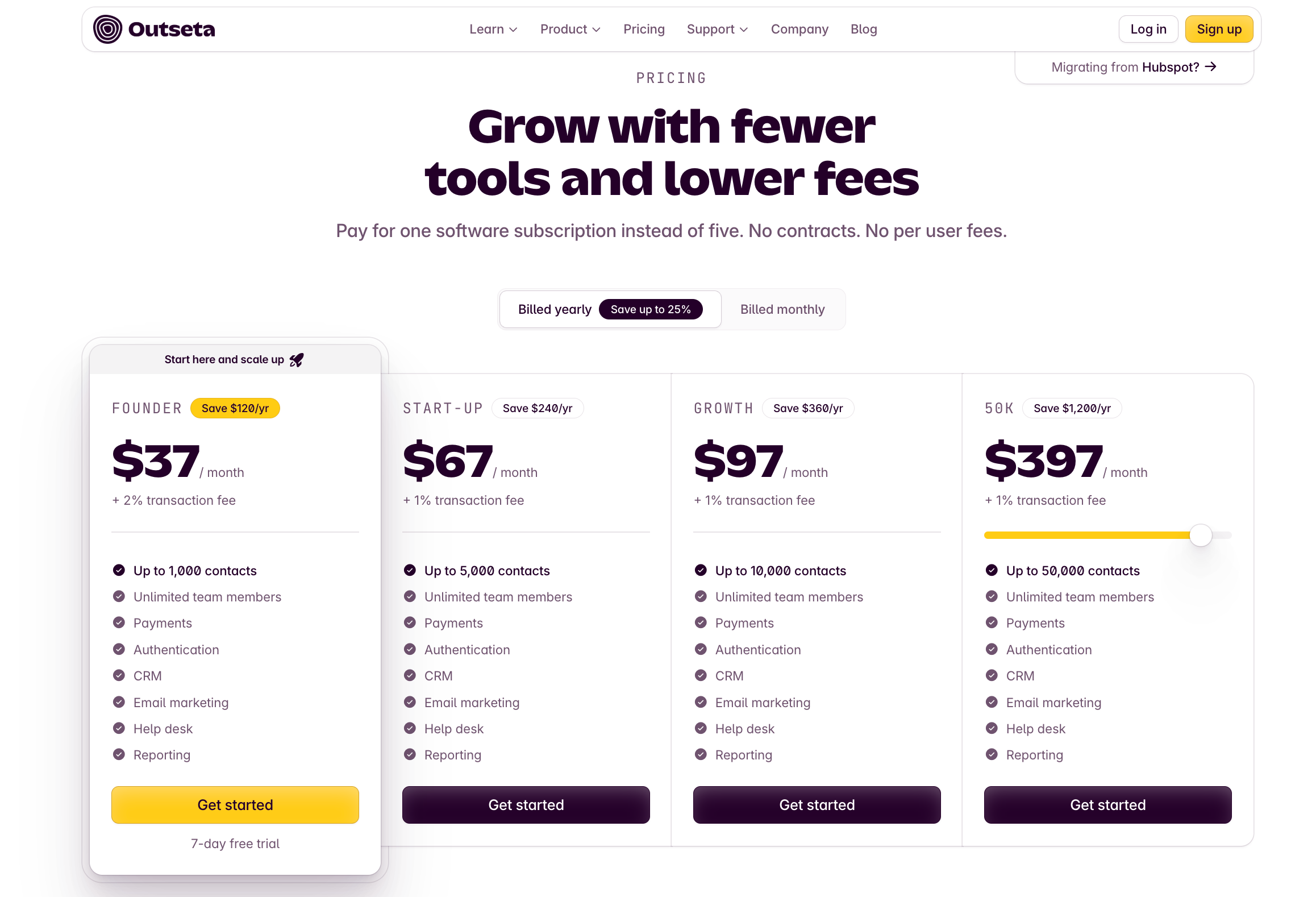
A great real-life example for using anchors as visual cues is pricing pages. For example, to drive conversion for the Founder Plan, Outseta uses multiple anchors: a floating card, a bolder CTA button, a “Start here” label with an icon, and a yellow discount badge.
The styling makes it feel like the recommended choice and that’s not by accident.
12. Unity
Unity is a design principle you can use to foster a sense of harmony and cohesion.
For example, when your website uses one typeface for headers, another for body text, and throws in a neon CTA that doesn’t match the color palette, users will notice. And not in a good way.
You can achieve unity through:
-
Grids ensure cards, text blocks, and images align perfectly.
-
Shared components like buttons or icons reinforce familiar patterns.
-
Consistent spacing and color usage mean related elements feel connected.
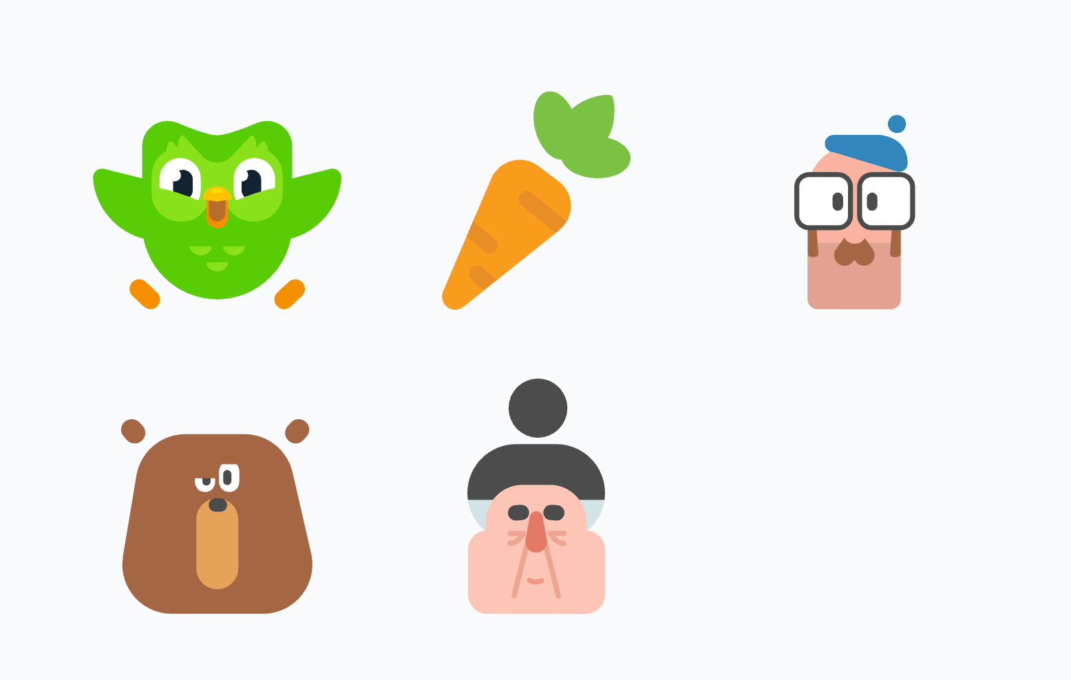
A great example of this is Duolingo’s illustration system. Every character, from the owl to the random bear or carrot, uses the same stroke weight, flat color palette, and geometric style.
13. Rhythm
Rhythm is the visual tempo of your design. It’s how repetition, spacing, and variation add flow to guide readers.
There are a few common types of rhythm you’ll see in design:
-
Regular rhythm – Repeated elements with consistent spacing. Think image galleries or icon grids where everything is evenly aligned. It creates balance and predictability.
-
Flowing rhythm – More organic repetition, like wavy patterns or curved lines. You might see this in decorative web backgrounds or packaging design.
-
Progressive rhythm – Patterns that change in size, shape, or color. A good example is a data visualization where icons grow in size to show value, it adds movement and hierarchy at the same time.
-
Random rhythm – As the name suggests, this has no fixed pattern. It’s more experimental and often used in expressive or abstract compositions.
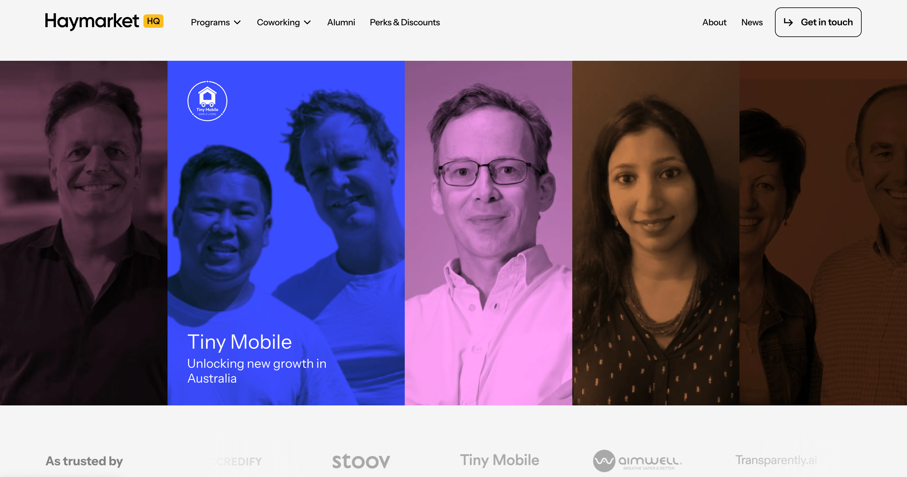
A great real-world example of progressive rhythm is on the Haymarket HQ homepage. Each team member sits in the same vertical panel layout, but the background colors shift across the row.
Even better: when you hover over a panel, it enlarges slightly, giving the impression of movement and bringing that person to the foreground.
Rhythm matters most when you’re dealing with complex layouts. In a multi-column web page or brochure, it helps users scan the content without feeling overwhelmed.
Repeating margins, section headers, or visual markers give them anchors as they scroll.
You don’t need animation to make a design feel alive. Sometimes, just repeating the right things with the right spacing does the job.
Key takeaways
Visual design is a highly sought after skill, and mastering these principles will help your work stand out. Graphic design principles help you create layouts that are not only visually appealing, but easy to understand and navigate. They are slick tools for any aspiring graphic designer.
Here are some key takeaways to rely on:
-
Keep contrast sharp to guide attention.
-
Use alignment and proximity to create order.
-
Implement hierarchy to lead the eye, and rhythm to shape how people move through your design.
The more you practice applying them across different projects, from web design to posters to UI components, the more naturally they’ll show up in your work.