19 Web Design Principles for User-Centric Sites

Petar Marinkovic
Created on Sep 26, 2025
Users form opinions about your website in as little as 50 milliseconds. If you don't know what their deal-breakers are, you may not leave the first impression that makes them want to stick around.
In this guide, I'll help you avoid this by covering widely accepted web design principles that ensure user-friendly, intuitive pages.
I'll also share different examples to show you those principles in practice.
What are web design principles?
Web design principles are reusable rules and guidelines that shape the site's layout, interaction, content, and accessibility. They help you follow a consistent framework that ensures positive user experiences by guiding the use of patterns and components.
If this terminology sounds a bit confusing, here's a quick table that clarifies the key terms:
|
Term |
What it is |
Example |
|
Principle |
A general rule that guides design decisions |
"Prioritize one primary action per screen." |
|
Pattern |
A solution template or proven way to solve a recurring problem |
“Account creation with email + magic link.” |
|
Component |
A reusable component or styled building block |
“Primary Button/ButtonGroup/Card.” |
Each principle aims to achieve a specific goal that contributes to a positive user experience.
Let's take visual hierarchy as an example. In most cases, following this principle solves the problem of a cluttered homepage. Here's a before-and-after scenario that shows the results of hierarchy implementation:
-
Before: The homepage shows a rotating carousel, four equal “Learn more/Shop/Subscribe/Contact” buttons, three promo banners, and a newsletter modal on load. All CTAs look identical; headings are the same size, spacing is tight, and users miss the main action (start shopping).
-
After:
-
Define one primary goal: “Start shopping.”
-
Replace the carousel with a hero section: H1 “Fresh groceries, delivered today,” short subcopy, and one filled primary button “Start shopping.”
-
Demote secondary actions to text links in the header and a ButtonGroup with outline styles below the fold.
-
Group promos into a 3-card grid under “Popular this week,” each with a single secondary CTA.
-
Increase hierarchy via type scale (H1 36–40 px, H2 24–28 px, body 16 px), 8-pt spacing rhythm, and contrast(AA-compliant).
-
Whether you're creating a new site or refreshing an existing one, well-defined principles will help designers and product teams align scope, decisions, and success metrics.
Why do website design principles matter?
Website design principles reduce rework by creating a common decision framework across design, product, engineering, and content.
Instead of going back and forth on every screen, teams can repeatedly reference specific rules (e.g., “one primary action per page” or “write task-first headings”). This results in:
-
Streamlined design workflows
-
Fewer late-stage changes
-
Consistency in UI, copy, and code
Seeing as each principle serves a specific goal, it can be tied to a concrete outcome you can measure. For example:
-
Visual hierarchy → clear focus on the next step → increased CTA click-through rate
-
Contrast and readability → easier to read and fill forms → improved form completion rate
-
Clear navigation → users find tasks faster → shorter median time to task
Another reason to define and follow clear design principles is to ensure inclusivity and compliance with best practices and legal requirements.
Principles like sufficient color contrast, semantic structure, and keyboard operability directly map to Web Content Accessibility Guidelines (WCAG) 2x success criteria, so applying them improves accessibility for:
-
Screen-reader users
-
Low-vision users
-
Visitors with motor or cognitive disabilities
At the same time, doing so minimizes the risk of non-compliance with important accessibility laws and directives (e.g., ADA, Equality Act, EU Web Accessibility Directive).
Not following the necessary principles doesn't only result in the absence of these benefits—it can expose you to many risks, such as:
-
Inconsistent, hard-to-maintain site: One-off decisions proliferate, causing duplicate components, conflicting behaviors, and costly rework.
-
Brand dilution and trust erosion: Inconsistent visuals, tone, and interaction behaviors make the site feel unreliable, lowering perceived quality and willingness to take action.
Use in practice:
Choose principles: Hierarchy, clarity, consistency, feedback, accessibility, etc. Define each with a one-line rule and a “when it applies” note.
Codify in docs: Put principles in your design system with examples, do/don’t visuals, copy guidelines, and WCAG mappings; add metrics you’ll track per principle.
Review in crits/QA: Turn principles into checklist items for design crits, content reviews, code reviews, and release QA
19 website design principles to follow
To create web pages that provide users with a pleasant experience, follow these principles:
1. Clarity and simplicity
Cluttered web pages confuse users and cause distractions that pull them away from the page's focus and intended action. Simplifying the interface reduces noise so that attention flows to the key tasks you want the user to accomplish.
There are many reasons why your page might be cluttered, but extensive text is often the main culprit. While there's a time and place for text-rich pages (e.g., blog posts), you shouldn't meet the user with huge blocks of text.
Instead, keep your copy as punchy as possible. This way, a sentence like:
"If you're looking for a graphic design agency, you've come to the right place—we will help you design unique visual materials that establish a consistent brand presence and make your business stand out in the crowd."
Can become:
"Our agency translates ideas into compelling visual forms to establish a unique brand identity."
In my experience, the first copy draft will probably have to be trimmed down a few times before you land on the final version. Revisit your copy to spot and remove any fluff.
Other effective ways to simplify a page include:
-
Reducing actions and buttons: Make sure there's one primary CTA per view. Turn secondary actions into links or move them to a details panel.
-
Limiting color palettes: Stick to a single color palette that reflects your brand visuals. Make sure there's enough contrast between the background and the page's content (especially CTAs and important buttons).
-
Simplifying typography: Use 1–2 typefaces and a clear scale (e.g., 12–16–20–28 px) to avoid messy and cluttered typography
Pro tip: Use white space as a feature, not a leftover. It creates visual breathing room, groups related elements, and points the eye to what matters. More often than not, increasing spacing and reducing borders does more for clarity than adding lines or boxes.
If you need an example of a simple but captivating page design, look at Squarespace's homepage:
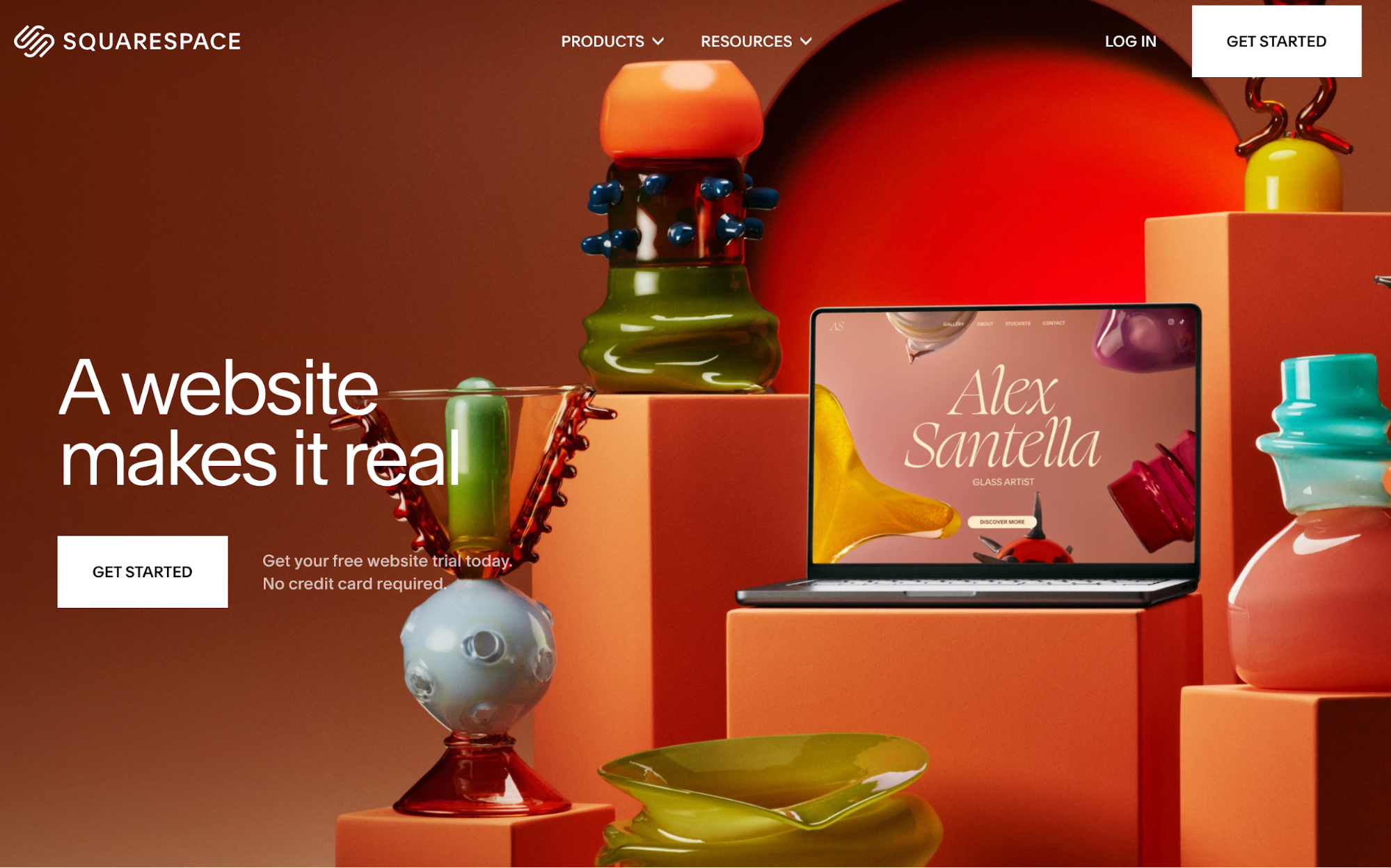
The target action is clear (getting started), and everything on the page supports it, from crisp copy to the contrast between a vibrant background and white CTA buttons.
The page also proves that white space doesn't actually need to be white—you're free to add some splash of color as long as the content is contrasted well.
2. Visual hierarchy
Visual hierarchy prevents users from being overwhelmed by guiding their attention through the size, color, contrast, and placement of different components. It also makes navigation intuitive and helps users take action more smoothly.
The easiest way to achieve a clear hierarchy is to use the H1 → H2 → body → CTA structure while paying attention to the elements like color and size. Here's a sample hero layout you can follow:
-
H1 (largest, bold): 40–56 px desktop; concise value prop (“Do X better/faster”).
-
H2/subhead (medium, regular): 20–24 px; one sentence that clarifies the promise.
-
Body (regular): 16–18 px; 1–2 lines to reduce uncertainty (what it is, who it’s for).
-
Primary CTA (high contrast): Prominent button (“Get started” / “Start free trial”).
-
Placement: H1 top-left; subhead immediately below; CTA under the copy (or right-aligned in the same block). Keep a single visual (product shot/illustration) adjacent, not competing.
If you want to see this layout in action, Stripe's homepage follows it:
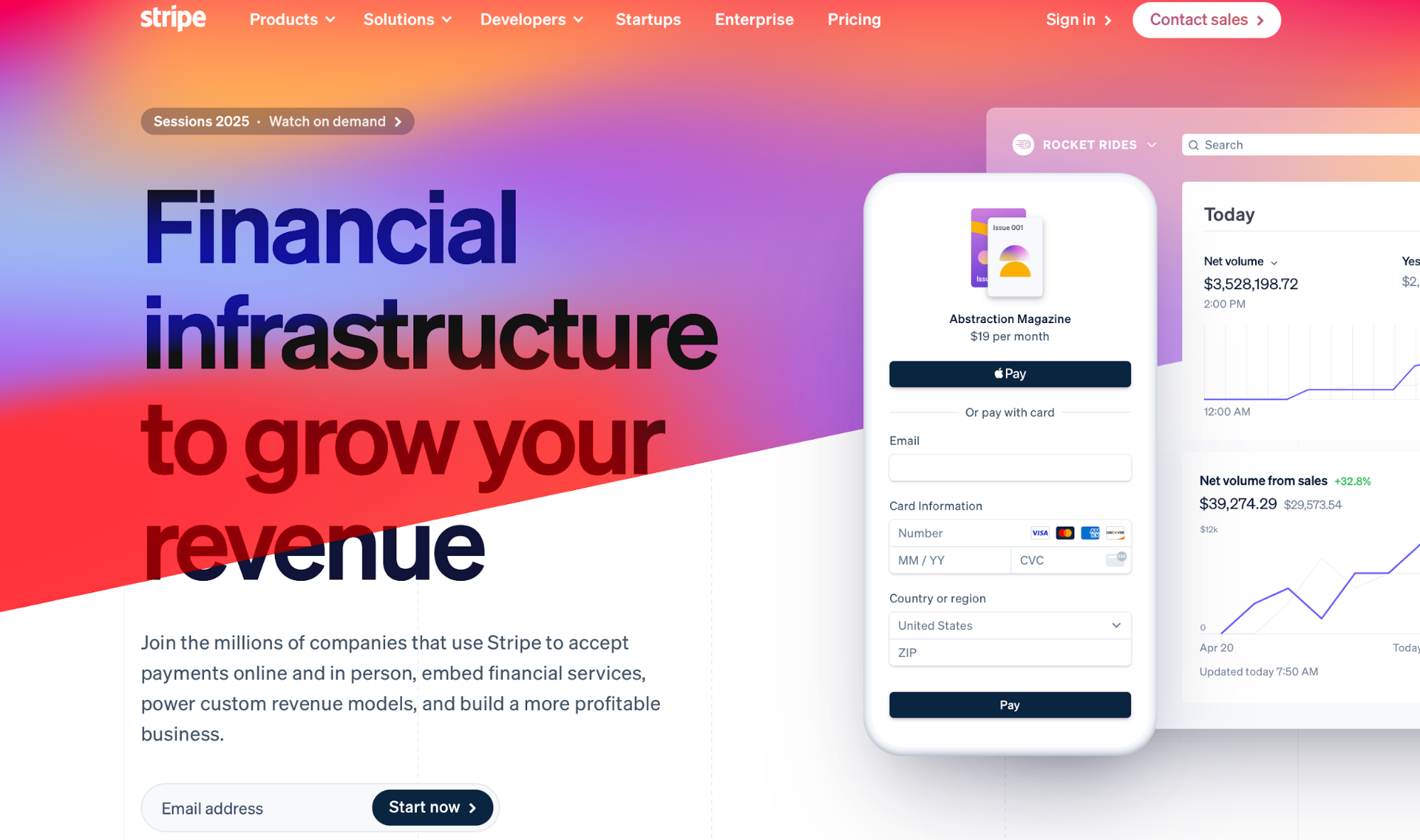
The eye is immediately drawn to the H1 and intuitively guided to the CTA without confusion or overwhelm.
Now let's contrast this to a page like Gates N Fences:
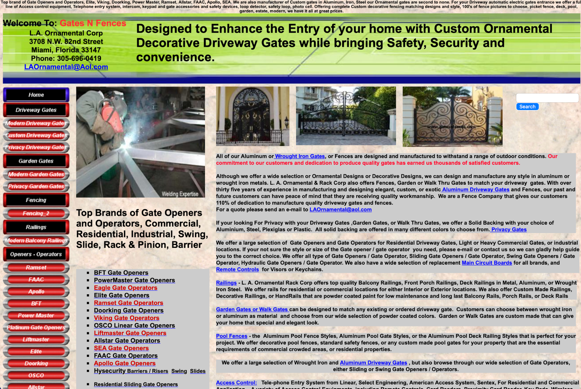
You can instantly see why this page is tough on the eyes.
There's no clear entry point for the eye, and the page piles dense text, huge link lists, mixed font sizes, and competing sections with little spacing. As you enter the page, you start haphazardly scanning it without clarity on the next step.
3. Navigation
Besides being esthetically pleasing, your website needs to ensure streamlined navigation. You should strike the right balance between looks and functionality, which you can do by following a few simple rules.
First, map your site's navigation by splitting it into two types:
-
Primary navigation: Include 5–7 top-level items, which outline the core tasks you want users to complete on the site (e.g., Products, Pricing, Docs, etc.).
-
Secondary navigation: Dedicate secondary navigation to utilities, which should be clearly separated from primary items.
If this sounds a bit abstract, here's an example of Samsung's homepage:
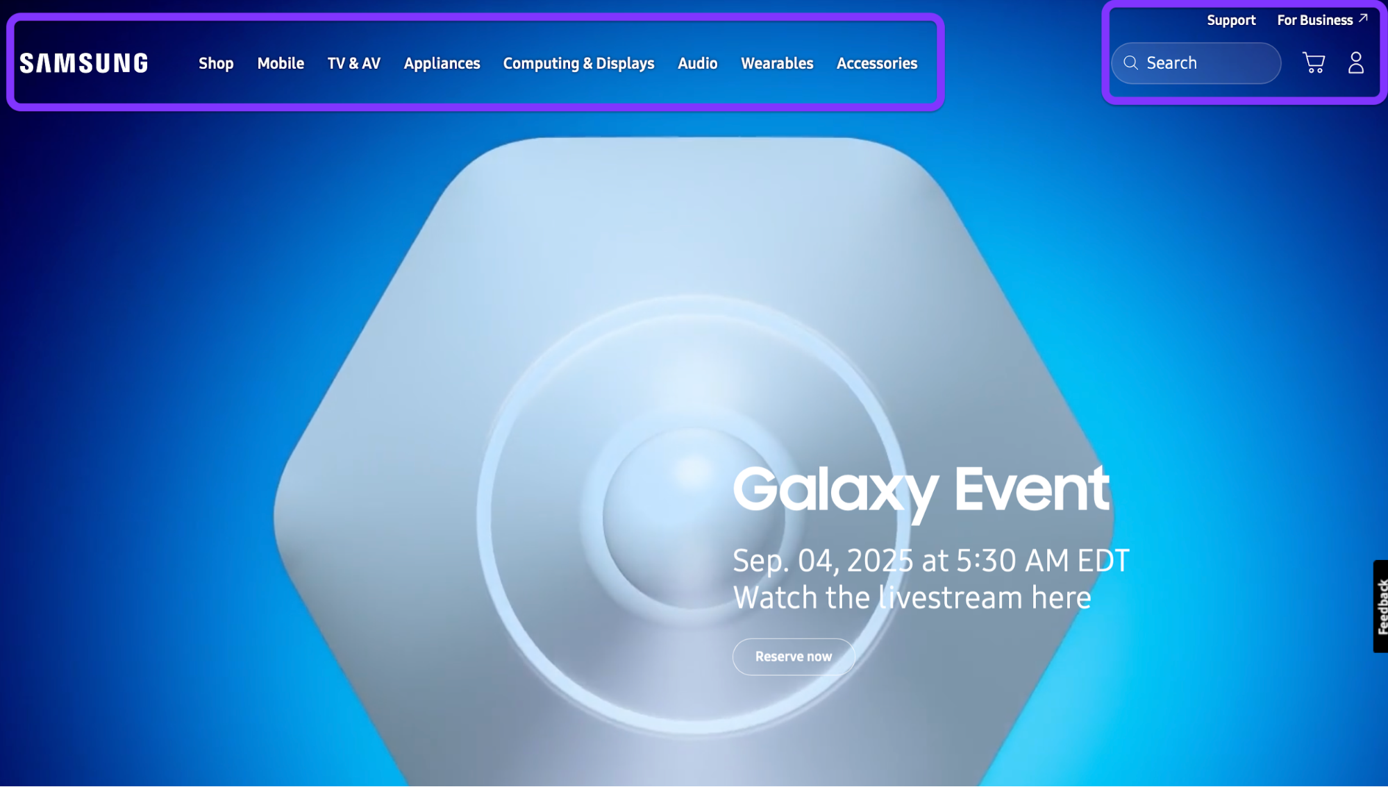
As you can see, there are two distinct categories of items—one for core tasks and another for utilities like search, support, and account creation.
You also don't want to make users dig too deep to find what they need and complete the key tasks. Instead, make sure the user can access them in no more than two clicks (e.g., Home → Section → Target page).
If a task consistently needs 3+ clicks, promote it in the information architecture (IA) or surface it as a quick link.
Of course, not all of your website will be accessible in two clicks. You'll most likely have three or more levels, in which case you should use breadcrumbs (e.g., Home > Products > Analytics > Dashboards). When setting them up, follow these rules:
-
Make all but the last item clickable
-
Mirror real labels (page names)
-
Keep breadcrumbs directly under the header for quick backtracking and orientation
And if you struggle to keep the key actions close to the entry point, try rethinking your labels. For example, you can split a catch-all dropdown label like Solutions into concrete, task-first labels like Use cases, Templates, and Integrations.
Doing so improves information scent and speed scanning, making tasks more visible and accessible.
To validate your navigation and its effectiveness, you can use two types of tests:
-
Card sort (30–45 min): List ~20 common topics on cards, and then ask 5–8 users to group and name them. Use the winning group names as candidate top-level labels.
-
Tree test (30 min): Paste a text-only version of your nav into a tree-testing tool or a spreadsheet outline and give 5–8 tasks (“Find pricing for Team plan”). Track success rate and time-to-first-click, fixing anything below ~80% success.
4. Grid‑based layout
A grid-based layout gives your page a consistent rhythm and alignment, so users can scan it faster and find what they need with less cognitive load.
Columns and gutters create predictable “parking spots” for content (cards, images, forms) that line up across pages and breakpoints, ensuring a clean and responsive design.
Start with a 12-column grid on desktop. Give yourself 24 px gutters between columns and 32–40 px outer margins inside the page container (a comfy 1200–1280 px max width works well).
This setup works because 12 divides nicely into 2, 3, 4, and 6, so you can make halves, thirds, and quarters without wobbly spacing.
As the screen size drops, the grid should shrink:
-
Desktop (≥1200 px): 12 columns, 24 px gutters, 32–40 px margins
-
Tablet (768–1199 px): 8 columns, 20 px gutters, 24–32 px margins
-
Phone (≤767 px): 4 columns, 16 px gutters, 16–24 px margins
To visualize this structure, picture a row of content cards (image, title, meta, CTA) like a blog or product grid.
-
On desktop, place three cards per row at 4/12 columns each (4 + 4 + 4). All card edges line up, images share a top baseline, and CTAs sit on the same vertical step (use an 8-pt spacing scale so paddings/margins are 8/16/24/32 px, etc.).
-
On tablet, shift to two cards per row, each 4/8 columns.
-
On phone, go one card per row, a full 4/4 columns, stacking image → text → CTA.
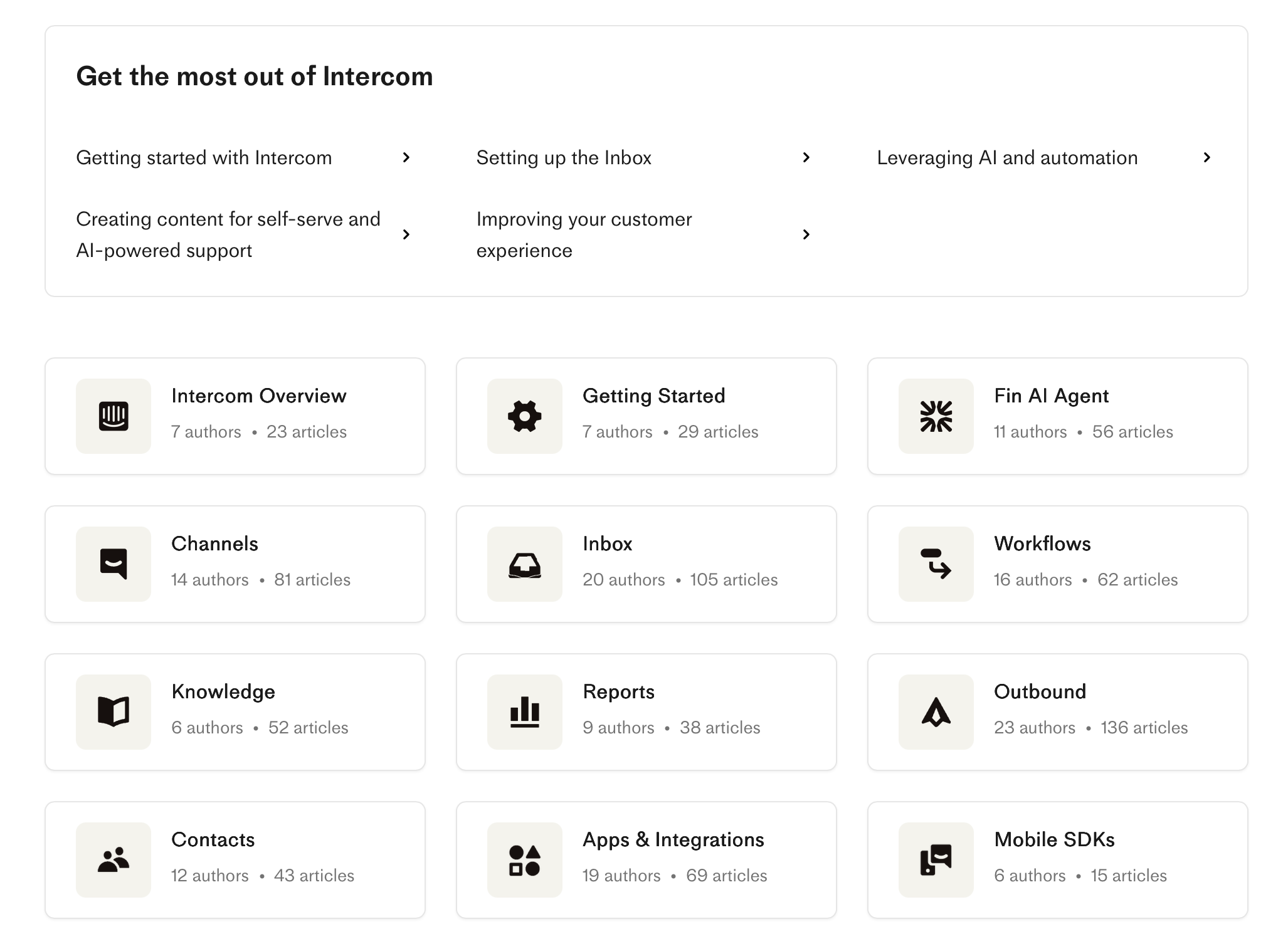
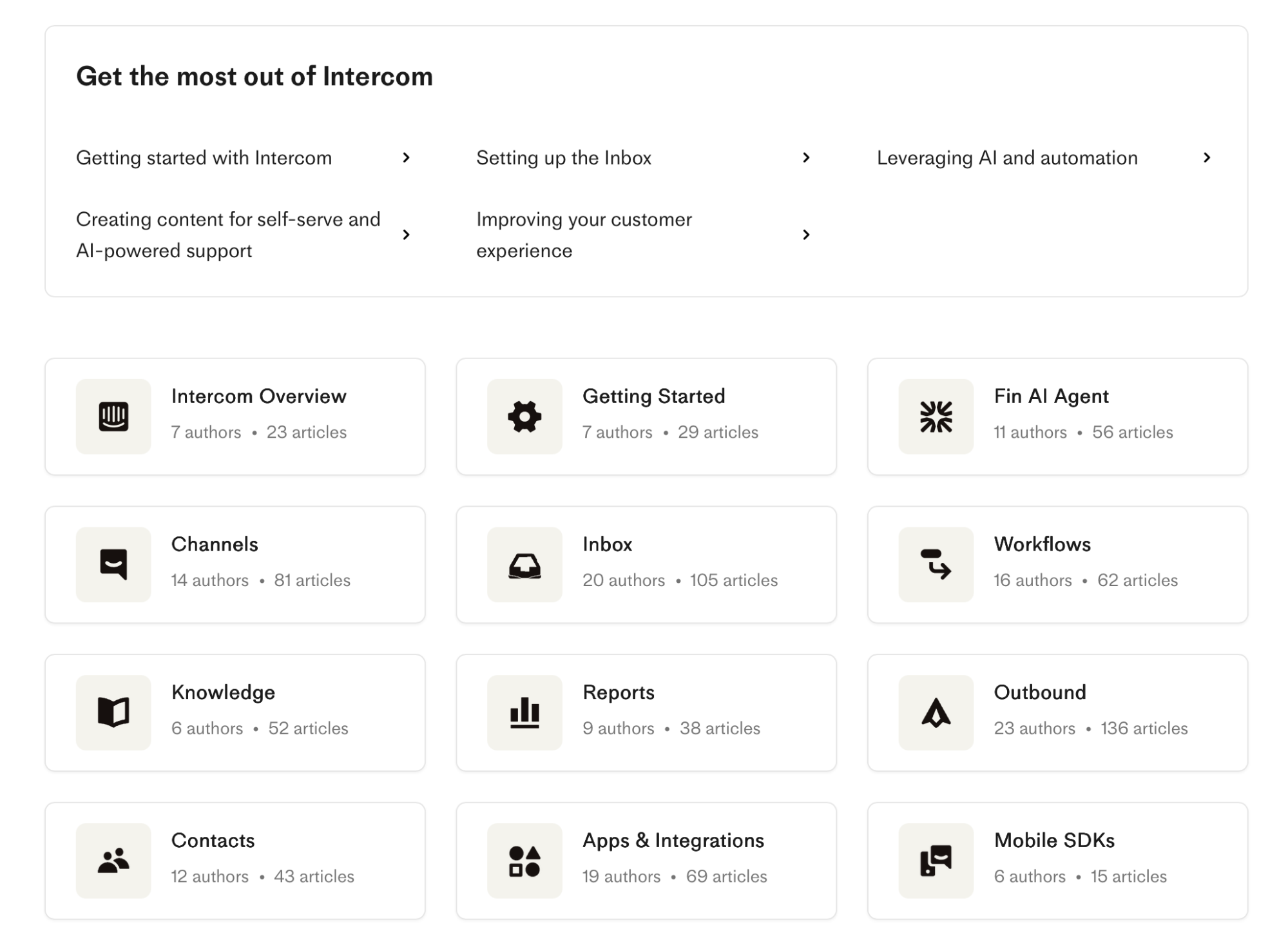
If you need a practical example, you can check out Intercom's help center. On desktop, you can see a 3-column card layout for collections:
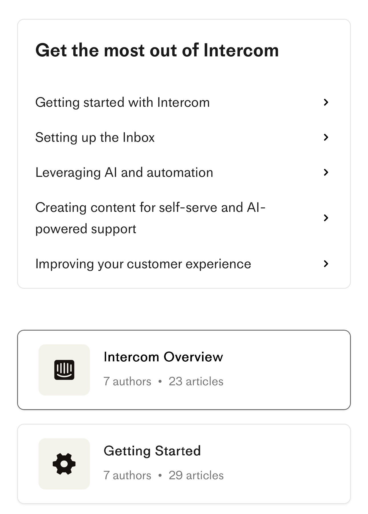
When you switch to mobile, the collection cards collapse down to a 1-column layout:
Don’t: “just nudge it a few pixels”
This is how clean layouts get messy. You nudge a card’s image 6 px left to “look centered,” the CTA gets 18 px side padding instead of 16/24, and suddenly edges don’t align and gutters are uneven. Users can’t always say what’s wrong—they just feel the jitter.
The more you nudge, the worse it gets, so you may end up with a completely misaligned layout like this one:
While this is an extreme example, it shows that eyeballing doesn't work. Make sure each card container snaps exactly to 4/12 columns. If something looks off, change the column span or adjust the grid tokens (gutters/margins)—don’t freehand pixels.
5. White space
White space (negative space) is the intentional empty space around and between elements. Some mistakenly consider it "wasted" space, but it's anything but.
White space lets content breathe, separates ideas, and gives the eye a path to follow.
To ensure adequate white space, pick a simple, modular scale (e.g., 4 / 8 / 12 / 16 / 24 / px) and use it everywhere. If you need some guidelines, here's what you can do:
-
Cards: inner padding 16–24 px; outer gap between cards 24 px for desktop and 16 px on mobile
-
Sections: top/bottom padding 48–64 px so sections feel distinct; keep side padding tied to your grid margins.
To stay consistent, you can lock these values into tokens (e.g., space-8, space-24) so designers and engineers snap to the same values instead of eyeballing.
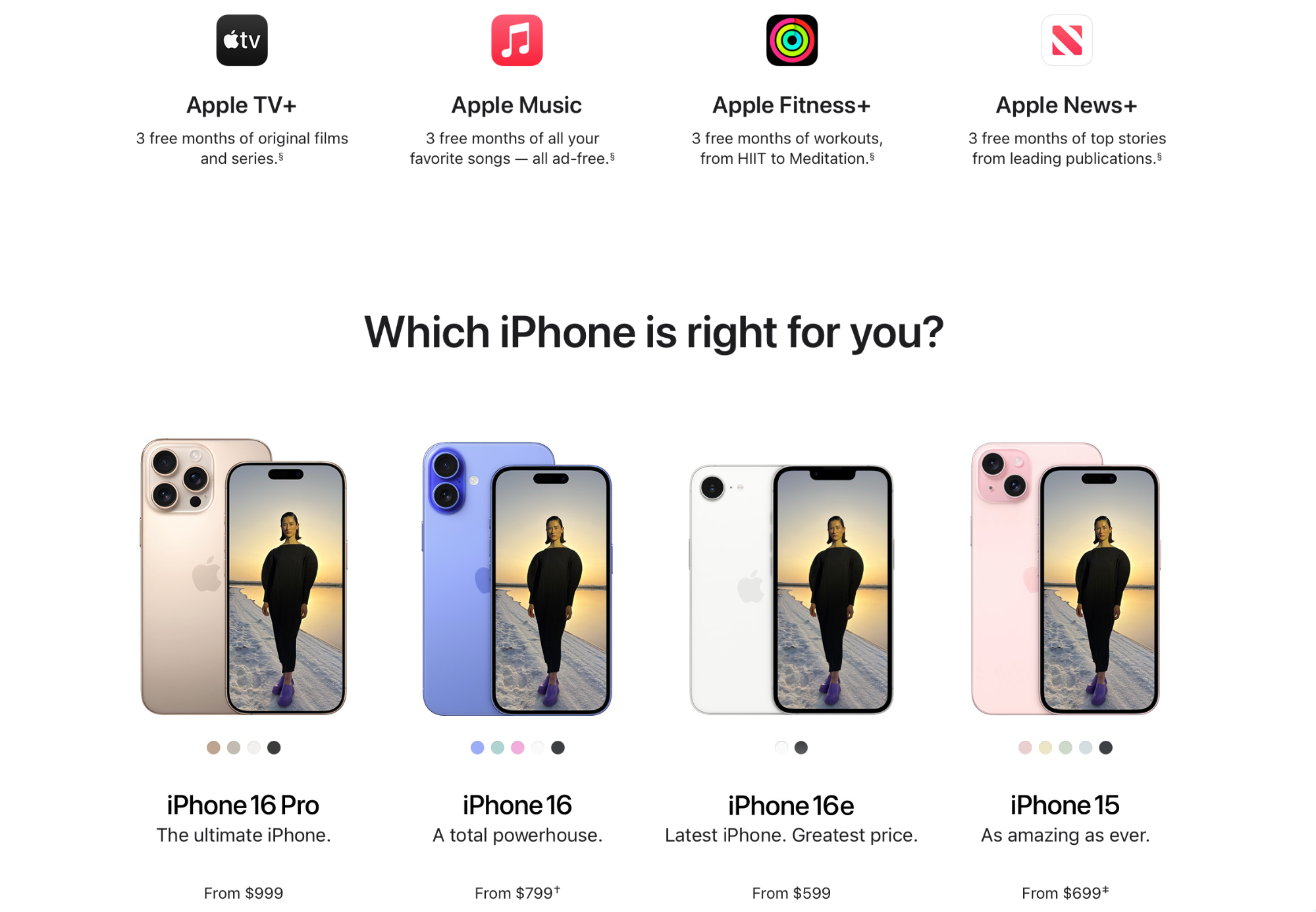
Apple's website uses ample, consistent white space, which gives it a clean and polished look. Here's an example from the iPhone 15 product page:
Now compare this to Arngren's homepage:
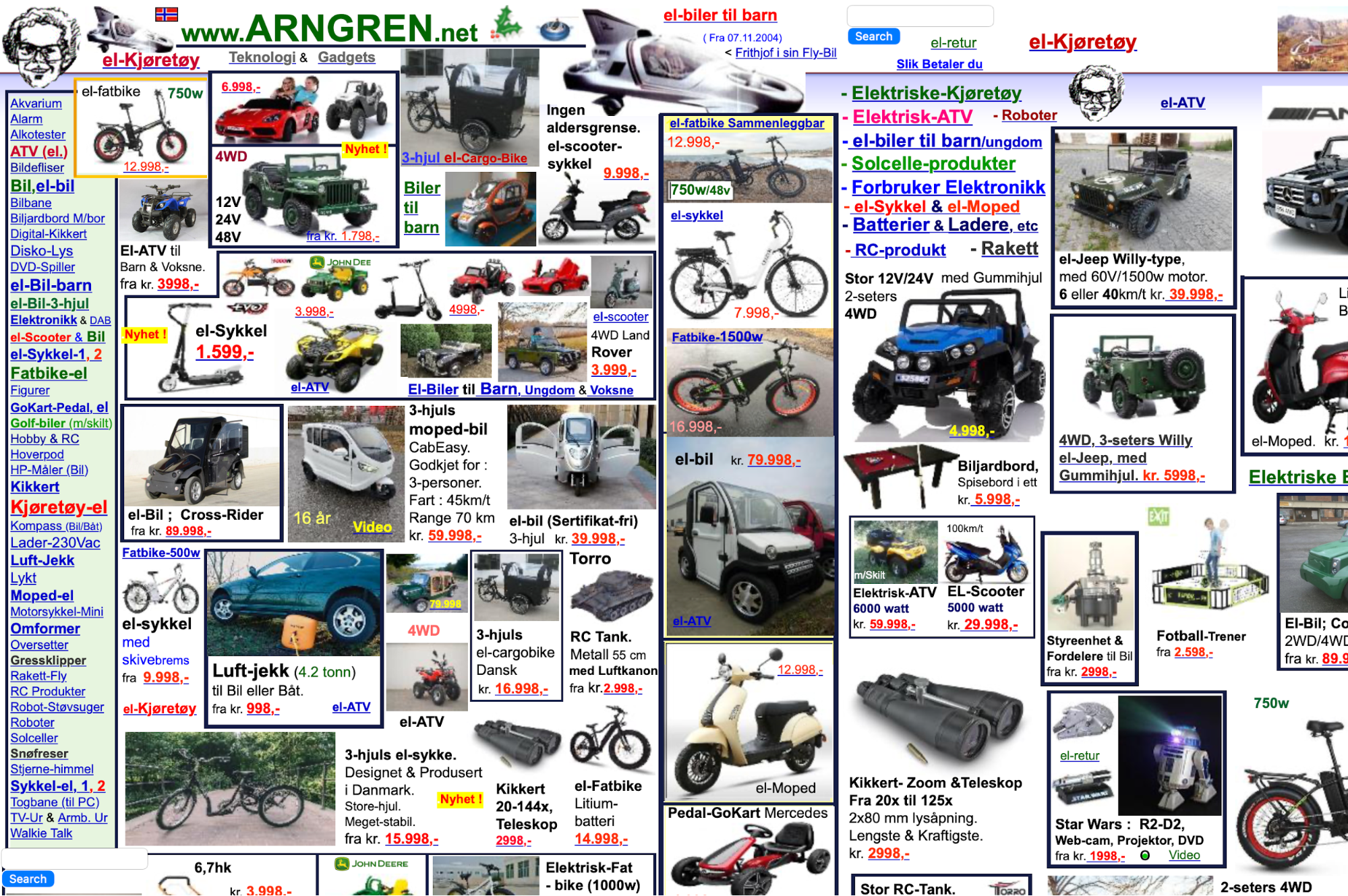
Product tiles, ads, and text are packed with inconsistent gaps and no column rhythm, which makes everything look chaotic and barely readable.
You can also use white space to group related items and separate them from others. For example:
-
In a card, keep image ↔ title ↔ meta ↔ CTA on a consistent vertical rhythm (e.g., 8 / 16 / 24 px).
-
Between different cards/sections, increase the gap (e.g., 32–48 px) so users know they’ve moved to a new idea.
6. Simplicity
Simplicity plays several important roles in web design. It lowers cognitive load so that users make decisions and take actions faster while reducing defects and rework across design, content, and engineering.
Following this principle comes down to one goal: make a page do one thing, and make sure it does it well.
In practical terms, this means keeping one primary action above the fold and making it the only filled button in the hero. Any secondary actions should be included as text links or outline buttons below the fold or in the footer.
You also need to steer away from non-essentials that create clutter, such as:
-
Carousels
-
Duplicate CTAs
-
Auto-open modals
-
Low-value badges
If you need any of these elements, make sure they're below the fold.
Simplicity isn't only a design feature but also a literary one. Replace jargon or technical slang with everyday words, and keep sentences at ~20 words to clarify the page's primary purpose in a way that doesn't cause mental strain.
Finally, limit color and type choices to a small, purposeful set. For example:
-
1 brand color (primary)
-
1 neutral (background)
-
1 accent (states/links)
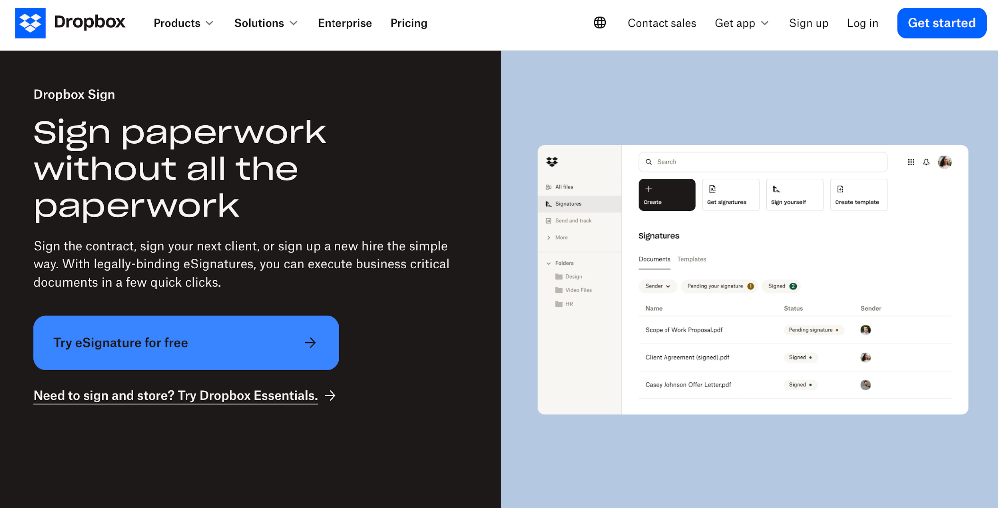
The Dropbox Sign landing page follows pretty much all of these simplicity guidelines. It has a clear hero headline, one dominant CTA above the fold, short plain-English copy, and restrained color/typography.
7. Accessibility and inclusivity
Accessibility ensures that your site doesn't exclude people with visual, motor, and other disabilities while improving the overall UX.
Clearer structure, better contrast, and predictable interactions help all users complete tasks faster.
The first thing you should focus on is the contrast of your site content. You need to meet the WCAG 2.2 AA guidelines, which recommend at least 4.5:1 for normal body text and 3:1 for large text (more on contrast a bit later).
You shouldn't rely on color alone to convey meaning. Pair it with icons, patterns, or labels (e.g., error text + icon, not just red) to ensure maximum visibility.
Tip: If you need help working out the right contrast, you can use tools like the WebAIM contrast checker.
Alt text is another key aspect of accessibility, as it helps visually impaired users and those using assistive technology understand the purpose and context of the page's visual elements.
Give every image accurate, concise alt text that states the purpose and explains it—for example:
-
"Add to cart button"
-
"Team photo at launch event"
-
"Blue shirt on a gray background"
To support users with motor limitations, make sure your page is fully keyboard-operable. When you put the mouse away, you should be able to tab through in a sensible order, open/close menus and dialogs, and never get stuck in a keyboard trap.
An often overlooked detail you should focus on is labeling all form fields with error text and helper text when needed (e.g., “Use at least 8 characters with a number”).
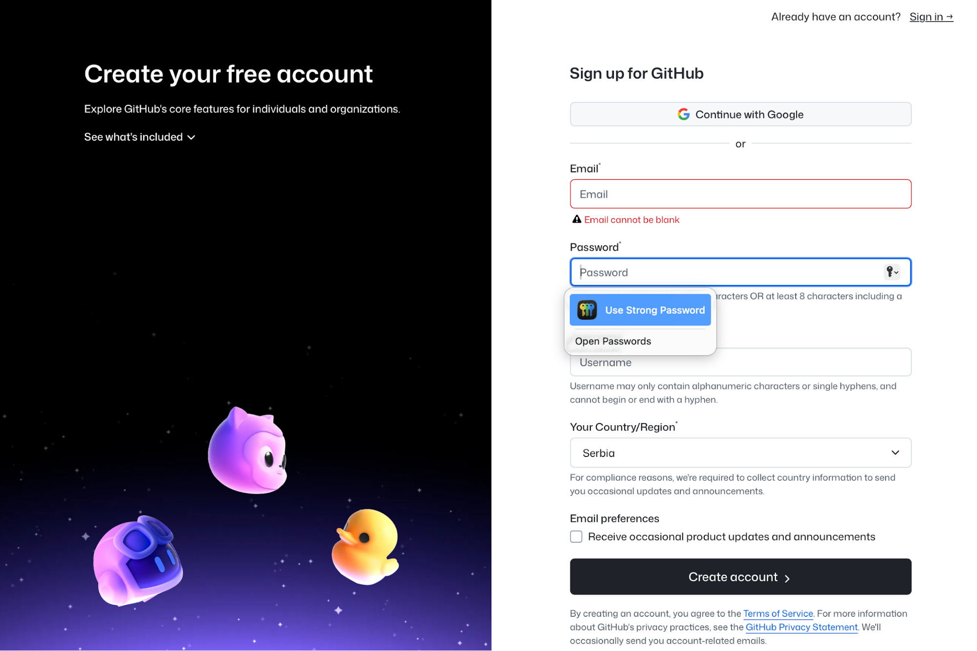
GitHub's signup page is a perfect example of these guidelines. You can tab through all the key elements, and you'll see error messages in the relevant fields.
You’ll also see clear labels, high-contrast text, and a single primary action per step.
If you add any media besides images, provide captions for videos and transcripts for audio to ensure the inclusion of users with hearing disabilities. You should also avoid autoplaying audio and respect prefers-reduced-motion by offering a way to pause/stop animations.
Lastly, if color indicates status in charts, add textures, shapes, or labels so it’s understandable in grayscale or for color-blind users.
8. Mobile-first design
When designing a page, go mobile‑first and prioritize thumb‑reachable targets. They should be big enough to hit comfortably—at least ~44×44 pt on iOS (roughly a 44×44 px guideline)—so buttons and links are easy to tap.
You should also place primary actions where thumbs naturally rest (bottom half/center lines) and keep enough breathing room between taps.
It’s a tiny choice that prevents tapping errors and speeds task completion. Apple’s Human Interface Guidelines (HIG) reinforce generous hit areas and clear affordances, so you can use them as a reference point.
As the page switches from desktop to mobile, replace sprawling menus with a clear menu button (or concise tabs) and put search front and center because many users arrive intent-first.
Google’s guidelines also suggest mobile-first content and structure because the mobile version is used for indexing and ranking, so following them can help attract more website traffic.
To see if your page's structure works, try at least three devices and two browsers to catch layout jitters, keyboard overlays, and slow taps. For example:
|
Device |
OS |
Browsers to test |
|---|---|---|
|
iPhone 14/15 |
iOS |
Safari, Chrome |
|
Pixel 7/8 |
Android |
Chrome, Firefox |
|
Samsung Galaxy S22/S23 |
Android |
Chrome, Samsung Internet |
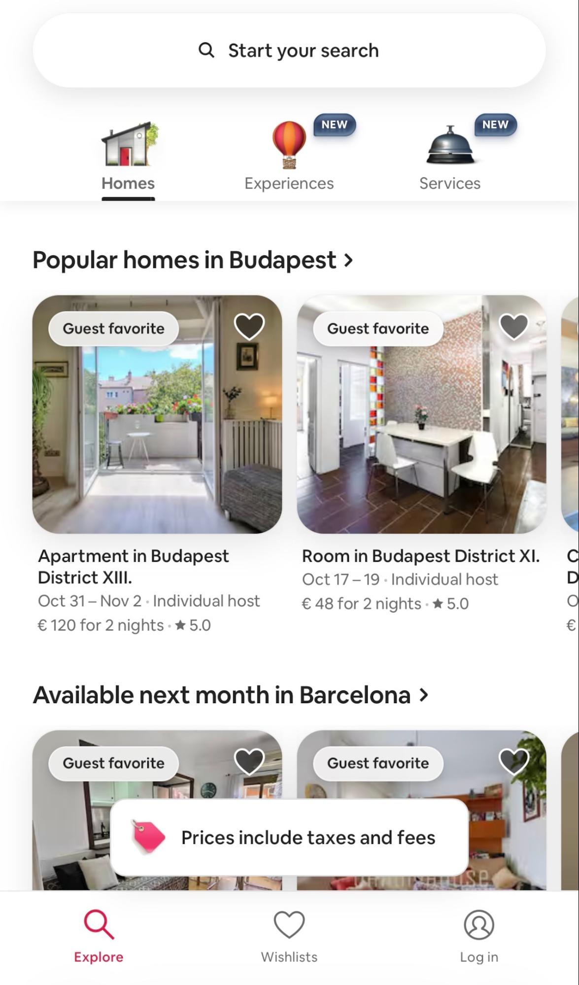
To see mobile-friendly design in action, open Airbnb's website on a mobile device. You'll notice that the search bar is the hero, the rest of the UI stays out of the way, and navigation is collapsed into concise controls.
9. Balance
A balanced layout feels stable, and this stability turns into clearer reading paths and faster decisions. This makes it especially important for product pages, where you want to make purchasing decisions as smooth as possible.
You can use symmetrical or asymmetrical balance depending on your goal.
For example, Warby Parker uses symmetry through a classic two-column PDP: image gallery on the left, details on the right. The columns feel roughly equal, so your eye ping-pongs comfortably left and right to compare angles, colors, and specs.
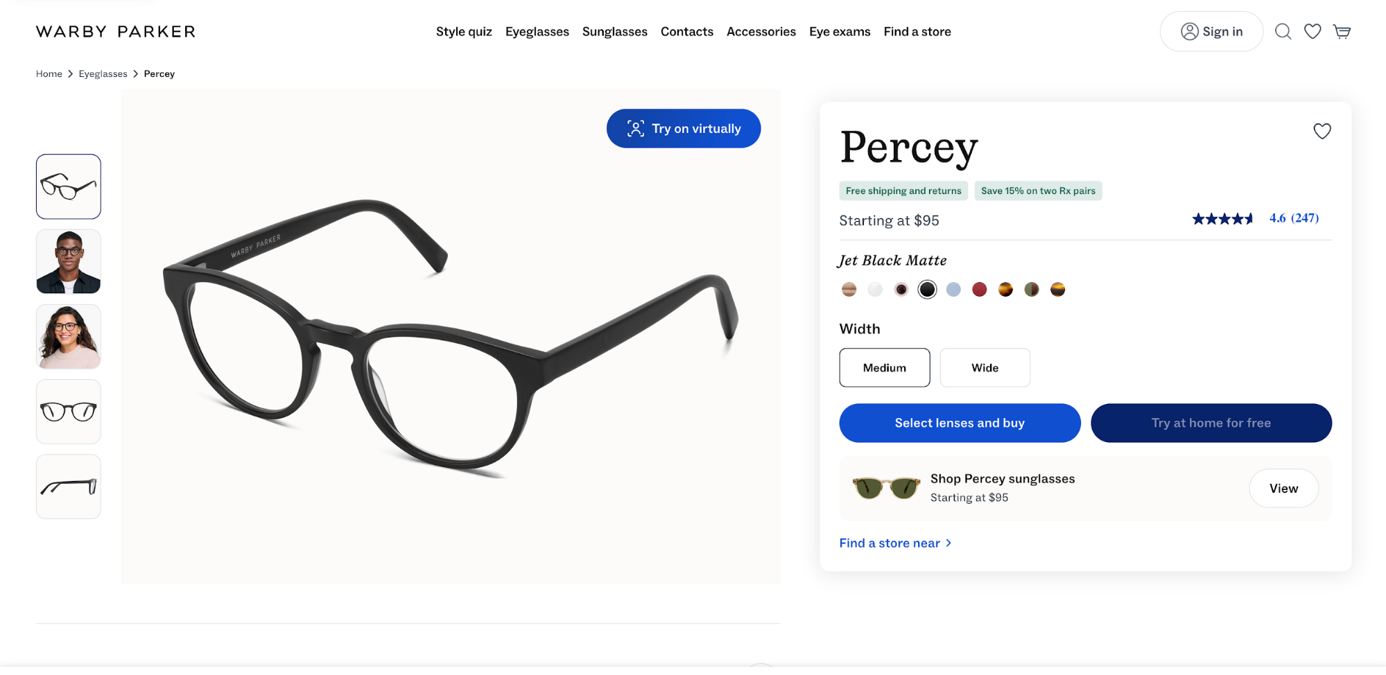
Symmetrical balance works best when your goal is clarity or when you want to provide comparisons. By contrast, asymmetry may work better when the goal is emotion, craftsmanship, and faster conversion for visually led products.
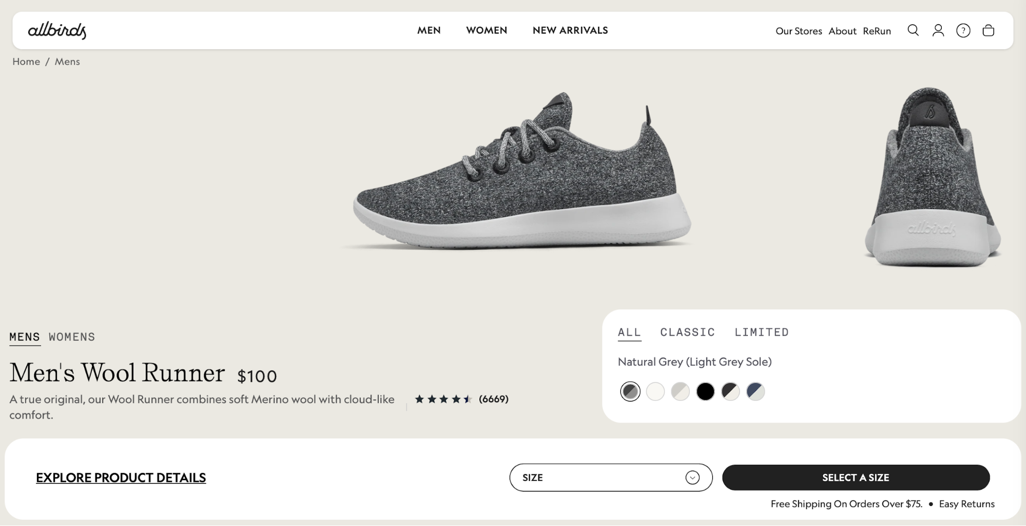
A good example is Allbirds, which gives more visual weight to the product media (large gallery) with a narrower right rail for size selection and Add to cart.
It’s still balanced, just not mirrored—the imagery sells texture and comfort first, while the compact select a size box keeps the action obvious above the fold.
Whichever approach you take, make sure to strike the right visual balance. For example, if your left-side image is large, offset it with a clear right rail hierarchy (title, price, reviews, primary CTA) and a consistent type scale so text blocks don’t collapse into a heavy blob.
Also, keep the page’s optical center (the spot where the layout feels most stable) close to the true center.
If the top tilts left (large photo), reinforce the right with a slightly larger price/CTA block or a sticky buy box so the page doesn’t feel lopsided as you scroll.
Pay special attention to the spacing rhythm. Uneven gaps make pages feel like they’re sliding downhill, so decide on a spacing scale (e.g., 8/16/24/32 px) and apply it down the page:
-
Inside the details column, keep title → price → ratings → options → CTA on consistent steps (e.g., 8/8/16/24).
-
Between sections (e.g., from “Highlights” to “Specs”), jump up a step (e.g., 32–48 px) so groups read as distinct.
-
Align card edges and captions to the grid. If something looks off, change the span or the token instead of nudging pixels.
10. Purpose‑driven design
Each page must serve a specific purpose that the user will understand clearly the moment they reach a page. This means you should avoid vague actions like "click here" or "take the next step."
You need to clarify exactly what will happen when the user clicks on a button, so make sure all CTAs are descriptive—for example:
-
"Book a call"
-
"Download the whitepaper"
-
"Get a free trial"
When you decide on the purpose, trim everything that doesn't serve it. This includes:
-
Other CTAs
-
Carousel slides
-
Pop-ups
-
Off-path links
Make sure the purpose is reflected by one filled primary button above the fold, and turn everything else into text links or move it below the fold.
You can tie specific KPIs to the page's purpose to measure the success rate. For example:
-
“book a demo”: track primary CTA clicks → form start → form submit → calendar booked
-
“start a free trial”: track primary CTA clicks → account created → first key action (e.g., import, invite)
-
“download the guide”: track CTA clicks → email capture → file delivered
HubSpot's landing page is a great example of a page with a clear purpose
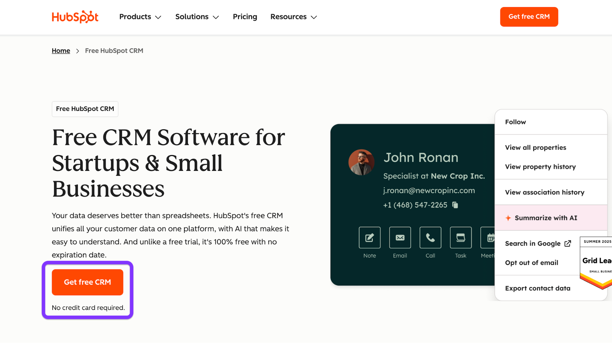
The CTA is clear and descriptive, and there's a reassurance line underneath it ("No credit card required.") that further encourages the action and reduces friction.
11. Consistent branding
Consistency turns one-off screens into a brand experience. The user sees recognizable colors, type, buttons, and voice that reflect your unique brand identity and make your site more memorable.
To ensure consistency, lock in brand tokens and reuse the same parts everywhere. Here's an example:
-
Colors: brand/primary, brand/secondary, neutral/100–900, semantic/success|warning|error.
-
Type scale: H1 36–40, H2 24–28, H3 20–22, body 16, caption 12–14.
-
Radii and shadows: radius/sm 4, md 8, lg 12; one shadow for cards, one for overlays.
You should then wire components to those tokens and reuse them site-wide, from headers and footers to form fields and badges.
When checking for consistency, don't just glance over your pages. Instead, follow a systemized checklist. For example, here's what the checklist would look like for header and footer consistency across three templates:
-
Templates: Home, Article, Checkout.
-
Header:
-
Identical logo size and placement
-
Same nav item order and labels
-
One primary CTA style (filled) and the same hover/focus states
-
Minimal header on checkout (but still the same height, brand color, and iconography)
-
-
Footer:
-
Same background tone, link groups, social icons, and legal text
-
Consistent spacing and link styles
-
Newsletter field uses the same form component as elsewhere.
-
-
Tokens/components audit:
-
Colors match tokens (no off-brand hex codes)
-
Text sticks to the type scale
-
Buttons/cards use the same radii and shadows
-
Focus rings look identical
-
-
Behavior: active states, scroll behavior (sticky/not), and breakpoint swaps (e.g., menu collapse) behave the same on all three pages.
Besides design choices, consistency heavily relies on your brand voice. You must choose the tone of voice that resonates with your audience and ensure continuity in all your content and copy.
If you need examples, here are a few ways you can approach error messages:
-
Helpful: “We couldn’t save your changes. Try again, or save a copy.”
-
Specific + actionable: “Password needs 8+ characters, including a number.”
-
Human + calm: “Card was declined. Check the number or try another card.”
12. Content structure
The right content structure ensures seamless and intuitive navigation. It also helps search engines crawl your content more effectively, increasing the pages' chances of ranking well in search results.
Before publishing content, map out the topics and subtopics. Then, make sure that navigation, breadcrumbs, and URLs mirror that structure.
For example, the structure can look like this:
-
Projects
-
Overview
-
Templates
-
Permissions
-
-
Tasks
-
Creating tasks
-
Assignments & due dates
-
Recurring tasks
-
In this case, you'd need to check the following boxes:
-
Navigation: Top nav uses the top-level topics (Projects, Tasks,).
-
Breadcrumbs: Home › Tasks › Assignments & due dates
-
URLs: Keep slugs readable and consistent—/tasks/assignments-due-dates
As for the content on each page, use meaningful headings that convey specific information—for example:
-
H1: States the outcome: “Plan and track projects.”
-
H2/H3: Break the job into steps or questions: “Create a project,” “Invite teammates,” “Track progress on a timeline.”
You'll also likely use images, but focus on those that add value instead of purely decorative visuals. And if the image tells something, include it in the caption that reflects the key point.
For example, Mailchimp uses visuals to present its service, and it captions them with engaging, benefit-driven copy.
13. Readability
Low readability is bound to cause a poor user experience, so you should be strategic with type sizes, line lengths, and other factors that ensure you don't end up with large, monotonous blocks of text.
General recommendations include:
-
Body text at 16–18 px
-
Line length ~45–75 characters
-
Line height 1.4–1.6
This combination gives content room to breathe without being overbearing for readers. If a paragraph still feels heavy, widen line height one notch before shrinking the font—small type should always be a last resort.
You should also add headings to make the content more scannable and skimmable. Use sentence case instead of title case for subheadings (“Manage projects faster,” not “Manage Projects Faster”), as doing so makes headings less formal and easier to process.
When writing headings, put the important words first so that readers get the point at a glance. For example, “Pricing for teams” beats “Our approach to pricing” because the heading starts with the key word a reader cares about.
To make sure your content stays readable, run every page through this checklist:
-
Short paragraphs: 2–4 sentences each. Break up walls of text, and don’t fear white space.
-
Plain words: Choose “use” over “utilize,” “help” over “facilitate,” “start” over “initiate.”
-
Active voice: “Upload your file” is more impactful than “Your file can be uploaded.”
-
Front-load meaning: Lead with the outcome (“Save time with templates”) before support detail.
-
One idea per sentence: If you need too many commas and semicolons to hold it together, split it.
-
Helpful subheads: Every 3–5 paragraphs, add a clear signpost for what's to come.
-
Consistent terms: Pick one label (“Sign in” vs. “Log in”) and stick with it.
-
Lists wherever applicable: Add numbered lists and bullet points to improve skimmability.
-
Contrast and size: Make sure that body content meets 4.5:1 and is readable on a phone.
14. Responsive images and media
Images are powerful assets, but they're also among the heaviest ones. You should carefully add them to your page to prevent issues like slow loading and accessibility issues.
Specifically, prioritize modern formats like AVIF and WebP because they enable smaller file sizes without compromising quality.
You can serve JPEG/PNG as a fallback so older browsers still render your visuals if they don't support the newer formats.
Your images should also adapt to screen sizes, which you can ensure by using the <picture> element with srcset + sizes to offer multiple resolutions and formats.
Here's an example piece of code that brings it all together:
<picture>
  <!-- Modern formats first -->
  <source type="image/avif"
          srcset="/hero@800.avif 800w, /hero@1200.avif 1200w, /hero@1600.avif 1600w" />
  <source type="image/webp"
          srcset="/hero@800.webp 800w, /hero@1200.webp 1200w, /hero@1600.webp 1600w" />
  <!-- Fallback JPEG; note the width/height for layout stability -->
  <img src="/hero@1200.jpg"
       srcset="/hero@800.jpg 800w, /hero@1200.jpg 1200w, /hero@1600.jpg 1600w"
       sizes="(max-width: 768px) 90vw, (max-width: 1200px) 80vw, 1200px"
       alt="Project dashboard showing tasks completed and a green success badge"
       width="1200" height="720" decoding="async" />
</picture>
Here's what's happening in the above code:
-
srcset lists available widths.
-
sizes tells the browser how wide the image will display at different breakpoints, so it picks the smallest file that still looks sharp.
-
width/height (or CSS aspect-ratio) prevents layout shift while the image loads.
Another step you should take is to compress heavy visuals and lazy-load below-the-fold images. Doing so prevents unnecessary work during the first paint and makes your page faster. Lazy-load anything you don’t need immediately, and focus on the elements the user will see first.
For each image you add, include alt text that explains what the image does or what information it conveys.
Don't use file names as alt text (e.g., alt="IMG_2049.avif") because this is meaningless to users of screen readers. The same goes for vague alt text that doesn't convey the contents (e.g., alt="Chart")
Unless an image is purely decorative (in which case you can use alt="" so it's skipped), add meaningful alt text as explained in the accessibility section above.
15. Color strategy
Colors don't just serve an esthetic purpose. You need to define them by their roles and impact on the user experience, not the hues.
This "color by role" model looks something like this:
-
Primary: interactive emphasis (filled CTAs, active tabs, selection)
-
Secondary: supportive UI (secondary buttons, info links)
-
Semantic: success / warning / error / info (form validation, banners)
-
Background / Surfaces: page canvas, cards, input fields
-
Text: default, subdued, inverse
Less is more when it comes to the color palette, so define and document all the constraints you'll use to ensure consistency. For example:
-
One primary color site-wide; one accent per screen (max).
-
Neutrals for most surfaces; reserve vibrant hues for actions and semantics.
-
Do not use semantic colors (green/red) for decorative accents—keep them for feedback only.
-
Components inherit tokens; no local hex overrides in templates.
After defining colors, make sure there's sufficient contrast by validating every combination against WCAG 2.2 AA (e.g., body text ≥ 4.5:1). During reviews, run a quick pass in a color-blind simulator (protanopia/deuteranopia/achromatopsia) and ensure the page retains its purpose via icons, labels, or patterns, not color alone.
Notion uses a simple but effective color palette.
There's a minimal neutral canvas (light background, high-contrast black text) with a single, consistent accent reserved for primary CTAs and key highlights. Because neutrals do the heavy lifting, CTAs stand out without fighting other colors, and text remains highly legible across sections.
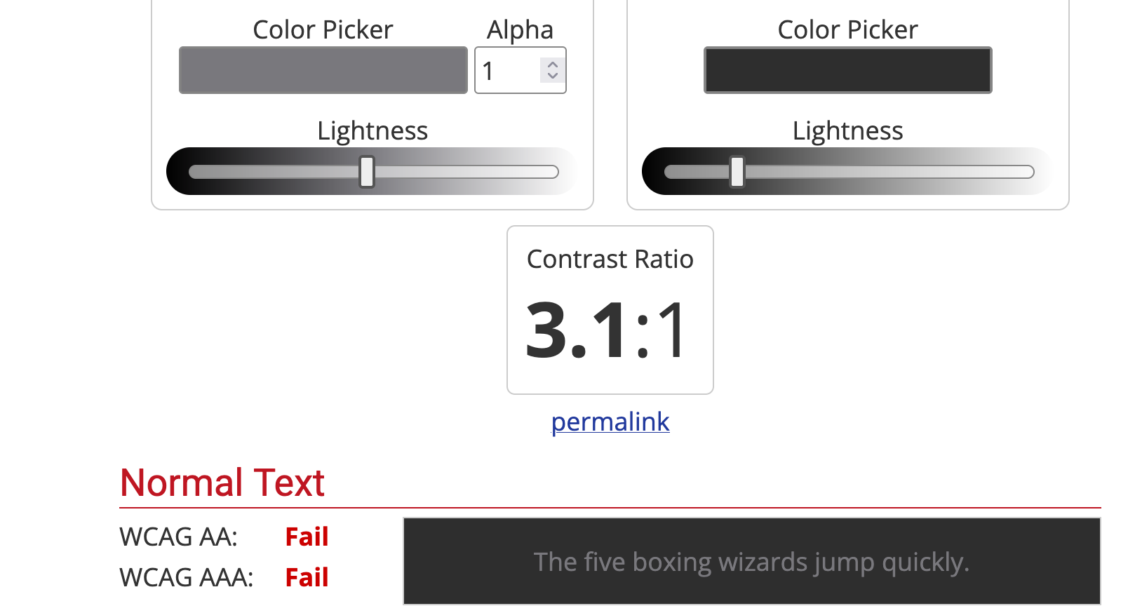
16. Contrast and legibility
High contrast reduces reading effort and mistake clicks, especially on mobile and in bright light. To ensure it, follow the WCAG 2.2 AA guidelines, most notably:
-
Normal body text: ≥ 4.5:1
-
Large text (≥ 18 pt or 14 pt bold): ≥ 3:1
-
UI components (buttons, inputs, icons, focus outlines): ≥ 3:1 against adjacent colors
These references aren't just numbers—they translate to tangible effects on the reading experience. For example:
-
Pass (AA): Dark text on white with a ratio of 7.0:1 (e.g., typical “near-black” body copy)—comfortably above 4.5:1, so paragraphs remain legible at 16–18 px.
-
Borderline: Mid-gray body text at 4.6:1—technically passes AA for normal text, but leaves little room for small sizes or thin weights.
-
Fail: Light gray body text at 3.4:1—below the 4.5:1 requirement; expect eye strain and missed words.
You must also ensure that focus indicators and hover states meet contrast guidelines. Focus rings should stand out at ≥ 3:1 against both the component and the background (e.g., a bold outline that clearly contrasts with a button’s fill).
Hover/active states shouldn’t only change color. They must also adjust weight (border width), style (underline for links), or shadow so the state remains obvious for color-blind users.
If you plan on using dark mode, re-check ratios to maintain legibility because light text on dark backgrounds must still hit ≥ 4.5:1. While off-white text on near-black at 13:1 is good, medium gray on charcoal at 3.1:1 won't work.
17. Load time and performance
Few issues can be as frustrating to users as slow-loading sites. Google's research shows that users are 32% more likely to leave a page if its load time increases from 1 to 3 seconds.
To minimize load time, focus on three metrics known as Core Web Vitals:
|
Metric |
What it is |
Target |
|
LCP (Largest Contentful Paint) |
Time from page load to when the largest visible content element (e.g., hero image or big text block) finishes rendering |
LCP ≤ 2.5s |
|
CLS (Cumulative Layout Shift) |
The total of all unexpected layout shifts while the page is open |
CLS ≤ 0.1 |
|
INP (Interaction to Next Paint) |
The delay between a user interaction and the next visual update |
INP ≤ 200ms |
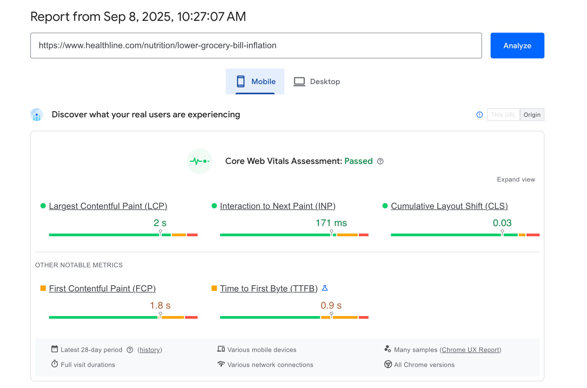
You can use a tool like PageSpeed Insights to check these metrics and identify issues. For example, we can see that this article by Healthline passes the Core Web Vitals test on mobile devices:
If your page doesn't, the top three fixes you should try are:
-
Trim and delay JavaScript: Cut unused libs, ship ESM, split bundles, and defer anything non-critical.
-
Serve media and fonts smartly: Compress/resize images, preload the hero image, subset fonts, and use font-display: swap.
-
Stabilize layout: Always set dimensions/aspect-ratio for images, ads, and embeds to kill layout shift.
Deferring non-critical scripts is often the most effective fix, which involves loading only what's needed for the first paint and queueing everything else. Here's an example piece of code that makes this happen:
<!-- Critical script (small, needed for above-the-fold interactivity) -->
<script type="module" src="/app-critical.js"></script>

<!-- Non-critical scripts: defer or load after first interaction -->
<script src="/analytics.js" defer></script>
<script>
  // Load heavier stuff on idle
  if ('requestIdleCallback' in window) {
    requestIdleCallback(() => import('/charts.js'));
  } else {
    setTimeout(() => import('/charts.js'), 1500);
  }
</script>
In many cases, you need to tell the browser what’s most important for the first screen, like so:
<!-- Hero image used in the above-the-fold section -->
<link rel="preload" as="image" href="/img/hero-1200.avif" imagesrcset="/img/hero-800.avif 800w, /img/hero-1200.avif 1200w"
      imagesizes="(max-width: 900px) 90vw, 1200px" fetchpriority="high">

<!-- Critical CSS (above-the-fold only) -->
<link rel="preload" as="style" href="/css/critical.css">
<link rel="stylesheet" href="/css/critical.css">
Poorly optimized fonts can kill your LCP without you knowing it, so ship performance-friendly ones. To make this happen, subset to your language (e.g., Latin only), drop unused weights, and use a system-font stack for body if possible. Here's an example:
<!-- Preload only the weights/styles you actually use -->
<link rel="preload" href="/fonts/Inter-latin-400.woff2" as="font" type="font/woff2" crossorigin>
<link rel="preload" href="/fonts/Inter-latin-600.woff2" as="font" type="font/woff2" crossorigin>

<style>
  @font-face {
    font-family: 'Inter';
    src: url('/fonts/Inter-latin-400.woff2') format('woff2');
    font-weight: 400;
    font-display: swap; /* show system font first, swap when ready */
  }
  @font-face {
    font-family: 'Inter';
    src: url('/fonts/Inter-latin-600.woff2') format('woff2');
    font-weight: 600;
    font-display: swap;
  }
</style>
As for CLS, you can cut it at its roots by setting width/height or aspect-ratio on every image/video in HTML, like so:
<img src="/card.webp" width="600" height="400" alt="Product card">
<!-- or -->
<img src="/card.webp" style="aspect-ratio: 3 / 2;" width="600" alt="Product card">
Finally, add and enforce a performance budget for each item to set clear boundaries. Here are some reference points to follow
|
Budget item |
Limit (mobile) |
|---|---|
|
Total JS (initial) |
≤ 170 KB compressed (≈ 500 KB uncompressed) |
|
Largest image (above fold) |
≤ 180 KB |
|
Fonts (combined) |
≤ 100 KB |
|
Total requests (initial) |
≤ 35 |
|
Hero HTML |
≤ 35 KB |
18. Use common scanning patterns (F/Z)
Users don't read every word on a page—they scan the highlights until they find something worth focusing on. To accommodate this, web designers often use the F and Z scanning patterns.
The F pattern is better for text-heavy pages like blog posts. Here's a quick "sketch" of the pattern:
Top row: logo → primary nav → utility.
Left column start: H1, standfirst, key links.
Second row: subhead or featured links under the H1.
Left spine: section links continue down the page.
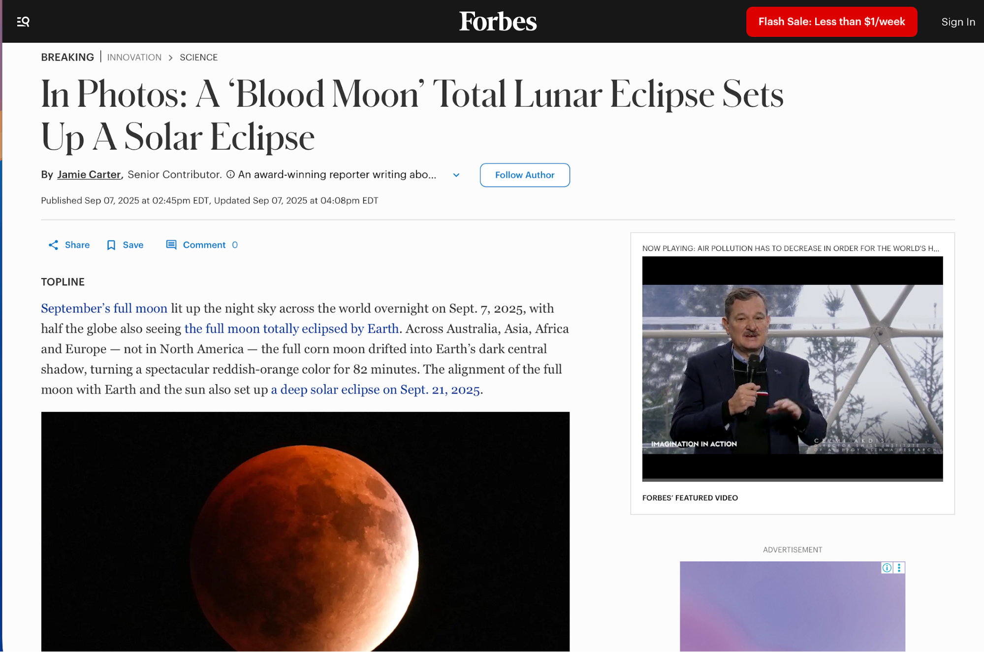
A good example of an F pattern is this Forbes article. You'll see a left-anchored headline + standfirst, and body text set in a single readable column with clear sectional signposts.
By contrast, the Z pattern is better for simpler and more marketing-focused pages like landing pages. Here's what it generally looks like:
-
Top-left: logo
-
Top-right: primary CTA
-
Diagonal sweep through headline + subcopy
-
Bottom-right: CTA (or key proof) to close the “Z”.
Zapier's signup page is a classic example of the Z pattern. Your eye goes top-left (logo) → top-right (primary CTA ) → diagonally through the hero headline + visual → and finishes along the bottom row at the form/CTA.
Whichever pattern you choose, place the key cues along the scan path. Line up the logo, nav, headline, and the primary CTA along the expected path (top row and the diagonal in Z; top rows and left spine in F). Then do a sanity check with a quick heatmap/click-map run to confirm people actually follow the trail.
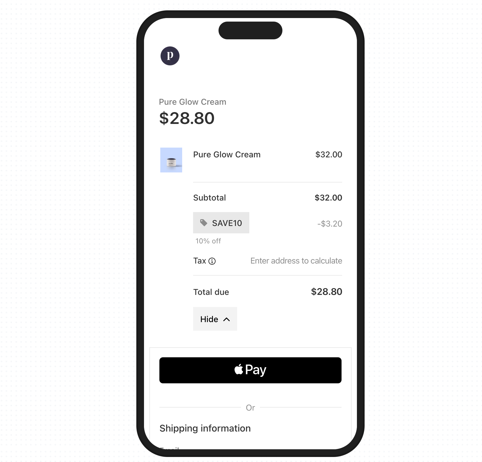
In some cases, you may want to break the pattern to highlight the key action more prominently. For example, Stripe’s mobile hosted Checkout centers the entire experience on a single, focused payment form with minimal chrome.
There's no top nav to scan left→right and no diagonal sweep, so the user’s attention is pulled straight to the middle column.
19. Testing and iteration
Web design is an iterative process, so you should run small, fast tests to quickly spot and resolve issues. Take 5–7 users who match your target audience and run task-based sessions of 15–20 minutes each. Give users concrete goals, such as:
-
"Find pricing for the Team plan"
-
"Book a demo"
-
"Add the blue sweater (M) to cart"
As the test progresses, record metrics like:
-
Task completion (yes/no)
-
Time to complete
-
Notable errors (missed clicks, backtracks, wrong paths)
Once the tests are completed, triage findings with analytics to fix the biggest pain first. Ask yourself whether users are reaching the CTA or key content, and if not, where do they drop from a specified path (e.g., CTA click → form start → submit).
Gather the results, and then ship changes with documented modifications and improvements. You can keep a lightweight changelog where each entry links to a metric you expect to move. For example:
-
April 19: Moved “Start free trial” into hero, demoted “Contact sales” to link.
-
Expectation: Primary-CTA CTR +20%, time-to-task −15%.
-
-
April 26: Increased body contrast to 7:1; added focus rings.
-
Expectation: Form completion +10%, error rate −20%.
-
-
May 02: Collapsed menu on mobile; surfaced search.
-
Expectation: Search starts +25%, bounce −10%.
-
Key takeaways
-
Web design principles are reusable rules that shape layout, interaction, content, and accessibility so pages work consistently.
-
Shared principles reduce rework, speed decisions across teams, and tie choices to measurable outcomes like time-to-task or form completion.
-
Leverage clarity by removing noise and keeping one primary action per view so that your pages guide users to the most impactful actions.
-
Use size, contrast, and placement (H1 → H2 → body → CTA) to guide the eye and make the next step obvious.
-
Limit top-level items to 5–7, separate utilities, and design for “find top tasks in two clicks” with breadcrumbs for depth.
-
Use a 12-column grid with defined gutters/margins to keep alignment clean and responsive across breakpoints.
-
Apply a simple spacing scale (e.g., 8/16/24/32) to group related content and improve scanning without extra chrome.
-
Make each page do one job and place a single filled CTA above the fold; demote or delete everything else.
-
Meet WCAG 2.2 AA guidelines, provide alt text and visible focus, and ensure full keyboard operability to help everyone navigate pages regardless of disabilities.
-
Prioritize mobile-friendly design with thumb-friendly targets (~44×44), collapsed nav, and prominent search for intent-driven visits.
-
Use symmetrical balance for clarity/comparison or asymmetrical for impact, and keep the optical center steady as users scroll.
-
Ensure consistent branding by locking in tokens (color, type, radii) and reusing components so headers, cards, and buttons feel the same site-wide.
-
To ensure readability, set body at 16–18 px, ~45–75 characters per line, 1.4–1.6 line height, and write sentence-case headings with front-loaded keywords.
-
Serve AVIF/WebP with srcset/sizes, compress, lazy-load below the fold, and write purpose-driven alt text so that visuals stay responsive.
-
Define role-based colors (primary/secondary/semantic), limit accents to one per screen, and validate contrast and color-blind safety.
-
Set a ≥4.5:1 contrast for body text and ≥3:1 for UI states, and ensure clear focus/hover in both light and dark modes.
-
Target LCP ≤ 2.5 s, CLS ≤ 0.1, INP ≤ 200 ms by deferring non-critical JS, preloading true criticals, and optimizing fonts.
-
Use F scanning patterns for text-heavy pages and Z patterns for simple marketing, placing logo, nav, headlines, and CTAs along the scan path.
-
Run usability quick sessions with 5–7 users, pair insights with funnels/scroll depth, document changes, and re-test to confirm lifts.