12 Steps To Learn Web Design in 2025

Petar Marinkovic
Created on Sep 29, 2025
The web design market is set to exceed $92 billion by 2030, compared to $61.2 billion in 2025, so the value of the related skills will keep growing in importance. Becoming a web designer can open up a world of opportunities for freelance work, full-time jobs, and even passion projects.
While AI and advanced tools are reshaping web design workflows, the core fundamentals stay the same. Mastering them can help you leverage these new technologies to create compelling, user-friendly websites without friction.
In this guide, I'll show you how to make this happen by covering the 12 steps you should take to learn web design.
1. Understand what web design is and why it matters
Web design is a process that blends user interface (UI) and user experience (UX) to create clear, usable, and goal-driven websites.
UI covers layout, typography, color, and visual hierarchy, while UX covers structure, navigation, speed, accessibility, and micro-interactions.
Businesses of all sizes rely on successful web design, each in their own way:
-
Startups need fast, credible landing pages to validate ideas and gain traction.
-
SMBs need clean service pages that convert local visitors.
-
Enterprises need consistent, accessible systems that scale across products and regions.
A web designer knows how to align these goals with the right web design principles. Failure to do so may result in a poor design that causes plenty of issues, such as:
-
Loss of customer trust
-
Damaged conversions through increased bounce rate and cart abandonment
-
User confusion due to a lack of clarity on the key actions
On the bright side, a well-designed website brings countless benefits, most notably:
-
Reduced friction throughout the buying journey
-
Increased user engagement
-
Positive user experiences that boost conversions
Take Apple as an example, specifically the MacBook page:
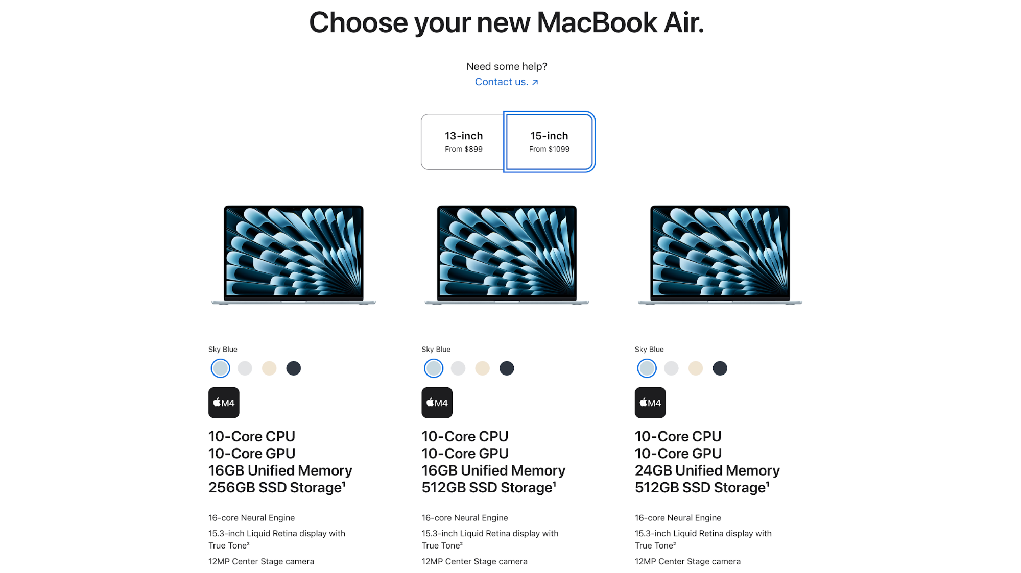
We can see generous white space, sharp imagery, and obvious CTAs that guide you from features to purchase smoothly.
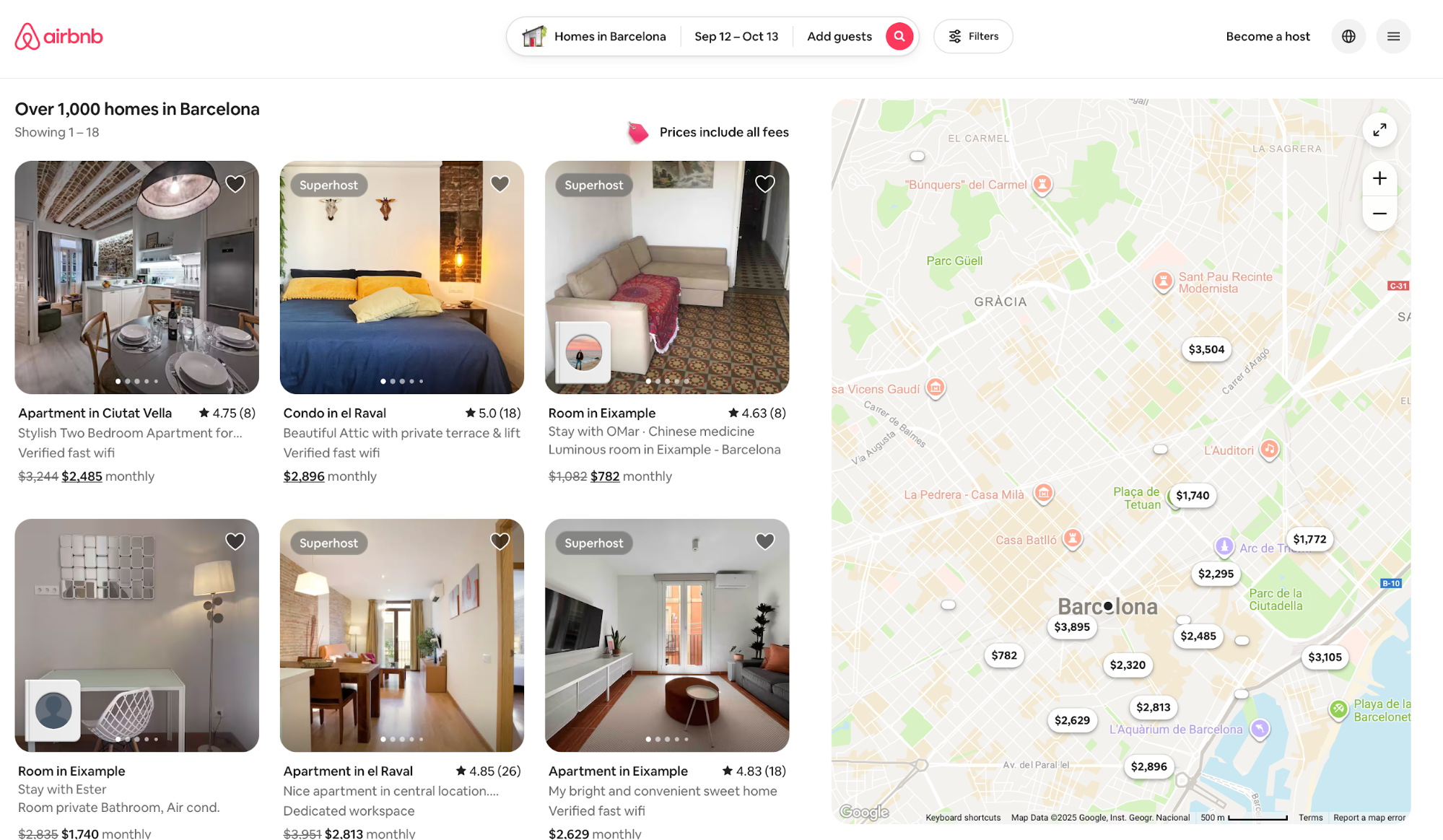
Similarly, Airbnb provides an enjoyable user experience on both desktop and mobile.
When you open it, you'll see a user-friendly, focused search flow with clear filters, as well as trustworthy listing visuals that make finding and booking stays fast and low-stress.
2. Copy an existing website
Recreating an existing site is among the smartest and fastest ways to learn web design. When you copy a real interface, you need to decode its layout grid, spacing rhythm, type scale, navigation flows, and little interaction details that rarely show up in tutorials.
Start simple, and then work your way up as you start understanding why certain design choices are made. For example, you can set three difficulty levels for yourself:
-
Beginner: A portfolio or blog homepage (hero, grid of posts, footer).
-
Intermediate: A product/landing page with sections, CTAs, and a pricing table.
-
Advanced: An e-commerce or news site with filters, pagination, and account UI.
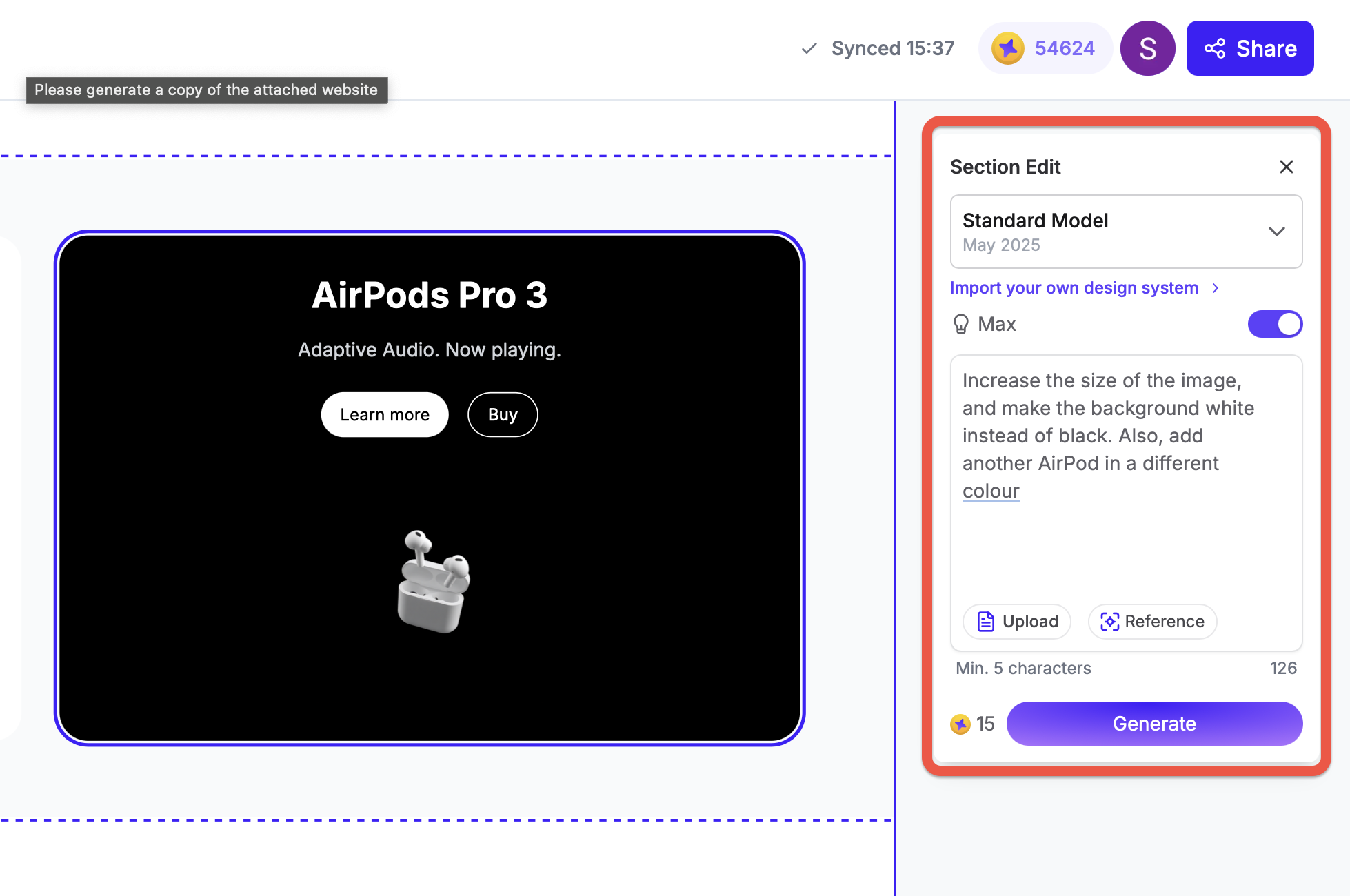
You can copy other websites in a matter of seconds using UX Pilot’s AI features.
- Head to UX Pilot and upload a screenshot in jpeg or pdf
- Enable the Deep design and Max features for the highest match
For example, I took a screenshot and asked UX Pilot to create a replica of Apple’s website.
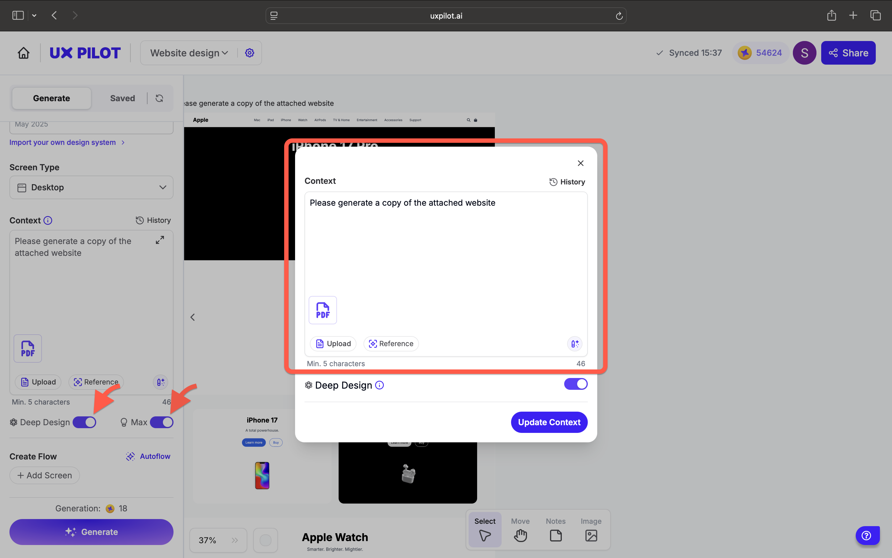
And you can see that it did a pretty good job of creating a duplicate copy of Apple’s website.
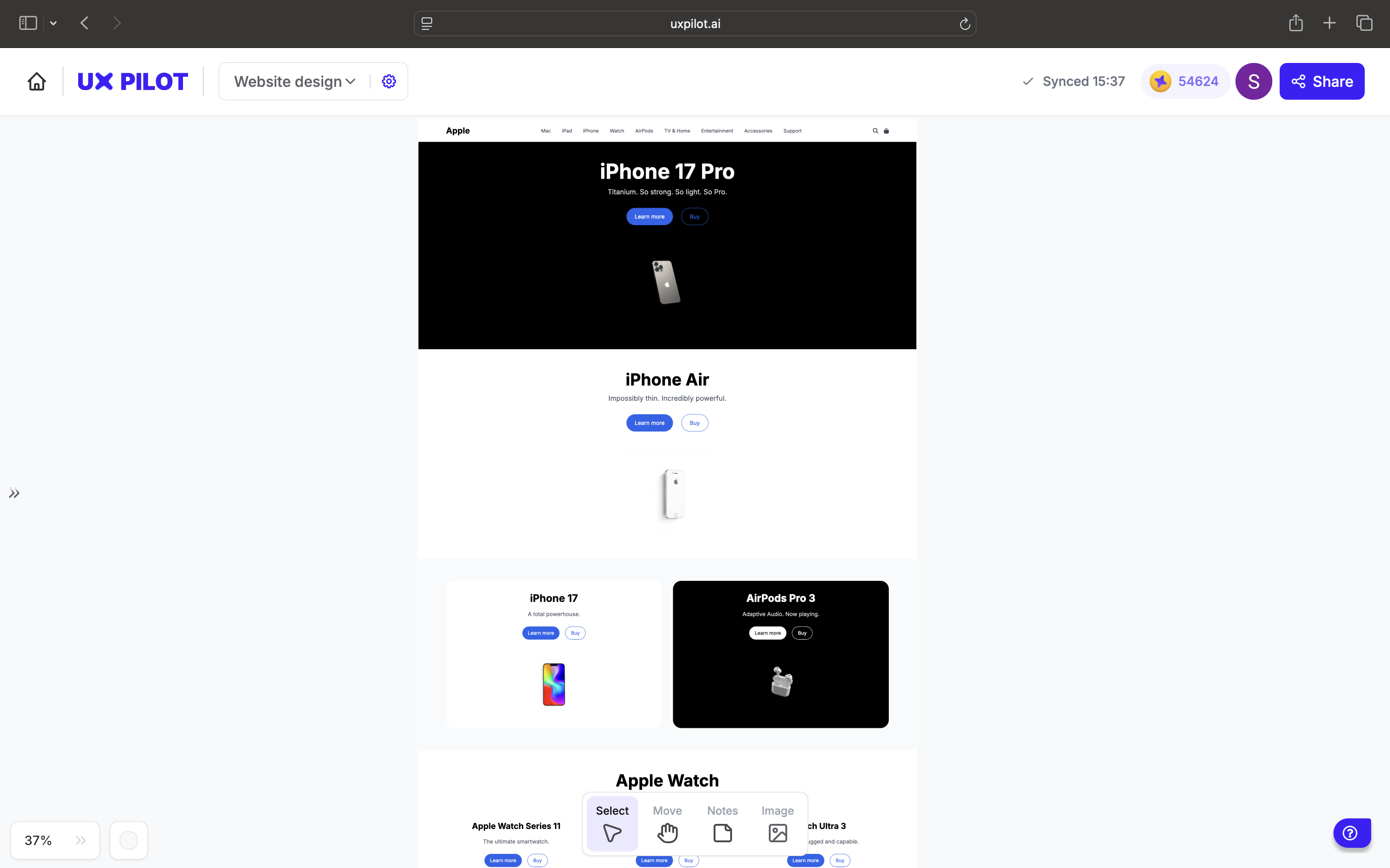
You can then exercise full control to edit sections and customize text based on your needs.
Give yourself a clear target that reflects the skills you're trying to learn. For instance, you can try:
-
Apple's landing pages for rhythm, whitespace, and decisive CTAs.
-
Medium for typography, readability, and card-based lists that scale.
-
Wikipedia's home page for dense information design, utility navigation, and robust accessibility patterns.
Be methodical with your recreation, and keep checking the reference page throughout the process. Compare your version to the original at multiple breakpoints, and see if there's any room for improvement.
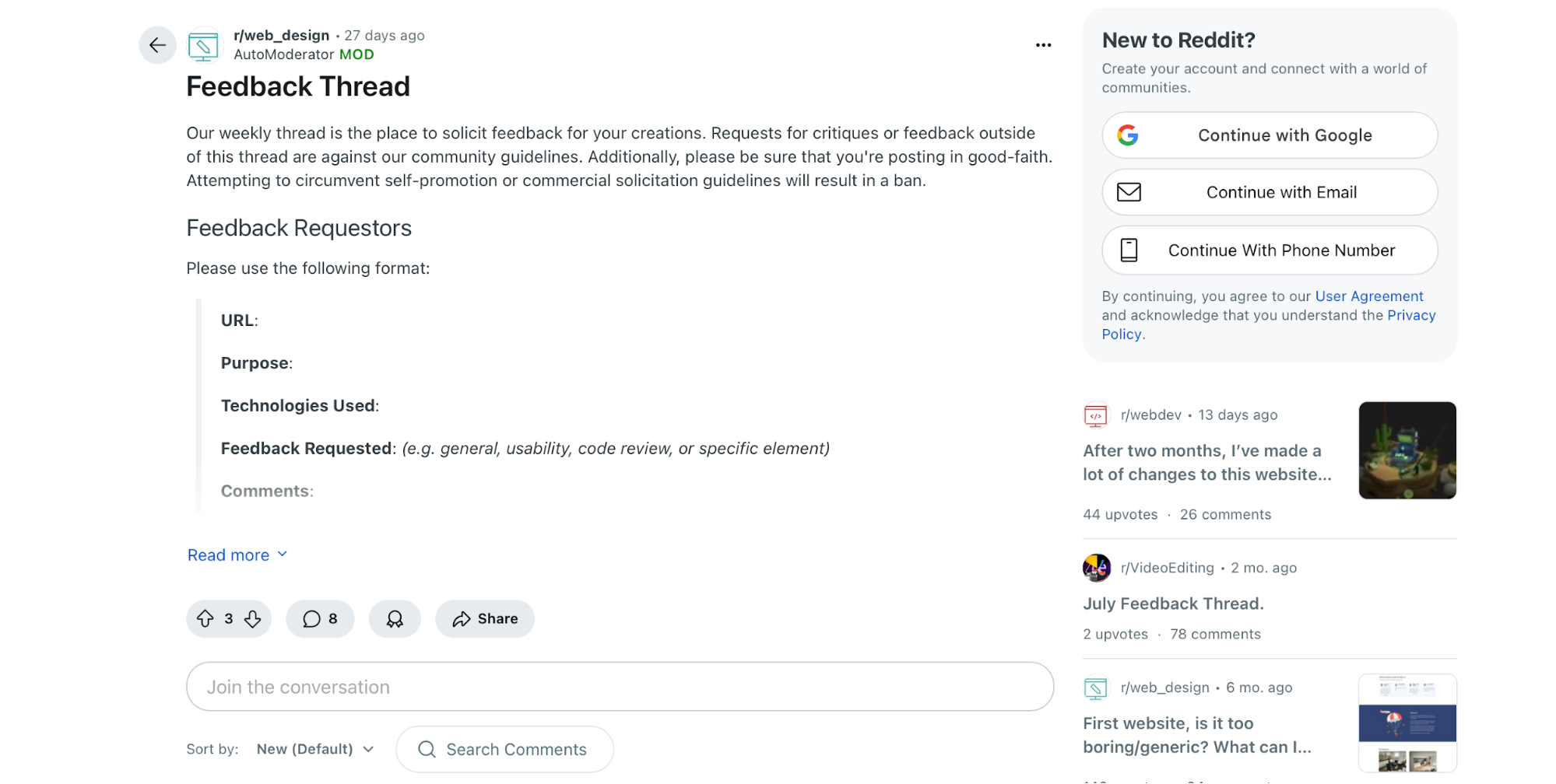
When you're done, ship your site publicly. Post a live demo and code repo, write a short teardown of what you learned, and ask for critique.
If you're not sure where to share your work, there's a dedicated web design Subreddit thread where web designers go to look for feedback, so you can start there.
3. Start with HTML and CSS as your core building blocks
You don't need to learn any over-the-top programming languages to start designing websites—you can build a solid foundation by learning HTML and CSS. HTML defines what's on the page (headings, paragraphs, images, forms, buttons, etc.), while CSS decides how it looks by defining the page's:
-
Layout
-
Spacing
-
Colors
-
Typography
-
Responsive behavior
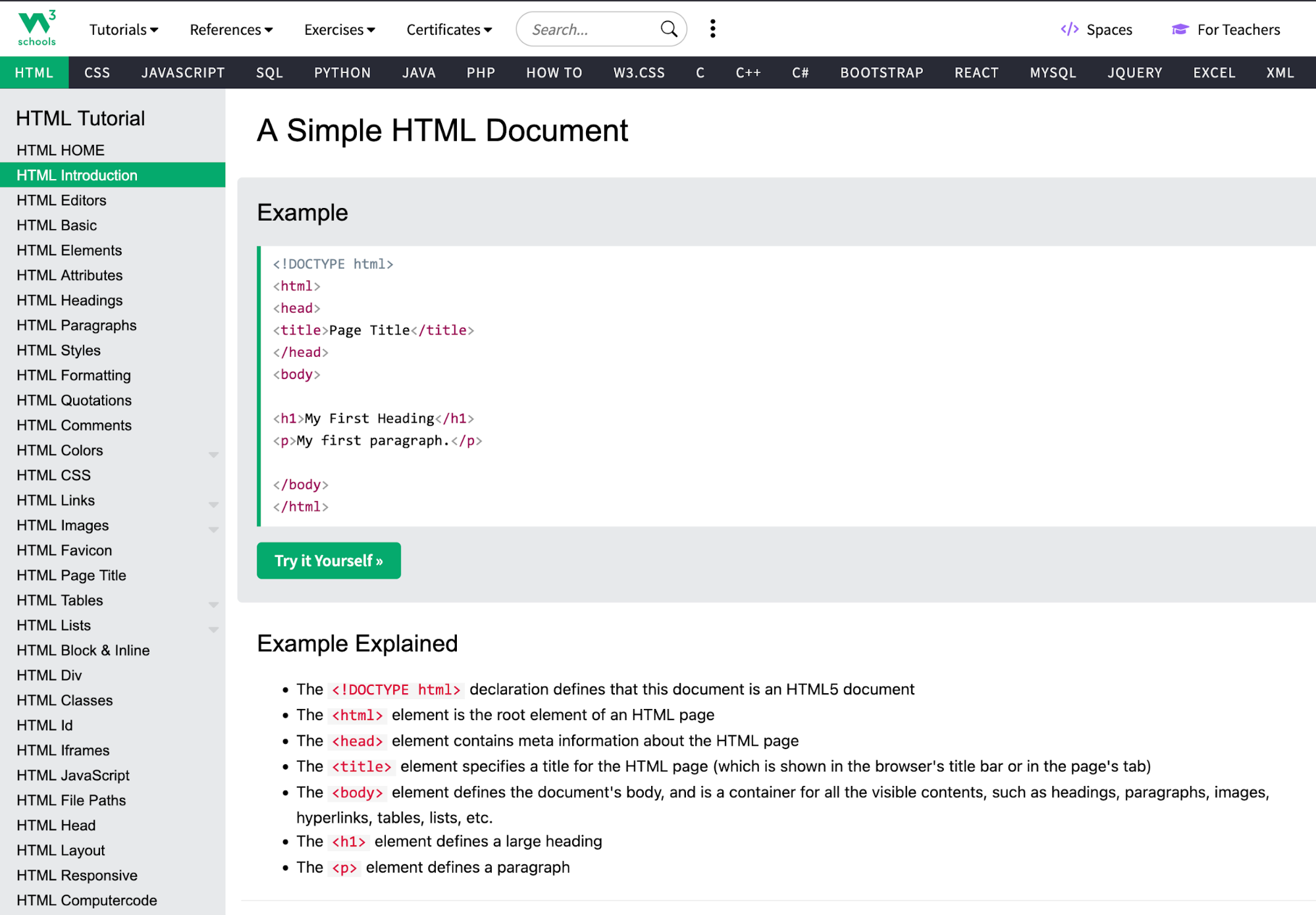
If you're a complete beginner, you can start with simple courses like W3School's HTML tutorial. It offers user-friendly learning with plenty of examples and detailed guidance, so it should help you master HTML without hassle.
If you want to learn about specific aspects of web development, like ensuring a responsive web design, you can use freeCodeCamp's course. It enables learning by doing through hands-on practice and projects, helping you go beyond theory.
As you practice HTML and CSS, try on small starter projects like creating a portfolio page or styling a blog. Experiment with layouts, components, and other aspects of a page to get a feel of the web design process.
Once you’re comfortable with semantic HTML and modern CSS (Flexbox/Grid, variables, media queries), everything else becomes easier and more intuitive.
You'll have a firmer grasp on components, design systems, frameworks, and even AI-generated code.
4. Learn UI, UX, and accessibility to design for users
User-centered design blends UI that draws attention and UX that reduces friction. A clear hierarchy, obvious actions, readable type, and intuitive forms maximize usability and reduce the need for heavy rework.
When designing a page, you need to keep all users in mind—including those with visual, motor, and other disabilities. This is why accessibility is a non-negotiable component of a well-designed web page.
The good news is that creating accessible websites doesn't involve any guesswork. Web Content Accessibility Guidelines (WCAG) 2.2 clarify everything you need to do, so aim for level AA of each of the applicable guidelines, such as:
-
Text alternatives: Use concise, meaningful alt text for images, as well as labels for form controls.
-
Keyboard first: Make every interactive element reachable via Tab/Shift-Tab with visible focus states.
-
Color and contrast: Meet contrast ratios (at least 4.5:1 for normal text and at least 3:1 for large text), and provide error text plus icons for non-color-dependent visual cues.
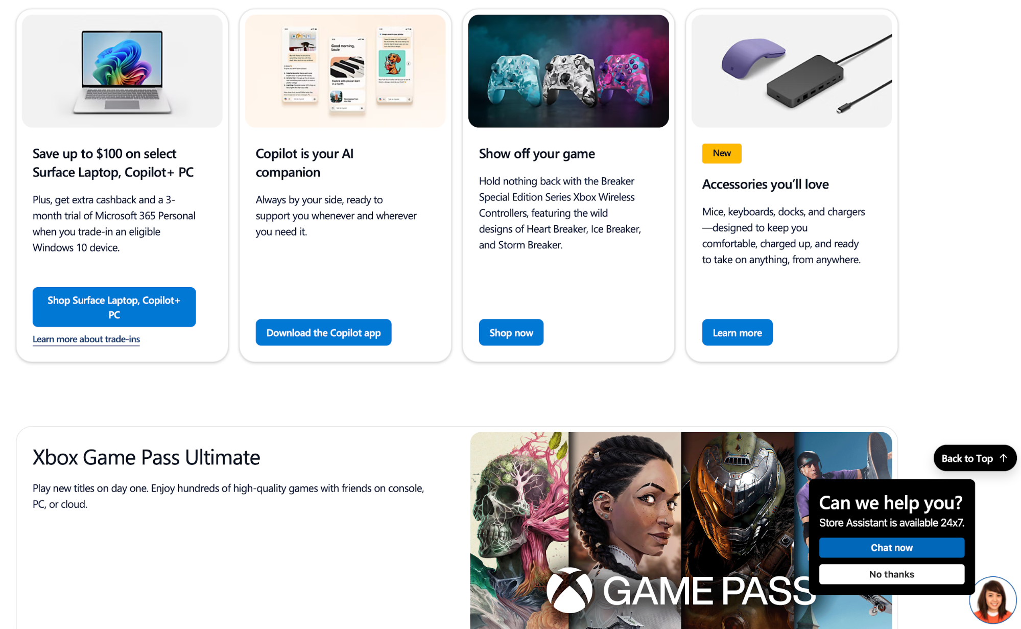
Microsoft is a perfect example of accessible web design. It uses strong focus states, high-contrast modes, and clear input guidance across docs and product sites.
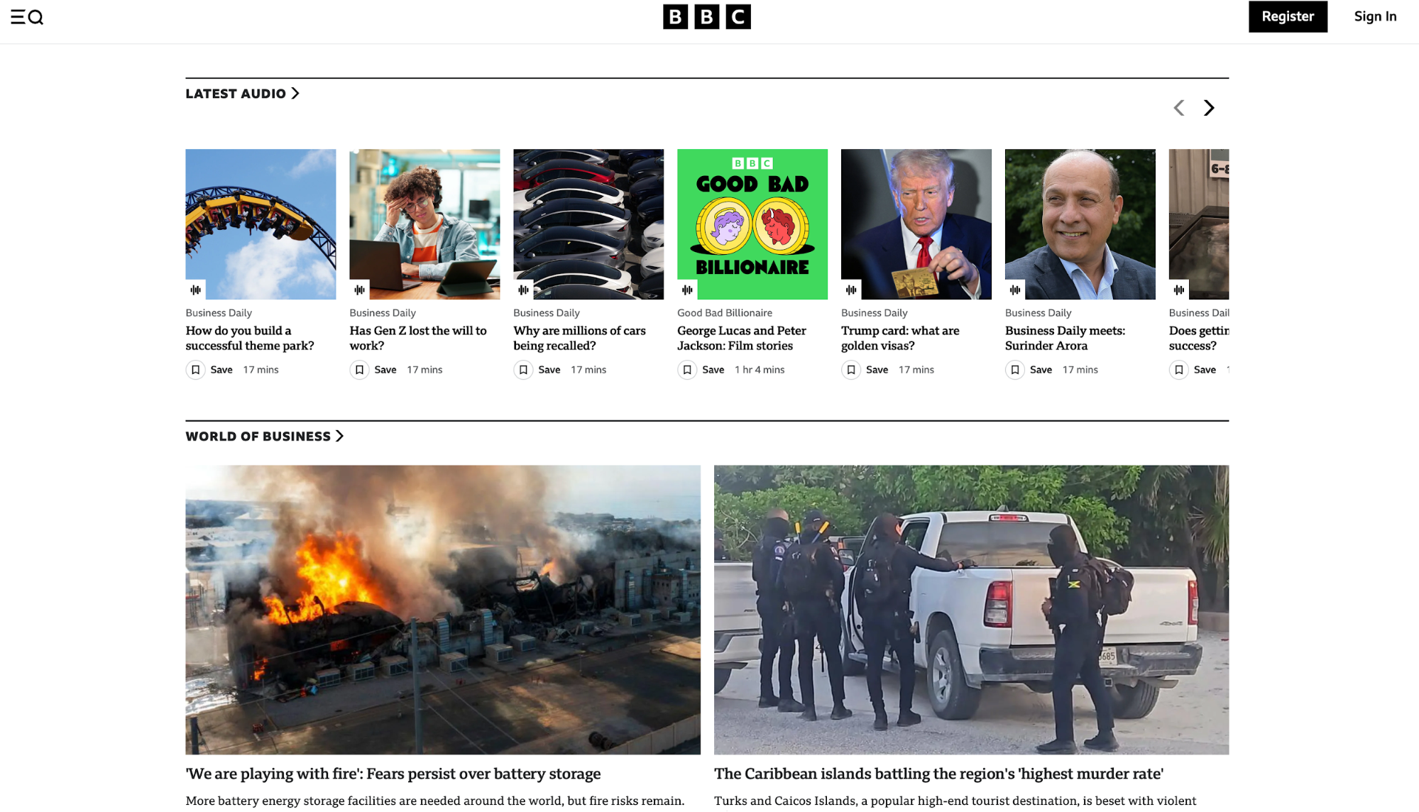
Similarly, BBC applies consistent typography, structured landmarks, captions, and keyboard-friendly controls. It also offers audio news, further enhancing accessibility.
If you need some tools and resources for creating user-centric, accessible websites, you can check out these:
-
WCAG 2.2 Quick Reference: Shows how to meet each success criterion, with filters and techniques
-
WAI-ARIA Authoring Practices (APG): Offers patterns and examples for menus, tabs, dialogs, and more
-
Accessibility Fundamentals and Tutorials: Provides plain-language primers and step-by-step tutorials
-
Web Accessibility Evaluation Tools List: Gives you a searchable directory of checkers and linters
5. Use semantic HTML, forms, and navigation to structure content
Semantic HTML gives your web pages meaning and communicates it to search engines, browsers, and assistive technology. You should use tags like <header>, <nav>, <main>, <article>, and <footer> to describe the purpose of specific elements.
Doing so improves accessibility and search engine optimization (SEO), helping pages get indexed more easily and rank higher in search engines.
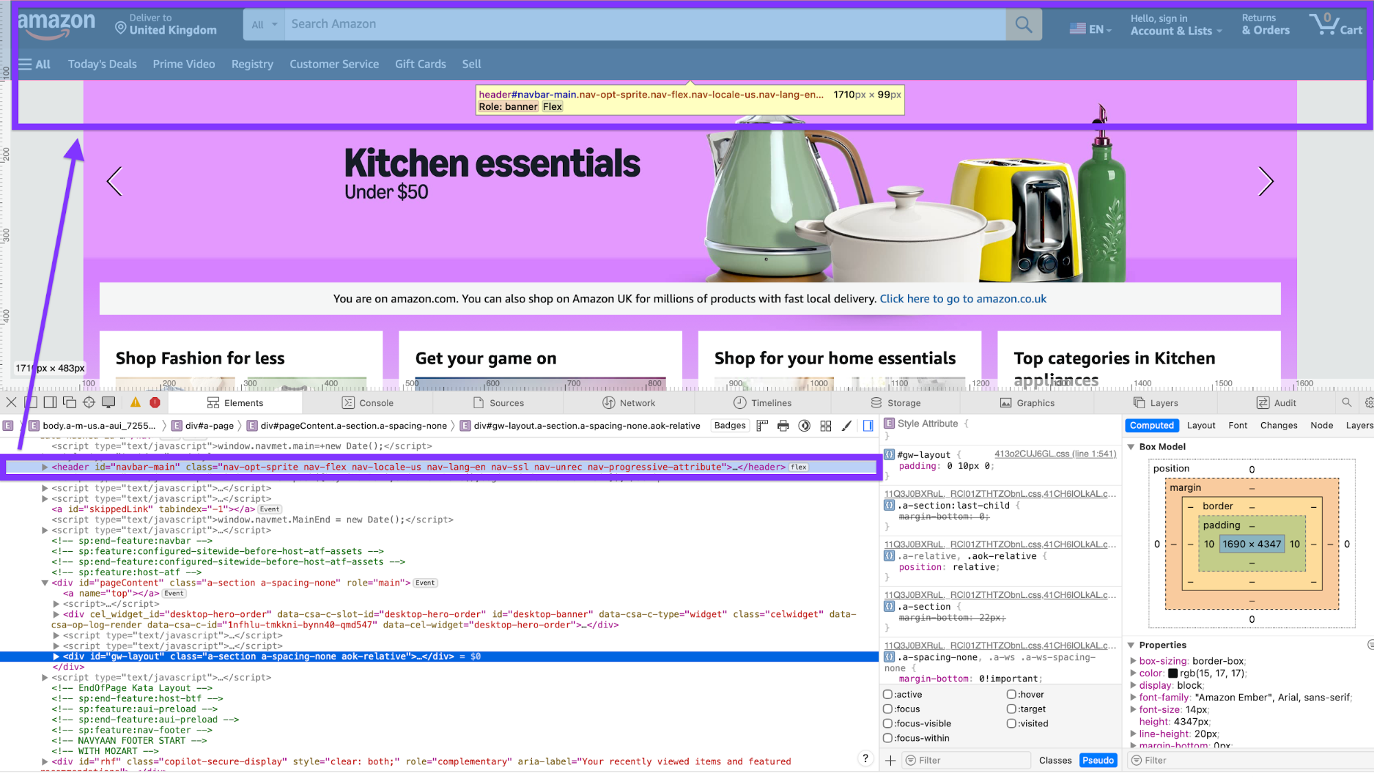
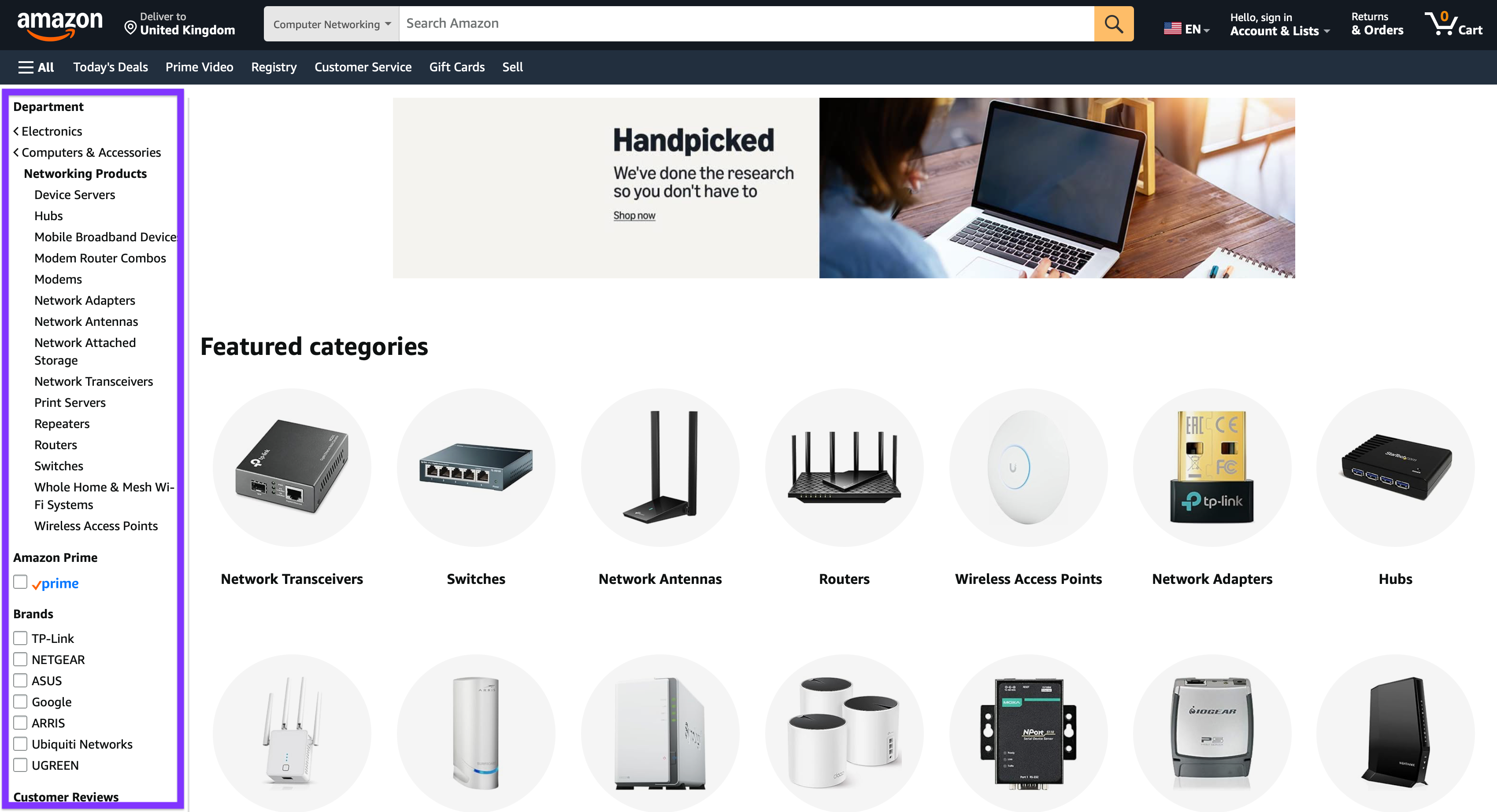
If you want to see semantic HTML in action, open and inspect any page. Here's an example of the main navigation bar on Amazon's homepage:
When building a page, pay special attention to forms because this is where specific actions happen (signups, checkouts, feedback, etc.). To optimize forms for conversions, make sure to:
-
Use proper <label> tags tied to inputs, helpful placeholder/aria-describedby text, and clear error messaging.
-
Group related fields with <fieldset>/<legend>
-
Support keyboard and mobile input types (type="email", inputmode="numeric")
As you structure content, make navigation as intuitive as possible. A clear <nav> with concise labels helps users predict where clicks lead, and breadcrumbs expose location and shorten backtracking (“Home → Category → Product”).
Let's use Amazon as an example again. If you search for a product, you'll see faceted nav that makes massive product catalogs easily scannable.
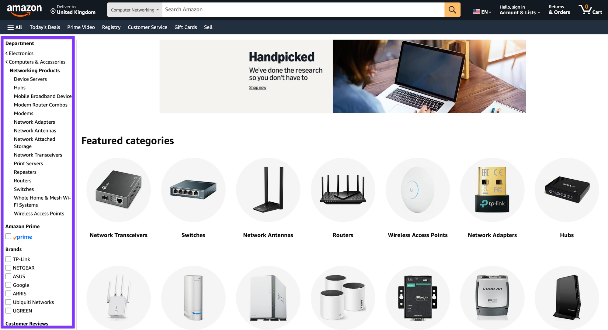
At the same time, product contexts show category paths similar to breadcrumbs and related trails (brand store, category, recommendations), reinforcing orientation and discoverability.
6. Master modern layout systems like Flexbox and Grid
Flexbox and Grid enable responsive web design by offering layouts that automatically adapt content to different screen sizes. Here's what each does:
-
Flexbox: Used for one-dimensional alignment (centering, spacing, and ordering items in a row or column)
-
Grid: Handles two-dimensional layouts, defining rows and columns to create complex, magazine-style compositions
In practical terms, Flexbox-style alignment is used for:
-
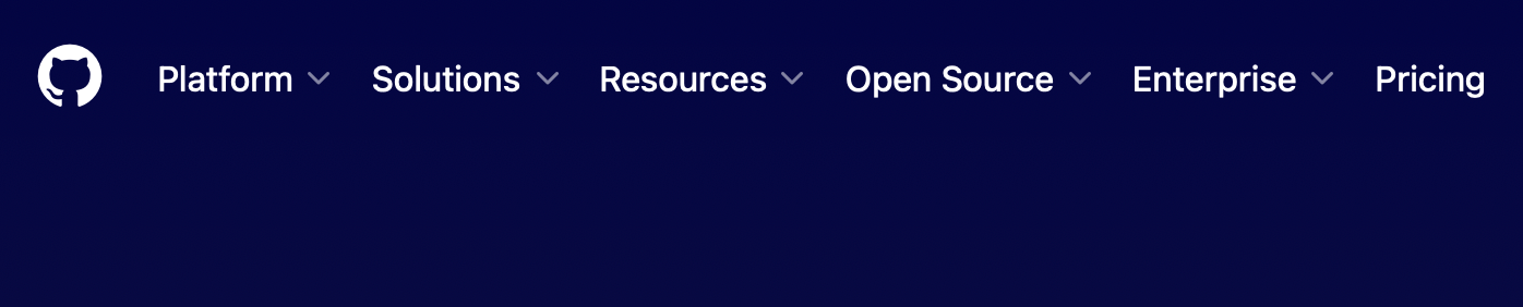
Navbars with spaced links (e.g., GitHub's homepage header)
-
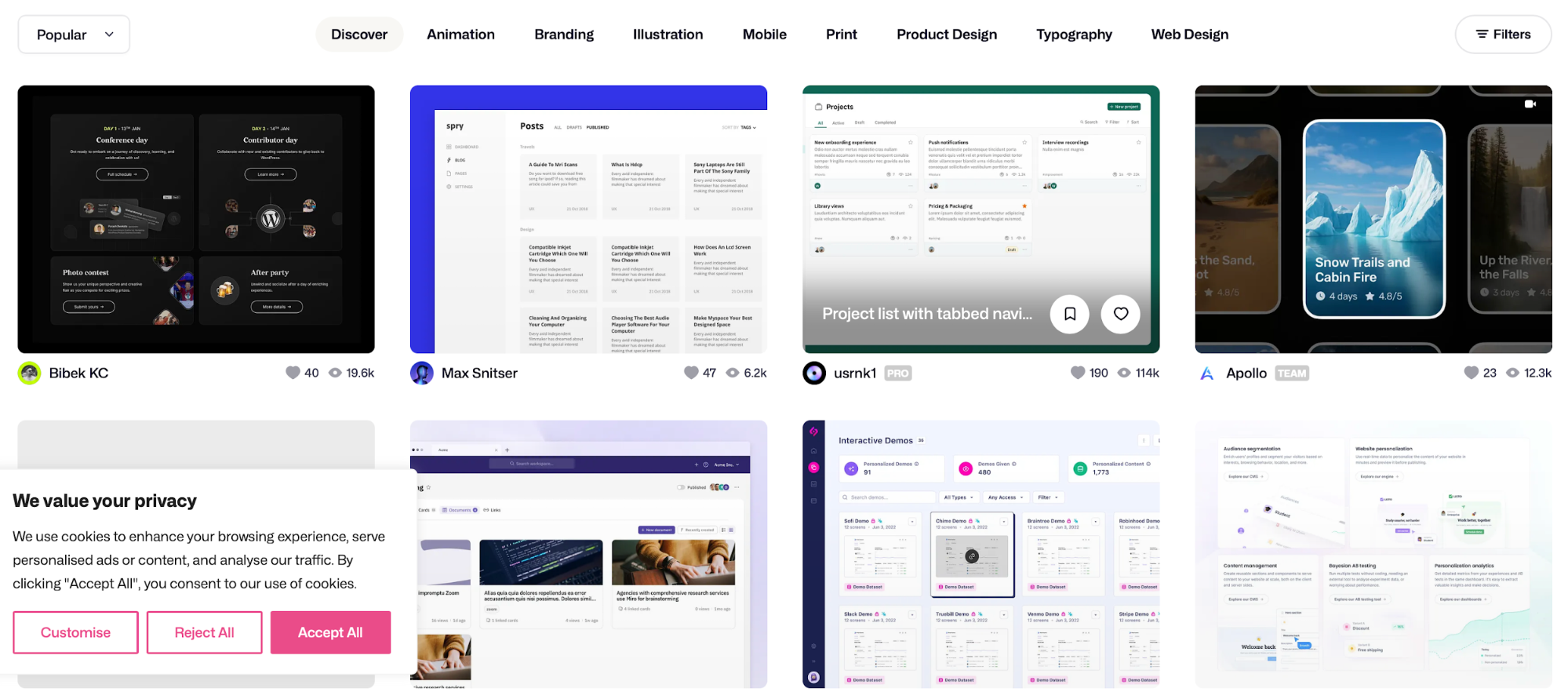
Card rows that wrap neatly (e.g., Dribble's design results page)
-
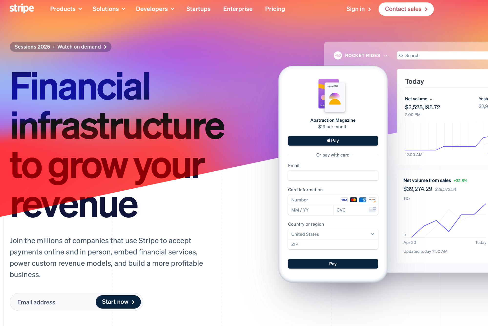
Perfectly centered hero content (e.g., Stripe's homepage hero)
As for Grid, web developers often use it for:
-
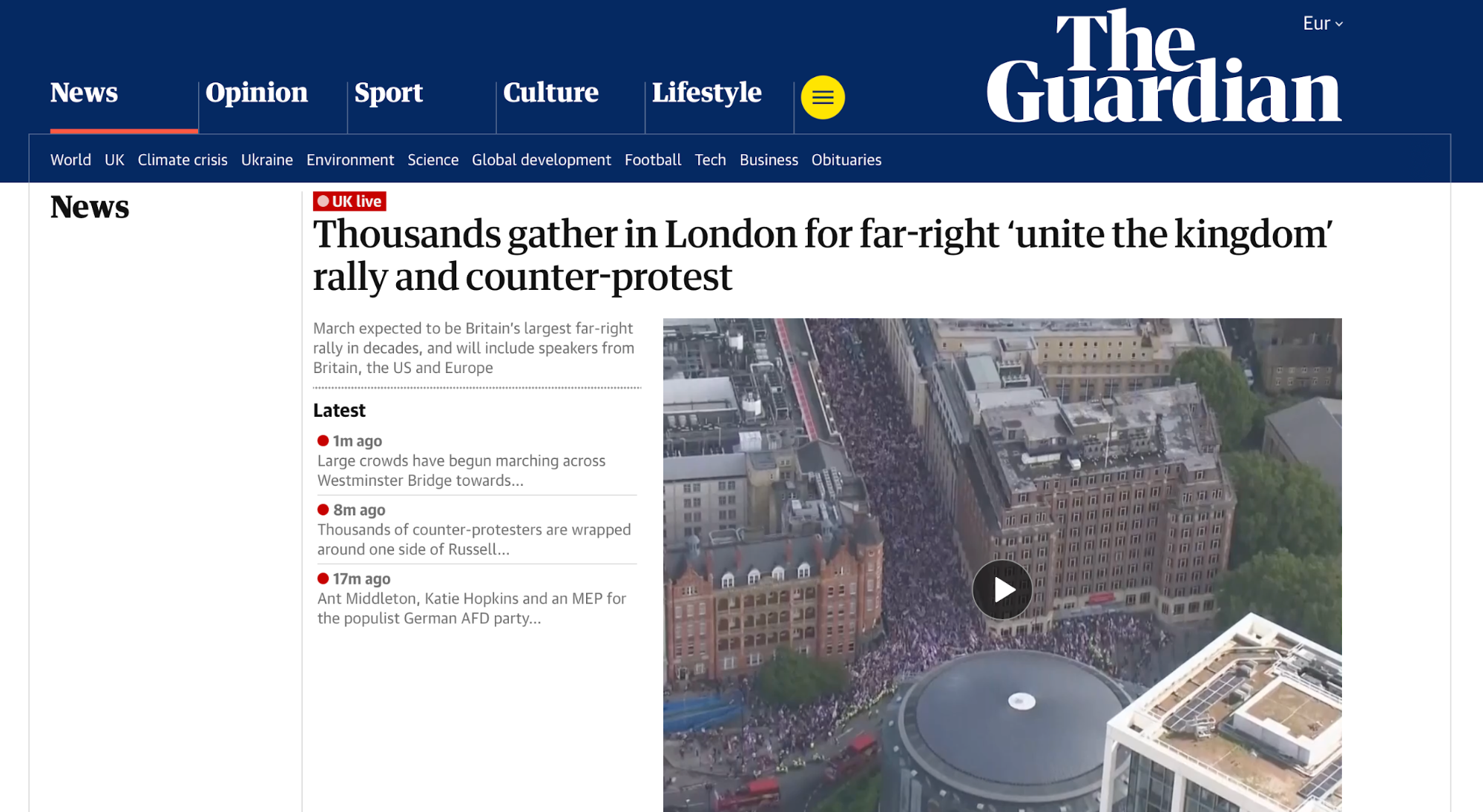
Editorial/magazine layout (e.g., The Guardian's homepage)
-
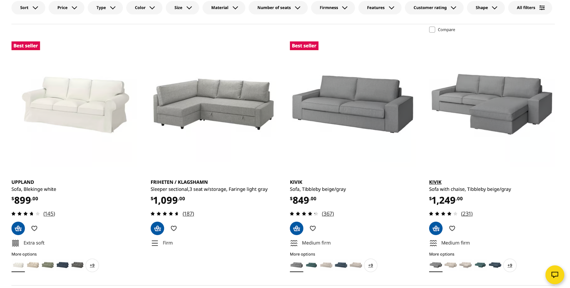
Product galleries with consistent gutters (e.g., IKEA's category listing)
-
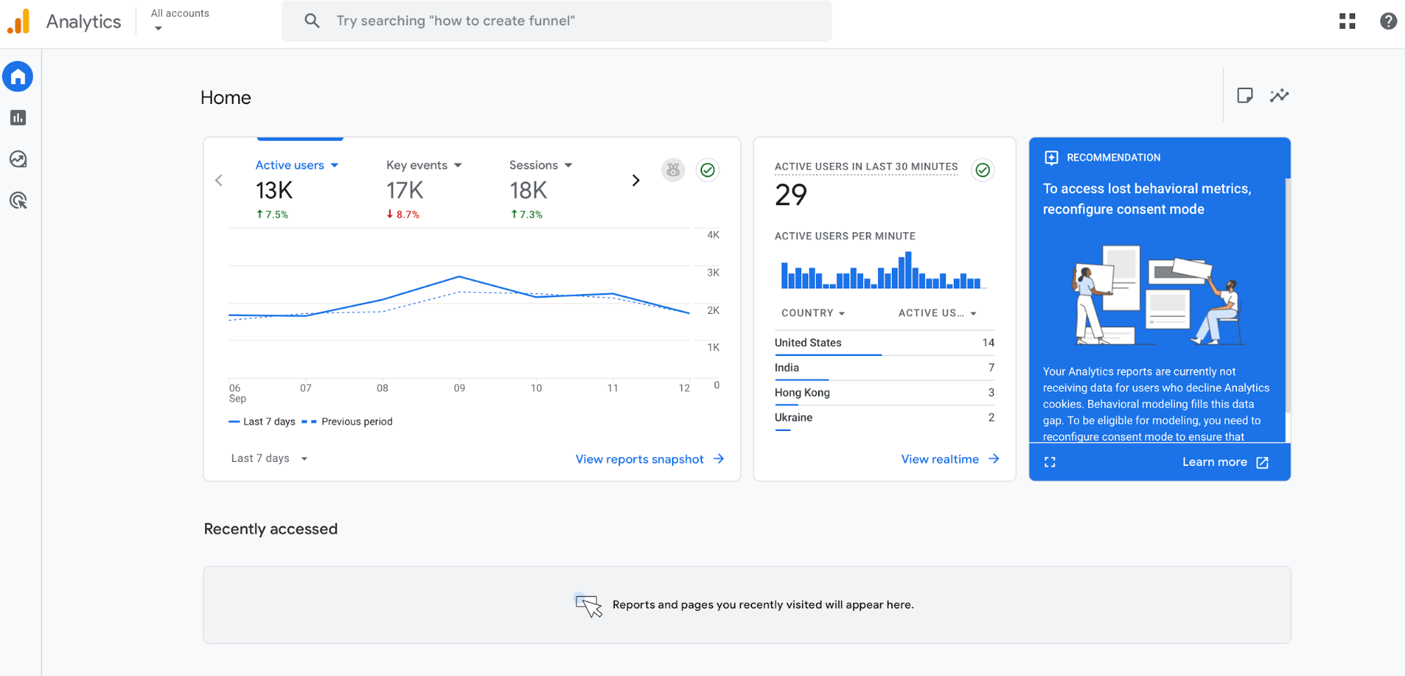
Dashboards with fixed sidebars and flexible content (e.g., GA4 demo)
You can use CSS Tricks' Guide to Flexbox and Guide to Grid to learn more about these layout systems. Then, get some practice by rebuilding a simple home page twice—once with Flexbox, and once with Grid. This way, you can develop a feel for which method to use for different pages.
Seeing as Flexbox and Grid are all about responsiveness, test your designs by using browser DevTools to toggle device sizes, inspect box models, and live-edit CSS.
Your layout should adapt without breaking, so check for issues like long headings, extra cards, or missing images.
7. Improve your designs with typography, colors, and visual principles
Typography is an essential part of your brand's visual identity, and it must reflect the brand's voice. Pick one primary typeface that fits the brand, and then build a simple scale so headlines, subheads, and body copy feel related.
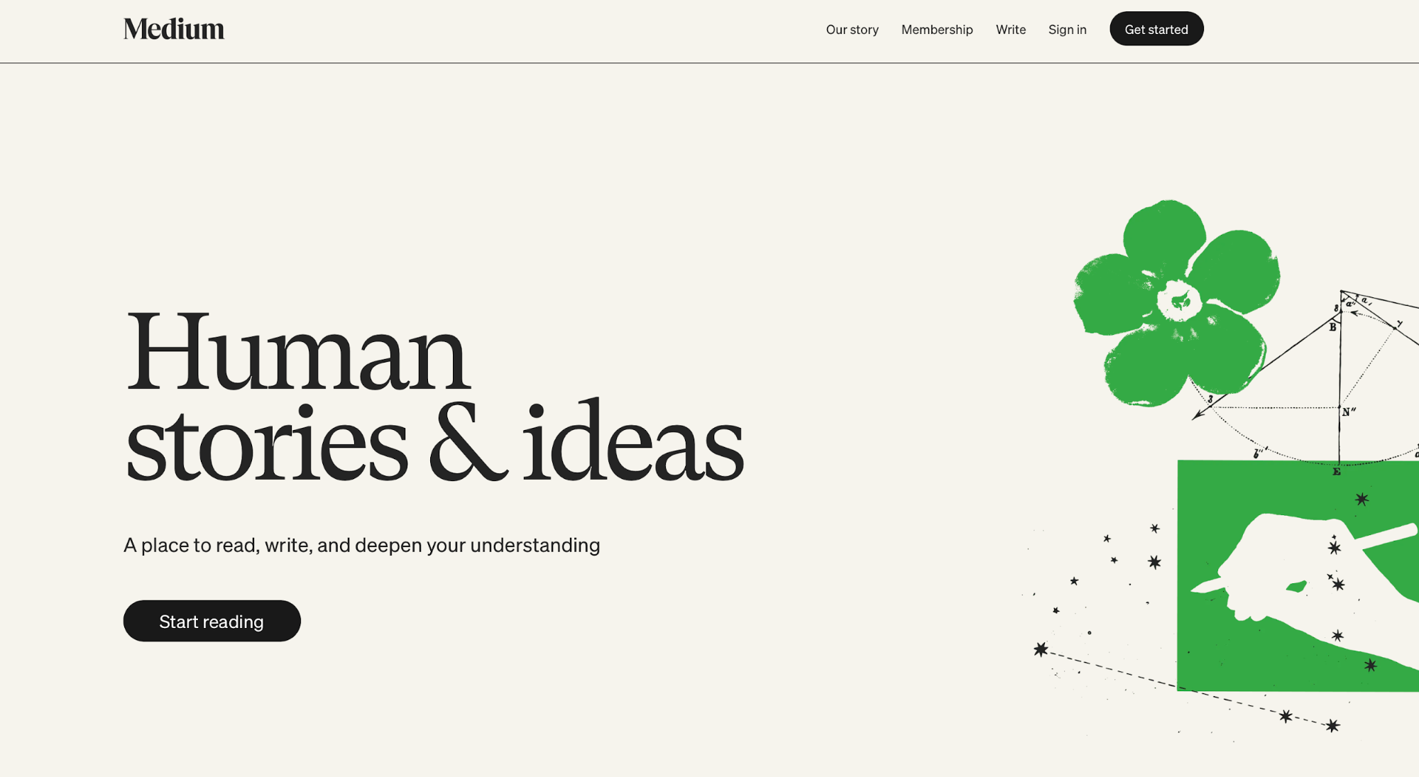
Take a look at Medium's site as an example. It uses a custom typeface based on a late 19th-century grotesque, which reflects the brand's identity and focus on storytelling.
Your color palette is another crucial decision because it shapes emotions and ensures brand recognition. When choosing the palette, don't go overboard to ensure the site doesn't look overwhelming. Instead, stick to one primary color, one or two accents, and neutral grays.
To choose the color palette, you need to understand color theory and think in roles instead of only focusing on making the site visually appealing. These role-based decisions look something like this:
-
Action color for CTAs
-
Supportive accent for highlights
-
Neutrals for backgrounds
For example, Spotify contrasts a vivid green color with a dark UI, highlighting the key actions while ensuring readability and accessibility.
If you want to experiment with color palettes, you can use Canva's Color Wheel. Play around with it to create complementary, analogous, or triadic palettes, and then plug them into your components.
8. Add interactivity and animations to bring websites to life
A bit of motion can do wonders for the user experience by making your product feel much more engaging. You can use CSS transitions and animations to help elements feel more responsive (e.g., cards lifting on focus or modals fading instead of snapping open).
When you need more advanced behavior (dropdown menus, sliders, modals, tabs), reach for JavaScript.
It lets you manage state, wire up events, and coordinate ARIA attributes so components are both interactive and accessible.
You can find examples of this all over the web. For instance, Instagram's double-tap “like” uses a tiny heart animation to reward the action without stealing focus.
If you haven't used JS before, you can find a beginner-friendly web design course on JavaScript.com. It gives you a hands-on way to practice the basics before layering on UI patterns.
When adding animations, opt for small, purposeful micro-animations tied to user intent. Test animations with reduced-motion settings, and make sure everything works with the keyboard to maintain accessibility.
9. Build responsive, real-world projects to apply your skills
Every successful web designer will tell you that the skills you develop stick when you consistently ship your product. Don’t just read web design theory and take courses—pick small ideas, and then create websites end-to-end.
Start with a personal portfolio to kill two birds with one stone. You'll practice as you build the portfolio, and you'll have a single hub for all your work.
Keep your portfolio lightweight, especially if you're just starting out. You can add:
-
A simple hero
-
Project cards
-
A contact form
When the basics are done, try a landing page for a simulated product to practice messaging, CTAs, and building out a pricing section. Then, take it a step further through an e-commerce demo with:
-
A product grid
-
Details page
-
Cart overlay
-
A checkout form with validation
Keep the scope tight but professional. Use semantic HTML, modern CSS (Flexbox/Grid), and a bit of JS for forms, modals, and tabs. Test your site on different screens to ensure a responsive design, and break the layout on purpose if needed to see how it behaves.
When you're ready, push your product to GitHub and deploy with GitHub Pages or Netlify so anyone can see a live link. Write a short README that covers:
-
The goal
-
The stack
-
Key lessons you've learned
-
What you’d improve next
Maintaining this public loop (build > ship > reflect) can turn practice into a solid portfolio that can kick-start your web design career.
10. Test your websites for browser compatibility and performance
You never know which browser users are accessing your site from, so you should make it work on all of them (or at least major browsers like Chrome, Edge, Firefox, and Safari). Test the site in different browsers, and stay on the lookout for issues like:
-
Layout shifts
-
Sticky headers that misbehave
-
Form controls that style differently
-
Any JS features that might need a polyfill
You don't need to actually access the site from different browsers to test it. Instead, you can use tools like BrowserStack to run live tests across browsers and devices.
Regardless of the browser, your site must perform efficiently so that users don't bounce from it. In other words, you need to optimize websites for speed, layout, and navigation so that users interact with them seamlessly.
To check if your site performs well, you can use a free tool like Google's PageSpeed Insights. Add your site's link, and you'll see a comprehensive report with plenty of performance data.
The most important metrics will be featured first as a part of Google's Core Web Vitals analysis, which you must pass to ensure the site is fast and stable.
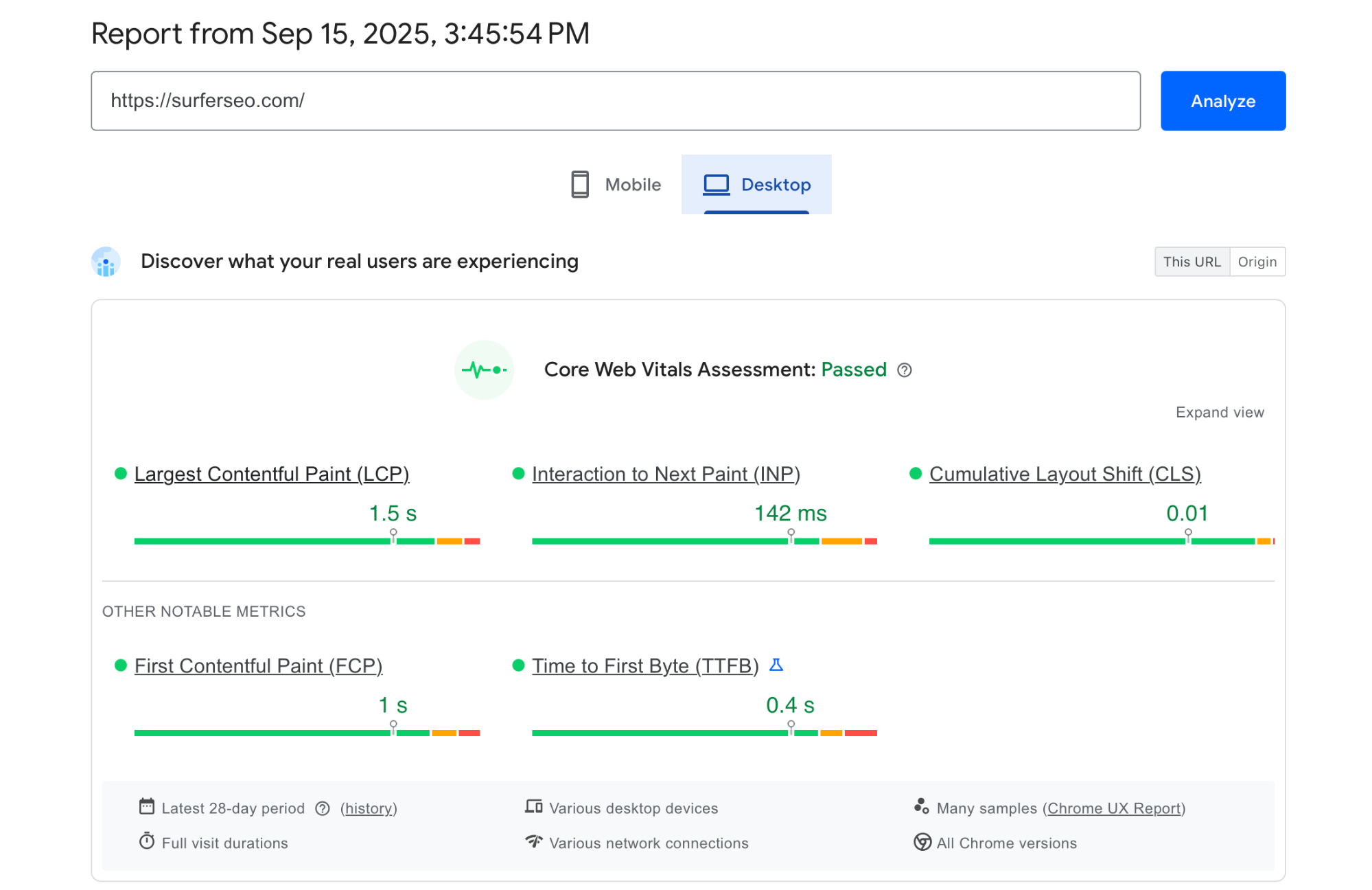
Test your site on desktop and mobile, and scroll down the report for actionable guidance on what to improve. If you need to quickly boost your scores, start with low-hanging fruit like:
-
Compressing images
-
Lazy-loading below-the-fold media
-
Preloading critical fonts
-
Trimming unused JS/CSS
Finally, don't forget to check the site's accessibility. Open Lighthouse in Chrome DevTools (Audits → Lighthouse), run the Accessibility check, and fix what it flags (e.g., missing alt text, low contrast, or unlabeled inputs).
If needed, do a manual check after using Lighthouse to verify that the changes work. Tab through the page, try it with reduced motion, and check zoom at 200%+ to see if everything works as intended.
11. Use online forums, resources, and courses to grow faster
No matter what issue you encounter, there's a high chance you're not first. Whether you need advice, answers, or simply a chat with other web designers, you can join plenty of online communities like Reddit’s r/web_design, Stack Overflow, or design Slack groups.
For more structured learning, you can explore online courses that can help you develop the necessary technical skills. Here are some recommendations:
|
Platform |
Course |
|
freeCodeCamp |
|
|
Codecademy |
|
|
Coursera |
|
|
Udemy |
Don't forget about the artistic side of web design. Browse sites like Dribbble and Behance to get inspiration and see how others solve layouts, type, and motion, and to spot patterns you can re-create in your practice builds.
Most importantly, ask for feedback.
Post a live link, say what you were aiming for, and ask one or two specific questions (e.g., “Is the value prop clear above the fold?”). Most web designers will be happy to provide some guidance, so don't hesitate to seek it if needed.
12. Plan your career path
The web design world is massive, so you'll have plenty of opportunities to choose a career path that works for you. The most common options designers can browse include:
-
Freelancing: Gives you variety and control over your work. You handle clients, pricing, and process, and you learn fast by owning the whole project
-
Agency work: Drops you into team play and a dynamic setting. You can expect exposure to many industries in a short time, as well as comprehensive development of your knowledge and skills.
-
In-house roles: Let you go deep on one product, refine patterns, and ship improvements that compound over months, not days.
No matter which route you choose, always stay in touch with the latest trends. Tools and frameworks evolve, so you need to be curious and willing to explore everything from new CSS specs to AI-assisted design processes.
As you grow, consider a specialty. Zeroing in on UX (research, testing, information architecture), frontend frameworks (React/Vue, component libraries, design tokens), or accessibility (WCAG, audits, inclusive patterns) can turn you into the person teams seek out for high-impact work.
This means you'd also be the one who gets tapped for leadership, higher rates, or more ownership. Start broad, and then lean into what you enjoy and where you consistently deliver results.
Key Takeaways
-
Web design treats UI (how it looks) and UX (how it works) as a single system. It prioritizes clarity, speed, and accessibility to reduce friction, build trust, and improve conversions.
-
The best way to learn web design is to rebuild existing websites and practice grids, spacing, type scales, and micro-interactions. Compare your own website to the original at multiple breakpoints to identify areas of improvement.
-
Nail semantic HTML and modern CSS before anything else. Build small projects like a portfolio or blog to make frameworks more intuitive later on.
-
Ensure accessibility by following WCAG 2.2: write meaningful alt text, ensure keyboard access and visible focus, and meet contrast ratios so actions are obvious and usability is built in.
-
Structure pages with semantic HTML (header, nav, main, article, footer), label and group form fields properly, and use clear navigation and breadcrumbs to keep users oriented.
-
Use Flexbox for one-dimensional alignment and Grid for two-dimensional layouts. Stress-test in DevTools to catch wrapping, overflow, long headings, and odd viewport issues.
-
Pick a single primary typeface and a simple type scale, then choose a restrained color palette so that important elements stand out without hurting readability or accessibility.
-
Add motion sparingly with CSS transitions and small, purposeful micro-animations. Layer JavaScript for components like menus, modals, and tabs while honoring reduced-motion settings and full keyboard use.
-
Build and ship real projects to get feedback and improve quickly. Maintain a public feedback loop to keep learning from experienced web designers.
-
Test your site on different browsers to ensure full support. Analyze and optimize the site's performance to ensure it loads quickly and remains stable.
-
Explore freelancing, agency, and in-house roles to see what works best, and then choose your specialty to focus on a particular aspect of design. Stay in touch with the latest developments in web design to remain skilled and competitive.