13 Website Layout Ideas for Designers


Khanh Linh Le
Created on Sep 26, 2025
Designing a website layout isn’t easy. You’ve got to balance usability, aesthetics, and business goals. All while making sure visitors don’t bounce in the first five seconds. Too often, layouts either feel cluttered or so minimal that users get lost.
That’s why it helps to see proven layout ideas in action. In this article, I’ll share 13 website layout ideas that work across different industries.
You’ll see how each layout drives clarity, improves engagement, and creates memorable experiences you can adapt to your own projects.
What is a website layout?
A website layout is the structural arrangement of page elements, such as header, navigation, content sections, calls-to-action, and footer. It’s the blueprint that decides what visitors see and also how they move through your site.
The easiest way to think about it is like a floor plan in architecture. Just as the arrangement of rooms guides how people move in a building, the placement of sections and elements on a website shapes how users navigate, interact, and convert.
Layouts also change depending on the purpose. A blog often uses a clean, scrollable web design for reading, while an e-commerce site needs grids and product filters to drive sales. Portfolios lean on visuals to showcase work, and landing pages strip things down to focus attention on a single CTA.
Why are website layouts important?
Website layouts are important because they decide how visitors experience your site. A strong layout directly shapes usability, readability, and first impressions.
The right layout makes information easy to scan, helps users focus on what matters, and builds trust within seconds. That’s critical when your business goals depend on actions like sign-ups, purchases, or demo requests.
For example, an e-commerce site with a clean product grid layout makes browsing quick and intuitive. Meanwhile a storytelling layout with bold visuals and narrative flow is better at driving user engagement with your brand.
A good website layout also works with how site visitors naturally view content. The human eye often scans in Z-patterns (diagonal across the page) or F-patterns (down and across like reading text).
Good layouts should organize content and place headlines, CTAs, and key visuals where your eye naturally goes. This way, users are more likely to stay engaged instead of dropping off.
13 website layout design ideas
There’s no single “perfect” website layout; the best choice depends on your goals, content, and audience.
To help spark inspiration, here are 13 visually appealing layout ideas for you to improve usability, engagement, and conversions.
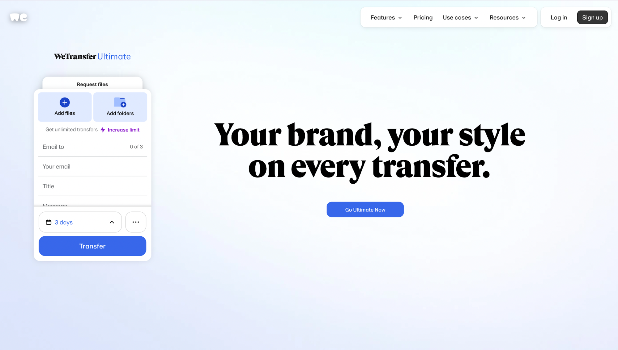
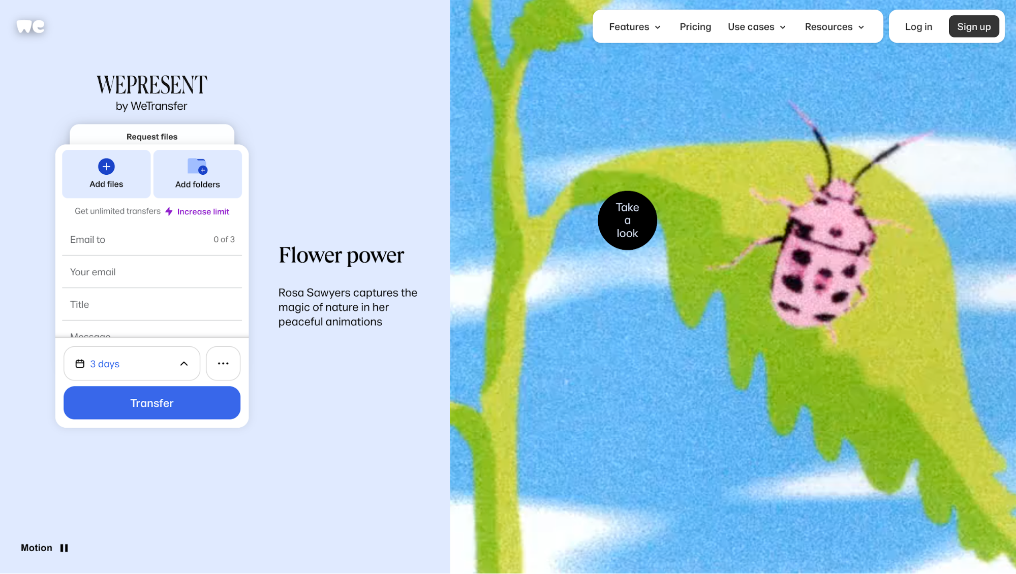
Idea 1: Fullscreen immersive hero
When I land on WeTransfer, the hero takes over the entire viewport that instantly generates a visual interest.
There’s no clutter, just a clean gradient background, a bold headline (“Your brand, your style on every transfer”), and a simple CTA.
On the left, the upload panel itself is embedded directly in the hero, so the product action and the brand message sit side by side without distraction.
You don’t scroll past this hero; it’s the whole experience until you move into a specific feature or pricing page. That makes the layout immersive by design; it frames the service in one decisive moment.
What’s good about it:
-
Upload panel + headline synergy: The upload widget is integrated directly in the hero layout (with “Add files / Add folders,” recipient fields, transfer button). Placing important elements there means you’re seeing the product function and the brand message together. No guessing what the site does.
-
Dynamic hero screens & content switching: The hero doesn’t stay static. After a few seconds, it transitions into WePresent features (showcasing creator content, mood visuals). That keeps the layout feeling alive and gives you a taste of the broader ecosystem beyond file uploads.
-
Sub-menu/settings reveal premium → pricing paths: When you click the “⋯” (three dots), it reveals options like “Premium features.” That link takes you directly to pricing. It’s subtle, but good for conversion: you’re not pushing pricing up front, but making it discoverable in the context of action.
Idea 2: Minimalist and UX-focused design
The first thing that strikes you about Jords & Co is how clean and uncluttered the homepage design feels.
Big whitespace, limited colors, and strong typography set a calm tone that makes the message instantly clear.
What’s good about it:
-
Clear sectional structure: The layout follows a simple flow: Header → Hero → Featured Work/Case Studies → “Why Us” with differentiators (“Founders built”, “Strategy-first”, etc.) → Proof/Testimonials. Each section is visually distinct with enough whitespace so your eye moves cleanly from one to the next.
-
Ample whitespace creates focus: There’s breathing room around every element, i.e., big margins around the hero text, space between sections, and clean backgrounds. That lets the most important content (like the headline, CTAs, client logos, testimonials) pop instead of competing for attention. This creates a balanced layout that feels harmonious across all screen sizes.
-
Limited color palette, high contrast typography: They mostly use neutral backgrounds (white or very light), black/dark text, and one accent color for buttons and CTAs. Strong fonts and bold text for headings add hierarchy. This keeps visual noise low so you focus on what matters: the message, the action.
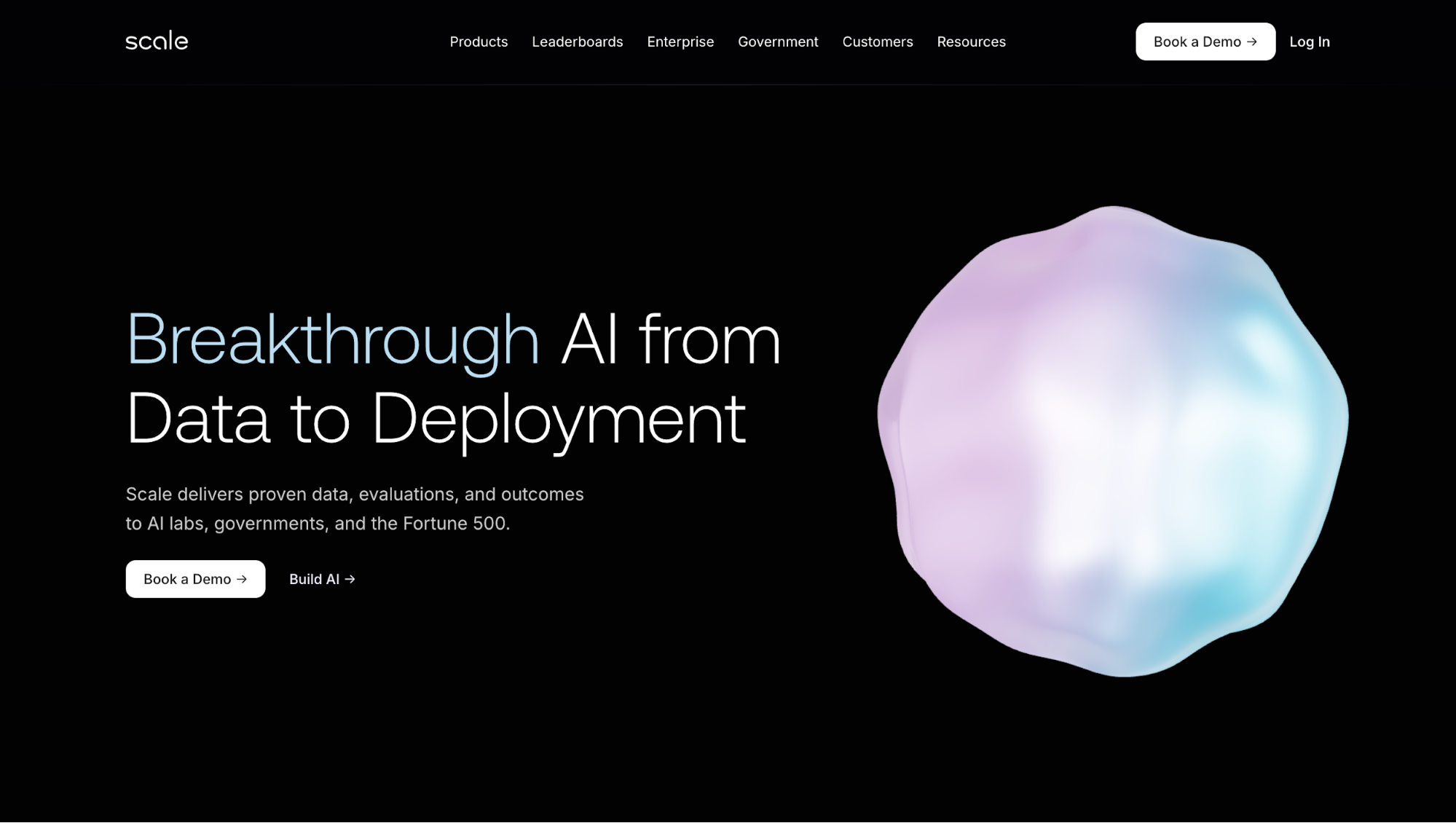
Idea 3: Dark mode aesthetics
On Scale, the dark background instantly sets a sleek, high-tech mood. You see crisp white typography and bright CTAs that stand out sharply against the dark canvas.
Another thing that immediately catches your attention is the moving blob that morphs into the Scale logo. It’s a clever move: the shifting organic shape draws your eyes immediately, and when it transforms into the logo, the brand impression sticks.
I find this kind of inverted website design works especially well when a brand wants to feel premium and futuristic.
What’s good about it:
-
High contrast headline & primary action up front: The page opens with a headline and action buttons (“Book a Demo” or “Build AI”) that are immediately visible. Because of the dark-light contrast, the CTAs stand out sharply and feel urgent.
-
Minimalist styling, restrained color palette: There’s very little color beyond the brand accents and partner logos. Text is mostly white/light grey, links/buttons highlight in cool tones or bright accent. This keeps the layout clean so you don’t get distracted.
-
Consistent UI elements & spacing: Buttons, links, and navigation are consistent in style. Even with dark mode, tap targets, font weights, and line spacing are balanced so text doesn’t feel too thin or hard to read.
If you’re considering a dark-mode layout yourself, here’s a quick checklist to keep it usable and effective:
-
Ensure strong contrast (4.5:1 or higher) for text on dark backgrounds.
-
Make CTAs bright and distinct so they guide visitors' attention without competing.
-
Use motion sparingly, i.e., subtle animations like Scale’s blob work better than heavy effects.
-
Choose heavier font weights and ample spacing so light text stays readable.
-
Test in different lighting conditions (bright daylight vs. dim rooms) to prevent eye strain.
Idea 4: Grid layout and modular cards
If you want to see a grid layout done right, Dan Woodger is a perfect example.
It's interesting how he fills the homepage with project thumbnails with some rectangular and some circular, not equal parts. These together form a modular grid. You don’t just scroll through; you wander.
And personally, I found myself pausing more than usual because every card invites a closer look.
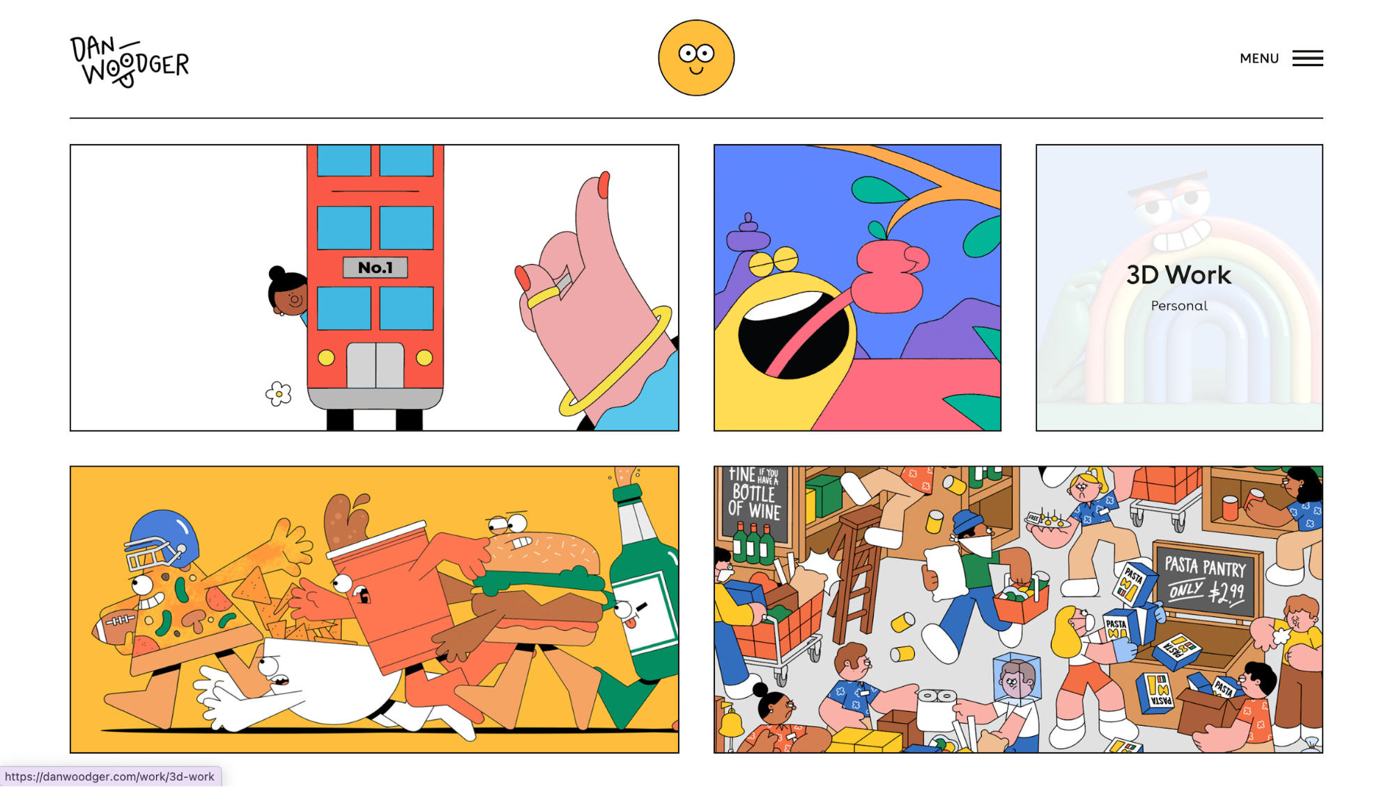
What’s good about it:
-
Grid as navigation: The layout doubles as both content and menu. Instead of a long scroll, you explore through a tiled set of projects.
-
Whitespace as balance: Every project thumbnail bursts with color, yet the generous use of white space keeps the grid harmonious.
-
Content revelation upon hovering: When you hover over a card, descriptive text appears, giving context without cluttering the clean design. It’s a smart way to balance minimalism and detail.
-
Responsive adaptability: On desktop, the grid shows several columns. As the screen narrows, cards collapse into two columns or a single column, keeping thumbnails legible and tappable.
Idea 5: Split-screen layout
Educated Guess uses a layout where messaging sits side by side with strong visual branding and navigation cues.
On the top left corner, you get the story, and on the other side, you'll find navigation and brand identity presentation. The split is clean, not overly fancy, but it gives you both message and visual identity immediately.
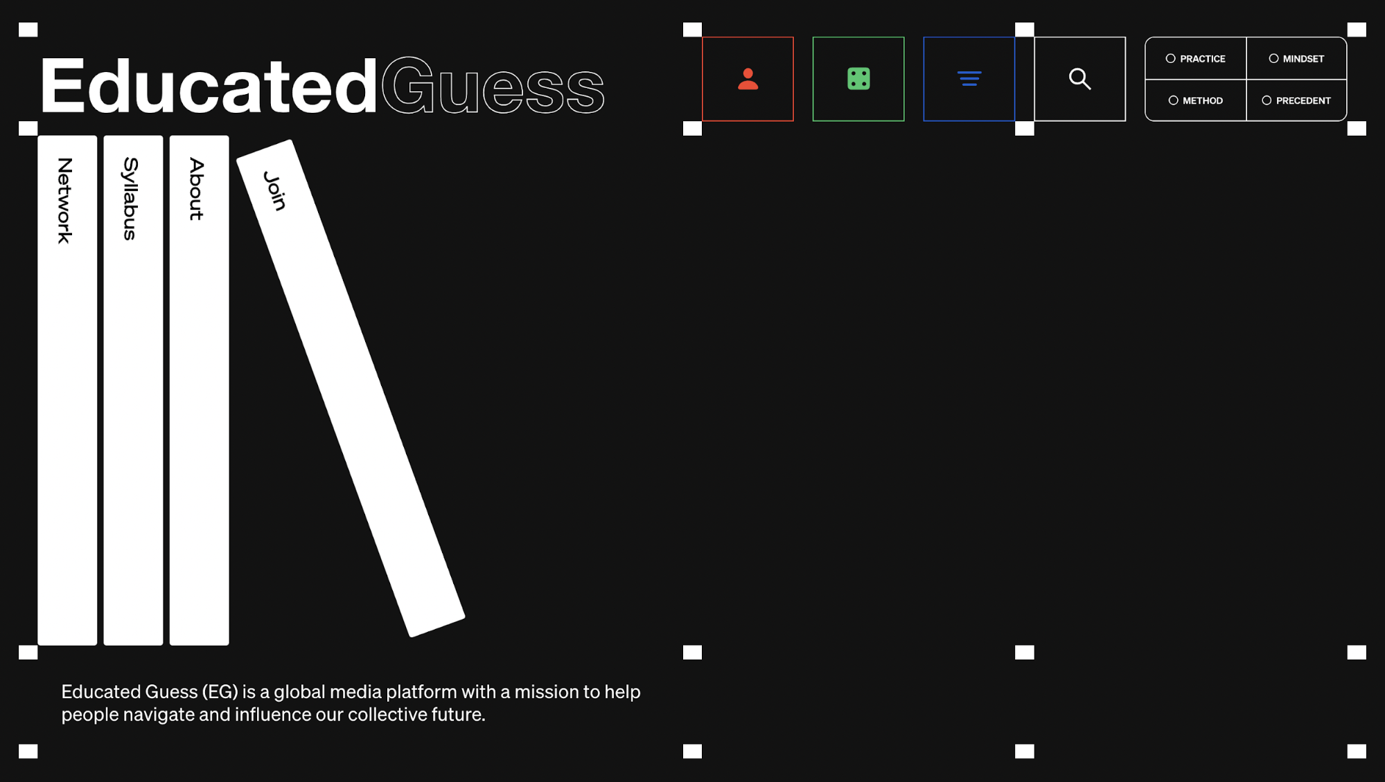
What’s good about it:
-
Immediate clarity of purpose vs branding: The split lets you see what Educated Guess is and who is behind it right away. The text block lays out the mission, scope, and content areas. The other side reinforces identity through logo, link structure, and minimalist visual styling. You don’t have to scroll to understand what this platform is.
-
User choice path enabled early: Because both messaging and navigation are visible upfront, you can decide what to do. That’s ideal when you have diverse user goals.
-
Design harmony via restraint: The split-screen uses limited colors, clean typography, and no extra decorative visuals. That keeps visual harmony, so your eyes don’t get pulled away by unnecessary clutter.
Idea 6: Layered or card stack layout
If you’ve ever played with a deck of cards, you know how satisfying it is to flip through one by one.
The Stacking Slider demo on Webflow is a perfect example: Each card sits partly over the next, and when you click the arrow, the top card slides away to reveal the important information underneath.
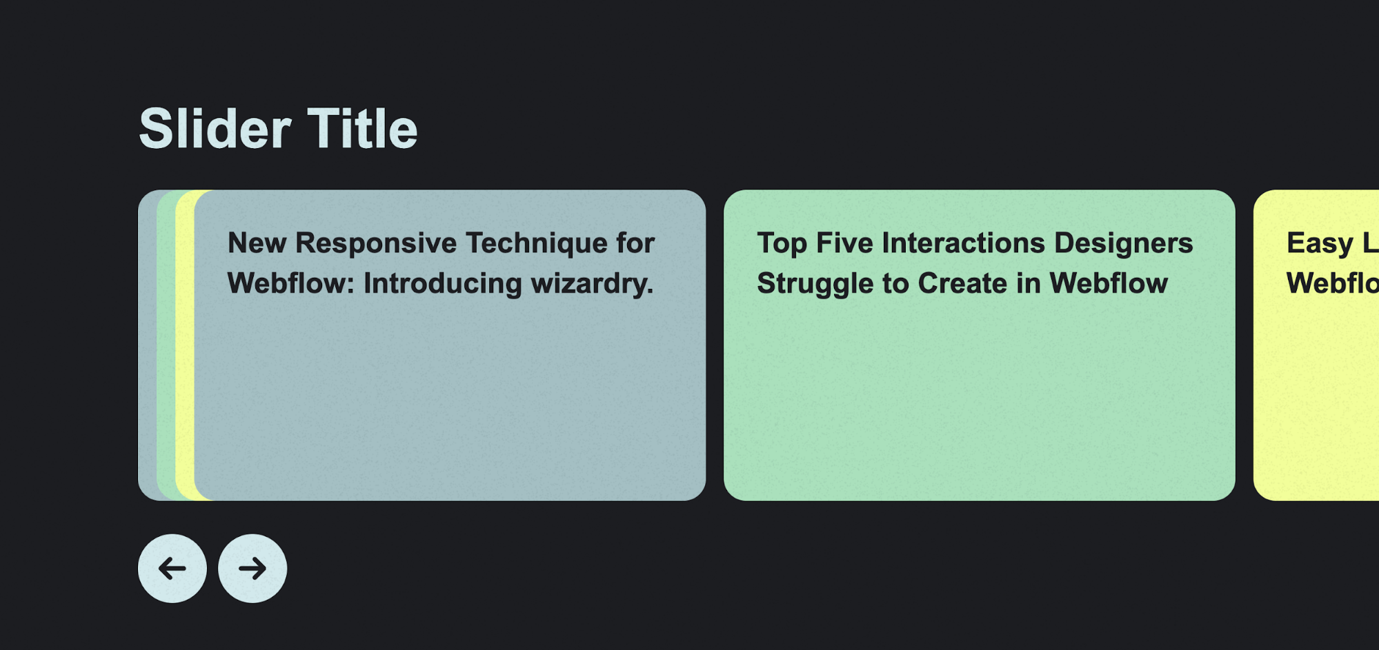
In real-world websites, you often see this effect triggered by scrolling, swiping, or auto-advancing motion. I like this pattern because it’s more dynamic than a static carousel or plain grid.
That same principle shows up more subtly on Aurora’s homepage. In the Real-world scenarios section, the “Superhuman driving capabilities” examples use light card-style motion.
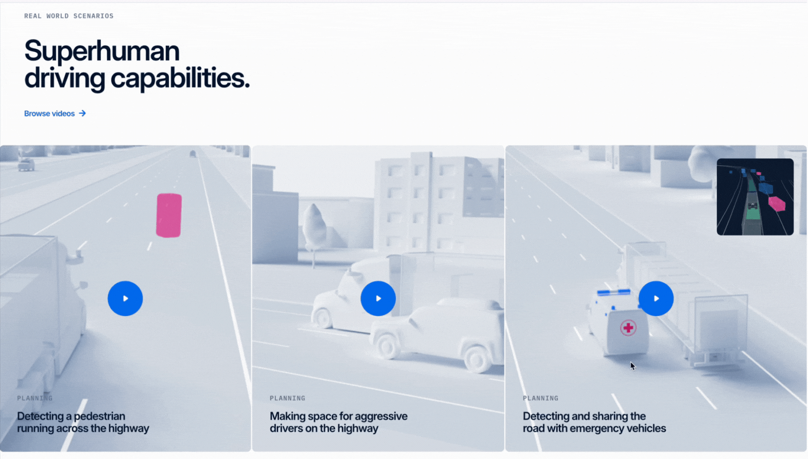
Instead of sharp overlaps, each scenario, like “Detecting a pedestrian” or “Making space for aggressive drivers,” shifts in and out, so one remains in focus while others recede into the background.
It’s essentially a stacked experience, but tuned for clarity and storytelling rather than pure visual flair.
What’s good about it
-
Scenario-driven storytelling feels immersive: Each card transition ties to a real-world driving challenge. This makes Aurora’s advanced tech easier to understand through concrete, visual examples.
-
Subtle stacking motion keeps clarity: One scenario card stays in focus while others fade back. This adds dimensionality without overwhelming or distracting you.
Idea 7: Image gallery layout
KWP + Partners’ Our Work page takes the gallery approach head-on. Instead of text-heavy project summaries, you get a wall of edge-to-edge visual blocks. Each case study is represented by a bold, full-bleed image that you can click to dive deeper.
In addition, it doesn’t settle for a simple static grid for mediocre past work showcasing. Instead, the gallery is split into three vertical columns, each with its own scrolling direction.
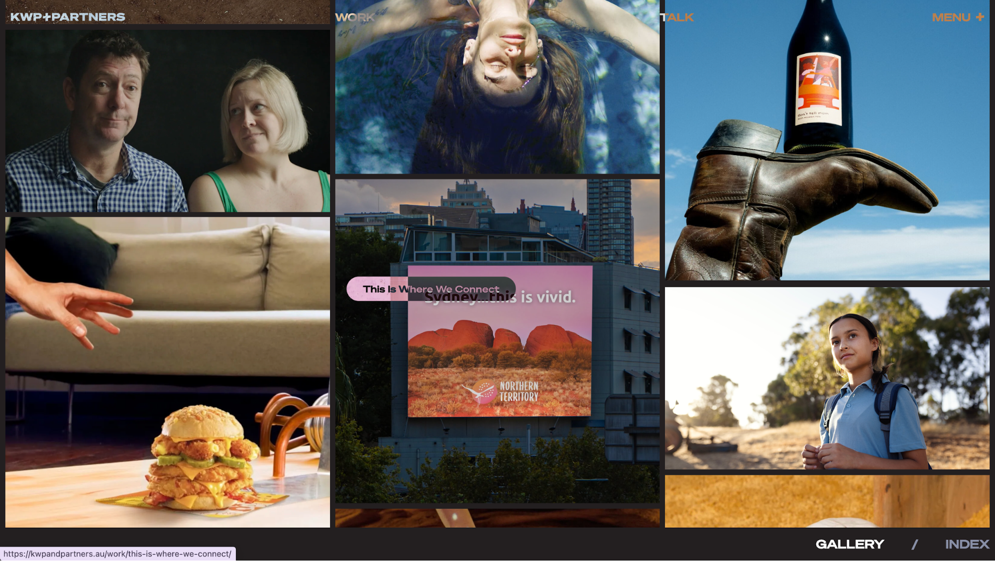
That interplay creates a sense of movement that feels more alive than a conventional gallery. I noticed myself lingering longer because the opposing directions give a rhythm.
What’s good about it
-
Immersive brand personality: The full-bleed imagery paired with alternating scroll directions makes the agency’s work feel energetic and confident. You’re not just browsing; you’re experiencing.
-
Distinct from traditional galleries: Where most portfolios rely on static grids or linear carousels, this shifting three-column gallery feels bold and memorable. It helps reinforce the agency’s creative edge.
Idea 8: Asymmetrical layout/grid disruption
Handle Freelance Solutions’ homepage makes clear use of asymmetry. Sections aren’t aligned in predictable left-right grids.
The header already sets the tone: a bold, full-screen image that shifts over time, paired with oversized type aligned off-center. It feels less corporate and more like a creative campaign.
As you scroll, the What We Do section breaks away from rigid grids. Content blocks alternate in alignment: One left, the next right, and the following left. The staggered arrangement is deliberate. Instead of a monotonous list, you get a zig-zag flow that pulls your eye across the screen.
I liked how this offsetting made payroll and compliance, topics that could feel dry, feel unexpectedly dynamic.
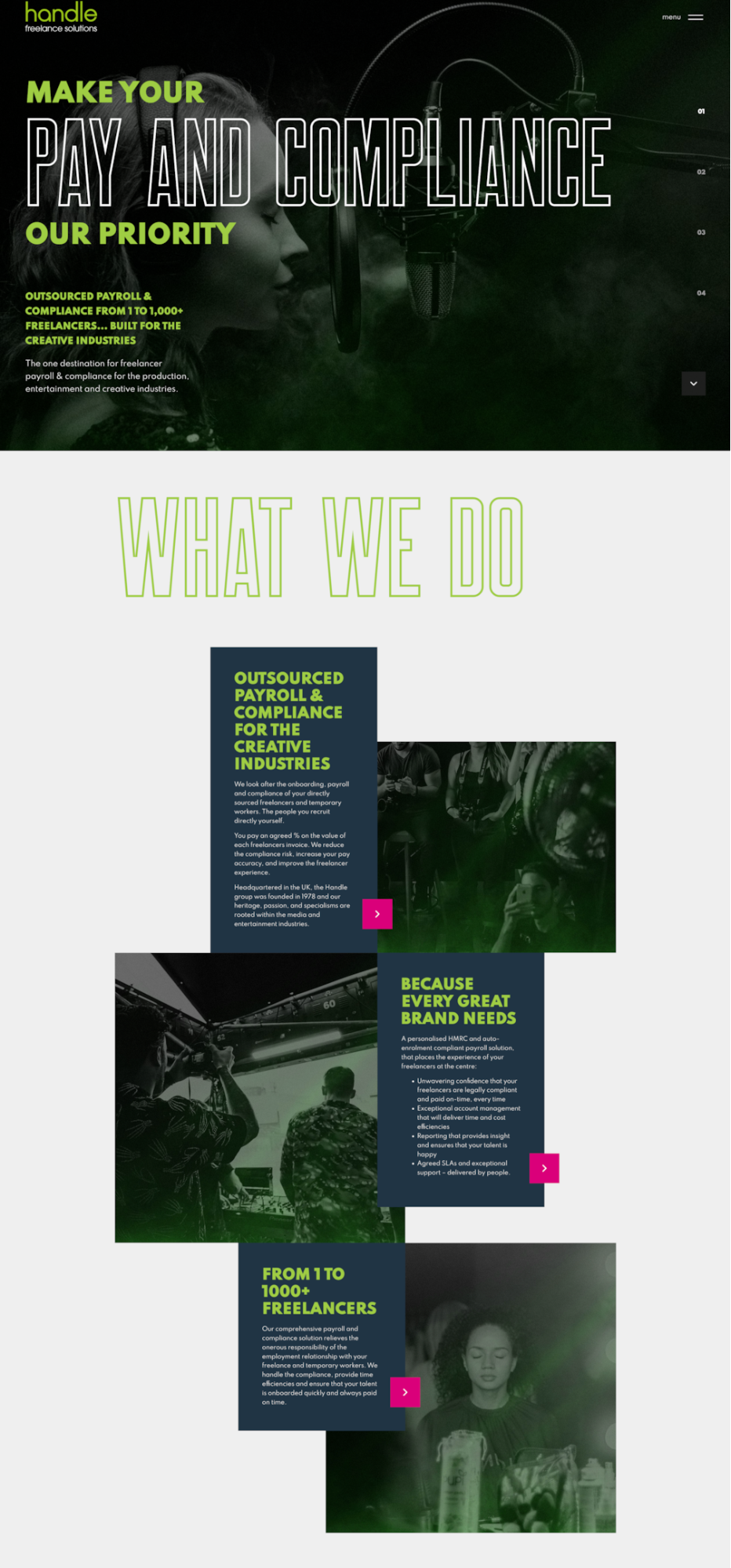
What’s good about it
-
Movement through offset blocks: The alternating alignment creates a natural rhythm, nudging your gaze diagonally rather than straight down. That makes the page feel more active.
-
Brand personality through disruption: By avoiding symmetry, the site signals creativity and energy. Even in a compliance-focused space, the design feels bold and confident.
Idea 9: Text-only hero layout
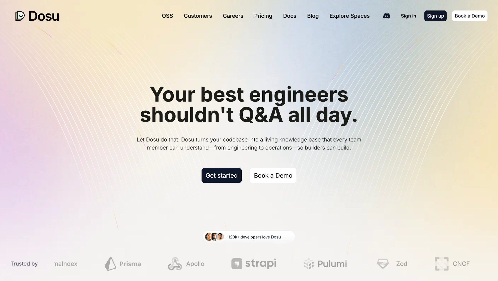
On Dosu.dev, the hero section strips away big imagery (or at least keeps visuals minimal) and leans hard on text: a strong headline “Your best engineers shouldn’t Q&A all day.”, a short supporting sentence, and a clear CTA (“Get started”/“Book a Demo”).
The visual noise is low. Everything up top is about message and action.
Text-only heroes like this force you to focus. When there’s no photo, video, or background pattern competing for attention, your mind goes straight to meaning: what the product is, what value you’ll get, and what to do next.
I find this kind of layout especially effective for SaaS or B2B tools where trust and clarity matter more than mood imagery.
What’s good about it
-
Strong typographic hierarchy: Dosu uses large, bold type for the headline, smaller but readable body text underneath, then a prominent CTA. The visual weight clearly guides you: headline → message → action.
-
Focused action paths: Because you aren’t distracted by visuals, the CTA stands out. “Get started” / “Book a Demo” choices are front and center, making it easier for you to decide what to do without hunting around.
Idea 10: Parallax scrolling effects
Parallax scrolling is where background content moves more slowly than foreground content when you scroll.
It adds depth, making pages feel more three-dimensional. It can also heighten storytelling by letting layers reveal themselves at different speeds.
Take Le Pain Quotidien as an example. The hero section starts with a bold headline placed over an anchored image of bread. As you scroll, the text shifts line by line before fading out, almost like the page is narrating its story in motion.
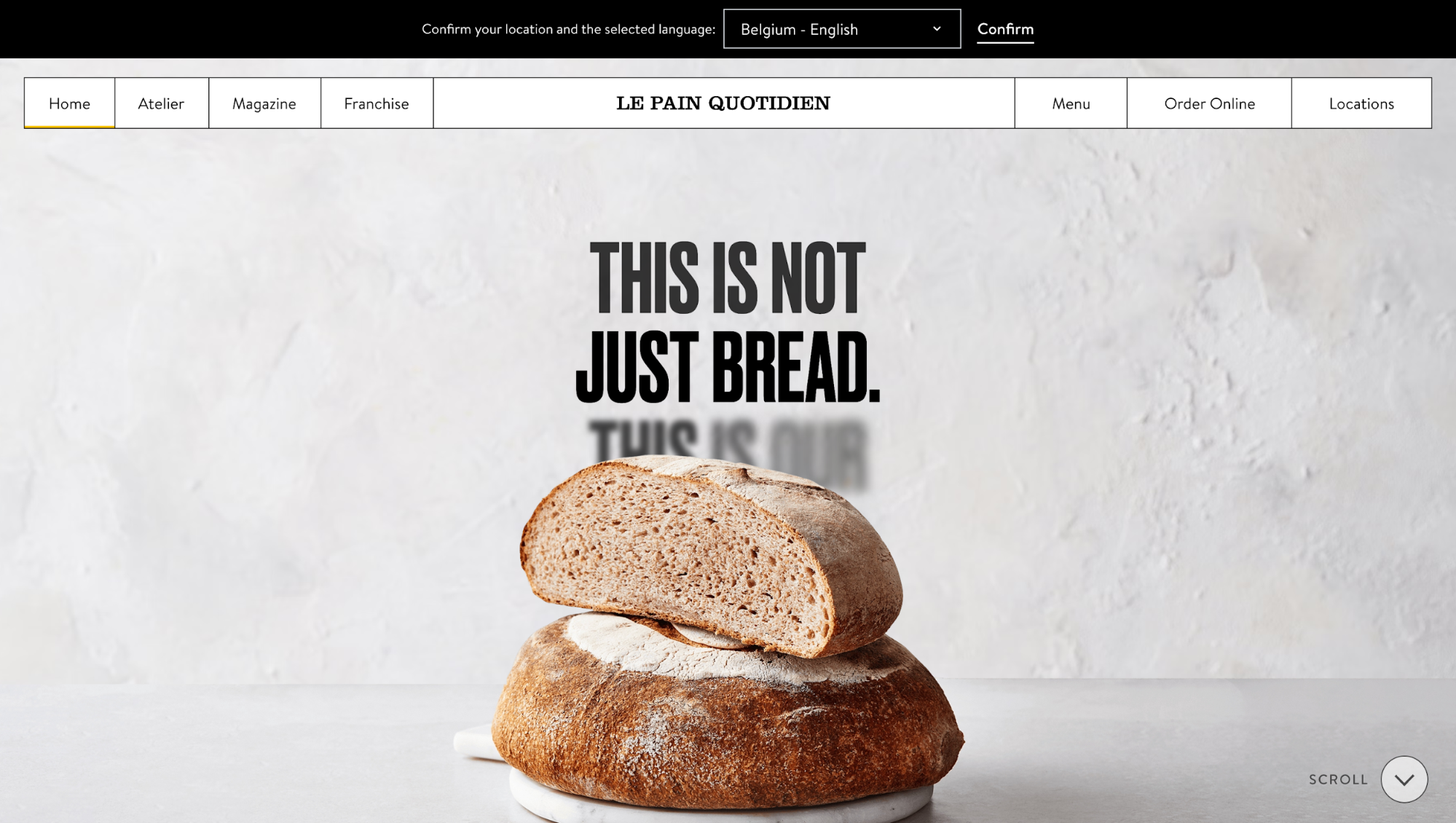
Further down, you'll see a background video revealed by layered text that “curls up” as you scroll, almost like pulling open a curtain. These little shifts keep you hooked while reinforcing their brand message of tradition and craft.
What’s good about it
-
Text and visuals aren’t just placed, they’re timed. You uncover the story step by step, which makes the message more memorable.
-
The parallax effects are subtle enough to feel smooth, but strong enough to make the brand experience immersive.
However, since parallax effects tend to be heavier on rendering, here are key trade-offs and strategies to keep you in the right direction:
-
Use compressed/lazy-loaded images, and scale them appropriately for different viewport sizes.
-
Respect prefers-reduced-motion: give users the option to disable motion or reduce animation speed.
-
Provide fallbacks on mobile (e.g. static backgrounds or simplified transitions), because parallax can lag or cause jank on slower processors.
-
Test how parallax layers affect performance (frame drop, scrolling smoothness), especially on touch devices.
Idea 11: 3D-style layout with shadows and depth
Mastercard’s Business Outcomes site shows how far you can push depth on the web without losing usability. From the header, you’re met with floating disc-like shapes rendered in a glossy 3D style.
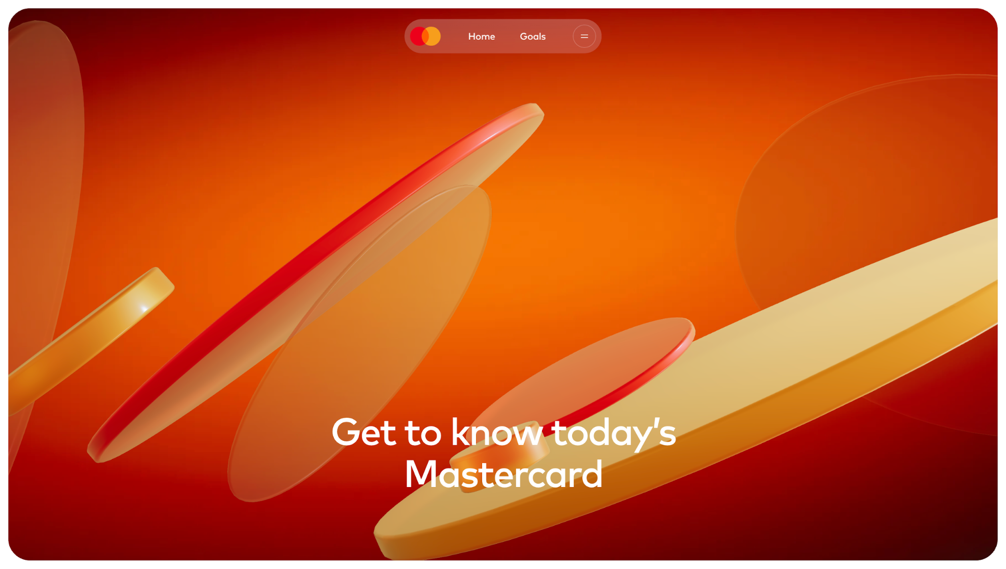
I found myself noticing which elements “popped” first before I even started reading.
What’s good about it:
-
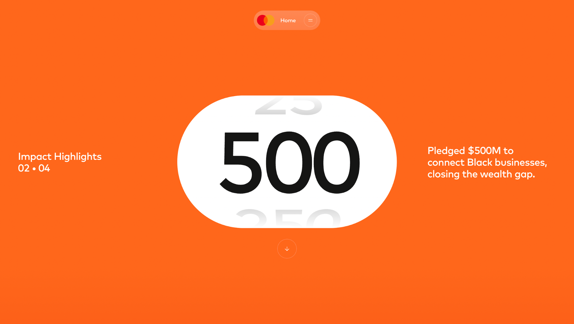
3D depth reinforces storytelling: As you scroll, the site keeps that sense of dimension alive. The header gives way to goal-focused messaging paired with full-screen video. Instead of just swapping one block of content for another, the video zooms in and out while still playing in the background. Scroll again, and the numbers in the impact section animate with reflection shadows that make them look like physical counters.
-
Strong usability despite complexity: Even with heavy visuals, typography is bold and contrast is high. CTAs and messages remain front and center, so you don’t lose track of action.
This is the core strength of 3D-style layouts: they use shadow, overlap, and motion to set hierarchy instantly.
But let’s be honest, it’s not always the right choice.
Flat design is lightweight, clean, and universally easy to scan. 3D brings visual intrigue and brand memorability, but it can slow performance, introduce accessibility concerns, and demand more development work.
If you want to experiment with depth, don’t just copy Mastercard’s polish; test the fundamentals first.
-
Keep text readable. Don’t let shadows or moving layers compete with typography. Use strong contrast and scale to protect legibility.
-
Prioritize elements with depth. If everything looks “on top,” nothing feels important. Reserve the strongest shadows or motion for CTAs and key content.
-
Design for performance. Heavy graphics can slow load time. Make sure the 3D layers degrade gracefully on low-powered devices or when motion preferences are reduced.
Idea 12: Textured or noise-driven backdrop
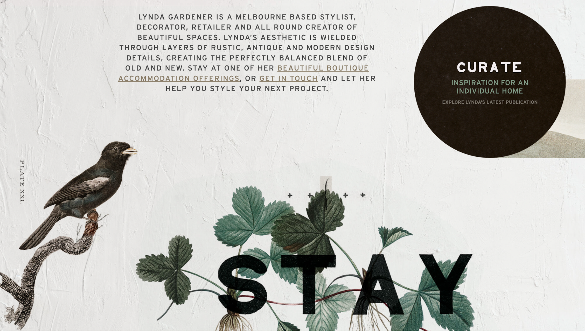
Lynda Gardener’s website is a perfect showcase of how subtle textures can enrich a layout without overwhelming it.
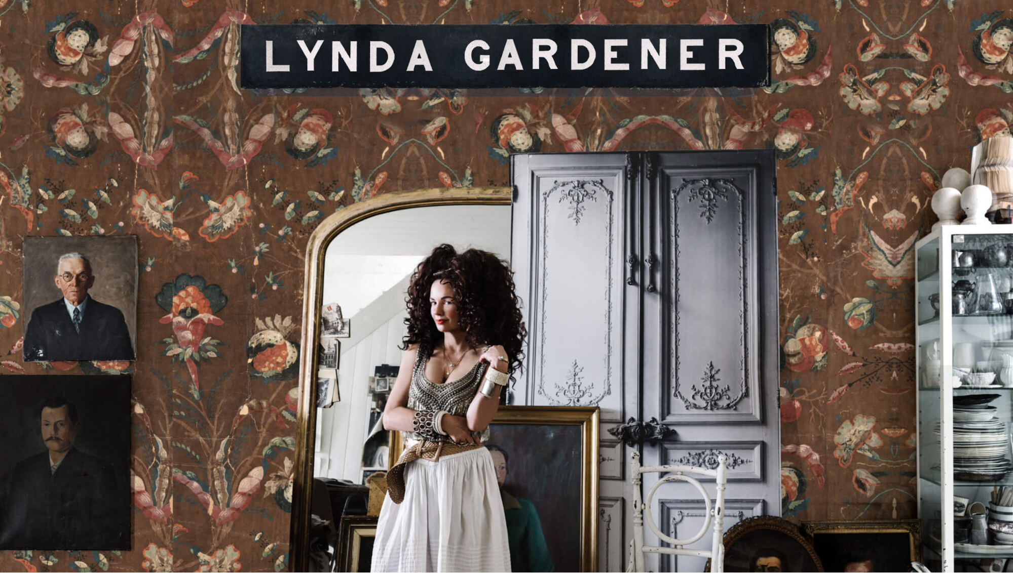
Instead of a flat digital background, the site uses grainy, tactile backdrops that echo her rustic-meets-modern interior design aesthetic. The textures make the screen feel lived-in, almost like paper or fabric, which instantly adds warmth.
This approach works especially well for artistic portfolios or fashion brands where atmosphere matters as much as clarity.
Compared to clean, open white backgrounds, textured ones provide mood and depth, but you need to balance them against readability.
What’s good about it:
-
The textured backdrops align with Gardener’s brand identity, reinforcing her “layered” interior design philosophy directly on the web.
-
Typography is kept bold and minimal, ensuring that the added noise never compromises readability.
Idea 13: Animated typography
Plink Rebuild page is a perfect example of using animated text.
The typography isn’t static. Words shift in size, lines stack, and emphasis changes on different parts (“payment requests,” “get paid,” etc.). It uses changes in scale and layout to call out the key messages.
Another thing I noticed on the page is how the headline “Create payment requests” jumps out.
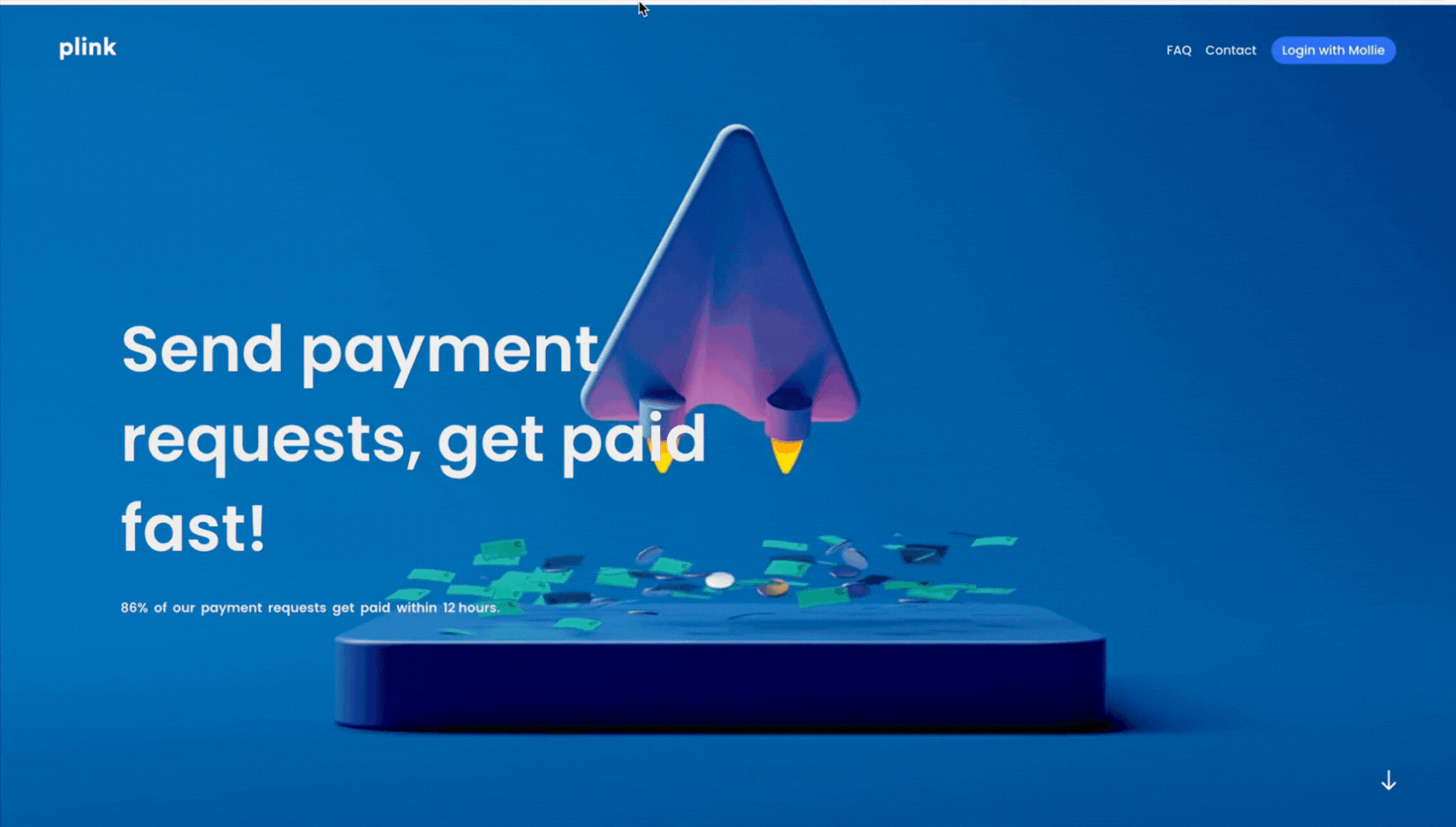
What’s good about it
-
The shifting layout and scaling text in Plink highlight what matters most (“payment link,” speed, getting paid) in digestible steps, so your eyes follow the flow naturally.
-
Animated text reinforces urgency and personality. The brand voice (fast, action-driven) comes through clearer than if it were just plain static copy.
Animated typography adds emphasis in ways static text can’t. When done well, it draws your attention, reinforces brand voice (fast, efficient, action-oriented here), and helps you digest the message in stages. But there are trade-offs: if overused, it can distract, slow load times, or cause reading fatigue.
Here’s a tight breakdown of how static vs kinetic typography compare:
|
Variation |
Pros |
Cons |
|---|---|---|
|
Static typography |
Fast to render, easier for users with cognitive or visual processing needs, predictable layout. |
Less emphasis, weaker brand voice, risk of blending into generic designs. |
|
Animated / kinetic typography |
Grabs attention, helps emphasize key messages, adds modern brand feel. |
Can harm readability if text moves too fast, may disrupt flow, heavier on performance. |
So if you plan on implementing text animation, do keep in mind:
-
Use animated typography for key messages only (e.g. hero headlines, CTAs). Don’t animate every line on the page.
-
Make sure variant states (hover/focus/reduced motion) keep legibility high. If text overlays a background, ensure contrast remains sufficient.
-
Test the animation speed; what seems stylish on desktop might feel slow or even jarring on mobile devices or those with lower performance.
Key takeaways
Looking back at all these website layout ideas, a few lessons stand out. First, layouts aren’t just about arranging blocks on a page; they shape how people feel, read, and act.
For me, the biggest takeaway is how interaction and clarity need to live side by side. I’ve seen layouts with beautiful effects that ultimately harm performance or overshadow the CTA. You don’t want that. Instead, you should aim for layouts that inspire and convert.
Here’s what you can turn into your own quick checklist for inspiration:
-
Strong hero → sets the tone in the first scroll, whether bold, simple, or animated.
-
Motion balance → animation and parallax should feel deliberate, not distracting.
-
CTA clarity → keep actions visible and consistent across devices.
-
Responsive storytelling → use layouts that adapt naturally from desktop to mobile.
-
Performance → test load times, reduced-motion accessibility, and fallback states.
And finally: don’t just copy. Explore portfolios like Landbook, Mobbin, and Awwwards to see what’s trending. Then, test, tweak, and make layouts your own. That’s how you stay sharp as a designer and build sites that feel fresh without losing usability.