11 Web Design Tips for Better UX

Horea Matei
Created on Sep 21, 2025
Good web design involves a lot more than just aesthetics. Web designers also need to ensure their websites are fast, user-friendly, accessible, and most importantly, generate more traffic and conversions.
In other words, there's a lot to take into account. That's why this web design tips checklist covers all you need to know about web design-related best practices: from basic principles around layouts and visuals, to accessibility, user testing, performance optimization, and more.
1. Understand your users first
Your website's purpose has to align with user needs. Take the time to understand your target audience before you jump into the design process itself.
This helps establish a more guided approach to your website's layout: what key elements to prioritize according to user pain points, what pages website visitors might be most interested in, how to present your product or service for extra conversions, and so on.
Here's how you can do it:
-
Set up user personas: These outline your target audience's demographics, job titles, needs, wants, and common pain points—an absolute must for a customer-facing product and design.
-
Conduct customer interviews: Your buyer personas must be backed by concrete data from customer interviews and surveys to gain an accurate understanding of your target audience.
-
Create empathy maps: These complement user personas. Empathy maps focus on your user base's emotional profiles—their aspirations, motivations, and values, their expectations regarding products/services within your industry, how their pain points make them feel, and what they do to alleviate these effects.
Here's a quick user persona example from Venngage:
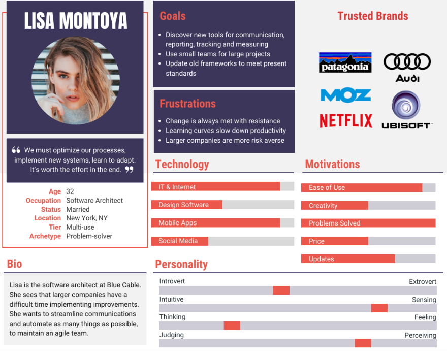
This persona template humanizes a particular consumer segment very well: from their professional backgrounds, work-related day-to-day challenges, and how they aim to overcome them. It also goes down to more personal details, including personality traits and trusted brands.
These details alone can give a lot of guidance to your website's design—how to showcase products to appeal to their needs, the color schemes and content language that would resonate with them the most, and what trust badges would be most effective, for example.
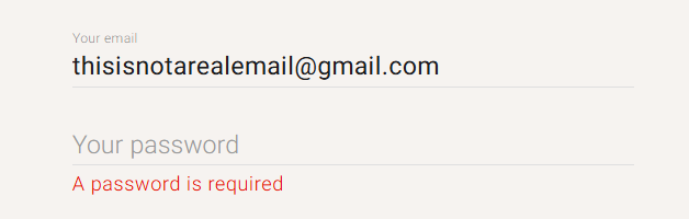
2. Prioritize accessibility from the start
Poor accessibility will render your website unusable or at least confusing for your entire user base—not just users with disabilities.
It's best to nail down this step from the get-go, so you can set up the framework and build on top of it from there. This way, you don't have to worry about any major accessibility-related design changes later down the road.
Case in point, Craigslist is far from the best-looking website out there.
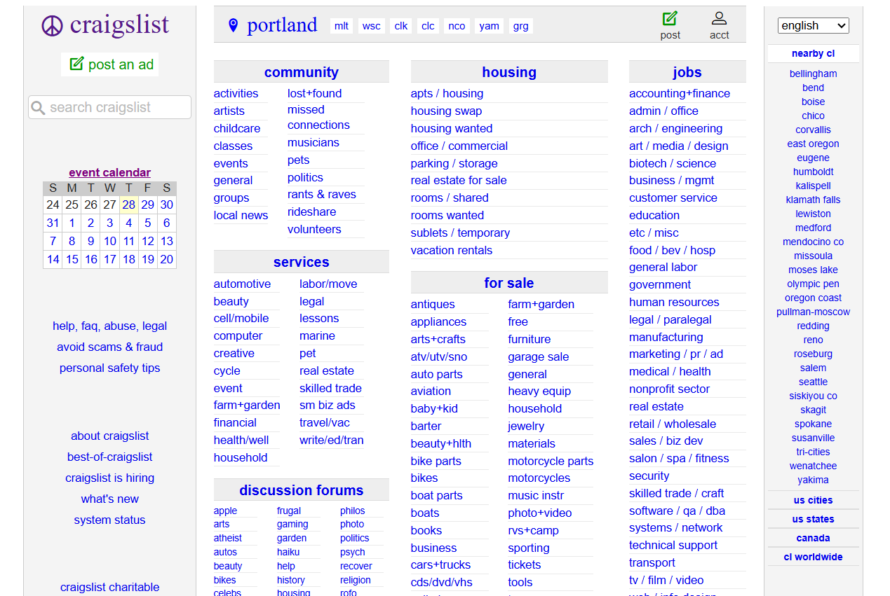
But it's definitely accessible, hence millions of people still use it to this day.
Its basic color palette doesn't create problems for color-blind users, while the column-based lists of hyperlinked texts are easy to navigate by screen-reader and keyboard users.
Plus, lacking visuals and any other complex design elements ensures fast loading speeds regardless of the internet connection.
Of course, this doesn't mean you should stop prioritizing aesthetics in favor of a more Spartan approach. But Craigslist's design philosophy does demonstrate why you should think about accessibility first.
That said, here are a few accessibility best practices, according to WebAIM’s accessibility checklist:
-
Texts should be resizable so the page can maintain legibility even when zoomed by 200%.
-
Dynamic elements like carousels or animations should include a pause button if they last over five seconds.
-
Flashing design elements must not include more than three flashes per second.
-
Include synchronized captions for all embedded videos.
-
Text blocks with multiple sentences should be under 80 characters wide, with line spacing covering at least half of the typeface height and paragraph spacing covering 1.5 times the height.
3. Keep navigation simple and intuitive
As per a web design study conducted by Clutch, around 38% of first-time website visitors will first look at your navigation menu whenever they land on your page. That means your site's navigation must be crystal-clear and encourage users to stick around.
It's best to align with web design conventions here, a set of common web design practices that people have grown familiar with and become part of user expectations.
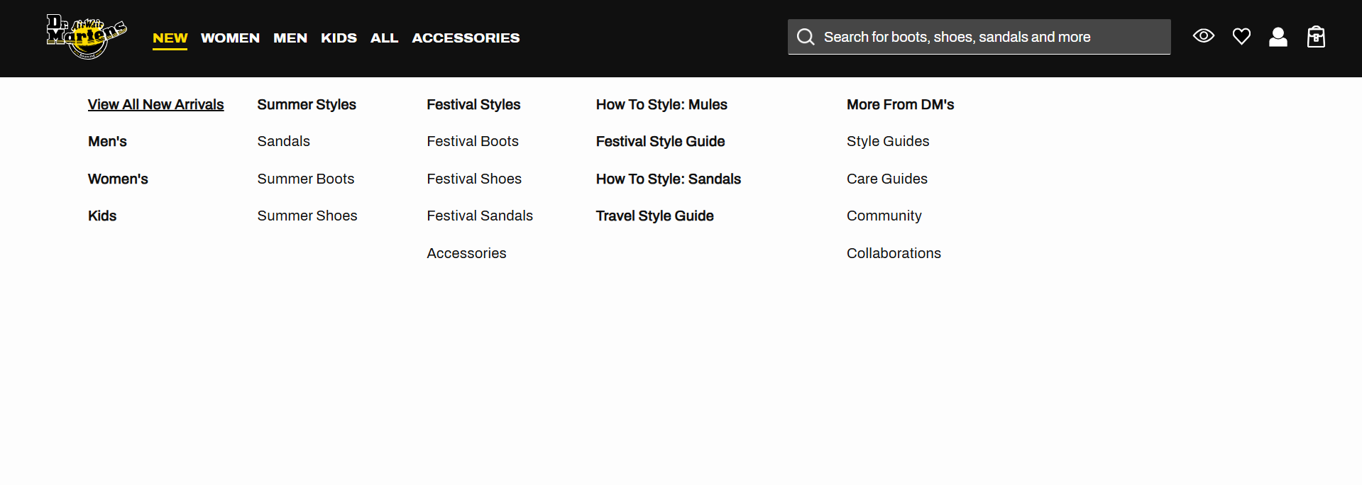
Dr. Martens is a great example. I'm sure you've seen this navigation menu design a few times already:

This layout works, so there's no reason to change it. Here's why:
-
The navigation follows a format and placement users are already familiar with: a horizontal bar at the top of the screen.
-
It includes just enough clearly-labeled menu items to get users to the site's most important pages—no more, no less.
-
The navigation bar is sticky, so users have easy access to it regardless of how far they scroll down the page.
-
The company logo also doubles as a home page button, which is super convenient.
-
The search bar on the right is particularly handy for users who already know what they're looking for—a common feature in sites with many pages, like blogs and online stores.
Either way, the number of menu items you include should be your priority first. You don't want to overwhelm users with too many options. That may cause them to bounce off the page.
Only link to your most important site pages, just like Dr. Martens linked to its main product categories. Five to seven menu items is the sweet spot, as it gives users enough variety without inducing decision paralysis.
If you do have loads of pages, however, you can go for a secondary menu—a separate or adjacent navigation menu that links to less important site pages, but still contributes to the user experience.
Going back to Dr.Martens, hovering the mouse over a main navigation item actually triggers a secondary menu to pop up.
Notice how secondary items are neatly categorized and placed under a column-based layout to further improve user experience.
Breadcrumb navigation is also a good idea to help users quickly go back to previously visited pages.

4. Design with responsive layouts
Responsive layouts automatically adjust the size and placement of design elements to different device types and viewports—mobiles, desktops, and tablets. This is done through responsive grids, images, and typography.
Don't overlook this step.
Google uses mobile-first indexing. That means search engines prioritize your site's mobile version when crawling and indexing it.
Plus, mobile devices generate 64% of all web traffic, so unresponsive layouts will drastically worsen user experiences for the vast majority of visitors.
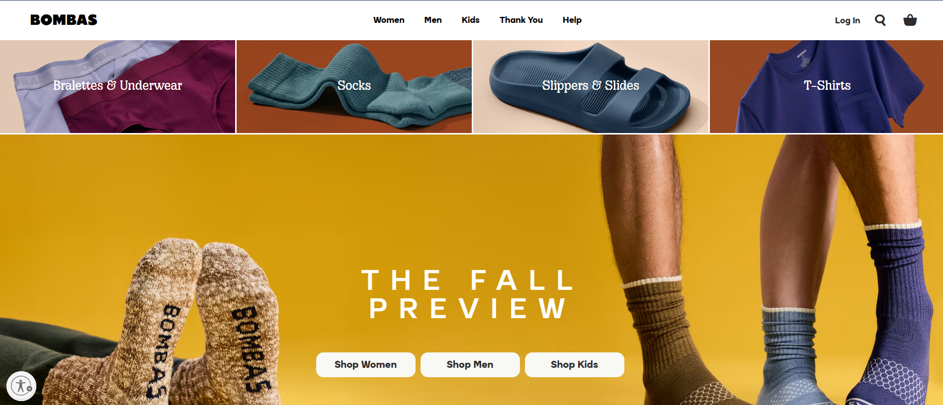
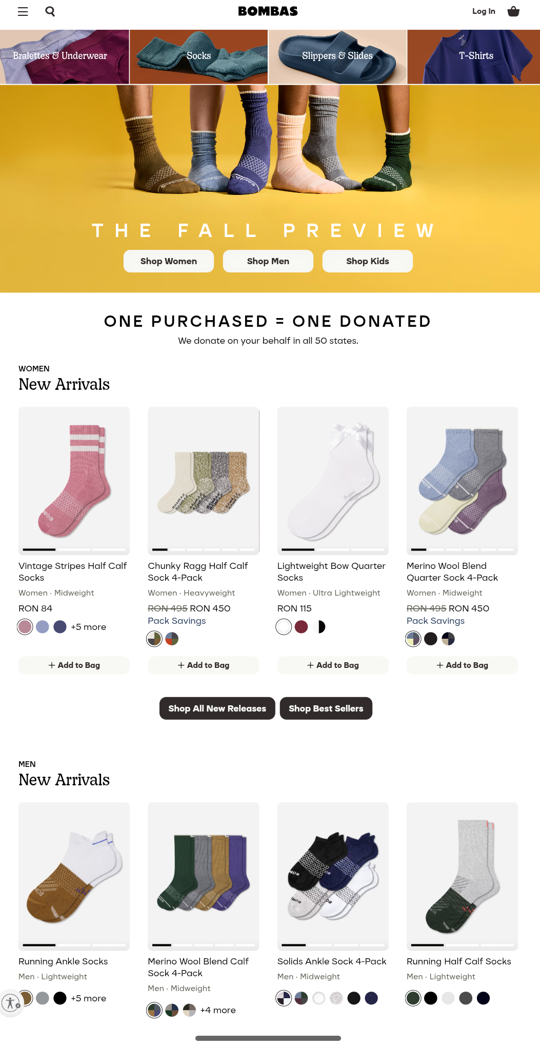
To better illustrate, I'll show you Bombas' homepage layout across both desktops and mobiles, and also showcase how the desktop version looks on mobiles to demonstrate how important this step is.
Here's the desktop version:
And here's the mobile one:

Notice how the top-section one-row, four-column grid on desktops turned into a two-row, two-column layout on mobile devices for better screen tappability.
The three side-by-side buttons also slightly change for the same reason.
This is done through fluid grids, a system of columns and rows that uses relative units to automatically adjust their size to different viewports.
Now let's take a look at the desktop version as seen on mobile devices, where grids are not fluid:
Most clickable elements now are so small and close to one another, it's easy to missclick on mobiles. Plus, font sizes are super small and hard to read.
Most website builders are responsive by default. But here are a few best practices if you want to build your site completely from scratch:
-
Use common breakpoints to ensure your layouts fit across most viewports: 320-480px for mobiles (portrait view), 601-768px for tablets (portrait view), 1025-1280px for laptops, and 1281-1440px for desktops.
-
Always set your viewport with meta name="viewport" in the HTML meta tag, to avoid having browsers render your site's desktop version on mobile devices, just like shown above.
-
Use the content="width=device-width" code snippet in your HTML's header—it tells browsers to adjust screen size to viewport width.
-
Add responsive texts with the style="font-size= (your size)vw" snippet.
-
Resize images with width or max-width CSS media queries.
Design your web pages for mobiles first and foremost. This lets you ensure a proper user experience for most website visitors. You can gradually add extra design elements as you move up in screen sizes.
5. Use visual hierarchy to guide attention
Visual hierarchy adjusts your design elements' size, placement, colors, and typography to highlight their importance in order. It's super useful to draw attention to particular areas and nudge conversions.
Sythesia's homepage is a good example:
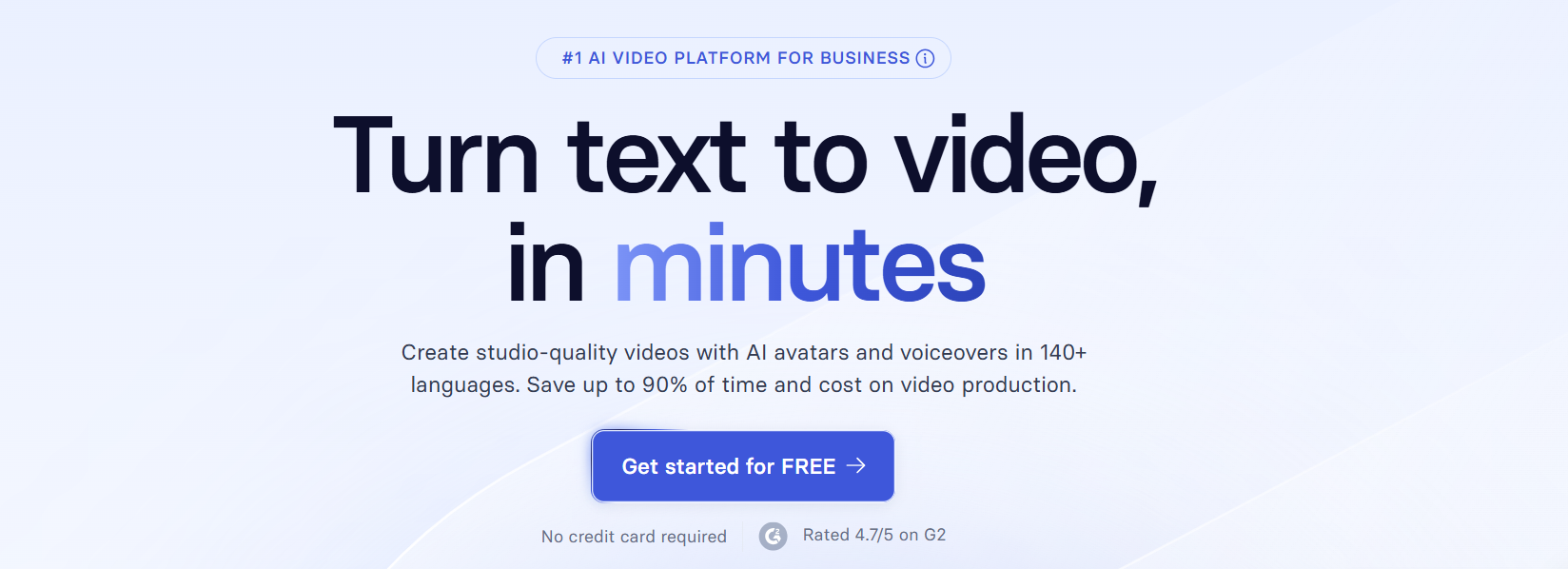
The headline, supporting copy, and CTA button are neatly stacked on top of each other in a logical manner.
Notice how the sizing and coloring between these design elements differ: The headline will first attract attention whenever a visitor lands on the page.
The CTA's contrasting colors and straightforward copy encourage conversions, while the supporting copy in between aims to further persuade users if they have any second thoughts.
The trust badges at the bottom further reinforce this effect.
And here's a how-not-to example:
The layout here is way too busy and lacks focus. It distracts users' attention from too many directions, leaving them confused and lacking guidance as to which button to click next, while the lack of white space makes the homepage look too crammed.
To put it differently, your visual hierarchy should subtly guide users towards the web page areas that you actually want them to see.
The same idea applies if you're running an online store selling multiple products, for example. Here's how KoreanSkinCare uses visual hierarchy to drive attention to one of its products:
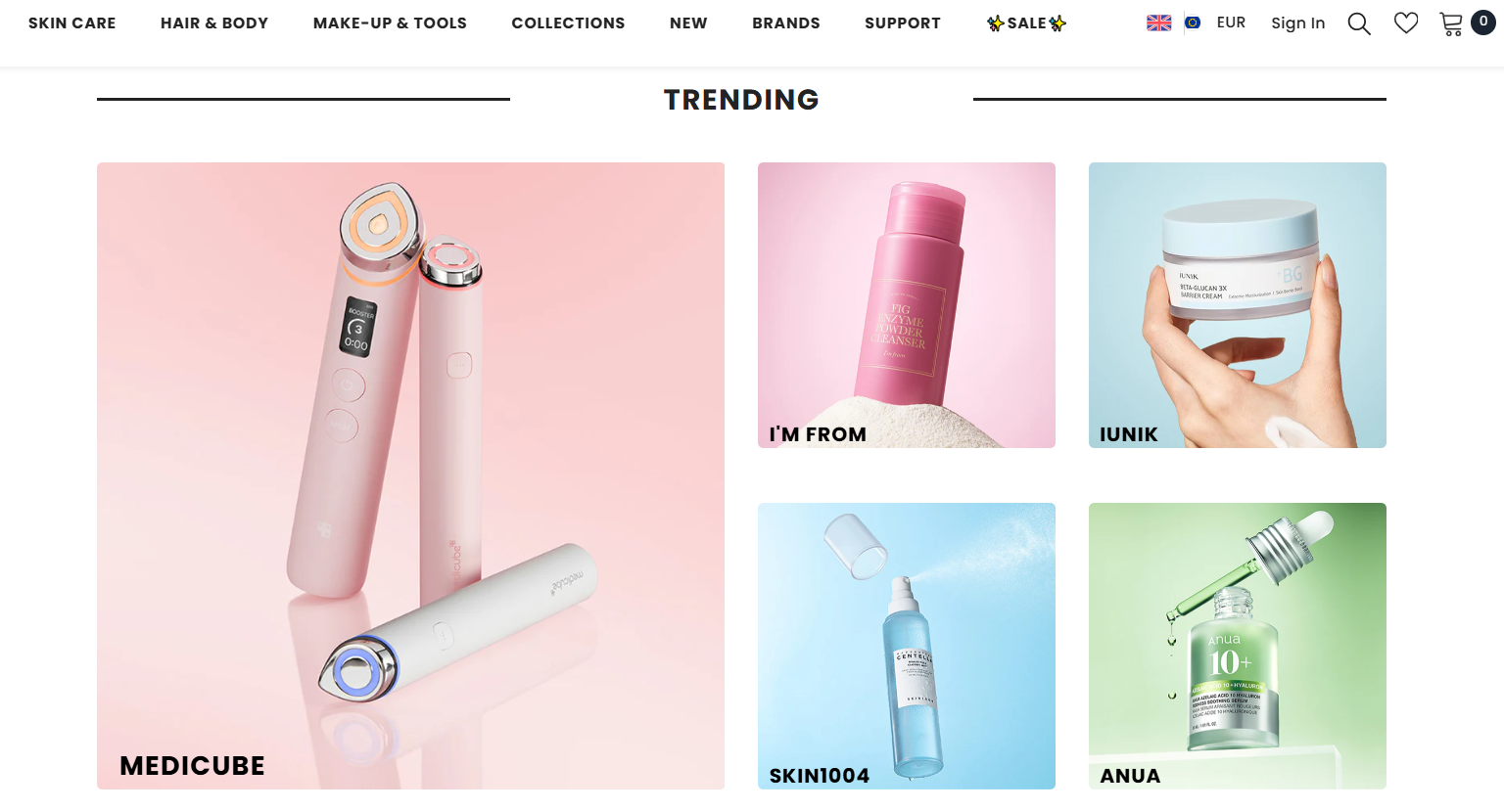
The Medicube section takes up twice the space compared to the other products. It's a clever way to eliminate decision paralysis and drive extra clicks to a particular product—while still giving options to users who might be more interested in other products.
6. Balance aesthetics with performance
Images, videos, and animation effects are important elements to make your site visually appealing, but they're also heavy-hitters in terms of page performance.
Page speed will impact your website's user experience. Loading time is also a direct ranking factor, so poor performance will drag down your search engine optimization efforts too.
Run your site through analytics tools like Google Lighthouse and PageSpeed Insights to measure your site's performance.
In case your page speed is not up to standard, here's what you can do:
-
Compress visuals with tools like TinyJPG or WPCompress(for WordPress sites).
-
Pick the right image format: WebP offers a good balance between file size and quality, while PNG files are the fastest, but they compromise on quality.
-
Enable lazy loading via the <img loading="lazy"> code snippet while specifying an image in your site's HTML. Lazy loading reduces initial loading times by only rendering images after visitors land on your page.
-
Use a code minification tool to cut down unnecessary code.
-
Leverage a Content Delivery Network (CDN) to distribute your site across multiple servers around the globe—users will connect to the server closest to them.
7. Write content that supports the design
Visual design elements and written content go hand-in-hand—they help strengthen your core message, improve user engagement, and boost conversion rates.
As such, make sure your content builds on the ideas you want to convey through visuals, and vice versa.
To better illustrate, here's how Tandem handles it:
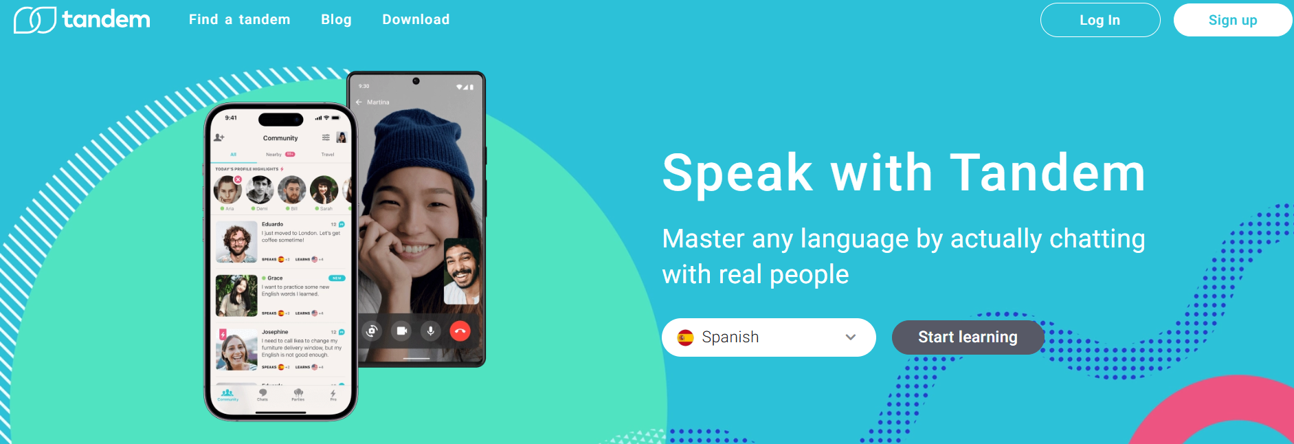
Notice how well the hero section's headline and supporting copy link with the visuals. The copy talks about learning new languages by chatting with real people, while the imagery visualizes that specific idea through actual glimpses of the app's user interface.
This helps visitors paint a better picture of what Tandem does and how it works, and nudges them to imagine themselves using the app, which can contribute to better conversion rates.
Also, notice how the primary call-to-action button ties into the language-learning context. "Start learning" makes a lot more sense and sounds more impactful than simply "Sign up" in this case.
The same idea applies to the rest of Tandem's homepage design, too:
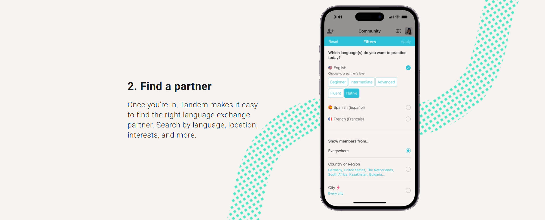
The website uses a blend of in-app screenshots and straightforward copy to explain how the platform works as concisely as possible.
Notice how the web copy is neatly organized into numbered lists and has plenty of breathing room via white space. Coupled with the text's simple language, the website's written content is easy to read through and engaging.
Here's what else you need to know here:
-
Focus on benefits, not features: People want to know how your products or services help them, not necessarily how they work. Highlight how particular features help target audiences, and try to use visuals to showcase that in action.
-
Use active voice: It makes content more engaging and concise. Second-person pronouns also make your copy more impactful when appropriate.
-
Avoid stock imagery: Stock photos add little to no value to your design and can leave a poor first impression. Try using original visuals as much as possible.
-
Write crystal-clear microcopy: Call to action and navigation button labels, form hints, and error messages should clearly explain what you want users to do next. Form hints must indicate what information is required, while error messages should explain their triggers, for example.
8. Maintain consistency with design systems
Just like web design conventions, using elements from popular design systems like Material Design and Carbon Design System adds a sense of familiarity to your website.
And you won't have to build everything from scratch, so you'll also get to speed up your product development or web design projects.
Here's a quick overview of the type of elements you can borrow from Material Design, for example:
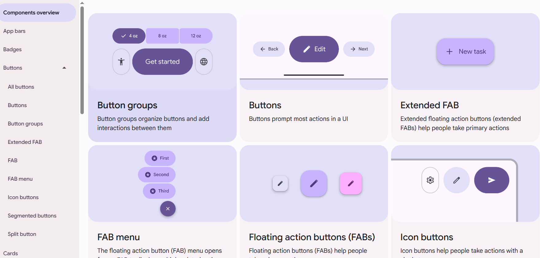
You can borrow loads of reusable interactive elements, including buttons, loading indicators, navigation menus, and get access to extra tips and tricks on implementing these components appropriately.
Still, pick your design components carefully. You don't want a mishmash of various design styles. That could interfere with your website's design language and flow, and potentially throw visitors off.
Here's a checklist on how to pick and apply design components appropriately:
-
Use a simple color palette: Color schemes should cover three colors and follow the 60/30/10 rule: a primary color for backgrounds (60% of your page's real estate), a secondary color for texts and other important elements or sections (30%), and an accent color for CTA buttons (10%), for example. Make sure your color palette reflects your brand identity.
-
Stick to a few fonts: Ideally, stick to three fonts within the same family, like Sans Serif fonts—a good idea to maintain consistency, but still include enough variety to distinguish between copy types (headings, subheadings, body copy).
-
UI elements should follow a similar style: Just like with fonts, UI elements like icons and buttons should maintain a consistent style to keep your design's overall flow throughout your website. Image sizes and alignment should also be primarily uniform.
Jamie Oliver's website implements these practices down to a tee:
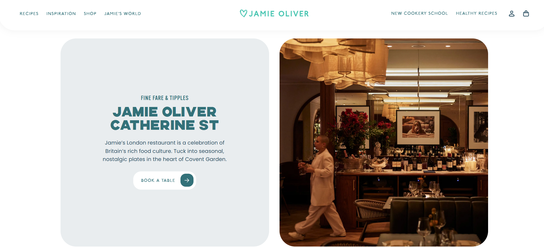
The website's three-tone color palette is simple yet visually appealing and attracts attention to key areas via contrasting colors.
It also uses three distinct fonts to distinguish between headings, subheadings, and body text, while visuals are consistent in sizing and alignment.
9. Test designs early and often
Test designs early so you can spot and fix potential issues before they blow out of proportion.
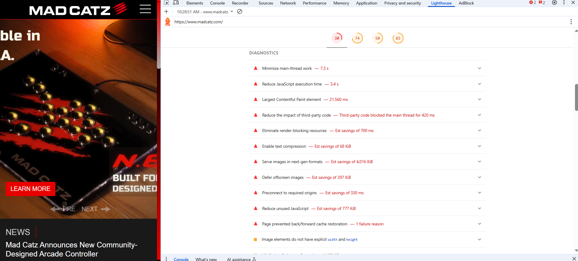
To illustrate, Mad Catz's homepage looks fine on desktops, but it takes a long time to load, and the mobile site version is poorly optimized.

The hero image carousel doesn't fit properly on mobile viewports—it's a big issue because that's the first thing mobile users will see when they land on the site.
The interesting part is that all the other pages, except for the homepage, display well on mobile viewports.
As such, the lack of thorough testing might be the cause here.
Focus on usability tests to measure your website's user experience and see how visitors would perform specific actions, like adding a product to cart and going through the checkout process, or completing user registration forms, etc.
There are a few testing methodologies you can use:
-
Moderated usability testing: You walk participants directly through your layout and guide them to perform your desired actions—a solid method to gather precise feedback in real-time.
-
Click tracking: Measures where users click on your website via heatmaps, session recordings, etc. This method helps identify attention hot-spots and collect usability data at a larger scale.
You can then use the gathered details to alter your website for a better user experience and ultimately a higher-quality product. But make sure to conduct regular A/B tests to see the exact impact of these changes.
It's best to test one design tweak at a time. This helps you see how each particular change affects your website's user experience, and makes it easy to quickly revert to previous versions whenever necessary.
10. Collaborate closely across teams
Encourage strong communication between anyone involved in your website design and development projects from the get-go. That means web designers, developers, product managers, etc.
Just like the Mad Catz example above, some design decisions may not translate well into code.
You want to minimize the risk of that ever happening through continuous communication between departments and seamless developer hand-offs.
Establish cross-departmental communication channels and leverage the following methods to minimize any potential errors during design workflows:
-
Hold sprint planning sessions to clearly communicate your project and business goals, as well as all tasks, responsibilities, and measures across each department needed to achieve your desired results.
-
Establish through review processes across all design and development stages—from wireframes to prototypes, and the end product.
-
Centralize all documentation for easy access across departments, like brand style guides, standard operating procedures, and so on.
11. Document and share design decisions
Documenting each step of your design process is another way to foster strong communication and eliminate any potential errors. It also helps onboard new team members more easily, as you give them overviews of how your team works and communicates.
That said, make sure to leverage annotated wireframes that clearly explain each essential element's purpose and the context behind it to create more accurate prototypes.
Decision logs are a good idea, too. These are records of all decisions made throughout the web design and development process, and the reasons behind them—great refreshers that team members can always get back to.
Also, set up clear brand style guides to minimize the amount of touchups during the final stage of the design process.
Key takeaways
-
Conduct consumer interviews and surveys, and use the gathered feedback to set up user personas and empathy maps. These details help design your websites around user behavior, needs, and expectations.
-
Focus on website accessibility first to build a user-friendly foundation and prevent any usability-related structural changes in the future.
-
Add a sense of familiarity by sticking to web design conventions and components from popular design systems.
-
Make sure your website is properly optimized for mobiles through responsive grids, breakpoints, and so on.
-
Use visual hierarchy to guide users' attention to key page areas.
-
Compress images, enable lazy loading, and minify code to strike a balance between aesthetics and performance.
-
Complement visuals with relevant content to strengthen your core message and drive conversions.
-
Regularly conduct moderated usability tests and leverage click tracking to ensure your website works as intended.
-
Encourage frequent collaboration between web and product development teams, as well as web designers, to minimize communication-related issues, bugs, and speed up site deployment. Document each step throughout your project's course.