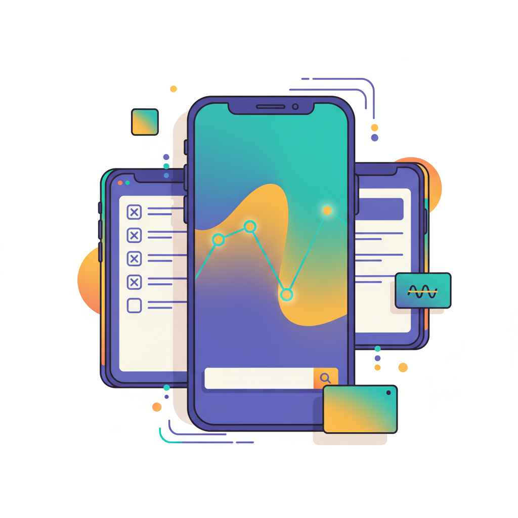
9 Mobile App Design Trends for 2026

Khanh Linh Le
Created on Oct 28, 2025
Mobile design is crossing a tipping point: according to recent research, the average user spends 4.8 hours per day in mobile apps. This means any friction, mismatch, or outdated UI now hits your growth metrics directly.
In 2026, the apps that succeed won’t just look slick, they’ll adapt in real time, learn from behaviour, generate dynamic visuals, etc. The real challenge? It’s no longer about adopting the “next trend”, but about keeping pace with change itself.
In this article, you’ll find nine emerging trends that are already reshaping how we build mobile experiences for 2026 and how you can integrate them to deliver a seamless user experience!
1. AI-driven personalization and predictive interfaces
In 2026, mobile applications will predict what you’ll do next and reshape the digital interface accordingly. I believe we’re moving into a phase where design is anticipatory, meaning fewer clicks and more relevance.
Here's what you don't want to miss out:
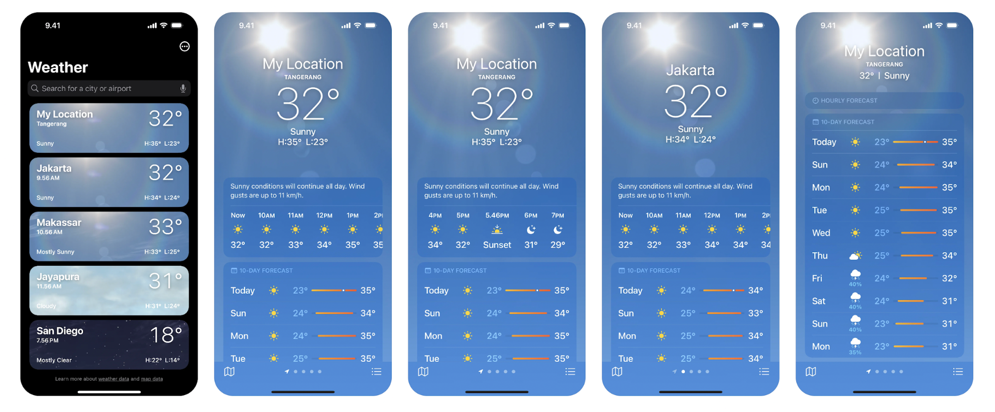
Context-aware triggers: Modern apps collect context signals of user interactions, such as time of day, location, and usage patterns, to predict intent and surface the most relevant action. A finance app might push a spending summary on Friday evening because it knows that’s when users often review budgets.
Paypal for example, just partnered with OpenAI to push AI driven personalized suggestions.
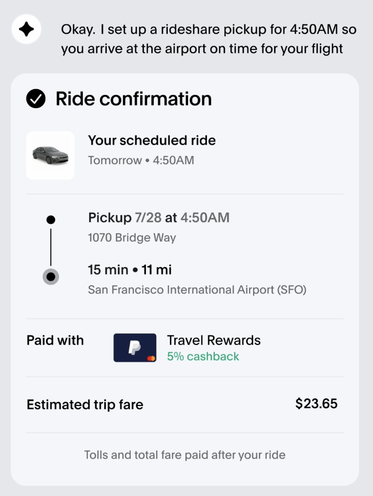
Reactive vs predictive interfaces: Instead of a one-size-fits-all design approach, modules reorder or reveal themselves when the system expects you to need them. Reactive personalization says “because you did X, here’s more of X”. Predictive personalization says “you’ll likely do Y next, so here’s Y now”. Predictive is more ambitious and requires more user behavior data/context.
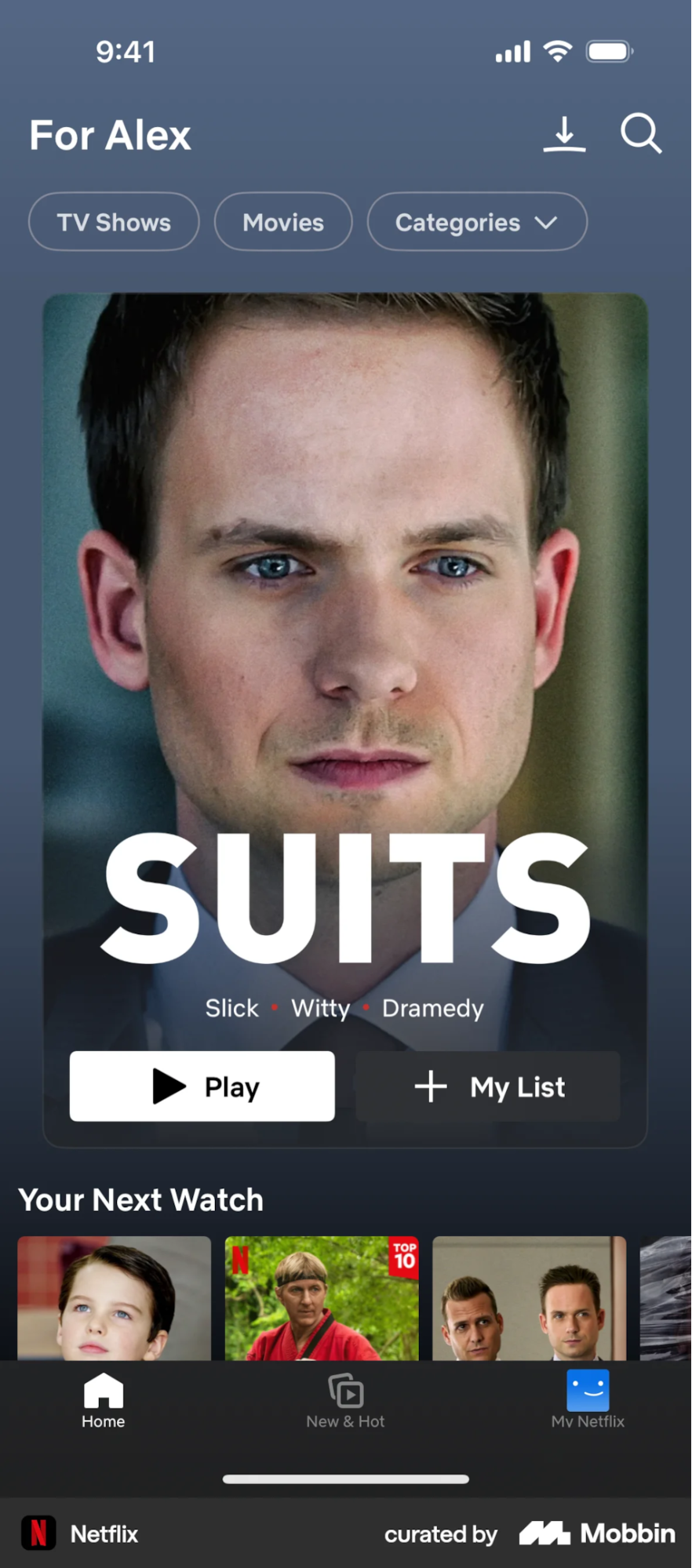
Big names like Spotify and Netflix already hopped on this trend. More specifically, Netflix and other streaming services now run larger, multi-model recommender digital content stacks.
Their main job is to predict your next favorite movie and pre-surface it. That’s why you may find “continue watching” or auto-surfaced previews eerily correct.
For designers, this trend demands a new mindset. You can’t just design fixed states anymore; you design rules that decide what the user sees next.
That means thinking in probabilities, not paths, and focusing on how an interface adapts when the prediction hits or misses during the design process.
2. Zero-UI and conversational interfaces
Design is slowly moving off the screen. “Zero-UI” refers to user interfaces that rely on voice, gesture, or environmental cues instead of traditional visual elements.
I find this UI design trend both exciting and intimidating. It challenges everything we’ve learned about hierarchy, buttons, and user engagement. It also forces designers to think in conversations, not grid layouts.
The shift is already happening around us. Voice assistants like Alexa and Google Assistant have turned commands into conversations. Meanwhile, ChatGPT’s voice mode proves that natural dialogue can replace layers of menus and buttons entirely.
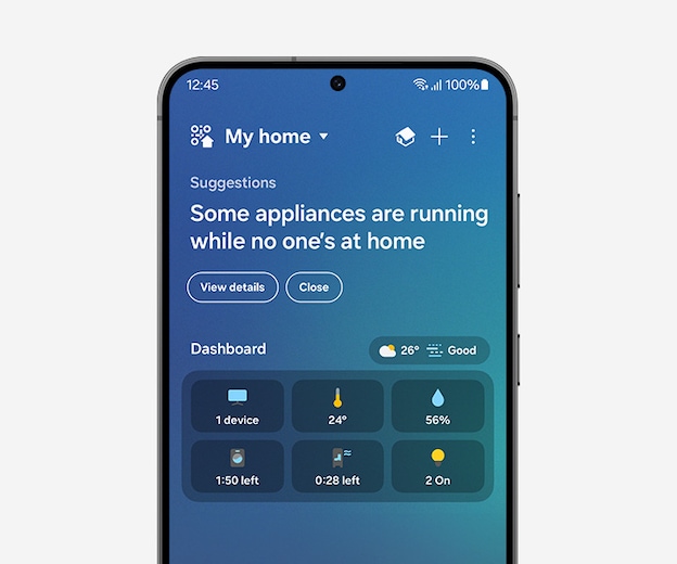
Samsung’s SmartThings ecosystem pushes this even further; your lights, thermostat, and security system quietly coordinate with your habits, learning from how you move through space instead of what you tap on.
But this mobile app UI trend isn't without friction. Around 41% of voice assistant users are concerned about "who is listening" and how their data is used. While accuracy has improved significantly, even household names like Siri still only answer correctly about 83.1% of the time.
Then there's the challenge of personality: designing for tone in AI voices means deciding whether your interface sounds helpful, authentic, casual, or empathetic.
This kind of design introduces new UX variables. Context, tone, and phrasing now carry as much meaning as layout once did.
For designers, the opportunity lies in learning to write, not draw. It’s about scripting responses, defining tone, and designing for scenarios that unfold through conversation instead of navigation.
3. Agentic UX (AI assistants acting for users)
We’re entering an era where apps act on our behalf. “Agentic UX” refers to systems that move beyond instruction-based interaction, taking initiative to complete tasks for users.
We’re already seeing this future take shape.
Google’s Gemini-powered assistant can plan an itinerary or summarize an email thread without step-by-step guidance. Perplexity’s Comet can research topics, compare options, and generate structured reports on its own. And most recently, ChatGPT’s Agentic Payments feature allows the AI to execute transactions directly, enabling users to book flights or order products.
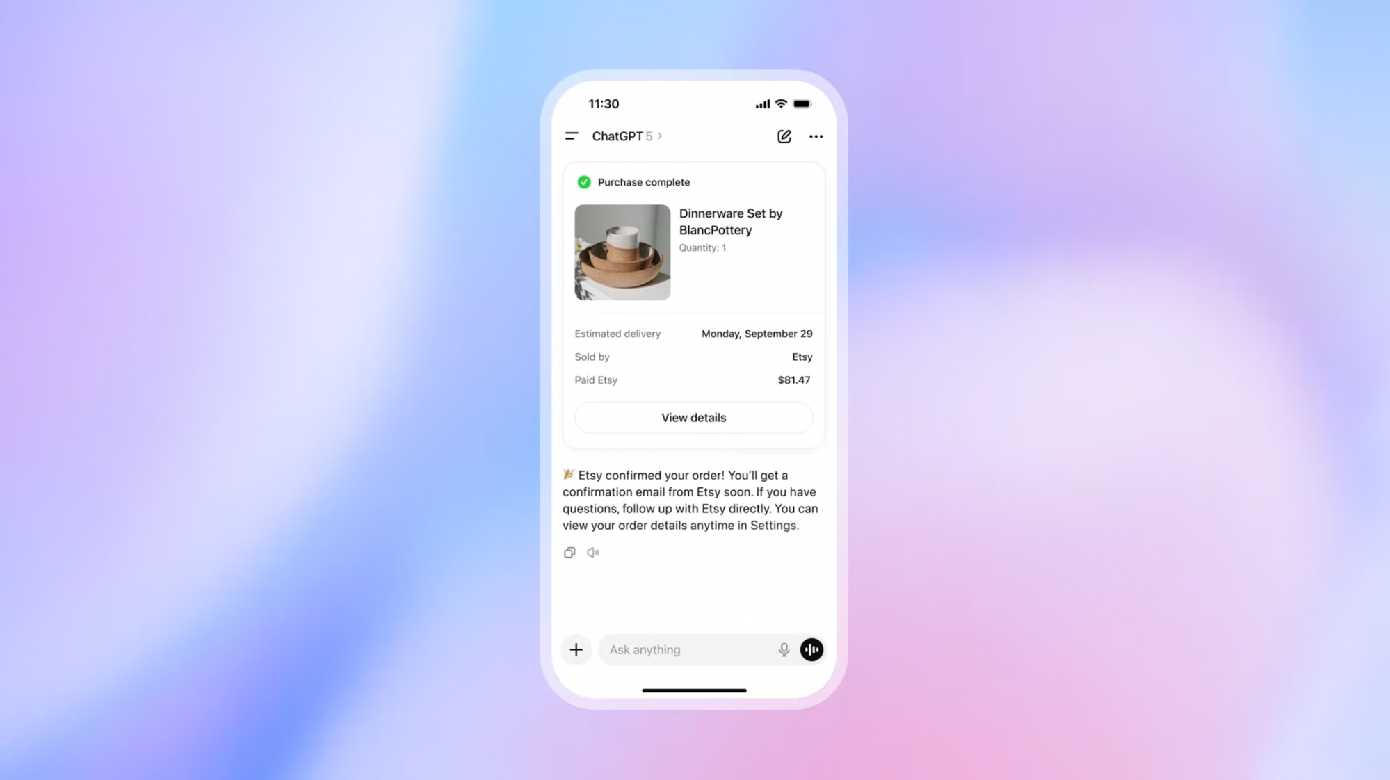
This autonomy changes the nature of UX entirely. The interaction no longer centers on buttons or menus but on trust, control, and transparency.
When an AI can make choices on your behalf, you start to ask: Did it understand my intent? Why did it choose this path?
The key takeaway for designers is to design for a visible reasoning process by showing users what it’s doing, why, and how to override it when needed. Without that transparency, the experience quickly feels alienating, even if the outcome is correct.
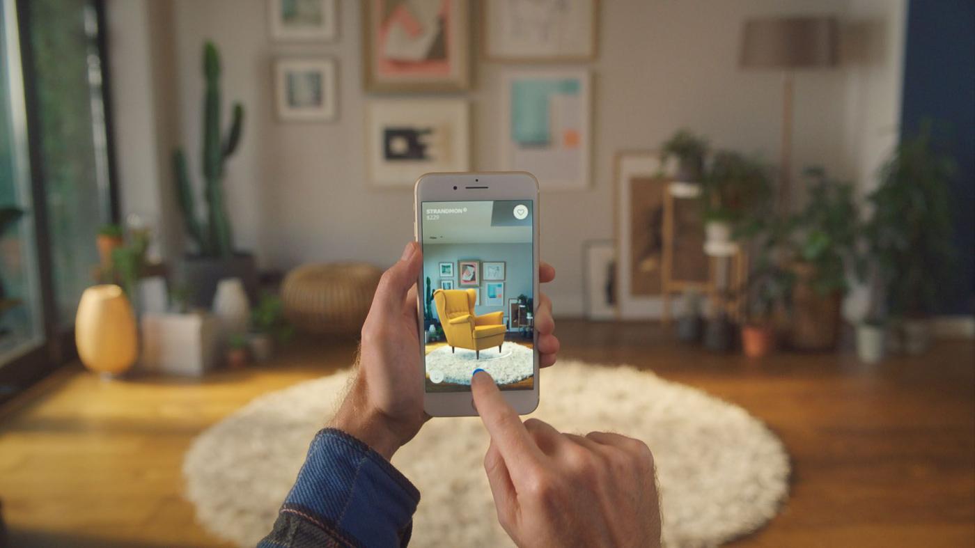
4. Immersive, spatial, and 3D interfaces (AR and beyond)
Mobile UI is finally breaking out of the flat design. With Apple Vision Pro, Meta’s smart glasses, and spatial SDKs now trickling down to phones, spatial design is moving from experimental to everyday.
I think this is the moment where “immersive” stops being a buzzword. We’re already seeing brands explore what this dynamic animation looks like in practice.
IKEA Place allows users to preview furniture in their living rooms with realistic texture and scale.
Another example is L’Oréal’s augmented reality (AR) try-on mirrors, which render makeup directly onto the user’s face with uncanny precision.
As wearables and IoT evolve, the boundaries between digital and physical world will blur even further.
Spatial UIs could soon connect seamlessly with our surroundings: a car dashboard that syncs with your calendar and lights up a route in your AR glasses, or a home interface where a simple glance dims lights and queues your playlist.
However, spatial design isn't a universal solution. AR is highly effective for products that benefit from spatial visualization. So if your product's value depends on how it fits into physical space, like furniture, home decor, automotive parts, or fashion, adding AR functionality can help accelerate purchase decisions.
5. Glassmorphism and layered depth design
In 2026, Glassmorphism has quietly made its way back to the forefront. It's the soft, frosted-glass aesthetic that blurs background layers while keeping interfaces airy and modern.
Its resurgence amid minimalist design style dominance in 2026 wasn’t accidental. Apple’s renewed use of translucent surfaces called Liquid Glass across macOS and iOS made the style mainstream again.
Image source: Mikołaj Gałęziowski on Dribbble
And now, a wave of third-party mobile apps is adopting the same visual appeal. I think its comeback says a lot about where visual design is headed: interfaces are rediscovering materiality.
So, why is this used-to-be-avoided design style popular again? Here are a few key drivers:
-
Improved performance & cross-platform support: Modern GPUs and rendering APIs make blur and subtle shadow effects much lighter on mobile devices.
-
Maturity of execution: Designers are more strategic with the effect now. They've learnt to use frosted layers for key element emphasis (app icons, cards, modals, overlays) while sticking to visual hierarchy.
-
Accessibility and tool support catching up: Today, many UI element kits and frameworks include built-in support for proper contrast, fallback states, and performance optimisation.
But knowing why glassmorphism works now doesn't automatically mean it'll work in your design.
The guideline for using Glassmorphism is simple: Use it purposefully. Limit it to elements that benefit from layering or focus (e.g., overlays, floating cards), ensure strong contrast for text, and test on real devices under different lighting.
6. Micro-interactions and motion feedback
Micro-interactions are subtle animations or effects that give visual feedback, guide attention, or reward how users interact.
It's nothing new but what's shifted in 2026 is the intent behind these animations. The focus has moved from simply adding visual interest to being functionally helpful.
Take iOS's pull-to-refresh animation, which responds directly to your finger movement. Pull a little and the spinner starts to appear, pull further and it becomes fully visible.
Twitter's heart animation works on a similar principle but adds emotional weight. When you double-tap a tweet, the heart fills with color, bounces slightly, and radiates outward.

That split-second interaction makes liking something feel more intentional than a static icon change ever could. This is exactly why it's so satisfying to use.
Duolingo takes this idea further with its streak flame. When you complete a lesson and maintain your streak, the flame lights up, flickers with energy, and sometimes adds a celebratory burst if it's another streak milestone.
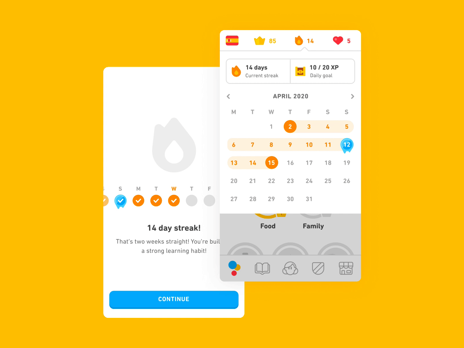
Think of these moments as the product’s punctuation marks: they confirm, nudge, and celebrate without interrupting the sentence. That means timing, threshold, and context matter more than fancy trajectories. So it's best to keep motion short, tied to a clear trigger, and easy to skip.
The app turns an intensive task like learning English with AI into a fun, gamified experience through personalized lessons, streaks, rewards, and interactive challenges.
7. Contextual and adaptive UI
Adaptive UI means your app doesn’t just respond to screen size or device; it changes based on context, behaviour, preferences, time, and place.
I believe this trend matters because it shifts the design goal, from “one size fits all” to “the right size for this moment.”
Here’s a closer look at what you should keep in mind:
Adaptive to environment and device
For example, Google Maps transitions into dark mode as night falls. You'll notice Weather apps do something similar: Adapting their visuals to real-time conditions. When it’s raining outside, animated droplets appear on-screen; when it’s sunny, the interface brightens and shifts tones. This kind of context-aware shift reduces friction by aligning the interface to what the user likely needs.
Real-time content and layout changes
Many apps now swap modules or rearrange tabs based on signals (location, time of day, current mode). One study shows adaptive UIs can boost task-completion rates by up to 22% and engagement by ~31%.
AI and predictive modelling as enablers
Because we can gather behavioural and contextual data instantly, adaptive UIs use AI to predict what a user might need next. This goes from changing menus, surface features, to moving frequently-used actions into easier reach.
Designing flexibility into the grid & pattern systems
It’s no longer enough to build one layout. You need flexible grids, modular components, and responsive patterns that allow for unconventional layout shifts. For instance, different button positions when the device is used one-handed, or interface elements that fade out when context suggests minimal distraction.
8. Sustainable, ethical, and inclusive design
Sustainable design means creating mobile apps that not only serve users today but do so with minimal environmental impact, lower power consumption, and reduced cognitive load.
Ethical design often goes hand in hand with this. Think of transparency in how systems work, protecting data, and ensuring everyone can use your products. If we build for people and the planet, we’re designing for a future that actually holds up.
Here’s what’s changing right now:
Sustainability in action: Digitally-heavy products have a measurable footprint. Every extra image, video, or unnecessary animation adds energy use and carbon emissions. For example, a report found that 80% of a product’s environmental impact is locked in at the design stage. Optimising assets, enabling dark mode on OLED screens, and designing for minimalism are meaningful levers.
Ethical UX rising up: Users increasingly ask: Why did the app make this suggestion? What data are you using? Good ethical UX means giving visible explanations, offering control over data, and designing consent flows that aren’t just check boxes.
Inclusive UX isn’t optional anymore: Over 15% of the global population lives with some form of disability. Designs that ignore contrast, voice control, or non-standard navigation are excluding large user groups. Statistics show that inclusive sites can see up to 35% higher engagement.
Here's an interesting example: You'll be surprised to know Google’s dark theme and low-data modes are not just style choices. They actually cut energy consumption on OLED devices and reduce data transmission.
If you’re designing mobile apps in 2026, you’ll do well to ask: Does every animation, every image, every load-screen introduce real value? And who might be left out by this design? This is because sustainable, ethical, and inclusive design is becoming the baseline of what users expect.
9. Password-less, biometric, and security-centered UX
Authentication is undergoing a major upgrade. We’re moving from passwords you remember to biometric checks you barely notice, and to passkeys that replace shared secrets entirely.
Here’s how the shift is playing out:
Passkeys go mainstream
Built on the FIDO2 standard, passkeys replace passwords with cryptographic credentials tied to your device. Apple Passkeys, Google Identity Services (on Chrome and Android), and Microsoft Entra all support them, and adoption is exploding. The FIDO Alliance reports over 15 billion accounts now passkey-ready, with mobile being the fastest-growing entry point.
Awareness and adoption are rising fast
Survey data shows 74% of consumers know what a passkey is, and 69% have enabled a passkey on at least one account. Dashlane also found a ~400% rise in passkey adoption in 2024 and a 70% improvement in successful logins where passkeys are used.
You’ve probably already experienced this without noticing. You open your bank app, glance at your phone, and you’re in. You log into Chrome, and your device quietly authenticates with a passkey.
At this point, password-less and biometric UX is table stakes. However, the challenge isn’t enabling passkeys; it’s making sure trust holds up when the system falters.
If you’ve ever switched phones and had to reauthenticate everything, you know how frustrating that can be. Recovery should feel invisible. Therefore, things like multi-device pairing or cloud-synced passkeys should just work without making you wonder what happened to your data.
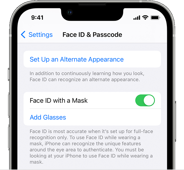
And since biometrics still fail occasionally (wet fingers, masks, bad lighting), fallback flows like PIN or passcode entry must stay quick and intuitive. For example, Apple tackled this in a smart way by updating Face ID to work with masks, using only the eye region for authentication.
Key takeaways
Looking at these trends together, it’s clear that mobile design in 2026 is maturing. Everything is becoming more adaptive, more intelligent, and more invisible. Interfaces are learning to think, predict, and even act for users, which makes the role of design less about decoration and more about direction.
A few thoughts to leave with:
-
Don’t chase aesthetics, chase adaptability. The best designs now evolve with users, not against them. Tools, styles, and devices change fast, but products that evolve with users stay relevant the longest.
-
Use artificial intelligence as leverage, not decoration. The value isn’t in adding “smart” features, but in removing friction where it actually matters.
-
Make trust visible. Whether it’s data, automation, or personalization, explain what the system is doing and why. Transparency is the new polish.
-
Small details scale big. Micro-interactions, context cues, and motion feedback do more for experience than most redesigns ever will.