16 Homepage Design Examples to Use as Inspiration

Khanh Linh Le
Created on Sep 21, 2025
Your homepage is your brand’s digital storefront. Prospective customers form an opinion about your site in just a few milliseconds, which means even small flaws in layout or messaging can cost you trust and clicks.
At the same time, expectations are higher than ever: People now demand lightning-fast performance, smooth interactivity, and even personalized experiences from the very first page.
That’s why browsing real-world homepage design examples can be so valuable. They not only keep you up to date with the latest design trends but also remind you of timeless design principles that never lose relevance.
In this article, I’ll walk you through 16 excellent examples you can draw inspiration from and show you what makes each one effective.
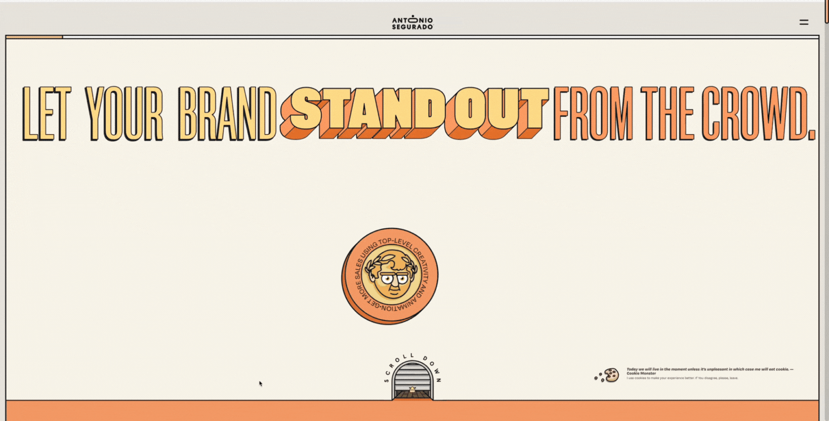
1. Striking animated illustration
Illustrator and designer Tone Segurado is a great example of captivating homepages built around playful animated illustrations.
Instead of leaning on photography or minimal layouts, the site greets visitors with bold, hand-drawn characters and warm color choices that feel personal and approachable. The illustrations aren’t static either; they animate in a way that feels alive, without crossing into chaos.
What makes it great:
-
Animated illustrations and warm color palettes: The homepage uses bespoke, character-led art supported by a warm palette of peaches, oranges, and neutrals. This combination feels handcrafted, approachable, and instantly human, setting the brand identity apart from generic stock-based sites.
-
Staged timing for animation pacing: Animations don’t launch all at once. Larger elements, like the hero section, appear after a brief delay, while smaller micro-gestures trigger every few seconds. This rhythm creates intentionality, giving space to notice details without overwhelming users.
-
‘Bio neck-turning’ as a micro-gesture: A standout detail is the illustrated character’s subtle head-turn, which mimics natural human gestures like glancing. This small movement suggests awareness, adds charm, and deepens engagement. Because it’s brief and restrained, it feels authentic rather than gimmicky.
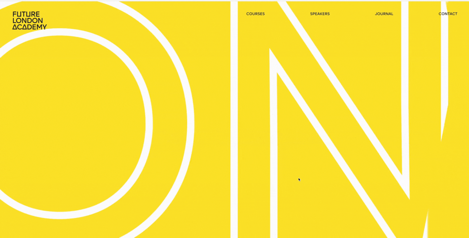
2. Bold typography and color
Future London Academy’s homepage hits hard with oversized, blurred typography and bursts of bright yellow that immediately grab attention and set a bold tone.
The large type covers big parts of the screen, sometimes overlapping other elements, making the headline its own visual statement. This unconventional layout puts the focus on center stage.
Bright yellow accents and contrasting colors inject energy into the design.
Coupled with the bold typographic hierarchy, it turns words (“START DESIGNING YOUR FUTURE TODAY”, etc.) into more than messages. They become part of the look, the brand statement.
What makes it great:
-
Blurred, oversized text that demands attention: The headlines are large, slightly blurred in places or softened at the edges, which adds drama. They occupy large screen real estate, so the eye is drawn first to the message.
-
Bright yellow homepage elements invoke energy and urgency: Yellow is used as an accent color against darker or muted background tones. This contrast makes keywords or CTAs pop, giving a sense of optimism, urgency, and creativity.
-
Typography-as-brand statement through visual drama: The bold text, unusual scale, and layering of text aren’t just decorative. They communicate that this is a place that thinks big and isn’t afraid of making design decisions that challenge the norm.
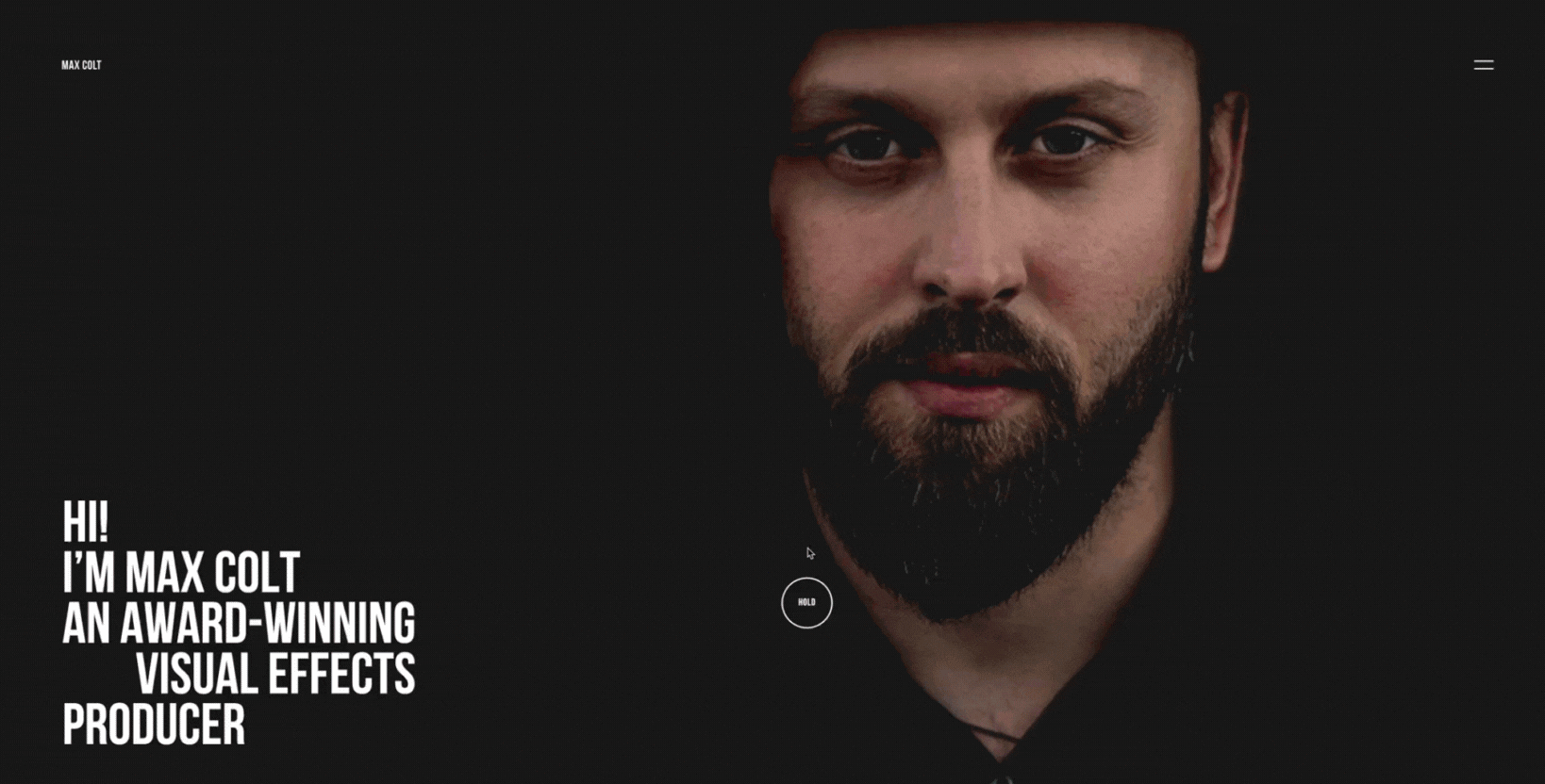
3. Interactive portrait effect
Max Colt’s homepage uses a cursor-responsive portrait blur effect that humanizes the page immediately. As you move your cursor, parts of the portrait subtly shift or blur, which draws you in and makes it feel like the image is reacting to you.
That subtle, responsive animation makes the homepage feel personal. Instead of a static face or image, the interaction suggests awareness, as though the site “sees” you. It builds connection without needing elaborate motion or heavy graphics, just enough to make you feel noticed.
What makes it great:
-
Cursor-responsive portrait blur that humanizes interaction: The portrait isn’t just decorative; it reacts to your movement, introducing softness or blur when approached and clarity when viewed straight on. That tiny responsiveness bridges the gap between viewer and creator.
-
Subtle interaction builds emotional connection: The effect is light with slight blur/sharpness transitions rather than heavy distortion or full animation. That helps it feel like a human response and avoid overwhelming users.
-
Fallback/consideration for mobile & reduced motion: On mobile devices or tablets without a cursor, the effect is either disabled or replaced with a static portrait. Also, for users who prefer reduced motion (via OS settings), the site respects that and minimizes or removes the effect.
4. Scroll-triggered 3D effect
When I landed on SquadEasy’s homepage, the first thing I noticed was how the visuals seemed to move with me as I scrolled. Instead of static blocks of content, key elements like images pop out in layers. This creates a 3D-like effect that makes the page feel alive.
There’s also a use of portrait or smiling people images (“personne qui rit”, “femme souriante”, etc.) and visual mockups that shift or reveal as you scroll, which adds playfulness. Though not a full 3D model rotation, these effects mimic depth and animate elements in ways that make the scroll itself feel immersive.
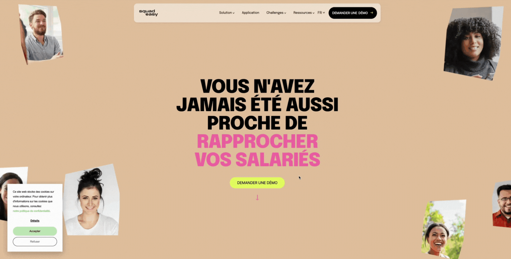
What makes it great:
-
Scroll-velocity linked motion enhances storytelling: When layered elements move at varying speeds upon scroll (parallax-like or reveal transitions), the page builds momentum, guiding the visitor through the story.
-
Playful tone via human imagery + mockups: The smiling faces, mockups of app use, and socially oriented visuals inject warmth and friendliness. The scroll effects accentuate these visuals, so you feel more connected to the people behind the brand.
-
Technical smoothness matters: Good scroll-triggered effects need careful optimization. If layered assets are heavy, movement lags or stutters. SquadEasy keeps things smooth, so motion enhances rather than distracts.
5. Functional hero layout
KeyNest’s homepage is an outstanding example of a functional and intuitive layout. Its hero section immediately tells me what I can do rather than what the company is.
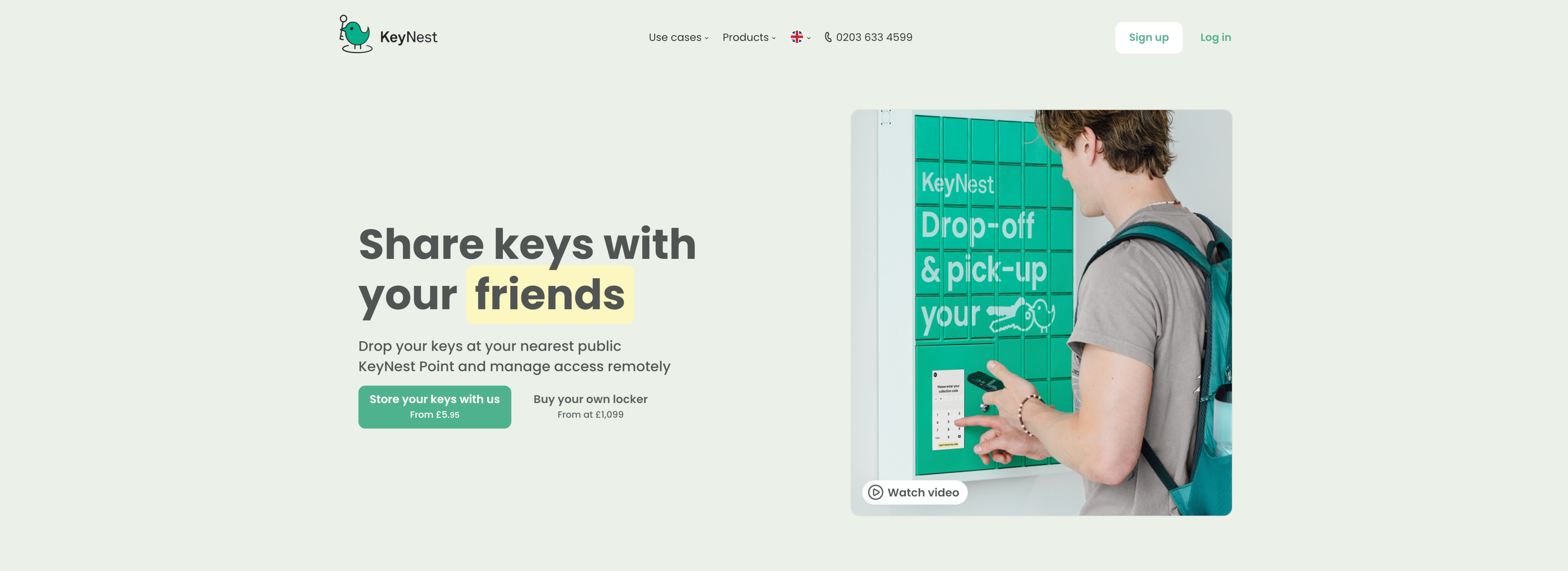
Right at the top, there’s a strong headline “Share keys with your guests” (or similar), a clear description of how the service works (“Drop your keys at your nearest public KeyNest Point and manage access remotely”), and action-oriented buttons (“Store your keys with us / Buy your own locker / Watch video”).
What I also like is how “How it works” is laid out close to the hero, simple, step-by-step, so there’s no guessing.
You see use cases (“Airbnb hosts”, “Estate agents”, etc.), product offerings, and even fare pricing (“From £5.95 / Buy your own locker from £1,099”) right above the fold. This provides easy access to key information.
That way, trust signals and conversion cues are visible without scrolling.
What makes it great:
-
Hero search-bar / clear calls to action drive clarity: The hero uses strong CTAs and descriptive text so you know what you can do and how it benefits you, instead of having to hunt for functions. This approach can significantly improve conversion rate.
-
“How it works” feature reduces friction: Breaking down the process into simple, recognizable steps helps visitors understand quickly what to expect.
-
Trust & conversion elements prioritized above the fold: Visitors can easily spot “5,000+ KeyNest Points,” “5m+ guests checked in,” use cases, pricing, all trust or proof points. They lower hesitation and encourage them to take action.
6. Product-focused minimalism
MadTasty’s homepage strikes you immediately with a bold splash: vibrant colors, big visuals, minimal text. The first thing I see is powerful product photography (the seltzers, waters) paired with strong gradients and color pops. There’s no clutter, just a clear mood: fun, energetic, modern.
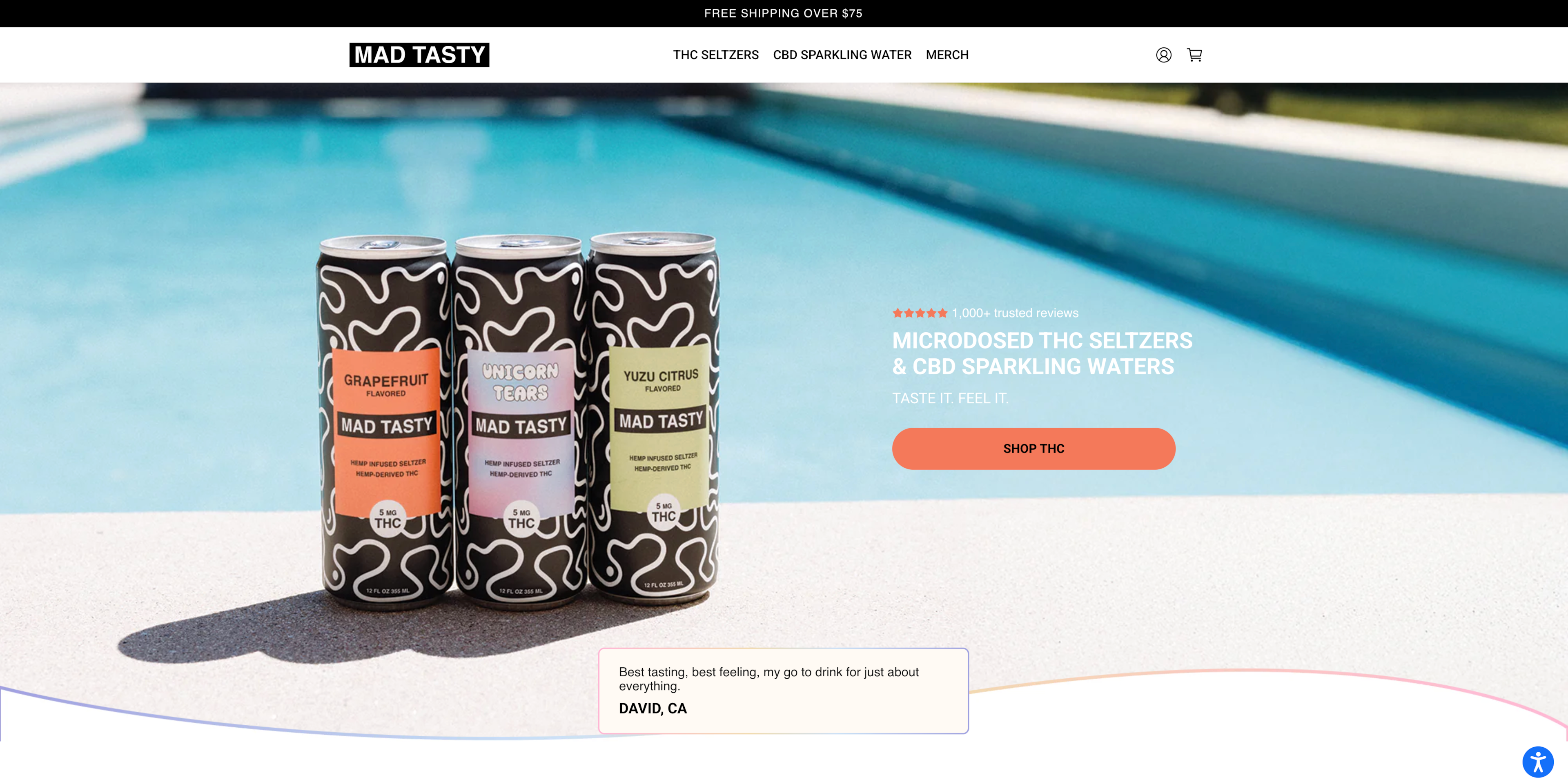
You get brand tone set instantly: “TASTE IT. FEEL IT.” is short, evocative, and backed by the visuals. There’s just enough content for you to know what the product is, what it does, and how it feels. Everything else (reviews, “meet the founder”, and FAQ) comes after.
What makes it great:
-
Contrasting vibrant colors and immediate brand tone: The homepage uses bright gradients behind product shots to draw attention. Pinks, peaches, and warm tones contrast sharply with cooler shades. That visual clash gives energy and positions the brand as bold rather than muted.
-
Strong visuals lean, minimal content for emotional appeal: Few words, but expressive imagery do heavy lifting: the products, the founder’s story, punchy taglines. By limiting text, MadTasty lets the visuals carry emotion, which makes you feel the mood more than perceive information.
7. Immersive storytelling
When I explore Locomotive’s site, what grabs me first is how every project on their own site feels like a chapter of a story.
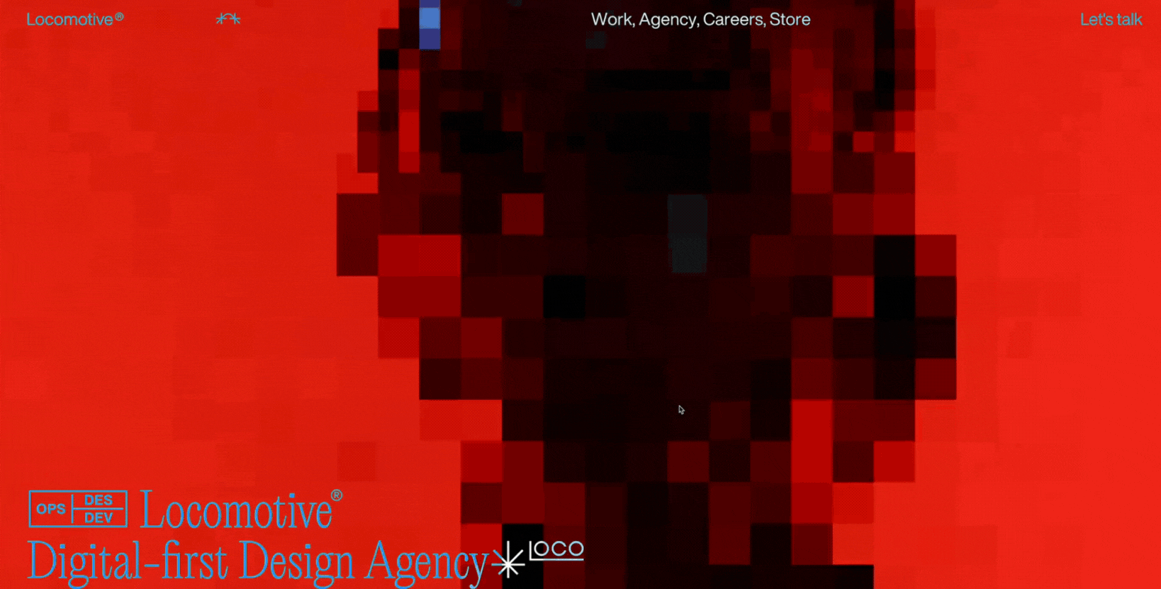
Each featured work (Mate Libre, Lightship, Pangram, etc.) is shown not just as visual case studies but with smooth transitions, thoughtful imagery, and text that hints at challenges, strategy, and outcome.
You immediately sense that motion isn’t there for decoration. Animations, hover effects, reveal transitions, and other interactive elements all serve to guide users through the experience.
Story cues like project goals, context, and brand tone are woven in so you end up understanding what matters to the agency emotionally and functionally.
What makes it great:
-
Fluid animation that connects section to section: As users scroll or navigate, animations (fade-ins, transitions, image reveals) flow in a way that keeps me moving. You get continuity, not abrupt cuts.
-
Storytelling via context, not just visuals: Each project includes brief descriptions of the problem or goal, design rationale, and how the work impacts real clients. That builds credibility and helps you understand not only what they did but why.
-
Emotional and functional cues in balance: Visual tone (lighting, framing, movement) elicits feeling (creative, professional, detail-oriented), while structure (work → read more → outcomes) delivers clarity. You know what Locomotive stands for and what you (as a potential client or collaborator) can expect.
8. Curated examples
Awwwards showcases award-winning web designs, examples not just of beauty, but of high performance, innovation, and craft. When I browse the top picks (Sites of the Day, Nominees), you can see daring layout experiments, cutting-edge animations, and subtle interactivity.
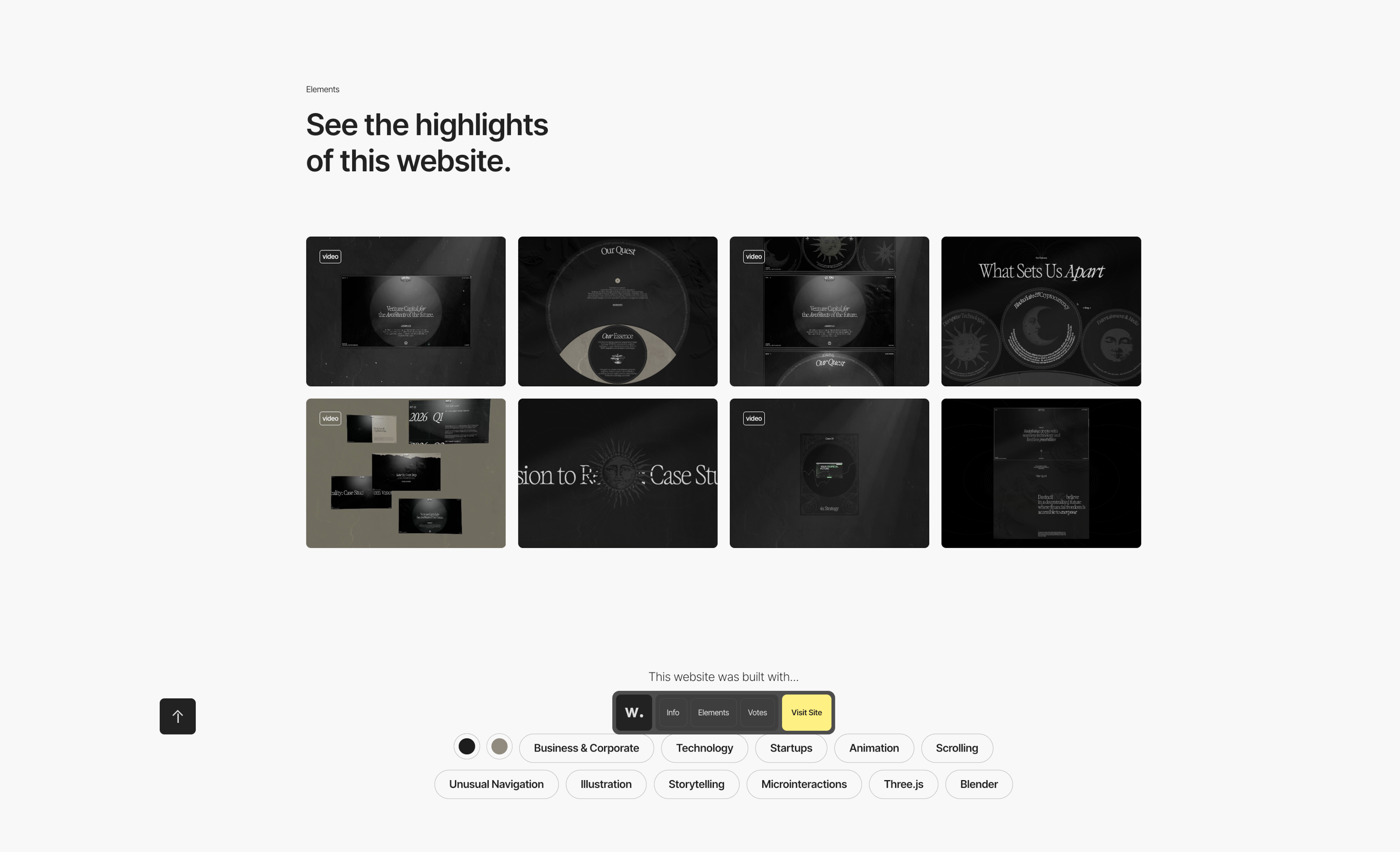
These designs push creativity: avant-garde typography, surprising transitions, immersive visuals. But you also notice loading speed, clean navigation, and responsive behavior. So, they don’t just look good, they work well. That’s what makes them so useful as inspiration.
What makes it great:
-
Blend of creativity and technical excellence: The curated showcase forces you to analyze not only how daring the concept is, but whether animations are smooth, whether layouts degrade well on smaller screen sizes, and whether visuals support accessibility.
-
Performance doesn’t take a back seat to aesthetics: Even the wilder designs include fallback states, optimized assets, and minimal blocking scripts, so you get strong visuals without sacrificing user experience or load time.
-
Inspiration with guardrails: Seeing avant-garde design in real, high-scoring examples lets you borrow ideas safely, i.e., experiments in typography, motion, and layout. Meanwhile, you can also keep an eye on what actually works: readability, conversion, and clarity.
9. Creative portfolios
Browsing Lotta Nieminen’s portfolio reminds me of what personal, conceptual design work can do to inspire. The homepage features vivid, art-driven visuals and playful experimental layouts that feel like design ideas in motion.
You see project thumbnails that hint at prototypes, side explorations, or editorial experiments, not just final branding or product work. Through those, Lotta Nieminen invites you into her creative process, offering ideas you might adapt, remix, or use as springboards for your own work.
What makes it great:
-
Conceptual and prototype work sparks creativity: Seeing early-stage explorations or design sketches encourages you to think beyond deliverables, letting you imagine what might lie between the polished final product.
-
Strong visual personality with minimal constraints: Lotta uses color, typography, and layout in experimental ways that remain coherent with her style. It’s wild but still feels like her. That contrast inspires without overwhelming.
-
Portfolio as idea lab, not just showcase: Projects with concept-driven work allow you to see design thinking: what was tried, what was refined. It turns the portfolio into a space for inspiration, not just admiration.
10. Visual micro-interactions
When I landed on ChronicleHQ’s homepage, one of the things I really appreciated was how small visual details react as I hover, click, or scroll. The interface doesn’t sit static: Templates lighten, image cards shift, and buttons subtly animate.
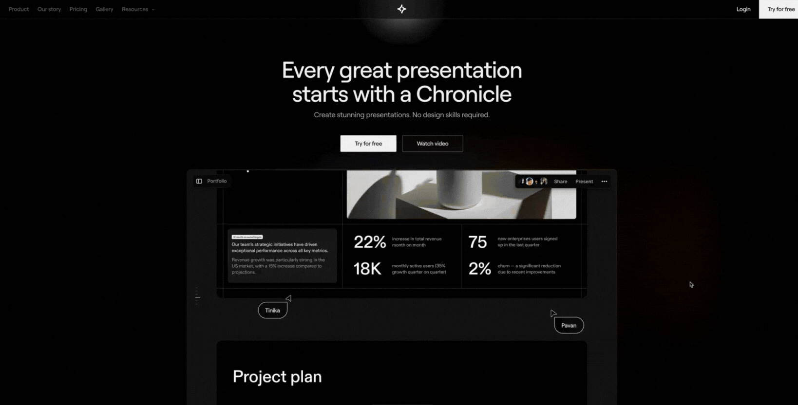
You get the sense that these micro-motions aren’t just decorative. They guide attention, hint at what's clickable, and reinforce the polish of the product. They make the experience feel alive, without overwhelming you with full-screen animations or flourishes.
What makes it great:
-
Snapshots of subtle motion: Hover effects, light transitions on image cards, and animated buttons provide feedback and bring clarity to what’s interactive.
-
Interface refresh via micro-interactions: Tiny gestures (image highlight, smooth reveal of template previews) keep the UI feeling modern and responsive.
-
Balance of emotional and functional cues for intuitive navigation: The interactions make the product look thoughtful and premium, while helping you understand how to navigate or use features without extra explanation.
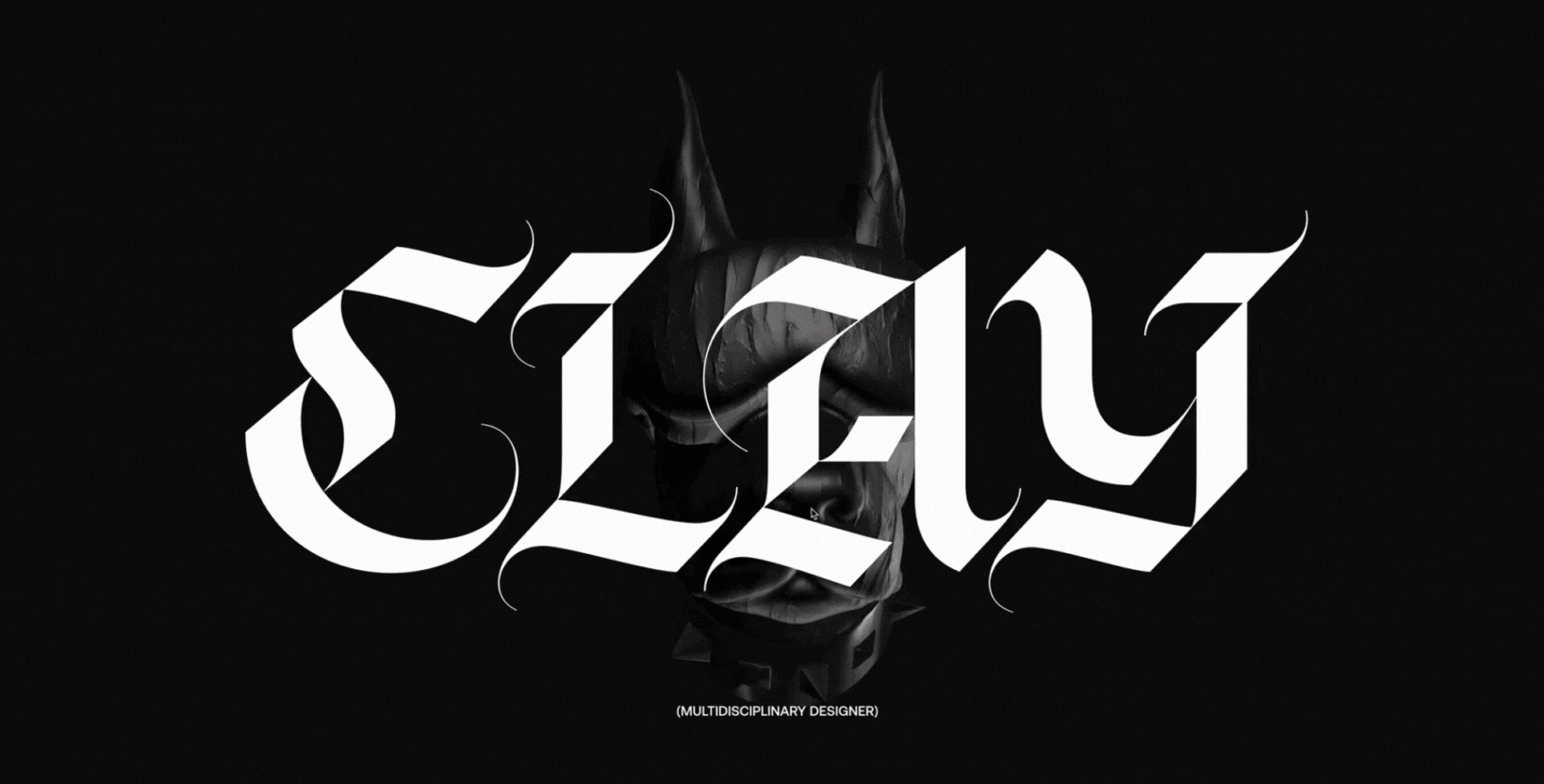
11. Immersive 3D & motion
Visiting Clay Boan’s portfolio feels like entering a motion-driven art piece. The homepage leads with full-screen visuals and layered 3D-style transitions that move as you scroll or hover.
The site uses gorgeous featured work sections with texture, depth, and momentum that pull you in before you click anything.
You immediately sense that motion is integral to how the site communicates the designer’s style. The interplay of scale, 3D layering, and motion gives the work space to breathe and invites you to explore. It’s storytelling through presence: visuals + movement = emotional engagement.
What makes it great:
-
Full-screen storytelling with featured work: The major projects (Apple, Nike × NBA, Google, etc.) dominate the screen, often with immersive graphics that set tone and scale from the start.
-
Layered motion and hover effects: As you navigate, elements shift subtly (i.e., text layers, background layers, featured work previews), offering hints of 3D depth without heavy load times or disorienting motion.
-
3D & texture reinforce brand identity: Motion, shadows, overlays, and layered imagery (even when minimal) build personality. They tell you the designer cares about craft, detail, and experience, not just visuals.
12. Minimalist, clean design
When I opened Jords & Co’s site, I was struck by how uncluttered everything feels above the fold. The hero area delivers a sharp headline ("RISE ABOVE THE NOISE · OWN YOUR CATEGORY"), a sub-headline clarifying who they serve ("B2B tech startups"), and just a few primary calls to action ("Book an intro call", "Explore our work").
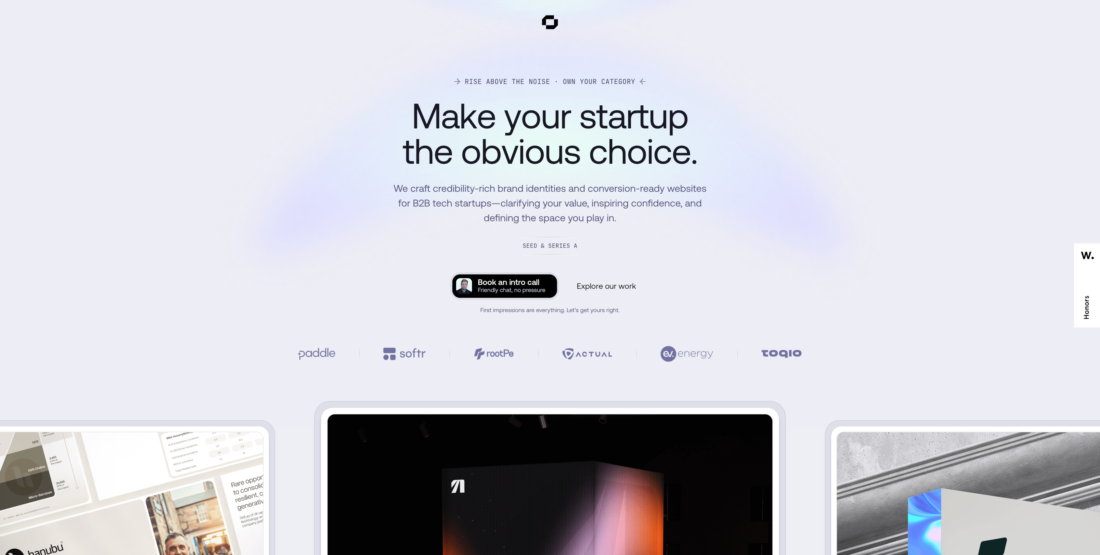
You immediately sense trust and clarity: white space gives breathing room, typography is clean and purposeful, and visuals are restrained so your eye goes where it needs to.
This well-designed homepage shows that minimalist design and strong layout can do heavy lifting without fluff.
What makes it great:
-
Whitespace + strong CTAs sharpen focus: Generous empty space around the hero headline and buttons ensures the CTAs stand out. You can’t miss “Book an intro call” or “Explore our work” because nothing else competes.
-
Clarity through messaging: The headline, subhead, and descriptive line explain precisely what they do, who they serve, and why it matters. No vague promises, as you know immediately what to expect.
-
Visual simplicity supports trust: Clean typography, limited color palette, restrained imagery make the site feel professional, trustworthy, and premium. This is exactly what you want from a digital partner in B2B.
13. Storytelling
Upon landing at Eagle’s Nest by Serge Syutkin, I found myself swept into a narrative from the first aerial image: lake, mountains, serenity. The visuals, typography, and layout work together to set a mood of escape, artistry, and transformation.
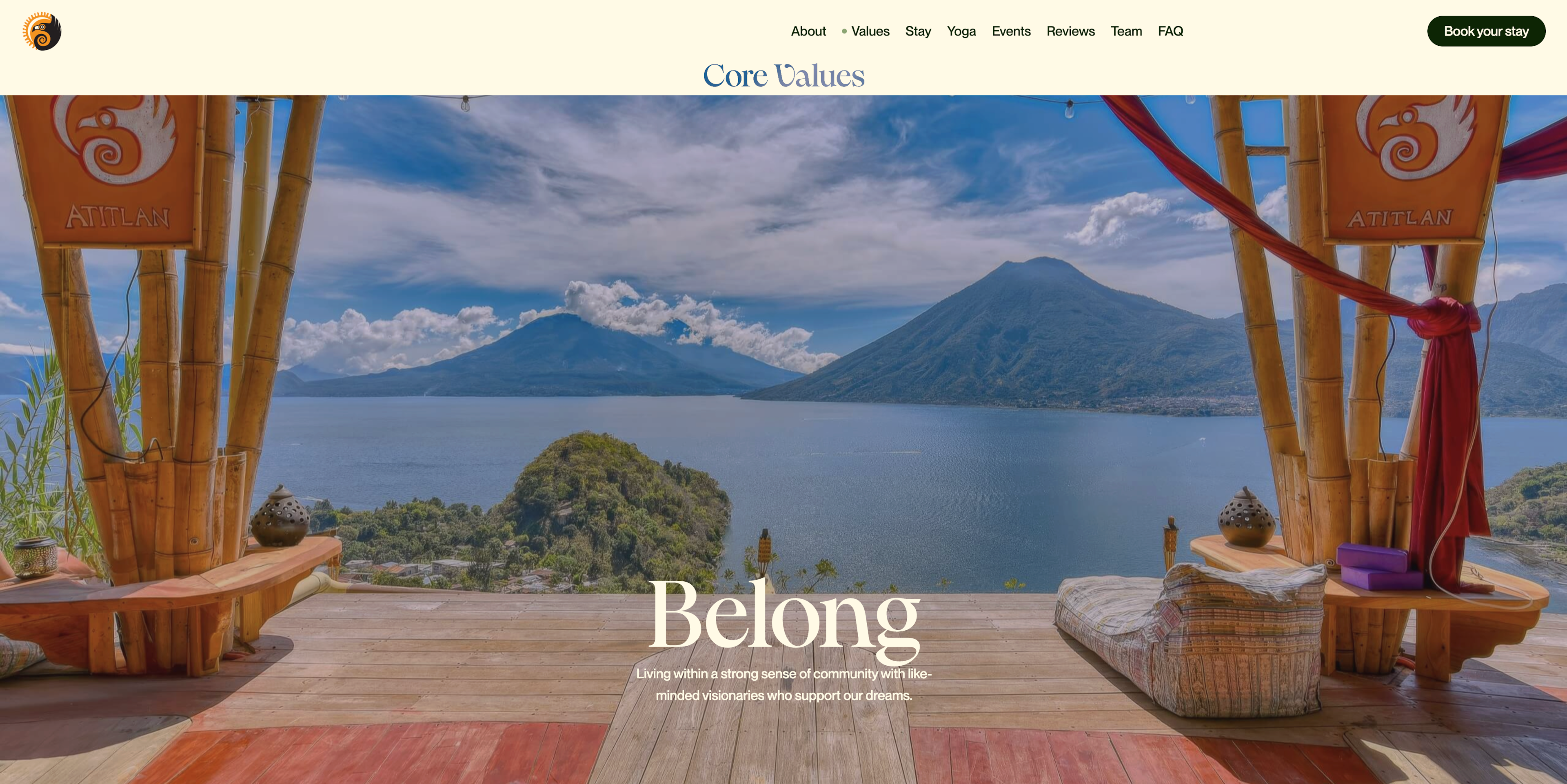
The storytelling continues to flow through sections. Values (Belong, Play, Elevate) lead into stay-with-us descriptions, daily life (yoga, workshops, meals), and even event ritual details.
Each image is curated to evoke atmosphere (morning light, nature, rustic hospitality). And typography reinforces that: Headings with personality, clean text that doesn’t compete with visuals, and pacing allowing users to pause.
What makes it great:
-
Images that set tone and tell a story: Large, high-quality photography of landscape, interior, and daily experiences. Each image suggests emotion: calm, adventure, and connection.
-
Typography & hierarchy that support narrative: Headings are expressive yet legible; subheads guide you gently through what feels like chapters (i.e., “Values”, “Stay”, “Workshops”, etc.), so you sense purpose before reading details.
-
Design pacing & section flow: The site gives you breathing room between sections. The transitions from aerial image to “About” to “Stay” etc. feel deliberate, letting emotion and curiosity build rather than forcing you to digest everything at once.
-
Story cues through context & detail: Not just what you can do (yoga, dance, workshops), but why through core values, eco-ethos, and community. The text about “each eco-conscious room tells a different story…” or “founded in 2016 as Acroyoga space … vibrant hub …” adds background and character.
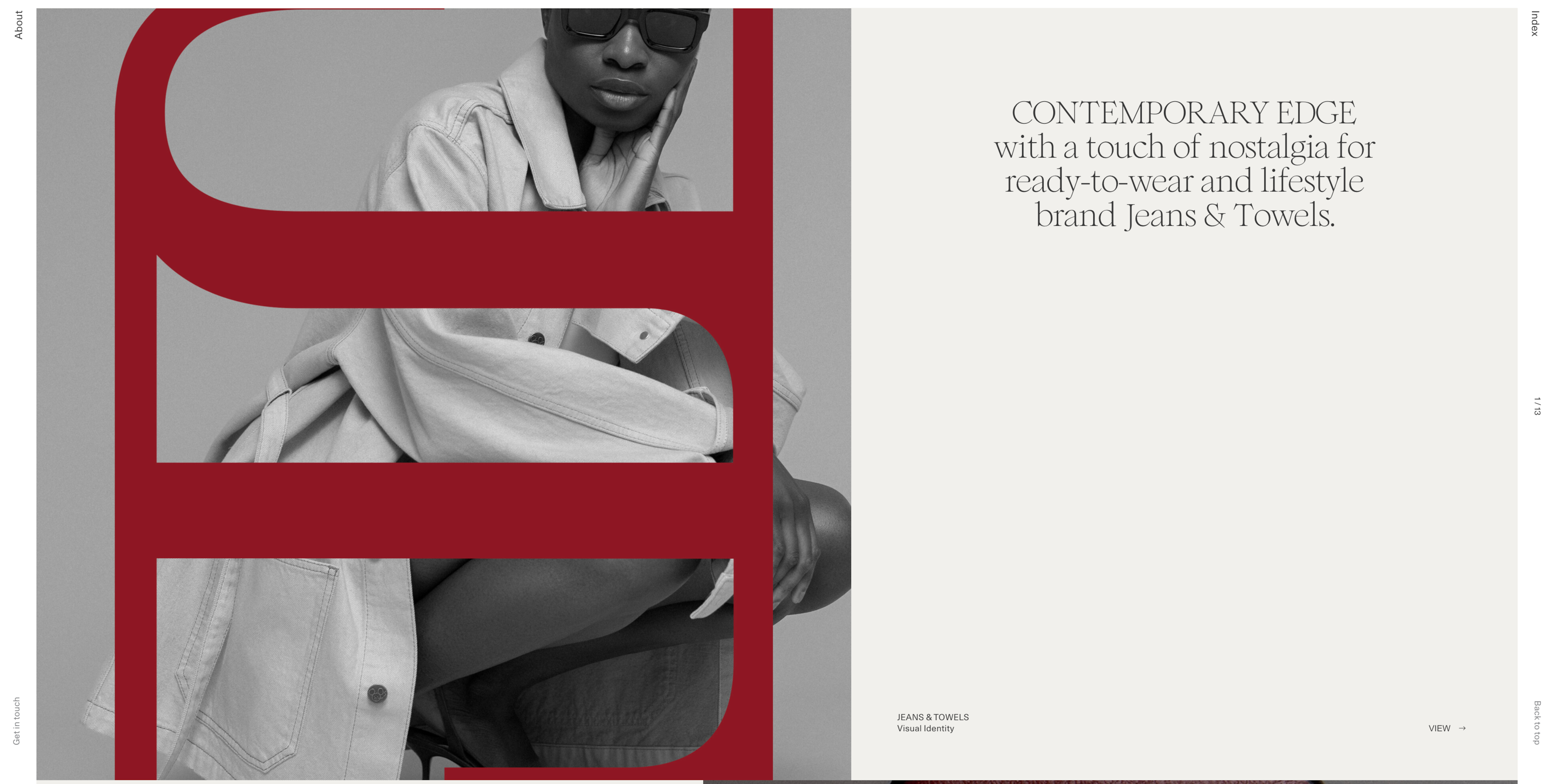
14. Branding integration
B-Egg Farm’s website is one of the best homepage designs regarding branding integration. One thing that stands out is how the packaging design and the web visuals feel like siblings.
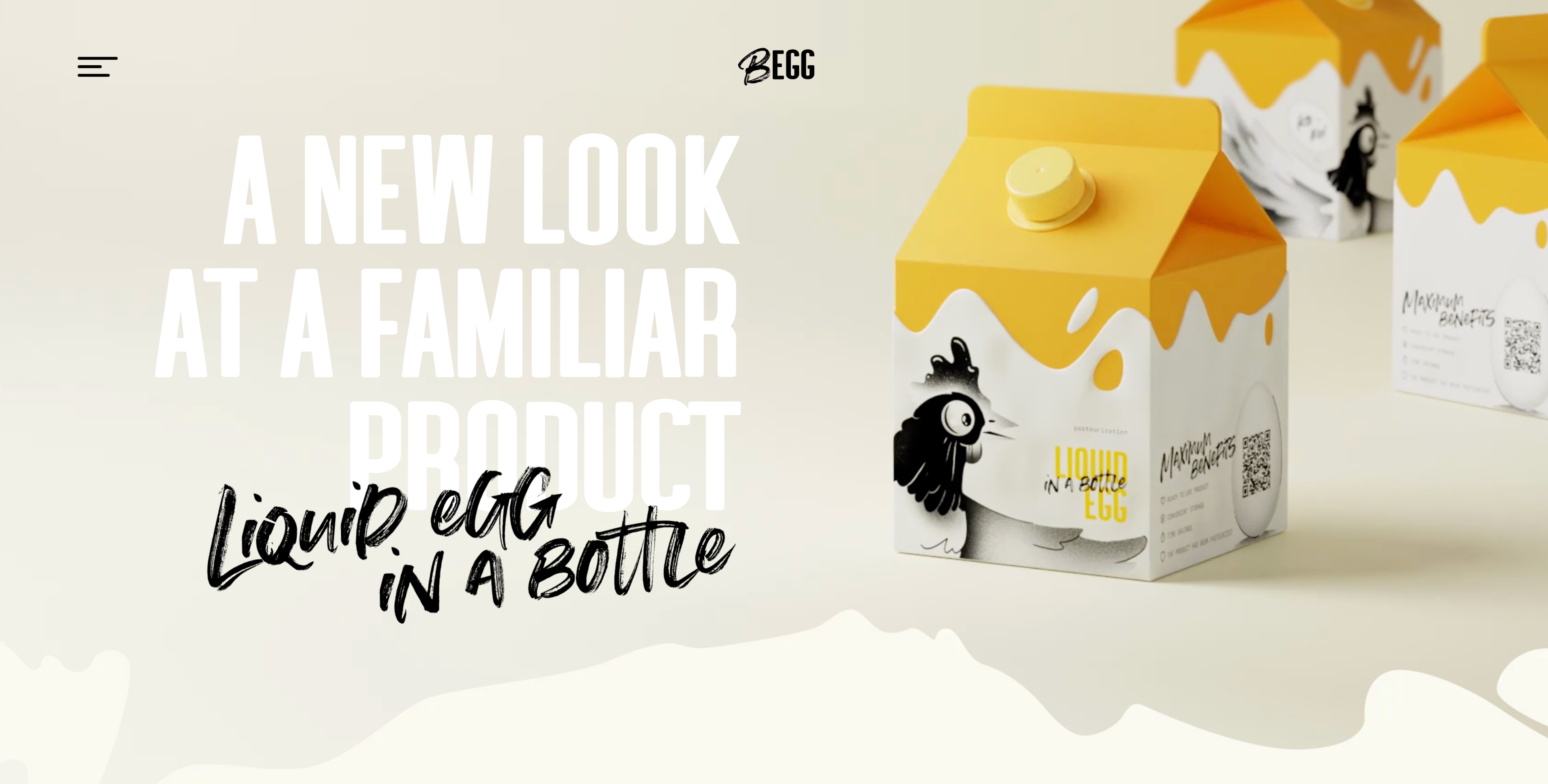
The imagery, fonts, color tones, and even texture carry over from pack to page, giving a cohesive and authentic brand experience.
You see real product shots, nutritional labels, “certified laboratory” icons, badges like “without antibiotics,” and plant-fodder logos, all echoing the physical package.
The site uses similar layouts and graphic treatments (light backgrounds, clean boxed product info, crisp imagery), so the digital feels like an extension of the shelf.
What makes it great:
-
Visual alignment between packaging & site imagery: The product packaging (liquid egg packs, bar codes, cert badges) is shown on the site with minimal filters, clean lighting, and consistent style. Therefore, what you see online matches what you’d find in real life.
-
Use of product-centric photography & icons: Close-ups of product labels, nutrition data, and icons like “certified laboratory,” “plant fodder,” and “no hormones” reinforce quality and trust. They look like they were taken from the packaging or marketing assets.
-
Typography, design element, and layout consistency: Fonts used for product names, nutrition values, headings, and body text mirror packaging print, which are clean, sans serif, and legible. Layouts with boxed sections and aligned elements feel well-structured, making information easy to scan.
-
Color & tone that match the physical product vibe: The site uses muted light backgrounds, soft greys, white space, and accent colors that emulate the packaging design. Because of that, you feel the brand identity before reading much text.
15. Dark mode with bold visuals
As one of the best examples of a homepage with a dark background, Mezmo pairs deep tones with vibrant highlights to create instant visual impact.
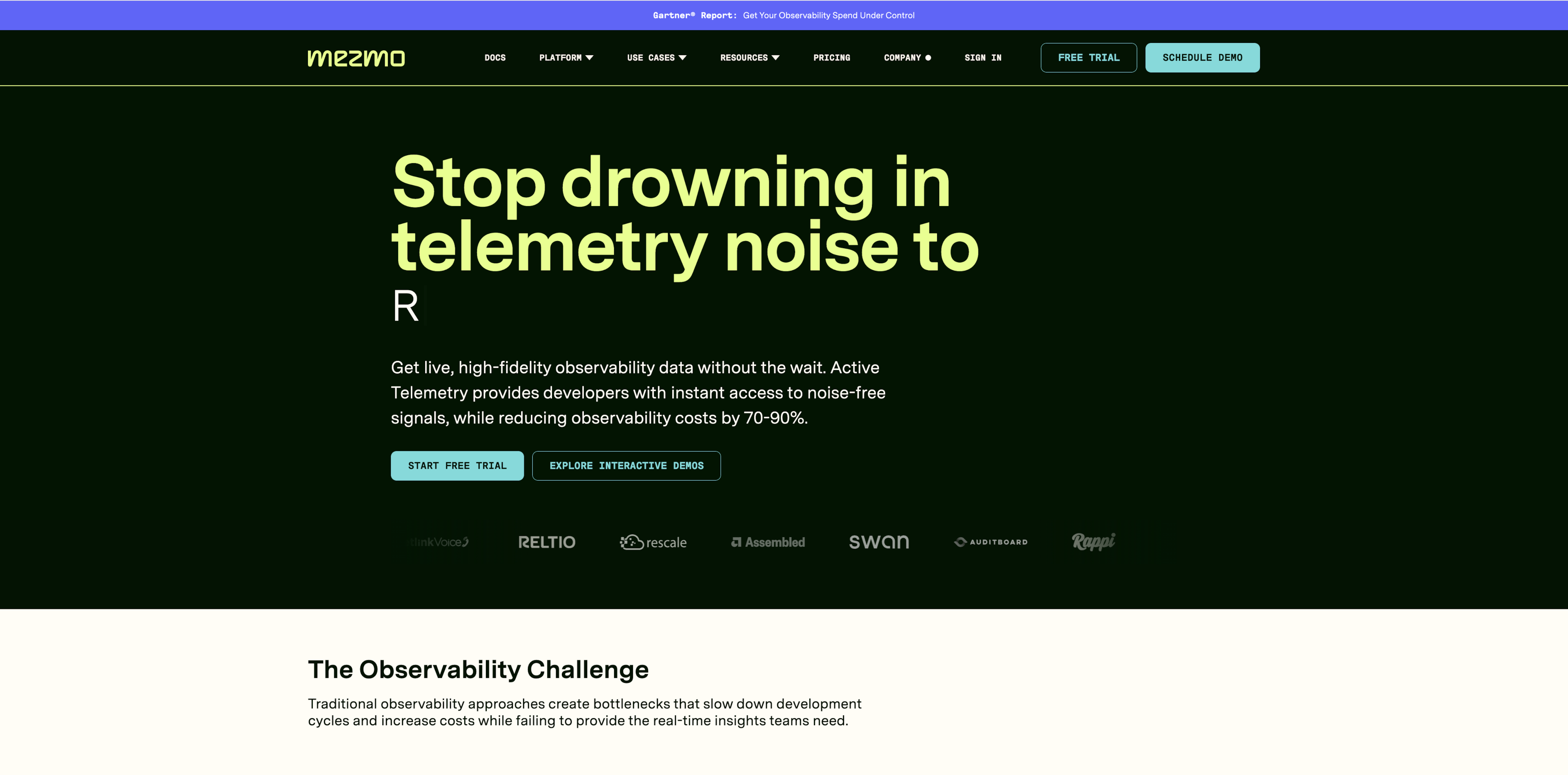
The headline “Stop drowning in telemetry noise” pops off the page, and the primary CTAs (“Start free trial”, “Explore interactive demos”) are sharp and clear against the dark canvas.
What makes it great:
-
High contrast for clarity and focus: Light text, glowing accent buttons including electric blue elements, and bright imagery stand out against the dark background. Your eye is guided immediately toward what matters: messaging, CTAs, and proof points. This creates high contrast that serves both aesthetic and functional purposes.
-
Emotion + professionalism through dark aesthetic: The dark mode gives a sense of seriousness and sophistication. It positions the product as premium and high-tech while still being readable and approachable.
16. Clean homepage with social proof
PaystubHero is an example of a SaaS company that bucks current trends in favor of keeping its homepage minimal yet credible, a smart move for a fintech SaaS.
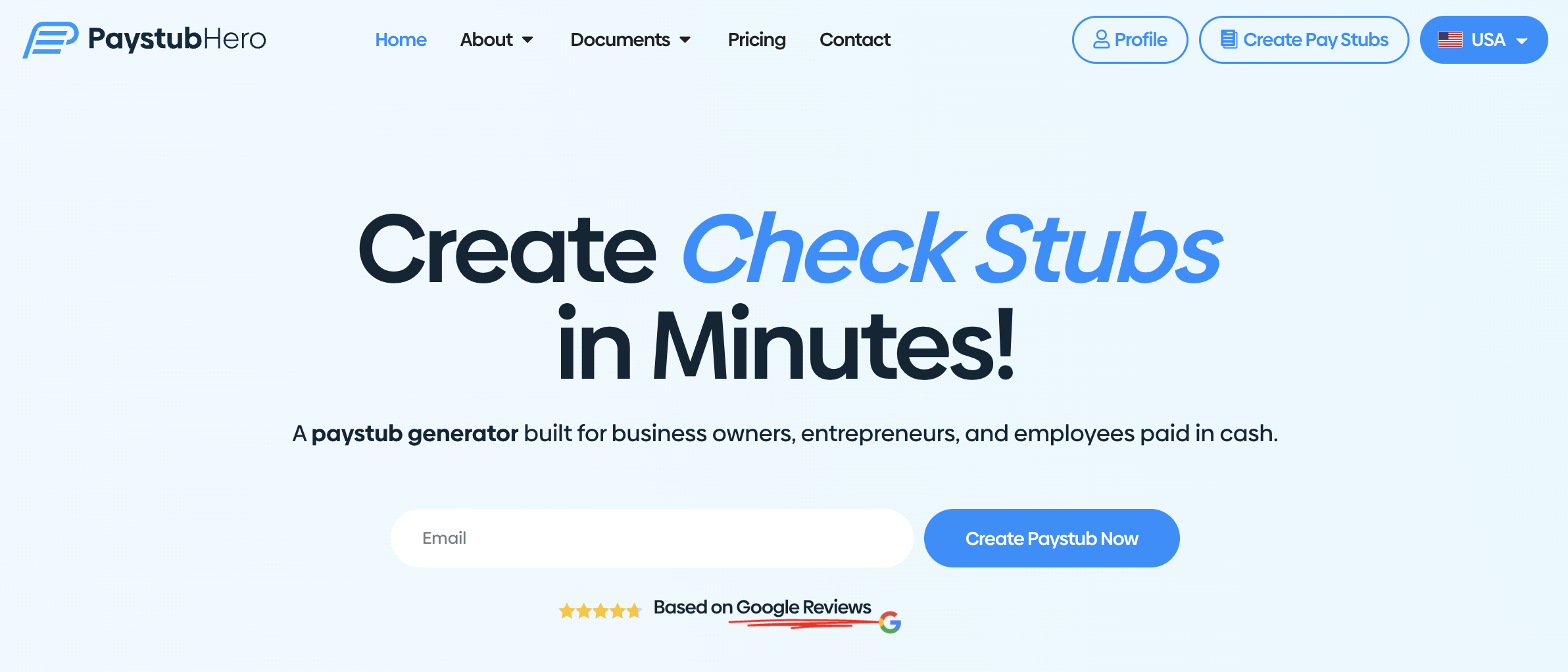
A clear headline states the core value while trust is built with badges, ratings, and straightforward CTAs. The design prioritizes quick understanding and action: no visual clutter, clear pricing signals, and a frictionless path to get started.
What makes it great:
- Ratings and reviews: PaystubHero uses social proof and trust elements without overwhelming visitors. Customer ratings and third-party review badges create instant credibility, while secure payment icons reassure users handling sensitive financial data.
- Testimonials: First hand experiences in straightforward copy reduce uncertainty, showing the product is reliable and widely used. This combination builds confidence quickly and is useful for a financial tool where security and legitimacy are top priorities.
Key takeaways
Looking at these homepages, one thing is obvious: On top of being pretty to look at, good design is all about what the page does for your visitors.
Here are the biggest lessons worth keeping in mind:
-
Interactivity makes pages feel alive. Small details like hover states, scroll-driven animations, or subtle gestures go a long way in keeping people engaged.
-
Bold visuals create impact fast. Oversized type, vibrant palettes, or dark backgrounds instantly set the tone and help your brand stand out, especially when a first visitor arrives at your homepage.
-
Storytelling connects emotionally. Images, typography, and pacing can guide visitors through your narrative and make your brand more memorable.
-
Clarity drives action. Strong heroes, focused CTAs, and simple flows mean visitors don’t waste time figuring out what to do next. A clear call to action is essential for converting potential customers.
-
Performance ties it all together. Smooth motion, quick loads, and accessible layouts make sure your design feels as good as it looks. This is for improving content consumption across all touchpoints.
The easiest way to use these lessons? Turn them into your own design checklist: strong hero section, balanced motion, clear CTAs, responsive storytelling, and performance checks.
And don’t stop here. Build a habit around browsing portfolios, test new patterns, and draw fresh inspiration from places like Awwwards, Behance, and WebStacks. The more you explore, the sharper your design instincts will get.