Design Specifications Explained for UI-UX

Khanh Linh Le
Created on Aug 25, 2025
Cornell's survey of agile teams across 25 countries found that 98% of practitioners consider documented technical details, like wires, UI artifacts, and compliance requirements, moderately to extremely important when estimating effort.
That tells us one thing: clear documentation is essential. In UI/UX design, this is exactly the role design specifications play.
But here’s the catch: Do your design and development team actually use design specifications? And if so, do you know what they should include?
In this article, I’ll break down what design specifications are, why they matter, and their key components.
What are design specifications?
At their core, design specifications serve as a helpful tool for the product development process. They include technical descriptions that outline exactly how an interface should look, behave, and be built.
This covers everything from colors, typography, and spacing, to interactions, states, and even error handling.
Their role is to ensure project managers, software engineering, and design team share a clear understanding of the project.
Think of it as an architect’s blueprint, it provides precise dimensions of each room, the placement of windows, the materials for walls, and even the location of electrical outlets.
Similarly, system design specifications guide engineering team members with the level of detail they need to bring a user friendly interface to life.
For example, take the annotated design in the screenshot below. Instead of just handing over a static mockup of a navigation panel, the designer documents specific details such as:
-
Typography: Helvetica Neue Medium, 13px, color #fff
-
Off-state font: Color #666
-
Divider line: 1px solid #000 at 30% opacity
-
Button rollover: Overlay block of color #000 at 30% opacity
-
Selected state: Background overlay color #25262a
-
Element spacing: 40px vertical padding, 240px panel width
-
Border radius: 10px on top-left and bottom-left corners
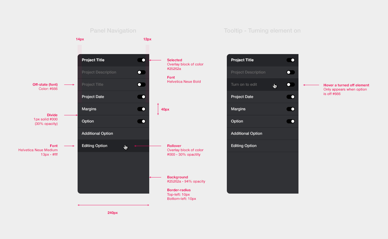
source: Andrew Couldwell
Design specs vs design systems: what’s the difference?
It’s easy to mix up design specs and design systems, but they serve very different purposes.
A design system is a living style guide. It’s the source of truth for reusable tokens and components, i.e., colors, typography scales, spacing units, buttons, and so on. Its job is to maintain consistency across different products and teams.
Meanwhile, a design specification is project-specific. It applies those building blocks for a user interface in context, i.e., defining how a particular screen, interactive elements, or user flows should be built. Specs don’t replace the system, they just add functional requirements on top of it.
|
🏷️ Aspect |
📐 Design Specs |
🏛️ Design Systems |
|---|---|---|
|
🎯 Purpose |
Instructions for building a single product or feature |
A reusable collection of rules, visual design components, and guidelines |
|
📄 Format |
Detailed description regarding sizes, colors, assets, interactions, etc. |
Living system (tokens, components, design patterns) |
|
🧩 Scope |
One project or screen |
Multiple products, teams, and platforms |
|
📅 Lifespan |
Short-term, tied to a project release |
Long-term, evolves with brand + product |
|
🛠️ Usage |
Developers follow to implement exact UI |
Designers + devs use to build consistent experiences |
|
🔄 Flexibility |
Tied to one particular project and needs updating as the project evolves |
Dynamic (updates cascade across products) |
|
👥 Ownership |
Usually by product designers for dev handoff process |
Shared across org (design + dev + brand teams) |
|
📊 Example |
"Button: 48px height, 16px padding, hex #007AFF" |
"Primary button component, responsive design, themable" |
Here’s the analogy I find most useful:
-
Design system = ingredient list. It shows you what’s available.
-
Design spec = recipe. It tells you how to combine those ingredients into a finished dish.
In short, you'll need both working together to ship polished products.
Why are design specs important for product development
Remember the fact that 98% of Agile practitioners rely heavily on documented artifacts to estimate effort? That stat perfectly illustrates why design specifications matter: when teams lack clear documentation, everything grinds to a halt.
Here’s why specs are so important in practice:
-
They reduce miscommunication and enhance collaboration. Specs give designers and developers a shared reference point. It's also helpful for incorporating user feedback into design updates without derailing development.
-
They keep designs consistent across platforms. A product might look right on desktop but break on mobile without specified rules. Specs ensure the experience remains consistent and meets user expectations across every device.
-
They accelerate iteration and onboarding: When I onboard developers on a new product or even complex ideas, I'll just point them to the specs. Those detailed specifications enable them to catch up quickly and start contributing immediately.
-
They help you avoid costly misunderstandings. I’ve seen projects where a “Forgot password?” link was designed but never built because there are no documented technical requirements. QA missed it, the final product shipped broken, and fixing it cost extra cycles. Specs eliminate those gaps before they happen.
And it’s not just developers who benefit. QA testers use specs as a checklist. Product owners use them to confirm product design requirements and user needs are met.
In other words, specs keep the entire product team on the same page.
Key elements of a design specification document
In practice, a strong document should capture the flow between screens, the rules for navigation, the states components can take, and the details QA and product managers can use to validate a build.
So, in the next parts, I’ll break down those elements one by one so you can see exactly what belongs in a complete specification.
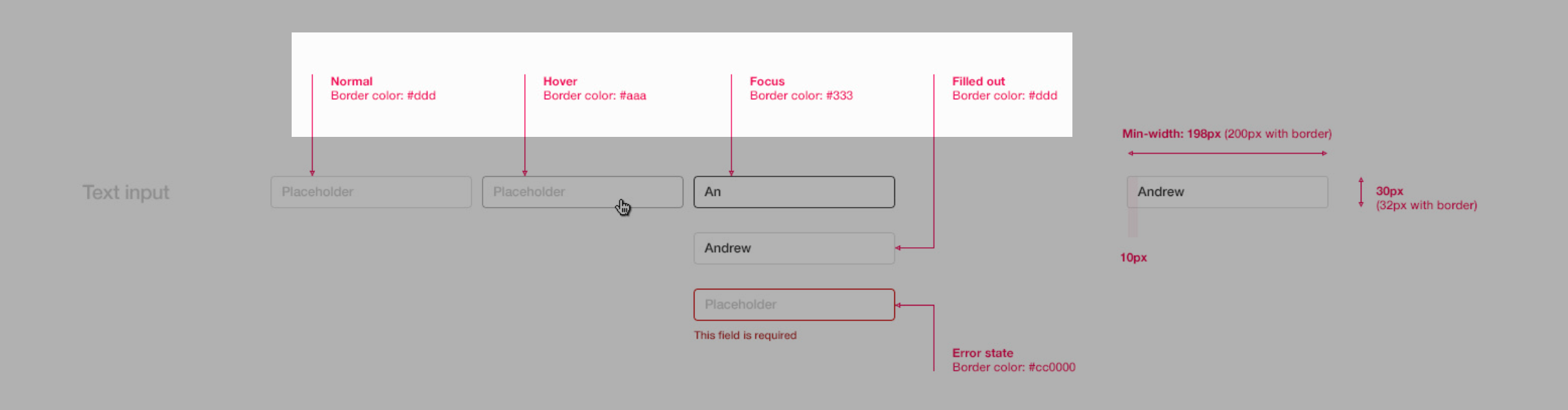
Layout dimensions and spacing
One of the first things I document in a spec is layout dimensions and spacing. Without them, developers are left eyeballing margins or aligning elements by “what looks right,” and that’s how inconsistencies creep in.
Every spec should define:
-
Screen or container sizes — including desktop, tablet, and mobile breakpoints.
-
Spacing values — margins, paddings, and alignment rules, usually in pixels, rems, or percentages depending on the system.
-
Grid structure — columns, gutters, and overall width constraints.
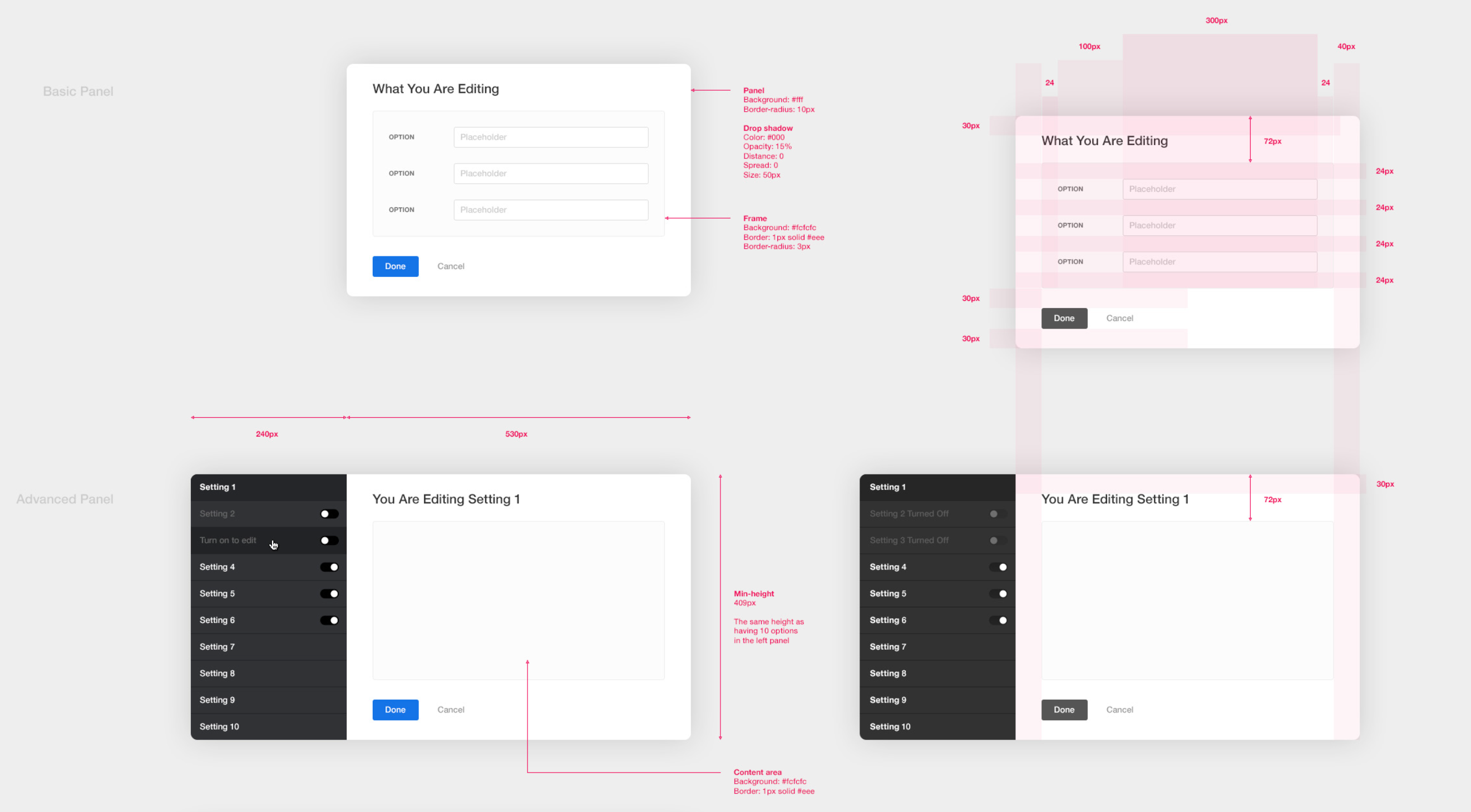
Source: Andrew Couldwell
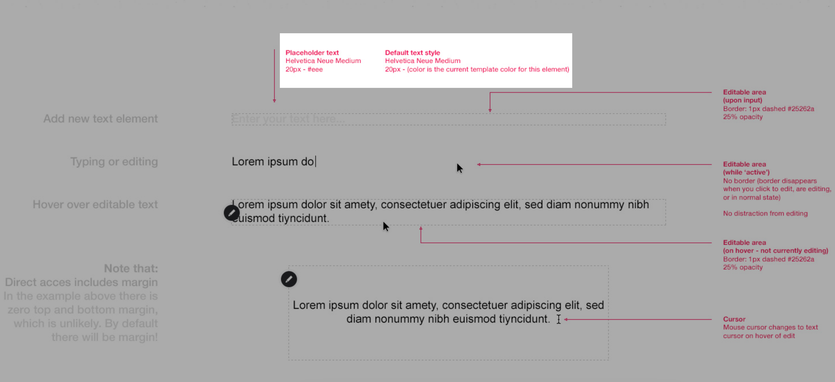
I’ve found that annotated visuals work best here. Instead of a developer squinting at Figma, a screenshot with rulers and measurements removes all guesswork.
A spec that shows “16px padding between card edges and text” or “12-column grid at 1140px” communicates more in seconds than a paragraph ever could.
Typography and font styles
I’ve seen too many projects where developers default to “close enough” fonts and the end result feels sloppy. Detailed documents on type rules prevent that.
At minimum, a spec should define:
-
Font families — including primary and fallback fonts (e.g., Inter, Helvetica, Arial, sans-serif).
-
Weights and sizes — from bold display headers to regular body text.
-
Line heights and spacing — to keep copy blocks readable across devices.
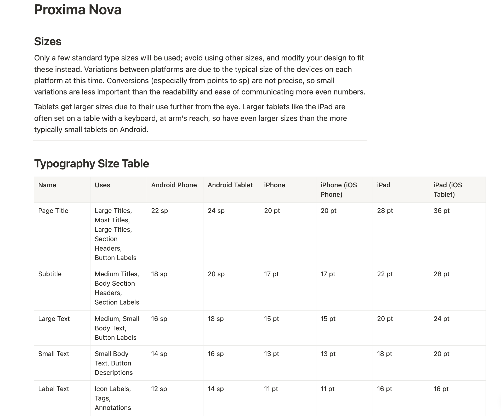
Source: UXMatters
It’s also important to distinguish between use cases. Headers, body copy, captions, and button text each have their own roles. A proper hierarchy also makes scanning easier.
For example:
-
H1 headers: 32px, bold, line height 40px
-
Body copy: 16px, regular, line height 24px
-
Captions: 12px, medium, line height 16px
-
Buttons: 14px, semibold, uppercase
Source: Andrew Couldwell
The easiest way to tie it all together is with annotated text samples. Showing an H1 above a block of body copy, or labeling the size and weight of a button text, gives developers a direct visual comparison.
That context reduces the chance of misinterpretation and makes the hierarchy you’ve defined impossible to miss.
Apart from that, good typography specs should also account for fallbacks and accessibility. If the primary font doesn’t load, a defined backup ensures the UI doesn’t break.
And type that looks clean in Figma can still fail in the real world if the contrast is too low or the size is too small. Documenting minimum font sizes, color contrast ratios, and responsive scaling makes the design more resilient.
Color system
Color is one of the most visible parts of a design, which makes it especially important to document clearly. A proper spec defines not just the colors themselves but also how and where they should be applied, so the product remains consistent across every screen and platform.
Source: Andrew Couldwell
A complete color system typically includes:
-
Primary, secondary, background, and text colors — every color used in the interface.
-
Hex codes and RGB values — exact definitions so there’s no ambiguity.
-
Naming conventions for design elements — such as Primary Blue 500, Gray 200, or Error Red for easier reference in code.
The spec should also describe intended usage. For example:
-
Primary Blue → buttons, links, highlights
-
Secondary Gray → card backgrounds, dividers
-
Error Red → alerts and validation messages
-
Success Green → confirmation states
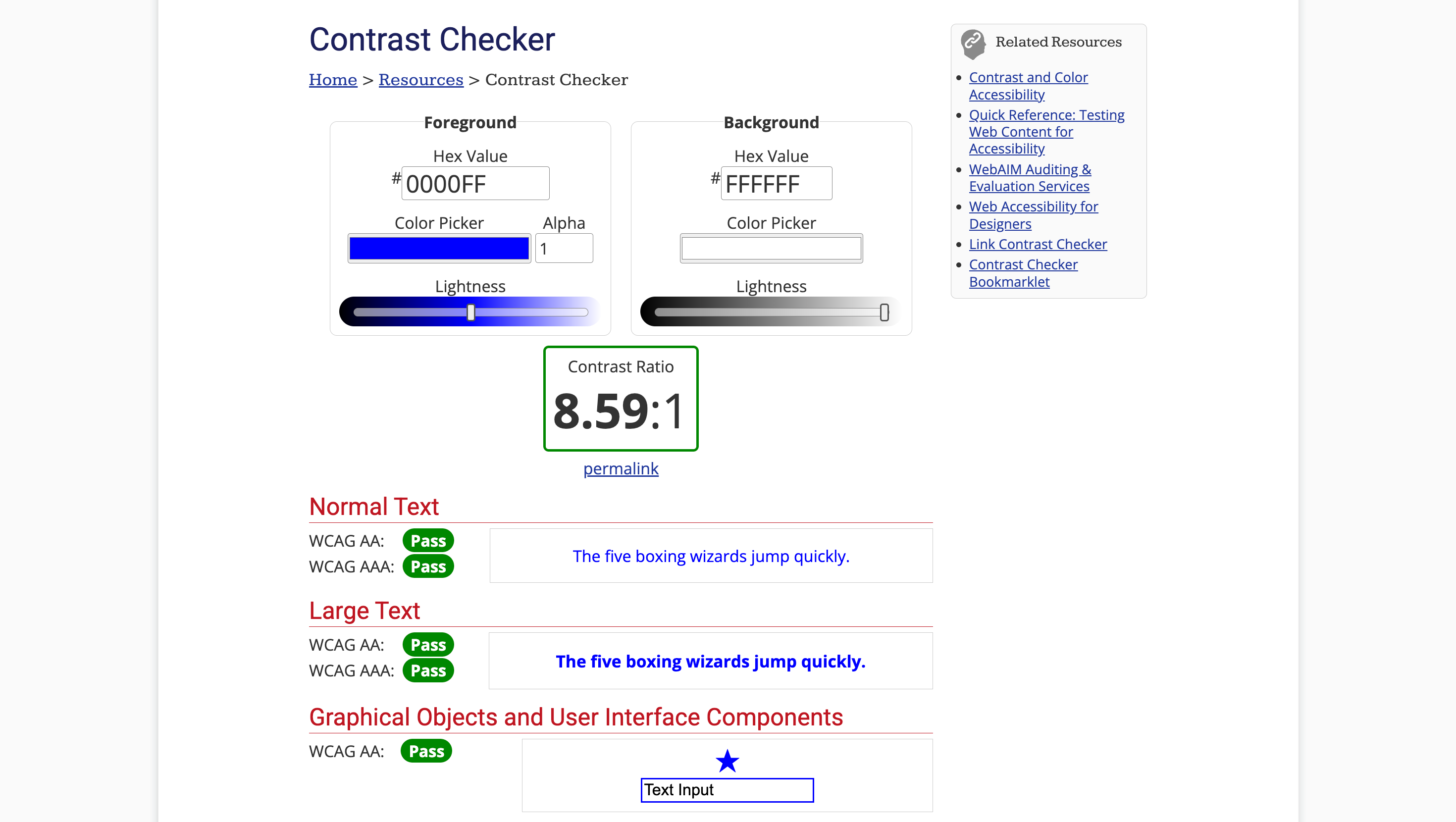
Accessibility also needs to be part of the color system. Running palettes through a tool like WebAIM’s contrast checker helps confirm text meets WCAG contrast ratios. Documenting which combinations pass industry standards saves QA and your users from painful readability issues down the line.
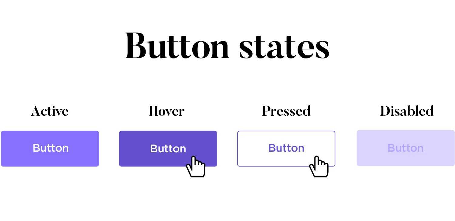
Components and UI elements
One of the most valuable parts of a functional specification, in my experience, is the section on reusable components. Buttons, cards, forms, modals, navigation bars, these are the building blocks of the interface.
A few things you should include in your specs docs are:
-
A list of core components (buttons, input fields, cards, nav bars, etc.)
-
States for each component — default, hover, active, disabled, and sometimes loading
-
Annotated visuals or screenshots that label spacing, text sizes, and interaction rules
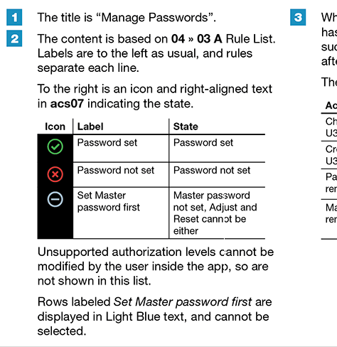
👉 For example, here’s a component spec for a password management UI. Notice how the table clearly defines the icon, label, and state for each scenario, with rules on what can and can’t be selected. This kind of annotation leaves no room for misinterpretation:
Source: UXMatters
Your team can save a lot of time during the iterative process when developers can build once and reuse everywhere.
Instead of styling a “new” button for each screen, they implement the component once and then drop it in wherever it’s needed.
Interaction and behavior
The last thing I never skip is documenting the functional requirements for element interactions.
At a minimum, here’s what I make sure to cover:
-
Click, hover, tap, scroll, and drag behaviors — e.g., hover highlights a button, tapping triggers navigation, scrolling reveals lazy-loaded content.
Source: Matthew Devaney on X
-
Transitions and animations — duration, easing curves, and when to apply them (like modal fade-ins or smooth accordion opens).
-
Gesture-based interactions — swipes, long-presses, or pull-to-refresh actions on mobile.
-
System states — what the UI looks like during loading, after a successful action, or when an error occurs.
These design details may feel small, but they shape how the product feels. Nielsen Norman Group calls them microinteractions, and they’re right: Small changes are what give users confidence that the interface is responding.
How to write UX design specifications
When I sit down to write a spec, I don’t start with anything fancy.
Free tools like Google Docs, Notion, or Dropbox Paper work perfectly well for creating structured documents with screenshots, tables, and callouts.
The key is making the content scannable and easy for developers to use, not which editor you pick.

Source: Matt Jedraszczyk
That said, if you’re working directly in Figma, you can go a step further.
For example, tools like the Component Spec Tool let you place side-by-side notes right next to your designs. It comes pre-filled with the most common CSS properties, i.e., border, padding, colors, shadows, etc., so you can annotate components without leaving your design file.
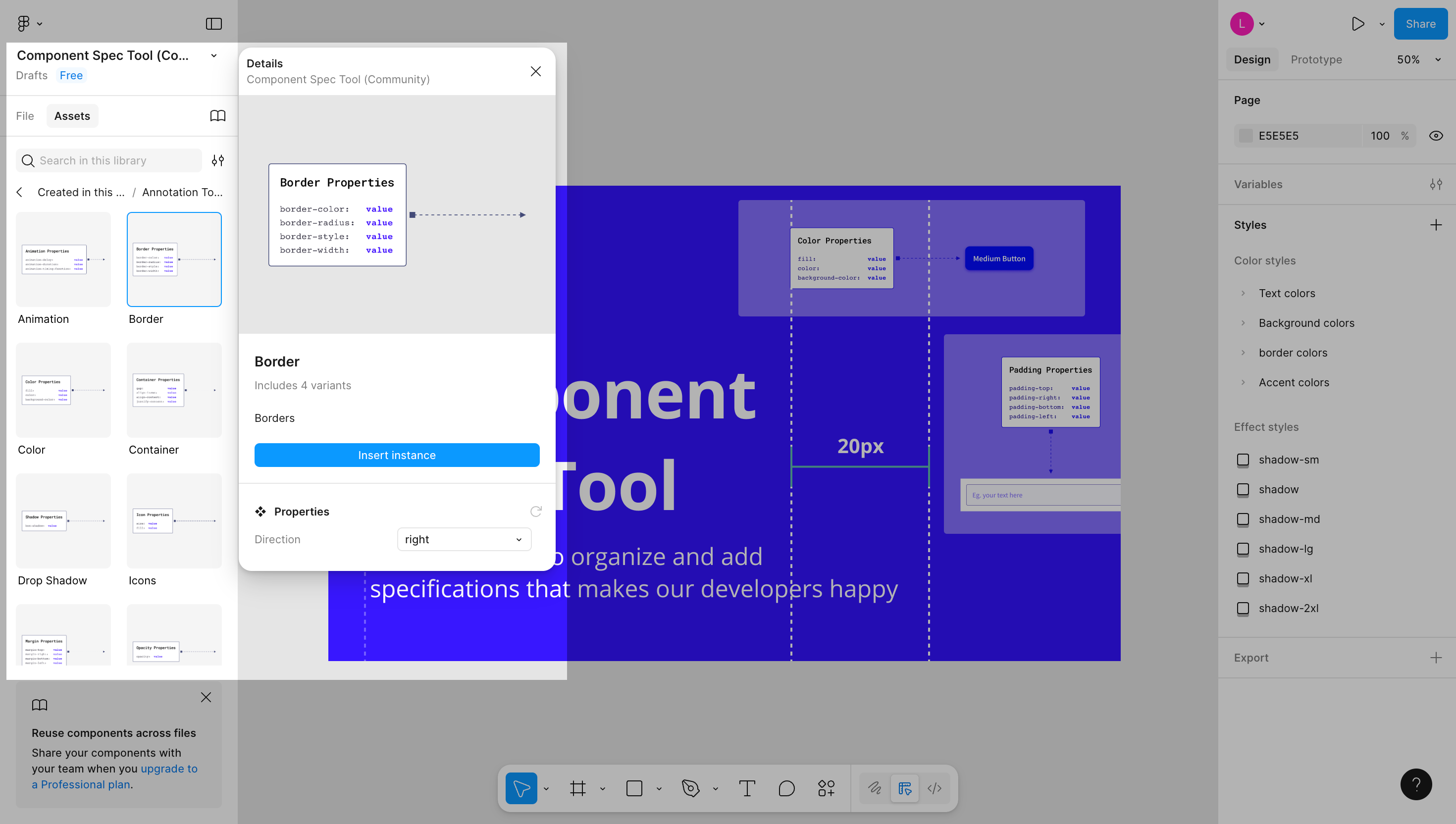
Even if you don’t use Figma, the principle applies anywhere: annotate everything.
Screenshots with arrows, labels, spacing notes, or text callouts are far more effective than paragraphs of description.
If you want quick diagrams outside of Figma, lightweight tools like Excalidraw or Whimsical are great for sketching flows and interactions.
A simple, repeatable structure I’ve found useful for any spec looks like this:
-
Project scope — product idea, context, goals, market research notes, output format
-
Screens — annotated mockups with layout details
-
Components — reusable UI elements and states
-
Interactions and technical specifications — hover, click, gestures, animations
-
Dev notes — platform and technical constraints, performance standards, libraries, edge cases
Stick to that, and you’ll avoid the “wall of text” problem that makes specs hard to follow. Instead, your document becomes a practical guide developers, PMs, and QA can all rely on.
Design specifications checklist
As your software design specification is ready, I'd recommend that you run it through a quick checklist. This is to make sure nothing important slipped through the cracks.
Here’s the short list I keep handy:
|
Section |
Checklist Question |
|---|---|
|
Layout dimensions & spacing |
|
|
Typography |
|
|
Color system |
|
|
Components |
|
|
Interactions |
|
|
Supporting notes |
|
Apart from those above checking points, you can also take a couple more steps such as:
-
Check both mobile and desktop variants if your product supports multiple platforms.
-
Test your spec handoff by asking a developer to implement one screen exactly as documented, any gaps they find will show you what’s missing.
-
Use accessible formats and version control (Google Docs, Notion, Figma comments, Git-based systems) so updates are easy to track and feedback loops stay clean.
But in case you’re new to writing specs, it also helps to start with a template. As I mentioned earlier, a lightweight sample might include: Project Overview → Screens → Components → Interactions → Dev Notes.
Common mistakes to avoid when writing design specs
Over the years, I’ve learned that the mistakes in specs usually aren’t about what’s written, but what’s missing or overcomplicated. Here are the common pitfalls and how to avoid them:
-
Being too vague or incomplete: I once reviewed a spec that said: “Use the standard button style here.” The problem? There were three “standard” buttons in the design system. The developer guessed wrong, and we ended up with a secondary button where the primary was required. Ambiguity like that always costs more time later.
-
Adding too much visual fluff: Specs overloaded with decorative mockups, shadows, or long explanations slow everyone down. I’ve found clarity always beats polish so a simple annotated screenshot communicates faster than a glossy full-screen export.
-
Inconsistent naming conventions: Calling one component a “card” in one section and a “tile” in another might feel harmless, but it creates confusion in implementation. Developers rely on consistent language; once terms start shifting, bugs and mismatches follow.
-
Forgetting interactive states: A static design with no hover, error, or loading states documented is a recipe for improvisation. And when developers improvise, the UI ends up behaving differently across screens. Always document the states, even if they seem obvious.
-
Not reviewing with both teams: A spec is only done when both design and development agree it’s usable. I always schedule a short review before finalizing, and it catches gaps every time.
So my bottom line is: a good spec is clear, consistent, and complete without being bloated. Keeping these mistakes in mind saves you from the endless cycle of handoff fixes.
Key takeaways
Design specifications are what keep design and development moving in sync. Here’s what to remember:
-
Design specs act as blueprints that define how a product should look, behave, and be built.
-
They’re different from design systems: systems define the ingredients, while specs show the recipe for a specific project.
-
Clear specs reduce miscommunication and keep products consistent across platforms, while speeding up onboarding and iteration.
-
A strong spec covers the essentials like layout, typography, color, components, and interactions, supported by annotations and visuals.
-
Checklists and templates help ensure nothing gets missed, from interactive states to mobile variants and accessibility compliance.
-
Avoid common pitfalls like vagueness, inconsistent naming, or skipping reviews with dev teams.
A well-written spec ensure your final product aligns with the project's requirements. If you treat specs as part of the design process, not an afterthought, you’ll see the payoff in faster development and fewer costly reworks.